chapter twelve
Adding 2D Transforms
In this chapter, you leave behind older browsers and make use of one of CSS3’s most exciting features, transforms, which let you move, rotate, and scale elements, among other manipulations.
Project files update (ch12-00): If you haven’t followed the previous instructions and are comfortable working from here onward or would like to reference the project files up to this point, you can download them from www.wiley.com/go/treehouse/css3foundations.
Safely Using Experimental CSS3 Properties
 Because all the CSS features explained in this chapter are from the CSS3 specification, they are unsupported in Internet Explorer 6, 7, and 8. Likewise, 3D transforms, transitions, and animations described in Chapters 13 and 14 are also unsupported in these browsers, as well as Internet Explorer 9. They do however have good support in Internet Explorer 10 and other major browsers.
Although these CSS3 properties are “experimental” and a part of Working Draft modules, they have been implemented in modern browsers for some time, and are actually close to being safe enough to use without prefixes. At the time of writing though, these properties should be used with prefixes, so you’ll learn to do just that—the most future proof way to use the latest CSS3 features.
Because I am creating the Cool Shoes & Socks page in Google Chrome, I use the –webkit- prefix. If you are using a different browser, replace the –webkit- prefix with your browser’s prefix:
• -webkit- for Google Chrome and Apple Safari
• -moz- for Mozilla Firefox
• -o- for Opera
• -ms- for Microsoft Internet Explorer
In Chapter 15, you use a tool that adds the missing prefixes to your stylesheet so that the Cool Shoes & Socks page works across all browsers.
transform and 2D Transform Functions
Initial value: none | Inherited: No | Applies to: All elements with a display declaration relating to block, inline or table | CSS3
Unprefixed browser support: IE 10+, Firefox 16+, Opera 12.5+
Prefixed browser support: IE 9+, Firefox 3.5+, Chrome 12+, Opera 10.5+, Safari 3.1+
The transform property allows you to manipulate the position, size, rotation, and skew of an element. When prefixed, the property itself looks like this:
-webkit-transform
-moz-transform
-ms-transform
-o-transform
The values to be used with transform are all functions: translate(), translateX(), translateY(), scale(), scaleX(), scaleY(), rotate(), skewX(), and skewY(). They all affect an element in 2D. The next chapter covers 3D functions to be used with the transform property.
translate(), translateX(), and translateY()
The translate functions allow you to move elements around on a web page. That capability may not seem very exciting because you’ve already seen this happen lots with properties such as position, top, left, right, and bottom, but translate() is an easier way to move elements around without affecting the rest of the document. Ideally, you use translate functions when you want to animate the position of elements, creating movement.
Remember that “25% Off” banner image you fixed to the bottom of the Cool Shoes & Socks page in Chapter 9? I mentioned that the image is square and has a transparent section, which may prevent users from interacting with elements below it. By using the transform property, you can make that banner without using an image and work around that problem of the image taking up an area it doesn’t need to.
1. In index.html, find the following HTML and delete it:
<img class=”banner-ad” src=”images/banner-25percent.png” alt=”25% Off All Purchases” />
2. In its place, add the following:
<div class=”banner-ad”><span>25% Off</span>All Purchases</div>
3. Save index.html.
Now that you’ve replaced the image, add some CSS to make the <div> look like the image.
4. In styles.css, add the following declarations to the .banner-ad rule set below the existing declarations:
background: #00B0DC;
color: white;
text-align: center;
font-family: Tahoma, Verdana, sans-serif;
font-size: 1.1em;
font-weight: bold;
min-height: 50px;
width: 200px;
5. Below the .banner-ad rule set, add a new rule set:
.banner-ad span {
clear: both;
display: block;
font-size: 2.2em;
}
6. Save styles.css.
As shown in Figure 12-1, the banner advertisement image is replaced with text and CSS. At the moment, the banner sits square on the page, but you can change that position using the transform property.

Figure 12-1 The banner advertisement now made using CSS rather than an image.
7. In the .banner-ad rule set, add the following declaration:
-webkit-transform: translate(50px, -25px);
8. Save styles.css.
The banner now sits partially off-screen, outside the viewport, as shown in Figure 12-2. This change is all part of the master plan and puts the banner in a place where you can rotate it in a moment.

Figure 12-2 The banner advertisement moved 50px on the X axis and –25px on the Y axis.
By giving the translate() function two values (the X and Y positions), you tell the browser to move the banner 50px horizontally to the right and move it vertically upward 25px on the Y axis. Negative values on the X axis move an element horizontally to the left and vertically upward on the Y axis.
Putting the banner in this position may seem strange, but it makes more sense when you consider the origin of the element. Each element has an origin, which is the position used to calculate transforms. As shown in Figure 12-3, an element’s origin (represented by a cross) is its center by default, which you can change via the transform-origin property that is covered shortly.
By using the translate() function to position the center of the banner here, you can then rotate it to be perfectly positioned in the way the image was.

Figure 12-3 The origin of the banner advertisement and how it is used to calculate the banner’s new position.
You can give the translate() function any unit of length or a percentage as its values. If the second value, representing the Y axis, is absent, it is assumed to be 0.
translate() is the shorthand function for translateX()and translateY(), which change the X and Y axis, respectively.
rotate()
If you’re itching to get to it, you can rotate that banner straight away and then take a closer look at the rotate() function:
1. In styles.css, change the transform declaration in the .banner-ad rule set to include a rotate() function:
-webkit-transform: translate(50px, -25px) rotate(-45deg);
2. Save styles.css.
As shown in Figure 12-4, the banner is now rotated and appears in the same way that the image did. Why go to that effort? Although the element is still square after you rotate it, the diagonal top of the banner is now the top of the element, so there is no invisible space, as there was with the image. What’s more, in Chapter 14, you take this process further and animate the banner when it’s hovered over.

Figure 12-4 The banner advertisement rotated to sit at –45 degrees in the corner of the viewport.
Now look at that code you added:
-webkit-transform: translate(50px, -25px) rotate(-45deg);
Because the banner is to be both translated and rotated, you add two functions to the transform declaration, separated by a space. You can give a transform declaration as many functions as required.
You can give the rotate function a value either in degrees, gradians, radians, or turns:
• Degrees (deg)—There are 360 degrees in a full circle.
• Gradians (grad)—There are 400 gradians in a full circle.
• Radians (rad)—There are 2π radians in a full circle (meaning 3.1415 is the equivalent of 180 degrees).
• Turn (turn)—There is 1 turn in a full circle.
When you specify a rotate() value of -45deg, the banner is rotated counterclockwise by 45 degrees. A positive number rotates an element clockwise.
scale(), scaleX(), and scaleY()
The scale() function increases or decreases an element in size. As with translate(), scale() takes two arguments: the X and Y axes. If the second value is absent in scale(), however, unlike translate(), that one value is applied to both the X and Y axes. If you want to transform only one axis, you can use the functions scaleX() and scaleY().
1. In styles.css, change the transform declaration in the .banner-ad rule set to include a scale() function:
-webkit-transform: translate(50px, -25px) rotate(-45deg) scale(1.1);
2. Save styles.css.
When you specify a scale() value of 1.1, the banner element and its contents are scaled by 110% of its original size. You can give scale()only a number, which is a multiplication of its calculated size.
skewX() and skewY()
Skewing an element makes that element appear slanted or twisted.
You may be wondering why there’s no skew() function to go with skewX() and skewY(). An early version of the CSS3 Transforms module (www.w3.org/TR/css3-transforms/) did include skew(), and you may find browsers still render the function, but it has been removed from the specification. This was due to concerns about its name being misleading. For this reason, you should only use skewX() and skewY().
skewX() and skewY() skew an element around its X and Y axis, respectively.
I’ll use the More Information button to demonstrate skew transforms but not actually keep the effect:
-webkit-transform: skewX(10deg);
As shown in Figure 12-5, when you give the rule set .showcase .button a transform of skewX(10deg), the More Information button is skewed 10 degrees counterclockwise from the Y axis.

Figure 12-5 The More Information button with a 10-degree skew applied to the X axis.
When skewX(10deg) is replaced with skewY(10deg), like so:
-webkit-transform: skewY(10deg);
The button is skewed 10 degrees clockwise from the X axis, as shown in Figure 12-6.

Figure 12-6 The More Information link with a 10-degree skew applied to the Y axis.
If you want to skew both axes, rather than use the no-longer standard skew() function, simply use both skewX() and skewY() separated by a space:
-webkit-transform: skewX(10deg) skewY(10deg);
Skew functions accept degrees, radians, or gradians as arguments.
matrix()
The transform property also accepts the matrix() function, which allows for complex transformations. Because this is an advanced feature, it is not demonstrated in CSS3 Foundations, but if you want to learn more, I recommend reading Opera’s article, “Understanding the CSS Transforms Matrix,” available at http://dev.opera.com/articles/view/understanding-the-css-transforms-matrix/.
transform-origin
Initial value: 50% 50% | Inherited: No | Applies to: All elements with a display declaration relating to block, inline or table | CSS3
Unprefixed browser support: IE 10+, Firefox 16+, Opera 12.5+
Prefixed browser support: IE 9+, Firefox 3.5+, Chrome 12+, Opera 10.5+, Safari 3.1+
When you are transforming an element, that element has a transform origin, which, by default, is 50% 50% (on both the X and Y axes)—the center of the element.
As shown in Figure 12-7, the top element has the default origin of 50% 50%, which places the origin in the center (represented by a cross). When you apply a rotate transform of 45 degrees, that element is rotated around its origin.
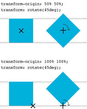
Figure 12-7 An element being rotated 45 degrees around an origin of 50% 50% and 100% 100%.
In Figure 12-7, the element at the bottom has an origin that is placed 100% on the X axis and 100% on the Y axis (the bottom-right corner). When you rotate the element 45 degrees around this origin, the transformation creates a different effect.
Let’s go back to the “25% Off” banner advertisement to make use of transform-origin.
Although the banner is in the desired position, as shown in Figure 12-8, when the text size is scaled in a browser such as Firefox, the banner goes a bit crooked, and not all the text can be seen! This happens because the Y axis in the translate() function is -25px, which is supposed to be half the height of the element. When text is resized, the height of the element grows, and that -25px value may no longer be half the height of the banner, causing its position to go off center.

Figure 12-8 The banner advertisement goes crooked when text is resized.
You can fix this problem by changing the origin of the banner:
1. In styles.css, add the following declaration to the .banner-ad rule set:
-webkit-transform-origin: 50% 100%;
2. Modify the transform declaration, as follows:
-webkit-transform: translate(75px, -25px) rotate(-45deg) scale(1.1);
3. Save styles.css.
As shown in Figure 12-9, the origin is still placed on the center of the X axis but at the bottom of the Y axis. The translate() value for the X axis is 75px = 100 px (half of the banner’s width) – 25px (to place the X origin 25px inside the viewport), and the Y axis is -25px to also place it 25 px inside the viewport. Because the banner has a specified width of 200px, the X origin is always a constant, and now that the origin on the Y axis is changed to the bottom of the element, it too is a constant, allowing the banner to grow as tall as it needs and always remain anchored 25px inside the viewport.

Figure 12-9 The origin of the banner element now placed on the center of the X axis and the bottom of the Y axis.
Summary
In this chapter, you scratched the surface of 2D transforms. Making the banner advertisement out of text and CSS instead of an image doesn’t prevent users from interacting with elements below it like the image did. Although not all browsers support 2D transforms, those that don’t still see the banner, just without the transforms applied to it (as it was in Figure 12-1). In Chapter 14, you learn to animate that banner to make it move in and out of the page when interacted with.
In the next chapter, you make some elements jump off the page using 3D transforms!