chapter five
Adding Presentational Styles
In this chapter, you take a deeper look at some of the properties you’ve already used, learn how to use shorthand properties and property values, and learn many more properties to make Cool Shoes & Socks really stand out!
Before you begin reading about presentational styles, first set up the page to give it a little more structure:
Project Files Update (ch05-00): If you haven’t followed the previous instructions and are comfortable working from here onward or would like to reference the project files up to this point, you can download them from www.wiley.com/go/treehouse/css3foundations.
1. In styles.css, find the body rule set and add the following declarations:
margin: 0 auto;
max-width: 960px;
2. Save styles.css.
These properties—that center the web page as shown in Figure 5-1—are covered in Chapters 6–9. It’s kind of looking more like a web page now, right?

Figure 5-1 The web page centered and with a defined width of 960 pixels.
Using Experimental Properties Safely
In Chapter 1, I mentioned that some of the CSS3 modules are incomplete and at various stages prior to reaching the Recommendation status.
 With many of CSS3’s modules still being written, browser vendors are constantly updating their browsers to better support CSS3’s new features. The more they can implement, the more they and their users can test and provide feedback on, so it is very important for a browser to keep up with the latest web technology.
To make implementing experimental features as safe as possible, it was decided that each browser should have its own prefix to be placed before a CSS property. That way, if two browsers do implement a feature in a different way, that feature viewed in one browser doesn’t appear broken in the other; they both refer to the same feature but may have their own unique implementation of it. When a feature becomes official, the vendor-prefixed property then becomes obsolete, and the official property is relied on instead.
So, what exactly are vendor prefixes and how do you use them?
One example of an experimental property is transition-duration, which you will learn to use in Chapter 14. A transition-duration declaration may be written like so:
transition-duration: 2s;
This is the official property name that is described in the CSS3 Transitions module. However, as at the time of writing, that module is a Working Draft, for the safest implementation, transition-duration should be written with a vendor prefix for each browser, like so:
-webkit-transition-duration: 2s;
-moz-transition-duration: 2s;
-ms-transition-duration: 2s;
-o-transition-duration: 2s;
transition-duration: 2s;
These vendor prefixes apply to the following browsers:
• -webkit- — Google Chrome and Apple Safari (they use the WebKit Layout Engine)
• -moz- — Mozilla Firefox
• -ms- — Microsoft Internet Explorer
• -o- — Opera
The vendor-prefixed properties should be followed by the official, unprefixed property, which ensures that when this property does become official, the standardized property will be used—instead of the vendor-specific one.
In the preceding example, the same property is repeated five times. If you’re anything like me, typing it that many times sounds like a hassle. It’s important to use vendor prefixes, though!
You can be thankful that there are free tools that allow you to write only one vendor prefix during development, and they will fill in the rest for you. When you use vendor prefixes throughout CSS3 Foundations, write one only for the browser in which you’ve decided to create your web page (I use -webkit- for Google Chrome), and in Chapter 15, you use a tool that adds the other vendor prefixes to your CSS automatically.
When a property should be used with vendor prefixes, I’ll let you know. However, as the web is constantly evolving, if you’d like to be certain of whether a property still requires a vendor prefix or not, I recommend visiting a website called When can I use... ( www.caniuse.com). Not only will When can I use... tell you which properties are supported in which browsers, it’ll also show whether you need to use vendor prefixes for that property.
At the time of writing, browser vendors are making a push toward removing vendor prefixes from the more established CSS3 properties and as time goes on, fewer vendor prefixes will be required, until they eventually become obsolete.
Using vendor-prefixed properties when they are no longer necessary won’t cause any problems and it is better safe than sorry. A browser will simply skip over a vendor-prefixed property that it may no longer support and instead use the official property. So, providing you place the official property below the vendor-prefixed ones, your CSS will remain future proof.
Borders
Borders are graphical elements that are applied around the edge of an element.
border-color
Initial value: the value of color | Inherited: No | Applies to: All | CSS2.1
Browser support: IE 4+, Firefox 1+, Chrome 1+, Opera 3.5+, Safari 1+
As you would expect, border-color specifies the color of a border and can be given a variety of values, such as RGB, RGBA, HSL, HSLA, and color keywords.
1. In styles.css, find the #main rule set and add the following declaration:
border-color: #ccc;
2. Save styles.css.
This gives the border around the main content container <div id=”main” class=”group”> a gray border color. However, for borders to work, you need to specify a border-style and border-width along with the border-color property. Because the initial value of border-style is none, you cannot see the border yet.
In the CSS2.1 specification, the initial value for border-color is the same as that of the color property. So if a border-color isn’t specified and the color is red, then the border-color will be red too. In CSS3, the initial value is the keyword currentColor, which achieves exactly the same—the border-color will be the same as the color. The introduction of this keyword is just to allow you to specifically show you want the border-color to be the same as the color. If you were working in a team with multiple people working on the same stylesheet for example, the following clearly shows you intend to have the border-color be the same as the color, whereas without the border-color declaration, it may look like you forgot to add that style:
body {
color: red;
border-color: currentColor;
}
Although currentColor is a CSS3 keyword and may not work in older browsers, those older browsers will simply ignore it and just apply the same color value to the border-color property anyway, so it can be safely used across all browsers.
border-style
Initial value: none | Inherited: No | Applies to: All | CSS2.1
Browser support: IE 4+, Firefox 1+, Chrome 1+, Opera 3.5+, Safari 1+
border-style styles the border of an element, unless that element also has a border-image declaration.
1. In styles.css, underneath the border-color declaration you just added to the #main rule set, add the following:
border-style: solid;
2. Save styles.css.
The values you can use with the border-style property are none, hidden, dotted, dashed, solid, double, groove, ridge, inset, and outset (see Figure 5-2).
The none keyword can be used with many properties and will remove a style that is inherited in the cascade or for example when you wish to have a style removed when an element is hovered over.
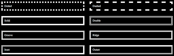
Figure 5-2 The dotted, dashed, solid, double, groove, ridge, inset, and outset border styles each with a border-color of white and border-width of 8px.
The border styles page can be found in the project files ch05-00, named border-styles.html.
You’ll be able to see the border after you specify a border-width...I promise!
border-width
Initial value: medium | Inherited: No | Applies to: All | CSS2.1
Browser support: IE 4+, Firefox 1+, Chrome 1+, Opera 3.5+, Safari 1+
The border-width property sets the thickness of a border.
1. In styles.css, underneath the border-style declaration, add the following:
border-width: 1px;
2. Save styles.css.
Now finally, you can see a thin border applied around the main content area.
For border-width, you can specify all values of length as well as the keywords thin, medium, and thick.
border (Shorthand)
Browser support: IE 4+, Firefox 1+, Chrome 1+, Opera 3.5+, Safari 1+
When CSS properties share similarities, you can use one shorthand declaration in place of multiple declarations.
The border property is a shorthand way of writing the three properties you just added. Go ahead and change those declarations into just one declaration:
1. In styles.css, in the #main rule set, remove the following declarations:
border-color: #ccc;
border-style: solid;
border-width: 1px;
2. Add the shorthand border declaration:
border: #ccc solid 1px;
3. Save styles.css.
The border property requires three values (in any order), separated by spaces. By adding this shorthand declaration, you achieve the same effect using less code and less time!
Now, if you’re wondering how you style the border of just one side of an element, you can do that using border-left-width, border-top-style, and so on. This means that border-color, border-style, and border-width are shorthand properties too; they apply styles to all four borders of an element in one go.
Try styling just one side of an element using a shorthand property:
1. In styles.css, find the #footer rule set, and below its other declarations, add the following:
border-top: #999 dotted 4px;
2. Save styles.css.
Here, you style the top border of the footer element with a dark gray dotted border (see Figure 5-3). You use a shorthand property, which is the equivalent of:
border-top-color: #999;
border-top-style: dotted;
border-top-width: 4px;
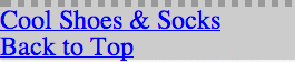
Figure 5-3 The footer area with a dotted border applied only to the top.
I like things to be as simple as possible. It’s not that I’m lazy…honest! If you like the simplicity of shorthand properties, you’ll be pleased to know CSS has quite a few more like these, which are covered as you make your way through CSS3 Foundations.
border-radius
Initial value: 0 | Inherited: No | Applies to: All, except internal table elements when border-collapse is collapse | CSS3
Unprefixed browser support: IE 9+, Firefox 4+, Chrome 4+, Opera 10.5+, Safari 5+
Prefixed browser support: Firefox 1+, Chrome 0.2+, Safari 3.0+
border-radius enables you to give elements rounded corners. It is supported in all modern browsers but not Internet Explorer 6, 7, and 8. Because it’s a visual effect and nothing more, the fact that old versions of Internet Explorer don’t render rounded corners isn’t a problem; they just remain square.
1. In styles.css, find the #newsletter rule set, and below its other declarations, add the following:
border-radius: 8px;
2. Save styles.css.
Here you give the newsletter box very subtle rounded corners (see Figure 5-4). Because the CSS3 Backgrounds and Borders Module (www.w3.org/TR/css3-background/), which this property is a part of, is a “Candidate Recommendation,” you can use border-radius without vendor prefixes.

Figure 5-4 The newsletter box with subtle rounded corners.
Although you haven’t given the newsletter box a style, border-radius still applies (because whether or not an element has styled borders, the border of an element still exists).
border-radius is shorthand for border-top-left-radius, border-top-right-radius, border-bottom-left-radius, and border-bottom-right-radius. By specifying one value of 8px for the border-radius, you tell the browser you want all four corners to be 8px. What if you want each corner to have a different value?
border-radius: 8px 12px 16px 20px;
This declaration gives the top-left corner a radius of 8px and then works clockwise from there, giving the top-right a 12px radius; bottom-right, 16px; and bottom left, 20px.
You also are able to create corners that aren’t perfectly round by specifying two values for a corner, one for the horizontal radius, and the other for the vertical radius, like so:
border-top-right-radius: 8px 20px;
If this declaration is applied, the top-right corner of an element has a horizontal curve of 8px, going into a vertical curve of 20px.
If you want this noncircular radius to apply to all corners, you can use the shorthand border-radius property, first specifying the four horizontal values, followed by a slash / and then the four vertical values, like so:
border-radius: 8px 8px 8px 8px / 20px 20px 20px 20px;
Or, because those values are repeating, an even shorter way would be to write
border-radius: 8px / 20px;
Border Images
If none of the border styles covered so far takes your fancy, CSS Level 3 introduces border images, which allow you to use your own images in place of the basic styles described previously. Border images are unfortunately at various states between browsers at the moment. Google Chrome has good support, Firefox partial, Internet Explorer versions 6–9 have no support at all, and other modern browsers support only the shorthand property border-image.
Because border image is another visual style, it doesn’t particularly matter that Internet Explorer doesn’t show a border image. Let’s look at the longhand properties for border images and then convert them to shorthand so the style works in the majority of browsers.
border-image-source
Initial value: none | Inherited: No | Applies to: All, except internal table elements when border-collapse is collapse | CSS3
Unprefixed browser support: Firefox 15+, Chrome 15+
border-image-source enables you to specify an image to use for the border by using a url() function with a path to the image (the source) as an argument. You take a closer look at the url() function and its arguments in the background-image definition shortly.
Figure 5-5 shows the custom border to be used on the Cool Shoes & Socks website. Although you apply it only to the top border of the footer section, the image to be used should still consist of four sides.

Figure 5-5 The image to be used for the border of the newsletter box.
1. In styles.css, below the other declarations in the #footer rule set, add the following:
border-image-source: url(“../images/bdr-footer.png”);
2. Save styles.css.
As you saw with the other border declarations, it takes a few of them to work together before you get a result.
border-image-slice
Initial value: 100% | Inherited: No | Applies to: All, except internal table elements when border-collapse is collapse | CSS3
Unprefixed browser support: Chrome 15+
When the browser knows which image you want to use, it slices it into nine parts; four corners, four edges, and one center piece. How that slicing occurs depends on the border-image-slice property.
1. In styles.css, below the border-image-source declaration, add the following:
border-image-slice: 4;
2. Save styles.css.
The border-image-slice property can be given up to four number values. Here, border-image-slice: 4; is the same as border-image-slice: 4 4 4 4;, the first value being the top and then working clockwise from there.
Note that unless using percentage values, the border-image-slice value should not be given a unit identifier (such as px). This is because the values represent pixels when using a raster image and co-ordinates when using a vector image (a file ending with a .svg extension).
As shown in Figure 5-6, a border-image-slice of 4 will slice the raster image 4px from the edge of the image.

Figure 5-6 The border image is sliced with the border-image-slice property set to 4.
border-image-width
Initial value: 1 | Inherited: No | Applies to: All, except internal table elements when border-collapse is collapse | CSS3
Unprefixed browser support: Firefox 13+, Chrome 15+
border-image-width determines the width of the image applied to the border.
In most cases, you don’t need to specify a border-image-width because its initial value of 1 along with the use of the border-width property is usually adequate. The border already has a width of 4px, which you specified on the #footer element earlier, like so:
#footer {
background-color: #ccc;
background-image: url(“../images/bg-footer.jpg”);
border-top: #999 dotted 4px;
}
The border-image-width can be either a percentage value (or four percentage values for the top, right, bottom, and left), which causes the border’s width to be a certain percentage of the element it is applied to, or a number (or four numbers for top, right, bottom, and left), which is a multiplication of the calculated border-width. If you specify a border-image-width of 4, the border-image-width is 16px = 4px × 4.
As shown in Figure 5-7, the border image is now applied to the footer in Google Chrome (other browsers don’t work until the shorthand border-image property is added). At the moment, though, the border image is stretched because the border-image-repeat property’s default value is stretch. You can fix that…

Figure 5-7 The border image stretched across the footer.
border-image-repeat
Initial value: stretch | Inherited: No | Applies to: All, except internal table elements when border-collapse is collapse | CSS3
Unprefixed browser support: Firefox 15+, Chrome 15+
The reason the border image is currently stretched is that the initial value of border-image-repeat is stretch.
1. In styles.css, below the border-image-slice declaration, add the following:
border-image-repeat: repeat;
2. Save styles.css.
This tells the browser to take each of the nine slices and repeat them where necessary (see Figure 5-8). Because you’re applying only this border image to the top border, the top edge slice (or tile) of the nine slices is repeated until it fills the area.
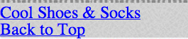
Figure 5-8 The border image repeating across the footer.
The Backgrounds and Borders module also describes two other values that can be used: round and space. Note that at present no browsers support these values. round repeats the image, but if the repeated tile does not fill the area using a whole number of tiles, it rescales the image so it does. space also repeats, but if the tile does not fill the area in the same way, the extra space is distributed around the tiles.
border-image-outset
Initial value: 0 | Inherited: No | Applies to: All, except internal table elements when border-collapse is collapse | CSS3
Unprefixed browser support: Chrome 15+
Another option for border images is the outset, which specifies how far outside an element the border should be positioned:
border-image-outset: 20px;
This example causes the border image to be 20 pixels outside the element it is applied to (see Figure 5-9). The border-image-outset can be any unit of length, and as with values for the other border image properties, you can specify up to four, representing the top, right, bottom, and left borders.
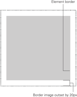
Figure 5-9 An element with a border-image and border-image-outset of 20px applied to it.
If you’re a fan of math, you can use a multiplication number too, just like the border-image-width number, which is a multiplication of the computed border-width.
border-image (Shorthand)
Unprefixed browser support: Firefox 15+, Opera 11+
Prefixed browser support: Firefox 3.5+, Chrome 7+, Opera 10.5+, Safari 3+
As with the other border properties, border image properties have a shorthand property too and, as mentioned, at present, most browsers support only the use of the border-image property. Therefore, it’s wise to use that property in place of the other border image properties.
The shorthand property should take the following syntax:
border-image: border-image-source border-image-slice border-image-width border-image-outset border-image-repeat
When any of the preceding values are omitted, the properties initial value is used.
1. In styles.css, find the #footer rule set and remove the following declarations:
border-image-source: url(“../images/bdr-footer.png”);
border-image-slice: 4;
border-image-repeat: repeat;
2. Add the shorthand declaration in their place:
-webkit-border-image: url(“../images/bdr-footer.png”) 4 repeat;
3. Save styles.css.
Rather than use three properties here, you use one; specifying the url(), followed by the slice value and then the repeat value.
As mentioned earlier in this chapter, during the creation of the Cool Shoes & Socks website, I use the –webkit- vendor prefix because I am using Google Chrome. If you are using a different browser, use the vendor prefix for that browser.
In Chapter 15, you use a tool that automatically adds the other vendor prefixes to the CSS, saving you from having to write five different vendor-prefixed properties now.
box-shadow
Initial value: none | Inherited: No | Applies to: All | CSS3
Unprefixed browser support: IE 9+, Firefox 4+, Chrome 10+, Opera 10.5+, Safari 5.1+
Prefixed browser support: Firefox 3,5+, Chrome 1+, Safari 3+
The box-shadow property applies a drop shadow to an element.
You can add a subtle drop shadow (see Figure 5-10) to the main content area:
1. In styles.css, find the #main rule set and add the following below the other declarations:
box-shadow: 0 3px 8px 0 #ccc;
2. Save styles.css.
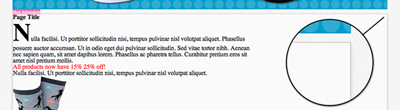
Figure 5-10 The main content area with a subtle box shadow.
The first four values of the box-shadow property can be any unit of length and modify the shadow as follows:
• The first value of a drop shadow represents its horizontal offset: how far the shadow is from the right of the box, a negative value to its left. The shadow you added doesn’t have an offset.
• The second value is the vertical offset. A positive number goes below the element and negative goes above. The shadow you added is offset 3px vertically from the main content element.
• The third value is the blur of the shadow. A value of 0 here would make the edges of the shadow sharp, whereas 8px gives it a mild blur.
• The fourth value is the spread distance, which determines how far the shadow should spread on all sides of the element.
Following on from the shadow values is an optional color. By default, a shadow is black, but the shadow you added has a light gray color to match the border.
You also are able to make box shadows inset so the shadow appears inside the element:
1. In styles.css, find the rule set for input[type=”text”], input[type=”email”] and add the following:
box-shadow: -3px 3px 2px 0 #ccc inset;
2. Save styles.css.
Adding this declaration gives the input fields of type text and email an inset shadow. An inset shadow is often a good visual indication of an input field.
It’s also possible to add more than one shadow to an element (see Figure 5-11), by separating shadows with a comma:
box-shadow: 0 3px 8px 0 #ccc, 0 3px 8px 0 red inset;
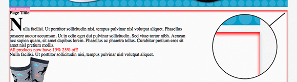
Figure 5-11 The main content area with a subtle gray box shadow and red inset box shadow.
Code Challenge: Add More Border and Box Shadow Styles
In styles.css, do the following:
1. Add a declaration of border: rgba(0,0,0,0.1) solid 5px; to the #newsletter rule set.
2. Add a declaration of border-radius: 8px; and border: 2px solid white; to the .button rule set.
3. Add a new rule set for #header nav > ul with the declarations border-radius: 20px; and border: #ccc solid 1px;.
4. Add a new rule set for .showcase with a declaration of box-shadow: 0 -3px 8px 0 #ccc;.
Project files update (ch05-01): If you haven’t followed the previous instructions and are comfortable working from here onward or would like to reference the project files up to this point, you can download them from www.wiley.com/go/treehouse/css3foundations.
Backgrounds
In the preceding chapter, you applied a background color to a couple of elements, as well as a background image to the body of the page. CSS has many other properties to allow you to style a background.
background-color
Initial value: transparent | Inherited: No | Applies to: All | CSS2.1
Browser support: IE 4+, Firefox 1+, Chrome 1+, Opera 3.5+, Safari 1+
As you saw in the preceding chapters, you specify a background color using the background-color property and can give it a variety of values, such as RGB, RGBA, HSL, HSLA, and color keywords:
body {
background-color: #f5f5f5;
}
By default, background-color is transparent, meaning it is see-through, allowing elements below it or containing it to show through.
background-image
Initial value: none | Inherited: No | Applies to: All | CSS2.1
Browser support: IE 4+, Firefox 1+, Chrome 1+, Opera 3.5+, Safari 1+
background-image accepts a url() function or none as its value. As you saw in the border-image-source explanation, the url() function takes a URI as its argument.
A URI (also referred to as a source, link, or path) within the url() function can optionally be wrapped with single or double quotation marks. Previously, you added this style:
background-image: url(“../images/bg-body.jpg”);
This style is just as acceptable written without the quotation marks and with optional whitespace inside the brackets:
background-image: url( ../images/bg-body.jpg );
The choice is yours.
You may be wondering what the two dots mean in the URI. The two types of URI you can use are relative and absolute. This type is known as relative.
An absolute URI is complete and in its entirety. For example, if you want to view the image bg-body.jpg directly, in your browser, you can navigate to http://www.coolshoesandsocks.com/images/bg-body.jpg. To make the URI of the background image apply to the body, you use the following declaration:
background-image: url(“http://www.coolshoesandsocks.com/images/bg-body.jpg”);
Absolute URIs tend to be used when you’re linking to an external resource—on another domain, for example. Although they can be used internally too, it is good practice to use relative URIs instead as they can make a web page quicker to load.
A relative URI is a path (source or link) that is relative to the document it is within. When you added the relative URI../images/bg-body.jpg in styles.css, you told the browser to go up one directory (denoted by ../) into the images directory and then use the image bg-body.jpg from there.
Following are a few rules when using relative URIs:
• Links to resources in the same directory should consist only of the filename and file extension: bg-body.jpg
• Links to subdirectories consist of the subdirectories’ names (without a preceding slash), followed by the filename and extension: images/bg-body.jpg
• To go up a directory, use two full stops (dots or periods) followed by a slash, then the subdirectory (if required), and then the filename and file extension: ../images/bg-body.jpg
You may have noticed I refer to a URL and a URI. What’s the difference? You might be sorry you asked, but I hope this explanation clears up matters! The name URL means Uniform Resource Locator and, as the CSS specification states, the url() function requires a URI (Uniform Resource Identifier) as its argument. A URL and URN (Uniform Resource Name) are subclasses of a URI (they can be both referred to as URIs). However, a URN has no use in CSS, so although it’s technically true that the url() function does take a URI as its argument, only a URL is of use (hence the function being called url() rather than uri()). This distinction is not necessarily something you need to be concerned about, but you may have been curious!
background-repeat
Initial value: repeat | Inherited: No | Applies to: All | CSS2.1
Browser support: IE 4+, Firefox 1+, Chrome 1+, Opera 3.5+, Safari 1+
When you applied the background image to the body in Chapter 3, as you saw, that image was only 40px × 40px, but the browser repeated the image to make it fill the whole body. This is the default behavior of a background image, but by using the background-repeat property, you can change that.
Add a background image to the newsletter form:
1. In styles.css, find the #newsletter rule set and add the following:
background-image: url(“../images/icon-newsletter.png”);
2. Save styles.css.
Figure 5-12 shows that the little image of the envelope has repeated across the entire newsletter box. Looks a bit over the top, doesn’t it?

Figure 5-12 The background image repeating across the newsletter box.
Because you have not yet specified a background-repeat declaration, the initial value of repeat is applied. So, what other values can you use?
• background-repeat: repeat-x—causes an image to repeat only horizontally.
• background-repeat: repeat-y—causes an image to repeat only vertically.
Although these values are useful, this image would look better if it wasn’t repeating.
1. In styles.css, below the background-image declaration you added to the #newsletter rule set, add the following:
background-repeat: no-repeat;
2. Save styles.css.
Figure 5-13 shows the result of applying no-repeat.

Figure 5-13 The background image of the newsletter box, now with no-repeat specified.
Now, the background image doesn’t repeat, and you see only one image applied to the newsletter box.
background-position
Initial value: 0% 0% | Inherited: No | Applies to: All | CSS2.1
Browser support: IE 4+, Firefox 1+, Chrome 1+, Opera 3.5+, Safari 1+
The background image is currently in its initial position of 0% 0%. The first 0% is the horizontal position, relative to the left of the parent element, and the second 0% is the vertical position, relative to the top of the parent element.
When specifying a background-position value, you can use all the length unit types as described in Chapter 4, percentages, pixels, ems, and so on. You can also use the keywords left, right, top, bottom, and center.
Because the background image is currently sitting underneath the text, making the text hard to read, change its position:
1. In styles.css, below the background-repeat declaration you added to the #newsletter rule set, add the following:
background-position: right top;
2. Save styles.css.
As shown in Figure 5-14, the background image is now positioned to the far right and at the top of the newsletter box. This declaration is the equivalent of background-position: 100% 0%. It’s just a little nicer to read and write a declaration like this when it’s written using keywords!

Figure 5-14 The background image positioned to the right and at the top of the newsletter box.
If only one of the background-position values is specified, the missing value is assumed to be center, so if you use the declaration background-position: right, the background image is positioned to the right of the newsletter box but vertically centered.
The position of the background image might not make a huge amount of sense at the moment, but when you give the page more structure in Chapters 6–9, it will!
In preparation, give the background image a more accurate position that will better suit the newsletter box when it has more structure:
1. In styles.css, change the background-position declaration to
background-position: 91% 2%;
2. Save styles.css.
background-attachment
Initial value: scroll | Inherited: No | Applies to: All | CSS2.1
Browser support: IE 4+, Firefox 1+, Chrome 1+, Opera 3.5+, Safari 1+
By default, when you scroll the viewport or an element that can scroll (you learn how to make an individual element scrollable using the overflow property in Chapter 9), a background image moves with the scrolling of the viewport or element.
body {
background-color: #f5f5f5;
background-image: url(“../images/bg-body.jpg”);
background-attachment: fixed;
font-size: 62.5%;
}
For example, giving the background image applied to the <body> element a declaration of background-attachment: fixed causes the background image to remain in place when you scroll the page (as opposed to the background image moving with the scrolling).
If you want to try this example yourself, depending on your screen size, you might need to give the body selector a temporary declaration of height: 2000px to make the page tall enough to require scrolling.
Applying Multiple Background Images
Browser support: IE 9+, Firefox 3.6+, Chrome 1+, Opera 11+, Safari 1.3+
CSS Level 3 introduces multiple background images per element. Multiple background images are supported in all modern browsers, but not in Internet Explorer versions 6, 7, and 8. Because of this, it’s best to use multiple background images only if they’re not important, such as those used for decorative purposes.
Add another background image to the newsletter box:
1. In styles.css, change the background-image, background-repeat, and background-position declarations in the #newsletter rule set to
background-image: url(“../images/icon-newsletter.png”),
url(“../images/bg-newsletter.png”);
background-repeat: no-repeat, repeat;
background-position: 91% 2%, 0;
2. Save styles.css.
Here, you specify two url() functions for the background-image and separate them with commas, which now apply two background images to the newsletter box. Likewise, you give the background-repeat and background-position declarations secondary values, again, by separating them with commas.
So, the secondary background image repeats (filling the whole newsletter box) and is given a position of 0 (it’s set to repeat so the position doesn’t matter).
Background Gradients
Prior to CSS Level 3, a gradient (an image that blends from one color to another) had to be made in a graphics application such as Adobe Photoshop or Fireworks, but now you can do it using nothing but CSS! Technically, a gradient is an image that the browser generates so it can be applied to—and in place of—any element that accepts the url() function.
Just like background images, provided that you specify a basic background color to fall back to, you can use gradients safely.
Gradients come in two flavors: linear and radial. A linear gradient is the blending of colors from one point to another, whereas a radial gradient starts from a center point and blends outward.
Unfortunately, gradients are in a state of disarray, with varying support and syntaxes across browsers.
Internet Explorer versions 6, 7, 8, and 9 have no support for official gradients. That said, they do actually support a different type of gradient using an unofficial filter property that Microsoft added before they concerned themselves with following the standardized specifications.
For more information about the unofficial filter property, visit msdn.microsoft.com/en-us/library/ie/ms530752(v=vs.85).aspx.
Linear gradients in other browsers are supported either using the official syntax or an outdated one. You’ll learn both syntaxes to be able to achieve the most supported and future-proof approach to linear gradients.
Radial gradients have an even wider level of varying support. Because of this, CSS3 Foundations doesn’t cover radials. Should you wish to learn more, I’d recommend reading the CSS3 Image Values and Replaced Content module which contains the Candidate Recommendation explanation of radial gradients, found at www.w3.org/TR/css3-images/#radial-gradients. The Candidate Recommendation will almost certainly be the finalized syntax, which is already supported unprefixed in Internet Explorer 10+ and Firefox 16+.
If you’d rather just create a radial gradient effect and not worry about how the code works, you can use a code generator, such as the one found at www.colorzilla.com/gradient-editor/ (which can also generate linear gradients).
Linear Gradients
Unprefixed browser support: IE 10+, Firefox 16+, Opera 12+
Prefixed browser support: Firefox 3.6+, Chrome 10+, Opera 11+, Safari 5.1+
Start by applying a linear gradient to the buttons on the page before taking a closer look at how to write them:
1. In styles.css, find the rule set for .showcase .button:hover and above it, add the following rule set:
.showcase .button {
padding: 20px;
background-image:
-webkit-linear-gradient(top, #FB3876 0%, #d4326d 100%);
background-image:
-moz-linear-gradient(to bottom, #FB3876 0%, #d4326d 100%);
background-image:
-o-linear-gradient(to bottom, #FB3876 0%, #d4326d 100%);
background-image:
linear-gradient(to bottom, #FB3876 0%, #d4326d 100%);
}
2. Save styles.css.
When using gradients, the vendor prefix is prefixed to the property value rather than the property.
First, you add 20px of padding to the showcase button, which places space between the border of the box and the content. You learn about this property in Chapter 7. The purpose of this padding is just to make the area a little bigger so you can see that fancy gradient better!
I mentioned previously you wouldn’t have to write all of the vendor-prefixed properties yourself but just to demonstrate the safest way to use gradients, you’ve done so in this rule set. The -webkit- property uses the outdated syntax for gradients, which you’ll look at in a moment. The -moz- property applies to Firefox versions 3.6 to 15. The -o- property applies to Opera 11 and the official, unprefixed property applies to Internet Explorer 10+, Opera 12+, and Firefox 16+, it will eventually apply to future versions of WebKit browsers too. Note that because Internet Explorer 9 doesn’t support gradients at all and Internet Explorer 10+ only supports the official unprefixed property, a prefixed -ms- property is not required. Should you include it, though, it won’t affect anything.
So, now you know how to achieve gradients in the widest amount of browsers, what does the linear-gradient() function do?
As evident in Figure 5-15, linear-gradient() specifies the gradient line (the direction of the gradient) and two color stops, which consist of a color and the position of that color.

Figure 5-15 The linear gradient applied to the showcase button, starting with a hot pink, going into a darker pink at the bottom.
Gradient Line
The default argument for the gradient line is the keyword to bottom, so technically in this example, to bottom can be omitted and the same effect would be achieved. The keyword to bottom starts the gradient from the top and ends at the bottom. Other gradient line keywords are to top (going from bottom to top), to right (going from left to right), and to left (going from right to left).
Note that WebKit doesn’t understand these keywords and instead opts for top, bottom, left, and right (the outdated syntax), which denote the starting point of the gradient and are the equivalents of to bottom, to top, to right, and to left.
If you would like something other than a straight gradient line, you can specify an angle in degrees. The preceding keywords each represent an angle; to top is 0deg, to right is 90deg, to bottom is 180deg, and to left is 270deg. You can also combine these keywords to create a gradient line that goes from corner to corner; to bottom right goes from the top left to the bottom right, for example. You’ll be pleased to know that WebKit, does understand gradient lines when expressed as degrees in the same way that Firefox does, so to make things more consistent, you could rely on degrees instead of keywords.
Color Stops
A color stop is composed of a color value (using any of the color property values described in Chapter 4), followed by an optional stop position, which can be defined by a value type such as percentages or pixels. You can specify as many color stops as you need, separating each with a comma to create a multicolored gradient. If you specify a color value but not an optional stop position, the browser assumes the stop position should be placed exactly in between the other stop positions. So, linear-gradient(#fff, #000) creates a gradient going from top to bottom with the top being white, fading into black as it reaches the bottom.
Figure 5-16 shows how linear-gradient(#fff, #ff0000, #000) creates a gradient going from top to bottom with the top being white, the center being red, and the bottom being black.

Figure 5-16 The linear gradient applied to the showcase button, starting with white, changing into red at the center, and then changing into black at the bottom.
When you are adding a gradient to a web page, sometimes it’s better to look at a visual representation of the gradient you’re trying to create, to get it exactly as you want it. Many free tools are available that make working with gradients easier. My personal recommendation is ColorZilla’s gradient editor, which you can find at www.colorzilla.com/gradient-editor/.
background-clip
Initial value: border-box | Inherited: No | Applies to: All | CSS3
Browser support: IE 9+, Firefox 4+, Chrome 1+, Opera 10.5+, Safari 3+
background-clip determines the “painting area” of an element, the area of the element to which a background should be applied. By default, the background-clip value is border-box, which makes the painting area start from the edges of an element, where the border starts.
Looking at Figure 5-17, you can see the background image of the newsletter box reaches the edges. Earlier in the “Add More Border and Box Shadow Styles” code challenge, you gave this element a black border with a transparency of 0.1, but note that the border actually looks like a dark blue color. The reason is that the background image appears behind the border and shows through the partially transparent border.

Figure 5-17 The newsletter box, with a background-clip of border-box.
If you want the painting area to start inside the border, you can apply the following to the #newsletter rule set:
background-clip: padding-box;
The “padding” of an element starts inside an element’s border. In Figure 5-18, you can now see the border is black with a 0.1 transparency (making it gray because the white of the main content area shows through).

Figure 5-18 The newsletter box, with a background-clip of padding-box.
Padding, which is covered in Chapter 7, adds space between the edge of an element and the elements or contents it contains.
Add padding to the newsletter box:
1. In styles.css, add the following declaration to the #newsletter rule set:
padding: 6%;
2. Save styles.css.
There is now a significant space between the edges of the newsletter box and its content. What if you want the painting area to be only the background of the content? In that case, you can use the final background-clip value, content-box, as shown in Figure 5-19.

Figure 5-19 The newsletter box with a background-clip of content-box and 6% padding.
Note that if you want to use multiple background images, as with the other background properties, you can separate multiple background-clip properties with a comma.
background-origin
Initial value: padding-box | Inherited: No | Applies to: All | CSS3
Browser support: IE 9+, Firefox 4+, Chrome 1+, Opera 10.5+, Safari 3+
In Figure 5-19, you may have noticed the newsletter icon disappeared. With a declaration of background-clip: content-box, the icon was positioned outside the content area and got clipped. background-origin allows you to change the background positioning area.
In Figure 5-20, I changed the background-clip back to border-box and gave it a background-position of 92% 0. As you can see, the newsletter icon still sits 92% to the right of the box but starts perfectly where the padding box does—the default value for background-origin.

Figure 5-20 The newsletter icon in relation to the newsletter box with a background-clip of border-box and a background-position of 92% 0.
When you change the background-origin to border-box, the newsletter icon touches the top of the border, as shown in Figure 5-21.

Figure 5-21 The newsletter icon in relation to the newsletter box with a background-origin of border-box applied to it.
Can you guess what happens when background-origin: content-box is applied? The position of the newsletter icon starts within the content area, as shown in Figure 5-22.

Figure 5-22 The newsletter icon in relation to the newsletter box with a background-origin of content-box applied to it.
background-size
Initial value: auto | Inherited: No | Applies to: All | CSS3
Unprefixed browser support: IE 9+Prefixed browser support: Firefox 3.6+, Chrome 1+, Opera 9.5+, Safari 3+
The background-size property was introduced in CSS Level 3, which allows you to change the size of a background image. As with background-position, you can use all value types, percentages, pixels, ems, and so on. Percentages are relative to the background positioning area, a concept explained in the descriptions for the previous properties.
background-size: 50% 100%;
In this example, two values are specified: one for the width, one for the height. A background image with this declaration is 50% the width of the element to which it is applied and 100% its height.
If you use the declaration background-size: 50%, the second value is assumed to be auto. When auto is used, the browser calculates the height based on the specified width to maintain the image’s aspect ratio.
You can also use two keyword values: cover and contain.
background-size: contain scales a background image to fit inside the background positioning area, making it as large as possible while respecting the image’s aspect ratio.
background-size: cover scales a background image to the smallest size so that both the image’s height and width cover the background positioning area while respecting the image’s aspect ratio.
background (Shorthand)
Browser support: IE 4+, Firefox 1+, Chrome 1+, Opera 3.5+, Safari 1+
Much like the border properties, background properties also have a shorthand property, simply called background.
Rather than have up to eight declarations to style a background, you can use the background shorthand with the following syntax:
background: background-image background-position background-size
repeat-style attachment background-origin background-clip
background-color
When you use multiple background images, you should specify background-color only on the last layer of a background.
1. In styles.css, find the #newsletter rule set and remove the following declarations:
background-color: #00ACDF;
background-image: url(“../images/icon-newsletter.png”),
url(“../images/bg-newsletter.png”);
background-repeat: no-repeat, repeat;
background-position: 91% 2%, 0;
2. Add a shorthand declaration:
background: url(“../images/icon-newsletter.png”) no-repeat 91% 2%,
url(“../images/bg-newsletter.png”) repeat 0 #00ACDF;
3. Save styles.css.
The shorthand declaration achieves the exact same styles as was originally achieved. Because the newsletter box had two background images applied to it, a comma separates the two shorthand values. Finally, although you can have multiple background images, you can have only one background color, so you add background-color at the end of the last background layer.
CSS Image Replacement
Sometimes, you may want to show an image in place of text. Take the Cool Shoes & Socks link in the footer of the page for example. At the moment, it’s just text, but really, it would look nicer if it was a small version of the logo.
Add a background image to the footer link:
1. In styles.css, add the following rule set:
.small-logo a {
background: white url(“../images/logo-small.png”) no-repeat center;
display: block;
min-height: 11px;
width: 162px;
padding: 5px;
}
2. Save styles.css.
This rule set adds a small version of the Cool Shoes & Socks logo as a background image, makes the <a> element a block to fill a space of 11px × 162px and gives it a small amount of padding (padding is covered in Chapter 7 and display in Chapter 9).
The problem with doing this is that the text sits on top of the background image, which doesn’t look right, as shown in Figure 5-23.
Figure 5-23 The footer link text conflicting with the background image.
You could just remove the text from the HTML and put an <img> element in its place. However, as the footer logo is more of a style than content, it’s a best practice to make it a background image instead.
To work around the clashing of text and background image, you can use a technique commonly referred to as Image Replacement.
3. In the newly added .small-logo a rule set, add the following declarations:
font: 0/0 a;
text-shadow: none;
color: transparent;
4. Save styles.css.
You will learn about text-shadow and font properties in Chapter 11. For now, know that the font property makes the font size and line height zero. Any shadow that may be applied to the text is removed and the color is made transparent. These three properties together hide text in all browsers (see Figure 5-24) so now, although the text is still in the HTML, it can’t be seen, allowing just the background image to show. If CSS is disabled in the browser, the text will be shown in place of the background image. Ideal!
Figure 5-24 The footer link with hidden text, allowing the background image to show through.
Code Challenge: Add More Background Properties
In styles.css, do the following:
1. Add a new rule set for #header nav > ul > li with the declaration background: white;.
2. In the #footer rule set, change the background-image and background-color declarations to use the background shorthand property.
3. In the .showcase rule set, add the declaration background: #f5f5f5;.
Project files update (ch05-02): If you haven’t followed the previous instructions and are comfortable working from here onward or would like to reference the project files up to this point, you can download them from www.wiley.com/go/treehouse/css3foundations.
opacity
Initial value: 1 | Inherited: No | Applies to: All | CSS3
Browser support: IE 9+, Firefox 1+, Chrome 1+, Opera 9+, Safari 1.2+
opacity, introduced in CSS Level 3, gives elements a level of transparency.
opacity: 0.5;
The value for opacity is a number, ranging between 0 and 1, to one decimal place. In the preceding example, the opacity of an element is 50%.
Unlike when you use a background color with an alpha value (which is a color with a transparency), opacity applies to the element and all its children. So say you use the following:
body {
opacity: 0.7;
}
Here, the entire web page has a 70% transparency, which isn’t very sensible!
The opacity property works in all modern browsers except for Internet Explorer versions 6, 7, and 8. However, as with gradients, these older versions of Internet Explorer support a filter property that achieves the same effect. For more information about the unofficial filter property, please see msdn.microsoft.com/en-us/library/ie/ms530752(v=vs.85).aspx.
In Chapter 15, you learn how to use a tool to automatically write vendor prefixes you haven’t included during the creation of the Cool Shoes & Socks website. It also adds the alternative filter properties to make any instance of opacity work in older versions of Internet Explorer.
visibility
Initial value: visible | Inherited: Yes | Applies to: All | CSS2.1
Browser support: IE 4+, Firefox 1+, Chrome 1+, Opera 4+, Safari 1+
Using opacity: 0 to hide an element works visually, but it’s not necessarily the best way to hide an element. The visibility property can be given three values: visible, hidden and collapse. All elements, by default, are visible. visibility: hidden hides an element, but how does that differ from opacity: 0, which also hides elements?
Assume for a moment that you want to hide the “About” link on the Cool Shoes & Socks web page. When hiding the link, you use opacity, like so:
nav ul li:nth-child(2){
opacity: 0;
}
In Figure 5-25, the “About” link is no longer visible on the page, but you can still see an empty space where that link should be. If you hover over that empty space, you can still click the “About” link, even though the element has an opacity of 0.
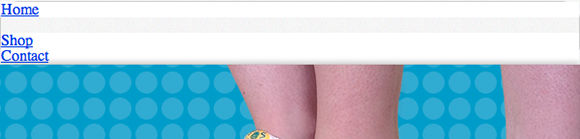
Figure 5-25 The blank area where the “About” link is positioned.
When visibility: hidden is applied:
nav ul li:nth-child(2){
visibility: hidden;
}
The “About” link is still rendered (you can see the empty space, as in Figure 5-25); however, this time, you can’t click it! So both methods of hiding an element still render that element, but visibility: hidden has no events—such as clicking—whereas opacity: 0 does.
What if you want to have an element hidden and not even rendered? An element that exists in the HTML but doesn’t show an empty space when it’s hidden?
Using display: none achieves that, as shown in Figure 5-26:
nav ul li:nth-child(2){
display: none;
}
Figure 5-26 The “About” link is no longer rendered on the page when it is given the declaration display: none.
Because display relates to structure, it is covered in Chapter 9.
cursor
Initial value: auto | Inherited: Yes | Applies to: All | CSS2.1
Browser support: IE 4+, Firefox 1+, Chrome 1+, Opera 7+, Safari 1.2+
The cursor property allows you to change the type of cursor displayed when hovering over an element. The initial value of auto means the user agent stylesheet determines the cursor.
Changing the cursor is a great way to show users how they can interact with a particular element.
1. In styles.css, find the rule set for input[type=”submit”][class=”button”] and add the following declaration:
cursor: pointer;
}
2. Save styles.css.
Now, when you hover over the Sign Up button in the newsletter box, the cursor changes to a pointer, letting the user know the button can be clicked.
The look of the cursors differs based on the operating system they are being viewed on. The following values can be used: crosshair, default, pointer, move, e-resize, ne-resize, nw-resize, n-resize, se-resize, sw-resize, s-resize, w-resize, text, wait, help, and progress.
If these cursors don’t take your fancy, you can also use the url() function (as you did with the background-image property) to use a custom cursor.
outline (Shorthand)
Browser support: IE 8+, Firefox 1.5+, Chrome 1+, Opera 7+, Safari 1.2+
You applied styles in Chapter 3 to give every element that has focus an outline. Giving elements an outline is important for accessibility. Assume a visitor to your web page can’t use a mouse (he may have a disability that prevents him from doing so or, quite simply, the batteries in his mouse ran out). To browse your web page, that user needs to use his keyboard. To move between elements of a web page using a keyboard, you can use the Tab key. With each press of the Tab key, starting from the top left of the page, elements are given an outline style, which lets the user know where on the page he is.
Because this is an important property that aids navigation, many browsers have this style built in to their default styles via the user agent stylesheet. If you want to change those default styles, you can use the outline-color, outline-style, and outline-width properties.
Do those property names ring a bell? That’s right; they work in the exact same way as border-color, border-style, and border-width. You can use the shorthand outline in the same way as the shorthand border too!
Because you already added outline styles to the a:focus pseudo-class in Chapter 3, you don’t need to add any more. However, you can change those properties into one shorthand property:
1. In styles.css, find the pseudo-class a:focus and remove the following declarations:
outline-color: black;
outline-style: dotted;
outline-width: 1px;
2. Add the shorthand declaration:
outline: black dotted 1px;
3. Save styles.css.
content
Initial value: auto | Inherited: No | Applies to: :before and :after only | CSS3
Browser support: IE 8+, Firefox 2+, Chrome 4+, Opera 9+, Safari 3.1+
In Chapter 3 you used the content property to give quotation marks to the customer testimonials. content can be applied only to :before and :after pseudo-elements.
Now try another example:
1. In styles.css, below the three blockquote related rule sets, add the following:
blockquote cite:before {
content: “- “;
}
2. Save styles.css.
This adds a hyphen before the customer’s name, showing that a testimonial belongs to her. This is just a visual style, and in its absence, the content of the page isn’t affected. These sorts of styles are the purpose of content, which I hope answers the question raised in Chapter 3: What place does content have in CSS? CSS, after all, is supposed to separate style from content and structure, so why would you want to include content in your CSS?
Characters such as quotation marks and hyphens are arguably presentational styles as opposed to content. You may have a website containing 50 quotation marks, and one day decide you want to change the style of them. If those quotation marks were included in the HTML page as physical characters, you would have to go into each page and change them individually. If you generate those characters via the content property, changing their style is a simple case of changing one property value.
Summary
In this chapter, you learned to use many of CSS’s visual styles. With the inclusion of CSS Level 3’s most recent and exciting features, border and backgrounds alone are enough to give a page a unique look.
Properties such as opacity, visibility, cursor, and outline allow you to give a page certain styles when interacted with, helping a user navigate through your web site.
You’ve also learned how to implement experimental properties safely using vendor prefixes. As you make your way through CSS3 Foundations, you’ll rely on vendor prefixes again, to be used with the latest CSS3 properties.
Now that you’ve added styles to make elements stand out and give the page its own personality, you’re ready to move on to giving the page structure.