
Chapter 3
Styling Lists and Menus
In This Chapter
 Using CSS styles with lists
Building buttons from lists of links
Dynamically displaying sublists
Managing vertical and horizontal lists
Building CSS-based menus
Most pages consist of content and navigation tools. Almost all pages have a list of links somewhere on the page. Navigation menus are lists of links, but lists of links in plain HTML are ugly. There has to be a way to make ’em prettier.
It's remarkably easy to build solid navigation tools with CSS alone (at least, in the modern browsers that support CSS properly). In this chapter, you rescue your lists from the boring 1990s sensibility, turning them into dynamic buttons, horizontal lists, and even dynamically cascading menus.
Revisiting List Styles
HTML does provide some default list styling, but it's pretty dull. You often want to improve the appearance of a list of data. Most site navigation is essentially a list of links. One easy trick is to make your links appear as a set of buttons, as shown in Figure 3-1.

Figure 3-1: These buttons are actually a list. Note that one button is depressed.
The buttons in Figure 3-1 are pretty nice. They have a 3D effect with shadows. They also act like buttons, with each button depressing when the mouse hovers over it. When you click one of these buttons, it acts like a link, taking you to another page, but they aren't really buttons at all, but a list, cleverly disguised to look and act like buttons.
Defining navigation as a list of links
If you look at the HTML, you'll be astonished at its simplicity:
<!DOCTYPE html>
<html lang = "en-US">
<head>
<meta charset = "UTF-8">
<title>buttonList.html</title>
<link rel = "stylesheet"
type = "text/css"
href = "buttonList.css" />
</head>
<body>
<h1>Button Lists</h1>
<div id = "menu">
<ul>
<li><a href = "http://www.google.com">Google</a></li>
<li><a href = "http://www.wiley.com">Wiley</a></li>
<li><a href = "http://www.wikipedia.org">Wikipedia</a></li>
<li><a href = "http://www.reddit.com">Reddit</a></li>
</ul>
</div>
</body>
</html>
Turning links into buttons
As far as the HTML code is concerned, it's simply a list of links. There's nothing special here that makes this act like a group of buttons, except the creation of a div called menu. All the real work is done in CSS:
#menu li {
list-style-type: none;
width: 7em;
text-align: center;
margin-left: -2.5em;
}
#menu a {
text-decoration: none;
color: black;
display: block;
background-color: #EEEEFF;
box-shadow: 5px 5px 5px gray;
margin-bottom: 2px;
}
#menu a:hover {
background-color: #DDDDEE;
box-shadow: 3px 3px 3px gray;
border: none;
}
The process for turning an ordinary list of links into a button group like this is simply an application of CSS tricks:
- Begin with an ordinary list that will validate properly.
It doesn't matter if you use an unordered or ordered list. Typically, the list will contain anchors to other pages. In this example, I'm using this list of links to some popular websites:
<div id = "menu">
<ul>
<li><a href = "http://www.google.com">Google</a></li>
<li><a href = "http://www.wiley.com">Wiley</a></li>
<li><a href = "http://www.wikipedia.org">Wikipedia</a></li>
<li><a href = "http://www.reddit.com">Reddit</a></li>
</ul>
</div> - Enclose the list in a named div.
Typically, you still have ordinary links on a page. To indicate that these menu links should be handled differently, put them in a div named menu. All the CSS-style tricks described here refer to lists and anchors only when they're inside a menu div.
- Remove the bullets by setting the list-style-type to none.
This removes the bullets or numbers that usually appear in a list because these features distract from the effect you're aiming for (a group of buttons). Use CSS to specify how list items should be formatted when they appear in the context of the menu ID:
#menu li {
list-style-type: none;
width: 5em;
text-align: center;
margin-left: -2.5em;
} - Specify the width of each button:
width: 5em;
 A group of buttons looks best if they're all the same size. Use the CSS width attribute to set each li to 5em.
 - Remove the margin by using a negative margin-left value, as shown here:
margin-left: -2.5em;
Lists have a default indentation of about 2.5em to make room for the bullets or numbers. Because this list won't have bullets, it doesn't need the indentations. Overwrite the default indenting behavior by setting margin-left to a negative value.
- Clean up the anchor by setting text-decoration to none and setting the anchor's color to something static, such as black text on light blue in this example:
#menu a {
text-decoration: none;
color: black;
display: block;
background-color: #EEEEFF;
box-shadow: 5px 5px 5px gray;
margin-bottom: 2px;
}The button's appearance will make it clear that users can click it, so this is one place you can remove the underlining that normally goes with links.
- Give each button a box shadow, as shown in the following:
box-shadow: 5px 5px 5px gray;
The shadow makes it look like a 3D button sticking out from the page. This is best attached to the anchor, so you can swap the border when the mouse is hovering over the button.
- Set the anchor's display to block.
This is a sneaky trick. Block display normally makes an element act like a block-level element inside its container. In the case of an anchor, the entire button becomes clickable, not just the text. This makes your page easier to use because the mouse has a much bigger target to aim for:
display: block;
- Provide a small gap to separate each element.
Use the margin-bottom rule to separate each button. This will enhance the 3D effect by making the shadows more obvious.
margin-bottom: 2px;
- Provide a border radius for rounded corners.
Use of the border-radius property gives the corners a nice rounded effect, enhancing the button feel.
- Use an outset border for a little more dimension.
Setting the border to outset can give the buttons just a bit more 3D appeal.
- Make the button depress when the mouse hovers on an anchor:
#menu a:hover {
background-color: #DDDDEE;
box-shadow: 3px 3px 3px gray;
border: none;
}When the mouse hovers on the button, the shadow is smaller, and the background color of the element is darker. I also removed the border, making the button feel flat. These techniques together give a convincing illusion of the button being depressed.
This list makes an ideal navigation menu, especially when placed inside one column of a multicolumn floating layout.
The shadow trick is easy, but there are many variations. If you prefer, you can build two empty button images (one up and one down) in your image editor and simply swap the background images rather than changing the shadows. Some variations also involve changing the border.
Building horizontal lists
Sometimes, you want horizontal button bars. Because HTML lists tend to be vertical, you might be tempted to think that a horizontal list is impossible. In fact, CSS provides all you need to convert exactly the same HTML to a horizontal list. Figure 3-2 shows such a page.

Figure 3-2: This list uses the same HTML but different CSS.
There's no need to show the HTML again because it hasn't changed at all. (Ain't CSS grand?) Even the CSS hasn't changed much:
#menu ul {
margin-left: -2.5em;
}
#menu li {
list-style-type: none;
width: 7em;
text-align: center;
float: left;
}
#menu a {
text-decoration: none;
color: black;
display: block;
background-color: #EEEEFF;
box-shadow: 5px 5px 5px gray;
margin-bottom: 2px;
margin-right: 2px;
border-radius: 5px;
border: 3px outset #EEEEFF;
}
#menu a:hover {
background-color: #DDDDEE;
box-shadow: 3px 3px 3px gray;
border: none;
}
The modifications are incredibly simple:
- Float each list item by giving each li a float:left value:
#menu li {
list-style-type: none;
float: left;
width: 5em;
text-align: center;
} - Move the margin-left of the entire ul by taking the margin-left formatting from the li elements and transferring it to the ul:
#menu ul {
margin-left: -2.5em;
} - Add a right margin.
Now that the button bar is horizontal, add a little space to the right of each button so they don't look so crowded together:
margin-right: 2px;
Creating Dynamic Lists
A simple list of buttons can look better than ordinary HTML links, but sometimes, your page needs to have a more complex navigation scheme. For example, you may want to create a menu system to help the user see the structure of your site.
When you think of a complex hierarchical organization (which is how most multipage websites end up), the easiest way to describe the structure is in a set of nested lists. HTML lists can contain other lists, and this can be a great way to organize data.
Nested lists are a great way to organize a lot of information, but they can be complicated. You can use some special tricks to make parts of your list appear and disappear when needed. In the sections “Hiding the inner lists” and “Getting the inner lists to appear on cue,” later in this chapter, you expand this technique to build a menu system for your pages.
Building a nested list
Begin by creating a system of nested lists without any CSS at all. Figure 3-3 shows a page with a basic nested list.
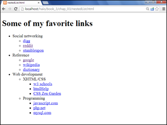
Figure 3-3: This nested list has no styles yet.
No CSS styling is in place yet, but the list has its own complexities:
- The primary list has three entries. This is actually a multilayer list. The top level indicates categories, not necessarily links.
- Each element in the top list has its own sublist. A second layer of links has various links in most elements.
- The Web Development element has another layer of sublists. The general layout of this list entry corresponds to a complex hierarchy of information — like most complex websites.
- The list validates to the HTML Strict standard. It's especially important to validate your code before adding CSS when it involves somewhat complex HTML code, like the multilevel list. A small problem in the HTML structure that may go unnoticed in a plain HTML document can cause all kinds of strange problems in your CSS.
Here is the code for the nested list in plain HTML:
<!DOCTYPE html>
<html lang = "en-US">
<head>
<meta charset = "UTF-8">
<title>nestedList.html</title>
</head>
<body>
<h1>Some of my favorite links</h1>
<ul>
<li>Social networking
<ul>
<li><a href = "http://www.digg.com">digg</a></li>
<li><a href = "http://www.reddit.com">reddit</a></li>
<li><a href = "http://www.stumbleupon.com">stumbleupon</a></li>
</ul>
</li>
<li>Reference
<ul>
<li><a href = "http://www.google.com">google</a></li>
<li><a href = "http://wikipedia.org">wikipedia</a></li>
<li><a href = "http://dictionary.com">dictionary</a></li>
</ul>
</li>
<li>Web development
<ul>
<li>XHTML/CSS
<ul>
<li><a href = "http://www.w3schools.com">w3 schools</a></li>
<li><a href = "http://htmlhelp.com">htmlHelp</a></li>
<li><a href = "http://www.csszengarden.com">CSS Zen Garden</a></li>
</ul>
</li>
<li>Programming
<ul>
<li><a href = "http://javascript.com">javascript.com</a></li>
<li><a href = "http://php.net">php.net</a></li>
<li><a href = "http://www.mysql.com">mysql.com</a></li>
</ul>
</li>
</ul>
</li>
</ul>
</body>
</html>
 Take special care with your indentation when making a complex nested list like this one. Without proper indentation, it becomes very difficult to establish the structure of the page. Also, a list item can contain text and another list. Any other arrangement (putting text between list items, for example) will cause a validation error and big headaches when you try to apply CSS.
Hiding the inner lists
The first step of creating a dynamic menu system is to hide any lists that are embedded in a list item. Add the following CSS style to your page:
li ul {
display: none;
}
In reality, you usually apply this technique only to a specially marked div, like a menu system. Don't worry about that for now. Later in this chapter, I show you how to combine this technique with a variation of the button technique for complex menu systems.
Your page will undergo a startling transformation, as shown in Figure 3-4.
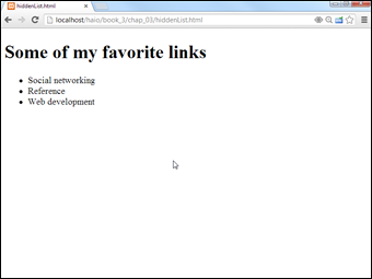
Figure 3-4: Where did everything go?
That tiny little snippet of CSS code is a real powerhouse. It does some fascinating things, such as
- Operating on unordered lists that appear inside list items: What this really means is the topmost list won't be affected, but any unordered list that appears inside a list item will have the style applied.
- Using display:none to make text disappear: Setting the display attribute to none tells the HTML page to hide the given data altogether.
This code works well on almost all browsers. It's pretty easy to make text disappear. Unfortunately, it's a little trickier to make all the browsers bring it back.
Getting the inner lists to appear on cue
The fun part is getting the interior lists to pop up when the mouse is over the parent element. A second CSS style can make this happen:
li ul {
display: none;
}
li:hover ul {
display: block;
}
The new code is pretty interesting. When the page initially loads, it appears the same as what's shown in Figure 3-4, but see the effect of holding the mouse over the Social Networking element in Figure 3-5.
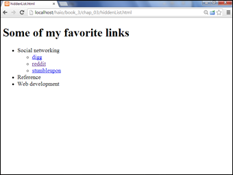
Figure 3-5: Holding the mouse over a list item causes its children to appear.
This code doesn't work on all browsers! Internet Explorer 6 (IE6) and earlier versions don't support the:hover pseudo-class on any element except a. Provide a conditional comment with an alternative style for early versions of IE. All modern browsers (including IE 7 and later) work fine.
Here's how the list-reappearing code works:
- All lists inside lists are hidden. The first style rule hides any list that's inside a list element.
- li:hover refers to a list item that's being hovered on. That is, if the mouse is situated on top of a list item, this rule pertains to it.
- li:hover ul refers to an unordered list inside a hovered list item. In other words, if some content is an unordered list that rests inside a list that currently has the mouse hovering over it, apply this rule. (Whew!)
- Display the list as a block. display:block overrides the previous display:none instruction and displays the particular element as a block. The text reappears magically.
This hide-and-seek trick isn't all that great on its own. It's actually quite annoying to have the contents pop up and go away like that. There's another more annoying problem. Look at Figure 3-6 to see what can go wrong.

Figure 3-6: If the mouse hovers on Web development, both submenus appear.
To see why this happens, take another look at the CSS code that causes the segment to reappear:
li:hover ul {
display: block;
}
This code means set display to block for any ul that's a child of a hovered li. The problem is that the Web Development li contains a ul that contains two more uls. All the lists under Web Development appear, not just the immediate child.
One more modification of the CSS fixes this problem:
li ul {
display: none;
}
li:hover > ul {
display: block;
}
The greater than symbol (>) is a special selector tool. It indicates a direct relationship. In other words, the ul must be a direct child of the hovered li, not a grandchild or great-grandchild. With this indicator in place, the page acts correctly, as shown in Figure 3-7.

Figure 3-7: Now, only the next menu level shows up on a mouse hover.
This trick allows you to create nested lists as deeply as you wish and to open any segment by hovering on its parent.
My current code has a list with three levels of nesting, but you can add as many nested lists as you want and use this code to make it act as a dynamic menu.
Figure 3-8 illustrates how to open the next section of the list.

Figure 3-8: You can create these lists as deep as you wish.
I'm not suggesting that this type of menu is a good idea. Having stuff pop around like this is actually pretty distracting. With a little more formatting, you can use these ideas to make a functional menu system. I'm just starting here so you can see the hide-and-seek behavior in a simpler system before adding more details.
Building a Basic Menu System
You can combine the techniques of buttons and collapsing lists to build a menu system entirely with CSS. Figure 3-9 shows a page with a vertically arranged menu.

Figure 3-9: Only the top-level elements are visible by default.
When the user hovers over a part of the menu, the related sub-elements appear, as shown in Figure 3-10.

Figure 3-10: The user can select any part of the original nested list.
This type of menu has a couple interesting advantages, such as
- It's written entirely with CSS. You don't need any other code or programming language.
- The menus are simply nested lists. The HTML is simply a set of nested lists. If the CSS turns off, the page is displayed as a set of nested lists, and the links still function normally.
- The relationships between elements are illustrated. When you select an element, you can see its parent and sibling relationships easily.
Nice as this type of menu system is, it isn't perfect. Because it relies on the li:hover trick, it doesn't work in versions of Internet Explorer (IE) prior to 7.0. You need alternate CSS for these users.
Building a vertical menu with CSS
The vertical menu system works with exactly the same HTML as the hiddenList example — only the CSS changed. Here's the new CSS file:
/* vertMenu.css */
/* unindent entire list */
#menu ul {
margin-left: -2.5em;
}
/* set li as buttons */
#menu li {
list-style-type: none;
border: 1px black solid;;
width: 10em;
background-color: #cccccc;
text-align: center;
}
/* display anchors as buttons */
#menu a {
color: black;
text-decoration: none;
display: block;
}
/* flash white on anchor hover */
#menu a:hover {
background-color: white;
}
/* collapse menus */
#menu li ul {
display: none;
}
/* show submenus on hover */
#menu li:hover > ul {
display: block;
margin-left: -2em;
}
Of course, the CSS uses a few tricks, but there's really nothing new. It's just a combination of techniques you already know:
- Un-indent the entire list by setting the ul's margin-left to a negative value to compensate for the typical indentation. 2.5em is about the right amount.
Because you're removing the list-style types, the normal indentation of list items will become a problem.
- Format the li tags.
Each li tag inside the menu structure should look something like a button. Use CSS to accomplish this task:
/* set li as buttons */
#menu li {
list-style-type: none;
border: 1px black solid;
width: 10em;
background-color: #cccccc;
text-align: center;
}- Set list-style-type to none.
- Set a border with the border attribute.
- Center the text by setting text-align to center.
- Add a background color or image, or you'll get some strange border bleed-through later when the buttons overlap.
- Format the anchors as follows:
/* display anchors as buttons */
#menu a {
color: black;
text-decoration: none;
display: block;
}- Take out the underline with text-decoration: none.
- Give the anchor a consistent color.
- Set display to block (so the entire area will be clickable, not just the text).
- Give some indication it's an anchor by changing the background when the user hovers on the element:
/* flash white on anchor hover */
#menu a:hover {
background-color: white;
}Because the anchors no longer look like anchors, you have to do something else to indicate there's something special about these elements. When the user moves the mouse over any anchor tag in the menu div, that anchor's background color will switch to white.
- Collapse the menus using the hidden menus trick (discussed in the section “Hiding the inner lists,” earlier in this chapter) to hide all the sublists:
/* collapse menus */
#menu li ul {
display: none;
} - Display the hidden menus when the mouse hovers on the parent element by adding the code described in the “Getting the inner lists to appear on cue” section:
/* show submenus on hover */
#menu li:hover > ul {
display: block;
margin-left: -2em;
}
Building a horizontal menu
You can make a variation of the menu structure that will work along the top of a page. Figure 3-11 shows how this might look.

Figure 3-11: The same list is now a horizontal menu.
The submenus come straight down from their parent elements. I find a little bit of indentation helpful for deeply nested lists, as shown in Figure 3-12.

Figure 3-12: For the multilevel menus, a little bit of indentation is helpful.
Again, the HTML is identical. The CSS for a horizontal menu is surprisingly close to the vertical menu. The primary difference is floating the list items:
/* vertMenu.css */
/* unindent each unordered list */
#menu ul {
margin-left: -2.5em;
}
/* turn each list item into a solid gray block */
#menu li {
list-style-type: none;
border: black solid 1px;
float: left;
width: 10em;
background-color: #CCCCCC;
text-align: center;
}
/* set anchors to act like buttons */
#menu a {
display: block;
color: black;
text-decoration: none;
}
/* flash anchor white when hovered */
#menu a:hover {
background-color: white;
}
/* collapse nested lists */
#menu li ul {
display: none;
}
/* display sublists on hover */
#menu li:hover > ul {
display: block;
}
/* indent third-generation lists */
#menu li li li{
margin-left: 1em;
}
The CSS code has just a few variations from the vertical menu CSS:
- Float each list item by adding float and width attributes.
/* turn each list item into a solid gray block */
#menu li {
list-style-type: none;
border: black solid 1px;
float: left;
width: 10em;
background-color: #CCCCCC;
text-align: center;
}This causes the list items to appear next to each other in the same line.
- Give each list item a width. In this case, 10em seems about right.
- Indent a deeply nested list by having the first-order sublists appear directly below the parent.
A list nested deeper than its parent is hard to read. A little indentation helps a lot with clarity.
- Use #menu li li li to indent nested list items, as shown here:
/* indent third-generation lists */
#menu li li li{
margin-left: 1em;
}This selector is active on an element which has #menu and three list items in its family tree. It will work only on list items three levels deep. This special formatting isn't needed at the other levels but is helpful to offset the third-level list items.
These tricks are just the beginning of what you can do with some creativity and the amazing power of CSS and HTML. You can adopt the simple examples presented here to create your own marvels of navigation.
These menu systems work pretty well, but if they're used in a standard layout system, the rest of the page can shift around to fit the changing shape of the menus. To avoid this, place the menu using the fixed mechanisms described in Chapter 4 of this minibook.