
Chapter 7
Creating Forms
In This Chapter
 Adding forms to your pages
Creating input and password text boxes
Building multi-line text inputs
Making list boxes and check boxes
Building groups of radio buttons
Using HTML5 form elements
Creating buttons
HTML gives you the ability to describe web pages, but today's web isn't a one-way affair. Users want to communicate through web pages, by typing in information, making selections from drop-down lists, and interacting, rather than simply reading. In this chapter, you learn how to build these interactive elements in your pages.
You Have Great Form
There's one more aspect to HTML that you need to understand — the ability to make forms. Forms are the parts of the page that allow user interaction. Figure 7-1 shows a page with all the primary form elements in place.
The form demo (or formDemo.html on this book's web site, if you're playing along at home) exemplifies the main form elements in HTML. In this chapter, you discover how to build all these elements. For more on this book's website, see the Introduction.
 You can create forms with ordinary HTML, but to make them do something, you need a programming language. Book IV explains how to use JavaScript to interact with your forms, and Book V describes the PHP language. Use this chapter to figure out how to build the forms and then jump to another minibook to figure out how to make them do stuff. If you aren't ready for full-blown programming yet, feel free to skip this chapter for now and move on to CSS in Books II and III. Come back here when you're ready to make forms to use with JavaScript or PHP.
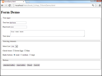
Figure 7-1: Form elements allow user interaction.
The formDemo.html page shows the following elements:
- A form: A container for form elements. Although the form element itself isn't usually a visible part of the page (like the body tag), it could be with appropriate CSS.
- Text boxes: These standard form elements allow the user to type text into a one-line element.
- Password boxes: These boxes are like text boxes, except they automatically obscure the text to discourage snooping.
- Text areas: These multi-line text boxes accommodate more text than the other types of text boxes. You can specify the size of the text area the user can type into.
- Select lists: These list boxes give the user a number of options. The user can select one element from the list. You can specify the number of rows to show or make the list drop down when activated.
- Check boxes: These non-text boxes can be checked or not. Check boxes act independently — more than one can be selected at a time (unlike radio buttons).
- Radio buttons: Usually found in a group of options, only one radio button in a group can be selected at a time. Selecting one radio button deselects the others in its group.
- Buttons: These elements let the user begin some kind of process. The Input button is used in JavaScript coding (which I describe in Book IV), whereas the Submit buttons are used for server-side programming (see Book V). The Reset button is special because it automatically resets all the form elements to their default configurations.
- Labels: Many form elements have a small text label associated with them. Although labels are not required, they can make a form easier to style with CSS and easier for the user.
- Fieldsets and legends: These set off parts of the form. They're optional, but they can add a lot of visual appeal to a form.
Now that you have an overview of form elements, it's time to start building some forms!
Forms must have some form
All the form elements must be embedded inside a <form></form> pair. The code for basicForm.html illustrates the simplest possible form:
<!DOCTYPE html>
<html lang = "en-US">
<head>
<meta charset = "UTF-8">
<title>basicForm.html</title>
</head>
<body>
<h1>A basic form</h1>
<form action = "">
<h2>Form elements go here</h2>
<h3>Other HTML is fine, too.</h3>
</form>
<p>
<input type = "text"
value = "googoo" />
</p>
</body>
</html>
The <form></form> pair indicates a piece of the page that may contain form elements. All the other form doohickeys and doodads (buttons, select objects, and so on) must be inside a <form> pair.
The action attribute indicates what should happen when the form is submitted. This requires a programming language, so a full description of the action attribute is in Book IV. Still, you must indicate an action to validate, so for now just leave the action attribute null with a pair of quotes ( "" ).
Organizing a form with fieldsets and labels
Forms can contain many components, but the most important are the input elements (text boxes, buttons, drop-down lists, and the like) and the text labels that describe the elements. Traditionally, web developers used tables to set up forms, but this isn't really the best way to go because forms aren't tabular information. HTML includes some great features to help you describe the various parts of a form. Figure 7-2 shows a page with fieldsets, layouts, and basic input.

Figure 7-2: This form has a legend and labels.
A fieldset is a special element used to supply a visual grouping to a set of form elements.
The form still doesn't look very good, I admit, but that's not the point. Like all HTML tags, the form elements aren't about describing how the form looks; they're about what all the main elements mean. (Here I go again. . . .) You use CSS to make the form look the way you want. The HTML tags describe the parts of the form, so you have something to hook your CSS to. It all makes sense very soon, I promise.
Here's the code for the fieldset demo (fieldsetDemo.html on this book's website):
<!DOCTYPE html>
<html lang = "en-US">
<head>
<meta charset = "UTF-8">
<title>fieldsetDemo.html</title>
</head>
<body>
<h1>Sample Form with a Fieldset</h1>
<form action = "">
<fieldset>
<legend>Personal Data</legend>
<p>
<label>Name</label>
<input type = "text" />
</p>
<p>
<label>Address</label>
<input type = "text" />
</p>
<p>
<label>Phone</label>
<input type = "text" />
</p>
</fieldset>
</form>
</body>
</html>
The form has these elements:
- The <form> and </form> tags: These define the form as a part of the page. Don't forget the null action attribute.
- The <fieldset> pair: This pair describes the included elements as a set of fields. This element isn't necessary, but it does give you some nice organization and layout options later when you use CSS. You can think of the fieldset as a blank canvas for adding visual design to your forms. By default, the fieldset places a border around all the contained elements.
- The <legend> tag: A part of the fieldset, this tag allows you to specify a legend for the entire fieldset. The legend is visible to the user.
- The paragraphs: I sometimes place each label and its corresponding input element in a paragraph. This provides some nice formatting capabilities and keeps each pair together.
- The <label> tag: This tag allows you to specify a particular chunk of text as a label. No formatting is done by default, but you can add formatting later with CSS. The label also has an optional for attribute that allows you to connect the label with a specific input element. This can help to organize your form just a little more.
- The <input> elements: The user types data into these elements. For now, I'm just using very basic text inputs so the form has some kind of input. In the next section, I explain how to build more complete text inputs.
Building Text-Style Inputs
Most of the form elements are variations of the same tag. The <input> tag can create single-line text boxes, password boxes, buttons, and even invisible content (such as hidden fields). Most of these objects share the same basic attributes, although the outward appearance can be different.
Making a standard text field
Figure 7-3 shows the most common form of the input element — a plain text field.
To make a basic text input, you need a form and an input element. Adding a label so that the user knows what he's supposed to enter into the text box is also common. Here's the code:
<!DOCTYPE html>
<html lang = "en-US">
<head>
<meta charset = "UTF-8">
<title>textbox.html</title>
</head>
<body>
<form action = "">
<p>
<label>Name</label>
<input type = "text"
id = "txtName"
value = "Jonas"/>
</p>
</form>
</body>
</html>
An input element has three common attributes:
- type : The type attribute indicates the type of input element this is. This first example sets type to text , creating a standard text box. Other types throughout this chapter create passwords, hidden fields, check boxes, and buttons.
- id : The id attribute creates an identifier for the field. When you use a programming language to extract data from this element, use id to specify which field you're referring to. An id field often begins with a hint phrase to indicate the type of object it is (for instance, txt indicates a text box).

Figure 7-3: The input element is often used to make a text field.
- value : This attribute determines the default value of the text box. If you leave this attribute out, the text field begins empty.
Text fields can also have other attributes, which aren't used as often, such as
- size : This attribute determines the number of characters that are displayed.
- maxlength : Use this attribute to set the largest number of characters that are allowed.
There is no </input> tag. Input tags are a holdover from the days when many tags did not have ending tags. You just end the original tag with a slash character ( / ), as shown in the preceding sample code.
You might wonder why I added the <label> tag if it doesn't have any effect on the appearance or behavior of the form. In this particular example, the <label> tag doesn't have an effect, but like everything else in HTML, you can do amazing style things with it in CSS. Even though labels don't typically have a default style, they are still useful.
Building a password field
Passwords are just like text boxes, except the text isn't displayed. Instead, a series of asterisks appears. Figure 7-4 shows a basic password field.
The following code reveals that passwords are almost identical to ordinary text fields:
<!DOCTYPE html>
<html lang = "en-US">
<head>
<meta charset = "UTF-8">
<title>password.html</title>
</head>
<body>
<form action = "">
<fieldset>
<legend>Enter a password</legend>
<p>
<label>Type password here</label>
<input type = "password"
id = "pwd"
value = "secret" />
</p>
</fieldset>
</form>
</body>
</html>
In this example, I've created a password field with the ID pwd . The default value of this field is secret . The term secret won't actually appear in the field; it will be replaced with six asterisk characters.
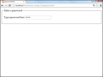
Figure 7-4: Enter the secret pass-word. . . .
 The password field offers virtually no meaningful security. It protects the user from spy satellites glancing over his shoulder to read a password, but that's about it. The open standards of HTML and the programming languages mean passwords are often passed in the open. There are solutions — such as the SSL (Secure Socket Layer) technology — but for now, just be aware that the password field isn't suitable for protecting the recipe of your secret sauce.
This example doesn't really do anything with the password, but you'll use other technologies for that.
Making multi-line text input
The single-line text field is a powerful feature, but sometimes, you want something with a bit more space. The essay.html program, as shown in Figure 7-5, demonstrates how you might create a page for an essay question.
The star of this program is a new tag — <textarea> :
<!DOCTYPE html>
<html lang = "en-US">
<head>
<meta charset = "UTF-8">
<title>essay.html</title>
</head>
<body>
<form action = "">
<fieldset>
<legend>Quiz</legend>
<p>
<label>Name</label>
<input type = "text"
id = "txtName" />
</p>
<p>
<label>
Please enter the sum total of
Western thought. Be brief.
</label>
</p>
<p>
<textarea id = "txtAnswer"
rows = "10"
cols = "40"></textarea>
</p>
</fieldset>
</form>
</body>
</html>
Here are a few things to keep in mind when using the <textarea> tag:
- It needs an id attribute, just like an input element.
- You can specify the size with rows and cols attributes.
- The content goes between the tags. The text area can contain a lot more information than the ordinary <input> tags, so rather than placing the data in the value attribute, the content of the text goes between the <textarea> and </textarea> tags.
Anything placed between <textarea> and </textarea> in the code ends up in the output, too. This includes spaces and carriage returns. If you don't want any blank spaces in the text area, place the ending tag right next to the beginning tag, as I did in the essay example.
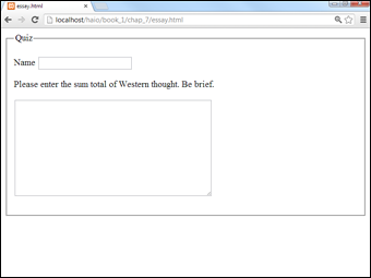
Figure 7-5: This quiz might require a multi-line response.
Creating Multiple Selection Elements
Sometimes, you want to present the user with a list of choices and then have the user pick one of these elements. HTML has a number of interesting ways to do this.
Making selections
The drop-down list is a favorite selection tool of web developers for the following reasons:
- It saves screen space. Only the current selection is showing. When the user clicks the list, a series of choices drop down and then disappear again after the selection is made.
- It limits input. The only things the user can choose are things you've put in the list. This makes it much easier to handle the potential inputs because you don't have to worry about typing errors.
- The value can be different from what the user sees. This seems like an odd advantage, but it does turn out to be very useful sometimes. I show an example when I describe color values later in this chapter.
Figure 7-6 shows a simple drop-down list in action.

Figure 7-6: The user can choose from a list of colors.
The code for this simple drop-down list follows:
<!DOCTYPE html>
<html lang = "en-US">
<head>
<meta charset = "UTF-8">
<title>basicSelect.html</title>
</head>
<body>
<form action = "">
<p>
<label>What is your favorite color?</label>
<select id = "selColor">
<option value = "#ff0000">Red</option>
<option value = "#00ff00">Green</option>
<option value = "#0000ff">Blue</option>
<option value = "#00ffff">Cyan</option>
<option value = "#ff00ff">Magenta</option>
<option value = "#ffff00">Yellow</option>
<option value = "#000000">Black</option>
<option value = "#ffffff">White</option>
</select>
</p>
</form>
</body>
</html>
The select object is a bit different from some of the other input elements you're used to, such as
- It's surrounded by a <select></select> pair. These tags indicate the entire list.
- The select object has an id attribute. Although the select object has many other tags inside, typically only the select object itself has an id attribute.
- It contains a series of <option></option> pairs. Each individual selection is housed in an <option></option> set.
- Each <option> tag has a value associated with it. The value is used by code. The value isn't necessarily what the user sees. (See the sidebar “What are those funky #ff00ff things?” for an example.)
- The content between <option></option> is visible to the user. The content is what the user actually sees.
Select boxes don't require the drop-down behavior. If you want, you can specify the number of rows to display with the size attribute. In this case, the number of rows you specify will always be visible on the screen.
Building check boxes
Check boxes are used when you want the user to turn a particular choice on or off. For example, look at Figure 7-7.
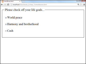
Figure 7-7: Any number of check boxes can be selected at once.
Each check box represents a true or false value that can be selected or not selected, and the status of each check box is completely independent from the others. The user can check none of the options, all of them, or any combination.
This code shows that check boxes use your old friend the <input> tag:
<!DOCTYPE html>
<html lang = "en-US">
<head>
<meta charset = "UTF-8">
<title>checkBoxes.html</title>
</head>
<body>
<form action = "">
<fieldset>
<legend>Please check off your life goals </legend>
<p>
<input type = "checkbox"
id = "chkPeace"
value = "peace" />World peace
</p>
<p>
<input type = "checkbox"
id = "chkHarmony"
value = "harmony" />Harmony and brotherhood
</p>
<p>
<input type = "checkbox"
id = "chkCash"
value = "cash" />Cash
</p>
</fieldset>
</form>
</body>
</html>
You're using the same attributes of the <input> tag, but they work a bit differently than the way they do in a plain old text box:
- The type is checkbox . That's how the browser knows to make a check box, rather than a text field.
- The checkbox still requires an ID. If you'll be writing programming code to work with this thing (and you will, eventually), you'll need an ID for reference.
- The value is hidden from the user. The user doesn't see the actual value. That's for the programmer (like the select object). Any text following the check box only appears to be the text associated with it.
Creating radio buttons
Radio buttons are used when you want to let the user pick only one option from a group. Figure 7-8 shows an example of a radio button group in action.
Radio buttons might seem similar to check boxes, but they have some important differences:
- Only one can be checked at a time. The term radio button came from the old-style car radios. When you pushed the button for one station, all the other buttons popped out. Even my car isn't that old any more, but the name has stuck.
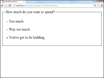
Figure 7-8: You can choose only one of these radio buttons.
- They have to be in a group. Radio buttons make sense only in a group context. The point of a radio button is to interact with its group.
- They all have the same name! Each radio button has its own ID (like other input elements), but they also have a name attribute. The name attribute indicates the group a radio button is in.
- You can have more than one group on a page. Just use a different name attribute for each group.
- One of them has to be selected. The group should always have one value and only one. Some browsers check the first element in a group by default, but just in case, you should select the element you want selected. Add the checked = "checked" attribute (developed by the Department of Redundancy Department) to the element you want selected when the page appears. In this example, I preselected the most expensive option, all in the name of good capitalistic suggestive selling.
Here's some code that explains it all:
<!DOCTYPE html>
<html lang = "en-US">
<head>
<meta charset = "UTF-8">
<title>radioButtons.html</title>
</head>
<body>
<form action = "">
<fieldset>
<legend>How much do you want to spend?</legend>
<p>
<input type = "radio"
name = "radPrice"
id = "rad100"
value = "100" />Too much
</p>
<p>
<input type = "radio"
name = "radPrice"
id = "rad200"
value = "200" />Way too much
</p>
<p>
<input type = "radio"
name = "radPrice"
id = "rad5000"
value = "5000"
checked = "checked" />You've got to be kidding.
</p>
</fieldset>
</form>
</body>
</html>
Pressing Your Buttons
HTML5 also comes with several types of buttons. You use these guys to make something actually happen. Generally, the user sets up some kind of input by typing in text boxes and then selecting from lists, options, or check boxes. Then, the user clicks a button to trigger a response. Figure 7-9 demonstrates four types of buttons.
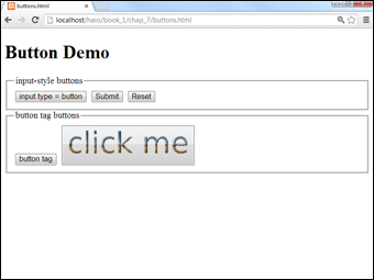
Figure 7-9: HTML5 supports several types of buttons.
The code for this button example is shown here:
<!DOCTYPE html>
<html lang = "en-US">
<head>
<meta charset = "UTF-8">
<title>buttons.html</title>
</head>
<body>
<h1>Button Demo</h1>
<form action = "">
<fieldset>
<legend>
input-style buttons
</legend>
<input type = "button"
value = "input type = button" />
<input type = "submit" />
<input type = "reset" />
</fieldset>
<fieldset>
<legend>button tag buttons</legend>
<button type = "button">
button tag
</button>
<button>
<img src = "clickMe.gif"
alt = "click me" />
</button>
</fieldset>
</form>
</body>
</html>
Each button type is described in this section.
Making input-style buttons
The most common form of button is just another form of your old friend, the <input> tag. If you set the input's type attribute to "button", you generate a basic button:
<input type = "button"
value = "input type = button" />
The ordinary Input button has a few key features:
- The input type is set to "button". This makes an ordinary button.
- The value attribute sets the button's caption. Change the value attribute to make a new caption. This button's caption shows how the button was made: input type = "button".
- This type of button doesn't imply a link. Although the button appears to depress when it's clicked, it doesn't do anything. You have to write some JavaScript code to make it work.
- Later, you'll add event-handling to the button. After you discover JavaScript in Book IV, you use a special attribute to connect the button to code.
- This type of button is for client-side programming. This type of code resides on the user's computer. I discuss client-side programming with JavaScript in Book IV.
Building a Submit button
Submit buttons are usually used in server-side programming. In this form of programming, the code is on the web server. In Book V, you use PHP to create server-side code. The <input> tag is used to make a Submit button, too!
<input type = "submit" />
Although they look the same, the Submit button is different than the ordinary button in a couple subtle ways:
- The value attribute is optional. If you leave it out, the button displays Submit Query. Of course, you can change the value to anything you want, and this becomes the caption of the Submit button.
- Clicking it causes a link. This type of button is meant for server-side programming. When you click the button, all the information in the form is gathered and sent to some other page on the web.
- Right now, it goes nowhere. When you set the form's action attribute to null ( "" ), you told the Submit button to just reload the current page. When you figure out real server-side programming, you change the form's action attribute to a program that works with the data.
- Submit buttons aren't for client-side. Although you can attach an event to the Submit button (just like the regular Input button), the linking behavior often causes problems. Use regular Input buttons for client-side and Submit buttons for server-side.
It's a do-over: The Reset button
Yet another form of the versatile <input> tag creates the Reset button:
<input type = "reset" />
This button has a very specific purpose. When clicked, it resets all the elements of its form to their default values. Like the Submit button, it has a default value ( "reset" ), and it doesn't require any code.
Introducing the <button> tag
The button has been a useful part of the web for a long time, but it's a bit boring. HTML 4.0 introduced the <button> tag, which works like this:
<button type = "button">
button tag
</button>
The <button> tag acts more like a standard HTML tag, but it can also act like a Submit button. Here are the highlights:
- The type attribute determines the style. You can set the button to ordinary (by setting its type to button ), submit , or reset . If you don't specify the type, buttons use the Submit style. The button's type indicates its behavior, just like the Input-style buttons.
- The caption goes between the <button></button> pair. There's no value attribute. Instead, just put the intended caption inside the <button> pair.
- You can incorporate other elements. Unlike the Input button, you can place images or styled text inside a button. This gives you some other capabilities. The second button in the buttons.html example uses a small GIF image to create a more colorful button.
New Form Input Types
HTML forms are centered around the humble but flexible input element. HTML5 adds a number of very useful forms of input, which help build more modern and flexible interfaces.
Although support for these tags is not universal, it is safe to begin using them now. Any browser (even IE6) which does not understand the advanced input types will revert to input type = "text" , which will still work exactly as expected (although not with the validation and user interface improvements of the newer tags).
Note that the standard indicates that the various types will be supported, but the exact way the elements are supported will vary from browser to browser. For example, the e-mail field will likely look just like an ordinary text field to a user with a standard desktop machine, but the virtual keyboard on a mobile device might change to include the @ when it encounters an e-mail field.
Figure 7-10 illustrates many of these form elements in action using Google Chrome, which supports all of these features.
date
Setting the input type to date indicates that you wish the user to enter a date value. Some browsers (Firefox 3.5) still display a text field, and others (Opera 10) display a special calendar control, allowing for much more accurate and easier date selection. Still other browsers (Chrome) include both text and a pop-up calendar. If the date is entered by text, it must be entered in a yyyy-mm-dd format.
<input type="date"
id = "date" />

Figure 7-10: Newer browsers have special inputs — here I'm picking a color.
You can restrict the dates allowed to a specific range by applying the min and max attributes to the element.
time
The purpose of the time input type is to allow the user to enter a time. Time is stored in hh:mm format, where hh is the hour (in 24-hour format) and mm is the minutes. Some browsers include a colon directly in the field, and some modify the virtual keyboard with numbers and the colon character. It is also possible that a browser will pop up some sort of custom time selector, but this is not yet supported in any major browsers.
<input type = "time"
id = "time" />
datetime
The datetime element combines date and time into a single element. It also includes a mechanism for entering the time zone.
<input type="datetime"
id = "datetime" />
Some browsers pop up a calendar control for the date and a formatted input for the time. Others may modify virtual keyboards for date and time input.
datetime-local
The datetime-local element is just like the datetime element except it does not include a time zone indicator.
<input type="datetime-local"
id = "datetimeLocal" />
The datetime-local input type expects and returns a date and time in the same format as the standard datetime element, except datetime-local does not include a time zone offset.
week
The week field is used to pick a week from a calendar control. It returns a value in the following format:
yyyy-Wnn
- yyyy represents a four-digit year
- - is the dash character
- W is the capital W character
- nn is the week as a two-digit number
Some browsers pop up the standard calendar control. When the user selects a date (or a week), only the year and week will be returned. Other browsers will simply validate for the proper format:
<input type = "week"
id = "week" />
month
The month input type generates a four-digit year followed by a two-digit month. It frequently pops up the same calendar control as other date pickers, but only the year and month ( yyyy-mm format) are returned.
<input type = "month"
id = "month" />
color
The color tool allows the user to choose a color using standard web formats: recognized color names (yellow) and hex values preceded by a # symbol (#ff0033.) The browser may display a color-picking tool like the ones found in word processors and paint programs. At the moment, some browsers simply display a text box and indicate whether the current content is a valid color name or value.
<input type = "color"
id = "color" />
number
The number field allows the input of numerical data. This often consists of a text field followed by some kind of selector (say up and down arrows), or it might change the virtual keypad of a portable device to handle only numeric input.
<input type = "number"
id = "number"
max = "10"
min = "0" />
The number input type supports several special attributes:
- min: This is the minimum value allowed. If there is an on-screen input element, it will not allow a value less than the min value. The field will also not validate if the value of the field is less than the min value.
- max: This is the maximum allowed value. If there is an on-screen input element, it will not allow a value larger than the max value. The field will not validate if the value of the field is larger than the max value.
- step: This value indicates how much the visual interface tools (typically small up and down arrows) will change the value when activated.
- value: This is the numeric value of the element.
All values can be integer or floating point. However, current browsers which support this tag (Opera and Chrome) do not seem to validate as well with floating-point values as they do with integer values. For more control of numeric input, consider the range input type, described in the following section.
range
The range input type is a long-anticipated addition to the HTML toolbox. User interface experts have known for years that user input of integer values is very difficult to get right. Most user interface toolkits have some sort of slider or scrollbar mechanism that makes it easy for users to enter a numeric value visually. The <input type = “range”> construct finally adds this functionality to HTML forms.
<input type = "range"
id = "range"
min = "0"
max = "255"
value = "128" />
The range input takes the attributes number, min, max, value, and step. If the browser supports this tag, the user will see a scroller. If not, a plain-text input type will appear. When this element becomes widespread, its use will be encouraged because it is much easier to restrict the users input to a valid range (especially when the mechanism for doing so is visual and easy) than it is to check the user's input after the fact.
However, the range type does not display the exact value, and it can be harder to get precise results than with the number input type. One solution is to pair an output tag to the range, and use JavaScript to update the output when the range is changed. See rangeOutput.html on the book's website to see this in action. (You may need to review JavaScript coding in Book IV to completely follow this example.)
search
The search input type is used to retrieve text that's intended to be used as part of a search (either internally or through some searching service like Google). On most browsers, it is displayed like an ordinary text field. It does sometimes have some special behavior. On Safari, the search field has a small X that clears the contents of the search. On Chrome, the auto-completion features of the main search bar (which is also the URL input element in Chrome) are automatically applied to the search box.
<input type="search"
id = "search" />
Like the other new input types, there is no penalty for using the search element in browsers that do not support it. The fall-back is a plain text input.
Note that the search element doesn't actually do any searching. If you want to actually search for the value, you'll still need to write some code. The search element does give you an interface consistent with the browser's integrated search tools, but the actual behavior is still up to the programmer.
The email element generally looks like a plain text field, but it validates on an e-mail address. Also, it is possible that the browser will modify the user experience in other ways. For example, mobile browsers may modify the virtual keyboard to include the @ symbol, which is always present in e-mail addresses:
<input type="email"
id = "txtEmail" />
tel
The tel field is used to input a telephone number. It expects three digits followed by a dash and four digits. You may need to play with the pattern attribute if you want to allow an area code or extensions to validate.
<input type = "tel"
id = "tel" />
url
Use this input type to indicate a web address. Browsers that support this element will check for the http:// prefix. Mobile browsers may also adapt the virtual keyboard to include characters commonly found in URLs: the colon ( : ), forward slash ( / ), and tilde ( ~ ).
<input type = "url"
id = "url" />