
Chapter 40
ASP.NET Web Forms
WHAT’S IN THIS CHAPTER?
- Server-side controls
- Master pages
- Site navigation
- Validating user input
- Data access
- Security
- ASP.NET AJAX
WROX.COM CODE DOWNLOADS FOR THIS CHAPTER
The wrox.com code downloads for this chapter are found at http://www.wrox.com/remtitle.cgi?isbn=1118314425 on the Download Code tab. The code for this chapter is divided into the following major examples:
- ProCSharpSample
- ProCSharpAjaxSample
OVERVIEW
In this chapter you look at some of the techniques that ASP.NET Web Forms supplies to enhance your web applications. These techniques make it easier for you to create websites and applications, make it possible for you to add advanced functionality, and improve the user experience.
You start by looking into the page model from ASP.NET Web Forms, checking the page events and postbacks, and then take a detailed look at the <% syntax variants for encoding, data binding, and expressions.
The chapter also covers master pages, a technique that enables you to provide templates for your websites. Using master pages you can implement complex layouts on web pages throughout a website with a great deal of code reuse. You also see how you can use the navigation web server controls in combination with a master page to provide consistent navigation across a website.
Site navigation can be made user-specific, such that only certain users (those who are registered with the site, or site administrators, for example) can access certain sections. You also look at site security and how to log in to web applications — something that is made extremely easy via the login web server controls.
Finally, you look at ASP.NET AJAX, a powerful set of technologies that provides a way to enhance the user experience. It enables websites and applications to become more responsive by updating sections of a page independently, and streamlines the process of adding client-side functionality.
ASPX PAGE MODEL
When the client makes an HTTP request to a Web Forms application, a page is instantiated and creates the response. To see the page and its model in action, create an ASP.NET Empty Web Application named ProCSharpSample, and add a Web Form named ShowMeetingRooms.aspx.
The first line of the ASPX page contains a Page directive, as shown in the following code snippet (code file ProCSharpWeb/PageModel/ShowMeetingRooms.aspx). This directive defines attributes for the ASP.NET page parser and compiler, as well as for Visual Studio. The Language attribute is used by the compiler during runtime to compile the statements within the ASPX page. The ASPX statements are surrounded with <% %>. The AutoEventWireup attribute is set to true, which means that the event handlers for the page events are automatically wired. It’s only necessary to define the methods with the correct name and signature to activate the event handlers for the page. The CodeBehind attribute is not used during runtime; this informs Visual Studio that the file ShowMeetingRooms.aspx.cs belongs to the ShowMeetingRooms.aspx page and thus they will be displayed in relation to each other within Solution Explorer. What’s important for the ASPX engine is the Inherits attribute. From the ASPX page, a class is created that derives from the base class as defined by the Inherits attribute:
<%@ Page Language="C#" AutoEventWireup="true"
  CodeBehind="ShowMeetingRooms.aspx.cs"
  Inherits="ProCSharpSample.ShowMeetingRooms" %>
The file ShowMeetingRooms.aspx.cs contains the code-behind. By default, just the handler method Page_Load for the Load event of the Page is implemented. Mapping to this handler is done because of the AutoEventWireup attribute:
using System;
using System.Collections.Generic;
using System.Linq;
using System.Web;
using System.Web.UI;
using System.Web.UI.WebControls;

namespace ProCSharpSample
{
  public partial class ShowMeetingRooms : System.Web.UI.Page
  {
    protected void Page_Load(object sender, EventArgs e)
    {

    }
  }
}
Adding Controls
Controls are added to the page by dropping them from the toolbox to either the designer or the source code view in the editor. The first page of the application will show a drop-down for selecting a meeting room. For this, the page contains a DropDownList, a Label, and a Button control. In the designer view, clicking the smart tag of the DropDownList control opens the DropDownList tasks, which includes the menu entry Edit Items. Selecting this opens the ListItem Collection Editor shown in Figure 40-1.
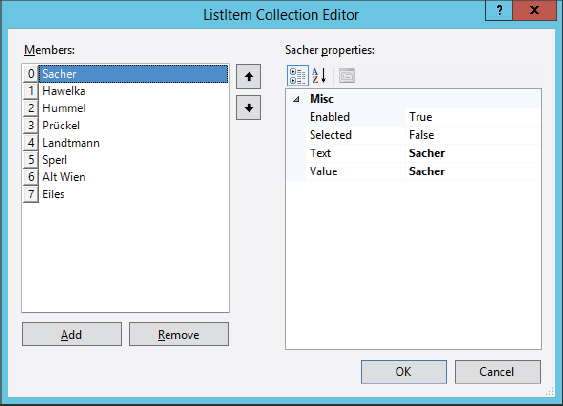
This editor can be used to add some meeting room names to the DropDownList control. The resulting code from the page ShowMeetingRooms.aspx is as follows:
<body>
  <form id="form1" runat="server">
  <div>
    <asp:DropDownList ID="DropDownListMeetingRooms" runat="server" Width="165px">
      <asp:ListItem>Sacher</asp:ListItem>
      <asp:ListItem>Hawelka</asp:ListItem>
      <asp:ListItem>Hummel</asp:ListItem>
      <asp:ListItem>Prückel</asp:ListItem>
      <asp:ListItem>Landtmann</asp:ListItem>
      <asp:ListItem>Sperl</asp:ListItem>
      <asp:ListItem>Alt Wien</asp:ListItem>
      <asp:ListItem>Eiles</asp:ListItem>
    </asp:DropDownList>
    <br />
    <br />
    <asp:Label ID="LabelSelectedRoom" runat="server" Text=""></asp:Label>
    <br />
    <br />
    <asp:Button ID="Button1" runat="server" Text="Submit" />
  </div>
  </form>
</body>DropDownList, Label, and Button are server-side controls, as indicated by the runat="server" attribute. These controls are programmable with server-side C# code and return HTML and JavaScript code to the client. The code-behind file is a partial class. The designer creates another partial class file for the same type that contains only member variables of the server-side controls named within the ASPX file. This way, it’s possible to access all the controls from the code-behind file, as the code-behind file is the same class.
Using Events
Now you’ll add an event handler to the controls. With ASPX, event handlers can be added directly from within the ASPX code editor or from the Properties window. For the DropDownList control in the sample page, the OnRoomSelection method is assigned to the event OnSelectedIndexChanged. If the user changes the selection, server-side code should take over:
    protected void OnRoomSelection(object sender, EventArgs e)
    {
      this.LabelSelectedRoom.Text = DropDownListMeetingRooms.SelectedItem.Value;
    }
Working with Postbacks
You can try that out by starting the page from Visual Studio. The drop-down list contains all the meeting rooms, and the generated HTML code is shown in the following code snippet. This code does not contain any server-side code. The attribute runat="server" is also stripped out.
<!DOCTYPE html>
<html xmlns="http://www.w3.org/1999/xhtml">
<head><title>
</title></head>
<body>
<form method="post" action="ShowMeetingRooms.aspx" id="form1">
<div class="aspNetHidden">
<input type="hidden" name="__VIEWSTATE" id="__VIEWSTATE"
value="ulPYwDLRsU6bWhjWCNAUuO+9ETPHK9DCpZyJxKTHikrAh/ghb3nUb81ZP06x2
sDPdBHpJ4ObOMGKB8reZ2yNJqg42ep+xM6cgmks2irc7+ZrY5bnMtGj22CfjGOW5otD" />
</div>
<div class="aspNetHidden">
<input type="hidden" name="__EVENTVALIDATION" id="__EVENTVALIDATION"
value="AIZNlXgDjsO7fINvnNT9WSFZZfkci1pv28cSbIIvwKCAGjBtX9ZDzL+NL4+S
LcTF2t7XXvjezChHhEHzRI08UHIfPpQ1AfRlc81+s3If0l9+FPdZg4d8ByuVtUu9nIL
0mZEaiwn3Ab8KrkuYaHm6KaXqksh4/BJrp4SV5BjetsYgC/F5+JFdFi70Uy/yORSlzr
8XJGOmHEmjxXf3XILwf1MEkBifAF9KAc/05a9h7Ih5HSFh6/8nODcbHCsywcvpWnoW1
kCCe3DeAD74aIoert/JOR+9cjwqBcvS+uRE7Vs=" />
</div>
<div>
<select name="DropDownListMeetingRooms" id="DropDownListMeetingRooms"
style="width:165px;">
<option selected="selected" value="Sacher">Sacher</option>
<option value="Hawelka">Hawelka</option>
<option value="Hummel">Hummel</option>
<option value="Prückel">Prückel</option>
<option value="Landtmann">Landtmann</option>
<option value="Sperl">Sperl</option>
<option value="Alt Wien">Alt Wien</option>
<option value="Eiles">Eiles</option>
</select>
<br />
<br />
<span id="LabelSelectedRoom"></span>
<br />
<br />
<input type="submit" name="Button1" value="Submit" id="Button1" />
</div>
</form>
</body>
</html>There’s an issue, however: The event handler is not invoked when the selection is changed. Only when the Submit button is clicked is the event handler invoked on the server side. The ASPX page model is based on postbacks. As the C# compiled code is running on the server, the client needs to send a request to the server to call the event handler. This happens upon clicking the Submit button, sending all the state information from the controls within the form element with the HTTP POST request to the server. This also includes the view state information. ASPX controls make use of view state to manage event handling functions. When sending the page to the client, the view state contains information about the actual control state, e.g., what is selected with the DropDownList control. This state information remains unchanged when the user changes a value in the DropDownList control. When posting the data to the server, the view state still contains the original information, and the state that is passed with the DropDownList within the view contains the current information. On the server side, now a change can be detected between the original state information and the current state, which fires the event OnSelectedIndexChanged and therefore invokes the event handler.
Using Auto-Postbacks
Sometimes it’s necessary to do a postback to the server immediately following a change to the DropDownList control. Because of the selection some other parts of the page might be necessary to change. You can do this by setting the AutoPostBack="true" property with the DropDownList control. With HTML, this cannot be achieved without JavaScript code, but the DropDownList control automatically creates the JavaScript code that does a form postback on the onchange event of the select element.
Doing Postbacks to Other Pages
Until now you’ve seen postbacks that always request the same page. In case a different page needs to be returned to the client after the postback is done, there are several ways to do this. Invoking the Response.Redirect method, the client receives an HTTP redirect request to request another page. This method requires an extra round-trip to the server. Invoking the Server.Transfer method, another page is invoked on the server side. This doesn’t require another roundtrip, but the URL that is seen by the client is just the original page and not the new page. ASPX supports another way: cross-page postbacks.
Now a second page named MeetingRoomInformation.aspx is created. This page includes a Label control that should display the selected meeting room.
In the page ShowMeetingRooms.aspx, the Submit button is modified to set the PostBackUrl property to the new page. With this information, the HTML code generated contains a JavaScript onclick event to the Button control, which changes the postback of the form to the new page:
    <asp:Button ID="Button1" runat="server" Text="Submit"
      PostBackUrl="~/MeetingRoomInformation.aspx" />
The Page_Load event handler of the MeetingRoomInformation.aspx page can access page values from the previous page. The PreviousPage property contains the information from the previous page in case of a cross-page postback. To handle that behavior, the previous page has the IsCrossPagePostback property set to true. With the previous page, all the controls and their state that are set, and the values passed from the client can be accessed. The controls can be found with the FindControl method of the page, passing the name. In the following code snippet, the selected value from the DropDownList control is assigned to the Text property of the Label within the current page:
    protected void Page_Load(object sender, EventArgs e)
    {
      if (this.PreviousPage != null)
      {
        DropDownList meetingRoomSelection = this.PreviousPage.FindControl(
          "DropDownListMeetingRooms") as DropDownList;
        if (meetingRoomSelection != null)
        {
          this.Label1.Text = meetingRoomSelection.SelectedItem.Value;
        }
      }
    }
To test this, open the ShowMeetingRooms.aspx page in the browser now and click the Submit button. This should result in a cross-page postback and open the second page.
Defining Strongly Typed Cross-Page Postbacks
ASPX also offers strongly typed access to a previous page. To take advantage of this, a read-only property SelectedMeetingRoom is added to the MeetingRooms class. This property accesses the selected value from the DropDownList control:
    public string SelectedMeetingRoom
    {
      get
      {
        return DropDownListMeetingRooms.SelectedItem.Value;
      }
    }
In the MeetingRoomInformation.aspx file, the PreviousPageType directive is added following the Page directive. The previous page is specified with the VirtualPath attribute:
<%@ Page Language="C#" AutoEventWireup="true"
  CodeBehind="MeetingRoomInformation.aspx.cs"
  Inherits="Meetingroom.MeetingRoomInformation" %>
<%@ PreviousPageType VirtualPath="~/ShowMeetingRooms.aspx" %>Now you can simplify the implementation of the Page_Load method to directly access the SelectedMeetingRoom property:
    protected void Page_Load(object sender, EventArgs e)
    {
      if (this.PreviousPage != null)
      {
        this.Label1.Text = this.PreviousPage.SelectedMeetingRoom;
      }
    }
Using Page Events
With the ShowMeetingRooms.aspx page, you’ve seen load and change events of the page. There are many more page events. Before the page is rendered, these Page events are fired on a first request: PreInit, Init, InitComplete, PreLoad, Load, LoadComplete, PreRender, Render, and RenderComplete. Many of these events are defined with three steps: PreXX, XX, and XXComplete. In the case of a postback to a page, some additional events are fired to take care of the view state and the HTTP POST data to fill the values of the controls and to fire change and action events.
The first step in the life cycle of the Page is initialization. The PreInit event is fired before the initialization takes place. Here it’s possible to change the master page, and themes. After this event, these properties cannot be set again. It’s also possible to create controls dynamically with this event. The Init event is fired after all controls of the page have been initialized. Initialization values for the controls in the page can be set with the Page_Init event handler. The InitComplete event is fired after the initialization of the page and all controls has been completed.
After the initialization stage, the loading stage takes place. PreLoad is fired after the view state is loaded for the page and its controls, and postback data of the form is assigned to the controls of the page. When the Load event is fired, the page has been restored and all the controls are set to their previous state (based on the view state). Validation can be done here, as well as dynamically creating new controls that are not based on view state initialization from postbacks. Change and action events are fired in this state — such as the OnSelectedIndexChanged event of the DropDownList control, and the OnClick event of a Button control. Change events are fired before action events. The end of the loading stage is marked with the LoadComplete event.
After the loading stage, the rendering stage takes place. With a handler on the PreRender event, some final changes to the page or its controls can be done. This event is fired before any view state is saved. This is the last point in time when property values can be changed before the information goes to the view state. SaveStateComplete is fired next when the view state is saved. Then you are ready for rendering the content and generating HTML and JavaScript for the client. The Render method is called here. After the rendering is completed, the page is unloaded, and the UnLoad event is fired. Cleanup can be done here to release all the resources needed to build the page.
To analyze the page events and to see what happens when, it’s a good idea to turn on ASP.NET web tracing. Tracing can be enabled in the web.config file with the trace element. This element is defined as a child of system.web. The example configuration in the next code snippet enables tracing and defines some trace configurations. The trace information should not be shown in the requested page itself (pageOutput), but the trace.axd URL can be used instead. requestLimit specifies that only the 10 most recent requests should be remembered, with older ones discarded. Setting mostRecent to true specifies that the request limit should apply to the most recent pages, and not the first requested pages since the application was started. The localOnly attribute specifies that trace information should be shown only from a client on the same system as the server. This is restricted for security reasons. The traceMode is set to sort the traces by time. Sorting by category is the alternate option.
    <trace enabled="true" pageOutput="false" mostRecent="true"
      requestLimit="10" localOnly="true" traceMode="SortByTime"/>
Starting the application after tracing has been enabled, the traces are filled and can be viewed by opening trace.axd from within the browser. The output is shown in Figure 40-2. With this application trace, ShowMeetingRooms.aspx was opened with a GET request, an item in the DropDownList was selected that caused a POST request to the same page, then the Submit button was clicked which resulted in a POST request to the page MeetingRoomInformation.aspx.
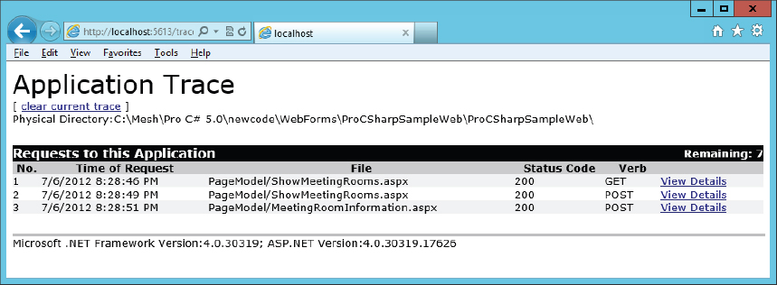
Clicking a View Details link on the page provides a plethora of additional information. Figure 40-3 shows request details for the session identifier, and trace information about what events occurred on the page, including timing information. Here you can easily see how much time an event handler needed, so you might find code that needs some tweaking for better performance. You can write your own custom messages to this trace information by invoking the Write and Warn methods of the TraceContext class. This class can be accessed by using the Trace property from the page, or the Trace property from HttpContext.Current.

ASPX Code
Server-side controls can be accessed from the code-behind code by using the ID of the variable. A code file with a partial class that is hidden by default contains all the members of the page that are defined with the ASPX file. The following sections look at the different options for accessing code from within ASPX.
Writing to the Response Stream
Using the syntax <% %> defines a code block within the ASPX page. Multiple statements can be used within this code block, and each of them must end with the semicolon. The following code snippet does some calculation and writes the result to the response using Response.Write:
    <div>
      <%
        int a = 3;
        int b = 4;
        int c = a + b;
        Response.Write(c);
      %>
    </div>
Getting Results
To get the result of a method or property directly to the response stream, <%= can be used. The following code snippet invokes the method GetText1 from the page and writes the result directly to the content of the div element:
    <div>
      <%= GetText1() %>
    </div>
The GetText1 method just returns a simple string to be called from the ASPX page:
    public string GetText1()
    {
      return "Hello from the Page";
    }
Encoding
Using <%= can be potentially dangerous, in particular if the content that is written to the UI comes from users without any validation of their input. To see how this could happen, a simple script is added to the return string of the GetText2 method. Calling this method as shown previously, the script is invoked in the browser. The alert function just opens a message box on the client, but it would be possible to access the complete DOM model, and redirect the user to other pages:
    public string GetText2()
    {
      return @"<script>alert(""Hello"");</script>";
    }
To avoid such scripting attacks, output should be encoded. Server.HtmlEncode encodes the input string and returns an HTML encoded string that enables the browser to display the script as text:
    <div>
      <%= Server.HtmlEncode(GetText2()) %>
    </div>
Because encoding should be used in so many places, a nice shorthand notation for Server.HtmlEncode and <%= is available.
    <div>
      <%: GetText2() %>
    </div>
Data Binding
To bind the result of methods or properties, <%# is used. The following code snippet binds the result of the GetText1 method to the Text property of the Button control:
<asp:Button ID="Button1" runat="server" Text="<%# GetText1() %>" />Merely defining the binding does not mean something happens. The DataBind method must be invoked. Here it’s done in the Page_Load event handler method:
    protected void Page_Load(object sender, EventArgs e)
    {
      this.Button1.DataBind();
    }
Instead of invoking DataBind on the control, the DataBind method can also be invoked on the Page. This in turn invokes DataBind on all the controls associated with the Page.
Expressions
<%$ is the syntax for using an expression builder. The following code snippet uses the resources expression to access the result from the resource named SampleResources, and the key Message1:
    <asp:Button ID="Button2" runat="server"
      Text="<%$ Resources:SampleResources, Message1 %>" />
A resources expression starts with <%$ Resources:. Resources are covered in detail in Chapter 28, “Localization.”
ASP.NET comes with several expression types. AppSettings expressions read application configuration values from the configuration file, ConnectionString expressions read connection strings from the configuration file, and RouteUrl and RouteValue expressions use the URL link to get values from the route.
To edit expressions of the various types, select the Properties window from the design editor, and then open the Expressions editor, shown in Figure 40-4.

Server-Side Controls
So far, you have seen two web server controls: DropDownList and Button. There are many more, of course, and they are grouped in the toolbar within categories. Most of these categories are covered in this chapter.
The Standard category in the toolbar contains not only simple controls such as Button, Label, DropDownList, CheckBox, and ListBox, which are easily represented in HTML, but also controls with more complex HTML, such as Table, Calendar, MultiView, and Wizard. MultiView enables defining different views that can be selected based on different options (e.g., different views depending on whether the user is logged in), and the Wizard enables the user to complete a process step by step.
The Data category contains controls to both display data (Repeater, FormView, GridView) and access data (EntityDataSource, ObjectDataSource, SiteMapDataSource).
The Validation category contains validator controls that enable checking user input for both client-side and server-side code. The RequiredFieldValidator requires user input, the RangeValidator checks user information from a specified range of values, and the CompareValidator not only checks whether a newly entered password matches the one in another field, but also verifies whether the input conforms to a date or a currency value. With the RegularExpressionValidator, regular expressions can be specified to validate user input.
The Navigation category contains Menu, SiteMapPath, and Tree controls that enable creating a navigation structure for the user.
The Login category contains controls for security-related tasks. The Login control enables entering the username and password, and makes use of the Membership API. A user can register with the CreateUser Wizard control, change and recover the password with ChangePassword and PasswordRecovery, and display the state of authentication with LoginName, LoginStatus, and LoginView controls.
The WebParts category contains controls for building dynamic web applications. With controls from this category, users can select what Web parts should be displayed, and move Web parts between different zones.
The AJAX Extensions category contains controls that make it easy, with the server-side controls model of ASP.NET Web Forms, to use AJAX features without the need to write JavaScript code. ScriptManager, UpdatePanel, and Timer controls belong to this category.
Finally, the HTML category contains controls that by default do not have any server-side functionality. Simple HTML controls are in this category such as Input (Button), Input (Text), and Textarea. There’s also a way to use these controls from server-side code by applying the attribute runat="server". With server-side functionality, the types for these controls are defined in the namespace System.Web.UI.HtmlControls. Unlike the web server controls (namespace System.Web.UI.WebControls), these controls have server-side properties and names that conform to the functions of client-side scripting code accessing the HTML DOM.
MASTER PAGES
Many web applications contain some parts that are shared across all of the pages. With ASP.NET Web Forms, master pages can be used to handle this behavior. Using master pages, the content pages do not return the complete HTML code. Content pages only define the parts of the page that should be placed within the master page. A master page defines the places where a content page should dock into using content placeholders. With these content placeholders, the master page can also define defaults if the content page doesn’t supply content.
Creating a Master Page
This section adds a master page named Company.Master to the sample web application. The Visual Studio 2012 template creates a master page with one ContentPlaceHolder control in the head section, and one ContentPlaceHolder control in the body section. The content placeholder in the head section enables the content page to add scripting code or stylesheets to the page. With the code snippet shown next, multiple ContentPlaceHolder controls are added to the body section, along with some HTML code.
Looking at the code of the master page in the example, note that a master page starts with the Master directive. This is very similar to the Page directive used with web pages. However, master pages with the .Master file extension are never requested by the client. Indeed, a forbidden handler is defined with the handler mappings if a master file is requested. Instead, the client requests an ASPX page, and the ASPX page handler uses a master page to generate the HTML code for the client. The <html> root element, including head, body, and form, are defined within the master page, not with content pages that use a master page. You can add HTML and web server controls to master pages in the same way that you do with web pages.
What’s special about the content of master pages are the ContentPlaceHolder controls. The example code defines ContentPlaceHolder controls with the IDs topContent, leftContent, and mainContent. These are the parts that can be replaced by content pages. The master page can also supply default content. This is shown with the ContentPlaceHolder control named leftContent. Here, a nav element is defined with a list of navigation items. This list is shown in content pages if the content page doesn’t add its own content for this content placeholder.
<%@ Master Language="C#" AutoEventWireup="true" CodeBehind="Company.master.cs"
  Inherits="Meetingroom.Company" %>

<!DOCTYPE html>
<html>
<head runat="server">
  <link rel="stylesheet" type="text/css" href="Company.css" />
  <title></title>
  <asp:ContentPlaceHolder ID="head" runat="server">
  </asp:ContentPlaceHolder>
</head>
<body>
  <form id="form1" runat="server">
  <div class="top">
    <h1>Professional C# 2012 Demo Web Application</h1>
  </div>
  <div class="top2">
    <asp:ContentPlaceHolder ID="topContent" runat="server">
    </asp:ContentPlaceHolder>
  </div>
  <div class="left">
    <!-- Navigation Controls -->
    <asp:ContentPlaceHolder ID="leftContent" runat="server">
      <nav>
        <ul>
          <li>Home
          <ul>
            <li>Reserve Room</li>
            <li>Show Rooms</li>
          </ul>
          </li>
          <li>About</li>
        </ul>
      </nav>
    </asp:ContentPlaceHolder>
  </div>
  <div class="main">
    <asp:ContentPlaceHolder ID="mainContent" runat="server">
    </asp:ContentPlaceHolder>
  </div>
  <div class="bottom">
    <div>CN innovation</div>
    <div>http://www.cninnovation.com</div>
  </div>
  </form>
</body>
</html>
As shown in Figure 40-5, the design view of Visual Studio shows the look of the page, along with the CSS file that is applied to the master page.

Using Master Pages
To use a master page, Visual Studio 2012 includes the template Web Form Using Master Page. With this item template, a master page can be selected upon creating the page. The Page directive of the generated page just defines the additional attribute MasterPageFile to reference the selected master page. Other than the Page directive, the page only contains Content controls. The Content controls define what is replaced from the master page. With the ContentPlaceHolderId property, the Content control references the ContentPlaceHolder control to define the content to replace:
<%@ Page Title="" Language="C#" MasterPageFile="~/Company.Master"
  AutoEventWireup="true" CodeBehind="ReserveRoom.aspx.cs"
  Inherits="Meetingroom.ReserveRoom" %>
<asp:Content ID="Content1" ContentPlaceHolderID="head" runat="server">
</asp:Content>
<asp:Content ID="Content2" runat="server" contentplaceholderid="topContent">
</asp:Content>
<asp:Content ID="Content3" runat="server" contentplaceholderid="mainContent">
</asp:Content>By default, Content controls are created for all these placeholders where the master page doesn’t create default content. To replace the default content, you can access the design view of the web page to use the smart tags from the controls to replace content.
With the sample web page, the content of the mainContent is replaced with a DropDownList as it has been used in a previous example:
<asp:Content ID="Content3" runat="server" contentplaceholderid="mainContent">
<div>
<asp:DropDownList ID="DropDownListMeetingRooms" runat="server"
OnSelectedIndexChanged="OnRoomSelection" Width="165px" AutoPostBack="True">
<asp:ListItem>Sacher</asp:ListItem>
<asp:ListItem>Hawelka</asp:ListItem>
<asp:ListItem>Hummel</asp:ListItem>
<asp:ListItem>Prückel</asp:ListItem>
<asp:ListItem>Landtmann</asp:ListItem>
<asp:ListItem>Sperl</asp:ListItem>
<asp:ListItem>Alt Wien</asp:ListItem>
<asp:ListItem>Eiles</asp:ListItem>
</asp:DropDownList>
<br />
<br />
<asp:Label ID="LabelSelectedRoom" runat="server" Text=""></asp:Label>
<br />
<br />
<asp:Button ID="Button1" runat="server" Text="Submit" />
</div>
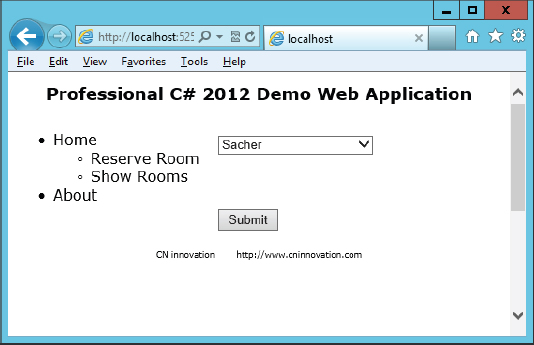
</asp:Content>Running the application, the HTML code is merged with the master and content pages, as shown in Figure 40-6.
Defining Master Page Content from Content Pages
Using placeholders and content controls to define the content for pages is a very powerful option. However, sometimes you only need to replace a few items in the master page, or change some content. You can access a master page from a content page by using the Master property of the page object.
The following code snippet accesses the Label control named LabelBottom from the master page by using the Master property of the Page, which returns a MasterPage object, and then the FindControl method to determine where the content should be set:
    protected void Page_Load(object sender, EventArgs e)
    {
      Label label = Master.FindControl("LabelBottom") as Label;
      if (label != null)
      {
        label.Text = "Hello from the content page";
      }
    }
Similar to what you’ve seen with strongly typed access to cross-page postback, strongly typed access to master pages is also possible. Next, with the master page code-behind file Company.Master.cs, the property LabelBottomText is defined to allow read/write access to the Text property of the LabelBottom control:
    public string LabelBottomText
    {
      get
      {
        return LabelBottom.Text;
      }
      set
      {
        LabelBottom.Text = value;
      }
    }
To define a strongly typed master page, the MasterType directive can be applied with the content page:
<%@ Page Title="" Language="C#" MasterPageFile="~/Company.Master"
  AutoEventWireup="true" CodeBehind="ReserveRoom.aspx.cs"
  Inherits="Meetingroom.ReserveRoom" %>
<%@ MasterType VirtualPath="~/Company.Master" %>
Now the code accessing the master page can be simplified to directly use the property defined:
    protected void Page_Load(object sender, EventArgs e)
    {
      Master.LabelBottomText = "Hello from the content page";
}NAVIGATION
Let’s add some navigation content to navigate within different pages of the web application. ASP.NET offers a site map that can be used with Menu and MenuPath controls.
Site Map
The structure of the web application can be described in a site map file. To create site maps, Visual Studio 2012 offers a Site Map item template that creates a file with the name Web.sitemap. A sample site map file is shown in the following code. siteMap is the root element, which can contain a hierarchy of siteMapNode elements. A siteMapNode defines attributes for the url that it accesses, a title that is displayed with menus, and a description that is used with a tooltip:
<?xml version="1.0" encoding="utf-8" ?>
<siteMap xmlns="http://schemas.microsoft.com/AspNet/SiteMap-File-1.0" >
  <siteMapNode url="~/Default.aspx" title="Home"
    description="Professional C# 2012 Demo Web Application">
    <siteMapNode url="MeetingRooms.aspx" title="Meeting Rooms" description="" >
      <siteMapNode url="~/ReserveRoom.aspx" title="Reserve a Room" />
      <siteMapNode url="~/CancelRoom.aspx" title="Cancel a Room" />
    </siteMapNode>
    <siteMapNode url="~/Accounts.aspx" title="Accounts">
      <siteMapNode url="~/RegisterUser.aspx" title="Register User"
        description="" />
    </siteMapNode>
  </siteMapNode>
</siteMap>
Other than the attributes used with the example, the siteMapNode also offers localization and support for roles. For localization, a resourceKey is used to specify resources to be used for menu titles and tooltips. The roles attributed is used to specify access only to users who belong to the specified roles.
Menu Control
The web site map is used by a Menu control. All you need to do to fill the content for the Menu control is add a SiteMapDataSource. By default, the SiteMapDataSource uses the site map file named Web.sitemap. The Menu control references the data source with the DataSourceID property (code file Company.Master):
  <div class="left">
    <asp:ContentPlaceHolder ID="leftContent" runat="server">
      <asp:Menu ID="Menu1" runat="server" DataSourceID="SiteMapDataSource1" >
      </asp:Menu>
      <asp:SiteMapDataSource ID="SiteMapDataSource1" runat="server" />
    </asp:ContentPlaceHolder>
</div>The Menu control is shown in Figure 40-7. By default, the control creates HTML list content with ul, li, and a elements. The outcome is completely customizable. The RenderingMode property can be set to List or Table to create list or table elements, respectively; items can be displayed statically or dynamically; horizontal or vertical displays can be configured with the Orientation property; and colors, styles, and CSS classes can be set.

Menu Path
The SiteMapPath control is a breadcrumb control that indicates its current position, along with information about how to go back in the tree:
  <div class="top2">
    <asp:ContentPlaceHolder ID="topContent" runat="server">
      <asp:SiteMapPath ID="SiteMapPath1" runat="server"></asp:SiteMapPath>
    </asp:ContentPlaceHolder>
  </div>
Figure 40-8 shows the SiteMapPath control on the web page Reserve a Room.
VALIDATING USER INPUT
ASP.NET Web Forms contains several validation controls that offer validation on both the client and the server. Validating input on the client is just done for convenience of the user, as he sees the validation result faster without the need to send data to the server. However, you can never trust input from the client, and you need to verify the data on the server again.
Using Validation Controls
To show validation in action, this section creates the ValidationDemo.aspx page. At first, this page contains two Labelcontrols, two TextBox controls (named textName and textEmail), and a Button control. Users are required to enter their name and e-mail address, and the latter should be validated. Validation controls that can be used for this scenario are the RequiredFieldValidator and the RegularExpressionValidator.
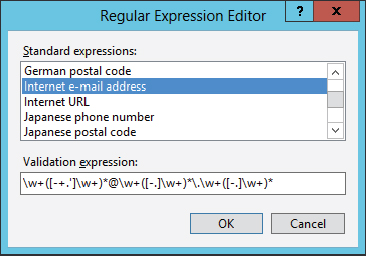
All the validator controls derive from the base class BaseValidator and thus have the properties ControlToValidate, which needs to be set to the TextBox control that is covered by the validation control; and ErrorMessage, which defines the text that is displayed in case of invalid input. The following code snippets show the validator controls connected to the TextBox controls, and the ErrorMessage properties set. The TextBox control named TextEmail has two validation controls: a RequiredFieldValidator and an associated RegularExpressionValidator. With the RegularExpressionValidator, the ValidationExpression property is set, to verify that the e-mail address is valid. The Regular Expression Editor, shown in Figure 40-9, contains a list of predefined regular expressions, one of which is the Internet e-mail address. Of course, you can also add a custom regular expression.
      <table class="auto-style1">
        <tr>
          <td>Name:</td>
          <td>
            <asp:TextBox ID="TextName" runat="server"></asp:TextBox>
            <asp:RequiredFieldValidator ID="RequiredFieldValidator1"
              runat="server" ControlToValidate="TextName"
              ErrorMessage="Name required"></asp:RequiredFieldValidator>
          </td>
        </tr>
        <tr>
          <td>Email:</td>
          <td>
            <asp:TextBox ID="TextEmail" runat="server"></asp:TextBox>
            <asp:RequiredFieldValidator ID="RequiredFieldValidator2"
              runat="server" ControlToValidate="TextEmail" Display="Dynamic"
              ErrorMessage="Email required"></asp:RequiredFieldValidator>
            <asp:RegularExpressionValidator ID="RegularExpressionValidator1"
              runat="server" ControlToValidate="TextEmail" Display="Dynamic"
              ErrorMessage="Please enter an email"
              ValidationExpression="w+([-+.']w+)*@w+([-.]w+)*.w+([-.]w+)*">
            </asp:RegularExpressionValidator>
          </td>
        </tr>
        <tr>
          <td>
            <asp:Button ID="Button1" runat="server" Text="Register" />
          </td>
          <td> </td>
        </tr>
      </table>
In Figure 40-10, the name is not entered and the e-mail address is invalid. Therefore, two validation controls apply: the RequiredFieldValidator with the TextName control and the RegularExpressionValidator with the TextEmail control. The error messages from these two validation controls are shown. With the RequiredFieldValidator that is connected to the TextEmail control, the Display property is set to Dynamic. This is necessary to arrange the error message from the RequiredFieldValidator in the position of the RequiredFieldValidator. Otherwise the space would be empty.

Using a Validation Summary
If error messages shouldn’t be displayed with the input controls but instead with summary information on the page, all you need to do is add a ValidationSummary control; and with the validation controls, the Text property should be set to a string that is shown in case of an error. With the sample page, the Text properties are set to *, and the ErrorMessage properties keep the value from the previous code snippet.
The result is shown in Figure 40-11. Here, both RequiredFieldValidator validation controls apply, and thus the values for the ErrorMessage properties are shown in the ValidationSummary control. With each of the failing validation controls, the value of the Text property is displayed.

Validation Groups
If the page contains multiple submit-type buttons with different areas of validation, validation groups can be assigned. If validation groups are not used, with every postback all the controls are verified to be correct. With the page shown in Figure 40-12, if the user clicks the Register button, only the controls that belong to this part should be validated; and if the user clicks the Submit button, only these controls should be validated. This issue is solved by setting the ValidationGroup property of the first group of validation controls as well as the Button control to "Register", and the second group of validation controls to "Event". Clicking the button belonging to the ValidationGroup "Event" validates only the validation controls from the same group.

ACCESSING DATA
Data access can be very simple using data controls from ASP.NET. A lot is possible without writing a single line of C# code. Controls in the category Data belong to two different groups: data sources and UI controls. Data sources are used to access data, such as by using the ADO.NET Entity Framework or DataSets. UI controls define different looks, such as the GridView and the DetailsView.
The following table describes the data source controls.
| DATA SOURCE CONTROL | DESCRIPTION |
| AccessDataSource | Used to access Microsoft Access databases. |
| EntityDataSource | Makes use of the ADO.NET Entity Framework to read and write data. |
| LinqDataSource | Used to access LINQ to SQL. This mapping tool has been mostly replaced by the ADO.NET Entity Framework. |
| ObjectDataSource | This can be used to access custom objects with static or instance members to return list of objects, and offers methods to add and update objects. |
| SiteMapDataSource | Reads the Web.sitemap file and is used for navigation. This data source was shown previously in the chapter. |
| SqlDataSource | Makes use of either a DataReader or a DataSet. These types are explained in Chapter 32, “Core ADO.NET.” |
| XmlDataSource | Used to access XML data, either from a file or an XML object. XML manipulation is explained in Chapter 34, “Manipulating XML.” |
The next table contains information about controls for the UI.
| WEB SERVER DATA CONTROL | DESCRIPTION |
| ListView | A powerful control for showing data in a grid style. It enables selecting, sorting, deleting, editing, and inserting records. The UI is customized with templates. |
| DataList | This control can be bound to a data source to show data in a grid-style format. The UI can be customized with templates. This control also supports selecting and editing data. |
| DataPager | This can be used in conjunction with another control (e.g., the ListView) to add paging functionality. |
| GridView | Uses a table to show bound data. Selecting, sorting, and editing are possible. |
| Repeater | Unlike the other UI controls, the Repeater requires a custom layout using templates in order to have useful output. Many other controls can use templates, but without them there is already output. |
| DetailsView | Shows a single record and allows editing, deleting, and inserting records. |
| FormView | Like the DetailsView, the FormView is used to display a single record. FormView requires a user-defined template, and enables more customization than the DetailsView. |
Clearly, many controls can be used to display grids. Over the years, ASP.NET Web Forms has continued to add grid controls with more features. Usually a good option is to use the ListView control. This control is only available since .NET 3.5 and offers features found in the other controls and more. GridView has been available since .NET 2.0, and DataList since .NET 1.1. Knowing the availability of these controls helps deciding which one to use, which one offers more “modern” features.
Using the Entity Framework
Although the ADO.NET Entity Framework is covered in detail in Chapter 33, “ADO.NET Entity Framework,” this section describes how to define access code using it.
The sample database contains two tables, Reservations and MeetingRooms, and these tables are mapped to the types MeetingRoom and Reservation as shown in Figure 40-13. The model can be created easily by adding a new item of type ADO.NET Entity Data Model, and selecting the existing database. You can download the database along with the sample code.
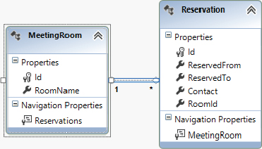
The designer creates entity types MeetingRoom and Reservation that derive from the base class EntityObject and contain all the properties defined in the database schema. In addition to the entity objects, an object context named RoomReservationEntities is created. This context defines properties for every table to return ObjectSet<MeetingRoom> and ObjectSet<Reservation> objects. This class manages the connection to the database.
Using the Entity Data Source
With the first page, the meeting rooms should be shown in a DropDownList, and a GridView should display the reservations for a room. With a simple scenario, this can be done without writing a single line of C# code.
The first two controls on the page ShowReservations.aspx are a DropDownList and an EntityDataSource control. Using the smart tag, the data source can be configured to use the connection that was used to create the model. Selecting this connection finds the container name of the entities, RoomReservationEntities. The second dialog, shown in Figure 40-14, requires the entity set MeetingRooms, with an EntityTypeFilter.

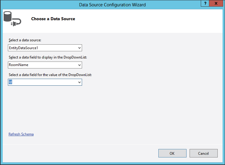
After configuring the data source, the UI control can be configured to reference the data source control. For this, you can use the Data Source Configuration Wizard, shown in Figure 40-15. For the display in the DropDownList, the RoomName property is used; for the identification of the data field, the Id property is used.
Opening the page, the rooms from the database are displayed. The next step is to display the reservations based on the selection. For this activity, a GridView and one more EntityDataSource control are added to the page. The second data source control is configured to access the Reservations EntitySetName, and automatic inserts, updates, and deletes are enabled.
After initial configuration of the data source, more options are available with the properties of this control. Grouping, ordering, and filtering can be configured. With the sample page, the Where property is set to a RoomId parameter, as shown in Figure 40-16. If the parameter has the same name as a property of the entity type, a WHERE expression is created based on the paramter. The value of the parameter is taken directly from the SelectedValue property of the DropDownList. This selection is directly available from the Expression Editor. One advanced property also needs to be set. Because the RoomId is of type int, the property type needs to be set to Int32. By default, it’s a string.

In the example code, the source of the parameter is the DropDownList control. With the Expression Editor you can also see other source types available. Cookie, Form, Profile, QueryString, Session, and RouteData are other parameter source options. There’s really a lot that can be done just by configuration of some properties. With the GridView control, only the DataSourceId needs to be set to the second EntityDataSource control.
So far, the code-behind is empty, and the DropDownList, EntityDataSource, and GridView controls are configured as follows:
      <asp:DropDownList ID="DropDownList1" runat="server" AutoPostBack="True"
        DataSourceID="EntityDataSource1" DataTextField="RoomName"
        DataValueField="Id" Height="22px" Width="150px">
      </asp:DropDownList>
      <br />
      <asp:EntityDataSource ID="EntityDataSource1" runat="server"
        ConnectionString="name=RoomReservationEntities"
        DefaultContainerName="RoomReservationEntities" EnableFlattening="False"
        EntitySetName="MeetingRooms" EntityTypeFilter="MeetingRoom">
      </asp:EntityDataSource>
      <br />
      <asp:GridView ID="GridView1" runat="server"
        DataSourceID="EntityDataSource2">
      </asp:GridView>
      <br />
      <br />
      <asp:EntityDataSource ID="EntityDataSource2" runat="server"
        AutoGenerateWhereClause="True"
        ConnectionString="name=RoomReservationEntities"
        DefaultContainerName="RoomReservationEntities" EnableDelete="True"
        EnableFlattening="False" EnableInsert="True" EnableUpdate="True"
        EntitySetName="Reservations" Where="">
        <WhereParameters>
          <asp:ControlParameter ControlID="DropDownList1" Name="RoomId"
            PropertyName="SelectedValue" Type="Int32" />
        </WhereParameters>
      </asp:EntityDataSource>
The page can now be opened in the browser to select room reservations, as shown in Figure 40-17.

Sorting and Editing
Out of the box, the GridView supports sorting, paging, end editing, depending on the capabilities of the data source. For example, earlier in the chapter, Figure 40-14 shows the editing features of the EntityDataSource: automatic inserts, updates, and deletes. When this is selected, editing and deleting can be enabled with the GridView (see Figure 40-18).
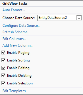
Setting these options with the GridView sets the properties AllowPaging and AllowSorting, and adds a CommandField column with Delete, Edit, and Select buttons:
<asp:GridView ID="GridView1" runat="server" DataSourceID="EntityDataSource2"
AllowPaging="True" AllowSorting="True">
<Columns>
<asp:CommandField ShowDeleteButton="True" ShowEditButton="True"
ShowSelectButton="True" />
</Columns>
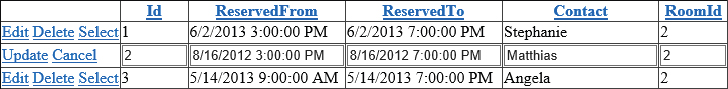
</asp:GridView>The GridView just uses the name of the properties in the heading (Id, ReservedFrom, ReservedTo, Contact), and uses Label controls in read mode, and TextBox controls in edit mode, as shown in Figure 40-19. When the Edit button is clicked, the row changes to edit mode. In edit mode, TextBox controls are bound to the data. Changing the values there also changes the entities in the Entity Framework object context. Clicking Update invokes the SaveChanges method of the object context and writes the changes to the database.
Customizing Columns
By default all the properties are shown. At least the heading should be changed, and the Id column should remain read-only in edit mode. Such customization is easy by opening the Fields editor, shown in Figure 40-20.
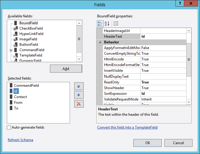
Instead of auto-generating fields, you can select the fields that should be displayed. You can configure many aspects of these fields, including heading information and images for the headings, footer text, a default display for null values, a format string, and styles for the control, header, footer, and item elements. The content of the GridView is now changed to BoundField objects, as shown in the following code snippet:
      <asp:GridView ID="GridView1" runat="server" DataSourceID="EntityDataSource2"
        AllowPaging="True" AllowSorting="True" AutoGenerateColumns="False">
        <Columns>
          <asp:CommandField ShowDeleteButton="True" ShowEditButton="True"
            ShowSelectButton="True" />
          <asp:BoundField DataField="Id" HeaderText="Id" ReadOnly="True"
            SortExpression="Id"></asp:BoundField>
          <asp:BoundField DataField="Contact" HeaderText="Contact"
            SortExpression="Contact"></asp:BoundField>
          <asp:BoundField DataField="ReservedFrom" HeaderText="From"
            SortExpression="ReservedFrom"></asp:BoundField>
          <asp:BoundField DataField="ReservedTo" HeaderText="To"
            SortExpression="ReservedTo"></asp:BoundField>
        </Columns>
      </asp:GridView>
Using Templates with the Grid
For more customization, you can use templates. With the Fields editor, columns can be converted to templates. Changing the Contact field to templates, now a TemplateField instead of a BoundField is used, as shown in the following code snippet. With template fields, you can create different user interfaces, such as ItemTemplate, EditItemTemplate, AlternatingItemTemplate, HeaderTemplate, FooterTemplate, and more. The default ItemTemplate makes use of a Label, and the EditItemTemplate uses a TextBox. With both of these, the Text property is bound to the Contact property of the bound object:
<asp:TemplateField HeaderText="Contact" SortExpression="Contact">
<EditItemTemplate>
<asp:TextBox ID="TextBox2" runat="server"
Text='<%# Bind("Contact") %>'></asp:TextBox>
</EditItemTemplate>
<ItemTemplate>
<asp:Label ID="Label2" runat="server"
Text='<%# Bind("Contact") %>'></asp:Label>
</ItemTemplate>
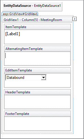
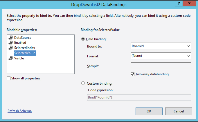
</asp:TemplateField>Using the Template Editor (see Figure 40-21), any ASP.NET controls can be added to the different template modes. The sample adds a template for the MeetingRoom column, and replaces a TextBox in edit mode by a DropDownList control. With the DropDownList control, the data source is selected to be the first entity data source control that returns the meeting rooms. Properties of the DropDownList control can be bound by using the DataBindings editor, shown in Figure 40-22.
The resulting ASPX code now uses a DropDownList in the EditItemTemplate, and a Label in the ItemTemplate:
        <asp:TemplateField HeaderText="MeetingRoom" SortExpression="MeetingRoom">
          <EditItemTemplate>
            <asp:DropDownList ID="DropDownList2" runat="server"
              DataTextField="RoomName" DataValueField="Id"
              Width="146px" Height="16px" SelectedValue='<%# Bind("RoomId") %>'
              DataSourceID="EntityDataSource1">
            </asp:DropDownList>
          </EditItemTemplate>
          <ItemTemplate>
            <asp:Label ID="Label1" runat="server" Text='<%#
              Bind("MeetingRoom.RoomName") %>'></asp:Label>
          </ItemTemplate>
        </asp:TemplateField>
Figure 40-23 shows the opened page with the DropDownList in the edit mode. Meeting rooms are retrieved from the first data source, while the grid itself is bound to the second data source.

Customizing Object Context Creation
Displaying and editing with a grid covering multiple data sources is an easy task. So far, not a single line of code was added to the code-behind; everything was just set by using the properties of existing controls. However, as multiple EntityDataSource controls are used within the page, with every request multiple object context instances are created. You can tweak this behavior easily by adding the event handlers OnContextCreating and OnContextDisposing to the page. Within the OnContextCreating method, a new RoomReservationEntities object context is created if the method is called for the first time. This object context is assigned to the Context property of EntityDataSourceContextCreatingEventArgs. After assigning this context, the EntityDataSource control makes use of it instead of creating a new one:
using System;
using System.Web.UI.WebControls;

namespace ProCSharpSampleWeb.DataAccess
{
  public partial class ShowReservations : System.Web.UI.Page
  {
    private RoomReservationEntities data;

    protected void Page_Load(object sender, EventArgs e)
    {
    }

    protected void OnContextCreating(object sender,
      EntityDataSourceContextCreatingEventArgs e)
    {
      if (data == null)
      {
        data = new RoomReservationEntities();
      }
      e.Context = data;
    }

    protected void OnContextDisposing(object sender,
      EntityDataSourceContextDisposingEventArgs e)
    {
      if (data != null)
      {
        data.Dispose();
        data = null;
      }
    }
  }
}
With the two EntityDataSource objects, the ContextCreating and ContextDisposing events are set to the corresponding event handlers, and performance is improved.
Object Data Source
Whereas the EntityDataSource makes direct use of the ADO.NET Entity Framework, the ObjectDataSource can use a class with static or instance members and invoke these. This gives you a lot more flexibility to work with the data access code.
The RoomReservationFactory class implements the methods MeetingRooms, GetReservationsByRoom, and UpdateReservation:
using System.Collections.Generic;
using System.Data;
using System.Linq;

namespace ProCSharpSampleWeb.DataAccess
{
  public class RoomReservationFactory
  {
    public IEnumerable<MeetingRoom> MeetingRooms()
    {
      IEnumerable<MeetingRoom> rooms;
      using (RoomReservationEntities data = new RoomReservationEntities())
      {
        rooms = data.MeetingRooms.ToList();
      }
      return rooms;
    }

    public IEnumerable<Reservation> GetReservationsByRoom(int roomId)
    {
      IEnumerable<Reservation> reservations;
      using (RoomReservationEntities data = new RoomReservationEntities())
      {
        reservations = data.Reservations.Where(r => r.RoomId == roomId).ToList();
      }
      return reservations;
    }

    public void UpdateReservation(Reservation reservation)
    {
      using (RoomReservationEntities data = new RoomReservationEntities())
      {
        data.Reservations.Attach(reservation);
        data.ObjectStateManager.ChangeObjectState(reservation,
          EntityState.Modified);
        data.SaveChanges();
      }
    }
  }
}
Using an ObjectDataSource, you can define methods to select, update, insert, and delete from the RoomReservationFactory class, as shown in Figure 40-24. Then the data source can be used similarly to the EntityDataSource as before.

SECURITY
Another important aspect of ASP.NET web applications is using authentication and authorization. In the previous chapter, the Membership and Roles APIs have been discussed. This chapter covers calling these APIs with the help of available web server controls.
Enabling Forms Authentication
You can configure forms authentication by starting the ASP.NET Configuration Tool from within Visual Studio 2012. Starting this tool also creates the aspnetdb database as you can see with the configuration string in the web.config file:
  <connectionStrings>
    <clear />
    <add name="LocalSqlServer" connectionString="data source=(localDB)v11.0;
      Integrated Security=SSPI;AttachDBFilename=|DataDirectory|aspnetdb.mdf"
      providerName="System.Data.SqlClient"/>
    <!-- ... -->
  </connectionStrings>
Using this tool to change to Internet authentication adds the authentication configuration with the mode attribute set to Forms. If only authorized users are allowed, by default the file login.aspx is requested if the user is not authenticated.
    <authorization>
      <deny users="?" />
    </authorization>
    <authentication mode="Forms" />
Login Controls
Needed along with the login.aspx page are controls to enter username and password, and probably a check box to remember the password. All this is offered by the Login control:
<asp:Login ID="Login1" runat="server"></asp:Login>This control makes use of several Label controls for user information, two TextBox controls for user input, a CheckBox to enable remembering the password, validator controls, and a Button to submit the login information that uses the predefined Elegant format (see Figure 40-25).

To customize the Login control, set its properties — for example, title text and the text that should be shown for the username and password, and whether a “remember me” check box should be displayed. Some predefined style schemes are available to provide different looks. Of course, you can also style the outcome with custom CSS. If these format settings are not enough, a LayoutTemplate can be used for complete customization. Only the IDs of the essential UI controls must stay the same.
When the Log In button is clicked, the events LoggingIn, LoggedIn, and LoginError are fired. If no event handlers are added, the Login control already uses the Membership.ValidateUser method to validate the user.
To allow registration of anonymous users with the sample application, a subdirectory named anonymous is created. This subdirectory contains a web.config file that allows anonymous users. This setting overrides the setting from the web.config file in the parent directory:
<?xml version="1.0" encoding="utf-8"?>
<configuration>
  <system.web>
    <authorization>
      <allow users="?" />
    </authorization>
  </system.web>
</configuration>
The subdirectory contains the ASP.NET page RegisterUser.aspx, which contains only the control CreateUserWizard within the form element. CreateUserWizard is a simple control for asking users all the information needed to create a new account. Figure 40-26 shows the default output of this control.

    <asp:CreateUserWizard ID="CreateUserWizard1" runat="server">
      <WizardSteps>
        <asp:CreateUserWizardStep runat="server" />
        <asp:CompleteWizardStep runat="server" />
      </WizardSteps>
    </asp:CreateUserWizard>
AJAX
Ajax enables you to enhance the user interfaces of web applications by means of asynchronous postbacks and dynamic client-side web page manipulation. The term Ajax was invented by Jesse James Garrett and is shorthand for Asynchronous JavaScript and XML.
By definition, Ajax involves both JavaScript and XML. However, Ajax programming requires the use of other technologies as well, such as HTML, CSS, and the document object model (DOM). Nowadays, XML is not always used with Ajax for transferring data between the client and the server. Instead, JSON (JavaScript Object Notation) is used an alternative. It has less overhead compared to XML.
Of course, the most important part of Ajax is the XMLHttpRequest. Since Internet Explorer 5, IE has supported the XMLHttpRequest API as a means of performing asynchronous communication between the client and server. This was originally introduced by Microsoft as a technology to access e-mail stored in an Exchange server over the Internet, in a product known as Outlook Web Access. Since then, it has become the standard way to perform asynchronous communications in web applications, and it is a core technology of Ajax-enabled web applications. Microsoft’s implementation of this API is known as XMLHTTP, which communicates over what is often called the XMLHTTP Protocol.
Ajax also requires server-side code to handle both partial-page postbacks and full-page postbacks. This can include both event handlers for server-control events and web services. Figure 40-27 shows how these technologies fit together in the Ajax web browser model, in contrast to the “traditional” web browser model.

Prior to Ajax, the first four technologies listed in the preceding table (HTML, CSS, the DOM, and JavaScript) were used to create what was known as Dynamic HTML (DHTML) web applications. These applications were notable for two reasons: they provided a much better user interface and they generally worked on only one type of web browser.
Since DHTML, standards have improved, along with the level of adherence to standards in web browsers. However, there are still differences, and an Ajax solution must take them into account. This has meant that most developers have been quite slow to implement Ajax solutions. Only with the advent of more abstracted Ajax frameworks (such as ASP.NET AJAX) has Ajax-enabled website creation become a viable option for enterprise-level development.
What Is ASP.NET AJAX?
ASP.NET AJAX is Microsoft’s implementation of the Ajax framework, and it is specifically targeted at ASP.NET Web Forms developers. It is part of the core ASP.NET Web Forms functionality. The website dedicated to ASP.NET AJAX is http://ajax.asp.net, where you can find documentation, forums, and sample code that you may find useful for whichever version of ASP.NET you are using.
ASP.NET AJAX provides the following functionality:
- A server-side framework that enables ASP.NET web pages to respond to partial-page postback operations
- ASP.NET server controls that make the implementation of Ajax functionality easy
- An HTTP handler that enables ASP.NET web services to communicate with client-side code by using JSON serialization in partial-page postback operations
- Web services that enable client-side code to gain access to ASP.NET application services, including authentication and personalization services
- A website template for creating ASP.NET AJAX-enabled web applications
- A client-side JavaScript library that provides a number of enhancements to JavaScript syntax, as well as code to simplify the implementation of Ajax functionality
These server controls and the server-side framework that makes them possible are collectively known as the ASP.NET Extensions. The client-side part of ASP.NET AJAX is known as the AJAX Library. The ASP.NET AJAX Control Toolkit is not part of the Visual Studio 2012 installation. This toolkit can be installed from a NuGet Package. At the time of this writing, the most current version is 4.1.60623, which is used with the examples. This toolkit contains a lot of server controls that are available as shared source.
Together these downloads provide a richly featured framework that you can use to add Ajax functionality to your ASP.NET web applications. In the following sections, you learn more about the various component parts of ASP.NET AJAX. Its core functionality is contained in two parts: the AJAX Extensions and the AJAX Library.
ASP.NET AJAX Extensions
ASP.NET AJAX extensions are contained in two assemblies that are installed in the GAC:
- System.Web.Extensions.dll — This assembly contains the ASP.NET AJAX functionality, including the AJAX Extensions and the AJAX Library JavaScript files, which are available through the ScriptManager component (described shortly).
- System.Web.Extensions.Design.dll — This assembly contains ASP.NET Designer components for the AJAX Extensions server controls. This is used by the ASP.NET Designer in Visual Studio or Visual Web Developer.
Much of the AJAX Extensions component of ASP.NET AJAX is concerned with enabling partial-page postbacks and JSON serialization for web services. This includes various HTTP handler components and extensions to the existing ASP.NET Framework. All this functionality can be configured through the web.config file for a site. There are also classes and attributes that you can use for additional configuration. However, most of this configuration is transparent, and you will rarely need to change the defaults.
Your main interaction with AJAX Extensions will be using server controls to add Ajax functionality to your web applications. There are several of these, which you can use to enhance your applications in various ways. The following table shows a selection of the server-side components. These components are demonstrated later in this chapter.
| CONTROL | DESCRIPTION |
| ScriptManager | This control, central to ASP.NET AJAX functionality, is required on every page that uses partial-page postbacks. Its main purpose is to manage client-side references to the AJAX Library JavaScript files, which are served from the ASP.NET AJAX assembly. The AJAX Library is used extensively by the AJAX Extensions server controls, which all generate their own client-side code. This control is also responsible for the configuration of web services that you intend to access from client-side code. By supplying web service information to the ScriptManager control, you can generate client-side and server-side classes to manage asynchronous communication with web services transparently. You can also use the ScriptManager control to maintain references to your own JavaScript files. |
| UpdatePanel | This extremely useful control may be the ASP.NET AJAX control that you will use most often. It acts like a standard ASP.NET placeholder and can contain any other controls. More important, it also marks a section of a page as a region that can be updated independently of the rest of the page, in a partial-page postback. Any controls contained by an UpdatePanel control that cause a postback (a Button control, for example) will not cause full-page postbacks. Instead, they cause partial-page postbacks that update only the contents of the UpdatePanel. In many situations, this control is all you need to implement Ajax functionality. For example, you can place a GridView control in an UpdatePanel control, and any pagination, sorting, and other postback functionality of the control will take place in a partial-page postback. |
| UpdateProgress | This control enables you to provide feedback to users when a partial-page postback is in progress. You can supply a template for this control that will be displayed when an UpdatePanel is updating. For example, you could use a floating <div> control to display a message such as “Updating...” so that the user is aware that the application is busy. Note that partial-page postbacks do not interfere with the rest of a web page, which will remain responsive. |
| Timer | The ASP.NET AJAX control provides a way to cause an UpdatePanel to update periodically. You can configure this control to trigger postbacks at regular intervals. If the Timer control is contained in an UpdatePanel control, then the UpdatePanel is updated every time the Timer control is triggered. This control also has an associated event so that you can carry out periodic server-side processing. |
| AsyncPostBackTrigger | You can use this control to trigger UpdatePanel updates from controls that aren’t contained in the UpdatePanel. For example, you can enable a drop-down list elsewhere on a web page to cause an UpdatePanel containing a GridView control to update. |
The AJAX Extensions also include the ExtenderControl abstract base class for extending existing ASP.NET server controls. This is used, for example, by various classes in the ASP.NET AJAX Control Toolkit, as you will see shortly.
AJAX Library
The AJAX Library consists of JavaScript files that are used by client-side code in ASP.NET AJAX-enabled web applications. A lot of functionality is included in these JavaScript files, some of which is general code that enhances the JavaScript language and some of which is specific to Ajax functionality. The AJAX Library contains layers of functionality that are built on top of each other, as described in the following table.
| LAYER | DESCRIPTION |
| Browser compatibility | The lowest-level code in the AJAX Library consists of code that maps various JavaScript functionality according to the client web browser. This is necessary because browsers differ in terms of how they implement JavaScript. By providing this layer, JavaScript code in other layers does not have any browser compatibility issues, and you can write browser-neutral code that will work in all client environments. |
| Core services | This layer contains the enhancements to the JavaScript language, in particular OOP functionality. By using the code in this layer you can define namespaces, classes, derived classes, and interfaces using JavaScript script files. This is of particular interest to C# developers, because it makes writing JavaScript code much more like writing .NET code (by using C# and encouraging reusability). |
| Base class library | The client base class library (BCL) includes many JavaScript classes that provide low-level functionality to classes further down the AJAX Library hierarchy. Most of these classes are not intended to be used directly. |
| Networking | Classes in the networking layer enable client-side code to call server-side code asynchronously. This layer includes the basic framework for making a call to a URL and responding to the result in a callback function. For the most part, this is functionality that you will not use directly; instead, you will use classes that wrap this functionality. This layer also contains classes for JSON serialization and deserialization. You will find most of the networking classes on the client-side Sys.Net namespace. |
| User interface | This layer contains classes that abstract user interface elements such as HTML elements and DOM events. You can use the properties and methods of this layer to write language-neutral JavaScript code to manipulate web pages from the client. User interface classes are contained in the Sys.UI namespace. |
| Controls | The final layer of the AJAX Library contains the highest-level code, which provides Ajax behaviors and server control functionality. This includes dynamically generated code that you can use, for example, to call web services from client-side JavaScript code. |
You can use the AJAX Library to extend and customize the behavior of ASP.NET AJAX-enabled web applications, but it is important to note that it isn’t necessary. You can go a long way without using any additional JavaScript in your applications — it becomes a requirement only when you need more advanced functionality. If you do write additional client-side code, however, you will find that it is much easier using the functionality that the AJAX Library offers.
ASP.NET AJAX Control Toolkit
The AJAX Control Toolkit is a collection of additional server controls, including extender controls, that have been written by the ASP.NET AJAX community. Extender controls are controls that enable you to add functionality to an existing ASP.NET server control, typically by associating a client-side behavior with it. For example, one of the extenders in the AJAX Control Toolkit extends the TextBox control by placing “watermark” text in the TextBox, which appears when the user hasn’t yet added any content to the text box. This extender control is implemented in a server control called TextBoxWatermark.
Using the AJAX Control Toolkit, you can add quite a lot more functionality to your sites beyond what is provided in the core download. These controls are also interesting simply to browse, and they will probably give you plenty of ideas about enhancing your web applications. However, because the AJAX Control Toolkit is separate from the core download, you should not expect the same level of support for these controls.
ASP.NET AJAX Website Example
Now that you have seen the component parts of ASP.NET AJAX, it is time to start looking at how to use them to enhance your websites. This section demonstrates how web applications that use ASP.NET AJAX work, and how to use the various aspects of functionality that ASP.NET AJAX includes. You start by examining a simple application, and then add functionality in subsequent sections.
The ASP.NET Web Site template includes all the ASP.NET AJAX core functionality. You can also use the AJAX Control Toolkit Web Site template (after it is installed) to include controls from the AJAX Control Toolkit. For the purposes of this example, you can create a new ASP.NET Emtpy Web Application template called ProCSharpAjaxSample.
Add a web form called Default.aspx and modify its code as follows:
<%@ Page Language="C#" AutoEventWireup="true" CodeBehind="Default.aspx.cs"
  Inherits="ProCSharpAjaxSample.Default" %>

<!DOCTYPE html>

<html>
<head runat="server">
  <title>Pro C# ASP.NET AJAX Sample</title>
</head>
<body>
  <form id="form1" runat="server">
  <asp:ScriptManager ID="ScriptManager1" runat="server" />
  <div>
    <h1>Pro C# ASP.NET AJAX Sample</h1>
    This sample obtains a list of primes up to a maximum value.
      <br />
    Maximum:
      <asp:TextBox runat="server" ID="MaxValue" Text="2500" />
    <br />
    Result:
      <asp:UpdatePanel runat="server" ID="ResultPanel">
        <ContentTemplate>
          <asp:Button runat="server" ID="GoButton" Text="Calculate" />
          <br />
          <asp:Label runat="server" ID="ResultLabel" />
          <br />
          <small>Panel render time: <%= DateTime.Now.ToLongTimeString() %>
          </small>
        </ContentTemplate>
      </asp:UpdatePanel>
    <asp:UpdateProgress runat="server" ID="UpdateProgress1">
      <ProgressTemplate>
        <div style="position: absolute; left: 100px; top: 200px;
          padding: 40px 60px 40px 60px; background-color: lightyellow;
          border: black 1px solid; font-weight: bold; font-size: larger;
          filter: alpha(opacity=80);">
          Updating.
        </div>
      </ProgressTemplate>
    </asp:UpdateProgress>
    <small>Page render time: <%= DateTime.Now.ToLongTimeString() %></small>
  </div>
  </form>
</body>
</html>
Switch to design view (note that the ASP.NET AJAX controls such as UpdatePanel and UpdateProgress have visual designer components) and double-click the Calculate button to add an event handler. Modify the code as follows (code file ProCSharpAjaxSample/Default.aspx.cs):
    protected void GoButton_Click(object sender, EventArgs e)
    {
      int maxValue = 0;
      var resultText = new StringBuilder();
      if (int.TryParse(MaxValue.Text, out maxValue))
      {
        for (int trial = 2; trial <= maxValue; trial++)
        {
          bool isPrime = true;
          for (int divisor = 2; divisor <= Math.Sqrt(trial); divisor++)
          {
            if (trial % divisor == 0)
            {
              isPrime = false;
              break;
            }
          }
          if (isPrime)
          {
            resultText.AppendFormat("{0} ", trial);
          }
        }
      }
      else
      {
        resultText.Append("Unable to parse maximum value.");
      }
      ResultLabel.Text = resultText.ToString();
    }
  }
Save your modifications and press F5 to run the project. If prompted, enable debugging in web.config.
When the web page appears, as shown in Figure 40-28, note that the two render times shown are the same.

Click the Calculate button to display prime numbers less than or equal to 2500. Unless you are running on a slow machine, this should be almost instantaneous. Note that the render times are now different — only the one in the UpdatePanel has changed.
Finally, add some zeros to the maximum value to introduce a processing delay (about three more should be enough on a fast PC) and click the Calculate button again. This time, before the result is displayed, the UpdateProgress control displays a partially transparent feedback message, as shown in Figure 40-29.

While the application updates, the page remains responsive. You can, for example, scroll through the page. Close the browser to return to Visual Studio.
Close the browser to return to Visual Studio.
ASP.NET AJAX-Enabled Website Configuration
Most of the configuration required for ASP.NET AJAX is supplied for you by default; you only need to add to web.config if you want to change these defaults. For example, you can add a <system.web.extensions> section to provide additional configuration. Most of the configuration that you can add with this section concerns web services and is contained in an element called <webServices>, which in turn is placed in a <scripting> element. First, you can add a section to enable access to the ASP.NET authentication service through a web service (you can choose to enforce SSL here if you wish):
  <system.web.extensions>
    <scripting>
      <webServices>
        <authenticationService enabled="true" requireSSL="true"/>
Next, you can enable and configure access to ASP.NET personalization functionality through the profile web service:
        <profileService enabled="true"
          readAccessProperties="propertyname1,propertyname2"
          writeAccessProperties="propertyname1,propertyname2" />
The last setting related to web services is for enabling and configuring access to ASP.NET role functionality through the role web service:
        <roleService enabled="true"/>
      </webServices>
Finally, the <system.web.extensions> section can contain an element that enables you to configure compression and caching for asynchronous communications:
      <scriptResourceHandler enableCompression="true" enableCaching="true" />
    </scripting>
  </system.web.extensions>
Additional Configuration for the AJAX Control Toolkit
Installing the AJAX Control Toolkit using NuGet adds the following configuration to web.config:
    <pages>
      <controls>
        <add tagPrefix="ajaxToolkit" assembly="AjaxControlToolkit"
          namespace="AjaxControlToolkit" />
      </controls>
    </pages>
This maps the toolkit controls to the ajaxToolkit tag prefix. These controls are contained in the AjaxControlToolkit.dll assembly, which should be in the /bin directory for the web application.
Alternatively, you could register the controls individually on web pages using the <%@ Register %> directive:
<%@ Register Assembly="AjaxControlToolkit" Namespace="AjaxControlToolkit"
  TagPrefix="ajaxToolkit" %>
Adding ASP.NET AJAX Functionality
The first step in adding Ajax functionality to a website is to add a ScriptManager control to your web pages. Then you add server controls such as UpdatePanel controls to enable partial-page rendering, and dynamic controls such as those supplied in the AJAX Control Toolkit to add usability and glitz to your application. You may also add client-side code, and you can use the AJAX Library for further assistance in customizing and enhancing your application’s functionality. This section describes the functionality you can add using server controls. Later in this chapter you look at client-side techniques.
The ScriptManager Control
As mentioned earlier in the chapter, the ScriptManager control must be included on all pages that use partial-page postbacks and several other aspects of ASP.NET AJAX functionality.
As well as enabling ASP.NET AJAX functionality, you can also use properties to configure this control. The simplest of these properties is EnablePartialRendering, which is true by default. Setting this property to false disables all asynchronous postback processing, such as that provided by UpdatePanel controls. This can be useful, for example, if you want to compare your AJAX-enabled website with a traditional website — perhaps if you were giving a demonstration to a manager.
You can use the ScriptManager control for several reasons, including the following common scenarios:
- To determine whether server-side code is being called as a result of a partial-page postback
- To add references to additional client-side JavaScript files
- To reference web services
- To return error messages to the client
These configuration options are covered in the following sections.
Detecting Partial-Page Postbacks
The ScriptManager control includes a Boolean property called IsInAsyncPostBack. You can use this property in server-side code to detect whether a partial-page postback is in progress. Note that the ScriptManager for a page may actually be on a master page. Rather than access this control through the master page, you can obtain a reference to the current ScriptManager instance by using the static GetCurrent method, for example:
ScriptManager scriptManager = ScriptManager.GetCurrent(this);
if (scriptManager != null && scriptManager.IsInAsyncPostBack)
{
   // Code to execute for partial-page postbacks.
}
You must pass a reference to a Page control to the GetCurrent method. For example, if you use this method in a Page_Load event handler for an ASP.NET web page, you can use this as your Page reference. Also, remember to check for a null reference to avoid exceptions.
Client-Side JavaScript References
Rather than add code to the HTML page header, or in <script> elements on the page, you can use the Scripts property of the ScriptManager class. This centralizes your script references and makes it easier to maintain them. To do this declaratively, first add a child <Scripts> element to the <UpdatePanel> control element, and then add <asp:ScriptReference> child control elements to <Scripts>. You use the Path property of a ScriptReference control to reference a custom script.
The following example shows how to add references to a custom script file called MyScript.js in the root folder of the web application:
<asp:ScriptManager runat="server" ID="ScriptManager1">
  <Scripts>
    <asp:ScriptReference Path="~/MyScript.js" />
  </Scripts>
</asp:ScriptManager>
Web Service References
To access web services from client-side JavaScript code, ASP.NET AJAX must generate a proxy class. To control this behavior, you use the Services property of the ScriptManager class. As with Scripts, you can specify this property declaratively, this time with a <Services> element. You add <asp:ServiceReference> controls to this element. For each ServiceReference object in the Services property, you specify the path to the web service by using the Path property.
The ServiceReference class also has a property called InlineScript, which defaults to false. When this property is false, client-side code obtains a proxy class to call the web service by requesting it from the server. To enhance performance (particularly if you use a lot of web services on a page), you can set InlineScript to true. This causes the proxy class to be defined in the client-side script for the page.
ASP.NET web services use a file extension of .asmx. Without going into too much detail in this chapter, to add a reference to a web service called MyService.asmx in the root folder of a web application, you would use code as follows:
<asp:ScriptManager runat="server" ID="ScriptManager1">
  <Services>
    <asp:ServiceReference Path="~/MyService.asmx" />
  </Services>
</asp:ScriptManager>
You can add references only to local web services (that is, web services in the same web application as the calling code) in this way. You can call remote web services indirectly via local web methods.
Later in this chapter you will see how to make asynchronous web method calls from client-side JavaScript code that uses proxy classes generated in this way.
Client-Side Error Messages
If an exception is thrown as part of a partial-page postback, the default behavior is to place the error message contained in the exception into a client-side JavaScript alert message box. You can customize the message that is displayed by handling the AsyncPostBackError event of the ScriptManager instance. In the event handler, you can use the AsyncPostBackErrorEventArgs.Exception property to access the exception that is thrown and the ScriptManager.AsyncPostBackErrorMessage property to set the message that is displayed to the client. You might do this to hide the exception details from users.
To override the default behavior and display a message in a different way, you must handle the endRequest event of the client-side PageRequestManager object by using JavaScript. This is described later in this chapter.
Using UpdatePanel Controls
The UpdatePanel control is likely to be the control that you will use most often when you write ASP.NET AJAX-enabled web applications. This control, as you have seen in the simple example earlier in the chapter, enables you to wrap a portion of a web page so that it is capable of participating in a partial-page postback operation. To do this, you add an UpdatePanel control to the page and fill its child <ContentTemplate> element with the controls that you want it to contain:
<asp:UpdatePanel runat="Server" ID="UpdatePanel1">
  <ContentTemplate>
    ...
  </ContentTemplate>
</asp:UpdatePanel>
The contents of the <ContentTemplate> template are rendered in either a <div> or <span> element according to the value of the RenderMode property of the UpdatePanel. The default value of this property is Block, which results in a <div> element. To use a <span> element, set RenderMode to Inline.
Multiple UpdatePanel Controls on a Single Web Page
You can include any number of UpdatePanel controls on a page. If a postback is caused by a control that is contained in the <ContentTemplate> of any UpdatePanel on the page, a partial-page postback will occur instead of a full-page postback. This will cause all the UpdatePanel controls to update according to the value of their UpdateMode property. The default value of this property is Always, which means that the UpdatePanel will update for a partial-page postback operation on the page, even if this operation occurs in a different UpdatePanel control. If you set this property to Conditional, the UpdatePanel updates only when a control that it contains causes a partial-page postback or when a trigger that you have defined occurs. Triggers are covered shortly.
If you have set UpdateMode to Conditional, you can also set the ChildrenAsTriggers property to false to prevent controls that are contained by the UpdatePanel from triggering an update of the panel. Note, though, that in this case these controls still trigger a partial-page update, which may result in other UpdatePanel controls on the page being updated. For example, this would update controls that have an UpdateMode property value of Always. This is illustrated in the following code:
<asp:UpdatePanel runat="Server" ID="UpdatePanel1" UpdateMode="Conditional"
  ChildrenAsTriggers="false">
  <ContentTemplate>
    <asp:Button runat="Server" ID="Button1" Text="Click Me" />
    <small>Panel 1 render time: <%= DateTime.Now.ToLongTimeString() %></small>
  </ContentTemplate>
</asp:UpdatePanel>
<asp:UpdatePanel runat="Server" ID="UpdatePanel2">
  <ContentTemplate>
    <small>Panel 2 render time: <%= DateTime.Now.ToLongTimeString() %></small>
  </ContentTemplate>
</asp:UpdatePanel>
<small>Page render time: <%= DateTime.Now.ToLongTimeString() %></small>
In this code, the UpdatePanel2 control has an UpdateMode property of Always, the default value. When the button is clicked, it causes a partial-page postback, but only UpdatePanel2 will be updated. Visually, you will notice that only the “Panel 2 render time” label is updated.
Server-Side UpdatePanel Updates
Sometimes when you have multiple UpdatePanel controls on a page, you might decide not to update one of them unless certain conditions are met. In this case, you would configure the UpdateMode property of the panel to Conditional as shown in the previous section, and possibly also set the ChildrenAsTriggers property to false. Then, in your server-side event-handler code for one of the controls on the page that causes a partial-page update, you would (conditionally) call the Update method of the UpdatePanel. Here is an example:
protected void Button1_Click(object sender, EventArgs e)
{
  if (TestSomeCondition())
  {
    UpdatePanel1.Update();
  }
}
UpdatePanel Triggers
You can cause an UpdatePanel control to be updated by a control elsewhere on the web page by adding triggers to the Triggers property of the control. A trigger is an association between an event of a control elsewhere on the page and the UpdatePanel control. All controls have default events (for example, the default event of a Button control is Click), so specifying the name of an event is optional. Two types of triggers can be added, represented by the following two classes:
- AsyncPostBackTrigger — This class causes the UpdatePanel to update when the specified event of the specified control is triggered.
- PostBackTrigger — This class causes a full-page update to be triggered when the specified event of the specified control is triggered.
You will mostly use AsyncPostBackTrigger, but PostBackTrigger can be useful if you want a control inside an UpdatePanel to trigger a full-page postback.
Both of these trigger classes have two properties: ControlID, which specifies the control that causes the trigger by its identifier, and EventName, which specifies the name of the event for the control linked to the trigger.
To extend an earlier example, consider the following code:
<asp:UpdatePanel runat="Server" ID="UpdatePanel1" UpdateMode="Conditional"
  ChildrenAsTriggers="false">
  <Triggers>
    <asp:AsyncPostBackTrigger ControlID="Button2" />
  </Triggers>
  <ContentTemplate>
    <asp:Button runat="Server" ID="Button1" Text="Click Me" />
    <small>Panel 1 render time: <% =DateTime.Now.ToLongTimeString() %></small>
  </ContentTemplate>
</asp:UpdatePanel>
<asp:UpdatePanel runat="Server" ID="UpdatePanel2">
  <ContentTemplate>
    <asp:Button runat="Server" ID="Button2" Text="Click Me" />
    <small>Panel 2 render time: <% =DateTime.Now.ToLongTimeString() %></small>
  </ContentTemplate>
</asp:UpdatePanel>
<small>Page render time: <% =DateTime.Now.ToLongTimeString() %></small>
The new Button control, Button2, is specified as a trigger in the UpdatePanel1. When this button is clicked, both UpdatePanel1 and UpdatePanel2 will be updated: UpdatePanel1 because of the trigger, and UpdatePanel2 because it uses the default UpdateMode value of Always.
Using UpdateProgress
The UpdateProgress control, as shown in the earlier example, enables you to display a progress message to the user while a partial-page postback is in operation. You use the ProgressTemplate property to supply an ITemplate for the progress display. You will typically use the <ProgressTemplate> child element of the control to do this.
You can place multiple UpdateProgress controls on a page by using the AssociatedUpdatePanelID property to associate the control with a specific UpdatePanel. If this is not set (the default), the UpdateProgress template will be displayed for any partial-page postback, regardless of which UpdatePanel causes it.
When a partial-page postback occurs, there is a delay before the UpdateProgress template is displayed. This delay is configurable through the DisplayAfter property, which is an int that specifies the delay in milliseconds. The default is 500 milliseconds.
Finally, you can use the Boolean DynamicLayout property to specify whether space is allocated for the template before it is displayed. With the default value of true for this property, space on the page is dynamically allocated, which may result in other controls being moved out of the way for an inline progress template display. If you set this property to false, space will be allocated for the template before it is displayed, so the layout of other controls on the page will not change. You set this property according to the effect you want to achieve when displaying progress. For a progress template that is positioned by using absolute coordinates, as in the earlier example, you should leave this property set to the default value.
Using Extender Controls
The core ASP.NET AJAX download includes a class called ExtenderControl. The purpose of this control is to enable you to extend (that is, add functionality to) other ASP.NET server controls. This is used extensively in the AJAX Control Toolkit to great effect, and you can use the ASP.NET AJAX Server Control Extender project template to create your own extended controls. ExtenderControl controls all work similarly — you place them on a page, associate them with target controls, and add further configuration. The extender then emits client-side code to add functionality.
To see this in action in a simple example, create a new Web Form named ExtenderDemo.aspx, and then add the following code:
<%@ Page Language="C#" AutoEventWireup="true" CodeBehind="ExtenderDemo.aspx.cs"
  Inherits="ProCSharpAjaxSample.ExtenderDemo" %>

<!DOCTYPE html>

<html>
<head runat="server">
  <title>Color Selector</title>
</head>
<body>
  <form id="form1" runat="server">
  <asp:ScriptManager ID="ScriptManager1" runat="server" />
  <div>
    <asp:UpdatePanel runat="server" ID="updatePanel1">
      <ContentTemplate>
        <span style="display: inline-block; padding: 2px;">My favorite color is:
        </span>
        <asp:Label runat="server" ID="favoriteColorLabel" Text="green"
          Style="color: #00dd00; display: inline-block; padding: 2px;
            width: 70px; font-weight: bold;" />
        <ajaxToolkit:DropDownExtender runat="server" ID="dropDownExtender1"
          TargetControlID="favoriteColorLabel"
          DropDownControlID="colDropDown" />
        <asp:Panel ID="colDropDown" runat="server"
          Style="display: none; visibility: hidden; width: 60px;
            padding: 8px; border: double 4px black; background-color: #ffffdd;
            font-weight: bold;">
          <asp:LinkButton runat="server" ID="OptionRed" Text="red"
            OnClick="OnSelect" Style="color: #ff0000;" /><br />
          <asp:LinkButton runat="server" ID="OptionOrange" Text="orange"
            OnClick="OnSelect" Style="color: #dd7700;" /><br />
          <asp:LinkButton runat="server" ID="OptionYellow" Text="yellow"
            OnClick="OnSelect" Style="color: #dddd00;" /><br />
          <asp:LinkButton runat="server" ID="OptionGreen" Text="green"
            OnClick="OnSelect" Style="color: #00dd00;" /><br />
          <asp:LinkButton runat="server" ID="OptionBlue" Text="blue"
            OnClick="OnSelect" Style="color: #0000dd;" /><br />
          <asp:LinkButton runat="server" ID="OptionPurple" Text="purple"
            OnClick="OnSelect" Style="color: #dd00ff;" />
        </asp:Panel>
      </ContentTemplate>
    </asp:UpdatePanel>
  </div>
  </form>
</body>
</html>
You also need to add the following event handler to the code-behind (code file ProCSharpAjaxSample/ExtenderDemo.aspx.cs):
protected void OnSelect(object sender, EventArgs e)
{
   favoriteColorLabel.Text = ((LinkButton)sender).Text;
   favoriteColorLabel.Style["color"] = ((LinkButton)sender).Style["color"];
}
As shown in Figure 40-30, not very much is visible in the browser at first, and the extender seems to have no effect.
However, when you hover over the text that reads “green,” a drop-down dynamically appears. If you click this drop-down, a list appears, as shown in Figure 40-31.
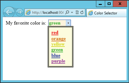
When you click one of the links in the drop-down list, the text changes accordingly (after a partial-page postback operation).
Note two important points about this simple example:
- It was extremely easy to associate the extender with target controls.
- The drop-down list was styled using custom code — meaning you can place whatever content you like in the list. This simple extender is a great, and easy, way to add functionality to your web applications.
The extenders contained in the AJAX Control Toolkit are continually being added to and updated. If you have installed it using NuGet, you’ll be automatically informed when a new version is available.
In addition to the extender controls that are supplied by the AJAX Control Toolkit, you can create your own. To create an effective extender, you must use the AJAX Library. However, a discussion of this scripting library is not part of this book.
ASP.NET Application Services
ASP.NET AJAX includes three specialized web services that you can use to access ASP.NET application services. These services are accessed through the following client-side classes:
- Sys.Services.AuthenticationService — This service includes methods to log in or log out a user or determine whether a user is logged in.
- Sys.Services.ProfileService — This service enables you to get and set profile properties for the currently logged-on user. The profile properties are configured in the web.config file for the application.
- Sys.Services.RoleService — This service enables you to determine role membership for the currently logged-on user.
Used properly, these classes enable you to implement extremely responsive user interfaces that include authorization, profile, and membership functionality. A discussion of these services is beyond the scope of this chapter, but you should be aware of them — and they are well worth investigating.
SUMMARY
In this chapter you looked at several advanced techniques for creating ASP.NET pages and web applications. You’ve seen how you can use ASP.NET AJAX to enhance ASP.NET web applications. ASP.NET AJAX contains a wealth of functionality that makes websites far more responsive and dynamic and can provide a much better user experience.
First, you learned about the ASP.NET Web Forms page model, the event model, and how to find out about these events by using tracing. The page events are most important understanding ASP.NET Web Forms. You then looked at master pages, and how to provide a template for the pages of your website, which is another way to reuse code and simplify development.
You’ve seen validation using ASP.NET validation controls, and you took a brief look at security and how you can implement forms-based authentication on your websites with minimal effort based on the APIs shown in the previous chapter
Next, you investigated data controls and how easy it is to access the Entity Framework. Then, the ObjectDataSource illustrated some more flexible use. In the last part of this chapter, you learned about ASP.NET AJAX, Microsoft’s implementation of Ajax.
The next chapter is about another ASP.NET framework: ASP.NET MVC. Unlike Web Forms, with ASP.NET MVC it’s necessary to deal with HTML and JavaScript, and to use .NET for server-side functionality. Because of a clear separation between the UI, functionality, and data access, unit testing is easier with ASP.NET MVC.