
Chapter 37
Creating Documents with WPF
WHAT’S IN THIS CHAPTER?
- Creating flow documents
- Creating fixed documents
- Creating XPS documents
- Printing documents
WROX.COM CODE DOWNLOADS FOR THIS CHAPTER
The wrox.com code downloads for this chapter are found at http://www.wrox.com/remtitle.cgi?isbn=1118314425 on the Download Code tab. The code for this chapter is divided into the following major examples:
- Show Fonts
- Text Effects
- Table
- Flow Documents
- Create XPS
- Printing
INTRODUCTION
Creating documents is a large part of WPF. The namespace System.Windows.Documents supports creating both flow documents and fixed documents. This namespace contains elements with which you can have a rich Word-like experience with flow documents, and create WYSIWYG fixed documents.
Flow documents are geared toward screen reading; the content of the document is arranged based on the size of the window and the flow of the document changes if the window is resized. Fixed documents are mainly used for printing and page-oriented content and the content is always arranged in the same way.
This chapter teaches you how to create and print flow documents and fixed documents, and covers the namespaces System.Windows.Documents, System.Windows.Xps, and System.IO.Packaging.
TEXT ELEMENTS
To build the content of documents, you need document elements. The base class of these elements is TextElement. This class defines common properties for font settings, foreground and background, and text effects. TextElement is the base class for the classes Block and Inline, whose functionality is explored in the following sections.
Fonts
An important aspect of text is how it looks, and thus the importance of the font. With the TextElement, the font can be specified with the properties FontWeight, FontStyle, FontStretch, FontSize, and FontFamily:
- FontWeight — Predefined values are specified by the FontWeights class, which offers values such as UltraLight, Light, Medium, Normal, Bold, UltraBold, and Heavy.
- FontStyle — Values are defined by the FontStyles class, which offers Normal, Italic, and Oblique.
- FontStretch — Enables you to specify the degrees to stretch the font compared to the normal aspect ratio. FrontStretch defines predefined stretches that range from 50% (UltraCondensed) to 200% (UltraExpanded). Predefined values in between the range are ExtraCondensed (62.5%), Condensed (75%), SemiCondensed (87.5%), Normal (100%), SemiExpanded (112.5%), Expanded (125%), and ExtraExpanded (150%).
- FontSize — This is of type double and enables you to specify the size of the font in device-independent units, inches, centimeters, and points.
- FontFamily — Use this to define the name of the preferred font-family, e.g., Arial or Times New Roman. With this property you can specify a list of font family names so if one font is not available, the next one in the list is used. (If neither the selected font nor the alternate font are available, a flow document falls back to the default MessageFontFamily.) You can also reference a font family from a resource or use a URI to reference a font from a server. With fixed documents there’s no fallback on a font not available because the font is available with the document.
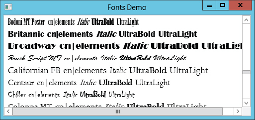
To give you a feel for the look of different fonts, the following sample WPF application includes a ListBox. The ListBox defines an ItemTemplate for every item in the list. This template uses four TextBlock elements whereby the FontFamily is bound to the Source property of a FontFamily object. With different TextBlock elements, FontWeight and FontStyle are set (XAML file ShowFonts/ShowFontsWindow.xaml):
    <ListBox ItemsSource="{Binding}">
      <ListBox.ItemTemplate>
        <DataTemplate>
          <StackPanel Orientation="Horizontal" >
            <TextBlock Margin="3, 0, 3, 0" FontFamily="{Binding Path=Source}"
              FontSize="18" Text="{Binding Path=Source}" />
            <TextBlock Margin="3, 0, 3, 0" FontFamily="{Binding Path=Source}"
              FontSize="18" FontStyle="Italic" Text="Italic" />
            <TextBlock Margin="3, 0, 3, 0" FontFamily="{Binding Path=Source}"
              FontSize="18" FontWeight="UltraBold" Text="UltraBold" />
            <TextBlock Margin="3, 0, 3, 0" FontFamily="{Binding Path=Source}"
              FontSize="18" FontWeight="UltraLight" Text="UltraLight" />
          </StackPanel>
        </DataTemplate>
      </ListBox.ItemTemplate>
    </ListBox>
In the code-behind, the data context is set to the result of the SystemFontFamilies property of the System.Windows.Media.Font class. This returns all the available fonts (code file ShowFonts/ShowFontsWindow.xaml.cs):
  public partial class ShowFontsWindow : Window
  {
    public ShowFontsWindow()
    {
      InitializeComponent();

      this.DataContext = Fonts.SystemFontFamilies;
    }
  }
Running the application, you get a large list of system font families with italic, bold, ultrabold, and ultralight characteristics, as shown in Figure 37-1.
TextEffect
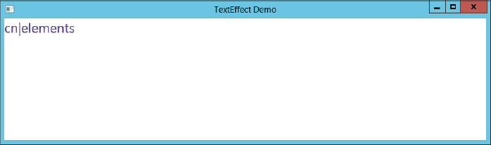
Now let’s have a look into TextEffect, as it is also common to all document elements. TextEffect is defined in the namespace System.Windows.Media and derives from the base class Animatable, which enables the animation of text.
TextEffect enables you to animate a clipping region, the foreground brush, and a transformation. With the properties PositionStart and PositionCount you specify the position in the text to which the animation applies.
For applying the text effects, the TextEffects property of a Run element is set. The TextEffect element specified within the property defines a foreground and a transformation. For the foreground, a SolidColorBrush with the name brush1 is used that is animated with a ColorAnimation element. The transformation makes use of a ScaleTransformation with the name scale1, which is animated from two DoubleAnimation elements (XAML file TextEffectsDemo/MainWindow.xaml):
  <TextBlock>
    <TextBlock.Triggers>
      <EventTrigger RoutedEvent="TextBlock.Loaded">
        <BeginStoryboard>
          <Storyboard>
            <ColorAnimation AutoReverse="True" RepeatBehavior="Forever"
                From="Blue" To="Red" Duration="0:0:16"
                Storyboard.TargetName="brush1"
                Storyboard.TargetProperty="Color" />
            <DoubleAnimation AutoReverse="True"
                RepeatBehavior="Forever"
                From="0.2" To="12" Duration="0:0:16"
                Storyboard.TargetName="scale1"
                Storyboard.TargetProperty="ScaleX" />
            <DoubleAnimation AutoReverse="True"
                RepeatBehavior="Forever"
                From="0.2" To="12" Duration="0:0:16"
                Storyboard.TargetName="scale1"
                Storyboard.TargetProperty="ScaleY" />
          </Storyboard>
        </BeginStoryboard>
      </EventTrigger>
    </TextBlock.Triggers>
    <Run FontFamily="Segoe UI">
        cn|elements
      <Run.TextEffects>
        <TextEffect PositionStart="0" PositionCount="30">
          <TextEffect.Foreground>
            <SolidColorBrush x:Name="brush1" Color="Blue" />
          </TextEffect.Foreground>
          <TextEffect.Transform>
            <ScaleTransform x:Name="scale1" ScaleX="3" ScaleY="3" />
          </TextEffect.Transform>
        </TextEffect>
      </Run.TextEffects>
    </Run>
  </TextBlock>
Running the application, you can see the changes in size and color as shown in Figures 37-2 and 37-3.

Inline
The base class for all inline flow content elements is Inline. You can use Inline elements within a paragraph of a flow document. Because within a paragraph one Inline element can follow another, the Inline class provides the PreviousInline and NextInline properties to navigate from one element to another. You can also get a collection of all peer inlines with SiblingInlines.
The Run element that was used earlier to write some text is an Inline element for formatted or unformatted text, but there are many more. A new line after a Run element can be done with the LineBreak element.
The Span element derives from the Inline class and enables the grouping of Inline elements. Only Inline elements are allowed within the content of Span. The self-explanatory Bold, Hyperlink, Italic, and Underline classes all derive from Span and thus have the same functionality to enable Inline elements as its content, but to act on these elements differently. The following XAML code demonstrates using Bold, Italic, Underline, and LineBreak, as shown in Figure 37-4 (XAML file FlowDocumentsDemo/FlowDocument1.xaml):

  <Paragraph FontWeight="Normal">
    <Span>
      <Span>Normal</Span>
      <Bold>Bold</Bold>
      <Italic>Italic</Italic>
      <LineBreak />
      <Underline>Underline</Underline>
    </Span>
  </Paragraph>
AnchoredBlock is an abstract class that derives from Inline and is used to anchor Block elements to flow content. Figure and Floater are concrete classes that derive from AnchoredBlock. Because these two inline elements become interesting in relation to blocks, these elements are discussed later in this chapter.
Another Inline element that maps UI elements that have been used in previous chapters is InlineUIContainer. InlineUIContainer enables adding all UIElement objects (for example, a Button) to the document. The following code segment adds an InlineUIContainer with ComboBox, RadioButton, and TextBox elements to the document (the result is shown in Figure 37-5) (XAML file FlowDocumentsDemo/FlowDocument2.xaml):
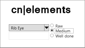
  <Paragraph TextAlignment="Center">
    <Span FontSize="36">
      <Italic>cn|elements</Italic>
    </Span>
    <LineBreak />
    <LineBreak />
    <InlineUIContainer>
      <Grid>
        <Grid.RowDefinitions>
          <RowDefinition />
          <RowDefinition />
        </Grid.RowDefinitions>
        <Grid.ColumnDefinitions>
          <ColumnDefinition />
          <ColumnDefinition />
        </Grid.ColumnDefinitions>
        <ComboBox Width="40"  Margin="3"  Grid.Row="0">
          <ComboBoxItem>Filet Mignon</ComboBoxItem>
          <ComboBoxItem>Rib Eye</ComboBoxItem>
          <ComboBoxItem>Sirloin</ComboBoxItem>
        </ComboBox>
        <StackPanel Grid.Row="0" Grid.RowSpan="2" Grid.Column="1">
          <RadioButton>Raw</RadioButton>
          <RadioButton>Medium</RadioButton>
          <RadioButton>Well done</RadioButton>
        </StackPanel>
        <TextBox Grid.Row="1" Grid.Column="0" Width="140"></TextBox>
      </Grid>
    </InlineUIContainer>
  </Paragraph>
Block
Block is an abstract base class for block-level elements. Blocks enable grouping elements contained to specific views. Common to all blocks are the properties PreviousBlock, NextBlock, and SiblingBlocks that enable you to navigate from block to block. Setting BreakPageBefore and BreakColumnBefore page and column breaks are done before the block starts. A Block also defines a border with the BorderBrush and BorderThickness properties.
Classes that derive from Block are Paragraph, Section, List, Table, and BlockUIContainer. BlockUIContainer is similar to InlineUIContainer in that you can add elements that derive from UIElement.
Paragraph and Section are simple blocks; Paragraph contains inline elements, and Section is used to group other Block elements. With the Paragraph block you can determine whether a page or column break is allowed within the paragraph or between paragraphs. KeepTogether can be used to disallow breaking within the paragraph; KeepWithNext tries to keep one paragraph and the next together. If a paragraph is broken by a page or column break, MinWidowLines defines the minimum number of lines that are placed after the break; MinOrphanLines defines the minimum number of lines before the break.
The Paragraph block also enables decorating the text within the paragraph with TextDecoration elements. Predefined text decorations are defined by TextDecorations: Baseline, Overline, Strikethrough, and Underline.
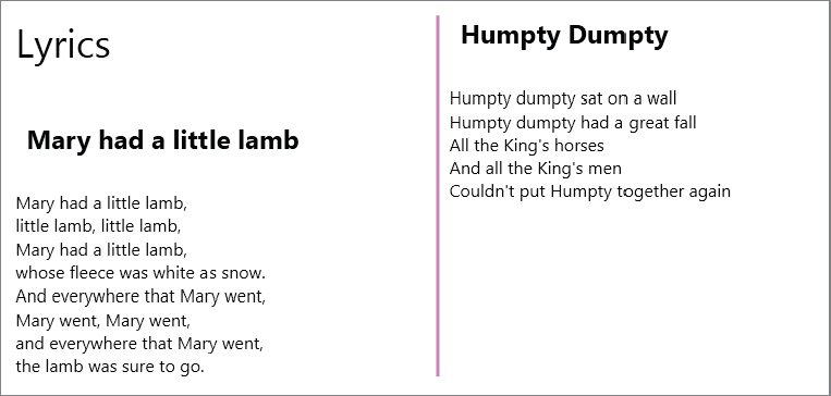
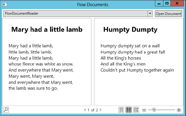
The following XAML code shows multiple Paragraph elements. One Paragraph element with a title follows another with the content belonging to this title. These two paragraphs are connected with the attribute KeepWithNext. It’s also assured that the paragraph with the content is not broken by setting KeepTogether to True (XAML file FlowDocumentsDemo/ParagraphDemo.xaml):
<FlowDocument xmlns="http://schemas.microsoft.com/winfx/2006/xaml/presentation"
              ColumnWidth="300" FontSize="16" FontFamily="Georgia">
  <Paragraph FontSize="36">
    <Run>Lyrics</Run>
  </Paragraph>
  <Paragraph TextIndent="10" FontSize="24" KeepWithNext="True">
    <Bold>
      <Run>Mary had a little lamb</Run>
    </Bold>
  </Paragraph>
  <Paragraph KeepTogether="True">
    <Run>Mary had a little lamb,</Run>
    <LineBreak />
    <Run>little lamb, little lamb,</Run>
    <LineBreak />
    <Run>Mary had a little lamb,</Run>
    <LineBreak />
    <Run>whose fleece was white as snow.</Run>
    <LineBreak />
    <Run>And everywhere that Mary went,</Run>
    <LineBreak />
    <Run>Mary went, Mary went,</Run>
    <LineBreak />
    <Run>and everywhere that Mary went,</Run>
    <LineBreak />
    <Run>the lamb was sure to go.</Run>
  </Paragraph>
  <Paragraph TextIndent="10" FontSize="24" KeepWithNext="True">
    <Bold>
      <Run>Humpty Dumpty</Run>
    </Bold>
  </Paragraph>
  <Paragraph KeepTogether="True">
    <Run>Humpty dumpty sat on a wall</Run>
    <LineBreak />
    <Run>Humpty dumpty had a great fall</Run>
    <LineBreak />
    <Run>All the King's horses</Run>
    <LineBreak />
    <Run>And all the King's men</Run>
    <LineBreak />
    <Run>Couldn't put Humpty together again</Run>
  </Paragraph>
</FlowDocument>
The result is shown in Figure 37-6.
Lists
The List class is used to create textual unordered or ordered lists. List defines the bullet style of its items by setting the MarkerStyle property. MarkerStyle is of type TextMarkerStyle and can be a number (Decimal), a letter (LowerLatin and UpperLatin), a roman numeral (LowerRoman and UpperRoman), or a graphic (Disc, Circle, Square, Box). List can only contain ListItem elements, which in turn can only contain Block elements.
Defining the following list with XAML results in the output shown in Figure 37-7 (XAML file FlowDocumentsDemo/ListDemo.xaml):

  <List MarkerStyle="Square">
    <ListItem>
      <Paragraph>Monday</Paragraph>
    </ListItem>
    <ListItem>
      <Paragraph>Tuesday</Paragraph>
    </ListItem>
    <ListItem>
      <Paragraph>Wednesday</Paragraph>
    </ListItem>
  </List>
Tables
The Table class is very similar to the Grid class presented in Chapter 35 to define rows and columns. The following example demonstrates creating a FlowDocument with a Table. To create tables you can add TableColumn objects to the Columns property. With TableColumn you can specify the width and background.
The Table also contains TableRowGroup objects. The TableRowGroup has a Rows property whereby TableRow objects can be added. The TableRow class defines a Cells property that enables adding TableCell objects. TableCell objects can contain any Block element. Here, a Paragraph is used that contains the Inline element Run (code file TableDemo/MainWindow.xaml.cs):
      var doc = new FlowDocument();
      var t1 = new Table();
      t1.Columns.Add(new TableColumn
      { Width = new GridLength(50, GridUnitType.Pixel) });
      t1.Columns.Add(new TableColumn
      { Width = new GridLength(1, GridUnitType.Auto) });
      t1.Columns.Add(new TableColumn
      { Width = new GridLength(1, GridUnitType.Auto) });

      var titleRow = new TableRow { Background = Brushes.LightBlue };
      var titleCell = new TableCell
      { ColumnSpan = 3, TextAlignment = TextAlignment.Center };
      titleCell.Blocks.Add(
          new Paragraph(new Run("Formula 1 Championship 2011")
          { FontSize=24, FontWeight = FontWeights.Bold }));
      titleRow.Cells.Add(titleCell);

      var headerRow = new TableRow
      { Background = Brushes.LightGoldenrodYellow };
      headerRow.Cells.Add(new TableCell(new Paragraph(new Run("Pos"))
      { FontSize = 14, FontWeight=FontWeights.Bold}));
      headerRow.Cells.Add(new TableCell(new Paragraph(new Run("Name"))
      { FontSize = 14, FontWeight = FontWeights.Bold }));
      headerRow.Cells.Add(new TableCell(new Paragraph(new Run("Points"))
      { FontSize = 14, FontWeight = FontWeights.Bold }));

      var rowGroup = new TableRowGroup();
      rowGroup.Rows.Add(titleRow);
      rowGroup.Rows.Add(headerRow);

      string[][] results = new string[][]
      {
        new string[] { "1.", "Sebastian Vettel", "392" },
        new string[] { "2.", "Jenson Button", "270" },
        new string[] { "3.", "Mark Webber", "258" },
        new string[] { "4.", "Fernando Alonso", "257" },
        new string[] { "5.", "Lewis Hamilton", "227"}
      };

      List<TableRow> rows = results.Select(row =>
        {
          var tr = new TableRow();
          foreach (var cell in row)
          {
            tr.Cells.Add(new TableCell(new Paragraph(new Run(cell))));
          }
          return tr;
        }).ToList();

      rows.ForEach(r => rowGroup.Rows.Add(r));

      t1.RowGroups.Add(rowGroup);
      doc.Blocks.Add(t1);

      reader.Document = doc;
Running the application, you can see the nicely formatted table as shown in Figure 37-8.

Anchor to Blocks
Now that you’ve learned about the Inline and Block elements, you can combine the two by using the Inline elements of type AnchoredBlock. AnchoredBlock is an abstract base class with two concrete implementations, Figure and Floater.
The Floater displays its content parallel to the main content with the properties HorizontalAlignment and Width.
Starting with the earlier example, a new paragraph is added that contains a Floater. This Floater is aligned to the left and has a width of 120. As shown in Figure 37-9, the next paragraph flows around it (XAML file FlowDocumentsDemo/ParagraphKeepTogether.xaml):

  <Paragraph TextIndent="10" FontSize="24" KeepWithNext="True">
    <Bold>
      <Run>Mary had a little lamb</Run>
    </Bold>
  </Paragraph>
  <Paragraph>
    <Floater HorizontalAlignment="Left" Width="120">
      <Paragraph Background="LightGray">
        <Run>Sarah Josepha Hale</Run>
      </Paragraph>
    </Floater>
  </Paragraph>
  <Paragraph KeepTogether="True">
    <Run>Mary had a little lamb</Run>
    <LineBreak />
    <!-- ... -->
  </Paragraph>
A Figure aligns horizontally and vertically and can be anchored to the page, content, a column, or a paragraph. The Figure in the following code is anchored to the page center but with a horizontal and vertical offset. The WrapDirection is set so that both left and right columns wrap around the figure. Figure 37-10 shows the result of the wrap (XAML file FlowDocumentsDemo/FigureAlignment.xaml):
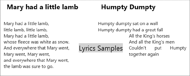
  <Paragraph>
    <Figure HorizontalAnchor="PageCenter" HorizontalOffset="20"
        VerticalAnchor="PageCenter" VerticalOffset="20" WrapDirection="Both" >
      <Paragraph Background="LightGray" FontSize="24">
        <Run>Lyrics Samples</Run>
      </Paragraph>
    </Figure>
  </Paragraph>
Floater and Figure are both used to add content that is not in the main flow. Although these two features seem similar, the characteristics of these elements are quite different. The following table explains the differences between Floater and Figure:
| CHARACTERISTIC | FLOATER | FIGURE |
| Position | A floater cannot be positioned. It is rendered where space is available. | A figure can be positioned with horizontal and vertical anchors. It can be docked relative to the page, content, column, or paragraph. |
| Width | A floater can be placed only within one column. If the width is set larger than the column’s size, it is ignored. | A figure can be sized across multiple columns. The width of a figure can be set to 0.5 pages or two columns. |
| Pagination | If a floater is larger than a column’s height, the floater breaks and paginates to the next column or page. | If a figure is larger than a column’s height, only the part of the figure that fits in the column is rendered; the other content is lost. |
FLOW DOCUMENTS
With all the Inline and Block elements, now you know what should be put into a flow document. The class FlowDocument can contain Block elements, and the Block elements can contain Block or Inline elements, depending on the type of the Block.
A major functionality of the FlowDocument class is that it is used to break up the flow into multiple pages. This is done via the IDocumentPaginatorSource interface, which is implemented by FlowDocument.
Other options with a FlowDocument are to set up the default font and foreground and background brushes, and to configure the page and column sizes.
The following XAML code for the FlowDocument defines a default font and font size, a column width, and a ruler between columns:
<FlowDocument xmlns="http://schemas.microsoft.com/winfx/2006/xaml/presentation"
    ColumnWidth="300" FontSize="16" FontFamily="Georgia"
    ColumnRuleWidth="3" ColumnRuleBrush="Violet">
Now you just need a way to view the documents. The following list describes several viewers:
- RichTextBox — A simple viewer that also allows editing (as long as the IsReadOnly property is not set to true). The RichTextBox doesn’t display the document with multiple columns but instead in scroll mode. This is similar to the Web layout in Microsoft Word. The scrollbar can be enabled by setting the HorizontalScrollbarVisibility to ScrollbarVisibility.Auto.
- FlowDocumentScrollViewer — A reader that is meant only to read but not edit documents. This reader enables zooming into the document. There’s also a toolbar with a slider for zooming that can be enabled with the property IsToolbarEnabled. Settings such as CanIncreaseZoom, CanDecreaseZoom, MinZoom, and MaxZoom enable setting the zoom features.
- FlowDocumentPageViewer — A viewer that paginates the document. With this viewer you not only have a toolbar to zoom into the document, you can also switch from page to page.
- FlowDocumentReader — A viewer that combines the functionality of FlowDocumentScrollViewer and FlowDocumentPageViewer. This viewer supports different viewing modes that can be set from the toolbar or with the property ViewingMode that is of type FlowDocumentReaderViewingMode. This enumeration has the possible values Page, TwoPage, and Scroll. The viewing modes can also be disabled according to your needs.
The sample application to demonstrate flow documents defines several readers such that one reader can be chosen dynamically. Within the Grid element you can find the FlowDocumentReader, RichTextBox, FlowDocumentScrollViewer, and FlowDocumentPageViewer. With all the readers the Visibility property is set to Collapsed, so on startup none of the readers appear. The ComboBox that is the first child element within the grid enables the user to select the active reader. The ItemsSource property of the ComboBox is bound to the Readers property to display the list of readers. On selection of a reader, the method OnReaderSelectionChanged is invoked (XAML file FlowDocumentsDemo/MainWindow.xaml):
  <Grid x:Name="grid1">
    <Grid.RowDefinitions>
      <RowDefinition Height="Auto" />
      <RowDefinition Height="*" />
    </Grid.RowDefinitions>
    <Grid.ColumnDefinitions>
      <ColumnDefinition Width="*" />
      <ColumnDefinition Width="Auto" />
    </Grid.ColumnDefinitions>
    <ComboBox ItemsSource="{Binding Readers}" Grid.Row="0" Grid.Column="0"
        Margin="4" SelectionChanged="OnReaderSelectionChanged"
       SelectedIndex="0">
      <ComboBox.ItemTemplate>
        <DataTemplate>
          <StackPanel>
            <TextBlock Text="{Binding Name}" />
          </StackPanel>
        </DataTemplate>
      </ComboBox.ItemTemplate>
    </ComboBox>
    <Button Grid.Column="1" Margin="4" Padding="3" Click="OnOpenDocument">
        Open Document</Button>
    <FlowDocumentReader ViewingMode="TwoPage" Grid.Row="1"
        Visibility="Collapsed" Grid.ColumnSpan="2" />
    <RichTextBox IsDocumentEnabled="True" HorizontalScrollBarVisibility="Auto"
        VerticalScrollBarVisibility="Auto" Visibility="Collapsed"
        Grid.Row="1" Grid.ColumnSpan="2" />
    <FlowDocumentScrollViewer Visibility="Collapsed" Grid.Row="1"
        Grid.ColumnSpan="2" />
    <FlowDocumentPageViewer Visibility="Collapsed" Grid.Row="1"
        Grid.ColumnSpan="2" />
  </Grid>
The Readers property of the MainWindow class invokes the GetReaders method to return to return the readers to the ComboBox data binding. The GetReaders method returns the list assigned to the variable documentReaders. In case documentReaders was not yet assigned, the LogicalTreeHelper class is used to get all the flow document readers within the grid grid1. As there is not a base class for a flow document reader nor an interface implemented by all readers, the LogialTreeHelper looks for all elements of type FrameworkElement that have a property Document. The Document property is common to all flow document readers. With every reader a new anonymous object is created with the properties Name and Instance. The Name property is used to appear in the ComboBox to enable the user to select the active reader, and the Instance property holds a reference to the reader to show the reader if it should be active (code file FlowDocumentsDemo/MainWindow.xaml.cs):
    public IEnumerable<object> Readers
    {
      get
      {
        return GetReaders();
      }
    }

    private List<object> documentReaders = null;
    private IEnumerable<object> GetReaders()
    {
      return documentReaders ?? (documentReaders =
        LogicalTreeHelper.GetChildren(grid1).OfType<FrameworkElement>()
          .Where(el => el.GetType().GetProperties()
              .Where(pi => pi.Name == "Document").Count() > 0)
          .Select(el => new
          {
            Name = el.GetType().Name,
            Instance = el
          }).Cast<object>().ToList());
    }
When the user selects a flow document reader, the method OnReaderSelectionChanged is invoked. The XAML code that references this method was shown earlier. Within this method the previously selected flow document reader is made invisible by setting it to collapsed, and the variable activeDocumentReader is set to the selected reader:
    private void OnReaderSelectionChanged(object sender,
                                          SelectionChangedEventArgs e)
    {
      dynamic item = (sender as ComboBox).SelectedItem;

      if (activedocumentReader != null)
      {
        activedocumentReader.Visibility = Visibility.Collapsed;
      }
      activedocumentReader = item.Instance;
    }

private dynamic activedocumentReader = null;When the user clicks the button to open a document, the method OnOpenDocument is invoked. With this method the XamlReader class is used to load the selected XAML file. If the reader returns a FlowDocument (which is the case when the root element of the XAML is the FlowDocument element), the Document property of the activeDocumentReader is assigned, and the Visibility is set to visible:
    private void OnOpenDocument(object sender, RoutedEventArgs e)
    {
      try
      {
        var dlg = new OpenFileDialog();
        dlg.DefaultExt = "*.xaml";
        dlg.InitialDirectory = Environment.CurrentDirectory;
        if (dlg.ShowDialog() == true)
        {
          using (FileStream xamlFile = File.OpenRead(dlg.FileName))
          {
            var doc = XamlReader.Load(xamlFile) as FlowDocument;
            if (doc != null)
            {
              activedocumentReader.Document = doc;
              activedocumentReader.Visibility = Visibility.Visible;
            }
          }
        }
      }
      catch (XamlParseException ex)
      {
        MessageBox.Show(string.Format("Check content for a Flow document, {0}",
            ex.Message));
      }
    }
The running application is shown in Figure 37-11. This figure shows a flow document with the FlowDocumentReader in TwoPage mode.
FIXED DOCUMENTS
Fixed documents always define the same look, the same pagination, and use the same fonts — no matter where the document is copied or used. WPF defines the class FixedDocument to create fixed documents, and the class DocumentViewer to view fixed documents.
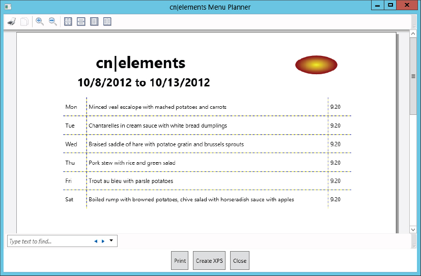
This section uses a sample application to create a fixed document programmatically by requesting user input for a menu plan. The data for the menu plan is the content of the fixed document. Figure 37-12 shows the main user interface of this application, where the user can select a day with the DatePicker class, enter menus for a week in a DataGrid, and click the Create Doc button to create a new FixedDocument. This application uses Page objects that are navigated within a NavigationWindow. Clicking the Create Doc button navigates to a new page that contains the fixed document.

The event handler for the Create Doc button, OnCreateDoc, navigates to a new page. To do this, the handler instantiates the new page, DocumentPage. This page includes a handler, NavigationService_LoadCompleted, that is assigned to the LoadCompleted event of the NavigationService. Within this handler the new page can access the content that is passed to the page. Then the navigation is done by invoking the Navigate method to page2. The new page receives the object menus that contains all the menu information needed to build the fixed page. menus is a readonly variable of type ObservableCollection<MenuEntry> (code file CreateXps/MenuPlannerPage.xaml.cs):
    private void OnCreateDoc(object sender, RoutedEventArgs e)
    {
      if (menus.Count == 0)
      {
        MessageBox.Show("Select a date first", "Menu Planner",
            MessageBoxButton.OK);
        return;
      }
      var page2 = new DocumentPage();
      NavigationService.LoadCompleted +=
          page2.NavigationService_LoadCompleted;
      NavigationService.Navigate(page2, menus);
    }
Within the DocumentPage, a DocumentViewer is used to provide read access to the fixed document. The fixed document is created in the method NavigationService_LoadCompleted. With the event handler, the data that is passed from the first page is received with the ExtraData property of NavigationEventArgs.
The received ObservableCollection<MenuEntry> is assigned to a menus variable that is used to build the fixed page (code file CreateXps/DocumentPage.xaml.cs):
    internal void NavigationService_LoadCompleted(object sender,
        NavigationEventArgs e)
    {
      menus = e.ExtraData as ObservableCollection<MenuEntry>;
      fixedDocument = new FixedDocument();
      var pageContent1 = new PageContent();
      fixedDocument.Pages.Add(pageContent1);
      var page1 = new FixedPage();
      pageContent1.Child = page1;
      page1.Children.Add(GetHeaderContent());
      page1.Children.Add(GetLogoContent());
      page1.Children.Add(GetDateContent());
      page1.Children.Add(GetMenuContent());
      viewer.Document = fixedDocument;
      NavigationService.LoadCompleted -= NavigationService_LoadCompleted;
    }
Fixed documents are created with the FixedDocument class. The FixedDocument element only contains PageContent elements that are accessible via the Pages property. The PageContent elements must be added to the document in the order in which they should appear on the page. PageContent defines the content of a single page.
PageContent has a Child property such that a FixedPage can be associated with it. To the FixedPage you can add elements of type UIElement to the Children collection. This is where you can add all the elements you’ve learned about in the last two chapters, including a TextBlock element that itself can contain Inline and Block elements.
In the sample code, the children to the FixedPage are created with helper methods GetHeaderContent, GetLogoContent, GetDateContent, and GetMenuContent.
The method GetHeaderContent creates a TextBlock that is returned. The TextBlock has the Inline element Bold added, which in turn has the Run element added. The Run element then contains the header text for the document. With FixedPage.SetLeft and FixedPage.SetTop the position of the TextBox within the fixed page is defined:
    private static UIElement GetHeaderContent()
    {
      var text1 = new TextBlock
      {
        FontFamily = new FontFamily("Segoe UI"),
        FontSize = 34,
        HorizontalAlignment = HorizontalAlignment.Center
      };
      text1.Inlines.Add(new Bold(new Run("cn|elements")));
      FixedPage.SetLeft(text1, 170);
      FixedPage.SetTop(text1, 40);
      return text1;
    }
The method GetLogoContent adds a logo in the form of an Ellipse with a RadialGradientBrush to the fixed document:
    private static UIElement GetLogoContent()
    {
      var ellipse = new Ellipse
      {
        Width = 90,
        Height = 40,
        Fill = new RadialGradientBrush(Colors.Yellow, Colors.DarkRed)
      };
      FixedPage.SetLeft(ellipse, 500);
      FixedPage.SetTop(ellipse, 50);
      return ellipse;
    }
The method GetDateContent accesses the menus collection to add a date range to the document:
    private UIElement GetDateContent()
    {
      Contract.Requires(menus != null);
      Contract.Requires(menus.Count > 0);

      string dateString = String.Format("{0:d} to {1:d}",
          menus[0].Day, menus[menus.Count - 1].Day);
      var text1 = new TextBlock
      {
        FontSize = 24,
        HorizontalAlignment = HorizontalAlignment.Center
      };
      text1.Inlines.Add(new Bold(new Run(dateString)));
      FixedPage.SetLeft(text1, 130);
      FixedPage.SetTop(text1, 90);
      return text1;
    }
Finally, the method GetMenuContent creates and returns a Grid control. This grid contains columns and rows that contain the date, menu, and price information:
    private UIElement GetMenuContent()
    {
      var grid1 = new Grid { ShowGridLines = true };

      grid1.ColumnDefinitions.Add(new ColumnDefinition
      { Width= new GridLength(50)});
      grid1.ColumnDefinitions.Add(new ColumnDefinition
      { Width = new GridLength(300)});
      grid1.ColumnDefinitions.Add(new ColumnDefinition
      { Width = new GridLength(70) });
      for (int i = 0; i < menus.Count; i++)
      {
        grid1.RowDefinitions.Add(new RowDefinition
        { Height = new GridLength(40) });
        var t1 = new TextBlock(new Run(String.Format(
                               "{0:ddd}", menus[i].Day)));
        var t2 = new TextBlock(new Run(menus[i].Menu));
        var t3 = new TextBlock(new Run(menus[i].Price.ToString()));
        var textBlocks = new TextBlock[] { t1, t2, t3 };

        for (int column = 0; column < textBlocks.Length; column++)
        {
          textBlocks[column].VerticalAlignment = VerticalAlignment.Center;
          textBlocks[column].Margin = new Thickness(5, 2, 5, 2);
          Grid.SetColumn(textBlocks[column], column);
          Grid.SetRow(textBlocks[column], i);
          grid1.Children.Add(textBlocks[column]);
        }
      }
      FixedPage.SetLeft(grid1, 100);
      FixedPage.SetTop(grid1, 140);
      return grid1;
    }
Run the application to see the created fixed document shown in Figure 37-13.
XPS DOCUMENTS
With Microsoft Word you can save a document as a PDF or a XPS file. XPS is the XML Paper Specification, a subset of WPF. Windows includes an XPS reader.
.NET includes classes and interfaces to read and write XPS documents with the namespaces System.Windows.Xps, System.Windows.Xps.Packaging, and System.IO.Packaging.
XPS is packaged in the zip file format, so you can easily analyze an XPS document by renaming a file with an .xps extension to .zip and opening the archive.
An XPS file requires a specific structure in the zipped document that is defined by the XML Paper Specifications (which you can download from http://www.microsoft.com/whdc/xps/xpsspec.mspx). The structure is based on the Open Packaging Convention (OPC) that Word documents (OOXML or Office Open XML) are based on as well. Within such a file you can find different folders for metadata, resources (such as fonts and pictures), and the document itself. Within the document folder of an XPS document is the XAML code representing the XPS subset of XAML.
To create an XPS document, you use the XpsDocument class from the namespace System.Windows.Xps.Packaging. To use this class, you need to reference the assembly ReachFramework as well. With this class you can add a thumbnail (AddThumbnail) and fixed document sequences (AddFixedDocumentSequence) to the document, as well as digitally sign the document. A fixed document sequence is written by using the interface IXpsFixedDocumentSequenceWriter, which in turn uses an IXpsFixedDocumentWriter to write the document within the sequence.
If a FixedDocument already exists, there’s an easier way to write the XPS document. Instead of adding every resource and every document page, you can use the class XpsDocumentWriter from the namespace System.Windows.Xps. For this class the assembly System.Printing must be referenced.
With the following code snippet you can see the handler to create the XPS document. First, a filename for the menu plan is created that uses a week number in addition to the name menuplan. The week number is calculated with the help of the GregorianCalendar class. Then the SaveFileDialog is opened to enable the user overwrite the created filename and select the directory where the file should be stored. The SaveFileDialog class is defined in the namespace Microsoft.Win32 and wraps the native file dialog. Then a new XpsDocument is created whose filename is passed to the constructor. Recall that the XPS file uses a .zip format to compress the content. With the CompressionOption you can specify whether the compression should be optimized for time or space.
Next, an XpsDocumentWriter is created with the help of the static method XpsDocument.CreateXpsDocumentWriter. The Write method of the XpsDocumentWriter is overloaded to accept different content or content parts to write the document. Examples of acceptable options with the Write method are FixedDocumentSequence, FixedDocument, FixedPage, string, and a DocumentPaginator. In the sample code, only the fixedDocument that was created earlier is passed:
    private void OnCreateXPS(object sender, RoutedEventArgs e)
    {
      var c = new GregorianCalendar();
      int weekNumber = c.GetWeekOfYear(menus[0].Day,
          CalendarWeekRule.FirstFourDayWeek, DayOfWeek.Monday);
      string fileName = String.Format("menuplan{0}", weekNumber);
      var dlg = new SaveFileDialog
      {
        FileName = fileName,
        DefaultExt = "xps",
        Filter = "XPS Documents|*.xps|All Files|*.*",
        AddExtension = true
      };
      if (dlg.ShowDialog() == true)
      {
        var doc = new XpsDocument(dlg.FileName, FileAccess.Write,
                                  CompressionOption.Fast);
        XpsDocumentWriter writer = XpsDocument.CreateXpsDocumentWriter(doc);
        writer.Write(fixedDocument);
        doc.Close();
      }
    }
By running the application to store the XPS document, you can view the document with an XPS viewer, as shown in Figure 37-14.

To one overload of the Write method of the XpsDocumentWriter you can also pass a Visual, which is the base class of UIElement, and thus you can pass any UIElement to the writer to create an XPS document easily. This functionality is used in the following printing example.
PRINTING
The simplest way to print a FixedDocument that is shown onscreen with the DocumentViewer is to invoke the Print method of the DocumentViewer with which the document is associated. This is all that needs to be done with the menu planner application in an OnPrint handler. The Print method of the DocumentViewer opens the PrintDialog and sends the associated FixedDocument to the selected printer (code file CreateXPS/DocumentPage.xaml.cs):
    private void OnPrint(object sender, RoutedEventArgs e)
    {
      viewer.Print();
    }
Printing with the PrintDialog
If you want more control over the printing process, the PrintDialog can be instantiated, and the document printed with the PrintDocument method. The PrintDocument method requires a DocumentPaginator with the first argument. The FixedDocument returns a DocumentPaginator object with the DocumentPaginator property. The second argument defines the string that appears with the current printer and in the printer dialogs for the print job:
      var dlg = new PrintDialog();
      if (dlg.ShowDialog() == true)
      {
        dlg.PrintDocument(fixedDocument.DocumentPaginator, "Menu Plan");
      }
Printing Visuals
It’s also simple to create UIElement objects. The following XAML code defines an Ellipse, a Rectangle, and a Button that is visually represented with two Ellipse elements. With the Button, there’s a Click handler OnPrint that starts the print job of the visual elements (XAML file PrintingDemo/MainWindow.xaml):
  <Canvas x:Name="canvas1">
    <Ellipse Canvas.Left="10" Canvas.Top="20" Width="180" Height="60"
        Stroke="Red" StrokeThickness="3" >
      <Ellipse.Fill>
        <RadialGradientBrush>
          <GradientStop Offset="0" Color="LightBlue" />
          <GradientStop Offset="1" Color="DarkBlue" />
        </RadialGradientBrush>
      </Ellipse.Fill>
    </Ellipse>
    <Rectangle Width="180" Height="90" Canvas.Left="50" Canvas.Top="50">
      <Rectangle.LayoutTransform>
        <RotateTransform Angle="30" />
      </Rectangle.LayoutTransform>
      <Rectangle.Fill>
        <LinearGradientBrush>
          <GradientStop Offset="0" Color="Aquamarine" />
          <GradientStop Offset="1" Color="ForestGreen" />
        </LinearGradientBrush>
      </Rectangle.Fill>
      <Rectangle.Stroke>
        <LinearGradientBrush>
          <GradientStop Offset="0" Color="LawnGreen" />
          <GradientStop Offset="1" Color="SeaGreen" />
        </LinearGradientBrush>
      </Rectangle.Stroke>
    </Rectangle>
    <Button Canvas.Left="90" Canvas.Top="190" Content="Print" Click="OnPrint">
      <Button.Template>
        <ControlTemplate TargetType="Button">
          <Grid>
            <Grid.RowDefinitions>
              <RowDefinition />
              <RowDefinition />
            </Grid.RowDefinitions>
            <Ellipse Grid.Row="0" Grid.RowSpan="2" Width="60"
                Height="40" Fill="Yellow" />
            <Ellipse Grid.Row="0" Width="52" Height="20"
                HorizontalAlignment="Center">
              <Ellipse.Fill>
                <LinearGradientBrush StartPoint="0.5,0" EndPoint="0.5,1">
                  <GradientStop Color="White" Offset="0" />
                  <GradientStop Color="Transparent" Offset="0.9" />
                </LinearGradientBrush>
              </Ellipse.Fill>
            </Ellipse>
            <ContentPresenter Grid.Row="0" Grid.RowSpan="2"
                HorizontalAlignment="Center"
                VerticalAlignment="Center" />
          </Grid>
        </ControlTemplate>
      </Button.Template>
    </Button>
  </Canvas>
In the OnPrint handler, the print job can be started by invoking the PrintVisual method of the PrintDialog. PrintVisual accepts any object that derives from the base class Visual (code file PrintingDemo/MainWindow.xaml.cs):
        private void OnPrint(object sender, RoutedEventArgs e)
        {
            var dlg = new PrintDialog();
            if (dlg.ShowDialog() == true)
            {
                dlg.PrintVisual(canvas1, "Print Demo");

            }
        }
To programmatically print without user intervention, the PrintDialog classes from the namespace System.Printing can be used to create a print job and adjust print settings. The class LocalPrintServer provides information about print queues and returns the default PrintQueue with the DefaultPrintQueue property. You can configure the print job with a PrintTicket. PrintQueue.DefaultPrintTicket returns a default PrintTicket that is associated with the queue. The PrintQueue method GetPrintCapabilities returns the capabilities of a printer, and depending on those you can configure the PrintTicket as shown in the following code segment. After configuration of the print ticket is complete, the static method PrintQueue.CreateXpsDocumentWriter returns an XpsDocumentWriter object. The XpsDocumentWriter class was used previously to create an XPS document. You can also use it to start a print job. The Write method of the XpsDocumentWriter accepts not only a Visual or FixedDocument as the first argument but also a PrintTicket as the second argument. If a PrintTicket is passed with the second argument, the target of the writer is the printer associated with the ticket and thus the writer sends the print job to the printer:
      var printServer = new LocalPrintServer();
      PrintQueue queue = printServer.DefaultPrintQueue;
      PrintTicket ticket = queue.DefaultPrintTicket;
      PrintCapabilities capabilities =
          queue.GetPrintCapabilities(ticket);
      if (capabilities.DuplexingCapability.Contains(
          Duplexing.TwoSidedLongEdge))
        ticket.Duplexing = Duplexing.TwoSidedLongEdge;
      if (capabilities.InputBinCapability.Contains(InputBin.AutoSelect))
        ticket.InputBin = InputBin.AutoSelect;
      if (capabilities.MaxCopyCount > 3)
        ticket.CopyCount = 3;
      if (capabilities.PageOrientationCapability.Contains(
          PageOrientation.Landscape))
        ticket.PageOrientation = PageOrientation.Landscape;
      if (capabilities.PagesPerSheetCapability.Contains(2))
        ticket.PagesPerSheet = 2;
      if (capabilities.StaplingCapability.Contains(Stapling.StapleBottomLeft))
        ticket.Stapling = Stapling.StapleBottomLeft;
      XpsDocumentWriter writer = PrintQueue.CreateXpsDocumentWriter(queue);
      writer.Write(canvas1, ticket);
SUMMARY
In this chapter you learned how WPF capabilities can be used with documents, how to create flow documents that adjust automatically depending on the screen sizes, and fixed documents that always look the same. You’ve also seen how to print documents and how to send visual elements to the printer.
The next chapter continues with XAML, showing how it can be used with Windows 8 applications.