
Chapter 36
Business Applications with WPF
WHAT’S IN THIS CHAPTER?
- Menu and ribbon controls
- Using commanding for input handling
- Data binding to elements, objects, lists, and XML
- Value conversions and validation
- Using the TreeView to display hierarchical data
- Displaying and grouping data with the DataGrid
- Live shaping with the Collection View Source
WROX.COM CODE DOWNLOADS FOR THIS CHAPTER
The wrox.com code downloads for this chapter are found at http://www.wrox.com/remtitle.cgi?isbn=1118314425 on the Download Code tab. The code for this chapter is divided into the following major examples:
- Books Demo
- Multi Binding Demo
- Priority Binding Demo
- XML Binding Demo
- Validation Demo
- Formula 1 Demo
- Live Shaping
INTRODUCTION
In the previous chapter you read about some of the core functionality of WPF. This chapter continues the journey through WPF. Here you read about important aspects for creating complete applications, such as data binding and command handling, and about the DataGrid control. Data binding is an important concept for bringing data from .NET classes into the user interface, and allowing the user to change data. WPF not only allows binding to simple entities or lists, but also offers binding of one UI property to multiple properties of possible different types with multi binding and priority binding that you’ll learn here as well. Along with data binding it is also important to validate data entered by a user. Here, you can read about different ways for validation including the interface INotifyDataErrorInfo that is new with .NET 4.5. Also covered in this chapter is commanding, which enables mapping events from the UI to code. In contrast to the event model, this provides a better separation between XAML and code. You will learn about using predefined commands and creating custom commands.
The TreeView and DataGrid controls are UI controls to display bound data. You will see the TreeView control to display data in the tree where data is loaded dynamically depending on the selection of the user. With the DataGrid control you will learn how to using filtering, sorting, and grouping, as well as one new .NET 4.5 feature named live shaping that allows changing sorting or filtering options to change in real time.
To begin let’s start with the Menu and the Ribbon controls. The Ribbon control made it into the release of .NET 4.5.
MENU AND RIBBON CONTROLS
Many data-driven applications contain menus and toolbars or ribbon controls to enable users to control actions. With WPF 4.5, ribbon controls are now available as well, so both menu and ribbon controls are covered here.
In this section, you create a new WPF application named BooksDemo to use throughout this chapter — not only with menu and ribbon controls but also with commanding and data binding. This application displays a single book, a list of books, and a grid of books. Actions are started from menu or ribbon controls to which commands associated.
Menu Controls
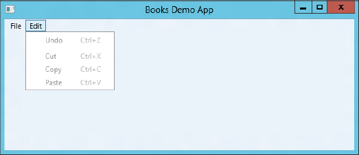
Menus can easily be created with WPF using the Menu and MenuItem elements, as shown in the following code snippet containing two main menu items, File and Edit, and a list of submenu entries. The _ in front of the characters marks the special character that can be used to access the menu item easily without using the mouse. Using the Alt key makes these characters visible and enables access to the menu with this character. Some of these menu items have a command assigned, as discussed in the next section (XAML file BooksDemo/MainWindow.xaml):
<Window x:Class="Wrox.ProCSharp.WPF.MainWindow"
xmlns="http://schemas.microsoft.com/winfx/2006/xaml/presentation"
xmlns:x="http://schemas.microsoft.com/winfx/2006/xaml"
xmlns:local="clr-namespace:Wrox.ProCSharp.WPF"
Title="Books Demo App" Height="400" Width="600">
<DockPanel>
<Menu DockPanel.Dock="Top">
<MenuItem Header="_File">
<MenuItem Header="Show _Book" />
<MenuItem Header="Show Book_s" />
<Separator />
<MenuItem Header="E_xit" />
</MenuItem>
<MenuItem Header="_Edit">
<MenuItem Header="Undo" Command="Undo" />
<Separator />
<MenuItem Header="Cut" Command="Cut" />
<MenuItem Header="Copy" Command="Copy" />
<MenuItem Header="Paste" Command="Paste" />
</MenuItem>
</Menu>
</DockPanel>
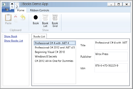
</Window>Running the application results in the menus shown in Figure 36-1. The menus are not active yet because commands are not active.
Ribbon Controls
Microsoft Office was the first application released with Microsoft’s newly invented ribbon control. Shortly after its introduction, many users of previous versions of Office complained that they could not find the actions they wanted with the new UI. New Office users who had no experience with the previous user interface had a better experience with the new UI, easily finding actions that users of previous versions found hard to detect.
Of course, nowadays the ribbon control is very common in many applications. With Windows 8, the ribbon can be found in tools delivered with the operating system, e.g., Windows Explorer, Paint, and WordPad.
The WPF ribbon control is in the namespace System.Windows.Controls.Ribbon and requires referencing the assembly system.windows.controls.ribbon.
Figure 36-2 shows the ribbon control of the sample application. In the topmost line left of the title is the quick access toolbar. The leftmost item in the second line is the application menu, followed by two ribbon tabs: Home and Ribbon Controls. The Home tab, which is selected, shows two groups: Clipboard and Show. Both of these groups contain some button controls.
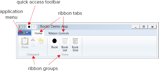
The Ribbon control is defined in the following code snippet. The first children of the Ribbon element are defined by the QuickAccessToolBar property. This toolbar contains two RibbonButton controls with small images referenced. These buttons provide users with direct access to quickly and easily fulfill actions:
    <Ribbon DockPanel.Dock="Top">
      <Ribbon.QuickAccessToolBar>
        <RibbonQuickAccessToolBar>
          <RibbonButton SmallImageSource="Images/one.png" />
          <RibbonButton SmallImageSource="Images/list.png" />
        </RibbonQuickAccessToolBar>
      </Ribbon.QuickAccessToolBar>
To get these buttons from the quick access toolbar directly to the chrome of the Window, the base class needs to be changed to the RibbonWindow class instead of the Window class (code file BooksDemo/MainWindow.xaml.cs):
  public partial class MainWindow : RibbonWindow
  {
Changing the base class with the code-behind also requires a change in the XAML code to use the RibbonWindow element:
<RibbonWindow x:Class="Wrox.ProCSharp.WPF.MainWindow"
        xmlns="http://schemas.microsoft.com/winfx/2006/xaml/presentation"
        xmlns:x="http://schemas.microsoft.com/winfx/2006/xaml"
        xmlns:local="clr-namespace:Wrox.ProCSharp.WPF"
        Title="Books Demo App" Height="400" Width="600">
The application menu is defined by using the ApplicationMenu property. The application menu defines two menu entries — the first one to show a book, the second one to close the application:
      <Ribbon.ApplicationMenu>
        <RibbonApplicationMenu SmallImageSource="Images/books.png" >
          <RibbonApplicationMenuItem Header="Show _Book" />
          <RibbonSeparator />
          <RibbonApplicationMenuItem Header="Exit" Command="Close" />
        </RibbonApplicationMenu>
      </Ribbon.ApplicationMenu>
After the application menu, the content of the Ribbon control is defined by using RibbonTab elements. The title of the tab is defined with the Header property. The RibbonTab contains two RibbonGroup elements. Each of the RibbonGroup elements contains RibbonButton elements. With the buttons, a Label can be set to display a text and either SmallImageSource or LargeImageSource properties for displaying an image:
      <RibbonTab Header="Home">
        <RibbonGroup Header="Clipboard">
          <RibbonButton Command="Paste" Label="Paste"
              LargeImageSource="Images/paste.png" />
          <RibbonButton Command="Cut" SmallImageSource="Images/cut.png" />
          <RibbonButton Command="Copy" SmallImageSource="Images/copy.png" />
          <RibbonButton Command="Undo" LargeImageSource="Images/undo.png" />
        </RibbonGroup>
        <RibbonGroup Header="Show">
          <RibbonButton LargeImageSource="Images/one.png" Label="Book" />
          <RibbonButton LargeImageSource="Images/list.png" Label="Book List" />
          <RibbonButton LargeImageSource="Images/grid.png" Label="Book Grid" />
        </RibbonGroup>
      </RibbonTab>
The second RibbonTab is just used to demonstrate different controls that can be used within a ribbon control, for example, text box, check box, combo box, split button, and gallery elements. Figure 36-3 shows this tab open.

      <RibbonTab Header="Ribbon Controls">
        <RibbonGroup Header="Sample">
          <RibbonButton Label="Button" />
          <RibbonCheckBox Label="Checkbox" />
          <RibbonComboBox Label="Combo1">
            <Label>One</Label>
            <Label>Two</Label>
          </RibbonComboBox>
          <RibbonTextBox>Text Box </RibbonTextBox>
          <RibbonSplitButton Label="Split Button">
            <RibbonMenuItem Header="One" />
            <RibbonMenuItem Header="Two" />
          </RibbonSplitButton>
          <RibbonComboBox Label="Combo2" IsEditable="False">
            <RibbonGallery SelectedValuePath="Content" MaxColumnCount="1"
                SelectedValue="Green">
              <RibbonGalleryCategory>
                <RibbonGalleryItem Content="Red" Foreground="Red" />
                <RibbonGalleryItem Content="Green" Foreground="Green" />
                <RibbonGalleryItem Content="Blue" Foreground="Blue" />
              </RibbonGalleryCategory>
            </RibbonGallery>
          </RibbonComboBox>
        </RibbonGroup>
</RibbonTab>COMMANDING
Commanding is a WPF concept that creates a loose coupling between the source of an action (for example, a button) and the target that does the work (for example, a handler method). This concept is based on the Command pattern from the Gang of Four. Events are strongly coupled (at least with XAML 2006). Compiling the XAML code that includes references to events requires that the code-behind have a handler implemented and available at compile time. With commands, the coupling is loose.
The action that is executed is defined by a command object. Commands implement the interface ICommand. Command classes that are used by WPF are RoutedCommand and a class that derives from it, RoutedUICommand. RoutedUICommand defines an additional Text property that is not defined by ICommand. This property can be used as textual information in the UI. ICommand defines the methods Execute and CanExecute, which are executed on a target object.
The command source is an object that invokes the command. Command sources implement the interface ICommandSource. Examples of such command sources are button classes that derive from ButtonBase, Hyperlink, and InputBinding. KeyBinding and MouseBinding are examples of InputBinding derived classes. Command sources have a Command property whereby a command object implementing ICommand can be assigned. This fires the command when the control is used, such as with the click of a button.
The command target is an object that implements a handler to perform the action. With command binding, a mapping is defined to map the handler to a command. Command bindings define what handler is invoked on a command. Command bindings are defined by the CommandBinding property that is implemented in the UIElement class. Thus, every class that derives from UIElement has the CommandBinding property. This makes finding the mapped handler a hierarchical process. For example, a button that is defined within a StackPanel that is inside a ListBox — which itself is inside a Grid — can fire a command. The handler is specified with command bindings somewhere up the tree — such as with command bindings of a Window. The next section changes the implementation of the BooksDemo project to use commands.
Defining Commands
.NET gives you classes that return predefined commands. The ApplicationCommands class defines the static properties New, Open, Close, Print, Cut, Copy, Paste, and others. These properties return RoutedUICommand objects that can be used for a specific purpose. Other classes offering commands are NavigationCommands and MediaCommands. NavigationCommands is self-explanatory, providing commands that are common for navigation such as GoToPage, NextPage, and PreviousPage. MediaCommands are useful for running a media player, with Play, Pause, Stop, Rewind, and Record.
It’s not hard to define custom commands that fulfill application domain–specific actions. For this, the BooksCommands class is created, which returns RoutedUICommands with the ShowBook and ShowBooksList properties. You can also assign an input gesture to a command, such as KeyGesture or MouseGesture. In the following example, a KeyGesture is assigned that defines the key B with the Alt modifier. An input gesture is a command source, so clicking the Alt+B combination invokes the command (code file BooksDemo/BooksCommands.cs):
  public static class BooksCommands
  {
    private static RoutedUICommand showBook;
    public static ICommand ShowBook
    {
      get
      {
        return showBook ?? (showBook = new RoutedUICommand("Show Book",
            "ShowBook", typeof(BooksCommands)));
      }
    }

    private static RoutedUICommand showBooksList;
    public static ICommand ShowBooksList
    {
      get
      {
        if (showBooksList == null)
        {
          showBooksList = new RoutedUICommand("Show Books", "ShowBooks",
              typeof(BooksCommands));
          showBook.InputGestures.Add(new KeyGesture(Key.B, ModifierKeys.Alt));
        }
        return showBooksList;
      }
    }
  }
Defining Command Sources
Every class that implements the ICommandSource interface can be a source of commands, such as Button and MenuItem. Inside the Ribbon control created earlier, the Command property is assigned to several RibbonButton elements, e.g., in the quick access toolbar, as shown in the following code snippet (XAML file BooksDemo/MainWindow.xaml):
      <Ribbon.QuickAccessToolBar>
        <RibbonQuickAccessToolBar>
          <RibbonButton SmallImageSource="Images/one.png"
              Command="local:BooksCommands.ShowBook" />
          <RibbonButton SmallImageSource="Images/list.png"
              Command="local:BooksCommands.ShowBooksList" />
        </RibbonQuickAccessToolBar>
      </Ribbon.QuickAccessToolBar>
Predefined commands such as ApplicationCommands.Cut, Copy, and Paste are assigned to the Command property of RibbonButton elements as well. With the predefined commands the shorthand notation is used:
        <RibbonGroup Header="Clipboard">
          <RibbonButton Command="Paste" Label="Paste"
              LargeImageSource="Images/paste.png" />
          <RibbonButton Command="Cut" SmallImageSource="Images/cut.png" />
          <RibbonButton Command="Copy" SmallImageSource="Images/copy.png" />
          <RibbonButton Command="Undo" LargeImageSource="Images/undo.png" />
        </RibbonGroup>
Command Bindings
Command bindings need to be added to connect them to handler methods. In the following example, the command bindings are defined within the Window element so these bindings are available to all elements within the window. When the command ApplicationCommands.Close is executed, the OnClose method is invoked. When the command BooksCommands.ShowBooks is executed, the OnShowBooks method is called:
  <Window.CommandBindings>
    <CommandBinding Command="Close" Executed="OnClose" />
    <CommandBinding Command="local:BooksCommands.ShowBooksList"
        Executed="OnShowBooksList" />
  </Window.CommandBindings>
With command binding you can also specify the CanExecute property, whereby a method is invoked to verify whether the command is available. For example, if a file is not changed, the ApplicationCommands.Save command could be unavailable.
The handler needs to be defined with an object parameter, for the sender, and ExecutedRoutedEventArgs, where information about the command can be accessed (code file BooksDemo/MainWindow.xaml.cs):
    private void OnClose(object sender, ExecutedRoutedEventArgs e)
    {
      Application.Current.Shutdown();
}Command bindings can also be defined by controls. The TextBox control defines bindings for ApplicationCommands.Cut, ApplicationCommands.Copy, ApplicationCommands.Paste, and ApplicationCommands.Undo. This way, you only need to specify the command source and use the existing functionality within the TextBox control.
DATA BINDING
WPF data binding takes another huge step forward compared with previous technologies. Data binding gets data from .NET objects for the UI or the other way around. Simple objects can be bound to UI elements, lists of objects, and XAML elements themselves. With WPF data binding, the target can be any dependency property of a WPF element, and every property of a CLR object can be the source. Because a WPF element is implemented as a .NET class, every WPF element can be the source as well. Figure 36-4 shows the connection between the source and the target. The Binding object defines the connection.

Binding supports several binding modes between the target and source. With one-way binding, the source information goes to the target but if the user changes information in the user interface, the source is not updated. For updates to the source, two-way binding is required.
The following table shows the binding modes and their requirements.
| BINDING MODE | DESCRIPTION |
| One-time | Binding goes from the source to the target and occurs only once when the application is started or the data context changes. Here, you get a snapshot of the data. |
| One-way | Binding goes from the source to the target. This is useful for read-only data, because it is not possible to change the data from the user interface. To get updates to the user interface, the source must implement the interface INotifyPropertyChanged. |
| Two-way | With two-way binding, the user can make changes to the data from the UI. Binding occurs in both directions — from the source to the target and from the target to the source. The source needs to implement read/write properties so that changes can be updated from the UI to the source. |
| One-way-to-source | With one-way-to-source binding, if the target property changes, the source object is updated. |
WPF data binding involves many facets besides the binding modes. This section provides details on binding to XAML elements, binding to simple .NET objects, and binding to lists. Using change notifications, the UI is updated with changes in the bound objects. The material presented here discusses getting the data from object data providers and directly from the code. Multibinding and priority binding demonstrate different binding possibilities other than the default binding. This section also describes dynamically selecting data templates, and validation of binding values.
Let’s start with the BooksDemo sample application.
BooksDemo Application Content
In the previous sections, a ribbon and commands have been defined with the BooksDemo application. Now content is added. Change the XAML file MainWindow.xaml by adding a ListBox, a Hyperlink, and a TabControl (XAML file BooksDemo/MainWindow.xaml):
    <ListBox DockPanel.Dock="Left" Margin="5" MinWidth="120">
      <Hyperlink Click="OnShowBook">Show Book</Hyperlink>
    </ListBox>
    <TabControl Margin="5" x:Name="tabControl1">
    </TabControl>
Now add a WPF user control named BookUC. This user control contains a DockPanel, a Grid with several rows and columns, a Label, and TextBox controls (XAML file BooksDemo/BookUC.xaml):
<UserControl x:Class="Wrox.ProCSharp.WPF.BookUC"
    xmlns="http://schemas.microsoft.com/winfx/2006/xaml/presentation"
    xmlns:x="http://schemas.microsoft.com/winfx/2006/xaml"
    xmlns:mc="http://schemas.openxmlformats.org/markup-compatibility/2006"
    xmlns:d="http://schemas.microsoft.com/expression/blend/2008"
    mc:Ignorable="d"
    d:DesignHeight="300" d:DesignWidth="300">
  <DockPanel>
    <Grid>
      <Grid.RowDefinitions>
        <RowDefinition />
        <RowDefinition />
        <RowDefinition />
        <RowDefinition />
      </Grid.RowDefinitions>
      <Grid.ColumnDefinitions>
        <ColumnDefinition Width="Auto" />
        <ColumnDefinition Width="*" />
      </Grid.ColumnDefinitions>
      <Label Content="Title" Grid.Row="0" Grid.Column="0" Margin="10,0,5,0"
          HorizontalAlignment="Left" VerticalAlignment="Center" />
      <Label Content="Publisher" Grid.Row="1" Grid.Column="0"
          Margin="10,0,5,0" HorizontalAlignment="Left"
          VerticalAlignment="Center" />
      <Label Content="Isbn" Grid.Row="2" Grid.Column="0"
          Margin="10,0,5,0" HorizontalAlignment="Left"
          VerticalAlignment="Center" />
      <TextBox Grid.Row="0" Grid.Column="1" Margin="5" />
      <TextBox Grid.Row="1" Grid.Column="1" Margin="5" />
      <TextBox Grid.Row="2" Grid.Column="1" Margin="5" />
      <StackPanel Grid.Row="3" Grid.Column="0" Grid.ColumnSpan="2">
        <Button Content="Show Book" Margin="5" Click="OnShowBook" />
      </StackPanel>
    </Grid>
  </DockPanel>
</UserControl>
Within the OnShowBook handler in the MainWindow.xaml.cs, create a new instance of the user control BookUC and add a new TabItem to the TabControl. Then change the SelectedIndex property of the TabControl to open the new tab (code file BooksDemo/MainWindow.xaml.cs):
    private void OnShowBook(object sender, ExecutedRoutedEventArgs e)
    {
      var bookUI = new BookUC();
      this.tabControl1.SelectedIndex = this.tabControl1.Items.Add(
          new TabItem { Header = "Book", Content = bookUI });
    }
After building the project you can start the application and open the user control within the TabControl by clicking the hyperlink.
Binding with XAML
In addition to being the target for data binding, a WPF element can also be the source. You can bind the source property of one WPF element to the target of another WPF element.
In the following code example, data binding is used to resize the controls within the user control with a slider. You add a StackPanel control to the user control BookUC, which contains a Label and a Slider control. The Slider control defines Minimum and Maximum values that define the scale, and an initial value of 1 is assigned to the Value property (XAML file BooksDemo/BooksUC.xaml):
  <DockPanel>
    <StackPanel DockPanel.Dock="Bottom" Orientation="Horizontal"
        HorizontalAlignment="Right">
      <Label Content="Resize" />
      <Slider x:Name="slider1" Value="1" Minimum="0.4" Maximum="3"
          Width="150" HorizontalAlignment="Right" />
    </StackPanel>
Now you set the LayoutTransform property of the Grid control and add a ScaleTransform element. With the ScaleTransform element, the ScaleX and ScaleY properties are data bound. Both properties are set with the Binding markup extension. In the Binding markup extension, the ElementName is set to slider1 to reference the previously created Slider control. The Path property is set to the Value property to get the value of the slider:
    <Grid>
      <Grid.LayoutTransform>
        <ScaleTransform x:Name="scale1"
            ScaleX="{Binding Path=Value, ElementName=slider1}"
            ScaleY="{Binding Path=Value, ElementName=slider1}" />
      </Grid.LayoutTransform>
When running the application, you can move the slider and thus resize the controls within the Grid, as shown in Figures 36-5 and 36-6.
Rather than define the binding information with XAML code, as shown in the preceding code with the Binding metadata extension, you can do it with code-behind. With code-behind you have to create a new Binding object and set the Path and Source properties. The Source property must be set to the source object; here, it is the WPF object slider1. The Path is set to a PropertyPath instance that is initialized with the name of the property of the source object, Value. With controls that derive from FrameworkElement, you can invoke the method SetBinding to define the binding. However, ScaleTransform does not derive from FrameworkElement but from the Freezable base class instead. Use the helper class BindingOperations to bind such controls. The SetBinding method of the BindingOperations class requires a DependencyObject — which is the ScaleTransform instance in the example. With the second and third argument, the SetBinding method requires the dependency property of the target (which should be bound), and the Binding object:
      var binding = new Binding
      {
        Path = new PropertyPath("Value"),
        Source = slider1
      };
      BindingOperations.SetBinding(scale1, ScaleTransform.ScaleXProperty,
          binding);
      BindingOperations.SetBinding(scale1, ScaleTransform.ScaleYProperty,
binding);You can configure a number of binding options with the Binding class, as described in the following table:
| BINDING CLASS MEMBERS | DESCRIPTION |
| Source | Use this property to define the source object for data binding. |
| RelativeSource | Specify the source in relation to the target object. This is useful to display error messages when the source of the error comes from the same control. |
| ElementName | If the source is a WPF element, you can specify the source with the ElementName property. |
| Path | Use this property to specify the path to the source object. This can be the property of the source object, but indexers and properties of child elements are also supported. |
| XPath | With an XML data source, you can define an XPath query expression to get the data for binding. |
| Mode | The mode defines the direction for the binding. The Mode property is of type BindingMode. BindingMode is an enumeration with the following values: Default, OneTime, OneWay, TwoWay, and OneWayToSource. The default mode depends on the target: with a TextBox, two-way binding is the default; with a Label that is read-only, the default is one-way. OneTime means that the data is only init loaded from the source; OneWay updates from the source to the target. With TwoWay binding, changes from the WPF elements are written back to the source. OneWayToSource means that the data is never read but always written from the target to the source. |
| Converter | Use this property to specify a converter class that converts the data for the UI and back. The converter class must implement the interface IValueConverter, which defines the methods Convert and ConvertBack. You can pass parameters to the converter methods with the ConverterParameter property. The converter can be culture-sensitive; and the culture can be set with the ConverterCulture property. |
| FallbackValue | Use this property to define a default value that is used if binding doesn’t return a value. |
| ValidationRules | Using this property, you can define a collection of ValidationRule objects that are checked before the source is updated from the WPF target elements. The class ExceptionValidationRule is derived from the class ValidationRule and checks for exceptions. |
| Delay | This property is new with WPF 4.5. It enables you to specify an amount of time to wait before the binding source is updated. This can be used in scenarios where you want to give the user some time to enter more characters before starting a validation. |
Simple Object Binding
To bind to CLR objects, with the .NET classes you just have to define properties, as shown in the Book class example and the properties Title, Publisher, Isbn, and Authors. This class is in the Data folder of the BooksDemo project (code file BooksDemo/Data/Book.cs).
using System.Collections.Generic;

namespace Wrox.ProCSharp.WPF.Data
{
  public class Book
  {
    public Book(string title, string publisher, string isbn,
                params string[] authors)
    {
      this.Title = title;
      this.Publisher = publisher;
      this.Isbn = isbn;
      this.authors.AddRange(authors);
    }
    public Book()
      : this("unknown", "unknown", "unknown")
    {
    }
    public string Title { get; set; }
    public string Publisher { get; set; }
    public string Isbn { get; set; }

    private readonly List<string> authors = new List<string>();
    public string[] Authors
    {
      get
      {
        return authors.ToArray();
      }
    }

    public override string ToString()
    {
      return Title;
    }
  }
}
In the XAML code of the user control BookUC, several labels and TextBox controls are defined to display book information. Using Binding markup extensions, the TextBox controls are bound to the properties of the Book class. With the Binding markup extension, nothing more than the Path property is defined to bind it to the property of the Book class. There’s no need to define a source because the source is defined by assigning the DataContext, as shown in the code-behind that follows. The mode is defined by its default with the TextBox element, and this is two-way binding (XAML file BooksDemo/BookUC.xaml):
    <TextBox Text="{Binding Title}" Grid.Row="0" Grid.Column="1" Margin="5" />
    <TextBox Text="{Binding Publisher}" Grid.Row="1" Grid.Column="1" Margin="5" />
    <TextBox Text="{Binding Isbn}" Grid.Row="2" Grid.Column="1" Margin="5" />
With the code-behind, a new Book object is created, and the book is assigned to the DataContext property of the user control. DataContext is a dependency property that is defined with the base class FrameworkElement. Assigning the DataContext with the user control means that every element in the user control has a default binding to the same data context (code file BooksDemo/MainWindow.xaml.cs):
private void OnShowBook(object sender, ExecutedRoutedEventArgs e)
{
var bookUI = new BookUC();
bookUI.DataContext = new Book
{
Title = "Professional C# 4 and .NET 4",
Publisher = "Wrox Press",
Isbn = "978-0-470-50225-9"
};
this.tabControl1.SelectedIndex =
this.tabControl1.Items.Add(
new TabItem { Header = "Book", Content = bookUI });
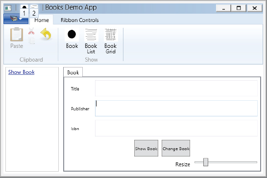
}After starting the application, you can see the bound data, as shown in Figure 36-7.

To see two-way binding in action (changes to the input of the WPF element are reflected inside the CLR object), the Click event handler of the button in the user control, the OnShowBook method, is implemented. When implemented, a message box pops up to show the current title and ISBN number of the book1 object. Figure 36-8 shows the output from the message box after a change to the input was made during runtime (code file BooksDemo/BookUC.xaml.cs):

    private void OnShowBook(object sender, RoutedEventArgs e)
    {
      Book theBook = this.DataContext as Book;
      if (theBook != null)
        MessageBox.Show(theBook.Title, theBook.Isbn);
    }
Change Notification
With the current two-way binding, the data is read from the object and written back. However, if data is not changed by the user, but is instead changed directly from the code, the UI does not receive the change information. You can easily verify this by adding a button to the user control and implementing the Click event handler OnChangeBook (XAML file BooksDemo/BookUC.xaml):
      <StackPanel Grid.Row="3" Grid.Column="0" Grid.ColumnSpan="2"
                  Orientation="Horizontal" HorizontalAlignment="Center">
        <Button Content="Show Book" Margin="5" Click="OnShowBook" />
        <Button Content="Change Book" Margin="5" Click="OnChangeBook" />
      </StackPanel>
Within the implementation of the handler, the book inside the data context is changed but the user interface doesn’t show the change (code file BooksDemo/BookUC.xaml.cs):
    private void OnChangeBook(object sender, RoutedEventArgs e)
    {
      Book theBook = this.DataContext as Book;
      if (theBook != null)
      {
        theBook.Title = "Professional C# 5";
        theBook.Isbn = "978-0-470-31442-5";
      }
    }
To get change information to the user interface, the entity class must implement the interface INotifyPropertyChanged. Instead of having an implementation with every class that needs this interface, the abstract base class BindableObject is created. This base class implements the interface INotifyPropertyChanged. The interface defines the event PropertyChanged, which is fired from the OnPropertyChanged method. As a convenience for firing the event from the property setters from the derived classes, the method SetProperty makes the change of the property and invokes the method OnPropertyChanged to fire the event. This method makes use of the caller information feature from C# using the attribute CallerMemberName. Defining the parameter propertyName as an optional parameter with this attribute, the C# compiler passes the name of the property with this parameter, so it’s not necessary to add a hard-coded string to the code (code file BooksDemo/Data/BindableObject.cs):
using System.Collections.Generic;
using System.ComponentModel;
using System.Runtime.CompilerServices;

namespace Wrox.ProCSharp.WPF.Data
{
  public abstract class BindableObject : INotifyPropertyChanged
  {
    public event PropertyChangedEventHandler PropertyChanged;
    protected void OnPropertyChanged(string propertyName)
    {
      var propertyChanged = PropertyChanged;
      if (propertyChanged != null)
      {
        PropertyChanged(this, new PropertyChangedEventArgs(propertyName));
      }
    }

    protected void SetProperty<T>(ref T item, T value,
        [CallerMemberName] string propertyName = null)
    {
      if (!EqualityComparer<T>.Default.Equals(item, value))
      {
        item = value;
        OnPropertyChanged(propertyName);
      }
    }
  }
}The class Book is now changed to derive from the base class BindableObject in order to inherit the implementation of the interface INotifyPropertyChanged. The property setters are changed to invoke the SetProperty method, as shown here (code file BooksDemo/Data/Book.cs):
using System.ComponentModel;
using System.Collections.Generic;

namespace Wrox.ProCSharp.WPF.Data
{
  public class Book : BindableObject
  {
    public Book(string title, string publisher, string isbn,
               params string[] authors)
    {
      this.title = title;
      this.publisher = publisher;
      this.isbn = isbn;
      this.authors.AddRange(authors);
    }
    public Book()
      : this("unknown", "unknown", "unknown")
    {
    }

    private string title;
    public string Title {
      get
      {
        return title;
      }
      set
      {
        SetProperty(ref title, value);
      }
    }

    private string publisher;
    public string Publisher
    {
      get
      {
        return publisher;
      }
      set
      {
        SetProperty(ref publisher, value);
      }
    }
    private string isbn;
    public string Isbn
    {
      get
      {
        return isbn;
      }
      set
      {
        SetProperty(ref isbn, value);
      }
    }

    private readonly List<string> authors = new List<string>();
    public string[] Authors
    {
      get
      {
        return authors.ToArray();
      }
    }

    public override string ToString()
    {
      return this.title;
    }
  }
}
With this change, the application can be started again to verify that the user interface is updated following a change notification in the event handler.
Object Data Provider
Instead of instantiating the object in code-behind, you can do this with XAML. To reference a class from code-behind within XAML, you have to reference the namespace with the namespace declarations in the XML root element. The XML attribute xmlns:local="clr-namespace:Wrox.ProCsharp.WPF" assigns the .NET namespace Wrox.ProCSharp.WPF to the XML namespace alias local.
One object of the Book class is now defined with the Book element inside the DockPanel resources. By assigning values to the XML attributes Title, Publisher, and Isbn, you set the values of the properties from the Book class. x:Key="theBook" defines the identifier for the resource so that you can reference the book object (XAML file BooksDemo/BookUC.xaml):
<UserControl x:Class="Wrox.ProCSharp.WPF.BookUC"
    xmlns="http://schemas.microsoft.com/winfx/2006/xaml/presentation"
    xmlns:x="http://schemas.microsoft.com/winfx/2006/xaml"
    xmlns:mc="http://schemas.openxmlformats.org/markup-compatibility/2006"
    xmlns:d="http://schemas.microsoft.com/expression/blend/2008"
    xmlns:local="clr-namespace:Wrox.ProCSharp.WPF.Data"
    mc:Ignorable="d"
    d:DesignHeight="300" d:DesignWidth="300">
  <DockPanel>
    <DockPanel.Resources>
      <local:Book x:Key="theBook" Title="Professional C# 4 and .NET 4"
          Publisher="Wrox Press" Isbn="978-0-470-50225-9" />
</DockPanel.Resources>xmlsn:sys="clr-namespace:System;assembly=mscorlib"In the TextBox element, the Source is defined with the Binding markup extension that references the theBook resource:
      <TextBox Text="{Binding Path=Title, Source={StaticResource theBook}}"
          Grid.Row="0" Grid.Column="1" Margin="5" />
      <TextBox Text="{Binding Path=Publisher, Source={StaticResource theBook}}"
          Grid.Row="1" Grid.Column="1" Margin="5" />
      <TextBox Text="{Binding Path=Isbn, Source={StaticResource theBook}}"
          Grid.Row="2" Grid.Column="1" Margin="5" />
Because all these TextBox elements are contained within the same control, it is possible to assign the DataContext property with a parent control and set the Path property with the TextBox binding elements. Because the Path property is a default, you can also reduce the Binding markup extension to the following code:
    <Grid x:Name="grid1" DataContext="{StaticResource theBook}">
      <!-- ... -->
      <TextBox Text="{Binding Title}" Grid.Row="0" Grid.Column="1"
          Margin="5" />
      <TextBox Text="{Binding Publisher}" Grid.Row="1" Grid.Column="1"
          Margin="5" />
      <TextBox Text="{Binding Isbn}" Grid.Row="2" Grid.Column="1"
          Margin="5" />
Instead of defining the object instance directly within XAML code, you can define an object data provider that references a class to invoke a method. For use by the ObjectDataProvider, it’s best to create a factory class that returns the object to display, as shown with the BookFactory class (code file BooksDemo/Data/BookFactory.cs):
using System.Collections.Generic;

namespace Wrox.ProCSharp.WPF.Data
{
  public class BookFactory
  {
    private List<Book> books = new List<Book>();

    public BookFactory()
    {
      books.Add(new Book
      {
        Title = "Professional C# 4 and .NET 4",
        Publisher = "Wrox Press",
        Isbn = "978-0-470-50225-9"
      });
    }

    public Book GetTheBook()
    {
      return books[0];
    }
  }
}
The ObjectDataProvider element can be defined in the resources section. The XML attribute ObjectType defines the name of the class; with MethodName you specify the name of the method that is invoked to get the book object (XAML file BooksDemo/BookUC.xaml):
    <DockPanel.Resources>
      <ObjectDataProvider x:Key="theBook" ObjectType="local:BookFactory"
          MethodName="GetTheBook" />
    </DockPanel.Resources>
The properties you can specify with the ObjectDataProvider class are listed in the following table:
| OBJECTDATAPROVIDER PROPERTY | DESCRIPTION |
| ObjectType | Defines the type to create an instance. |
| ConstructorParameters | Using the ConstructorParameters collection, you can add parameters to the class to create an instance. |
| MethodName | Defines the name of the method that is invoked by the object data provider. |
| MethodParameters | Using this property, you can assign parameters to the method defined with the MethodName property. |
| ObjectInstance | Using this property, you can get and set the object that is used by the ObjectDataProvider class. For example, you can assign an existing object programmatically rather than define the ObjectType so that an object is instantiated by ObjectDataProvider. |
| Data | Enables you to access the underlying object that is used for data binding. If the MethodName is defined, with the Data property you can access the object that is returned from the method defined. |
List Binding
Binding to a list is more frequently done than binding to simple objects. Binding to a list is very similar to binding to a simple object. You can assign the complete list to the DataContext from code-behind, or you can use an ObjectDataProvider that accesses an object factory that returns a list. With elements that support binding to a list (for example, a ListBox), the complete list is bound. With elements that support binding to just one object (for example, a TextBox), the current item is bound.
With the BookFactory class, now a list of Book objects is returned (code file BooksDemo/Data/BookFactory.cs):
  public class BookFactory
  {
    private List<Book> books = new List<Book>();

    public BookFactory()
    {
      books.Add(new Book("Professional C# 4 with .NET 4", "Wrox Press",
                         "978-0-470-50225-9", "Christian Nagel", "Bill Evjen",
                         "Jay Glynn", "Karli Watson", "Morgan Skinner"));
      books.Add(new Book("Professional C# 2008", "Wrox Press",
                         "978–0-470-19137-8", "Christian Nagel", "Bill Evjen",
                         "Jay Glynn", "Karli Watson", "Morgan Skinner"));
      books.Add(new Book("Beginning Visual C# 2010", "Wrox Press",
                         "978-0-470-50226-6", "Karli Watson", "Christian Nagel",
                         "Jacob Hammer Pedersen", "Jon D. Reid",
                         "Morgan Skinner", "Eric White"));
      books.Add(new Book("Windows 7 Secrets", "Wiley", "978-0-470-50841-1",
                         "Paul Thurrott", "Rafael Rivera"));
      books.Add(new Book("C# 2008 for Dummies", "For Dummies",
                         "978-0-470-19109-5", "Stephen Randy Davis",
                         "Chuck Sphar"));
    }

    public IEnumerable<Book> GetBooks()
    {
      return books;
    }
  }
To use the list, create a new BooksUC user control. The XAML code for this control contains Label and TextBox controls that display the values of a single book, as well as a ListBox control that displays a book list. The ObjectDataProvider invokes the GetBooks method of the BookFactory, and this provider is used to assign the DataContext of the DockPanel. The DockPanel has the bound ListBox and TextBox as its children (XAML file BooksDemo/BooksUC.xaml):
<UserControl x:Class="Wrox.ProCSharp.WPF.BooksUC"
    xmlns="http://schemas.microsoft.com/winfx/2006/xaml/presentation"
    xmlns:x="http://schemas.microsoft.com/winfx/2006/xaml"
    xmlns:mc="http://schemas.openxmlformats.org/markup-compatibility/2006"
    xmlns:d="http://schemas.microsoft.com/expression/blend/2008"
    xmlns:local="clr-namespace:Wrox.ProCSharp.WPF.Data"
    mc:Ignorable="d"
    d:DesignHeight="300" d:DesignWidth="300">
  <UserControl.Resources>
    <ObjectDataProvider x:Key="books" ObjectType="local:BookFactory"
                        MethodName="GetBooks" />
  </UserControl.Resources>
  <DockPanel DataContext="{StaticResource books}">
    <ListBox DockPanel.Dock="Left" ItemsSource="{Binding}" Margin="5"
        MinWidth="120" />
    <Grid>
      <Grid.RowDefinitions>
        <RowDefinition />
        <RowDefinition />
        <RowDefinition />
        <RowDefinition />
      </Grid.RowDefinitions>
      <Grid.ColumnDefinitions>
        <ColumnDefinition Width="Auto" />
        <ColumnDefinition Width="*" />
      </Grid.ColumnDefinitions>
      <Label Content="Title" Grid.Row="0" Grid.Column="0" Margin="10,0,5,0"
          HorizontalAlignment="Left" VerticalAlignment="Center" />
      <Label Content="Publisher" Grid.Row="1" Grid.Column="0" Margin="10,0,5,0"
          HorizontalAlignment="Left" VerticalAlignment="Center" />
      <Label Content="Isbn" Grid.Row="2" Grid.Column="0" Margin="10,0,5,0"
          HorizontalAlignment="Left" VerticalAlignment="Center" />
      <TextBox Text="{Binding Title}" Grid.Row="0" Grid.Column="1" Margin="5" />
      <TextBox Text="{Binding Publisher}" Grid.Row="1" Grid.Column="1"
          Margin="5" />
      <TextBox Text="{Binding Isbn}" Grid.Row="2" Grid.Column="1" Margin="5" />
    </Grid>
  </DockPanel>
</UserControl>
The new user control is started by adding a Hyperlink to MainWindow.xaml. It uses the Command property to assign the ShowBooks command. The command binding must be specified as well to invoke the event handler OnShowBooksList. (XAML file BooksDemo/BooksUC.xaml):
    <ListBox DockPanel.Dock="Left" Margin="5" MinWidth="120">
      <ListBoxItem>
        <Hyperlink Command="local:BooksCommands.ShowBook">Show Book</Hyperlink>
      </ListBoxItem>
      <ListBoxItem>
        <Hyperlink Command="local:ShowCommands.ShowBooksList">
            Show Books List</Hyperlink>
      </ListBoxItem>
    </ListBox>
The implementation of the event handler adds a new TabItem control to the TabControl, assigns the Content to the user control BooksUC and sets the selection of the TabControl to the newly created TabItem (code file BooksDemo/BooksUC.xaml.cs):
private void OnShowBooks(object sender, ExecutedRoutedEventArgs e)
{
var booksUI = new BooksUC();
this.tabControl1.SelectedIndex =
this.tabControl1.Items.Add(
new TabItem { Header="Books List", Content=booksUI});
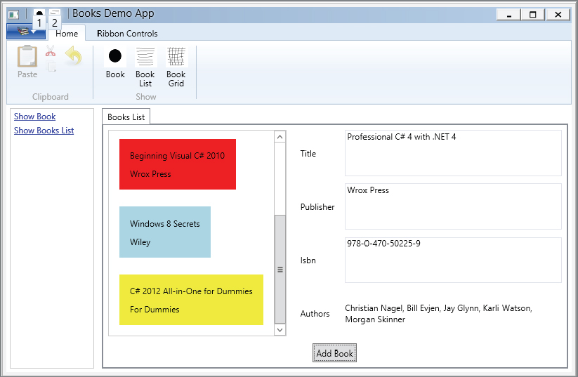
}Because the DockPanel has the Book array assigned to the DataContext, and the ListBox is placed within the DockPanel, the ListBox shows all books with the default template, as illustrated in Figure 36-9.
For a more flexible layout of the ListBox, you have to define a template, as discussed in the previous chapter for ListBox styling. The ItemTemplate of the ListBox defines a DataTemplate with a Label element. The content of the label is bound to the Title. The item template is repeated for every item in the list. Of course, you can also add the item template to a style within resources (XAML file BooksDemo/BooksUC.xaml):
    <ListBox DockPanel.Dock="Left" ItemsSource="{Binding}" Margin="5"
        MinWidth="120">
      <ListBox.ItemTemplate>
        <DataTemplate>
          <Label Content="{Binding Title}" />
        </DataTemplate>
      </ListBox.ItemTemplate>
    </ListBox>
Master Details Binding
Instead of just showing all the elements inside a list, you might want or need to show detail information about the selected item. It doesn’t require a lot of work to do this. The Label and TextBox controls are already defined; currently, they only show the first element in the list.
There’s one important change you have to make to the ListBox. By default, the labels are bound to just the first element of the list. By setting the ListBox property IsSynchronizedWithCurrentItem="True", the selection of the list box is set to the current item (XAML file BooksDemo/BooksUC.xaml):
    <ListBox DockPanel.Dock="Left" ItemsSource="{Binding}" Margin="5"
             MinWidth="120" IsSynchronizedWithCurrentItem="True">
      <ListBox.ItemTemplate>
        <DataTemplate>
          <Label Content="{Binding Title}" />
        </DataTemplate>
      </ListBox.ItemTemplate>
    </ListBox>
Figure 36-10 shows the result; details about the selected item are shown on the right.

MultiBinding
Binding is one of the classes that can be used for data binding. BindingBase is the abstract base class of all bindings and has different concrete implementations. Besides Binding, there’s also MultiBinding and PriorityBinding. MultiBinding enables you to bind one WPF element to multiple sources. For example, with a Person class that has LastName and FirstName properties, it is interesting to bind both properties to a single WPF element (code file MultiBindingDemo/Person.cs):
  public class Person
  {
    public string FirstName { get; set; }
    public string LastName { get; set; }
  }
For MultiBinding, a markup extension is not available — therefore, the binding must be specified with XAML element syntax. The child elements of MultiBinding are Binding elements that specify the binding to the various properties. In the following example, the FirstName and LastName properties are used. The data context is set with the Grid element to reference the person1 resource.
To connect the properties, MultiBinding uses a Converter to convert multiple values to one. This converter uses a parameter that allows for different conversions based on the parameter (XAML file MultiBindingDemo/MainWindow.xaml):
<Window x:Class="Wrox.ProCSharp.WPF.MainWindow"
        xmlns="http://schemas.microsoft.com/winfx/2006/xaml/presentation"
        xmlns:x="http://schemas.microsoft.com/winfx/2006/xaml"
        xmlns:system="clr-namespace:System;assembly=mscorlib"
        xmlns:local="clr-namespace:Wrox.ProCSharp.WPF"
        Title="MainWindow" Height="240" Width="500">
  <Window.Resources>
    <local:Person x:Key="person1" FirstName="Tom" LastName="Turbo" />
    <local:PersonNameConverter x:Key="personNameConverter" />
  </Window.Resources>
  <Grid DataContext="{StaticResource person1}">
    <TextBox>
      <TextBox.Text>
        <MultiBinding Converter="{StaticResource personNameConverter}" >
          <MultiBinding.ConverterParameter>
            <system:String>FirstLast</system:String>
          </MultiBinding.ConverterParameter>
          <Binding Path="FirstName" />
          <Binding Path="LastName" />
        </MultiBinding>
      </TextBox.Text>
    </TextBox>
  </Grid>
</Window>
The multi-value converter implements the interface IMultiValueConverter. This interface defines two methods, Convert and ConvertBack. Convert receives multiple values with the first argument from the data source and returns one value to the target. With the implementation, depending on whether the parameter has a value of FirstLast or LastFirst, the result varies (code file MultiBindingDemo/PersonNameConverter.cs):
using System;
using System.Globalization;
using System.Windows.Data;

namespace Wrox.ProCSharp.WPF
{
  public class PersonNameConverter : IMultiValueConverter
  {
    public object Convert(object[] values, Type targetType, object parameter,
                          CultureInfo culture)
    {
      switch (parameter as string)
      {
        case "FirstLast":
          return values[0] + " " + values[1];
        case "LastFirst":
          return values[1] + ", " + values[0];
        default:
          throw new ArgumentException(String.Format(
              "invalid argument {0}", parameter));
      }
    }

    public object[] ConvertBack(object value, Type[] targetTypes,
                                object parameter, CultureInfo culture)
    {
      throw new NotSupportedException();
    }
  }
}
In such simple scenarios, just combining some strings with a MultiBinding doesn’t require an implementation of IMultiValueConverter. Instead, a definition for a format string is adequate, as shown in the following XAML code snippet. The string format defined with the MultiBinding first needs a {} prefix. With XAML the curly brackets usually define a markup expression. Using {} as a prefix escapes this and defines that no markup expression, but instead a normal string, follows. The sample specifies that both Binding elements are separated by a comma and a blank (XAML file MultiBindingDemo/MainWindow.xaml):
 <TextBox>
      <TextBox.Text>
        <MultiBinding StringFormat="{}{0}, {1}">
          <Binding Path="LastName" />
          <Binding Path="FirstName" />
        </MultiBinding>
      </TextBox.Text>
    </TextBox>
Priority Binding
PriorityBinding makes it easy to bind to data that is not readily available. If you need time to get the result with PriorityBinding, you can inform users about the progress so they are aware of the wait.
To illustrate priority binding, use the PriorityBindingDemo project to create the Data class. Accessing the ProcessSomeData property requires some time, which is simulated by calling the Thread.Sleep method (code file PriorityBindingDemo/Data.cs):
  public class Data
  {
    public string ProcessSomeData
    {
      get
      {
        Thread.Sleep(8000);
        return "the final result is here";
      }
    }
  }
The Information class provides information to the user. The information from property Info1 is returned immediately, whereas Info2 returns information after five seconds. With a real implementation, this class could be associated with the processing class to get an estimated time frame for the user (code file PriorityBindingDemo/Information.cs):
  public class Information
  {
    public string Info1
    {
      get
      {
        return "please wait...";
      }
    }
    public string Info2
    {
      get
      {
        Thread.Sleep(5000);
        return "please wait a little more";
      }
    }
  }
In the MainWindow.xaml file, the Data and Information classes are referenced and initiated within the resources of the Window (XAML file PriorityBindingDemo/MainWindow.xaml):
    <Window.Resources>
        <local:Data x:Key="data1" />
        <local:Information x:Key="info" />
    </Window.Resources>
PriorityBinding is done in place of normal binding within the Content property of a Label. It consists of multiple Binding elements whereby all but the last one have the IsAsync property set to True. Because of this, if the first binding expression result is not immediately available, the binding process chooses the next one. The first binding references the ProcessSomeData property of the Data class, which needs some time. Because of this, the next binding comes into play and references the Info2 property of the Information class. Info2 does not return a result immediately; and because IsAsync is set, the binding process does not wait but continues to the next binding. The last binding uses the Info1 property. If it doesn’t immediately return a result, you would wait for the result because IsAsync is set to the default, False:
    <Label>
      <Label.Content>
        <PriorityBinding>
          <Binding Path="ProcessSomeData" Source="{StaticResource data1}"
              IsAsync="True" />
          <Binding Path="Info2" Source="{StaticResource info}"
              IsAsync="True" />
          <Binding Path="Info1" Source="{StaticResource info}"
              IsAsync="False" />
        </PriorityBinding>
      </Label.Content>
    </Label>
When the application starts, you can see the message “please wait. . .” in the user interface. After a few seconds the result from the Info2 property is returned as “please wait a little more.” It replaces the output from Info1. Finally, the result from ProcessSomeData replaces the output again.
Value Conversion
Returning to the BooksDemo application, the authors of the book are still missing in the user interface. If you bind the Authors property to a Label element, the ToString method of the Array class is invoked, which returns the name of the type. One solution to this is to bind the Authors property to a ListBox. For the ListBox, you can define a template for a specific view. Another solution is to convert the string array returned by the Authors property to a string and use the string for binding.
The class StringArrayConverter converts a string array to a string. WPF converter classes must implement the interface IValueConverter from the namespace System.Windows.Data. This interface defines the methods Convert and ConvertBack. With the StringArrayConverter, the Convert method converts the string array from the variable value to a string by using the String.Join method. The separator parameter of the Join is taken from the variable parameter received with the Convert method (code file BooksDemo/Utilities/StringArrayConverter.cs):
using System;
using System.Diagnostics.Contracts;
using System.Globalization;
using System.Windows.Data;

namespace Wrox.ProCSharp.WPF.Utilities
{
  [ValueConversion(typeof(string[]), typeof(string))]
  class StringArrayConverter : IValueConverter
  {
    public object Convert(object value, Type targetType, object parameter,
                          CultureInfo culture)
    {
      if (value == null) return null;

      string[] stringCollection = (string[])value;
      string separator = parameter == null;

      return String.Join(separator, stringCollection);
    }

    public object ConvertBack(object value, Type targetType, object parameter,
                              CultureInfo culture)
    {
      throw new NotImplementedException();
    }
  }
}In the XAML code, the StringArrayConverter class can be declared as a resource.This resource can be referenced from the Binding markup extension (XAML file BooksDemo/BooksUC.xaml):
<UserControl x:Class="Wrox.ProCSharp.WPF.BooksUC"
    xmlns="http://schemas.microsoft.com/winfx/2006/xaml/presentation"
    xmlns:x="http://schemas.microsoft.com/winfx/2006/xaml"
    xmlns:mc="http://schemas.openxmlformats.org/markup-compatibility/2006"
    xmlns:d="http://schemas.microsoft.com/expression/blend/2008"
    xmlns:local="clr-namespace:Wrox.ProCSharp.WPF.Data"
    xmlns:utils="clr-namespace:Wrox.ProCSharp.WPF.Utilities"
    mc:Ignorable="d"
    d:DesignHeight="300" d:DesignWidth="300">
  <UserControl.Resources>
    <utils:StringArrayConverter x:Key="stringArrayConverter" />
    <ObjectDataProvider x:Key="books" ObjectType="local:BookFactory"
                        MethodName="GetBooks" />
  </UserControl.Resources>
  <!-- -->
For multiline output, a TextBlock element is declared with the TextWrapping property set to Wrap to make it possible to display multiple authors. In the Binding markup extension, the Path is set to Authors, which is defined as a property returning a string array. The string array is converted from the resource stringArrayConverter as defined by the Converter property. The Convert method of the converter implementation receives the ConverterParameter=', ' as input to separate the authors:
      <TextBlock Text="{Binding Authors,
                 Converter={StaticResource stringArrayConverter},
                 ConverterParameter=', '}"
                 Grid.Row="3" Grid.Column="1" Margin="5"
                       VerticalAlignment="Center" TextWrapping="Wrap" />
Figure 36-11 shows the book details, including authors.

Adding List Items Dynamically
If list items are added dynamically, the WPF element must be notified of elements added to the list.
In the XAML code of the WPF application, a Button element is added inside a StackPanel. The Click event is assigned to the method OnAddBook (XAML file BooksDemo/BooksUC.xaml):
    <StackPanel Orientation="Horizontal" DockPanel.Dock="Bottom"
                HorizontalAlignment="Center">
      <Button Margin="5" Padding="4" Content="Add Book" Click="OnAddBook" />
    </StackPanel>
In the method OnAddBook, a new Book object is added to the list. If you test the application with the BookFactory as it is implemented now, there’s no notification to the WPF elements that a new object has been added to the list (code file BooksDemo/BooksUC.xaml.cs):
    private void OnAddBook(object sender, RoutedEventArgs e)
    {
      ((this.FindResource("books") as ObjectDataProvider).Data as IList<Book>).
          Add(new Book("HTML and CSS: Design and Build Websites",
              "Wiley", "978-1118-00818-8"));
    }
The object that is assigned to the DataContext must implement the interface INotifyCollectionChanged. This interface defines the CollectionChanged event that is used by the WPF application. Instead of implementing this interface on your own with a custom collection class, you can use the generic collection class ObservableCollection<T> that is defined with the namespace System.Collections.ObjectModel in the assembly WindowsBase. Now, as a new item is added to the collection, the new item immediately appears in the ListBox (code file BooksDemo/Data/BookFactory.cs):
  public class BookFactory
  {
    private ObservableCollection<Book> books = new ObservableCollection<Book>();
    // ...


    public IEnumerable<Book> GetBooks()
    {
      return books;
    }
  }
Adding Tab Items Dynamically
Adding items dynamically to a list is in principle the same scenario as adding user controls to the tab control dynamically. Until now, the tab items have been added dynamically using the Add method of the Items property from the TabControl class. In the following example, the TabControl is directly referenced from code-behind. Using data binding instead, information about the tab item can be added to an ObservableCollection<T>.
The code from the BookSample application is now changed to use data binding with the TabControl. First, the class UIControlInfo is defined. This class contains properties that are used with data binding within the TabControl. The Title property is used to show heading information within tab items, and the Content property is used for the content of the tab items:
using System.Windows.Controls;

namespace Wrox.ProCSharp.WPF
{
  public class UIControlInfo
  {
    public string Title { get; set; }
    public UserControl Content { get; set; }
  }
}
Now an observable collection is needed to allow the tab control to refresh the information of its tab items. userControls is a member variable of the MainWindow class. The property Controls — used for data binding — returns the collection (code file BooksDemo/MainWindow.xaml.cs):
    private ObservableCollection<UIControlInfo> userControls =
        new ObservableCollection<UIControlInfo>();
    public IEnumerable<UIControlInfo> Controls
    {
      get { return userControls; }
    }
With the XAML code the TabControl is changed. The ItemsSource property is bound to the Controls property. Now, two templates need to be specified. One template, ItemTemplate, defines the heading of the item controls. The DataTemplate specified with the ItemTemplate just uses a TextBlock element to display the value from the Text property in the heading of the tab item. The other template is ContentTemplate. This template specifies using the ContentPresenter that binds to the Content property of the bound items (XAML file BooksDemo/MainWindow.xaml):
    <TabControl Margin="5" x:Name="tabControl1" ItemsSource="{Binding Controls}">
      <TabControl.ContentTemplate>
        <DataTemplate>
          <ContentPresenter Content="{Binding Content}" />
        </DataTemplate>
      </TabControl.ContentTemplate>
      <TabControl.ItemTemplate>
        <DataTemplate>
          <StackPanel Margin="0">
            <TextBlock Text="{Binding Title}" Margin="0" />
          </StackPanel>
        </DataTemplate>
      </TabControl.ItemTemplate>
    </TabControl>
Now the event handlers can be modified to create new UIControlInfo objects and add them to the observable collection instead of creating TabItem controls. Changing the item and content templates is a much easier way to customize the look, instead of doing this with code-behind.
    private void OnShowBooksList(object sender, ExecutedRoutedEventArgs e)
    {
      var booksUI = new BooksUC();
      userControls.Add(new UIControlInfo
      {
        Title = "Books List",
        Content = booksUI
      });
    }
Data Template Selector
The previous chapter described how you can customize controls with templates. You also saw how to create a data template that defines a display for specific data types. A data template selector can create different data templates dynamically for the same data type. It is implemented in a class that derives from the base class DataTemplateSelector.
The following example implements a data template selector by selecting a different template based on the publisher. These templates are defined within the user control resources. One template can be accessed by the key name wroxTemplate; the other template has the key name dummiesTemplate, and the third one is bookTemplate (XAML file BooksDemo/BooksUC.xaml):
    <DataTemplate x:Key="wroxTemplate" DataType="{x:Type local:Book}">
      <Border Background="Red" Margin="10" Padding="10">
        <StackPanel>
          <Label Content="{Binding Title}" />
          <Label Content="{Binding Publisher}" />
        </StackPanel>
      </Border>
    </DataTemplate>

    <DataTemplate x:Key="dummiesTemplate" DataType="{x:Type local:Book}">
      <Border Background="Yellow" Margin="10" Padding="10">
        <StackPanel>
          <Label Content="{Binding Title}" />
          <Label Content="{Binding Publisher}" />
        </StackPanel>
      </Border>
    </DataTemplate>

    <DataTemplate x:Key="bookTemplate" DataType="{x:Type local:Book}">
      <Border Background="LightBlue" Margin="10" Padding="10">
        <StackPanel>
          <Label Content="{Binding Title}" />
          <Label Content="{Binding Publisher}" />
        </StackPanel>
      </Border>
    </DataTemplate>
For selecting the template, the class BookDataTemplateSelector overrides the method SelectTemplate from the base class DataTemplateSelector. The implementation selects the template based on the Publisher property from the Book class (code file BooksDemo/Utilities/BookTemplateSelector.cs):
using System.Windows;
using System.Windows.Controls;
using Wrox.ProCSharp.WPF.Data;

namespace Wrox.ProCSharp.WPF.Utilities
{
  public class BookTemplateSelector : DataTemplateSelector
  {
    public override DataTemplate SelectTemplate(object item,
        DependencyObject container)
    {
      if (item != null && item is Book)
      {
        var book = item as Book;
        switch (book.Publisher)
        {
          case "Wrox Press":
            return (container as FrameworkElement).FindResource(
                "wroxTemplate") as DataTemplate;
          case "For Dummies":
            return (container as FrameworkElement).FindResource(
                "dummiesTemplate") as DataTemplate;
          default:
            return (container as FrameworkElement).FindResource(
                "bookTemplate") as DataTemplate;
        }
      }
      return null;
    }
  }
}
For accessing the class BookDataTemplateSelector from XAML code, the class is defined within the Window resources (XAML file BooksDemo/BooksUC.xaml):
<src:BookDataTemplateSelector x:Key="bookTemplateSelector" />Now the selector class can be assigned to the ItemTemplateSelector property of the ListBox:
    <ListBox DockPanel.Dock="Left" ItemsSource="{Binding}" Margin="5"
             MinWidth="120" IsSynchronizedWithCurrentItem="True"
             ItemTemplateSelector="{StaticResource bookTemplateSelector}">
Running the application, you can see different data templates based on the publisher, as shown in Figure 36-12.
Binding to XML
WPF data binding has special support for binding to XML data. You can use XmlDataProvider as a data source and bind the elements by using XPath expressions. For a hierarchical display, you can use the TreeView control and create the view for the items by using the HierarchicalDataTemplate.
The following XML file containing Book elements is used as a source in the next examples (XML file XmlBindingDemo/Books.xml):
<?xml version="1.0" encoding="utf-8" ?>
<Books>
<Book isbn="978-1-118-31442-5">
<Title>Professional C# 2012</Title>
<Publisher>Wrox Press</Publisher>
<Author>Christian Nagel</Author>
<Author>Jay Glynn</Author>
<Author>Morgan Skinner</Author>
</Book>
<Book isbn="978-0-470-50226-6">
<Title>Beginning Visual C# 2010</Title>
<Publisher>Wrox Press</Publisher>
<Author>Karli Watson</Author>
<Author>Christian Nagel</Author>
<Author>Jacob Hammer Pedersen</Author>
<Author>John D. Reid</Author>
<Author>Morgan Skinner</Author>
</Book>
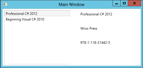
</Books>Similarly to defining an object data provider, you can define an XML data provider. Both ObjectDataProvider and XmlDataProvider are derived from the same base class, DataSourceProvider. With the XmlDataProvider in the example, the Source property is set to reference the XML file books.xml. The XPath property defines an XPath expression to reference the XML root element Books. The Grid element references the XML data source with the DataContext property. With the data context for the grid, all Book elements are required for a list binding, so the XPath expression is set to Book. Inside the grid, you can find the ListBox element that binds to the default data context and uses the DataTemplate to include the title in TextBlock elements as items of the ListBox. You can also see three Label elements with data binding set to XPath expressions to display the title, publisher, and ISBN numbers:
<Window x:Class="XmlBindingDemo.MainWindow"
        xmlns="http://schemas.microsoft.com/winfx/2006/xaml/presentation"
        xmlns:x="http://schemas.microsoft.com/winfx/2006/xaml"
        Title="Main Window" Height="240" Width="500">
  <Window.Resources>
    <XmlDataProvider x:Key="books" Source="Books.xml" XPath="Books" />
    <DataTemplate x:Key="listTemplate">
      <TextBlock Text="{Binding XPath=Title}" />
    </DataTemplate>

    <Style x:Key="labelStyle" TargetType="{x:Type Label}">
      <Setter Property="Width" Value="190" />
      <Setter Property="Height" Value="40" />
      <Setter Property="Margin" Value="5" />
    </Style>
  </Window.Resources>

  <Grid DataContext="{Binding Source={StaticResource books}, XPath=Book}">
    <Grid.RowDefinitions>
      <RowDefinition />
      <RowDefinition />
      <RowDefinition />
      <RowDefinition />
    </Grid.RowDefinitions>
    <Grid.ColumnDefinitions>
      <ColumnDefinition />
      <ColumnDefinition />
    </Grid.ColumnDefinitions>
    <ListBox IsSynchronizedWithCurrentItem="True" Margin="5"
        Grid.Column="0" Grid.RowSpan="4" ItemsSource="{Binding}"
        ItemTemplate="{StaticResource listTemplate}" />

      <Label Style="{StaticResource labelStyle}" Content="{Binding XPath=Title}"
          Grid.Row="0" Grid.Column="1" />
      <Label Style="{StaticResource labelStyle}"
          Content="{Binding XPath=Publisher}" Grid.Row="1" Grid.Column="1" />
      <Label Style="{StaticResource labelStyle}"
          Content="{Binding XPath=@isbn}" Grid.Row="2" Grid.Column="1" />
    </Grid>
</Window>
Figure 36-13 shows the result of the XML binding.
Binding Validation and Error Handling
Several options are available to validate data from the user before it is used with the .NET objects:
- Handling exceptions
- Handling data error information errors
- Handling notify data error information errors
- Defining custom validation rules
Handling Exceptions
The first option demonstrated here reflects the fact that the .NET class throws an exception if an invalid value is set, as shown in the class SomeData. The property Value1 accepts values only larger than or equal to 5 and smaller than 12 (code file ValidationDemo/SomeData.cs):
  public class SomeData
  {
    private int value1;
    public int Value1 {
      get { return value1;  }
      set
      {
        if (value < 5 || value > 12)
        {
          throw new ArgumentException(
              "value must not be less than 5 or greater than 12");
        }
        value1 = value;
      }
    }
  }
In the constructor of the MainWindow class, a new object of the class SomeData is initialized and passed to the DataContext for data binding (code file ValidationDemo/MainWindow.xaml.cs):
  public partial class MainWindow: Window
  {
    private SomeData p1 = new SomeData { Value1 = 11 };

    public MainWindow()
    {
      InitializeComponent();
      this.DataContext = p1;

    }
The event handler method OnShowValue displays a message box to show the actual value of the SomeData instance:
private void OnShowValue(object sender, RoutedEventArgs e)
{
MessageBox.Show(p1.Value1.ToString());
}
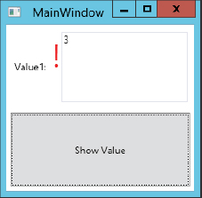
}With simple data binding, the following shows the Text property of a TextBox bound to the Value1 property. If you run the application now and try to change the value to an invalid one, you can verify that the value never changed by clicking the Submit button. WPF catches and ignores the exception thrown by the set accessor of the property Value1 (XAML file ValidationDemo/MainWindow.xaml):
    <Label Margin="5" Grid.Row="0" Grid.Column="0" >Value1:</Label>
    <TextBox Margin="5" Grid.Row="0" Grid.Column="1"
        Text="{Binding Path=Value1}" />
To display an error as soon as the context of the input field changes, you can set the ValidatesOnException property of the Binding markup extension to True. With an invalid value (as soon as the exception is thrown when the value should be set), the TextBox is surrounded by a red line. The application showing the error rectangle is shown in Figure 36-14.

    <Label Margin="5" Grid.Row="0" Grid.Column="0" >Value1:</Label>
    <TextBox Margin="5" Grid.Row="0" Grid.Column="1"
        Text="{Binding Path=Value1, ValidatesOnExceptions=True}" />
To return the error information in a different way to the user, you can assign the attached property ErrorTemplate that is defined by the Validation class to a template defining the UI for errors. The new template to mark the error is shown as follows with the key validationTemplate. The ControlTemplate puts a red exclamation point in front of the existing control content:
    <ControlTemplate x:Key="validationTemplate">
      <DockPanel>
        <TextBlock Foreground="Red" FontSize="40">!</TextBlock>
        <AdornedElementPlaceholder/>
      </DockPanel>
    </ControlTemplate>
Setting the validationTemplate with the Validation.ErrorTemplate attached property activates the template with the TextBox:
    <Label Margin="5" Grid.Row="0" Grid.Column="0" >Value1:</Label>
    <TextBox Margin="5" Grid.Row="0" Grid.Column="1"
        Text="{Binding Path=Value1, ValidatesOnExceptions=True}"
        Validation.ErrorTemplate="{StaticResource validationTemplate}" />
The new look of the application is shown in Figure 36-15.
The error information itself can be accessed from the Errors collection of the Validation class. To display the error information in the ToolTip of the TextBox you can create a property trigger as shown next. The trigger is activated as soon as the HasError property of the Validation class is set to True. The trigger sets the ToolTip property of the TextBox:
    <Style TargetType="{x:Type TextBox}">
      <Style.Triggers>
        <Trigger Property="Validation.HasError" Value="True">
          <Setter Property="ToolTip"
              Value="{Binding RelativeSource={x:Static RelativeSource.Self},
              Path=(Validation.Errors)[0].ErrorContent}" />
        </Trigger>
      </Style.Triggers>
    </Style>
Data Error Information
Another way to deal with errors is when the .NET object implements the interface IDataErrorInfo. The class SomeData is now changed to implement this interface, which defines the property Error and an indexer with a string argument. With WPF validation during data binding, the indexer is called and the name of the property to validate is passed as the columnName argument. With the implementation, the value is verified as valid; if it isn’t, an error string is passed. Here, the validation is done on the property Value2, which is implemented by using the C# automatic property notation (code file ValiationDemo/SomeData.cs):
  public class SomeData: IDataErrorInfo
  {
    //...

    public int Value2 { get; set; }

    string IDataErrorInfo.Error
    {
      get
      {
        return null;
      }
    }

    string IDataErrorInfo.this[string columnName]
    {
      get
      {
        if (columnName == "Value2")
        {
          if (this.Value2 < 0 || this.Value2 > 80)
              return "age must not be less than 0 or greater than 80";

        }
        return null;
      }
    }
}If you set the property ValidatesOnDataErrors of the Binding class to true, the interface IDataErrorInfo is used during binding. In the following code, when the TextBox is changed the binding mechanism invokes the indexer of the interface and passes Value2 to the columnName variable (XAML file ValidationDemo/MainWindow.xaml):
    <Label Margin="5" Grid.Row="1" Grid.Column="0" >Value2:</Label>
    <TextBox Margin="5" Grid.Row="1" Grid.Column="1"
        Text="{Binding Path=Value2, ValidatesOnDataErrors=True}" />
Notify Data Error Info
Besides supporting validation with exceptions and the IDataErrorInfo interface, WPF with .NET 4.5 supports validation with the interface INotifyDataErrorInfo as well. Unlike the interface IDataErrorInfo, whereby the indexer to a property can return one error, with INotifyDataErrorInfo multiple errors can be associated with a single property. These errors can be accessed using the GetErrors method. The HasErrors property returns true if the entity has any error. Another great feature of this interface is the notification of errors with the event ErrorsChanged. This way, errors can be retrieved asynchronously on the client — for example, a Web service can be invoked to verify the input from the user. In this case, the user can continue working with the input form while the result is retrieved, and can be informed asynchronously about any mismatch.
Let’s get into an example in which validation is done using INotifyDataErrorInfo. The base class NotifyDataErrorInfoBase is defined, which implements the interface INotifyDataErrorInfo. This class derives from the base class BindableObject to get an implementation for the interface INotifyPropertyChanged that you’ve seen earlier in this chapter. NotifyDataErrorInfoBase uses a dictionary named errors that contains a list for every property to store error information. The property HasErrors returns true if any property has an error; the method GetErrors returns the error list for a single property; and the event ErrorsChanged is fired every time error information is changed. In addition to the members of the interface INotifyDataErrorInfo, the base class implements the methods SetError, ClearErrors, and ClearAllErrors to make it easier to deal with setting errors (code file ValidationDemo/NotifyDataErrorInfoBase.cs):
using System;
using System.Collections;
using System.Collections.Generic;
using System.ComponentModel;
using System.Runtime.CompilerServices;

namespace ValidationDemo
{
  public abstract class NotifyDataErrorInfoBase : BindableObject,
      INotifyDataErrorInfo
  {
    public void SetError(string errorMessage,
        [CallerMemberName] string propertyName = null)
    {
      List<string> errorList;
      if (errors.TryGetValue(propertyName, out errorList))
      {
        errorList.Add(errorMessage);
      }
      else
      {
        errorList = new List<string> { errorMessage };
        errors.Add(propertyName, errorList);
      }
      HasErrors = true;
      OnErrorsChanged(propertyName);
    }

    public void ClearErrors([CallerMemberName] string propertyName = null)
    {
      if (hasErrors)
      {
        List<string> errorList;
        if (errors.TryGetValue(propertyName, out errorList))
        {
          errors.Remove(propertyName);
        }
        if (errors.Count == 0)
        {
          HasErrors = false;
        }
        OnErrorsChanged(propertyName);
      }
    }

    public void ClearAllErrors()
    {
      if (HasErrors)
      {
        errors.Clear();
        HasErrors = false;
        OnErrorsChanged(null);
      }
    }

    public event EventHandler<DataErrorsChangedEventArgs> ErrorsChanged;

    private Dictionary<string, List<string>> errors =
        new Dictionary<string, List<string>>();
    public IEnumerable GetErrors(string propertyName)
    {
      List<string> errorsForProperty;
      bool err = errors.TryGetValue(propertyName, out errorsForProperty);
      if (!err) return null;
      return errorsForProperty;
    }

    private bool hasErrors = false;
    public bool HasErrors
    {
      get { return hasErrors; }
      protected set {
        if (SetProperty(ref hasErrors, value))
        {
          OnErrorsChanged(propertyName: null);
        }
      }
    }

    protected void OnErrorsChanged([CallerMemberName] string propertyName = null)
    {
      var errorsChanged = ErrorsChanged;
      if (errorsChanged != null)
      {
        errorsChanged(this, new DataErrorsChangedEventArgs(propertyName));
      }
    }
  }
}
The class SomeDataWithNotifications is the data object that is bound to the XAML code. This class derives from the base class NotifyDataErrorInfoBase to inherit the implementation of the interface INotifyDataErrorInfo. The property Val1 is validated asynchronously. For the validation, the method CheckVal1 is invoked after the property is set. This method makes an asynchronous call to the method ValidationSimulator.Validate. After invoking the method, the UI thread can return to handle other events; and as soon as the result is returned, the SetError method of the base class is invoked if an error was returned. You can easily change the async invocation to call a Web service or perform another async activity (code file ValidationDemo/SomeDataWithNotifications.cs):
using System.Runtime.CompilerServices;
using System.Threading.Tasks;

namespace ValidationDemo
{
  public class SomeDataWithNotifications : NotifyDataErrorInfoBase
  {
    private int val1;
    public int Val1
    {
      get { return val1; }
      set
      {
        SetProperty(ref val1, value);
        CheckVal1(val1, value);
      }
    }

    private async void CheckVal1(int oldValue, int newValue,
        [CallerMemberName] string propertyName = null)
    {
      ClearErrors(propertyName);

      string result = await ValidationSimulator.Validate(newValue, propertyName);
      if (result != null)
      {
        SetError(result, propertyName);
      }
    }
  }
The Validate method of the ValidationSimilator has a delay of three seconds before checking the value, and returns an error message if the value is larger than 50:
  public static class ValidationSimulator
  {
    public static Task<string> Validate(int val,
        [CallerMemberName] string propertyName = null)
    {
      return Task<string>.Run(async () =>
        {
          await Task.Delay(3000);
          if (val > 50) return "bad value";
          else return null;
        });
    }
  }
With data binding, just the ValidatesOnNotifyDataErrors property must be set to True to make use of the async validation of the interface INotifyDataErrorInfo (XAML file ValidationDemo/NotificationWindow.xaml):
    <TextBox Grid.Row="0" Grid.Column="1"
        Text="{Binding Val1, ValidatesOnNotifyDataErrors=True}" Margin="8" />
Running the application, you can see the text box surrounded by the default red rectangle three seconds after wrong input was entered. Showing error information in a different way can be done in the same way you’ve seen it before — with error templates and triggers accessing validation errors.
Custom Validation Rules
To get more control of the validation you can implement a custom validation rule. A class implementing a custom validation rule needs to derive from the base class ValidationRule. In the previous two examples, validation rules have been used as well. Two classes that derive from the abstract base class ValidationRule are DataErrorValidationRule and ExceptionValidationRule. DataErrorValidationRule is activated by setting the property ValidatesOnDataErrors and uses the interface IDataErrorInfo; ExceptionValidationRule deals with exceptions and is activated by setting the property ValidatesOnException.
In the following example, a validation rule is implemented to verify a regular expression. The class RegularExpressionValidationRule derives from the base class ValidationRule and overrides the abstract method Validate that is defined by the base class. With the implementation, the RegEx class from the namespace System.Text.RegularExpressions is used to validate the expression defined by the Expression property:
  public class RegularExpressionValidationRule : ValidationRule
  {
    public string Expression { get; set; }
    public string ErrorMessage { get; set; }

    public override ValidationResult Validate(object value,
        CultureInfo cultureInfo)
    {
      ValidationResult result = null;
      if (value != null)
      {
        var regEx = new Regex(Expression);
        bool isMatch = regEx.IsMatch(value.ToString());
        result = new ValidationResult(isMatch, isMatch ?
           null: ErrorMessage);
      }
      return result;
    }
}Instead of using the Binding markup extension, now the binding is done as a child of the TextBox.Text element. The bound object defines an Email property that is implemented with the simple property syntax. The UpdateSourceTrigger property defines when the source should be updated. Possible options for updating the source are as follows:
- When the property value changes, which is every character typed by the user
- When the focus is lost
- Explicitly
ValidationRules is a property of the Binding class that contains ValidationRule elements. Here, the validation rule used is the custom class RegularExpressionValidationRule, where the Expression property is set to a regular expression that verifies whether the input is a valid e-mail address; and the ErrorMessage property, which outputs the error message if the data entered in the TextBox is invalid:
  <Label Margin="5" Grid.Row="2" Grid.Column="0">Email:</Label>
  <TextBox Margin="5" Grid.Row="2" Grid.Column="1">
    <TextBox.Text>
      <Binding Path="Email" UpdateSourceTrigger="LostFocus">
        <Binding.ValidationRules>
          <src:RegularExpressionValidationRule
              Expression="^([w-.]+)@(([[0–9]{1,3}.[0–9]{1,3}.
                          [0–9]{1,3}.)|(([w-]+.)+))([a-zA-Z]{2,4}|
                          [0–9]{1,3})(]?)$"
              ErrorMessage="Email is not valid" />
        </Binding.ValidationRules>
      </Binding>
    </TextBox.Text>
  </TextBox>
TREEVIEW
The TreeView control is used to display hierarchical data. Binding to a TreeView is very similar to the binding you’ve seen with the ListBox. What’s different is the hierarchical data display — a HierarchicalDataTemplate can be used.
The next example uses hierarchical displays and the DataGrid control. The Formula1 sample database is accessed with the ADO.NET Entity Framework. The mapping used is shown in Figure 36-16. The Race class contains information about the date of the race and is associated with the Circuit class. The Circuit class has information about the Country and the name of the race circuit. Race also has an association with RaceResult. A RaceResult contains information about the Racer and the Team.
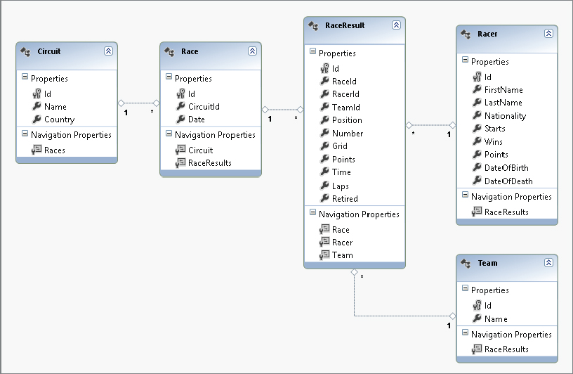
With the XAML code a TreeView is declared. TreeView derives from the base class ItemsControl, where binding to a list can be done with the ItemsSource property. ItemsSource is bound to the data context. The data context is assigned in the code-behind, as you will see next. Of course, this could also be done with an ObjectDataProvider. To define a custom display for the hierarchical data, HierarchicalDataTemplate elements are defined. The data templates here are defined for specific data types with the DataType property. The first HierarchicalDataTemplate is the template for the Championship class and binds the Year property of this class to the Text property of a TextBlock. The ItemsSource property defines the binding for the data template itself to specify the next level in the data hierarchy. If the Races property of the Championship class returns a collection, you bind the ItemsSource property directly to Races. However, because this property returns a Lazy<T> object, binding is done to Races.Value. The advantages of the Lazy<T> class are discussed later in this chapter.
The second HierarchicalDataTemplate element defines the template for the F1Race class and binds the Country and Date properties of this class. With the Date property a StringFormat is defined with the binding. The next level of the hierarchy is defined binding the ItemsSource to Results.Value.
The class F1RaceResult doesn’t have a children collection, so the hierarchy stops here. For this data type, a normal DataTemplate is defined to bind the Position, Racer, and Car properties (XAML file Formula1Demo/TreeUC.xaml):
<UserControl x:Class="Formula1Demo.TreeUC"
             xmlns="http://schemas.microsoft.com/winfx/2006/xaml/presentation"
             xmlns:x="http://schemas.microsoft.com/winfx/2006/xaml"
             xmlns:mc="http://schemas.openxmlformats.org/markup-compatibility/2006"
             xmlns:d="http://schemas.microsoft.com/expression/blend/2008"
             xmlns:local="clr-namespace:Formula1Demo"
             mc:Ignorable="d"
             d:DesignHeight="300" d:DesignWidth="300">
  <Grid>
    <TreeView ItemsSource="{Binding}" >
      <TreeView.Resources>
        <HierarchicalDataTemplate DataType="{x:Type local:Championship}"
                                  ItemsSource="{Binding Races.Value}">
          <TextBlock Text="{Binding Year}" />
        </HierarchicalDataTemplate>

        <HierarchicalDataTemplate DataType="{x:Type local:F1Race}"
                                  ItemsSource="{Binding Results.Value}">
          <StackPanel Orientation="Horizontal">
            <TextBlock Text="{Binding Country}" Margin="5,0,5,0" />
            <TextBlock Text="{Binding Date, StringFormat=d}" Margin="5,0,5,0" />
          </StackPanel>
        </HierarchicalDataTemplate>

        <DataTemplate DataType="{x:Type local:F1RaceResult}">
          <StackPanel Orientation="Horizontal">
            <TextBlock Text="{Binding Position}" Margin="5,0,5,0" />
            <TextBlock Text="{Binding Racer}" Margin="5,0,0,0" />
            <TextBlock Text=", " />
            <TextBlock Text="{Binding Car}" />
          </StackPanel>
        </DataTemplate>
      </TreeView.Resources>
    </TreeView>
  </Grid>
</UserControl>
Now for the code that fills the hierarchical control. In the code-behind file of the XAML code, DataContext is assigned to the Years property. The Years property uses a LINQ query, instead of the ADO.NET Entity Framework data context, to get all the years of the Formula-1 races in the database and to create a new Championship object for every year. With the instance of the Championship class, the Year property is set. This class also has a Races property to return the races of the year, but this information is not yet filled in (code file Formula1Demo/TreeUC.xaml.cs):
using System.Collections.Generic;
using System.Linq;
using System.Windows.Controls;

namespace Formula1Demo
{
  public partial class TreeUC : UserControl
  {
    private Formula1Entities data = new Formula1Entities();

    public TreeUC()
    {
      InitializeComponent();
      this.DataContext = Years;
    }

    public IEnumerable<Championship> Years
    {
      get
      {
        F1DataContext.Data = data;
        return data.Races.Select(r => new Championship
        {
          Year = r.Date.Year
        }).Distinct().OrderBy(c => c.Year);
      }
    }
  }
}
The Championship class has a simple automatic property for the year. The Races property is of type Lazy<IEnumerable<F1Race>>. The Lazy<T> class was introduced with .NET 4 for lazy initialization. With a TreeView control, this class comes in very handy. If the data behind the tree is large and you do not want to load the full tree in advance, but only when a user makes a selection, lazy loading can be used. With the constructor of the Lazy<T> class, a delegate Func<IEnumerable<F1Race>> is used. With this delegate, IEnumerable<F1Race> needs to be returned. The implementation of the Lambda expression, assigned to the delegate, uses a LINQ query to create a list of F1Race objects that have the Date and Country property assigned (code file Formula1Demo/Championship.cs):
  public class Championship
  {
    public int Year { get; set; }
    public Lazy<IEnumerable<F1Race>> Races
    {
      get
      {
        return new Lazy<IEnumerable<F1Race>>(() =>
        {
          return from r in F1DataContext.Data.Races
                 where r.Date.Year == Year
                 orderby r.Date
                 select new F1Race
                 {
                   Date = r.Date,
                   Country = r.Circuit.Country
                 };
        });
      }
    }
  }
The F1Race class again defines the Results property that uses the Lazy<T> type to return a list of F1RaceResult objects (code file Formula1Demo/F1Race.cs):
  public class F1Race
  {
    public string Country { get; set; }
    public DateTime Date { get; set; }
    public Lazy<IEnumerable<F1RaceResult>> Results
    {
      get
      {
        return new Lazy<IEnumerable<F1RaceResult>>(() =>
        {
          return from rr in F1DataContext.Data.RaceResults
                 where rr.Race.Date == this.Date
                 select new F1RaceResult
                 {
                   rr.Position,
                   Racer = rr.Racer.FirstName + " " + rr.Racer.LastName,
                   Car = rr.Team.Name
                 };
        });
      }
    }
  }
The final class of the hierarchy is F1RaceResult, which is a simple data holder for Position, Racer, and Car (code file Formula1Demo/Championship.cs):
  public class F1RaceResult
  {
    public int Position { get; set; }
    public string Racer { get; set; }
    public string Car { get; set; }
  }
When you run the application, you can see at first all the years of the championships in the tree view. Because of binding, the next level is already accessed — every Championship object already has the F1Race objects associated. The user doesn’t need to wait for the first level after the year or an open year with the default appearance of a small triangle. As shown in Figure 36-17, the year 1984 is open. As soon as the user clicks a year to see the second-level binding, the third level is done and the race results are retrieved.
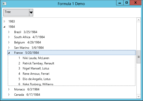
Of course, you can also customize the TreeView control and define different styles for the complete template or the items in the view.
DATAGRID
To display and edit data using rows and columns, the DataGrid control can be used. The DataGrid control is an ItemsControl and defines the ItemsSource property that is bound to a collection. The XAML code of this user interface also defines two RepeatButton controls that are used for paging functionality. Instead of loading all the race information at once, paging is used so users can step through pages. In a simple scenario, only the ItemsSource property of the DataGrid needs to be assigned. By default, the DataGrid creates columns based on the properties of the bound data (XAML file Formula1Demo/GridUC.xaml):
<UserControl x:Class="Formula1Demo.GridUC"
    xmlns="http://schemas.microsoft.com/winfx/2006/xaml/presentation"
    xmlns:x="http://schemas.microsoft.com/winfx/2006/xaml"
    xmlns:mc="http://schemas.openxmlformats.org/markup-compatibility/2006"
    xmlns:d="http://schemas.microsoft.com/expression/blend/2008"
    mc:Ignorable="d"
    d:DesignHeight="300" d:DesignWidth="300">
  <Grid>
    <Grid.RowDefinitions>
      <RepeatButton Margin="5" Click="OnPrevious">Previous</RepeatButton>
      <RepeatButton Margin="5" Click="OnNext">Next</RepeatButton>
    </Grid.RowDefinitions>
    <StackPanel Orientation="Horizontal" Grid.Row="0">
      <Button Click="OnPrevious">Previous</Button>
      <Button Click="OnNext">Next</Button>
    </StackPanel>
    <DataGrid Grid.Row="1" ItemsSource="{Binding}" />
  </Grid>
</UserControl>
The code-behind uses the same Formula1 database as the previous TreeView example. The DataContext of the UserControl is set to the Races property. This property returns IEnumerable<object>. Instead of assigning a strongly typed enumeration, an object is used to make it possible to create an anonymous class with the LINQ query. The LINQ query creates the anonymous class with Year, Country, Position, Racer, and Car properties and uses a compound to access Races and RaceResults. It also accesses other associations of Races to get country, racer, and team information. With the Skip and Take methods, paging functionality is implemented. The size of a page is fixed to 50 items, and the current page changes with the OnNext and OnPrevious handlers (code file Formula1Demo/GridUC.xaml.cs):
using System.Collections.Generic;
using System.Linq;
using System.Windows;
using System.Windows.Controls;

namespace Formula1Demo
{
  public partial class GridUC : UserControl
  {
    private int currentPage = 0;
    private int pageSize = 50;
    private Formula1Entities data = new Formula1Entities();
    public GridUC()
    {
      InitializeComponent();
      this.DataContext = Races;
    }

    public IEnumerable<object> Races
    {
      get
      {
        return (from r in data.Races
                from rr in r.RaceResults
                orderby r.Date ascending
                select new
                {
                  r.Date.Year,
                  r.Circuit.Country,
                  rr.Position,
                  Racer = rr.Racer.FirstName + " " + rr.Racer.LastName,
                  Car = rr.Team.Name
                }).Skip(currentPage * pageSize).Take(pageSize);
      }
    }


    private void OnPrevious(object sender, RoutedEventArgs e)
    {
      if (currentPage > 0)
      {
        currentPage--;
        this.DataContext = Races;
      }
    }

    private void OnNext(object sender, RoutedEventArgs e)
    {
      currentPage++;
      this.DataContext = Races;
    }
  }
}
Figure 36-18 shows the running application with the default grid styles and headers.

In the next DataGrid example, the grid is customized with custom columns and grouping.
Custom Columns
Setting the property AutoGenerateColumns of the DataGrid to False doesn’t generate default columns. You can create custom columns with the Columns property. You can also specify elements that derive from DataGridColumn. You can use predefined classes, and DataGridTextColumn can be used to read and edit text. DataGridHyperlinkColumn is for displaying hyperlinks. DataGridCheckBoxColumn displays a check box for Boolean data. For a list of items in a column, you can use the DataGridComboBoxColumn. More DataGridColumn types will be available in the future, but if you need a different representation now, you can use the DataGridTemplateColumn to define and bind any elements you want.
The example code uses DataGridTextColumn elements that are bound to the Position and Racer properties. The Header property is set to a string for display. Of course, you can also use a template to define a complete custom header for the column (XAML file Formula1Demo/GridUC.xaml.cs):
      <DataGrid ItemsSource="{Binding}" AutoGenerateColumns="False">
        <DataGrid.Columns>
          <DataGridTextColumn Binding="{Binding Position, Mode=OneWay}"
                              Header="Position" />
          <DataGridTextColumn Binding="{Binding Racer, Mode=OneWay}"
                              Header="Racer" />
        </DataGrid.Columns>
Row Details
When a row is selected, the DataGrid can display additional information for the row. This is done by specifying a RowDetailsTemplate with the DataGrid. A DataTemplate is assigned to the RowDetailsTemplate, which contains several TextBlock elements that display the car and points (XAML file Formula1Demo/GridUC.xaml.cs):
        <DataGrid.RowDetailsTemplate>
          <DataTemplate>
            <StackPanel Orientation="Horizontal">
              <TextBlock Text="Car:" Margin="5,0,0,0" />
              <TextBlock Text="{Binding Car}" Margin="5,0,0,0" />
              <TextBlock Text="Points:" Margin="5,0,0,0" />
              <TextBlock Text="{Binding Points}" />
            </StackPanel>
          </DataTemplate>
        </DataGrid.RowDetailsTemplate>
Grouping with the DataGrid
The Formula-1 races have several rows that contain the same information, such as the year and the country. For such data, grouping can be helpful to organize the information for the user.
For grouping, the CollectionViewSource can be used in XAML code. It also supports sorting and filtering. With code-behind you can also use the ListCollectionView class, which is used only by the CollectionViewSource.
CollectionViewSource is defined within a Resources collection. The source of CollectionViewSource is the result from an ObjectDataProvider. The ObjectDataProvider invokes the GetRaces method of the F1Races type. This method has two int parameters that are assigned from the MethodParameters collection. The CollectionViewSource uses two descriptions for grouping—first by the Year property and then by the Country property (XAML file Formula1Demo/GridGroupingUC.xaml):
    <Grid.Resources>
      <ObjectDataProvider x:Key="races" ObjectType="{x:Type local:F1Races}"
                          MethodName="GetRaces">
        <ObjectDataProvider.MethodParameters>
          <sys:Int32>0</sys:Int32>
          <sys:Int32>20</sys:Int32>
        </ObjectDataProvider.MethodParameters>
      </ObjectDataProvider>
      <CollectionViewSource x:Key="viewSource"
                            Source="{StaticResource races}">
        <CollectionViewSource.GroupDescriptions>
          <PropertyGroupDescription PropertyName="Year" />
          <PropertyGroupDescription PropertyName="Country" />
        </CollectionViewSource.GroupDescriptions>
      </CollectionViewSource>
    </Grid.Resources>
How the group is displayed is defined with the DataGrid GroupStyle property. With the GroupStyle element you need to customize the ContainerStyle as well as the HeaderTemplate and the complete panel. To dynamically select the GroupStyle and HeaderStyle, you can also write a container style selector and a header template selector. It is very similar in functionality to the data template selector described earlier.
The GroupStyle in the example sets the ContainerStyle property of the GroupStyle. With this style, the GroupItem is customized with a template. The GroupItem appears as the root element of a group when grouping is used. Displayed within the group is the name, using the Name property, and the number of items, using the ItemCount property. The third column of the Grid contains all the normal items using the ItemsPresenter. If the rows are grouped by country, the labels of the Name property would all have a different width, which doesn’t look good. Therefore, the SharedSizeGroup property is set with the second column of the grid to ensure all items are the same size. The shared size scope needs to be set for all elements that have the same size. This is done in the DataGrid setting Grid.IsSharedSizeScope="True":
        <DataGrid.GroupStyle>
          <GroupStyle>
            <GroupStyle.ContainerStyle>
              <Style TargetType="{x:Type GroupItem}">
                <Setter Property="Template">
                  <Setter.Value>
                    <ControlTemplate >
                      <StackPanel Orientation="Horizontal" >
                        <Grid>
                          <Grid.ColumnDefinitions>
                            <ColumnDefinition SharedSizeGroup="LeftColumn" />
                            <ColumnDefinition />
                            <ColumnDefinition />
                          </Grid.ColumnDefinitions>
                          <Label Grid.Column="0" Background="Yellow"
                                 Content="{Binding Name}" />
                          <Label Grid.Column="1" Content="{Binding ItemCount}" />
                          <Grid Grid.Column="2" HorizontalAlignment="Center"
                                VerticalAlignment="Center">
                            <ItemsPresenter/>
                          </Grid>
                        </Grid>
                      </StackPanel>
                    </ControlTemplate>
                  </Setter.Value>
                </Setter>
              </Style>
            </GroupStyle.ContainerStyle>
          </GroupStyle>
        </DataGrid.GroupStyle>
The class F1Races that is used by the ObjectDataProvider uses LINQ to access the Formula1 database and returns a list of anonymous types with Year, Country, Position, Racer, Car, and Points properties. The Skip and Take methods are used to access part of the data (code file Formula1Demo/F1Races.cs):
using System.Collections.Generic;
using System.Linq;

namespace Formula1Demo
{
  public class F1Races
  {
    private int lastpageSearched = -1;
    private IEnumerable<object> cache = null;
    private Formula1Entities data = new Formula1Entities();

    public IEnumerable<object> GetRaces(int page, int pageSize)
    {
      if (lastpageSearched == page)
        return cache;
      lastpageSearched = page;

      var q = (from r in data.Races
               from rr in r.RaceResults
               orderby r.Date ascending
               select new
               {
                 Year = r.Date.Year,
                 Country = r.Circuit.Country,
                 Position = rr.Position,
                 Racer = rr.Racer.Firstname + " " + rr.Racer.Lastname,
                 Car = rr.Team.Name,
                 Points = rr.Points
               }).Skip(page * pageSize).Take(pageSize);
      cache = q;
      return cache;
    }
  }
}
Now all that’s left is for the user to set the page number and change the parameter of the ObjectDataProvider. In the user interface, a TextBox and a Button are defined (XAML file Formula1Demo/GridGroupingUC.xaml):
    <StackPanel Orientation="Horizontal" Grid.Row="0">
      <TextBlock Margin="5" Padding="4" VerticalAlignment="Center">
        Page:
      </TextBlock>
      <TextBox Margin="5" Padding="4" VerticalAlignment="Center"
         x:Name="textPageNumber" Text="0" />
      <Button Click="OnGetPage">Get Page</Button>
    </StackPanel>
The OnGetPage handler of the button in the code-behind accesses the ObjectDataProvider and changes the first parameter of the method. It then invokes the Refresh method so the ObjectDataProvider requests the new page (code file Formula1Demo/GridGroupingUC.xaml.cs):
    private void OnGetPage(object sender, RoutedEventArgs e)
    {
      int page = int.Parse(textPageNumber.Text);
      var odp = (sender as FrameworkElement).FindResource("races")
                as ObjectDataProvider;
      odp.MethodParameters[0] = page;
      odp.Refresh();
    }
Running the application, you can see grouping and row detail information, as shown in Figure 36-19.

Live Shaping
A new feature with WPF 4.5 is live shaping. You’ve seen the collection view source with its support for sorting, filtering, and grouping. However, if the collection changes over time in that sorting, filtering, or grouping returns different results, the CollectionViewSource didn’t help — until now. For live shaping, a new interface, ICollectionViewLiveShaping, is used. This interface defines the properties CanChangeLiveFiltering, CanChangeLiveGrouping, and CanChangeLiveSorting to check the data source if these live shaping features are available. The properties IsLiveFiltering, IsLiveGrouping, and IsLiveSorting enable turning on the live shaping features — if available. With LiveFilteringProperties, LiveGroupingProperties, and LiveSortingProperties, you can define the properties of the source that should be used for live filtering, grouping, and sorting.
The sample application shows how the results of a Formula 1 race — this time the race from Barcelona in 2012 — change lap by lap.
A racer is represented by the Racer class. This type has the simple properties Name, Team, and Number. These properties are implemented using auto properties, as the values of this type don’t change when the application is run (code file LiveShaping/Racer.cs):
  public class Racer
  {
    public string Name { get; set; }
    public string Team { get; set; }
    public int Number { get; set; }

    public override string ToString()
    {
      return Name;
    }
  }
The class Formula1 returns a list of all racers who competed at the Barcelona race 2012 (code file LiveShaping/Formula1.cs):
  public class Formula1
  {
    private List<Racer> racers;
    public IEnumerable<Racer> Racers
    {
      get
      {
        return racers ?? (racers = GetRacers());
      }
    }

    private List<Racer> GetRacers()
    {
      return new List<Racer>()
      {
        new Racer { Name="Sebastian Vettel", Team="Red Bull Racing", Number=1 },
        new Racer { Name="Mark Webber", Team="Red Bull Racing", Number=2 },
        new Racer { Name="Jenson Button", Team="McLaren", Number=3 },
        new Racer { Name="Lewis Hamilton", Team="McLaren", Number=4 },
        new Racer { Name="Fernando Alonso", Team="Ferrari", Number=5 },
        new Racer { Name="Felipe Massa", Team="Ferrari", Number=6 },
        new Racer { Name="Michael Schumacher", Team="Mercedes", Number=7 },
        new Racer { Name="Nico Rosberg", Team="Mercedes", Number=8 },
        new Racer { Name="Kimi Raikkonen", Team="Lotus", Number=9 },
        new Racer { Name="Romain Grosjean", Team="Lotus", Number=10 },
        new Racer { Name="Paul di Resta", Team="Force India", Number=11 },
        new Racer { Name="Nico Hülkenberg", Team="Force India", Number=12 },
        new Racer { Name="Kamui Kobayashi", Team="Sauber", Number=14 },
        new Racer { Name="Sergio Perez", Team="Sauber", Number=15 },
        new Racer { Name="Daniel Riccardio", Team="Toro Rosso", Number=16 },
        new Racer { Name="Jean-Eric Vergne", Team="Toro Rosso", Number=17 },
        new Racer { Name="Pastor Maldonado", Team="Williams", Number=18 },

        //... more racers in the source code download
      };
    }
  }
Now it gets more interesting. The LapRacerInfo class is the type that is shown in the DataGrid control. The class derives from the base class BindableObject to get an implementation of INotifyPropertyChanged as you’ve seen earlier. The properties Lap, Position, and PositionChange change over time. Lap gives the current lap number, Position gives the position in the race in the specified lap, and PositionChange provides information about how the position changed from the previous lap. If the position did not change, the state is None; if the position is lower than in the previous lap, it is Up; if it is higher, then it is Down; and if the racer is out of the race, the PositionChange is Out. This information can be used within the UI for a different representation (code file LiveShaping/LapRacerInfo.cs):
  public enum PositionChange
  {
    None,
    Up,
    Down,
    Out
  }

  public class LapRacerInfo : BindableObject
  {
    public Racer Racer { get; set; }
    private int lap;
    public int Lap
    {
      get { return lap; }
      set { SetProperty(ref lap, value); }
    }
    private int position;
    public int Position
    {
      get { return position; }
      set { SetProperty(ref position, value); }
    }
    private PositionChange positionChange;
    public PositionChange PositionChange
    {
      get { return positionChange; }
      set { SetProperty(ref positionChange, value); }
    }
  }
The class LapChart contains all the information about all laps and racers. This class could be changed to access a live Web service to retrieve this information, and then the application could show the current live results from an active race.
The method SetLapInfoForStart creates the initial list of LapRacerInfo items and fills the position to the grid position. The grid position is the first number of the List<int> collection that is added to the positions dictionary. Then, with every invocation of the NextLap method, the items inside the lapInfo collection change to a new position and set the PositionChange state information (code file LiveShaping/LapChart.cs):
  public class LapChart
  {
    private Formula1 f1 = new Formula1();
    private List<LapRacerInfo> lapInfo;
    private int currentLap = 0;
    private const int PostionOut = 999;
    private int maxLaps;
    public LapChart()
    {
      FillPositions();
      SetLapInfoForStart();
    }

    private Dictionary<int, List<int>> positions =
        new Dictionary<int, List<int>>();
    private void FillPositions()
    {
      positions.Add(18, new List<int> { 1, 2, 2, 2, 2, 2, 2, 2, 2, 2, 1, 1, 2, 2,
          2, 2, 2, 2, 2, 2, 2, 2, 2, 2, 2, 3, 3, 1, 1, 1, 1, 1, 1, 1, 1, 1, 1, 1,
          1, 1, 1, 1, 3, 3, 3, 2, 2, 1, 1, 1, 1, 1, 1, 1, 1, 1, 1, 1, 1, 1, 1, 1,
          1, 1, 1, 1, 1 });
      positions.Add(5, new List<int> { 2, 1, 1, 1, 1, 1, 1, 1, 1, 1, 2, 3, 1, 1,
          1, 1, 1, 1, 1, 1, 1, 1, 1, 1, 1, 1, 1, 3, 2, 2, 2, 2, 2, 2, 2, 2, 2, 2,
          2, 2, 2, 2, 1, 1, 1, 3, 3, 3, 2, 2, 2, 2, 2, 2, 2, 2, 2, 2, 2, 2, 2, 2,
          2, 2, 2, 2, 2 });
      positions.Add(10, new List<int> { 3, 5, 5, 5, 5, 5, 5, 5, 5, 4, 4, 9, 7, 6,
          6, 5, 4, 4, 4, 4, 4, 4, 4, 4, 4, 4, 4, 5, 4, 4, 4, 4, 4, 4, 4, 4, 4, 4,
          4, 4, 4, 4, 4, 4, 4, 4, 4, 4, 4, 3, 3, 4, 4, 4, 4, 4, 4, 4, 4, 4, 4, 4,
          4, 4, 4, 4, 4 });
      // more position information with the code download

      maxLaps = positions.Select(p => p.Value.Count).Max() - 1;
    }

    private void SetLapInfoForStart()
    {
      lapInfo = positions.Select(x => new LapRacerInfo
      {
        Racer = f1.Racers.Where(r => r.Number == x.Key).Single(),
        Lap = 0,
        Position = x.Value.First(),
        PositionChange = PositionChange.None
      }).ToList();
    }

    public IEnumerable<LapRacerInfo> GetLapInfo()
    {
      return lapInfo;
    }

    public bool NextLap()
    {
      currentLap++;
      if (currentLap > maxLaps) return false;

      foreach (var info in lapInfo)
      {
        int lastPosition = info.Position;
        var racerInfo = positions.Where(x => x.Key == info.Racer.Number).Single();

        if (racerInfo.Value.Count > currentLap)
        {
          info.Position = racerInfo.Value[currentLap];
        }
        else
        {
          info.Position = lastPosition;
        }
        info.PositionChange = GetPositionChange(lastPosition, info.Position);

        info.Lap = currentLap;
      }
      return true;
    }

    private PositionChange GetPositionChange(int oldPosition, int newPosition)
    {
      if (oldPosition == PositionOut ||| newPosition == PositionOut)
        return PositionChange.Out;
      else if (oldPosition == newPosition)
        return PositionChange.None;
      else if (oldPosition < newPosition)
        return PositionChange.Down;
      else
        return PositionChange.Up;
    }
  }
In the main window, the DataGrid is specified and contains some DataGridTextColumn elements that are bound to properties of the LapRacerInfo class that is returned from the collection shown previously. DataTrigger elements are used to define a different background color for the row depending on whether the racer has a better or worse position compared to the previous lap by using the enumeration value from the PositionChange property (XAML file LiveShaping/MainWindow.xaml):
    <DataGrid IsReadOnly="True" ItemsSource="{Binding}"
        DataContext="{StaticResource cvs}" AutoGenerateColumns="False">
      <DataGrid.CellStyle>
        <Style TargetType="DataGridCell">
          <Style.Triggers>
            <Trigger Property="IsSelected" Value="True">
              <Setter Property="Background" Value="{x:Null}" />
              <Setter Property="BorderBrush" Value="{x:Null}" />
            </Trigger>
          </Style.Triggers>
        </Style>
      </DataGrid.CellStyle>
      <DataGrid.RowStyle>
        <Style TargetType="DataGridRow">
          <Style.Triggers>
            <Trigger Property="IsSelected" Value="True">
              <Setter Property="Background" Value="{x:Null}" />
              <Setter Property="BorderBrush" Value="{x:Null}" />
            </Trigger>
            <DataTrigger Binding="{Binding PositionChange}" Value="None">
              <Setter Property="Background" Value="LightGray" />
            </DataTrigger>
            <DataTrigger Binding="{Binding PositionChange}" Value="Up">
              <Setter Property="Background" Value="LightGreen" />
            </DataTrigger>
            <DataTrigger Binding="{Binding PositionChange}" Value="Down">
              <Setter Property="Background" Value="Yellow" />
            </DataTrigger>
            <DataTrigger Binding="{Binding PositionChange}" Value="Out">
              <Setter Property="Background" Value="Red" />
            </DataTrigger>
          </Style.Triggers>
        </Style>
      </DataGrid.RowStyle>
      <DataGrid.Columns>
        <DataGridTextColumn Binding="{Binding Position}" />
        <DataGridTextColumn Binding="{Binding Racer.Number}" />
        <DataGridTextColumn Binding="{Binding Racer.Name}" />
        <DataGridTextColumn Binding="{Binding Racer.Team}" />
        <DataGridTextColumn Binding="{Binding Lap}" />
      </DataGrid.Columns>
</DataGrid>The data context specified with the DataGrid control is found in the resources of the window with the CollectionViewSource. The collection view source is bound to the data context that you’ll see soon is specified with the code-behind. The important property set here is IsLiveSortingRequested. The value is set to true to change the order of the elements in the user interface. The property used for sorting is Position. As the position changes, the items are reordered in real time:
  <Window.Resources>
    <CollectionViewSource x:Key="cvs" Source="{Binding}"
        IsLiveSortingRequested="True">
      <CollectionViewSource.SortDescriptions>
        <scm:SortDescription PropertyName="Position" />
      </CollectionViewSource.SortDescriptions>
    </CollectionViewSource>
  </Window.Resources>
Now, you just need to get to the code-behind source code where the data context is set and the live values are changed dynamically. In the constructor of the main window, the DataContext property is set to the initial collection of type LapRacerInfo. Next, a background task invokes the NextLap method every three seconds to change the values in the UI with the new positions. The background task makes use of an async Lambda expression. The implementation could be changed to get live data from a Web service (code file LiveShaping/MainWindow.xaml.cs).
  public partial class MainWindow : Window
  {
    private LapChart lapChart = new LapChart();
    public MainWindow()
    {
      InitializeComponent();
      this.DataContext = lapChart.GetLapInfo();

      Task.Run(async () =>
        {
          bool raceContinues = true;
          while (raceContinues)
          {
            await Task.Delay(3000);
            raceContinues = lapChart.NextLap();
          }
        });
    }
  }
Figure 36-20 shows a run of the application while in lap 14, with a leading Fernando Alonso driving a Ferrari.

SUMMARY
This chapter covered some features of WPF that are extremely important for business applications. For clear and easy interaction with data, WPF data binding provides a leap forward. You can bind any property of a .NET class to a property of a WPF element. The binding mode defines the direction of the binding. You can bind .NET objects and lists, and define a data template to create a default look for a .NET class.
Command binding makes it possible to map handler code to menus and toolbars. You’ve also seen how easy it is to copy and paste with WPF because a command handler for this technology is already included in the TextBox control. You’ve also seen many more WPF features, such as using a DataGrid, the CollectionViewSource for sorting and grouping, and all this with live shaping as well.
The next chapter goes into another facet of WPF: working with documents.