
What is this design intended to achieve?
IN CHAPTER 3 we focused on the client's initial problem statement, and talked about how we worked to revise that problem statement by (1) identifying and correcting any errors, biases, or implied solutions; and (2) incorporating the appropriate objectives, constraints, and functions. We now turn to clarifying the objectives that we want our design to achieve. We will examine the constraints that must be satisfied in Chapter 5 and the functions the design must perform in Chapter 6.
4.1 CLARIFYING A CLIENT'S OBJECTIVES
In Table 3.1 we presented a starting list of the desired attributes of a safe ladder, including objectives, constraints, functions, and means. We have pruned that list of attributes to the shorter list of objectives that we show in Table 4.1, but we see that our list still has a lot of entries. We might find the list more useful if we could organize it in some way. For example, the several uses that we have identified for the ladder might be grouped or clustered together in some coherent way.
Another way to group list entries might be to ask why we care about them. For example, why do we want our ladder to be used outdoors? Maybe that's part of what makes a ladder useful, which relates to another entry on our list. Similarly, we could ask why we care whether the ladder is useful. In this case, the answer is not on the list: We want it to be useful so that people will buy it. Put another way, usefulness makes a ladder marketable. This suggests that we need an entry on marketing for our pruned objectives list: “The ladder should be marketable.” This turns out to be a very helpful objective, since it tells us why we want the ladder to be cheap, portable, etc. (On the other hand, we should be careful identifying “superobjectives” such as marketability, since almost any new or interesting product feature could fit under that rubric.) If we go through thoughtful clustering of our questions in this way, we can develop a new list that we can represent in an indented outline, with hierarchies of major headings and various levels of subheadings (e.g., Table 4.2).
TABLE 4.1 A pruned list of objectives for a safe ladder
| Ladder should be useful
Used to string conduit and wire in ceilings Used to maintain and repair outlets in high places Used to replace light bulbs and fixtures Used outdoors on level ground Used suspended from something in some cases Used indoors on floors or other smooth surfaces Should be reasonably stiff and comfortable for users Should allow a person of medium height to reach and work at levels up to 11 ft. Must be safe Should be relatively inexpensive Must be portable between job sites Should be light Must be durable |
TABLE 4.2 An indented list of the pruned objectives for a safe ladder
| 0. A safe ladder for electricians
1. The ladder should be safe 1.1 The ladder should be stable 1.1.1 Stable on floors and smooth surfaces 1.1.2 Stable on relatively level ground 1.2 The ladder should be reasonably stiff 2. The ladder should be marketable 2.1 The ladder should be useful 2.2.1 The ladder should be useful indoors 2.2.1.1 Useful to do electrical work 2.2.1.2 Useful to do maintenance work 2.2.2 The ladder should be useful outdoors 2.2.3 The ladder should be of the right height 2.2 The ladder should be relatively inexpensive 2.3 The ladder should be portable 2.3.1 The ladder should be light in weight 2.3.2 The ladder should be small when ready for transport 2.4 The ladder should be durable |
The revised, indented outline in Table 4.2 allows us to explore each of the higher-level objectives further, in terms of the subobjectives that tell us how to realize them. At the top level, our objectives turn us back to the original design statement we were given, namely to design a safe ladder that can be marketed to a particular group.
We have certainly not exhausted all of the questions we could ask about the ladder, but this outline answers some of the questions mentioned earlier. For example, “What do you mean by safe?” is answered by two subobjectives in the cluster of safety issues: The designed ladder should be both stable and relatively stiff. We have answered “How are you going to do that?” by identifying several subobjectives or ways in which the ladder could be useful within the “The ladder should be useful” cluster and by specifying two further “sub-subobjectives” about how the ladder would be useful indoors. And we have answered the question “Why do you want that?” by indicating that the ladder ought to be cheap and portable in order to reach its intended market of electricians and construction and maintenance specialists.
4.1.1 Representing Lists of Objectives in Objectives Trees
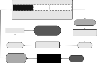
The indented outline of objectives in Table 4.2 is one way to represent the information contained in that list. That same information can also be represented or portrayed graphically in a hierarchy of boxes, each of which contains an objective for the object being designed, as shown in Figure 4.1. Each layer or row of objective boxes corresponds to a level of indentation (indicated by the number of digits to the right of the first decimal point) in the outline. Thus, the indented outline becomes an objectives tree: a graphical depiction of the objectives for the device or system. The top-level goal in an objectives tree—the root node at the top of the tree—is decomposed or broken down into sub-objectives at differing levels of importance or to include progressively more detail. Thus, the tree reflects a hierarchical structure as it expands downward. An objectives tree also gives the tree some organizational strength and utility by clustering together related subobjectives or similar ideas.

Figure 4.1 The objectives tree for the design of a safe ladder. Note the hierarchical structure and the clustering of similar ideas.
The graphical tree display is very useful for portraying design issues, and for highlighting things we need to measure, since these objectives will provide our basis for choosing between alternatives. The tree format also corresponds to the mechanics of the process that many designers follow: One of the most useful ways of “getting your mind around” a large list of objectives is to put them all on Post-It™ notes, and then move them around until the tree makes sense. Note, too, that process just outlined—from lists to refined lists to indented outlines to trees—has a lot in common with outlining, a fundamental skill of writing. A topical outline provides an indented list of topics to be covered, together with the details of the subtopics corresponding to each topic. Since each topic represents a goal for the material to be covered, the identification of an objectives tree with a topical (or an indented) outline seems logical.
4.1.2 Remarks on Objectives Trees
In addition to their use in depicting design objectives, objectives trees are valuable in several other ways. First, and perhaps foremost, note that as we work down an objectives tree (or further in on the levels of indentation of an outline), we are not only getting more detail. We are also answering a generic how question for many aspects of the design: “How are you going to do that?”
Conversely, as we move up the tree, or further out toward fewer indentations, we are answering a generic why question about a specific objective: “Why do you want that?” This may be important if, when selecting a design, we find that one alternative is better with respect to one objective, but weaker with respect to another.
But if we're working downward as we construct and organize a tree, where do we stop? When do we end our list or tree of objectives? One simple answer is: We stop when we run out of objectives and implementations begin to appear. That is, within any given cluster, we could continue to parse or decompose our subobjectives until we are unable to express succeeding levels as further subobjectives. The argument for this approach is that it points the objectives tree toward a solution-independent statement of the design problem. We know what characteristics the design has to exhibit, without having to make any judgment about how it might get to be that way. In other words, we determine the features or behaviors of the designed object without specifying the way the objective is realized in concrete form.
We can also limit the depth of an objectives tree by watching for verbs or “doing” words because they normally suggest functions. Functions do not generally appear on objectives trees or lists.
Another tree-building issue has to do with deciding what to do with the things that we have removed from the original list of attributes. The functions and means (or implementations) are simply put aside—recorded, but not discarded—to be picked up again later in the process. Constraints, however, are sometimes added to objectives tree, although in ways that very clearly distinguish them from the objectives: We might present constraints in boxes differently shaped than the objectives. In an outline form of the objectives tree, we might use italics or a different font to denote constraints (see Figure 5.1 in Section 5.2). In either case, it is most important to recognize that constraints are related to but are different from objectives: They mean very different things and are used in different ways.
Obviously, it is important to take notes when we are generating our lists of objectives, because we are generating a lot of information, to ensure that all suggestions and ideas are captured, even those that seem silly or irrelevant at the moment. Then it becomes important to organize the information we're getting so we can use it effectively: It's always easier to prune and throw away things than to recapture spontaneous ideas and inspirations. Also, get the substance of the objectives down first: Once a rough outline of an objectives tree has emerged, it can be formalized and made to look presentable and pretty with any number of standard software packages for constructing organization charts or similar graphical displays.
Finally, do we build an objectives tree as soon as we start a design job, or after doing some homework and learning more about the design task we're undertaking? There's no hard and fast answer to these questions, in part because building an objectives list or tree is not a mathematical problem with an attendant set of initial conditions that must be met. Also, building a tree is not a one-time, let's-get-it-done kind of activity. It's an iterative process, but one that a design team should start with at least some degree of understanding of the design domain. Thus, some of the questioning of clients, users, and experts should have begun, and some of the tree building can go on episodically while more information is being gathered.
4.1.3 The Objectives Tree for the Juice Container Design
In the juice container design example, our design team is working for one of the two competing food product manufacturers.
In questioning people such as the marketing staff and potential customers to clarify what was wanted from this design, we might have heard several motivations driving the desire for a new “juice bottle,” including:
- plastic bottles and containers all look alike;
- the product has to be delivered to diverse climates and environments;
- safety is a big issue for parents whose children might drink the juice;
- customers, especially parents, are concerned about environmental issues;
- the market is very competitive;
- parents (and teachers) want children to be able to get their own drinks; and
- children always spill drinks.
This list of motivations emerged during the questioning process, and their effects are displayed in an annotated attributes list for the container in Table 4.3. This annotated list also shows how that some of the listed objectives are expanded into subobjectives, while others are connected to existing objectives at higher levels. In one case a brand new top-level objective, Highly Marketable, is identified. We show in Figure 4.2 the objectives tree corresponding to (and expanded from) the annotated attribute list of Table 4.3. The detailed subobjectives that emerge in these trees clearly track well with the list of concerns and motivations identified in the clarification process.
TABLE 4.3 An annotated objectives list for the juice container design
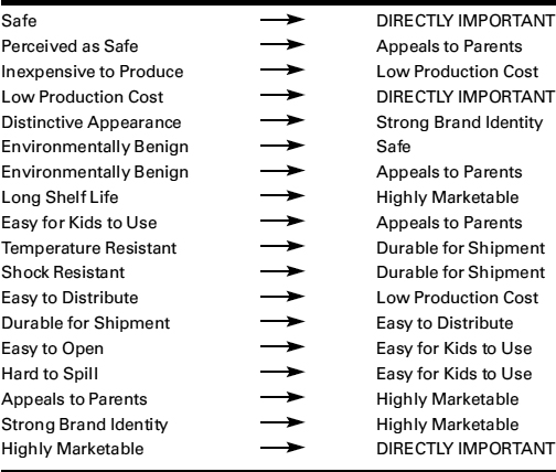

Figure 4.2 An objectives tree for the design of a new juice container showing the hierarchical structuring of the needs identified by the juice company and by the potential consumers of the new juice drink.
We also note in Figure 4.2 that some of the very detailed subobjectives are written as passive, “are” descriptions (e.g., Shock Resistant, Temperature Resistant). These sub-objectives might easily be written in more active forms, for example, Resist Shock and Resist Temperature. This confirms our statement in Section 4.1.2 that we get to how we achieve objectives as we move down an objectives tree, and also anticipates how we express functions (see Section 6.2.5).
4.2 MEASUREMENT ISSUES IN ORDERING AND EVALUATING OBJECTIVES
Having identified the client's objectives for a design, we ask: Are some objectives more important than others, that is, what are the client's priorities? A second question arises, how will we know whether objectives have been achieved? These two questions imply the third question: Are there measurements we could make to compare design objectives and their relative achievement? This last question will be central when we near the end of the conceptual design phase and choose a single, final design, so we defer discussion of the third question until Chapter 8. We will answer the first two in Sections 4.3 and 4.4, respectively, after first providing some needed context about measurement.
Engineers are used to measuring all sorts of things: beam lengths, surface areas, hole diameters, speeds, temperatures, pressures, and so on. In each of these cases, there is a ruler or scale involved that shows a zero and has marks that show units, whether they be inches, microns, millimeters of mercury, or degrees Fahrenheit or centigrade. The ruler establishes a common basis for comparison. Without rulers, we cannot meaningfully quantify the assertion that “A is taller than B” short of simply standing A and B against each other, back to back. However, by using a measuring stick that is marked with a zero and a countable number of intervals of fixed length, we can establish real numbers to represent their heights and make meaningful comparisons of their heights.
The important point here is that of having a ruler or scale with (1) a defined zero, and (2) a unit to define the markings scribed onto the ruler. In mathematical terms, these properties enable strong measurements that allow us to treat measured mathematical variables (say L for length, T for temperature, and so on) as we would any variable in calculus. Thus, strong measurements can be used like any of our “normal” physical variables in a mathematical model.
On the other hand, we generally use ordinal scales to place things in rank order, that is, in first, second, or nth place. This is not as straightforward or useful as it seems. Suppose we're standing by a race's finish line, but without a watch: We can tell the order of the racers' arrivals, but not their respective times. Thus, we can say that A is faster than B, who is faster than C, and so on—but we can never say by how much. Similarly, people say that they prefer vanilla ice cream to chocolate, but not by how much. This is precisely the problem with asking the client to set priorities because we are really asking for a subjective ranking of their relative importance. The client may prefer portability over price in designing a new laptop computer, but there is no meaningful way to say that “portability is five times more important than cost” because there is no scale or ruler that defines both a zero and a unit with which to make such measurements.
4.3 RANK ORDERING OBJECTIVES WITH PAIRWISE COMPARISON CHARTS
We have been rather insistent in this chapter that we properly identify and list all of the client's objectives, while taking great care to separate out constraints, functions, or means. But do we know that all of the identified objectives have the same importance or value to the client or the users? Since we made no effort to see whether there is any variation in an objective's relative value, we have implicitly assumed that every top-level objective has the same value to all concerned. Yet it is almost certain that some objectives are more important than others, so we ought to be able to recognize that and measure it. How are we going to do that?
4.3.1 An Individual's Rank Orderings
Suppose we want to know the relative value or importance of objectives, one to another, and then order them accordingly. Sometimes the client will state clear preferences, or perhaps a potential user does, so that we, as designers, don't have to determine an explicit ordering ourselves. More often, however, we have to elicit values from the client. Fortunately, there is a straightforward technique that can be used by an individual to rank objectives that are on the same level in our objectives tree or are within the same grouping or cluster. It is very important that we make our comparisons of objectives with this hierarchical restriction firmly in mind to ensure that we're comparing apples with apples and oranges with oranges. For example, rank ordering the ladder's usefulness, cost, portability, and durability would provide useful design information. On the other hand, it makes little sense to compare having a ladder be useful for electrical work against its durability.
Consider a ladder with the four high-level objectives stated cost, useful, portable, and durable. The pairwise comparison chart (PCC) is a tool for ordering the relative importance of objectives. It is based on the assumption that we can order any two objectives taken as a pair. For example, we prefer cost to durability, portability to cost, portability to convenience, and so on. The PCC is a simple matrix that allows us to (1) compare every objective with each remaining objective individually, and (2) add total scores for each objective.
Table 4.4 shows a PCC for our four-objective ladder design. The entries in each box of the chart are determined as binary choices: Every entry is either a 1 or a 0, where 1 indicates that the row objective is preferred over the column objective. Along the row of each objective, such as cost, we enter a zero in the columns for portability and convenience if they are preferred over cost, and we enter 1 in the durability column because cost is preferred over durability. We enter nothing in the diagonal boxes corresponding to weighting any objective against itself, and we enter ratings of 0.5 for objectives valued equally. The scores for each objective are found simply by adding across each row. Here the four objectives are ranked (with their scores) in order of decreasing value or importance: portability (3), convenience (2), cost (1), and durability (0).
TABLE 4.4 A pairwise comparison chart (PCC) for a ladder design
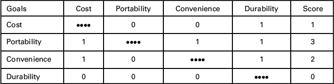
Note, too, that the score of 0 earned by durability does not mean that we can or should drop it as an objective! Durability earned the 0 because it was ranked as least important, that is, it placed last in the line of the four objectives ranked. If it were of no importance, it would not have been listed as an objective to begin with. Thus, we cannot drop objectives that score zeroes.
It should also be noted that the pairwise comparison, if done correctly, preserves the important property of transitivity. That is, in the ladder design we preferred portability to convenience and convenience to cost—and the PCC produced a consistent result when it said that we preferred portability to cost. If we have inconsistencies in our PCC (e.g., if we preferred cost to portability), we should clear up exactly what the client's preferences are. The simple PCC process just described, which is also known as the Borda count, is a valid way of ordering things, but its results should be taken as no more than a straightforward rank ordering, or an ordering of place in line. The scores assembled in Table 4.4 do not constitute what we had defined as strong measurement because there is no scale on which we can measure the four objectives, and the zero is only implied, not defined. We cannot, however, say that we portability is three times as important as cost or twice as important as convenience.
4.3.2 Aggregating Rank Orderings for a Group
Sometimes we need to develop an aggregate ranking for a group of clients, users, or designers. We have so far worked in the framework of the single decision maker who is making a subjective assessment to obtain a meaningful and useful ranking. The group situation—in which a group of clients or users (or a design team) collects individual votes to aggregate into a set of preferences for the entire group (or team)—is still more complicated and a subject of both research and discussion. The sticking point derives from the Arrow Impossibility Theorem of decision theory, for which Kenneth J. Arrow won the Nobel Prize in Economics in 1972. It states, in essence, that it is impossible to run a “fair” aggregation and preserve transitivity when there are more than two objectives to rank. There is corresponding discussion in the design community as to the role that decision theory plays in the design process, but we believe that the PCC (or Borda count) can be used to indicate the collective preferences of a group of clients or of a design team.
Suppose a team of 12 people is asked to rank order three objectives: A, B, and C. In doing so, the 12 individuals produce 12 individual orderings that, using the ranking symbol ![]() to indicate that
to indicate that ![]() means “A is preferred to B,” are
means “A is preferred to B,” are
The collective will of these 12 individuals is worked out through the aggregated PCC in Table 4.5. One point is awarded to the winner of each pairwise comparison, and the number of points awarded to each alternative by each of the 12 rankers is summed. The aggregate rank ordering of the three objectives is
TABLE 4.5 An aggregated pairwise comparison chart (PCC) for 12 people

The group consensus, based on summing, is that C is most important, B second, and A least. The 12 choose objective C as their most important objective, even though it clearly was not unanimous. In fact, only 3 of 12 designers ranked it most important. However, the PCC as applied here provides as good a tool as there is for these purposes, so long as its results are used with the same caution noted for individual PCCs.
4.3.3 Using Pairwise Comparisons Properly
The role of PCCs in design is still a subject of design research, in part, because it has often been misstated and/or misapplied. Thus, we want to repeat and add some cautionary notes to ensure their proper use. First, the PCC approach should be applied in a constrained, top-down fashion, so that (1) objectives are compared only when at the same level on the objectives tree, and (2) the higher-level objectives are compared and ranked before those at lower, more detailed levels. The second point seems only a matter of common sense to ensure that more “global” objectives (i.e., those more abstract objectives that are higher up on the objectives tree) are properly understood and ranked before we fine-tune the details. Also, for many design tasks, only top-level objectives need be so ranked. It would make sense to rank objectives below the top level only for the design of complex subsystems, within large and complex systems.
In addition, given the subjective nature of such rankings, we should ask whose values are being assessed when we use a PCC. For example, marketing values can easily be included: A ladder design team might want to know whether it's “better” for a ladder to be cheaper or heavier. On the other hand, there could be objectives rankings that reflect fundamental values of clients and/or designers. For example, consider how the objectives for the juice container design might be ranked at two competing companies, ABC and NBC. We show PCCs for the ABC- and NBC-based design teams in parts (a) and (b) of Table 4.6, respectively. These two charts and the scores in their right-hand columns, show that ABC was far more interested in a container that would generate a strong brand identity and be easy to distribute than in one that would be environmentally benign or appeals to parents. At NBC, on the other hand, the environment and the taste preservation ranked more highly. Thus, subjective values show up in PCCs and, consequently, in the marketplace!
Finally, one more cautionary warning: Rankings of objectives cannot be put on a scale or ruler. We cannot attach relative weights to objectives or make similar calculations. We can't answer questions such as “How much more important is portability than cost in our ladder?” While there are cases where one objective is far more important than any of the others (e.g., safety for an air traffic control system), there is no mathematical foundation for scaling or normalizing the rankings obtained with tools such as the PCC. The numbers obtained with a PCC are subjective orderings of relative value. Therefore, we should not try to make these numbers seem more important by doing further calculations with them (e.g., adding weights) or by giving them unwarranted precision. In fact, to weight objectives is to commit a very clear error of building an appealing numerical edifice on a mathematically unsound foundation.
TABLE 4.6 PCCs for the design of a new juice container ranking objectives at (and reflecting the values of) (a) ABC and (b) NBC

4.4 DEVELOPING METRICS TO MEASURE THE ACHIEVEMENT OF OBJECTIVES
Having determined what our client wants in a design in terms of rank-ordered objectives, we now take up the question of assessing how well a particular design actually does all these things. As we noted in Section 4.2, such assessment requires metrics, standards that measure the extent to which a design's objectives are realized. In principle, it is easy to devise metrics, as we need only units and a scale of something that can be measured about an objective and a way to assign a value to the design in terms of those units. In practice, it is often hard to devise and apply an appropriate metric.
Sometimes metrics are straightforward. If we want to minimize the number of parts, we simply count the parts in a design. If we want to minimize manufacturing costs, we estimate its manufacturing costs in the currency of interest. Problems arise, however, in two different ways. First, even when we can actually calculate or measure the achievement of each of our objectives, how do we put their different metrics (e.g., part counts, manufacturing dollars) on a common scale so that we can compare their respective achievements? Second, what do we do in situations where there is no ruler? For example, how would we measure the achievement of “simplicity” as a design objective? We will introduce value scales to answer the first question, and surrogate metrics to answer the second.
4.4.1 Establishing Good Metrics for Objectives
First and foremost, a metric should actually measure the objective that the design is supposed to meet. Often designers try to measure something that may be interesting, but that is not really on point for the desired objective: Measuring the number of colors on a package may not be a good metric by which to assess its appeal to consumers. On the other hand, sometimes we invoke surrogate metrics because there are no obvious measures appropriate to the objective of interest. For example, we might drop a cell phone from several different heights and check its post-drop performance to assess its durability. Similarly, the simplicity (or the complexity) of a product might be assessed in terms of the number of parts that are needed to make the product, or perhaps in terms of the product's estimated assembly time. Thus, surrogate metrics are quite useful when they are measurable properties that strongly relate to the objective of interest.
Having decided what to measure, we then determine the appropriate units in which to make the measurement(s). For an objective of low ladder weight, for example, we could use units of weight or mass, that is, kg, lb, or oz. For an objective of low cost, our metric would be measured in currency, that is, US$ in the United States. Along with determining appropriate units, we must also be sure that the metric enables the correct scale or level of precision. For a low-weight ladder, we should not measure weight in either tons or milligrams.
Our next step is to assign points for the metric that corresponds to the scale or range expressed in the right units of interest or figures of merit. For example, if we want a fast car, we might use speed in kilometers per hour as the figure of merit and assume that the range of speed of interest is from 50 to 200 km/h. Then we could assign points linearly distributed over the range, that is, from 0 points at the low end (50 km/h), up to 10 points at the high end (200 km/h). Thus, a design alternative that has a projected speed of 170 km/h would earn or be awarded eight points. Were we assessing the durability of a cell phone, we might drop the phone over a range of heights of 1 m ≤ height ≤ 10 m and then assign points from 0 points at the low end (1 m) up to 10 points at the high end (10 m).
Note that in awarding points for speeds or drop test heights, we are implicitly assuming that we have a plan for measuring performance that is compatible with the type of scale and units selected. Such a measurement plan could include laboratory tests, field trials, consumer responses to surveys, focus groups, and so on. But while some things are relatively easy to measure directly (e.g., weight, on a balance scale) or indirectly (e.g., weight, by computing volume), others must be estimated (e.g., the top speed of a planned airplane, by doing a back-of-the-envelope calculation). Further, some things are neither easily measured nor easily estimated (e.g., cost may be hard to estimate if we don't know how we're manufacturing something or how many units we're making, and so on).
TABLE 4.7 Scales or rulers for awarding points depending on perceived value of a solution (Use-Value Analysis) or perceived value of the idea or concept (VDI2225 Guidelines)

Often the appropriate “units” are general categories (e.g., “high,” “medium,” or “low”) or qualitative characterizations (e.g., “great,” “okay,” or “lousy”). In Table 4.7 we show two ways to quantify qualitative characterizations by assigning “measurement” points to the values or categories. Eleven categories of the value of a solution are offered in Use-Value Analysis, with points then being awarded on a scale ranging from 0 (absolutely useless) to 10 (ideal). There are five categories in the German VDI 2225 standard, with points awarded on a scale ranging from 0 (unsatisfactory) to 4 (very good/ideal), depending on the degree to which an idea or a concept or something else is considered valuable.
Consider once again the ladder objective of low cost. We may not be able to get the information needed to accurately calculate the ladder's manufacturing costs without undertaking a significant, expensive study. We might instead estimate the manufacturing costs by summing the costs of the ladder's components when purchased in given lot sizes. This may neglect some relevant costs (e.g., component assembly, company overhead), but it does allow us to distinguish between designs with expensive elements and designs with cheaper elements. Alternatively, we might seek expert input from our client and then rank the designs into qualitative categories such as “very expensive,” “expensive,” “moderately expensive,” “inexpensive,” and “very cheap.”
It is important that we measure the achievements of all of the objectives of a design consistently, on the same ruler or scale: We can't allow some objectives to dominate the overall assessments by virtue of their being measured on scales that award more points than could be earned by other objectives. In fact, we can use the Use-Value Analysis and VDI 2225 Guidelines of Table 4.7 to ensure that we are assessing quantitative performance ratings on similar, consistent scales. In Table 4.8 we show how two different sets of quantitative performance ratings in their figures of merit, for mass per unit power (measured in kilogram/kilowatt) and service life (measured in kilometer), each of which is arrayed against the Use-Value Analysis and German VDI 2225 scales.
TABLE 4.8 Measuring quantitative performance levels for figures of merit of mass per unit power (kg/kW) and for service life (km) measured on the Use-Value Analysis and VDI2225 scales or rulers

It is important to determine whether or not the information derived from using a metric is worth the cost of actually performing a measurement. The value of the metric may be small in comparison with the resources needed to obtain the measurement. In those cases we can either develop a new metric or find another means for measuring the expensive metric, or look for an alternative way to assess our design. There may be other metrics that provide equivalent information, in which case we may be able to choose a less expensive measurement. In other cases, we may decide to use a less accurate method to assess our designs. As a last resort, we may even decide to convert a hard-to-measure objective into a constraint, which allows us to consider some designs and reject others. (And we must keep in mind the distinction between converting objectives to constraints and confusing objectives with constraints.) In the case of designing a low-cost ladder without adequate cost information, perhaps that objective could be converted into a constraint such as “Contains no parts costing greater than $20.” This constraint indirectly works toward the original objective, while enabling the dismissal of designs that seem certain to not be low in cost.
A few closing comments about metrics. First, a metric should be repeatable: Anyone conducting the same measurement should get the same results, subject to normal experimental error. Repeatability can be fostered either by using standard methods and instruments, or, if they're unavailable, by carefully documenting the protocols followed. We should also run as many tests as we need to ensure the statistical validity of our measurements. Second, we should express our test results in understandable units of measure. And, finally, we should work very hard to ensure the unambiguous interpretation of our results: Everyone viewing results should come to the same conclusion about the measurement. We certainly don't want a posttest debate about what our assessment or our measurements mean.
4.4.2 Establishing Metrics for the Juice Container
Let us now establish metrics for the six objectives (identified in Figure 4.2) for the juice container design. We see immediately that these objectives will require qualitative metrics simply because there is no direct measurement that we can make for any of them. Thus, we will establish metrics analogous to Use-Value Analysis and the VDI 2225 Guidelines. We will also keep in mind what we've said before: Metrics should be solution-independent, that is, they should be established without reference to specific design solutions.
Consider first that we want the juice container to be environmentally benign. Products that are environmentally benign must at worst do no harm to the environment, that is, they should produce no hazardous waste or residue. At best, containers should be easily reused, or—and almost as good—their materials should be recyclable. Thus, we might propose the following qualitative metric:
Objective: Juice container should be environmentally benign.
Units: Rating assessment of most environmentally desirable alternative from 0 (worst) to 100 (best).
Metric: Assign points according to the following scale:
| Completely reusable: | 100 points |
| Material is recyclable: | 90 points |
| Material is easily disposable: | 50 points |
| Material is disposable with difficulty: | 25 points |
| Material is a hazardous waste: | 0 points |
We might also establish a surrogate metric of environmental costs for this objective by, for example, ascertaining the cost of washing bottles to enable reuse (as they once were for sodas and other drinks). Similarly, we might estimate the cost of recycling the materials (i.e., glass bottles and aluminum cans). Finally, the social and opportunity costs of disposal might be estimated. For example, we might consider the cost of disposing of relatively benign materials (e.g., cardboard), or more hazardous materials and products (e.g., the plastic bags that are a major pollutant of the oceans, or small seed-like detritus that is eaten by unsuspecting birds). Then a quantitative surrogate metric can be established using known or estimated environmental costs. Note that environmental, life cycle, and sustainability issues are increasingly central in product design, as we will discuss in Chapter 14.
We also want the juice container to be easy to distribute. Thus, we should consider whether the container is easily packed, in terms of both shape and size; whether it is breakable; and whether it or the juice product is sensitive to temperature. It is also likely that standard container shapes make it easier for storeowners to provide shelf space for the new juice. We propose the following use-value analog:
Objective: Juice container should be easy to distribute.
Units: Rating of design team's assessment of the ease of packing and stacking the container, from 0 (worst) to 100 (best).
Metric: Assign points according to the following scale:
| Very easy to pack and stack: | 100 points |
| Easy to pack and stack: | 75 points |
| Can be packed and stacked: | 50 points |
| Hard to pack and stack: | 25 points |
| Very hard to pack and stack: | 0 points |
This metric is one for which a juice company would likely have both data and experience with what works and what doesn't. Clearly, a data-driven metric is much more meaningful—and persuasive—than the qualitative metric we are proposing here.
We also want our juice container to have a long shelf life. For this objective, the design team can use:
Objective: Juice container should have long shelf life.
Units: Rating of how long the juice product remains in acceptable condition, from 0 (worst) to 100 (best).
Metric: Assign points according to the following scale:
| Shelf life 1 year (12 months): | 100 points |
| Shelf life 9 months: | 75 points |
| Shelf life 6 months: | 50 points |
| Shelf life 3 months: | 25 points |
| Shelf life 1 month: | 0 points |
This is another instance in which the juice company is almost certain to have both experience and data. In fact, for this objective and the remaining three objectives (appeal to parents, permit marketing flexibility, and generate brand identity), our design team is almost certainly going to ask our client's marketing teams and other in-house resources (e.g., ABC and NBC senior managers) for the information we need to assess the attainment of these objectives. This may also be an occasion to use some of the established ways (described in Section 2.3.3) of assessing the market (e.g., focus groups, structured questionnaires, surveys).
4.5 OBJECTIVES AND METRICS FOR THE DANBURYARM SUPPORT
The objectives elicited by two different teams (A and B) are shown as an objectives tree (Figure 4.3) and as a list of objectives (Table 4.9) as they presented them in their final reports. While both lists may have some errors or problems that are worth noting, there are a number of interesting points to be made about these two sets of objectives. First, the two sets of objectives are different. This is not surprising, given that they reflect the work of two different teams; it highlights the fact that the objectives that designers discern are subject to analysis, interpretation, and revision. That is why it is very important that we, as designers, carefully review our findings with our client(s) before proceeding too far in the design process.

Figure 4.3 Team A's objectives tree for the Danbury arm support project. Are there any entries in this tree that don't belong? Adapted from Attarian et al. (2007).
TABLE 4.9 Team B's lists of objectives for the Danbury arm support project. How does this set of objectives compare with those shown in Figure 4.3? Are all of its entries appropriate?
Design objectives
|
It is also worth noting that Teams A's objectives tree (Figure 4.3) has been given in great detail, so that we can traverse that objectives tree to readily answer, with some specificity, questions like How? and Why?. Such a dense objectives tree, however, raises some other questions: Do we need to develop metrics for each and every sub- and sub-subobjective on an objectives tree? How many of these subsidiary objectives (and metrics) should we consider when we later select a design from among a set of design alternatives?
A second point to note is that team A incorporated much more detail (Figure 4.3), perhaps already reflecting some additional research into potential designs, than did team B, whose objectives are much more general (Table 4.10), perhaps reflecting only what the client indicated in personal interviews.
Each team developed and applied metrics for its own set of objectives. Table 4.10 shows the metrics developed for 12 of the 23 objectives identified by team A; they illustrate some interesting issues. First, only outcomes are given: There are no scales or units. Rather, in their 62-page final report, the team wrote: “The specific units and scales for each metric are not presented due to size constraints.” We might wonder what a client (or others) thinks about the apparent unwillingness to make room to credibly document the basis for design selection. In fact, team A developed some neat results (to be presented later), but their impact could be lessened because of such inattention to detail. Second, these metrics were actually developed not for the three objectives at the second level of team A's tree (Figure 4.3), or for the 10 subobjectives at the tree's third level, but for each of the 23 sub-sub-subobjectives displayed in the tree's fourth level. Thus, the higher-level objectives were not directly assessed, perhaps because they were sufficiently abstract that meaningful measurements could not be made. Third and last, some of the formal metrics appear to be very qualitative. It may often be that only qualitative assessments are possible, but a client will find it easier to accept such judgments when complete details are given for those objectives whose metrics can be measured.
Table 4.11 shows the metrics and their corresponding scales and units developed by team B. The metrics leave no doubt about what's to be tested, and how to measure the achievement of their objectives. This approach led to the rapid adoption of a very small set of design alternatives, within which the selection of components remained somewhat larger. One minor quibble is that it would have been more helpful if the metrics were listed in the same order as their corresponding objectives in Table 4.9.
TABLE 4.10 This table shows metrics for 12 of the 23 objectives in the fourth level of Team A's objectives tree of Figure 4.3
| Objectives | Metrics |
| 1. Minimize number of sharp edges | Number of sharp edges |
| 2. Minimize pinching | Number of pinching possibilities |
| 3. Finger friendly | Number of places on device to get finger caught |
| 4. Durable | Disconfiguration, misalignments of device after regular use |
| 5. Remain secure on user | Conditions under which device remains securely attached to user |
| 6. Maintain stable position | Conditions where position, orientation of device maintain mountain setting |
| 7. Minimize cost | Estimate dollar amount |
| 8. Normalize arm movement | User ability to draw straight line compared to do so without the device |
| 9. Maximize range of voluntary motion | Degree of freedom in motion of wrist, elbow, arm, and torso |
| 10. Movable while in use | Required assembly condition to move device |
| 11. Transportable | Necessary level of disassembly for movement |
| 12. Useable by multiple | Range of permissible arm sizes |
TABLE 4.11 Team B's metrics for their objectives in Table 4.9
| Objectives | Metrics |
| Safety | Measured by number of possible ways in which device can cause bodily harm.
cale: Total Points = 10 − # ways to cause harm |
| Stabilization | Ability to resist sudden acceleration.
Scale: 1−10 by Subjective Evaluation |
| Comfortable | Perceived comfort of device.
Scale: Total Points = 10 − # sources of discomfort |
| Non-Restrictive | Measured by the area of allowed motion.
Scale: Total Points = 10 − (Area/2 sq. ft.) |
| Ease of Installation | Measured by the number of minutes required for installation.
Scale: Total Points = 10 − 2(Minutes Required) |
| Durable | Measured by flimsiness, points of failure, and ability to resist torques.
Scale: Total Points = 10 − # of points of failure |
| Adjustability | Measured by the device's ability to fit a range of wheelchairs and individuals.
Scale: 1–10 by Subjective Evaluation |
| Low Cost | Determined of the production cost of one unit.
Scale: Total Points: 10 − (cost/$200) |
TABLE 4.12 Team B's pairwise comparison chart (PCC) for the Danbury arm support project
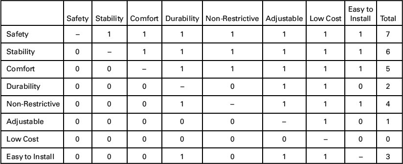
As a final note on the lists of objectives generated by teams A and B, we look at how they ranked or prioritized their individual lists. Team A did not include a pairwise comparison chart in their final report. Rather, they stated that, “The primary objectives were ranked on (1) the piecewise [their wording] comparison charts of the individual team members, in which all possible pairings of objectives were ranked, thus creating a complete ranking order, and (2) the recommendations of the team's liaisons.” Team A's objectives rankings are thus reflected in the order in which they appear in the list of metrics in Table 4.10. Team B reported a formal PCC, which is shown in Table 4.12, and put that ordering to use when they evaluated their competing designs.
4.6 NOTES
Section 4.1: More examples of objectives trees can be found in Cross (1994), Dieter and Schmidt (2012), and Suh (1990).
Section 4.2: Measurements and scales are very important in all aspects of engineering, and not just design. Our discussion takes on a positivist approach (Jones 1992, Otto 1995).
Section 4.3: Some aspects of measurements have recently become controversial in the design community, to a degree beyond our current scope. Some of the critiques derive from an attempt to make design choices and methods emulate long-established approaches of economics and social choice theory (Arrow 1951, Hazelrigg 1996, 2001, Saari 1995, 2001a, 2001b). The PCCs outlined in the text are exactly the same as the best tool offered by the social choice theorists, the Borda count (Dym, Wood, and Scott 2003).
Section 4.4: Our discussion of metrics is strongly influenced by the German approach to design (Pahl and Beitz 1996).
Section 4.5: The results for the Danbury arm support design project are taken from final reports (Attarian et al. 2007, Best et al. 2007) submitted during the Spring 2007 offering of Harvey Mudd College's first-year design course, E4: Introduction to Engineering Design. The course is described in greater detail in Dym (1994b).