
Which design should I choose? Which design is “best”?

NOW WE will finish our work on conceptual design by evaluating design concepts to see which ones are worth pursuing. Because choices among alternative designs invariably involve subjective judgments, perhaps the most important lesson to be learned here is that we must always take care not to mistake things to which we somehow assign numbers for those things we can truly measure.
8.1 APPLYING METRICS TO OBJECTIVES: SELECTING THE PREFERRED DESIGN
With several feasible designs in hand, we now turn to choosing a “best” or preferred design—and choose we must because rarely are the resources (e.g., time, money, and personnel) available to fully develop more than one design scheme, never mind all of our alternatives. Whether we found our alternatives using a morph chart or a less structured approach, we have to “pick a winner” from among the identified options for further elaboration, testing, and evaluation. And how do we pick that winner? What makes the most sense is to choose the design (or designs) that best meet the client's objectives. Recall that we introduced metrics as a way to measure the achievement of objectives. Now we put those metrics to use to assess how close we've come to meeting each of the client's objectives, and combine our insights from the measurements for the individual objectives to reflect some sense of how the client's overall set of objectives are achieved.
Having said that, there are three potential problems in this process. First, we really need to try and limit our analysis to the client's most important objectives. This reflects common sense, but it also reminds us to avoid drowning useful information in a sea of relatively unimportant data. Second, we have to remember to establish our metrics with common sense of scale, so as not to mistakenly over- or underemphasize some results. Third, and last, when examining metrics results for several different objectives, we have to keep in mind that our information necessarily reflects a fair amount of subjectivity. This is especially the case when we rank objectives in terms of order of relative importance, and even in the application of metrics because many of those metrics reflect qualitative—not measurable, quantitative—results. At the most fundamental level, the results of our metrics should be thought of more as indicating a clear sense of direction than an algorithm or numerical solution.
We will discuss three methods for choosing from among a set of alternative designs or concepts: the numerical evaluation matrix; the priority checkmark method; and the best-of-class chart. The three selection methods explicitly link design alternatives to ordered unweighted design objectives. Ordered objectives cannot be scaled on a mathematically meaningful ruler, so we must be very cautious as we strive to bring order to judgments and assessments that are subjective at their root. Just as professors give grades to encapsulate judgments about how well students have mastered concepts, ideas, and methods, designers try to integrate the best judgments in a sensible and orderly manner. And we must always use common sense when we look at the results of applying any such method.
No matter what kind of chart or other decision support technique we apply, our first step should always be to check that each alternative satisfies all of the applicable constraints: design alternatives that don't meet constraints must be immediately rejected as infeasible. Having said that, as we describe our three selection methods, we will show how the applicable constraints can be applied to narrow the design space accordingly.
8.1.1 Numerical Evaluation Matrices
To examine the numerical evaluation matrix, we can revisit the juice container problem. Consider further that our design process has led us to four alternatives, each of which can be seen as a feasible design in the morph chart in Figure 7.1: a glass bottle with a distinctive shape, an aluminum can with a pull tab and a clever label, a Mylar bag where the juice is accessed via a straw, and a polyethylene bottle with a screw cap. We show in Table 8.1 a numerical evaluation matrix for this situation. This matrix shows both constraints (upper rows) and objectives (lower rows) in the left-hand column. (For simplicity's sake, we have limited our objectives to a subset of ones the client has indicated as particularly important.) We can immediately rule out glass bottles and aluminum containers because they violate a constraint because of their potential for sharp edges. Thus, we need to evaluate only two designs, a Mylar bag and a polyethylene bottle, against the metrics for the relevant objectives, which are environmentally benign, easy to distribute, and long shelf life. In general, we would try to limit the number of decisive objectives to the top two or three because it is difficult to mediate among more than two or three objectives at one time. If we apply the corresponding metrics, we get the results shown in the two rightmost columns of Table 8.1.
TABLE 8.1 A numerical evaluation matrix for the juice container design problem. Note that only three of the six objectives originally identified for this design are utilized here, in part because we think these three objectives are more important than the other three, and in part because we have metrics (and presumably data) for these three objectives
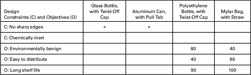
It is tempting to sum the data from these columns, but we should not. There is simply no basis for doing so, since it would imply that a score in one metric is somehow translatable into another. Indeed, adding the scores would suggest that the metric results could be considered as equally rank ordered, which we learned is not the case when we examined pairwise comparison charts. So what do the numbers mean? First of all, they allow us to see if one design is what as known as Pareto optimal, that is, superior in one or more dimensions, and at least equal in all the others. In this case, neither design is Pareto optimal. One design, the polyethylene bottle seems strongly superior with respect to the environmental objective, inferior with respect to distribution issues, and essentially tied in terms of shelf life. (Had we summed up the numbers, the particular ways in which one design is superior or inferior might well be masked, in addition to the problems mentioned above.) These values can be used to work with the client (and perhaps users) to revisit the objectives. It is not uncommon for a client to change their mind about relative rankings in order to get a very strong winner in some other dimension, especially if the design process has taken a long time since the initial consideration. There is more to be said about the individual component values that the different designs achieve.
This marked contrast between the designs with respect to different objectives suggests that designers might wind up choosing different designs based on the values of their clients. For example, one client might value an environmentally friendly container above all else, to the point of making the objective environmentally benign its dominant or even sole objective. That client would choose the polyethylene bottle. Another client might value ease of distribution above all else, perhaps because its principal concern is to get its new juice distributed into markets in poor countries as quickly as possible. With this value in mind, they might choose the Mylar bag with the same degree of rationality as NBC choosing the polyethylene bottle. (We can see this in the design decisions surrounding food packaging for disaster relief, where environmentalism is considered important, but secondary to the ability to get help where it is most needed.)
The results in Table 8.1 give the metric results awarded for each objective of each design, that is, they reflect solely the application of the metrics to the two design alternatives. They are independent of the client. In fact, there's nothing in Table 8.1 that identifies the client, which is as it should be. If our metrics produced different values for different clients (for the same product), we would have to wonder whether there was a defect in the testing process or in how the test results were reported. Ideally, a design team's metrics and associated testing procedures should not change with whoever is applying or making measurements for the metrics.
8.1.2 Priority Checkmark Method
The priority checkmark method is a simpler, qualitative version of the numerical evaluation matrix we have just described. We simply rank the objectives as high, medium, or low in priority. Objectives with high priority are given three checks, those with medium priority are given two checks, while objectives with low priority are given only one check, as shown in Table 8.2 for the same designs of Table 8.1. Similarly, metric results are assigned as 1 if they are awarded more than some arbitrary, but high value, such as 70 points (on a scale of 0–100), and as 0 if their award is less than the target value. Thus, a design alternative that meets an objective in a “satisfactory” way is then marked with one or more checks, as shown in Table 8.2. This method is easy to use, makes the setting of priorities rather simple, and is readily understood by clients and by other parties. On the other hand, the priority checkmark loses considerable information that may be useful in differentiating between relatively close alternatives. The actual metric results, for example, are no longer presented for consideration and discussion. In addition, because of its binary nature, this method may lead to results that appear to be more disparate than they really are. Designers need to be particularly careful not to succumb to the temptation to “cook the results” in choosing the thresholds.
TABLE 8.2 A priority benchmark chart for the juice container design problem. This chart qualitatively reflects a client's values in terms of the priority assigned to each objective, so it uses the ordering in the PCC of Figure 4.4

8.1.3 The Best-of-Class Chart
Our last method for ranking alternatives is the best-of-class chart. For each objective, we assign scores to each design alternative that start from 1 for the alternative that meets that objective best, increasing to 2 for second-best, and so on, until the alternative that met the objective worst is given a score equal to the number of alternatives being considered. So if there are seven alternatives, then the best at meeting a particular objective would receive a 1, and the worst a 7. Ties are allowed (e.g., two alternatives are considered “best” and so are tied for first) and are handled by splitting the available rankings (e.g., two “firsts” would each get a score of (1 + 2)/2 = 1.5, and a tie between the “second” and “third” would get (2 + 3)/2 = 2.5). Once again, we do not sum the results, since this would imply that all the objectives being considered have equal weight. Rather, the scores allow us to see if we have a design that is Pareto optimal (best in all categories), or at least best in the most important (i.e., highest ranked) objectives, and to discuss what the various high and low performances will mean for the final concept or scheme adopted.
Table 8.3 shows a best-of-class chart for the juice container example. Notice that this approach allows the designer and client to see how each design ranked with respect to the objectives, but gives no information on the actual scoring. If, for example, the Mylar bag was very close on the environmental scores, we might choose to treat that as a near tie, and select it over the alternative.
The best-of-class approach has advantages and disadvantages. One advantage is that it allows us to evaluate alternatives with respect to the results for each metric, rather than simply treat as a binary yes/no decision, as we did with priority checkmarks. It is also relatively easy to implement and explain. The ranking methods also allow for qualitative evaluations and judgments, since the persons applying the metric do not have to have a formal quantitative test for each objective. (This can be particularly helpful when the concepts are too expensive, difficult, or time-consuming to produce as prototypes.) The method can also be done by individual team members or by a design team as a whole to make explicit any differences in rankings or approaches. The disadvantages of the best-of-class approach are that it encourages evaluation based on opinion rather than testing or actual metrics, and it may lead to a moral hazard akin to that attached to priority checkmarks, that is, the temptation to fudge the results or cook the books. It also shows only the rankings, but not the actual score. As we saw in our juice container example, we do not know if the first and second results are close or not, which could be important information. Best of class can be particularly helpful if there are many alternatives and we want to narrow or consultative and thoughtful process to the top few.
TABLE 8.3 A best-of-class chart for the juice container design problem. This chart presents the rank ordering of the metrics results for each acceptable design. Notice that in this case, the client and the designer will need to select between the winner for the highest objective, or a design that wins on both of the other ones

8.1.4 An Important Reminder About Design Evaluation
No matter which of the three selection methods is used, design evaluation and selection demand careful, thoughtful judgment. First and foremost, as we have cautioned earlier, the ordinal rankings of the objectives obtained using PCCs cannot be meaningfully scaled or weighted. To draw a crude analogy, think of being at the finishing line of a race without a clock: we can observe the order in which racers finish, but we cannot measure how fast (i.e., how well) they finish the course. Similarly, while we can measure ranking with a PCC, we cannot measure or scale objectives' weights from their PCC order of finish: A PCC's ordinal rankings cannot be weighted or scaled. This means that we also cannot simply sum our results, since that would imply that all our objectives are being weighted with an equal value of 1.
Further, we must always exercise common sense as we are evaluating results. If the metrics results for two alternative designs are relatively close, they should be treated as effectively equal, unless there are other unevaluated strengths or weaknesses. Further, if we are surprised by our evaluations, we should ask whether our expectations were wrong, our measurements were consistently applied, or whether our rankings and our metrics are appropriate to the problem.
Still further, if the results do meet our expectations, we should ask whether we have done our evaluation fairly, or we have just reinforced some biases or preconceived ideas. Finally, it might be wise to check whether the constraints used to eliminate designs are truly binding.
In brief, there is no excuse for accepting results blindly and uncritically.
8.2 EVALUATING DESIGNS FOR THE DANBURY ARM SUPPORT
We now return to following the two design teams working on the arm support for the CP-afflicted student at the Danbury School. We noted in Chapter 7 that Team B developed three designs that we identified earlier as “Dually-Hinged Structure with Rail,” “Dually-Hinged Structure,” and “Ball and Socket Structure.” They applied their metrics (previously given in Table 4.11) as shown here in Table 8.4. Team B's report stated that, “As indicated by [the] applied metrics, the dually-hinged structure incorporating a rail overcame competing designs.” Their results highlight that designers cannot simply rely on numerical outcomes blindly. In this case, the selected design scored as high or higher on their top two objectives, but had mixed results on some of the others. This is often the case—designers must ultimately exercise informed judgment in consultation with their client. The dually hinged structure was declared the winner and, with some further modifications, was prototyped.
TABLE 8.4 This table shows the results of applying Team B's metrics to their three designs

Team A developed three designs from their morph chart (see Figure 7.6). They called those three designs “Sling,” “Sliding Bars,” and “Support Arm.” According to team A's final report,
“The evaluation of design alternatives consisted of(1) assigning percent weights to each objective, and (2) assigning a score to each design alternative for each objective, by estimating how well a design met an objective using metrics. After tallying the scores for the three devices, the support arm had the highest score. Thus, the support arm was selected as the final design to be refined and constructed.”
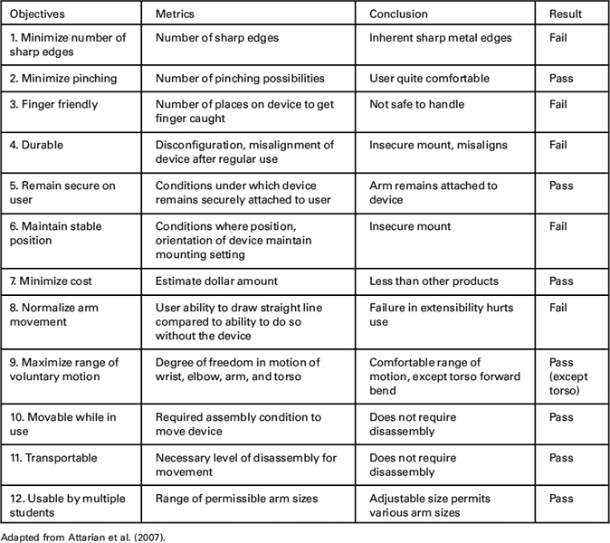
Team A did not present any of the results they said they obtained, save for the qualitative evaluation of their final design that is shown in Table 8.5, which show evaluation “Conclusions” and “Results” for the metrics we had previously shown in Table 4.10. The team clearly did several things it should not have, including: weighting the objectives, not limiting the number of objectives used in this design evaluation, not indicating in any way the margins (absolute or even relative) of the summed scores for their three designs, and just generally not providing the underlying basis for their design decisions to the client (or to their faculty advisors!). They were fortunate that they were working in a relatively narrow design space, as we noted before, and that they had used their ingenuity and insights into currently available products to produce what seemed like a reasonable design.
TABLE 8.5 Partial evaluation table of some of the most important objectives for the Danbury CP arm, as viewed by Team A, along with metrics, “Conclusion(s),” and final results
8.3 NOTES
Section 8.1: The three design evaluation methods discussed derive from Pugh's concept selection method, which is discussed in Pugh (1990), Ullman (1992, 1997), and Ulrich and Eppinger (1997, 2000).
Section 8.2: The results for the Danbury arm support design project are taken from Attarian et al. (2007) and Best et al. (2007), but have been modified and corrected for pedagogical reasons. Both teams attached weights to their metrics and summed them, which is incorrect. Rather than present two incorrect examples, the authors elected to present one correct, that is, unweighted, example.