
Understanding color and how Photoshop uses it
Understanding how to use histograms to analyze colors
Using the Curves tool to adjust tones
Selecting a color mode for an image
Selecting colors in Photoshop
Color is the basic element for everything that you do with images. The purpose of this chapter is to help you understand how Photoshop perceives color so you can use the tools in subsequent chapters more effectively.
Photoshop provides some very powerful tools to analyze, adjust, and select colors in your images. This chapter discusses using the histogram to understand the color composition in an image. Understanding the histogram is a basic necessity to make the most out of tools such as the Levels and Curves adjustments.
Another important aspect of this chapter is discussing the color modes provided in Photoshop and how to select colors based on those color modes. The color modes give you an insight into how Photoshop perceives color and consequently how to make the most out of the editing tools provided.
Color is the basic element of all images. The purpose of this section is to discuss the nature of color in relation to the human eye to give you a good foundation to work from. Understanding color helps you make better adjustments and corrections to your images. Also, because Photoshop gives you the option of working in several different color models, understanding color helps you choose the best color model.
They human eye can detect millions of different colors, but really, what are those colors made of? Put simply, color is made of light. Light travels in a series of waves. Visible light is made of waves traveling between a specific set of wavelengths. White light is light that contains waves of all frequencies and therefore contains all colors.
The human eye can distinguish the different wavelengths of the light waves. The wavelength of each light wave determines the color that the eye detects. For example, light waves with frequencies on the low end of the visible light spectrum are interpreted as blue, and light waves with frequencies on the high end of the visible light spectrum are interpreted as red.
When the eye looks at an object, it is detecting the light that is reflecting off the object. Depending on the nature of the surface of the object, some of the frequencies are absorbed by the surface of the object and some are reflected into the eye, producing the colors we see.
The eye detects color in light waves through tiny receptor cells in the retina called cones. Light stimulates these receptor cells, and they transfer the data to the brain. Of the three groups of cones, some are sensitive to the higher frequencies, some to the lower frequencies, and some to the middle frequencies of light. Therefore, no matter how complex the composition of wavelengths in the light that the eye is receiving, the color is broken down into three basic components by the eye. This is important as we discuss topics such as channels, histograms, and color management throughout the book.
Another attribute of light that affects the colors we see is the intensity. Intensity is the strength of the light reaching the eye. Basically, brighter light carries more intensity than does dimmer light. Because the cones in the eye are stimulated by the light waves, less intense waves stimulate them less, resulting in a limited amount of data being collected. This limits the number of shades of a color that the eye can discern. Understanding this helps you when you are making adjustments and correcting photos.
The eye overcomes dim lighting by using additional receptor cells called rods. In bright light, the rods perform almost no function; however, in dim light, the rods transfer additional data to the brain. The data from the rods is colorless, however, which is why we don't see much color in very low lighting. This also is why indoor photos taken with a flash appear much better than those taken without a flash.
Note
The cones in the eye are most sensitive to colors on the upper end of the visible light spectrum. Therefore, colors such as red, green, and yellow are affected less by reducing the intensity than colors such as blue and purple.
Photoshop applies the concepts of digital color in a way similar to the way our eyes work. Digital color is divided into channels and levels. A channel represents a specific color, and a level represents the intensity of that color. Using combinations of different levels of channels, Photoshop can represent millions of colors.
To illustrate this better, let's look at how some colors are represented in Photoshop using the RGB color mode (discussed later in this chapter). Using the RGB color mode, all colors are divided into three channels—red, green, and blue, hence RGB. Each channel has an intensity level range of 0 to 255, where 0 is none of the color and 255 is full intensity of the color.
Using the RGB color model, the color red is represented as 255 in the red channel, 0 in the blue, and 0 in the green. Similarly, green is represented as 255 in the green channel and 0 in the other two. Yellow is represented as a combination of the red and green channels at 255 and the blue channel at 0. To get black, all channels are set to 0; to get white, all channels are set to 255. In this way, all colors can be represented as a combination of different levels of the red, blue, and green channels.
Tip
Often, when working with multiple images, images on multiple computers, or in different applications, you need to make certain you use the same color in all places. If you note the level value in each channel, you can easily reproduce the same color, no matter where you are working. For example, you may be working in RGB mode and need to create specific color of blue where the red channel has a level of 26, the green channel has a level of 74, and the blue channel has a value of 158.
Each of the different color modes utilizes different color channels. However, all color modes use the concept of varying levels of each channel to represent different colors or tones. Photoshop provides several tools that use the concept of channels and levels to adjust images and apply special effects. Understanding how channels and levels represent color helps you utilize those tools in a much broader scope.
One of the most useful tools Photoshop provides when adjusting colors and tones in your images is the histogram. Using histograms, you can visually see the composition levels in one or more channels. At first histograms may seem a bit daunting to understand; however, after you understand what is being represented, your Photoshop life will never be the same. In this section, we discuss what histograms are and how to use the histogram tools provided in several areas of Photoshop to quickly adjust the levels of channels.
At first glance, a histogram looks like the silhouette of a mountain range, as shown in Figure 4.1. A histogram is really just a vertical bar chart. The chart is constructed by looking at each pixel in the image and counting the number of pixels that contain a value of 0 for that channel, then the value of 1, and so forth up to the value of 255.
Using the bar chart, histograms show how the levels of each channel are distributed in the image. So what does this mean? It means that you have a visual representation of the color and intensity distributing in your image.

You can interpret the visual data in the histograms in many ways to understand the composition of colors and light in an image to help you make the most out of Photoshop's adjustment tools. To illustrate this, the following sections cover how to use histograms to determine the exposure and color balance in an image.
One of the most useful features of a histogram is the ability to quickly determine how overexposed or underexposed an image is. Some photos are obviously overexposed or underexposed, and others just don't quite look good due to overexposure or underexposure, but it is difficult to tell by just looking at an image. Using histograms helps you quickly tell if an image is overexposed or underexposed.
Tip
When adjusting color, contrast, levels, and tone of an image, first check to see if the image is overexposed or underexposed. You want to adjust the exposure first as discussed in Chapter 9.
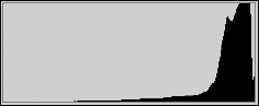
Images that are overexposed have mostly higher levels for all channels and almost no lower levels because more light was recorded in the image. Therefore, the histogram looks like a mountain on the right and not much on the left. Figure 4.2 shows an example of an image that has been overexposed. Notice that most of the data in the image falls to the higher end of the histogram.
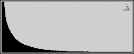
Images that are underexposed have mostly lower levels for all channels and almost no higher levels because not enough light reached the image. Therefore, the histogram looks like a mountain on the left side instead of the right. Figure 4.3 shows an example of an image that has been underexposed. Notice that most of the data in the image falls to the lower end of the histogram.
Histograms allow you to ascertain the color balance in an image. Understanding the color balance helps when you are trying to correct color and tonal issues in images. For example, if you look at the histograms of an image that should be balanced and see that the image has a disproportionate amount of red, you can easily adjust the red.
The best way to determine color balance in an image is to look at the histograms of each color channel individually. Viewing the histograms of each channel shows how much of that color is present in the image compared to the other color channels as well as a distribution of the levels of each channel.
Note
When viewing the color channel histograms of an image, keep in mind what colors should be present. For example, if you are working with an RGB image of a boat on the ocean with a blue sky background, you should see lots of blue, but not much green, and almost no red. However, if the image contains people, with green trees in the background and a blue sky, then there should be a fairly even distribution of red, green, and blue.
Figure 4.4 shows the channel histograms of an RGB image. Notice that the red channel has almost no values, and the values that are present are in the lower levels. Conversely, the green channel contains lots of data and is fairly distributed. The blue channel contains a moderate amount of data but is definitely skewed to the lower levels.
Obviously, the color levels in this image are not balanced, but what does that mean? Well, if the image is of a green plant, then it just means that the image contains much more green than any other color. However, if the image is a snapshot of a person's face, then it means that their skin tone is severely out of whack, and you've got your work cut out trying to fix it because you need red to get the pink back in the cheeks.

In the previous sections, we discussed the importance of using histograms in understanding the composition of light and color in an image. Photoshop provides a Histogram panel that helps you quickly view the important histograms of an image.
Using the Histogram panel, you can view the histograms of each of the channels, all channels together, colors, and luminosity. You also can use the histogram tool to view histograms of specific layers. In addition to the histograms, the Histogram panel can show you numerical statistics about the level composition of each histogram.
Tip
When you are making adjustments or corrections that have to do with color, hue, tone, contrast, and so on, view the Histogram panel for the image. Look at the overall histogram to check for overexposure/underexposure. Also, look at the individual channels to verify that the color balance is what you would expect for that image.
The Histogram panel, shown in Figure 4.5, is launched by selecting Window

The Histogram panel provides several views that can be set by selecting the menu icon shown in Figure 4.5. The following settings in the Histogram panel menu allow you to configure what information is shown in the Histogram panel:
Compact view: The compact view, shown on the left in Figure 4.6, shows only the histogram image of the current channel. This view is handy if you just want to dock the histogram with several other panels to view changes as you adjust the image.
Expanded view: The expanded view, shown in the center in Figure 4.6, shows the histogram image of the current channel but also provides the option to select different channels and sources for the histogram. It also displays the statistics if the Show Statistics option is selected.
All channels view: The all channels view, shown on the right in Figure 4.6, shows the histograms of all channels in addition to everything that the expanded view shows.
Show statistics: The show statistics setting toggles the statistics on and off in the expanded and all channels views.
Show channels in color: The show channels in color option toggles the color view of channels on and off. When selected, the histograms of individual channels are displayed in the channel color. This is useful if you are viewing a specific channel, because it is easy to distinguish which channel it is.
The Channel menu, shown in Figure 4.7, allows you to select a specific channel to view. The channel that is selected is displayed in the compact and expanded views and at the top of the all channels view. Also, the statistics are based on the channel that is selected.

Note
What channels are available in the Channel drop-down list depends on the color mode of the current image. For example, if the color mode is RGB, then the channels available are Red, Green, and Blue; if the color mode is CYMK, then the channels are Cyan, Magenta, Yellow, and Black.
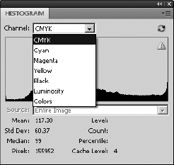
The following channels are available in the Histogram panel:
All Channels: At the top of the list in the channels menu is the option to select all the channels for the color mode. For example, if you are using RGB, the top item is RGB and it selects all channels to use for the histogram views and statistics.
Single Channel: In addition to all channels, each individual channel is listed in the channels list.
Luminosity: Selecting the luminosity channel calculates the histogram and statistics based on how much general light is coming from a composite of all channels. This is useful in determining the overexposure/underexposure.
Colors: Selecting the colors channel displays a histogram that is a composite of all color channels as well as the overlapping colors they generate. This is useful in seeing the general color composition in the image.
The Histogram panel allows you to select different sources to calculate the histograms from. Selecting one of the following options from the Source menu gives you the ability to view a histogram from any layer or adjustment layer or for the entire image:
Note
The image must have more than one layer or adjustment layer to use the Source menu to select alternate sources.
Entire Image: This calculates the histogram based on a composite of all layers. Basically, this is the histogram of the image if you flatten out all your changes.
Selected Layer: This calculates the histogram based on the selected layer in the Layer panel. You use this to calculate histograms on only a single layer.
Adjustment Composite: This calculates the histogram based on the adjustments made in the selected adjustment layer and all layers below it. This is useful to understand the adjustments you have made to an image in graphical form.
Tip
When combining elements from multiple images, add the selection from one image as a layer in the second. Then you can use the selected layer option in the source menu of the Histogram panel to compare the histograms of each different layer to see how well the colors match up. Making the histograms match better helps the composite image look better.
The statistics data in the Histogram panel, shown in Figure 4.8, displays the numerical values that are represented in the histogram image as well as some additional items. Most people would never need to use the statistics because image editing is really more of an art than a science. However, having specific numerical data about the histograms can be useful if you are tightly comparing images.
Tip
Many of the statistics change to match the level under the mouse cursor as you move the mouse over the image.

The following statistics are available from the statistics view in the Histogram panel:
Mean: This represents the average level for the selected channel.
Standard Deviation: This represents the variability of the selected channel—in other words, how varied in intensity levels the color in the selected channel is.
Median: This shows the exact middle value of the intensity levels for the channel. In other words, if you took the pixels that are more intense and placed them on one side of a scale and the pixels that are less intense on the other side of the scale, they would be evenly balanced.
Pixels: This shows the number of pixels in the selected channel. This can be useful to see how much data is contained in a specific layer—if you create a selection mask as a layer, for example.
Level: This shows the intensity level value directly under the mouse pointer when the mouse is over the histogram.
Count: This shows the total number of pixels that contain a level of intensity equal to the level under the mouse cursor.
Percentile: This displays the percentage of pixels with intensity levels that are at or below the level under the mouse cursor. The percentage is calculated based on a percentage of all pixels in the image, so the level to the farthest left is 0% and the level to the farthest right is 100%.
Cache Level: This displays the setting for current cache level if the Use Cache for Histograms is selected in the Preferences dialog box.
Some Photoshop tools provide histogram tools to help you better see how to adjust and correct images. Although we cover using the tools, such as the levels adjustments, in subsequent chapters, you need to know generally how they work.
The tools that Photoshop provides all have the same basic components. As an example, look at the Levels tool in Figure 4.9. The input levels are represented as a histogram. Below the histogram view are three triangular control handles that allow you to easily adjust the input levels of the channel in the image. To the right of the histogram are three eyedropper tools that allow you to select dark, light, and midtone points in the image to quickly adjust the input levels of the channel. The following sections discuss briefly how to use these tools. We discuss the tools in more detail in subsequent chapters as we get into correcting and adjusting images.

Figure 4.9. The Levels tool showing the histogram utility that Photoshop provides in several different tools
The dark handle on the left controls the minimum level for the channel, the white handle on the right controls the maximum level for the channel, and the middle gray handle controls the balance of middle tones between the high and low levels.
So what do the histogram controls really do? To help clarify, notice that most of the level values in the histogram shown in Figure 4.10 are located in the center levels. That means a relatively small number of tones are represented in the image, about 75 out of 255. The result typically is a washed-out image with very little detail.
Now move the left control over to the right until it is on the left side of the histogram mountain, and move the control on the right to the left until it is on the right side of the histogram mountain, as shown in Figure 4.10.
Note
A file with a histogram similar to the one in the image shown in Figure 4.10 can be found on this book's Web site as Figure 4-10.tif. You can open it in Photoshop. Try adjusting the levels and see how changing the histogram works and the results in the image.
Notice the values of the Histogram panel are distributed more evenly between 0 and 255. This means a greater range of tones is represented in the image because it includes values ranging between 0 and 255 instead of just a range between about 100 and 175. The tonal range of the entire image has been extended, providing much more detail with the simple adjustment of the two sliders.

Figure 4.10. Adjusting the minimum and maximum levels on the Levels tool to match more closely with the actual data in the image
The middle slider simply adjusts the balance of the midtone levels in the histogram. When the histogram is weighted heavily to one side or the other, the middle adjustment handle can be moved toward that side to balance midtones represented in the image.
For example, the Levels tool shown in Figure 4.11 is weighted heavily to the left, which means that all the data for the image is in the darker end of the levels. Move the midtone handle to the left toward the middle of the histogram mountain. Notice that the histogram mountain moves to the right to balance on the new location of the midtone slider.
Note
A file with a histogram similar to the one in the image shown in Figure 4.11 can be found on this book's Web site as Figure 4-11.tif. You can open it in Photoshop. Try adjusting the levels and see how changing the histogram works and the results in the image.

The Eyedropper tools allow you to adjust the levels of a channel by selecting three points in the image. The eyedropper on the left sets the minimum level for the channel, the eyedropper handle on the right sets the maximum level for the channel, and the middle eyedropper controls the balance of middle tones for the channel between the high and low levels.
The eyedroppers work similarly to the control handles except that instead of selecting a specific level for the dark, light, and midtones, you can select pixels directly in the image. To use the eyedroppers, simply click the left Eyedropper tool and select a pixel that should appear black in the image. Then click the right Eyedropper tool, and select a pixel that should appear white in the image. Finally click the middle Eyedropper tool, and select a pixel that should match the midtone for the color channel selected. In the case of all channels, select a pixel that should appear gray in the image.
Tip
The eyedroppers are fast and extremely accurate if there are items in the image that should appear black, white, and gray in the image. If you are not certain of the colors of the pixels, use the control handles instead of the eyedroppers.
Another tool that Photoshop provides to help you better see how to adjust and correct images is the Curves tool, available by selecting Image
While the Histogram tool allows you to change the light, dark, and midtone values for the histogram, the Curves tool allows you to apply a complex curve equation to the histogram, giving you unlimited control of the range of levels in the image. Using the Curves tool, you can control completely the tonal properties of an image.
In this section, we discuss what the curve is and how to use the Curves tool to adjust the levels in the image. Using the different Curves tools in Photoshop for specific purposes is covered in later chapters of this book.
To understand how the Curves tool works, you need to understand the curve itself. The curve starts as a diagonal line with the value of 0 on the left and 255 on the right, as shown in Figure 4.12. This means that the pixels currently with an intensity level of 0 for that channel have a value of 0 in the histogram, the pixels at level 1 have a value of 1, and so on up to 255.
Note
The grid lines in the curve window allow you to more easily tell what the values are for points on the line. The bottom/left line has a value of 0, the middle line has a value of 127, and the top/right line has a value of 255. The middle left/bottom line has a value of 64, and the middle right/top line has a value of 192.

The Curve tool works by applying new level values in the histogram for each of the current levels. Think of the Selection tool just as you would a graph with the existing level values specified along the bottom axis from 0 to 255. The new values are equal to the value of the point on the line corresponding to each of the old levels.
To help you understand the curve better, look at the following example. Figure 4.13 shows a modified curve. Notice that the points on the left (0), right (255), and the middle (127) all are on the original line, which means that pixels with those level values will not change. However, the curve goes above the original line before level 127 so those pixels for each of those levels increase to match the value of the line.
Using only two points may be a bit of a problem with the tonal correction. Notice that the levels close to 0, 127, and 255 do not change as much as the levels around 64 and 192. To overcome this problem, Photoshop allows you to apply additional points to the line to adjust the curve in several ways.

Now that you understand how the curve works, we discuss the features of the Curve tool that enable you to create dynamic curves that can really have an impact on the tones of your images. These tools can be found whether you are adjusting images using the Curves tool, with an adjustment layer, or in Camera Raw.
The first thing you want to do is to select that channel you want to adjust. The Channel drop-down menu, shown in Figure 4.14, allows you to select any channel or all the channels.

Points can be added to the curve by clicking the points curve button and then clicking the curve in the curve window. When the points curve button is selected, you can use the mouse to add points by clicking on the curve. You can add up to 14 points to the curve, making a total of 16 points including the ends, because the end points also are adjustable. Points can be removed from the line by dragging them with the mouse to the bottom-left corner or to the top-right corner of the curve window.
Tip
The more points you add to the line, the finer your adjustments to the tonal correction are. However, adding more points makes it more difficult to make adjustments because you may need to adjust all points when you adjust one. Make the bigger adjustments first, and then add more points as needed to speed things up.
You can adjust the input levels using the control handles along the bottom axis of the levels windows. This is the same thing as adjusting the minimum dark and maximum light levels in the histogram. This limits the curved lined to operate between those ranges. To adjust the input levels, simply grab one of the control handles with the mouse and drag it to the appropriate value.
A useful feature of the Curves tool is the ability to select a level directly from the image. This allows you to simply select a particular area of the image based on what colors/tones you see.
To adjust the levels from the image, click the click-and-drag button in the Curves tool (refer to Figure 4.14). Then use the mouse to select a pixel in the image containing the tone you want to adjust. A new point is created on the curve. While holding down the mouse button, you can move the mouse up and down to adjust the level of that point.
If 16 points on the curve line is not enough, you can create your own line by clicking on the Freehand Curve button (refer to Figure 4.14). The Freehand Curve button allows you to draw a freehand line directly on the curve window instead of using points to create the curve.
The freehand curve can be used by itself to create the curve. You can use the Freehand Curve tool to make slight, nonsmooth adjustments to the curve after you have created it with points. Only the areas of the curve that you draw with the Freehand tool are corrected.
Tip
You can convert a freehand line into a points curve by clicking the points curve button. This is helpful if you need to make some additional adjustments to the points curve after you change it using the Freehand tool.
Photoshop provides several color modes that help when working with images. Ultimately, as we discussed earlier in this chapter, color is just different intensities of light at different frequencies. However, that data needs to be translated into a quantifiable form that can be understood by Photoshop, the monitor, printers, and ultimately you.
This section gives you an overview of the different color modes available for use in Photoshop and why to use them. It also helps you understand the bits/channel settings for the image modes.
A color model is simply a method to translate the light captured in an image into a digital form that the computer and other devices can understand. Each color model breaks the light into one or more channels and then assigns an intensity level of each channel for each pixel in the image. Photoshop provides several color modes that match the most common color models.
Depending on what you are doing with an image, you want to use a specific color mode that provides the best management of the color. To set the color mode of an image, select Image
The bitmap color mode contains only one channel with only two possible levels, 0 and 255. The translation is that a bitmap is a black and white image without color and even without shades of gray. In essence, the image becomes a series of black dots on a white background. This may not sound very useful. However, there are several good uses for these types of images.
The most common use of the bitmap mode is outputting the image to a black and white laser printer. Laser printers create images as a series of black dots on the page. So working with the image as a bitmap lets you make changes to a version that appears exactly how it will when it is printed by the laser printer.
Tip
Bitmap images that are printed on low-resolution laser printers often end up darker than you would expect. Be sure to lighten the image before printing it to a low-resolution laser printer.
The bitmap dialog box shown in Figure 4.15 lets you set the resolution and method to use when creating the bitmap from the image. You should set the resolution to the same resolution that you will be using to output the image to the printer. The following methods can be selected from the drop-down list in the dialog box:
50% Threshold: This sets every pixel in the image that is more that 50% gray to black and every pixel that is 50% gray or lighter to white. This is by far the simplest pattern; however, the end effect is very choppy, and the image typically doesn't look very good unless you are trying for a special effect, for which it would be better to use the Threshold tool in the Image

Pattern Dither: The pattern dither uses a pattern to mix black and white pixels together, which results in the appearance of different shades of gray. The problem with this method is that the pattern shows up in the image, so the effect is not very smooth.
Diffusion Dither: This uses an error-diffusion method of converting an image into a series of dithered pixels that are less structured than the pattern dither. The diffusion dither method produces an image similar to a mezzotint, which often is the best option for printing on low-resolution laser printers.
Halftone Screen: This uses a series of dots of varying sizes and spacing that trick the eye into believing it is seeing a continuous tone. When you select the halftone screen option, an additional dialog box pops up that enables you to select the frequency, angle, and shape of the halftone dots. Typically, the best shape to use is the round shape because it is closest to what the printer generates. The frequency depends on the resolution of the printer. The higher the frequency, the better resolution you get in the image; however, if you set the frequency too high, the patterns overlap when printed and the results do not look good.
Custom Pattern: This allows you to select a custom pattern, either one of those included with Photoshop or one of your own. The custom pattern can be used with similar results to the pattern dither. Typically, this option is used only if you have a specific pattern that you want to show up in the image.

The grayscale mode contains only one channel, but unlike the bitmap mode it can have intensity levels from 0 to 255. The grayscale mode is useful if you are outputting the image to a noncolor printer.
Tip
You can create a grayscale image from a single RGB channel by selecting that channel in the Channels panel and converting the image to grayscale. Only the selected channel is converted to grayscale. This can be useful for special effects as well as utilizing the detail of a specific channel.
Another advantage of grayscale is that viewing and adjusting the image in grayscale reduces the overhead of dealing with three color channels. Photoshop is much faster at performing complex operations on grayscale images than on multichannel images. Having a single channel also makes it easier to make adjustments to an image because you only need to worry about adjusting that channel.
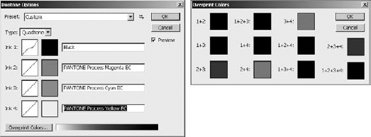
The duotone mode uses on contrasting color of ink over another to produce highlights and middle tones in a black and white image. Duotones typically are used to prepare images for printing. Using the Duotones Options dialog box, you can add one, two, three, or four inks to create a monotone, duotone, tritone, or quadtone image in Photoshop.
Use the following steps to configure the monotone, duotone, tritone, or quadtone options from the Duotone Options dialog box shown in Figure 4.16:
Note
The Duotone color mode option is available only for grayscale images. If you are using a color image you need to convert it to grayscale before changing to duotone.
Select the type of tone from the Type menu.
Click the blank swatch for each ink you need to specify.
Select the color to use for that tone.
Typically, you should use black for the first ink in the list.
Click the curve for each ink you need to configure to launch the Duotone Curve tool.
Use the Duotone Curve tool to adjust the tone curve for that color of ink.
Typically, you do not need to adjust the curve unless you want a specific effect from that tone of ink.
Click the Overprint Colors button, shown in Figure 4.16, to bring up the Overprint Colors dialog box.
Adjust the colors used when one ink is printed over another ink by selecting the colors for each of the overlapping options.
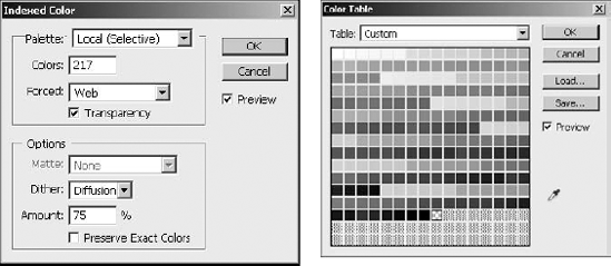
The indexed color mode contains a single channel with a single set of indexed colors. Converting an image to indexed color reduces the image to a set of most important colors. The remaining colors are given an index between 3 and 256 in a color lookup table. Instead of using the level value of the pixel to define the intensity of the channel, it points to an index value in the lookup table for the indexed image.
To change the color mode of an image to indexed color, select Image
Palette: This lets you select which palette to use when choosing the color to be placed in the index. You can choose a palette based on Exact, System, Web, Uniform, Local, Master, or Custom colors. The Local option selects colors local to the image. If you are working with multiple images, the Master option selects colors from a master of all images. When selecting local or master palettes, you can use a Selective, Adaptive, or Perceptual method of choosing the colors. The Selective method tries to preserve the key colors in the image. The Adaptive method simply preserves the most common colors. The Perceptual method intelligently selects colors that will provide the best transitions, rather than just the most popular ones. You also have the option to select System colors for images that will be viewed only on a computer. The Web option selects only Web-safe colors for images that will be used on Web pages.
Colors: This specifies the number of colors to use in the color lookup table. The minimum is 3 colors and the maximum is 256.
Tip
When creating Web images with file formats such as .gif and .png, using fewer colors results in smaller images.
Forced: This lets you force the conversion to keep certain colors in the image. The default is to force only black and white to be kept. The Primaries option protects eight colors: white, black, red, green, blue, cyan, yellow, and magenta. The Web option protects the 216 colors in the Web-safe colors. The Custom option allows you to preserve a specific palette of colors that you create. When you select the Custom option, a dialog box launches that allows you to specify the colors that you want to preserve.
Transparency: This specifies whether to preserve the transparency in the image.
Matte: The matte option allows you to specify a matte to use when working with transparency in the image. If there is no transparency in the image, this option is inactive. If the transparency option is selected, the translucent areas in the image are filled with the matte color. If the transparency option is deselected, the translucent and transparent areas are filled with the matte color.
Dither: This specifies the method Photoshop uses to calculate replacement colors for colors being discarded from the image. The None option simply selects the closest color in the lookup table, which can sometimes result in harder edges but is typically the best option to use. The Diffusion option dithers the color randomly, creating a more naturalistic effect. The Pattern option dithers in geometric patterns, which is usually the least desirable because the patterns show up in the image. The Noise option mixes pixels throughout the image instead of just the areas of transition.
Amount: This specifies the percentage of diffusion to use when dithering. This option is available only when you select the Diffusion dithering option. Lower values decrease the size of the file but result in harsher color transitions.
Preserve Exact Colors: This turns dithering off for areas of solid color when the Diffusion dithering option is selected. This option is not available unless the Diffusion dithering option is selected. Using this option helps your images look better even if you have to use dithering.
You likely will use the RGB color model most often. The RGB color model is used by computer monitors and the human eye. Photoshop processes its wide range of vivid colors quickly.
RGB is the model that most closely matches the human eye for two reasons. First, RGB uses three colors similar to the receptors in the human eye. Second, RGB is additive, meaning that as you add more color, you get more light, in the same way that more color results in the eye seeing white.
In the RGB model, colors are divided into three channels of red, green, and blue. Each channel has an intensity level range between 0 and 255. Each color is made up of a combination of intensity levels from these three channels, resulting in the possibility of over 16.7 million different colors.
RGB provides by far the most vibrant use of colors of all the color models and is supported by most file formats. The one downside to RGB is that it contains more colors, especially the brighter ones, than can be printed. This can result in loss of detail in areas of your images when they are printed. The solution is to use the CYMK color model if you are going to have your images professionally printed.
The CYMK color model is completely different from the RGB model in that it uses a subtractive method, meaning that the more color is added, the less light is seen. This is one of the reasons the CYMK model works so well for printing. Think about adding ink to a page; if you add all the colors, you get black, or rather a really deep brown.
Another difference between the CYMK model and the RGB model is that it is made up of four channels: cyan, yellow, magenta, and black. The black channel is necessary because adding the ink all together makes a dark brown not black, so if you want the printer to print true black, you must have a separate channel to specify black.
Which model should you use for general color image editing? The answer is RGB. The RGB model provides the widest range for tonal adjustment and correction. The scanner, monitor, and most other devices (except printers) work in the RGB model. Also, editing images in Photoshop in the RGB mode is much faster than in CYMK.
Tip
Even if you are using the RGB model, you can select View
The Lab color model is very different from RGB and CYMK. The Lab model does have three channels, but instead of all three dedicated to colors, only two—a and b—are dedicated to color; the third—Lightness—is dedicated to luminosity.
The a channel maps colors ranging from deep green at level 0 to gray at level 127 to a rich pink at 255. The b channel maps colors ranging from bright blue at level 0 to gray at level 127 to a dim yellow at 255. The Luminosity channel maps the brightness of each pixel from dark at 0 to white at 255.
The Lab channel is additive like the RGB model, but it has only two channels of color mixing, and the levels of those channels are not mapping to intensity but rather tones of color. The tones add together to form brighter colors, and only the luminosity channel provides data to darken the tone that is created by the other two channels.
Editing images in Lab color is about the same speed as RGB and much faster than CYMK, so it is a fun alternative if you want to adjust your thinking of mixing colors.
The Multichannel mode separates out the channels in the current color model into spot channels. Spot channels can be used to store parts of an image that you want to print in specific inks or spot colors. For example, you can print specific inks from a Pantone library.
When you convert an image to the Multichannel model, the current channels are changed to spot channels. The channels created in Multichannel mode depend on the original color mode of the image. For example, the RGB mode gets converted to cyan, magenta, and yellow spot channels, the CYMK model gets converted into cyan, magenta, yellow, and black spot channels, and the Lab model gets converted into three Alpha channels.
Note
The spot channels overlap, so if you do not want ink from one channel to be printed on ink from another channel, the data in those areas of the channel cannot overlap.
How many bits should you use per channel? The quick answer is 8 bits per channel, but let's look a bit closer. What does bits per channel mean? A bit is a single item of information for a computer with a value of 0 or 1. That doesn't mean much in terms of an image, but if you string millions of bits together, it can mean a lot.
Using 8 bits of information, we can define an intensity level of 0 to 255. For three channels, we can define about 16.7 million different colors for each channel. If we use 16 bits per channel, that goes up to over 281.4 trillion colors; if we go to 32 bits per channel, well, you get the idea.
So why not just use 32 bits per channel and maximize our information? The answer is disk space and speed. An image with 32 bits per channel takes up much more disk space and much more effort to edit on Photoshop's part. Plus, the human eye can't even detect all the colors in the 8 bits per channel.
And that leads to the question of why not just use 8 bits per channel, because it is more than enough for the human eye? The answer lies in what happens during adjustments, corrections, and conversions. Each time you make a correction to an image, change the levels, add a filter, and so on, you lose a little bit of the distinguishing detail. If you do enough corrections on an image with 8 bits per channel, you may lose noticeable detail in the image. However, if you are using an image with 16 bits per channel, the data lost is in levels that cannot be detected by the human eye, so when you convert the image back to 8 bits per channel, there is no data loss.
An image must be in the RGB or Lab color modes to convert it to 16 bits per channel. To change your image to 16 bits per channel, select Image
Now that you understand about color and how it relates to different modes in Photoshop, the last thing you need to know is how to actually select a color in Photoshop. You will be working with many different tools in Photoshop that require you to select colors to use.
Remember that even in 8 bits per channel, you can choose from more than 16 million colors. The following sections discuss the main methods that you will use to set and select colors.
The most common method of choosing a color is using the Color Picker tool shown in Figure 4.18. The Color Picker tool is launched by clicking the foreground or background tool in the Photoshop toolbox.
The Color Picker tool allows you to select any color possible in Photoshop and gives you a wealth of information. The main areas of the Color Picker tool are the color chooser pane, the range slider, the new/current color view, and the color settings.
The Color Picker lets you use the mouse to select the color of any pixel displayed in the pane. The range slider lets you use the mouse to adjust the range of colors displayed in the Color Picker pane. The new/current color view simply shows the current color on the bottom and the newly selected color on top for comparison purposes.

The color settings allow you to change each individual aspect of color that Photoshop uses to define a color. Selecting one of the color settings changes the types of color that can be displayed in the color chooser pane. Changing the value of one of the settings changes the selected color. This list describes the available settings in the Color Picker tool:
H: Changes the hue of the color. The hue values are based on a range of 0 degrees to 360 degrees. Think of a color wheel where red is at 0/360 degrees, green is at 120 degrees, and blue is at 240 degrees. The hue setting is one of the best to use when selecting colors because it allows you to quickly move to a specific color using the range slider.
S: Changes the saturation of the color. The values are based on 0% to 100%. A higher saturation means more of the color, and a lower saturation means gray. If you have the color you want but you want a little bit different tone, this is the best option to select for the range view.
B: Changes the brightness of the color. The values are based on 0% to 100%. Higher values mean the colors are brighter, and lower values mean darker. This is also useful when you have the color you want but you want to adjust the tone just a bit.
R: Changes the intensity of the red channel in the color. The values are based on intensity levels of 0 to 255. Lower values mean less red, and higher values mean more intense red.
G: Changes the intensity of the green channel in the color. The values are based on intensity levels of 0 to 255. Lower values mean less green, and higher values mean more intense green.
B: Changes the intensity of the blue channel in the color. The values are based on intensity levels of 0 to 255. Lower values mean less blue, and higher values mean more intense blue.
#: Specifies the hexadecimal code associated with the color. This is useful for colors that are specified in Web pages and for specifying a particular color without having to memorize multiple values.
L: Changes the lightness of the color. The values are based on a luminosity of 0 to 100. Higher values mean white, lower values mean black, and middle values specify the tone of the color. This is useful when you have the color you want but want to adjust the tone just a bit.
a: Changes the value of the a channel in the Lab color mode. The values are based on tones between −128 and 127, where −128 is green, 127 is pink, and 0 is gray.
b: Changes the value of the b channel in the Lab color mode. The values are based on tones between −128 and 127, where −128 is blue, 127 is yellow, and 0 is gray.
C: Specifies the percentage of cyan in the color. The values are based on a range of 0% to 100%, where 0% is no cyan and 100% is full intensity cyan.
M: Specifies the percentage of magenta in the color. The values are based on a range of 0% to 100%, where 0% is no magenta and 100% is full intensity magenta.
Y: Specifies the percentage of yellow in the color. The values are based on a range of 0% to 100%, where 0% is no yellow and 100% is full intensity yellow.
K: Specifies the percentage of black in the color. The values are based on a range of 0% to 100%, where 0% is no black and 100% is full intensity black.
Another nice feature of the Color Picker tool is the ability to add the color you have chosen to the Swatches panel. This is especially nice if you have taken a long time to find just the right color. To add the color to the swatch, click the Add to Swatches button and specify the swatch name to add the color to.
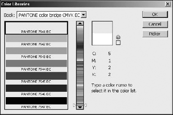
The Color Picker tool also allows you to select colors from a color library such as a Pantone color. To select a color from a color library, click the Color Libraries button to bring up the Color Library dialog box shown in Figure 4.19. Select the library book, and choose the color. To change back to the Color Picker, click the Picker button.
Another method of choosing a color is using the Color panel shown in Figure 4.20. The Color panel provides the option of quickly selecting a color based on one of the color models or using sliders to adjust the levels of the color channels. To launch the Color panel, select Window
The working components of the Color panel are the before/after view, the Slider tools, the color ramp, and the menu. The before/after view allows you to see the original color as well as the newly selected color. The color ramp at the bottom allows you to select a color from the ramp using the Eyedropper tool that becomes visible when the mouse is over it. The Slider tools allow you to use the mouse to drag handles to quickly select the level for each available channel or to type in a specific value.
The menu of the Color panel provides the following options to change the color mode used to select colors:

Grayscale Slider: Sets the slider control to a single slider that adjusts the level of grayscale colors. This tool is useful if you need to add gray without any other tone to the image.
RGB Sliders: Sets the slider control to three sliders that allow you to adjust the intensity levels of the red, blue, and green channels.
HSB Sliders: Sets the slider control to three sliders that allow you to adjust the hue, saturation, and brightness of the color.
CYMK Sliders: Sets the slider control to four sliders that allow you to adjust the intensity levels of the cyan, yellow, magenta, and black channels.
Lab Sliders: Sets the slider control to three sliders that allow you to adjust the values of the a, b, and luminosity levels in the Lab channels.
Web Color Sliders: Sets the slider control to three sliders that allow you to adjust the hex code values of the red, green, and blue channels for Web images.
Copy Color as HTML: Copies the current color as the HTML code that gets inserted into an HTML tag when building Web pages—for example, color="#9999cc".
Copy Color's Hex Code: Copies the current color as the hexadecimal code that represents the red, green, and blue values—for example, 9999cc.
RGB Spectrum: Changes the color ramp to use the RGB spectrum for selecting colors using the eyedropper.
CYMK Spectrum: Changes the color ramp to use the CYMK spectrum for selecting colors using the eyedropper.
Grayscale Ramp: Changes the color ramp to use the grayscale ramp for selecting a shade of gray using the eyedropper.
Current Colors: Changes the color ramp to use only the tonal values of the current color when selecting a color using the eyedropper.
Make Ramp Web Safe: Changes the color ramp to provide only the Web-safe palette for selecting colors using the eyedropper.
One of the simplest methods of choosing a color is using the Swatches panel shown in Figure 4.21. A swatch is just a set of colors combined together. The Swatches panel displays the available colors in the swatch either as thumbnails or a list. To choose a color, simply click the one you want. To launch the Swatches panel, select Window

Using the Swatches panel menu, you can select one of the following views to display the colors available in the swatch:
Small Thumbnail: Displays the colors as tiny squares in the Swatch panel. This view is the most commonly used. Typically, the colors are big enough to see and yet the panel doesn't take up much room.
Large Thumbnail: Displays the colors as larger squares in the Swatch panel. This view is useful if you have colors that are very close to each other in the swatch. Viewing larger squares makes it easier to distinguish between the colors.
Small List: Displays the colors as a list with tiny squares next to the color names in the Swatch panel. This view typically is used when you want to know the name of the color when selecting it. Navigating large swatches from the list form is difficult.
Large List: Displays the colors as a list with large squares next to the color names in the Swatch panel. This view is almost never used because of the difficulty in scrolling through to find a color.
Using the menu in the Swatch panel, you also can save the colors in the current swatch as a custom swatch as well as load and replace swatches. You also can select from a list of swatches built into Photoshop.
Tip
When you open a new swatch, it allows you to append it to the existing swatch. This enables you to combine swatches you commonly use into a single custom swatch that you can load later, allowing you to avoid constantly switching between swatches.
Another way to select a color is to use the Eyedropper tool in the Toolbox. This is by far the simplest method of selecting a color. The Eyedropper tool works by selecting the color that the mouse is currently over in the image when the left button is clicked.
The downside to using the Eyedropper tool is that the color must appear in the image. The upside to using the Eyedropper tool is that the color appears in the image. These two statements may appear to conflict; however, it depends on what you are trying to do.
If the colors in the image are limited or you want to add a color that doesn't exist in the image, the Eyedropper tool will not work for you. However, if you are trying to use a color that matches the surrounding image, selecting a color from the image guarantees that it matches somewhere in the image.
When using the Eyedropper tool, the options menu shown in Figure 4.22 will allow you to set the following options:
Sample Size: Allows you to specify the size of the area of pixels beneath the Eyedropper tool that are sampled to determine color when the mouse is clicked. The default is 11 by 11, but you can specify ranges from a single pixel to 101 by 101. The total area of pixels is sampled and the average color is selected. For images with a lot of variance, you will likely want to use a smaller sample size.
Sample: Specifies whether to sample pixels from all layers or only the current layer.
Show Sampling Ring: When this option is selected a large ring, shown in Figure 4.22, is displayed as long as you hold the mouse button down. The color ring shows the current color on the bottom and the sampled color on top as you drag the mouse around the image. Notice that the current color is black and the sample color is from the small patch of blue in the image.
Note
The Show Sampling Ring option is available only if you enable OpenGL drawing as described in Chapter 2.

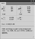
A subtool of the Eyedropper tool in the Photoshop Toolbox is the Color Sampler. It looks like the Eyedropper, but has a crosshair in the icon. The Color Sampler tool allows you to view channel settings for up to four channels. As shown in the Info panel in Figure 4.23, the Color Sampler tool launches when a pixel is selected.
To use the Color Sampler tool, select it from the Toolbox and use the mouse to select pixels in the image. After a pixel is selected by left-clicking in the image, the Info panel is loaded. As the mouse moves, the data at the top of the Info panel changes, telling you the values of the RGB and CYMK channels of the pixel that the mouse is over.
You can add up to four samples to the Info panel using the Color Sampler tool. To delete a sample, right-click the sample using Color Sampler tool and select Delete from the pop-up menu. To change the color mode information listed in the Info panel, right-click the sample and select the color mode.
One of the best ways to quickly select a color while using another tool such as a brush is to use the HUD Color Picker shown in Figure 4.24. The HUD color picker provides a hue strip or wheel that sets the base tone for a color block. An Eyedropper cursor in the color block allows you to select a specific color from the color block or a hue from the hue strip or wheel.
The HUD Color Picker is launched by pressing Alt(Option)+Shift while right-clicking with the mouse. Figure 4.24 shows both the wheel and strip versions of the HUD Color Picker. Which version is displayed is defined in the General settings of the Preferences dialog as discussed in Chapter 2.
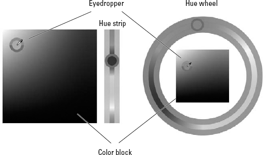
Figure 4.24. The HUD Color Picker is a very useful method to change the color while using other tools
Note
The HUD Color Picker is available only if you enable OpenGL drawing as described in Chapter 2 and in 8-bit and 16-bit images.
This chapter covered everything about color, from how the human eye perceives it to how to select a color in Photoshop. The histogram shows you the basic composition of one or more color channels, and modifying the histogram modifies the color composition in the image.
The purpose this chapter was to familiarize you with the relationship between light, color, the human eye, digital files, and Photoshop. You have learned the following:
Color is simply light reflected off surfaces at different frequencies and intensities.
How to understand the information contained in a histogram and how it applies to the level and channels contained in the different color modes of Photoshop.
The purpose and how to best use each of the color modes such as RGB, CYMK, and grayscale.
Utilizing the color tools in Photoshop to give you the maximum information when editing your images.