Lighting is a cornerstone of any 3D project. Although you can easily create and position lights within a scene, an understanding of lighting theory will help you make aesthetically solid choices. The history of art and cinema is full of inspiring examples to choose from. Although 3-point lighting is a mainstay of 3D, 1-point, 2-point, and naturalistic lighting provide alternative lighting methods that better match the real world and the art traditions of the past. On the other hand, stylistic lighting can free an artist from traditional bounds and thereby place no limits on expression.
Chapter Contents
Common lighting terms
An overview of 1-, 2-, and 3-point lighting
An exploration of naturalistic and stylistic lighting
A quick review of color theory, monitor calibration, and composition techniques
Lighting examples
Like every aspect of 3D, lighting must be created from scratch. Unfortunately, the techniques for emulating the real world are not always obvious or intuitive. Luckily, a wealth of lighting theory exists in the form of historical artwork, photography, and motion pictures.
For the sake of clarity, I've broken the discussion of lighting theory into the following categories: 1-point, 2-point, 3-point, naturalistic, and stylistic. The first three categories refer to the number of lights employed. The last two refer to a particular style. Before delving into 1-point lighting, however, I'll define a few common lighting terms:
- Key
The most intense light in a scene. The key light's source is generally identifiable (the sun, a lamp, and so on). The key light usually produces the strongest shadow in the scene.
- Fill
A secondary light that is less intense than the key. This light "fills" in the dark areas of a subject and the shadows produced by the key. Fill lights often represent light from a key that has bounced off a surface, such as a wall.
- Rim
An intense light source placed behind a subject that strikes the subject along the edge. Rim lights are often employed as hair lights. These lights are commonly known as backlights or kickers.
The 1-point lighting scheme is dramatic, sometimes stark, and often foreboding. The lighting involves a single, easily identifiable key light source, with no significant supplemental sources. You can find 1-point lighting in the following situations:
A man lights a cigarette in an otherwise dark alley.
A woman drives a car down a dark country road, lit only by the car's instrument panel.
Sunbeams burst through the window of an otherwise unlit interior.
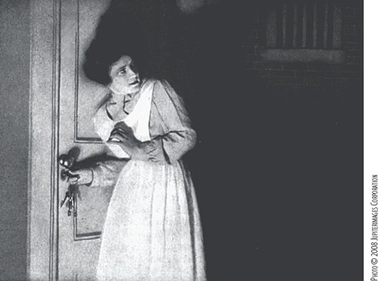
A theater audience is illuminated by the light of the movie screen (see Figure 1.1).
The motion picture genre that most closely emulates 1-point lighting is film noir. Film noir is a style historically associated with crime dramas of the 1940s and 1950s. The style is typified by black-and-white film stock, sparsely lit characters, and deep black shadows. Aesthetically, the lighting stemmed from stories with cynical, paranoid, or nihilistic outlooks. Technically, the stark lighting was the result of placing only a few lights on the set, in some cases because of budgetary restrictions. Although multiple lights were generally needed for any given shot for proper exposure, the result often appears as if a single light source exists (see Figure 1.2).

Classic film noir films include The Maltese Falcon (1941), Double Indemnity (1944), and Touch of Evil (1958). More recent examples include Blade Runner (1982) and Sin City (2005). The lighting style employed by film noir is often referred to as low-key lighting, where there is a strong key light and little, if any, fill.
Film noir is closely related to German expressionism, which was an art movement popular in Germany from 1905 to 1925. German expressionism was dominated by the dark, sinister aspects of the human psyche. The movement is known for its bold, simplified woodcuts (see Figure 1.3) and its atmospheric horror cinema (for example, The Cabinet of Dr. Caligari, 1919).

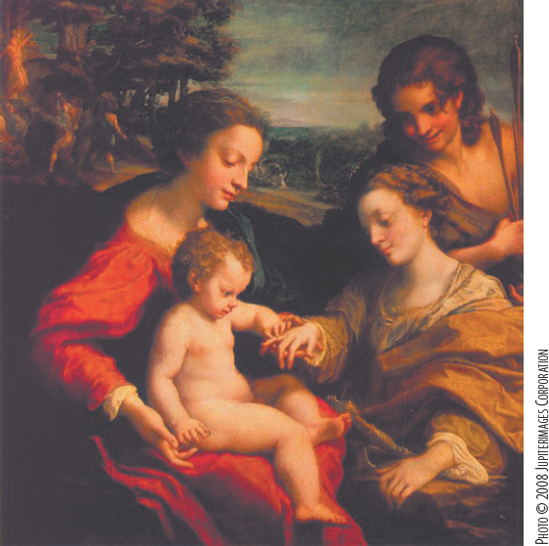
The roots of expressionism can be traced to the chiaroscuro painting style of the 15th and 16th centuries in Italy and Flanders. Chiaroscuro is defined by a bold contrast between lights and darks (the word is Italian for light-dark). This is often characterized by figures in bright pools of light jutting through dark spaces. Chiaroscuro reached its pinnacle with the baroque art movement (17th and 18th centuries in Europe) and is exemplified by master painters Caravaggio (1573–1610) and Rembrandt (1606–69). For example, in Figure 1.4, Jesus and his disciples are lit by the light of a single high window from the left. A fill light reaches the front of the table and the sides of their faces; however, the result is fairly subtle.
When painters push for stronger contrast, unlit areas of the scene are rarely painted with pure black. In Figure 1.5, an unidentified key light arrives from the left. No other source of light is apparent. Yet, a background wall is visible due to a faint fill. In addition, the head of a central character is seen in the shadow. Hence, the paintings illustrated in Figures 1.4 and 1.5 bridge the gap between 1- and 2-point lighting.

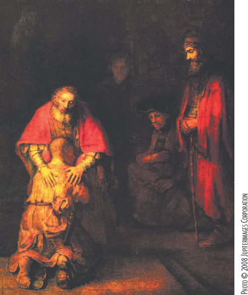
Figure 1.5. Rembrandt. The Return of the Prodigal Son. 1662. Oil on canvas. The Hermitage, St. Petersburg. Note that the wall and central character in the background are barely visible.
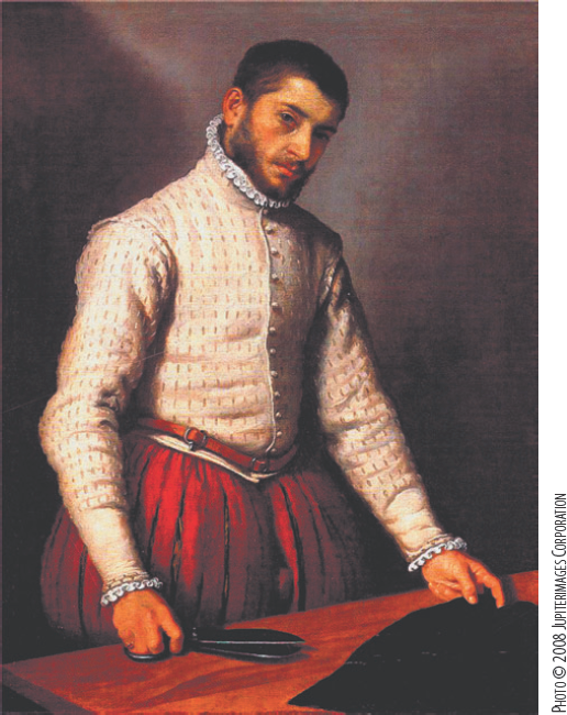
In comparison, true 1-point lighting is sometimes found in portraiture. For example, in Figure 1.6 there is a single light source in front of and higher than the man. A secondary light source is not identifiable. The painter, Anthony Van Dyck (1599–1641), was an influential baroque portraitist.

Figure 1.6. Van Dyck. Portrait of Cornelis van der Geest. c. 1621. Oil on oak. National Gallery, London.
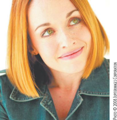
You'll see 1-point lighting in contemporary photography and videography. In particular, this technique is used in work created for the fashion industry, commercial advertising, and music videos. A strong, diffuse key light, sometimes in the form of a "soft box" light diffuser or a large ring of fluorescent lights, is placed around, beside, or above the camera. This setup creates evenly lit faces with little sense of additional lighting (see Figure 1.7).
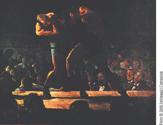
Modern painters have also made use of 1-point lighting. For example, in Figure 1.8 a boxing match is lit by a single strong source from frame left. As with the work illustrated in Figures 1.4 and 1.5, there is an extremely soft fill present; the fill lights the back of the rightmost boxer. The painter, George Bellows (1882–1925), was a member of the Modern School movement; he sought to portray the gritty reality of urban life.
It's easy to set up 1-point lighting in 3D. The most difficult aspect of the scheme is the creation of aesthetic patterns of light and dark. For example, in Figure 1.9 a film noir–style photo is re-created in Maya. A series of trial-and-error renders were necessary to position a directional light in a satisfactory manner. The intensity of the key should be high enough to illuminate the parts not in shadow but not so high as to "blow out" or overexpose some areas.
The 2-point lighting scheme matches many of the lighting scenarios we encounter in our everyday lives. The scheme often involves a strong key and an extremely diffuse fill. The following are examples of 2-point lighting:
Sunlight streams through a window. The light bounce from the interior walls serves as a fill.
Office workers sit in a windowless room lit with overhead fluorescent lights. The light bounce from the walls, desks, and floor serves as a fill.
A couple walks down a sidewalk on a sunny day. The light bounces off the concrete, providing fill to the bottom of their hands, the underside of their chins, and their eye sockets (see Figure 1.10).
You'll often see 2-point lighting in painted portraits. For example, in Figure 1.11 a man is lit by a strong key light arriving from the left. A second light source delivers fill from the right; thus, no part of the person or his outfit is left unlit. This painting was created by Frans Hals (1582–1666), a baroque painter whose loose, powerful brushstrokes inspired the impressionism movement. This style of lighting is called short lighting in studio photography; the side of the head facing away from the camera receives the key. The opposite style of lighting is called broad lighting, in which the side of the head facing the camera receives the key.

Figure 1.10. A couple receives sunlight from above and as a bounced fill from the sidewalk. The lighting is a 2-point setup.
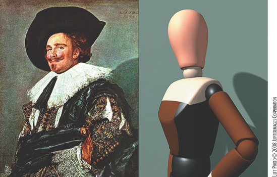
Figure 1.11. (Left) Hals. The Laughing Cavalier. 1624. Oil on canvas. The Wallace Collection, London. (Right) 2-point lighting re-creation in Maya. The scene is included on the CD as 2_point.ma.
The intensity of the key light as compared to the fill (key-to-fill ratio) should vary with the subject and location. The optimum intensity of any light used in a scene depends on its position and the qualities of the materials involved. Nevertheless, as a rough rule of thumb for an initial lighting pass, you can set the intensity of a fill light to at least half that of the key. For the 3D reproduction illustrated in Figure 1.11, a directional light serves as the key. The directional light's Intensity value is set to 1.75. An ambient light, which serves as the fill, is placed screen right with its Intensity value set to 0.6 (see Figure 1.12).

The 2-point lighting scheme is not limited to portraits. Many outdoor scenes exhibit two distinct sources of light. For example, in Figure 1.13 a watercolor street scene portrays a strong key light in the form of the sun. An even fill along the backs of the house and other structures represents the bounced sunlight, which serves as the second light source.

Perhaps the most commonly discussed and applied lighting technique is 3-point lighting. Descriptions can be found in numerous 3D, film, and video instructional materials. Although 3-point lighting is a reliable way to light many scenes, it has inherent drawbacks.
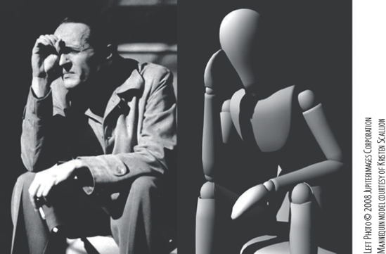
In the standard 3-point lighting scheme, a strong key is placed to one side of a subject (approximately 15 to 45 degrees off the camera axis). A fill light is placed on the opposite side and is at least half the intensity of the key (see Figure 1.14). A rim light is placed behind the subject so that it grazes the subject's edge.
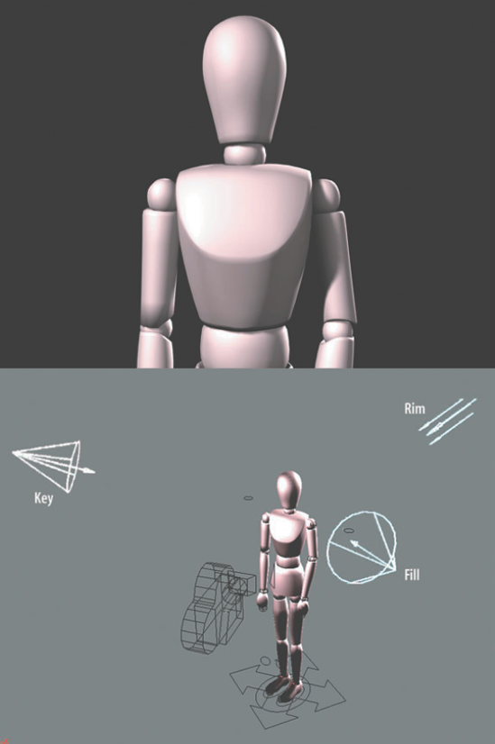
Figure 1.14. Standard 3-point lighting applied to a mannequin. This scene is included on the CD as 3_point_man.ma.
Note
Four-point lighting simply adds a fourth light to illuminate the background or set behind the subject.
The 3-point lighting scheme is popular in the realm of 3D because it lends depth to a potentially flat subject. For example, in Figure 1.15 a sphere is given additional roundness with three lights. A spot light, which serves as the key, is placed screen left. An ambient light, which serves as a fill, is placed screen right. A directional light, which functions as a rim light, is placed behind the sphere. The balance between the key and fill creates a slightly dark "core" down the center of sphere. The bright edge created by the rim helps separate the sphere from the dark background.
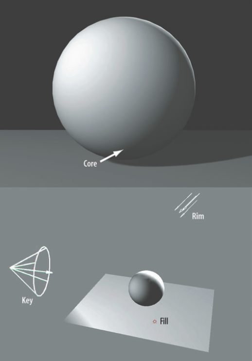
Figure 1.15. Standard 3-point lighting applied to a primitive sphere. This scene is included on the CD as 3_point_sphere.ma.
Three-point lighting was developed in the "Golden Age of Hollywood," which refers to the period between the advent of "talkies" and the years immediately following World War II. Studio cinematographers developed the technique as an efficient way to light scenes when time was somewhat limited and production schedules had to be met. When lighting actors, cinematographers often sought out the "Rembrandt patch," which is a triangular patch of light on the cheek opposite the light source (see Figure 1.16). The patch was named after the painter, who often featured such a pattern in his portraits.
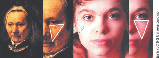
Figure 1.16. (Left) Rembrandt. Portrait of an Old Woman. c. 1650. Oil on canvas. Pushkin Museum of Fine Arts, Moscow. (Right) Modern photo with similar "Rembrandt patch" on subject's left cheek.
Rim lights, in particular, were developed to separate the actor from a dark or cluttered background. Rim lights (and other fundamental aspects of lighting design) can trace their roots to early theatrical stage lighting. Early examples of their use in motion pictures include, but are not limited to, Old and New (1929), directed by Sergei Eisenstein, and the 1920s comedies of Charles Chaplin (A Woman of Paris, Gold Rush, and so on). Eventually, rim lights were used to impart a fantastic glow to the hair of heroines such as Ingrid Bergman in Casablanca (1942), Rita Hayworth in Gilda (1946), and Grace Kelly in Rear Window (1954). The use of rim lights does not necessitate the use of a definitive fill light. Glamour lighting, a name loosely given to the lighting style of publicity photography of American motion picture studios from the 1920s to the 1940s, often used only a key and a rim (see Figure 1.17). A variation of this technique, known as butterfly lighting or Paramount lighting, places a high key directly in front of the subject (thereby creating a shadow in the shape of a butterfly under the nose).
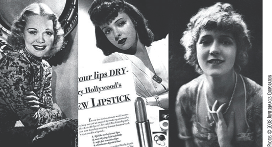
Figure 1.17. Three variations of glamour lighting, as seen in photographs of Jane Wyman (left), Ida Lupino (center), and Mary Pickford (right).
Proper 3-point lighting is fairly difficult to find in the world of painting. Clearly defined rims are not generally painted in. In many cases, a portion of a subject that is dark is allowed to blend into a dark background (see Figures 1.4, 1.5, and 1.6). In other situations, the chosen background is bright enough to delineate the outline of the subject. In Figure 1.18, the man's dark hair and the shadow on his left shoulder are offset by a pool of light on the back wall. This strategically placed pool serves the same function as a rim light, but isn't part of the modern 3-point lighting method.
On the other hand, rim lighting can often be found in nature. For example, in Figure 1.19 a cloud covers the sun and picks up a bright rim. Intense sunlight strikes a cactus from behind, thereby illuminating its spines. A woman's hair is lit from light streaming through a window. These natural occurrences, however, do not fit the standard 3-point lighting system. None of the subjects are affected by more than two distinct sources of light.
Many contemporary cinematographers and videographers consider 3-point lighting either antiquated or unsatisfactory for many lighting situations. The necessity of specific positions for key, fill, and rim lights guarantees that 3-point lighting does not match many real-world situations. The alternative to 3-point lighting is thus naturalistic lighting.

Naturalistic lighting is an adaptable scheme that matches the natural lighting scenario of the subject location. Any light that is visible is logically driven by a recognizable source. Naturalistic lighting is sometimes called "transparent" in that no artificial lighting methods can be detected. Another way to define naturalistic lighting is to list what it lacks:
Unmotivated shadows
Impossibly distinct rim light
Perfectly placed lights that never permit a character to fall into shadow or be unglamorously lit
In the field of motion pictures, there are numerous examples of non-naturalistic lighting. Many films feature stylized or exaggerated lighting. This is particularly evident with musicals, which are fantastic by their very nature. Such films as The Band Wagon (1953) and Silk Stockings (1957) employ high-key lighting, in which the fill light is intense and there is a low key-to-fill ratio. The characters in these films are therefore evenly lit and carry a minimum number of deep, dark shadows. High-key lighting is also evident in many television sitcoms, in which it is necessary to keep a character well lit at all positions on the set. Similar lighting is employed for advertising and catalog art (see Figure 1.20).

In other situations, non-naturalistic lighting is a result of technical limitations or time and budget restrictions. A common problem with older motion pictures is the unintended creation of unmotivated, multiple shadows. For example, light representing the sun casts multiple shadows of a character on the ground. More commonly, a lamp casts multiple, distinct shadows of its own fixture (see Figure 1.21). This is caused by a need to illuminate a set with multiple lights to attain correct exposure even though the desired light source—in terms of the story—is singular.
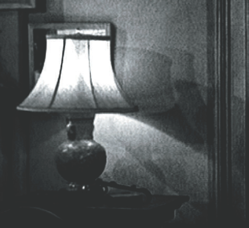
Figure 1.21. A lamp unrealistically casts three sharp shadows of itself (as seen in a frame blowup from a 1950s motion picture).
In contrast, naturalistic lighting is often found in post-1950s historical dramas, particularly those set in times before the advent of the lightbulb. Prime examples include Barry Lyndon (1975), directed by Stanley Kubrick (1928–99), and 1492 (1992), directed by Ridley Scott (1937–). In these works, lighting is motivated by combinations of sunlight, moonlight, candlelight, and firelight. Keys, fills, and their resulting shadows are often extremely soft. The naturalistic lighting approach is not limited to historical drama, however. Kubrick also employed naturalistic lighting in such films as A Clockwork Orange (1971) and The Shining (1980).
In the world of art, naturalistic lighting can be found in any of the painting genres that placed a premium on accurate lighting. For example, Jan van Eyck (1385–1440) was an early adopter of physically accurate painting. In Figure 1.22, the light from several windows bounces through a room, creating soft shadows along the way. Van Eyck helped to establish the style of the Early Renaissance, which placed an importance on the study of the natural world.
In addition to chiaroscuro works, the baroque movement produced many naturalistic paintings. The movement placed an emphasis on emotionally and physically accurate portrayals of subjects. Two Dutch painters, Jan Vermeer (1632–75) and Pieter de Hooch (1629–84), were particularly successful at rendering soft, naturally lit interiors and exteriors. For example, in Figure 1.23 a sunset sky provides a diffuse light within a building's shadow for a threesome at a table, yet brightly lights buildings in the distance.
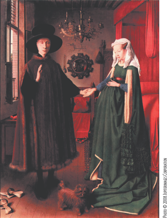
Figure 1.22. Van Eyck. Giovanni Arnolfini and His Wife Giovanna Cenami. 1434. Tempura on wood. National Gallery, London.
Realism, as an art movement, appeared in the mid-19th century and placed a premium on an accurately portrayed world with no hint of idealism or romanticism. Realist artists include George Caleb Bingham (1811–79) and Jules Breton (1827–1906), both of whom are noted for their accurately rendered outdoor scenes. Impressionism, centered in France in the 1860s and considered a branch of realism, sought to faithfully portray light and color as perceived by the human eye. This attention to light is illustrated by Figure 1.24. A woman stands at a bar in front of a large mirror. The painting was created at a real location and was not staged in the artist's studio (this preference was known as "plein-air," or "open-air"). Although the scene is quite cluttered with detail, little attempt has been made to separate the woman from her surroundings. That is, there is no artificial rim light or artifacts of a specific lighting scheme. This is equally true of the bottles at the lower left; their forms begin to merge into a single mass. (Although the lighting is accurately portrayed, the mirror's reflection lacks the artist and skews the entire background for compositional convenience.) Famous impressionistic painters include Edgar Degas (1834–1917), Claude Monet (1840–1926), Pierre-Auguste Renoir (1841–1919), and édouard Manet (1832–83).
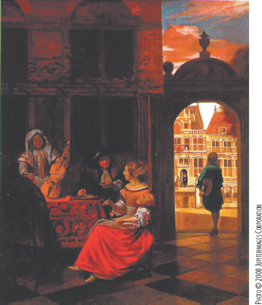
Figure 1.23. De Hooch. A Musical Party in a Courtyard. c. 1677. Oil on canvas. National Gallery, London.
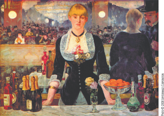
Figure 1.24. Manet. A Bar at the Foiles-Bergére. 1882. Oil on canvas. Courtauld Institute Galleries, London.
Naturalistic lighting, by its very nature, does not dictate a fixed number of lights or specific light locations or intensities. However, you can use the following guidelines to assist you during setup:
Determine what the strongest light is and where it should be coming from. Is the light source visible within the frame or is it arriving from offscreen? Set one or more key lights in appropriate locations. Match the type of light to the type of source. (See Chapter 2 for more information on Maya light types.) Render tests to determine the appropriate intensities of the key or keys before adding fill lights.
Determine what secondary light sources are needed. Are these sources physical (that is, a lamp, a candle, and so on), or are they actually the bounced light of the strongest light source? Set fill lights in the appropriate locations. If you are copying an existing location, replicate the key-to-fill ratio. If the scene you are creating does not exist in the real world, apply a key-to-fill ratio that is similar to an equivalent location in the real world.
When applying shadows, replicate the type of shadow that is naturally produced by a specific light source. For example, midday sunlight creates hard-edged parallel shadows (see Figure 1.25). An artificial source close to the subject, such as a lightbulb, produces a shadow that widens and softens over distance. (See Chapter 3 for information on shadow creation in Maya.)
Color is equally important when reproducing a particular location. Different light sources create different wavelengths of light, which in turn produce specific hues that are perceived by the human eye or recorded on a medium such as film or video. (See Chapter 2 for information concerning Maya light color. For information on color temperature, see "A Note on Color Temperature" at the end of this chapter.)

For practice, you can always re-create existing images. For example, in Figure 1.26 the lighting of a Vermeer painting is replicated in 3D.
Stylized lighting pays no heed to the real world but fabricates fantastic sources of light or simply ignores the lighting information altogether.
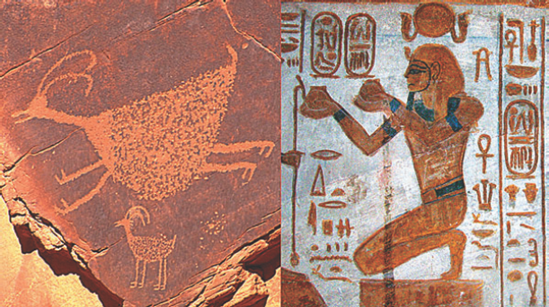
The oldest form of stylized lighting can be called 0-point lighting. In this case, lighting plays no part in the artistic representation. You can see this in prehistoric art, as well as in the art of ancient or primitive cultures (see Figure 1.27). To this day, 0-point lighting survives as line-art cartoons.
You can find stylized lighting in numerous pieces of modern art. Many times, this style is evident even when distinct modeling is given to the subject. (That is, the subject is painted to have three-dimensional form.) For example, in Figure 1.28, a man is completely disconnected from his environment. Although it can be assumed to be night, there is no way to tell for sure. No shadows of lighting clues exist to establish a real-world lighting scheme.
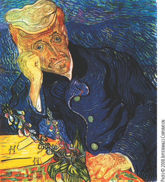
Figure 1.28. Vincent Willem van Gogh (18590). Portrait of Dr. Gachet. 1890. Oil on canvas. Whereabouts unknown.
Stylized lighting is well suited for 3D animation, since the medium places no limitation on the type of lighting employed. For 3D examples of this style, see the section "Step-by-Step: 3D Lighting Examples" at the end of this chapter.
Successful lighting is not dependent on appropriate light placement alone. One crucial component is color. Unfortunately, it is beyond the scope of this book to cover the bulk of color theory. However, a discussion of the RYB and RGB color models, color wheels, color space, color temperature, and light color is worth a look.
At the same time, composition is a critical component of any animation that is rendered. Composition—the aesthetic arrangement of objects within a frame—can be reduced to the golden mean and the rule of thirds.
In the traditional color theory model, red, yellow, and blue are considered primary colors. As such, they follow these rules:
No combination of any two primary colors can produce a third primary color.
Combinations of all three primaries can produce a wider range of colors than any other combination of colors.
You can form secondary colors by mixing together primary colors, which produces orange, green, and violet (purple). You can form tertiary colors by mixing primary colors and secondary colors; the resulting colors are generally given hyphenated names, such as blue-green. The primary, secondary, and tertiary colors are often represented by a 12-step color wheel (see Figure 1.29).
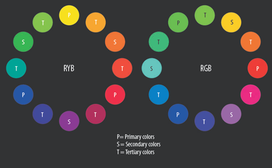
Figure 1.29. (Left) Red-yellow-blue (RYB) color wheel re-created in Maya. The scene is included on the CD as RYB_wheel.ma. (Right) Red-green-blue (RGB) color wheel re-created in Maya. The scene is included on the CD as RGB_wheel.ma.
The red-yellow-blue (RYB) color theory model evolved in the 18th century and was based on color materialism, which assumes that primary colors are based on specific, indivisible material pigments found in minerals or other natural substances. The popularization of specific RYB colors was aided by printmakers such as Jakob Christoffel Le Blon (1667–1741), who developed the color separation printing process. The color wheel itself was invented by Sir Isaac Newton (1642–1727) in 1704, although his variation contained seven hues visible when white light was split by a prism.
The development of computer graphics, however, has added a new set of primary colors: red, green, and blue, or RGB. This produces its own unique color wheel (see Figure 1.29). Through an additive process, computer monitors mix red, green, and blue light to produce additional colors. Added in equal proportions, RGB primaries produce white. In contrast, the RYB color theory model is subtractive in that the absence of red, yellow, and blue produces white (assuming that the blank paper or canvas is indeed white). In this case, if colored paint or ink pigments are present, they absorb certain wavelengths of light, thus preventing those wavelengths from being reflected back at the viewer. When combined in equal proportions, the RYB primaries produce black (having absorbed all visible wavelengths of light). Modern printing techniques follow the subtractive model by utilizing cyan, magenta, and yellow primary inks, with the addition of black ink (CMYK, where K is black). Cyan, magenta, and yellow happen to be secondary colors on the RGB color wheel. Maya's Color Chooser window represents the RGB color wheel as a hexagon shape; primary and secondary colors are located at the corners of the hexagon. (For more information on the Color Chooser, see Chapter 6.)
Despite the disparity between color theory models, methods of using a RYB color wheel are equally applicable to RGB color wheels. As such, the goal of color selection is color harmony, which is the pleasing selection and arrangement of colors within a piece of art. The most common methods of choosing harmonic colors produce the following color combinations with the RGB color wheel:
- Complementary colors
A pair of colors at opposite ends of the color wheel. For example, in Figure 1.30, the blue-cyan body and red-orange head of a bizarre character compose a complementary color set.
- Split complement
One color plus the two colors that flank that color's complementary color (for example, green, blue-violet, and red-violet).
- Analogous colors
Colors that are side-by-side. For example, in Figure 1.31 the cloaks of two women are red-orange and yellow-orange. In RGB, red-orange is a mixture of primary red and tertiary orange; yellow-orange is the mixture of secondary yellow and tertiary orange. (If compared to the RYB color wheel, the colors correspond to secondary orange and tertiary yellow-orange, which are also analogous.)
- Diad
Two colors that have a single color position between them (for example, secondary violet and primary red on the RGB color wheel).
- Triad
Three colors that are equally spaced on the wheel.
Note
A common mistake made by many 2D and 3D animators is the overuse of pure primary and secondary colors in their designs. Colors located between the secondary and tertiary elements will provide a more diverse palette. For instance, instead of choosing 1, 0, 1 in Maya RGB color space, try selecting 0.5, 0.4, 0.8 for a more muted variation of violet.
Maya operates in RGB color space. Color space represents all the colors that a device can produce. The color space available to various output devices varies greatly. For example, the color space that a television can display is significantly different from the color space available to a computer monitor or a printer.
Never assume that a computer monitor is displaying your renders correctly. If you are creating an animation for video, it's best to check the resulting edit on a professional broadcast monitor. If you are creating a render for print, bring the render into Photoshop or a similar program, convert the RGB color space to CMYK color space, and choose the correct color profile (see the next paragraph). If you are creating the animation for motion picture film, calibrate your monitor based on the suggestions of the service transferring the frames. Larger animation houses often maintain their own transfer equipment. In many cases, a lookup table (LUT) is developed to properly map the gamma of the computer monitors used by animators. Portable calibration hardware is also used to check the calibration result. (The color displayed by a monitor "drifts" over time.) Although this process may be too costly for an independent animator, calibration shortcuts can be taken.
Many digital-imaging programs are bundled with calibration software. Adobe Gamma is perhaps the most common. Launching the program will step you through an interactive calibration process. Although useful, Adobe Gamma is designed for print projects, so it might not provide accurate settings for some animation. In addition, Photoshop, along with other digital-imaging programs, offers multiple color profiles based on the color standards of the International Color Consortium (ICC). Color profiles represent the color reproduction capabilities of a device. Hence, you can work within the color limitations of a specific printer while in Photoshop. Unfortunately, the standard profiles are not designed for film or video.
A quick-and-dirty method of checking the color calibration of a monitor involves the use of a chip chart. For example, in Figure 1.32 a chart runs from black to white in 11 distinct steps and in a continuous gradient. When displayed on a monitor, a portion of the chart may appear "crushed." (Certain steps may no longer be visible, and the gradient may no longer be smooth.) If this is the case with your monitor, you might unintentionally base a scene's lighting on an inaccurate view of the scene's actual color space. The end result might be an animation that appears too dark and muddy on video or too bright and washed out on film. Adjusting the brightness, contrast, gamma, and color temperature of the monitor can alleviate this problem. Although you can usually adjust the brightness and contrast through a monitor's external control panel, the gamma and color temperature are usually controlled through a piece of calibration software (for example, Adobe Gamma). (For more information on gamma, see Chapter 6.)

Color temperature is based on the wavelength of light emitted by a material when it is heated. Technically speaking, if a light source is said to be 5500 kelvin, it emits the same wavelength of light, and the same color of light, as a black body radiator heated to 5500 kelvin. A black body radiator is a theoretical material that absorbs 100 percent of the radiation that strikes it when the body is at absolute zero (−273 C°). Although there are no true black bodies in the real world, graphite and various metals come close. In the original experiments by William Kelvin (1824–1907), a block of heated carbon was used. The kelvin, on the other hand, is a measurement of temperature that adds 273 to the temperature read in Celsius. The kelvin measurement only refers to the thermal temperature of the theoretical black body radiator and is not the actual temperature of a light source. In other words, a fluorescent lightbulb does not have to reach a real-world 4000 degrees kelvin to produce the same color of light as the black body radiator at 4000 kelvin; instead, the color of the bulb is roughly correlated to the color of the heated black body.
When a material is heated to a temperature above 700 K (700 kelvin), it emits visible light. At temperatures close to 700 K, the light wavelength is long and the perceived light is red. At temperatures above 6000 K, the wavelength becomes shorter and the perceived color shifts to blue. The chart in Figure 1.33 indicates the color temperature of various light sources and their perceived colors. The colors represented are only a rough approximation. In addition, the color temperatures listed for each light source are an average; depending on the circumstance or the method of manufacture, color temperatures can easily vary by hundreds of kelvin.
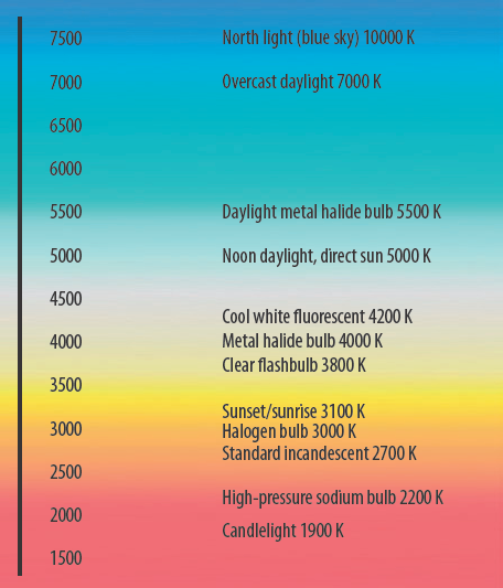
In the case of monitor calibration, color temperature is used to set the white point of the hardware. A white point is a coordinate in color space that defines what is "white." If a monitor is given a white point with a high kelvin value, the display has a blue cast. If a monitor is given a white point with a low kelvin value, the display has a yellow cast. The flexibility of the white point is necessary to match potential output formats. For example, graphic artists who use offset printing might set their monitors to 5500 K. For 3D animation intended for video, 6500 K generally works because broadcast-quality video monitors have a hardware white point set to 6500 K. In contrast, older consumer televisions may have a white point set as high at 9300 K. Many plasma and LCD televisions now offer the option to switch to 5400 K to better match motion picture film.
When lighting in Maya, you do not need to know the kelvin temperature of a light source. What is important, however, is that the color of the light logically fits the type of source. For example, daytime sunlight varies from white to blue. Firelight varies from red to orange. Incandescent lightbulbs are yellowish. If a light color is out of place, a scene may appear incorrect to the viewer. This should not be confused with the way colors are recorded on film, where colors are often exaggerated. For example, daylight film (balanced for 5500 K) will make the yellow of an incandescent bulb more orange. Tungsten film (balanced for 3200 K) will make sunlight extremely blue. Professional photographers and cinematographers reduce this problem by employing color corrective filters and gels. However, the end result is rarely the same as the way it was originally perceived by the human eye. Obviously, if you are matching 3D to a live-action plate, colors should be replicated regardless of what they might be. However, if the 3D is only meant to look real, colors—as they're perceived by the human eye—should be matched.
For more information on color manipulation, see Chapter 6. For information on color bit depth, see Chapter 10.
The golden mean was extolled by Pythagoras (580–500 BC) and his fellow Greeks. The mean is a number, 1.618 . . ., that is irrational and cannot be converted to a fraction. The golden mean defines a golden rectangle, which has an aspect ratio of roughly 1.618:1. Mathematically, a golden rectangle is a rectangle that can be partitioned into a square and a smaller rectangle that has the same aspect ratio of the original rectangle (see Figure 1.34). The golden mean is represented as the Greek letter phi and is commonly referred to as the golden ratio, golden section, or golden proportion. Although the Greeks are often given credit for discovering the golden mean, some historians suggest that it was employed by earlier civilizations (for example, Babylonia and Egypt).

Greek architects determined that the golden rectangle was aesthetically superior to other ratios and employed the shape in many building designs. This determination has persisted for the past two millennia in the architecture of Western civilization. As for fine art, the golden mean was rediscovered by artists of the Renaissance, including Leonardo da Vinci (1452–1519) and Raphael (1483–1520). Variations of the golden mean can also be found in Medieval Islamic architecture and tile work. Many 19th- and 20th-century artists, including Georges Seurat (1859–91), Piet Mondrian (1872–1944), and Salvador Dali (1904–89), applied the compositional technique (see Figure 1.35). The golden rectangle survives to this day as the approximate aspect ratio of credit and debit cards (1.6:1). The 1.66:1 motion picture aspect ratio, used extensively outside North America, also comes close to the golden rectangle. (For more information on aspect ratios, see Chapter 10.)
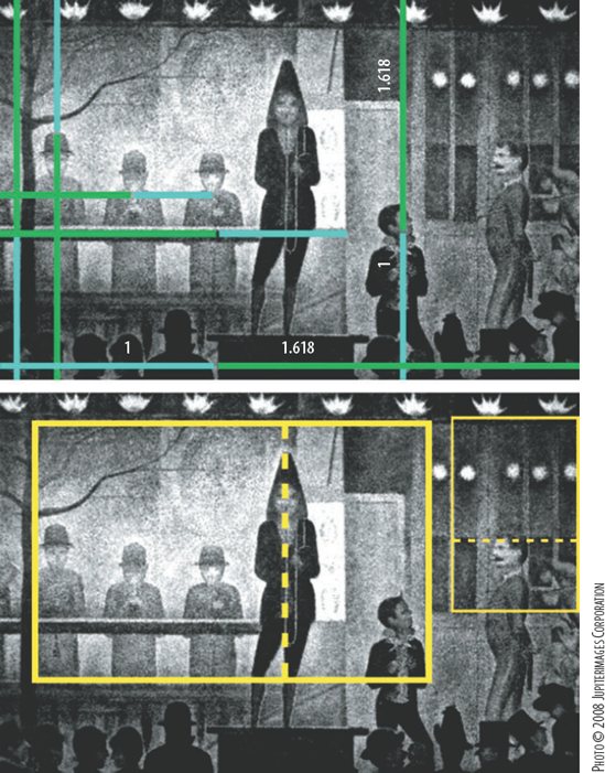
Figure 1.35. The golden mean and golden rectangle used in a composition by Seurat. (Circus Sideshow. 1888. Oil on canvas. Metropolitan Museum of Art, New York.) The painting is repeated twice.
The golden mean has many natural occurrences. For example, the Fibonacci series, a series of numbers in which the division of any two adjacent numbers is roughly the golden mean, can be used to accurately predict the growth of flower petals, seeds, seashells, pine cones, and various plant leaves.
Numerous psychological studies have been undertaken since the late 1800s to determine if humans have a natural bias toward the golden rectangle. Conclusions have been varied; on average, they've recognized the rectangle's slight advantage. Nevertheless, since the golden mean and its geometric corollaries have consciously or unconsciously been used in such a large body of popular art, you can benefit from its judicious use.
In addition to the golden rectangle, the golden mean can be expressed as a golden triangle, a pentagram, or a decagon. For example, in Figure 1.36 the golden triangle and pentagram are used in the composition of paintings by Raphael and Leonardo da Vinci.

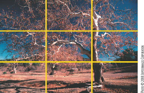
The rule of thirds is a compositional technique developed for modern photography and videography. Simply put, you can take any frame and divide it into three horizontal and vertical sections to determine the alignment of subjects (see Figure 1.37). For example, you can align a tree, a person, or other vertical element with a vertical line. You can align the horizon or a building with a horizontal line. The four points at which the lines cross are considered prime compositional spots and should feature important details in a shot (for example, a person's face, the moon, and so on).
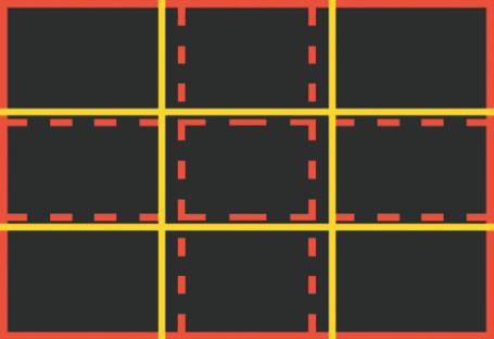
The rule of thirds is not an accurate representation of the golden mean (see Figure 1.38). However, the rule may have evolved as a simplified variation of the golden rectangle subdivided according to the golden mean. (Unfortunately, the exact origin of the rule of thirds technique remains murky.) The rule of thirds is useful for modern media, such as videography, that often require quick compositional decision making. The golden mean, on the other hand, is appropriate for painting and 3D since more time can be spent contemplating composition. In any case, attention to compositional detail will improve any animation you choose to tackle.
Note
Screen direction, a system of motion picture rules developed over the last 100 years, dictates how and where characters, vehicles, and props should be positioned and/or be allowed to move through a series of shots. A strong knowledge of this system will allow you to make proper choices when setting up an animation with multiple shots. You can find information on screen direction from sources that discuss storyboarding, film direction, or editing.
In this section, I'll discuss the lighting approach of various independent animations. The lighting style varies from naturalistic to stylized.
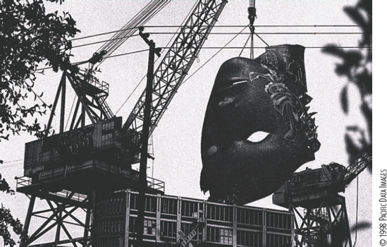
Millennium Bug featured a series of otherworldly characters inserted into photographs of San Francisco. Simple naturalistic lighting was employed to match the cloudy, overcast weather conditions of the photos. In one shot (see Figure 1.39), a 3D head was added to a preexisting crane. A single spotlight, positioned high and to the right, served as a key. A very low intensity fill light was placed low and to the left. The shadow of the head on the building was added in the composite. Film grain and an artificial camera move were also added in postproduction. Millennium Bug was created with Alias PowerAnimator on Silicon Graphics machines.
Mirror employed an extreme example of chiaroscuro lighting. Many shots possessed only a single key with a limited cone size and no fill. In Figure 1.40, a woman is lit with a single spotlight from screen left. The shadow directly behind the woman was fabricated in the composite and is hence less dense than other shadows in the shot. Mirror was created with the original beta release of Maya.
In Day Off the Dead, a combination of naturalistic and 2-point lighting was used. For exteriors, one to four lights were placed to emulate a bright, sunlit day (see the top of Figure 1.41). For the interiors, rarely more than two lights were used; in each case, there was always a strong key. Many of the shadows were created during the composite, which allowed the shadow shapes to go off in unrealistic and inappropriate directions (see the bottom of Figure 1.41). This lent a dreamlike feel to the piece. Depth of fields were added for many shots in postproduction.

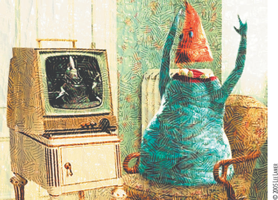
Weapons of Mass Destruction employed high-key lighting with supersaturated colors. The film was constructed as a series of short vignettes, many of which served as bizarre commercials from the future. In one shot (see Figure 1.42), a worm was lit with a strong key from the front. The ambience and incandescence of the character's material prevented the need for any additional lights. The background, which started as a 3D piece, was eventually converted to a digital matte painting.
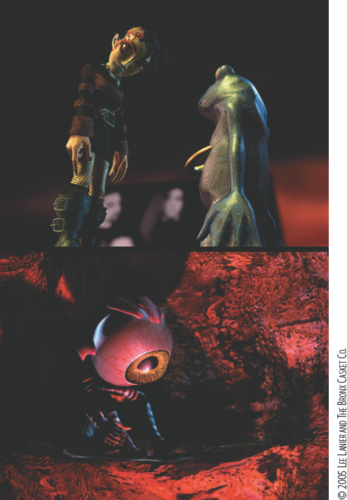
Little Dead Girl made use of stylistic lighting. In many cases, the light hitting the characters had little to do with the environment. In the two shots featured in Figure 1.43, the Little Dead Girl, the Lab Frog, and the Eyeball Child were given their own sets of key lights, fill lights, and rim lights. The goal of the lighting was simply to model the characters in an interesting fashion. In the end, the animation took on the feel of stop-motion cinematography.

Figure 1.42. Weapons of Mass Destruction, 2004. A QuickTime movie excerpt is included on the CD as womd.mov.