
Analysis of Cost and Performance
The characterization of different machine configurations is at the heart of computer system design, and so it is vital that we as practitioners do it correctly. Accurate and precise characterizations can provide deep insight into system behavior, enable correct decision-making, and ultimately save money and time. Failure to accurately and precisely describe the system under study can lead to misinterpretations of behavior, misdirected attention, and loss of time and revenue. This chapter discusses some of the metrics and tools used in computer system analysis and design, from the correct form of combined multi-parameter figures of merit to the philosophy of performance characterization.
28.1 Combining Cost and Performance
The following will be obvious in retrospect, but it quite clearly needs to be said, because all too frequently work is presented that unintentionally obscures information: when combining metrics of both cost and performance into a single figure of merit, one must take care to treat the separate metrics appropriately. The same reasoning presented in this section lies behind other well-known metric combinations such as energy-delay product and power-delay product.
To be specific, if combining performance and cost into a single figure of merit, one can only divide cost into performance if the choice of metric for performance grows in the opposite direction as the metric for cost. For example, consider the following:
Bandwidth is good if it increases, while pin count is good if it decreases. MIPS is good if it increases, while die area (square millimeters) is good if it decreases. Transactions per second is good if it increases, while dollar cost is good if it decreases. The combined metrics give information about the value of the design they represent, in particular, how that design might scale. The figure of merit bandwidth per pin suggests that twice the bandwidth can be had for twice the cost (i.e., by doubling the number of pins); the figure of merit IPC per square millimeter suggests that twice the performance can be had by doubling the number of on-chip resources; the figure of merit transactions per second per dollar suggests that the capacity of the transaction-processing system can be doubled by doubling the cost of the system; and, to a first order, these implications tend to be true.
If we try to combine performance and cost metrics that grow in the same direction, we cannot divide one into the other; we must multiply them. For example, consider the following:
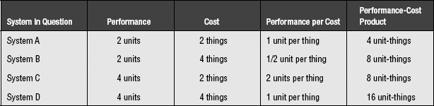
On the surface, these might seem to be reasonable representations of cost performance, but they are not. Consult Table 28.1, which has intentionally vague units of measurement. For example, assume that “performance” is in execution time and that “cost” is in dollars, an example corresponding to the first “bad” bullet item above. Dividing dollars into execution time (performance per cost, fourth column) suggests that systems A and D are equivalent. Yet system D takes twice as long to execute and costs twice as much as system A—it should be considered four times worse than system A, a relationship that is suggested by the values in the last column. Similarly, consider performance as CPI and cost as die area (second bad bullet item above). Dividing die area into CPI (performance per cost, fourth column) suggests that system C is four times worse than system B (its CPI per square millimeter value is four times higher). However, put another way, system C costs half as much as system B, but has half the performance as B, so the two should be equivalent, which is precisely what is shown in the last column.
TABLE 28.1
Using a performance-cost product instead of a quotient gives the results that are appropriate and intuitive:
Note that, when combining multiple atomic metrics into a single figure of merit, one is really attempting to cast into a single number the information provided in a Pareto plot, where each metric corresponds to its own axis. Collapsing a multidimensional representation into a single number itself obscures information, even if done correctly, and thus we would encourage a designer to always use Pareto plots when possible. This leads us to the following section.
28.2 Pareto Optimality
This section reproduces part of the “Overview” chapter, for the sake of completeness.
28.2.1 The Pareto-Optimal Set: An Equivalence Class
While it is convenient to represent the “goodness” of a design solution, a particular system configuration, as a single number so that one can readily compare the goodness ratings of candidate design solutions, doing so can often mislead a designer. In the design of computer systems and memory systems, we inherently deal with multi-dimensional design spaces (e.g., encompassing performance, energy consumption, cost, etc.), and so using a single number to represent a solution’s value is not really appropriate, unless we assign exact weights to the various metrics (which is dangerous and will be discussed in more detail later) or unless we care about one aspect to the exclusion of all others (e.g., performance at any cost).
Assuming that we do not have exact weights for the figures of merit and that we do care about more than one aspect of the system, a very powerful tool to aid in system analysis is the concept of Pareto optimality or Pareto efficiency, named after the Italian economist, Vilfredo Pareto, who invented it in the early 1900s.
Pareto optimality asserts that one candidate solution to a problem is better than another candidate solution only if the first dominates the second, i.e., if the first is better than or equal to the second in all figures of merit. If one solution has a better value in one dimension, but a worse value in another dimension, then the two candidates are Pareto-equivalent. The “best” solution is actually a set of candidate solutions: the set of Pareto-equivalent solutions that are not dominated by any solution.
Figure 28.1(a) shows a set of candidate solutions in a two-dimensional (2D) space that represents a cost/performance metric. In this example, the x-axis represents system performance in execution time (smaller numbers are better), and the y-axis represents system cost in dollars (smaller numbers are better). Figure 28.1(b) shows the Pareto-optimal set in solid black and connected by a line; the line denotes the boundary between the Pareto-optimal subset and the dominated subset, with points on the line belonging to the dominated set (dominated data points are shown in the figure as grey). In this example, the Pareto-optimal set forms a wavefront that approaches both axes simultaneously. Figures 28.1(c) and 28.1(d) show the effect of adding four new candidate solutions to the space: one lies inside the wavefront, one lies on the wave-front, and two lie outside the wavefront. The first two new additions, A and B, are both dominated by at least one member of the Pareto-optimal set, and so neither is considered Pareto-optimal. Even though B lies on the wavefront, it is not considered Pareto-optimal; the point to the left of B has better performance than B at equal cost, and thus it dominates B.

FIGURE 28.1 Pareto optimality. Members of the Pareto-optimal set are shown in solid black; non-optimal points are grey.
Point C is not dominated by any member of the Pareto-optimal set, nor does it dominate any member of the Pareto-optimal set; thus, candidate-solution C is added to the optimal set, and its addition changes the shape of the wavefront slightly. The last of the additional points, D, is dominated by no members of the optimal set, but it does dominate several members of the optimal set, so D’s inclusion in the optimal set excludes those dominated members from the set. As a result, candidate-solution D changes the shape of the wavefront more significantly than does candidate-solution C.
The primary benefit of using Pareto analysis is that, by definition, the individual metrics along each axis are considered independently. Unlike the combination metrics of the previous section, a Pareto graph embodies no implicit evaluation of the relative importance between the various axes. For example, if a 2D Pareto graph presents cost on one axis and (execution) time on the other, a combined cost-time metric (e.g., the Cost-Execution Time product) would collapse the 2D Pareto graph into a single dimension, with each value α in the 1D cost-time space corresponding to all points on the curve y = α/x in the 2D Pareto space. This is shown in Figure 28.2. The implication of representing the data set in a one-dimensional (1D) metric such as this is that the two metrics cost and time are equivalent—that one can be traded off for the other in a 1-for-1 fashion. However, as a Pareto plot will show, not all equally achievable designs lie on a 1/x curve. Often, a designer will find that trading off a factor of two in one dimension (cost) to gain a factor of two in the other dimension (execution time) fails to scale after a point or is altogether impossible to begin with. Collapsing the data set into a single metric will obscure this fact, while plotting the data in a Pareto graph will not, as Figure 28.3 illustrates. Real data reflects realistic limitations, such as a non-equal trade-off between cost and performance. Limiting the analysis to a combined metric in the example data set would lead a designer toward designs that trade off cost for execution time, when perhaps the designer would prefer to choose lower cost designs.

FIGURE 28.2 Combining metrics collapses the Pareto graph. The figure shows two equivalent data sets. (a) is a Pareto plot with 1/x curves drawn on it; (b) is the resulting 1D reduction when the two axes of the Pareto plot are combined into a single figure of merit.
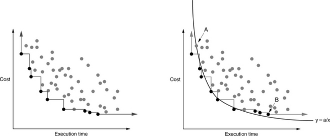
FIGURE 28.3 Pareto analysis versus combined metrics. Combining different metrics into a single figure of merit obscures information. For example, representing the given data-set with a single cost-time product would equate by definition all designs lying on each 1/x curve. The 1/x curve shown in solid black would divide the Pareto-optimal set: those designs lying to the left and below the curve would be considered “better” than those designs lying to the right and above the curve. The design corresponding to data point “A,” given a combined-metric analysis, would be considered superior to the design corresponding to data point “B,” though Pareto analysis indicates otherwise.
28.2.2 Stanley’s Observation
A related observation (made by Tim Stanley, a former graduate student in the University of Michigan’s Advanced Computer Architecture Lab) is that requirements-driven analysis can similarly obscure information and potentially lead designers away from optimal choices. When requirements are specified in language such as not to exceed some value of some metric (such as power dissipation or die area or dollar cost), a hard line is drawn that forces a designer to ignore a portion of the design space. However, Stanley observed that, as far as design exploration goes, all of the truly interesting designs hover right around that cut-off. For instance, if one’s design limitation is cost not to exceed X, then all interesting designs will lie within a small distance of cost X, including small deltas beyond X. It is frequently the case that small deltas beyond the cut-off in cost might yield large deltas in performance. If a designer fails to consider these points, he may overlook the ideal design.
28.3 Taking Sampled Averages Correctly
In the opening chapter of the book, we discussed this topic and left off with an unanswered question. Here, we present the full discussion and give closure to the reader. Like the previous section, so that this section can stand alone, we repeat much of the original discussion.
In many fields, including the field of computer engineering, it is quite popular to find a sampled average, i.e., the average of a sampled set of numbers, rather than the average of the entire set. This is useful when the entire set is unavailable or difficult to obtain or expensive to obtain. For example, one might want to use this technique to keep a running performance average for a real microprocessor, or one might want to sample several windows of execution in a terabyte-size trace file. Provided that the sampled subset is representative of the set as a whole, and provided that the technique used to collect the samples is correct, the mechanism provides a low-cost alternative that can be very accurate. This section demonstrates that the technique used to collect the samples can easily be incorrect and that the results can be far from accurate, if one follows intuition.
The discussion will use as an example a mechanism that samples the miles-per-gallon performance of an automobile under way. We study an out and back trip with a brief pit stop, shown in Figure 28.4. The automobile follows a simple course that is easily analyzed:
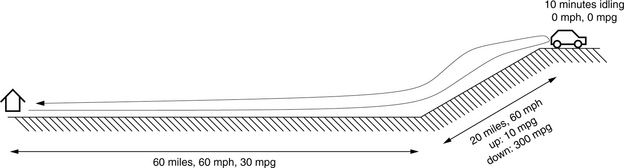
1. The auto will travel over even ground for 60 miles at 60 mph, and it will achieve 30 mpg during this window of time.
2. The auto will travel uphill for 20 miles at 60 mph, and it will achieve 10 mpg during this window of time.
3. The auto will travel downhill for 20 miles at 60 mph, and it will achieve 300 mpg during this window of time.
4. The auto will travel back home over even ground for 60 miles at 60 mph, and it will achieve 30 mpg during this window of time.
5. In addition, before returning home, the driver will sit at the top of the hill for 10 minutes, enjoying the view, with the auto idling, consuming gasoline at the rate of 1 gallon every 5 hours. This is equivalent to 1/300 gallon per minute, or 1/30 of a gallon during the 10-minute respite. Note that the auto will achieve 0 mpg during this window of time.
Let’s see how we can sample the car’s gasoline efficiency. There are three obvious units of measurement involved in the process: the trip will last some amount of time (minutes), the car will travel some distance (miles), and the trip will consume an amount of fuel (gallons). At the very least, we can use each of these units to provide a space over which we will sample the desired metric.
28.3.1 Sampling Over Time
Our first treatment will sample miles per gallon over time, so for our analysis we need to break down the segments of the trip by the amount of time they take:
This is displayed graphically in Figure 28.5, in which the time for each segment is shown to scale. Assume, for the sake of simplicity, that the sampling algorithm samples the car’s miles per gallon every minute and adds that sampled value to the running average (it could just as easily sample every second or millisecond). Then the algorithm will sample the value 30 mpg 60 times during the first segment of the trip; it will sample the value 10 mpg 20 times during the second segment of the trip; it will sample the value 0 mpg 10 times during the third segment of the trip; and so on. Over the trip, the car is operating for a total of 170 minutes; thus, we can derive the sampling algorithm’s results as follows:
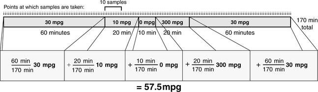
FIGURE 28.5 Sampling mpg over time. The figure shows the trip in time, with each segment of time labelled with the average miles per gallon for the car during that segment of the trip. Thus, whenever the sampling algorithm samples mpg during a window of time, it will add that value to the running average.
If we were to believe this method of calculating sampled averages, we would believe that the car, at least on this trip, is getting roughly twice the fuel efficiency of traveling over flat ground, despite the fact that the trip started and ended in the same place. That seems a bit suspicious and is due to the extremely high efficiency value (300 mpg) accounting for more than it deserves in the final results: it contributes one-third as much as each of the over-flat-land efficiency values. More importantly, the amount that it contributes to the whole is not limited by the mathematics. For instance, one could turn off the engine and coast down the hill, consuming zero gallons while traveling non-zero distance, and achieve essentially infinite fuel efficiency in the final results. Similarly, one could arbitrarily lower the sampled fuel efficiency by spending longer periods of time idling at the top of the hill. For example, if the driver stayed a bit longer at the top of the hill, the result would be significantly different.
28.3.2 Sampling Over Distance
Our second treatment will sample miles per gallon over the distance traveled, so for our analysis we need to break down the segments of the trip by the distance that the car travels:
This is displayed graphically in Figure 28.6, in which the distance traveled during each segment is shown to scale. Assume, for the sake of simplicity, that the sampling algorithm samples the car’s miles per gallon every mile and adds that sampled value to the running average (it could just as easily sample every meter or foot or rotation of the wheel). Then the algorithm will sample the value 30 mpg 60 times during the first segment of the trip; it will sample the value 10 mpg 20 times during the second segment of the trip; it will sample the value 300 mpg 20 times during the third segment of the trip; and so on. Note that, because the car does not move during the idling segment of the trip, its contribution to the total is not counted. Over the duration of the trip, the car travels a total of160 miles; thus, we can derive the sampling algorithm’s results as follows:
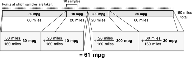
FIGURE 28.6 Sampling mpg over distance. The figure shows the trip in distance traveled, with each segment of distance labelled with the average miles per gallon for the car during that segment of the trip. Thus, whenever the sampling algorithm samples mpg during a window, it will add that value to the running average.
This result is not far from the previous result, which should indicate that it, too, fails to gives us believable results. The method falls prey to the same problem as before: the large value of 300 mpg contributes significantly to the average, and one can “trick” the algorithm by using infinite values when shutting off the engine. The one advantage this method has over the previous method is that one cannot arbitrarily lower the fuel efficiency by idling for longer periods of time: idling is constrained by the mathematics to be excluded from the average. Idling travels zero distance, and therefore, its contribution to the whole is zero. Yet this is perhaps too extreme, as idling certainly contributes some amount to an automobile’s fuel efficiency.
On the other hand, if one were to fail to do a reality check, i.e., if it had not been pointed out that anything over 30 mpg is likely to be incorrect, one might be seduced by the fact that the first two approaches produced nearly the same value. The second result is not far off from the previous result, which might give one an unfounded sense of confidence that the approach is relatively accurate or at least relatively insensitive to minor details.
28.3.3 Sampling Over Fuel Consumption
Our last treatment will sample miles per gallon along the axis of fuel consumption, so for our analysis we need to break down the segments of the trip by the amount of fuel that they consume:
• Outbound: 60 miles @ 30 mpg = 2 gallons
• Uphill: 20 miles @ 10 mpg = 2 gallons
• Idling: 10 minutes at 1/300 gallon per minute = 1/30 gallon
This is displayed graphically in Figure 28.7, in which the fuel consumed during each segment of the trip is shown to scale. Assume, for the sake of simplicity, that the sampling algorithm samples the car’s miles per gallon every 1/30 gallon and adds that sampled value to the running average (it could just as easily sample every gallon or ounce or milliliter). Then the algorithm will sample the value 30 mpg 60 times during the first segment of the trip; it will sample the value 10 mpg 60 times during the second segment of the trip; it will sample the value 0 mpg once during the third segment of the trip; and so on. Over the duration of the trip, the car consumes a total of 6.1 gallons. Using this rather than number of samples gives an alternative, more intuitive, representation of the weights in the average: the first segment contributes 2 gallons out of 6.1 total gallons; the second segment contributes 2 gallons out of 6.1 total gallons; the third segment contributes 1/30 gallons out of 6.1 total gallons; etc. We can derive the sampling algorithm’s results as follows:
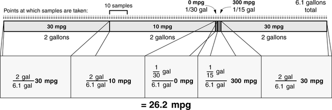
FIGURE 28.7 Sampling mpg over fuel consumed. The figure shows the trip in quantity of fuel consumed, with each segment labelled with the average miles per gallon for the car during that segment of the trip. Thus, whenever the sampling algorithm samples mpg during a window, it will add that value to the running average.
This is the first sampling approach in which our results are less than the auto’s average fuel efficiency over flat ground. Less than 30 mpg is what we should expect, since much of the trip is over flat ground, and a significant portion of the trip is uphill. In this approach, the large MPG value does not contribute significantly to the total, and neither does the idling value. Interestingly, the approach does not fall prey to the same problems as before. For instance, one cannot trick the algorithm by shutting off the engine: doing so would eliminate that portion of the trip from the total. What happens if we increase the idling time to 1 hour?
Idling for longer periods of time affects the total only slightly, as is what one should expect. Clearly, this is the best approach yet.
28.3.4 The Moral of the Story
So what is the real answer? The auto travels 160 miles, consuming 6.1 gallons; it is not hard to find the actual miles per gallon achieved.
The approach that is perhaps the least intuitive (sampling over the space of gallons?) does give the correct answer. We see that, if the metric we are measuring is miles per gallon,
Moreover (and perhaps most importantly), in this context, bad means “can be off by a factor of two or more.”
The moral of the story is that if you are sampling the following metric:
then you must sample that metric in equal steps of dimension unit. To wit, if sampling the metric miles per gallon, you must sample evenly in units of gallon; if sampling the metric cycles per instruction, you must sample evenly in units of instruction (i.e., evenly in instructions committed, not instructions fetched or executed1); if sampling the metric instructions per cycle, you must sample evenly in units of cycle; and if sampling the metric cache-miss rate (i.e., cache misses per cache access), you must sample evenly in units of cache access.
What does it mean to sample in units of instruction or cycle or cache access? For a microprocessor, it means that one must have a countdown timer that decrements every unit, i.e., once for every instruction committed or once every cycle or once every time the cache is accessed, and on every epoch (i.e., whenever a predefined number of units have transpired) the desired average must be taken. For an automobile providing real-time fuel efficiency, a sensor must be placed in the gas line that interrupts a controller whenever a predefined unit of volume of gasoline is consumed.
What determines the predefined amounts that set the epoch size? Clearly, to catch all interesting behavior one must sample frequently enough to measure all important events. Higher sampling rates lead to better accuracy at a higher cost of implementation. How does sampling at a lower rate affect one’s accuracy? For example, by sampling at a rate of once every 1/30 gallon in the previous example, we were assured of catching every segment of the trip. However, this was a contrived example where we knew the desired sampling rate ahead of time. What if, as in normal cases, one does not know the appropriate sampling rate? For example, if the example algorithm sampled every gallon instead of every small fraction of a gallon, we would have gotten the following results:
The answer is off the true result, but it is not as bad as if we had generated the sampled average incorrectly in the first place (e.g., sampling in minutes or miles traveled).
28.4 Metrics for Computer Performance
This section explains what it means to characterize the performance of a computer and discusses what methods are appropriate and inappropriate for the task. The most widely used metric is the performance on the SPEC benchmark suite of programs; currently, the results of running the SPEC benchmark suite are compiled into a single number using the geometric mean. The primary reason for using the geometric mean is that it preserves values across normalization, but, unfortunately, it does not preserve total run time, which is probably the figure of greatest interest when performances are being compared.
Average cycles per instruction (average CPI) is another widely used metric, but using this metric to compare performance is also invalid, even if comparing machines with identical clock speeds. Comparing averaged CPI values to judge performance falls prey to the same problems as averaging normalized values.
Instead of the geometric mean, either the harmonic or the arithmetic mean is the appropriate method for averaging a set of running times. The arithmetic mean should be used to average times, and the harmonic mean should be used to average rates2 (“rate” meaning 1/time). In addition, normalized values must never be averaged, as this section will demonstrate.
28.4.1 Performance and the Use of Means
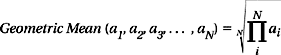
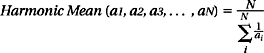
We want to summarize the performance of a computer. The easiest way uses a single number that can be compared against the numbers of other machines. This typically involves running tests on the machine and taking some sort of mean; the mean of a set of numbers is the central value when the set represents fluctuations about that value. There are a number of different ways to define a mean value, among them the arithmetic mean, the geometric mean, and the harmonic mean.
The arithmetic mean is defined as follows:

The geometric mean is defined as follows:
The harmonic mean is defined as follows
In the mathematical sense, the geometric mean of a set of n values is the length of one side of an n-dimensional cube having the same volume as an n-dimensional rectangle whose sides are given by the n values. It is used to find the average of a set of multiplicative values, e.g., the average over time of a variable interest rate. A side effect of the math is that the geometric mean is unaffected by normalization; whether one normalizes by a set of weights first or by the geometric mean of the weights afterward, the net result is the same. This property has been used to suggest that the geometric mean is superior for calculating computer performance, since it produces the same results when comparing several computers irrespective of which computer’s times are used as the normalization factor [Fleming & Wallace 1986]. However, the argument was rebutted by Smith [1988]. In this book, we consider only the arithmetic and harmonic means. Note that the two are inverses of each other:

28.4.2 Problems with Normalization
Problems arise when we average sets of normalized numbers. The following examples demonstrate the errors that occur. The first example compares the performance of two machines using a third as a benchmark. The second example extends the first to show the error in using averaged CPI values to compare performance. The third example is a revisitation of a recent proposal published on this very topic.
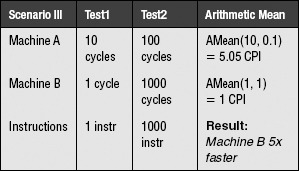
Example 1: Average Normalized by Reference Times
There are two machines, A and B, and a reference machine. There are two tests, Test1 and Test2, and we obtain the following scores for the machines:
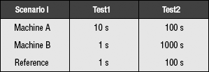
In scenario I, the performance of machine A relative to the reference machine is 0.1 on Test1 and 1 on Test2. The performance of machine B relative to the reference machine is 1 on Test1 and 0.1 on Test2. Since time is in the denominator (the reference is in the numerator), we are averaging rates; therefore, we use the harmonic mean. The fact that the reference value is also in units of time is irrelevant. The time measurement we are concerned with is in the denominator; thus, we are averaging rates. The performance results of scenario I:
| Scenario I | Harmonic Mean |
| Machine A | HMean(0.1, 1) 2/11 |
| Machine B | HMean(1, 0.1) 2/11 |
The two machines perform equally well. This makes intuitive sense; on one test, machine A was ten times faster, and on the other test, machine B was ten times faster. Therefore, they should be of equal performance. As it turns out, this line of reasoning is erroneous. Let us consider scenario II, where the only thing that has changed is the reference machine’s times (from 100 seconds on Test2 to 10 seconds):
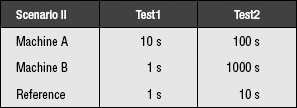
Here, the performance numbers for A relative to the reference machine are 1/10 and 1/10, the performance numbers for B are 1 and 1/100, and these are the results:
| Scenario II | Harmonic Mean |
| Machine A | HMean(0.1, 0.1) = 1/10 |
| Machine B | HMean(1, 0.01) = 2/101 |
According to this, machine A performs about five times better than machine B. If we try yet another scenario, changing only the reference machine’s performance on Test2, we obtain the result that machine A performs five times worse than machine B.

The lesson: do not average test results that have been normalized.
Example 2: Average Normalized by Number of Operations
The example extends even further. What if the numbers were not a set of normalized running times, but CPI measurements? Taking the average of a set of CPI values should not be susceptible to this kind of error, because the numbers are not unitless; they are not the ratio of the running times of two arbitrary machines.
Let us test this theory. Let us take the average of a set of CPI values in three scenarios. The units are cycles per instruction, and since the time-related portion (cycles) is in the numerator, we will be able to use the arithmetic mean.
The following are the three scenarios, where the only difference between each scenario is the number of instructions performed in Test2. The running times for each machine on each test do not change. Therefore, we should expect the performance of each machine relative to the other to remain the same.
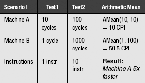
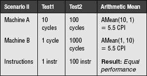
We obtain the same anomalous result as before: the machines exhibit different relative performances that depend on the number of instructions executed.
So our proposed theory is flawed. Average CPI values are not valid measures of computer performance. Taking the average of a set of CPI values is not inherently wrong, but the result cannot be used to compare performance. The erroneous behavior is due to normalizing the values before averaging them. Again, this example is not meant to imply that average CPI values are meaningless, they are simply meaningless when used to compare the performance of machines.
Example 3: Average Normalized by Both Times and Operations
An interesting mathematical result is that, with the proper choice of weights (weighting by instruction count when using the harmonic mean and weighting by execution time when using the arithmetic mean), the use of both the arithmetic and harmonic means on the very same performance numbers—not the inverses of the numbers—provides the same results. That is,
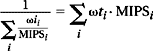
where the expression on the left is the harmonic mean of a set of values, the expression on the right is the arithmetic mean of the same set, ωii is the instruction-count weight, ωti and is the execution-time weight, as follows:
Ix is the instruction count of benchmark x, and Tx is the execution time of benchmark x. The fact of this equivalence may seem to suggest that the average so produced is somehow correct, in the same way that the geometric mean’s preservation of values across normalization was used as evidence to support its use [Fleming & Wallace 1986]. A recent article does indeed propose this method of normalization for exactly this reason. However, as shown in the sampled averages section, noting that two roads converge on the same or similar answer is not a proof of correctness; it could always be that both paths are erroneous. Take, for example, the following table, which shows the results for five different benchmarks in a hypothetical suite.
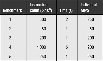
The overall MIPS of the benchmark suite is 2000 million instructions divided by 10 seconds, or 200 MIPS. Taking the harmonic mean of the individual MIPS values, weighted by each benchmark’s contribution to the total instruction count, yields an average of 200 MIPS. Taking the arithmetic mean of the individual MIPS values, weighted by each benchmark’s contribution to the total execution time, yields an average of 200 MIPS. This would seem to be a home run. However, let us skew the results by changing benchmark #2 so that its instruction count is 200 times larger than before and its execution time is also 200 times larger than before. The table now looks like this:
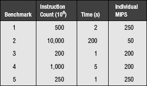
This is the same effect as looping benchmark #2 200 times. However, the total MIPS now becomes roughly 12,000 million instructions divided by roughly 200 seconds, or roughly 60 MIPS—a factor of three lower than the previous value. Thus, though this mechanism is very convincing, it is as easily spoofed as other mechanisms: the problem comes from trying to take the average of normalized values and interpret it to mean performance.
28.4.3 The Meaning of Performance
Normalization, if performed, should be carried out after averaging. If we wish to average a set of execution times against a reference machine, the following equation holds (which is the ratio of the arithmetic means, with the constant N terms cancelling out):

However, if we say that this describes the performance of the machine, then we implicitly believe that every test counts equally, in that on average it is used the same number of times as all other tests. This means that tests which are much longer than others will count more in the results.
Perspective: Performance Is Time Saved
We wish to be able to say, “this machine is X times faster than that machine.” Ambiguity arises because we are often unclear on the concept of performance. What do we mean when we talk about the performance of a machine? Why do we wish to be able to say this machine is X times faster than that machine? The reason is that we have been using that machine (machine A) for some time and wish to know how much time we would save by using this machine (machine B) instead.
How can we measure this? First, we find out what programs we tend to run on machine A. These programs (or ones similar to them) will be used as the benchmark suite to run on machine B. Next, we measure how often we tend to use the programs. These values will be used as weights in computing the average (programs used more should count more), but the problem is that it is not clear whether we should use values in units of time or number of occurrences. Do we count each program the number of times per day it is used or the number of hours per day it is used?
We have an idea about how often we use programs. For instance, every time we edit a source file we might recompile. So we would assign equal weights to the word-processing benchmark and the compiler benchmark. We might run a different set of three or four n-body simulations every time we recompiled the simulator; we would then weight the simulator benchmark three or four times as heavily as the compiler and text editor. Of course, it is not quite as simple as this, but you get the point; we tend to know how often we use a program, independent of how slowly or quickly the machine we use performs it.
What does this buy us? Say, for the moment, that we consider all benchmarks in the suite equally important (we use each as often as the other); all we need to do is total up the times it took the new machine to perform the tests, total up the times it took the reference machine to perform the tests, and compare the two results.
The Bottom Line
It does not matter if one test takes 3 minutes and another takes 3 days on your new machine. If the reference machine performs the short test in less than 1 second (indicating that your new machine is extremely slow), and it performs the long test in 3 days and 6 hours (indicating that your new machine is marginally faster than the old one), then the time saved is about 6 hours. Even if you use the short program 100 times as often as the long program, the time saved is still 1 hour over the old machine.
The error is that we considered performance to be a value that can be averaged; the problem is our perception that performance is a simple number. The reason for the problem is that we often forget the difference between the following statements:
• On average, the amount of time saved by using machine A over machine B is … .
• On average, the relative performance of machine A to machine B is … .
We usually know what our daily computing needs are; we are interested in how much of that we can get done with this computer versus that one. In this context, the only thing that matters is how much time is saved by using one machine over another. Performance is, in reality, a specific instance of the following:
• A set of programs to be run on them
• An indication of how important each of the programs is to us
Performance is therefore not a single number, but really a collection of implications. It is nothing more or less than the measure of how much time we save running our tests on the machines in question. If someone else has similar needs to ours, our performance numbers will be useful to them. However, two people with different sets of criteria will likely walk away with two completely different performance numbers for the same machine.
28.5 Analytical Modeling and the Miss-Rate Function
The classical cache miss-rate function, as defined by Stone, Smith, and others, is M(x) = βxα for constants β and negative α and variable cache size x [Smith 1982, Stone 1993]. This function has been shown to describe accurately the shape of a cache’s miss rate as a function of the cache’s size. However, when used directly in optimization analysis without any alterations to accommodate boundary cases, the function can lead to erroneous results. This section presents the mathematical insight behind the behavior of the function under the Lagrange multiplier optimization procedure and shows how a simple modification to the form solves the inherent problems.
28.5.1 Analytical Modeling
Mathematical analysis lends itself well to understanding cache behavior. Many researchers have used such analysis on memory hierarchies in the past. For instance, Chow showed that the optimum number of cache levels scales with the logarithm of the capacity of the cache hierarchy [Chow 1974, 1976]. Garcia-Molina and Rege demonstrated that it is often better to have more of a slower device than less of a faster device [Garcia-Molina et al. 1987, Rege 1976]. Welch showed that the optimal speed of each level must be proportional to the amount of time spent servicing requests out of that level [Welch 1978]. Jacob et al. [1996] complement this earlier work and provide intuitive understanding of how budget and technology characteristics interact. The analysis is the first to find a closed-form solution for the size of each level in a general memory hierarchy, given device parameters (cost and speed), available system budget, and a measure of the workload’s temporal locality. The model recommends cache sizes that are non-intuitive; in particular, with little money to spend on the hierarchy, the model recommends spending it all on the cheapest, slowest storage technology rather than the fastest. This is contrary to the common practice of focusing on satisfying as many references in the fastest cache level, such as the L1 cache for processors or the file cache for storage systems. Interestingly, it does reflect what has happened in the PC market, where processor caches have been among the last levels of the memory hierarchy to be added.
The model provides intuitive understanding of memory hierarchies and indicates how one should spend one’s money. Figure 28.8 pictures examples of optimal allocations of funds across three- and four-level hierarchies (e.g., several levels of cache, DRAM, and/or disk). In general, the first dollar spent by a memory-hierarchy designer should go to the lowest level in the hierarchy. As money is added to the system, the size of this level should increase, until it becomes cost-effective to purchase some of the next level up. From that point on, every dollar spent on the system should be divided between the two levels in a fixed proportion, with more bytes being added to the lower level than the higher level. This does not necessarily mean that more money is spent on the lower level. Every dollar is split this way until it becomes cost-effective to add another hierarchy level on top; from that point on every dollar is split three ways, with more bytes being added to the lower levels than the higher levels, until it becomes cost-effective to add another level on top. Since real technologies do not come in arbitrary sizes, hierarchy levels will increase as step functions approximating the slopes of straight lines. The interested reader is referred to the article for more detail and analysis.
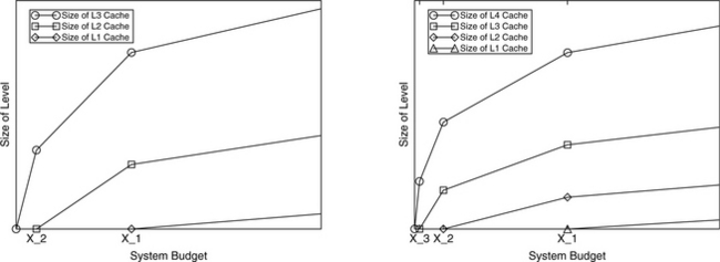
FIGURE 28.8 An example of solutions for two larger hierarchies. A three-level hierarchy is shown on the left; a four-level hierarchy is shown on the right. Between inflection points (at which it is most cost-effective to add another level to the hierarchy) the equations are linear; the curves simply change slopes at the inflection points to adjust for the additional cost of a new level in the hierarchy.
28.5.2 The Miss-Rate Function
As mentioned, there are many analytical cache papers in the literature, and many of these use the classical miss-rate function M(x) = βxα. This function is a direct outgrowth of the 30% Rule,3 which states that successive doublings of cache size should reduce the miss rate by approximately 30%.
The function accurately describes the shape of the miss-rate curve, which represents miss rate as a function of cache size, but it does not accurately reflect the values at boundary points. Therefore, the form cannot be used in any mathematical analysis that depends on accurate values at these points. For instance, using this form yields an infinite miss rate for a cache of size zero, whereas probabilities are only defined on the [0,1] range. Caches of size less than one4 will have arbitrarily large miss rates (greater than unity). While this is not a problem when one is simply interested in the shape of a curve, it can lead to significant errors if one uses the form in optimization analysis, in particular the technique of Lagrange multipliers. This has led some previous analytical cache studies to reach half-completed solutions or (in several cases) outright erroneous solutions.
The classical miss-rate function can be used without problem provided that its form behaves well, i.e., it must return values between 1 and 0 for all physically realizable (non-negative) cache sizes. This requires a simple modification; the original function M(x) = βxα becomes M(x) = (βx + 1)α. The difference in form is slight, yet the difference in results and conclusions that can be drawn are very large. The classical form suggests that the ratio of sizes in a cache hierarchy is a constant; if one chooses a number of levels for the cache hierarchy, then all levels are present in the optimal cache hierarchy. Even at very small budget points, the form suggests that one should add money to every level in the hierarchy in a fixed proportion determined by the optimization procedure.
By contrast, when one uses the form M(x) = (βx + 1)α for the miss-rate function, one reaches the conclusion that the ratio of sizes in the optimal cache hierarchy is not constant. At small budget points, certain levels in the hierarchy should not appear. At very small budget points, it does not make sense to appropriate one’s dollar across every level in the hierarchy; it is better spent on a single level in the hierarchy, until one has enough money to afford adding another level (the conclusion reached in Jacob et al. [1996]).
1The metrics must match exactly. The common definition of CPI is total execution cycles divided by the total number of instructions performed/committed and does not include speculative instructions in the denominator (though it does include their effects in the numerator).
2A note on rates, in particular, miss rate. Even though miss rate is a “rate,” it is not a rate in the harmonic/arithmetic mean sense because (a) it contains no concept of time, and, more importantly, (b) the thing a designer cares about is the number of misses (in the numerator), not the number of cache accesses (in the denominator). The oft-chanted mantra of “use harmonic mean to average rates” only applies to scenarios in which the metric a designer really cares about is in the denominator. For instance, when a designer says “performance,” he is really talking about time, and when the metric puts time in the denominator either explicitly (as in the case of instructions per second) or implicitly (as in the case of instructions per cycle), the metric becomes a rate in the harmonic mean sense. For example, if one uses the metric cache-accesses-per-cache-miss, this is a de facto rate, and the harmonic mean would probably be the appropriate mean to use.
3The 30% Rule, first suggested by Smith [1982], is the rule of thumb that every doubling of a cache’s size should reduce the cache misses by 30%. Solving the recurrence relation
yields a polynomial of the form
where α is negative.
4Note that this is a perfectly valid region to explore; consider, for example, an analysis in which the unit of cache size measurement is megabytes.