
Chapter 8 Visualizing Your Data with Charts and Maps
Modifying Chart and Map Properties 220
Crystal Reports in the Real World—Complex Charts 228
Introduction
Chapter 2, “Selecting and Grouping Data,” and Chapter 3, “Filtering, Sorting, and Summarizing Data,” introduced the importance of grouping and summarizing in report generation. When doing so for business users, it is often effective to present these groups and summarizations using various visualization techniques. The charting and mapping features in Crystal Reports provide a very effective way to communicate relevant information using powerful visualization techniques.
Charts and maps with Crystal Reports provide an extensive array of data visualization options to report designers. In addition to familiar chart types including bar charts, pie charts, scatter charts, line charts, and bubble charts, new chart types in recent versions include the following:
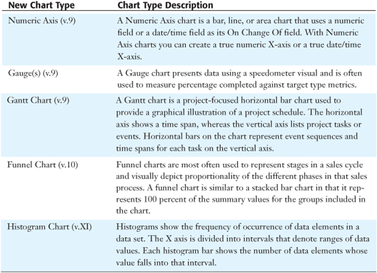
- Histogram charts (v.XI)
- Funnel charts (v.10)
- Gantt charts (v.9)
- Gauges (v.9)
- Numeric Axis charts (v.9)
Geographic Mapping with color-coding and integrated charting options provides another effective method of conveying macro-level information to report consumers.
This chapter introduces various charting and mapping techniques, including
- Enhancing the sample reports from previous chapters with charts and maps
- A review of the Crystal Reports charting expert
- An introduction to the newer chart types—Gantt, Gauge, Numeric Axis, Funnel, and Histogram charts
- A review of the Crystal Reports mapping expert
- Manual chart and map formatting
The Chart Expert is a good place to begin adding visualizations to your reports.
Using the Chart Expert
Reflecting back on the sample reports used in Chapters 2 and 3, you might find that there are opportunities for enhancement through the addition of meaningful charts. As you learned in Chapter 2 with groupings, it is quite easy to summarize the data you collect for a report into meaningful categories or groups. Chapter 2 reviews some examples of grouping based on fields such as country and employee ID. By hiding or suppressing the detail sections of reports, you learned how to bring the meaningful summarizations around these types of groups to the forefront. To further bring this aggregated data to the business user’s attention, you can create a chart on this grouped data using the Chart Expert.
To open the Chart Expert, either click on the Chart icon located on the Insert toolbar or select the Insert Chart option under the main Insert menu and then after placing the chart placeholder on your report in the desired section, access the Chart Expert menu option from the chart’s right–click menu. Figure 8.1 displays the Chart Expert.
Figure 8.1. The Chart Expert dialog enables the rapid addition of valuable charts to reports.
After you access the Chart Expert, several steps are required to actually complete the chart. These are reviewed in the next five sections.
Using the Chart Expert Type Tab
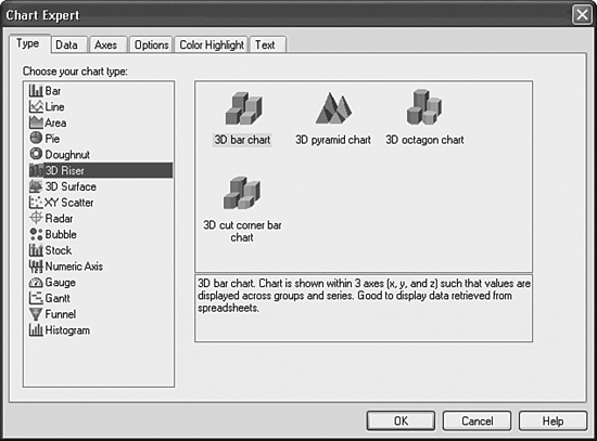
The Chart Expert consists of six different tabs. The initial display tab on the Chart Expert is the Type tab, shown in Figure 8.1. On this tab, the type of graphic or chart is selected. In Crystal Reports version XI, there are more than 40 different basic chart types from which to select.
In addition to the classic bar, line, pie, and area charts, new chart types in versions 9,10, and XI are listed in Table 8.1.
Table 8.1. New Chart Types in Crystal Reports Versions 9, 10, and XI
These charts have been added to expand the visual capabilities of Crystal Reports and enrich your report presentations. Let’s create a Sample Customer Order Listing report and add a chart to it that highlights the Company’s Top 10 Customers in the following steps:
- Quickly create the basics of this sample report by selecting the Customer Name, Order ID, and Order Amount fields from the Xtreme Sample Database (Customer and Orders tables). Then Group by Customer Name and Summarize Order Amount by the Customer Name group.
- To restrict the data to the Top 10 Customers, access the Group Sort Expert from the Report menu option. Select a Top 10 Sort based on the Sum of Order Amount and do not include Others or Ties.
- Insert a Chart onto the report using the Chart toolbar icon or the Chart option from the Insert menu. You will then decide where to place the chart on your report. Drop the Chart object identified by a colored outline in the Report Header section. The location of the report is important in determining the recurrence of the chart. By placing it in the Report Header, the Chart will only appear once. If you had placed it in the Group Header or Footer for Country, a new and separate chart would be created for every group.
- Right-click on the newly created Chart object and select the Chart Expert option. Select a bar chart as the main chart type in the list box by clicking on it. Then click the Horizontal radio button that is present at the bottom of the dialog.
- Select the two-dimensional side-by-side bar chart sub-chart type (top left option) by clicking on the associated graphical icon to the right of the Chart Type list box.
Figure 8.2 displays the result of these five steps. You will continue creating this chart in the next four sections.
Figure 8.2. The Type tab on the Chart Expert dialog for the Sample Top 10 Customers report.
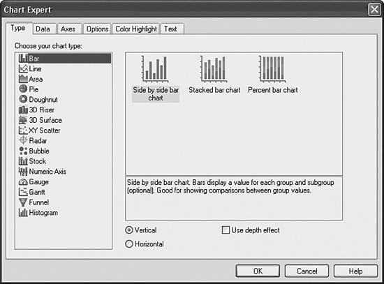
Table 8.2 highlights some common reports, their contained graphics, and the benefits of using them.
Table 8.2 Common Reports with Corresponding Chart Types

Using the Chart Expert Data Tab
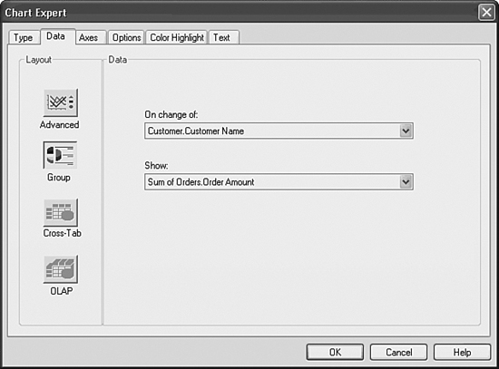
After a chart type has been selected in the Type tab, click on the Data tab. The Data tab enables the selection of the specific data on which the chart is based and the chart’s location on the report. Figure 8.3 displays one view of the second tab of the Chart Expert. This view might vary depending on the different Chart Type options you have selected. The Data tab is composed of two sections: Layout and Data. These sections and corresponding options are discussed next.
Figure 8.3. The Data tab of the Chart Expert enables specification of layout and data options.
Specifying Chart Layout
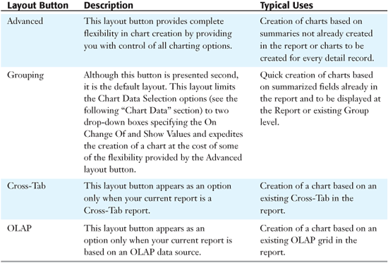
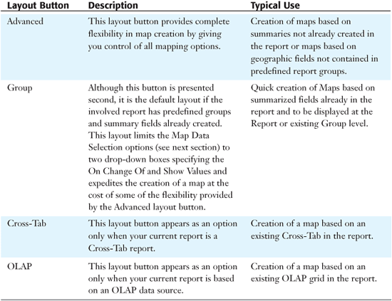
The Chart Layout section specifies the data selection options that the selected chart provides to the report designer. The actual data is selected in the Chart Data section. Note that the options presented in that section are dependent on the specific Chart Layout button you have selected. Table 8.3 lists the different layout buttons and their typical uses.
Table 8.3 Layout Buttons and Typical Uses
The Cross-Tab and OLAP layout buttons and their related options are explored in Chapters 10, “Using Cross-Tabs for Summarized Reporting,” and 16, “Formatting Multidimensional Reporting Against OLAP Data,” because they relate to very specific report types. The next section explores the detailed data options that the Advanced and Grouping layout buttons enable.
Specifying Chart Data
Figure 8.3 displays the Data tab with the Group layout button selected. As previously described, this layout option is designed to facilitate the quick creation of a chart with a minimal amount of effort. To accomplish this rapid chart creation, two pieces of information are requested through two drop-down boxes—On Change Of (grouping item) and Show (field to be shown in the chart) selections. The On Change Of field is used to determine where the selected chart breaks the report data to be displayed. The Show field specifies the summary field to be displayed for each break of the data.
To continue adding a bar chart to the sample report, follow these steps:
- Ensure that the Group layout button from the Layout section is selected.
- Select Customer Name in the On Change Of field. This indicates that the chart breaks for each different customer.
- Select Sum of Orders.Order Amount for the Show field. This indicates that the chart reflects this Sum for each customer. Figure 8.3 should reflect the results of these steps in the Chart Data tab. You will continue creating this chart in the next section.
When leveraging the Rapid Chart Creation functionality of the Group layout option, it’s worth noting that you are limited to chart creation based on existing summary fields already created in your reports and inserted into existing group sections. For more flexible chart creation, you can use the Advanced layout option described later.
Figure 8.4 displays the Data tab with the Advanced Layout button selected. The additional options presented here give you more flexibility in the charts that you can create.
Figure 8.4. The Data tab with the Advanced Layout button selected.
The On Change Of and Show Values fields should be recognizable in this new window although they are selected in a much more flexible manner (see the right side of the Data section beside the Available Fields listing) described next.
The On Change Of field is now only one selection option (among three) in its own drop-down box. If you need to create a chart based on changing a specific field (as you did with the standard group layout), select the On Change Of charting option and then specify the field or fields to break the chart sections on by selecting any of the fields in the available fields listing. Unlike the drop-down box under the Group layout, you can select any of the available report fields in this interface, dynamically order them with the Order button or restrict their display on the report to a specified Top or Bottom N with the Top N button.
You can also dynamically select multiple fields for the chart to break on, and none of the selected fields need already be on the report or have summary fields previously existing on the report for them.
The remaining two options in the On Change Of drop-down box are For Each Record and For All Records. These two options enable charts to be created either against all data in a report or for each detailed record in a report.
When using the For All Records charting option, you can select the field to be displayed for each break by selecting a field from the Available Fields list in the list box beneath the For All Records drop-down box.
After selecting any of these options, you need to select a Show Value(s) field to enable the chart’s creation. This selection specifies the summary field to be displayed for each break of the data and can come from any field (database, report, formula, and so on) that is listed in the available field’s list. To select the Show Value fields, highlight the intended field and use the selection arrow buttons adjacent to the Show Values list box.
You do not need to have an existing summary on your report to use it for a graph in the Advanced Charting layout options. You can add any field to the Show Values list and then dynamically create a summary by clicking on the Set Summary Operation button. These dynamically created summaries are created automatically and used by the chart. This is one of the unique features of Crystal Reports that provides you with more charting flexibility.
Using the Chart Expert Axes Tab
The fourth tab in the Chart Expert dialog, the Axes tab, only appears if the Automatically Select Chart Options check box has been deselected on the Type tab. You can then select the Axes tab by clicking it. This tab enables you to customize chart gridlines, data value scales, data value ranges, and data value divisions. Figure 8.6 displays the Axes tab of the Chart Expert dialog for a bar chart.
Figure 8.5. The Axes tab of the Chart Expert allows specification of gridline display, axis ranges, and divisions.
Figure 8.6. The Chart Expert Options tab allows specification of data points and legends for the involved chart.
This tab only appears when the selected chart type has axes within it (for example, a bar chart or line chart) and does not display for other chart types such as a pie chart.
To continue adding a bar chart to the sample report, try the following step: Select the Major Gridlines check box for the data axis. This facilitates the reading of the bar charts. You will finish creating this bar chart in the following section.
By manually setting both the Min/Max Data Ranges and the Number of Divisions, you are able to customize your data axis gridline display labels.
Using the Chart Expert Options Tab
The Options tab in the Chart Expert only appears if the Automatically Select Chart Options check box has been deselected on the Type tab. The Options tab enables you to customize chart coloring, data-point labeling, legend placement, legend format options, and several other chart type–specific formatting options. Figure 8.7 displays the Options tab of the Chart Expert dialog for a bar chart.
Figure 8.7. The Text tab of the Chart Expert allows specification of text labels for the associated chart.
To continue customizing the bar chart you have been adding to your working sample report, follow these steps:
- Select the Show Value button in the Data Points section.
- Select the 1K format from the Number Format drop-down box.
- Click the OK button.
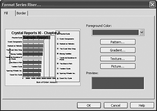
Using the Chart Expert Color Highlight Tab
New to XI, the Color Highlight tab provides you with an easy method of controlling the color of the different elements (such as bars, pie slices, and so forth) in your created charts. This functionality was hard to find in previous versions of Crystal Reports, yet it was previously available through the Format button under the Chart Expert Options tab.
The color highlighting functionality enables you to create charts with consistent coloring both within and across your reports. In the sample report in this chapter, you could specify the color of any particular customer(s) or you could specify the color of multiple bars based on the sum of the Orders Amount field. An example might be that where the sum of Orders Amount is greater than 75,000, the involved bar should be colored black to highlight the positive impact on Xtreme’s bottom line.
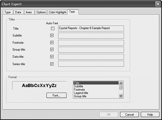
Using the Chart Expert Text Tab
After a chart type and data have been specified, select the Text tab. This tab on the Chart Expert dialog enables you to specify titles and title formatting that the chart displays when it is placed on the report. Figure 8.7 shows the Text tab of the Chart Expert.
To finish adding the bar chart to the sample report, follow these steps:
- Deselect the Auto-Text check box beside the Title entry. You should now be able to modify the text box for the title. Change the title to Crystal Reports—Chapter 8 Sample Chart.
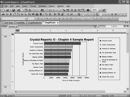
- Deselect the Auto-Text check box beside the Data Title entry. Change the Data Title entry to Order Amounts. Click OK and you will find a bar chart similar to that in Figure 8.8, providing a snapshot of the Top 10 Customers for this report.
Figure 8.8. A sample Customer Orders report with a bar chart highlighting the visual benefits of charting.
If you find your chart is slightly different in appearance or imperfect, that is okay. You have plenty of powerful fine-tuning tools at your disposal, and they will be explored at the end of this chapter.
Using the Map Expert
As you explore the charting capabilities of Crystal Reports, you will discover numerous powerful data visualizations that enhance the productivity of your reports and business users. Another valuable form of data presentation available in Crystal Reports is geographic mapping. This enables you to create reports that are logically grouped by geographically related information and that can communicate meaningful information in a familiar mapping model. When working with geographic data, you can quickly create a map or a map/chart combination on this data using the Map Expert.
The maps and mapping functionality provided within Crystal Reports are bundled from a third-party company—MapInfo. Additional map layers and types can be purchased directly from MapInfo and can be made accessible from Crystal Reports by adding them to the mapping folders under Program FilesMap Info X. You can order additional mapping information from MapInfo at www.mapinfo.com.
To open the Map Expert, either click on the Map Globe icon located on the Insert toolbar or access the Insert Map option under the Insert menu. Figure 8.9 displays the Map Expert dialog.
Figure 8.9. The Map Expert dialog enables the rapid addition of mapping visuals to a report.
The next three sections introduce you to the functionality of the Map Expert and also escort you through a brief tutorial on the addition of a map to a sample Order Listing report slightly different than the one you just created.
Using the Map Expert Data Tab
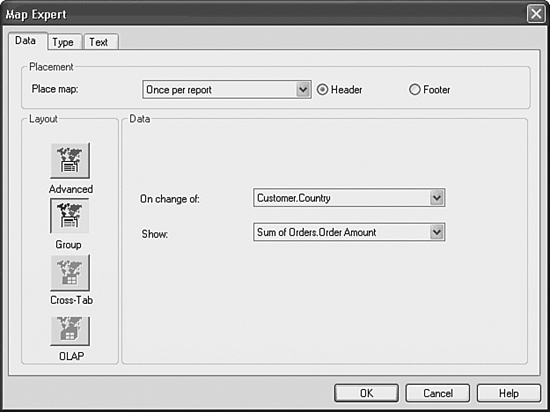
The Data tab on the Map Expert dialog enables you to select the specific data that the map is based on and where it will be placed on the report. Figure 8.9 displays this tab of the Map Expert. The Data tab is composed of three different sections: Placement, Layout, and Data. These sections, and corresponding options, are discussed next.
Specifying Map Placement
The Map Placement section enables the selection of the location of the map on the report and consequently the recurrence of the map throughout the report.
Using the Place Map drop-down box, select the section of the report where the map will be located (for example, Group 1, Group 2, and so on). The options available in this drop-down box are limited to the groups previously created in the report in addition to the option to create the graphic only once for the entire report. Using the radio buttons located beside the drop-down box, choose the header or footer of the selected report section. By making these selections, you have also determined the map’s recurrence in the report because the map repeatedly appears in every section you have specified (for example, for each country in the group based on country).
To begin with a walk-through of an example, perform the following steps:
- Quickly create a new report based on the Xtreme sample data 11 database, include a few columns of data in the detail section, including Order Amount, and group the report by Customer Country and then Customer Name. Finally, add summary fields on Order Amount for each of the Country and Customer Name groups.
- Open the Map Expert.
- Select Once Per Report in the Placement drop-down box and select the header as the map’s intended location. The following sections contain more steps for this example.
Specifying Map Layout
The Layout section specifies the data that the map uses. The actual data is selected in the Map Data section (described next), but the options presented in that section are dependent on the Map Layout button you have selected. Table 8.4 lists the different layout buttons and their typical use.
Table 8.4. Map Expert Layout Buttons and Typical Use
![]() For information on the Cross-Tab and OLAP layout buttons and their related options, see Chapter 10, “Using Cross-Tabs for Summarized Reporting,” p. 249, and Chapter 16, “Formatting Multidimensional Reporting Against OLAP Data,” p. 359.
For information on the Cross-Tab and OLAP layout buttons and their related options, see Chapter 10, “Using Cross-Tabs for Summarized Reporting,” p. 249, and Chapter 16, “Formatting Multidimensional Reporting Against OLAP Data,” p. 359.
The next section explores the detailed data options enabled by the Advanced and Group Layout buttons.
If you attempt to create a geographic map based on a non-geographic field, the Map Expert accepts your request and then displays a blank map when it cannot resolve the selected field values to geographic entities. Make sure you select a valid geographic field in the Geographic Field item of the Advanced layout section or the On Change Of field in the Group layout section.
Specifying Map Data
As you saw earlier, Figure 8.9 displays the Map Data section with the Group layout button selected. As described in Table 8.4, this layout option is designed to facilitate the quick creation of a map with a minimal amount of user interaction. To accomplish this rapid map creation, two pieces of information are requested through two drop-down boxes.
The first drop-down box requests you to select the On Change Of field and the second the Show field. The On Change Of field is used to determine where the selected map breaks the report data to be displayed (for example, Country, State, or Province). The Show field specifies the summary field to be displayed for each break of the data.
When using the Rapid Map Creation function of the Group layout option, you are limited to map creation based on existing summary fields already created in your reports and inserted into existing group sections. For more flexible map creation, use the Advanced layout option described later.
Figure 8.10 displays the Map Data tab with the Advanced layout button selected. The additional options presented here provide you with improved flexibility in the maps that you can create.
Figure 8.10. The Data tab with the Advanced layout button selected allows flexible selection of mapping data, layout, and placement.

The familiar On Change Of field should be recognizable in this new window although it is selected in a more flexible manner using the selection buttons in the interface. It is selected in exactly the same manner as the Geographic field selection in this interface by selecting any of the fields in the Available Fields listing and clicking on the selection button.
The Geographic and On Change Of fields are often the same, but can be set to be different. These are set to different field values when you want to present pie or bar charts on top of the involved map and for each of the different values in the selected Geographic field. An example of this would be presenting a pie chart for each country that highlights the different order amounts by company—indicated in the On Change Of field.
After selecting your Geographic and On Change Of fields, a Map Values field must be selected to enable the map’s creation. This selection specifies the summary field to be displayed for each break of the data and can come from any field (database, report, formula, and so on) that is listed in the available field’s list. To select the Show Value fields, highlight the intended field and use the selection arrow buttons adjacent to the Map Values list box.
As mentioned previously, you do not need to have had an existing summary on a report to summarize on it using the Advanced Mapping layout options. You can add any field to the Map Values list and then dynamically create a summary by clicking on the Set Summary Operation button. These dynamically created summaries are automatically created and used by the map.
To continue adding a map to your sample report, follow these steps:
- Ensure that the Advanced layout button from the Layout section is selected.
- Select Country for the Geographic field. This indicates that the map breaks for each different country. Leave the On Change Of field as Country when this gets populated automatically.
- Select Order Amount for the Show field and leave the default Sum as the summary operation. This indicates that the map reflects this Sum of Orders for each country. You will finish creating this map in the next two sections.
Using the Map Expert Type Tab
The Type tab enables you to select from the five different types of maps that are available for presentation. The five map types can be logically broken into two distinct and separate categories—maps that present a summarization based on one variable, and maps that present a summarization based on two variables. The Type tab with these five map types is depicted in Figure 8.11. All five of the map types are also described in Table 8.5.
Figure 8.11. The Map Expert Type tab enables you to select from the different types of maps available for display in your report.
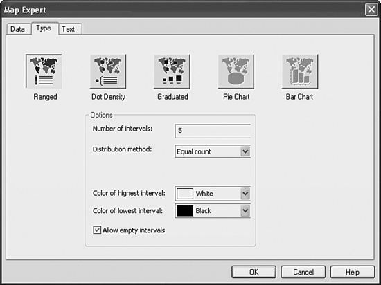
Table 8.5. Map Types with Corresponding Sample Reporting Scenario

The first three map types shown base their maps on the summary of the selected Show Value field and for each Geographic field—the single fluctuating variable. The last two map types base their maps not only on the changing Geographic field, but also on a second fluctuating variable selected in the On Change Of field. Based on this second variable changing, either bar or pie charts are displayed on top of each of the involved Geographic fields. Table 8.5 describes the different map types, and includes a sample scenario for each.
Each Map Type has a small number of associated options that can be set to customize the appearance of that particular map. You are encouraged to explore these options to help you find the maps most useful for your specific design goals.
Using the Map Expert Text Tab
After a map’s type and data have been selected, select the Text tab. This tab on the Map Expert dialog enables you to specify titles and legend formatting that the map uses when it is placed on the report.
To finish adding a map to your sample report, follow these steps:
- On the Type tab, select the Ranged map type.
- Select Yellow and Blue as the respective low and high range colors.
- Click on the Text tab and give your map a title such as Crystal Reports—Chapter 8 Map Sample.
- Click OK, and you will find a geographic map added to your report that should look similar to Figure 8.12.
Figure 8.12. A sample Customer Orders Report with a geographic map.

Modifying Chart and Map Properties
After you have successfully created a chart or map and placed it on your report, you have a number of post-creation editing options at your disposal within the Crystal Reports Designer. Both charts and maps provide a number of easy-to-use methods to re-visit and edit your charts or maps. Several of the most common editing methods are listed in the following sections.
Modifying Chart Properties
After a chart has been created and placed on your report, you can perform numerous post-creation edits by right-clicking on the chart object while in Preview mode. From the Chart menu that appears, you have both the ability to revisit the Chart Expert and use a number of more finely tuned post-creation editing tools, including the powerful and flexible Chart Option functions.
Versions 9, 10 and XI of Crystal Reports give you greater abilities to perform numerous in-place edits to chart objects. For example, you can grab a chart title (or other object) and move its location or change its font directly in place in these recent versions. Previous to version 9, this functionality was mostly accessible from a separate tab called the Chart Analyzer. This tab is no longer available.
Format Chart options
As introduced in Chapter 6, “Fundamentals of Report Formatting,” the Format Chart dialog enables you to add common formatting options for the involved chart. Common options set here for charts include borders, ToolTips, and/or general hyperlinks. Review Chapter 6 for a detailed discussion of the different general formatting options you have for the chart.
Using and Creating Chart Templates
The Load Template selection provides direct access to a set of almost 100 custom charts in eight categories, including Basic, Big Data Sets, Corporate, Gradients, Letter Size B&W, Letter Size Color, Surveys, and User Defined. By selecting one of these predefined templates, all of the formatting attributes of the selected template will overwrite those on your existing chart. The Save Template option enables the saving of your own personal charting templates and enables future re-use of those across other reports. Chart templates can be particularly useful if you want to apply standard corporate chart formatting across your organization.
Specifying Chart Size and Position
This option enables you to identify very specific x and y coordinates in addition to height and width measurements for the involved chart. Charts can also be dynamically resized and repositioned by grabbing any of the sizing handles that appear on the frame of the chart after it is selected.
Modifying Chart Options
The Chart Options menu choice enables you to fine-tune the look of your charts at a granular level not available in the standard Chart Expert. The following sections explore the variety of chart customizations and formatting options exposed through the Chart Options menu. These are especially useful where the functionality of the standard chart creation expert does not meet your exact requirements. The chart options are made accessible through a rich multi-tabbed interface with a chart preview window. Figure 8.13 highlights the interface, and the following paragraphs describe the details of the respective tabs.
Figure 8.13. The Chart Options dialog provides advanced chart configuration functionality.
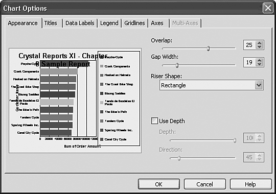
The Appearance tab provides general formatting options for each chart type. These settings give you a great deal of flexibility in controlling the details of the involved graphics (such as Pie Chart tilt, rotation, hole size, and exploding pie characteristics, or Bar Chart shape, overlap, width, depth, and so on).
Some common options for pie, bar, and other charts include the following:
- Overlap—Use this slider to change how much risers within each category overlap each other.
- Gap Width—Use this slider to change the gap between the group of bar risers in each category.
- Riser Shape—Use this list box to choose the shape of the chart’s bars or risers.
- Use Depth—Use this check box to apply a depth effect or to make a completely flat chart.
- Depth—When Use Depth is selected, use this slider to specify the amount of depth to be applied to the chart risers and frame.
- Pie Tilt—Use this slider to tilt the involved pie chart(s).
- Pie Rotation—Use this slider to rotate the involved pie(s).
- Explode Pie—Exploding a pie or doughnut chart detaches all slices away from its center. Select the Series option from the right-click menu of a highlighted pie slice if you want to attach or detach an individual slice from a chart.
The Titles tab enables you to specify chart titles, subtitles, footnotes, and so on. Many charts also include axis title specifications such as Group Axis title or Data Axis title here.
The Data Labels tab provides formatting and display options for data labels. The different options enable you to select the presentation of data labels based on either the underlying value representing the chart graphics, the associated label, or a combination of the two.
The Legend tab provides options for changing the appearance of the involved chart. The Color Mode drop-down box enables you to select a color scheme for the involved chart components. This is typically a decision between coloring by group or by series, although other options are provided for surface charts. The visual effects of these modes are only truly seen when more than one Change By field has been set for the involved chart.
The remaining options surround the display of the legend (available on most charts) and its placement relative to the chart.
The Gridlines tab provides options for displaying or hiding gridlines for specified chart types. Typical options set here include gridline display for both the group and data axis.
The Axes tab provides display options for both the data and group axis. You can also select to use dual Y axes for your chart if you have previously selected two On Change Of fields in the Chart Expert and also decide if you want those dual axes split or shown in the same grid.
The Multi-Axes tab provides selection options for the display of your dual Y axes report. By default, when a dual Y axis report is selected, half of your series members will be assigned to each Y axis. You can change that default assignment in this tab. If a split axis has been selected, you can also select some display options about the proportion of the grid taken by each split of the Y axes.
Specifying Series Options
This menu option is used to apply formatting options to an individual series in a chart. The Series Option is only available for selection if a series was previously selected in the chart. This series selection is done in place in Crystal Reports (for example, highlighting a pie slice on a pie chart enables the Series Option functionality for that pie slice’s series). Figure 8.14 highlights the Series Option dialog for the chart you created earlier this chapter, and the following paragraphs describe the different tabs available on the Series option dialog and some common usage scenarios.
Figure 8.14. The Series Option dialog provides the capability to specify chart series options such as trendlines, data labels, and number formats.
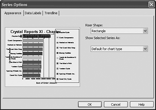
The Appearance tab shows general formatting options for a selected series. Common display effects enacted here include altering the visual metaphor for a selected series so it is different than the other series (for example, displaying the U.S. Sales results as an area visual on a bar chart). In certain charts such as 3D Charts, the selection of each series’ riser shape is also available.
The Data Labels tab shows data label display options for the currently selected series. It enables you to specify series-specific data labels. This functionality is effective for highlighting a series of particular relevance. Unlike the General menu option’s Data Labels tab, this series-specific functionality only enables the setting of numeric-based data labels.
The Trendline tab provides display and formatting options for a trendline selection. It enables you to represent trends in a data series graphically. You can add trendlines to data series in a number of unstacked charts (such as 2D area, bar, bubble, column, line, and scatter charts). Several different automatic trendline creations are possible including Linear, Logarithmic, Polynomial, or Exponential trendlines, in addition to Moving Averages.
Specifying X and Y Axis Options
These chart options are used to format chart axes, axis numbers, gridlines, and scaling. Unlike versions previous to XI, the axis options are now accessed independently by selecting any axis object and its associated right-click menu, and then the involved Axis Options menu selection. When an axis dialog is selected, the tabs at the top of the dialog reflect the available formatting options for that axis. Figure 8.15 shows the Data (Y) Axis Settings dialog for this chapter’s sample report, and the following paragraphs describe the different tabs available on the Axis Option dialogs and some common usage scenarios.
Figure 8.15. The Data (Y) Axis Settings dialog provides granular level control over chart axis display options. A similar dialog is available for the group (X) axis.
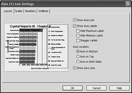
The Layout tab shows general formatting options for a selected axis. You can specify the location of the Axis labels here (for example, top, bottom, left, right, both) through the Location of the Label radio buttons. Additional options of interest new to version XI are the abilities to stagger labels automatically and to skip a specified number of labels.
The Scales tab provides options around the scale for the involved axis. The most common options set in this tab are the manually set maximum and minimum scale options. These enable increased control over the range presented on the involved axis. Other options include settings around the logarithmic scale and forcing the inclusion of zero in the axis range. New to Version XI, settings for using a descending axis and for selecting a minor gridline interval can be made here.
The Numbers tab shows formatting options for data axis numbers. This tab enables you to specify data axis numeric data label formatting. The category drop-down box enables you to select a general format for the numeric component of the data labels. After this is selected, more granular options are exposed for control over the display of each format. If you are looking to format the data label numbers displayed within the chart, you must select them and access the Format Data Label option from their right-click menu.
The Grid tab provides access to the Gridline formatting options for the involved data axis. This tab enables you to specify the involved axis’ displayed gridlines including Custom Gridlines specified at certain values and different grid formats.
Specifying Selected Item Formatting Options
This Chart Options menu selection enables you to format line, area, and text objects in a chart. It is only available when a chart object has been selected with the mouse or other pointer. Figure 8.16 highlights the Formatting dialog. Different tabs (Font, Line, or Fill) are highlighted and available based on the underlying selected chart item.
Figure 8.16. The Formatting dialog provides the capability to format user-selected objects within the involved chart.
Specifying 3D Viewing Angle Options
This menu option is only available for 3D charts. It enables you to edit the involved chart’s viewing angles, position, wall thickness, and so on. The basic options enable you to select a predefined viewing angle template. The advanced options enable you to create new templates and refine the manipulation of the 3D Chart. Figure 8.17 highlights the Viewing Angles Advanced Option dialog.
Figure 8.17. The Viewing Angles Advanced dialog provides the capability to specify precise viewing angles for 3D charts.
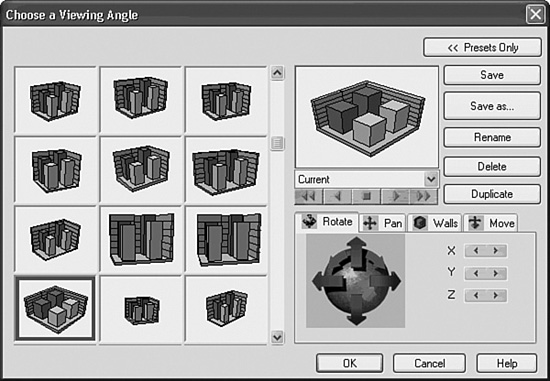
The Rotate tab and its X, Y, and Z dimension controls are used to rotate a 3D chart to any angle. There are three different methods or controls to change the rotation of the chart:
- Use the X, Y, and Z left and right control buttons to incrementally rotate the chart in the preview window.
- Use the directional arrows surrounding the globe to affect the rotation.
- Use the preview window itself to click and drag the previewed chart around the different axes.
The Pan tab is used to pan and zoom a 3D chart. The same control options exist here as were described for the Rotate tab, with the Zoom option being an additional component.
The Walls tab provides a method to increase and decrease the thickness and length of the walls on a 3D chart. The same control options exist for this tab as those mentioned previously for the Rotate tab.
The Move tab provides a method to move and set the perspective of the 3D chart. The same control options exist for this tab as those mentioned previously for the Rotate tab.
You will find separate and advanced charting help instructions for these granular options available through the help button present on all the dialogs accessed from the Chart Options menu. This advanced help is provided by 3D Graphics—the third party responsible for the charting in Crystal Reports.
Modifying Map Properties
After a map has been created and placed on your report, you can perform numerous post-creation edits by right-clicking on the map object while in the Preview mode. From the menu that appears when you right-click, you have the capability to either re-visit the Map Expert or use a number of more finely tuned post-creation editing tools such as Zooming, Layer Control, Map Navigation, and Data Mismatch Resolution.
Format Map Options
As introduced in Chapter 6, the Format Map dialog enables you to add common formatting options for the involved chart. Common options set here for charts include borders, ToolTips, and/or general hyperlinks. Review Chapter 6 for a detailed discussion of the general formatting options available for the chart.
Size and Position
This option enables you to specify very specific X and Y coordinates, in addition to height and width measurements for the involved map. Maps can also be dynamically resized and repositioned by grabbing any of the sizing handles that appear on the frame of the map after it is selected.
Layer Control
By clicking on the Layers menu option, you can specify the different layers that display on your map. Examples of this include World Capital Cities and the Mapping Grid. Crystal Reports version XI is distributed with a number of built-in layers that are accessed through this Layer Control dialog. These layers can be added and removed from Crystal Reports using this dialog and more detail-oriented layers. Additional maps can be purchased separately from MapInfo (a third-party company) and integrated into Crystal Reports.
Resolve Mismatch
The Resolve Mismatch dialog provides two very useful functions for maps. First, the Resolve Mismatch dialog enables you to select a specific map to use for your report. Several maps are provided out of the box with Crystal Reports and others can be purchased separately. Additionally, you can match the field names stored in the Geographic field from which you are basing the map onto the names that the involved map is expecting. This powerful feature enables you to take raw, untransformed data and dynamically match it to a geographical map value that the mapping engine can understand. For example, on a map of Canada, you might have multiple inconsistent data entries in your database for the province of Ontario (for example, ON, Ont, Ontario, and so on). Using this dialog, you can match each of these to the expected value of Ontario, and the mapping engine successfully interprets all of them.
Zooming and Panning
The Zoom In and Zoom Out options enable you to focus on a particularly relevant part of the involved map. The Panning option enables you to horizontally pan the view of the map to what is most interesting to you and your business users. When any of these options have been selected from the Map menu, you are then placed in an interactive mode with the map and your mouse/touchpad. Clicking zooms you in and out and double-clicking and dragging facilitates panning. When you are finished working in these special design modes, you can change back to the Select Mode for standard map navigation.
When selecting from the Map menu, the Map Navigator provides a thumbnail of the entire map you are currently working with. As you saw earlier, Figure 8.12 highlights this Map Navigator in your report sample. The Map Navigator also provides a dotted outline of the area that is currently selected for display. You can fine-tune the area that displays by grabbing this dotted line, double-clicking on any of its corners, and subsequently dragging or expanding them out or collapsing them in while holding down your second click.

Troubleshooting
Charting on a Field Not Already Grouped in the Report
I want to create a chart based on changing a specific field but don’t know how.
Select the On Change Of charting option under the Advanced layout option and then specify the field or fields to break the chart sections on by selecting any of the fields in the available fields listing. Unlike the drop-down box under the Group layout, you can select any of the available report fields in this interface, dynamically order them with the Order button, or restrict their display on the report to a specified Top or Bottom N with the Top N button.
Displaying a Chart Beside Related Report Data
I want to add a chart to a report that is displayed alongside or inline with other displayed report data.
This can be accomplished by adding your charts into report sections (for instance, Group or Report Headers) above the data you wish to have them displayed besides. You can then use the Underlay Following Sections option accessed through the Section Expert dialog. With some design forethought, you can create nicely formatted reports that integrate both data and visuals very closely.
Crystal Reports in the Real World—Complex Charts
Charts can be particularly useful when they display data that is different but complementary. Although it is certainly possible to show data in multiple charts, showing complementary data in the same chart allows direct comparison of information and more efficient use of space. The following steps will walk through a good example of this:
- Start by opening the report Chap8Chart.rpt. In the chart that will be added, bars represent the individual stores and a line shows the running total across all stores.
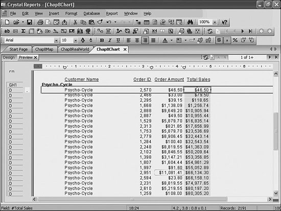
- With the report open, right-click on the field Order Amount and choose Insert, Running Total. When the Create Running Total Field window opens, give the running total a name like Total Order Amount and leave the remaining values as defaults similar to Figure 8.18. Click OK to close the window.
Figure 8.18. Creating this Running Total field will help present a creative use of charts.
- From the Insert menu, select Chart and place it on your report above the existing chart (you will need to move the original chart down in the same section). Open the new chart’s Chart Expert, go to the Data tab and click the Advanced button. Select the Customer Name field and use the upper arrow (>) button to move the field to the On Change Of window. Finally, select the Order Amount and Total Sales fields and add them to the Show Values window using the lower arrow (>) button. The results of this step should resemble Figure 8.19.
Figure 8.19. Creating an advanced chart with a two summary fields will enable some creative charting.

- Select the Customer Name field in the On Change Of window and click the Top N button. When the Group Sort Expert window opens, select All from the list box and choose Descending. Click OK to close the window.
- Click the Text tab. Uncheck the Title Auto-Text boxes and type Comparison Chart into the Chart Title text box. Click OK to close the window and return to the report.
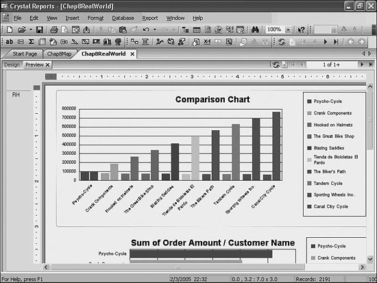
- Using the handles on the chart object, stretch the chart to fit the page width. Figure 8.20 provides a good benchmark.
Figure 8.20. Bars representing both Individual Client Sales and Total Cumulative Sales are displayed on the same chart, effectively communicating multiple pieces of information in one chart.
- Notice that because the Total Sales becomes such a large value, the contrast between individual sales values appears quite small using this scale. To change this, the report will be changed to use a dual Y axis. This enables you to show both sets of values while still highlighting the contrast between individual elements within a set. To change the chart to a dual Y axis, right-click anywhere in the chart and choose Chart Options and then the Axes tab. Click on the Dual Axes box, ensure the Split Dual Axis check box is not checked for this exercise, and then click OK.
- To enable this chart to better project both sets of information more clearly, you could set a split dual axis back in the Chart Options dialog or you could change the display format of the involved series. To do the latter, first navigate to the Legends tab in the Chart Options menu and change the Color Mode to Color by Series. Next, click any of the individual Total Sales bars to select it, and then right-click the bar and select Chart Options, Series. Change the list box from Default for Chart Type to Line and click OK to close.
- Save the report.
Figure 8.21. Bars represent Individual Client Sales and a line represents Total Cumulative Sales with two separate numeric scales displayed.
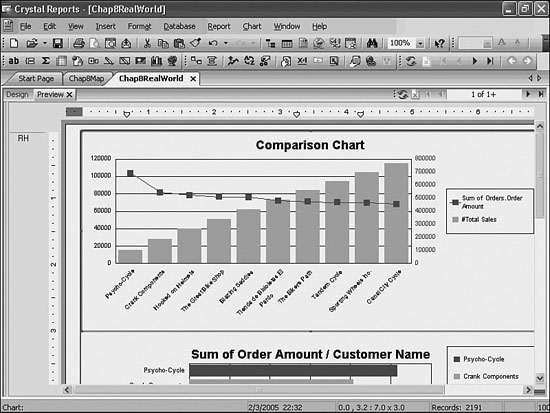
The preceding example provided a great example of displaying different data sets in the same chart. Another practical use of this functionality is displaying averages (or running total calculations) over time in the line chart to complement the other bar chart sums by some specified time period (such as a month). Essentially, you could create a chart that represents a moving average laid on top of the monthly sums.