Chapter 9 Custom Formatting Techniques
Making Presentation-Quality Reports 234
Common Formatting Features 234
Creating a Vertical Text Watermark 238
Conditional Formatting—Using Data to Drive the Look of a Report 240
Crystal Reports in the Real World—Advanced Charting 243
Introduction
This chapter focuses on more complex formatting to make reports look like high-quality information portals rather than simply paper reports. Often a software suite is either powerful or easy to use, but Crystal Reports actually does a great job of being both and can be best described as having layers of complexity. For the beginner, a simple listing report can suffice but the advanced user may extend this listing report with formatting, interactive reports, and powerful charts.
Making Presentation-Quality Reports
Up to this point in the book, the focus of the chapters has been on making sure that the data appears as required. The next step, formatting, keeps users coming back to the reports time and time again. When we talk about formatting, users often assume we’re simply making a report “pretty” or “boardroom quality” and this simply isn’t the case. With rich formatting, the data should be easier to read, understand, and navigate. Rich formatting should guide the reader’s eye to those elements of the report that are most important and in the case of reports that mimic paper documents, your Crystal Report can be made to look identical to the original document—adoption of your new report should be very impressive.
Formatting can take many different forms, from basic font coloring to hyperlinks to conditional formatting (formatting that is based on the data). This chapter examines a cross-section of all these types of formatting to give the report author a good basis for report formatting.
This chapter presents a series of tutorials to enable you to add formatting to a report started in an earlier chapter. Let’s assume that you would like to improve the report that was started in Chapter 6, “Fundamentals of Report Formatting.”
Common Formatting Features
The most common formatting feature is changing font color or font face. This can be done by choosing the features directly on the Formatting toolbar, as shown in Figure 9.1.
Figure 9.1. The Crystal Reports Formatting toolbar lets you change object formatting.

Chapter 6 introduced the Highlighting Expert, so if more detail is necessary it can be found there.
Working with ToolTips
All report objects can have rollover text or ToolTips available when the report is viewed. For example, if you would like to use descriptive text to explain why a certain formula was created, you could do this with a ToolTip.
In the example created in Chapter 6, you now want to inform the end user about a formula. The text should appear whenever a user mouses over the ‘Days Until Shipped’ fields on the report. The following steps create a ToolTip:
- Open Chap6RealWorld.rpt, or the report created earlier in Chapter 6. Select File, Open and browse to find Chap6RealWorld.rpt and open it.
- Format the e-mail field at the far right. Right-click on it and choose Format Field.
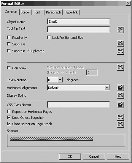
- Add the ToolTip text. In the Format Editor dialog, select the Common tab. To the right of the ToolTip Text box, click on the formula editor button (see Figure 9.2), and enter the following formula, which makes a custom message for each e-mail address:

Figure 9.2. On the Common tab, click the ToolTip text formula button.
- Test the ToolTip text. Click OK to finish the formatting. In Preview, scroll the mouse over the e-mail field and see that the rollover text now appears as a custom message, which is different when viewed by each e-mail recipient. Before proceeding, save the report as Chap9_1.rpt by choosing File, Save As.
Lines and Boxes
Adding lines and boxes to a report can make it easier to read as well as visually grouping items for business users.
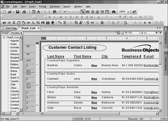
To add lines under each Detail section as well as a box around each group, follow these steps:
- View Chap9_1.rpt in Design mode. If the report is not already open, open it using Ctrl+O. Make sure that the report is in Design Mode by choosing Ctrl+D.
- Insert the line by Choosing Insert, Line. The mouse changes to a pencil. Move the mouse to the bottom-left of the fields in the Details Section. Hold down the left mouse button to begin drawing the line. Scroll the mouse to the right until you reach the end of the Details Section. Once reached, release the mouse button.
- View the result in Preview mode. Select F5 to refresh the report to see the line with the data as shown in Figure 9.3.
Figure 9.3. Use the Preview mode view of a report to show a line under each detail record.

- Add the box by choosing Insert, Box. The mouse changes to a pencil. Move the mouse to the top-left of the Country/Pays USA data in the Group Header. Hold down the left mouse button to begin drawing the box. Scroll the mouse down to the bottom left of the Summary amount in the Group Footer and then scroll to the right until the end of the Group Footer section. Once reached, release the mouse button. The resulting box should appear similar to Figure 9.4.
Figure 9.4. Preview a report to show lines and boxes.

- Choose File, Save As and save the report as Chap9_2.rpt.
A feature of boxes is that they can be rounded. To do this right-click on a box, choose Format Box, and select the Rounding tab. The rounding factor can be changed by the slide or the percentage buttons. Figure 9.5 shows how Xtreme’s report would look with a rounded box at 30%.
Figure 9.5. Preview of a report showing rounded boxes.
Creating a Vertical Text Watermark
Another visually pleasing feature is the capability to rotate text. This can be very effective when used in conjunction with the Underlay Section property for sections. Follow these steps to make a sample watermark:
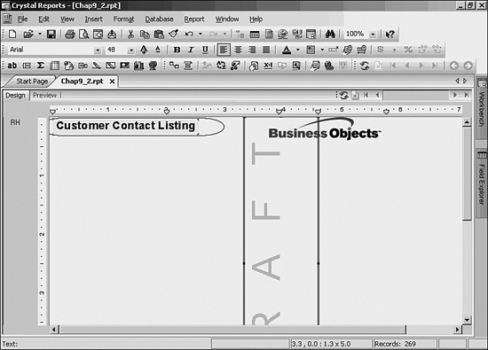
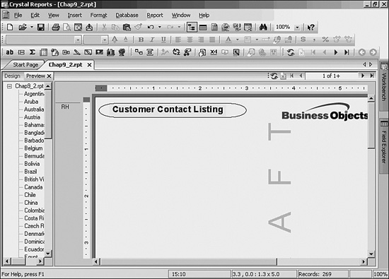
- Start by using Chap9_2.rpt in Design mode. Choose Insert, Text Object to add a text field in the Report Header. Enter DRAFT for the text.
- Right-click on the Text field and choose Format Text. Select the Common tab. Change the Text Rotation to 90 degrees and click OK. Go to the Font tab, where you can change the font size to 48pts. Because you want this watermark to be semi-transparent, choose the More item from the Color drop-down, where you can specify a custom color. Choose a light gray (or silver). Increase the Character font spacing by specifying 70 pts in the dialog, then exit the dialog by clicking OK twice.
- Resize the field. Because the field needs to go down the page, it needs to be resized to be narrow and long. Select the field and choose the rightmost square on the field. Resize the object by holding down the left mouse button. Now choose the bottom square on the field and stretch the height to 5”. Figure 9.6 shows how this should look.
Figure 9.6. Design tab with text rotation applied to text field.
- Refresh the report to see your progress by pressing F5. It shows the text rotated, although it is not running down beside the records as shown in Figure 9.7
Figure 9.7. Preview of the report with text rotation.
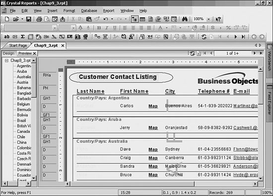
- Set the Report Header to Underlay. Because the text does not yet flow to the record level, it must be underlayed. This is a section property. Right-click in the Report Header section located on the left side of the report design area, choose Section Expert, and click the Insert button near the top left. Be sure to select Report Header B in the Sections window and put a check in the box to the left of Underlay Following Sections, and click OK. Drag your text box into Report Header B. The desired results should appear similar to Figure 9.8.
Figure 9.8. Preview of the report with rotated text flowing behind the detail records.

Realize that when rotating text, the justification rules might be opposite of what would normally be expected. In the case of 90 degrees, the text must be right-justified to have the company name appear to be top-justified, as shown in Figure 9.9.
Figure 9.9. Conditional highlighting based on another field.
- Save as
Chap9_3.rpt
Conditional Formatting—Using Data to Drive the Look of a Report
Up to now, the focus has been on static formatting. The next step is to apply formatting based on the data that is being returned from a field or even applying formatting on one field based on the value of another.
Conditional formatting relies on formulas. Because the formula language is extensive, complex statements can be created. This chapter will introduce fairly simple examples to illustrate.
The simplest way to add conditional formatting is to use the Highlighting Expert. This feature enables us to apply font face and font color changes to database fields based on their values.
Almost every formatting option can be conditional. To determine which ones are conditional, look at the x+2 button next to the option in the Formatting Editor dialogs.
If a formatting option has already been set to a conditional format, the button appears with red text. Otherwise, it appears as blue text.
Applying Formatting from Another Field
- In Design view, right-click the Contact Last Name field, choose Format Field, and then navigate to the Font tab and click the formula button to the right of the Color drop-down. This opens the formula editor, driving your font color choice.
- Enter the following formula:

Here you specified a color as the result of the case expression because the formula controlled color. In cases where the formatting option is Boolean (that is, either you turn the feature on or off) there is an assumed IF statement, and all you have to do is enter the condition (for example,
{table.field} > 100). Entering a full IF statement in cases like this causes an error. - Refresh the report by pressing F5 while you’re in the Preview tab. Now you see red, yellow, and green last names depending on the amount of last year’s sales for that person (see Figure 9.9).
- Save the report as
chap9_4.rpt.
Report-to-Report Linking
No matter how well designed, no single report can be expected to address all the needs of a business. Even if it could be done, the report would be unhelpful to the users—overwhelming and hard to read. One way of making the information easy to manage is to break it out over several reports but make navigation easy by placing hyperlinks in the report to allow the user to move smoothly from report to report.
In the Chap9_4 report, you’ll add a hyperlink that opens a report from BusinessObjects Enterprise. More about Enterprise will be explained in Part V, “Web Report Distribution—Using BusinessObjects Enterprise and Crystal Reports Server,” but for now just follow along.
- From the menu choose File, Open. In the bottom left of the Open dialog window there is a button labeled Enterprise. Click the button and, if you aren’t already connected to Enterprise, you will be prompted to log on. If you don’t know the appropriate information to log on, move to the next section.
- Browse to the Report Samples folder, then the General Business folder, and finally to the World Sales Report and click open.
- With the World Sales Report open, right-click on the chart and choose copy. Using the report tabs displayed right below the toolbars, go back to the Chap9_4 report.
- Right-click on the Customer Contact Listing text, choose format text, and click the hyperlink tab.
- Select Another Report Object and click the Paste button. You will see much of the window get populated. If the Paste button is not enabled, go back to your World Sales Report, select the chart, right-click the chart, choose copy, and try again. By copying the chart, you’re actually trapping significant information about the chart that the designer interprets for you.
Figure 9.10. Creating a hyperlink to another report.

- Click OK. From the View menu, choose HTML Preview. When the preview has opened, mouse over the Customer Contact Listing text box and notice that the mouse cursor changes, indicating a hyperlink. Clicking the hyperlink will open the World Sales Report.
- This powerful feature allows users to flow from one report to another with the potential to drill down from a high level to very low level of detail or to a completely different subject matter altogether.
Crystal Reports in the Real World—Advanced Charting
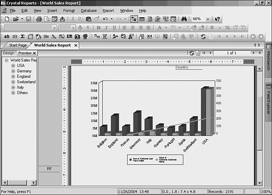
Nothing enables users to visualize data better than a chart. With a glance, charts enable users to see relative distribution, peaks, and valleys of values. This section describes how to use charting in creative ways. The following creates a report that charts the sum of sales and distribution of customers by country:
- Open the World Sales Report from
C:Program FilesBusiness ObjectsCrystal Reports 11SamplesenReportsGeneral Business.
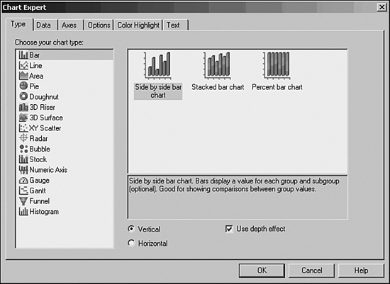
Stretch the chart so it takes the full width of the page. In the left margin, right-click on the text Group Footer 1 (the text might simply say GF1 if you are using short section names), and choose Suppress from the menu. - Right-click on the chart and choose Chart Expert. For Chart Type choose Bar and from the options that refine which type of bar chart, choose the left option listed as Side by Side Bar Chart (see Figure 9.11).
Figure 9.11. Choosing a chart type.
- Click on the Data tab and the Advanced button. From the list of available fields select Customer.Country and add it to the window below On Change Of. Again, from the list of available fields choose Customer.Last Year’s Sales and Customer.Customer Name and add them to the Show Values (see Figure 9.12).
Figure 9.12. Selecting data for the chart.

- Click the Options tab and uncheck the Show Label option. Click OK to close the window.
- The bar chart is almost complete. It contains the correct data so it is technically accurate, but because the scale of the values is so different it is unreadable for the user. See Figure 9.13.
Figure 9.13. Technically accurate but not helpful yet...

- Because the scale of the data is significantly different, the chart needs to be broken into two axes. Right-click on the chart and choose Chart Options, Axes tab. Click the Dual Axis check box, and click OK. The resulting chart should look like Figure 9.14.
Figure 9.14. Chart showing two scales of information.

- Finally, a trend line can be added to the chart to show a trend in the data. Right-click on the customer name bar and choose Series Options. Click the Trendline tab and add a check to the Show Trendlines check box and click OK. The resulting chart should resemble Figure 9.15. Save the report as World Sales Report with Charts.rpt.
Figure 9.15. Chart showing two scales of information and a trend line.