
Chapter 10
Creating Multi-Page Applications
WHAT YOU WILL LEARN IN THIS CHAPTER:
- Understanding the fundamental navigation patterns used in Windows 8 apps
- Getting to know the Page class and understanding the navigation mechanism among pages
- Starting other applications through file associations from your app
- Using the Split Application and Grid Application templates to create apps with your custom content
WROX.COM CODE DOWNLOADS FOR THIS CHAPTER
You can find the wrox.com code downloads for this chapter on the Download Code tab at www.wrox.com/remtitle.cgi?isbn=012680. The code is in the Chapter10.zip download and individually named, as described in the corresponding exercises.
In Chapter 9, you learned about a number of important Windows 8 app user interface (UI) patterns, such as using the context menus and the app bar, integrating your app with the settings charm, saving the application state, using dialog box messages, and so on. The samples in those exercises were simple applications with one screen — or, following the Windows 8 style app terminology, with one page.
Real applications often use more than one page. In this chapter, you learn how to create applications with multiple pages. First, you will study the navigation concepts used in Windows 8 apps, and you will get acquainted with the UI controls that support paging.
With Visual Studio, Microsoft provides two project templates — the Grid Application template and the Split Application template — that are great for starting your multi-page apps. In this chapter, you will discover the details surrounding these templates and learn how to create your own content with them.
Navigation Basics
Content is a key factor in the design of Windows 8 style applications. If your app presents its content in a way that users perceive as a great experience, your app will be successful and popular; otherwise, it will be just another app hidden in a crowd. You can use many elements to provide an excellent user experience, such as clean layout and typography, great animations, intuitive UI controls, and so on. These are all very important elements, but a more essential one rules them all — navigation.
Navigation Patterns
When users browse app content, they use navigation to roam from one content element to another. The designers of the Windows 8 language created a number of navigation patterns that are fairly intuitive, and users can use these to find the content they are looking for.
Hub Navigation
Probably the most frequently used pattern is the hub navigation. In this case, the content is placed into a hub page that can be scrolled horizontally with the keyboard (using the PgUp and PgDown keys), with the mouse wheel, or even with touch using slide gestures. The hub page is a virtually wide page that is several times wider than the screen. As you slide or scroll the hub page, the content flies in. The content is built up so that the user always knows there is more content to discover.
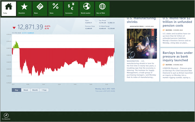
For example, when you start the Finance app, you see a screen similar to the one shown in Figure 10-1. You can see that the content on the right side overflows the screen. Intuitively, you can guess that scrolling or sliding the screen to the left provides more content. When you’re using touch and you reach the edges of the hub page, you’ll see a bouncing effect, indicating that there is no more content to scroll to.
Figure 10-1: The hub page of the Finance app

Direct Navigation
The hub page is often combined with direct page navigation. In this case, you can select the type of content you would like to see using a navigation control, such as the app bar. For example, the Finance app provides a top app bar that enables you to select a page directly, as shown in Figure 10-2. The app bar shows a list of available pages, displaying the Today page with a white background indicating that this page is the current one. For example, when you select the Currencies page, you navigate directly to it without the need to slide or scroll the hub page.
Figure 10-2: The app bar of the Finance app provides direct navigation
Hierarchical Navigation
In many apps, you are presented with so much information that using the hub pattern simply does not work. You might have hundreds or thousands of information elements that simply cannot be scrolled fast enough to find your topic of interest in a few seconds.
The solution for this situation is hierarchical navigation. You present the content in a hierarchy, where separate pages display separate hierarchy levels. During the navigation, you can move up and down among the nodes in this hierarchy and look at the content on the current node. For example, when you start the Store app, its first screen displays app categories in a hub page, as shown in Figure 10-3. This is the root level of the hierarchy. When you select an item, you get to a lower hierarchy level that displays apps in the selected category, as shown in Figure 10-4.
Figure 10-3: The top hierarchy level of the Store app’s content

Figure 10-4: Applications in a selected app category

Semantic Zoom
Windows 8 provides a feature called semantic zoom. You can use this feature to accelerate navigation when you have many items that would be difficult to view with scrolling and sliding. Semantic zoom uses the pinch gesture to zoom in or out in a list with lots of items. You can also use the Ctrl key together with the + and – keys on the numeric keyboard to zoom in and out, respectively, or click the zoom icon in the bottom-right corner of the Start screen.
Figure 10-5: Contacts in the People app as displayed by semantic zoom

For example, the People app displays contacts. Most users who regularly use any kind of social app generally have hundreds or thousands of contacts. With semantic zoom, it’s easier to navigate among them. The People application uses the semantic zoom to display an alphabet when you zoom out the list of your contacts, as shown in Figure 10-5. When you click or tap an item, you immediately zoom in the contact list displaying your contacts filed under the corresponding letter.
In this chapter, you will learn about using these patterns (except semantic zoom) for creating multi-page applications.
Working with Pages
Every Windows 8 app you created earlier in the exercises of this book used pages. In these examples, you had filenames ending with Page, such as BlankPage.xaml or MainPage.xaml. The Page control is one of the fundamental controls that contains a plethora of functions to implement your apps quickly with only a few lines of code. When you create a new application with the C# Blank Application template, it provides a MainPage.xaml file with the related MainPage.xaml.cs file, as shown in Listing 10-1 and Listing 10-2, respectively.
Listing 10-1: The MainPage.xaml file of an app created with the Blank Application template
<Page
    x:Class="MyApp.MainPage"
    IsTabStop="false"
    xmlns="http://schemas.microsoft.com/winfx/2006/xaml/presentation"
    xmlns:x="http://schemas.microsoft.com/winfx/2006/xaml"
    xmlns:local="using:MyApp"
    xmlns:d="http://schemas.microsoft.com/expression/blend/2008"
    xmlns:mc="http://schemas.openxmlformats.org/markup-compatibility/2006"
    mc:Ignorable="d">

    <Grid Background="{StaticResource ApplicationPageBackgroundThemeBrush}">

    </Grid>
</Page>
Listing 10-2: The MainPage.xaml.cs file of an app created with the Blank Application template (comments omitted for the sake of brevity)
using System;
using System.Collections.Generic;
using System.IO;
using System.Linq;
using Windows.Foundation;
using Windows.Foundation.Collections;
using Windows.UI.Xaml;
using Windows.UI.Xaml.Controls;
using Windows.UI.Xaml.Controls.Primitives;
using Windows.UI.Xaml.Data;
using Windows.UI.Xaml.Input;
using Windows.UI.Xaml.Media;
using Windows.UI.Xaml.Navigation;

namespace MyApp
{
    public sealed partial class MainPage : Page
    {
        public MainPage()
        {
            this.InitializeComponent();
        }

        protected override void OnNavigatedTo(NavigationEventArgs e)
        {
        }
    }
}
Figure 10-6: The Document Outline of an empty page
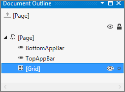
The MainPage.xaml file contains a Page control that embeds a Grid control. The grid is a placeholder for the UI elements of the page. When you take a look at the Document Outline tool window, you can see that the page also has a placeholder for a top and a bottom app bar, as shown in Figure 10-6.
The MainPage.xaml.cs file contains two methods by default:
- The MainPage constructor initializes all controls according to the XAML description.
- The OnNavigatedTo method is invoked whenever the user navigates to this page. One such occasion is when your application launches.
The Page class has the entire infrastructure required to implement navigation among pages, as you learn in the next section.
Navigating Backward and Forward
The simplest form of page navigation is sequential navigation, when you start your task with a page and navigate sequentially to other pages (unless the task is entirely finished). In the next exercise, you will learn about the implementation details of such an easy navigation pattern. You start with a prepared app that simulates the steps of recoding a scuba dive log entry in a diver’s digital logbook. The application does not let you enter data because it is just for demonstrating the navigation. This log entry task uses four pages.
<Grid Background="{StaticResource PageBackgroundBrush}">
    <Grid.RowDefinitions>
        <RowDefinition Height="140"/>
        <RowDefinition Height="*"/>
    </Grid.RowDefinitions>
    <!-- Back button and page title -->
    <Grid>
        <Grid.ColumnDefinitions>
            <ColumnDefinition Width="Auto"/>
            <ColumnDefinition Width="*"/>
        </Grid.ColumnDefinitions>
        <Button x:Name="backButton" Click="GoBack"
                IsEnabled="{Binding Frame.CanGoBack, ElementName=PageRoot}"
                Style="{StaticResource BackButtonStyle}" />
        <TextBlock x:Name="pageTitle" Grid.Column="1"
                   Text="Step 2: Depth and Bottom Time"
                   Style="{StaticResource PageHeaderTextStyle}"
                   Foreground="{StaticResource TitleForegroundBrush}"/>
    </Grid>
    <StackPanel HorizontalAlignment="Left" Height="557.927" Margin="116,0"
                Grid.Row="1" VerticalAlignment="Top" Width="1240.652">
        <TextBlock HorizontalAlignment="Left" TextWrapping="Wrap"
            Style="{StaticResource H2Style}"
            Text="Specify the maximum depth and the bottom time." />
        <Button x:Name="NextButton" Margin="0,24,0,0"
                Style="{StaticResource ButtonStyle}"
                Click="NextButtonClicked">Next</Button>
    </StackPanel>
</Grid>private void NextButtonClicked(object sender, RoutedEventArgs e)
{
Frame.Navigate(typeof(Step3));
}private void GoBack(object sender, RoutedEventArgs e)
{
if (this.Frame != null && this.Frame.CanGoBack) this.Frame.GoBack();
}private void NextButtonClicked(object sender, RoutedEventArgs e)
{
Frame.Navigate(typeof(Step2));
}Figure 10-7: The first page of the DiveLog app

Figure 10-8: The Location and Date page
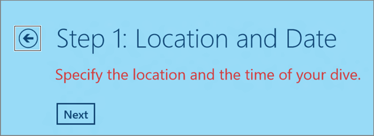
Figure 10-9: The back button is shown on the first page

Frame.Navigate(typeof(Step3));<Button x:Name="backButton" Click="GoBack"
IsEnabled="{Binding Frame.CanGoBack, ElementName=PageRoot}"
Style="{StaticResource BackButtonStyle}" />private void GoBack(object sender, RoutedEventArgs e)
{
if (this.Frame != null && this.Frame.CanGoBack) this.Frame.GoBack();
}Parameters and Navigation Events
The pages displayed in a Windows 8 app can accept parameters. These parameters can be used when rendering the content of the page. In the previous exercise, the Navigate method was called with a single argument that accepted the type of the page. However, Navigate can be called with two arguments, where the second one is an optional System.Object instance that is the parameter of the page.
Navigation Event Arguments
Every time you navigate to a page, the target page’s OnNavigatedTo method is called with a NavigationEventArgs argument that has a number of properties, as summarized in Table 10-1.
Table 10-1: NavigationEventArgs Properties
| Property | Description |
| Content | Gets the root node of the target page's content. |
| NavigationMode | Gets a value that indicates the direction of movement during navigation. This property takes its value from the NavigationMode enumeration:
|
| Parameter | Gets any parameter object passed to the target page for the navigation (the second argument of the Frame’s Navigate method). |
| SourcePageType | This property’s name is a bit confusing. It’s called SourcePageType, but it gets the data type of the target page. |
| Uri | Gets the uniform resource identifier (URI) of the target. This property contains a non-null value when you are using JavaScript. |
Using Navigation Parameters
It is very easy to use the Navigate and OnNavigatedTo methods to pass and process page parameters, as demonstrated in a prepared sample that you can find in the DiveLog - Parameters folder of this chapter’s download. This sample contains a modified version of the DiveLog app that adds a few text blocks to the pages, as shown in Figure 10-10.
Figure 10-10: Additional labels on DiveLog pages

The button click event-handler code of each page uses the Frame.Navigate method with two arguments:
Frame.Navigate(typeof(PageType), Frame.BackStackDepth);The PageType is the type representing the target page. The navigation logic behind Frame keeps a stack of visited pages as you go forward and back. The Frame.BackStepDepth property indicates the depth of this stack, and the code uses this value as the page parameter. In Figure 10-10, this value is shown in the Parameter label. The value “3” indicates that the depth of this stack was 3 when navigating to the MainPage page.
The labels in Figure 10-10 are refreshed in the OnNavigatedTo methods that happen to be the same in each page:
protected override void OnNavigatedTo(NavigationEventArgs e)
{
    NavigationModeLabel.Text = e.NavigationMode.ToString();
    SourcePageLabel.Text = e.SourcePageType.Name;
    ParameterLabel.Text = (e.Parameter ?? "<none>").ToString();
    UriLabel.Text = e.Uri == null ? "<none>" : e.Uri.ToString();
}
Navigating Away from Pages
When you run this sample, you can see how the depth of the navigation stack increases or decreases as you move forward and back among the pages. The value of the Navigation Mode label tells you the direction, too, as shown in Figure 10-10.
In many situations, it is important to know when you are about to leave a page. If the user enters information on the page, you may not allow navigating away unless the data is valid. You can override the OnNavigatingFrom method that accepts a NavigationCancelEventArgs argument. Set the Cancel property of the argument to true to prevent leaving the page.
It can be also useful to catch the moment before you leave the page. Your page may allocate memory for its data that is not required when leaving the page. Because the page is not disposed as you leave it (you may navigate back to it later), it is your responsibility (and in your best interest) to free temporarily unused resources.
You can override the OnNavigatedFrom method that accepts a NavigationEventArgs argument just like the OnNavigatedTo method. The Step3.xaml.cs file in the sample solution demonstrates using these methods, as shown in Listing 10-3.
Listing 10-3: Navigating away from a page in the Step3.xaml.cs file
public sealed partial class Step3 : Page
{
    private static bool _lastCancelled;

    public Step3()
    {
        this.InitializeComponent();
        _lastCancelled = false;
    }

    protected async override void OnNavigatedFrom(NavigationEventArgs e)
    {
        var dialog = new MessageDialog(
            "You are leaving Step 3 page.",
            "Navigation Message");
        dialog.Commands.Add(new UICommand("OK"));
        await dialog.ShowAsync();
        base.OnNavigatedFrom(e);
    }

    protected override void OnNavigatingFrom(NavigatingCancelEventArgs e)
    {
        _lastCancelled = !_lastCancelled;
        e.Cancel = _lastCancelled;
        if (_lastCancelled) NavigationModeLabel.Text = "Navigation Cancelled";
        base.OnNavigatingFrom(e);
    }

    // --- Other methods omitter for the sake of brevity
}
The OnNavigatingFrom method is implemented so that, every second time, it prevents leaving the page by setting the e.Cancel flag (through the _lastCancelled flag) to true, and signals the canceled state on the screen. The OnNavigatedFrom method pops up a dialog box on the screen every time you successfully navigated away from the Step3 page.
Using App Bars for Navigation
As you learned earlier in this chapter, you can use the direct navigation pattern with the app bar to explicitly select a page to navigate to, instead of sequentially traversing through pages. As you saw in Figure 10-2, the Finance app uses this model. You can use the same approach to create an app bar, as you learned in Chapter 9. However, using app bars with page navigation is a bit trickier than you would think, as you learn from the next exercises.
The Intuitive Solution
In the next exercise, you start from a prepared sample (going on with the DiveLog application) that adds an app bar to the MainPage object. The app bar contains four buttons, one for each page.
<Page.TopAppBar>
<AppBar x:Name="CommandBar" Style="{StaticResource AppBarStyle}">
<StackPanel Orientation="Horizontal">
<Button x:Name="NewEntryButton"
Style="{StaticResource TopAppBarButtonStyle}"
Tapped="NewEntryButtonTapped" Content="New Entry">
</Button>
<Button x:Name="LocationButton"
Style="{StaticResource TopAppBarButtonStyle}"
Tapped="LocationButtonTapped" Content="Location & Time">
</Button>
<Button x:Name="DepthButton"
Style="{StaticResource TopAppBarButtonStyle}"
Tapped="DepthButtonTapped"
Content="Maximum Depth & Bottom Time">
</Button>
<Button x:Name="CompletedButton"
Style="{StaticResource TopAppBarButtonStyle}"
Tapped="CompletedButtonTapped" Content="Completed">
</Button>
</StackPanel>
</AppBar>
</Page.TopAppBar>private void NewEntryButtonTapped(object sender, TappedRoutedEventArgs e)
{
Frame.Navigate(typeof(MainPage), Frame.BackStackDepth);
}
private void LocationButtonTapped(object sender, TappedRoutedEventArgs e)
{
Frame.Navigate(typeof(Step1), Frame.BackStackDepth);
}
private void DepthButtonTapped(object sender, TappedRoutedEventArgs e)
{
Frame.Navigate(typeof(Step2), Frame.BackStackDepth);
}
private void CompletedButtonTapped(object sender, TappedRoutedEventArgs e)
{
Frame.Navigate(typeof(Step3), Frame.BackStackDepth);
}Figure 10-11: The app bar with buttons representing pages

Figure 10-12: The Parameter value of the Step2 page is 0

var rootFrame = new Frame();
if (!rootFrame.Navigate(typeof(MainPage)))
{
    throw new Exception("Failed to create initial page");
}
Window.Current.Content = rootFrame;
Window.Current.Activate();Figure 10-13: Layout container hierarchy when displaying MainPage

Figure 10-14: Layout container hierarchy when displaying the Step2 page

Of course, you can fix this issue, as you learn in the next exercise.
Fixing the App Bar Issue
Figure 10-15: Fixed layout hierarchy
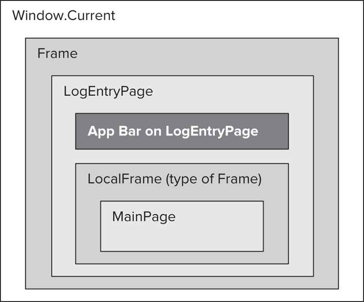
The key to fixing this issue of a missing app bar is to utilize the traversal mechanism you just learned about. Instead of using the layout hierarchy shown in Figure 10-13 and Figure 10-14, you should create another one, as depicted in Figure 10-15.
This hierarchy contains a new Page object called LogEntryPage. This page holds the app bar, and it nests a new Frame object, named LocalFrame. When navigating among pages, LocalFrame will be used instead of the Frame of Windows.Current. So, when you navigate to the Step2 page, the layout hierarchy would be the one shown in Figure 10-16. As you can see, the search algorithm would find and display the app bar of LogEntryPage.
Figure 10-16: Fixed layout hierarchy after navigating to the Step2 page

<Frame x:Name="LocalFrame" />CommandBar.IsOpen = false;protected override void OnNavigatedTo(NavigationEventArgs e)
{
LocalFrame.Navigate(typeof(MainPage));
}using Windows.UI.Xaml.Controls;
using Windows.UI.Xaml.Input;
using Windows.UI.Xaml.Navigation;
namespace DiveLog
{
public sealed partial class LogEntryPage : Page
{
public LogEntryPage()
{
this.InitializeComponent();
}
protected override void OnNavigatedTo(NavigationEventArgs e)
{
    LocalFrame.Navigate(typeof(MainPage));
}
private void NewEntryButtonTapped(object sender, TappedRoutedEventArgs e)
{
LocalFrame.Navigate(typeof(MainPage), LocalFrame.BackStackDepth);
CommandBar.IsOpen = false;
}
private void LocationButtonTapped(object sender, TappedRoutedEventArgs e)
{
LocalFrame.Navigate(typeof(Step1), LocalFrame.BackStackDepth);
CommandBar.IsOpen = false;
}
private void DepthButtonTapped(object sender, TappedRoutedEventArgs e)
{
LocalFrame.Navigate(typeof(Step2), LocalFrame.BackStackDepth);
CommandBar.IsOpen = false;
}
private void CompletedButtonTapped(object sender, TappedRoutedEventArgs e)
{
LocalFrame.Navigate(typeof(Step3), LocalFrame.BackStackDepth);
CommandBar.IsOpen = false;
}
}
}if (!rootFrame.Navigate(typeof(MainPage)))if (!rootFrame.Navigate(typeof(LogEntryPage)))By now, you’ve used only page navigation in this chapter. However, you can navigate to web pages, and open files through associated apps, as you learn in the next section.
Launching Files and Web Pages
You can launch other files from your currently running app with any of the apps associated with the file extension. The Windows.System namespace contains a Launcher object responsible for this. Using the Launcher object is very easy, as the LaunchFiles.sln sample solution in the LaunchFiles folder of this chapter’s download demonstrates.
Launcher is a static class with two methods:
- LauchFileAsynch accepts a file (an IStorageFileObject) argument and opens the application associated with the specified file type.
- LaunchUriAsync accepts an Uri argument and starts the default (or specified) browser with the given Uri.
Both methods have an overload that accepts a second argument with a type of LauncherOptions. Using this option, you can specify several options to launch a file association or a URI.
Let’s take a look at a few examples of using Launcher. To start the default application associated with the .png file extension, use this simple code snippet:
const string FILE = @"AssetsSurface.png";
// ...
var file = await Package.Current.InstalledLocation.GetFileAsync(FILE);
if (file != null)
{
    bool success = await Launcher.LaunchFileAsync(file);
    if (success)
    {
        // --- Application launched successfully
    }
    else
    {
        // --- Application has not been launched
    }
else
{
    // --- There are issues accessing the file
}
Starting a URI follows the same pattern:
const string URI = "http://msdn.com";
// ...
bool success = await Launcher.LaunchUriAsync(file);
if (success)
{
    // --- URI launched successfully
}
else
{
    // --- URI has not been launched
}
Using the LauncherOptions argument, you can ask for a confirmation from the user before starting the app, as the boldfaced code in the following snippet indicates:
const string FILE = @"AssetsSurface.png";
// ...
var file = await Package.Current.InstalledLocation.GetFileAsync(FILE);
if (file != null)
{
    var options = new LauncherOptions();
    options.TreatAsUntrusted = true;
    bool success = await Launcher.LaunchFileAsync(file);
    if (success)
    {
        // --- Application launched successfully
    }
    else
    {
        // --- User did not allow to start the app
    }
else
{
    // --- There are issues accessing the file
}
Using LauncherOptions, you can even let the user launch the associated app using the Open With dialog box:
const string FILE = @"AssetsSurface.png";
// ...
var file = await Package.Current.InstalledLocation.GetFileAsync(FILE);
if (file != null)
{
    var transform = StartOpenWithButton.TransformToVisual(null);
    var popupLocation = transform.TransformPoint(new Point());
    popupLocation.Y += StartOpenWithButton.ActualHeight;
    var options = new LauncherOptions();
    options.DisplayApplicationPicker = true;
    options.UI.PreferredPlacement = Placement.Below;
    options.UI.InvocationPoint = popupLocation;
    bool success = await Launcher.LaunchFileAsync(file, options);
    // --- Handle launch status
}
// --- Handle file issues
This code sets the DisplayApplicationPicker property to true, and this setting causes the Open With picker dialog box to pop up. In this dialog box, you can select the application with which to open the specified file. The PreferredPlacement property is set to Placement.Below, and so the InvocationPoint property is taken into account as the upper-left position of the picker dialog box. This position is calculated according to the position of the button (StartOpenWithButton) used to run this code snippet.
Now, you’ve learned the fundamental concepts and details of navigation. It’s time to get to know the behavior of two great Visual Studio application templates — the Split Application and the Grid Application templates.
Using the Split Application and Grid Application Templates
The Windows 8 team at Microsoft places a lot of emphasis on making it easy for developers to follow the Windows 8 design patterns — including content representation and navigation. To support these patterns, Visual Studio provides two Windows 8 application templates that boost your application development by providing a fast start:
- The Split Application template supports hierarchical navigation. It is a two-page project for an app that navigates among grouped items, as shown in Figure 10-17. The first page allows group selection, and the second displays an item list alongside details for the selected item.
- The Grid Application template supports hierarchical navigation, as shown in Figure 10-18. It is a three-page project for an app that navigates among groups of items. The first page allows group selection, and the two other pages are dedicated to displaying group and item details, respectively.
Figure 10-17: Navigation structure of the Split Application template

Figure 10-18: Navigation structure of the Grid Application template

These templates are harnessed with useful tools that manage the behavior of your application:
- Sample data source — Templates provide sample data at design time. This helps you to preview the UI without running your application.
- Application layout — The pages in these templates manage the different visual states of the application. When you rotate your device (for example, from landscape to portrait view), or you snap two apps on the screen, the page layout accommodates the new visual state.
- State management — You do not have to worry about saving and restoring your application’s state (remember the discussion about the Windows 8 app lifecycle in Chapter 9). These templates handle the Suspending and Resuming application events.
- Navigation support — Your app handles the keyboard and mouse navigation events automatically. For example, when the user presses the Alt+Left or Alt+Right key combinations, your application navigates backward or forward, respectively. Also, when your mouse supports the back and forward buttons, those are correctly used for page navigation.
Before you create apps with the Split Application or Grid Application templates, it is worth getting acquainted with the structures and the toolsets they provide.
The Structure of the Templates
When you create a new app with either the Split Application or Grid Application template, your project is equipped with a number of useful code files, as shown in Figure 10-19. Although you see an app built on the Split Application template in this figure, these files have the same content for both templates. Table 10-2 summarizes the role of these code files.
Figure 10-19: Code infrastructure files created by the Split and Grid Application templates

Table 10-2: Common Infrastructure Files in the Split and Grid Application Templates
| File | Description |
| BindableBase.cs | This file contains the BindableBase abstract class that is a helper class to implement the INotifyPropertyChanged interface — it has a key role in XAML data binding, as you learned in Chapter 8. You can use this class to derive your model classes (that is, classes that represent data to be displayed in the app). The model classes in the SampleDataSource.cs file derive from this class. |
| BooleanNegationConverter.cs | This is a data-binding converter class that negates the value of a boolean flag. It is not used in the templates directly. |
| BooleanToVisibilityConverter.cs | This is a data-binding converter class that translates the boolean true and false values to the Visible and Collapsed values of the Visibility enumeration. Although this converter is not used directly in the templates, it is very convenient when you want to bind the visibility of a UI element to a boolean value. |
| LayoutAwarePage.cs | This file implements the LayoutAwarePage class that adds functionality to your pages, including application lifecycle management, handling visual state, and navigation. You learn more about this class later. |
| Readme.txt | This file contains a very short generic description of the files in the Common folder. |
| RichTextColumns.cs | This file contains the RichTextColumns class that helps you manage multiple columns of rich text and related scrolling tasks. This class is used only in the Grid Application template. |
| StandardStyles.xaml | This file contains predefined resources (styles, data templates, and so on). |
| SuspensionManager.cs | This file contains an implementation of the SuspensionManager class that captures global session states to simplify app lifetime management. |
| SampleDataSource.cs | This class defines a sample data source for your app that can be used at design time. |
In addition to the common files, the Split Application and Grid Application templates contain their own page files, as summarized in Table 10-3 and Table 10-4, respectively.
Table 10-3: Split Application Template Pages
| Page File | Description |
| ItemsPage.xaml | This is the Start Page of the app. It displays item groups in a GridView (or in a ListView in snapped mode). |
| SplitPage.xaml | Selecting a group in the ItemsPage view navigates to this page. It contains the list of items on the left, and the details of the selected item on the right. In snapped mode, this view works as if the list and the item details were two separate pages. |
Table 10-4: Grid Application Template Pages
| Page File | Description |
| GroupedItemsPage.xaml | This is the Start Page of the app. It displays all groups and their items in a GridView (or in a ListView in snapped mode). |
| GroupDetailPage.xaml | Selecting a group header in the GroupedItemsPage view navigates to this page. It contains the detailed information about the group and its items. |
| ItemDetailPage.xaml | Selecting an item in the GroupedItemsPage view or in the GroupDetailPage view navigates to this page. It contains the details of the selected item. |
Just like most Windows 8 apps, these templates use the Model-View-ViewModel (MVVM) design pattern to separate the responsibilities of objects composing the application. If you want to understand these templates better, you cannot avoid having a basic overview about MVVM.
To handle the cooperating components of your application as loosely coupled as possible, MVVM suggests that you divide the build of your application components around the three roles of Model, View, and ViewModel. The Model represents an object that retrieves your content (application data) and writes back the modifications to a store (database). The View is the UI that displays the application content. In the case of Windows 8 apps using XAML, the View is the XAML code representing your UI.
To separate the Model and the View from each other, the data is transferred through a ViewModel between them. When the Model is queried for a kind of content, it retrieves a ViewModel representing that content. The View uses the ViewModel to display data coming from the Model. When the user modifies some information on the UI, the View uses a ViewModel object and sends it to the Model to persist it.
When you start working with a new Split Application or Grid Application, these templates contain a Model, and a number of ViewModel and several View (one view for each page type) components. If you want to customize the application, you must carry out the following steps:
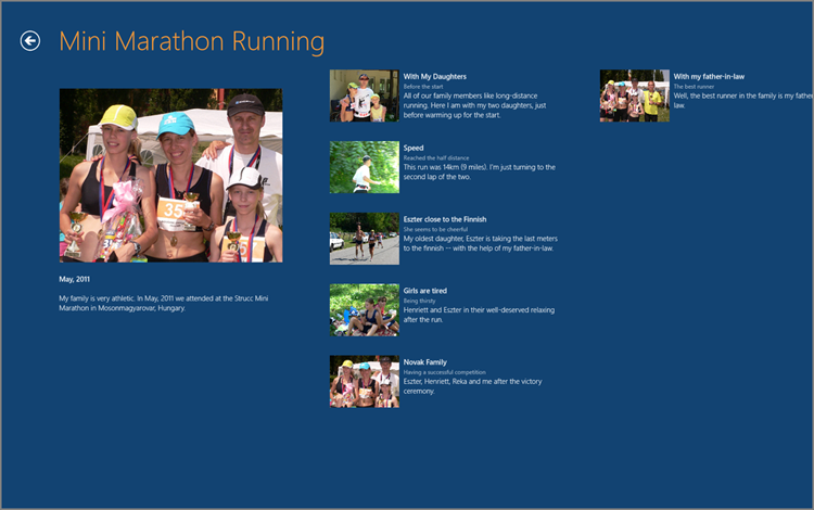
You can find two prepared sample applications in the FamilyTripsSplit and FamilyTripsGrid folder of this chapter’s download that were created with the Split Application template and the Grid Application template, respectively. These apps display photos with their descriptions, as shown in an example in Figure 10-20.
Figure 10-20: The FamilyTrips app — based on the Grid Application template
As you learn in the next section, it is worth opening these sample apps and regularly comparing them with the freshly created (and non-customized) versions of Split and Grid apps.
Managing Sample Data and Runtime Data
The DataModel folder contains a SampleDataSource.cs file that represents the content of the template app in memory, just as if it were read from a database (or queried from an Internet data source). Table 10-5 summarizes the types in this file and their roles.
Table 10-5: Types in the SampleDataSource.cs File
| Type | Description |
| SampleDataCommon | A type representing an abstract ViewModel class for items with a unique ID, a title, a subtitle, a description, and an image. |
| SampleDataItem | A data item (ViewModel) inheriting the attributes from SampleDataCommon and adding a Content property. |
| SampleDataGroup | A data item (ViewModel) inheriting the attributes from SampleDataCommon, and adding an Items property that represents SampleDataItem instances that belong to that group. |
| SampleDataSource | The Model class that has several (read-only) operations, such as GetGroups GetGroup, and GetItem. |
The SampleDataSource class is used as sample data during the design of pages. This behavior is defined in a CollectionViewSource resource in the XAML files of application pages:
<!-- d:Source is broken into three separate lines for better readability, -->
<!-- however, is should be types as one line! -->
<CollectionViewSource
    x:Name="itemsViewSource"
    Source="{Binding Items}"
    d:Source="{Binding AllGroups,
        Source={d:DesignInstance Type=data:SampleDataSource,
        IsDesignTimeCreatable=True}}"/>
The d:source attribute of the <CollectionViewSource> element indicates that the AllGroups property of SampleDataSource should be used during design time. The Source attribute defines the runtime data source.
The data is bound to UI elements through the ItemsSource property of UI controls. For example, ItemsPage.xaml contains a GridView and a ListView element that refer to the CollectionViewSource by its name (itemsViewSource):
<GridView
    <!-- ... -->
    ItemsSource="{Binding Source={StaticResource itemsViewSource}}"
    <!-- ... -->
/>

<ListView
    <!-- ... -->
    ItemsSource="{Binding Source={StaticResource itemsViewSource}}"
    <!-- ... -->
/>
The Split Application and Grid Application templates use the SampleDataSource class not only at design time, but also as a runtime data source. The runtime assignment is done in the LoadState method of the apps’ starting pages:
protected override void LoadState(Object navigationParameter,
       Dictionary<String, Object> pageState)
{
    var sampleDataGroups = SampleDataSource.GetGroups((String)navigationParameter);
    this.DefaultViewModel["Items"] = sampleDataGroups;
}
Putting sampleDataGroups in the “Items” element of the DefaultViewModel container binds the data to the CollectionViewSource, because of the Source={Binding Items} declaration.
Layout Management
Both templates derive all page classes from the LayoutAwarePage class that is located in the Common folder. This class undertakes the responsibility of managing the layout of the application. As you rotate the screen of a mobile device, or snap apps beside your app, the screen layout is managed for you automatically.
As soon as the page inheriting from LayoutAwarePage is loaded, it subscribes to the current window’s SizeChanged event. When this event is triggered, LayoutAwarePage automatically moves the page to the appropriate visual state. When the window size changes, not only does the size of existing controls change but sometimes the whole layout of the page. For example, when an app based on the Split Application template is snapped on the screen, the layout of the ItemsPage view changes from the GridView to a ListView, because of the boldfaced markup in the following declaration:
<VisualStateManager.VisualStateGroups>
    <VisualStateGroup x:Name="ApplicationViewStates">
        <VisualState x:Name="FullScreenLandscape"/>
        <VisualState x:Name="Filled"/>
        <VisualState x:Name="FullScreenPortrait">
            <!-- Details omitted for the sake of brevity -->
        </VisualState>
        <VisualState x:Name="Snapped">
            <Storyboard>
                <!-- The animation of the Back button and the Title is omitted -->
                <ObjectAnimationUsingKeyFrames
                         Storyboard.TargetName="itemListView"
                    Storyboard.TargetProperty="Visibility">
                    <DiscreteObjectKeyFrame KeyTime="0" Value="Visible"/>
                </ObjectAnimationUsingKeyFrames>
                <ObjectAnimationUsingKeyFrames
                         Storyboard.TargetName="itemGridView"
                    Storyboard.TargetProperty="Visibility">
                    <DiscreteObjectKeyFrame KeyTime="0" Value="Collapsed"/>
                </ObjectAnimationUsingKeyFrames>
            </Storyboard>
        </VisualState>
    </VisualStateGroup>
</VisualStateManager.VisualStateGroups>
This markup sets the Visibility property of the ListView to Visible (and so displays it) and the Visibility property of the GridView to Collapsed (and so hides it). You can use a similar solution to alter the layout of your apps adaptively as the window size changes.
Using Logical Pages
The Split Application template’s SplitPage view has a trick. Originally, it divides the screen into two panes — a list view on the left, and a detail view on the right. However, when the window’s layout changes to portrait or to snapped, the width of the remaining window is not enough to display both panes.
In this case, this page allows internal navigation between the list view and the detail view, as if the one physical page were actually two. The SplitPage view is handled as two logical pages. When the user navigates from the list to an item, the list view is hidden, and only the detail view is shown. When the back button is used on the detail pane, it navigates back only to the list view.
Using Rich Text Columns
The Grid Application template’s ItemDetailPage view uses a FlipView control to represent its content. The FlipView’s template contains a ScrollView (to enable you to scroll long content horizontally) that uses the RichTextColumns control to display the content in multiple columns on the screen:
<common:RichTextColumns x:Name="richTextColumns" Margin="117,0,117,47">
<RichTextBlock x:Name="richTextBlock" Width="560"
Style="{StaticResource ItemRichTextStyle}">
<Paragraph>
<Run FontSize="26.667" FontWeight="Light" Text="{Binding Title}"/>
<LineBreak/>
<LineBreak/>
<Run FontWeight="SemiBold" Text="{Binding Subtitle}"/>
</Paragraph>
<Paragraph LineStackingStrategy="MaxHeight">
<InlineUIContainer>
<Image x:Name="image" MaxHeight="480" Margin="0,20,0,10"
Stretch="Uniform" Source="{Binding Image}"/>
</InlineUIContainer>
</Paragraph>
<Paragraph>
<Run FontWeight="SemiLight" Text="{Binding Content}"/>
</Paragraph>
</RichTextBlock>
<common:RichTextColumns.ColumnTemplate>
<DataTemplate>
<RichTextBlockOverflow Width="560" Margin="80,0,0,0">
<RichTextBlockOverflow.RenderTransform>
<TranslateTransform X="-1" Y="4"/>
</RichTextBlockOverflow.RenderTransform>
</RichTextBlockOverflow>
</DataTemplate>
</common:RichTextColumns.ColumnTemplate>
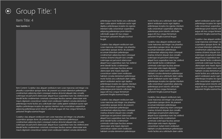
</common:RichTextColumns>The Width attribute of the <RichTextBox> element defines that the first column’s width is 560 pixels. The first <Paragraph> element nests the title, subtitle, and description of the item. The second <Paragraph> contains the image, and the third one nests the content that can be very long, even consuming multiple columns.
When the content of the <RichTextColumns> element does not fit into one column on the page, additional columns are automatically added where the content can overflow to. The <common:RichTextColumns.ColumnTemplate> element defines a template for the additional rich text columns. It uses a <RichTextBlockOverFlow> element of 560 pixels wide — the same width as the first column. If you change it to 280, you will recognize the overflow columns, as shown in Figure 10-21, because they were narrower than the first column.
Figure 10-21: Overflow columns are narrower than the first column
Other Features to Study
You can get some great ideas from studying the Split Application and Grid Application templates. Here are a few things that are worth examining:
- Look at the constructor of LayoutAwarePage, and study the methods in the Visual state switching section to determine how window size changes are managed within this class.
- You can use the SuspensionManager class in your other apps as well. Look at it to understand how it saves and loads application changes.
- The RichTextColumns class implements a panel control that creates additional columns on demand for overflown rich text. It does quite a complex job with a relatively small amount of code.
- The StandardStyles.xaml file contains a great variety of resource styles and templates you can use in other applications as well.
Summary
Most applications have multiple screens — or, using the Windows 8 terminology, pages. Several navigation patterns help users intuitively browse app content — expanding multiple pages. These patterns include hub navigation, direct navigation, hierarchical navigation, and semantic zoom.
The key object in multi-page scenarios is the Page object, the basic UI element that represents an application page. Each Page instance has an associated Frame object (which can be accessed through the Frame property) that controls the content of the page. You can use the Frame property to navigate to other pages, passing the type representing the target page.
You can handle events related to navigation, such as NavigatingFrom, NavigatedFrom, and NavigatedTo. If you want to handle these events within a Page-derived class, you can override the OnNavigatingFrom, OnNavigatedFrom, and OnNavigatedTo methods, respectively.
You do not need to start building your apps from empty pages. The Split Application and Grid Application templates provide a quick start that suits a number of scenarios. These templates are equipped with great predefined helper tools. They manage (among other things) a sample data source, a visual state that changes with the application window’s size (for example, rotating the device or snapping apps on the screen), and an application lifecycle state.
In Chapter 11, you will learn about some great new features of Windows 8 that enable you to build connected apps — applications that work together with each other or with services on the Internet.
Exercises
What You Learned In This Chapter
| Topic | Key Concepts |
| Navigation patterns | The designers of the Windows 8 language created a number of navigation patterns that are fairly intuitive and help users easily find the content they are looking for. The most important patterns are hub navigation, direct navigation, hierarchical navigation, and semantic zoom. |
| Page control | The Page UI control is the key building block used in creating Windows 8 applications with navigation. Derive your app screens from Page, and you obtain implicit navigation support in your app, including forward and backward navigation with history and navigation events. |
| Frame control | The Frame property of a Page is an instance of the Frame class. Frame is a container that can hold and display pages. Navigating from one page to another means changing the content of a Frame to another Page instance. |
| Frame.Navigate method | The Navigate method of a Frame instance is the key operation in page navigation. This method accepts two arguments. The first argument is the type of the page to navigate to, and the second (optional) argument is an object used as the parameter or the page. This parameter can be used to pass data used in page initialization. |
| OnNavigatingFrom method, NavigatingFrom event | When you are about to navigate from one page to another, the NavigatingFrom event is raised on the source Page instance. This event can be handled within the source page by overriding the OnNavigatingFrom method. Set the Cancel property of the event argument to true if you want to prevent navigation. |
| OnNavigatedFrom method, NavigatedFrom event | When you have navigated from one page to another, the NavigatedFrom event is raised on the source Page instance. This event can be handled within the source page by overriding the OnNavigatedFrom method. |
| OnNavigatingTo method, NavigatedTo event | When you have navigated from one page to another, the NavigatingTo event is raised on the target Page instance. This event can be handled within the target page by overriding the OnNavigatingTo method. |
| Launcher class | The Launcher class can be used to launch an app though a file associated with that application, or through a URI. This class provides the LaunchFileAsync and LaunchUriAsynch methods for this purpose, respectively. |
| Split Application template | The Split Application template supports hierarchical navigation. It is a two-page project for an app that navigates among grouped items. The first page allows group selection, and the second displays an item list alongside details for the selected item. |
| Grid Application template | The Grid Application template supports hierarchical navigation. It is a three-page project for an app that navigates among groups of items. The first page allows group selection. The two other pages are dedicated to displaying group and item details, respectively. |