
Chapter 8
Working with XAML Controls
WHAT YOU WILL LEARN IN THIS CHAPTER:
- Understanding and creating animations and transitions in Windows 8 style applications
- Understanding and applying transformations
- Understanding how to change the visual look of controls
- Getting acquainted with Microsoft Expression Blend
- Getting acquainted with the powerful Windows 8 style-specific complex controls
WROX.COM CODE DOWNLOADS FOR THIS CHAPTER
You can find the wrox.com code downloads for this chapter on the Download Code tab at www.wrox.com/remtitle.cgi?isbn=012680. The code is in the Chapter8.zip download and individually named, as described in the corresponding exercises.
In this chapter, you learn some more exciting features of Windows 8 style applications that enable you to create more stunning user experiences. This chapter begins with a look at how to create animations using the Animation Library, and how to create custom animations. You also learn about important concepts such as transformations, visual customization, and a tool called Microsoft Expression Blend. By the end of this chapter, you’ll have learned how to create a custom visual experience for your user interface (UI), and will be familiar with how to present complex controls in Windows 8 style applications.
Using Animations in Your Application
Animations can make your UI come alive. With carefully designed animations, you can make your application look fast, fluid, and responsive. Additionally, animations can help the user learn how to use your application much faster. For example, when you add a new item to a list, the new item animates into its place (instead of just simply popping up in the list control), while other items animate to a new position. Your UI ensures that the new item has enough room to display. These small (but meaningful) animations can help the user understand the performed action much more easily.
Although animations can add great value to your application, they also should be carefully designed. Animations and transitions should be consistent throughout the application and the operating system. They also should be smooth, fast, and fluid. Stuttering animations can be really disappointing.
When building Windows 8 style applications, you can choose from two different types of animations:
- Dependent animations — If you create custom animations, there’s a good chance that they’ll run as dependent animations. Dependent animations run on the UI thread. The UI thread is often busy with handling user input or with some drawing logic, so it might not be able to produce a consistent frame rate for your animations, thus making them stutter a little.
- Independent animations — Independent animations run independently from the UI thread. The work is offloaded from the CPU to the graphics processing unit (GPU). GPUs are optimized hardware units to deliver beautiful, rich graphics at a consistent frame rate. This means that if you want to have smooth and glitch-free animations, you should use independent animations, because they will perform much better.
One way to make sure you are using an independent animation that is consistent with other Windows 8 style applications is to use the Animation Library.
Animation Library
The Animation Library contains a set of predefined animations that are high-performing, smooth, and consistent with the look and feel of Windows animations. You don’t have to worry about making them fast and fluid, or even consistent. They are already taking advantage of the platform’s independent animation capability, and are used throughout the Windows operating system UI. Think of the Animation Library as a palette of animations that you can use whenever you want, and are already adjusted to the requirements of a great Windows 8 style UI.
The Application Library supports two types of animations:
- Theme transitions — These transitions are triggered automatically by the layout system. They are triggered in response to the changes of the active layout of the page. These are typically animations used to provide visuals for loading, unloading, or changing the location of objects.
- Theme animations — These animations are triggered manually from code, and you can specify a target for the animations.
Theme Transitions
Theme transitions are a great way to create simple animations that won’t annoy the user of your application, while still making it attractive and likeable. Typically, you’ll apply theme transitions to animate the adding, removing, or reordering of items, or the changing of the content of controls. The following code snippet demonstrates the use of a transition called EntranceThemeTransition:
<Button Content="Animated Button" HorizontalAlignment="Center">
    <Button.Transitions>
        <TransitionCollection>
            <EntranceThemeTransition/>
        </TransitionCollection>
    </Button.Transitions>
</Button>
By using this code snippet, you can animate a button to slide into its place, instead of just appearing when it is rendered for the first time. As you can see from the code snippet, you can apply more than one transition to a UIElement. Actually, you can have as many as you want (provided that doing so makes sense to the user).
Some transitions provide a certain degree of customization by enabling you to set a couple of properties on the transition. Customization should be performed with great care, because these transitions are designed to be simple, easy to use, and, most importantly, consistent.
The previous sample code snippet is not that interesting, because it applies only to a single Button control. The real fun starts when you start to apply these transitions to containers of other elements. In the following code sample, the transition is defined on the panel:
<WrapGrid>
    <WrapGrid.ChildrenTransitions>
        <TransitionCollection>
            <EntranceThemeTransition/>
            <RepositionThemeTransition/>
        </TransitionCollection>
    </WrapGrid.ChildrenTransitions>
    <Rectangle Fill="Red" Width="100" Height="100" Margin="10"/>
    <Rectangle Fill="Red" Width="100" Height="100" Margin="10"/>
    <Rectangle Fill="Red" Width="100" Height="100" Margin="10"/>
    <Rectangle Fill="Red" Width="100" Height="100" Margin="10"/>
    <Rectangle Fill="Red" Width="100" Height="100" Margin="10"/>
    <Rectangle Fill="Red" Width="100" Height="100" Margin="10"/>
    <Rectangle Fill="Red" Width="100" Height="100" Margin="10"/>
    <Rectangle Fill="Red" Width="100" Height="100" Margin="10"/>
    <Rectangle Fill="Red" Width="100" Height="100" Margin="10"/>
</WrapGrid>
Every child contained in the WrapGrid panel slides into its place when first rendered. This is achieved by using EntranceThemeTransition. RepositionThemeTransition ensures that whenever you add or remove a child element, the rest are repositioned and slide into their new places with a smooth and nice animation.
When using a complex control like a GridView or a ListView (which you learn more about later in this chapter), you don’t have to worry about configuring transitions. These controls are designed to support them by default.
Table 8-1 describes the supported transitions.
Table 8-1: Supported Theme Transitions
| Theme Transition | Description |
| AddDeleteThemeTransition | Animates the transition for item additions or removals. Typically applied to item containers. |
| ContentThemeTransition | Animates the transitions when the content of a control is changing. |
| EntranceThemeTransition | Provides the transition when an item is first displayed. |
| ReorderThemeTransition | Provides the transition when the order of the items changes in a list control. Typically used with drag and drop. |
| RepositionThemeTransition | Provides the transition when controls are repositioned to a new location. |
Theme Animations and Storyboards
Theme transitions are a great way to create simple animations, but you may need more control over the animation process while still being consistent with Windows operating system animations.
Storyboards are objects that can control multiple animations. You can think of storyboards like having a video player. You can start, stop, pause, resume, and seek animations using a storyboard. You will need to write code using event handlers to control a Storyboard object. Storyboards also support targets. This means that when you add an animation to a storyboard, you can set a target for the animation. The target represents the object that should be animated.
The following code snippet demonstrates the use of theme animations with storyboards:
<Grid>
    <Grid.Resources>
        <Storyboard x:Name="hideStoryboard">
            <FadeOutThemeAnimation Storyboard.TargetName="targetRectangle"  />
        </Storyboard>
    </Grid.Resources>
    <Rectangle x:Name="targetRectangle" PointerPressed="Rectangle_Tapped"
         Fill="Blue" Width="200" Height="300" />
</Grid>
Let’s take a closer look at this code sample. The Grid panel contains a single blue rectangle. The PointerPressed event is handled on the rectangle. The event handler looks like the following:
private void Rectangle_Tapped(object sender, PointerRoutedEventArgs e)
{
    hideStoryboard.Begin();
}
This code ensures that whenever a user clicks or taps on the rectangle, the Storyboard called hideStoryboard is started.
This storyboard contains a single animation called FadeOutThemeAnimation, which, as the name suggests, is a theme animation, and is responsible for a smooth fade-out animation to hide the target element. On the animation object, the target object is defined by setting the Storyboard.TargetName attached property. The value of this property is set to the value of the Name property of the targeted UIElement.
This means that whenever a user taps or clicks the rectangle, a fade-out animation is applied to the rectangle.
Table 8-2 describes some of the supported theme animations.
Table 8-2: Most Important Supported Theme Animations
| Theme Animation | Description |
| FadeInThemeAnimation | Opacity animation for controls on first appearance. |
| FadeOutThemeAnimation | Opacity animation for controls that are removed or hidden from the UI. |
| PopInThemeAnimation | Translation and opacity animation for UI components as they appear. This is a pop-up-like animation. |
| PopOutThemeAnimation | Translation and opacity animation for UI components as they are closed with a pop-up-like animation. |
| TapUpThemeAnimation | Animation that runs just after an element is tapped. |
| TapDownThemeAnimation | Animation that runs when an element is tapped. |
As you can see, you’ll most likely need quite a few supported animations to build stunning and exciting UIs. You should remember that using animations and transitions from the Animation Library guarantees that the animation will be an independent animation.
Getting to Know Visual States
An additional (and really useful) feature of animations is called visual states. Visual states are meant to describe the visual state of the view, and the transitions between different states of the view. Visual states use simple storyboard objects to describe the states and transitions. A good example is the states defined in the Button control. The Button control has pressed states and mouse-over states, among many others.
The following code snippet demonstrates the use of visual states:
<Grid x:Name="mainGrid">
    <VisualStateManager.VisualStateGroups>
        <VisualStateGroup x:Name="VisibilityGroup">
            <VisualState x:Name="Visible">
                <Storyboard>
                    <FadeInThemeAnimation Storyboard.TargetName=
                         "targetRectangle"  />
                </Storyboard>
            </VisualState>
            <VisualState x:Name="Hidden">
                <Storyboard>
                    <FadeOutThemeAnimation Storyboard.TargetName=
                         "targetRectangle"  />
                </Storyboard>
            </VisualState>
        </VisualStateGroup>
    </VisualStateManager.VisualStateGroups>

    <Rectangle x:Name="targetRectangle" Fill="Blue" Width="200" Height="300" />
</Grid>
As you can see, a visual state contains storyboards to represent the state of the control. You can define visual states any time. Visual states must be placed into VisualStateGroups. Your control can be only in one state at a same time inside a VisualStateGroup, but it can be in two or more states if all states are located in a different VisualStateGroup.
The previous code sample defines two different states in the same group. The group is called VisibilityGroup, and it contains the Visible and the Hidden states. You can change states from code using the GoToState() method of the VisualStateManager class. The following code sample demonstrates how to change that current visual state:
VisualStateManager.GoToState(this, "Hidden", true);The first parameter of the GoToState method is the control that contains the visual state. In this case, you can specify this as the control, which is a reference to the current Page control. The second parameter of the GoToState method is the name of the visual state to which you want to switch. The third and final parameter is a boolean value to decide whether or not you want to use visual transitions. Visual transitions are a more advanced concept of visual state management. They are meant to differentiate animations between state changes based on the original and the new target visual states. true means to use transitions when available.
By setting a visual state, the contained storyboard is started automatically. There is no need to start it manually. In this case, if you switch to the Visible state, a FadeInThemeAnimation is used to display the targetRectangle. If you switch to Hidden state, a FadeOutThemeAnimation is used to hide the targetRectangle.
Visual states are a great way to define multiple states for your views. For example, you could define two different visual states for a page based on the logged-in state of the user.
In the following exercise, you apply animations from the Animation Library to create a nice visual and smooth experience.
<VariableSizedWrapGrid x:Name="itemsContainer"/><StackPanel Orientation="Horizontal" HorizontalAlignment="Center"
VerticalAlignment="Top">
<Button Content="Add"/>
<Button Content="Remove" Margin="8,0,0,0"/>
</StackPanel>
<VariableSizedWrapGrid x:Name="itemsContainer" Margin="0,50,0,0"/><Button x:Name="btnAdd" Content="Add" Click="btnAdd_Click_1"/>
<Button x:Name="btnRemove" Content="Remove" Click="btnRemove_Click_1"
Margin="8,0,0,0"/>protected override void OnNavigatedTo(NavigationEventArgs e)
{
for (int i = 0; i < 20; i++)
{
var rectangle = new Rectangle();
rectangle.Width = 100;
rectangle.Height = 100;
rectangle.Fill = new SolidColorBrush(Colors.Red);
rectangle.Margin = new Thickness(8);
itemsContainer.Children.Add(rectangle);
}
}private void btnAdd_Click_1(object sender, RoutedEventArgs e)
{
itemsContainer.Children.Add(new Rectangle
{
Width = 100,
Height = 100,
Fill = new SolidColorBrush(Colors.Red),
Margin = new Thickness(8)
});
}private void btnRemove_Click_1(object sender, RoutedEventArgs e)
{
itemsContainer.Children.RemoveAt(1);
}<VariableSizedWrapGrid x:Name="itemsContainer">
<VariableSizedWrapGrid.ChildrenTransitions>
<TransitionCollection>
<EntranceThemeTransition/>
</TransitionCollection>
</VariableSizedWrapGrid.ChildrenTransitions>
</VariableSizedWrapGrid><VariableSizedWrapGrid x:Name="itemsContainer"> <VariableSizedWrapGrid.ChildrenTransitions> <TransitionCollection> <EntranceThemeTransition/> <AddDeleteThemeTransition/> <RepositionThemeTransition/> </TransitionCollection> </VariableSizedWrapGrid.ChildrenTransitions></VariableSizedWrapGrid>Figure 8-1: Animation during repositioning after item removal

Custom Animations
The Animation Library is really useful and quite powerful, but it can’t cover every possible animation scenario. If you want to create an animation that cannot be done with a theme animation or theme transition, you should create your own custom animation.
In most cases, custom animations are dependent animations. This means that you should use them with care. With custom animations, you have the freedom to create any kind of animation you want. You can animate any property that is a dependency property.
Following are some common animation types for which you can use animation classes to animate different types of properties:
- DoubleAnimation — DoubleAnimation is great to animate properties of type double. For example, you could animate an Opacity property, or a double property of a transformation object (such as rotation).
- ColorAnimation — ColorAnimation is a simple way to change the color of objects when something happens. For example, you could animate to a much lighter color to represent a highlighted item.
- ObjectAnimation — Sometimes objects have a somewhat more complex property that should be changed using animations. The most common usage of this type of animation is to hide and show controls using the Visibility enumeration.
Most of the time, you’ll probably use DoubleAnimations and animate properties like Opacity, or you’ll animate a property of a transformation. Using this set of animation techniques, you can create most of the animations you’ll want to perform. The following code snippet demonstrates the use of a DoubleAnimation:
<Grid>
    <Grid.Resources>
        <Storyboard x:Name="hideStoryboard">
            <DoubleAnimation Storyboard.TargetName="targetRectangle"
                Storyboard.TargetProperty="Opacity" Duration="00:00:00.5"
                To="0"/>
        </Storyboard>
    </Grid.Resources>
    <Rectangle x:Name="targetRectangle" PointerPressed="Rectangle_Tapped"
         Fill="Blue" Width="200" Height="300" />
</Grid>
This code snippet hides a rectangle by animating the Opacity property of the targetRectangle to 0 in 0.5 seconds. As you can see, you can use a custom animation just like you would use an animation from the Animation Library. You create a Storyboard and add an animation to it, and then you set the Storyboard.TargetName. However, this time you also set the name of the property you want to animate.
Animations in the Animation Library are predefined animations. Everything is specified on those types of animations (such as durations, properties to animate, and so on). With custom animations, you must specify all of this information.
The previous code sample sets the Storyboard.TargetProperty to the Opacity property and the Duration to 0.5 seconds. So, when the storyboard is playing, it will animate the opacity to 0 in 0.5 seconds. The desired value after the storyboard completes is defined using the To property. If you need to define the start value of the animation, you can use the From property as well.
Transformations
Now you know how to animate objects’ properties with custom animations. However, most of the time, you’ll animate transformation properties to slide, scale, or rotate controls. In Windows 8 style applications, these animations are called render transformations. These types of transformations are applied without affecting the layout, so you don’t have to worry about performance issues, or funny, continuously changing layouts.
The following transformation types are supported:
- TranslateTransform
- ScaleTransform
- RotateTransform
- SkewTransform
Origin of Transformations
Transformations must have a center point. This point determines the origin of transformations. For example, if you want to specify that you want to rotate a rectangle around its center, you should set the RenderTransformOrigin property to (0.5,0.5).
These coordinates are relative coordinates to the top-left corner of the UIElement:
- (0,0) is the top-left corner.
- (1,1) is the bottom-right corner.
- (0.5, 0.5) is the exact center of UIElement.
You might be wondering about an ellipse, which has no visual top-left corner. However, from a layout point of view, every UIElement is placed on the UI in a bounding rectangle that represents the minimal width and height the UIElement requires. You should set the RenderTransformOrigin properties with this bounding rectangle in mind.
Every UIElement you place into your XAML page has a property called RenderTransform. Assign any of the previously described transformations to this property and you’ll get a transformed UIElement. The following code sample shows an example:
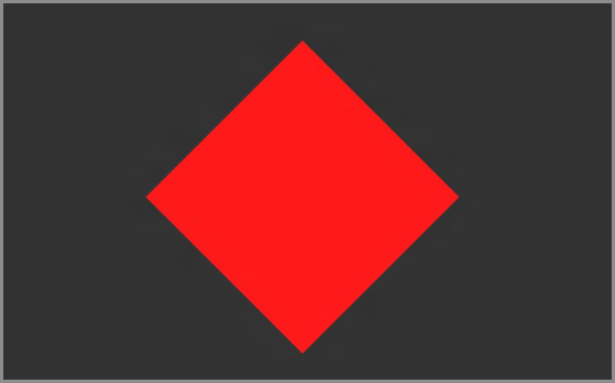
<Rectangle Width="200" Height="200" Fill="Red" RenderTransformOrigin="0.5,0.5">
    <Rectangle.RenderTransform>
        <RotateTransform Angle="45"/>
    </Rectangle.RenderTransform>
</Rectangle>
This code sample rotates the rectangle 45 degrees around its center point. Figure 8-2 shows the rotated rectangle.
Figure 8-2: Rectangle rotated 45 degrees
Applying Multiple Transformations
If you want to apply more than one transformation to a UIElement, you can use a TansformGroup like this:
<Rectangle Width="200" Height="200" Fill="Red" RenderTransformOrigin="0.5,0.5">
    <Rectangle.RenderTransform>
        <TransformGroup>
            <RotateTransform Angle="45"/>
            <TranslateTransform X="100"/>
        </TransformGroup>
    </Rectangle.RenderTransform>
</Rectangle>
These transformations are quite effective, but are also limiting at the same time. They are limited to the two-dimensional (2-D) space. Unfortunately, to create a real three-dimensional (3-D) space would require the use of DirectX and a lot of complicated code. But if you can cope with just a little cheating, PlaneProjections can come to the rescue.
Transformations in the 3-D Space
If you want to create 3-D-like transformations, you can simulate them in the 2-D space using PlaneProjections. PlaneProjections behave exactly like render transformations — they won’t affect the layout.
In the next exercise, you create a custom animation using PlaneProjections to rotate a panel in 3-D.
<Border Width="500" Height="350" Background="Orange"
        HorizontalAlignment="Center" VerticalAlignment="Center">
    <Grid>
        <TextBlock Foreground="White" FontSize="40" HorizontalAlignment=
             "Center" VerticalAlignment="Center" Text="Rotating in 3D"/>
    </Grid>
</Border>
<Grid Background="{StaticResource ApplicationPageBackgroundThemeBrush}">
    <Button x:Name="startButton" Content="Start Rotation" HorizontalAlignment=
         "Center" VerticalAlignment="Top"
            Click="startButton_Click_1"
            />

    <Border Width="500" Height="350" Background="Orange"
            HorizontalAlignment="Center" VerticalAlignment="Center">
        <Grid>
            <TextBlock Foreground="White" FontSize="40" HorizontalAlignment=
                 "Center" VerticalAlignment="Center" Text="Rotating in 3D"/>
        </Grid>
    </Border>
</Grid>
<Grid Background="{StaticResource ApplicationPageBackgroundThemeBrush}">
    <Button x:Name="startButton" Content="Start Rotation" HorizontalAlignment=
         "Center" VerticalAlignment="Top"
            Click="startButton_Click_1"
            />

    <Border Width="500" Height="350" Background="Orange"
            HorizontalAlignment="Center" VerticalAlignment="Center">
        <Border.Projection>
            <PlaneProjection x:Name="rotateTransform"/>
        </Border.Projection>
        <Grid>
            <TextBlock Foreground="White" FontSize="40" HorizontalAlignment=
                 "Center" VerticalAlignment="Center" Text="Rotating in 3D"/>
        </Grid>
    </Border>
</Grid>
<Page.Resources>
    <Storyboard x:Name="rotateStoryboard">
        <DoubleAnimation Storyboard.TargetName="rotateTransform"
                            Storyboard.TargetProperty="RotationY"
                            To="360"
                            Duration="00:00:00.5"/>
    </Storyboard>
</Page.Resources>
private void startButton_Click_1(object sender, RoutedEventArgs e)
{
    rotateStoryboard.Begin();
}
Designing the Visual Look of a Control
Creating visually appealing, beautiful UIs plays a very important role in the success of your application. Designing your application with the Windows 8 style principles in mind, using the built-in Windows 8 specific controls can help your cause quite a lot. But in many cases, you will want to change the visual appearance of a control.
In Windows 8 style applications, the control model is so flexible that, in fact, the controls only have a default look. This is what you see when you just use a built-in control. But their visual look can be overridden at any time.
Every control has a property called Template. This property represents the look and inner visual structure of a control. If you could take a look at the inside structure of a control (which, as a matter of fact, you can, as you see later in the next “Try it Out” exercise), you’d see borders, rectangles, panels, and other primitive controls that, as a whole, represent the control itself. To change the inside of a control, you must set the Template property of the control to something else you think is more appropriate.
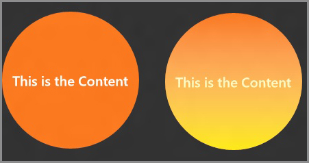
The following code snippet demonstrates the use of control templates when designing a button:
<Button Content="This is the Content" Width="200" Height="200" FontSize="20">
    <Button.Template>
        <ControlTemplate TargetType="Button">
            <Grid>
                <Ellipse Fill="Orange"/>
                <ContentPresenter/>
            </Grid>
        </ControlTemplate>
    </Button.Template>
</Button>
The Template property is of type ControlTemplate. That’s why you add a ControlTemplate to the Template property. On the ControlTemplate, you should specify the TargetType property, which determines what controls can use this structure as a template.
In this case, the ControlTemplate contains a Grid panel and an orange Ellipse that serves as the background for the Button. The ContentPresenter is a new element.
Let’s say you have a ContentControl and you want to redesign its template. You plan to add a lot of visuals to make it fancy. How can the run time decide which element will display the content of the ContentControl? The answer is simple — you explicitly create a placeholder to display the content. For ContentControls, the placeholder is called ContentPresenter; for ItemsControls, it’s called ItemsPresenter. All you have to do is to place this component inside the template to mark where to put the valuable content of the control.
Figure 8-3: The redesigned Button control

In this case, the “This is the Content” text will be displayed where the ContentPresenter is located. However, this template is super simple. Figure 8-3 shows the redesigned Button control.
This means that although the default look of this button has been changed, if you start using the button, you’ll notice that it’s missing all the visual feedback for interactions.
Connecting the Control with the Inside
The template created in the previous section is not flexible at all. The Button control has a couple of important properties, such as the Background property (which determines the background color of the control), and the HorizontalContentAlignment and VerticalContentAlignment properties (which determine the alignment of the button’s content). Although these properties worked before redefining the template, now they are useless. How could a button know which visual element serves as a background for the control? Is it the background of a border or a panel? Or is it a fill of a shape? You will have to be explicit about this information.
The challenge is to tell the Button control that the Background property is tied to the ellipse’s Fill property. You can use a familiar concept called template binding. It’s pretty much like data binding (which was discussed in detail in Chapter 7), but this one is designed for use in a control template. The following code sample demonstrates the use of TemplateBinding:
<Button Content="This is the Content" Width="200" Height="200" FontSize="20"
         Background="#FFFB6C09">
    <Button.Template>
        <ControlTemplate TargetType="Button">
            <Grid>
                <Ellipse Fill="{TemplateBinding Background}"/>
                <ContentPresenter HorizontalAlignment="{TemplateBinding
                     HorizontalContentAlignment}"
                     VerticalAlignment="{TemplateBinding
                     VerticalContentAlignment}"/>
            </Grid>
        </ControlTemplate>
    </Button.Template>
</Button>
Figure 8-4: The button with the refined template

This code sample ensures that the fill of the ellipse is tied to the background of the button, and the content’s alignment can be adjusted using the button’s HorizontalContentAligment and VerticalContentAlignment properties. Figure 8-4 shows the button with the refined template.
Responding to Interactions
So far, the redesigned button doesn’t react visually to any changes or interactions. There is no visual change to indicate that the mouse is over the control, or that it is being pressed. The Button control itself supports a couple of visual states you could hook up to. Implementing these states would mean that every time a button reacts to any interaction, it changes its visual state, and your storyboards would start.
By default, the Button control supports the following visual states:
- Normal — This is the default state.
- Pressed — The Pressed state is applied when the user clicks the button or touches the control.
- Disabled — The Disabled state is applied when the control’s IsEnabled property is false.
- PointerOver — The PointerOver state is applied when the mouse cursor is over the control.
These visual states belong to the CommonStates visual state group. Button also supports visual states for focus changes.
If you decide you want to implement any of the visual states, Button will use your implementations. You don’t have to support all the states, only the ones you are interested in.
The following code snippet demonstrates the use of visual states in the control template:
<Button Content="This is the Content" Height="200" Width="200"
         Background="#FFFB6C09" FontSize="20">
    <Button.Template>
        <ControlTemplate TargetType="Button">
            <Grid x:Name="grid" RenderTransformOrigin="0.5,0.5">
                <Grid.RenderTransform>
                    <CompositeTransform/>
                </Grid.RenderTransform>
                <VisualStateManager.VisualStateGroups>
                    <VisualStateGroup x:Name="CommonStates">
                        <VisualState x:Name="Normal"/>
                        <VisualState x:Name="Pressed">
                            <Storyboard>
                                <DoubleAnimation Duration="0" To="0.9"
                                  Storyboard.TargetProperty=
                                  "(UIElement.RenderTransform).
                                  (CompositeTransform.ScaleX)"
                                  Storyboard.TargetName="grid"
                                  d:IsOptimized="True"/>
                                <DoubleAnimation Duration="0" To="0.9"
                                   Storyboard.TargetProperty=
                                   "(UIElement.RenderTransform).
                                   (CompositeTransform.ScaleY)"
                                   Storyboard.TargetName="grid"
                                   d:IsOptimized="True"/>
                            </Storyboard>
                        </VisualState>
                        <VisualState x:Name="Disabled"/>
                        <VisualState x:Name="PointerOver">
                            <Storyboard>
                                <ObjectAnimationUsingKeyFrames
                                  Storyboard.TargetProperty="
                                  (UIElement.Visibility)"
                                  Storyboard.TargetName="mouseOverEllipse">
                                    <DiscreteObjectKeyFrame KeyTime="0">
                                        <DiscreteObjectKeyFrame.Value>
                                            <Visibility>Visible</Visibility>
                                        </DiscreteObjectKeyFrame.Value>
                                    </DiscreteObjectKeyFrame>
                                </ObjectAnimationUsingKeyFrames>
                            </Storyboard>
                        </VisualState>
                    </VisualStateGroup>
                    <VisualStateGroup x:Name="FocusStates"/>
                </VisualStateManager.VisualStateGroups>
                <Ellipse Fill="{TemplateBinding Background}"/>
                <ContentPresenter HorizontalAlignment="{TemplateBinding
                     HorizontalContentAlignment}"
                     VerticalAlignment="{TemplateBinding
                     VerticalContentAlignment}"/>
                <Ellipse x:Name="mouseOverEllipse" Visibility="Collapsed">
                    <Ellipse.Fill>
                        <LinearGradientBrush EndPoint="0.5,1" StartPoint="0.5,0">
                            <GradientStop Color="#FFFFE800" Offset="1"/>
                            <GradientStop Color="Transparent" Offset="0"/>
                        </LinearGradientBrush>
                    </Ellipse.Fill>
                </Ellipse>
            </Grid>
        </ControlTemplate>
    </Button.Template>
</Button>
This code has some exciting ideas that need some explanation.
First, take a look at the real visual content, and forget about the visual states. You’ll see that the new control template is very similar to the previous one. It has an ellipse that serves as the visual representation of the control, and has a ContentPresenter as well to support the content.
But this new version also has a new ellipse called mouseOverEllipse with a gradient fill. The gradient at the bottom of the ellipse displays the color #FFFFE800, which is a shade of yellow. At the top of the ellipse, the gradient changes to Transparent. Basically, this new ellipse is used to create a highlighted visual element for the button. By default, the mouseOverEllipse is collapsed, so it is not visible.
Now, let’s investigate the visual states of this template. You can find the visual states discussed earlier in the CommonStates VisualStateGroup. The PointerOver state defines a storyboard with an object animation to change the mouseOverEllipse’s Visibility property to Visible. Whenever the mouse cursor is over the button control, the PointerOver state is activated, and the Visibility property of the mouseOverEllipse is set to Visible. When the mouse cursor leaves the area of the Button control, the control switches back to the Normal visual state while reverting back all the property changes. You get this behavior for free when using visual states.
If you investigate further, you’ll see that the Pressed state is implemented as well. The Pressed state uses a storyboard to control two DoubleAnimations. These animations animate the ScaleX and the ScaleY properties of a CompositeTransform object defined on the template’s root grid. This means that when you press the button, it shrinks a bit to provide some nice visual feedback for the Click event. Figure 8-5 shows the button in two different states.
Figure 8-5: The Button in Normal and PointerOver states.
You must be thinking that this is quite a lot of complicated code to achieve simple things and modifications. You might also be wondering how to know what kind of visual states a control supports, and how to modify the default templates without redefining the whole control’s template.
In most cases, you’ll just want to adjust the template of the control to your own custom design, and you don’t want to start from scratch. Unfortunately, Visual Studio 2012 doesn’t do much to support this scenario. If you need a visual designer to create a new control template, or to edit an existing one, you should use Microsoft Expression Blend.
Visual Studio and Expression Blend share the same project structure, which means that you can load your project into Blend. Blend was primarily designed for interaction designers, but developers can also take advantage of this tool.
Working with Expression Blend
Microsoft Expression Blend does a great job in revealing the original template of the control, or showing you what kind of visual states the control supports. On the designer surface, you can easily adjust the visual structure, or create animations to customize the control. Figure 8-6 shows how Microsoft Expression Blend looks.
Figure 8-6: Microsoft Expression Blend

The Toolbar
Figure 8-7 shows the Expression Blend toolbar.
Figure 8-7: The Expression Blend toolbar
On the toolbar, you’ll find some really useful tools that will help you build UIs more easily. The most important tool is the selection tool, which is the first icon with a mouse cursor. If this tool is active, you can select and move items on the designer surface.
If you add a control to the UI, you’ll switch into “drawing mode.” This means that when you click the designer surface (or any item on the designer surface), you’ll start drawing the same control you added before. If you want to switch back to selection mode, you should click the selection tool on the toolbar (or press V).
On the bottom half of the toolbar, you can find controls as well. If you press and hold the Button, the TextBlock, the Grid, or the Rectangle controls, you are presented with other options (that is, other controls from the same category). If you just click these toolbar items, you switch into drawing mode. You can draw these controls on the designer surface just like you’d do in Microsoft Paint.
The Projects Panel
The Projects panel shown in Figure 8-8 is basically the Blend version of Visual Studio’s Solution Explorer. You can see the files associated with your solutions.
The Assets Panel
The Assets panel shown in Figure 8-9 contains everything you can add to your UIs, grouped into multiple categories. You can find controls, panels, shapes, media elements, styles, and so on in this panel. It also supports searching for controls. If you need a Button control, just locate it, and drag and drop it on the designer surface.
Figure 8-8: The Expression Blend Projects panel

Figure 8-9: The Expression Blend Assets panel

The States Panel
The States panel shown in Figure 8-10 displays the visual states supported by your controls. If you select a visual state, the designer surface switches to that state. Any property you change is added as an animation inside a storyboard to the active visual state. A red border around the designer surface and a message warns you that you are in visual state editing mode.
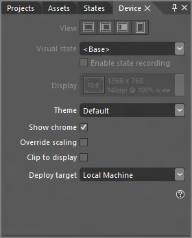
The Device Panel
The Device panel shown in Figure 8-11 helps you simulate different properties of Windows 8 devices. You can simulate orientations, snap states, resolutions, themes, and options where to deploy the application: remote device, local, or simulator.
Figure 8-10: The Expression Blend States panel

Figure 8-11: The Expression Blend Device panel
The Objects and Timeline Panel
Figure 8-12: The Expression Blend Objects and Timeline panel

The Objects and Timeline panel shown in Figure 8-12 displays the visual tree of controls on your page. You can see the entire hierarchy you’ve built. Selecting any node of the tree also selects the control on the designer surface. You can drag and drop items on the tree as well. This panel also offers an option to switch into Timeline mode, and to create and manage sophisticated storyboards.
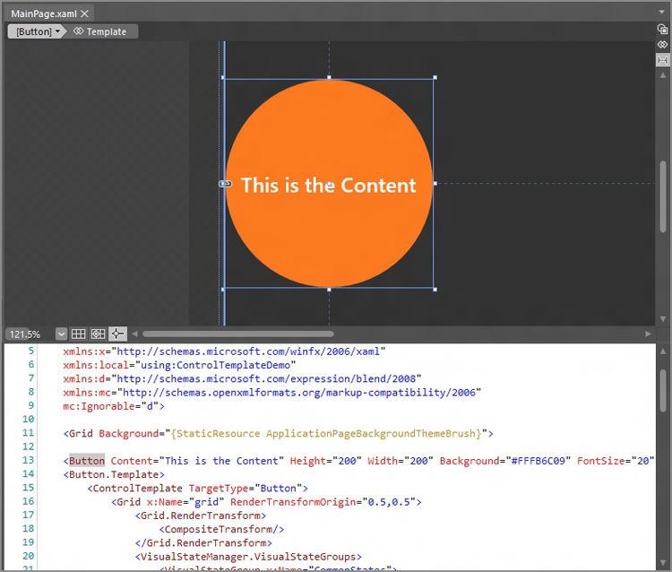
The Designer Surface
The designer surface shown in Figure 8-13 supports three different modes:
- Design mode — In this mode, you are in full visual designer mode, and you see no XAML.
- Code mode — In this mode, you can see and edit the XAML code, but you can’t see the visual representation.
- Split mode — In this mode, you can see both the XAML code editor and the visual designer, and you can edit both sides, while Expression Blend keeps the two views in sync.
Figure 8-13: The Expression Blend designer surface in Split mode
The Properties Panel
The Properties panel shown in Figure 8-14 is very similar to the one you’ll find in Visual Studio 2012. Actually, Visual Studio adopted the Expression Blend Properties panel. When an element is selected, all the properties are listed in this section. The Properties panel is also the place where you can subscribe to events when you switch it to events mode. However, this option is rarely used, because most coding is done in Visual Studio 2012.
The Resources Panel
The Resources panel shown in Figure 8-15 enables you to get an overview of all of your resources in your entire application. On this panel, you can move resources between sections, and some resources can be edited in place as well. Using drag and drop, you can apply resources to elements located on the designer surface.
Figure 8-14: The Expression Blend Properties panel

Figure 8-15: The Expression Blend Resources panel

In the next exercise, you use Expression Blend to create the button you designed earlier.
Figure 8-16: The Button control on the toolbar

Figure 8-17: The Grid Panel on the toolbar

Figure 8-18: The Rectangle tool on the toolbar

This might have seemed like quite a few steps. But, rest assured, once you get to know Expression Blend and get some practice using it, this process can take less than a minute, which makes it very effective when customizing the UI.
Working with Complex Controls
One of the great benefits of the Windows 8 style application design principles and the basic set of controls with default styles is the capability to create a consistent user experience across applications and the Windows operating system. As you use more and more Windows 8 style applications, you’ll notice major similarities and familiar concepts in the UIs. These applications might use similar list controls, with similar layout. The interaction modes and gestures with these controls are the same. This is really good from the user experience point of view, especially when thinking about the learning curve of using applications confidently.
This similarity is coming from some well-established UI patterns formed by built-in complex controls like the GridView, ListView, FlipView, SemanticZoom, or AppBar controls. Using these controls, you can make your application easier to understand and more familiar for the user.
Getting to Know the ListViewBase Controls
Complex list controls are derived from the ListViewBase class (except ListBox). This class contains all the logic that a complex Windows 8 style list control needs. Classes derived from ListViewBase support features such as touch- and mouse-optimized interaction modes, on-demand asynchronous loading, grouping, multi-selection, and semantic zoom (among many others).
ListView and GridView controls are derived from ListViewBase, which means that, with these controls, you’ll get the features previously mentioned for free. One other (rather interesting) aspect of the ListView and GridView controls is that they are pretty much the same. These controls don’t invent additional properties in ListViewBase, but they are quite different when presenting data.
Using the GridView Control
The GridView control shown in Figure 8-19 represents a horizontally scrolling grid of items. You can see this layout in many applications where photos must be arranged. Typically, news and photo applications prefer this layout format.
Figure 8-19: The GridView control in the USA Today app

Binding to Data
The GridView control is an ItemsControl, and, as such, it exposes properties like Items and ItemsSource that you can use to specify a list of items as a data source. Binding a GridView to a collection is as simple as binding any ItemsControl to a collection.
The following code demonstrates binding to a GridView:
<Page.Resources>
    <local:PlayersCollection x:Key="players"/>
<Page.Resources>

<GridView ItemsSource="{Binding Source={StaticResource players}}"
  Margin="0,120,0,0" MaxHeight="500">
    <GridView.ItemTemplate>
        <DataTemplate>
            <StackPanel Margin="20">
                <TextBlock Text="{Binding Name}" FontWeight="Bold" />
                <TextBlock Text="{Binding BirthDate}"/>
                <CheckBox Content="Complete" IsChecked="{Binding
                     IsTeamCaptain}" IsEnabled="False"/>
            </StackPanel>
        </DataTemplate>
    </GridView.ItemTemplate>
</GridView>
This code snippet binds to a collection of players. The collection is located in the Page.Resources section. When setting the ItemsSource property using a binding, the Source can be referenced as a StaticResource. This GridView is also configured to display items using a custom ItemTemplate. All this functionality works exactly the same as it does with simple ItemsControls.
If you have a lot of data to display, you may want to group it visually so the user can process the presented information more easily. Grouping is not a feature specific to GridView. It is also supported by the ListViewBase class.
Grouping Data
Grouping to visually and logically partition data is quite common. However, changing the original structure and content of the data collection would be very expensive in terms of performance. It would also take quite a lot of code to write. To work around this issue, you can use a class called CollectionViewSource.
CollectionViewSource wraps your original collection and leaves it intact, no matter what you are doing — sorting, grouping, or filtering. Sorting, grouping, and filtering rules can be changed, added, or removed, and your original collection is not changed at all.
To enable grouping on CollectionViewSource, perform the following steps:
The following code demonstrates the use of the CollectionViewSource class:
<Page.Resources>
     <CollectionViewSource x:Name="teamsList" IsSourceGrouped="True"
          ItemsPath="Players"/>
<Page.Resources>

<GridView ItemsSource="{Binding Source={StaticResource teamsList}}"
  Margin="0,120,0,0" MaxHeight="500">
    …
</GridView>
In this case, you have a collection of Team objects. Every Team object has a collection of Player objects. What you want to do here is to use the teams as groups, and use the players as group items. This code snippet configures the CollectionViewSource to support this scenario.
Note that, in the previous code snippet, the Source property is not set. This is because, in most cases, you’ll do this using code in the code-behind file. You can set the Source property to any collection.
Defining Visual Groups
Although your CollectionViewSource is ready to be displayed in a grouped view, the GridView still requires some refinement. The GridView needs to know which property should be used to display the grouping headers. You can specify this using the GroupStyle property.
The GroupStyle property enables you to completely customize the visual representation of grouping. The GroupStyle property defines a HeaderTemplate to customize the look of the header.
The following code demonstrates the definition of a GroupStyle:
<Page.Resources>
     <CollectionViewSource x:Name="teamsList" IsSourceGrouped="True"
          ItemsPath="Players"/>
<Page.Resources>

<GridView ItemsSource="{Binding Source={StaticResource teamsList}}"
  Margin="0,120,0,0" MaxHeight="500">
    <GridView.ItemTemplate>
        <DataTemplate>
            <StackPanel Margin="20">
                <TextBlock Text="{Binding Name}" FontWeight="Bold" />
                <TextBlock Text="{Binding BirthDate}"/>
                <CheckBox Content="Complete" IsChecked="{Binding
                     IsTeamCaptain}" IsEnabled="False"/>
            </StackPanel>
        </DataTemplate>
    </GridView.ItemTemplate>

    <GridView.GroupStyle>
        <GroupStyle HidesIfEmpty="True">
            <GroupStyle.HeaderTemplate>
                <DataTemplate>
                    <Grid Background="LightGray">
                        <TextBlock Text='{Binding TeamName}'
                                   Foreground="Black" Margin="30"
                                   Style="{StaticResource HeaderTextStyle}"/>
                    </Grid>
                </DataTemplate>
            </GroupStyle.HeaderTemplate>

            <GroupStyle.Panel>
                <ItemsPanelTemplate>
                    <VariableSizedWrapGrid/>
                </ItemsPanelTemplate>
            </GroupStyle.Panel>
        </GroupStyle>
    </GridView.GroupStyle>

</GridView>
This code sample displays the Players grouped by Teams. On the GroupStyle, several properties are defined:
- The HidesIfEmpty property defines whether or not to display the group when no items are in the group.
- The HeaderTemplate property defines what data should be displayed in the header of the groups. It is bound to the TeamName property.
- The TextBlock’s style representing the header text is referencing the HeaderTextStyle system resource.
- The default panel for the group is overridden. Using the GroupStyle.Panel property, it is set to use a VariableSizedWrapGrid.
As you can see, you can use many properties and options to customize the grouping functionality of the GridView control.
Using the ListView Control
The ListView control is a vertically arranged scrollable list of items. It is designed to represent items one after the other, while supporting features that make it easy to use and learn for the user. By default, ListView does not have a visual representation; only the items are rendered. Figure 8-20 shows the ListView control in use in the PC Settings application. The settings groups are represented as a vertical list of items.
Comparing ListView to ListBox
ListBox and ListView are both ItemsControls, and they share a very similar behavior. Both controls are meant to visually arrange a list of items. By default, these controls display these items vertically stacked.
However, subtle (but very important) differences exist between these two. Technically, they have different base classes. ListBox is inherited directly from the Selector class, whereas the ListView is inherited from the ListViewBase class. But still, their important differences come from their default visual look.
The ListView was designed with the Windows 8 style principles and touch applications in mind, whereas the ListBox control is more of a heritage. By default, the ListView control provides more room for its items in order to make it more comfortable for touch, and it does not have a visual look like the ListBox does.
Figure 8-20: The ListView control in the PC Settings

When it comes to touch and selection, their behavior is quite different as well. When you try to scroll the contents of a ListBox, you’ll notice that it highlights the element you tapped first. Because the scrolling and selection actions start with the same touch gesture, the ListBox control simply cannot tell the difference at the beginning.
The ListView has a completely different gesture and mouse action for selection, so this problem just does not occur in that case. ListView also supports transitions and animations from the Animation Library to help the user understand more easily what happens when you add or remove an item from the list.
These are subtle, yet very important, differences between the two controls. It is recommended to prefer the ListView control in Windows 8 style applications.
The following code shows how to use the ListView control:
<ListView ItemsSource="{Binding Source={StaticResource players}}">
    <ListView.ItemTemplate>
        <DataTemplate>
            <Grid Height="100" Margin="8">
                <Grid.ColumnDefinitions>
                    <ColumnDefinition Width="Auto"/>
                    <ColumnDefinition Width="*"/>
                </Grid.ColumnDefinitions>
                <Border Width="100" Height="100">
                    <Image Source="{Binding PlayerPhoto}" Stretch="UniformToFill"/>
                </Border>
                <StackPanel Grid.Column="1" VerticalAlignment="Top"
                       Margin="8,0,0,0">
                    <TextBlock Text="{Binding Name}"/>
                    <TextBlock Text="{Binding BirthDate"/>
                    <TextBlock Text="{Binding TeamName}"/>
                </StackPanel>
            </Grid>
        </DataTemplate>
    </ListView.ItemTemplate>
</ListView>
This code displays a list of players vertically. Every item has an Image displaying the photo of the Player. Next to the photo, the name, birth date, and team name information is displayed.
Using the FlipView Control
The FlipView control is an ItemsControl that is designed to display only one item at a time. As odd as it may sound, the concept of FlipView is really useful — concentrate only on one item of a list. You can think of this control as one that represents a details view with many pages.. When using a touch device, the FlipView control provides a smooth transition when the user changes the current item with a swipe gesture. When the user is using the mouse as an input device, the control provides pager controls on both sides. Figure 8-21 shows the FlipView control in use.
Figure 8-21: The FlipView control in the Photos application
The following code snippet demonstrates the use of the FlipView control:
<FlipView Width="480" Height="250 ItemsSource="{Binding Photos}"/>
    <FlipView.ItemTemplate>
        <DataTemplate>
            <Grid>
                <Image Width="480" Height="250" Source="{Binding Image}"
                     Stretch="UniformToFill"/>
                <Border Height="80" VerticalAlignment="Bottom">
                    <TextBlock Text="{Binding ImageTitle}"/>
                 </Border>
            </Grid>
        </DataTemplate>
    </FlipView.ItemTemplate>
</FlipView>
Notice how the FlipView control uses the ItemTemplate property to define how a single item should be displayed. Still, it displays only one item at a time.
Using SemanticZoom
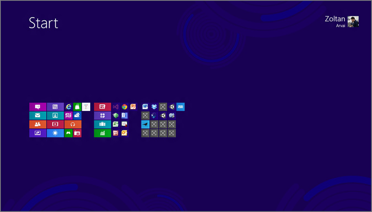
SemanticZoom control is definitely the coolest feature in Windows 8 style applications. SemanticZoom enables you to define two different zoom levels to represent the same set of data. This means that if you have a lot of data, you can create a detailed zoom level where you can see every piece of data, and you can define an overview presentation of the data. SemanticZoom offers nice transitions between the levels, and gesture support as well. You can use the pinch and the zoom gestures to switch between the zoom levels.
SemanticZoom has two properties corresponding to two zoom levels:
- ZoomedOutView
- ZoomedInView
You can add any control to these properties that implement the ISemanticZoomInformation interface. The XAML framework provides two controls that implement this interface: GridView and ListView. Figure 8-22 shows the Windows 8 Start menu using SemanticZoom.
The following code sample shows how to use SemanticZoom:
<SemanticZoom>
    <SemanticZoom.ZoomedOutView>
        <!-- GridView or ListView for the zoomed out view here. -->
    </SemanticZoom.ZoomedOutView>
    <SemanticZoom.ZoomedInView>
        <!-- GridView or ListView for the zoomed in view here. -->
    </SemanticZoom.ZoomedInView>
</SemanticZoom>
In the next exercise, you learn to use the new controls in Windows 8, and learn more about the prepared application templates.
Figure 8-22: The Windows 8 Start menu using SemanticZoom
<CollectionViewSource
            x:Name="groupedItemsViewSource"
            Source="{Binding Groups}"
            IsSourceGrouped="true"
            ItemsPath="TopItems"
            d:Source="{Binding AllGroups, Source={d:DesignInstance
Type=data:SampleDataSource, IsDesignTimeCreatable=True}}"/><GridView
x:Name="itemGridView"
AutomationProperties.AutomationId="ItemGridView"
AutomationProperties.Name="Grouped Items"
Grid.Row="1"
Margin="0,-3,0,0"
Padding="116,0,40,46"
ItemsSource="{Binding Source={StaticResource groupedItemsViewSource}}"
ItemTemplate="{StaticResource Standard250x250ItemTemplate}"
SelectionMode="None"
IsItemClickEnabled="True"
ItemClick="ItemView_ItemClick">
<GridView.ItemsPanel>
<ItemsPanelTemplate>
<VirtualizingStackPanel Orientation="Horizontal"/>
</ItemsPanelTemplate>
</GridView.ItemsPanel>
<GridView.GroupStyle>
<GroupStyle>
<GroupStyle.HeaderTemplate>
<DataTemplate>
<Grid Margin="1,0,0,6">
<Button
AutomationProperties.Name="Group Title"
Content="{Binding Title}"
Click="Header_Click"
Style="{StaticResource TextButtonStyle}"/>
</Grid>
</DataTemplate>
</GroupStyle.HeaderTemplate>
<GroupStyle.Panel>
<ItemsPanelTemplate>
<VariableSizedWrapGrid Orientation="Vertical"
Margin="0,0,80,0"/>
</ItemsPanelTemplate>
</GroupStyle.Panel>
</GroupStyle>
</GridView.GroupStyle>
</GridView>void ItemView_ItemClick(object sender, ItemClickEventArgs e)
{
// Navigate to the appropriate destination page, configuring the new page
// by passing required information as a navigation parameter
var itemId = ((SampleDataItem)e.ClickedItem).UniqueId;
this.Frame.Navigate(typeof(ItemDetailPage), itemId);
}Using the AppBar Control
In many cases, you’ll face a situation where you’ll want to add extra functionalities, commands, or operations to your UI, but you don’t want to dedicate space and extra visuals on your content area. Windows 8 style applications offer a great solution for this issue. Using a Windows 8 style pattern, the AppBar control, you can build a uniform solution to this problem.
Every Page has two AppBar regions: a TopAppBar and a BottomAppBar. If you adhere to the Windows 8 style application design principles, you’ll use the TopAppBar to add navigation controls (such as a back button) and use the BottomAppBar to show commands and tools related to your application and the current page. Figure 8-23 shows the AppBar control in action.
Figure 8-23: The AppBar control

The following code sample shows how to use the AppBar control:
<Page.TopAppBar>
    <AppBar>
        <StackPanel Orientation="Horizontal" HorizontalAlignment="Right">
            <Button Style="{StaticResource RemoveAppBarButtonStyle}"
                 Click="RemoveButton_Click"/>
            <Button Style="{StaticResource AddAppBarButtonStyle}"
                 Click="AddButton_Click"/>
        </StackPanel>
    </AppBar>
</Page.TopAppBar>
Summary
Animations make your applications come alive. Using the Animation Library, you can create smooth and consistent user experiences, but you still have the power to create a custom animation.
Using transformations and projections, you can apply any kind of animation you can think of while still keeping your application performance. You can even create a sense of using 3-D-like tranformations.
Using a control template, you have the power to completely change the visual look of a control, while still preserving all the functionality a control offers.
In Windows 8 style applications, you have lot of exciting ways to display data using specific complex controls such as GridView, ListView, FlipView, or SemanticZoom.
In Chapter 9, you learn about more integration with the operating system using controls and services offered by it. You also learn about other important features like data persistence, localization, notification, and Live Tiles.
Exercises
What You Learned In This Chapter
| Topic | Key Concepts |
| Independent animations | Independent animations are fast and smooth animations calculated on the GPU. |
| Dependent animations | Dependent animations might not be smooth, because they are calculated on the CPU. Most custom animations are dependent animations, so you should use them with great care. |
| Animation Library | The API offers a set of predefined animations and transitions that are independent animations, and are consistent with the behavior of Windows 8. |
| Storyboard | Animations are controlled using a storyboard. A single storyboard can control multiple animations at the same time. |
| Visual states | You can assign different visual states to a control. For every visual state, you can define how the UI looks. Visual states are described using storyboards. When changing states, animations are responsible for transitioning into the new state. |
| Render transformation | Most of the time, you will animate transformations. Render transformation is applied after the layout logic was executed, so it will not affect the layout. You can apply one or more transformations to a single UIElement. |
| Control template | To change the visual look of a control, you can assign a new control template to the control’s Template property. It will enable you to redefine the inner visual structure of the control without affecting the behavior and logic of the control. |
| ContentPresenter | In case of ContentControls inside a ControlTemplate you should explicitly define a placeholder for the control where it can display its content. You can use ContentPresenter to mark where the content should be placed inside the control. |
| CollectionViewsource | CollectionViewSource serves as a view over a collection of data. It supports grouping, sorting, and filtering without affecting the underlying original collection. It is a great way to present data for complex controls like GridView or ListView. |
| Grouping | ItemsControls represent visual lists. The items in the list can be grouped visually by any property using GroupStyles and HeaderTemplates. |