3.4.5. Customizing the Views to Complete the Design
You’ll now complete the app’s design by customizing the views’ properties and creating several string and dimension resources. As you learned in Section 2.5, literal string values should be placed in the strings.xml resource file. Similarly, literal numeric values that specify view dimensions (e.g., widths, heights and spacing) should be placed in the dimens.xml resource file.
Step 6: Specifying Literal Text
Specify the literal text for the amountTextView, customPercentTextView, percent15TextView, percentCustomTextView, tipTextView and totalTextView:
1. Select the amountTextView in the Outline window.
2. In the Properties window, click the ellipsis button next to the Text property.
3. In the Resource Chooser Dialog, click New String....
4. In the Create New Android String dialog, specify Amount in the String field and amount in the New R.string field, then click OK.
5. In the Resource Chooser dialog, click OK to set the amountTextView’s Text property to the string resource identified as amount.
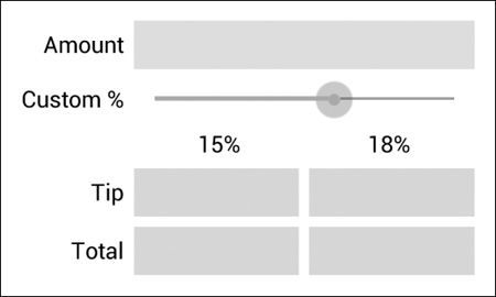
Repeat the preceding tasks for the other TextViews using the values shown in Fig. 3.7.

Step 7: Right Aligning the TextViews in the Left Column
In Fig. 3.3, each of the left column’s TextViews is right aligned. For the amountTextView, customPercentTextView, tipTextView and totalTextView, set the layout Gravity property to right—located in the Layout Parameters section in the Properties window.
Step 8: Configuring the amountTextView’s Label For Property
Generally, each EditText should have a descriptive TextView that helps the user understand the EditText’s purpose (also helpful for accessibility)—otherwise, Android Lint issues a warning. To fix this, you set the TextView’s Label For property to the Id of the associated EditText. Select the amountTextView and set its Label For property (in the Properties window’s View section) to
@+id/amountEditText
The + is required because the TextView is defined before the EditText in the GUI, so the EditText does not yet exist when Android converts the layout’s XML into the GUI.
Step 9: Configuring the amountEditText
In the final app, the amountEditText is hidden behind the amountDisplayTextView and is configured to allow only digits to be entered by the user. Select the amountEditText and set the following properties:
1. In the Properties window’s Layout Parameters section, set the Width and Height to wrap_content. This indicates that the EditText should be just large enough to fit its content, including any padding.
2. Remove the layout Gravity value fill_horizontal, leaving the property’s value blank. We’ll discuss fill_horizontal in the next step.
3. Remove the Ems property’s value, which indicates the EditText’s width, measured in uppercase M characters of the view’s font. In our GridLayout, this causes the second column to be too narrow, so we removed this default setting.
4. In the Properties window’s TextView section, set Digits to 0123456789—this allows only digits to be entered, even though the numeric keypad contains minus (-), comma (,), period (.) and space buttons. By default, the Digits property is not displayed in the Properties window, because it’s considered to be an advanced property. To display it, click the Show Advanced Properties ( ) toggle button at the top of the Properties window.
5. We restricted the bill amount to a maximum of six digits—so the largest supported bill amount is 9999.99. In the Properties window’s TextView section, set the Max Length property to 6.
Step 10: Configuring the amountDisplayTextView
To complete the formatting of the amountDisplayTextView, select it and set the following properties:
1. In the Properties window’s Layout Parameters section, set the Width and Height to wrap_content to indicate that the TextView should be large enough to fit its content.
2. Remove the Text property’s value—we’ll programmatically display text here.
3. In the Properties window’s Layout Parameters section, set the layout Gravity to fill_horizontal. This indicates that the TextView should occupy all remaining horizontal space in this GridLayout row.
4. In the View section, set the Background to @android:color/holo_blue_bright. This is one of several predefined colors (each starts with @android:color) in Android’s Holo theme. As you start typing the Background property’s value, a drop-down list of the theme’s available colors is displayed. You can also use any custom color created from a combination of red, green and blue components called RGB values—each is an integer in the range 0–255 that defines the amount of red, green and blue in the color, respectively. Custom colors are defined in hexadecimal (base 16) format, so the RGB components are values in the range 00–FF. Android also supports alpha (transparency) values in the range 0 (completely transparent) to 255 (completely opaque). To use alpha, you specify the color in the format #AARRGGBB, where the first two hexadecimal digits represent the alpha value. If both digits of each color component are the same, you can use the abbreviated formats #RGB or #ARGB. For example, #9AC is treated as #99AACC and #F9AC is treated as #FF99AACC.
5. Finally, you’ll add some padding around the TextView. To do so, you’ll create a new dimension resource named textview_padding, which you’ll use several times in the GUI. A view’s Padding property specifies space on all sides of the views’s content. In the Properties window’s View section, click the Padding property’s ellipsis button. Click New Dimension... to create a new dimension resource. Specify textview_padding for the Name and 8dp for the Value and click OK, then select your new dimension resource and click OK.
Step 11: Configuring the customPercentTextView
Notice that the customPercentTextView is aligned with the top of the customTipSeekBar’s thumb. This looks better if it’s vertically centered. To do this, in the Properties window’s Layout Parameters section, modify the Gravity value from right to
right|center_vertical
The vertical bar (|) character is used to separate multiple Gravity values—in this case indicating that the TextView should be right aligned and centered vertically within the grid cell. Also set the customPercentTextView’s Width and Height properties to wrap_content.
Step 12: Configuring the customTipSeekBar
By default, a SeekBar’s range is 0 to 100 and its current value is indicated by its Progress property. This app allows custom tip percentages from 0 to 30 and specifies a default of 18. Set the SeekBar’s Max property to 30 and the Progress property to 18. Also, set the Width and Height to wrap_content.
Step 13: Configuring the percent15TextView and percentCustomTextView
Recall that GridLayout does not allow you to specify how a view should be sized relative to other views in a given row. This is why we placed the percent15TextView and percentCustomTextView in a LinearLayout, which does allow proportional sizing. A view’s layout Weight (in certain layouts, such as LinearLayout) specifies the view’s relative importance with respect to other views in the layout. By default, all views have a Weight of 0.
In this layout, we set Weight to 1 for percent15TextView and percentCustomTextView—this indicates that they have equal importance, so they should be sized equally. By default, when we added the percentLinearLayout to the GridLayout, its layout Gravity property was set to fill_horizontal, so the layout occupies the remaining space in the third row. When the LinearLayout is stretched to fill the rest of the row, the TextViews each occupy half of the LinearLayout’s width.
We also wanted each TextView to center its text. To do this, in the Properties window’s TextView section, set the Gravity property to center. This specifies the TextView’s text alignment, whereas the layout Gravity property specifies how a view aligns with respect to the layout.
Step 14: Configuring the tip15TextView, tipCustomTextView, total15TextView and totalCustomTextView
To finalize these four TextViews, perform the following tasks on each:
1. Select the TextView.
2. Delete its Text value—we’ll set this programmatically.
3. Set the Background to @android:color/holo_orange_light.
4. Set the layout Gravity to center.
5. Set the layout Weight to 1.
6. Set the layout Width to 0dp—this allows the layout to use the Weight to determine the view’s width.
7. Set the TextView Gravity to center.
8. Set the TextView Padding to @dimen/textview_padding (the dimension resource you created in a previous step).
Notice that there’s no horizontal space between the TextViews in the tipLinearLayout and totalLinearLayout. To fix this, you’ll specify an 8dp right margin for the tip15TextView and total15TextView. In the Properties window’s Layout Parameters section, expand the Margin section, then set the Right margin to 8dp by creating a new dimension resource named textview_margin. Next, use this resource to set the total15TextView’s Right margin.
Step 15: Vertically Centering the tipTextView and totalTextView
To vertically center the tipTextView and totalTextView with the other views in their respective rows, modify their layout Gravity properties from right to
right|center_vertical
When you do this for the totalTextView, the GridLayout centers this component vertically in the remaining space from the fifth row to the bottom of the screen. To fix this problem, drag a Space view (in the Palette’s Layout section) onto the gridLayout node in the Outline window. This creates a sixth row that occupies the rest of the screen. As its name implies, a Space view occupies space in a GUI. The GUI should now appear as in Fig. 3.8.