
3.4.4. Adding the TextViews, EditText, SeekBar and LinearLayouts
You’ll now build the GUI in Fig. 3.3. You’ll start with the basic layout and views in this section. In Section 3.4.5, you’ll customize the views’ properties to complete the design. As you add each view to the GUI, immediately set its Id property using the names in Figs. 3.4–3.5. You can change the selected view’s Id via the Properties window or by right clicking the view (in the Graphical Layout editor or Outline window), selecting Edit ID... and changing the Id in the Rename Resource dialog that appears.
In the following steps, you’ll use the Outline window to add views to the GridLayout. When working with layouts, it can be difficult to see the layout’s nested structure and to place views in the correct locations by dragging them onto the Graphical Layout editor window. The Outline window makes these tasks easier because it shows the GUI’s nested structure. Perform the following steps in the exact order specified—otherwise, the views will not appear in the correct order in each row. If this happens, you can reorder views by dragging them in the Outline window.
Step 1: Adding Views to the First Row
The first row consists of the amountTextView in the first column and the amountEditText behind the amountDisplayTextView in the second column. Each time you drop a view or layout onto the gridLayout in the Outline window, the view is placed in the layout’s next open cell, unless you specify otherwise by setting the view’s Row and Column properties. You’ll do that in this step so that the amountEditText and amountDisplayTextView are placed in the same cell.
All of the TextViews in this app use the medium-sized font from the app’s theme. The Graphical Layout editor’s Palette provides preconfigured TextViews named Large, Medium and Small (in the Form Widgets section) to represent the theme’s corresponding text sizes. In each case, the IDE configures the TextView’s Text Appearance property accordingly. Perform the following tasks to add the two TextViews and the EditText:
1. Drag a Medium TextView from the Palette’s Form Widgets section and drop it on the gridLayout in the Outline window. The IDE creates a new TextView named textView1 and nests it in the gridLayout node. The default text "Medium Text" appears in the Graphical Layout editor. Change the TextView’s Id to amountTextView. You’ll change its text in Step 6 (Section 3.4.5).
2. This app allows you to enter only non-negative integers, which the app divides by 100.0 to display the bill amount. The Palette’s Text Fields section provides many preconfigured EditTexts for various forms of input (e.g., numbers, times, dates, addresses and phone numbers). When the user interacts with an EditText, an appropriate keyboard is displayed based on the EditText’s input type. When you hover over an EditText in the Palette, a tooltip indicates the input type. From the Palette’s Text Fields section, drag a Number EditText (displayed with the number 42 on it) and drop it on the gridLayout node in the Outline window. Change the EditText’s Id to amountEditText. The EditText is placed in the second column of the GridLayout’s first row.
3. Drag another Medium TextView onto the gridLayout node in the Outline window and change the Id to amountDisplayTextView. The new TextView is initially placed in the first column of the GridLayout’s second row. To place it in the second column of the GridLayout’s first row, set this TextView’s Row and Column properties (located in the Properties window’s Layout Parameters section) to the values 0 and 1, respectively.
Step 2: Adding Views to the Second Row
Next, you’ll add a TextView and SeekBar to the GridLayout. To do so:
1. Drag a Medium TextView (customPercentTextView) from the Palette’s Form Widgets section onto the gridLayout node in the Outline window.
2. Drag a SeekBar (customTipSeekBar) from the Palette’s Form Widgets section onto the gridLayout node in the Outline window.
Step 3: Adding Views to the Third Row
Next, you’ll add a LinearLayout containing two TextViews to the GridLayout. To do so:
1. From the Palette’s Layouts section, drag a Linear Layout (Horizontal) (percentLinearLayout) onto the gridLayout node in the Outline window.
2. Drag a Medium TextView (percent15TextView) onto the percentLinearLayout node in the Outline window. This nests the new TextView in the LinearLayout.
3. Drag another Medium TextView (percentCustomTextView) onto the percentLinearLayout node in the Outline window.
4. The percentLinearLayout and its two nested TextViews should be placed in the second column of the GridLayout. To do so, select the percentLinearLayout in the Outline window, then set its Column property to 1.
Step 4: Adding Views to the Fourth Row
Next, you’ll add a TextView and a LinearLayout containing two more TextViews to the GridLayout. To do so:
1. Drag a Medium TextView (tipTextView) onto the gridLayout node.
2. Drag a Linear Layout (Horizontal) (tipLinearLayout) onto the gridLayout node.
3. Drag two Medium TextViews (tip15TextView and tipCustomTextView) onto the tipLinearLayout node.
Step 5: Adding Views to the Fifth Row
To create the last row of the GUI, repeat Step 4, using the Ids totalTextView, totalLinearLayout, total15TextView and totalCustomTextView.
Reviewing the Layout So Far
The GUI and Outline window should now appear as shown in Fig. 3.6. The warning symbols shown in the Graphical Layout editor and the Outline window will go away as you complete the GUI design in Section 3.4.5.
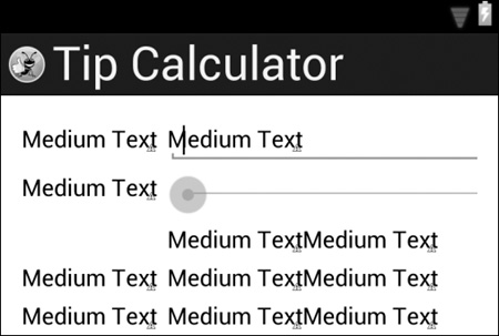
a) GUI design so far
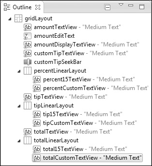
b) Outline window showing Tip Calculator components
Fig. 3.6 | The GUI and the IDE’s Outline window after adding all the views to the GridLayout.