3.4.1. GridLayout Introduction
This app uses a GridLayout (Fig. 3.3) to arrange views into five rows and two columns. Each cell in a GridLayout can be empty or can hold one or more views, including layouts that contain other views. Views can span multiple rows or columns, though we did not use that capability in this GUI. You can specify a GridLayout’s number of rows and columns in the Properties window.
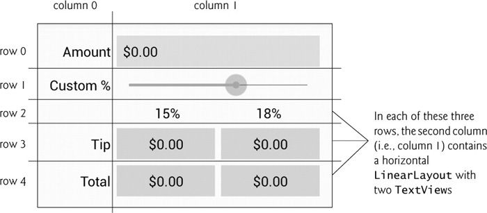
Each row’s height is determined by the tallest view in that row. Similarly, the width of a column is defined by the widest view in that column. By default, views are added to a row from left to right. As you’ll see, you can specify the exact row and column in which a view is to be placed. We’ll discuss other GridLayout features as we present the GUI-building steps. To learn more about class GridLayout, visit:
Id Property Values for This App’s Views
Figure 3.4 shows the views’ Id property values. For clarity, our naming convention is to use the view’s class name in the view’s Id property and Java variable name.
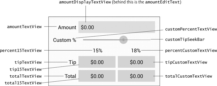
In the right column of the first row, there are actually two components in the same grid cell—the amountDisplayTextView is hiding the amountEditText that receives the user input. As you’ll soon see, we restrict the user’s input to integer digits so that the user cannot enter invalid input. However, we want the user to see the bill amount as a currency value. As the user enters each digit, we divide the amount by 100.0 and display the currency-formatted result in the amountDisplayTextView. In the U.S. locale, if the user enters 3456, as each digit is entered the amountDisplayTextView will show the values $0.03, $0.34, $3.45 and $34.56, respectively.
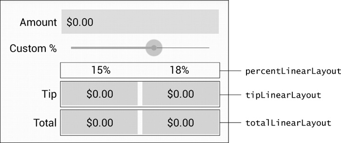
LinearLayout Id Property Values
Figure 3.5 shows the Ids of the three horizontal LinearLayouts in the GridLayout’s right column.