In previous chapters of this book, you created some sample apps and used some basic controls like the button, label, image, and text field. In this chapter, you’ll broaden your arsenal of controls a little and explore, by building simple apps, how some of these controls work.
This chapter assumes you’ve worked through the examples in previous chapters and that you know your way around the Xcode interface for creating new apps and editing the UI using the storyboard editor. It also assumes you’ve practiced creating outlets and actions and that you’ve done a bit of coding. If you get stuck, refer back to earlier chapters or check out the complementary videos to this book on ios7developer.com.
You’ll look at the “segmented” control, which is a horizontal control with multiple segments, each of which acts as a button. You’ll see how to use this to create a simple app that changes the background color of your view. From there you’ll move onto the “slider” control, which gives you the ability to choose a value by sliding a thumb horizontally. After that, it’s the easy but common “switch” control that gives you a consistent on/off switch interface, and finally the “stepper” control, which is similar to the slider in that it gives you the ability to choose a discrete value, but with a different user interface—one that gives you the ability to hit a “+” or a “-” to increment or decrement a value, respectively.
The segmented control, or UISegmentedControl, is a horizontal control made of multiple segments, with each functioning as a discrete button. Using this control gives you a compact means to group together a number of commands that are related.
UISegmentedControl Example
You can see an example of a UISegmentedControl in the Safari browser. If you don’t have an iOS7 device, don’t worry—you can still see it in the simulator. Launch the Safari browser, and you’ll see something like Figure 7-1.
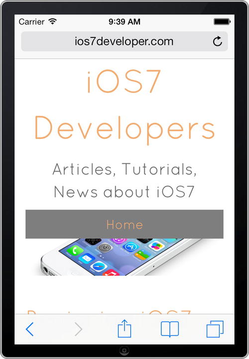
Figure 7-1. Running Safari in the emulator
The “Bookmarks/Reading List” icon is the second from the right and looks like an open book. Select it, and you’ll be taken to a view that allows you to select between “Bookmarks” and “Reading List.” See Figure 7-2.
Figure 7-2. The Bookmarks/Reading view
At the top of the screen you can see a button with both “Bookmarks” and “Reading List” written on it, and when you touch one or the other, the view changes. This is a UISegmentedControl, so let’s take a look at building an app that uses one.
Building an App with a UISegmentedControl
In this section we’ll look at building a simple app that uses a UISegmentedControl with three options on it, and we’ll use them to change the color of the current view.
Create a new single view iPhone app and call it “segmentControlDemo.” If you’re not familiar with doing this, go back to Chapter 2 and take a look at how to create a simple single view app.
When you’re done, select “Main.storyboard” in the project navigator, and the storyboard editor will open. On the left of the storyboard editor, open “View Controller Scene” and make sure that “View Controller” is selected. You’ll see a blue border around the design surface when you’ve done this. See Figure 7-3.
Figure 7-3. Editing the view controller
Tip You can also click the black bar under the view controller surface to select it. You can see it in Figure 7-3.
On the right of the screen, near the bottom, you’ll see the list of controls. Scroll down until you see the “Segmented Control” item. Alternatively, you can use the search box in this window to speed up selection. See Figure 7-4 to see what the segmented control looks like.
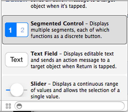
Figure 7-4. The segmented control
Drag the control onto the view controller and drop it near the top of the design surface. You can use the sizing handles to make it wider. When you drag it so that it’s nearly the full width of the design surface, you’ll see blue guidelines appear, indicating the recommended margins. Try to fit the control between them. You’ll see that it is created with two segments, called “First” and “Second” by default. See Figure 7-5.

Figure 7-5. Placing the segmented control on your view
With the segmented control selected, open the attributes inspector. To do this, ensure that the rightmost icon in the toolbar (a rectangle with a shaded right side) is selected, and that the attributes button, which looks like a down-pointing arrow, is selected on the utilities area. See Figure 7-6.
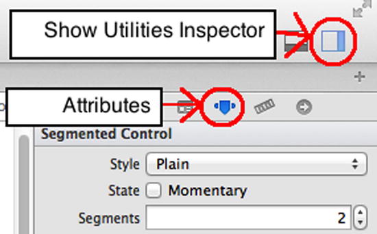
Figure 7-6. Using the attributes inspector
Tip You can also access the attributes inspector using Alt-Command-4 keystrokes.
When using a segmented control, the most common attributes you are going to change are the number of segments and the titles for each of these segments. You can see these at the top of the attributes inspector.
First, let’s change the number of segments on our control. To the right of the segments entry, you can see a little up/down arrow. Click the up arrow to change the number of segments to three. You’ll see that a new, blank segment is created for you on the design surface. See Figure 7-7.

Figure 7-7. Adding a new segment
To edit segments, pick the segment from the drop-down list in the segment entry and edit its “Title” setting. So, if you refer to Figure 7-7, you’ll see that the segment that is selected is “Segment 0 – First” and its title is “First.” As a result, the control shows “First” as its text. Change the title field to “Red,” and press the “Enter” key. You’ll see that the design updates to “Red,” and the segment is now called “Segment 0 – Red.” See Figure 7-8.
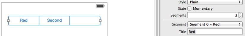
Figure 7-8. Editing the first segment
Repeat this for the other segments. From the segment drop-down list, select “Segment 1 – Second,” as in Figure 7-9, and edit the title to “Green.”
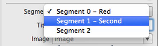
Figure 7-9. Choosing segments
Finally, choose “Segment 2” and edit the title to “Blue.” When you’re done, your control should look like Figure 7-10.
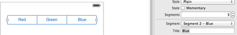
Figure 7-10. Your finished segmented control
You can run your app now, and you will see that when your app starts, the “Red” control will be selected by default. This control always has to have something selected, so iOS will default you at Segment 0.
Now let’s wire up our outlets and actions and write some code to see how the segmented control works.
First, close the utilities view and open the assistant editor. To do this, click the same tool that you clicked to open the utilities view (the rectangle with shaded right side in Figure 7-6), and then click the assistant, which is an icon that looks like a tuxedo. If you aren’t familiar with this, we strongly recommend referring back to Chapter 2.
Make sure that “ViewController.h” is selected in the assistant view, as in Figure 7-11.

Figure 7-11. Ensuring the assistant control is editing your ViewController.h file
Now, select the segmented control on the design surface and CTRL-drag it to ViewController.h. Drop it just below where it says @interface, and a helper window will pop up. Use this to create an outlet, and call it “colorChooser.” See Figure 7-12.
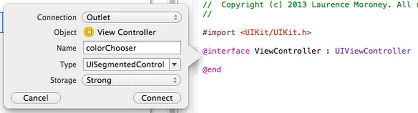
Figure 7-12. Insert the colorChooser outlet
When you’re done, click the “Connect” button, and the outlet will be created.
Next, you’ll need to create the action. In the same way as before, CTRL-drag the segmented control onto the assistant and drop just below where it says @interface.
This time, change the “Connection” setting to “Action,” and use the name “colorChosen.” The “Event” type should be set to “Value Changed.” See Figure 7-13.
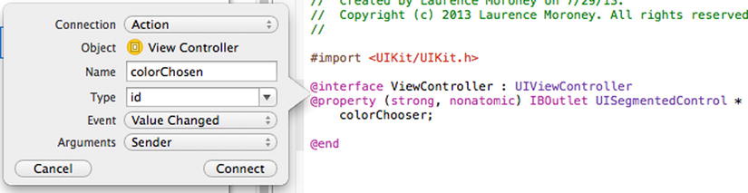
Figure 7-13. Insert the colorChosen action
Click “Connect,” and the action will be created.
Note It’s a personal style, but one we think works well, that outlets should be chosen as nouns that imply that an action can be performed on it, like “colorChooser,” which gives the impression that that is what it is used for. Actions should be named as if something has already happened, such as “colorChosen” in this case. It makes it easier to understand your code later, where once the user has chosen a color, the “color chosen” action will run.
You can now close the assistant and open the “ViewController.m” file to edit the code in response to the colorChosen action taking place.
When you created the action, you’ll see that a colorChosen function was created in ViewController.m. The code here will execute whenever the user selects a button on your segmented control.
The code should look like this:
- (IBAction)colorChosen:(id)sender {
}
The outlet that refers to the segmented control was called colorChooser, so we can refer to it in code as _colorChooser. This exposes a property called selectedSegmentIndex , which is an integer containing the index of the selected segment. In our case it will be 0, 1, or 2 as we have three segments. So, if this value is 0, we want red, if it is 1 we want green, and if it is 2, we want blue.
We can check it with code like this:
if( _colorChooser.selectedSegmentIndex == 0)
{
    self.view.backgroundColor = [UIColor redColor];
}
Remember that self refers to the current view, and it has a property called backgroundColor that can be set to whatever color we like. Objective-C has a number of built-in keywords for colors, such as redColor, blueColor, and greenColor, which we can then use to actually get a color value that we set to be the backgroundColor of the view.
Our finished colorChosen function with all three colors would then look like this:
- (IBAction)colorChosen:(id)sender {
    if( _colorChooser.selectedSegmentIndex == 0)
    {
        self.view.backgroundColor = [UIColor redColor];
    }
    if( _colorChooser.selectedSegmentIndex == 1)
    {
        self.view.backgroundColor = [UIColor greenColor];
    }
    if( _colorChooser.selectedSegmentIndex == 2)
    {
        self.view.backgroundColor = [UIColor blueColor];
    }
}
Run the app and you’ll see that it works nicely. When you select the different buttons, the background color of the view will change to match them.
But this code is a little untidy and difficult to read. Objective-C has its roots in the C language, which has what is called a case statement functionality that makes code like this clearer.
With a case statement, you have a variable, and based on different potential values for that variable, you have pieces of code that you execute.
To use a case statement for this app, you can change the colorChosen function to look like this:
- (IBAction)colorChosen:(id)sender {

    switch(_colorChooser.selectedSegmentIndex)
    {
        case 0:
            self.view.backgroundColor = [UIColor redColor];
            break;
        case 1:
            self.view.backgroundColor = [UIColor greenColor];
            break;
        case 2:
            self.view.backgroundColor = [UIColor blueColor];
            break;
    }

}
This is much easier to read, and it executes in the same way. When using a case statement, make sure to always end your clauses with “break,” as in the preceding example, or your code will run from one clause to another. If you didn’t have a break like this and you selected “red,” the code would set the view to red, and then to green, and then to blue!
You can see what the app should look like in Figure 7-14, where “green” has been selected, and the view background color has changed accordingly.

Figure 7-14. Using the segmented control
And that’s it for a quick tour of what you can do with this control. As you build apps you’ll find it a very useful control for managing user expectations and giving them a quick way to input data. In the next section you’ll look at another useful control, the slider.
A UI slider control is used to select a single value from a continuous range of values. In iOS7, sliders are always displayed as horizontal bars, with an indicator, also called a thumb, that the user can drag across the range and drop into a new location in order to change the setting.
Slider Control Example
A great example of a slider control in action is the brightness setting on your iPhone. This isn’t available in the simulator, so you need a real device to see it. From your iPhone home screen, select the “Settings” app, and then select “Brightness and Wallpaper.” You’ll see the setting screen, which looks like Figure 7-15.

Figure 7-15. The slider control in the Settings app
Right at the top of the screen, you’ll see the slider, where, if you slide the thumb to the right, the screen gets brighter, and if you slide it to the left, the screen gets darker. This is a common UI paradigm for changing values like this, and it’s quite an easy control to implement.
Let’s build an app that uses a slider like this.
Building an App with a Slider
As before, create a new single view application and call it “sliderControlDemo.” Open the “Main.storyboard” file and find the slider control in the controls list. It should look like Figure 7-16.
Figure 7-16. Choosing the slider control
Drag and drop it onto the design surface of your view controller.
Use the sizing handles to make the control almost as wide as the screen. As you resize, you’ll see blue guidelines giving you a recommended margin size. It’s good practice to use them. See Figure 7-17 for a good width for the control.
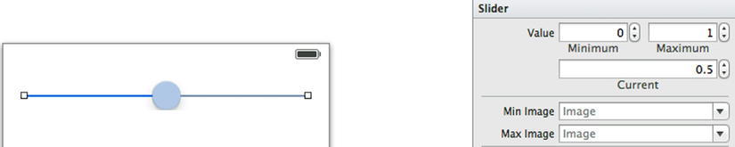
Figure 7-17. Putting the slider on the view
By default the slider gives you what is called a normalized value, where the setting is between 0 and 1. You can change this by changing the minimum and maximum settings on the inspector. If you can’t see the inspector, go back to the previous example of the segmented control, and you’ll see how to open it up.
In Figure 7-17 you can see this normalized value, and you can see that the current value is 0.5, which is halfway between 0 and 1—the thumb is at the halfway point of the line.
To see the slider in action, add a label to the design surface for your view controller. Make it the same width as the slider, and position it a little below the slider. See Figure 7-18.

Figure 7-18. Adding a label to the slider sample
Next, open the inspector and add an outlet for the label. CTRL-drag it to your ViewController.h and add an outlet called “lblOutput .”
You’ll need an action that handles the change in the slider, so CTRL-drag the slider onto your ViewController.h and add an action called “sliderChanged” for the “Value Changed” event. See Figure 7-19.
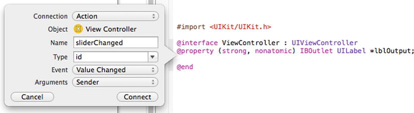
Figure 7-19. Adding the sliderChanged action
Click “Connect,” and the action will be created, along with a function to handle it in ViewController.m. Finally, you’ll also need an outlet for the slider, as you need to inspect its value in code, which is easier to do with a named outlet. So CTRL-drag the slider to ViewController.h again and create an outlet called “valueSlider.” See Figure 7-20.
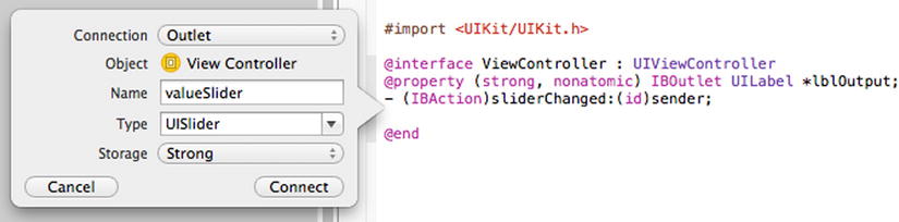
Figure 7-20. Creating an outlet for the slider
Now, open ViewController.m, where you’ll see the action code that was created for you. It should be right at the bottom of your code window and will look like this:
- (IBAction)sliderChanged:(id)sender {
}
In this function, you’re going to read the value of the slider whenever it changes and assign that value to the label, so we can see what value the user has set.
You can get the value of the slider with its value property. This returns a floating point number, represented by a float. A floating point number is a number with portions of the number represented by a decimal point. So, for example, while 10 is an integer, 10.0 or 10.012103 are floats. You’ll need to convert the float into a string in order to use it as the text for the label. To do this, the NSString type conveniently has a constructor function that allows you to construct a string based on a format. The “%f” format corresponds to a float, so if you construct your string using it, the value of the float will be loaded into the string.
Tip The “%f” code instructs the parser to treat the float as a string and print it that way. There are lots of different formats, and you can find a reference for how to use them at bit.ly/stringformats.
Here’s the code:
NSString *value = [NSString stringWithFormat:@"%f", _valueSlider.value];
The entire function is here:
- (IBAction)sliderChanged:(id)sender {
    NSString *value = [NSString stringWithFormat:@"%f", _valueSlider.value];
    _lblOutput.text = value;

}
Now you can run your app and experiment with the slider. See Figure 7-21.

Figure 7-21. The slider sample
As you drag the thumb around, you’ll see that you can get very granular results. Indeed, the screenshot in Figure 7-21 shows the value to six decimal places.
There’s more customization that you can do to the slider, such as setting custom minimum and maximum images in order to get the effect of images on either side of the track line, as in Figure 7-15, so experiment and have fun!
The Switch Control
The switch control is a very basic but powerful UI control that allows you to set a value to be on or off. They’re used extensively in iOS, such as in the “Photos & Camera” settings screen. See Figure 7-22.
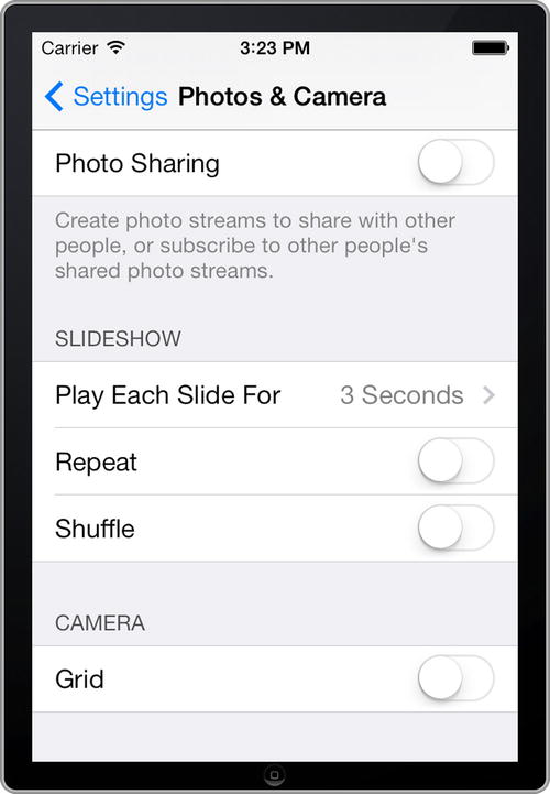
Figure 7-22. The UI switch control in iOS7
To examine how it works, create a new single view app called “switchControlTest” and open its storyboard in the designer.
On the controls list, select the “Switch” control from the controls list. You can see it in Figure 7-23.

Figure 7-23. Picking the switch control
Drag and drop it to the design surface for your view controller and place it towards the right-hand side. You’ll notice that the control is just the switch—there is no label. See Figure 7-24.

Figure 7-24. The switch control
It’s a good idea to put a label control beside it as a hint as to what the switch does. Go ahead and do that now, and also drop another label beneath the first that we’ll use for the output. Give the labels the text “This is my first switch” and “My first switch is on,” as in Figure 7-25. Make sure that the width of the label will hold all the text.

Figure 7-25. Adding labels to the switch
Open the assistant editor and CTRL-drag the switch onto ViewController.h. Create an outlet called “firstSwitch.”
CTRL-drag the switch again and create an action called “switchChanged.” This should be mapped to the “Value Changed” event. If you’re not familiar with this, go back through the earlier examples in this chapter for other controls—the process is identical.
Finally, CTRL-drag the “My first switch is on” label to ViewController.h and create an outlet called “lblOutput .”
Now you can write some code. Close the assistant editor and then open ViewController.m. Find the action function. It should look like this:
- (IBAction)switchChanged:(id)sender {
}
The UISwitch provides a BOOLEAN property called “on,” which will be true if the switch is on, and false if not. So, in our switchChanged function, we can set the text of the lblOutput based on this value.
Here’s the code:
- (IBAction)switchChanged:(id)sender {
    if(_firstSwitch.on)
    {
        _lblOutput.text = @"My first switch is on";
    }
    else
    {
        _lblOutput.text = @"My first switch is off";
    }
}
Now you can run the app, and the output label will change as you flip the switch. See Figure 7-26.
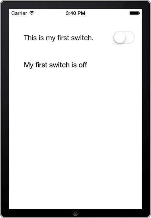
Figure 7-26. Testing the switch
A very simple demo for a very simple control. But as you can see, as you build up your skills with each control, you’re learning more and more of what goes into an iOS7 user interface. In the next section you’ll learn how to use the stepper control, a simple control that gives you a user interface for incrementing or decrementing a value.
The Stepper Control
The stepper control provides a user interface for quickly incrementing or decrementing a control by a fixed amount. It defaults to having a range of 0 to 100 in steps of 1, but you can easily override this functionality in the attributes inspector.
To explore how the stepper control works, create a new app called “stepperControlDemo.” Open Main.storyboard and, from the controls list, find the “Stepper” control. You can see it in Figure 7-27.

Figure 7-27. The stepper control
Place it on the upper-right-hand side of the design surface for your view controller. Your screen should look something like Figure 7-28 when done.
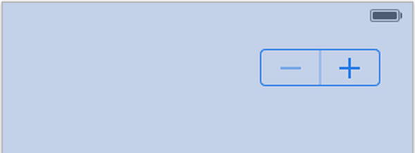
Figure 7-28. Adding the stepper control
Add a couple of label controls to the design surface. The first should read “How many eggs?”; the second should read “You have 0 eggs.” See Figure 7-29 for how they should be arranged.

Figure 7-29. Adding the text labels
Now you are going to need two outlets—one for the stepper control, which you should call “eggCounter,” and one for the second label (which presently reads “You have 0 eggs”), which you should call “lblOutput.” Do this with the assistant editor using CTRL-drag, as you’ve done with all other examples.
When you’re done with that, add an action called “stepperChanged.” Make sure that its event is the “Value Changed” event.
Now you can take a look at your ViewController.m code. You’ll see the action function has been created for you. It should look like this:
- (IBAction)stepperChanged:(id)sender {
}
The UIStepper returns a numeric value. In order to read it, you can use code like:
int numberOfEggs = _eggCounter.value;
Earlier in this chapter, in the slider section, you saw that you can create a string from a float value by using the format “%f” within the string. Now we’re going to do the same, but with an int, which can be represented by “%d.” This will render the number with zero decimal places.
Thus, we can set our label text like this:
_lblOutput.text = [NSString stringWithFormat:@"You have %d eggs", numberOfEggs];
The entire stepperChanged function should look like this:
- (IBAction)stepperChanged:(id)sender {
    int numberOfEggs = _eggCounter.value;
    _lblOutput.text = [NSString stringWithFormat:@"You have %d eggs", numberOfEggs];

}
You can now run the app and try changing the settings on the stepper. See Figure 7-30.

Figure 7-30. Using the stepper control
You might notice that iOS is smart enough to realize that your range is from 0 to 100, so if you keep clicking the “-” until you have 0 eggs, it will disable the “-” button so that you can’t go further!
Changing the range and the step size is simple. It can be done from the attributes inspector, where you have four boxes (each with a stepper control of their own!) that allow you to set the minimum, maximum, current, and step sizes. See Figure 7-31.

Figure 7-31. Changing the stepper time values
And it’s as simple as that. You’ve gotten pretty much all the basic controls down now! As you build more-complex apps you’ll be using these controls, as well as a couple of bigger, more sophisticated ones, which you’ll look at over the next few chapters, including date and time controls, mapping controls, and table views.
Summary
In this chapter you took a look at a few new controls that are commonly used in iOS applications and built simple applications that use them in order to get a feel for how they work.
You looked at the UISegmentedControl, which gives you a horizontal, ordered list of buttons that allow you to make a selection from a fixed group. This control is commonly used in Apple-built iOS applications, so now you know how to do the same yourself! You explored the UISlider control, which allows you to specify a value by dragging a thumb along a track, as is commonly used for scenarios such as that in the brightness settings dialog for your iPhone, or perhaps something like audio volume. You then looked at a simple switch control, which is very commonly used in settings apps for an on/off scenario, and finally you saw the UIStepper control, which allows your users to enter a value from a discrete range with a discrete step size. Now, when you look at your iPhone or iPad and see other people’s apps, you’ll see these controls in action and can feel confident that you know how to use them for yourself!
In the next chapter, you’ll take a look at two much bigger controls for data entry, the “Picker View,” which gives you a spinning wheel motif for a range of values, and the “Date Picker,” which allows your users to easily enter a date and time.