

Job:03171 Title:Typography Referenced (Rockport)
Page: 330
aoeg
aoeg
adhesion adhesion
320-335 03171.indd 330 9/23/11 2:34 PM
Typography, Referenced
Text
Job:03171 Title:Typography Referenced (Rockport)
Page: 330
B
efore we go any further it is
important to point out that
“legibility” and “readability” are not
the same. Legibility is essentially
the measure of how easy or diffi cult it is to
distinguish one letter of a typeface from
another. This makes it a typeface design issue
rather than a typographic one, a subtle but
important diff erence. Designers generally
accept the technique that underpins the
creation of legible typefaces: that they should
not try too hard to draw attention to their
design or style. A reader should see the words
fi rst and not get distracted by the typeface itself.
The most legible typefaces tend to have
prominent features such as large x-height and
large counters, along with individual character
shapes clearly defi ned from one another
and therefore easily recognizable. (X-height
should not be too large, however, because
too little contrast [230] between x-height
and length of ascenders and descenders can
compromise legibility.) For this reason—
relative simplicity of character shapes—some
argue that sans serif fonts are more legible than
serif fonts.
It really depends on the individual typeface
rather than the classifi cation, and on the
intended purpose of the typeface, whether for
signage, display, text and so on. Weight plays
an important part, too; ultra light or black/
heavy faces are often not as legible as those
with a roman or book weight, especially when
set at smaller point sizes. Research has shown
that the optimum stroke width for legibility is
around 18 percent of the character’s x-height.
It is also important to bear in mind that
the vast majority of letters in running text are
lowercase (332), so diff erences in lowercase
character shapes and openness of counters
have the greatest eff ect on legibility. Lowercase
characters vary much more in shape between
typefaces, not just because of proportions
but also because of characters such as the
double-storey a or g, which help distinguish
those characters from the similarly shaped
o, e, q, and so on.
In contrast to legibility, readability falls on
the designer’s shoulders and doesn’t neces-
sarily depend on typeface legibility. Reading
should ideally take no additional eff ort beyond
actually recognizing and comprehending what
Legibility and Readability
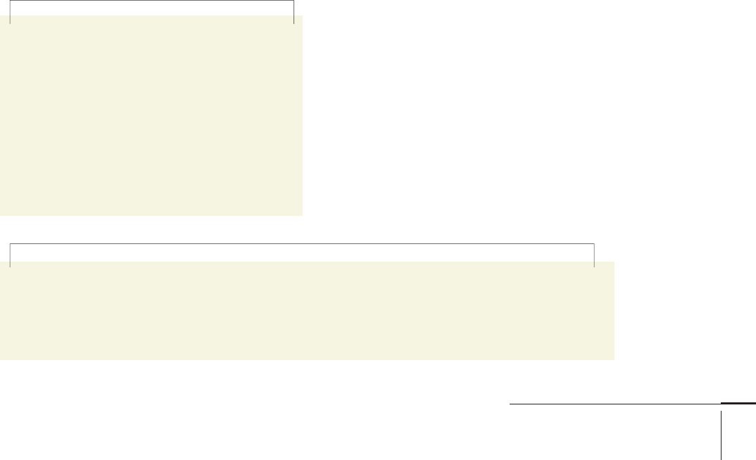
Certain letterforms are more distinctive
in serif typefaces. On the left, Garamond.
On the right, Franklin Gothic.
A double-storey lowercase
character such as an a or g helps to
improve legibility between other
similarly-proportioned characters.
How x-height eff ects legibility: Typefaces with
large x-heights often appear larger set at the
same size as typefaces with smaller x-heights.
Tiempos Text 24 point Baskerville 24 point
Tiempos Text 24 point Baskerville 32 point
320-335 03171.indd 330 9/23/11 2:34 PM
Job:03171 Title:Typography Referenced (Rockport)
Page: 331
320-335 03171.indd 331 9/23/11 2:34 PM
Typography Terminology and Language
Text
Job:03171 Title:Typography Referenced (Rockport)
Page: 331
the words say and mean. Once an individual has
learned basic reading skills, the act of reading
becomes a series of automated responses to the
arrangement of the characters and words on the
page or screen. It is up to the designer to make
decisions that will create good readability.
It is not a given that a highly legible typeface
will produce highly readable text. One of the
more common mistakes made when selecting a
typeface is choosing one designed for a purpose
other than that which the designer has in mind.
For example, typefaces designed specifi cally for
signage will generally be highly legible, but this
doesn’t mean they work well as a text face. Take
the time to fi nd out about a typeface’s origins
and intended use, and experiment with dummy
settings at various sizes to see how a face reads
before making a committed choice.
Typeface choice aside, the combination of
measure plus word-count-per-line is proba-
bly the dominant factor that aff ects readability.
A character count (including spaces) that falls
somewhere between fi fty-four and eighty per
line of text tends to be the most satisfactory for
readability. This range works for pretty much
every typeface suitable for use as running text,
with the typeface (and any restrictions imposed
by the layout itself) infl uencing decisions about
point size and measure.
Also, take into account subject matter of text
when deciding how a measure will infl uence
readability. For example, a long read such as a
novel can support the use of a wider measure
as the reader will relax into a “reading rhythm,”
allowing him or her to scan longer lines of text.
In addition, longer measures allow letter spacing
(334) to be set more evenly, further improving
readability. On the fl ip side, text appearing in a
reference book or newspaper benefi ts from being
set over a shorter measure in a layout utilizing
two or more columns for easy, quick scanning of
bite-sized pieces of information.
A designer’s job will become even more chal-
lenging as the quantity of information and noise
increases during the twenty-fi rst century. Those
who possess a broad typographic understanding
will best meet the communicative and cre-
ative challenge, especially during a time when
people know the diff erence between one font and
another—and which ones read better or worse
with software’s default 120-percent leading.
A designer’s job will become even more challenging as the quantity of information and noise increases
during the twenty-fi rst century. Those who possess a broad typographic understanding will best meet the
communicative and creative challenge, especially during a time when people know the diff erence between
one font and another—and which ones read better or worse with software’s default 120-percent leading.
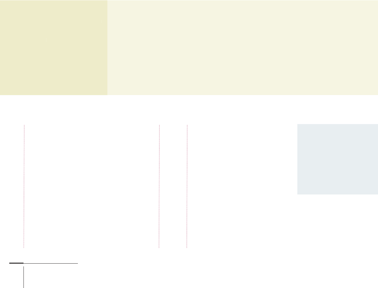
The short measure shown to
the left is ideal for shorter
sections of bite-sized infor-
mation; it displays excellent
readability properties and
is perfect for newspapers or
reference books. The longer
measure below would work
well in a novel, but read-
ability is not as good over
just four lines of text.
320-335 03171.indd 331 9/23/11 2:34 PM
Job:03171 Title:Typography Referenced (Rockport)
Page: 332
320-335 03171_C2.indd 332 10/13/11 5:02 PM
332
Typography, Referenced
Text
Job:03171 Title:Typography Referenced (Rockport)
Page: 332
“A de
s
will b
e
more
c
as th
e
infor
m
Certa
i
such
a
T app
e
when
“
“
A
A
A
d
d
e
e
s
w
w
w
w
i
l
l
l
b
b
e
m
m
m
m
o
o
r
e
e
c
a
a
a
s
s
t
t
h
h
e
i
i
n
n
n
f
f
o
o
r
r
m
C
C
C
e
e
r
r
t
a
a
i
s
s
u
u
u
c
c
h
a
T
T
T
a
a
p
p
p
e
w
w
w
h
h
h
e
n
n
332
Typography, Referenced
A designer’s job will become even more
challenging as the quantity of information
and noise increases during the twenty-
fi rst century. Those who possess a broad
typographic understanding will best
meet the communicative and creative
challenge, especially during a time when
people know the diff erence between one
font and another—and which ones read
A DESIGNER’S JOB WILL BECOME
EVEN MORE CHALLENGING AS THE
QUANTITY OF INFORMATION AND NOISE
INCREASES DURING THE TWENTYFIRST
CENTURY. THOSE WHO POSSESS A BROAD
TYPOGRAPHIC UNDERSTANDING WILL
BEST MEET THE COMMUNICATIVE AND
CREATIVE CHALLENGE, ESPECIALLY
DURING A TIME WHEN PEOPLE KNOW
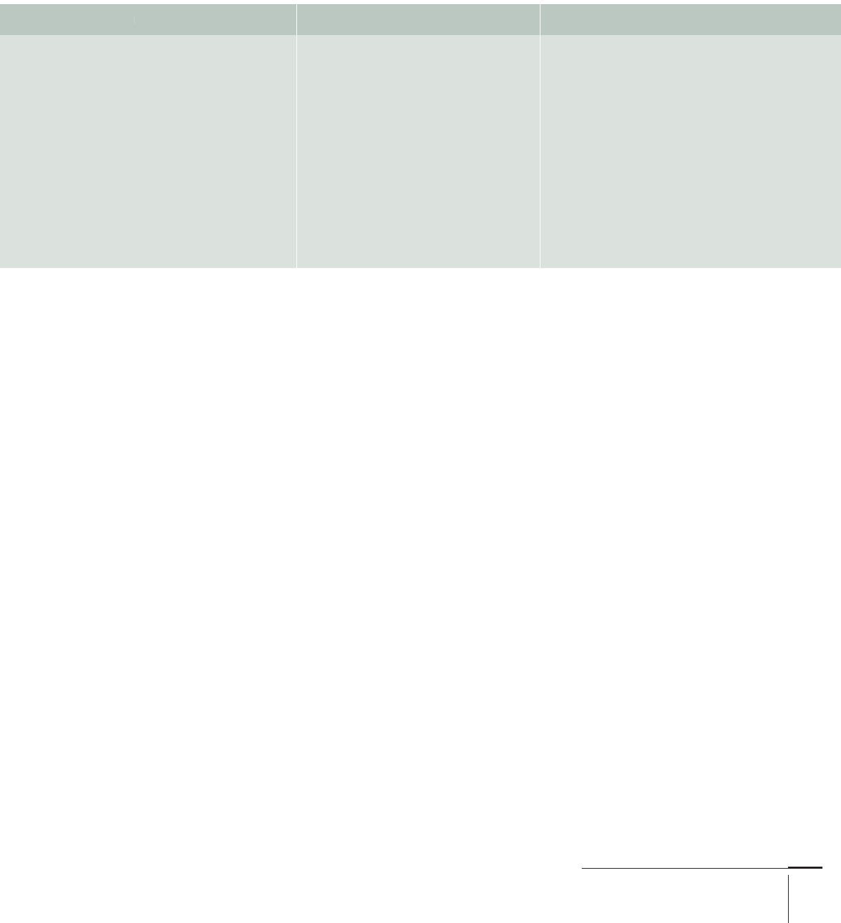
Running text set in CAPS
is harder to read because
the shape of words set
in lowercase appear as
remembered word images
to a seasoned reader.
Words set in CAPS appear
simply as rectangles.
Optical alignment
allows certain
characters that
would otherwise
appear as slightly
indented to nudge
into the margin,
where they are
referred to as
“hung” characters.
Upper and Lowercase
Uppercase characters provide emphasis and stress
importance, whether at the start of a sentence or when
used in a headline. Caps are LOUDER than lowercase
characters and can visually SHOUT to the reader.
However, on the readability (330) front, uppercase
text that extends beyond the length of the average
headline is not as easy to scan, drastically reducing
reading speed.
This is because a reader cannot recognize words set
in uppercase as quickly; the word is read letter by letter
rather than as a single image. This point does not apply
to new readers, for example young children, but rather
to seasoned readers who have learned to recognize word
images in the same way a computer caches information.
A word set in uppercase always appears as a rectangle
with varying length depending on number of characters,
while a mixture of upper- and lowercase gives every
word its own unique shape. This ties in neatly with
the notion that lowercase characters have the greater
legibility (330).
Beyond this little snippet of typographic science,
the use of upper- and lowercase characters simply
comes down to style, limited only by a designer’s skill
and imagination.
“A designer’s job
will become even
more challenging
as the quantity of
information…
Certain characters,
such as the uppercase
T appear slightly indented
when positioned…
“A designer’s job
will become even
more challenging
as the quantity of
information…
Certain characters,
such as the uppercase
T appear slightly indented
when positioned…
320-335 03171_C2.indd 332 10/13/11 5:02 PM
Job:03171 Title:Typography Referenced (Rockport)
Page: 333
320-335 03171.indd 333 9/23/11 2:34 PM
Typography Terminology and Language
Text
Job:03171 Title:Typography Referenced (Rockport)
Page: 333
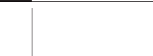
Flush Left Flush Right Center
A designer’s job will become even
more challenging as the quantity
of information and noise increases
during the twenty-fi rst century. Those
who possess a broad typographic
understanding will best meet the
communicative and creative challenge,
especially during a time when people
know the diff erence between one
font
and another—and which ones read
better or worse with software’s
default 120-percent leading.
Alignment
There are only four basic alignment choices—fl ush left,
fl ush right, justifi ed, and centered—and most people
understand these terms regardless of their profession.
However, good reasons exist for choosing one option
over another, as well as for not mixing the options, all of
which link back to readability (330) and aesthetics.
Flush-left text means a consistent vertical alignment
down the left side of a column such that each new line
of text starts from the same point. This helps improve
readability. Flush-right text aligns at the right side of a
column; this lessens readability for long passages of text,
but can work for shorter paragraphs that range against
the right side of an image or page edge in a layout.
Beware of mixing fl ush-left and fl ush-right alignment in
any given text chain. It never works and will ruin a pro-
fessional layout.
Justifi ed text, which aligns down both sides of a
column, is better suited to text set over wider measures.
To force the words in each line of text to justify, the
word and letter spacing (334) gets adjusted across the
full measure, occasionally introducing awkward spaces
between longer words. It is sometimes possible to man-
ually adjust the spacing to create aesthetically pleasing
typography, but often editing the text results in the
greatest improvement.
Centered text arguably provides the lowest level
of readability, so it is best reserved for short, isolated
paragraphs of text set over a fairly narrow column.
Inappropriate use of centered text in a layout is a good
indicator that a designer is not an experienced typog-
rapher. One of the most common mistakes is mixing
centered headlines with fl ush-left text. On the other
hand, a centered headline works with justifi ed text as
long as headline length and text measure balance well.
Optical alignment
Following from the basic points made above, aligning
text along a vertical edge is not always as straightfor-
ward as it may seem. Certain characters, such as the
uppercase (332) T or W, appear slightly indented when
positioned at the start of a line. The same applies to
punctuation, for example quotation marks. Adjusting
these can achieve perfect optical alignment.
The off ending characters must be “hung,” meaning
repositioned slightly to the left of the point of vertical
alignment (if the text is fl ush left). The degree of
adjustment varies from typeface to typeface and
depends on the point size. The eff ect is less apparent
at smaller point sizes, and the kerning (334) pairs
built into a font deal with the problem in most
circumstances. Page layout applications such as Adobe
InDesign have built in functions such as optical margin
alignment that get applied automatically.
320-335 03171.indd 333 9/23/11 2:34 PM
Job:03171 Title:Typography Referenced (Rockport)
Page: 334
Ave Aw Ay Ca Cl Ci Ey Ko Ky
Ma My Ov Ow Ox Oy Pa Pe Pi Pj Po Pr
Ra Re Ri Ro Ru Rw Ry n’t i’l
Te Th Ti To Tr Ts Tu Tw Ty
Va Ve Vi Vo Wa We Wi Wo Wu Wy
Xa Xe Xi Xy Ya Ye Yi Yo Za Ze Zi Zo Zu
320-335 03171.indd 334 9/23/11 2:34 PM
Typography, Referenced
Text
Job:03171 Title:Typography Referenced (Rockport)
Page: 334
Typography, Referenced
Letter spacing
This should eff ectively be invisible. The only spaces that
should register in a reader’s mind are those between
words. The aim of kerning, the typographic term for
letter spacing, is to achieve even visual spacing between
all characters in all words of a text. No letter space
should appear so large as to be mistaken for a word
space or look larger than any of the neighboring spaces.
Type designers build into digital fonts what are
called kerning pairs to alleviate the problem of
unsightly letter spacing between pairs of characters
that sit together awkwardly. The illustration below
shows some of the more common problem-causing
pairs. A well-designed typeface eliminates through
the shape of its letterforms the need for an excessive
number of kerning pairs, with the best letter spacing for
optimum readability (330) between characters set auto-
matically for any given font.
This auto-kerning works best for fonts within the
10- to 14-point range, known as the optimal size range.
Type set below 10 point or above 14 point more likely
will need some manual kerning. Point sizes below 10
may look like they are closing up and may need space
added. Point sizes above 14 create the impression that
the character spacing is too large, with the eff ect of
increasing as point size increases.
Space can be added or subtracted uniformly for all
lines of text in a layout by adjusting tracking, a facil-
ity built into Adobe InDesign, QuarkXPress, and other
layout programs. Adjust kerning incrementally to
achieve the best results, and watch out when ligatures
(single characters composed of two characters paired
together in certain combinations) are involved. If the
kerning on either side of a ligature does not look right,
choose between further kerning or replacing the liga-
tures with standard characters using the appropriate
functionality of your design application.
There are many kerning pairs that often require
attention, especially when used at larger point sizes.
Some may not seem familiar to you, but bear in mind
that kerning pairs in your native language may diff er
from those commonly used in another language.
320-335 03171.indd 334 9/23/11 2:34 PM
..................Content has been hidden....................
You can't read the all page of ebook, please click here login for view all page.