

Job:03171 Title:Typography Referenced (Rockport)
Page: 8
008-029 03171.indd 8 9/21/11 5:01 PM
Text
Job:03171 Title:Typography Referenced (Rockport)
Page: 8
8
Typography, Referenced
Fifth Century
Greek lapidary letters, letters carved into hard surfaces,
were one of the fi rst formal uses of Western letterforms.
The Greeks adopted the Phoenician alphabet for their own
needs, and as a result, changed several letters and created
the foundation for Western writing.
Second Century
Roman lapidary letters exemplifi ed transitional
letterforms from ancient Greek to the more modern
Roman shapes and proportions.
First Century
Roman monumental capitals are the foundation
for Western type design, as well as the ancestor of all
serif typefaces
Fourth and Fifth Centuries
This time period saw square capitals, formal hand-written
letters that evolved from Roman monumental capitals.
Eighth through
Eleventh Centuries
Thanks to Charlemagne, Carolingian minuscule became
the basis for the standard lowercase (332) alphabet.
Type History and Timeline
By Allan Haley with Kathryn Henderson
The history of type dates back to the ancient Greeks.
Here’s a look at that timeline, from its start through .
Greek lapidary letters Roman monumental capitals
008-029 03171.indd 8 9/21/11 5:01 PM
Job:03171 Title:Typography Referenced (Rockport)
Page: 9
008-029 03171.indd 9 9/21/11 5:01 PM
Text
Job:03171 Title:Typography Referenced (Rockport)
Page: 9
9
Fourteenth and Fifteenth Centuries
Although he did not invent movable type, the printing
press, or printing ink, nor was he even the fi rst person to
print with metal type, Johannes Gutenberg (1394–1468)
did create the art of typography. Gutenberg synthesized
all existing devices into an economical and practical
product. His adjustable mold, for example, enabled one
letterform model produced by a designer to be replicated
thousands of times. Gutenberg then took these products
and combined them into works of typographic art that,
more than 500 years later, are still considered some of the
best ever produced.
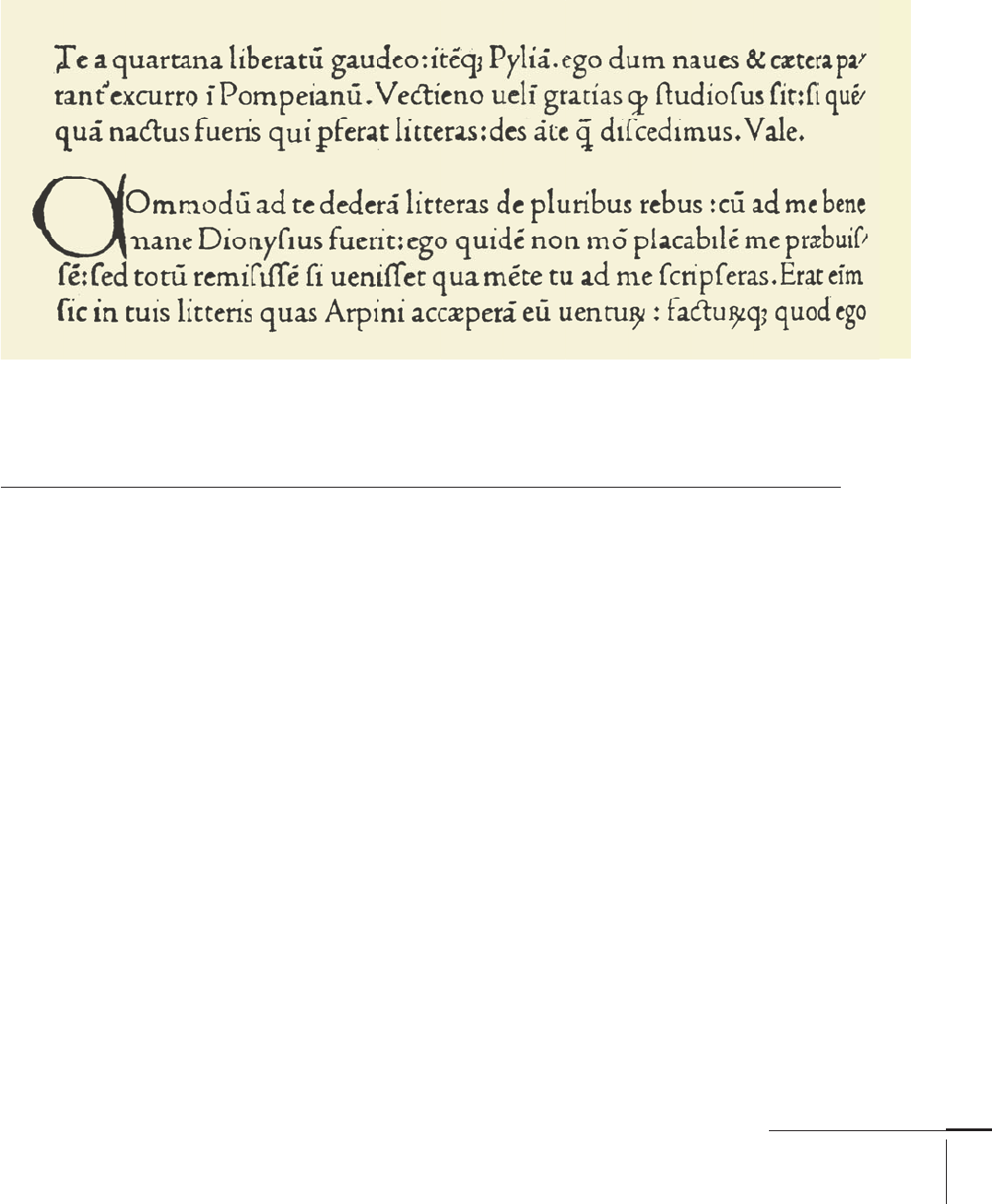
Nicolas Jenson (77) (1420–1480) was one of the fi rst
printers to cut and use fonts based on Roman rather
than northern European Fraktur letterform. Revivals of
his type include William Morris’s Golden Type, and the
very successful Jenson Oldstyle fi rst released in 1893 by
American Type Founders.
Another fi fteenth-century notable, William Caxton
(1421–1491), a man credited with introducing to England
the craft of printing with movable type, was fi rst a suc-
cessful businessman and government offi cial before
beginning his typographic career. He printed one of the
fi rst commercial advertisements, a poster that extolled the
products and services of his shop.
The earliest fonts Caxton used came from mainland
Europe, but once he established his business, he con-
vinced a noted Flemish calligrapher to change professions
to typeface designer and to move to England to produce
type fonts. Caxton eventually had eight fonts produced
for his press, most in the Blackletter (192) style of north-
ern Germany, and one of which is generally considered the
ancestor to Old English types still used today.
In 1450, the Gutenberg Bible was printed. This was the
fi rst important book printed in moveable type. In 1476,
Caxton set up his printing business in the Almonry of
Westminster Abbey.
Around the same time, the great Italian printer and type
founder Aldus Manutius (78) (1450–1515) commissioned
font designer Francesco Griff o (76) to create several type-
faces, the most important of which is now revived under
the name Bembo (155). The basis for the typeface was fi rst
used in Pietro Bembo’s book de Aetna, printed in 1495
by Manutius in a font designed by Griff o. (Interestingly,
Griff o only designed a lowercase [332] for the project, with
the caps pulled from an existing font.) This became a
model followed by Claude Garamond (74), as well as the
ancestor of many seventeenth-century European types.
Also, Manutius and Griff o are generally credited with
inventing italic type as a means to produce inexpensive
books. The former is true, but not the latter; Manutius
never produced an inexpensive book in his life. He created
italic type as a “marketing tool” to help sell his books to
well-off scholars and government offi cials who wrote in a
similar style.
Nicolas Jenson 1470
008-029 03171.indd 9 9/21/11 5:01 PM

Job:03171 Title:Typography Referenced (Rockport)
Page: 10
Aa Bb Cc Dd Ee Ff Gg Hh Ii Jj Kk Ll Mm Nn
Oo Pp Qq Rr Ss Tt Uu Vv Ww Xx Yy Zz
abcdefghijklmnopqrstuvwxyz
008-029 03171.indd 10 9/22/11 4:13 PM
10
Typography, Referenced
Text
Job:03171 Title:Typography Referenced (Rockport)
Page: 10
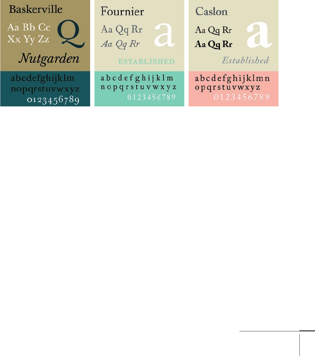
Sixteenth Century
Garamond (74) (–) was the most distinguished type
designer of his time, perhaps of the entire Renaissance period. A
true typographic innovator, he was instrumental in the adoption
of Roman typeface designs in France as a replacement for the
commonly used Gothic, or blackletter (192), fonts. In , his
fi rst Roman type appeared in Paraphrais in Elgantiarum Libros
Laurentii Vallae. He also was one of the fi rst type designers to
create obliqued capitals to complement an italic lowercase (332).
Though Garamond’s designs were exceptionally popular
for a long time (the Helvetica [176] of their day), they did not,
however, enjoy uninterrupted popularity. After a time, new
French designs and styles created by English, Dutch, and Italian
foundries began to replace Garamond’s type as the design of
choice among printers. Not until the beginning of the twentieth
century (18) did new versions of Garamond style begin to appear
again in print shops.
The work of Robert Granjon (75) (–) is closely associated
with Garamond. Active from to , Granjon is credited
with introducing italic type form as a complement to the
roman faces popular at the time. His work provided the models
for Plantin and Times New Roman (165), as well as Matthew
Carter’s (85) Galliard. The face that bears his name, however, is
based on a design by Garamond.
Type designer Jean Jannon (76) (–) created the type-
face on which most modern Garamond revivals are based.
Jannon worked more than years after Garamond, and was the
fi rst to release revivals of the earlier Frenchman’s work.
Seventeenth and
Eighteenth Centuries
During this period, English gunsmith-turned-type-designer
William Caslon I (72) (–) founded the Caslon Type
Foundry. He was one of the few wealthy type designers. His work,
based on earlier Dutch designs, does not possess irreproachable
perfection like that of Bodoni (156) or Baskerville (154). Caslon’s
strength as a type designer was not in his ability to create fl awless
letters, but to create a font that when set in a block of text copy
appeared perfect in spite of the vagaries and individuality of each
letterform.
The fi rst modern revivals of Caslon’s work came out in the
United States under the name Old Style. When American Type
Founders () was formed in , this design later became
Caslon . After that came many succeeding Caslons all
based on Caslon’s work: Monotype Caslon, Adobe Caslon, and
even Caslon. His surviving punches now reside in the St Bride
Printing Library in London.
When John Baskerville (70) (–) fi rst endeavored to
create fonts of type, he found that printing technology of the day
did not allow him to print as he wished. As a result, he explored,
changed, and improved virtually all aspects of the printing
process. He made his own printing press, a vastly improved
version over others of the period; he developed his own ink, which
even today is diffi cult to match for darkness and richness; and he
invented the hot-pressing process to create smooth paper stock,
even having a small mill built on his property to produce paper
that met his standards.
Today Baskerville’s “unpopular” type is one of the most popular
and most frequently used serif typestyles. It is represented in
essentially every type library, and can be reproduced on practi-
cally every kind of imaging device.
008-029 03171.indd 10 9/22/11 4:13 PM
Job:03171 Title:Typography Referenced (Rockport)
Page: 11
008-029 03171.indd 11 9/21/11 5:02 PM
11
Type History and Timeline
Text
Job:03171 Title:Typography Referenced (Rockport)
Page: 11
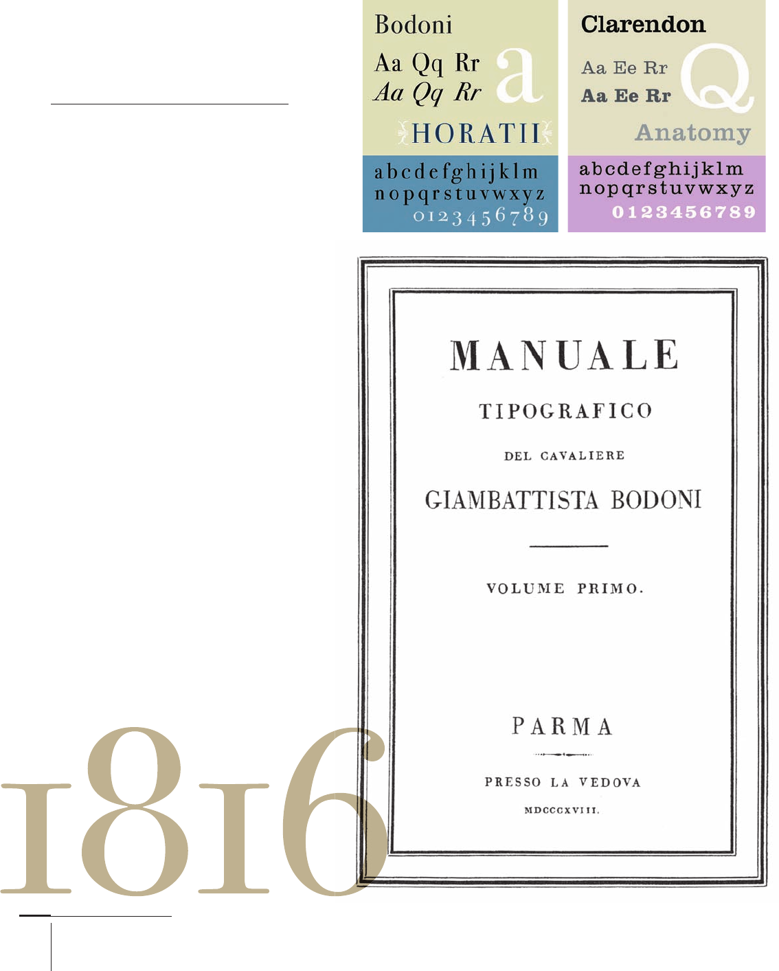
Also during the eighteenth century, French printer and type
designer Pierre Simon Fournier () (–) was working. His
work predated that of Giambattista Bodoni () (–) and
is the foundation for much of Bodoni’s fi rst typeface designs;
Monotype Fournier and Barbou are based on Fournier’s work, as
is Dwiggins Electra.
In , Caslon’s () types were fi rst shown. Although based
on Dutch old style weights and proportions, his font became the
fi rst great British type and set the standard for all that followed. It
is said that just as Shakespeare gave England a national theater,
Caslon gave the country a national typeface.
After the introduction of Caslon’s fonts came Bodoni’s work.
The typography and type designs Bodoni created are still
regarded as among the most refi ned and elegant ever produced.
But he did have the luxury of almost limitless time, money, and
eff ort to spend on his projects. Bodoni worked for the Duke of
Parma, and outside of the occasional royal commission, only
worked on projects of his choosing.
Bodoni’s type was the result of an evolutionary process. The
fi rst fonts he used were Old Style () designs purchased from
Fournier (), and his fi rst own fonts relied heavily on the
Fournier type. Over many years, however, Bodoni’s design
style changed to the Modern with which we are familiar today.
Interestingly, when Bodoni’s style changed, he would simply
recut specifi c letters for existing fonts to make them current.
This designer was one of history’s mostly prolifi c creators of
type. He was a demanding and exacting typographer who wanted
to use exactly the size and proportion of type that best suited
his needs. As a result, he created hundreds of fonts—all in the
Bodoni style. An inventory of his output showed more than
, punches and more than , matrices (letter molds).
When Bodoni was just twenty years old, in , the Industrial
Revolution began. This set the stage for advances in graphic
design production. In , Baskerville () typeface was fi rst
used. Baskerville’s fonts bridged the gap between the Old Style
designs produced during the Renaissance and the moderns
created by Firmin Didot () (–) and Bodoni.
008-029 03171.indd 11 9/21/11 5:02 PM
Job:03171 Title:Typography Referenced (Rockport)
Page: 12
008-029 03171.indd 12 9/22/11 4:17 PM
12
Typography, Referenced
Text
Job:03171 Title:Typography Referenced (Rockport)
Page: 12
Early Nineteenth
Century
Early in this century, Lord Stanhope invented
the fi rst printing press made of all cast-
iron parts, requiring one-tenth the manual
labor and doubling the possible paper size.
A few years later, in , William Caslon
IV, the great, great grandson of the William
Caslon (72), designed the fi rst sans serif font,
creating the English serifed design. Many
claim that the design for this sans is based on
the Greek lapidary letters of the fi fth century.
Note how close they also look to the caps
found in faces such as Futura (174) and
Avant Garde Gothic.
In , Bodoni’s (71) Manuale (completed
by his wife after his death) showed the
quintessential modern type. Today, there
are hundreds of Bodoni (156) revival designs
based on those shown in this benchmark
of typography. Three years later, in ,
Italienne—one of the fi rst commercially
popular advertising display designs—was
fi rst used. Because serifs are heavier than
main character strokes, this style of type has
been called a reversed Egyptian.
The s saw some important typography
milestones. In the early part of the decade,
Edward Binn’s The Anatomy of Sleep, the fi rst
book typeset by a mechanical typesetting
machine, published in London. In ,
R. Besley & Co. Type Founders released
Clarendon (58) as a heavy face to accompany
standard text composition in directories
and dictionaries. Clarendon became popular
as an advertising display face, eventually
copied by other foundries.
Bodoni
008-029 03171.indd 12 9/22/11 4:17 PM
..................Content has been hidden....................
You can't read the all page of ebook, please click here login for view all page.