

Job:03171 Title:Typography Referenced (Rockport)
Page: 68
068-121 03171.indd 68 9/22/11 4:53 PM
Text
Job:03171 Title:Typography Referenced (Rockport)
Page: 68
Typography, Referenced
Type
Designers
By Richard Poulin
I
n simple terms, type designers design
type. Due to the specialized requirements
of producing and designing typefaces,
practitioners at this discipline’s
beginning were far and few between. Even at
the start of the postindustrial revolution, type
design occurred in relatively few locations,
undertaken by a small group of individuals.
During the twentieth century (), type
design was realized in many forms. Some design-
ers worked alone, others collaborated yet still
retained independent control of their ultimate
work. These collaborations frequently occurred
between designers in diff erent cities and even
diff erent countries. In the early s, most
type designers worked for large companies or
foundries; during the later part of the century,
this became more and more the exception.
Advances in twentieth-century technology,
an ever-growing demand for new typefaces, and
access to the Internet have increased the public’s
need and desire for new and innovative type
design. Contemporary type designers have had
a tremendous infl uence on the current state
of this discipline. Today, notable practitioners
span all ages, cultures, and countries.
Peter Bilák, Fedra Multiscript,
068-121 03171.indd 68 9/22/11 4:53 PM
Job:03171 Title:Typography Referenced (Rockport)
Page: 69
068-121 03171.indd 69 9/22/11 4:53 PM
Text
Job:03171 Title:Typography Referenced (Rockport)
Page: 69
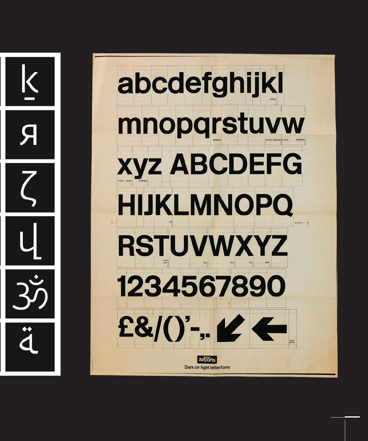
Margaret Calvert, Type,
068-121 03171.indd 69 9/22/11 4:53 PM
Job:03171 Title:Typography Referenced (Rockport)
Page: 70
068-121 03171.indd 70 9/22/11 4:53 PM
Typography, Referenced
Text
Job:03171 Title:Typography Referenced (Rockport)
Page: 70
John Baskerville
British, –
Typeface: Baskerville (1757)
Born in Worcestershire,
England, John Baskerville
moved to Birmingham
in where he began
working as a writing and
cutting master of gravestone
inscriptions. Baskerville
was cranky, vain, and
scornful of convention.
His peers disapproved
of him, his type, and his
printing. Baskerville
was also an iconoclast of
the fi rst order. He lived
with a woman for sixteen
years before marrying her
(something not unheard
of in eighteenth-century
England, but also not
something approved of by
eighteenth-century society).
He also had a lifetime
aversion to Christianity,
even going so far as to
build a mausoleum on his
property for his burial.
Almost no one liked
Baskerville’s fonts or print-
ing; his work was truly
created out of love for the
craft. In the truest sense of
the word, Baskerville was
an amateur. Freedom from
paying customers, however,
provided him an advan-
tage: He could take as much
time and be as demand-
ing as he wanted. Lack of
paying clients also provided
Baskerville the opportunity
to experiment with practi-
cally every aspect of type
founding and printing.
In , he set up his
fi rst printing press and
soon realized that existing
typefaces, substandard
printing inks, and the
technical limitations of the
eighteenth-century printing
press prevented him from
meeting his own high
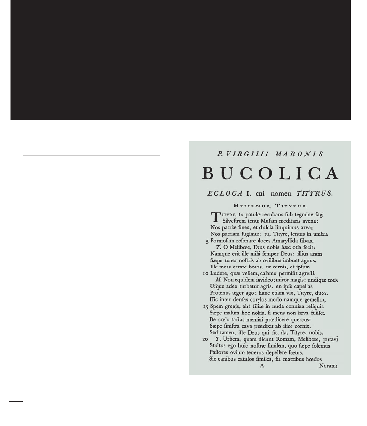
Virgil, 1757
Pre-twentieth Century
John Baskerville, Giambattista Bodoni, William Caslon,
Firmin Didot, Pierre Simon Fournier, Claude Garamond,
Philippe Grandjean, Robert Granjon, Francesco Griff o,
Jean Jannon, Nicolas Jenson, Aldus Manutius
068-121 03171.indd 70 9/22/11 4:53 PM

Job:03171 Title:Typography Referenced (Rockport)
Page: 71
068-121 03171.indd 71 9/22/11 4:53 PM
Type Designers
Text
Job:03171 Title:Typography Referenced (Rockport)
Page: 71
book-production standards.
Up to this point, printed type
lacked clarity and defi nition.
The spread of ink on paper
created heavier, softer
letterforms than their metal
type counterparts. Baskerville
modifi ed his printing
press to reproduce a lighter
typographic impression, used
denser and more concentrated
inks for enhanced contrast
(230) and clarity, and
introduced the use of hot-
pressed “calendared” or
wove paper that had a harder,
crisper, less absorbent surface
not previously available.
These innovations provided
him with fi ner results in
the printing process, as
well as a more pronounced
visual contrast on the
printed page (this became
an inherent characteristic
of his typefaces, too).
While Baskerville
contributed signifi cantly to
eighteenth-century printing,
he also was a true innovator in
designing type. His typeface,
Baskerville, possesses sharp,
vertical proportions with stark
contrasts between their thick
and thin strokes. It is one of
the few eighteenth-century
typefaces successfully adapted
to accommodate a wide range
of technological advances.
It remains one of the most
attractive and legible (330) of
all text typefaces (212).
His attention to fi ne
detail and perfectionism
to typographic nuances
carried over into his romans,
italics, large-scale capitals,
small capitals, and Old
Style (54) numerals. It’s also
noticeable in his unorthodox
use of judicious leading and
letterspacing. While the
typeface Baskerville remains
one of the most distinctive
and legible Transitional (55)
typefaces ever designed, most
British printers continued
to use Old Style or Garalde
typefaces such as Garamond
(162) throughout the
eighteenth and nineteenth
centuries. The typeface
Baskerville was largely
forgotten until Bruce Rogers
(99) rediscovered it in and
prompted several revivals.
In the late eighteenth century (10),
Giambattista Bodoni was one of the most
renowned punchcutters, type designers,
and printers in Europe, as well as the
creator of one of the fi rst Modern or
Didone (56) typefaces. Born in in
the northern Italian city of Turin, he was
the son of a printer. At age eighteen, he
worked as a compositor for Propaganda
Fide in Rome and then became director
of the Duke of Parma’s press at the age of
twenty-eight.
Typefaces created during the same
time period by designers Pierre Simon
Fournier (73) and Firmin Didot (73)
infl uenced Bodoni’s work. He used them
as his primary references in developing
his typeface, Bodoni, in . It was one
of the fi rst Modern typefaces to exhibit
extreme contrasts (230) of light and
dark in its thick and thin strokes, as
well as have a vertical stress and razor-
sharp serifs with unsupported brackets.
During his lifetime, Bodoni also
designed numerous script typefaces.
This designer documented his
philosophy and principles of typography
in his Manuale Tipografi co, which
reveals his innovative use of large-scale
type, generous white space (228) on the
page, and minimal page ornamentation.
Bodoni’s typography and type designs
are still regarded as among the most
refi ned and elegant ever produced. He
created hundreds of fonts—all in the
Bodoni style. An inventory of
his output showed more than ,
punches and more than , matrices.
Giambattista Bodoni
Italian, –
Typeface: Bodoni (1798)
Bodoni, 1816
068-121 03171.indd 71 9/22/11 4:53 PM

Job:03171 Title:Typography Referenced (Rockport)
Page: 72
068-121 03171.indd 72 9/22/11 4:54 PM
Typography, Referenced
Text
Job:03171 Title:Typography Referenced (Rockport)
Page: 72
William Caslon
British, –
Typeface: Caslon (1725)
William Caslon was well known in eighteenth-century
Great Britian for designing typefaces that had crisp, upright
characters. He was the fi rst British type designer of any
renown, responsible for ending British printers’ dependence
on using imported Dutch and French typefaces that
had dominated printing and publishing throughout the
seventeenth century (10).
Born in Worcestershire, England, Caslon began his career
as an engraver before becoming interested in punchcutting
and type design in . His fi rst roman typeface, the Pica
Roman (circa ), was closely based on a Dutch typeface. His
subsequent typefaces included Caslon English, Small Pica No.
, Long Primer No. , and the celebrated Great Primer Roman.
He was one of the fi rst type designers to publish a specimen
sheet illustrating almost the full range of his roman typefaces.
Caslon’s typefaces marked the end of the Old Style (54) or
Garalde era and for more than years became the standard
roman for most printers in Great Britain. William Caslon was
undeniably the most important member of the Caslon family
due to his contributions to typeface design, but the Caslon
family continued in the type foundry business until as the
Stephenson Blake & Co. Foundry.
Caslon, 1734
068-121 03171.indd 72 9/22/11 4:54 PM
..................Content has been hidden....................
You can't read the all page of ebook, please click here login for view all page.