
11 Portrait Compositional Basics

© Lisa Evans (Courtesy of the artist)
Most of the common vocabularies about composition are rooted in painting and drawing. As portrait photographers, we can find these concepts beneficial, but it makes sense to speak in terms of how a portrait works rather than just presenting traditional art concepts. For this approach, we widen the ideas from the “elements” or “principles” of composition to include the perceptual aspects of composition, including both psychophysical and phenomenal aspects within the portrait.
Many books present compositional concepts as six, seven, or eight elements of design with five or more principles. We deal with all of these ideas throughout this book, not just in this chapter. It is important to recognize that these concepts are immersed in the total process of making a solid portrait. We present the concepts by tying them to the portrait without defining their specific importance by how or when we introduce them. For example, one of the consistently discussed elements is tonality, or value, which was discussed in depth in its own chapter (chapter 5). Also, certain concepts of color were brought out in chapter 2 when discussing light and value and in chapter 6 when discussing lighting ratios. However, many further ideas that need discussion will be amplified here.
Balance
Noted art psychologist Rudolf Arnheim stated that without balance, communication in an image is not possible. Starting with this concept, it is imperative that we define how balance functions in a portrait.
Balance in an image is based on the visual structure within the frame and where we find the natural focus point—the visual center. The visual center is identified as a point that has the most effect on balance. It sits slightly above the physical center, where the two diagonals from the four corners cross. The balance of the image is then defined around this point.
We can create a symmetrically balanced image by arranging it with an equal amount of visual weight on either side of a vertical line through the visual center. A mirror image, where each side of the image is the reverse of the other, is purely symmetrical. Symmetrical images are stable and tend to be static and appear more formal.
While a mirror image is the model for symmetry, in reality, many images are close to symmetrical without being exact. The human face, for example, is close to symmetrical though not identical from one side to the other. Likewise, we can gain the same image stability by counterbalancing objects of similar size, weight, or importance at a near-centered vertical point in the frame. When the subject is positioned on the visual center, the image becomes stable; without other balance effects, such images are banal. Symmetry by itself does not make a portrait banal because such images are about a line, not just the visual center.
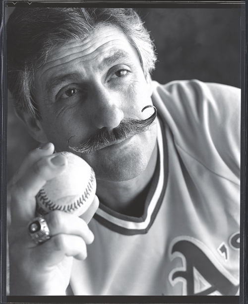
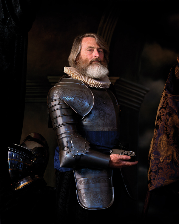
This portrait of Hall of Fame pitcher Rollie Fingers shows various elements working together successfully. Balance is created by the Athletic’s logo at the bottom, the baseball, and Rollie’s face. Further, his fingers and the logo become leading lines toward his face. His signature mustache is at the visual center of the image and, along with the contrast of the lighting on the cheek, centers the attention of view on this portrait. © Tim Mantoani (Courtesy of the artist)
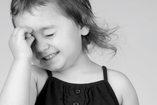
In this image by Julie Sparks Andrada we can see two major aspects of balance. First, the image is constructed with the visible eye of the little girl placed at the upper left intersection of lines based on the rule of thirds. Second, the visual weight of the dark jumper gives stability to the image. © Julie Sparks Andrada (Courtesy of the artist)

In this image, the red feathers provide lines that frame the face and control the view © Douglas Dubler (Courtesy of the artist)
When an image is not arranged equally around the vertical centerline, it is considered to be asymmetrical. This does not mean that the image is not balanced. The structure of the image uses a lever-and-fulcrum approach to creating balance. In this situation the visual forces within the frame create tension that finds equilibrium. These images are said to have dynamic balance. The elements in the image are arranged so that their distance and visual weight or tension corresponds to the point in the image acting as the fulcrum. For example, a heavier visual weight can be balanced by a lighter visual weight if the heavier element is closer to the fulcrum than the lighter visual element. The fulcrum point need not be in the center. The combination of size, tone, color saturation, and distance of the visual elements from the fulcrum point creates the dynamic balance. Regardless of the type, some sort of balance is needed for an image to work.
How the elements of a portrait are arranged around the visual center can also create apparent motion in the image. If the subject is positioned adjacent to the visual center, there will be a pull toward the center. In Western societies, because of our reading patterns, a subject above and off to the right of the visual center tends to pull more to the center than a subject on the left. As the subject moves away from the visual center in the frame, the pull is reduced. Based on this concept, we can see how the “rule of thirds” functions. This rule states that to construct a dynamically balanced image, the subject must be placed at an intersection of lines drawn parallel to the edges of the image frame at one third of the image’s length from each side. The rule of thirds is a dominant tool in portrait composition. Normally, the eyes are placed in the upper third with one eye on the vertical centerline. However, these rules are often broken in contemporary portrait photography to add visual impact.
As mentioned above, the balance depends on visual weight. In turn, the visual weight of various parts of an image depends on several factors. The first factor is the tonal density of the element. The darker the tone, the greater the visual weight. As can easily be seen, the second factor is size. Tone and size work together to increase the total effect of visual weight. The third factor in visual weight is the saturation of any color. When the saturation of a color increases, its visual weight increases. It should be noted that complementary colors of similar value and saturation balance each other.
As the elements of the image move toward the edges, they are pulled toward the edges. If an element touches the edge, it becomes stable. This is true of all edges, but especially true of the bottom edge. If there is a mass, such as the shoulders touching the bottom edge of the frame, the image becomes very stable. If the portrait has a vignette, then the edge of the vignette becomes the critical edge. In a head shot, the eyes are central to defining the balance of the image. In a fuller body portrait, the head and face are considered to be the balance-determining portion.

In this profile of Twiggy we can see the power of the contour as well as a strong figure-ground aspect. When the white is seen as ground, Twiggy’s face is clearly seen, but if interpreted with the black being the ground a figure of a seated woman can be seen.
© Douglas Kirkland (Courtesy of the artist)
Lines
In drawing, lines are absolutely essential, and they can also play a positive role in the composition of a photographic portrait. We discuss lines in terms of their weight, their thickness, and their direction and form and whether they are straight or curved. Lines can have mass and texture but are extremely long compared to their width.
Within a photographic portrait, lines are seldom the major element of the composition; they usually support other design elements. Folds in material, shadows, hair details, an arm or finger, etc., can form or imply lines. Because lines have direction, they are often used as “leading lines” to guide the eye toward important objects. We can think of a leading line as a type of arrow that concentrates the view. A line can also aid in balance, e.g., adding a countereffect to an off-center subject.
One of the most important lines in a portrait is the one that defines the shape of the face. In drawing, this contour line alone can be used to define the subject. Particularly with a profile, we can define subjects more easily with a strong contour than with any other part of the portrait. Even when the portrait is not a profile, a contour is needed to define the shape of the face; if this contour line is not readily visible, it can decrease the effectiveness of the image. The lack of a contour line frequently occurs in very high-key or low-key portraits.

In this portrait, the painted screen in the background has a ribbon motif that reinforces the gown, bows, and sash the subject is holding. Even though the color is not exact, because they are all in the same family of colors (reds), the similarity is seen.
© Phillip Stewart Charis (Courtesy of the artist)

In this image, the shape of the face is unmistakable. The specular light creates sharpness in the shapes between brilliant highlights and dark shadows. © Tim Meyer

© Judy Host
(Courtesy of the artist)
The background color warms up the image by selectively reflecting onto the subject and setting an overall warmer color scheme to the portrait
© Matthew Scott Drake (Courtesy of the artist)
Shape
The contour is not always a line; it is often seen as a shape. Shapes are essential to the identity of the subject, the balance of the image, and the vibrancy of the portrait. Shapes are the building blocks for all pictures. They are filled with tones, textures, and lines; most important for portraiture, they are filled with light and shadows.
As mentioned earlier, the contour of a portrait can give more information as to the identity of the subject than any other element of the image. The silhouette or the shadow of Alfred Hitchcock at the beginning of his television show identifies the subject without any other information. The contour is formed by the boundary between the subject and the background. In order for the contour to be visible, we assume that the background continues behind the shape defining the subject’s contour. When the contour is a strong boundary, we can clearly define the subject’s identity. The more separation between the subject and the background, whether color, tone, texture, etc., the more identified the contour will be.
When we create this boundary between the subject and the background, we create a “figure-ground” relationship. In portrait photography, we often speak of separating the subject from the background. If we want to concentrate on the subject of the portrait, then it is important that we define the subject as figure and the background as ground. Since the boundary is part of both the subject and background, it can be assumed to be part of either. When there is confusion as to where the boundary belongs, then we have a situation known as a “figure-ground illusion” or “contour rivalry” that makes the image difficult to interpret. This may occur when the subject and background tones are flat at the boundary with a strong tonal variation—particularly when the background is brighter in tone or more vivid in color than the subject. In this situation, the background and foreground are often transposed, resulting in visual confusion.
“Negative space” is what we routinely call the space within the background that is identifiable as interesting. These background shapes are seldom problematic, and they can become important visual and conceptual aspects of the image. However, they can also become destructive if they distract from the portrait. A common scenario is to have a contrasting background that creates bold, recognizable shapes. In the hands of a master, this concept can lead to dramatic communication of the meaning of the portrait.
While the contour is an obvious shape, the entirety of any portrait is made up of interrelated shapes. We can think of the face of our subject as made up of a group of shapes defined by shadows, highlights, and LD Edges. For example, a triangle-shaped light area often forms under the eye with Rembrandt lighting, and we then see the chin as a block or curved shape. The overall shape of the face is a major consideration in our choice of a lighting pattern. Hair styling can change the apparent shape of the face. As we divide the face with shadows and highlights, its interaction with hair and/or clothing creates the shapes in the image.
Shadows have a tremendous impact on creating shapes, both in terms of the shape itself and how we perceive it. With crisper definition of shapes, a portrait displays a harsher look. A specular light with well-defined LD Edges forms hard shapes, while the LD Edge from a diffuse source softens the shapes and the portrait.

© Paul Tumason (Courtesy of the artist)
Perceptually, shapes are seen as complete and fully closed even when small parts are missing. This concept is known as closure. If a small part of the contour of a face is obscured, our brain fills in the missing piece. This aspect can be enhanced by the use of similar shapes within the image. If there are many circles in a portrait, then nearly circular shapes complete easier. Regardless of their exact proportions, similar shapes support each other. Shapes will also “group” based on their similarity and proximity.
Similarity
Like other compositional elements, shapes support each other. This happens in two ways. First, when there is a similarity of color, texture, shape, etc., the repetition helps us react to the object. If the subject has a round-shaped face, then other rounded shapes in the image will accent and reinforce that roundness. Repetition does not require exact replication of the element, but only enough similarity so that the relationship can be visibly recognized. Such repetition can be either a plus or minus, depending on your desires.
A second, related concept is that of grouping. When there is close proximity between similar shapes or lines, the elements will tend to be seen as a group rather than as separate elements. This can be easily seen in a group portrait where an individual moves away and is therefore seen as separate from the group.
Juxtaposition
In a portrait, elements placed near each other so that they interact without supporting each other are referred to as “juxtaposed.” Juxtaposition accents the elements by contrasting them. Not all elements can be seen as juxtaposed because of their similarity or because of how they support other elements.
Color
We discussed some of the physical attributes of color in chapter 2, but here we will deal with its perceptual and emotional aspects.
The perception of color happens better in bright light situations than in dark light situations. Therefore, when we see color, we interpret the area where the color is lit with the most intense light. This concept of brightness relating to color also relates to the saturation of color. Since our perceptual system identifies brighter objects as closer, when color is seen, it advances in the perceived space toward the viewer. Thus, with more saturated color, there is even greater perceived closeness. Also, psychologically cool (blue-based) colors tend to recede in a portrait whereas warm (red-based) colors tend to pull forward.
Several other attributes of color affect the way it functions in a portrait. Colors interact with each other and affect the way we see nearby colors. This concept, known as border contrast, strengthens or weakens the perception of the neighboring colors depending on their relative value and whether the colors are complements to each other. Complementary colors enhance their apparent saturation when bordering each other. When a color is bordered by a dark neutral, such as black, the color is also perceived as more saturated. When bordering colors are near each other on the color wheel, they reduce their apparent saturations.

In this portrait diptych of the artist Magdalena Abakanowicz, the size relationship of the sculptures’s legs in the environmental portrait and the large frontal portrait create the dynamic for interpreting the image
© Bettina Flitner (Courtesy of the artist)
The portraitist can benefit from the use of the mood and emotionality of color in the image. Like the quality of light, the saturation of color helps set the mood for the portrait. Saturated colors tend to make harder images, while less saturated, pastel colors make softer images. Saturated colors are bolder and can make a portrait more dynamic. When colors are complementary, the contrast hardens the portrait; the opposite occurs when colors are within the same spectral area.
Whether an image is seen as hot or cool, cheery or sad, its colors can have a great effect on the viewer. While the color temperature for red is cooler than blue, in determining the relative warmth of a portrait the opposite is the case. The colors red through yellow on the color wheel are perceived as warm, and blues are seen as cool.
Color has a great deal of emotional impact. Beyond the issue of heat created by color, we often think of red as the color of love and blue/violet as the color of royalty. Orange is seen as full of life and energy, while blue green is seen as restful. In many societies, pink is feminine and blue is masculine. Though we dress babies in blue or pink based on gender, a vibrant red car is seen as “macho.” Green is the color of jealousy. The gold part of the yellow spectrum is seen as rich. Blue is seen as staid and proper. The “blue suit” is the standard for business. When the portrait is dark, the image is perceived as somber, while lighter colors are happier. Colors are loaded with meaning and emotion.
A significant use of color in a portrait is for emphasis. Color attracts the eyes of the viewer and directs how to process the image. Whether it’s the red lipstick that attracts attention or the brilliant blue eyes, spots of color add emphasis. Some glamour portraits use saturated color to attract attention or set the mood.
Texture and Pattern
The difference between texture and pattern is mostly a function of scale. Both involve repetitive detail, with texture being smaller and more likely random. Texture is not seen as a primary element of an image, whereas pattern sometimes is critical to the look. Texture and pattern are often perceived as backgrounds and interpreted as continuing behind a subject.
Both texture and pattern can give a great feel of depth to an image. Perceptually, as they become smaller, they provide visual clues to depth. At an infinite distance from the viewer, they both become tone.
Perhaps the most important difference between texture and pattern is the way each interacts with light. Since texture is created by differences in depth, the type of light (specular/diffuse) has a significant effect on it, whereas pattern is not affected to any great degree by differences in light quality. Specular light, particularly at a large angle of incidence, increases the ability to see texture, while diffuse light decreases the ability to see it. In portrait photography, skin texture is enhanced by specular light and made smoother by diffuse light. A pattern, whether added to the skin or occurring naturally, is unaffected by light quality.
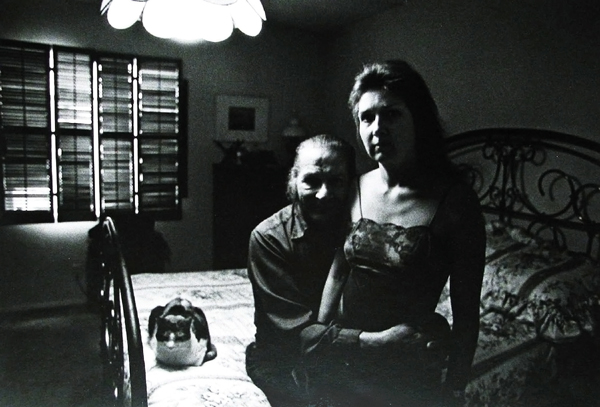
In this environmental portrait by Anne Noggle, the symbolism is powerful. Most noticeable is the lighting used to set the mood, with the light from the single room light and the sun trying to come in through the window. Other symbols, the bed, cat, and the woman’s attire, also add meaning to the image.
© Anne Noggle (1922-2005) (From the collection of Jim Holbrook)
Volume
Volume is an element that gives life to an image. Since photographic portraiture is a two-dimensional art form, we must replace the natural three-dimensionality of our subjects with elements that communicate volume. The primary elements are the LD Edge as it defines shape of the lit surface and the characteristic of the light (specular/diffuse) that makes the image. These elements convey a form that we perceive as human with all its roundness and depth.
While the LD Edge and the shadowing on the subject create much of the volume of a portrait, the highlights also contribute. As the intensity and definition of the specular highlights increase, they pull forward in the image and make the portrait seem more three-dimensional.
Size
Size refers to the relational portions that objects occupy within the portrait’s frame. In medieval paintings, the size of the people gave an indication of their importance. Relative size within the frame was often dictated by stylistic conventions. In modern portrait photographs, the same concepts can be applied. If a person is small within the frame, then they will be perceived as less dominant. With multiple objects or subjects, their relative sizes will establish their value.
Symbolism, Content, and Meaning
Photography is a powerful language. However, the strength of the language has no meaning if you have nothing to say. Portraits can convey far more than the identities of their subjects. The real content of the portrait lies in the way symbolism is used to communicate. For example, Arnold Newman was known for taking portraits in a subject’s environment, but he was careful to control the camera so that the symbols he captured told the story he wished to tell.
Symbols are objects that provide meaning by their presence in a portrait. While the object may not directly communicate the desired meaning, its presence allows the viewer to receive the intended meaning. There are two types of symbols: universal and societal specific. Of the two, specific symbols tend to be more powerful because they have more communicative value to the society that supports them. While many societies use a cross as a symbol, Christian societies attach greater meaning to it because of its religious connotation. Some Asian societies might see the symbol as meaning the number 10, with less importance than the Christian connotation.
While it is obvious that an environmental portrait will utilize symbols, they are also important in studio portraits. Jewelry, clothing, and accessories can function as symbols, as can facial expressions and head positions.
Richard © David Williams (Courtesy of the artist)