Overview
This chapter covers model evaluation in depth. We will discuss alternatives to accuracy to evaluate the performance of a model when standard techniques are not feasible, especially where there are imbalanced classes. Finally, we will utilize confusion matrices, sensitivity, specificity, precision, FPR, ROC curves, and AUC scores to evaluate the performance of classifiers. By the end of this chapter, you will have an in-depth understanding of accuracy and null accuracy and will be able to understand and combat the challenges of imbalanced datasets.
Introduction
In the previous chapter, we covered regularization techniques for neural networks. Regularization is an important technique when it comes to combatting how a model overfits the training data and helps the model perform well on new, unseen data examples. One of the regularization techniques we covered involved L1 and L2 weight regularizations, in which penalization is added to the weights. The other regularization technique we learned about was dropout regularization, in which some units of layers are randomly removed from the model fitting process at each iteration. Both regularization techniques are designed to prevent individual weights or units by influencing them too strongly and allowing them to generalize as well.
In this chapter, we will learn about some different evaluation techniques other than accuracy. For any data scientist, the first step after building a model is to evaluate it, and the easiest way to evaluate a model is through its accuracy. However, in real-world scenarios, particularly where there are classification tasks with highly imbalanced classes such as for predicting the presence of hurricanes, predicting the presence of a rare disease, or predicting if someone will default on a loan, evaluating the model using its accuracy score is not the best evaluation technique.
This chapter explores core concepts such as imbalanced datasets and how different evaluation techniques can be used to work through these imbalanced datasets. This chapter begins with an introduction to accuracy and its limitations. Then, we will explore the concepts of null accuracy, imbalanced datasets, sensitivity, specificity, precision, false positives, ROC curves, and AUC scores.
Accuracy
To understand accuracy properly, let's explore model evaluation. Model evaluation is an integral part of the model development process. Once you've built your model and executed it, the next step is to evaluate your model.
A model is built on a training dataset and evaluating a model's performance on the same training dataset is bad practice in data science. Once a model has been trained on a training dataset, it should be evaluated on a dataset that is completely different from the training dataset. This dataset is known as the test dataset. The objective should always be to build a model that generalizes, which means the model should produce similar (but not the same) results, or relatively similar results, on any dataset. This can only be achieved if we evaluate the model on data that is unknown to it.
The model evaluation process requires a metric that can quantify a model's performance. The simplest metric for model evaluation is accuracy. Accuracy is the fraction of predictions that our model gets right. This is the formula for calculating accuracy:
Accuracy = (Number of correct predictions) / (Total number of predictions)
For example, if we have 10 records and 7 are predicted correctly, then we can say that the accuracy of our model is 70%. This is calculated as 7/10 = 0.7 or 70%.
Null accuracy is the accuracy that can be achieved by predicting the most frequent class. If we don't run an algorithm and just predict accuracy based on the most frequent outcome, then the accuracy that's calculated based on this prediction is known as null accuracy:
Null accuracy = (Total number of instances of the frequently occurring class) / (Total number of instances)
Take a look at this example:
10 actual outcomes: [1,0,0,0,0,0,0,0,1,0].
Prediction: [0,0,0,0,0,0,0,0,0,0]
Null accuracy = 8/10 = 0.8 or 80%
So, our null accuracy is 80%, meaning we are correct 80% of the time. This means we have achieved 80% accuracy without running an algorithm. Always remember that when null accuracy is high, it means that the distribution of response variables is skewed in favor of the frequently occurring class.
Let's work on an exercise to find the null accuracy of a dataset. The null accuracy of a dataset can be found by using the value_count function in the pandas library. The value_count function returns a series containing counts of unique values.
Note
All the Jupyter Notebooks for the exercises and activities in this chapter are available on GitHub at https://packt.live/37jHNUR.
Exercise 6.01: Calculating Null Accuracy on a Pacific Hurricanes Dataset
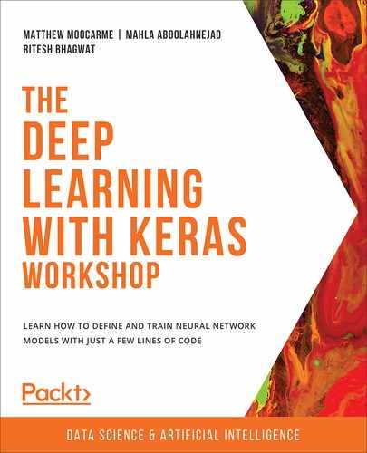
We have a dataset documenting whether a hurricane has been observed in the Pacific Ocean that has two columns, Date and hurricane. The Date column indicates the date of the observation, while the hurricane column indicates whether there was a hurricane on that date. Rows with a hurricane value of 1 means there was a hurricane, while 0 means there was no hurricane. Find the null accuracy of the dataset by following these steps:
- Open a Jupyter notebook. Import all the required libraries and load the pacific_hurricanes.csv file into the data folder from this book's GitHub repository:
# Import the data
import pandas as pd
df = pd.read_csv("../data/pacific_hurricanes.csv")
df.head()
The following is the output of the preceding code:
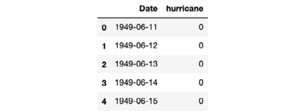
Figure 6.1: Data exploration of the pacific hurricanes dataset
- Use the built-in value_count function from the pandas library to get the distribution for the data of the hurricane column. The value_count function shows the total instances of unique values:
df['hurricane'].value_counts()
The preceding code produces the following output:
0 22435
1 1842
Name: hurricane, dtype: int64
- Use the value_count function and set the normalize parameter to True. To find the null accuracy, you will have to index the pandas series that was produced for index 0 to get the proportion of values related to no hurricanes occurring on a given day:
df['hurricane'].value_counts(normalize=True).loc[0]
The preceding code produces the following output:
0.9241257156979857
The calculated null accuracy of the dataset is 92.4126%.
Here, we can see that our dataset has a very high null accuracy of 92.4126%. So, if we just make a dumb model that predicts the majority class for all outcomes, our model will be 92.4126% accurate.
Note
To access the source code for this specific section, please refer to https://packt.live/31FtQBm.
You can also run this example online at https://packt.live/2ArNwNT.
Later in this chapter, in Activity 6.01, Computing the Accuracy and Null Accuracy of a Neural Network When We Change the Train/Test Split, we will see how null accuracy changes as we change the test/train split.
Advantages and Limitations of Accuracy
The advantages of accuracy are as follows:
- Easy to use: Accuracy is very easy to compute and understand as it is just a simple fraction formula.
- Popular compared to other techniques: Since it is the easiest metric to compute, it is also the most popular and is universally accepted as the first step of evaluating a model. Most introductory books on data science teach accuracy as an evaluation metric.
- Good for comparing different models: Suppose you are trying to solve a problem with different models. You can always trust the model that gives the highest accuracy.
The limitations of accuracy are as follows:
- No representation of response variable distribution: Accuracy doesn't give us an idea of the distribution of the response/dependent variable. If we get an accuracy of 80% in our model, we have no idea how the response variable is distributed and what the null accuracy of the dataset is. If the null accuracy of our dataset is above 70%, then an 80% accurate model is pretty useless.
- Type 1 and type 2 errors: Accuracy also gives us no information about type 1 and type 2 errors of the model. A type 1 error is when a class is negative and we have predicted it as positive, while a type 2 error is when a class is positive and we have predicted it as negative. We will be studying both of these errors later in this chapter. In the next section, we will cover the imbalanced datasets. The accuracy scores for models classifying imbalanced datasets can be particularly misleading, which is why other evaluation metrics are useful for model evaluation.
Imbalanced Datasets
Imbalanced datasets are a distinct case for classification problems where the class distribution varies between the classes. In such datasets, one class is overwhelmingly dominant. In other words, the null accuracy of an imbalanced dataset is very high.
Consider an example of credit card fraud. If we have a dataset of credit card transactions, then we will find that, of all the transactions, a very minuscule number of transactions were fraudulent and the majority of transactions were normal transactions. If 1 represents a fraudulent transaction and 0 represents a normal transaction, then there will be many 0s and hardly any 1s. The null accuracy of the dataset may be more than 99%. This means that the majority class (in this case, 0) is overwhelmingly greater than the minority class (in this case, 1). Such sets are imbalanced datasets. Consider the following figure, which shows a general imbalanced dataset scatter plot:
Figure 6.2: A general imbalanced dataset scatter plot
The preceding plot shows a generalized scatter plot of an imbalanced dataset, where the stars represent the minority class and the circles represent the majority class. As we can see, there are many more circles than stars; this can make it difficult for machine learning models to distinguish between the two classes. In the next section, we will cover some approaches to working with imbalanced datasets.
Working with Imbalanced Datasets
In machine learning, there are two ways of overcoming the shortcomings of imbalanced datasets, which are as follows:
- Sampling techniques: One way we can mitigate the imbalance of a dataset is by using special sampling techniques with which we can select our training and testing data in such a way that there is an adequate representation of all the classes. There are many such techniques—for instance, oversampling the minority class (meaning we take more samples from the minority class) or undersampling the majority class (meaning we take a smaller sample from the majority class). However, if the data is highly imbalanced with null accuracies above 90%, then sampling techniques struggle to give the correct representation of majority-minority classes in the data and our model may overfit. So, the best way is to modify our evaluation techniques.
- Modifying model evaluation techniques: When working with highly imbalanced datasets, it is better to modify model evaluation techniques. This is the most robust way to get good results, which means using these methods will likely achieve good results on new, unseen data. There are many evaluation metrics other than accuracy that can be modified to evaluate a model. To learn about all those techniques, it is important to understand the concept of the confusion matrix.
Confusion Matrix
A confusion matrix describes the performance of the classification model. In other words, a confusion matrix is a way to summarize classifier performance. The following table shows a basic representation of a confusion matrix and represents how the predicted results by the model compared to the true values:

Figure 6.3: Basic representation of a confusion matrix
Let's go over the meanings of the abbreviations that were used in the preceding table:
- TN (True negative): This is the count of outcomes that were originally negative and were predicted negative.
- FP (False positive): This is the count of outcomes that were originally negative but were predicted positive. This error is also called a type 1 error.
- FN (False negative): This is the count of outcomes that were originally positive but were predicted negative. This error is also called a type 2 error.
- TP (True positive): This is the count of outcomes that were originally positive and were predicted as positive.
The goal is to maximize the values in the TN and TP boxes in the preceding table, that is, the true negatives and true positives, and minimize the values in the FN and FP boxes, that is, the false negatives and false positives.
The following code is an example of a confusion matrix:
from sklearn.metrics import confusion_matrix
cm = confusion_matrix(y_test,y_pred_class)
print(cm)
The preceding code produces the following output:
array([[89, 2],
[13, 4]], dtype=int64)
The aim of all machine learning and deep learning algorithms is to maximize TN and TP and minimize FN and FP. The following example code calculates TN, FP, FN, and TP:
# True Negative
TN = cm[0,0]
# False Negative
FN = cm[1,0]
# False Positives
FP = cm[0,1]
# True Positives
TP = cm[1,1]
Note
Accuracy does not help us understand type 1 and type 2 errors.
Metrics Computed from a Confusion Matrix
The metrics that can be derived from a confusion matrix are sensitivity, specificity, precision, FP rate, ROC, and AUC:
- Sensitivity: This is the number of positive predictions divided by the total actual number of positives. Sensitivity is also known as recall or true positive. In our case, it is the total number of patients classified as 1, divided by the total number of patients who are actually 1:
Sensitivity = TP / (TP+FN)
Sensitivity refers to how often the prediction is correct when the actual value is positive. In cases such as building a model to predict patient readmission at a hospital, we need our model to be highly sensitive. We need 1 to be predicted as 1. If a 0 is predicted as 1, it is acceptable, but if a 1 is predicted as 0, it means a patient who was readmitted is predicted as not readmitted, and this will cause severe penalties for the hospital.
- Specificity: This is the number of negative predictions divided by the total number of actual negatives. To use the previous example, it would be readmission predicted as 0 divided by the total number of patients who were actually 0. Specificity is also known as the true negative rate:
Specificity = TN / (TN+FP)
Specificity refers to how often the prediction is correct when the actual value is negative. There are cases, such as spam email detection, where we need our algorithm to be more specific. The model predicts 1 when an email is spam and 0 when it isn't. We want the model to predict 0 as always 0, because if a non-spam email is classified as spam, important emails may end up in the spam folder. Sensitivity can be compromised here because some spam emails may arrive in our inbox, but non-spam emails should never go to the spam folder.
Note
As we discussed previously, whether a model should be sensitive or specific totally depends on the business problem.
- Precision: This is the true positive prediction divided by the total number of positive predictions. Precision refers to how often we are correct when the value predicted is positive:
Precision = TP / (TP+FP)
- False Positive Rate (FPR): The FPR is calculated as the ratio between the number of false-positive events and the total number of actual negative events. FPR refers to how often we are incorrect when the actual value is negative. FPR is also equal to 1 - specificity:
False positive rate = FP / (FP+TN)
- Receiver Operating Characteristic (ROC) curve: Another important way to evaluate a classification model is by using a ROC curve. A ROC curve is a plot between the true positive rate (sensitivity) and the FPR (1 - specificity). The following plot shows an example of an ROC curve:

Figure 6.4: An example of ROC curve
To decide which ROC curve is the best among multiple curves, we need to look at the empty space on the upper left of the curve—the smaller the space, the better the result. The following plot shows an example of multiple ROC curves:

Figure 6.5: An example of multiple ROC curves
Note
The red curve is better than the blue curve because it leaves less space in the upper-left corner.
The ROC curve of a model tells us the relationship between sensitivity and specificity.
- Area Under Curve (AUC): This is the area under the ROC curve. Sometimes, AUC is also written as AUROC, meaning the area under the ROC curve. Basically, AUC is a numeric value that represents the area under a ROC curve. The larger the area under the ROC, the better, and the bigger the AUC score, the better. The preceding plot shows us an example of an AUC.
In the preceding plot, the AUC of the red curve is greater than the AUC of the blue curve, which means the AUC of the red curve is better than the AUC of the blue curve. There is no standard rule for the AUC score, but here are some generally acceptable values and how they relate to model quality:

Figure 6.6: General acceptable AUC score
Now that we understand the theory behind the various metrics, let's complete some activities and exercises to implement what we have learned.
Exercise 6.02: Computing Accuracy and Null Accuracy with APS Failure for Scania Trucks Data
The dataset that we will be using in this exercise consists of data that's been collected from heavy Scania trucks in everyday usage that have failed in some way. The system in focus is the Air pressure system (APS), which generates pressurized air that is utilized in various functions in a truck, such as braking and gear changes. The positive class in the dataset represents component failures for a specific component in the APS, while the negative class represents failures for components not related to the APS.
The objective of this exercise is to predict which trucks have had failures due to the APS so that the repair and maintenance mechanics have the information they can work with when checking why the truck failed and which area of the truck needs to be inspected.
Note
The dataset for this exercise can be downloaded from this book's GitHub repository at https://packt.live/2SGEEsH.
Throughout this exercise, you may get slightly different results due to the random nature of the internal mathematical operations.
Data preprocessing and exploratory data analysis:
- Import the required libraries. Load the dataset using the pandas read_csv function and explore the first five rows of the dataset:
#import the libraries
import numpy as np
import pandas as pd
# Load the Data
X = pd.read_csv("../data/aps_failure_training_feats.csv")
y = pd.read_csv("../data/aps_failure_training_target.csv")
# use the head function view the first 5 rows of the data
X.head()
The following table shows the output of the preceding code:

Figure 6.7: First five rows of the patient readmission dataset
- Describe the feature values in the dataset using the describe method:
# Summary of Numerical Data
X.describe()
The following table shows the output of the preceding code:
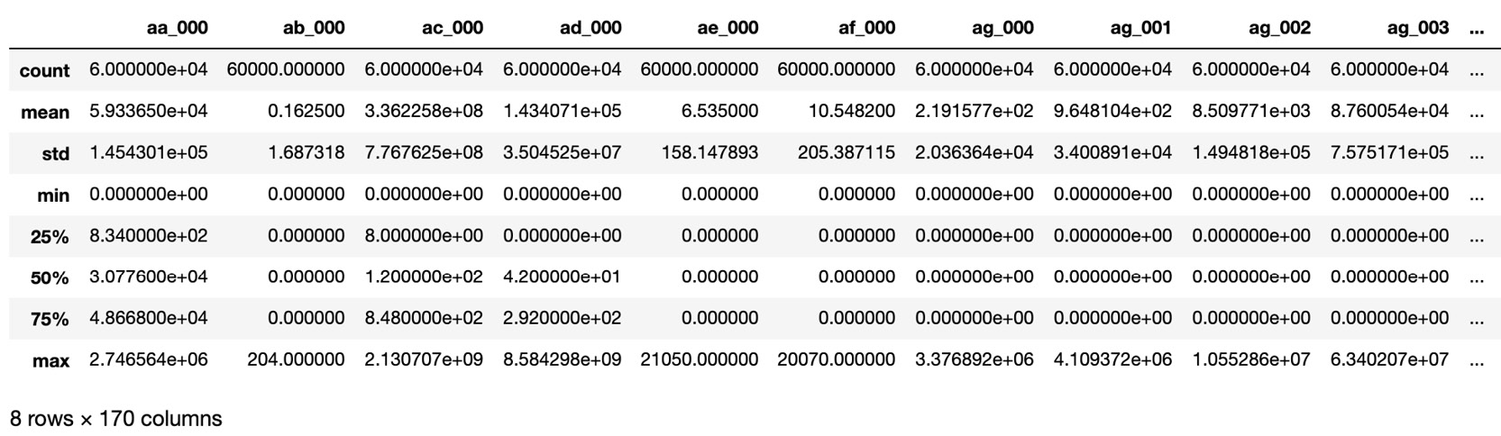
Figure 6.8: Numerical metadata of the patient readmission dataset
Note
Independent variables are also known as explanatory variables, while dependent variables are also known as response variables. Also, remember that indexing in Python starts from 0.
- Explore y using the head function:
y.head()
The following table shows the output of the preceding code:

Figure 6.9: The first five rows of the y variable of the patient readmission dataset
- Split the data into test and train sets by using the train_test_split function from the scikit-learn library. To make sure we all get the same results, set the random_state parameter to 42. The data is split with an 80:20 ratio, meaning 80% of the data is training data and the remaining 20% is test data:
from sklearn.model_selection import train_test_split
seed = 42
X_train, X_test,
y_train, y_test= train_test_split(X, y, test_size=0.20,
random_state=seed)
- Scale the training data using the StandardScaler function and use the scaler to scale the test data:
# Initialize StandardScaler
from sklearn.preprocessing import StandardScaler
sc = StandardScaler()
# Transform the training data
X_train = sc.fit_transform(X_train)
X_train = pd.DataFrame(X_train,columns=X_test.columns)
# Transform the testing data
X_test = sc.transform(X_test)
X_test = pd.DataFrame(X_test,columns=X_train.columns)
Note
The sc.fit_transform() function transforms the data and the data is converted into a NumPy array. We may need the data for further analysis in the DataFrame objects, so the pd.DataFrame() function reconverts data into a DataFrame.
This completes the data preprocessing part of this exercise. Now, we need to build a neural network and calculate the accuracy.
- Import the libraries that are required for creating the neural network architecture:
# Import the relevant Keras libraries
from keras.models import Sequential
from keras.layers import Dense
from keras.layers import Dropout
from tensorflow import random
- Initiate the Sequential class:
# Initiate the Model with Sequential Class
np.random.seed(seed)
random.set_seed(seed)
model = Sequential()
- Add five hidden layers of the Dense class and the add Dropout after each. Build the first hidden layer so that it has a size of 64 and with a dropout rate of 0.5. The second hidden layer will have a size of 32 and a dropout rate of 0.4. The third hidden layer will have a size of 16 and a dropout rate of 0.3. The fourth hidden layer will have a size of 8 and dropout rate of 0.2. The final hidden layer will have a size of 4 and a dropout rate of 0.1. Each hidden layer will have a ReLU activation function and the kernel initializer will be set to uniform:
# Add the hidden dense layers and with dropout Layer
model.add(Dense(units=64, activation='relu',
kernel_initializer='uniform',
input_dim=X_train.shape[1]))
model.add(Dropout(rate=0.5))
model.add(Dense(units=32, activation='relu',
kernel_initializer='uniform'))
model.add(Dropout(rate=0.4))
model.add(Dense(units=16, activation='relu',
kernel_initializer='uniform'))
model.add(Dropout(rate=0.3))
model.add(Dense(units=8, activation='relu',
kernel_initializer='uniform'))
model.add(Dropout(rate=0.2))
model.add(Dense(units=4, activation='relu',
kernel_initializer='uniform'))
model.add(Dropout(rate=0.1))
- Add an output Dense layer with a sigmoid activation function:
# Add Output Dense Layer
model.add(Dense(units=1, activation='sigmoid',
kernel_initializer='uniform'))
Note
Since the output is binary, we are using the sigmoid function. If the output is multiclass (that is, more than two classes), then the softmax function should be used.
- Compile the network and fit the model. Calculate the accuracy during the training process by setting metrics=['accuracy']:
# Compile the model
model.compile(optimizer='adam',
loss='binary_crossentropy',
metrics=['accuracy'])
- Fit the model with 100 epochs, a batch size of 20, and a validation split of 20%:
#Fit the Model
model.fit(X_train, y_train, epochs=100,
batch_size=20, verbose=1,
validation_split=0.2, shuffle=False)
- Evaluate the model on the test dataset:
test_loss, test_acc = model.evaluate(X_test, y_test)
print(f'The loss on the test set is {test_loss:.4f}
and the accuracy is {test_acc*100:.4f}%')
The preceding code produces the following output:
12000/12000 [==============================] - 0s 20us/step
The loss on the test set is 0.0802 and the accuracy is 98.9917%
The model returns an accuracy of 98.9917%. But is it good enough? We can only get the answer to this question by comparing it with the null accuracy.
Compute the null accuracy:
- The null accuracy can be calculated using the value_count function of the pandas library, which we used in Exercise 6.01, Calculating Null Accuracy on a Pacific Hurricanes Dataset, of this chapter:
"""
Use the value_count function to calculate distinct class values
"""
y_test['class'].value_counts()
The preceding code produces the following output:
0 11788
1 212
Name: class, dtype: int64
- Calculate the null accuracy:
# Calculate the null accuracy
y_test['class'].value_counts(normalize=True).loc[0]
The preceding code produces the following output:
0.9823333333333333
Here, we have obtained the null accuracy of the model. As we conclude this exercise, the following points must be noted: the accuracy of our model is 98.9917%, approximately. Under ideal conditions, 98.9917% accuracy is very good accuracy, but here, the null accuracy is very high, which helps put our model's performance into perspective. The null accuracy of our model is 98.2333%. Since the null accuracy of the model is so high, an accuracy of 98.9917% is not significant but certainly respectable, and accuracy in such cases is not the correct metric to evaluate an algorithm with.
Note
To access the source code for this specific section, please refer to https://packt.live/31FUb2d.
You can also run this example online at https://packt.live/3goL0ax.
Now, let's go through activity on computing the accuracy and null accuracy of the neural network model when we change the train/test split.
Activity 6.01: Computing the Accuracy and Null Accuracy of a Neural Network When We Change the Train/Test Split
A train/test split is a random sampling technique. In this activity, we will see that our null accuracy and accuracy will be affected by changing the train/test split. To implement this, the part of the code where the train/test split was defined has to be changed. We will use the same dataset that we used in Exercise 6.02, Computing Accuracy and Null Accuracy with APS Failure for Scania Trucks Data. Follow these steps to complete this activity:
- Import all the necessary dependencies and load the dataset.
- Change test_size and random_state from 0.20 to 0.30 and 42 to 13, respectively.
- Scale the data using the StandardScaler function.
- Import the libraries that are required to build a neural network architecture and initiate the Sequential class.
- Add the Dense layers with Dropout. Set the first hidden layer so that it has a size of 64 with a dropout rate of 0.5, the second hidden layer so that it has a size of 32 with a dropout rate of 0.4, the third hidden layer so that is has a size of 16 with a dropout rate of 0.3, the fourth hidden layer so that it has a size of 8 with a dropout rate of 0.2, and the final hidden layer so that it has a size of 4 with a dropout rate of 0.1. Set all the activation functions to ReLU.
- Add an output Dense layer with the sigmoid activation function.
- Compile the network and fit the model using accuracy. Fit the model with 100 epochs and a batch size of 20.
- Fit the model to the training data while saving the results from the fit process.
- Evaluate the model on the test dataset.
- Count the number of values in each class of the test target dataset.
- Calculate the null accuracy using the pandas value_count function.
Note
In this activity, you may get slightly different results due to the random nature of internal mathematical operations.
Here, we can see that the accuracy and null accuracy will change as we change the train/test split. We will not cover any sampling techniques in this chapter as we have a very highly imbalanced dataset, and sampling techniques will not yield any fruitful results.
Note
The solution for this activity can be found on page 430.
Let's move on to the next exercise and compute the metrics that have been derived from the confusion matrix.
Exercise 6.03: Deriving and Computing Metrics Based on a Confusion Matrix
The dataset that we will be using in this exercise consists of data that has been collected from heavy Scania trucks in everyday usage that have failed in some way. The system that's in focus is the Air Pressure System (APS), which generates pressurized air that is utilized in various functions in a truck, such as braking and gear changes. The positive class in the dataset represents component failures for a specific component in the APS, while the negative class represents failures for components not related to the APS.
The objective of this exercise is to predict which trucks have had failures due to the APS, much like we did in the previous exercise. We will derive the sensitivity, specificity, precision, and false positive rate of the neural network model to evaluate its performance. Finally, we will adjust the threshold value and recompute the sensitivity and specificity. Follow these steps to complete this exercise:
Note
The dataset for this exercise can be downloaded from this book's GitHub repository at https://packt.live/2SGEEsH.
You may get slightly different results due to the random nature of internal mathematical operations.
- Import the necessary libraries and load the data using the pandas read_csv function:
# Import the libraries
import numpy as np
import pandas as pd
# Load the Data
X = pd.read_csv("../data/aps_failure_training_feats.csv")
y = pd.read_csv("../data/aps_failure_training_target.csv")
- Next, split the data into training and test datasets using the train_test_split function:
from sklearn.model_selection import train_test_split
seed = 42
X_train, X_test,
y_train, y_test = train_test_split(X, y,
test_size=0.20, random_state=seed)
- Following this, scale the feature data so that it has a mean of 0 and a standard deviation of 1 using the StandardScaler function. Fit the scaler to the training data and apply it to the test data:
from sklearn.preprocessing import StandardScaler
sc = StandardScaler()
# Transform the training data
X_train = sc.fit_transform(X_train)
X_train = pd.DataFrame(X_train,columns=X_test.columns)
# Transform the testing data
X_test = sc.transform(X_test)
X_test = pd.DataFrame(X_test,columns=X_train.columns)
- Next, import the Keras libraries that are required to create the model. Instantiate a Keras model of the Sequential class and add five hidden layers to the model, including dropout for each layer. The first hidden layer should have a size of 64 and a dropout rate of 0.5. The second hidden layer should have a size of 32 and a dropout rate of 0.4. The third hidden layer should have a size of 16 and a dropout rate of 0.3. The fourth hidden layer should have a size of 8 and a dropout rate of 0.2. The final hidden layer should have a size of 4 and a dropout rate of 0.1. All the hidden layers should have ReLU activation functions and have kernel_initializer = 'uniform'. Add a final output layer to the model with a sigmoid activation function. Compile the model by calculating the accuracy metric during the training process:
# Import the relevant Keras libraries
from keras.models import Sequential
from keras.layers import Dense
from keras.layers import Dropout
from tensorflow import random
np.random.seed(seed)
random.set_seed(seed)
model = Sequential()
# Add the hidden dense layers and with dropout Layer
model.add(Dense(units=64, activation='relu',
kernel_initializer='uniform',
input_dim=X_train.shape[1]))
model.add(Dropout(rate=0.5))
model.add(Dense(units=32, activation='relu',
kernel_initializer='uniform'))
model.add(Dropout(rate=0.4))
model.add(Dense(units=16, activation='relu',
kernel_initializer='uniform'))
model.add(Dropout(rate=0.3))
model.add(Dense(units=8, activation='relu',
kernel_initializer='uniform'))
model.add(Dropout(rate=0.2))
model.add(Dense(units=4, activation='relu',
kernel_initializer='uniform'))
model.add(Dropout(rate=0.1))
# Add Output Dense Layer
model.add(Dense(units=1, activation='sigmoid',
kernel_initializer='uniform'))
# Compile the Model
model.compile(optimizer='adam',
loss='binary_crossentropy',
metrics=['accuracy'])
- Next, fit the model to the training data by training for 100 epochs with batch_size=20 and validation_split=0.2:
model.fit(X_train, y_train, epochs=100,
batch_size=20, verbose=1,
validation_split=0.2, shuffle=False)
- Once the model has finished fitting to the training data, create a variable that is the result of the model's prediction on the test data using the model's predict and predict_proba methods:
y_pred = model.predict(X_test)
y_pred_prob = model.predict_proba(X_test)
- Next, compute the predicted class by setting the value of the prediction on the test set to 1 if the value is above 0.5 and 0 if it's below 0.5. Compute the confusion matrix using the confusion_matrix function from scikit-learn:
from sklearn.metrics import confusion_matrix
y_pred_class1 = y_pred > 0.5
cm = confusion_matrix(y_test, y_pred_class1)
print(cm)
The preceding code produces the following output:
[[11730 58]
[ 69 143]]
Always use y_test as the first parameter and y_pred_class1 as the second parameter so that you always get the correct results.
- Calculate the true negative (TN), false negative (FN), false positive (FP), and true positive (TP):
# True Negative
TN = cm[0,0]
# False Negative
FN = cm[1,0]
# False Positives
FP = cm[0,1]
# True Positives
TP = cm[1,1]
Note
Using y_test and y_pred_class1 in that order is necessary because if they are used in reverse order, the matrix will still be computed without errors, but will be incorrect.
- Calculate the sensitivity:
# Calculating Sensitivity
Sensitivity = TP / (TP + FN)
print(f'Sensitivity: {Sensitivity:.4f}')
The preceding code produces the following output:
Sensitivity: 0.6745
- Calculate the specificity:
# Calculating Specificity
Specificity = TN / (TN + FP)
print(f'Specificity: {Specificity:.4f}')
The preceding code produces the following output:
Specificity: 0.9951
- Calculate the precision:
# Precision
Precision = TP / (TP + FP)
print(f'Precision: {Precision:.4f}')
The preceding code produces the following output:
Precision: 0.7114
- Calculate the false positive rate:
# Calculate False positive rate
False_Positive_rate = FP / (FP + TN)
print(f'False positive rate:
{False_Positive_rate:.4f}')
The preceding code produces the following output:
False positive rate: 0.0049
The following image shows the output of the values:

Figure 6.10: Metrics summary
Note
Sensitivity is inversely proportional to specificity.
As we discussed previously, our model should be more sensitive, but it looks more specific and less sensitive. So, how do we solve this? The answer lies in the threshold probabilities. The sensitivity of the model can be increased by adjusting the threshold value for classifying the dependent variable as 1 or 0. Recall that, originally, we set the value of y_pred_class1 to greater than 0.5. Let's change the threshold to 0.3 and rerun the code to check the results.
- Go to step 7, change the threshold from 0.5 to 0.3, and rerun the code:
y_pred_class2 = y_pred > 0.3
- Now, create a confusion matrix and calculate the specificity and sensitivity:
from sklearn.metrics import confusion_matrix
cm = confusion_matrix(y_test,y_pred_class2)
print(cm)
The preceding code produces the following output:
[[11700 88]
[ 58 154]]
For comparison, the following is the previous confusion matrix with a threshold of 0.5:
[[11730 58]
[ 69 143]]
Note
Always remember that the original values of y_test should be passed as the first parameter and y_pred as the second parameter.
- Compute the various components of the confusion matrix:
# True Negative
TN = cm[0,0]
# False Negative
FN = cm[1,0]
# False Positives
FP = cm[0,1]
# True Positives
TP = cm[1,1]
- Calculate the new sensitivity:
# Calculating Sensitivity
Sensitivity = TP / (TP + FN)
print(f'Sensitivity: {Sensitivity:.4f}')
The preceding code produces the following output:
Sensitivity: 0.7264
- Calculate the specificity:
# Calculating Specificity
Specificity = TN / (TN + FP)
print(f'Specificity: {Specificity:.4f}')
The preceding code produces the following output:
Specificity: 0.9925
There is a clear increase in sensitivity and specificity after decreasing the threshold:

Figure 6.11: Sensitivity and specificity comparison
So, clearly, decreasing the threshold value increases the sensitivity.
- Visualize the data distribution. To understand why decreasing the threshold value increases the sensitivity, we need to see a histogram of our predicted probabilities. Recall that we created the y_pred_prob variable to predict the probabilities of the classifier:
import matplotlib.pyplot as plt
%matplotlib inline
# histogram of class distribution
plt.hist(y_pred_prob, bins=100)
plt.title("Histogram of Predicted Probabilities")
plt.xlabel("Predicted Probabilities of APS failure")
plt.ylabel("Frequency")
plt.show()
The following plot shows the output of the preceding code:

Figure 6.12: A histogram of the probabilities of patient readmission from the dataset
This histogram clearly shows that most of the probabilities for the predicted classifier lie in a range from 0.0 to 0.1, which is indeed very low. Unless we set the threshold very low, we cannot increase the sensitivity of the model. Also, note that sensitivity is inversely proportional to specificity, so when one increases, the other decreases.
Note
To access the source code for this specific section, please refer to https://packt.live/31E6v32.
You can also run this example online at https://packt.live/3gquh6y.
There is no universal value of the threshold, though the value of 0.5 is commonly used as a default. One method for selecting the threshold is to plot a histogram and then select the threshold manually. In our case, any threshold between 0.1 and 0.7 can be used as the model as there are few predictions between those values, as can be seen from the histogram that was produced at the end of the previous exercise.
Another method for choosing the threshold is to plot the ROC curve, which plots the true positive rate as a function of the false positive rate. Depending on your tolerance for each, the threshold value can be selected. Plotting the ROC curve is also a good technique if we wish to evaluate the performance of the model because the area under the ROC curve is a direct measure of the model's performance. In the next activity, we will explore the performance of our model using the ROC curve and the AUC score.
Activity 6.02: Calculating the ROC Curve and AUC Score
The ROC curve and AUC score is an effective way to easily evaluate the performance of a binary classifier. In this activity, we will plot the ROC curve and calculate the AUC score of a model. We will use the same dataset and train the same model that we used in Exercise 6.03, Deriving and Computing Metrics Based on a Confusion Matrix. Use the APS failure data and calculate the ROC curve and AUC score. Follow these steps to complete this activity:
- Import all the necessary dependencies and load the dataset.
- Split the data into training and test datasets using the train_test_split function.
- Scale the training and test data using the StandardScaler function.
- Import the libraries that are required to build a neural network architecture and initiate the Sequential class. Add five Dense layers with Dropout. Set the first hidden layer so that it has a size of 64 with a dropout rate of 0.5, the second hidden layer so that it has a size of 32 with a dropout rate of 0.4, the third hidden layer so that it has a size of 16 with a dropout rate of 0.3, the fourth hidden layer so that it has a size of 8 with a dropout rate of 0.2, and the final hidden layer so that it has a size of 4, with a dropout rate of 0.1. Set all the activation functions to ReLU.
- Add an output Dense layer with the sigmoid activation function. Compile the network then fit the model using accuracy. Fit the model with 100 epochs and a batch size of 20.
- Fit the model to the training data, saving the results from the fit process.
- Create a variable representing the predicted classes of the test dataset.
- Calculate the false positive rate and true positive rate using the roc_curve function from sklearn.metrics. The false positive rate and true positive rate are the first and second of three return variables. Pass the true values and the predicted values to the function.
- Plot the ROC curve, which is the true positive rate as a function of the false positive rate.
- Calculate the AUC score using the roc_auc_score from sklearn.metrics while passing the true values and predicted values of the model.
After implementing these steps, you should get the following output:
0.944787151628455
Note
The solution for this activity can be found on page 434.
In this activity, we learned how to calculate a ROC and an AUC score with the APS failure dataset. We also learned how specificity and sensitivity change with different threshold values.
Summary
In this chapter, we covered model evaluation and accuracy in depth. We learned how accuracy is not the most appropriate technique for evaluation when our dataset is imbalanced. We also learned how to compute a confusion matrix using scikit-learn and how to derive other metrics, such as sensitivity, specificity, precision, and false positive rate.
Finally, we understood how to use threshold values to adjust metrics and how ROC curves and AUC scores help us evaluate our models. It is very common to deal with imbalanced datasets in real-life problems. Problems such as credit card fraud detection, disease prediction, and spam email detection all have imbalanced data in different proportions.
In the next chapter, we will learn about a different kind of neural network architecture (convolutional neural networks) that performs well on image classification tasks. We will test performance by classifying images into two classes and experiment with different architectures and activation functions.