
The previous chapter covered modeling: how we capture the design decisions that make up a software system's architecture. In practice, there are often different ways to display and interact with the information contained in those models. This is the domain of architectural visualization.
Definition. An architectural visualization defines how architectural models are depicted, and how stakeholders interact with those depictions.
This is an intentionally broad definition of visualization. Here, visualization consists of two key aspects: depiction and interaction. Put simply, a depiction is a picture or visual representation of architectural design decisions in a particular format. Visualization tools can provide one or more interaction mechanisms through which users can interact with those decisions in terms of the depiction. These mechanisms may include keyboard commands, point-and-click operations, and so on.
This chapter discusses the relationship between architecture modeling notations and visualizations, and how various modeling languages are visualized. It then covers various strategies for designing and evaluating visualizations to maximize their effectiveness. The chapter ends with a survey of various visualization techniques and evaluations of the strengths and weaknesses of each technique.
This chapter is not intended to be a treatment of techniques for usability design or information visualization in general; these subjects are too broad for the scope of this book. Instead, the chapter focuses on identifying the kinds of visualizations that can be used for architectural models and discusses issues specifically related to visualization of architectures.
Outline of Chapter 7
7 Visualization
7.1 Visualization Concepts
7.1.1 Canonical Visualizations
7.1.2 Textual Visualizations
7.1.3 Graphical Visualizations
7.1.4 Hybrid Visualizations
7.1.5 The Relationship between Visualizations and Views
7.2 Evaluating Visualizations
7.2.2 Constructing a Visualization
7.2.3 Coordinating Visualizations
7.2.4 Beyond Design: Using Visualization Dynamically
7.3 Common Issues in Visualization
7.3.1 Same Symbol, Different Meaning
7.3.2 Differences without Meaning
7.3.3 Decorations without Meaning
7.3.4 Borrowed Symbol, Different Meaning
7.4 Evaluating Visualization Techniques
7.5 Techniques
7.5.1 Textual Visualizations
7.5.2 Informal Graphical Editors
7.5.3 UML: The Unified Modeling Language
7.5.4 Rapide
7.5.5 The Labeled Transition State Analyzer (LTSA)
7.5.6 xADL 2.0
7.6 End Matter
7.7 Review Questions
7.8 Exercises
7.9 Further Reading
Visualization plays a critical role in software architecture. The most important message of this chapter is that the way architectures are visualized can be, to an extent, separate from the way they are modeled. The two are closely related; in fact, each modeling notation is associated with one or more canonical or native visualizations. (This will be discussed in more detail below.) Fundamentally, however, a model is just organized information. In the case of architectural models, the information consists of design decisions. Visualizations are the means by which the information in a model is given form: how it is depicted and how users interact with it.
A single architectural model can be visualized in any number of ways, and multiple diverse models can be visualized in similar ways. Thus, visualization can be used to hide (or at least smooth over) differences in back-end modeling notations. Second, visualizations can vary widely—many are graphical, but most ADLs have textual visualizations as well. Research has even been done in the area of esoteric visualizations, such as three-dimensional virtual realities (Feijs and De Jong 1998).
The goal of this section is to distinguish visualizations from their underlying modeling notations, introduce the kinds of visualizations that can be used to model architectures (textual, graphical, and hybrid), and then discuss the issues that arise when multiple visualizations (of all these kinds) are simultaneously applied to an architecture.
It is difficult to separate the abstract information in a model from the concrete ways in which that information is visualized. No information is completely divorced from visualization. However, we mentally make this separation often in our daily lives. A sign that depicts a stick figure pedestrian with a bar across it and a nearby sign that says "Do Not Cross" are simply two different ways of visualizing the same information: one graphical and one textual.
From this perspective, architectural modeling notations are simply ways of organizing information. Every notation has at least one visualization that is directly and specifically associated with it. We call this visualization the notation's canonical visualization. Models with multiple views are often associated with multiple canonical visualizations—one per view; views will be covered in the next section.
Text-based ADLs (including XML-based ADLs) are natively expressed using text-based visualizations. Not all modeling notations are textual, however. PowerPoint and OmniGraffle models are manipulated entirely in graphical visualizations, and there is no easy way to extract a text-based depiction of the model. Natively, UML diagrams are primarily graphical. Some parts of UML, such as the Object Constraint Language (OCL) constraints that are used to constrain relationships between model elements, are textual, having a well-defined syntax and semantics all their own.
A common pitfall is for users to associate an architecture modeling notation only with its canonical visualization, or to view a notation and its canonical visualization as the same thing. They are not: The notation is a way of organizing (abstract) information and the visualization dictates how the information is depicted and interacted with. For example, most tools that deal with architectural models store the model in data structures in memory, associated with no specific visualization; it is not until an editor is invoked that this information is visualized. Canonical visualizations present the information in a way that is closely related to its organization, but remember that this is almost always not the only way to present the information.
Not all visualizations are optimal for all uses, so notations for which there exist multiple visualizations are generally preferable to those that have only a single canonical visualization. In complex projects, desired architectural goals may be easier to achieve by developing a new visualization for an existing notation than by developing or selecting an entirely new notation.
Textual visualizations depict architectures using ordinary text files. These text files generally conform to a particular syntactic format, much like a .c or .java file conforms to the syntax of the C or Java language. (As we have discussed, architectural decisions can also be documented using natural language, in which case the textual visualization would only be constrained by the grammar and spelling rules of that language.)
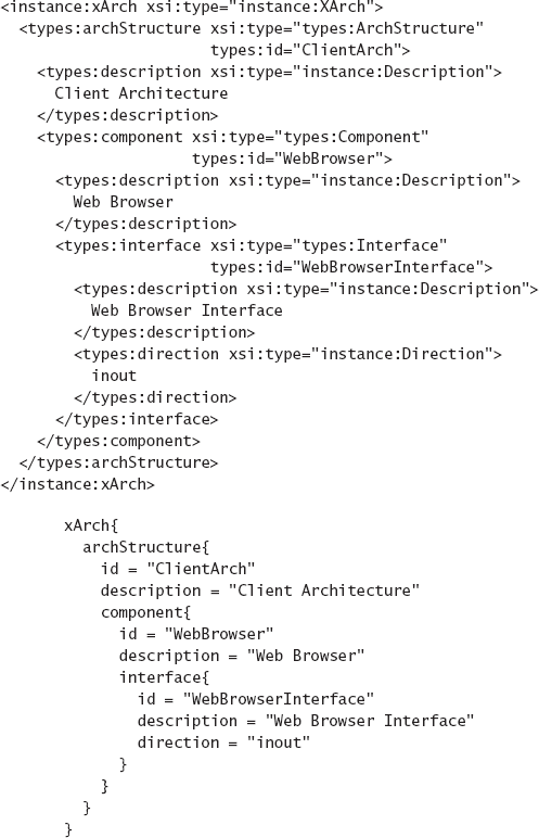
Figure 7-1 shows two textual depictions of the architecture of a Web client consisting of only one component: a Web browser. The first depiction depicts an architecture in xADL's native XML format, and the second depicts the same exact architecture in xADLite. This is an example of different visualizations being applied to the same model. The XML visualization of the architecture is easily read, manipulated, and syntactically validated by XML tools. The xADLite visualization describes the same architecture (and is, in fact, directly derived from the same model), but is better optimized for human readability.
Textual visualizations have several advantages. They generally depict the entirety of an architecture in a particular notation in a single file. Hundreds of text editors are readily available that allow the user to interact with text files. Years of research have gone into technologies for parsing, processing, and editing structured text. When a textual syntax is defined using a meta-language such as Backus-Naur Form (BNF), many tools are available to generate program libraries that can parse and check the syntax of text documents written in that language. Many text editors provide additional developer support for particular notations with features such as autocomplete and syntax checking as you type.
Textual notations have disadvantages, as well. Textual notations are good at depicting data linearly and hierarchically. (Think of a program in a language like C or Java: Linear ordering is done using lines from top-to-bottom, and hierarchical structure is captured using braces and indentation.) However, graphlike structures are not easily understood (by people) through a textual visualization. Additionally, text editors are generally limited to showing a contiguous screenful of text, with few options to organize the text differently (although some advanced environments may include features such as code folding that allow users to collapse a block of text into a single line).
Graphical visualizations depict architectures (primarily) using graphical symbols instead of text. Like textual visualizations, graphical visualizations generally conform to a syntax (this time of symbols instead of text elements), but they may also be free-form (high-level or overview diagrams of architectures are often free-form and stylistic).
Figure 7-2 shows two graphical depictions of the Lunar Lander architecture. The top depiction is a high-level overview of the lander and its mission. While this depiction lacks rigor or formality, it does convey useful information to stakeholders that are encountering the application for the first time. Such depictions are often used as conceptual overviews of complex applications, especially those consisting of many interconnected systems. Standards such as the Department of Defense Architecture Framework (DoDAF, discussed more extensively in Chapter 16) include such depictions—this depiction would satisfy the DoDAF "OV-1" view of the Lunar Lander architecture (DoD Architecture Framework Working Group 2004). Note, however, that it is ambiguous or misleading in several important ways. For example, the lander is tilted somewhat with respect to the moon's surface, which may imply a two- or three-dimensional aspect to the game that does not exist in the final application. It also depicts Earth in the background, which may lead one to believe that communications from Earth play a role in the lander simulation.
The bottom depiction is a logical view of the Lunar Lander architecture, depicting its structure in terms of a component and connector graph. This view is more rigorous, less ambiguous, and depicts more information at the cost of being less accessible to outside stakeholders. The overall mission and purpose of the system is lost in the detail of the components and their interconnections.

Graphical visualizations give stakeholders access to information about an architecture in many ways that textual visualizations cannot. Symbols, colors, and other visual decorations generally can be distinguished more easily than elements of structured text. Nonhierarchical relationships between elements can be seen much more easily in a graph than a text file. Graphical visualizations can use spatial relationships to express relationships among elements. Advanced graphical visualizations may also employ animation or other visual effects to highlight or demonstrate different aspects of architecture. Options for interacting with graphical visualizations are generally superior to text visualizations, as well: Scrolling, zooming, drilling down, showing and hiding different levels of detail, and direct manipulation of objects with the mouse are all commonplace in graphical visualization tools. For example, a graphical environment might allow a user to connect components by simply drawing a line between their interfaces with the mouse.
A major disadvantage of graphical visualizations is the cost of building tools to support them. Many tools exist for creating graphical diagrams—PowerPoint, Visio, OmniGraffle, Photoshop, and Illustrator are a few of the more popular ones. However, these tools lack understanding of architectural semantics, and it is difficult or impossible to add appropriate semantics and interaction operations to these tools so they can be integrated into a wider software engineering environment. Furthermore, these tools generally have their own (usually proprietary) file formats and in-memory models that are difficult to connect to a more architecture-centric representation [(Goldman and Balzer 1999) (Ren and Taylor 2003)].
Graphical and textual are rough ways of categorizing visualizations. Many visualizations blur the line between these categories. Few graphical visualizations use only symbols—generally, text is used to decorate, label, or explain the meaning of various elements. Some visualizations go even further, expressing some kinds of design decisions using graphics and others using text. For example, a UML class diagram is primarily composed of interconnected symbols, but constraints on relationships between the symbols are depicted in the Object Constraint Language (OCL) with an exclusively textual visualization.
Figure 7-3 depicts UML as a hybrid visualization. The class diagram is primarily graphical, capturing the three primary Lunar Lander elements—user interface, calculation, and data store. Alongside the class diagram, textual OCL is employed to depict the constraint that the new burn rate must be nonnegative.
Some visualizations can be composites of many different visualizations, both graphical and textual. For example, the UML composite structure diagram is a primarily graphical visualization used to contain other UML diagrams. Such composite visualizations can be good for displaying relationships between different aspects of the same architecture. Composite visualizations can become complex and confusing quickly as different depiction and interaction mechanisms are combined. Strategies such as drill-down interaction mechanisms, where users can navigate to subvisualizations from a higher-level composite visualization, can mitigate this complexity.
Some visualizations may depict the whole architectural model at once, but more often different visualizations are used to depict different views of the architecture. Chapter 6 presented the concept of views: subsets of the architecture, usually organized around a single concern or set of concerns. Recall the definitions presented:

Definition. A view is a set of design decisions related by a common concern (or set of concerns).
Definition. A viewpoint defines the perspective from which a view is taken.
Effectively, views and viewpoints let us consider different subsets of the design decisions in an architecture. We can apply the same concept of a subset to visualizations: A visualization for a viewpoint defines depiction and interaction mechanisms only for the kinds of design decisions included in that viewpoint. We associate visualizations with viewpoints rather than views because the same visualization can be used to visualize many different architectures; we do not create a new visualization for every architecture. For example, the UML class diagram is a visualization that can be used to visualize the class structure of many different applications. Two different class diagrams are not two separate visualizations; they are simply two instances of the UML class diagram visualization.
When a notation is associated with a set of viewpoints, it is often the case that each viewpoint has its own canonical visualization. UML is a good example of this: Each kind of UML diagram can be seen as a separate visualization. Although UML's canonical visualizations are all graphical, they differ widely. The box-and-arrow–style diagram used to depict components and their relationships bears little resemblance to the automata-like statechart or timeline-like sequence diagrams, as seen in Figure 7-4. This is a natural consequence of the fact that architectural models capture a wide variety of information about a system. What constitutes a useful visualization for one concern may be useless for another concern. Just as system stakeholders should identify the viewpoints they will use to examine and work with an architecture, they should also identify appropriate visualizations for each viewpoint.

All of our earlier comments about the relationship between visualizations and models apply equally to partial models—that is, views. If the same set of architectural design decisions is simply depicted in two different ways, these are not two different views of the architecture, but are two different visualizations applied to the same view.
In Chapter 6, we showed a depiction of Lunar Lander in xADLite, followed by the equivalent depiction in Archipelago. Figure 7-5 repeats the two depictions from Chapter 6 (although the extensive xADLite visualization has been abbreviated). This is an example of two different visualizations for the structural viewpoint being applied to the same subset of design decisions (that is, view) of the Lunar Lander architecture. Thus, we would not say that these are the xADLite view and Archipelago view of the Lunar Lander architecture; these are the xADLite and Archipelago depictions of the structural view of the Lunar Lander system.

The above sections outlined what visualizations are, what kinds of visualizations exist, and the relationships between visualizations, models, views, and viewpoints. However, a key question now emerges: What makes a visualization "good?" How can one distinguish visualizations from one another and choose the best one? Ultimately, the worth of a visualization is dependent upon how well it fits the needs of a project's stakeholders. As we have seen, stakeholder needs and priorities vary from project to project, so a visualization that is perfect for one project may be useless in another. Nonetheless, it is possible to identify some desirable qualities for visualizations, which can be prioritized by stakeholders to fit their specific situations. These qualities include:
Fidelity is a measure of how faithfully a visualization represents the underlying model. In general, the minimum acceptable fidelity for a visualization requires that information presented in the visualization be consistent with the underlying model. It would be extremely confusing, for example, if a structural visualization showed components that were not actually in the architecture, and so on. However, visualizations do not have to address all the information in an underlying model. Leaving some detail out can often make visualizations more effective by focusing attention on the parts of the model that matter in a given situation. Such is the case for visualizations that are associated with particular viewpoints, for example.
Fidelity affects both depiction and interaction. An interaction mechanism is faithful if it respects the underlying syntax and semantics of the visualized notation. For example, an interface that allows stakeholders to change the model in invalid ways may be confusing. A balance must be struck between fidelity and usability; preventing users from making mistakes entirely limits exploratory design.
Consistency is a measure of how well a visualization uses similar depictions and interaction mechanisms for similar concepts. This sense is one of internal consistency (whether a visualization is consistent with itself) rather than consistency with the underlying model (which we call fidelity). In terms of depiction, consistent visualizations display similar concepts in similar ways. For example, in UML, an object is always depicted as a rectangle with an underlined name regardless of the context in which it appears. UML is not perfectly visually consistent, however: In most diagrams, a dashed open-headed arrow represents a dependency, but in a sequence diagram, it represents an asynchronous invocation or message. In terms of interaction, consistent visualizations permit the user to do similar things in similar ways. If double-clicking on one element allows the user to assign a name to that element, requiring the user to right-click and select a menu option to assign a name to another kind of element would be inconsistent.
In general, more consistent visualizations are preferable to less consistent ones. The exception once again occurs at the extremes: Being too consistent might cause a visualization to have a huge and confusing variety of symbols (to make sure no two concepts share a symbol) or limit the conciseness of a visualization.
Comprehensibility is a measure of how easy it is for stakeholders to understand and use a visualization. This makes comprehensibility a function of both the visualization and the stakeholders who use it. Many factors contribute to comprehensibility, including the complexity of the visualization and how information is presented, the complexity of the interaction interface, and the skill sets and prior experiences of the stakeholders.
One way to improve comprehensibility is to narrow the scope of a visualization, limiting the number of concepts it tries to present and optimizing the visualization for only these concepts. Trying to display too much information at once—or many unrelated concepts simultaneously—complicates a visualization and increases its complexity. Alternatively, the comprehensibility of a visualization can be improved by leveraging stakeholder knowledge. For example, using a UML component symbol to represent components in non-UML diagrams can make a visualization more comprehensible to stakeholders that already have experience with UML. (Of course, this can backfire if stakeholders bring along assumptions about UML components that are not being implied by the use of the symbol.)
Dynamism is a measure of how well a visualization supports models that change over time; in Chapter 6 these are referred to as dynamic models. Information about changes flows two ways: changes to the model (from whatever source) can be reflected in the visualization, and changes to the visualization (through one of the interaction mechanisms) can be reflected in the model.
A range of possibilities exists here. An ideal dynamic visualization will be immediately updated when the underlying model changes from any source. Additionally, changes to the visualization through interaction mechanisms should cause the model to be updated accordingly.
In general, the depiction of a dynamic model will involve some kind of asynchronous animation; otherwise, the visualization will become inconsistent as the model changes. A less desirable alternative is to allow the user to manually refresh the visualization, optionally notifying the user when the underlying model has changed so that they can perform a refresh operation. With respect to interaction, any visualization that allows editing must be, to some extent, dynamic. Visualizations that update the underlying model in real-time, as the user works, are generally preferable to those that only synchronize changes periodically or at the user's request through, for example, a Save operation.
View coordination is how well one visualization is (or can be) coordinated with others. In general, environments that allow multiple visualizations to be presented and used simultaneously give users more insight and capability when designing or reviewing an architecture. However, coordinating multiple visualizations is not always straightforward or easy. Strategies for coordinating visualizations are discussed in their own section below.
Aesthetics is a measure of how pleasing a visualization is to its users. Aesthetics is not limited to depiction; user interfaces have aesthetic qualities as well. Here, depiction is the look and interaction is the feel of the visualization. Compared to other qualities, aesthetic qualities are extremely subjective. However, there is an enormous amount of literature available on evaluating and designing aesthetically pleasing displays of information. This comes from both the computer science community (for example, user interface design) and from other communities (art, advertising, marketing, and so forth). For example, color theory is instructive in choosing attractive and complementary colors for graphical visualizations. Determining which colors are complementary is easy with a color wheel and some basic knowledge of how color schemes are constructed, but difficult using intuition alone.
Technologists have a tendency to ignore or deprioritize aesthetic aspects of visualizations because they generally add little functional value. However, aesthetic qualities can often make the difference between a visualization being accepted or rejected by potential users.
Extensibility is a measure of how easy it is to modify a visualization to take on new capabilities, for either depiction or interaction. Just as underlying models and notations are often extended to support domain- and project-specific goals, visualizations of those models must be extended as well. A visualization that is difficult or impossible to extend will become less and less useful as underlying models expand to take on new concepts.
Mechanisms to support extensible visualizations include plug-in APIs, scripting support, and even simply open-sourcing the code that implements the visualization so others can modify it.
By now, it should be clear that the kinds of concepts that can be captured in an architecture are diverse and complex. They range from structural components and connectors to their interfaces to the schedules according to which they will be developed. Stakeholders choosing to include these elements in their architectures will also have to choose how they are depicted and manipulated in various visualizations.
If a preexisting or off-the-shelf notation is used to capture the architecture, its canonical visualizations will be available. For example, UML captures the notion of a class and has a specific symbol used to depict that class.
When decisions are captured that do not have a canonical visualization, or the canonical visualization is insufficient or inadequate, stakeholders have the option of constructing new visualizations. Creating good visualizations is somewhat of an art form, but there are a few things that can help.
Borrow Elements from Similar Visualizations. Even if you choose not to use UML to capture your architecture, it may be valuable to borrow certain symbols or conventions from UML, such as the shape of a package symbol to depict one of your packages or the closed white-headed arrow to depict a generalization relationship. This has the advantage that many users already will be familiar with the depiction and its meaning. However, there are also drawbacks: Users may assume that your diagrams are UML (when they are not) or they may assume specific semantics that you did not mean to import when you used the symbol. A good visualization will strike a balance. One good source for generic symbols that do not carry extensive semantic implications is flowcharting. Although flowcharts have fallen further and further into disuse as programs have become more complex, they are still well understood by a wide variety of users. Common flowcharting symbols useful outside the context of flowcharts include the diamond (decision point), the vertical drum (disk storage), the sideways drum (memory storage), and so on.
Be Consistent among Visualizations. If you are depicting the same concept in many visualizations, use similar symbology. Likewise, try to avoid using the same symbology to depict different concepts in different visualizations.
Give Meaning to Each Visual Aspect of Elements. In a diagram depicting many components, it is tempting to assign different colors to components just so the diagram will not look too monochromatic. While this may be aesthetically pleasant, it is confusing from a semantic perspective since the visual aspect of color has no relationship with the underlying architectural model. It is a good idea to use visual decorations, but each decoration should have precise meaning.
On a related note, users have a tendency to (often subconsciously) embed real semantic information in visual decorations without making that information explicit in the architectural model. For example, in a box-and-arrow graph depiction, a user might place components close to one another to indicate that they share functionality or arrange the components in a layered fashion to reflect an implicit understanding that there are layer-like dependencies in the architecture. When this occurs (and the relationships are not formally documented), valuable information becomes embedded and lost in the visualization. Here, stakeholders should consider whether these visual relationships have semantic importance and, if so, find a way to include them explicitly in the system's models.
Document the Meaning of Visualizations. While we would all like to think that our diagrams and other visualizations are self-explanatory, this is generally not the case. Documenting what each aspect of the diagram means, using a legend, design document, or organizational standard is key to reducing confusion among stakeholders. At best, each aspect of the visualization should correspond to a piece of information in the model.
Balance Traditional and Innovative Interfaces. It is fair to assume that most stakeholders involved in software design will have used a significant amount of software themselves. As we have pointed out, borrowing well-known depiction and interaction techniques allows users to leverage their previous experience. However, adhering too closely to this guideline will result in stagnant visualization design. From time to time, consider borrowing useful nontraditional and innovative visualization features as well, or even developing one's own.
For example, most users will assume that a box-and-arrow graph visualization for an architecture's structure will look and work like that of PowerPoint or Visio. However, it is almost certainly not the case that PowerPoint and Visio have perfected box-and-arrow graph editing. Here, one could consider advanced layout paradigms such as fish-eye layouts, where information is displayed at large sizes in the center of the display and at smaller sizes at the edges, or drill-down paradigms, where zooming in is used as a visual metaphor for looking at more detailed information. A good source of inspiration in visualization design is other software packages that are outside the realm of software design, such as CAD applications, video games, and so on. Aspiring visualization designers should take note of unusual but useful user interfaces that they encounter and determine how to apply those design ideas to architecture visualization.
When multiple visualizations of the same information are available, it is key to coordinate these visualizations with each other, so that changes to the information via one visualization are accurately reflected in other visualizations. If the visualizations are not coordinated, they can become out of sync and cause confusion.
It is important to distinguish the coordination of multiple visualizations from maintaining architectural consistency. Here, we are only dealing with ensuring that multiple visualizations of the same (parts of the) architectural model are up to date with respect to the model. Inconsistencies and conflicts between design decisions stored in the model are a separate issue.
Stakeholders must decide how and how much to allow multiple visualizations to display the same architectural information at the same time. If users are only allowed to view information through one visualization at a time, visualizations can be synchronized with the architectural model when they are called up. They can also assume that the model will not change due to some external influence while they are active—any changes to the model will be made through this single visualization.
However, if the same information can be visualized in many ways simultaneously, it is generally a good idea to synchronize the visualizations in real-time so that they accurately depict the underlying model. This situation is much more complicated, since any visualization can change the model, and the other visualizations must respond appropriately to that change. If the visualizations include both depiction and interaction, then both the depiction and the interaction state of the visualizations must be updated. This might mean changing editing modes, updating menu options, and so on.

Figure 7-6. Multiple strategies for coordinating visualizations of the same information: (a) peer-to-peer, (b) master-slave, (c) pull, and (d) push.
Coordinating multiple visualizations can be accomplished through many well-known methods, depending on the situation. For situations where information may be visualized through only one visualization at a time, a simple import-export method usually works best: Initial depictions are created when the visualization is called up and stored (if necessary) when the visualization is dismissed.
Situations where multiple simultaneous visualizations are allowed are harder to deal with. In these cases, four general synchronization strategies are available (see Figure 7-6):
Peer-to-Peer. The visualizations maintain their own copies of information from the model, know about each other and explicitly notify one another about changes. These strategies can be brittle because they tend to tightly couple visualizations. They require many point-to-point dependencies. The number of dependencies is
Master-Slave. One visualization is primarily responsible for interacting with the model repository, and it serves as the "master" visualization. Other slave visualizations coordinate through this master, either through a push- or pull-based strategy (see below). This works well when one visualization is auxiliary to another; for example, imagine a graphical editor where the main window shows a zoomed-in version of a portion of the architecture, but the corner of the window is portioned off to show a thumbnail of the entire architecture at the same time (for providing context to the user or serving as a navigation aid).
Pull-Based Each visualization repeatedly queries a shared model for changes and updates itself accordingly. This may happen manually—at the user's request, automatically at periodic intervals, or in response to certain actions (for example, when the user clicks on a new visualization or attempts to make a change to a different visualization). One disadvantage of pull-based strategies is that they may display out-of-date information until they perform a pull operation. Pull-based strategies can be used when the model repository is entirely passive (for example, a data structure that does not send out events when it changes, or a database system without triggers). When visualization updates are computationally expensive, pull-based strategies can be used to limit how often visualizations are updated. Also, if only one visualization is actually visible at a time, it might not be worthwhile to update a visualization until the user calls it up.
Push-Based Visualizations are notified and consequently update themselves whenever the model changes. Notifications are usually multicast to visualizations through asynchronous events. This is the strategy employed by the model-view-controller pattern. Push-based strategies keep all visualizations up to date. These strategies work well when multiple visualizations are presented to the user simultaneously.
In situations where the architecture is organized into multiple (partial) models, it is sometimes possible to coordinate access to these models through a single visualization, thus masking some of the differences between notations or combining the strength of multiple visualizations. Figure 7-7 shows an architecture whose component-and-connector structure is expressed in xADL 2.0, but the detailed design of each component is expressed in UML.
As discussed above, architecture visualizations are primarily used to depict and allow interaction with the design decisions that comprise an architecture. However, more advanced and dynamic visualizations can be used to gain an even deeper understanding of the architecture.
We now introduce the concept of effect visualizations.
Definition. An effect visualization is a visualization that does not represent architectural design decisions directly, but instead represents the effects of architectural design decisions.
For example, imagine an architectural model that contains enough information that it can be used as the basis for a behavioral simulation. The output or results of this simulation are not strictly an architectural model, since they are the results of the design decisions made in the architecture rather than the decisions themselves. Thus, visualizations of such results are not strictly architectural visualizations. These results, however, can be extremely effective in helping stakeholders to better comprehend, implement, or debug the architecture. Therefore, it is useful to consider these effect visualizations in tandem with more traditional architecture visualizations.
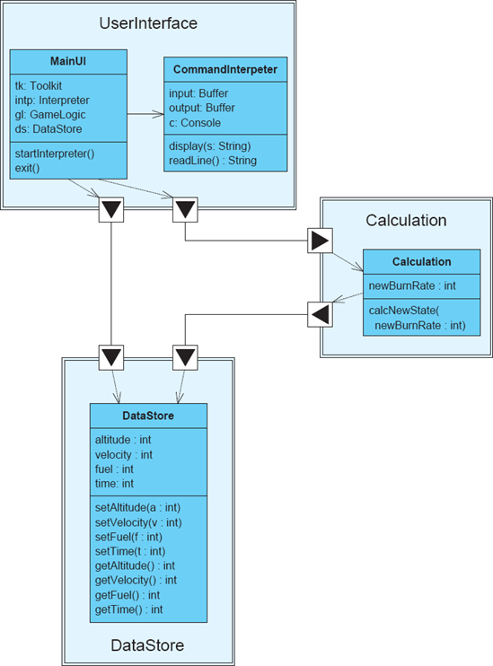

Figure 7-8 shows common strategies for generating effect visualizations. In general, a rich architectural model serves as one input, and an implemented version of the system or a prototype may serve as another. These are fed into a tool that can analyze or simulate the behavior of the system, or perhaps record and trace the operation of the system implementation or prototype. The output of this tool may include static simulation results or animations that demonstrate the operation of the (simulated) system.
Several architecture tools provide effect visualizations, including Rapide, the Labeled Transition State Analyzer (LTSA), and the Message Tracing and Analysis Tool (MTAT). These tools are discussed in more detail in Section 7.5.
While this chapter has focused mainly on techniques for constructing a broad variety of effective visualizations, we can also learn from common mistakes people make in designing visualizations. The following sections present some of these mistakes.
When the same symbol is used multiple times in the same visualization, or even across related visualizations, it becomes confusing for users if different meanings are applied to the symbol. This is extremely common for generic symbols such as basic shapes (rectangles, ovals, arrows with default heads). Graphical visualizations provide users with a wide variety of ways of creating distinctive symbols—shapes, decorations, icons, borders, arrowheads, fills, and so on. All of these can be used to make visualizations richer and more precise.
Figure 7-9 shows a simple but deceptive diagram of a client-server system. Here, both the clients and the server are represented by the same symbol (a rectangle), even though they are distinct. The clients and server are all connected with the same type of plain line, although labels clearly indicate that these are different kinds of connections. Additionally, given the duties of the clients indicated by these connections—data, control, monitoring—it is possible that the clients are not even like one another, even though they appear to be.
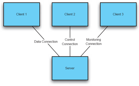
Graphical visualizations in which similar elements are repeated over and over (such as the same kinds of components or the same kinds of links) can often appear uninteresting or aesthetically flat. It is common to try to spice up such diagrams by adding decorations and other changes to symbols, primarily for their aesthetic value.
Figure 7-10 shows an example of this situation. Here, the otherwise uniform PC clients each are depicted with a different symbol. Different connection styles (including a random assortment of line styles and arrowheads) connect these uniform clients to the server, all for the same purpose. While this diagram does indeed look more interesting than the one in Figure 7-9, it only serves to confuse. It implies that there is heterogeneity among the clients, and that the connections between the clients and the server are substantially different.
Differences without meaning are not the only problem some graphical visualizations suffer. A related mistake is the consistent inclusion of visual decorations that indicate meaning but are not intended to convey it. A classic example of this is the use of double-headed arrows to indicate a simple connection between two symbols. The arrowheads imply directionality: that information or control is flowing in both directions across the connection. Often, the intended meaning is simply an association; in this case, the arrowheads only serve to confuse the issue by indicating flows where there are none.

Figure 7-11 shows a seemingly innocuous entity-relationship (ER) diagram. These diagrams are used to indicate various elements of a system and their quantity relationships to each other. For example, there is one business logic element in the system, associated with one ordinary server and many backup servers. However, the connections on the diagram are all two-headed arrows. Traditionally, ER diagrams do not include directional associations, since they are not meant to imply dependency, data flow, or any other meaning commonly associated with arrows. These additional decorations may imply things about the relationships between these elements that are simply not true.
Visualizations are never truly interpreted anew; they are always seen through the lens of the user's previous experience and knowledge. Experienced users are familiar with a catalog of other visualizations and the symbols and meanings associated with those visualizations. Using symbols that are strongly associated with a different visualization is a good idea if the (rough) meaning of the symbol is brought along as well. Using the same symbol to mean something completely different is a recipe for disaster. For example, using the closed white-headed arrow in a diagram to mean "calls" will likely confuse UML users who will interpret that arrow as meaning "generalization."
Figure 7-12 shows a simple logical layout for an application. In terms of the issues above, it fares well: three different kinds of symbols are used for three different kinds of components, only one kind of arrow is used and it indicates a calling dependency, and so on. The problem with this diagram lies in the choice of symbols. All these symbols are used in classic flowchart diagrams. The vertical cylinder, used in this diagram to represent the business logic component, is generally used in flowcharting to indicate a data store or disk. The box with a wavy bottom, used here to represent the data store component, is usually used to represent a document or data file. Users familiar with these interpretations might incorrectly infer that the data store was not a component, but simply a file, and that the business logic also acted as some sort of data store.


In the past sections, we have explored a number of dimensions that can be used to characterize different visualization techniques. These dimensions can be straightforwardly turned into a rubric for critically thinking about and evaluating different visualizations. This rubric will be applied to several techniques in the remainder of this chapter.
This section surveys representative examples of a variety of architecture visualizations that are used in research and practice, from traditional textual and graphical visualizations to more exotic tools that use animation and effect visualizations.
There are literally as many textual visualizations as there are text editors. Many models' canonical visualizations are text-based. The most rudimentary text-based visualizations are provided by editors such as Windows Notepad, or "pico" and "joe" on UNIX systems. These editors display architectural models in a structured text format, in a single font and color. Interactions in these basic text editors is limited—users can edit through rudimentary commands such as inserting and deleting characters, and copying-and-pasting blocks of text.
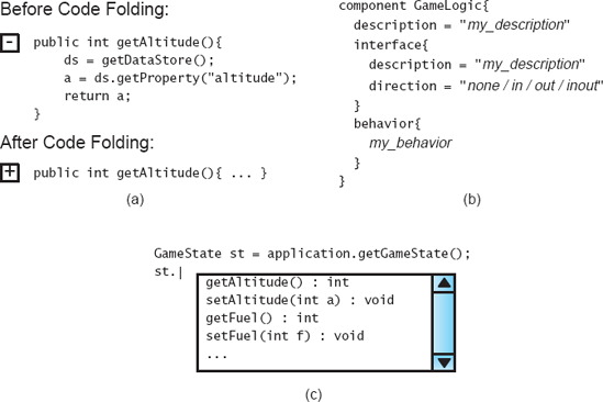
Figure 7-13. Various advanced techniques used in text visualizations: (a) code folding, (b) templates, and (c) autocomplete.
Enhanced text editors, such as those found in many integrated software development environments, support a similar base-feature set, but offer many improvements as well. These improvements are mostly available through the text editor having some internal knowledge of the syntax or semantics of the underlying notation. Common depiction enhancements include syntax coloring and code folding. Editors with syntax coloring support identify segments of text as tokens and color them to represent the type of token (keyword, character string, number, variable, and so on). Code folding is a technique whereby the editor can identify blocks of text and "fold" those blocks into a single line to reduce the amount of detail shown. Both these techniques require that the editor have an understanding of the syntax of the underlying notation. Common interaction enhancements include code completion and templates. Interfaces with code completion allow the user to type some or all of a token, and have the editor present options for completing the token to save typing. Templates allow the user to insert a block of text with placeholders and then enter data for each placeholder. Some of these depiction and interaction techniques are shown in Figure 7-13.
PowerPoint and similar graphical editors [(Microsoft Corporation 2007) (Microsoft Corporation 2007) (The Omni Group 2007)] are commonly used to capture architectural design decisions despite the fact that these tools have no support for architectural semantics—they are simply diagram editors. With no real graphical syntax or semantics, the power and allure of informal graphical modeling is not derived from the model or the notation, but from its visualization. From a depiction standpoint, informal graphical diagrams are generally straightforward and aesthetically pleasing. Text, symbols, and bitmap graphics coexist in depictions as needed. Nothing is hidden; everything in the depiction is visible on a single page or slide. The page provides a natural limitation on how much detail can be presented at a time; by having finite boundaries, it limits the complexity of the visualized information. By building up a slide deck or using tools such as PowerPoint's animation capabilities, it is even possible to depict the evolution of an architecture over time.
The most attractive aspect of informal graphical editors, however, is their user interfaces. These editors are characterized by point-and-click interfaces that allow users to create and manipulate diagrams with great ease and flexibility. Symbols can be created and moved simply by dragging and dropping. PowerPoint's connector lines will even maintain their connections as the shapes they connect are moved around the canvas. Users can easily add media from outside sources as well: Bitmap graphics, vector graphics, screenshots, and even video and audio clips in nearly any format can be added to these diagrams with only a few mouse clicks.
Figure 7-14 shows PowerPoint being used to draw a Koala-style architecture. Although the visualization is attractive, certain problems are already apparent. The various elements shown are just independent shapes and text. For example, the interfaces on the components are simply white boxes with black triangles on top; PowerPoint has no concept of an architectural interface. They are not even attached to the rectangles representing components; they simply overlap the edges. Because the diagram is not bound to any semantic representation, keeping it consistent with other models must be done manually. The graphical shapes and decorations available cannot be easily extended. There are no facilities in the user interface for establishing repeated patterns or for extending the interface to take into account architectural concepts.

UML as a notation was discussed in Chapter 6. UML has an associated canonical depiction that is primarily graphical. We have seen several examples of UML diagrams already, such as in Figure 7-4. Compared to the free-form nature of informal graphical editors that deal in boxes and arrows, UML diagrams are visualizations of more semantically meaningful elements such as classes and statechart nodes.
UML concepts are mapped to particular graphical symbols. For example, the "generalizes" relationship between elements is mapped to an arrow with a closed, white, triangular head. While certain concepts (and, as such, their associated symbols) are only present in certain diagrams, diagrams that incorporate common concepts use the same symbol in each diagram. For example, the "generalizes" relationship is present in both the class and object diagrams, and the same symbol (the closed white arrow) is used to represent the concept in both diagrams. Interestingly, although UML's syntax is defined in a graphical meta-model, the UML meta-model does not actually map UML concepts to symbols; this mapping is described in other documentation.
Even when taking into account this additional documentation, UML is only associated with a canonical depiction and not a canonical user interface. That is, UML's designers prescribe how UML diagrams should look, but not how the user should interact with them in tools or editing environments. These decisions are left up to individual tool vendors, and tools such as Rational Rose (Rational Software Corporation 2003) and ArgoUML (Argo/UML) have different mechanisms for manipulating and otherwise interacting with UML diagrams. Figure 7-15 shows a screenshot from ArgoUML editing a UML model. Note that the canonical graphical visualization is only one part of the environment. Another visualization of the model as a tree is present on the left side. Tools accessible from the menu and from the tabbed area below allow the model to be manipulated in different ways.
Tools such as Rose and ArgoUML provide compelling user interfaces, but often can blur the distinction between what is provided by the tool and what is provided by a modeling notation. For example, the screenshot in Figure 7-15 includes an editor for a to-do list. UML itself has no concept of a to-do list; this is a feature of ArgoUML. Users must be cognizant of these distinctions, as they can make it more difficult to integrate multiple tools operating on the same model, or to switch from one environment to another.

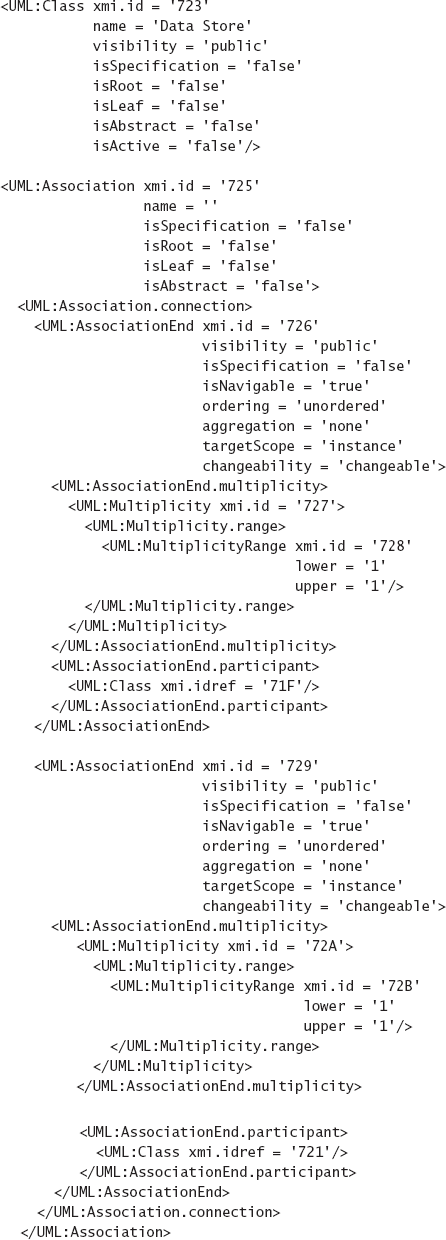
The canonical graphical visualization is not the only visualization available to UML users. Although it is not part of the core UML standard, it is possible to visualize UML data using text through the use of XMI (Object Management Group 2002). XMI is an XML-based format devised to facilitate interchange of models between tools. It is an interchange format in which a UML model can be encoded in XML. XMI helps to draw out the distinction between UML and its canonical graphical visualization. Plain XMI encodes only the information in a UML model, but not information about diagram layout from graphical visualizations. An extension to XMI that includes this information is provided in a separate standard. Figure 7-16 shows an excerpt of an XMI document generated by ArgoUML. Note the amount of text used to depict a simple point-to-point association, as well as the lack of information about graphical depiction, layout, or positioning.
One of the main advantages of UML's canonical graphical visualization is the (mostly) consistent use of symbols across diagrams and projects. The rationale behind this decision is that it increases the ability of stakeholders who are familiar with UML to quickly understand the meaning of diagrams in different contexts. In this regard, UML's popularity creates a network effect: The more people who use UML, the more valuable the consistent use of these symbols becomes.
UML's consistent use of symbols has limitations and disadvantages, however. Symbolic consistency in visualization cannot create semantic precision at the notational level. That is, if the concept of generalization is semantically ambiguous, the consistent use of the same arrow shape to depict the concept cannot repair this ambiguity. Additionally, the use of the same set of symbols across project and domain boundaries limits how much UML can be specialized for a particular domain. UML tools and standards do not generally support a lot of customization in UML visualizations for individual projects or domains. For example, Rational Rose allows users to associate stereotypes with graphical icons, but will not fundamentally change the symbol of the element to which the stereotype is being applied.
Effect visualizations, which depict the effects of architectural decisions rather than the decisions themselves, can be seen in the Rapide project (Luckham and Vera 1995). Chapter 6 shows several architectural models in Rapide's canonical textual visualization. However, the real power of Rapide comes from tools that allow users to run simulations of these architectural models. The Rapide simulator takes architecture models in the Rapide notation as input, and then simulates the interaction of the various components as defined by the behaviors specified in the model. Simulation runs generate a stream of events, some of which are causally related to one another. Because Rapide components run in parallel, the results of simulations are not strictly deterministic: Repeated simulations of the same architecture can generate different event streams depending on how the simulator's scheduler allocates time to the various components.
The result of a Rapide simulation is a directed graph of nodes, with each node representing an event and each edge representing a causal relationship between events. An example, originally -presented in Chapter 6, is shown again in Figure 7-17. This can be seen as a kind of visualization of the system and its architecture. Even though it does not necessarily depict specific design decisions, it depicts the direct result of architectural design decisions and can equally serve to provide stakeholders with insights about the workings of the architecture.
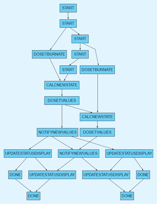
The Labeled Transition State Analyzer (LTSA) project from Imperial College in London, UK, is a way of analyzing and simultaneously visualizing concurrent systems (Magee and Kramer 2006). A system in LTSA is modeled as a set of interacting finite state machines. Users specify component behaviors in a compact process algebra called finite state processes (FSP); FSP is then compiled into state machines with labeled transitions. The LTSA tools can visualize these state machines graphically using a traditional nodes-and-arrows visualization.
Figure 7-18 shows a screenshot of the LTSA tool. Multiple concurrently maintained visualizations are shown. The upper-right area shows the canonical textual visualization of the model: raw FSP. To its left is a tree-based visualization of the project's organization. The lower-center section shows a graphical visualization of the FSP model as a state-transition diagram. The lower-right shows a textual effect visualization that results from automated analysis of the FSP model; animated effect visualizations are also available.
A unique strength of LTSA is its ability to employ dynamic visualizations. Because LTSA deals with concurrency, its visualizations have a specific need to present the state of systems over time. LTSA employs two strategies for this purpose, both employing animation. First, when a labeled transition state (LTS) is simulated and its state machines are being viewed, the current state and state transitions are animated atop the nodes-and-arrows visualization shown in Figure 7-18. Second, and more interestingly, LTSes can be hooked up to animated visualizations that use animation to directly show what is going on in the system from a domain-specific perspective.
One of the examples included in the LTSA documentation is an implementation of the famous dining philosophers problem shown in Figure 7-19, a classic problem in dealing with concurrency. In this problem, a set of philosophers sit around a circular table. In between each pair of philosophers is a fork. Philosophers need to pick up both their adjacent forks to eat, but are also constrained by a set of rules as to when they can pick up and put down forks. The challenge in the problem is coming up with a set of rules such that all philosophers get to eat periodically and the system does not enter a locked state (for example, in which each philosopher picks up one fork and none will put one down).


The LTSA tools model the philosophers as communicating state machines, but can also visualize the models as a diagram of a table surrounded by philosophers, similar to what is shown in Figure 7-19. State changes, like a philosopher acquiring a fork, are visualized as an actual picture of a philosopher picking up fork. Simulations of other applications, such as air traffic control, use similar domain-specific visualizations hooked up directly to the component behavior simulators (such as pictures of airplanes circling and landing). Unlike Rapide, which only allows users to visualize event traffic in a graph after the fact, LTSA allows users to visualize the system being simulated in real-time, using animations and symbols that are directly drawn from the real domain. Although users of LTSA have to spend time and effort to construct these domain-specific visualizations for each application, their value comes from the fact that they go a long way to communicate the real meaning of abstract state machines. It may be difficult to understand the meaning of a particular state transition in a nodes-and-arrows diagram, but it is much easier to understand a picture of a philosopher actually picking up a fork.
The syntax of the xADL 2.0 language is defined in a set of XML schemas. As such, the canonical visualization for xADL 2.0 files is textual, in XML that conforms to the syntax prescribed by the schemas. One of the most interesting aspects of xADL 2.0, however, is that its canonical visualization is rarely (if ever) used or even seen by its users. Tools that support xADL 2.0 modeling provide a variety of alternative visualizations, both graphical and textual (Dashofy 2007). Some of these visualizations include the following.
The xADLite visualization has been used throughout this book to describe various architectures. xADLite is a textual visualization that captures xADL 2.0 models using textual tokens organized in a manner similar to C-like programming languages: Hierarchical blocks are surrounded by curly braces, the "=" operator is used to denote assignment, double-quotes surround string values, and so on. This visualization was specifically crafted to capture all the data in a xADL 2.0 model in a compact format, using few extraneous characters. The programming-language-like symbology was chosen due to the popularity of this organization: Experienced software developers are comfortable with these symbols and organization and can read it easily without additional training. From a user-interface perspective, xADLite files are written and manipulated using standard text editors.
ArchEdit, shown in Figure 7-20, is a tool that provides a semigraphical visualization of xADL 2.0 models. The document structure is depicted in a tree format with selectable nodes. When a node is selected, text attributes of that node are displayed for editing. Although the information in this view is organized hierarchically (much like the XML or xADLite visualizations), the user interface of ArchEdit is far more interactive. ArchEdit has a point-and-click interface that not only allows users to expand and collapse subtrees of the document, but also provides context-sensitive menus that provide the user specific options to add, remove, or manipulate elements. ArchEdit provides a syntax-directed visualization: the user interface and what is displayed on the screen are both derived, at least partially, from the syntax of xADL 2.0 itself. For example, when you right-click on an element in ArchEdit, it brings up a menu of children that can be added to that element. The list of available children is generated based on the definition of the xADL 2.0 language, and is not hardcoded in the tool itself. For a language with malleable syntax like xADL 2.0, syntax-directed visualizations and other tools become even more valuable. The primary disadvantage of (even the best) syntax-directed visualizations is that the syntax of the underlying notation drives how the information is visually presented. If the notation is treelike and hierarchical, it is likely that a syntax-directed visualization of the notation will also employ trees and hierarchy.
Archipelago, shown in Figure 7-21, is a tool that provides graphical visualizations of xADL 2.0 models. Archipelago's visualizations are semantically aware, meaning that specific depictions and behaviors are built into Archipelago to represent and interact with different xADL concepts. For example, components and connectors are represented as rectangles, interfaces are represented as square endpoints attached to the borders of component and connector rectangles, and links are represented as splines. Unlike ArchEdit, which can adapt its user interface automatically to new syntactic elements, Archipelago must be extended with new code to support new xADL 2.0 concepts. However, Archipelago can provide much more intuitive visualizations to its users; it is much easier to understand an architectural topology by looking at a box-and-line graph than a flat list of components, connectors, and links.

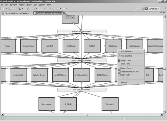
Archipelago's internal architecture relies heavily on plug-ins for implementing visual elements and their graphical representations as well as behaviors—how Archipelago reacts to user input and external events. In fact, Archipelago itself is really a small core of extension points; almost all of its behavior is implemented by plug-ins. This makes Archipelago a highly flexible environment for adding new visual elements and behaviors, a real necessity when the underlying notation being visualized (xADL 2.0) is itself modular and extensible.
The primary disadvantage of fully semantics-aware editors such as Archipelago is the expense of creating and maintaining them. Users expect intuitive, comprehensive, custom behavior tailored to individual notations, and for more extensive notations this can be quite costly to build. Archipelago attempts to limit this cost by using a modular architecture, but this cannot reduce the complexity of such editors to anywhere near the level of simpler syntax-directed editors.
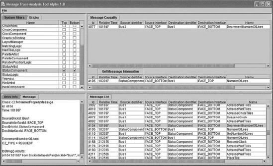
The Message Tracing and Analysis Tool (MTAT) (Hendrickson, Dashofy, and Taylor 2005), shown in Figure 7-22, provides additional visualization support for xADL 2.0 architectures that are mapped to implementations composed of components that interact using asynchronous events. Like Rapide and LTSA, MTAT's visualizations capture a dynamic aspect of a system's architecture, namely the sending and receiving of events. However, unlike Rapide and LTSA that work only on simulated architectures, MTAT provides a unified visualization of two life cycle activities: architecture design and implementation. Events visualized in MTAT are real events sent among components in a real system. Animation can overlay these events on structural diagrams of the architecture visualized in Archipelago, and the user can follow a string of events from component to component, watching how the running application works at the same time.
We have focused here on the role of visualization in software architecture-based development. Visualizations comprise depiction (how a set of design decisions is visually presented) and interaction (how stakeholders interact with, explore, and manipulate those depictions).
Perhaps the most important lesson from this chapter is that visualizations are not the same things as their underlying modeling notations. Every modeling notation has at least one canonical visualization, which may be textual, graphical, or a combination of both. It is difficult and sometimes counterintuitive to try to mentally separate the information content of a model from its canonical visualization, but making this distinction is useful. Once this distinction is made, it is possible to think about alternative or coordinated visualizations for the same model. It is also possible to separate the strengths and weaknesses of a modeling notation from the strengths and weaknesses of how that notation is visualized. This distinction also helps to explain phenomena such as the use of PowerPoint-like tools for architecture modeling. Here, the visualization is extremely mature and versatile, but the underlying model is devoid of semantics. This makes these tools attractive but dangerous to use in the long run.
When selecting visualizations for a project, do not neglect effect visualizations. Recall that effect visualizations do not visualize architectural design decisions directly, but the results of applying some process to those design decisions—analysis, simulation, and so on. Often, so much focus is put onto model visualization that these effect visualizations get short shrift. Remember that analysis and simulation results are critical and must be interpreted correctly; this can be made substantially easier with the use of appropriate effect visualizations.
Used appropriately, visualizations can make working with, understanding, exchanging, and communicating about architectural design decisions much easier. To maximize this effect, select visualizations with high degrees of fidelity, consistency (both internal and external), comprehensibility, dynamism, and so on. These decisions should be considered in the context of the target stakeholders and their own needs, skills, and prior experiences.
In this chapter and Chapter 6, we discussed how architectural design decisions can be captured in models, and how those models can be visualized. We have reiterated that semantically rich models are more valuable than semantically poor ones. The next chapter explains why. There, we discuss how architectural analysis leverages semantic information in models to help stakeholders discover important system properties early, before they propagate into later design phases where they are expensive to change.
What is a visualization? What two key elements comprise a visualization?
What is the difference between a visualization and a modeling notation? What is a canonical visualization?
Identify and describe the two primary categories of visualizations.
What are hybrid visualizations? Identify a hybrid visualization and describe why it is a hybrid.
What is the relationship between visualizations, viewpoints, and views?
Enumerate and describe some criteria that can be used to evaluate visualizations.
When should you consider creating a new visualization? Enumerate and describe some strategies for creating an effective new visualization.
What does the work of Edward Tufte have to say about software architecture visualizations? What are his key insights?
Enumerate and describe some strategies for coordinating multiple visualizations.
What are effect visualizations? Where do they come from? How are they different from ordinary architecture visualizations?
Enumerate and describe some common problems that arise in architecture visualization.
What kinds of visualizations are associated with UML? How do these complement and differ from each other?
How do Rapide and LTSA utilize effect visualizations?
What kinds of visualizations are associated with xADL 2.0? What are the strengths and weaknesses of these visualizations?
Identify a notation that is supported by two different visualizations (for example, a graphical and textual visualization). Model a system of your choosing, such as Lunar Lander, in both visualizations. Compare and contrast the experiences, and note especially what kinds of information were easy, hard, or impossible to capture in either.
Acquire and install a system that uses effect visualizations, such as Rapide, LTSA, or MTAT. Find a partner and have each of you model a small system using these tools. Trade systems and see how the effect visualizations can be used to help understand each other's models.
Choose one or more architectural visualizations not described here and evaluate it using the evaluation rubric presented in the chapter. What are their strengths and weaknesses?
Choose an architecture modeling notation and construct a simple novel visualization for it. For example, develop a simplified graphical editor that focuses only on a few kinds of elements, or use a translation technology such as XSLT to transform a complex textual depiction into something more readable.
Identify an unusual user interface feature (depiction, interaction, or both) that you have seen outside the context of architecture visualizations—perhaps in another application, a Web interface, or a video game. How might you apply this to architecture visualization? Would it be an improvement or a hindrance?
Choose an architecture visualization (or set of visualizations) not presented here. Does it follow the guidelines in this chapter for effective visualizations? Does it exhibit any of the common problems associated with visualizations? Develop a constructive critique of the visualization along these lines.
Most of the visualizations you will encounter are canonical visualizations, and so are documented in the same places as their associated tools or underlying notations. Such is the case for PowerPoint-like tools [(Microsoft Corporation 2007) (Microsoft Corporation 2007) (The Omni Group 2007)] and UML (Booch, Rumbaugh, and Jacobson 2005), as well as several others. It is also interesting to investigate related visualizations that are not canonical, such as XMI (Object Management Group 2002). Systems like Rapide (Luckham and Vera 1995) and LTSA (Magee and Kramer 2006) are interesting for their use of effect visualizations.
The work of Edward Tufte (Tufte 2001; Tufte 1990), cited in a sidebar in this chapter, is excellent reading for anyone who wants to present complex information in a clear, coherent way. Although he focuses mainly on the display of scientific, quantitative data, many of his ideas are easily translated to other domains and applications.