
Figure 18-13: Winamp’s action drawer opened to expose additional player controls. This is the same screen as Figure 18-12.
Source: Nullsoft
Chapter 18: User Action Design Patterns
This chapter introduces and explains the user action design patterns. These patterns can help you solve issues related to presenting and performing user actions. Some of the design patterns are very commonly used and are an integral part of the Android platform (like the Action Bar pattern), whereas others are much more rare and solve more obscure problems.
The user action design patterns discussed in this chapter include the following:
• The Action Bar pattern
• The Quick Actions pattern
• The Action Drawer pattern
• The Pull-to-Refresh pattern
• The Swipe-to-Dismiss pattern
Using the Action Bar Pattern
The Action Bar is the styled top bar of a user interface view that consists of the app icon and the contextual action buttons. It can also optionally contain an overflow menu as well as some navigation options. The Action Bar is one of the defining user interface design patterns of the Android user interface language. This design pattern has been around for a long time and has become one of the most recognizable components of the Android user interface.
Problems Addressed
The Action Bar pattern can potentially be a solution to multiple different problems, each of which is discussed in the following sections.
Important Contextual Actions
Mobile apps have many actions that users can perform on any screen. Some of these actions are important and are used often. These actions can be, for example, sending an email from the compose screen or showing a new note on a note taking app’s list screen. These important actions need to be instantly accessible and their placement in the user interface must be intuitive and consistent.
Corporate Logo
Presenting the corporate logo or brand in an app somewhere is very important to most companies. The user interface is often covered by components that are relatively difficult to customize or at least would cause a lot of additional design, implementation, and quality assurance effort to manipulate.
Sense of Location
Users should always have a clear understanding of where they are in the app structure and be able to clearly understand the significance of the information they are presented. On a small phone screen, it can be difficult to include navigation aids like breadcrumbs or navigation menus with the location highlighted.
Solutions
The Action Bar pattern is a dedicated area at the top of the screen that is visually separated from the rest of the user interface. The height of the Action Bar is typically the height of a single clickable icon plus the margin. The Action Bar is usually present on all screens throughout the app.
Action Bar Components
The Action Bar has four sections (see Figure 18-1). Note that you don’t have to use all of them. Your app might not require all of the possible functions. The left side of the Action Bar is reserved for the app icon. The app icon has three possible functions. It can take the users to the app front page, take them one level higher, or open the side navigation menu (more about side navigation design pattern in Chapter 19). When the app icon is used to navigate to a higher level, it is called the Up button and is displayed with a companion icon, sometimes called up affordance, indicating the up functionality. In some cases, the app icon doesn’t have to have any functionality.
The second part of an Action Bar is the view control. In Figure 18-1 the view control is just a simple label and doesn’t have any interactive functionality. I’ll talk more about the navigation aspect in Chapter 19.
The action buttons are shown on the right side of the Action Bar. Any actions that do not fit to the Action Bar or are low priority or rarely used are moved into the action overflow menu.
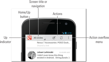
Figure 18-1: Action Bar components.
Source: Google
Action Bar and Corporate Brand
Color selection of the Action Bar background in combination with the app icon (or any other icon that is used in the Action Bar) provides a very distinguishable application brand without having to customize other components.
Figure 18-2 shows a good example of the Action Bar design pattern. The TED app uses the Action Bar to give the app a recognizable TED branding by using its colors and icons. The app also shows three actions available to the users on the screen.
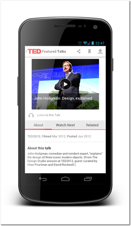
Figure 18-2: Good use of the Action Bar design pattern by the TED app.
Source: TED Conferences
Official Design Guidelines
The Action Bar design pattern is very well defined in the Android design guidelines documentation. I recommend reading it to get Google’s point of view of this design pattern at http://developer.android.com/design/patterns/actionbar.html.
Consequences
The Action Bar provides a consistent place for the most important actions. By using a common component in multiple applications, users learn to expect the functionality and find it easy to use. If the applications consistently provide the functionality, the app user interface does not have to be relearned. Users can utilize the knowledge established in other apps. This makes users more comfortable with the app’s main functionality, thus improving the overall user experience tremendously.
Additional features
There are few user interface features that relate to the Action Bar design pattern without being part of the pattern itself. These additional features, discussed in the following sections, can be added to the Action Bar and are often seen as part of the same design.
Up Button
The app icon is often used as an Up button. The Up button concept can be fairly complex and sometimes difficult for the users to understand. The problems arise when the Up button is confused with the Back functionality. The Up concept is, however, part of the Android design guidelines and worth noting. The Up button should always take the users to the parent screen in the app hierarchy, regardless of how the user ended up at the current screen. The Up functionality is indicated with a small left caret symbol. You can read more about the Up navigation from the Android design guideline page online at http://www.developer.android.com/design/patterns/navigation.html.com/.
Extra Navigation Controls
The Action Bar is sometimes used as a container for navigation controls. The two common navigation controls are the dropdown spinner navigation list, such as the one shown on the Google Maps app in Figure 18-3, and the use of tabs, such as those shown on the YouTube app in Figure 18-4.
Large screen adaptation
The Action Bar adapts to larger screens very easily. The larger horizontal space makes it easier to fit all the components on the Action Bar. The Action Bar is often slightly taller on a tablet device than on a phone, so it looks more visually balanced. Figure 18-5 shows how the TED app’s Action Bar looks on a tablet device. This is the same screen shown on the phone in Figure 18-2.
The increased space of larger screen or landscape layout allows you to add components like navigation tabs (see Figure 18-4), expand labels, and move some of the actions from the action overflow menu to the Action Bar.
Many of these adaptations are provided by the Action Bar libraries or the Android SDK. You’ll read more about implementation options in the technical implementation section later in this chapter.
Considerations and criticisms
The Action Bar, although a very common design pattern, isn’t without criticism. There are few things to consider when implementing an Action Bar design.
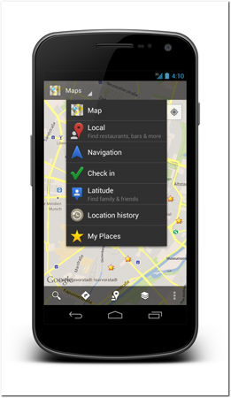
Figure 18-3: The Google Maps app uses the dropdown spinner navigation as part of the Action Bar.
Source: Google

Figure 18-4: YouTube apps places tabs in the Action Bar when the device is in landscape mode.
Source: Google
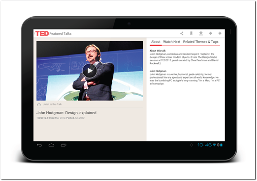
Figure 18-5: The TED app and Action Bar on a larger tablet screen.
Source: TED Conferences
Reach
The Action Bar contains the most important functionality and is located at the top of the screen. As smartphone displays grow in size, it is increasingly more difficult for users to use their phones with one hand and especially to reach the top part of the screen.
Wasted Screen Real Estate and Hiding
Another issue with the Action Bar has been its persistent nature. In some apps screens need to be fully dedicated to the content, and there’s no room for the Action Bar. Apps like video players and ebook readers are good examples of this. The Action Bar is often hidden until the user taps the content to make it visible again. Although this interaction has become pretty common, it can still cause discoverability problems.
Icon-Based Actions
The actions on the Action Bar are most of the time associated with icons. Icons, especially on touch screens, are often not very intuitive. Users cannot hover over an icon to get a helpful tooltip if the meaning of the icon is unclear.
Google added action tooltips, which can be shown by long-pressing the Action Bar icon (see Figure 18-6). Although this can be helpful for some users most of the users do not know that they can long-press icons to get this tooltip. You should not rely on this to help your users, but you should definitely provide this functionality in your Action Bars. As time passes, more users are likely to find out about this feature. In any case the most important thing is to make sure that your Action Bar icons are descriptive and intuitive to your users!
Variations of the Action Bar Pattern
There are some common variations on the standard Action Bar pattern that have become commonplace; several of them are covered in the following sections.
Split Action Bar
As a response to the limited space in the Action Bar as well as the reach problem, a split Action Bar concept has emerged. The split Action Bar adds another bar of actions to the bottom of the screen. There are a few variations of this concept. Sometimes the bottom Action Bar functions as an extension of the top Action Bar, and the actions that do not have enough room to be shown on the top Action Bar are placed on the bottom. In this case the overflow action menu should be placed on the bottom Action Bar instead of the top right.
Another way to split the Action Bar is to leave the app icon in the top Action Bar and move all its actions to the bottom part. This solves the reach issue but creates inconsistency in the Android system. Figure 18-7 shows an example of a split Action Bar that lists the functions in the bottom bar.
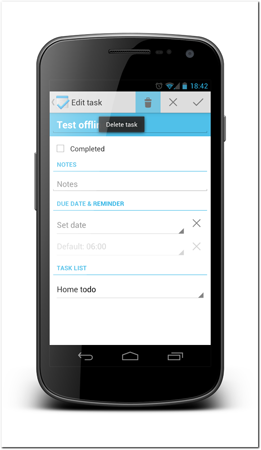
Figure 18-6: An example of tooltip help in the Tasks app, which you access by long-pressing an icon on the Action Bar.
Source: Tasks App
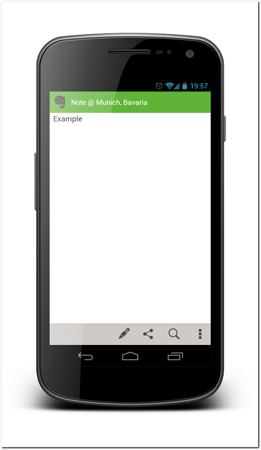
Figure 18-7: Evernote uses the split Action Bar.
Source: Evernote
It is very important to make sure the split Action Bar adapts correctly to orientation changes. Reserving top and bottom bars in landscape mode is not acceptable. When a split Action Bar screen rotates, the Action Bar should switch to single top Action Bar mode.
Contextual Action Bar Mode
In some screens, the user can manipulate individual items instead of just performing actions. In these situations, a so-called contextual Action Bar mode or action mode is often activated. It causes the Action Bar to show actions that relate to the selected items. Action mode is discussed more in the quick actions design pattern section later in this chapter.
Which actions to show?
Since the space for actions is limited you must carefully consider which actions you want to place in the Action Bar and which ones to leave in the overflow action menu.
Your first priority should be to include actions that are contextual to the screen and are very frequently used. A good example of this is the send action on an email compose screen. The second priority is actions that might not necessarily be contextual but address some of the most common use cases. In an email application, for example, the compose email action on the app landing screen should be visible on the Action Bar.
Adaptive Action Bar Actions
Different phones and tablets and different screen orientations have differing amounts of space for actions. Your app’s Action Bar should adapt to different screen sizes the same way as the rest of the user interface. Based on the importance of these actions, you should classify them in three categories:
• Always show on the Action Bar
• Show on the Action Bar if there is space
• Never show on the Action Bar
Most of the actions you deal with should be classified in the “if space” category. Only very general actions, like general settings, should be placed into the “never show” category.
Technical implementation
Since the Action Bar is a very well-established design pattern it has good support for implementation. It is one of the few complex components that has been added as part of the Android core SDK.
SDK
Support for the Action Bar was added to the Android SDK at the release of Android 3.0 Honeycomb, and support for the phone Action Bar was added to the Android 4.0 Ice Cream Sandwich release.
If your app targets only Android 3.0 or newer you can simply use the Action Bar provided by the SDK. It gives you a lot of functionality out of the box. It automatically adapts to larger screens and screen orientations as well as manages the shown actions based on the definitions you give to the action items. It also provides the long-press tooltip functionality and allows you to turn the app icon into an Up function.
For the full specification and guide for using the SDK’s Action Bar you should read the Android documentation at http://developer.android.com/guide/topics/ui/actionbar.html.
ActionBarSherlock
If you have a project that supports older Android versions, there is a very good Open Source third-party library that you can use. The library is called ActionBarSherlock, and it is maintained by Jake Wharton. The library allows you to bring the Action Bar functionality to all Android versions starting with Android 2.1. The library is implemented well and uses the same API call and styling parameters that the SDKs Action Bar uses. This means that you don’t have to relearn everything to use the ActionBarSherlock library. The library also automatically uses the native Action Bar when available.
Download and read the documentation for using ActionBarSherlock from the project website at http://actionbarsherlock.com/.
Theming
You have a large set of parameters you can use to create Action Bar themes. You can use solid colors or user background images for color themes. It’s best to use nine-patch images for backgrounds.
Drawing all the required assets can be a long process. There are tools that make it easier. For example, you can use an Action Bar style generator website created by Jeff Gilfelt to generate all the graphics based on numerical color values. The site also generates all the required XML files for you. You can find the generator at http://www.jgilfelt.github.com/android-actionbarstylegenerator/.com/.
Using The Quick Actions design pattern
The Quick Actions design pattern helps you create a user interface for actions that affect only one or a few items on the screen. This design pattern is most often used with list screens or other screens that show multiple items.
Problems Addressed
Apps often have screen where they display multiple items like emails, notes, and to-do items. Users need to be able to perform actions only on items they want to be affected. Operations like delete, edit, and move require users to select the items explicitly.
With mouse-operated user interfaces, users are used to right-clicking items they want to manipulate individually. On touch screens that approach is not possible, so an alternative must be found.
Solution
This design pattern contains multiple solutions to this problem. Each solution works best in certain. The first one, the contextual Action Bar, is the preferred solution but is not applicable if the application doesn’t use the Action Bar design pattern. It can also sometimes be cumbersome compared to the other solutions—the dropdown menu and custom overlay. The contextual Action Bar is the only one of the solutions that supports bulk operations that can be performed on multiple selected items.
Note that there is a related anti-pattern, called Swipe Overlay Quick Actions, covered in Chapter 21.
Contextual Action Bar
The Contextual Action Bar is an extension to the Action Bar pattern introduced previously. This is also the recommended solution in the Android design guidelines. The Contextual Action Bar is sometimes called the Action Bar action mode. The Gmail app uses the Contextual Action Bar to display actions that the users can perform when email list items are selected (see Figure 18-8). The Action Bar style changes and the actions provided there apply to selected items only. The top-left icon on the Action Bar changes into a Done icon that the users can use to cancel. The Android back button also cancels this mode.
 Scan the QR code with your Android phone to open the companion app and try out a functional example.
When using the Contextual Action Bar, you should indicate clearly that the list items are selectable. Often the best solution is to add a checkbox to the list items. List items with checkboxes allow users to select multiple items easily and edit their existing selection. When using checkboxes in list items that are themselves active selection components (such as when users can tap a list item to move to the item details screen), you must make sure that the checkbox area is large enough. Making only the checkbox itself the hit area will lead to user confusion and frustration. It is a good idea to make the portion of the left end of the list item a hit area for the checkbox as well.
Long-pressing a list item should also select the item.
Read more about contextual Action Bar from the Android design guidelines at http://www.developer.android.com/design/patterns/actionbar.html#contextual.com/.
Dropdown Menu
The dropdown menu can be used to present options for individual list items when no bulk operations are needed and the available operations are difficult to explain in the Action Bar icons. The Google Play Music Player app (see Figure 18-9) shows a good example of acceptable use of the dropdown menu quick actions.
Dropdown menus do not allow users to select more than one item at a time. However, you have much more space to explain the actions. In my opinion, you should use a dropdown menu only if the contextual Action Bar is not suitable.
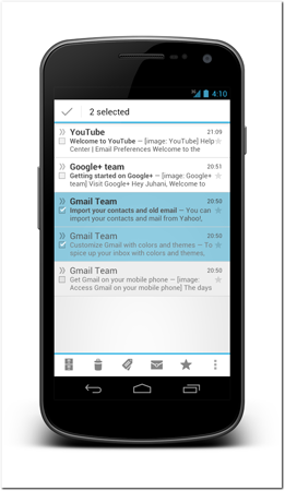
Figure 18-8: The Contextual Action Bar is used in the Gmail app.
Source: Google

Figure 18-9: Using dropdown quick actions in the Google Play Music Player app.
Source: Google
Be sure to indicate that users can open the menu by using the Android’s dropdown menu symbol on your list items. That symbol will visually indicate that a menu is available. Users can then open it by tapping the menu indicator or long-pressing the list item.
Custom Overlay
The third option is use a custom overlay to present quick actions to users. Although this is not the standard way of showing quick actions and might require more development work, the result can be very stylish. The TouristEye app shown in Figure 18-10 uses this approach. The TouristEye app doesn’t have that many quick actions, and they also don’t need any bulk operations. This custom overlay solution is very non-intrusive and offers users easy access to the actions. Note the use of the indicator icon, which triggers the custom overlay.
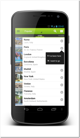
Figure 18-10: Nice use of custom overlay to show quick actions in the TouristEye app.
Source: TouristEye app
Consequences
Providing an easy and consistent way for users to perform actions is very important. If users are forced to navigate to separate screens in order to perform actions, the application will start to feel cumbersome. Using these common design patterns will also help users understand the functionality of your app more easily. They won’t have to spend time figuring out how to perform their desired actions.
Long-press
Long-press has become a standard gesture on touch screens. It replaces the right-click on pointer devices. Users are used to right-clicking components they want to manipulate individually. You should make sure that you provide long-press as a way for doing the same. Whichever of the previous solutions you choose to implement, make sure the long-press always brings up the quick actions.
Large screen adaptation
All of these solutions adapt to large screens very nicely. Contextual Action Bar uses the added screen real estate to show the actions nicely (see Figure 18-11 for an example). The other quick action alternatives do not require any alterations for the larger screen and can be used the same way they are used on smaller screens.

Figure 18-11: The Gmail app contextual Action Bar on a tablet.
Source: Google
Considerations and criticism
The way quick actions are presented has changed as the Android design has evolved. You might still see the old pre-ICS style quick actions in apps, although the new Android standards make them look outdated and you should not use them anymore. Prioritizing the contextual Action Bar makes it easier for you, from both a design and implementation point of view.
An important consideration when designing quick actions is that—regardless of which approach you take—you should always avoid hiding the selected items. You should also make it very clear to users which items are going to be affected by the actions. See Chapter 21, which covers anti-patterns (or bad designs), for more information about this.
Technical implementation
Depending on the solution you’ve chosen, the implementation can be very straightforward or somewhat complicated.
Contextual Action Bar
The Contextual Action Bar implementation is supported in the Android SDK as well in the ActionBarSherlock library. Most of the heavy lifting is done by the framework or library code.
When working with ActionBarSherlock, you only need to provide an ActionMode.Callback implementation that is used to display the contextual Action Bar. See the following code example for a simple implementation skeleton:
private final class ExampleActionMode implements ActionMode.Callback {
@Override
public boolean onCreateActionMode(ActionMode mode, Menu menu) {
menu.add(“Example action 1”).setShowAsAction(
MenuItem.SHOW_AS_ACTION_IF_ROOM);
return true;
}
@Override
public boolean onPrepareActionMode(ActionMode mode, Menu menu) {
return false;
}
@Override
public boolean onActionItemClicked(ActionMode mode, MenuItem item) {
// react to selections
mode.finish(); // end action mode
return true;
}
@Override
public void onDestroyActionMode(ActionMode mode) {
}
}
To start the action mode, you simply call startActionMode provided by the activity and give your action mode as a parameter:
startActionMode(new ExampleActionMode());
Dropdown Quick Actions Menu
For dropdown quick actions, you must implement a dropdown spinner user interface component. This spinner should take care of displaying and handling the actions. See the dropdown spinner user interface component for more implementation details in Chapter 11.
Another option for implementing a dropdown menu is to use View.registerForContextMenu(). See the Android documentation for more details and examples: http://www.developer.android.com/guide/topics/ui/menus.html#FloatingContextMenu.com/.
Custom Overlay
Custom overlay is the most complicated implementations of these three alternative quick actions approaches. Fortunately, there are Open Source libraries you can use as starting point for your implementation. A library called New Quick Actions 3D is one of them. You can find the instructions and source code for the project from githib at https://github.com/lorensiuswlt/NewQuickAction3D.
Using the Action Drawer design pattern
The Action Drawer design pattern is not commonly used, but still discussed in this chapter because the problem is commonly occurring and the solution can be very powerful. It saves space on-screen but still provides controls to users when they need them. This design pattern is sometimes called the sliding drawer, after the technical implementation in the Android SDK.
Problems Addressed
On small smartphone displays, screen real estate is very limited. Designers must carefully consider which actions should be shown to users on-screen and which ones will be hidden behind menus or other structures. Hiding menus or other screens can make them hard to find and make the app feel difficult to use.
Solution
Action drawer is a view that contains user actions and controls that aren’t fully visible on the screen by default. Usually a handle component is shown to users, which they can use to expose the view. The opened drawer view covers the user interface either partially or fully without moving the user into a new activity. The Winamp app uses the action drawer to show additional playlist controls when the user needs them. In Figure 18-12, the action drawer is closed and only a handle to open it is visible. In Figure 18-13, the action drawer is open and is covering the underlying user interface.
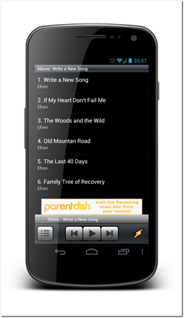
Figure 18-12: Winamp app uses the action drawer to hide additional player controls. In this screen the action drawer is closed.
Source: Nullsoft

Figure 18-13: Winamp’s action drawer opened to expose additional player controls. This is the same screen as Figure 18-12.
Source: Nullsoft
The action drawer should be opened when the user taps the handle or drags it open. The action drawer should be closed when the user taps the handle or drags it close. The Back button should also close the action drawer.
Consequences
Having secondary actions hidden frees space for primary functions and makes the user interface less cluttered. An action drawer is a very simple concept to understand and discover. An action drawer also maintains the user’s position in the user interface and is unlikely to confuse users as to the context of app navigation.
Large screen adaptation
It is unlikely that you’ll need an action drawer on a larger display. You should design your large screen user interface in a way that the actions that are hidden on a smaller display are visible on the large screen.
Considerations and criticism
Android design in general has shifted away from this design pattern; apps are more often using the Action Bar overflow menu. The overflow menu is very pervasive and is often much more familiar to users than an action drawer. To justify using an action drawer, the components placed there must be more complex. For example, in the Winamp app’s case, the seek bar cannot be part of an overflow menu as the overflow menu can only contain simple text items.
You should also make opening the action drawer as smooth and easy as possible. The drawer should open immediately and follow the user’s drag gesture immediately. It is also important to make the handle component look like it opens the action drawer to make it intuitive to users.
Technical implementation
Android SDK provides a user interface component for implementing an action drawer easily. The sliding drawer component was introduced in Chapter 11. For more information about the implementation, refer to the chapter or to Android documentation online at http://www.developer.android.com/reference/android/widget/SlidingDrawer.html.com/.
Note that the sliding drawer implementation allows only for creating drawers that open by pulling from the bottom upward. There are third-party libraries that can be used to implement drawers that open in other directions.
Using the Pull-to-refresh design pattern
Pull-to-refresh is a more controversial design pattern and has not been fully accepted as suitable for the Android platform. It is more prominent on the iOS than on Android devices even though its origins are not platform specific. It is also covered by a software patent owned by Twitter. Twitter has publicly announced that they intend to use the patent only as a defensive tool and sue anyone with this patent only if they are being sued first, but anything written in this book should not be taken as legal advice, and you should consult your company’s lawyers instead.
The pull-to-refresh pattern adds functionality to your list components by allowing users to refresh lists. They can pull down the list when it’s scrolled all the way to the top.
Problems addressed
Refresh is a very common action that usually must be provided to users especially when you’re displaying dynamic data. The refresh function often appears as a button on the Action Bar, which is valuable and limited screen real estate.
When users need to use the manual refresh very frequently, it can be annoying to constantly reach for the Action Bar on top of the screen.
Solution
To save room and allow users to manually invoke the refresh functionality, users can pull the list down beyond the top item. Figure 18-14 shows an example sequence. The user moves the list all the way to the top and then pulls it down. An additional user interface component is placed above the list, giving the user feedback of the action. Once the user releases the drag gesture, a loading indicator is placed above the list. Once the refresh operation is finished, the loading indicator disappears and any new items are added to the list.

Figure 18-14: Different states of pull-to-refresh when user pulls down the list.
Source: Twitter
Note that pull-to-refresh works only on lists that have the most recent items placed on the top. If the list is not ordered, the gesture does not make sense.
Consequences
Pull-to-refresh allows users to easily invoke the list refresh from any point on the list user interface. Pulling the list downwards is a very natural interaction as that is the normal way users interact with list components. If a user wants to see what is on top of the top-most item, pulling it down is the intuitive gesture.
Large screen adaptation
Pull-to-refresh works well on large screens. In most cases, there’s no need to modify the functionality when moving to larger screens.
Considerations and criticism
Pull-to-refresh has been criticized for not feeling like an Android design feature. It has been associated with the iOS bouncy list border effect, which doesn’t exist on the Android platform. My opinion is that pull-to-refresh is platform-independent and having bouncy list border effects is not necessary or related.
Discoverability is a real concern with pull-to-refresh. It’s not visible on-screen before users try to perform the pull gesture. Some developers have suggesting using a small indicator on top of the list, but this hasn’t gained significant penetration yet.
Technical implementation
There are few Open Source libraries that implement the pull-to-refresh feature for the Android platform. In my experience the best one is the Android-PullToRefresh library by Chris Banes. You can download the library project as well as see more details about how to use it from the github page at https://github.com/chrisbanes/Android-PullToRefresh.
The library project is implemented in a very smart way, extending the Android list view. That way, you can use all the functionality from the Android list view. Instead of using the default ListView in your layout code, you must use the list view class provided by the library project. The following layout code shows an example:
<?xml version=”1.0” encoding=”utf-8”?>
<LinearLayout xmlns:android=”http://schemas.android.com/apk/res/android”
android:layout_width=”fill_parent”
android:layout_height=”fill_parent”
android:orientation=”vertical” >
<!-- The PullToRefreshListView replaces a standard ListView widget. -->
<com.handmark.pulltorefresh.library.PullToRefreshListView
android:id=”@+id/pull_refresh_list”
android:layout_width=”fill_parent”
android:layout_height=”fill_parent” />
<TextView
android:id=”@android:id/empty”
android:layout_width=”wrap_content”
android:layout_height=”wrap_content”
android:layout_margin=”5dp”
android:text=”List is empty” />
</LinearLayout>
You can add a simple listener to the activity or fragment code that will receive an event when users pull down the list:
pullToRefreshView = (PullToRefreshListView) getActivity().findViewById(R.id.pull_refresh_list);
pullToRefreshView.setOnRefreshListener(new PullToRefreshListView.OnRefreshListener() {
@Override
public void onRefresh() {
new GetDataTask().execute(); // do refresh in background.
}
});
To remove the list-loading indicator, you need to let the list item know that the refresh operation is complete with the following simple call:
pullToRefreshView.onRefreshComplete();
Using the Swipe-to-dismiss gesture
Swipe-to-dismiss is a way for users to get rid of individual items shown on-screen. This is a new and emerging design pattern that is likely to become more common in the future. It has a somewhat limited area of use due to some gesture conflicts.
Problems addressed
For long lists of notifications or similar content, users might want to get rid of the items individually instead of clearing them all at once. Users can use individual delete with the quick actions design pattern introduced previously, but it can be cumbersome, as it requires selecting the item first and then performing the action.
The problem of not being able to quickly dismiss items is emphasized if the app in question generates data automatically. Automatically generated data, whether the data is events from other systems or something else, can lead to too much information being presented to the users. In situations like this, users must be able to easily dismiss the items they are not interested in while keeping the others.
Solution
Android 4.0 Ice Cream Sandwich introduced few changes to the Android notification system and to the multi-tasking system. Notifications and recent apps are now both shown as lists. If users want to get rid of any of the individual items in either list, they can simply drag the item they want to get rid of to the left or right. This effectively throws the item outside the screen. Figure 18-15 shows how Android notifications can be swiped to dismiss.
At the release of the Android 4.1 Jelly Bean, Google introduced a new Google service called Google Now. This is the first app that utilizes this pattern in an app instead of in a system service. The app is a single list of cards that can be dragged outside the screen to get rid of them (see Figure 18-16). Note that in this app as well as in the notifications, the item that is being swiped away follows the user’s finger. This makes the gesture more pleasant and easier to discover.
Figure 18-15: Android notifications since Android 4.0 use swipe to clear individual notifications.
Source: Android

Figure 18-16: Google Now allows users to swipe individual notifications.
Source: Google
Consequences
Swiping is an intuitive gesture for getting rid of things. It corresponds to real-world actions. People tend to swipe things away from their view when they don’t need to see them. Users can also intuitively try this gesture as it is being used on other similar functions on the platform. It’s easy to find and pleasant feeling, as it corresponds to the real world.
Additional features
There are many ways you can design this gesture to make it easier to understand. You can, for example, apply an increasing transparency or other effect when the user is moving it further away from its original place.
Large screen adaptation
On larger screens, it doesn’t always make sense to require users to swipe the item all the way off the screen. You must make sure that you use a transparency effect or something similar to clearly communicate to your users how far they have to swipe to dismiss the item. The Android multi-tasking menu is a good example of this. The multi-tasking menu is placed on the left side of the screen, but users can still remove recent apps from the list by swiping them to the right a few centimeters.
Considerations and criticism
Although swiping might be good, it is also already reserved for a lot of different functions in the Android user interface. Recall, too, the difficulties of detecting a swipe versus a drag to pan. Swiping is also very commonly used to switch between workspaces on tabbed user interfaces (more about workspaces in the Chapter 19).
Technical implementation
At the time of this writing, the technical implementation of this design pattern requires large amounts of code using the Android framework classes, including property animations. Including the full example here would be too cumbersome. There are, however, Open Source projects that provide this functionality. Therefore, I recommend you search github for “swipe to dismiss” to find the best project. One project that might help you is the SwipeToDismissNOA project by Jake Wharton, based on work of Roman Nurik. You can find it from the github at https://github.com/JakeWharton/SwipeToDismissNOA.
Summary
User action design patterns can help you create designs that users can easily interact with. These design patterns vary, from handling individual items to executing batch operations on multiple items to app operations like refresh. Of all the patterns discussed in this chapter, the Action Bar pattern is the most important and has become a standard component in almost all Android apps.