
Chapter 15: Beyond Scalable – Responsive Design
Until this point, the book has covered scalable Android user interfaces in the context of small variation of screen sizes. By utilizing layouts and other resources correctly, your app will scale nicely to phones with large 4.5-inch screens as well as to 3.5-inch screens. But what do you do when you want to go beyond these constraints?
A design approach called responsive design has become popular in web design when facing this same problem. Websites nowadays have to work on smartphones, tablets, laptops, desktops, and even on connected TVs. Simply stretching the layout from smaller screens to larger screens isn’t enough anymore. The idea is to dynamically change the order of components that are visible by rearranging the page structure. This usually means reducing the number of visible columns.
This chapter introduces you to responsive design on the Android.
More Android devices than just phones
Let’s look at the reasoning why more heavyweight methods are needed than just the layout managers. Android is a platform of diversity. As you read in the introductory chapters, there are hundreds of different devices out there. Many of them have much larger screens than the average smartphone device. The large screens require developers and designers to change their design approach. The smartphone design simply stretched to a larger screen doesn’t utilize the screen effectively and makes for a subpar user experience. Take a look at Figures 15-1 and 15-2.
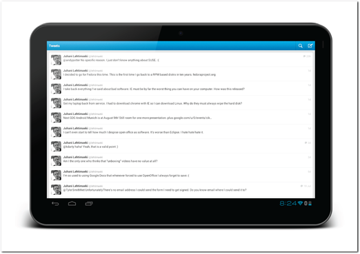
Figure 15-1: Twitter’s tweet list on a 10.1-inch tablet screen.
Source: Twitter
These two screenshots from the official Android Twitter client illustrate very vividly why using scalable layouts is not enough (I’m hoping that by the time you’re reading this Twitter has already released a better version of their client). A lot of screen space is wasted, and the layout does not look good. But it’s much more than just looking bad and not using all the screen space. In both screens, part of the information loses its context. In Figure 15-1, the tweet time is moved very far from the tweet text and in Figure 15-2, the retweet and favorite numbers are on the opposite side of the screen from their labels.
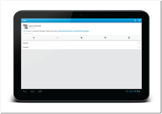
Figure 15-2: Twitter’s tweet view on a 10.1-inch tablet screen.
Source: Twitter
Android tablets
Android tablet is a fuzzy term. Tablets have as much or more variation than smartphones. In some cases it’s not easy to tell if a device is a tablet or not. Is the Samsung Galaxy Note with its 5.3-inch display a tablet? Will the same interface that works on a 7-inch display work on a 13-inch tablet? And what if the tablet has a full size external keyboard? Should you also consider Android netbooks?
Fortunately, there’s no real technical difference between an Android smartphone and an Android tablet, other than the screen size. Therefore, you can use the same techniques to make changes to the user interfaces on larger tablet devices.
Google TV
Android also runs on TVs. Although there is an official Google TV, it is not the only way to run Android apps on TVs. There are multiple devices that can be connected to large TV screens. The official Google TV is a separate version of Android that runs the same apps and provides the same APIs. The Google TVs have different controls and some added APIs. They, of course, don’t have touch screens, which are the dominant control mechanism on the smartphones.
It should be pretty clear that the same user interface won’t work on a TV screen controlled by a D-pad or touchpad that works on a smartphone or a tablet. But I think that the biggest difference with TVs, compared to the smartphone and tablet, are the different user goals. User goals are the foundation and requirements for an interface. TV apps must be different than just an adapted user interface. I strongly advise you to carefully evaluate your app’s user goals and determine how they align with TV experience before jumping into adapting your app to the TV.
Also worth noting is that a TV is usually a shared device, unlike smartphones and tablets. Users are unlikely to log in to TV devices with their personal accounts. That is also why Google has not provided versions of Gmail or Google+ apps for Google TV. These kinds of apps work much better on personal devices than on TVs.
Understanding Responsive design
Responsive design has its roots in web design. The web has always lacked strict size guidelines, and websites have to support many different resolutions. It’s no surprise that designing for the Android platform requires a similar mindset and similar tools.
The starting point for designing Android apps is different than when designing websites. Websites must work perfectly on all computer screens, so that’s where the interface design usually starts.
Let’s look at an abstract example of a generic website design (see Figure 15-3). In this example the website has a three-column layout. The column A is the navigation, column B is the main content, and column C is additional or secondary content. All the columns resize nicely when the available space changes.
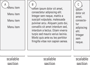
Figure 15-3: An abstract three-column design for a website.
If the available space becomes much smaller—the user resizes the browser window or maybe opens the page on a tablet—the content might not fit within the screen anymore. Each of the scalable sections has a natural minimum size at which they look good and are functional. When all of the sections reach that minimum size, you need a more drastic layout change.
Figure 15-4 shows how the layout could be rearranged. In this case the secondary content (C) moves below the main content (B), freeing more space for the main content and navigation (A).
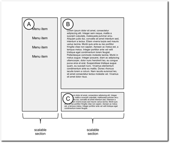
Figure 15-4: An example how the web design could be rearranged for a tablet device.
If the same website is viewed on an even smaller screen—a smartphone screen—the user interface must be rearranged again. Figure 15-5 shows an example of the same interface adapted to a smartphone screen. Note that the navigation section (A) is also rearranged internally due to the different shape of the container. This brings you into an important point of responsive design. Not only do the large component containers (A, B, C) rearrange, but each of them adapt internally as well.
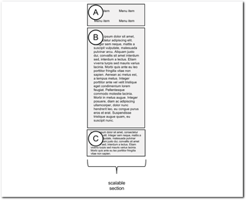
Figure 15-5: An example how the web design could be rearranged for a smartphone.
Tip: An important feature of responsive design is that the components that are rearranged are not reimplemented for every different position they can have. Doing that would be way too costly in the development phase. The key to responsive design is to keep using the same components you already have built to support all the different layouts you have.
How to approach responsive Android design
After that short overview of the theory of responsive design, this section returns to Android apps and covers how the same techniques can be utilized there. As android apps are built using a very similar design approach, the same responsive design approach works very well on the Android platform.
That said, the technology used to implement responsive design on the Android platform is different from the web. The Android user interface APIs are much more flexible than their web counterparts, which means you can build even better and more flexible apps on the Android than you can on the web.
This section introduces the thought process and approach to responsive design for Android. This chapter covers the overview, and Chapter 16 covers the technical implementations of this approach. The technologies you’ll use include the following:
• Android resource managers
• Android layout managers
• Fragments (A technical term for a reusable section of user interface. Fragments are explained in detail in Chapter 16.)
• Automatically adapting user interface components
Starting from a Phone
Responsive design on the web typically begins with the largest screen and then is modified to fit on smaller screens. On Android it is very likely that process will start from the other end. You are likely to start with an app that works on a smartphone and need to adapt it to a tablet. Even if you don’t have an app yet, it’s more likely that you’ll start from the phone design, as the smartphone market is currently so much larger than the tablet market. (It makes sense to target the largest target group first.)
If you created an information architecture diagram during your design, you should get it out and look at it again. If you didn’t draw one, now is the time to do it! This diagram will help you to visualize the relationships of each screen in your app.
A Simple Example
Consider this simple example—a list of items with an item detail screen and new item screen. For example, Gmail is a complicated version of this same structure. Figure 15-6 shows the information architecture diagram of this simple example app.
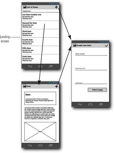
Figure 15-6: Information architecture of the abstract example app.
The structure of the information in this app is clear. The item list screen is a parent screen of the item details screen. The new items screen doesn’t have a place in the hierarchy. It is more like a utility screen that can be invoked from multiple places.
First consider what you can do with the item list screen (see Figure 15-7) and the item details screen (see Figure 15-8). It should be apparent that simply stretching these screens won’t be good enough. You need to rearrange the layout.
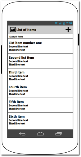
Figure 15-7: Item list screen on a phone.
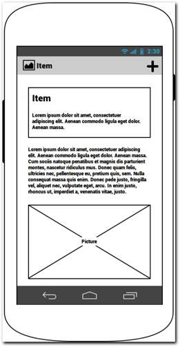
Figure 15-8: Item details screen on a phone.
On the Android, not all the content that is subject to the rearrange will always be on the same screen. You could bring the two item related screens into one large screen. Figure 15-9 shows an example of this approach. In this example I have placed the item list to the left and item details to the right. The screen functionality of these components is the same. When the user taps on any of the items on the list, the right side of the screen will update that item.
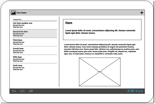
Figure 15-9: Item list and item details screen unified into one screen on a tablet.
But what about the Create New Item screen (see Figure 15-10)? Because this screen is not part of the screen hierarchy in an obvious way and combining it with any of the information in the other screens would probably not make it any better, you can keep it separate. In this example (see Figure 15-11), I’m using an overlay for the Create New Item screen on the tablet. That will help keep the width of the component smaller, thus making it look better. I’ve also added a text component on the left side of the form. This can include some help text of similar content.
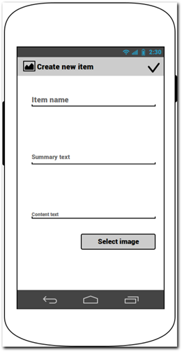
Figure 15-10: Create New Item screen on a phone.
This example shows a very general approach to responsive design on the Android platform. In practice, each app has its nuances. The rest of this chapter introduces techniques you can use to expand your toolkit in this field.
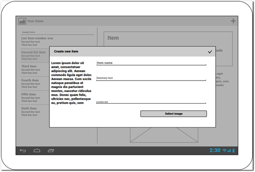
Figure 15-11: Create New Item screen on a tablet.
A Real Example
This section takes a look at a real example. This app is one of my favorites on the Android. It implements responsive design between phones and tablets nicely. You can see the app in the Figure 15-12. The structure of the app is very similar to the previous example.
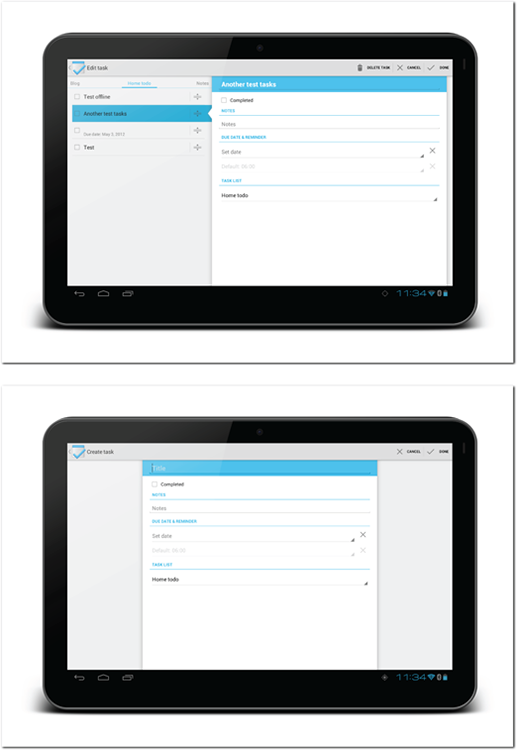
Figure 15-12: The Tasks app works great on phones and tablets.
Source: Tasks app
Don’t Build a Tablet App: Design for Tablets
The goal of this process should not be to build a separate tablet version of your app. Your tablet app and phone app should be the same in Google Play or in any other store.
Think about your app as one app with different user interface configurations.
Reusable components (fragments)
When designing your app, your goal is to define user interface sections, technically called fragments, that you can use and combine with any layout configuration to create the optimal user experience for each. In the previous examples, these sections or fragments were the list view, details view, and create new item view. All of these fragments can be implemented once and wrapped into different parent layouts to create different user interfaces to tablets and to phones without having to duplicate any of the functionality.
The Google Play Android app is an excellent example of the clever reuse of fragments in phone and tablet layout even when the layout is very different. The fragments in the Google Play app are relatively small, but they also are independent and, therefore, very easily redistributed in the user interface. Figures 15-13 and 15-14 show the similarities in the app’s item screen on the phone and tablet platforms, even though the layout as a whole is very different. For example, the components marked 1 and 2 in both figures are the same, with only very small tweaks that can be implemented easily. I encourage you to carefully study the Google Play app to see this reuse of components throughout the app.

Figure 15-13: Google Play app’s item screen on a phone.
Source: Google

Figure 15-14: Google Play app’s item screen on a tablet.
Source: Google
Chapter 16 explains creating fragments and using them in activities and layouts in detail.
Finding minimum and maximum size
Although practicality might sometimes dictate that you design simply, you should keep flexibility in mind. There’s no reason why the tablet user interface should not be used on devices that are technically phones if it is more suitable to them than the phone interface.
The key to flexibility is to find the minimum and maximum sizes of your user interfaces and the user interface fragments. For example, in the two-column layout I talked about previously, there is a certain point when the screen gets larger at which you can’t use only one list screen. On the other hand, having two columns becomes impossible at some point when the screen gets too small. I encourage you to study your interface on different screen sizes. Create the layout points based on your observations instead of simply making a phone and a tablet user interface.
Tip: You don’t have to create devices for all screen sizes. You can easily set up multiple emulators using the Android SDK.
Cost-benefit evaluation
Creating responsive user interfaces takes more effort than building a single user interface for one device group. This is true especially when the app was initially designed and built to run only on smartphones. As with everything you should always carefully evaluate whether your time is best spent doing this or something else.
The cost of responsive user interface can be minimized with careful planning. Reusing user interface components and fragments efficiently can save a lot of time. Even if you don’t plan to support larger screens in the initial launch of your app, I recommend that you take time to plan and design for such possibilities from the start. Implement your interface for phone screens using the fragment APIs, and plan for reusable components. This will save you a lot of time later and won’t make the initial implementation any slower.
Common ways to create responsive user interfaces
This section looks at some common ways you can adapt user interfaces from smaller to larger screens. You’ll often need to combine these solutions in order to create great results.
Screens to columns
As you already saw in the previous example, you can combine multiple small screens into one larger one (see Figure 15-15). This requires that the screens that you want to combine relate to each other.
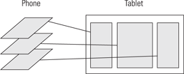
Figure 15-15: Overview of a screen-to-columns design.
I like to call this approach responsive design in 3D due to the added dimension of rearranging the activity stack to a flattened hierarchy.
Floating screens
Utility screens (such as a Settings screen) often don’t have a fixed place in the screen hierarchy and can be accessed from multiple screens directly, hence the term floating screen. Incorporating screens like this to a larger screen can be difficult. Often, they need to be shown alone without any helpful context, so the columns-to-screens design does not work.
Stretching the screen to a larger display isn’t a great option, because doing so often makes the screen look bad and sometimes even difficult to use.
In this situation, consider laying these types of floating screens on top of other screens (see Figure 15-16). Doing so allows you to limit the layout width so that the screen looks and functions correctly. This overlay technique also helps the users understand that the screen is not part of the navigation structure but is instead a side step to get a short task done.
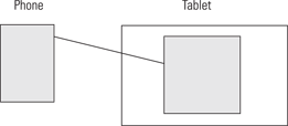
Figure 15-16: Screen to floating screen solution.
Optional content
What do you do if all the relevant information is shown on-screen, but you have leftover whitespace? Note that empty space isn’t necessarily a bad thing, but it’s still worth evaluating whether you have any content you can place there. Sometimes you might want to show content on a larger screen that isn’t part of your phone design or is hidden in a menu (see Figure 15-17). Help info or advertisements are good examples of optional information you might consider including.
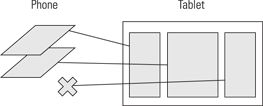
Figure 15-17: Optional content shown only on screens that have room for it.
Adjusting components one for one
Responsive design on the web often involves a one-to-one adjustment of all the existing components. The same technique can be used on the Android platform in many cases. You can rearrange all the components from your phone’s user interface to the tablet layout so that the user can access the same information easily. Usually this means that you adjust the user interface fragments that are laid out vertically on the phone to a wider layout on the tablet (see Figure 15-18).
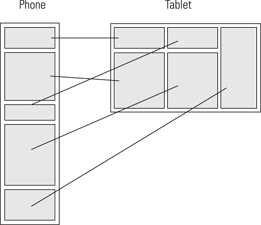
Figure 15-18: Abstract example from the phone to the tablet.
Replacing Components
Not all components work on a larger screen as desired. Sometimes you simply must create another component for the larger screen to utilize the increased screen real estate. A good example of a component that doesn’t work that well on a large screen is the list view. Lists can, of course, be made to work on larger screens by making them much smaller, but sometimes that is not possible or desirable. In those situations you might consider replacing the list with a grid view (see Figure 15-19). A grid view utilizes the available horizontal space better because it fills in components horizontally.

Figure 15-19: An abstract example of replacing a list component with a grid view when moving from a phone to a tablet.
Automatically Adapting Components
Some of the components provided by the Android APIs automatically adapt to larger screen sizes. One good example of this is the Action Bar. It automatically resizes when shown on a tablet screen.
Tabbed user interfaces also adapt automatically when more screen real estate is available by moving into Action Bar. You can see more about tabbed user interfaces in Chapter 19.
Summary
Don’t create a separate tablet version of your phone app. Instead, make your app’s user interface responsive. There is no one Android tablet but a continuum of devices with various screen sizes. Supporting all of their screen sizes requires you to provide a continuum of scalable user interface configurations. Following responsive design principles will help you reach a good solution.