
Chapter 10: Designing for Hardware Buttons, Input Methods, and Sensors
The ways users control their Android devices are many. Hundreds of different Android devices ship with different hardware configurations. Android devices in different categories are used in different ways. The way users use their Android smartphones and tablets is very different from the way they use their Android-powered TVs.
The differences don’t stop there. Nearly all Android devices can connect into external devices that add more control and input mechanisms. Different keyboards, mice, trackpads, and other devices add even more variety to the controller selection of Android.
However, don’t fret. Not every app needs to build support for every control mechanism out there. The typical app doesn’t benefit from most of them. Many of them are also supported pretty much automatically and are transparent to the apps. It is, however, good to know about these devices and understand the opportunities they provide.
Designing for the Touch screen
All Android phones and tablets have touch screens as their primary control mechanism. There are two different prominent touch screen technologies that are being used in devices right now—capacitive touch screens and resistive touch screens. The difference is in the technology but this also has implications for users.
Most of this book concentrates on the touch screen part of the user interface and how to work with the touch screen in the right way. This section covers the different types of touch screens technologies and explains how they affect the way users interact with their devices.
Resistive touch screens
Resistive touch screens require users to physically press the screen to make it react. Resistive touch screen technology is older and cheaper than the capacitive one. These kinds of screens are generally going away and are seen only on cheaper and older devices. However, there is still a notable selection of very low-end Android tablets that are built with resistive screens.
From the user interface point of view, the resistive touch screen has two notable effects. For one, performing gestures can be more difficult. For example, performing a bezel swipe (a swipe gesture starting from outside the screen) is practically impossible, and relying on that gesture as the only way to navigate is inherently a bad idea.
Resistive touch screens also don’t support any multi-touch features. Users with these devices must rely on single touch. It is good to remember that these older kind of devices are out there. Always build an alternative way to achieve what multi-touch gestures do.
Capacitive touch screens
Capacitive touch screens are the newer generation technology and now the prominent one. Capacitive screens do not require any pressure to register touch events. The lightest contact is enough. This technology also allows for multi-touch gestures. Many newer capacitive touch screens recognize as many as 10 different touch points simultaneously. Although more than two finger gestures are rarely used or useful, some specialist apps might benefit from this enhanced touch-recognition technology.
The Future of touch screens
As touch screens are becoming more prominent in user devices, more and more technology companies are investing in research in this field. You are likely going to see new innovation in the touch screen technology in the near future.
Two branches of screen technology research that have already popped up in concept forms are flexible displays and touch screens that don’t require touching. Flexible displays are going to change the design of the phone hardware by releasing the phone manufacturers from the flat surface constraint. Companies will likely introduce devices with screens that change size and can be moved around while using.
Some manufacturers have prototyped touch screens that detect the user’s finger before it touches the screen. This technology will bring a whole new interaction to touch screen devices, albeit one that people have been using for years on other devices—the mouse hover gesture. Suddenly users will be able to hover over a user interface control and get more information about it without having to click.
Both of these features are still some time away from the mass market, but they’re coming. It is good to keep your eyes open and follow what new innovation the OEMs are bringing to the technology.
Designing Phone hardware buttons
Until recently all Android phones were required to have at least three hardware buttons. All phones shipped with Menu, Home, and Back buttons. Some phones also had a hardware Search button, but that was an optional choice left to the hardware manufacturers.
The requirement for hardware buttons was lifted when Android 3.0 Honeycomb was released. The hardware buttons became optional and were usually replaced by software buttons.
There are still millions of older devices in use and will be for many years. This is a legacy burden for designers and developers alike. Users with old devices must still be able to fully utilize their device capabilities.
The Menu button is dead
One of the hardware buttons, the Menu button, was a user interface design blunder. Although having a Menu button was sometimes convenient, there was no way for users to tell if an app had a Menu button or not without first trying it. It took some time for Google to fix this design problem, but they finally did so. Menus can now be considered deprecated and should not be used the same way anymore.
The menu system has been replaced by the Action Bar design pattern (the Action Bar design pattern is introduced in detail in Chapter 18). Although use of the old menu structure is discouraged it is still part of the operating system as a fall-back mechanism for apps that have not been updated to the new system. Figure 10-1 shows how the old menu looks on a newer device.
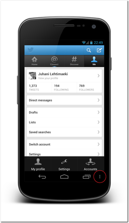
Figure 10-1: An app using the deprecated menu system. The three dots in the bottom bar indicate availability of the old menu to the users.
Source: Twitter
Designing for the On-screen keyboard
The Android operating system ships with a powerful on-screen keyboard. Although the exact keyboard layout differs among Android versions, different manufacturer skins, and different device sizes, the principles are the same. A portion of the screen is dedicated to the on-screen keyboard when it is needed.
The on-screen keyboard is rendered by the software and, therefore, very flexible. Developers and designers can help users by utilizing the Android keyboard correctly. The following sections discuss a few of the most important keyboard features of the Android platform.
Input methods
You can define the way on-screen keyboard affects the user interface layout and whether or not the keyboard is visible automatically. These are called soft input modes. They are defined per activity by adding the SoftInputMode attribute to the activity’s definition in the Android app manifest file.
<activity
android:name=”.keyboard.InputModeResizeActivity”
android:windowSoftInputMode=”adjustResize” >
</activity>
The most important parameters are adjustResize and adjustPan. If the former is set, the operating system will resize the activity’s window to accommodate the on-screen keyboard, and the latter attribute will place the on-screen keyboard on top of the user interface and pan the user interface so that the active input field is visible. The following figures and code example demonstrate the difference. Let’s first look at the layout code that follows. It is a simple layout that defines a ScrollView containing many EditText elements. Figure 10-2 shows how the layout is rendered before the on-screen keyboard is activated.
<?xml version=”1.0” encoding=”utf-8”?>
<LinearLayout xmlns:android=”http://schemas.android.com/apk/res/android”
android:layout_width=”fill_parent”
android:layout_height=”fill_parent”
android:orientation=”vertical” >
<ScrollView
android:layout_width=”fill_parent”
android:layout_height=”fill_parent”
android:layout_weight=”1”
android:fillViewport=”true” >
<LinearLayout
android:layout_width=”fill_parent”
android:layout_height=”fill_parent”
android:orientation=”vertical” >
<EditText
android:layout_width=”fill_parent”
android:layout_height=”wrap_content”
android:text=”” />
// … many more EditText elements here …
<EditText
android:layout_width=”fill_parent”
android:layout_height=”wrap_content”
android:text=”” />
</LinearLayout>
</ScrollView>
<Button
android:layout_width=”fill_parent”
android:layout_height=”wrap_content”
android:text=”example button” />
</LinearLayout>

Figure 10-2: The example layout before the on-screen keyboard is activated.
Now, let’s look at two activities that use the exact same layout but have a different input mode definition. In Figure 10-3 the activity uses the adjustResize mode. When a text field is activated and the keyboard appears, the operating system changes the layout size and then draws the layout again. Therefore, in this example, the example button remains visible.
In Figure 10-4, the activity uses the adjustPan mode. In this case, the example button will not be visible. In fact, users cannot focus the button without closing the on-screen keyboard first.
It is advisable to always use the adjustResize mode if there is no good reason not to. You can control the resulting user interface much better by placing ScrollViews wisely in the right places and making the interface scalable.
Input type

 Scan these QR codes with your Android phone to open the companion app and try out a functional example.
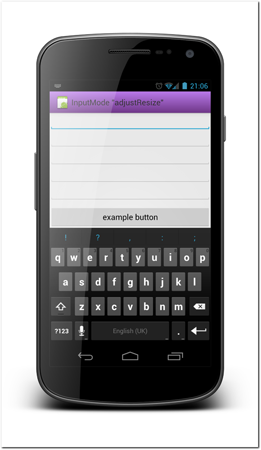
Figure 10-3: Activity rendered using the adjustResize input mode.
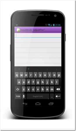
Figure 10-4: Activity rendered using the adjustPan input mode.
An input type is a definition a developer can assign to a text field to instruct the operating system as to what kind of information the user is expected to type into it. The operating system uses that information to show the user a best possible keyboard layout configuration. Making sure that all of your text fields have the correct type definition is probably the most effortless way to improve your app’s user experience. For example, when typing an email address, users are going to need the @ sign. By setting the input type to the correct text field (textEmailAddress), you force the operating system to show the users an @ sign (see Figure 10-5). Another good example of how you can make your user’s life easier is to enable the number pad for typing numbers (see Figure 10-6). If you have a field that accepts only numbers, you will not only help users type the numbers more easily but also help avoid confusion about accepted values.
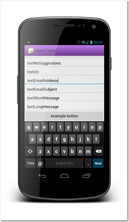
Figure 10-5: A selected text field with the input type set to an email address makes it easier for users to access special characters that are likely to be needed when typing an email address.
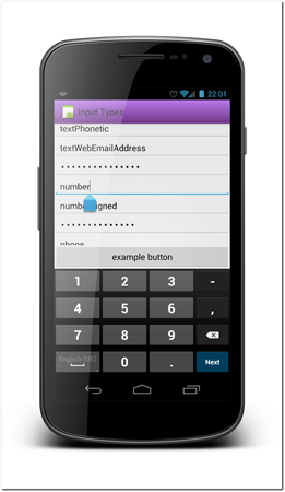
Figure 10-6: A number pad is much easier for typing a number field than using the default keyboard.
There are more than 20 input types. You should refer to the Android documentation for the full list at http://www.developer.android.com/reference/android/R.styleable.html#TextView_inputType.com/
Here are the most important input types:
• text—Just plain old text
• textCapCharacters—Capitalization of all characters
• textAutoCorrect—Auto-correction of text being input
• textAutoComplete—This field will be doing its own auto-completion
• textMultiLine—Multiple lines of text in the field
• textNoSuggestions—Should not show any dictionary-based word suggestions
• textUri—Text that will be used as a URI
• textEmailAddress—Text that will be used as an email address
• textShortMessage—Text that is the content of a short message
• textPersonName—Text that is the name of a person
• textPassword—Text that is a password
• number—A numeric only field
• phone—Text for entering a phone number
• datetime—Text for entering a date and time
• date—Text for entering a date
• time—Text for entering a time
(Portions of this page are reproduced from work created and shared by the Android Open Source Project and used according to terms described in the Creative Commons 2.5 Attribution License.)
A single text field can have more than one input type assigned to it. Not all combinations make sense, but for example a multi-line no-auto-correct field might be useful in some context.
Action button and IME options
 Scan the QR code with your Android phone to open the companion app and try out a functional example.
An action button is a button on the on-screen keyboard that changes based on context to perform different actions. By default, any single-line text field will have an action button that’s called Next if there is a logically following field on-screen. Tapping the Next button focuses the following field. If the operating system cannot find a suitable field to follow, the action button is labeled with Done instead. Tapping that button will simply close the on-screen keyboard.
Developers can override the action button label by selecting from a predefined list of supported options for each text field and then setting the imeOptions attribute. The most important available options are the following:
• normal—There are no special semantics associated with this editor.
• actionUnspecified—There is no specific action associated with this editor; let the editor come up with its own if it can.
• actionNone—This editor has no action associated with it.
• actionGo—The action key performs a go operation to take the user to the target of the text they typed.
• actionSearch (see Figure 10-7)—The action key performs a search operation, taking the users to the results of searching for the text they have typed.
• actionSend (see Figure 10-8)—The action key performs a send operation, delivering the text to its target.
• actionNext—The action key performs a next operation, taking the user to the next field that will accept text.
• actionDone—The action key performs a done operation, closing the soft input method.
• actionPrevious—The action key performs a previous operation, taking the user to the previous field that will accept text.
(Portions of this list are reproduced from work created and shared by the Android Open Source Project and used according to terms described in the Creative Commons 2.5 Attribution License.)
The actions can be detected from code by setting an onEditorActionListener to the corresponding text field.
The same attribute also controls parts of how the on-screen keyboard is used in the user interface. By default when a text field is focused in landscape mode, the app user interface is replaced with full-screen text-editing mode (see Figure 10-9). This functionality can be overridden by setting the imeOptions attribute to flagNoFullscreen (see Figure 10-10). These flags can be combined with other imeOption attributes by using the pipe symbol (|) to separate multiple values in a single attribute like in the following example.
android:imeOptions=”actionSend|flagNoFullscreen”
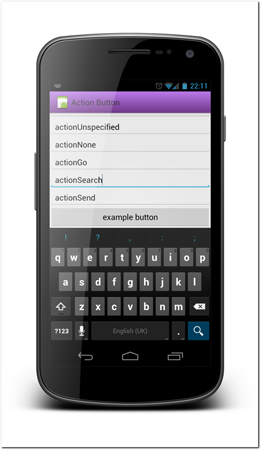
Figure 10-7: A text field with the imeOption actionSearch set.

Figure 10-8: A text field with the imeOption actionSend set.

Figure 10-9: A text field in the default full-screen edit mode.
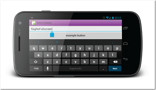
Figure 10-10: A text field in landscape edit mode when the flagNoFullscreen flag is set.
 Scan the QR code with your Android phone to open the companion app and try out a functional example.
Third-Party Keyboards
Not all Android phones have the same keyboard. Device manufacturers often replace the default keyboard with their own custom keyboards, and users might replace them with downloadable apps. This means that while defining the keyboard configurations is always a good idea, you cannot trust every device to function the same way. Some keyboards might provide different configurations with the same type.
Designing for Hardware keyboards
Some Android devices ship with hardware keyboards. Probably the best known examples of this are the very first Android device, G1, and the original Droid. Both of them shipped with a slide-out hardware keyboard.
The Android operating system is fully capable of handling hardware keyboard events automatically, but they present few design implications. The first one is an important one: Never disable landscape mode in your app! Most of the hardware keyboards are meant to be used in landscape mode. If you force your app to be in portrait mode, all the users with these keyboards are going to be annoyed with your app.
The second implication to design is that you cannot depend on your app’s user interface window to shrink when the user enters input mode, because if they are using a hardware keyboard, it won’t take any space on-screen.
Designing for D-Pads and Trackballs
Fewer and fewer phones seem to be shipping with trackballs or D-pad controls, but some phones still do and some large-volume older phones are still in heavy use.
D-pads (and trackballs) are used to change focus between user interface components. Although the feature is not critical to use, it sometimes is convenient and some users have learned to depend on them. You should aim to support D-pad navigation in your app.
You often don’t need to go to any additional effort to support D-pads in your apps. The Android operating system is pretty good at figuring out which component should be the next one to receive focus.
Tip: D-pads are the main navigation method of Android TV users. If you want your app to be capable of running on a TV, it must support directional navigation as its main navigation method.
In some cases the default logic fails. In these cases, you can easily override the default functionality by manually defining which user interface component should be focused next in each direction. You do this simply by adding the nextFocusDown/Up/Left/Right attribute to any user interface component definition. In the following example, these two FrameLayouts are part of a larger grid. Both of them have focus order definitions to ensure correct focus order.
<FrameLayout
android:id=”@+id/grid_1_selected”
android:focusable=”true”
android:nextFocusDown=”@+id/grid_5_selected”
android:nextFocusRight=”@+id/grid_2_selected”
android:clickable=”true”/>
<FrameLayout
android:id=”@id/grid_2_selected”
android:focusable=”true”
android:nextFocusDown=”@+id/grid_6_selected”
android:nextFocusLeft=”@id/grid_1_selected”
android:nextFocusRight=”@+id/grid_3_selected”
android:clickable=”true”/>
Designing for the Stylus
A stylus is a pen that’s used with a touch screen device. Styli were popular with older resistive touch screen devices due to their pressure points, but the capacitive touch screen revolution has made them all but disappear. It seems more recently that thy might be making a comeback. Samsung, HTC, and Asus have been incorporating styli into their phones and tablets, and many third-party manufacturers sell them as accessories that are compatible with all capacitive devices. Unlike the previous generation styli, this new generation is based on capacitive technology and act more as secondary input devices.
A stylus enables users to interact with the device much more precisely. Accessories like the stylus will enable new possibilities to app developers. Activities that previously weren’t feasible, such as drawing, become possible. Although the Android operating system has APIs to support many stylus interactions, the manufacturers have released their own extended SDKs to add to the functionality.
Tip: Using a stylus will naturally limit the devices the apps can run on, but sometimes it might be a compromise worth making.
Designing for Voice control
Voice control is widely integrated into the Android operating system. Users can switch to voice input on any app by enabling voice input from the Android keyboard (see Figure 10-11). Using this feature on devices running Android versions older than 4.1 requires a fast data connection, because the voice analysis is done on Google’s servers. Starting from Android 4.1 voice typing is available also offline.
In addition to the voice typing, users can control their phone with voice commands. After opening the voice command prompt, users can give predefined voice commands to the phone. For example, the command “navigate to London” will open a navigation app and set the destination to London (see Figure 10-12).
The quality of voice recognition and of the voice commands depends heavily on the Android operating system version. Later versions have greatly improved the voice interface. For example, on an Android 4.0 phone users can see continuous feedback of the text they are speaking near real time. In older phones, users have to speak a full sentence and then wait for the results to appear.

Figure 10-11: Android voice typing is always available to users without developers having to do anything.
Source: Android
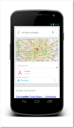
Figure 10-12: You can direct your phone to complete certain tasks simply by speaking the task into the phone.
Source: Android
Designing for External Keyboards, mice, and touchpads
Android has great support for external Bluetooth and USB devices, starting with version 3.0. External Bluetooth touch pads like the Apple’s Magic Trackpad are fully supported, including its multi-touch gestures. When the operating system detects multiple touch points, it displays multiple cursors on the screen. Figure 10-13 shows an example of five cursors on-screen at once.
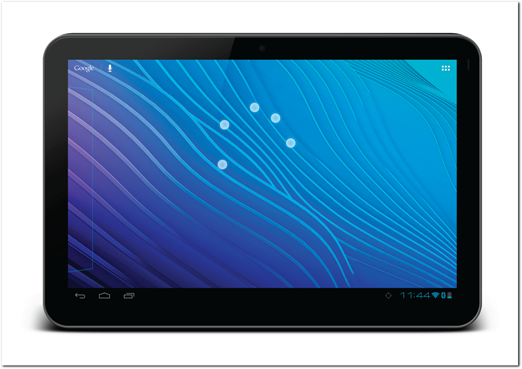
Figure 10-13: An Android tablet controlled by an external touch pad. Five cursors are shown on-screen, corresponding to a five-finger touch.
Source: Android
Designing for Connected smart accessories
With the popularity of Android devices increasing, the number of connected accessories has been growing fast. They range from big-name manufacturers like Motorola and Sony to small startups. Many of these smart accessories are like wristwatches with a display. They usually connect to an Android device via Bluetooth and allow users to control and extend the device’s functionality. Most common features are controlling music playback, showing caller IDs, and displaying exercise-related information.
Designing for Sensors
The Android operating system has very good support for a wide range of sensors. Sensors can be very different in nature and their possible uses vary a lot. Categories of supported sensors are motion sensors, position sensors, and environmental sensors.
• Motion sensors measure device movements like acceleration and rotation.
• Environmental sensors measure conditions outside the device. These kinds of sensors can be, for example, light sensors and thermometers.
• Position sensors measure the physical location of the device. Sensors in this category can be, for example, magnetometers and orientation sensors.
Designing for a Second screen
Sometimes a phone or tablet controls other devices or extends the functionality of other devices. A common example of this is when users use their smartphones or tablets together with a connected TV device. An Android device is a natural companion device, especially for a Google TV. Scenarios and opportunities for apps like this are going to be limitless once the connected TV market picks up the speed. You can already find many great remote control apps like the Able Remote for Google TV, shown in Figure 10-14.
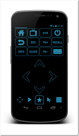
Figure 10-14: The Able Remote is a smartphone app that allows users to control their Google TV device.
Source: Able Remote app
Summary
The diversity of Android devices manifests itself in the hundreds of different control mechanisms in both hardware and software. When building your app, you cannot rely on the devices you have to be the norm. Remember that some devices are used in different ways.
The software controls on Android are flexible and if you use them correctly, they can be very helpful to your users. When building an app, think about the ways your user will be filling in forms and using the buttons. Remember to design natural ways for data types and keyboard action buttons to make data entry as effortless as possible.
Also think about the opportunities that the large accessory ecosystem brings. Maybe your app would benefit from adding better stylus support or a connection to an external smartwatch?
With the diversity and growth of the Android ecosystem, the opportunity for designers and developers to create something novel and useful is growing by leaps and bounds.