
Chapter 12: Managing Android Resources
Android devices come in many different forms and sizes. You’ve read in several places in this book that the Android SDK provides developers with great tools for building software that scales nicely to all devices. Now it is time to take a look at those tools.
This chapter talks about the Android resource management framework. It allows developers and designers to provide multiple alternative resources for an app and let the operating system use the correct ones for each device. After the resource manager overview, this chapter dives into the individual device properties, or qualifiers, that you can use.
Using Android resources
The Android operating system allows you to add multiple alternative resources to your app. The operating system picks the correct resource during runtime based on the runtime environment. This way, you can provide correct density graphics, the right kind of layouts for larger screens, correct language translations, and even alternative attributes for non-touch devices.
There are multiple types of resources that can be used in any Android app. The Resource Manager manages them, and the same rules apply to them. They need to be placed into the correct resource folder in your app project structure under the res/ folder:
• Animation definitions. (res/anim/ and res/animator/)
• Color state list definitions. (res/color/)
• Drawables. These can be bitmaps or XML drawable definitions. More about these in Chapter 14. (res/drawable/)
• Layout definitions. (res/layout/)
• Menu definitions. (res/menu/)
• Simple value definitions. These can be strings, colors, and integers. res/values/
• XML files. (res/xml/)
• Raw data. (res/raw/)
Don’t let the res/xml folder fool you into thinking that it is the only place for XML files. In fact, most of Android resource files are XML.
Configuration qualifiers
The operating system cannot automatically determine which alternative resource is for which device type. You must tell the system which resources you want to be used in which kind of environment.
The Android platform has a set of predefined qualifiers that you can provide as extensions to your resource folder names. Based on these qualifiers the operating system determines which resources should be used on a particular device. The qualifiers are added to the end of the resource folder name, separated by dash (-). For example, res/drawable-hdpi/ is the drawable folder that should be used when the app is running on a device that has a high-density screen (screen density is explained later in this chapter).
Tip: You don’t always have to provide all resources in all of the folders. In many cases you’ll have a large set of resources that don’t need any qualifiers, in which case you can leave them in the default folder and only add folders with qualifiers to the resources that need to have alternatives.
The operating system uses smart resolution when it tries to determine which resource should be used. A simplified way of thinking about how the operating system looks for the best match is to think about it as a game of elimination. The operating system eliminates all folders with qualifiers that do not match the current system configuration. Often, that is not enough, as multiple folders might remain after the elimination process (for example, res/values-en and res/values/). The second step in the resolution is to look for qualifiers that match the current configuration. If a matching qualifier is found, the operating system then eliminates all folders that do not have the qualifier.
Most of the time you can simply trust the operating system to find the best match. Complex cases are pretty rare. If you ever find yourself confused as to why wrong resources are being used, you can find the exact algorithm the operating system uses described in detail in the Android documentation. You can read it at http://www.developer.android.com/guide/topics/resources/providing-resources.html#BestMatch.com/.
The available qualifiers are covered in the following sections in this chapter.
Combining Qualifiers
In many occasions using the right resources requires using more specific definitions than just a single qualifier. The Android platform allows you to combine the qualifiers in any way you like. Some of the combinations don’t make sense but some are very important. For example, graphics sometimes contain text. In that case the graphical asset must be localized as well as provided for multiple densities. You could have the folders res/drawable-en-hdpi/ and res/drawable-en-mdpi/, as well as res/drawable-de-hdpi/ and res/drawable-de-mdpi/.
Library Projects and Overriding Resources
Library projects are a very important part of the Android project structure and organization. When you’re using library projects, the main project resources always override resources with the same name and same qualifiers as the library project. This can be a very powerful technique to use for creating different apps from the same source or from Android library projects that provide components.
API Level Requirements
Some qualifiers have been added in later phases of the Android platform development. Fortunately, the Android platform runtime is smart about them. It simply ignores folders with qualifiers it doesn’t understand. Using newer qualifiers won’t cause problems on older devices as long as you also provide resources in folders with qualifiers that the runtime Android version understands.
Designing for Screen density
Screen density is probably the most important and most used qualifier in any Android project. Without understanding how to handle screen densities correctly, it is nearly impossible to create apps that look good on all devices.
What does screen density mean in practice?
If you have a dual monitor setup for your computer, for example a laptop and an external display, you probably have two separate density displays. Consider the following example. Your laptop has a 15-inch full HD display (1920×1080 resolution), and your external connected display is a larger 30-inch display with the same full HD resolution. If you drag a window from your laptop’s display to your external display, its physical size grows. The window still has exactly the same pixels, but each pixel is larger. If you want to prevent this from happening you need to lower the resolution of your laptop display until the pixels on that screen are physically the same size as on the larger external display. Once you get the resolutions right the windows will stay the same physical size when you drag them between your displays. So these two displays have different display densities.
Consider another example. Let’s say that you have two smartphones, A and B, that both have 4-inch screens. Phone A has a 320×240 pixel resolution, and phone B has a 640×480 pixel resolution. An image using the same number of pixels on these two devices will be a very different physical size on each. See Figure 12-1 for an abstract example of this.

Figure 12-1: An abstract example of a picture displayed on a low-density screen (A) and a high-density screen (B).
Why is screen density important?
Why does this matter so much that I’ve dedicated multiple pages to it in this book? On a desktop screen, density isn’t a big deal, and you very rarely care about the physical size of the user interface on your computer displays. Physical size of user interface components matter much more on touch screen devices. Users interact with them with their fingers. User interface components that are the correct size on a 320×240 pixel 4-inch screen would be unusable on a 640×480 pixel 4-inch screen. Buttons would be too small to tap, and user interface components would be too close to each other. Users would not be able distinguish between their touch areas, causing them continuously tap the wrong components.
To fix this problem you must make sure that everything in the user interface is defined in a way so they end up being the same physical size no matter what screen density is. In case of images it requires the images either to be scaled automatically or for you to provide separate assets for different screen densities. Figure 12-2 shows an example of separate assets being displayed on the lower-density screen (A) and the higher-density screen (B). These two images will end up looking the same size for users due to the screen density difference.
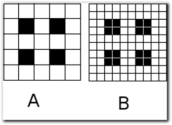
Figure 12-2: An abstract example of how the images should be displayed on two different density screens.
Screen density in Android terms
Dots per inch (DPI) is the metric used to describe screen density. The term is derived from its former use from print media and printers describing the same thing in that media. You might see pixels per inch (PPI) used sometimes. It is the same thing.
It is not feasible to support all possible screen densities separately. That is why the Android SDK groups them in categories with fixed range of densities. In practice it means that on devices that have close to each other’s screen density but not exactly the same your user interface will be a slightly different size. The categories have been selected in a way that these variations are minimal and don’t cause problems for user. Android documentation calls these groups generalized densities.
There are four screen density groups that can be used on Android devices plus one extra for TVs with 720p resolution (TVs are a different matter in this density case). Table 12-1 shows the Android supported density categories and corresponding resource qualifiers. Each device will fall into one of these categories. The manufacturer decides which generalized density a device has, but you can trust that any device is grouped appropriately. There have been exceptions in the past, most notably the first Galaxy Tab, but the exceptions are rare, and there really is no need to prepare for them.

Automatic graphics scaling vs. separate assets
If you don’t provide separate graphical assets for different screen densities the operating system performs an automatic scaling operation. The operating system uses the asset that is the closest fit to the target density.
In some cases the automatic scaling is good enough, but more often than not the result of the automatic scaling is not good enough. In the best case the scaled picture is blurry, and in the worst case it can be distorted badly.
On the other hand, producing assets takes time. It is always a matter of a compromise. You need to make the decision on case-by-case basis. Larger images often scale down nicely but upwards badly. Small icons rarely scale well in either direction.
res/drawable/ folder is for XML only
Always place your graphical assets into folders with the density qualifier. Never leave any GIFs, PNGs, or JPGs in the res/drawable/ folder. Although graphical assets from that folder do technically work, it can cause confusion. XML drawables on the other hand are density independent and should be in the default folder. You’ll learn more about XML drawables in Chapter 14.
Preventing scaling
Although it’s rare, you might sometimes need to provide assets that are not going to be scaled on any density screens. You can use the special density qualifier nodpi. If a graphical asset is found only from this folder, the operating system will draw it on the screen without performing any density scaling.
Screen densities that matter
There are devices out there with every kind of the screen density type, but the distribution is not even. As with picking the Android version to support, you should base your decision as to which screen densities to support on the device distribution. The optimum solution is, of course, to support all of them but that is not always possible.
Google publishes up-to-date data about the current screen density and size distribution on the Android developer website at http://www.developer.android.com/resources/dashboard/screens.html.com/. It’s worth taking a look at this chart when making your decision.
At the time of this writing, about 3 percent of Android devices have LDPI screens. By far, the massive majority of devices have MDPI or HDPI screens and only few have XHDPI screens. My advice is to always provide assets for HDPI and MDPI. LDPI can probably be safely ignored as it’s not being used as much in new devices. XHDPI, on the other hand, should not be ignored, even though it has a relatively small market share. Most new flagship phones are going to ship with gorgeous XHDPI screens. These devices are also perfect ways to demo your app.
Density independent pixels, dp
Although this topic isn’t directly related to the Android Resource Manager, it is such an important part of creating content that’s independent of screen density that it cannot be ignored here.
When creating layouts and defining component sizes you often need to give the operating system a desired size for the component. Although you can give a pixel size for a button, for example, doing that would lead to the same problem described previously. The button would be the wrong size on every density device other than the one you designed it for.
The Android SDK has a solution to this. You can define any size in density-independent pixels (dp or dip). In fact, you should always use dp definitions! Breaking this rule will break your app on a large amount of devices.
Density-independent pixel definitions are automatically handled by the operating system, which converts them to correct pixel sizes during the app runtime, depending on the pixel density of the device the app is running on. You can think of dp as an abstract pixel. If you design and define your whole user interface using dps, all your components will be the same physical size on all devices. You don’t have to do anything else. The operating system takes care the rest.
The concept of density independent pixels can be difficult concept to get your head around at first. The easiest way to think about density independent pixels is to think of them as pixels on a medium density screen. In fact, the definition goes like this 1dp = 1px on MDPI screen. Table 12-2 shows some dp to px conversions.
Table 12-2 Example of a 100dp to Pixel Conversion
|
Screen Density |
100dps in Pixels |
|
ldpi |
75.00px |
|
mdpi |
100.00px |
|
hdpi |
150.00px |
|
xhdpi |
200.00px |
You rarely need to think about these conversions with user interface components, but you need to know them when creating graphical assets. An icon that is 50×50px on a MDPI screen must be 75×75px on an HDPI screen, and so on. The between each screen density is 1.5. The fraction can make conversion difficult. One-pixel lines, for example, can cause trouble. You can’t make anything 1.5 pixels in size.
DPs from Code
When writing your app’s layout XML files you can always use the dp size definitions. But what if you need to set a component size in the code? All Android API size definition methods expect to get pixel size as the parameter.
Unfortunately, you need to do the conversion yourself. The following code example does the conversion. It asks the operating system for the current screen density multiplier and applies it. Note the added 0.5 on the last line ensures that any conversion never ends to value 0. According to Romain Guy (an Android engineer working at Google), this is also how the operating system performs the conversion:
// you must have a context object
DisplayMetrics metrics = context.getResources().getDisplayMetrics();
float dp = 20f; //this is the dp size you want to have
int pixels =
(int) (metrics.density * dp + 0.5f); // this results to correct pixel size
Density Independent Text Size
Text and typography were discussed in Chapter 11. In that chapter, I instructed you to use the sp (scale-independent pixels) size definitions for text. This corresponds to the dp definitions for other sizes.
Designing for Screen size and form
Screen size is another relevant issue when it comes to building Android apps. Android devices ship with screens as small as three inches all the way up to 13-inch tables. Most likely you are going to use screen size related qualifiers to provide different layouts for tablets and phones. I’ll talk much more about that in Chapter 15.
Generalized size
Just as screen densities are grouped into generalized density categories, screen sizes have four size categories that can be used as qualifiers to provide alternative resources. Table 12-3 includes more detail about these four qualifiers.
Table 12-3 Android Generalized Screen Size Qualifiers
|
Qualifier |
Appropriate Screen Size |
|
small |
320×426dp units |
|
normal |
320×470dp |
|
large |
480×640dp |
|
xlarge |
720×960dp |
These qualifiers are good enough for most phone screens, but when it comes to tablets these categories might be too vague. An xlarge screen is about seven inches or larger. Note that the xlarge qualifier was added in Android API level 9.
The resource system will never use resources from a folder with a qualifier that defines a larger size than the runtime environment has. If you don’t provide resources in a suitable folder it will cause a runtime crash.
Fine grained screen size
The first Android versions didn’t really take tablets into account but that changed with the release of Android 3.2 Honeycomb. The Honeycomb release added new qualifiers that can be used to support more fine-grained screen sizes. These three new qualifiers allow you to define an exact density independent pixel size for your resource folders.
As the qualifiers can contain any value, knowing which one to use isn’t as simple as with generalized size qualifiers. In the case of these three qualifiers, the system always uses the one that’s closest to the device configuration without exceeding it.
Smallest Width
The Smallest Width qualifier allows you to define resources based on the device’s screen size. This qualifier replaces the old categorized screen sizes. The Smallest Width qualifier is the smallest width of the device available to your app. This width is not dependent on the device orientation and also takes into account any additional space used by operating system components.
The syntax for defining this qualifier is as follows:
sw<N>dp
As an example, res/layout-sw720dp/ is used for a 10-inch MDPI 720x1280 tablet.
Available Width and Height
Unlike the smallest width available width and height are affected by the device orientation. These values refer to the currently available value. The syntax is w<N>dp for available width and h<N>dp for available height.
Aspect ratio
You might never use this one, but it can be quite useful in some cases. The two available qualifiers are long and notlong. These qualifiers are not dependent on the screen orientation.
The long screen form factor is slightly different from notlong. For example, the Nexus One is a notlong screen with 480×800 resolution, whereas the Motorola Droid with the 480×854 resolution is a long device. It has 54 more pixels on its long edge. The difference isn’t much and can often be ignored. Long screens include WQVGA, WVGA, FWVGA, and not-long screens include as QVGA, HVGA, and VGA.
Screen orientation
Screen orientation is simple and powerful. You can define different layouts when the device is on portrait mode and when it is in landscape mode. The qualifier values are port and land.
Designing for Language and region
The language and region qualifier is very useful when you have multiple languages on your app. All you need to do is to provide the language files in the right resource folders and the operating system takes care of the rest.
The syntax for the language and region qualifier is <language code>-r<region code>. The language code is a two-letter ISO 639-1 language code and the region code is two-letter ISO 3166-1-alpha-2 region code. The region code is optional and cannot be given alone. The qualifier is not case-sensitive.
You can also use mobile country code and mobile network code as a resource qualifier. The syntax for this is mcc<code>-mnc<code>. The first code is the mobile country code, and the second one is the mobile network code. The mobile country code can also be used alone.
Designing for Device controls
The platform has many qualifiers defining availability of control mechanisms. You might provide different functionality for devices with a stylus and for devices with a D-pad. Take a look at Table 12-4 for a list of these qualifiers and their corresponding explanations.
Table 12-4 Device Control Resource Qualifiers
|
Qualifier |
Explanation |
|
|
Device does not have a touch screen. |
|
|
Device has a resistive touch screen. |
|
|
Device has a touch screen. |
|
|
Device doesn’t have a hardware keyboard. |
|
|
Device has a hardware QWERTY keyboard. This category includes other QWERTY-like keyboards regardless of the actual layout like the German QWERTZ keyboard as well. |
|
|
Device has a hardware 12-key keyboard. |
|
|
Navigation keys are currently exposed. |
|
|
Navigation keys are currently hidden. |
|
|
Device doesn’t have separate navigation keys. |
|
|
Device has a D-pad. |
|
|
Device has a trackball. |
|
|
Device has a directional wheel. |
In the case of the keyboards, these qualifiers are not dependent on whether the keyboard is currently being used.
Designing for Platform versions
You can also provide different resources for devices running different operating system versions. This can be very useful when you want to utilize some components that aren’t available on older platforms but still support the older devices. You can, for example, provide alternative layouts using the latest user interface components.
The qualifier syntax is -v<minimum API level>. Read more about API levels from the Android documentation at http://www.developer.android.com/guide/appendix/api-levels.html.com/.
Designing for Device modes
Far fewer qualifiers are available to you if you plan to support device modes like docks or night mode. These were added in Android API level 8 and are not available on older devices.
For night mode, you can use the qualifiers night and notnight. These can change while your app is running.
You can also use two dock mode qualifiers—car and desk—to provide separate resources when the device is docked.
Summary
As you can see, Android is designed to run on a wide range of devices. The Resource Manager combined with the flexible layouts (introduce in the next chapter) are powerful tools that allow you to build apps that support all or most Android devices. By using these tools, you can turn the infamous Android fragmentation from a problem into a platform feature.
You need to choose where you invest your time, though. Providing different graphics for different screen densities is very important, but you probably won’t want to support all of them from the get-go.