
Chapter 13: Android App Layouts
Android layouts are the best tools in your toolkit for creating scalable applications. Because the Android platform was designed to support multiple device sizes and forms, it has a great set of layouts that you can utilize out of the box to support the widest possible selection of devices.
Android layout strategy
You should never define your Android user interfaces by setting absolute pixel positions to your components like you might do on other platforms. A user interface with an absolutely defined layout would look right on only one device. Instead of the absolute layout strategy Android user interfaces are built by defining how components relate to each other. In this sense designing layouts for Android is much closer to web design than to iOS design.
To make a layout scalable you must tell the operating system how the layout is to be scaled. Not all areas in the user interface should be resized. Android’s layouts let you define fixed areas and resizable areas. When used properly, these two types of areas will make your user interface scalable but maintain certain constraints for good results when scaling.
Fixed areas
A fixed area is a part of the user interface that cannot be resized. A typical example of this kind of area is a user interface icon. Icons are often a fixed size, and resizing them makes them look distorted.
Sometimes a fixed area is only fixed in one direction and resizable in the other. For example, a button bar often has a fixed height but is resizable horizontally to fill the whole screen.
Resizable areas
Resizable areas are the opposite of fixed areas. They can be resized to fill in a space in the user interface. Even resizable areas have their limitations. They often have a minimum size that is required to show all the content and sometimes also a maximum size as well. When it comes to these constraints, you can start to utilize responsive design principles to avoid too small or too large resizable areas. You’ll read much more responsive design in Chapter 15.
Resizable areas often utilize scrollable containers to make sure that the content will be fully accessible, even on very small devices.
Combining fixed and resizable areas
Making your user interface scalable requires you to utilize both fixed and resizable areas correctly. There is one simple rule you can use to check if your design is on the right track. If all the components on your user interface are fixed in one dimension (height or width), your interface is not scalable, and the operating system will not be able to adjust your interface to multiple screen sizes.
Tip: This is a good point to create a screen design for your app. Think about the resizable sections and the fixed sections, and make sure that your screen design has enough places for resizing.
Consider the example shown in Figure 13-1. The example screen design has three composite components—the top Action Bar, a list, and a bottom button bar. In this fairly typical Android screen design, the top Action Bar and the bottom button bar are a fixed height. The list component in the middle is resizable. I’m certain that you’ve seen layouts like this in many apps you’ve used. No matter what the screen size, this layout always works and displays the data correctly. On a smaller screen the list area will simply be smaller and fewer list items will be displayed at a time.

Figure 13-1: A simple example screen design demonstrating resizable and fixed areas.
Layouts in Layouts
Android layouts can be composed from other layouts. In fact, layouts inside layouts are very common. Take another look at Figure 13-1 but this time in the horizontal dimension. For example, the Action Bar is a resizable component, but it contains two fixed areas. In this case the left app icon and the right menu item are fixed, leaving the middle title part to be resizable. The bottom bar on the other hand contains only two user interface components, and they are designed to fill in the area together. They are both resizable.
Layouts from XML and code
The most common way you will define layouts is to use Android’s resource system discussed in Chapter 12. Most applications can define all layouts in the Android XML files placed in the res/layout/ folder or any of the related layout folders with a qualifier.
Most of the examples in this chapter are explained using XML layouts. For any and all layouts or layout structures you can also always use code to create the corresponding layout objects and their attributes. Using XML will save you a lot of time as well as make the project structure easier to maintain and better organized. Layout XML files can also benefit from the Android resource management system as well as be built by using various graphical development tools like the Android Eclipse plug-in’s visual user interface builder.
Layout managers
Now that you have established a basis for your Android layout strategy, you’re ready to take a look at the actual layouts the Android platform provides for developers. These layouts, when used correctly, allows developers to implement almost any screen design.
Relative Layout
Relative layout is by far the most powerful layout manager on Android. Whether you are an Android developer or designer, you should take some time to learn how this layout works in detail. Relative layout is the cornerstone of any Android app design. If designers understand its flexibilities and limitations, they can more easily specify user interfaces that the developers can implement the way they wanted. It is scalable and massively flexible. With that flexibility inevitably comes some complexity.
 Scan the QR code with your Android phone to open the companion app and try out a functional example.
As the name suggests, relative layout is based on the idea of defining component locations based on their relation to other components. You can think about a relative layout as a set of anchor points to which you can anchor your user interface components. Each added user interface component becomes an anchor point once it’s added to the layout.
First, take a look at the anchor points available to you related to the parent component (the layout). Whenever you add a user interface component to the relative layout, you can set any of these anchor points. These points define where the component will be placed. Table 13-1 lists all of these anchor points. These values are all set to true or false as they are only related to the parent component.
Table 13-1 Relative Layout Anchor Points Related to the Layout Itself
|
Anchor Point Name |
Explanation |
XML Parameter |
|
Parent bottom |
Aligns the child’s bottom edge with the parent’s bottom edge. |
|
|
Parent left |
Aligns the child’s left edge with the parent’s left edge. |
|
|
Parent right |
Aligns the child’s right edge with the parent’s right edge. |
|
|
Parent top |
Aligns the child’s top edge with the parent’s top edge. |
|
|
Center horizontally |
Centers the child horizontally with respect to the bounds of the parent. |
|
|
Center vertically |
Centers the child vertically with respect to the bounds of the parent. |
|
|
Center |
Centers the child with respect to the bounds of the parent. |
|
Take a look at the example in Figure 13-2. The large rectangle represents the relative layout, which might or might not be the whole user interface of an app screen. There are three components that are placed in the layout. Component A has a parent top and parent left layout attributes set. Component B has a center layout attribute set, and component C has a center horizontally and parent bottom layout attributes set.
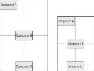
Figure 13-2: An example of relative layout used to place user interface components related to the parent.
Setting component locations based on their parent is very helpful, but that alone is not enough. Relative layout also allows you to set component location relative to the other components in the same layout. Table 13-2 describes the anchor points you can use to place components relative to their sibling components. Each of these attributes requires you to define another component as the anchor point.
Table 13-2 Relative Layout Anchor Points Related to Sibling Components
|
Anchor Point Name |
Explanation |
XML Parameter |
|
Above |
Aligns bottom edge with another child’s top edge. |
|
|
Below |
Aligns top edge with another child’s bottom edge. |
|
|
Left of |
Aligns right edge with another child’s left edge. |
|
|
Right of |
Aligns left edge with another child’s right edge. |
|
|
Align baseline |
Aligns baseline with another child’s baseline. |
|
|
Align bottom |
Aligns bottom edge with another child’s bottom edge. |
|
|
Align left |
Aligns left edge with another child’s left edge. |
|
|
Align right |
Aligns right edge with another child’s right edge. |
|
|
Align top |
Aligns top edge with another child’s top edge. |
|
Let’s look at another example in Figure 13-3. In this example, component B is the same as in the previous example. It is placed in the center of the layout. Component D combines the bottom layout attribute and the center horizontally layout attribute. It is laid out below component B. Component E is set to be laid out below the component D as well as set to align right of the component D. Now, no matter what the layout size in total is these components always stick together.

Figure 13-3: An example of relative layout components placed relative to each other.
The following source code shows you how the components from Figures 13-2 and 13-3 can be defined in Android layout XML. Figure 13-4 shows the resulting user interface.
<?xml version=”1.0” encoding=”utf-8”?>
<RelativeLayout xmlns:android=”http://schemas.android.com/apk/res/android”
android:layout_width=”fill_parent”
android:layout_height=”fill_parent”
android:orientation=”vertical” >
<Button
android:layout_width=”wrap_content”
android:layout_height=”wrap_content”
android:layout_alignParentLeft=”true”
android:layout_alignParentTop=”true”
android:text=”button a” />
<Button
android:id=”@+id/button_b”
android:layout_width=”wrap_content”
android:layout_height=”wrap_content”
android:layout_centerInParent=”true”
android:text=”button b” />
<Button
android:layout_width=”wrap_content”
android:layout_height=”wrap_content”
android:layout_alignParentBottom=”true”
android:layout_centerHorizontal=”true”
android:text=”button c” />
<Button
android:id=”@+id/button_d”
android:layout_width=”150dp”
android:layout_height=”wrap_content”
android:layout_below=”@id/button_b”
android:layout_centerHorizontal=”true”
android:text=”button d” />
<Button
android:layout_width=”wrap_content”
android:layout_height=”wrap_content”
android:layout_alignRight=”@id/button_d”
android:layout_below=”@id/button_d”
android:text=”button e” />
</RelativeLayout>
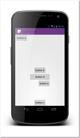
Figure 13-4: Screenshot of the user interface produced from the relative layout example code.
Linear Layout
Linear layout is a much more simple than the relative layout manager. In a linear layout all components are placed one below the other, or side-by-side. It is worth noting that unlike some similar layouts on other platforms, linear layout does not support automatic flow of elements. It always places the elements in exactly one row or exactly one line.
You can set the direction of a linear layout by setting the android:orientation attribute value to horizontal or vertical.
You can also add a layout weight attribute to any child components you place inside a linear layout. This attribute defines how much extra spacing is added to the child component. By default, the child components are not stretched and their weight values are 0. Any value higher than 0 will make the child component use more of the available space related to its siblings.
The following code example and Figure 13-5 demonstrate the linear layout and layout weight in practice. Note that button A takes only the vertical space it needs, whereas the other two buttons are stretched to fill the space of the parent layout. Button B is twice the size of button C as it has double the layout weight.
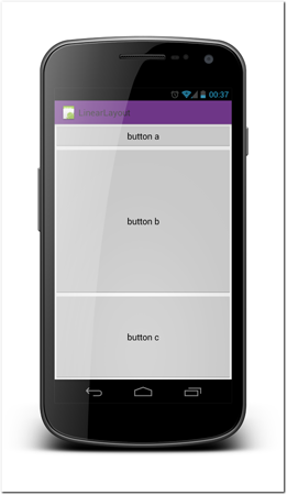
Figure 13-5: Screenshot of the user interface produced from the linear layout example code.
Note that the values of the weight attribute do not have to be between 0 and 1. Values 5 and 10 have exactly the same effect as 0.5 and 1. It is also worth noting that components that have the same weight are not necessarily the same size in the resulting screen. The weight attribute affects only the division of the empty extra space between the components.
<?xml version=”1.0” encoding=”utf-8”?>
<LinearLayout xmlns:android=”http://schemas.android.com/apk/res/android”
android:layout_width=”fill_parent”
android:layout_height=”fill_parent”
android:orientation=”vertical” >
<Button
android:layout_width=”fill_parent”
android:layout_height=”wrap_content”
android:text=”button a” />
<Button
android:layout_width=”fill_parent”
android:layout_height=”wrap_content”
android:layout_weight=”1”
android:text=”button b” />
<Button
android:layout_width=”fill_parent”
android:layout_height=”wrap_content”
android:text=”button c”
android:layout_weight=”0.5”/>
</LinearLayout>
 Scan the QR code with your Android phone to open the companion app and try out a functional example.
Frame Layout
Frame layout is the simplest layout of all, but it can still be very useful. A frame layout is simply a container for elements. Usually a frame layout contains only one child element, but in some cases you might want to add more elements to it. The only control you have over where the child element is placed is using the layout gravity setting, which is explained in the next section. Otherwise, all the components you add to a frame layout are placed on top of each other. The z-order, or the order in which the components are drawn, is defined by the order you add components to the layout. Components added early are drawn first and components added later are drawn on top of them. In the following code, the button labeled button b will be drawn on top of the button labeled button a, covering it.
<?xml version=”1.0” encoding=”utf-8”?>
<FrameLayout xmlns:android=”http://schemas.android.com/apk/res/android”
android:layout_width=”fill_parent”
android:layout_height=”fill_parent” >
<Button
android:layout_width=”wrap_content”
android:layout_height=”wrap_content”
android:text=”button a” />
<Button
android:layout_width=”wrap_content”
android:layout_height=”wrap_content”
android:text=”button b” />
</FrameLayout>
A common use for frame layouts is when a component is shown only temporary, such as when showing a loading indicator. You might place your main user interface layout and the loading indicator as a child of the same frame layout. This makes sure that the loading indicator is in the center of your user interface. Once the process is finished, you simply set the loading indicator visibility to gone and you’re done.
Layout Gravity
Layout gravity defines where in the parent layout the child components are placed. Not all layouts support layout gravity and it is more important on a frame layout than on other layouts. For any component, you can set an android:layout_gravity attribute, which tells the layout where the component should be placed related to the layout.
The following example code and Figure 13-6 show how the frame layout and gravity attribute works.
<?xml version=”1.0” encoding=”utf-8”?>
<FrameLayout xmlns:android=”http://schemas.android.com/apk/res/android”
android:layout_width=”fill_parent”
android:layout_height=”fill_parent” >
<Button
android:layout_width=”wrap_content”
android:layout_height=”wrap_content”
android:layout_gravity=”top|right”
android:text=”button a” />
<Button
android:layout_width=”wrap_content”
android:layout_height=”wrap_content”
android:layout_gravity=”center”
android:text=”button b” />
<Button
android:layout_width=”wrap_content”
android:layout_height=”wrap_content”
android:layout_gravity=”bottom|center_horizontal”
android:text=”button c” />
</FrameLayout>
 Scan the QR code with your Android phone to open the companion app and try out a functional example.
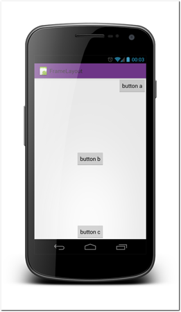
Figure 13-6: Screenshot of the user interface produced from the frame layout example code.
Grid Layout and Table Layout
Grid layout is a very flexible but rarely useful layout. As its name suggests, it’s a layout you can use to create grids of user interface items. The layout has a wide variety of attributes you can use to specify how the child components are laid out. For the full set of available options, see the Android documentation at http://developer.android.com/reference/android/widget/GridLayout.html.
Note that the grid layout is available only with API level 13 (Android 4.0) or newer.
The following example code creates a very simple grid layout. Figure 13-7 shows how it looks on a phone.
<?xml version=”1.0” encoding=”utf-8”?>
<GridLayout xmlns:android=”http://schemas.android.com/apk/res/android”
android:layout_width=”wrap_content”
android:layout_height=”wrap_content”
android:columnCount=”2” >
<TextView
android:layout_margin=”5dp”
android:background=”#AA222222”
android:padding=”10dp”
android:text=”col1 row1” />
<TextView
android:layout_margin=”5dp”
android:background=”#AA222222”
android:padding=”10dp”
android:text=”col2 row1” />
<TextView
android:layout_columnSpan=”2”
android:layout_gravity=”fill_horizontal”
android:layout_margin=”5dp”
android:background=”#AA222222”
android:padding=”10dp”
android:text=”col1,2 row2” />
</GridLayout>
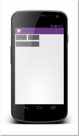
Figure 13-7: Screenshot of the user interface produced from the grid layout example code.
Table layout is somewhat similar to the newer grid layout but it is available from the API level 1. The table layout has some problems, though. It is nowhere near as flexible as the grid layout. Table layout has a very limited set of uses and most of them can be handled better by a relative layout.
 Scan the QR code with your Android phone to open the companion app and try out a functional example.
Tabs
Tabbed user interfaces are very powerful and useful concepts. You’ll learn more about tabbed user interfaces in Chapter 19.
Defining a layout size
Every Android user interface component must have both width and height set. Not providing these attributes will cause a runtime crash. In an XML layout definition, these values are provided by adding the android:layout_width and android:layout_height attributes to all user interface components, including the all layouts.
In order to define the component’s size you can give any of the following values to the attributes.
• wrap_content—Setting a component width or height to wrap_content makes the component use only as much space as it needs. The actual size of the component depends on its child component sizes.
• match_parent (formerly fill_parent)—The dimension of the component will fill all available space. The match_parent value was previously called fill_parent. The name change was made in Android API level 8. The values are synonyms; there is no difference.
• Dimension value in density independent pixels—Recall that the concept of density independent pixels was explained in Chapter 12. Never use pixels to define any size; always use density independent pixels instead.
Scrolling
Scrolling containers or scroll views are familiar tools from other platforms and have been around for a long time. A scrollable container allows you to have larger user interface structures than the screen can hold. Users can then scroll the viewport (the area that is visible) to see the entire area.
Scroll views work a bit differently on touch screen devices than they do on computers that are operated with a mouse. On a mouse-controlled system, the viewport moves by moving scroll bar controls up and down and left and right. On a touch-based device, users move the viewport by dragging it.
The difference in interaction methods causes some problems on touch devices that are not present on other devices. On touch devices it is not possible to have two scrollable components inside each other if both of the components can be scrolled in same direction (horizontal or vertical). This limitation also extends limiting use of any swipe gestures inside scroll views that have same direction as the scroll view.
Scroll View
Android ScrollView is the component providing scrolling functionality. It has fairly limited functionality but it is sufficient for the large majority of cases.
A scroll view can have only one child component, usually a layout. It also supports only vertical scrolling.
An important attribute to know for scroll views is android:fillViewport. Setting this attribute to true will cause the scroll view’s child component to expand to fill the view port in case it is smaller than the available space. This is usually the functionality that users expect. Setting the child component height to fill_parent alone is not enough.
Z axis, layout order
Sometimes it is necessary to place components on top of each other. In that case it is important to define the component z-order correctly. The z-order is the order that components are drawn. Components that are drawn later appear to be on top of the ones drawn before.
In Android layouts, the z-order is defined simply by the component definition order on the layout file or the order the components are added to a layout from code. Any components that are added to the layout earlier (on top of a layout file) are drawn first.
Padding and Margin
Getting the component spacing right makes your user interface look much nicer. Android provides you two sets of controls to influence the component spacing on any user interface.
Margin defines how much empty space should be left outside the component. Components should almost always have set margins. Placing components too close to each other will make your user interface look too busy. More importantly, because Android user interfaces are touch interfaces, leaving margins between different controls helps users press their intended target. Margins between two touch controls should be at least 2mm, which in Android is about 13-15dp.
Padding on the other hand defines how much space should be left inside the component border but outside the component content. Figure 13-8 shows a helpful illustration of padding and margin.
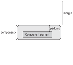
Figure 13-8: An abstract illustration of padding and margin related to a user interface component.
 Scan the QR code with your Android phone to open the companion app and try out a functional example.
Import and Merge layout files
It is always good to avoid copying any code; this will make maintaining and debugging the code easier. Due to the folder structure and the resource qualifier use, you might end up in situations where you need the same code either partially or fully in multiple places. You might also have some reusable layouts you want to use as part of multiple different screens.
Fortunately, there’s a good way to reuse the same code in multiple places. You can use the include element to import a layout file to another file. You simply give the element a parameter that tells the system which file you want to include. See the following example:
<?xml version=”1.0” encoding=”utf-8”?>
<FrameLayout xmlns:android=”http://schemas.android.com/apk/res/android”
android:layout_width=”fill_parent”
android:layout_height=”fill_parent” >
<include layout=”@layout/merge_example”/>
</FrameLayout>
Using include might lead to a situations where unnecessary layouts are created. For example, in the previous code example, if the included layout has another root layout the frame layout element is unnecessary. This is where the merge element enters the picture.
You can use the merge element as the root element of any of your layout XML files. When a layout like the following example code is induced in another layout, the system simply ignores the merge element and adds its child elements to the layout.
<?xml version=”1.0” encoding=”utf-8”?>
<merge xmlns:android=”http://schemas.android.com/apk/res/android” >
<Button
android:layout_width=”wrap_content”
android:layout_height=”wrap_content”
android:layout_gravity=”top|right”
android:text=”A button from merged layout” />
</merge>
 Scan the QR code with your Android phone to open the companion app and try out a functional example.
Custom layouts
As with any other user interface component you can also create your own layouts. Although this is very seldom needed, it can sometimes be a lifesaver. All layouts derive from the ViewGroup class and any custom layout class must do the same. Often the best way to reach your goals is to utilize one of the ready layout classes and then slightly modify its functionality instead of fully creating a new layout class from scratch.
Android Development Tools user interface builder
The Android Eclipse plug-in—Android Development Tools (ADT)—provides a graphical user interface builder that you can use to compose your user interface definitions by dragging and dropping components. The Eclipse plug-in is under active development by the Google’s Android tools team, and it is likely that by the time you are reading this, the user interface builder will have multiple improvements. Therefore, this section doesn’t fully explore all of its features. Instead, I encourage you to look into the tools and experiment with them.
Even when the graphical tools get better, it is always good to make sure that the generated XML code is exactly the way you meant it to be. The graphical tools can be used to create user interfaces faster than manually writing them. You can save a lot of time—while prototyping for example—by leveraging the graphical tools. The graphical user interface builder can be very helpful for learning the more complex layouts like the relative layout. Figure 13-9 shows an example screenshot of the tool helping users understand how the selected component will be anchored in a relative layout.

Figure 13-9: Android ADT plug-in user interface builder.
Source: Android SDK
Debugging layouts
It is sometime very difficult to understand the complex dynamic layout structures that are generated in the app runtime. These dynamic layouts are very difficult to debug when something goes wrong, such as when a view that should be visible isn’t. The Android SDK provides you with one more, great tool for debugging your views—the Hierarchy Viewer. You can find this tool in your Android SDK’s installation folder under the tools folder.
The Hierarchy Viewer connects to a runtime process and creates a graphical presentation of the layout tree. You can then inspect individual elements to better understand what’s going on. You can, for example, see elements that have zero width or zero height in the tree, and, therefore, do not show up. This tool can be a lifesaver. I encourage you to explore it. Figure 13-10 shows an example screenshot of this tool in action. Note that the Hierarchy Viewer can be used only with the Android emulator or with developer devices. It cannot load the layout hierarchy from non-developer devices.
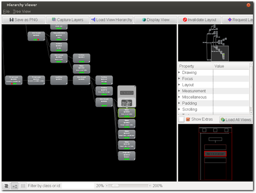
Figure 13-10: The Android Hierarchy Viewer shows detailed information of the runtime layout.
Source: Android SDK
Summary
Android layout managers are very powerful tools that you can use to create flexible and scalable user interfaces. Take time to learn the layouts to understand where they are best utilized and to know their limitations. The best and most flexible of all Android layout is the relative layout. Make sure you have mastered it. If you are a designer, the relative layout will be the key to drawing user interface specifications that your developers can easily implement.