
Chapter 14: Scalable Graphics
Graphical components are the most difficult ones to scale correctly of all of the different screen sizes and densities that Android devices have. There are many types of graphics that cannot be stretched or resized without destroying the look. Anything with gradients, diagonal lines, or text will look weird when stretched or scaled even a little bit.
Take a look at the example background in Figure 14-1. Having diagonal lines combined with a circular gradient would be a nightmare scenario if you could only use bitmap graphics. How would you create that bitmap? The aspect ratio must be the same because even a small distortion will make the circular form seem wrong. Scaling the image will not work either, because the spacing between the lines would then be wrong. You could provide one very large bitmap that would fit to the largest display. However, in addition to this looking bad on the smaller screens, the large bitmap would cause performance problems in your app due to its larger memory consumption.
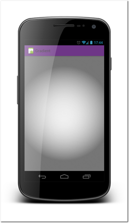
Figure 14-1: The round gradient with its diagonal lines is an example of a graphic situation that would be impossible to provide as a single file in a scalable manner.
Fortunately, there are a lot of useful tools and techniques that allow you to create complex graphics that are scalable. This chapter explains how and when to use them.
Nine-patching
Nine-patching is probably the most powerful tool that the Android platform provides when it comes to handling scalable graphical assets.
The idea of nine-patching is not new or unique to Android. It has been in use in web graphics for some time. The theory of nine-patch images is very simple. An image, for example a button background, is divided into nine images. Each of the corners is a separate image, the bits between these corner images are separate images, and then the part that is left in the middle is an image (see Figure 14-2). As a result of this splitting, the image can be scaled without ruining its rounded corners and borders. When content is placed in a nine-patch image, the corners remain their original sizes, but the parts between them and the center part are scaled to accommodate the content.
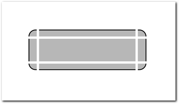
Figure 14-2: An example of button background divided into a nine-patch image.
Nine-patch structure in Android
Although nothing prevents you from building nine-patch images the same way they are used in the web, it can be done much more simply. Android provides with you a shortcut that can save a lot of time and effort as well as making the nine-patching on Android more flexible than the original idea.
 Scan the QR code with your Android phone to open the companion app and try out a functional example.
On Android nine-patch images are defined by adding a one-pixel border to the full image. On that one-pixel border, you can define where the image is going to be stretched and where the content will be placed by placing black pixels in the border. The operating system automatically strips the one-pixel border out of the resulting graphics and uses the information to correctly scale the image and place the content. The top and right parts of the border define which parts of the image are stretched and the bottom, and right parts of the border define where the content is placed (the padding).
Nine-patch images must have a special identifier in their filename for the Android operating system to recognize them as such. All nine-patch images must be named <imagename>.9.png.
The following example will make it easier for you to understand how nine-patching works in practice. Figure 14-3 shows a Polaroid-style picture border. Say that you want to use that as a border for your images but the images vary in sizes. The image contains text. Having text is always problematic when scaling, as different aspect ratios will always make the text look bad. Scaling text is also not very desirable; the result is likely to be pixilated.
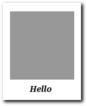
Figure 14-3: An example background image imitating a Polaroid-style picture border.
Let’s see how the example image can be used in a scalable way by utilizing the Android nine-patching. For this image to work, it’s important that the background is stretched from places where it will not cause the text to be distorted as well as to keep the borders the correct size.
Figure 14-4 shows how this example is defined to be scalable. To keep the text from stretching, I’ve set two pixels on both sides of the text to be the scaling pixels on the top border. Now, I’ve only added one pixel to be scaled because the background is a constant color. If you have color patterns or other effects, you need to carefully consider how the stretching is going to be done. Note that I also added exactly one pixel on both sides of the text so the image is scaled in the same proportions on both sides and the text stays in the middle.
For height I’ve added only one pixel to be scaled. In this case it doesn’t matter much where this pixel is placed as long as it is above the bottom-white part and below the top-white part. Note that the stretching area does not have to be only one pixel. It can be any size you like.
Content placement of the padding definition is very simple. The content image is placed in the gray area. Figure 14-5 shows a few examples of different size content images placed as content for this nine-patch example.

Figure 14-4: Example of nine-patch definition.
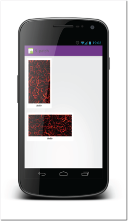
Figure 14-5: Resulting rendering of the example image border when nine-patching is utilized correctly.
Tip: When using nine-patch images, it’s important to understand that the operating system never scales nine-patch images smaller than the original size. This means that you should aim to optimize your graphics to be as small as possible to accommodate all possible content. Making the images small also makes your app smaller and conserves runtime memory.
Figure 14-6 shows how the Polaroid-style example can be optimized. Using this image will yield exactly same results as the image in Figure 14-5.
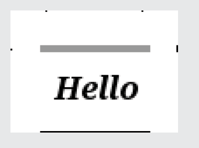
Figure 14-6: Rendering of the example image border when nine-patching is utilized correctly.
Using nine-patch images in code
Nine-patch images are most useful when used as background images. Using them is very simple, as the content placement is included in the image itself.
The following code example demonstrates the use of nine-patch images as an ImageView background (you can use it on any other component background too). The reference to @drawable/example_nine_patch points to example_nine_patch.9.png. Note that you don’t use the .9 in the drawable reference.
<ImageView
android:layout_width=”wrap_content”
android:layout_height=”wrap_content”
android:background=”@drawable/example_nine_patch”
android:src=”@drawable/example_content_high”
android:layout_margin=”10dp”/>
Nine-patch tool in SDK
The easiest way to build nine-patch files is to use a free utility tool called Draw 9-patch, which is provided with the Android SDK (see Figure 14-7). You’ll find this tool in your Android SDK installation folder under the tools subfolder.
This tool allows you to take your original image and define the one-pixel borders easily. Any image you upload to the tool will have the border automatically added unless the image is already in the nine-patch format.
The tool also provides a handy preview of your image in different sizes so you can see immediately how it will be scaled. To see how the content will be placed when the nine-patch image is used as a background, you enable the Show Content checkbox. A content overlay will be drawn on the preview images.
Nine-patch images from drawing tools
The Draw 9-patch tool isn’t the most flexible tool in the world. Designers who are already familiar with the everyday tools will likely prefer to use them instead. Using Photoshop or any other similar tool is possible and easy too. You just manually add the one-pixel border. The border must be fully transparent other than where the control pixels are. The control pixels must be full black without any transparency. It’s good idea to open the nine-patch images on the Draw 9-patch tool to check that everything works as intended. Using the wrong pixels on the border will cause a runtime crash when the image is used.
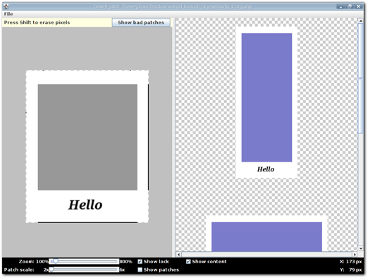
Figure 14-7: Android SDK’s Draw 9-patch tool.
Source: Android SDK
Drawable XML
Recall that the start of this chapter mentioned gradients and other graphics that are impossible to scale even when using the nine-patch method. Fortunately, the Android platform is not out of tricks yet. The platform supports creating simple graphical forms using XML-based definitions. You can create simple shapes, colors, gradients, and even bitmap effects by simply defining XML files. These XML files are placed in your project’s resources folder in the drawables folder. They can be used in the same way as any other drawables and can also benefit from Android’s excellent Resource Manager.
Shapes
You can draw simple shapes by defining them in XML. The shapes available to you are rectangle, oval, line, and ring. My opinion is that these shapes are not very helpful alone but can be used in combination with other drawables to create visual effects very efficiently. Figure 14-8 shows some examples of rectangle and oval drawables.
 Scan the QR code with your Android phone to open the companion app and try out a functional example.

Figure 14-8: Examples of rectangle and oval drawables from the XML definitions.
The way you define these drawables is to use a shape element and its android:shape attribute to describe which shape you want drawn. You can then add child elements to the shape element to change its properties. See the following code example. It is the top shape in Figure 14-8—the rectangle. The rectangle also has a gradient (more about gradients shortly) defined as the fill color, with rounded corners and a stroke color.
<?xml version=”1.0” encoding=”utf-8”?>
<shape xmlns:android=”http://schemas.android.com/apk/res/android”
android:shape=”rectangle” >
<gradient
android:endColor=”#66FF0000”
android:startColor=”#FF00FF00”
android:type=”sweep” />
<corners android:radius=”5dp” />
<stroke
android:width=”3dp”
android:color=”#FF0000FF” />
</shape>
The following source code shows a different example. This code defines the other shape from Figure 14-8—the oval. The oval also has a fill color defined, this time it’s a solid color and a stroke color.
<?xml version=”1.0” encoding=”utf-8”?>
<shape xmlns:android=”http://schemas.android.com/apk/res/android”
android:shape=”oval” >
<solid android:color=”#44FF0000” />
<stroke
android:width=”3dp”
android:color=”#FF00FFFF” />
</shape>
As you see these shapes are fairly simple but also very flexible. It is worth keeping these in mind when creating your graphical design. Using a shape instead of a bitmap will be much more memory efficient as well as more scalable.
Padding
You can add padding to your shape’s drawables by adding a padding element. However, you might not need to define the padding here, because you can define it in the layout XML. In some cases the padding element can be very useful. It can be especially important when defining layered drawables. You learn more about composite layered drawables later in this chapter.
Gradients
Gradients are nearly impossible to implement in a scalable way when you have a bitmaps whose size is not well defined. Fortunately you can create gradients as fill colors for any shape. These gradients can then be used as backgrounds on your components or as part of a layered composite drawable. You’ll learn about these composites shortly.
Android provides three gradient types for you:
• Linear—Gradient is drawn in one direction.
• Radial—Gradient starts from a single point and expands out in a radial manner.
• Sweep—Gradient direction follows a circular line.
The first two are very useful, and many designers use them in their designs. The sweep is much more rare, but at least there’s the option if you ever run into a situation where it is needed.
For any gradient you need to define a start and end color. You can also define an optional third middle color. Other attributes vary between the gradient styles. For a linear gradient you can define an angle that tells the system which way the linear gradient is drawn. For the radial gradient, you need to define the radius and optionally set offset coordinates for the gradient’s center.
 Scan the QR code with your Android phone to open the companion app and try out a functional example.
Color
A color drawable fills the available space with the selected color. This simple drawable can help make composite drawables easily customizable and maintainable. Note that (as in any other drawable) here too you can use the color resources to set the color. The following code example shows how simple it is to define a color drawable.
<?xml version=”1.0” encoding=”utf-8”?>
<color xmlns:android=”http://schemas.android.com/apk/res/android”
android:color=”#FFFF0000” >
</color>
Bitmaps
You can also have a drawable XML for a bitmap. There is one very important use for this—tiling. If you want to have a background of an unspecified size component or have your app’s background use a graphical pattern, this is pretty much the only option you have to implement it so it can scale and not suck massive amounts of memory.
The Android platform supports three tiling modes. Two of them are very useful. You can change the tiling mode by setting the android:tileMode attribute in the bitmap element to one of the following values (note that the default is no tiling):
• Repeat—Repeats the bitmap in both directions.
• Mirror—Repeats the shader’s image horizontally and vertically, alternating mirror images so that adjacent images always seam.
• Clamp—Replicates the edge color.
Repeat is the simple mode where the available space is filled with the bitmap by repeating it as it is. Mirror does the same thing, but alternates with mirrored and normal bitmap for every other row. Clamp is a special mode that isn’t tiling as such. It forces the bitmap’s border color to be used to fill in the remaining space. Figure 14-9 shows examples of the repeat and mirror modes.
The following example code demonstrates the use of the tile mode in a bitmap XML element. The bitmap used is a simple single triangle. The same bitmap is used with both examples.
<bitmap xmlns:android=”http://schemas.android.com/apk/res/android”
android:dither=”true”
android:src=”@drawable/example_triangle”
android:tileMode=”repeat” />
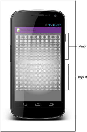
Figure 14-9: Examples of tiling bitmaps using repeat (above) and mirror (below) mode.
 Scan the QR code with your Android phone to open the companion app and try out a functional example.
Composite drawables with layers
Android also allows you to create drawables by combining multiple drawables into one layer. This method can be very handy especially when combining bitmaps with simple shapes or colors. You might, for example, have some kind of chrome effect that is created as a nine-patch image and used in combination of a dynamic choice of color. You can create a simple composite drawable with a color layer combined with the bitmap.
For layered drawable you need to use the layer-list element. The layer-list can be placed into a drawable XML and used the same way any other drawable can. In the layer-list you define any number of child item elements. Each item can either refer to another drawable or can contain any of the drawable definitions described previously.
Take a look at the following example code and the resulting drawable shown in the Figure 14-10. In this example code you can see how the items can even be nine-patch images as well as any other drawables. Note that in case of a nine-patch image, the system automatically applies the padding values from the nine-patch. Padding values from other drawables are also automatically applied. The system considers elements that are defined later as child elements of the earlier defined elements.

Figure 14-10: An example layer-list drawable used to draw multiple layers.
<?xml version=”1.0” encoding=”utf-8”?>
<layer-list xmlns:android=”http://schemas.android.com/apk/res/android” >
<item>
<nine-patch android:src=”@drawable/example_nine_patch” />
</item>
<item android:drawable=”@drawable/example_circular_gradient”/>
<item>
<color android:color=”#3300FF00” />
</item>
<item android:drawable=”@drawable/tiled_background”/>
</layer-list>
 Scan the QR code with your Android phone to open the companion app and try out a functional example.
Scale and Rotate
You can also scale and rotate drawables using the drawable definitions. Scale and rotate elements allow you to apply scaling or rotation to any drawable.
See the following source code and Figure 14-11 for an example of rotation applied to the layered drawable created in the previous section.
<?xml version=”1.0” encoding=”utf-8”?>
<rotate xmlns:android=”http://schemas.android.com/apk/res/android”
android:drawable=”@drawable/example_layer_drawable”
android:fromDegrees=”45”
android:pivotX=”50%”
android:pivotY=”50%” />
 Scan the QR code with your Android phone to open the companion app and try out a functional example.
Reminder About Selectors
Selectors are an important part of the drawable options. They allow you to define different drawables based on the user interface component state. The operating system then automatically handles the process of changing the graphics. Selectors were covered in Chapter 11 and so aren’t repeated here.
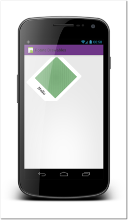
Figure 14-11: An example layer-list drawable used to draw multiple layers.
Drawing from code
Of course, using XML definitions to create graphics isn’t always detailed enough. The Android platform also provides great tools for creating visual presentations of components in the Android code. On the code level, you can change almost everything but it is also noticeably more complex and requires more effort. My recommendation is to carefully research the available components and their functionality before implementing your own.
To draw your own graphics, you need to create your own class that inherits from the View class or one of its descendants. I encourage you to find the class that most closely resembles the functionality you need and make that your class’s superclass. That way, you will likely need to customize only part of the class and can use the bulk of it as is. If, for example, you want to change the way some buttons work or look, you should start with the Button class and replace the functionality only when you must.
To define how your new component is going to be drawn, you must override the onDraw(Canvas) method. Depending on the situation you might not want to call . If you want to maintain the original component’s visuals and simply add to it, you should call the super method. If you want to fully override the component’s visuals, you can ignore it.
When you’re writing code for the onDraw method pay extra attention to your code’s performance. It is possible that this code will be called very often and all unnecessary object creation should be avoided here. It’s likely that keeping objects that are needed on each drawing pass in memory will be better for performance.
Drawing on Canvas
The tool for drawing is the canvas object you receive as a parameter to the onDraw method. The canvas class provides multiple helpful methods for you to draw different forms and bitmaps. A few of them are listed here, but for a full list of available methods and the full documentation, see the class documentation on Android developers website at http://developer.android.com/reference/android/graphics/Canvas.html.
• drawArc—Draws the specified arc, which will be scaled to fit inside the specified oval.
• drawBitmap—Draws a bitmap.
• drawCircle—Draws the specified circle using the specified paint.
• drawColor—Fills the entire canvas’s bitmap (restricted to the current clip) with the specified color.
• drawLines—Draws a series of lines.
• drawRect—Draws the specified Rect using the specified paint.
• drawText—Draws the text using the specified paint.
Paint object
The paint object is often a required parameter for drawing on the canvas. The paint object acts as the style definition for the object that is being drawn. It stores values like the colors, stroke style, transparency, and font style. Not all of these attributes apply to all shapes.
Plan the paints you use and create them outside the onDraw method if possible. Creating a paint object in the onDraw method will accumulate unnecessary garbage objects.
Shape-drawing Example
Let’s look at an example of dynamically drawing a shape on-screen. In the following source code you see a custom view. The only method that has been overridden is onDraw. The onDraw method draws a simple semi-transparent square. The location of the square is dynamic and decided by the coordinate variables. The coordinate variables on the other hand are controlled by the on touch listener. Note the invalidate() call at the touch event handler. That call causes the view to be redrawn whenever a user is moving his finger on the screen and the square follows that motion. Figure 14-12 shows the code rendered on a phone.
Note also the paint object created in the constructor. Because it is used on every draw iteration, recreating it every time would cause unnecessary garbage.
package com.androiduipatterns.smashingandroidui.examples.graphics;
import android.content.Context;
import android.graphics.Canvas;
import android.graphics.Paint;
import android.util.AttributeSet;
import android.view.MotionEvent;
import android.view.View;
public class ExampleCustomView extends View {
private Paint paint;
private int x = 0;
private int y = 0;
private int width = 200;
private int height = 200;
public ExampleCustomView(Context context, AttributeSet attrs) {
super(context, attrs);
// this Paint object is needed every time onDraw is called
// therefore I create it here and keep it.
paint = new Paint();
paint.setColor(0x44FF0000);
// To demonstrate dynamic drawing I’ve added a touch listener
// that allows user to drag the drawn rectangle on screen:
this.setOnTouchListener(new OnTouchListener() {
int x_start = 0;
int y_start = 0;
int x_drag_start = 0;
int y_drag_start = 0;
@Override
public boolean onTouch(View v, MotionEvent event) {
if (event.getAction() == MotionEvent.ACTION_DOWN) {
x_drag_start = (int) event.getX();
y_drag_start = (int) event.getY();
x_start = x;
y_start = y;
} else if (event.getAction() == MotionEvent.ACTION_MOVE) {
int delta_x = (int) event.getX() - x_drag_start;
int delta_y = (int) event.getY() - y_drag_start;
x = x_start + delta_x;
y = y_start + delta_y;
//calling invalidate causes the component to draw itself
invalidate();
}
return true;
}
});
}
/**
* Draws a rectangle on screen where the user has dragged it.
*/
@Override
protected void onDraw(Canvas canvas) {
canvas.drawRect(x, y, x + width, y + height, paint);
}
}
This component is placed into a layout by simply using the class’s fully qualified name. See the following example code:
<com.androiduipatterns.smashingandroidui.examples.graphics.ExampleCustomView
android:layout_width=”fill_parent”
android:layout_height=”fill_parent”
android:layout_margin=”10dp” />
 Scan the QR code with your Android phone to open the companion app and try out a functional example.

Figure 14-12: Example of how the code looks when rendered. Users can drag the square to move it on the screen.
Summary
With the various graphical drawing tools of the Android platform you can create infinitively scalable complex graphics like gradients and tiling backgrounds. Using these methods can save time and make your app work faster and more table. Although it is not necessary to memorize these techniques, it is a good idea to be aware of which drawing tools are out there.