Chapter 2. Which Application Does What?
It’s early on a Monday morning. You’ve just been handed a project to start. You turn on your computer and look at the list of applications in Creative Suite. How important is the decision as to which application you should use?
It’s a lot more important than you might think. Choosing the right application can mean that you have certain features that aren’t available in other applications, and can make it easier to move from the idea stage to the finished product. Choosing the wrong application may mean you get stuck at a certain point in your work and may need to spend time replicating the project in a different application.
In addition to which application you should choose, there is also the choice of how you should work within an application. For instance, if you work with InDesign for book production, should you work on one file that contains all the chapters of the book, or should you divide the project into separate files for each chapter? These are decisions that you want to make before you get too far along in the project.
In this chapter we’ll look at many different types of design and production projects and go through the reasons why we choose to work in a particular application for those projects. For your convenience we’ve divided the projects into seven categories:
• Photographic Projects: photo retouching, photo enhancing, special effects, contact sheets and layer comps, and duotones.
• Books: novels, textbooks, art and picture books, and children’s books.
• Other Long Documents: magazines and newspapers, annual reports, and catalogs.
• Enterprise Documents: stationery, business cards, price lists, labels, forms, and postcards and invitations.
• Design Projects: ads, CD/DVD labels and covers, brochures, movie posters, greeting cards, outdoor posters, book covers, matchbooks, logos and corporate identity, calendars, packaging, and fashion designs.
• Art and Illustration: fine art, technical drawings, maps, and charts and graphs.
• Web Pages and Web Graphics: web pages, web images, animations and movies, and web comps.
Of course, this is a subjective evaluation of which application to choose. There will certainly be times when you will choose a different workflow based on your own specific needs. Fortunately, the flexibility and options of Creative Suite 2 help make these decisions easy.
Photographic Projects
It is hard to find anyone in the field of graphics or illustration who doesn’t use Photoshop. If you’re a photographer, you need it for your work. You need it when you scan an image. And you need it to process your digital pictures. This section deals with the projects that are done primarily in Photoshop. However, that’s not to say that Photoshop is the only application that you can use for these types of projects.
Photo Retouching and Photo Enhancing
Any time you change the individual pixels within an image, your application of choice should be Photoshop. Only Photoshop has the incredible array of tools necessary to lighten, blur, sharpen, darken, recolor, and otherwise change all the pixels in an image as well as the individual pixels that compose the image. (For a complete discussion of what pixels are and an overview of how you can change them, see Chapter 4, “Pixels and Raster File Formats.”)
That doesn’t mean that you always have to go back to Photoshop for retouching, color correction, and image enhancement. Occasionally Sandee needs to clean up a bit of dirt on a scan in an Illustrator document. Rather than move the image back into Photoshop for correction, she creates a small white rectangle over the dirt and then rasterizes the white area into the placed image. Also, you can create dynamic filter effects in Illustrator to correct images; see “Using Vector Smart Objects for Pixel Artwork” in Chapter 9, “Smart Objects and Intelligent Layouts.” Similarly, you can do little tricks to images in InDesign. Instead of going back to Photoshop to delete part of an image, in InDesign you can change the shape of the frame that holds the image to delete the errant feature. You can also change the opacity or blend modes of images to change their appearance in InDesign.
Is there anything wrong with this workflow? Well, certainly the files will print with the final results as you expect. However, the major problem is that your changes don’t make their way back to the original file. This means that the next person to use that Photoshop file may experience the same problem you had. The same smudge of dirt, the same part of the image — whatever it was, it will need to be taken care of again. So the best route is to make these changes permanently, in Photoshop.
Special Effects
Once again, Photoshop is the champ when it comes to any kind of special effects applied to images. For example, while Illustrator and InDesign both have a drop-shadow effect that can be applied to images and objects, only Photoshop offers you a dazzling array of options for the final drop-shadow appearance. (See Chapter 11, “Transparency,” for the details of these options.)
However, at times it is better to apply special effects such as drop shadows, feathers, and glows in InDesign or Illustrator. For instance, if you import a Photoshop file that contains a drop shadow into InDesign, the drop shadow will be visible on the InDesign page, but that shadow won’t interact with any of the InDesign elements. This is why you may often need to redo shadows in InDesign rather than apply them in Photoshop. When Steve is working on a project in InDesign that requires a drop shadow that interact with type, he usually creates it there. Transparency applied in InDesign is “live” and will change if type changes at the last minute.
Contact Sheets and Layer Comps
Is it right to call something a contact sheet when no negative ever comes in contact with a piece of photo paper? (See the sidebar, “Behind the Scenes: Why Are They Called Contact Sheets?”) We can’t say for sure, but the term contact sheet now applies to any sort of document where multiple images are assembled so that small versions of the images can be viewed on a single page.
The most commonly known method for creating contact sheets in the Suite is, not surprisingly, in Photoshop (File > Automate > Contact Sheet II; for more information, see “Using Photoshop’s Automate Commands” in Chapter 15, “Automating Your Work”). This command is also available in Bridge (Tools > Photoshop).

There are several drawbacks to using Contact Sheet II. You don’t get too many options for the appearance of the contact sheet. You can choose the number of images and the typeface for the caption, but that’s about it. In addition, the images lose resolution as they are scaled down to fit the page. Also, the caption for the image is not set as PostScript type, but rather is rasterized. This does not make for a very good presentation when printed.
Happily, Contact Sheet II is not your only choice for creating contact sheets. You can also do it in InDesign via Adobe Bridge (in Bridge, choose Tools > InDesign > Create InDesign Contact Sheet). Steve and Sandee much prefer this option. Instead of losing resolution, the images are simply scaled down within InDesign to their final size. You can also choose an InDesign template to customize the appearance of the contact sheet. Sandee has created her own template, which contains film sprockets. You can download it from Adobe Studio Exchange. (For more on Adobe Studio Exchange, see the Appendix, “Creative Suite Resources.”)
In addition to creating an InDesign file for a contact sheet, you also have the option of outputting as a PDF file. This makes it easy to send the contact sheet to a client who can open and review the PDF document in Acrobat or Adobe Reader. We discuss the best ways to create PDF files from the CS2 applications in Chapter 14, “Creating and Using PDF Files.”
In addition to needing to send proofs of contact sheets, you may also need to send proofs of the layered compositions you create in Photoshop. Photoshop has a powerful way of saving the appearance and visibility of layers by creating layer comps, which we describe in Chapter 12, “The Flexibility of Layers.” Each layer comp shows one combination of the appearance of the layers appearance. Sandee likes to export the layer comps as single PDF pages. We tell you how to do this in “Trying Out the CS2 Scripts” in Chapter 15, “Automating Your Work.”
Duotones
As a happy reminder of her early-career days working on low-budget print projects, Sandee loves adding spot colors to grayscale images to create duotones. This is a great way to add class, variety, and color to a job while not breaking the bank. (See “Working with Spot Colors” in Chapter 10, “Colors and Color Management,” for information on creating spot colors in Creative Suite applications.)
The best way to create a duotone is to use Photoshop. You convert the image into the duotone mode, and then designate one channel to be black and the other a spot color. You can then control the curves of the spot-color and black images to boost the spot color in some areas of the image and lower the black in others, as shown in Figure 2-1. You can also load sample duotone curves (click the Load button and choose one from the Photoshop CS2 > Presets > Duotones folder). This is the proper, most elegant, and most correct way to create a duotone.
Figure 2-1. The Duotone Options dialog box allows you to specify the colors and adjust the curves for each of the color plates in the duotone.

Setting the curves for a duotone is a delicate process that depends on the two colors of the duotone. If you have never created a duotone, talk to the print shop that will be printing your project for more guidance.
But many designers create “poor man’s duotones” directly in their page-layout applications. They take a grayscale image and then change the background of the image from white to the second color. While this may seem the same as a real duotone, it is not. The second color simply fills in the areas where the black plate is light. The lighter the black, the darker the second color.
We’ve created a side-by-side comparison of a real duotone and a fake one, as shown in Figure 2-2. You can see a two-color version of this on pages C-4 and C-5 of the Color Insert. We hope that this example will inspire you to use the sophisticated duotone features in Photoshop rather than the quick-and-dirty fake duotones in InDesign.
Figure 2-2. Grayscale version of the duotone example found in the color plate section.
Books
InDesign should be your first choice for most interior book production. Interior is the term that book publishers use for the actual pages of a book, excluding the cover. However, the type of book will affect how you should work.

Novels
Ordinary novels or other all-text books flow perfectly into InDesign. Master pages and styles make it easy to flow text into the document. With coordination between the styles in InDesign and styles in a word-processing program, text should be placed automatically formatted. (We discuss the use of styles in the CS2 applications in Chapter 8, “Working with Style.”)
Master pages allow you to create running headers and footers with folios (page numbers) for recto and verso pages. You put the elements that you want to appear on all the document pages on the master page. Those elements then automatically appear on the document pages.
We know so many designers who feel it takes too much time to place elements on the master pages. Fact is, it takes longer to work later on if you don’t use master-page elements. Here are just some of the reasons why we encourage working with master pages:
• Revisions. Changes made to the elements on the master page will automatically appear on all the document pages.
• Consistency. Use of master-page elements guarantees that objects will be in the exact same position on all document pages.
• Protection. InDesign prevents you from selecting master-page elements when they appear on document pages. This means that you can’t inadvertently move or delete the master page objects from document pages.
Once you have set up master pages, you should decide whether or not to break the book up with separate documents for each chapter or use one document for all the chapters. We’ve seen publishers work both ways. While most people like to divide the book up into separate files for each chapter, there are some who like to put all the chapters in one document.
The major reason for the one-document approach is that it is much easier to get the book to the correct page count if there is just one file. Instead of fussing with the margins or type sizes for many different files, you can simply change the master pages in the one document. When the text flows onto the correct number of pages, you’re done.
If you divide the book up into chapters, you may find yourself in a pickle if you need to change elements on a master page. InDesign does not have a built-in feature that allows you to modify all the master pages in separate documents.
Textbooks: Simple and Complex
When does a textbook become complex? We can’t say for sure, but we know that at some point a textbook moves from simple to complex. It’s not just a question of length; we’ve seen huge books that are actually quite simple in their construction. It’s more about the type of elements in the document. Of the Creative Suite applications, InDesign is the right choice for simple textbooks. But it is not necessarily the best choice for longer, more complex ones.
Artwork — such as illustrations, maps, photos, graphs, and drawings — should be created using Photoshop or Illustrator. See Chapter 4, “Pixels and Raster File Formats,” and Chapter 5, “Getting to the Point of Vector Graphics,” for the differences between these two applications.

Simple Textbooks
This book is a good example of a simple textbook. While most of the book is a single text story, it includes many illustrations placed from other programs. The body text contains figure references that coordinate with figure captions, which need to flow with the text. There are sidebars that separate the text into freestanding elements. There are also many different types of text elements, including tables that require their own special treatment.
InDesign is the right choice for this type of textbook. In fact, Sandee and Steve have taught hundreds of textbook designers how to use InDesign to lay out this type of book. With a book such as this, most publishers decide to divide the book up into smaller segments. These can be individual chapters (as was done for this book) or they can even be spreads.
There are several good reasons to break up a book:
• Convenience of production. When books are divided into chapters or other segments, it’s easier for different people to handle the production layout of each section. For extremely large books, this may mean that three or four compositors work on the book simultaneously. InDesign has a book feature that automatically paginates the document and coordinates styles and colors.
• File size. Textbooks with lots of pages and many illustrations can become extremely large in terms of file size. Large files take longer to open, longer to navigate, and longer to save. Dividing the book up into smaller segments helps you work faster.
• Safety. We don’t want to frighten you, but sometimes bad things happen to computer files. While InDesign is one of the more robust programs, and has an exceptional automatic file-recovery system, files can become corrupted; hard disks can crash; documents can get inadvertently deleted. Putting all your eggs in one large file basket makes it more likely that if a catastrophe happens and you can’t open a document, you will have lost all your work. Dividing the book into sections means you won’t have to redo the entire project.
Complex Textbooks
When a textbook becomes complex — such as when it involves dynamic sections, live cross-referencing, or multiple versions that rely on back-end interaction — you may want to consider Adobe® FrameMaker®. Making the decision to use FrameMaker instead of InDesign is not a simple one.
We tell most publishers that if they are currently using many advanced FrameMaker features, such as conditional text, element-based cross-references, straddled tables, and system variables, they will most likely not be happy with the lack of those features in InDesign. In fact, all the user guides for Adobe applications are created using FrameMaker.
We thoroughly expect that someday InDesign will have most, if not all, of the sophisticated complex-document features found in FrameMaker. For instance, it already has footnotes, automatic numbered lists, bulleted lists, nested styles, tables, jump to/from page numbers, indexing, automatic table of contents, and importing XML documents. Unfortunately, many of these features are not as robust or sophisticated as the equivalent features in FrameMaker.
However, we’ve also seen some publishers who have been able to move from FrameMaker over to InDesign by adding one of the third-party plug-ins for InDesign. For instance, an Australian publishing company found that InDesign had everything they needed except for the ability to easily create mathematical equations. (For more information on using plug-ins, see “Adding Plug-ins for Your CS2 Applications” in Chapter 15, “Automating Your Work.” We list some specific plug-ins we discuss in this chapter in the Appendix, “Creative Suite Resources.”)
Art and Picture Books
You could also call art and picture books coffee-table books. These are oversized books with beautiful images and just a little text. Once again, we choose InDesign for the layout, with Photoshop or Illustrator for the images.
However, these books may be constructed very differently from the textbooks described in the previous section. Many publishers work on these books as if each spread is an individual project. It is only much later in the workflow that the pages are assembled.
You might expect that the individual spreads would be assembled using the native InDesign files. However, it might be more useful to assemble the spreads after they have been converted into PDF files. This allows you to create different size pages, such as foldouts, in one document. (See “Combining PDF Files” in Chapter 14, “Creating and Using PDF Files,” for more information.)
Children’s Books
You would think that children’s book are the simplest type of layout. But the irony is that the lower the age, the more sophisticated the production of a children’s book needs to be. We’ve seen books cut out in the shape of houses and cars, pop-up elements, and all sorts of bells and whistles (literally!) on the pages of kids’ books.
Most of the time InDesign would seem to be the logical choice. But we’ve seen some publishers who use Illustrator to lay out these types of children’s books. Each page of the book is one Illustrator document because Illustrator doesn’t support creating multipage documents. Considering the small amount of text and the low number of pages, this isn’t as wacky as it might seem.
However, since there’s no way to assemble Illustrator files into a multipage document, publishers must convert the documents to PDF files and then assemble them in Acrobat.
Other Long Documents
Obviously books are long documents, but there are many other long documents as well. What makes a project a “long” document? The number of pages is important. But so is the amount of information on each page. For instance, annual reports contain a lot of financial data and need many long-document features — especially when it comes to styling text. Here are some of the long-document projects that you can create in the CS2 applications.

Magazines and Newspapers
Just like textbooks, magazines and newspapers use InDesign for layout, with Photoshop and Illustrator for artwork. But magazines and newspapers aren’t just created by production or design departments. The editorial department often has to work on its stories at the same time they are being laid out. That’s when InDesign needs the addition of InCopy. This word-processing application works in tandem with InDesign.
Annual Reports
This is another area where InDesign is used for layout, with Photoshop and Illustrator used for artwork. There are, however, a few special needs for those creating annual reports.
InDesign can easily handle the front of the report with its regular text and page-layout features. But annual reports usually have many detailed tables at the back that need to be presented in attractive, easy-to-read styles.
These tables are most likely imported from Excel files. As much as we admire Excel for its powerful spreadsheet and calculation abilities, it is hardly an elegant typographic and design program. So it is an easy decision to do the table formatting in InDesign. In fact, InDesign has some of the most sophisticated table features of any program — including Microsoft Word. Figure 2-3 shows some of the special features you can add to tables in InDesign. (We discuss InDesign’s table features in “Tables in InDesign CS2,” in Chapter 6, “Type Magic.”)
Figure 2-3. Special effects in an InDesign table.

At this point the designer or compositor needs to make a workflow decision. It is very likely that some of the information in the table may be modified back in Excel at the same time that the report is produced. How should they handle those modifications?
If the changes are simple, the changes can be made by the designer right in the InDesign document or by an editor using InCopy. But there are many times when an entire table has to be regenerated in the original spreadsheet. This can be a problem if the table has had extensive formatting applied in InDesign. When the new spreadsheet information is imported into the layout, it loses all the formatting.
What about linking the table information back to the original spreadsheet file? That will allow you to update the information in the table, but in doing so you will lose any formatting that was applied in InDesign.
Those who work on annual reports or other documents that rely extensively on table data should consider a third-party plug-in such as Smart Styles from Woodwing or TableStyles and CellStyles from Teacup Software. These products allow you to reimport table data and then easily reapply complex table formatting. (See the Appendix, “Creative Suite Resources,” for more information about these plug-ins.)
Annual reports also have many charts and graphs. While not many people are aware of it, Illustrator has some rather sophisticated features for creating pie charts as well as column, line, and scatter graphs. (See the section on “Charts and Graphs” later in this chapter for more considerations on creating charts and graphs in Illustrator.)
Catalogs
Catalogs are similar to books and magazines in that they use InDesign to combine text and graphics. However, unlike books and magazines, the information in catalogs often comes from databases that contain the items, colors, sizes, prices, links to images, and other information.
The text and images in simple catalogs can be assembled manually. But at some point you are most likely going to want to automate the process, because with automation, you can import text and images into templates and then format and style hundreds of items with little manual work.
There are various “software solutions” that can be used in conjunction with InDesign and a database to create catalogs:
• Data Merge. The most rudimentary way to create a catalog in InDesign is to use the built-in Data Merge feature. Steve has used this feature to import comma- or tab-delimited text from a database into data fields that are predefined as placeholder elements in the InDesign story. In addition to text fields, Data Merge can also import images into tagged placeholder image frames. (See “Other Automation Features” in Chapter 15, “Automating Your Work,” for more information on using the Data Merge feature in InDesign.)
• XML Import. XML (eXtensible Markup Language) is a code that marks content so it can be output in multiple ways. XML tags describe the content categories of a document, such as item, price, colors, and so on. With an XML structure applied to a document, you can automatically create catalogs. Another benefit of working with XML is that the content can be easily repurposed; for example, the data for a catalog can also be used to generate price lists, web pages, or sales materials. (We don’t cover XML in this book, but Real World InDesign CS2 from Peachpit Press is a good reference.)
• Third-party catalog software. There is a wealth of third-party software that works in conjunction with InDesign to create catalogs. InCatalog from em Software creates a two-directional link between the InDesign document and the database. You can make changes to the InDesign document, and they update in the database. Or modify the database, and it updates in the InDesign layout. Another product, RoboCatalog, not only works with InDesign, but also includes a version of mySQL, the open-source database. The Rolls Royce of catalog software comes from Apsiva. Apsiva offers a flexible suite of software products for the creation and maintenance of print, web, and electronic catalogs. See the Appendix for information about these software products.
We can’t suggest which catalog solution is right for your organization; you need to examine your budget, production schedules, and database information. But the most important thing to remember is that you don’t have to manually import and format catalog layouts.
Enterprise Documents
We grew up calling them business documents, but today they are called enterprise documents. Business — er, enterprise — documents can be professionally printed or output on the local office printer. No matter how they are printed, it still matters which application you use.
You’ll find hundreds of templates for all sorts of projects in the Illustrator folder under Cool Extras > Templates. These templates give you precise measurements as well as cool artwork.
Stationery
We lump letterheads, envelopes, notepads, and other business paper all under the general category of stationery. (In the old days, when Steve worked at small printing companies, these were the bread and butter of their business.) So what’s the best program to design them? We’ll rule out Photoshop immediately — even if you use PostScript type, there are too many formats where the type will get rasterized. This causes fuzzy output, especially when printed on an office inkjet printer. (“Logos and Corporate Identity,” later in this chapter, explains other reasons why we don’t like using Photoshop for corporate identity artwork.)

So the choices narrow to InDesign and Illustrator. Most people turn to InDesign for these types of assignments. But we recommend Illustrator.
Why? If you use Illustrator, you can save a letterhead design as a native Illustrator file and then place that one file in many InDesign documents. If a phone number or suite number changes, you can then revise it in the single Illustrator file; the revision is updated wherever it appears in InDesign files.
Another advantage to creating the file in Illustrator is that you can insert the design into a Microsoft Word document or other Microsoft Office applications. Use the Save For Web dialog box (described in Chapter 17, “To The Web”) to create a transparent PNG-24 file — Office documents love the PNG format and work with it very well.
Tip: What About the Save For Microsoft Office Command?
So why not use Illustrator′s File > Save For Microsoft Office command? If you’re working on a Windows machine, go right ahead — your PNG graphic will work perfectly. But there’s a bug on the Macintosh platform that causes the PNG files created by Save For Microsoft Office to come in flattened, with a white background. We’d rather create a PNG with transparency using the Save For Web dialog box.
Business Cards
The decision here started as a tossup; both Illustrator and InDesign offer ways to merge data into layouts — variables in Illustrator and data merge in InDesign. You simply link the information in the business card to a database that will automatically plug in the correct name, phone number, office, mail drop, etc. You can even hook the variables to images so each person can have a unique picture on their card.
So why, finally, did we decide to recommend InDesign over Illustrator? It’s simply a question of complexity. InDesign’s Data Merge feature is just a little easier to learn and use. Once you’ve assigned the variables to the placeholder text or frames, it’s a simple matter to run the Data Merge command to create multiple versions of the data, as shown in Figure 2-4.
Figure 2-4. Use the Data Merge features in InDesign to create data-driven layouts.

Price Lists
Price lists can contain hundreds of entries, usually arranged in tables. Without question, InDesign is your best choice for this type of project. It hurts us to know that some businesses try to use word-processing programs for these types of documents.
With tables, nested styles, object styles, and text styles, you have almost everything you need to create sophisticated, well-designed price lists.
Remember that you can insert tables within the cells of a table. This makes it much easier to create very intricate tables.
Labels
Mailing labels can be generated in either InDesign (using the Data Merge feature) or Illustrator (using variables). Our preference is InDesign, as it allows you to create many pages of labels.
Forms
You know those forms that you have to fill out for insurance, mortgages, credit cards, and just about anything else? Well someone, somewhere, had to create them.
In a previous life, Steve worked as a typesetter where he created forms like these on a dedicated typesetting machine using command codes. When he saw how easy it was to create forms visually with InDesign’s table feature, he thought he had died and gone to heaven!
However, one request we get from a lot of people is some way to add interactive form fields to the InDesign document for export in PDF. After all, doesn’t InDesign allow you to add all sorts of interactive elements such as buttons, movies, and sound to the InDesign document for final output as an interactive PDF file?
Yep, but unfortunately form fields are not included in the InDesign interactive features. So the only workflow is to lay out the document in InDesign, export as a PDF file, and then add the form fields in Acrobat. We hope that this feature is added to InDesign in the future. (We discuss PDF file interactivity in “Adding Interactivity to PDF Files” in Chapter 14, “Creating and Using PDF Files.”)
Postcards and Invitations
Like with stationery and business cards, your choice here is between Illustrator and InDesign because of their better text handling features. If you’re going to be cutting up your documents to a specific size, you’re going to need some sort of crop marks that define the trim area. Illustrator has a feature that makes it easy to add crop marks to the final artwork (Filter > Create > Crop Marks). Remember, also, that the variables in Illustrator can be used to personalize these types of documents. These features cause us to give Illustrator the edge over InDesign.
Design Projects
There are so many different types of design projects that we’re sure that we’ve missed a few. The point of this list is to help you understand some of the criteria we consider when we work on different types of projects. Of course most designers were instantly smitten with InDesign when it introduced such typographic nuances as optical margin alignment and support for OpenType extended characters. We’ll discuss the typographic features in the Creative Suite applications in the “Breaking New Ground in Text and Typography” section of Chapter 6, “Type Magic.”
Ads
Ads are single-page documents, yet most ad agencies use InDesign for ad production rather than Illustrator. There’s nothing wrong with that. In fact, there are some special features in InDesign that make the easier application in which to create ads.
The first is InDesign’s slug area. The slug area is an area, outside the final trim and bleed, which may or may not print. Ad agencies use the slug area to display information such as the client, product, production manager, art director, ad size, and magazine insertion information.
Another feature is the Layout Adjustment option, found under the Layout menu. This little-known tool makes it easy to change the dimensions of the document or margins and have the text and graphics automatically adjust to fit the new size. This is extremely useful when you discover that the account executive wants to change the ad to run in a different magazine that has a slightly larger or smaller trim size.
Finally, although it may seem that InDesign and Illustrator have identical typographic features, there are actually quite a few differences. InDesign has better text-wrap controls, tables, bullets, drop caps, and paragraph rules; and more controls over pasting text and how paragraph are broken across columns and pages. See Chapter 6, “Type Magic,” for a complete discussion of the typographic features in each program.
CD/DVD Labels and Covers
Illustrator has the most tools for precision layout if you want to create a CD or DVD label layout on your own. And you’ll need that precision; disc labels and covers require exceptional accuracy; your artwork can’t be even slightly off measurements. Before you start work on CDs or DVDs, check with the print shop and production house and see if they have any templates you can use. If they don’t supply you with a template, look for the ones in the Cool Extras folder in the Illustrator application folder.
InDesign also has some template files that you may be able to use, including templates for labels, tray cards, book sleeves, and booklets. We describe how to use templates with Bridge in “Working with InDesign Files” in Chapter 3, “View from the Bridge.”
Brochures
As soon as you move into multipage documents, our choice is InDesign. Since brochures are rather simple, you may be tempted not to use master pages or styles. Don’t give in to temptation! Even a lowly two- or three-page brochure can benefit from the structure of master pages and styles. This is especially true if you have to revise the brochure later on.
Movie Posters
Movie posters are very visual documents. And since the illustration is critical, you’ll want to use Photoshop, and as many of its bells and whistles as possible. The small amount of text in the poster can easily be handled by the type features in Photoshop. We discuss how to use type in Photoshop in “Photoshop: Keeping Type As Vectors” in Chapter 6, “Type Magic.”

Greeting Cards
How many pages are in a greeting card? Some people count two — the front and back. Others count four, splitting the front and back at the fold. So where should you assemble the card?
It’s a tossup between Illustrator and InDesign, with Illustrator ever so slightly ahead. We put Illustrator ahead because it has so many great drawing tools and special effects. This is especially important if you are creating the artwork for the greeting card as well as the text.
So how would you handle the multiple pages? Should you create two separate Illustrator documents: one for the front and another for the back? Not at all. You can put both sides of the card on the Illustrator artboard and use the Filter > Create > Crop Marks command to indicate where the pages should be trimmed.
But if you are simply placing artwork created by someone else, and you’re adding just the text, you might as well go with InDesign. At least that way you can take advantage of the multiple pages.
Outdoor Posters
These are posters such as the ones you see at bus stops, train stations, and inside subway stations. We tend to think of these as simply rather large single-page ads. Therefore, you can use InDesign or Illustrator with equally good results.
The most important thing to remember about this type of artwork is not to worry about the quality of any photos or scanned artwork included in the poster. Most people assume, incorrectly, that they will need an insanely large image for the poster. But these outdoor posters usually have a fairly low-resolution line screen. So rather than the typical resolution of 300 ppi used for most print work, you can get away with an image of only 75 ppi. (For more information on resolution, see “Pixel Essentials” in Chapter 4, “Pixels and Raster File Formats.”)
Book Covers
Ordinarily we suggest using either Illustrator or InDesign for book-cover design. However, there is an important consideration you need to be aware of before you start a book-cover project.

The size of a book cover changes depending on the width of the spine (the thickness of the book). If you have been given a book-cover project, you can start work on the overall design, but before you can finish the layout you need to know the spine width. This is not something the untrained designer can calculate alone.
You need to know the number of pages. Unfortunately, this number may not be available when you first work on the cover design. (The cover for this book was designed long before we had any idea what the final page count was going to be.) You may have a rough page count, but you will have to wait until the final layout for the exact page count.
Even if you do know the number of pages, don’t try to estimate the spine width by yourself. The paper used for the interior pages can affect the width of the spine. High-bulk paper takes up more space than smooth paper. (High-bulk papers are often used to make books with a low number of pages appear thicker on the bookshelf.) The best way to find out the spine width is to ask the production department of the book publisher.
So how can you set up a cover design if you won’t know the final spine width until the last minute? One way we’ve seen cover designers work is to use Illustrator. The entire cover is laid out flat on the Illustrator art board. The spine is set up as its own element in the middle of the design. When the final spine width is determined, this center element can be shifted to be thinner or thicker as needed.
Matchbooks and Promotional Items
No job is ever too small to require a well-planned design, not even a lowly matchbook. Matchbooks, along with all sorts of other promotional materials such as key chains, pens, magnets, and so on, should be created in Illustrator to take advantage of its precision tools and special effects.
However, you should check with the company that will be doing the printing as to the type of digital files they will accept. We’ve found that Illustrator files are far more popular than InDesign ones. Does that mean you’re in trouble if you have used InDesign? Not at all! Just remember that PDF has become the almost universal (and most dependable) file format and that most companies are happy to accept them. So you can use InDesign to export the file as a PDF.
If you are creating artwork for special promotional items such as logos on cups, caps, t-shirts, and key rings, check with the promotion house for the production requirements. You might send a logo that uses halftones or colors that can’t be printed on the promotional item. See the following section “Logos and Corporate Identity” for our suggestions on logo design.
Logos and Corporate Identity
“Illustrator! Illustrator! Illustrator!” (Sandee is jumping up and down.) “Logo design should be done in Illustrator!” While Sandee goes off to calm down, let’s look at why she is so passionate about this subject.

Logo artwork should be created in a vector-drawing program — not a raster program such as Photoshop. There are several important reasons for this:
• PostScript edges. As described in Chapter 5, “Getting to the Point of Vector Graphics,” vector artwork has clean, crisp, PostScript edges. There are no fuzzy pixels that will give your logo a slightly blurry appearance. Logos should stand out on the page, not blur into the background.
• Scalability. Again, as mentioned in Chapter 5, vector artwork can be scaled as much as you want with no change of appearance. This is incredibly important since you will probably have no idea how your logo may be used years and years into the future. Who knows? Perhaps your logo will be blown up so that it covers the entire four-story wall of the company’s corporate headquarters. Perhaps it will be scaled down onto microchips. Only vector artwork gives you that flexibility.
• Ease of Modifications. Usually, it’s not easy to change the color or the exact shape of a raster illustration. Not so with vectors! It is much easier to pull a vector path or Bézier handle out just a tad (see Chapter 5) than to reshape the curve of raster artwork.
• Spot Colors. Companies often want to print their logos using a spot, rather than a process, color. It’s very difficult, if not impossible, to convert a Photoshop logo into a spot color. It’s much easier using Illustrator.
How about using InDesign to create a logo? It’s possible, but awkward. Illustrator gives you many more tools for working with vector artwork. Plus, you have more export and save options, making it easier to have your logo used by others.
Never one to avoid controversy, Sandee is troubled by some of the logo designs created by younger designers. Created in Photoshop, these designs use shadows, bevels, glows, and other raster effects. These effects have problems. Here, then, are Sandee’s personal rules for creating corporate logos:
• Not Color-Dependent. Yes, you can specify that the logo appears most of the time in color, but it should also be able to appear in black or white (for example, it might get printed in a newspaper or magazine). The Adobe logo is almost always printed in red, but there are times when it appears in a different color. For instance, it’s printed in black on the first page of the product user guides.
• No Halftones. Halftones are shades of gray. You create halftones as soon as you apply any of Photoshop’s layer effects. You can certainly use these effects to great advantage in a logo — the Volkswagen blue logo is an excellent example of one that uses a shadow — but you still need to have (as does VW) a version without any halftone effect. How else would they be able to embroider it on a polo shirt or baseball cap?
• Scalable to Multiple Sizes. A logo shouldn’t be so complex that it can’t be displayed at very small sizes. However, here’s a nuance that many young designers don’t realize. Your logo may need to be adjusted for use at different sizes. Corporate logos are often reworked when they appear at extremely small sizes. For instance, the NBC peacock logo is slightly different when it appears at really small sizes compared to when it is on a bus or outdoor ad. If you were to simply take the large logo and scale it down, the separations between the peacock feathers would fill up.
Of course you can enhance a logo in any other program. As long as the lawyers let you, you can shade it, put images in it, make it glow, or otherwise change the appearance of the logo. But the original logo design should be vector paths created in Illustrator!
Calendars
Every fall, for some strange reason, many people ask how to use InDesign to create calendars. There are two questions we see over and over.
The first question is how to rotate the pages of an InDesign document so that the spine is horizontal, not vertical. That’s the orientation for most wall calendars. The answer is, InDesign doesn’t have a setting to do this.
However, most calendars don’t need to be laid out with a horizontal spine. Just set up your document so that each page of the calendar is a non-facing page (non-facing pages are those that aren’t joined together at the spine) and then lay out each page as desired. Your print shop can impose the pages correctly for the calendar. The only time you might need to work with the calendar pages on the spine would be if the artwork from the top of the calendar bleeds across to the bottom. In that case you can rotate the pages 90 degrees.
The second question is how to have numbers automatically flow from one day to the next and then update the next year when the first of the month is on a different day. Again, there is no automatic feature that does this. However, you don’t really have to reinvent the wheel just to do a calendar. Adobe Studio Exchange has loads of terrific calendar templates that are uploaded as freebies by other InDesign users. (For more on Adobe Studio Exchange, see the Appendix, “Creative Suite Resources.”)

Packaging
One of the very first exercises Sandee learned in Illustrator was how to take flat package designs and transform them into isometric packaging. It was a lot of work and couldn’t be easily automated. Today it is much easier, using the 3D features in Illustrator, to map artwork onto all sorts of three-dimensional shapes, including boxes, bottles, and cans. For instance, Figure 2-5 shows how a simple rectangle was extruded into a cube, and then artwork was mapped onto each side of the cube, creating a child’s block.
Figure 2-5. An example of the 3D Extrude & Bevel controls together with art mapped onto the cube.

We know of some package designers who work in InDesign. But because InDesign doesn’t have the ability to map the flat artwork into dimensional comps, we much prefer Illustrator.
Once you get into packaging, you will also need to deal with the various types of bar codes that are used to hold the pricing and other information about the item. You can buy bar codes from various web sites, or you can use software, such as the products from Azalea (www.azalea.com), to generate bar codes in-house. These bar codes can be saved as PDF or EPS files that can be dropped into the packaging layout.
Get the right size for the bar code area and then generate it at that exact size. Scaling the bar code up or down could make the code unreadable by the bar-code scanner.
Fashion Designs
The key to choosing the program for fashion designs is to think patterns. Both Illustrator and Photoshop give you the ability to define artwork as a repeating pattern and then fill areas with that pattern. However, Illustrator has the edge when it comes to how easy it is to define and apply patterns to artwork. This is especially true when it comes to making seamless patterns that repeat without any obvious place where the pattern repeats.
If you must work with patterns in Photoshop, that’s fine. But you’re most likely going to want to create the original pattern in Illustrator and then bring it over to Photoshop later on.
Art and Illustrations
This section is very tricky for us because as soon as we suggest a certain program, we make a choice that affects the look of the artwork. And for many artists and illustrators, their medium of choice is a very important decision. So, at the risk of offending any artist who uses different techniques, here are some of our choices.

Fine Art
Most people find that their artwork is a little more organic and looks more traditional when they use Photoshop. Others use Illustrator. We even have a friend who uses InDesign for her image collages. Here then is a very brief look at the various options for creating artwork using Creative Suite applications.
Sketches
Many of our artist friends start with paper sketches and then scan them into digital format. The next question is which program should you use to modify, color, or otherwise enhance the sketches.
Most of the time artists will use Photoshop. But with the Live Trace feature in Illustrator, you have other options for converting paper sketches into vector artwork.
Watercolors and Painting
Photoshop is definitely our first choice for creating effects that mimic watercolors, paintings, and other traditional media. That’s not to say that you can’t replicate some of those looks in Illustrator. It’s just a lot harder. We’d rather work in Photoshop.
Collages
Collage or montage refers to taking many different images and arranging them into a larger composition. Photoshop is the obvious choice here; each image should be placed on its own layer as a Smart Object, and then it can be scaled or transformed without any problems.
However, one artist we know uses InDesign to do the rough layouts of her collages. Sharon Steuer, author of The Illustrator CS2 Wow! Book, uses InDesign for the composition of her photo-collage projects. She works with the placed images in InDesign because doing so create smaller files that are easier to move around, save, and reopen — especially when her final artwork is large, mural-sized pieces.
Photorealism
Bert Monroy, a Berkeley-based artist and Photoshop guru, has to be one of the best photorealistic Photoshop artists in the country, if not the world. Based on Bert’s work (www.bertmonroy.com), we would have insisted that you should use only Photoshop to do photo-realistic art.
Bert starts in Illustrator to set up the outlines of his paintings, but he finished them in Photoshop. That’s where he adds the textures, wood grains, lighting, and other effects to make his images realistic.
However, we’ve seen incredible photorealistic artwork created entirely in Illustrator. For instance, Scott Crouse (www.scottcrouse.com) is a talented artist who uses Illustrator for a wide range of artwork including photorealistic images of building, people, automobiles, and outdoor scenes. Another amazing artist is Takashi Kondo of Japan (homepage3.nifty.com/highside). Takashi is a part-time artist (full-time truck driver) who has written his own book on Illustrator in Japanese.
Technical Drawings
Illustrator is definitely our choice. With its graphic styles, text styles, and precision drawing tools, Illustrator offers everything for the technical illustrator.
Maps
There’s no doubt about it. Illustrator is the program of choice for all types of cartography, especially road maps, political maps, weather maps, and street maps. As you work on map projects, remember to use Illustrator symbols, which make it easy to modify each instance used throughout the document. Also, look at the graphic styles that can help you update the style for different types of roads, boundaries, rivers, and other elements.
Those who design maps usually make heavy use of layers — sometimes dozens of them — to separate the different map components. This makes it easier to hide or lock certain parts of the map while working on a complex illustration. Illustrator has very sophisticated layer controls. We talk more about using layers in Illustrator and other CS2 applications in Chapter 12, “The Flexibility of Layers.”
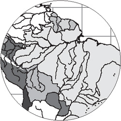
Many years ago, Sandee was hired to create maps to show the locations of endangered species in North America. Rather than draw North America from scratch, she started with the collection of maps from www.mapresources.com. These are well-drawn maps that give you unrestricted use in print, multimedia, web, and broadcast. She was then able to open those maps in Illustrator and modify them to show the areas of interest.
Charts and Graphs
The only drawback to using Illustrator for charts and graphs is that it requires a bit of work to create well-designed graphs. The default style for the art is basic black and white. Adding color, shading, depth, and other enhancements takes time.
If you don’t want to fuss with styling the charts and graphs in Illustrator, look for a third-party product that will allow you to export your artwork either as EPS (Encapsulated PostScript) or in PDF. And make sure that colors can be specified in CMYK values and, if necessary, defined as spot colors — you don’t want to be stuck with RGB colors in a CMYK job. (See Chapter 10, “Colors and Color Management,” for more information on using color in Creative Suite.)
Web Pages and Web Graphics
Sandee is convinced that the whole web thing is just a passing fad and that very soon there will be no need to create any documents for the web. However, until that unlikely day happens, Adobe will continue to add features that help you create all sorts of web pages and graphics. In fact, there is a wealth of options in the Creative Suite applications for web designers. This section covers only a few of the features for web development. For a full discussion, including saving, exporting, and packaging files for the web, see Chapter 17, “To The Web.”
Web Pages
The obvious choice here is GoLive. That’s what GoLive is — a web-page layout program. GoLive offers all the features necessary to create, organize, and maintain web pages and web sites. However, what happens if you need to get an InDesign document up on the web? One route is to use the File > Package For GoLive command. This converts the InDesign stories and graphics into assets that can be added to GoLive web pages.

Unfortunately, you really need to understand GoLive to get the InDesign assets into the GoLive layout. If you’re like most of the people who use InDesign, you may not be completely up-to-date in how to use GoLive. (Yes, we too find much of the rules for web-site creation a little baffling.)
So what are the choices for the print designer who just wants a simple way to get InDesign documents up on the web? The best choice is PDF. Create a PDF file and then post it on your web site. Not only is it easy to do, you totally maintain the look and feel of the original InDesign document.
For some reason that escapes us, many people are frightened of this solution. Perhaps they fear that the PDF document will be too big. That shouldn’t be a factor if you use the right compression settings.
Perhaps they fear that people will not be able to view the PDF document. Well, perhaps if those people are using computers that have been frozen in time since 1998. Back in those days there were plenty of people who did not have the free Reader software that would allow them to view PDF files. However, since that date it is hard to find anyone with a computer that does not already have the Adobe Reader to open and read PDF files.
OK, we understand that some people just don’t want to post PDF documents, even if they totally maintain the total look and feel of the original InDesign pages. Maybe what they want is a way to export their InDesign documents as HTML web pages. Unfortunately, that export option no longer exists in InDesign. (It was in InDesign 2, but the results were so primitive that Adobe decided that it would be better to encourage people to use a professional webpage layout program (GoLive) to design proper web pages using the assets from the Package for GoLive feature.)
Fortunately, if you have Creative Suite 2, you have the tools necessary to accomplish this translation. Start in InDesign and export as an Adobe PDF file. Now, open Acrobat and choose File > Save As. Use the Format list to save as HTML 3.2 or HTML 4.01 With CSS 1.0. The results are primitive, but it does give you an easy route to convert InDesign documents to web pages. In fact, it gives you the ability to take any PDF document and get it up on the web as HTML. If you can make a PDF of any application’s window, then you can use this method to convert the file to HTML.
Web Images
Photoshop and Illustrator each have the Save For Web dialog box, featuring a robust set of tools for saving files in any number of web formats, including GIF and JPEG.
However, you don’t actually have to convert Photoshop or Illustrator files to web-graphics formats. You can use GoLive Smart Objects to insert the actual Photoshop or Illustrator file into your web layout, and GoLive does the conversion then and there. This makes it much easier to resize or otherwise transform those images without worrying about resolution issues. (See Chapter 9, “Smart Objects and Intelligent Layouts,” for more on these features.)
Animations and Movies
Coming from a background producing television commercials, Sandee loves creating web animations. You can use either Photoshop or ImageReady (see the sidebar “What About ImageReady?”) to create GIF animations. You can also use ImageReady or Illustrator to create SWF (Flash) movies. You can even use ImageReady to convert animations into QuickTime movies. (See Chapter 17, “To the Web,” for details on all these techniques.)
Web Comps
What if you’re a designer who has been asked to come up with the general look and feel for a web site, but you know next to nothing about HTML code and the other tangles of the web? You might feel a bit lost if you tried to mock up a web page using GoLive.
No worries, mate! (Sandee just got back from Australia as she’s writing this.) Many web designers start in Photoshop and create a static page of the site’s design. What’s particularly good about this technique is that a qualified web-production person can take your Photoshop file and import it into GoLive to use as the style template for the actual site.
But don’t flatten your Photoshop document into a single background layer. Most likely you will have created navigation elements such as nav bars and buttons that your production person will be able to use in Photoshop or ImageReady to create live, interactive elements.
You get the benefit of working with the tool you are most comfortable in, and the web production person gets the benefit of elements that already exist.
Choices, Choices, Choices
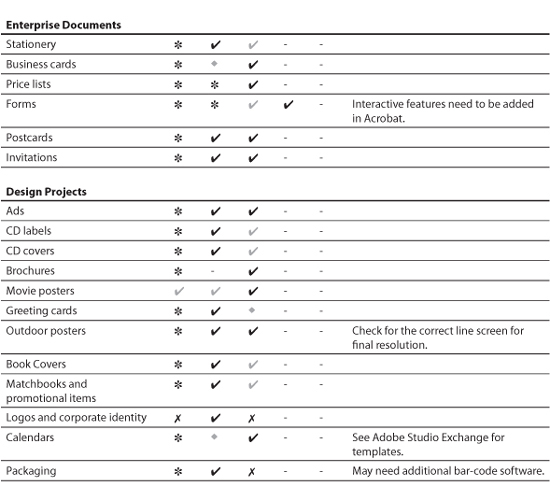
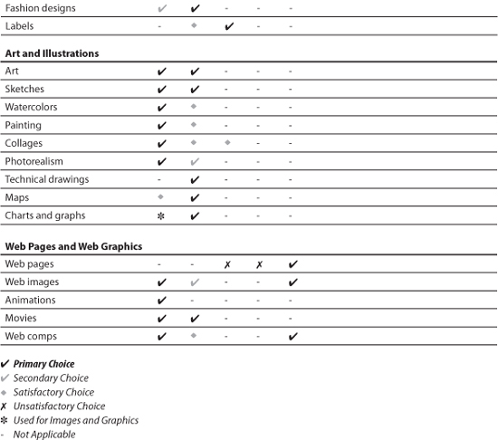
Yes, there are a lot of choices to make based on many different things. Table 2-1 contains a summary of the projects and our choices for which software to use. The rating system we use is totally unscientific and based on our own opinions. Here’s a guide to what the ratings mean:
• Primary choice is the application we would use as our personal favorite. It is also the application that other people would expect us to use.
• Secondary choice is the alternate for the primary choice. We would choose this application if we had a client who asked us to work in a specific application.
• Satisfactory choice is an application that could be used for the project, but only with great difficulty and loads of workarounds. We wouldn’t be thrilled working under these conditions, but we would do it if we absolutely had to — for some very compelling reason.
• Unsatisfactory choice means the application is the wrong one to choose. Choosing this application would be like using a screwdriver to hammer in a nail.
Table 2-1. A summary of the various projects and which Creative Suite software you should use.

Although there aren’t any hard-and-fast rules, we hope that this chapter will help you as you before you start working on your projects.