Color Insert
Additive Colors

Subtractive Colors

Working With Rich Black
A simulation of the effect of a rich black with a flat black logo.

Mixed Inks and Overprints
The mixed inks in InDesign allow you to mix spot and process colors together. A similar effect can be achieved in Illustrator using overprints. This illustration uses only two colors, yellow and black. The colors of the leaves and darker petals were created by setting one color to overprint another.

Colorizing Grayscale Images in Photoshop
Add color to a grayscale image by changing it to RGB and using the Colorize option in the Hue/Saturation dialog box.

You have more control over colorizing an image in Photoshop by creating a duotone.

Proper and Fake Duotone Examples
These images show why a proper duotone, created in Photoshop, is much preferred over the fake duotone that is created in InDesign.
The original grayscale image is shown on the top left. The proper duotone next to it was created in Photoshop using the curves shown next to each channel. Notice that the midtones for the magenta channel have been boosted and the midtones for the black channel have been supressed.

The fake duotone (below), created in InDesign, lacks the richness of the proper duotone. Its magenta plate is a direct translation of the grayscale image into magenta. The black plate is a direct translation of the grayscale image. The black swatch was then tinted to 15%. There is no subtlety to this fake.

Knockouts
With overprinting turned off, the cyan plate knocks out the type on the yellow plate (top and middle). The result is that the two colors don’t mix, and print purely (bottom).

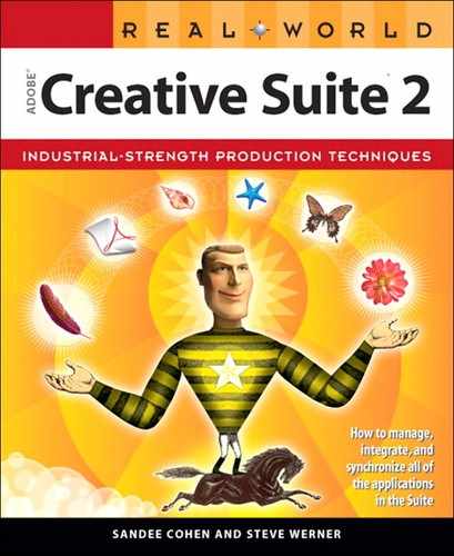
Setting Overprints
Use the InDesign Attributes palette to set a fill to overprint. Here the cyan-colored type has been set to overprint.
Overprints
Setting the cyan type to overprint leaves the yellow plate untouched (top and middle). The cyan and yellow colors mix to create green (bottom).

Previewing Ink Limits
In InDesign, select Ink Limit and an ink percentage in the Separations Preview palette to display, in shades of red, any areas exceeding the limit.

How the Transparency Flattener Works
Simple objects with transparency before flattening (top) and after (bottom). Some of the flattened objects were offset to make the results more obvious.


Previewing Transparency Flattening
The InDesign Flattener Preview palette (left) highlights the effects of any transparency flattener preset in the document window.
The Flattener Preview in Illustrator highlights the effects of transparency within the palette.

Transparency and the White Box Effect
With overprinting turned off, spot colors that interact with transparency will print with a white box (top). With overprinting (or Simulate Overprint) turned on, the effect previews and prints correctly (bottom).
Best Practices for Handling Transparency
If type is positioned lower than the transparent drop shadow, it interacts with the flattened transparency and is rasterized, indicated by the red in the Flattener Preview (top). On its own, higher layer, type is unaffected by transparency, indicated by the gray (bottom).


Blending Modes
The table on this and the following pages shows how a gradient set to the 23 blending modes interacts with a 1-bit image, a grayscale image, and a four-color (CMYK) image. Some blending modes are available only in Photoshop. We also indicate which blending modes should not be used with spot colors because this can introduce unexpected process colors or convert spot colors to process.


