
Chapter 8. Insert and Modify Charts
Chapter at a Glance
In this chapter, you will learn how to | |
✓ | |
✓ | |
✓ | |
You’ll often find it helpful to reinforce the argument you are making in a document with facts and figures. When it’s more important for your audience to understand trends than identify precise values, you can use a chart to present numerical information in visual ways.
In this chapter, you’ll add a chart to a document and modify its appearance by changing its chart type, style, and layout, as well as the color of some elements. Then you’ll recreate the chart by plotting data stored in an existing Microsoft Excel worksheet.
Important
The exercises in this chapter assume that you have Microsoft Excel 2010 installed on your computer. If you do not have this version of Excel, the steps in the exercises won’t work as described.
Practice Files
Before you can complete the exercises in this chapter, you need to copy the book’s practice files to your computer. The practice files you’ll use to complete the exercises in this chapter are in the Chapter08 practice file folder. A complete list of practice files is provided in Using the Practice Files at the beginning of this book.
Inserting Charts
When you insert a chart into a document created in Microsoft Word 2010, a sample chart is embedded in the document. The data used to plot the sample chart is stored in an Excel worksheet that is associated with the Word file. (You don’t have to maintain a separate Excel file.)
Troubleshooting
The appearance of buttons and groups on the ribbon changes depending on the width of the program window. For information about changing the appearance of the ribbon to match our screen images, see Modifying the Display of the Ribbon at the beginning of this book.
The Excel worksheet is composed of rows and columns of cells that contain values, which in charting terminology are called data points. Collectively a set of data points is called a data series. As with Word tables, each worksheet cell is identified by an address consisting of its column letter and row number—for example, A2. A range of cells is identified by the address of the cell in the upper-left corner and the address of the cell in the lower-right corner, separated by a colon—for example, A2:D5.
To customize the sample chart, you replace the sample data in the Excel worksheet with your own data. Because the Excel worksheet is linked to the chart, when you change the values in the worksheet, the chart changes as well. To enter a value in a cell, you click the cell to select it, and start typing. You can select an entire column by clicking the column header—the shaded box containing a letter at the top of each column—and an entire row by clicking the row header—the shaded box containing a number to the left of each row. You can select the entire worksheet by clicking the Select All button—the box at the junction of the column and row headers.
Tip
If you create a chart and later want to edit its data, you can open the associated worksheet by clicking the chart and then clicking the Edit Data button in the Data group on the Design contextual tab.
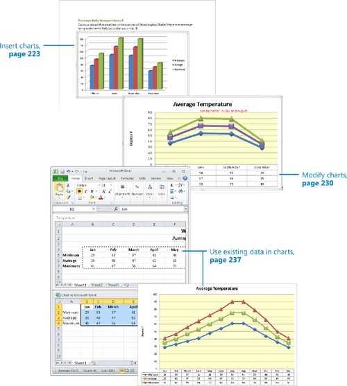
In this exercise, you’ll insert a chart into a document and then replace the sample data in the associated worksheet with seasonal minimum, average, and maximum temperature data.
Tip
If you open a document created in Word 2003 in Word 2010 and then insert a chart into it, Word uses Microsoft Graph to create the chart. This Word 2003 charting technology has been retained to maintain compatibility with earlier versions of the program. The steps in this exercise will work only with a document created in Word 2010 or Word 2007.
Set Up
You need the CottageA_start document located in your Chapter08 practice file folder to complete this exercise. Open the CottageA_start document, and save it as CottageA. Then follow the steps.
Press Ctrl+End to move to the end of the document. Then set the zoom percentage so that you can see almost the entire page.
On the Insert tab, in the Illustrations group, click the Chart button.
The Insert Chart dialog box opens.
In the gallery in the right pane, under Column, click the fourth thumbnail in the first row (3-D Clustered Column). Then click OK.
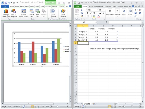
The document window is resized to fill the left half of the screen, and a sample chart of the type you selected is inserted at the cursor. An Excel worksheet containing the data plotted in the sample chart opens on the right.
Click the Select All button in the upper-left corner of the Excel worksheet, and then press the Delete key.
The sample data in the worksheet is deleted, and the worksheet is now blank. The columns in the sample chart in the document disappear, leaving a blank chart area.
Click the second cell in row 1 (cell B1), type March, and then press the Tab key.
Excel enters the heading and activates the next cell in the same row.
In cells C1 through E1, type June, September, and December, pressing Tab after each entry to move to the next cell.
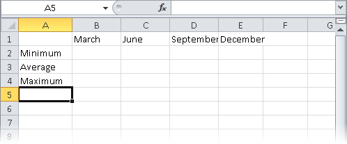
Click cell A2, type Minimum, and then press the Enter key.
Excel enters the heading and activates the next cell in the same column.
Keyboard Shortcut
Press Enter to move down in the same column or Shift+Enter to move up. Press Tab to move to the right in the same row or Shift+Tab to move to the left. Or press the Arrow keys to move up, down, left, or right one cell at a time.
See Also
For more information about keyboard shortcuts, see Appendix A at the end of this book.
In cells A3 and A4, type Average and Maximum, pressing Enter after each entry.
You have now entered the row and column headings for the data you want to plot.
Point to the border between the headers of columns A and B, and when the pointer changes to a double-headed arrow, double-click.
Excel adjusts the width of the column to the left of the border to fit the entries in the column.
Select columns B through E by dragging through their headers. Then point to the border between any two selected columns, and double-click.
Excel adjusts the width of all the selected columns to fit their cell entries.
In cell B2, type 37, and press Tab. Then in cells C2 through E2, type 54, 53, and 29, pressing Tab to move from cell to cell.
Type the following data into the cells of the Excel worksheet:
B
C
D
E
3
47
67
66
35
4
56
80
70
41
As you enter data, the chart changes to reflect what you type.
The data series in the columns (the months) are plotted by the categories in the rows (Minimum, Average, and Maximum).
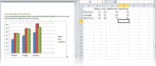
Something is wrong. You entered data for March, June, September, and December, but December is not shown in the chart. This is because the original sample chart plotted only the cells in the range A1:D5, and you have entered data in A1:E4. You need to specify the new range.
In the Word document, click a blank area inside the chart frame to activate the chart. Then on the Design contextual tab, in the Data group, click the Select Data button.
In the Excel worksheet, the plotted data range is surrounded by a blinking dotted border, and the Select Data Source dialog box opens so that you can make any necessary adjustments.
At the right end of the Chart data range box, click the Collapse Dialog button to shrink the Select Data Source dialog box. Then if you can’t see the worksheet data, point to the title bar of the collapsed dialog box, and drag it downward.
In the Excel worksheet, point to cell A1, and drag down and to the right to cell E4. Then in the Select Data Source dialog box, click the Expand Dialog button.
In the Select Data Source dialog box, the Chart Data Range box now contains the new range, and the Legend Entries (Series) list now includes December.
Click Switch Row/Column.
In the dialog box, Excel switches the entries in the Legend Entries (Series) and Horizontal (Category) Axis Labels boxes.
Click OK to close the dialog box. Then in the upper-right corner of the Excel window, click the Close button to close the worksheet.
The Word window expands to fill the screen. The data for December now appears in the chart, which is plotted by month.
Suppose you realize that you made an error when typing the data for September.
Click a blank area inside the chart frame. Then on the Design tab, in the Data group, click the Edit Data button to open the Excel worksheet.
In the Excel worksheet, click cell D4, type 79 to replace the existing data, and press Enter. Then close the Excel window.
In the chart, the maximum temperature column for September becomes taller to represent the new value.


Modifying Charts
If you decide that the chart you created doesn’t adequately depict the most important characteristics of your data, you can change the chart type at any time. Word provides 11 types of charts, each with two-dimensional and three-dimensional variations. Common chart types include the following:
Column. These charts show how values change over time.
Bar. These charts show the values of several items at one point in time.
Line. These charts show erratic changes in values over time.
Pie. These charts show how parts relate to the whole.
Having settled on the most appropriate chart type, you can modify the chart as a whole or any of its elements, such as the following:
Chart area. This is the entire area within the chart frame.
Plot area. This is the rectangular area bordered by the axes.
Axes. These are the lines along which the data is plotted. The x-axis shows the categories, and the y-axis shows the data series, or values. (Three-dimensional charts also have a z-axis.)
Labels. These identify the data along each axis.
Data markers. These graphically represent each data point in each data series.
Legend. This is a key that identifies the data series.

To modify a specific element, you first select it by clicking it, or by clicking its name in the Chart Elements box in the Current Selection group on the Format tab. You can then modify the element by clicking the buttons on the Design, Layout, and Format contextual tabs.
If you make extensive modifications, you might want to save the customized chart as a template so that you can use it for plotting similar data in the future without having to repeat all the changes.
In this exercise, you’ll modify the appearance of a chart by changing its chart type and style. You’ll change the color of the plot area and the color of two data series. You’ll then hide gridlines and change the layout to display titles and a datasheet. After adding an annotation in a text box, you’ll save the chart as a template.
Set Up
You need the CottageB_start document located in your Chapter08 practice file folder to complete this exercise. Open the CottageB_start document, and save it as CottageB. Then follow the steps.
Scroll through the document to display the chart, and click a blank area inside the chart frame to activate it.
Troubleshooting
Be sure to click a blank area inside the chart frame. Clicking any of its elements will activate that element, not the chart as a whole.
Word displays the Design, Layout, and Format contextual tabs.
On the Design tab, in the Type group, click the Change Chart Type button.
The Change Chart Type dialog box opens. This dialog box is the same as the Insert Chart dialog box shown earlier in the chapter.
In the gallery on the right, under Line, double-click the fourth thumbnail (Line with Markers).
The column chart changes to a line chart, which depicts data by using colored lines instead of columns.
In the Chart Styles group, click the More button.
The Chart Styles gallery appears.
In the gallery, click the second thumbnail in the fourth row (Style 26).
The lines are now thicker, and the data markers are three-dimensional.
Move the pointer over the chart between the axes that contains the data markers, and when a ScreenTip indicates that you are pointing to the plot area, click to select it.
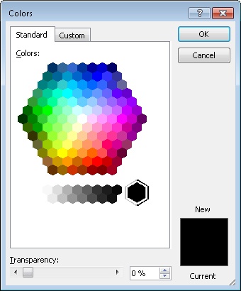
On the Format tab, in the Shape Styles group, click the Shape Fill button, and then click More Fill Colors.
The Colors dialog box opens.
On the Standard page of the Colors dialog box, click the pale yellow hexagon below and to the left of the center, and then click OK.
The plot area is now a pale yellow shade to distinguish it from the rest of the chart.
At the top of the Current Selection group, click the Chart Elements arrow to display the list of elements, and then click Series “Average“.
An outline appears around the data points of the selected series.
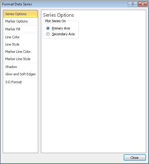
In the Current Selection group, click the Format Selection button.
The Format Data Series dialog box opens.
In the left pane, click Marker Fill, and on the Marker Fill page, click Solid Fill. In the Fill Color area, click the Color button, and under Theme Colors, click the purple box (Purple, Accent 4).
In the left pane, click Line Color. Then on the Line Color page, change the color to the same solid purple.
Check that the marker line color is also purple, and then click Close.
The Average data series is now represented by the color purple.
On the Layout tab, in the Axes group, click the Gridlines button, point to Primary Horizontal Gridlines, and then click None to remove the horizontal gridlines from the chart.
On the Design tab, in the Chart Layouts group, click the More button.
The Chart Layouts gallery appears.
In the gallery, click the second thumbnail in the second row (Layout 5).
The legend now appears below the chart with the data points in a datasheet. Gridlines have been turned back on, and placeholders for a chart title and axis title have been added to the chart.
In the chart, drag across the Chart Title placeholder at the top, and type Average Temperature. Then replace the Axis Title placeholder on the left with Degrees F.
On the Layout tab, in the Insert group, click the Draw Text Box button.
Point below the chart title and above the June maximum temperature data point, and then drag diagonally down and to the right until the text box stretches as far as the December data.
Type Can be hotter in July and August. Then select the text, and on the Home tab, in the Font group, change the size to 10 points and the color to Red.
Click outside the text box (but not outside the chart).
You can now see the results of your changes.
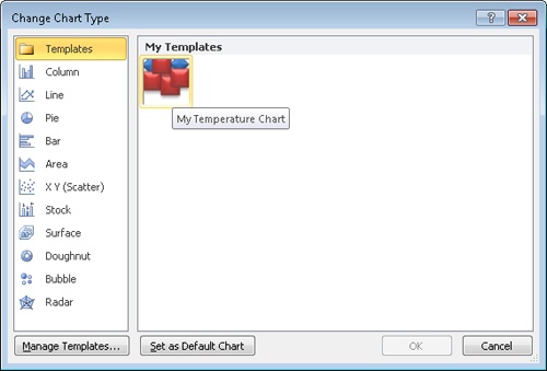
On the Design tab, in the Type group, click the Save As Template button.
The Save Chart Template dialog box opens and displays the contents of your Charts folder, which is a subfolder of your Templates folder.
With the Charts folder displayed in the Address bar, type My Temperature Chart in the File name box, and then click Save.
In the Type group, click the Change Chart Type button, and then in the left pane of the Change Chart Type dialog box, click Templates. Then, in the right pane, point to the icon under My Templates.
A ScreenTip identifies this template as the one you just created.
Click Cancel to close the dialog box.


Using Existing Data in Charts
If the data you want to plot as a chart already exists in a Microsoft Access database, an Excel worksheet, or a Word table, you don’t have to retype it in the chart’s worksheet. You can copy the data from its source program and paste it into the worksheet.
In this exercise, you’ll copy data stored in an Excel worksheet into a chart’s worksheet and then expand the plotted data range so that the new data appears in the chart.
Set Up
You need the CottageC_start document and the Temperature workbook located in your Chapter08 practice file folder to complete this exercise. Open the CottageC_start document, and save it as CottageC. Then follow the steps.
Press Ctrl+End to move to the end of the document, and then if necessary, adjust the zoom percentage so that you can see the entire page.
Right-click a blank area inside the chart frame, and then click Edit Data to open the associated Excel worksheet.
In the Excel window, click the File tab to display the Backstage view, and in the left pane, click Open. In the Open dialog box, navigate to your Chapter08 practice file folder, and double-click the Temperature workbook.
On the Excel View tab, in the Window group, click the Arrange All button. Then in the Arrange Windows dialog box, click Horizontal, and click OK.
Excel arranges the Temperature worksheet above the worksheet associated with the chart so that both are visible at the same time.
In the Temperature worksheet, click cell B4. Then at the bottom of the Temperature pane, to the right of the sheet tabs, drag the horizontal scroll bar until you can see column M. Hold down the Shift key, and click cell M7.
You have selected the range B4:M7.
On the Excel Home tab, in the Clipboard group, click the Copy button.
Click the title bar of the Chart in Microsoft Word worksheet to activate it, click cell B1, and then on the Excel Home tab, in the Clipboard group, click the Paste button.
The copied data is pasted into the worksheet associated with the chart.
Click the Temperature title bar to activate that worksheet, and close the Temperature workbook. Then maximize the chart worksheet.
Troubleshooting
Be sure to click the Close button at the right end of the Temperature title bar, and not the Close button in the upper-right corner of the Excel program window.
Now you need to specify that the new data should be included in the chart.
In the Word document, click a blank area inside the chart frame, and then on the Design contextual tab, in the Data group, click the Select Data button.
The Select Data Source dialog box opens.
In the Chart data range box, click to the right of the highlighted cell range, and change the range to read =Sheet1!$A$1:$M$4.
You are telling Excel to use the values in A1:M4 on Sheet1 of the associated worksheet. (The $ signs ensure that only that range of cells will be used as the source of the chart’s data. Sheet1 is the name defined for the worksheet on the sheet tab at the bottom of the Excel program window.)
Click OK, and then close the Excel window.
In the lower-right corner of the chart frame, drag the sizing handle down and to the right until the chart occupies most of the available space on the page.
Click Can be hotter in July and August, click the border of the text box, and press the Delete key. Then click outside the chart frame.
You can now see twelve months of data.

You can see from the chart that winter is relatively cold, summer is relatively hot, and spring and fall are mild.
Tip
You can also import data into your chart from a text file, Web page, or other external source, such as Microsoft SQL Server. To import data, first display the associated Excel worksheet. Then on the Excel Data tab, in the Get External Data group, click the button for your data source, and navigate to the source. For more information, see Microsoft Excel Help.


Key Points
A chart is often the most efficient way to present numeric data with at-a-glance clarity.
You can select the type of chart and change the appearance of its elements until it clearly conveys key information.
Existing data in a Word table, Excel workbook, Access database, or other structured source can easily be copied and pasted into the associated chart worksheet, eliminating time-consuming typing.