Publisher excels at helping you create visually exciting publications. One of the ways it provides assistance is by offering hundreds of ready-made visual elements that you can insert in a publication with a couple of clicks.
To simplify the use of these visual elements, Publisher 2007 organizes them in categories in the Design Gallery. Many of the elements have a common design and color scheme to give your publications a consistent look. When you are more familiar with color schemes and themes, you will be able to customize the colors of these elements, but for now, we will show you how to use the default Design Gallery elements to add professional touches to your publications.
See Also
For information about applying a different color scheme and using custom colors, see Creating Folded Cards in Chapter 3.
You cannot add a customized element to the Design Gallery, even if you originally inserted it in your publication from that gallery. If you want to reuse a customized Design Gallery element, or any other object, you can copy and paste it between publications or you can add it to the Content Library.
See Also
For information about storing objects for use in other publications, see Adding Items to the Content Library in Chapter 4.
In this exercise, you will insert ready-made elements from three categories of the Design Gallery into a publication. There is no practice file for this exercise.
On the Objects toolbar, click the Design Gallery Object button.
The Design Gallery opens. The left pane displays a list of categories. Clicking a category in the left pane displays the available Design Gallery objects in the right pane.
Notice that the objects available in the Accent Box category are all depicted in the same color scheme.
In the left pane, click Borders. Then in the right pane, double-click Stacked Corners.
Publisher inserts an asymmetrical border around the perimeter of the page.
With the border selected, press the
 key and the
  key repeatedly until the blue margin guides are approximately centered within the border.
The border consists of sets of overlapping rectangles. You can move the entire border because all of its components are grouped to form one object that can be treated as a single unit.
See Also
For information about grouping objects, see Connecting and Grouping Shapes, earlier in this chapter.
Display the Design Gallery again, click Dots in the left pane, and then double-click Diamond in the right pane.
With the row of dots selected, point to one of the corner handles on the left, and drag until the row of diamonds extends to the blue margin guide on the left. Then repeat this step to extend the row to the blue margin guide on the right.
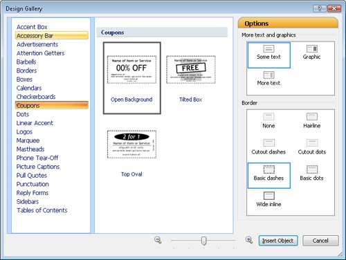
Display the Design Gallery, and in the left pane, click Coupons.
The Design Gallery displays the three available coupon designs, along with options for customizing them.
In the middle pane, click Top Oval. In the Options pane, under Border, click Basic dots. Then click Insert Object.
Drag the coupon to the area below the row of diamonds. Then use the corner handles to enlarge the coupon until it fills the available space.
By inserting the three ready-made objects from the Design Gallery, you have created this basic flyer:
You can customize the color and appearance of the placeholder text and graphic elements as you want.