Chapter 11
Visualization
Visualization in Autodesk® Revit® software—as with any tool (even a pencil)—isn’t an exact science. It still requires a patient, aesthetic eye. The most important thing you can do to successfully visualize your work starts with one thing: the ability to listen. That’s right—it’s your ears that make you a great artist! You need to be able to understand what your client is trying to accomplish because you’re not really trying to visualize something—you’re trying to communicate something for someone else.
In this chapter, you’ll learn to:
- Create real-time and rendered analytic visualizations
- Render emotive photorealistic visualizations
- Understand the importance of sequencing your visualization workflow
Explaining the Role of Visualization
We believe that anyone can use Revit to create compelling, emotive visualizations. What’s really great is that your visualizations are based on the same coordinated design information you’re using to document your project. But there are a few challenges:
- Creating emotive visualization is usually such a small part of your project’s overall workflow that it’s hard to spend the time necessary to hone your rendering skills. This is the reason that photorealistic renderings, both still and moving images, are often the realm of a specialist who deeply understands the techniques and workflow needed to create compelling imagery.
- The reality is that visualization is both art and science, but especially art. You’ll never be able to just push a button and get a beautiful image. There’s a world of difference between something that’s photorealistic and something that’s emotive and compelling. In other words, the button says Render, not Make Beautiful.
- Most important, visualization is about communication, something that many people forget to take into account. Don’t ever create a rendering until you know what you’re trying to accomplish. You must know your audience and understand what needs to be communicated (keeping in mind that the person requesting the rendering isn’t always the intended audience). Otherwise, you’ll spend hours doing something that is beautiful but entirely irrelevant.
You’ll likely struggle with two important points about rendering in Revit, and unfortunately there’s little that you can do about it, because the two are in tension with each other:
- Although engineers often analyze in order to design, architects often visualize in order to design. But if your intent is to put all of this visual iteration into Revit just to render it, you’ll probably get frustrated over all the entourage you’re putting into a database that you want to keep light and flexible (particularly during early design). The reality is that Revit is most useful during early design to communicate analytic rather than visually representative information.
- You’ll never be able to render out of Revit more than you put into it. The level of detail required to create deeply emotive and detailed visualizations is usually far greater than the level of detail necessary to produce accurate construction documentation.
Even though Revit has the ability to help you create great renderings, the level of detail required at the beginning of a project (when analytical relationships are still being resolved) is too high for schematic design. Even when the project is well resolved and established, the level of detail required for a highly finished and photorealistic visualization is far beyond what’s required to complete your project documentation. So what is the point of this chapter?
Our focus is to get you somewhere in the middle. You need to understand how Revit works, but you also need to understand that although something is technically feasible, it may not be practical from a workflow standpoint. Our goal is to help you focus on communication, not just visualization for its own sake. So if you’re happy with visualizing your project at its current level of development (not too far ahead and not overly detailed), you’re going to have a lot of success rendering with Revit software.
Before we begin to address the two types of visualization techniques in greater detail, let’s review the basic controls that are available to help you configure views for further visualization.
Understanding View Controls
In this section, we’ll describe the various visual styles that are available in the view control bar with regard to analytic visualization. Figure 11.1 shows the view control bar of an orthographic view and that of a perspective view.


Figure 11.1 2D and orthographic view control bar and perspective view control bar
All of the icons in the view control bar refer to view properties that can also be set in the Properties palette. The view control bar simply gives you quicker access to the most commonly used settings. The first control at the left of the view control bar is the view scale. Because camera views are not scale specific, it simply lists the status as Perspective.
Setting the Detail Level
After the Scale setting, the next icon in the view control bar sets the detail level in the view (Figure 11.2). The Detail Level property can be set to Coarse, Medium, or Fine.

Figure 11.2 Level of detail
When you create a new view, the default value for Detail Level is initially determined by the scale of the view, as shown by switching to the Manage tab in the ribbon and clicking Additional Settings ➢ Detail Level. Figure 11.3 shows the default settings.

Figure 11.3 View Scale-To-Detail Level Correspondence window
Even though a default value is specified for a new view, the Detail Level setting can be overridden after the view is created. This fact is important for two reasons. First, changing the scale after the view is created will not automatically reset the level of detail. Second, rendering a view with a finer detail level will (generally speaking) take more time. Even though the results may not be visible to the naked eye, the calculations required to render what you won’t be able to discern (because the objects are so small) will still be computed.
When you consider this information, you will find it’s very important to render at the appropriate level of detail. To illustrate this, look at the two perspectives in Figure 11.4. Although these two views look identical, one will rotate, refresh, and render faster than the other because they’re set to different levels of detail.

Figure 11.4 Nonidentical views
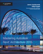
The reason for the differences in refresh rate at this scale is because the differences are barely a pixel in size. The view on the left is set to a Coarse level of detail, but the view on the right is set to a Fine level of detail. Although this different detail level doesn’t have much of an effect on the content in either view, there is a critical difference.
The Executive Chair family has been modified so that the casters at the base of the chair display only at a Fine level of detail. The results are shown in Figure 11.5.
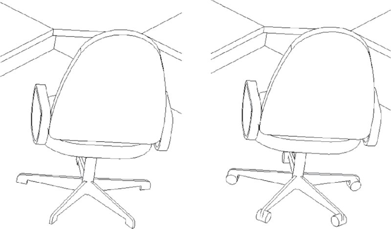
Figure 11.5 Detail level of chair
This difference may not have a large effect on a small project, yet it can have a significant effect on your project when you render (not to mention the additional time it will take when you export and print). So be sure that before you render a view, the level of detail is appropriately set. If you’re far away from the building or your view is broad, a Coarse detail level is sufficient. But if you’re zoomed in on a particular detail or part of the building (or just a single office or room), a Fine detail level might be more appropriate.
We discuss the use of detail level in Chapter 14, “Designing with the Family Editor,” where you will learn how to apply this property to your own content families.
Working with Graphic Display Options
The Graphic Display Options dialog box allows you to control all of your views’ graphic options (Figure 11.6). These are the Model Display (which we’ve just reviewed) and the Shadows, Sketchy Lines, Lighting, Photographic Exposure, and Background settings. This dialog box also allows you to save views as templates to quickly transfer the settings to other views. It’s important to understand how these settings impact the visualization in your view. Since we just stepped through the Model Display options, let’s go through the options in this dialog box to round out your understanding of how you can modify the view to get the desired effect in your renderings and visualizations.

Figure 11.6 Graphic Display Options dialog box
Model Display Model Display is the first group of settings you will find in the Graphic Display Options dialog box. In this group, you can define settings for the visual style, transparency of model elements, and silhouettes.
Likely one of the most commonly used settings, the visual style of your view can be defined from one of six options. The available visual styles are shown in the context of the view control bar in Figure 11.7.

Figure 11.7 Visual style settings in the view control bar
As we explore each of the visual styles, note that the Show Ambient Shadows setting has been enabled. The Wireframe view style (Figure 11.8) maintains only the edges of objects. Faces are hidden. Note that in Revit 2016, ambient shadows are not available in Wireframe view.

Figure 11.8 Wireframe view style
The Hidden Line view style keeps both the edges and faces visible (Figure 11.9). This view style is used by default in 2D and 3D views.

Figure 11.9 Hidden Line view style
The Shaded view style shows faces in their shaded value with accentuated edges (Figure 11.10). Note the change in color depending on an object’s orientation. This effect is particularly pronounced on curved surfaces. Additionally, if you have a material applied to an element and that material has a color associated with it, you’ll see those colors and patterns represented. Glazing appears clear and the shelving and desks have a wood tone to them. Materials with a model pattern (like the brick at the bottom of the image) will show their patterns as well.

Figure 11.10 Shaded view style
The Consistent Colors view style removes the color variation based on an object’s orientation to the viewer. Colors are strict interpolations of the shaded value (Figure 11.11) and therefore have a flatter yet more consistent appearance. The curved wall in the center of the image is stone, so it begins showing as a different color than the other wall types.

Figure 11.11 Consistent Colors view style
The Realistic view style provides real-time overlays of geometry with the material that will be used during a photorealistic rendering, as shown in Figure 11.12. In both Shaded and Realistic view styles, you can turn off Show Edges in the Graphic Display Options dialog box, whereas this mode is always on for all other styles.

Figure 11.12 Realistic view style
The Interactive Ray Trace mode is available only in the view control bar; it is not available in the Graphic Display Options dialog box. When you select this mode from the view control bar, the application will perform a quick render of the view window based on your current view settings (Figure 11.13). Based on your computer’s processor, it may take a bit of time to render the view, but once rendered, the view remains interactive—meaning you can continue to navigate within the view. As you do, the rendering will dynamically update. This is a fairly computationally intensive view type; if you’re working in this view, make sure you close other applications that might consume RAM or processor resources so the view you use is quick and fluid.

Figure 11.13 Interactive Ray Trace mode
One graphic setting in the Model Display options that’s not accessible in the view control bar is Transparency. This slider at the top of the Graphic Display Options dialog box allows you to make all the elements within the view transparent to an equal degree. In earlier versions of Revit, this was the Ghost Surfaces setting, but the percent of opacity/translucency was not modifiable. In Figure 11.14, the view has been set to 40 percent transparency with the Consistent Colors view style.

Figure 11.14 Perspective view with Transparency override applied
The Silhouettes option allows you to override the edges of objects in the view using your defined line (Figure 11.15).

Figure 11.15 Silhouettes style
In Figure 11.16, the image on the left illustrates the view without silhouettes, and the image on the right shows the view with Wide Lines enabled.

Figure 11.16 No silhouettes vs. Wide Lines silhouettes
Shadows The Shadows toggle is available in the Graphic Display Options dialog box, but there’s also a toggle in the view control bar. With this button, there is no flyout—simply select it to toggle shadows on and off based on sun settings we will discuss later in this chapter. The ability to turn shadows on in real time is a terrific feature that helps you add an improved sense of depth to your view (Figure 11.17).

Figure 11.17 Default shadows on
Keep a couple of things in mind when turning on shadows. First, it takes a bit longer for the screen to refresh when shadows are turned on. Depending on the complexity of your view and the size of your model, you might want to keep shadows off in your working views as you zoom in, zoom out, and rotate.
Second, the default settings could use adjusting depending on how you like to have the view rendered. Sometimes it’s more valuable to show the space well lit than to show an exact time of day for the sun position. To set the sun to an angle that is not dependent on a location and time, choose the Sun Setting button in the Lighting group of options. This button will report the current preset (sunlight from top right). Clicking this button will open the Sun Settings dialog box (Figure 11.18). Notice that the Lighting radio button is selected and an azimuth and altitude are specified as being relative to the view. This will show a sun angle regardless of the building’s orientation or location on the globe.

Figure 11.18 The Sun Settings dialog box
Back in the Graphic Display Options dialog box, you also have the ability to modify the intensity of the sun, ambient light, and shadows with the sliders (Figure 11.19). Changing these can dramatically change the amount of shade or shadow that appears in your view.

Figure 11.19 Increased sun intensity setting
Returning to the Shadows settings, another important visualization tool is the Show Ambient Shadows option. Combined with other graphic options such as edge enhancements and real-time materials, this setting allows you to create emotive, real-time views of your project that do not require renderings.
To activate ambient light and shadows, open the Graphic Display Options dialog box, expand the Shadows settings, and then select Show Ambient Shadows.
The results are noticeable, particularly around the intersections of objects. Shaded elements are embellished by highlights in the center of objects and deeper shading at the edges. The result is almost a watercolor effect that considerably softens the shaded view. The effect can be accentuated when combined with the option to enhance the silhouette of edges for even more real-time effects. Figure 11.20 demonstrates the differences in effect between shadows with and without ambient shadows turned on.
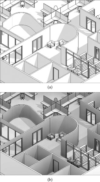
Figure 11.20 Activating ambient light and shadows: (top) without ambient shadows; (bottom) with ambient shadows
Sketchy Lines You can apply the Sketchy Lines feature as a graphic display style (Figure 11.21).

Figure 11.21 Sketchy Lines options for more informal presentations
You can adjust settings for Jitter and Extension to create unique interpretations of any visual style, as shown in Figure 11.22.

Figure 11.22 Sketchy Line options applied to a 3D view
Lighting For most analytic view styles, only sunlight settings are available to cast shadows throughout your model. Lighting controls are fully enabled in the Graphic Display Options when Realistic mode is selected. We discuss the use of artificial lighting settings for photorealistic visualization later in this chapter. If you are using Hidden Line, Shaded, or Consistent Colors, you will have access only to the Sun Settings dialog box we discussed earlier.
Sunlight can be customized to reflect the location of your project at a specific date and time or a position relative to the view. We will discuss solar and shadow studies later in this section.
Photographic Exposure Photographic Exposure allows you to control the color range within the view (Figure 11.23). This option is available only when your model display is set to Realistic.

Figure 11.23 Photographic Exposure settings
Without this setting enabled, the Realistic view types tend to be rather dark. This setting allows you to lighten the views and correct the highlights, shadow intensity, color saturation, and whitepoint to get the best possible image (Figure 11.24). Photographic Exposure also has an Automatic setting that allows you to let the software pick the best possible combination between those settings.

Figure 11.24 Manually modifying the Photographic Exposure settings
Background The final settings in the Graphic Display Options dialog box are the Background options (Figure 11.25).

Figure 11.25 Background settings
From the Background drop-down, you can choose Sky, Gradient, or Image. With the Gradient or Sky option, you can simulate a ground plane and horizon without rendering. This is a great feature if you’re presenting anything live within the model environment because it gives a visual plane for the building to sit on. Figure 11.26 shows the effect of the default Gradient settings on the building section. This setting can also be used in elevation and 3D views.

Figure 11.26 Default background settings applied to a section view
Working with the Section Box
Before we get into the rendering process, let’s discuss the section box. By selecting the Section Box option from the Properties palette for the view, you create a rectilinear matrix around your project that may be pushed and pulled to isolate a portion of your project within the view.
In Figure 11.27, the section box has been pulled to isolate a portion of the project. This technique is helpful for isolating a smaller portion of a larger project. But a word of warning: Be careful toggling the section box off and on. The extents of the section box will reset and you’ll have to pull them back into place. Very frustrating! If you want to see the whole project and the sectional view, it’s best to use two separate views.

Figure 11.27 Pulling the section box to isolate a portion of the project
After you activate a section box in a 3D view and you configure the box to intersect some model elements, you have another graphic tool to aid in your visualization. If the Detail Level option of the view is set to Coarse, model elements that are intersected by the section box will display a color and fill override that can be customized as you see fit. From the Properties palette for the view, select Edit Type. When you open the type properties, you’ll notice that there’s a Coarse Poche Material setting, which determines the color and fill pattern of the poché.
The poché can be seen in all display types (Wireframe through Realistic), but it is displayed only in a view that is set to the Coarse level of detail. We recommend that you set the default color to black.
Here’s why you would want the poché color to be black. As shown in Figure 11.28, the regions between host elements (like the walls and floors) are shown as discrete geometries. Notice that you can see black lines dividing the geometry where walls meet floors, and so on.

Figure 11.28 Regions between host elements are shown as discrete geometries.
You can use the Join Geometry option to clean up the lines between elements. But this approach is time-consuming and often leads to other problems in your file when a lot of things get “joined” just to create a graphic impression.
One simple way to clean this up graphically is to select a poché color that is the same as the color of the lines between elements: black. Again, it’s not the most desirable result, but it’s fast, doesn’t require manual joining of geometry, and reads well (Figure 11.29).

Figure 11.29 Coarse poché material set to solid black
Understanding Analytic Visualization
Now that we have covered the basic view control tools, let’s get back to the two types of visualization: analytic and photorealistic. To better understand the analytic concept, think for a moment about Google Maps and how it uses two types of visualization—there’s an option to view both Map and Satellite modes. Think of the Map mode as your analytic view and the Satellite mode as your photorealistic view. Both views are important, depending on what you’re trying to communicate. If you’re simply trying to understand directional information, the Map view is better. But if you’re trying to show someone what something looks like with regard to trees and other real-world features, the Satellite view has obvious advantages.
It’s also interesting that real-time information is easier to maintain in analytic views. For example, Google Maps has the option to show live traffic data. But this doesn’t mean that they’re showing actual cars moving on actual streets in photorealistic mode. Rather, they’re color-coding the streets based on overall traffic patterns and movement.
The same is going to be true when you’re visualizing your project in Revit. More often than not, you’ll have the ability to show analytic information in real time; however, producing photorealistic images of your project will require additional time to render your views.
Even as you get into more of the project development and detail, materials may be a distraction whereas textures may not. Keeping your materials abstract and analytic allows you to help keep your focus on communicating the big ideas of your project. For example, does the spatial arrangement elegantly fulfill the design requirements? How is the vertical/horizontal stacking? We’ll show you how to communicate these ideas in the following sections.
Project Parameters
Viewing information about your project in a variety of ways is easy, and one way to do this is with view filters. In this section, first you’ll create a view filter based on a project parameter, and then you’ll create one to illustrate a user-defined project parameter. A filter can be used to alter the default display properties of elements on a per-view basis. As you can see from the Filters dialog box in Figure 11.30, you can apply up to three filters to a single filter type to override the graphic values of 2D and 3D content as well as spaces.

Figure 11.30 The Filters dialog box
Figure 11.31 shows a simple example of how this works. In the view, there are walls that are two-hour rated. You’d be able to see this in a schedule, but how would you see it in a project view (2D or 3D)? You can easily show that with filters.

Figure 11.31 The default view—unfiltered
To apply a filter to your view and visualize the rated walls, follow these steps:
- First, open the Visibility/Graphic Overrides dialog box (type VG on the keyboard or select it in the Properties palette) and choose the Filters tab. Click the Add button to begin the process of creating and applying a new filter.
- Select the Edit/New button and create a new filter called Rated Walls, as shown in Figure 11.32. From the Categories list, check the box for Walls. In the Filter Rules group on the right side of the dialog box, select Fire Rating from the Filter By drop-down menu. Set the filter to Equals in the next drop-down, and from the third drop-down menu, select 2. Make sure the filter is selected in the column on the left, and click OK to add it to your Visibility/Graphic Overrides settings.
- When you return to the Visibility/Graphic Overrides dialog box, you’ll need to add the filter to your view. Simply click Add, and select Rated Walls.
- The next step is to customize the Rated Walls filter so that items that fall into the filter category will have a specific graphic effect. Set the Projection/Surface override for Patterns to Red and Solid Fill. To do this, select the Override button in that category to bring up the dialog box shown in Figure 11.33. You’ll also want to choose the Override button for both Lines and Patterns under the Cut heading and set each of their colors to Red, as you just did for line graphics.
- When you’ve finished, click OK to return to the view of the project. You’ll see that the filter is overriding the project-defined graphics of the two-hour rated walls (Figure 11.34).

Figure 11.32 Creating the filter, category, and filter rule

Figure 11.33 Graphic overrides

Figure 11.34 Applied filter in Shaded view
What’s wonderful about this is that you’re able to visually coordinate and verify your project schedules with project views that confirm what is being described in the schedules. This even works in Hidden Line view, as shown in Figure 11.35. Changing elements in the schedule or from the project environment will immediately update in all views of your project.

Figure 11.35 The applied filter in Hidden Line view
Setting User-defined Parameters
Now let’s look at another example where a particular parameter you might need for a project is not part of the default project environment. In this example, you want to show the space as functionally complete—all the office furniture in place—but a lot of the content that is shown in the image isn’t actually in the scope of work for your contract. To demonstrate this, you want to show those furnishings as a separate color. To do this, you’ll make two changes to the image.
First, this kind of parameter will have to be applied across many categories of elements—furniture, equipment, appliances, and so on. Second, it may apply to one element but not apply to another element in the very same category, name, and type. For example, under the Furniture category, the designer can be specifying the desks and cubicles but not the chairs. To make this possible, you’ll want to make sure you’re using an instance parameter (not a type parameter). Here are the steps:
- Open the default 3D view of the model and right-click it to rename the view. Call the new view PHASE 2 – 2 HOUR RATED WALLS. In the view, return to your Filters dialog box by opening the Visibility/Graphic Overrides dialog box (VG) and create a new filter named Not In Contract.
- Make sure you select numerous categories of elements that you want to be able to distinguish as Not In Contract. For this example, we chose Electrical Equipment, Electrical Fixtures, Furniture, and Furniture Systems, as shown in Figure 11.36. When you finish, select <More Parameters…> from the Filter Rules drop-down list.
-
The Project Parameters dialog box opens. You need to make a new parameter called Not In Contract. Select the Add button. This will take you to the Parameter Properties dialog box. Type in the name of the new parameter, Not In Contract. From the Type Of Parameter drop-down menu, choose Yes/No. Finally, check the boxes for the following categories: Electrical Equipment, Electrical Fixtures, Furniture, and Furniture Systems, as shown in Figure 11.37.
This user-defined project parameter will allow you to distinguish elements across a number of categories.
-
Click OK to apply your parameter to the filter.
In this case, you’re instructing Revit to override the graphics when the value of Not In Contract equals Yes in the Filter Rules settings (Figure 11.38).
- You’ll return to the Filters tab in the Visibility/Graphic Overrides dialog box, where you’ll define how the graphics will be overridden. Once again, add the filter and override the surface pattern with a solid yellow color.
- Back in the 3D view, select some elements from the categories that you’ve just created a filter for. You’ll notice that as you select the object in your file, the instance parameter for Not In Contract is available in the Properties palette (Figure 11.39).
-
Select the check box.
As you do, the solid color will be applied to the components, as shown in Figure 11.40, because the filter that you created now applies to the elements that you’ve selected, even in Hidden Line views!
Figure 11.36 Multicategory selection

Figure 11.37 User-defined instance parameters
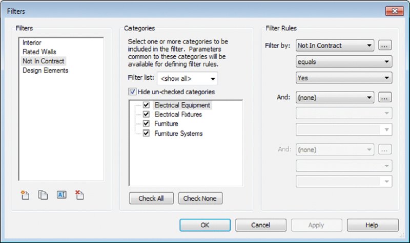
Figure 11.38 Filter parameters

Figure 11.39 Instance parameters

Figure 11.40 The Not In Contract graphic override in action
Identifying Design Elements
Another use for this process of using filters is identifying “generic” host design elements as you move between design iteration and design resolution. Figure 11.41 shows a filter that has been applied to a view to highlight any walls, floors, ceilings, or roofs that have the term Generic used in their family name.

Figure 11.41 Identifying generic elements
Typically in a design project, you might create a series of generic elements to replace the ones that have a more detailed label. Using a filter to identify those, you can quickly locate what needs more detail from within your project. The default template already uses the term generic to describe basic design host elements, which makes them easy to filter, as shown in Figure 11.42.

Figure 11.42 Generic host element filter
Setting Solar and Shadow Studies
By using solar and shadow studies, you can use another analytic visual style that allows you to communicate natural lighting based on your project’s location, orientation, and time of year. The sun’s path can also be displayed (Figure 11.43), and you can edit the path of the sun both directly by dragging the sun or sun path within the view and indirectly through time-of-day settings.

Figure 11.43 Visual sun path
The sun path can be activated from the view control bar. You’ll also notice the Sun Settings option in the Sun Settings pop-up menu. This setting will allow you to give an exact location, time, and date for the sun. Selecting Sun Settings (Figure 11.44) allows you to select the settings for your particular view and solar study type. This tool can be used in various view types, including plans, elevations, 3D, and perspectives.


Figure 11.44 Sun Settings
There are four types of solar studies that you can create in Revit:
- The Still setting allows you to create a study of a particular time, date, and location.
- Single Day allows you to create a study over an entire day at intervals of 15, 30, 45, and 60 minutes.
- Multi-Day allows you to create a sun study over a range of dates at intervals of an hour, a day, a week, and a month.
- A Lighting study is not related to a particular time, date, or place. It’s more useful for adding graphic depth and texture with “sunlight” from an analytic top right or top left.
Single images are created using the Rendering dialog box. However, animations of single- and multiday solar studies are created by clicking the Application menu and selecting Export ➢ Images And Animations ➢ Solar Study.
For either single- or multiday sun studies, you can set your project location through the Sun Settings dialog box. In the upper-right corner is the Location button. Selecting this button will pull up the Location Weather And Site dialog box (Figure 11.45). Here you can select your project location from the map or via the Project Address drop-down menu. Select your city and click OK to close the dialog box. This will set the location of your project universally for this model, so if you are using the energy modeling tools or sun settings, or exporting the project for use in another application like Autodesk® 3ds Max® software, this setting will locate the project on the globe for all those uses.

Figure 11.45 Locating the project
Regardless of whether you choose to use Still, Single Day, or Multi-Day, analytic visualization is incredibly useful for quickly communicating information about your project in a way that isn’t literally associated with the actual real-world material assignments of your project elements. Although photorealistic visualization would render wood as “wood,” an analytic visualization could be used to identify which wood materials were sustainably harvested, recycled, or LEED (Leadership in Energy & Environmental Design)-certified. Analytic visualization is concerned with the actual properties of a material, not just what it looks like. Because analytic visualizations can often be viewed in real time, your project information remains visually concurrent and up to date.
Understanding Photorealistic Visualization
When compared to analytic visualization, photorealistic visualization is the expression of the emotive, experiential qualities of your space and content. Materials are carefully selected for accuracy and real-world simulation. Put another way, if analytic visualization is about what something means, photorealistic visualization is about how something feels or is experienced.
In many cases you’ll find yourself tweaking materials and lighting in order to “theatrically” increase the visual interest of the space. Embellishing your model with nonproject entourage is probably essential, and we’ll cover important techniques to keep that content from cluttering up the views that are necessary for construction documentation.
In the following sections, we’ll review the process for creating camera views and walkthroughs, and then we’ll look at some of the settings that impact the outcome of the renderings in Revit.
Rendering Sequence and Workflow
You’d be surprised, but many people render in the wrong sequence. The workflow for creating compelling renderings is not the same one you use to resolve your design process. If you try to do one like the other, the result is a lot of wasted time and frustration. Consider a documentation-based design process to create a building that moves from intent to content:
- Host components (walls, floors, and roofs)
- Hosted components (doors and windows)
- Furniture, fixtures, and equipment
- Assembly details and documentation
The challenge is that this process does not provide an optimal workflow for creating great renderings. If you’re focused on the process of visualization, the ideal workflow is more along the lines of the following:
- Geometry (host and family components)
- Cameras (setting up your views)
- Lighting (using matte materials)
- Materials
Yes, this is as simple as it gets: cameras, and then lights, and then materials. In a documentation-based process, lights don’t usually show up until the building is well resolved because you’re placing lights meant to be the actual fixtures to be installed in the building, not just for rendering. So the documentation process is simply out of sequence with the visualization process.
Additionally, you need to evaluate the lighting neutrally, without materials to distract you. As you’re placing your content, a lot of elements already have material assignments. You need to find a way to neutralize the material settings while you figure out lighting. Now you just need to put it all together!
Creating Perspective Views
The tasks of creating and modifying your camera views are almost as important as the model content you’re creating. If you’re not careful, you can easily fail to impress the viewer by selecting the wrong view and aspect ratio of the camera and controls.
Perspective views communicate far more depth than orthographic views (Figure 11.46). Unless the view needs to be at dimensioned scales, we prefer to use perspective views of the project.

Figure 11.46 Orthographic vs. perspective view
To create a perspective view, switch to the View tab, locate the Create panel, and click 3D View ➢ Camera. This command will not work if you are working in a drafting view, a schedule, or another camera view. When the Camera command is activated, you will need to pick two points. The first point to select is the camera location, and the second point is the target location. Keep in mind that when you rotate your view, the rotation is centered on the target elevation. If you use the Camera command in a plan view, as shown in Figure 11.47, you have the opportunity to specify the elevation of the camera as an exact distance from the associated level in the Options bar.

Figure 11.47 Placing the camera in a plan view
After creating a camera view, you should understand that there is a boundary box that defines the extents of the view defined by the camera and target locations. If you need to adjust these two locations (other than navigating within the camera view), you can activate the controls by going to another view, like a plan, and then locate the camera view in the Project Browser. Right-click the camera view and choose Show Camera from the context menu, as shown in Figure 11.48.

Figure 11.48 Reactivate the camera controls with Show Camera.
Once you see the camera, you can select and move it around your project. Doing so allows you to move your camera closer or farther away. You can also select the clipping planes of your camera and edit the front and back planes of your camera’s view.
The aspect ratio of your camera view is also important. For example, a television ratio of 4:3 seems far less expansive and dramatic than a 16:9 wide-screen ratio. Figure 11.49 illustrates this; image (a) is 4:3 and image (b) is 16:9. The result is that image (a) seems too tight and constrained, whereas image (b) is far more natural.


Figure 11.49 Aspect ratio comparison
 To change the aspect ratio, select the crop region in the camera view and then click the Size Crop command in the contextual tab of the ribbon. In the resulting dialog box, you can change the aspect proportionally or non-proportionally (Figure 11.50). Keep in mind that this setting doesn’t zoom your camera forward and backward; it simply changes the relative height and width of the aperture.

Figure 11.50 The Crop Region Size dialog box
You can also modify the camera position and angle on the fly using the SteeringWheels® (similar to other Autodesk products). Simply activate the Navigation Wheel (Figure 11.51) located on the right side of the view window or press Shift+W on the keyboard. You’ll be able to zoom, pan, and orbit as well as control other view features using the Navigation Wheel. This tool can take some getting used to because it will “follow” your mouse pointer across the screen—it’s not anchored at the bottom corner as the image might suggest. This is helpful because it will give you a dynamic menu to change and modify your view, but don’t forget to turn it off before you start modifying geometry. Selecting the same button again will hide the tool until you need it again.

Figure 11.51 The Navigation Wheel
Locking Your View
After you create your view, you might want to consider locking it so it can’t be accidentally adjusted. Although you can’t tag elements in a perspective view, it is a good practice to lock camera views to preserve consistency between rendering iterations. The view-locking tools can be accessed from the view control bar, as shown in Figure 11.52.

Figure 11.52 Lock view settings
Three options are available from the Lock 3D View option. Save Orientation And Lock View keeps the current orientation and prohibits anyone from rotating the view. As its name implies, the Unlock View command unlocks the view and allows you to navigate freely. After you have unlocked a previously locked view and changed the view, click Restore Orientation And Lock View to return the view to its previously saved orientation. If you unlock a locked view and then choose Save Orientation And Lock View, the previously saved orientation is lost while the new orientation is saved and locked.
Creating a Walkthrough
In addition to still perspective views, you have the ability to create animation paths called walkthroughs. Creating a walkthrough is much like creating a series of connected camera views. Like any other 3D view, a walkthrough can be generated using any of the visual styles and settings we described previously in this chapter. In the following exercise, use the c11-Visualization-Start.rvt file.
-
From your Level 1 plan view, start placing a series of cameras by setting the camera location and then the camera direction.

Note that each time you pick a location, these cameras will become the key frames in your animation. When you have placed the last camera, press the Esc key and your finished path will appear (Figure 11.53).
-
Right-clicking the path and choosing Edit Walkthrough will allow you to manipulate each of the series of views that you just created. Right-click the nodes on the path and choose Go To View.
If your walkthrough path is not displayed, look in the Project Browser for the Walkthroughs category and locate the walkthrough view you just created. Right-click it and select Show Camera from the context menu.
-
Double-click the walkthrough view in the Project Browser to open the view as you would any of the other views.
Figure 11.54 shows the first view in the path that we’ve just created along with the Walkthrough view properties from the Properties palette.The view you might see when you activate a walkthrough is the last frame in the camera path. You’ll need to use the Show Camera method to select the walkthrough and then click Edit Walkthrough to access the frame controls. You can then use the control icons in the ribbon or set the Frame value to 1 in the Options bar to get to the first camera point in your walkthrough.
- Let’s modify the aspect ratio to 16:9. Select the view boundary and select Size Crop from the contextual tab in the ribbon. By default, the view is 6" × 4 -1/2" (150 mm × 113 mm). Select the Field Of View radio button and then set the Width value to 8" (200 mm).
-
We’re going to export a Hidden Line view for testing (especially before rendering), but we want to give the walkthrough more depth. So, in the Graphic Display Options dialog box we reviewed earlier in this chapter, under Model Display change the Silhouettes option to Wide Lines.
It’s not usually desirable to simply walk with the camera facing the same direction that you’re walking. So you’re going to modify the camera directions to make the visualization more dynamic. This will require that you open a couple of views and tile the view windows, as shown in Figure 11.55. This way, you’ll be able to see the results of your work in one view while working in another.
-
Activate the plan view of Level 1, and then click the Close Hidden Windows button from the Quick Access toolbar. Activate the walkthrough, and then tile those views by pressing WT on the keyboard. Press ZA to activate the Zoom All To Fit command.
A couple of important points should be noted. First, you’re showing the plan and the camera view at the same time. This allows you to see both the graphic and the analytic camera, which is important for modifying views. As you can see, when you select the boundary of the view on the right, the camera path highlights in the view on the left. Since the view is selected, you have the option of editing the crop size just as with any other camera. But you also have the option of editing the walkthrough.
-
Click the Edit Walkthrough option, and you’ll see the contextual toolbar, shown in Figure 11.56.
When you open the Walkthrough Editor, the camera path now shows important controls (Figure 11.57).
The red dots along the path represent key frame locations (when you placed your camera), and the red dot directly in front of the camera allows you to control the rotational direction. By default, all the cameras face ahead relative to their location on the path. But you can edit the default so that the camera can follow one direction but face another direction.

Figure 11.53 The finished camera path
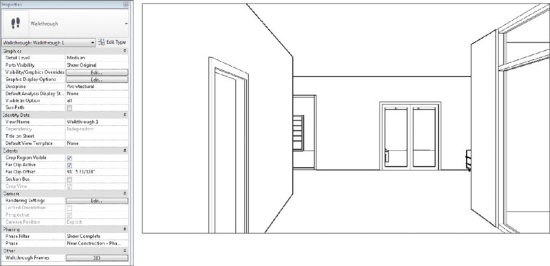
Figure 11.54 A walkthrough camera view with associated properties

Figure 11.55 Tiled camera and plan views

Figure 11.56 Edit Walkthrough contextual toolbar
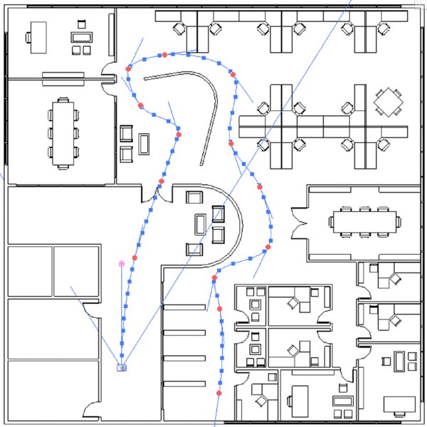
Figure 11.57 Camera path and controls
Because the default path is 300 frames in length, it would take a long time to go to each frame and edit what you see. It’s better to jump ahead from key frame to key frame, editing fewer locations. When you do this, Revit will interpolate the frames between the key frames for you. As you advance through each key frame, try to experiment rotating the camera to the left and right as well as glancing up and down. You can do so by dragging the target point in the plan view or using the Navigation Wheel in the camera view. Use the Look command from the Navigation Wheel for best results.
Exporting a Walkthrough
After you edit the key frames in the walkthrough, you can export the animation by clicking the Application button and choosing Export ➢ Images And Animations ➢ Walkthrough. The options to export an AVI are the same as all of the options for rendering still images (Figure 11.58).

Figure 11.58 Graphic format controls
A 15 frames-per-second (fps) frame rate is minimal to keep the animation smooth. But if you increased the frame rate, the animation length would shorten and it would seem like you were running (rather than walking) through the scene. What can you do to have a longer animation without adding speed? Simply add more frames to your animation.
From the Properties palette, open the Walkthrough Frames dialog box (Figure 11.59). By increasing the Total Frames value, you can also adjust the relative frames per second (fps) to maintain the desired speed.

Figure 11.59 Default frame count
So, for example, if you wanted to increase the fps to 30 but maintain the same travel speed, you would also increase the Total Frames setting to 600.
Finally, where a lot of people struggle is with the speed of their animation. Unless you’re breaking up your animation into separate paths (which will be combined later into a single sequence), it’s necessary to be able to speed up or slow down your camera’s movement. In Revit, you can uncheck the Uniform Speed option to speed up or slow down the camera during a single animation study.
The same visual effect plays a part in your renderings. The farther you are from something, the faster your camera can move as you fly by and still seem smooth and fluid. But you will need to slow down considerably if you’re walking through the building, where a comfortable pace is 6 to 8 feet (2 to 2.5 meters) per second.
![]() We’ve exported the animation from this portion of the chapter. It’s important to understand that when Revit exports video, it exports in an uncompressed format. The file sizes will be large compared to what you might be used to. Any of the videos can be brought into other video-editing tools (iMovie, HandBrake, Movie Maker, and so on) to compress the raw footage. If you want to investigate the file or animation, you can download the
We’ve exported the animation from this portion of the chapter. It’s important to understand that when Revit exports video, it exports in an uncompressed format. The file sizes will be large compared to what you might be used to. Any of the videos can be brought into other video-editing tools (iMovie, HandBrake, Movie Maker, and so on) to compress the raw footage. If you want to investigate the file or animation, you can download the c11-Visualization-Finished.rvt file or the c11_Visualization_Animation.avi file from the Chapter 11 folder on this book’s web page at www.sybex.com/go/masteringrevitarch2016.
Rendering Settings
Now that we have covered the processes to create still camera views and walkthroughs, let’s discuss some of the settings that are important to understand before you begin to generate photorealistic renderings. You can access the Rendering dialog box by clicking the teapot icon on the View tab in the ribbon or in the view control bar of a 3D view. Some of these settings are also available from the Rendering Settings dialog box, which is accessed from the Properties palette when you are working with a 3D view. Figure 11.60 shows the Rendering dialog box to the left and the Rendering Settings dialog box to the right.


Figure 11.60 Rendering dialog box
USING OUTPUT SETTINGS
An important setting in this dialog box is Resolution. It’s easy to spend far too much time creating a rendered view because rendering times increase exponentially when the resolution doubles. Think of it this way: If you’re rendering a view at 150 dots per inch (dpi) and then you render the same view at 300 dpi, the image is now four times larger, not twice as large (1 × 1 = 1 and 2 × 2 = 4). If you were to render the view at 600 dpi, it would be 16 times larger (4 × 4 = 16), and you could reasonably expect the 150 dpi image that rendered in a few minutes to take considerably longer at 600 dpi.
How large you need to render something depends on what you’re going to use it for: screen or print. Don’t expect a rendering the size of a 3" × 5" (75 mm × 150 mm) postcard to work for a 3′ × 5' (900 mm × 1,500 mm) banner.
So what resolution is big enough? Well, it’s probably better to render things a bit larger, which will give you some flexibility if you need to increase the size of your image later.
USING QUALITY AND OUTPUT SETTINGS
Revit provides five preset Quality settings: Draft, Low, Medium, High, and Best. Figure 11.61 illustrates the range between the Draft setting and the Best setting. These settings will control not only the quality of the output but also the time it takes to render. We recommend you perform a quicker draft render to get a feel for your scene setup before doing a rendering of higher quality. This will reduce the time you spend waiting for the rendering to complete in order to make iterative adjustments.

Figure 11.61 (a) Draft setting; (b) Best setting
The Output Settings options help you determine the level of resolution at which your image can be saved when rendered. The screen resolution is simply the resolution of the view on your monitor.
You should be much more interested in the Printer settings because of the likelihood that you’ll need to print your views. Again, the resolution is important, because you’re printing for something that will be viewed at some distance (arm’s length or a few feet away) with the naked eye. Rendering beyond what can reasonably be seen will add a lot of time to your renderings. While the default printer resolutions are shown in Figure 11.62, you can input other values by typing them in the dialog box.

Figure 11.62 Printer settings
Using Monochromatic Views to Examine Context and Lighting
Now that we have our geometry in a sample model and we have shown you how to create and manipulate camera views, we will move on to lighting before discussing materials. That said, it is difficult to review your design geometry with realistic lighting in Revit without also rendering component materials. If you want to examine spatial context and lighting quality in a monochromatic model, we’ll show you how to accomplish that technique in Revit.
Take a look at the rendering shown in Figure 11.63, which has been created by rendering a camera view with all the default materials active.

Figure 11.63 Camera view rendered with default materials
The challenge is that to get the materials correct, you’ll have to commit a significant amount of time to selecting, testing, editing, and refining many material selections for an otherwise simple view that’s quite early in the design stage. You don’t have time for resolving your design to this level of specificity early in the iterative process.
Figure 11.64 shows the same view rendered abstractly, with all the model objects set to a matte white material.

Figure 11.64 Abstract rendering
By selecting a matte material for everything in the view, you’re able to focus on form-space and light-shadow relationships. Using phase filters, you can create a rendering like this quickly and easily. This technique is much faster than trying to select neutral materials for each element type in your view. To begin the series of exercises in this chapter, download and open the file c11-Visualization-Start.rvt from this book’s web page. Here are the steps to create a matte rendering using the material overrides in Phasing:
- From the Project Browser, activate the 3D view named OVERHEAD CAMERA. Press VG on the keyboard to activate the Visibility/Graphic Overrides dialog box. In the Model Categories tab, uncheck the Ceilings category and then click OK.
- In the Properties palette, you should see the properties for this 3D view. Click the Edit button for Graphic Display Options to bring up the dialog box shown in Figure 11.65. Set Style to Shaded, and under Shadows check Show Ambient Shadows. Click OK to close the dialog box.
- On the Manage tab in the ribbon, click the Phases button to open the Phasing dialog box. Select the Phase Filters tab. Click the New button to create a new row in the list of filters. Rename the new filter to Abstract. Change the New and Existing column values to Overridden, and then change the Demolished and Temporary column values to Not Displayed.
- Switch to the Graphic Overrides tab, and then create a new material. You’ll do this by clicking inside the Material box and then clicking the Selector button on the right. This will open the Material Browser. In this new dialog box, select the Create New Material icon at the lower-left corner. Switch to the Identity tab, change the Name to Abstract, and then click Apply (Figure 11.66).

-
This will give you a generic material with some predefined settings. We’re going to customize this slightly to make it the universal material we want. Switch to the Appearance tab and click the Open/Closes Asset Browser icon.
This will open the Asset Browser, which will allow you to select the attributes of a material to match to your new material type. In the Asset Browser, type Porcelain in the search bar at the top. In the Asset Browser folder tree, click on Ceramic/Porcelain under the Appearance Library folder and double-click on Neutral Gray to replace the asset in the material definition.
 This material will give the rendering a nice overall gray finish without too much reflectivity. Click OK to close the Material Browser.
- Now assign this material to your New and Existing phase objects by selecting this same material for those phases (Figure 11.67).
- From the View tab in the ribbon, click the Render tool. In the Rendering dialog box, use the following settings:
- Quality: Medium
- Output Settings: Screen
- Lighting: Exterior: Sun Only
- Background Style: Color, with color set to White
- Click the Render button and observe the results in the view window. To toggle back and forth between the rendered view and the shaded display, click Show The Model at the bottom of the Rendering dialog box.

Figure 11.65 Graphic Display Options settings

Figure 11.66 Create a new default material.

Figure 11.67 Assigning the Abstract material
That’s it! When you want to render a project view with this abstract material assignment, simply assign the Abstract material to the graphic overrides in the Phasing dialog box and apply the Abstract phase filter to the properties of the camera view.
Adjusting Lighting and Interior Renderings
Let’s take a closer look at an interior camera view and how to adjust natural and artificial lighting. You will continue with the c11-Visualization-Start.rvt file from the book’s web page. From the Project Browser, activate the 3D view named RENDER - CONFERENCE ROOM. As you can see in Figure 11.68, we’ve already adjusted the shadows and sunlight as well as applied silhouette edge overrides to the live view.

Figure 11.68 Viewing an interior camera view in Hidden Line mode
Now let’s render the view. Keep in mind that the rendered material applied to the Abstract phase override is solid white (which we set up earlier in this chapter), so you’ll want to turn off the visibility of your curtain panels if you want to see through the glazing. Open the Rendering dialog box by clicking the teapot icon in the view control bar and choose the following settings:
- Quality: Medium
- Output Settings: Printer, set to 300 dpi
- Lighting: Exterior: Sun Only
- Background Style: Color, with color set to White
The reason we’re using Printer as the Output setting is that 300 dpi is sufficient for printing this page. And an 8" (200 mm) wide image will suffice for the anticipated width of this book.
Figure 11.69 shows the results of the rendering. The scene can be viewed beyond the immediate space of the conference room. Take particular note of the shadows and how the lighting drops off from the edge of a shadow. If the rendering appears too dark or too bright, click the Adjust Exposure button to change the Exposure Value setting.
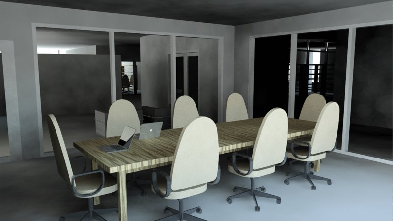
Figure 11.69 Sun Only rendering
Of course, this image is being rendered with the sun, which doesn’t count for interior renderings; it’s just a benchmark. But you can begin to see the level of detail and materiality and the “look and feel” of the space. Now that you know what it looks like, you can turn off the sun and start placing some artificial lights.
Because you’re rendering abstractly using a phase override, everything is going to be solid white. But if your light source is behind a solid lens, it’s not going to render very well. The best way we’ve found to handle this is to create a unique object subcategory for the lens that surrounds the light source. Doing so allows you to control the visibility of the lens of the lighting fixture, thus preventing obstruction of the light source. Unfortunately, this approach will not give the most realistic effect because many lighting effects result from light passing through translucent objects (like lenses or shades). But it’s the best you’ll be able to do for now to resolve lighting before you resolve materials.
Before you can add lighting, you need to add a ceiling to the spaces. To keep things generic, we’ve added the default compound ceiling to all the spaces. It’s just a placeholder for your ceiling that will change later. But the important thing is that you don’t get hung up centering ceiling tiles during your design process. Rooms will change dimensions, and all that time spent centering will go to waste.
Placing Artificial Lighting
Activate the Level 1 ceiling plan and locate the room we have identified with a revision cloud. This is the room in which you will begin placing light fixtures to continue the exercise.
- On the Architecture tab in the ribbon, click the Component tool, and from the Type Selector, choose the Downlight - Recessed Can family that has been preloaded from the default Revit library. You can use the 6" Incandescent - 120V type.
- Place fixtures in the ceiling plan along the lower and right walls as shown in Figure 11.70. The exact dimensions aren’t important—just get the idea right.

Figure 11.70 Placing light fixtures in the ceiling
![]() This light family doesn’t have a lens, so you don’t have to worry about the light source being obscured. Before you start to render these artificial lights, we need to explain the process and technique of using light groups.
This light family doesn’t have a lens, so you don’t have to worry about the light source being obscured. Before you start to render these artificial lights, we need to explain the process and technique of using light groups.
Manipulating Light Groups
There are times when you’ll want to isolate the lights that are being calculated and rendered in a particular view. You might want to test the lighting that will result from having certain lights on and others off, just as in a real space. Revit software allows you to create light groups for this purpose. Doing so saves you a lot of time compared to turning individual lights off and on manually.
By default, whenever you place lights in your project, they’re not placed in any group. They’re “unassigned,” just like the lights shown in Figure 11.71. You access this dialog box by clicking the Show Rendering Dialog tool on the view control bar and then clicking the Artificial Lights button in the Rendering dialog box. Here you can assign and create all kinds of light groups.

Figure 11.71 Light groups
Besides the assignment for the light group, you also have the option of adjusting the Dimming value. One reason you might use this feature would be to dim some of the lighting and leave other lighting at full value to highlight a feature in the rendering. Let’s create two light groups for the conference room in this exercise. Follow these steps:
- In the Level 1 ceiling plan, select any one of the lights you placed during the previous exercise. From the Light Group drop-down in the Options bar, choose Edit/New. In the Artificial Lights dialog box, click the New button to create two groups named Conference - Right and Conference - Left (Figure 11.72).
- Now assign the lights to the groups. Just select the lights in either the ceiling plan or any 3D orthographic view, and then assign them to the light group from the Light Group drop-down menu in the Options bar, as shown in Figure 11.73. Place the lights in each group as indicated in the Level 1 ceiling plan.
- Return to the camera view named RENDER - CONFERENCE ROOM. Before you start to render the view, let’s test the light groups by rendering only the lights in the Conference - Right group. To do this, from the Properties palette, open the Rendering Settings dialog box, and then click the Artificial Lights button. Turn off the lights in the left group by simply clicking the check box for that group in the Artificial Lights dialog box. Figure 11.74 shows the results after you render with the following settings:
- Quality: Medium
- Output Settings: Printer, set to 300 dpi
- Lighting: Interior: Artificial only
- Background Style: Color, with color set to White
- Let’s complete the rendering of the space with the other light group turned on. Keep in mind that the more lights you have turned on in your view, the longer the calculations will take and, therefore, the longer it will take to render your view. Figure 11.75 shows the results of this second rendering.
-
By default, the image will have a sepia tone. You can remove the sepia tone by adjusting the White Point value in the Exposure Control dialog box. In the Rendering Settings or Rendering dialog box, click the Adjust Exposure button.
Keep in mind that what you’re looking for is how the lighting affects the space. Are the lights too close or too far apart? We’ve added lights to brighten the room by adding the same lighting to the remaining two sides of the ceiling.
- After rendering the space with all the lights, what’s becoming apparent is that the lights aren’t illuminating the conference table (Figure 11.76). You need to add a nice linear lighting source above the table in order to understand the effect that light will have on the space. Again, it’s important that you do this without the distraction of materials.
- Return to the Level 1 ceiling plan. We’d like to see the conference table as a reference for placing a new light fixture in the context of a floor plan. In the Properties palette, set the Underlay value to Level 1, and then set the Underlay Orientation to Plan.
-
Start the Component tool again and from the Type Selector, choose the family named Pendant Light - Linear - 1 Lamp and use the type named 96" - 120V. Place one fixture over the conference table, as shown in Figure 11.77. You may need to rotate the fixture for proper alignment.
The pendant light fixture family has a lens, but it is not assigned to a subcategory that can be turned off when necessary. In the next series of exercise steps, you’ll assign the lens to a new subcategory in order to test a rendering with the lens turned off. First, open the Visibility/Graphic Overrides dialog box, and expand the Lighting Fixtures category. You will notice that the only subcategories are Hidden Lines and Light Source. This will change in a moment when you add Lens to the list.
- Select the linear light you placed over the conference table and click Edit Family in the contextual tab of the ribbon to open the family in the Family Editor. Activate the 3D view named View 1.
- In the 3D view, orbit the model so that you can see the bottom of the light fixture. Select the main cylindrical extrusion and from the view control bar, click the sunglasses icon and choose Hide Element. You will then see a rectangular extrusion that runs the length of the fixture. Select that extrusion and in the Properties palette you’ll see that the Subcategory value is None, but the material is set to Glass - White, High Luminance. Actually, it is assigned to a type parameter named Diffuser Material; however, this doesn’t help because we are overriding the material of all model objects using the abstract phasing filter we discussed previously in this chapter.
- From the Manage tab in the ribbon, click Object Styles. In the Object Styles dialog box, click the New button and create a new subcategory named Lens. Make sure that it is a subcategory of Lighting Fixtures. Click OK twice to close both dialog boxes.
- Select the rectangular extrusion again, and from the Properties palette set the Subcategory value to Lens, as shown in Figure 11.78.
-
From the ribbon, click Load Into Project to reload the light family into your project. At this point, if you were to render the view, you’d notice that light is still obscured by the lens, as shown in Figure 11.79.
Eventually, the lens will use its assigned translucent material that will allow the light to shine through, but for rendering matte images, you don’t want the light blocked.
- Open the Visibility/Graphic Overrides dialog box for the RENDER - CONFERENCE ROOM camera view. Expand the Lighting Fixtures category and uncheck the Lens subcategory.
- When you render the view again, the results will look like Figure 11.80. The lens for the linear light isn’t showing, but this is fine. You’re after the lighting effect of the lighting fixture. The lens will come back on when you render with all the materials showing.

Figure 11.72 Creating light groups

Figure 11.73 Assigning light groups

Figure 11.74 Rendering with light groups

Figure 11.75 Rendering both light groups

Figure 11.76 Rendering without center lights

Figure 11.77 Placing the light fixture over furniture

Figure 11.78 Assigning geometry to a subcategory

Figure 11.79 Rendering with an obscured lens

Figure 11.80 Rendered view with light lens turned off
If you want your rendering to seem more complete than just a rendering of the building elements, you’ll have to add entourage. But you don’t want to clutter all your views with the kinds of things that you want to add that will not be part of your document set.
Assigning Materials
Now that you have determined the right lighting effects using matte materials, you can set the phase filter of the interior camera view back to Show Complete. You’ll also want to turn on the visibility for the curtain panels as well as the Lens subcategory of Lighting Fixtures. Keep in mind that with all the new materials, transparency, and reflectivity, it will take quite a bit longer to re-render the view (Figure 11.81).

Figure 11.81 Rendering with materials
Once you render the view and you can start to see the transparency and reflectivity in the curtain panels, the rendering takes on a much more realistic effect. You can also see the materials in the table and chairs as well as the lens for the linear light above the conference table.
At the moment, all of the materials that are assigned to the walls in this view are based on the properties of the wall. And creating surface materials for every different wall would result in a very long list of wall types! A better method of assigning materials on a case-by-case basis is to use the Paint tool. Just be aware that your modeled walls might continue beyond the confines of the space in which you are designing, and painting a material on a surface may affect other spaces.

To assign materials to host elements, select the Paint tool on the Modify tab in the ribbon. Select a material from the Material Browser, and then click on a surface in the model. If you need to remove a painted-on material, use the Remove Paint tool from the same flyout button you used for the Paint tool.
Rendering in the Cloud
In addition to rendering on your own computer, Autodesk offers the ability to render “in the cloud.” This term simply means that you will be sending data from your computer to remote computers operated by Autodesk for increased processing power and more flexibility. As we mentioned previously in this chapter, the rendering process can be time-consuming—especially when you can’t do any other work while renderings are being produced. The cloud option becomes quite compelling when you consider the benefit of gained productivity.
As of this writing, you can create a user account for free at 360.autodesk.com. With a free account, you will receive some amount of complimentary cloud credits; however, some cloud-rendering processes are free. For example, you can process a still rendering at standard resolution without using any credits. This allows you to send many draft renderings until you are happy with the results and then use your credits to produce the final rendering.
After you create a user account, you will need to connect to the Autodesk® 360 service in the Info Center at the top of the application window, as shown in Figure 11.82.

Figure 11.82 Sign in to the Autodesk 360 service.
Once you are connected, you can use the Render In Cloud command from the View tab in the ribbon. In the Render In Cloud dialog box, you can select multiple 3D views for rendering, the output type (still image, interactive panorama, or illuminance), image size, exposure (advanced or native), and file format. At the bottom of the dialog box, you can also choose to be notified via e-mail when the cloud rendering is complete. Once you click the Start Rendering button, a small amount of data will be uploaded, and then you can get back to work while the cloud works on your renderings!
After you have been notified that your renderings have completed, you can access and share the renderings from your Autodesk 360 web space (Figure 11.83). Each image has contextual commands that include the ability to download the file and adjust the exposure levels.

Figure 11.83 Viewing renderings on the cloud rendering website
The Bottom Line
Create real-time and rendered analytic visualizations. Analytic visualization is the concept of communicating information about your project in a nonliteral way, and it’s very important! It’s not about showing real materials in the project but about using filters to visualize important metadata.
Master It During the renovation of a space, you want to reuse the doors rather than throw them away. How would you illustrate this?
Render emotive photorealistic visualizations. Photorealistic visualization is about communicating design ideas but in emotive ways that are much closer to how the space will be experienced, including real lighting, materials, and entourage. Just remember that the time it takes to calculate and render your views will change dramatically based on the quality and resolution of your views.
Master It Would the rendering for a PowerPoint presentation differ from a rendering being printed for a marketing brochure?
Understand the importance of sequencing your visualization workflow. The sequence of design—building, content, materials, and cameras—is not the same as the sequence for visualization (geometry/cameras, lighting, materials). Lighting is far more important than materials of actual objects. Get the lighting right and the materials will look great, but not the other way around.
Master It How do you create a rendering environment that replaces the actual materials with matte materials in order to study the effects of lighting on your design?