
4
Continuous Model Evaluation
In this chapter, we will discuss continuous model evaluation, our second model serving pattern based on the model serving principle. Whenever we serve a model, we need to keep in mind that this model will underperform after a certain period. As data is growing continuously and new data patterns appear regularly, a model that has been trained on old data will very soon become stale. In this chapter, we will introduce you to continuous model evaluation, why it is needed, the techniques of continuous model evaluation, and example scenarios. At a high level, we will discuss the following topics:
- Introducing continuous model evaluation
- The necessity of continuous evaluation
- Continuous model evaluation use cases
- Evaluating a model continuously
- Monitoring model performance when predicting rare classes
Technical requirements
In this chapter, you will need to have access to a Python IDE, the code from Chapter 3, and the code from Chapter 4. All this code can be found in this book’s GitHub repository in the respective folders. The link to this chapter’s code is https://github.com/PacktPublishing/Machine-Learning-Model-Serving-Patterns-and-Best-Practices/tree/main/Chapter%204.
You do not have to install any additional libraries for this chapter. However, if you have difficulty accessing a library, make sure you install the library using the pip3 command. This chapter will require the scikit-learn library and flask. Please install scikit-learn using pip3 install scikit-learn and install flask using pip3 install Flask.
Introducing continuous model evaluation
In this section, you will be introduced to continuous model evaluation.
The continuous evaluation of a model is a strategy in which the model’s performance is evaluated continuously to determine when the model needs retraining. This is also known as monitoring. Usually, there is a dashboard to monitor the values of different metrics over time. If the value of a metric falls below a certain threshold, indicating a performance drop, then there is usually a mechanism to notify the users.
In software engineering, after an application has been deployed, there are some service/operational metrics and business metrics that are monitored continuously to understand whether the application is performing correctly and meeting the business requirements.
For example, let’s imagine that we have launched a web application for users to read books online. Let’s think about what metrics need to be monitored to determine whether this application is operating well and achieving business success.
Some of the service/operational metrics could be the following:
- Latency: This will determine how much time the users need to wait to get a response after a request has been made. This metric is critical for target customer satisfaction.
- Error rate: This is the count of client-side/server-side errors over a time frame that is being used for evaluation. This metric helps to signal to developers that a malfunction is going on. Then, the developer can start debugging to understand what kind of bugs are occurring and what kind of improvements can be made to make the application more user-friendly and error-free.
- Availability: Availability is measured as a percentage. We set a time frame and measure what percentage of time the application was down over that last time frame. Then, we subtract that downtime percentage from 100%. An availability of nearly 100% is desirable.
Some of the business metrics could be the following:
- Registration count: This is the count of the number of new members registered to the application over the last time frame.
- Account Deletion Count: This specifies how many users deleted their accounts over the last time frame.
- Average Time Spent: This is the average time spent daily by users of the application.
Service metrics help to monitor the health of the application, while business metrics help to monitor the business impact of the application. In software engineering, continuous evaluation is considered a key element to ensure the success of software or an application.
These metrics are usually visualized on a dashboard for quick lookup. If the metrics are under or over the acceptable limit, then, usually, a notification is sent to the developers. For some metrics, the value can be bad if it goes below the threshold, while for other metrics, the value can be bad if it goes above the threshold:
- A metric value lower than the threshold is bad: For these metrics, the higher the value is, the better; for example, with throughput and availability, we want high throughput and high availability. Therefore, if these values drop below a predefined threshold, we need to be concerned.
- A metric value higher than the threshold is bad: For these metrics, the lower the value is, the better; for example, with latency and error count, we want low latency and few errors. Therefore, if these values go above a certain threshold, we need to take action.
Most big corporate companies assign a significant amount of developers’ time to monitor the service their team is managing. You can learn more about the monitoring support provided by Google Cloud at https://cloud.google.com/blog/products/operations/in-depth-explanation-of-operational-metrics-at-google-cloud and Amazon AWS monitoring dashboard support, monitoring metrics, and alarms at https://docs.aws.amazon.com/AmazonCloudWatch/latest/monitoring/CloudWatch_Dashboards.html.
Let’s think about how the metrics and continuous evaluation of the application using these metrics help the success of software:
- Operational perspectives: If an operational metric exceeds the threshold constraint, then we know our application needs to be fixed and redeployed. The developers can start digging deep to localize bugs and optimize the program.
- Business perspectives: By monitoring business metrics, we can understand the business impact and make the necessary business plan to enhance business impact. For example, if the registration count is low, then the business could think of a marketing strategy and developers could think about making registration more user-friendly.
So, we now know that monitoring can help us. But what should we look out for?
What to monitor in model evaluation
We saw some of the metrics that can be observed in software applications in the previous section. Now, the question is, to continuously evaluate a model, what metrics should we monitor? In model serving, the operational metrics can remain the same; as we discussed in Chapter 1, Introducing Model Serving, model serving is more of a software engineering problem than a machine learning one. We are not particularly interested in discussing those metrics. However, we will discuss some operational metrics that are related to the model, such as bad input or the wrong input format.
For continuous model evaluation, the most critical goal is to monitor the performance of the model in terms of inference. We need to know whether the inferences made by the model have more and more prediction errors. For example, if a model doing binary classification of cats and dogs starts failing to classify most of the input data, then the model is of no use anymore.
To evaluate model performance, we should use the same prediction performance metric that we used during training. For example, if we used accuracy as a metric while training the model, then we should also use accuracy as a metric to monitor during the continuous evaluation of the model after deployment. If we use a different metric, that can work but will create confusion.
For example, let’s say during training we trained the model and stopped training after the accuracy was 90%. Now, if we use a different metric, such as the F1 score, during continuous evaluation, we face the following problems:
- What is the ideal threshold value to set for the F1 score for the continuous evaluation of this model?
- How are accuracy and the F1 score related to the signal for when to start retraining?
To get rid of this confusion, we should use the same metric during training and continuous evaluation. However, we can monitor multiple parameters during continuous evaluation, but to make a retraining decision, we should use the value of the parameter we used during training.
Challenges of continuous model evaluation
In software applications, monitoring metrics can be configured without human intervention. Both the computation of operational metrics and business metrics can be calculated from the served application itself. For example, to monitor latency, we can start a timer once an application is called by the user and measure the time taken to get the response. This way, from the application itself, we can get the necessary data to compute latency. For business metrics such as counting registrations, we can increment a counter whenever a new registration succeeds.
However, for model evaluation, the ground truth for generating metrics needs to be collected externally.
For example, let’s say the metric is Square Error (SE). To measure this metric, the formula is as follows:

Here, yi is the actual value or ground truth for an input instance and y'I is the predicted value. Now, let’s say we have a model for predicting house prices. The model is predicting the features of a house and it is y'i. Now, how can we know the actual price? Sometimes, the ground truth may not even be available at the time of prediction. For example, in this case, to know the actual price, yi, we have to wait until the house is sold. Sometimes, the actual value may be available, but we need human intervention to collect those ground truth values.
Sometimes, knowing the actual value may not be legal. For example, let’s say a model predicts some personal information about users – accessing that private information might be disallowed in some cultures. Let’s say some models determine whether a patient has a particular disease, whether a person has particular limitations, and so on. If we access that information without legal processes, we might be violating laws.
Sometimes, the process of collecting the ground truth may be biased. For example, let’s say we have a model that predicts the rating of a particular product. To collect the ground truth, we might ask some human labelers to rate those. This can be prone to high bias, making the continuous evaluation biased as well.
Therefore, the problems with getting the ground truth to generate the model are as follows:
- The ground truth may not be available at the time of prediction
- Human intervention is needed and is prone to error sometimes
- Sometimes, knowing the actual value may not be legal
- There is the possibility of bias
In this section, we have discussed what continuous model evaluation is and what we monitor during continuous evaluation, along with an intuitive explanation of some of the metrics that need monitoring. In the next section, we will discuss the necessity of continuous evaluation more elaborately.
The necessity of continuous model evaluation
In the previous section, you were introduced to continuous model evaluation, challenges in continuous model evaluation, and an intuitive explanation of some metrics that can be used during continuous evaluation. In this section, you will learn about the necessity of continuous model evaluation. Once a model has been deployed after successful training and evaluation, we can’t be sure that the model will perform the same continuously. The model performance will likely deteriorate over time. We also need to monitor the model for 4XX (client-side errors) and 5XX errors (server-side errors). Monitoring these error metrics and doing necessary fixes are essential for maintaining the functional requirements of serving:
- Monitoring errors
- Deciding on retraining
- Enhancing serving resources
- Understanding the business impact
Let’s look at each in turn.
Monitoring errors
Monitoring errors is essential to providing smooth model serving for users. If users keep getting errors, then they will face difficulties in getting the desired service from the model.
Errors can mainly be classified into two groups: 4XX and 5XX errors. We will discuss these errors briefly in the following subsections.
4XX errors
All kinds of client-side errors fall into this category. Here, XX will be replaced by two digits to represent an actual error code. For example, the 404 (Not Found) error code indicates the serving endpoint you have provided is not available to the outside world. So, if you see this error, then you need to start debugging why the application is not available. You need to try to access the endpoint outside your organization’s VPN to ensure the endpoint is available. 401 (Unauthorized) indicates that the client is not authenticated to use the serving endpoint. If you see this error, then you need to start debugging whether the endpoint has some bad authentication applied and whether the API can authenticate the user correctly. 400 (Bad request) indicates that the client is not calling the serving endpoint properly. For example, if the payload is passed in the wrong format while calling the inference API, you might get a 400 error. This kind of error will be more common in model serving as the model will expect the input features in a particular format.
To understand 400 errors, let’s take the serving code from Chapter 3, Stateless Model Serving, and modify the "/predict-with-full-model" endpoint, as follows:
- Let’s add an if block to abort the program and raise a 400 error for the wrong dimension:
from flask import abort
@app.rout"("/predict-with-full-mod"l", methods'['PO'T'])def predict_with_full_model():
with ope"("dt.p"l"" ""b") as file:model: tree.DecisionTreeClassifier = pickle.load(file)
X = json.loads(request.data)
print(X)
if len(X) == 0 or len(X[0]) != 3:
abort(400" "The request feature dimension does not match the expected dimensi"n")
response = model.predict(X)
return json.dumps(response, cls=NumpyEncoder)
We have imported abort to throw the errors. We have also added a very basic case of throwing a 400 error when the feature dimension in the input does not match the feature dimension used during training.
- Next, we must test whether the error is occurring because we’re passing data of the wrong dimension during the call of the prediction endpoint.
Recall that we used the following data to train a basic decision tree model to demonstrate serving in Chapter 3:
X = [[0, 0, 2], [1, 1, 3], [3, 1, 3]]
Y = [0, 1, 2]
Notice that the input feature is a list of three training instances. Each training instance has a length of 3. After training the model, we need to pass the list of features following the same dimension criteria. This means that each input we pass for training must be a length of 3 as well. As model deployment engineers, we need to throw proper errors in these cases.
- Now, let’s add the following lines to throw a 400 error if these dimension criteria are not matched:
if len(X) == 0 or len(X[0]) != 3:
abort(400" "The request feature dimension does not match the expected dimensi"n")
The logic to throw here is very basic. We are only checking the first instance for size three in len(X[0] != 3. However, you need to check the size of all the instances. Usually, machine learning engineers that have less access to software engineering neglect these errors being thrown and during serving, proper health monitoring becomes a tedious job.
- Now, we will play with the output in Postman, as in Chapter 3. This time, we will pass an input of a bad dimension:
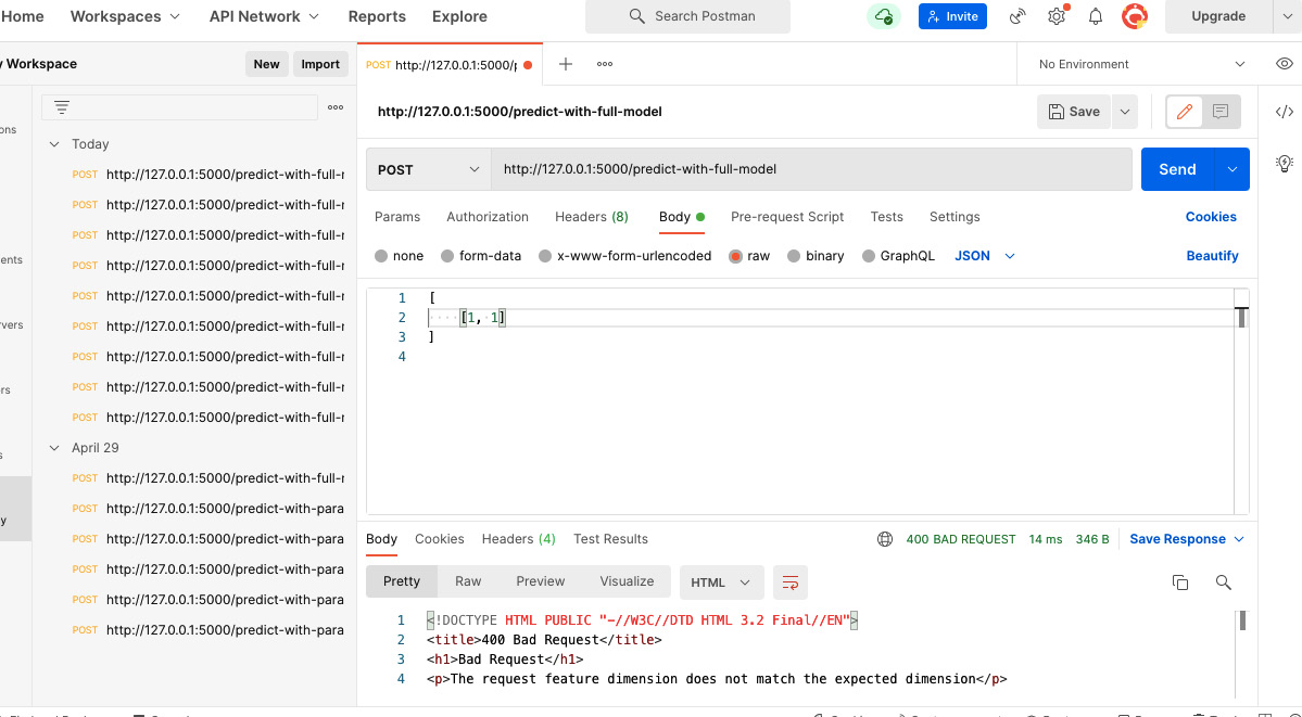
Figure 4.1 – A 400 error is thrown for passing a request with an input of a wrong dimension
In Figure 4.1, we passed an input of [[1, 1]]. Here, the length of the first feature is two but the model requires it to be three. So, we get a 400 error. The response that we get is as follows:
<!DOCTYPE HTML PUBLI" "-//W3C//DTD HTML 3.2 Final//"N">
<title>400 Bad Request</title>
<h1>Bad Request</h1>
<p>The request feature dimension does not match the expected dimension</p>
Here, the title (<title></title>) represents the error code and the paragraph (<p></p>) represents the message that we have passed. We should provide a clear message to the client. For example, in the error message, we could also provide the dimension information to indicate what was expected and what was passed. This would give a clear suggestion to the user on how to fix it.
- For example, if we modify the code in the following way to add a more verbose error message, it will give clear instructions to the client:
if len(X) == 0 or len(X[0]) != 3:
message ="""""
The request feature dimension does not match the expected dimension.
The input length of {X[0]} is {len(X[0])} but the model expects the length to be 3."""""abort(400, message)
This time, after making a request with the same input as before, we get the following error message:
<!DOCTYPE HTML PUBLI" "-//W3C//DTD HTML 3.2 Final//"N">
<title>400 Bad Request</title>
<h1>Bad Request</h1>
<p><br>The request feature dimension does not match the expected dimension.<br>The input length of [1, 1] is 2 but the model expects the length to be 3.
<br></p>
Now, the error code and message will help the developer improve the functionality of the application. How can monitoring errors help developers? Developers can enhance the API design and make plans in the following ways:
- Use a modeling language for API calls to build a request and ensure all the fields in the dimension are required. For example, using smithy (https://awslabs.github.io/smithy/), you can specify the input structure in an API call. However, it will still be in the client code. The code will not be able to hit the model serving code and the error can still come from the client code calling the APIs. For example, to specify the input list size as 3, you can use the following code snippet in smithy to define the model:
@length(min: 3, max: 3)
list X {member: int
}
Here, we created an input for the API, X, which is a list of integer numbers; the list’s size needs to be 3:
- Provide a user interface with the required fields for the users. In this way, we can add a sanity check to the client interface to ensure valid data is passed with the request.
- Create a script to automate the process of collecting input data for inference and formatting and then sending requests.
To learn more about REST API design and best practices, please visit https://masteringbackend.com/posts/api-design-best-practices. All these ideas can come onto the discussion table to enhance serving through monitoring these metrics. To learn more about 4XX errors, please follow this link: https://www.moesif.com/blog/technical/monitoring/10-Error-Status-Codes-When-Building-APIs-For-The-First-Time-And-How-To-Fix-Them/.
5XX errors
5XX errors occur when there is some error from the server side. Let’s look at one of the most common errors: 500 (Internal Server Error) error.
If there is something wrong during processing in the server-side code, then this error will appear. If there is an exception in the server-side code, it will throw a 500 error. To demonstrate this, let’s call the previous API endpoint, "/predict-with-full-model", with the following data:
[
["a", "b", "c"]
]
Here, we passed some strings, ["a", "b", "c"], instead of the numbers. The dimension of this input is 3, which is why this does not enter the conditional block:
         if len(X) == 0 or len(X[0]) != 3:
                 message = f"""
The request feature dimension does not match the expected dimension.
The input length of {X[0]} is {len(X[0])} but the model expects the length to be 3.
"""
                 abort(400, message)
That’s why we won’t see the 400 error. However, this time, the input list is not a list of numbers. If we pass this input to Postman, we will see the response of the 500 error, as shown in Figure 4.2:
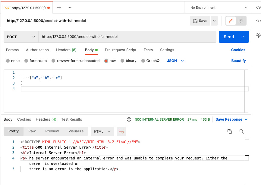
Figure 4.2 – An 500 error is thrown if the server code fails to process the client request
Now, the developer can go to the server and look at the log that is causing this error:
     array = np.asarray(array, order=order, dtype=dtype)
  File "/Library/Frameworks/Python.framework/Versions/3.8/lib/python3.8/site-packages/numpy/core/_asarray.py", line 83, in asarray
     return array(a, dtype, copy=False, order=order)
ValueError: could not convert string to float: 'a'
We get the preceding log in the terminal in the PyCharm IDE. Now, the developer knows why this error is appearing from the "ValueError: could not convert string to float: 'a'" error message. The client is passing some strings that could not be converted into floating-point numbers by the server code. What actions can the developers take? The developers can add a sanity check to the input to throw a 400 (Bad Request) error to the client if the type of the input data does not match the expected type. This 500 (Internal Server Error) is more common during model serving. There are a few other 5XX errors, such as 502 indicating issues in the gateway serving the API, 503 indicating unavailability of service, and 504 indicating timing out from the service. All these errors will help the developer to monitor server health.
Deciding on retraining
The crucial use case of continuous mode evaluation is to identify when the model is underperforming and when we should go for retraining. The goal of continuous model evaluation is different from that of software engineering application serving. When we train a model, we optimize the model to use a metric to understand whether the trained model is strong enough to make predictions. Then, we deploy the model to the server. However, the model will start underperforming as time goes on. A few reasons for it underperforming are as follows:
- The volume of unseen data with different distributions becomes high: By unseen data, I mean the data that was not used while training the model and has changed in the distribution of the data. In machine learning, this problem is widely known as data drift, as described at https://arize.com/model-drift/. As time goes on, the volume of unseen data will increase. We know that, during training, we use a major share of available data for training for some rules of thumb, such as the 80-20 split rule. Therefore, with this new volume of unseen data, the past model will behave like an underfitted model. One of the reasons for underfitting is not using sufficient data during training.
- The arrival of new patterns of data: Let’s say we are using a classification model to recognize the names of fruits in a garden. Let’s say the garden has only five fruits. So, the model is trained to classify these five fruits. Now, from the beginning of this year, the garden owner started to grow a sixth type of fruit. So, the old model becomes unusable now, as it will always misclassify the sixth fruit as one of the other five classes. We will be able to catch this degradation in performance through continuous monitoring. One thing we need to be careful of is that if the model fails to classify a rare class, then we might not notice a significant drop in performance. Therefore, we have to take care of rare classes during monitoring. One strategy could be to add more of a penalty by adding more weight during the misclassification of rare classes during evaluation.
- A change of market condition: A change of market condition may make a lot of features and their corresponding target values misaligned. For example, at the beginning of the pandemic, stock prices suddenly dropped. So, if we predicted the stock price using the same model before the pandemic, we would get a huge error, and that would tell us to retrain the model. Similarly, during inflation, market prices experience turmoil. If we use the same model as before, we will get more errors. The ground truths have now changed; this problem is widely known as concept drift in machine learning, as described at https://arize.com/model-drift/. If we do not continuously monitor the model, then we will miss the opportunity to update the model and get wrong predictions.
- A change of data calibration: A change of data calibration indicates that the business decided on a different label for the same input feature. This is widely known as prediction drift in machine learning, as described at https://arize.com/model-drift/. For example, let’s say we have a model to determine whether we should call a candidate for an interview for a particular position or not. This is a binary classification problem. This means that the label is either YES or NO. Let’s say a subset of the data in 2021 and 2022 for the company is shown in the table in Figure 4.3. For the same features, the company invited candidates for interviews in 2021, but in 2022, the company decided to no longer invite candidates for the same position with the same features for interviews in 2022. So, the model that automatically makes this prediction will not work in 2022, even though the model was very strong in 2021:
|
Years of Experience (Years) |
Major |
Highest Degree |
Decision 2021 |
Decision 2022 |
|
1 |
CS |
MS |
YES |
NO |
|
2 |
CS |
BSc |
YES |
NO |
|
1.5 |
CS |
BSc |
YES |
NO |
|
3 |
CS |
BSc |
YES |
NO |
Figure 4.3 – Interview call decisions based on the same features in 2021 and 2022
For the cases described here, we have to retrain the model. To make this decision, it helps automatically monitor the model metric continuously after deployment.
Enhancing serving resources
One of the usages of continuous model evaluation is to decide whether our serving resources need scaling. We need to monitor operational metrics such as availability and throughput for this. We can also monitor different errors such as request timeout errors, too many requests errors, and so on to determine whether our existing computation resource is no longer sufficient. If we get request timeout errors, then we need to enhance the computation power of the server. We might think about parallelizing computation, identifying bottlenecks, doing load testing, or using high-power GPUs or other high-power processors. If there are too many request errors, we need to horizontally scale the serving infrastructure and set a load balancer to drive requests to different servers to maintain an equal load on the servers.
To understand the load on our server, we can monitor the traffic count at different times of the day. Based on that, we can only enable high computation during peak times instead of keeping the resources available all the time.
Understanding business impact
The business success of a model depends on the business impact of the model. By continuously evaluating the model by monitoring the business metrics, we can understand the business impact of the model. For example, we can monitor the amount of traffic using the model daily to understand whether the model is reaching more clients. Based on the model’s business goal, we can define the metrics and keep monitoring those metrics via a dashboard.
For example, let’s assume we have a model to predict the estimated delivery time of food from a food delivery service provider app. The app needs to provide an estimated delivery time of food to the client when the client orders food using this app. Now, let’s say the app developers want to understand the business impact of the model. Some of the business metrics they could monitor are as follows:
- The number of users: How many new users have started to use the app can be a good metric to understand whether the app has been able to reach more people.
- Churn rate: How many users have stopped using the app can indicate whether the prediction made by the model does not reflect the actual delivery time.
- Average rating: The average star rating of the app can also indicate whether customers are satisfied with the performance of the app.
- The sentiment of reviews: Customers can write reviews about the delivery process, such as whether the food arrived timely or not. This sentiment analysis of reviews can show whether customers are happy with the delivery time predictions of the model or not.
We can also monitor model metrics such as the MSE of predicted delivery times and actual delivery times and do correlation analysis with customer ratings, churn rate, new user signup rate, and other business metrics to understand the correlation of model performance with the business metrics.
In this section, we have seen the necessity of continuous model evaluation. We saw that continuous model evaluation is needed to keep an eye on server health, to understand the business impact, and, most importantly, to understand when a model starts underperforming.
Next, let’s look at some of the most commonly used metrics so that we can use them wisely in continuous evaluation.
Common metrics for training and monitoring
In this section, we will introduce some common metrics for training and monitoring during continuous model evaluation. A detailed list of metrics used in training different kinds of machine learning models can be found here: https://scikit-learn.org/stable/modules/model_evaluation.html.
We shall discuss a few of them here to get a background understanding of the metrics.
Accuracy
Accuracy measures the percentage match of the predicted value and the actual value in a multilabel classification or multi-class problem. For example, if 70 predictions were made correctly out of 100 total predictions, then the accuracy would be 70%. Let’s look at the following code snippet from scikit-learn for computing accuracy:
from sklearn.metrics import accuracy_score
y_pred = [0, 2, 1, 3]
y_true = [0, 1, 2, 3]
acc1 = accuracy_score(y_true, y_pred)
print(acc1) # Prints 0.5
acc2 = accuracy_score(y_true, y_pred, normalize=False)
print(acc2) # Prints 2
Here, acc1 is the accuracy as a percentage – that is, the total correct predictions divided by the total number of predictions made by the model. On the other hand, acc2 gives the actual number of correct predictions made. If we are not careful, the decision made by acc2 could be biased. For example, let’s say the acc2 value is 70. Now, if the total number of predictions made is also 70, then we have 100% success. On the other hand, if the total number of predictions made is 1,000, then we have only 7% success.
In the preceding code, the value of acc1 is 0.5 or 50% because, in the y_true and y_pred arrays, two samples out of the four match. In other words, two out of four predictions were correct, and the value of acc2 is 2, indicating the concrete number of correct predictions.
Now, let’s implement the same metric function outside the library using simple Python logic to understand the metric well. We are avoiding handling all the corner cases to highlight just the logic:
def accuracy_score(y_true, y_pred, normalize = True):
     score = 0
     size = len(y_pred)
     for i in range(0, size):
           if y_pred[i] == y_true[i]:
                 score = score + 1
     if normalize:
           return score/size
     else:
           return score
y_pred = [0, 2, 1, 3]
y_true = [0, 1, 2, 3]
acc1 = accuracy_score(y_true, y_pred)
print(acc1) # Prints 0.5
acc2 = accuracy_score(y_true, y_pred, normalize=False)
print(acc2) # Prints 2
We get the same output as before from the preceding code snippet. It helps to understand how the metric is implemented and to understand the metric with more intuition. This is a simple metric that can be used to train a multi-label classification model.
Precision
Precision measures the ratio of true positives to the total number of positives predicted by the model. Some of the predicted positives are false positives. The formula for precision is tp/(tp + fp). Here, tp refers to the true positive count and fp refers to the false positive count. From the formula, we can see that if fp is high, then the denominator will be high, making the value of ratio or precision low. So, intuitively, this ratio discourages false positives and optimizes precision indicates, reducing the false alarms from the model. Positive and negative indicates two labels in binary classification. In a multi-class classification problem, this is a little difficult. In that case, we have to take the average of considering one class positive and all other classes negative at a time. The lowest value of precision is 0 and the highest value is 1.0.
To understand precision better, let’s look at the following code snippet from scikit-learn to compute the precision:
from sklearn import metrics
y_pred = [0, 1, 0, 0]
y_true = [0, 1, 1, 1]
precision = metrics.precision_score(y_true, y_pred)
print(precision) # Prints 1.0
From the preceding code snippet, we can see that the precision score that was computed using the scikit-learn API is 1.0 or 100%. The API considers 1 as the positive value and 0 as the negative value. So, if we manually compute the number of true positives and false positives, the total tp is 1 and fp is 0 because the only predicted positive is at index 1, which is also the true value. So, in this example, we only have a true positive, and there are no false positives in the response. Therefore, the precision is 1 or 100%.
To understand this logic better, let’s implement it in Python in the following code snippet. We are excluding all the corner cases just to show the logic:
def precision(y_true, y_pred):
     tp = 0
     fp = 0
     size = len(y_true)
     Positive = 1
     Negative = 0
     for i in range(0, size):
           if y_true[i] == Positive:
                 if y_pred[i] == Positive:
                       tp = tp + 1
           else:
                 if y_pred[i] == Positive:
                       fp = fp + 1
     return tp/ (tp + fp)
y_pred = [0, 1, 0, 0]
y_true = [0, 1, 1, 1]
precision = precision(y_true, y_pred)
print(precision) # Print 1.0
In the preceding code snippet, we implemented the basic logic of computing precision and we got the same result for the same input that we received from scikit-learn.
Here, we got a precision score of 1.0. We might be biased to think that we have a very perfect model. However, if we look at the y_true and y_pred arrays, we will notice that only 50% of the y_true values were predicted correctly. So, there is a risk in using precision alone as the scoring metric. If the model has a lot of false negatives, that means the model cannot recognize the negative cases at all, so the model will be very bad, even though the precision will be high. Consider a model that just has a single line of code, return 1, where there is no logic inside it. The model will have a precision of 100%, which can give us a biased interpretation of the model.
Recall
Recall is a metric that gives the ratio of true positive counts to the sum of the true positive counts and false negative counts. The formula of recall is tp/(tp + fn). Here, tp stands for true positives and fn stands for false negatives. False negatives refer to predictions where the true value is 1 but the prediction is 0 or negative. As these predictions are false or wrong, they are known as false negatives.
If the value of fn is high, then the value of the denominator in the formula for precision will also be high. Therefore, the ratio or recall will be lower. In this way, recall discourages false negatives and helps to train a model that will be optimized to produce fewer false negatives.
To understand the recall metric better, first, let’s see the following scikit-learn code snippet computing the recall:
from sklearn import metrics
y_pred = [0, 1, 0, 0]
y_true = [0, 1, 1, 1]
recall = metrics.recall_score(y_true, y_pred)
print(recall) # Prints 0.3333333333333333
Now, the recall score is ~0.33 for the same data shown in the example that computed the precision. The precision failed to tell us the model that’s predicting these values is a bad model. However, from the recall, we can tell that the model that was predicting a lot of false negatives is bad.
Now, to understand how the recall metric is generated, let’s see the implementation by using raw Python code, as follows:
def recall(y_true, y_pred):
     tp = 0
     fn = 0
     size = len(y_true)
     Positive = 1
     Negative = 0
     for i in range(0, size):
           if y_true[i] == Positive:
                 if y_pred[i] == Positive:
                       tp = tp + 1
                 else:
                       fn = fn + 1
     return tp/ (tp + fn)
y_pred = [0, 1, 0, 0]
y_true = [0, 1, 1, 1]
recall = recall(y_true, y_pred)
print(recall)
Here, we can see the same output as before. Notice that if the y_pred value is negative, then we do not do anything. This gives us a clue that there is some issue with the recall metric as well.
To understand this, let’s run the following scikit-learn model with the following input:
y_pred = [1, 1, 1, 1, 1]
y_true = [0, 0, 0, 0, 1]
recall = metrics.recall_score(y_true, y_pred)
print(recall)
We get a recall of 100% from the preceding code snippet. However, notice that out of five instances, the model only predicted one instance correctly, indicating a success of 20%. Out of the five predictions, only one was a true positive and the other four were false positives. So, we can see that the recall model gives a very biased interpretation of the model’s strength if the model makes a lot of false positives.
F1 score
From the discussions on precision and recall, we have seen that precision can optimize a model to be strong against false positives and recall can optimize the model to be strong against false negatives. F1 score combines these two goals to make a model that is strong against both false positives and false negatives. The F1 score is the harmonic mean of precision and recall. The formula for the F1 score is 2/(1/Precision + 1/Recall). There are some variants of the F1 score based on weights applied to precision. The actual formula is (1 + b^2)/ (b^2/recall + 1/precision) => (1 + b^2)*precision*recall/(b^2*precision + recall). This beta parameter is used to differentiate the weight given to precision and recall. If beta > 1, then precision has a lower weight as the weight will cause precision to contribute more to the denominator in the preceding formula, making the share of precision more than its actual value. If beta < 1, then recall has more weight compared to precision as precision will contribute less than its actual value. If beta = 1, then both precision and recall will have the same weights.
Now, to understand how the F1 score utilizes the best aspects of precision and recall, let’s compute the F1 score of the preceding data using scikit-learn:
from sklearn import metrics
y_pred1 = [0, 1, 0, 0]
y_true1= [0, 1, 1, 1]
F1 = metrics.f1_score(y_true1, y_pred1)
print(F1) # Prints 0.5
y_pred2 = [1, 1, 1, 1, 1]
y_true2 = [0, 0, 0, 0, 1]
F1 = metrics.f1_score(y_true2, y_pred2)
print(F1) # Prints 0.33333333333333337
Notice that for both sets of data, the F1 score now better represents the actual prediction power of the models. For the first dataset, for y_pred1 and y_true1, the F1 score is 50%. However, the precision was 100%, even though the prediction success was 50%.
For the second dataset, the value of the F1 score is ~0.3333. However, the recall was 100%, even though the prediction success was only 20%. Therefore, we can see that the F1 score is less biased in representing the power of the model. So, while monitoring for continuous model evaluation, we need to be careful when using mere precision or recall. We might be fooled into assuming the model is doing well, but it is not. It’s safer to use the F1 score in place of them.
There are many other metrics for classifications. We encourage you to go through all these metrics and try to implement them to understand which metrics are good for your business case. To understand model evaluation, understanding these metrics from the basics will help you to monitor and evaluate wisely.
In the next section, we will see some use cases of continuous model evaluation. We will demonstrate through examples how continuous model evaluation should be an integral part of models serving different business goals.
Continuous model evaluation use cases
In this section, we will see some cases to demonstrate when model performance monitoring is essential.
To understand when continuous model evaluation is needed, let’s take an example case of a regression model to predict house prices:
- First, let’s take dummy example data showing house prices from January 2021 to July 2021.
When we deploy the regression model, we have to continuously monitor regression metrics such as Mean Square Error (MSA) and Mean Absolute Percentage Error (MAPE) to understand whether our model’s prediction started deviating a lot from the actual value. For example, let’s say that a regression model to predict house prices was trained in January using the data shown in the table in Figure 4.4:
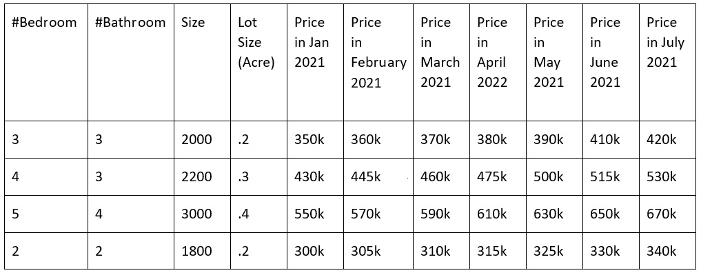
Figure 4.4 – Mock house price data against features in Jan 2021 and July 2021
In the table in Figure 4.4, we have also shown the hypothetical price change of houses until July. Let’s assume the model was developed with the data until January and was able to make a perfect prediction with zero errors in January. Though these predictions were perfect for the market in January, these were not good predictions from February to July.
- Next, we must compute the MSE of the predictions of the house prices in different months by the model and plot.
We can plot the MSE using the following code snippet:
from sklearn.metrics import mean_squared_error
import matplotlib.pyplot as plt
import numpy as np
predictions = [350, 430, 550, 300]
actual_jan = [350, 430, 550, 300]
actual_feb = [360, 445, 570, 305]
actual_mar = [370, 460, 590, 310]
actual_apr = [380, 475, 610, 315]
actual_may = [390, 500, 630, 325]
actual_june = [410, 515, 650, 330]
actual_july = [430, 530, 670, 340]
mse_jan = mean_squared_error(actual_jan, predictions)
mse_feb = mean_squared_error(actual_feb, predictions)
mse_mar = mean_squared_error(actual_mar, predictions)
mse_apr = mean_squared_error(actual_apr, predictions)
mse_may = mean_squared_error(actual_may, predictions)
mse_june = mean_squared_error(actual_june, predictions)
mse_july = mean_squared_error(actual_july, predictions)
errors = np.array([mse_jan, mse_feb, mse_mar, mse_apr, mse_may, mse_june, mse_july])
plt.plot(errors)
plt.ylabel("MSE")
plt.xlabel("Index of Month")
plt.show()
We will see a curve like the one shown in Figure 4.5:
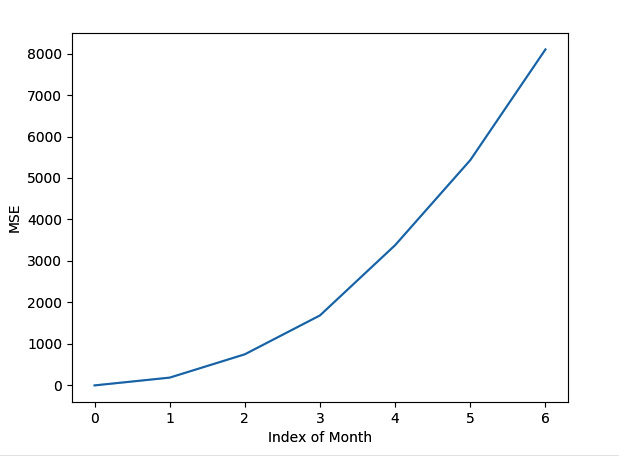
Figure 4.5 – Change of MSE from a hypothetical model until July 2021 that was trained in January 2021
From Figure 4.5, we can see that the MSE of prediction is increasing. We can show this monitoring chart on a dashboard to decide on retraining. We can see from the chart that the model performance is deteriorating as we didn’t update the model. The model is no longer usable and is dangerous to use after a certain time.
Now, let’s consider the case of a classification model. Let’s say it makes a binary decision on whether a person is eligible for a loan or not:
- First, let’s take some hypothetical training data. Let’s say the feature to train the model in January 2021 was as shown in the table in Figure 4.6:
|
Monthly Income |
Debt |
Can Get Loan |
|
10k |
30k |
Yes |
|
15k |
30k |
Yes |
|
20k |
35k |
Yes |
|
25k |
40k |
Yes |
|
30k |
75k |
Yes |
|
21k |
40k |
Yes |
|
30k |
45k |
Yes |
|
40k |
100k |
Yes |
|
17k |
12k |
Yes |
|
19k |
20k |
Yes |
Figure 4.6 – Hypothetical feature set used in January 2021 to decide whether a person can get a loan
For simplicity, let’s assume all 10 people were worthy of getting a loan in January 2021.
- Now, let’s assume these 10 people stay with the same financial conditions until July, but due to inflation and market conditions, the bank has slowly tightened the rules on giving loans over the months until July. Let’s assume that a person’s worthiness of getting a loan over the next 6 months looks like the table in Figure 4.7:
|
Feb |
Mar |
Apr |
May |
Jun |
Jul |
|
No |
No |
No |
No |
No |
No |
|
Yes |
No |
No |
No |
No |
No |
|
Yes |
Yes |
Yes |
No |
No |
No |
|
Yes |
Yes |
Yes |
Yes |
No |
No |
|
Yes |
Yes |
Yes |
Yes |
No |
No |
|
Yes |
Yes |
Yes |
Yes |
Yes |
No |
|
Yes |
Yes |
Yes |
No |
No |
No |
|
Yes |
Yes |
Yes |
Yes |
Yes |
No |
|
Yes |
Yes |
No |
No |
No |
No |
|
Yes |
Yes |
No |
No |
No |
No |
Figure 4.7 – Change of loan worthiness until July 2021
Notice that the actual loan worthiness of every person was lost by July 2021. However, as the model was trained in January 2021, and was passed the same features, the model will still predict that all 10 people are worthy of getting a loan, making the model unusable and unreliable.
- Let’s show the accuracy of the model over the months using the following code snippet:
from sklearn.metrics import accuracy_score
import matplotlib.pyplot as plt
import numpy as np
predictions = [1, 1, 1, 1, 1, 1, 1, 1, 1, 1]
actual_jan = [1, 1, 1, 1, 1, 1, 1, 1, 1, 1]
actual_feb = [0, 1, 1, 1, 1, 1, 1, 1, 1, 1]
actual_mar = [0, 0, 1, 1, 1, 1, 1, 1, 1, 1]
actual_apr = [0, 0, 1, 1, 1, 1, 1, 1, 0, 0]
actual_may = [0, 0, 0, 1, 1, 1, 0, 1, 0, 0]
actual_jun = [0, 0, 0, 0, 0, 1, 0, 1, 0, 0]
actual_jul = [0, 0, 0, 0, 0, 0, 0, 0, 0, 0]
acc_jan = accuracy_score(actual_jan, predictions)
acc_feb = accuracy_score(actual_feb, predictions)
acc_mar = accuracy_score(actual_mar, predictions)
acc_apr = accuracy_score(actual_apr, predictions)
acc_may = accuracy_score(actual_may, predictions)
acc_jun = accuracy_score(actual_jun, predictions)
acc_jul = accuracy_score(actual_jul, predictions)
errors = np.array([acc_jan, acc_feb, acc_mar, acc_apr, acc_may, acc_jun, acc_jul])
plt.plot(errors)
plt.ylabel("Accuracy")plt.xlabel("Index of Month")plt.show()
We get a trend of accuracy dropping from the preceding code. The trend line is shown in Figure 4.8:
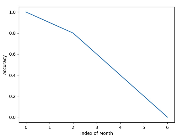
Figure 4.8 – Trend line of accuracy dropping from January 2021 to July 2022
Here, we can see that the accuracy is dropping linearly. We need to monitor the model to catch this performance drop. Otherwise, we might keep trusting the model until a big crash is exposed.
Now, let’s consider a case of product recommendation. Let’s assume there is a loyal customer of an e-commerce site who always trusts the product recommendations made by the site for them. Now, suddenly, the site has stopped updating the model. The loyal customer will soon find out that their favorite site is not recommending them the latest and upgraded products. Maybe the customer likes to buy the latest technical books. However, they are getting recommendations for 6-month-old books by using old technology. So, the loyal customer will quit the site and write bad reviews for it. Therefore, recommendation models need to be updated very frequently to recommend the latest products to clients based on their interests. We need to continuously monitor the model, and also the data, in this case, to upgrade the model. We need to monitor whether the model is recommending old products even though an upgraded version of the same product is already available.
In this section, we have seen some example cases to understand what can happen if a model is not evaluated continuously. We picked basic examples from different domains to demonstrate how important continuous evaluation is in those cases. In the next section, we will discuss strategies to evaluate a model continuously, along with examples.
Evaluating a model continuously
We can detect model performance in multiple ways. Some of them include:
- Comparing the performance drops using some metrics with the predictions and ground truths
- Comparing the input feature and output distributions of the training dataset are compared with the input feature and output distributions during the prediction
As an example demonstration, we will assess the model performance by comparing the predictions against the ground truths using the metrics. In this approach, to evaluate a model continuously for model performance, we have the challenge of getting the ground truth. Therefore, a major step in continuous evaluation is to collect the ground truth. So, after a model has been deployed, we need to take the following steps to continuously evaluate the model’s performance:
- Collect the ground truth.
- Plot the metrics on a live dashboard.
- Select the threshold for the metric.
- If the metric value crosses the threshold limit, notify the team.
Let’s look at these steps in more detail.
Collecting the ground truth
After the model has been served, we need to monitor the model performance metric that was used during training. However, to compute this metric, we need two arrays. One array will represent the predicted value and the other array will represent the corresponding actual value. However, we usually do not know the actual value of the predicted value during the time of prediction. So, what we can do is store a sample of the input and the corresponding prediction and take help from human effort to identify the correct values for those. There are multiple other ways to collect ground truths, both with human efforts and without human effort. Some of these efforts are stated here: https://nlathia.github.io/2022/03/Labelled-data.html. Collecting ground truth through human effort can be done in the following ways:
- Humans can label without domain knowledge: In these kinds of scenarios, a human can identify the actual label instantly. For example, consider a model for classifying cats and dogs. A human labeler could identify the correct label just by looking and no domain knowledge would be needed.
- Humans with domain knowledge can label: In this scenario, the human needs domain knowledge to identify the correct label. For example, let’s consider a model that detects whether a particular disease is present or not based on symptoms. Only doctors with adequate knowledge can label this kind of data correctly. Similarly, consider identifying the variety of apples using a model. Only an agriculture expert or farmer with adequate knowledge of the varieties of apples would be able to identify the labels correctly.
- Needing to wait to get the ground truth: Sometimes, to know the actual value or label, we need to wait until the value or label is available. For example, consider a model predicting the price of a house. We will know the value once the house is sold. Consider another model determining whether a person can get a loan or not. We can only identify the label after the loan application has been approved or denied.
- Needing data scraping: You may need to scrape data from different public sources to know the actual value. For example, to know the public sentiment, know the actual price of stocks, and so on, we can take the help of web scrapers and other data-collecting tools and techniques to collect the ground truth.
- Needing tool help: Sometimes, the label of a feature set needs to be confirmed by a tool. For example, let’s say that we have a model that recognizes the name of an acid. We need the help of tools and experiments to get the actual name of the acid.
As an example, to demonstrate saving some training examples and then collecting the ground truth later, let’s say we have predictions being made against some input, as shown in the table in Figure 4.9, which was taken from Figure 4.4. This time, while making predictions, we assign the Save? label with Yes/No values to denote whether we should save the example, to collect the ground truth:
|
#Bedroom |
#Bathroom |
Size |
Lot Size (Acre) |
Prediction in Jan 2021 |
Save? |
|
3 |
3 |
2000 |
.2 |
350k |
Yes |
|
4 |
3 |
2200 |
.3 |
430k |
Yes |
|
5 |
4 |
3000 |
.4 |
550k |
Yes |
|
2 |
2 |
1800 |
.2 |
300k |
No |
Figure 4.9 – We randomly select the input features to save to collect the ground truth
Let’s assume that, for the data in Figure 4.9, we have decided to save 75% of the data for collecting ground truth manually. Now, we can assign a human to collect the market price of the saved houses. We will provide the features so that the housing market expert can make an educated guess or can get the price from the actual house price listed during selling. Now, the human will collect the ground truth for the saved examples, as shown in the table in Figure 4.10:
|
#Bedroom |
#Bathroom |
Size |
Lot Size (Acre) |
Price in Feb 2021 |
|
3 |
3 |
2000 |
.2 |
360k |
|
4 |
3 |
2200 |
.3 |
445k |
|
5 |
4 |
3000 |
.4 |
570k |
Figure 4.10 – Ground truths for the saved instances are collected from the market for Feb 2021
Let’s assume the ground truth collection for this model is done at the beginning of every month. So, at the beginning of March 2021, we will save another 75% of examples along with their predictions. This way, the ground truth can continue to be collected to monitor the model continuously.
Plotting metrics on a dashboard
We should have a monitoring dashboard to monitor the trend of different metrics over time. This dashboard can have multiple metrics related to monitoring model performance, along with operation metrics and business metrics. We can have a separate service just to monitor the model. Inside that monitoring service, we can fetch the recent data of predicted and actual values and plot the charts. Those charts only show recent data as these monitoring charts do not need to show a lot of history. We do not have to visualize the whole history. On the dashboard, we can create separate sections for operational metrics, business metrics, and model metrics. However, to make model retraining decisions, we usually use model metrics.
For example, let’s assume that while using the instances saved for collecting ground truth, as shown in Figure 4.10, we get the metrics in different months, as shown in the following code snippet. Here, we are also creating a basic dashboard using the metrics:
import matplotlib.pyplot as plt
import numpy as np
import math
MSE = np.array([0, 4000, 7000, 11000, 15000, 23000])
MAE = np.array([0, 200, 300, 500, 700, 1000])
MAPE = np.array([0, 3, 8, 12, 20, 30])
RMSE = np.array([0, math.sqrt(4000), math.sqrt(7000),
                        math.sqrt(11000), math.sqrt(15000), math.sqrt(23000)])
fig, ax = plt.subplots(2, 2)
fig.suptitle("Model monitoring dashboard")
ax[0, 0].plot(MSE)
ax[0, 0].set(xlabel="Index of Month", ylabel="MSE")
ax[0, 1].plot(MAE)
ax[0, 1].set(xlabel="Index of Month", ylabel="MAE")
ax[1, 0].plot(MAPE)
ax[1, 0].set(xlabel="Index of Month", ylabel="MAPE")
ax[1, 1].plot(RMSE)
ax[1, 1].set(xlabel="Index of Month", ylabel="RMSE")
plt.show()
The dashboard that is created from this code is shown in Figure 4.11:
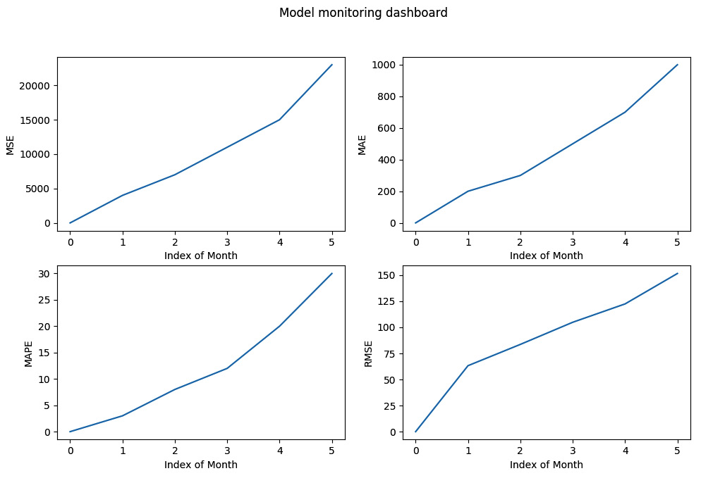
Figure 4.11 – A basic dashboard of model metrics created using matplotlib
This dashboard is very basic. We can develop more interactive dashboards using different libraries and frameworks such as seaborn, plotly, Grafana, AWS Cloudwatch, Tableau, and others.
Selecting the threshold
We can also set the threshold of the model performance metrics. The service will notify the developers when the performance starts dropping beyond the threshold. The threshold usually depends on the business goal. Some business goals will tolerate a maximum 1% drop in performance from the original performance of the model while other business goals might be okay with tolerating more of a drop. Once a threshold has been selected, then we are ready to set it in our monitoring code.
After the threshold has been selected, we can show that threshold line on the monitoring chart. For example, let’s assume that we have selected an MSE threshold of 5,000 for the preceding problem. We can add the following code snippet to show a threshold line for MSE:
MSE_Thresholds = np.array([5000, 5000, 5000, 5000, 5000, 5000])
fig, ax = plt.subplots(2, 2)
fig.suptitle("Model monitoring dashboard")
ax[0, 0].plot(MSE)
ax[0, 0].plot(MSE_Thresholds, 'r--', label="MSE Threshold")
ax[0, 0].legend()
ax[0, 0].set(xlabel="Index of Month", ylabel="MSE")
Now, the dashboard will look as shown in Figure 4.12:

Figure 4.12 – The threshold line is shown in the chart on the dashboard for monitoring
Notice that a red dashed line is added to the MSE chart and represents the threshold for MSE. From the monitoring dashboard, we can now monitor that the MSE is approaching the threshold in February 2021. So, the engineers can plan and prepare to retrain the model.
Setting a notification for performance drops
Once the monitoring threshold has been set, we can set appropriate actions if those thresholds are crossed.
We can set an alarm and notify the developers that the model is performing below the threshold level. We can also keep track of the value of the last index in our metric array to notify customers.
For example, in our dashboard program, we can add the following code snippet to print a warning if the selected MSE threshold is crossed by the last evaluated MSE from the predictions:
mse_threshold = 5000
if MSE[-1] >= mse_threshold:
     print("Performance has dropped beyond the accepted threshold")
We can also set other actions in this block instead of just print.
In this section, we discussed the approaches and strategies that need to be followed to continuously evaluate a model. In the next section, we will discuss monitoring rare classes, a special case of monitoring for continuous evaluation.
Monitoring model performance when predicting rare classes
So far, we have seen that monitoring a metric can tell us when to retrain our model. Now, let’s assume that we have a model where a class is very rare and the model started failing to detect the class. As the class is rare, it might have very little impact on the metric.
For example, let’s say a model is trained to classify three classes called 'Class A', 'Class B', and 'Class R'. Here, 'Class R' is a very rare class.
Let’s assume the total predictions made by the model in January, February, and March are 1,000, 2,000, and 5,000, respectively. The instances in different classes and their correct prediction over these three months are shown in the table in Figure 4.13:
|
January |
February |
March | ||||
|
Actual |
Predicted Correctly |
Actual |
Predicted Correctly |
Actual |
Predicted Correctly | |
|
Class A |
600 |
600 |
1300 |
1300 |
3000 |
3000 |
|
Class B |
399 |
399 |
698 |
698 |
1998 |
1998 |
|
Class R |
1 |
1 |
2 |
1 |
2 |
0 |
|
Accuracy |
100% |
99.95% |
99.96% | |||
Figure 4.13 – Wrong prediction of rare classes might not impact the metric value significantly
From Figure 4.13, we can see that even though all the rare classes are being predicted wrong in March, the accuracy is shown as better than in February. So, we might think our model has very good performance, but the model has become blind to recognizing classes. How can we prevent this? Well, one simple strategy, in this case, is to assign more weight to rare classes. The value of this weight can be determined depending on how rare a class is. For our use case, we can see that the rare class appears less than once in every 1,000 examples. So, we can assume a basic metric such as the following:
(total_predictions/(total_classes* total_times_rare_class_comes))
Therefore, the weight in January will be (1000/(3*1)) ~333, in February will be (2000/(3*2)) ~ 333, and in March will be (5000/6) ~ 833.
Now, let’s define the formula to compute the weighted accuracy:
(total_predictions – total_wrong_predictions*weight)/total_predictions
This formula is the same as the formula for computing normal accuracy with weight = 1.
Therefore, we get the modified weighted accuracy in January, February, and March as follows:
weighted_accuracy_Jan = (1000 – 0*333)/1000 = 100%
weighted_accuracy_Feb = (2000 – 1*333)/2000 = 83.35%
weighted_accuracy_Mar = (5000 – 2*833)/5000 = 66.68%
Now, we can decide that the model started performing very badly in March. Its weighted accuracy dropped to 66.68%. Therefore, we know that the model is no longer good and some actions need to be taken immediately.
In this section, we have discussed how can we use weighted metrics to monitor rare classes during continuous model evaluation. We will conclude with a summary in the next section.
Summary
In this chapter, we discussed another new pattern of model serving: the pattern of continuous model evaluation. This pattern should be followed to serve any model to understand the operational health, business impact, and performance drops of the model throughout time. A model will not perform the same as time goes on. Slowly, the performance will drop as unseen data not used to train the model will keep growing, along with a few other reasons. Therefore, it is essential to monitor the model’s performance continuously and have a dashboard to enable easier monitoring of the metrics.
We have seen what the challenges are in continuous model evaluation and why continuous model evaluation is needed, along with examples. We have also looked at use cases demonstrating how model evaluation can help keep the model up to date by enabling continuous evaluation through monitoring.
Furthermore, we saw the steps that need to be followed to monitor the model and showed examples with dummy data, and then created a basic dashboard showing the metrics on the dashboard.
In the next chapter, we will talk about keyed prediction, the last model serving pattern based on serving philosophies. We will discuss what keyed prediction is and why it is important, along with techniques that you can use to perform keyed prediction.
Further reading
You can read more about metrics and continuous monitoring by looking at the following resources:
- To learn more about built-in monitoring of operation metrics supported by AWS, you can follow the resources here: https://docs.aws.amazon.com/AmazonCloudWatch/latest/monitoring/working_with_metrics.html
- To learn more about model performance metrics, go to https://scikit-learn.org/stable/modules/model_evaluation.html