
4
Create Detailed Illustrations with Inkscape
You might not want to reach your artistic goals as an illustrator right now. But you will still see that this chapter is full of resources and methods you can use to create complex work in Inkscape. Basic vector illustrations are a good way to learn Inkscape, such as the set of icons we just finished in Chapter 3, Modular Icon Set Design with the Power of Vector. But to provide reliable design services for a client, it is good to know the tools and rules to create detailed drawings as well. This is why this chapter focuses on creating a business illustration with many details and elements.
This project is not just about drawing. It is about using illustration to practice the use of shape and color and efficient work in Inkscape!
In this chapter, we’re going to cover the following main topics:
- Sketching with Inkscape
- Adding colors and drawing your characters
- Drawing the laptop
- Finalizing your illustration
Sketching with Inkscape
As I stated in the previous chapters, whatever you’re designing, sketching will help. It helps to clarify your ideas and set your focus on the goal of your creation, whether it be a logo, an icon, or an illustration. I always say that sketching your ideas on paper is a must, at least to lay down a few basic directions, to get the work started.
Sketching is important, but, in some cases, you might want to sketch in the program itself. Since Inkscape is a vector graphic program, you can easily draw a few basic shapes and mold them into their final form later in the process. Also, while creating illustrations, you are not as limited as, for example, with logo design.
When working on an illustration, you have more flexibility; you can use more details and add as many shapes and objects as you want, and you are free to experiment with colors and lighting. In general, you have fewer rules to follow, and you have a larger toolset to convey your message.
In this chapter, your task is to create an illustration for CloudUsers. The theme of the illustration is people using cloud services. We will draw the illustration together step by step while practicing with all the tools you’ll need to create your own designs later!
This illustration will be more elaborate than the simple icons we created in earlier chapters. It will have more objects and more colors, and of course, it will tell a better story as well. The point of the illustration is to grab the attention of visitors to the website and get an emotional response.
In this case, what we want to show the visitor is that cloud services make communication and working together fun and easy, and that the people using CloudUsers’s services are a friendly bunch. Actually, this is the message that a lot of IT companies want to pass on nowadays, and their illustrators have created a simple and clean friendly corporate style in response. For our illustration, we will use this clean and colorful style too!
Here is a very simple vector sketch I made earlier – you can follow my lead, or draw your own version based on the techniques you practice in this chapter.

Figure 4.1 – My quick vector sketch for the CloudUsers illustration
This very basic sketch is more of an inventory than an illustration. Its purpose is to help you decide what needs to be in the image. I decided to include a big laptop in the middle, some small people interacting and working, and of course clouds as the visual representations of cloud-based services. What colors should we use? I don’t know yet! What is the final position of the elements? I don’t know yet! What are the figures doing? I don’t know yet! And that is all fine since this is just the first step on the way toward our final illustration.
Creating the first sketch in Inkscape
The goal here is really just throwing some elements down to put your first ideas on the screen. Therefore, you will only use basic shapes and simple colors. And don’t forget to utilize one more thing: the cloud shape you created earlier, which is still there and ready to be used!
Let’s create this first sketch together in Inkscape by taking the following steps!
- Create a new document for your illustration, then open the file containing the basic cloud shape for the icons. Copy the cloud shape into the new document.
Since we are not focusing on color at this stage, just assign any fill color to the cloud, and turn off the stroke color. I use some dull grays at this stage since they are easy to distinguish and don’t interfere with the artistic process. This will not stop you from thinking about colors and that is great for speed!
- Now draw a basic laptop. A laptop is just like a paper folded, two distorted rectangles sharing a common edge. Draw a gray rectangle and skew it to create the screen. Duplicate the rectangle and turn the object into a path. Then select the two top nodes of the path and move them to open the laptop. This will modify the second rectangle, sharing an exact edge with the first one while appearing to lie flat. See Figure 4.2 for a visual representation of this.

Figure 4.2 – Creating a basic laptop shape
Tip
Now, this is a trick I like to use when I create rectangles that share a common edge. It can be used for boxes, stairs, and so on. Duplicate the original rectangle and move the top nodes. This saves a lot of time since you don’t have to align the two objects to each other!
- Now add the clouds! Move and scale the cloud you had earlier to give a background to the laptop. Send the big cloud behind the laptop using Page Down. Pick a darker gray for it to remind you that it has to have a strong color contrast later.
- Duplicate the cloud, scale it smaller, and move it a bit higher to the left. This will be positioned as a real cloud later and will provide a seat for one of our characters.

Figure 4.3 – Laptop in a cloud
The stage is set; it is time to add some characters. Since this is only the first draft, you will not work on any details, just add some simple shapes to represent the users. The goal is just to figure out the positions and the general scale of the objects in the illustration.
- Draw a small, rounded rectangle, and draw a circle above it, similar to the user shape we created for the logo.
- Duplicate the user twice. Move one of them to stand in front of the giant laptop. The second one will sit on the cloud in the sky – you can make the body shorter to signal sitting. And move the third character to sit on the edge of the big laptop. Refer back to Figure 4.1 to see how I positioned them. Feel free to change the positions and play around with the size a bit in your version!
This is our flat vector sketch done. In the future, you will see that practicing this sketching technique will help you make faster decisions and make your design work with Inkscape much faster! Note that the sketch is not set in stone: you can and will modify it and change some parts later on. It is a flexible guideline for creating your final illustration.
Adding colors and drawing your characters
Now that our illustration is laid out with these flat shapes, it is time to go deeper and start adding those details. I know it may seem like it is easier said than done, but sometimes it is harder to imagine how to build up a vector illustration than actually doing it.
Tip
While building a basic sketch up to a complex vector illustration, follow the old rule of drawing: instead of focusing on one area only, try to work on the image as a whole. First, focus on the big shapes, then add some colors, then more and more layers of details, and finally, lighting and additional effects if needed. This way, the different parts of your illustration will be developed evenly. This makes it easier to keep things visually similar, and you will have an illustration where all the parts work together.
After sketching, the next step is to add colors while also adding more details to the illustration. Let’s turn those simple placeholders into humans interacting in an interesting environment!
Adding colors to your sketch
We usually start coloring an illustration with a few colors that will support the mood and the message. We’ve all struggled with finding the perfect colors. In this case, you will create an illustration to match a previously decided logo and its color palette. So, our first colors are already decided: the blue (#00AAD4) and the turquoise (#2AC1B5) we used earlier have to be included.
The idea is to pick a few starter colors, and then we will mix these colors and recolor elements later on as needed. To create your own color template on the drawing board, just draw a small square, and apply the basic blue color (#00AAD4) as a fill color to it. Then duplicate this square and color it turquoise (#2AC1B5).
What other colors do you need for starters? There needs to be a lighter shade of the two basic colors, and there needs to be a lighter and darker skin color for our characters, as well as a darker variant of the original blue, to draw hair and add some contrast to our drawing. And finally, pick a type of vivid orange or red to brighten up the whole image a bit so it is not just shades of blue and turquoise.
Add a small square for each of these colors. Feel free to choose your own colors using the color wheel in the Fill and Stroke window. Keep an eye out for matching colors; move the small squares of your palette onto each other to see how colors relate. This is the vector equivalent of trying a brush of color on the side of your paper while painting. See the following figure for my colors and codes. (You don’t need to copy the codes; I’m just showing the palette I created for your information.)
Figure 4.4 – The eight starter colors and their hexadecimal codes
To use this DIY palette, just select any object you would like to color and pick the color of the matching square using the Color picker tool! You don’t need to save this as a custom palette, nor do you need to copy codes anymore.
You will not apply the colors to the sketch just now. Before coloring anything, let’s design the characters in more detail.
Drawing the first character
Let’s start drawing the first character! The user standing in front of the laptop is a good choice, as it is standing in a fairly simple pose and will be a good reference for the other characters as well.
Drawing a simple human character standing is an easy job. They have a head, a torso, two arms, and two straight legs. You can start designing your shape from the placeholder character shape you already created for your sketch:
- Take the placeholder character and copy it to a new clean location away from your sketch. Then cut the bottom half by drawing a square over the figure using Path | Difference. Cut it a bit longer this time to add a slightly thinner body to the character. Then remove the circle as the head and draw a new rounded rectangle – a short pill shape – to be the head.
Later on, when we add details to the head, we will keep it simple: no nose, no eyes, maybe only a simple mouth to smile and communicate some emotions. But for now, just draw the shape for the head, and position it above the body and slightly off-center. We positioned the head a bit off-center, so that the character is facing forward, toward where the laptop will be.
Check out Figure 4.5 for a visual representation of these steps. This is only my version and my favored cartoon character proportions. Feel free to experiment with the proportions of your own characters!

Figure 4.5 – Creating the body and the head using simple rounded rectangles
- Next step: the legs. Use the Bezier tool and draw the legs with straight lines, starting from the hips. Just click with the mouse; do not hold the mouse button down!
We just want simple straight lines this time. You can also create the feet now, as it only takes one extra click of the mouse to draw this simple triangle shape.
- The same goes for the arm: it is a simple shape, so it will be fastest to use the Bezier tool and draw it with six easy clicks.
Refer to Figure 4.6 for help with drawing the arm and legs. After you draw them, put them in their places next to the body.
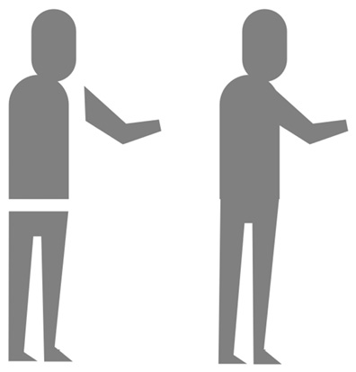
Figure 4.6 – Drawing the arm and the legs with the Bezier tool
Tip
Try to limit the number of nodes you create, to keep your vector paths as simple as possible. The fewer clicks you make with the Bezier tool, the smoother your path will appear. The line will appear less shaky, and it will be much easier to reshape later.
The arm and legs are simple shapes, and you may simplify the hands too. You don’t even need to draw any fingers. Why? Because although this will be a complex illustration compared to the icon you drew earlier, the characters and other elements in it will still be quite simple.
The combination of these simple elements will result in a complex image. So, you can create a hand with two simple shapes, and it will look like an expressive hand gesture when part of the bigger picture!
- Draw a vertical, rounded rectangle – a pill shape – and cut half of it vertically with a square using Path | Difference. Then duplicate this half, scale it down about half the size, and flip it horizontally by pressing H. This will be the thumb.
Now move it so close to the other half that they are touching. Together they create a simple rounded hand shape, almost like a lobster claw. Rotate, scale, and position the hand, so it sits on the end of the arm of the character. Refer to Figure 4.7 for visual help.

Figure 4.7 – Even simple shapes are enough to create a hand gesture on a smaller scale
The standing character is coming together nicely, and it is time to use some of those colors you selected earlier!
- Select the head and the hand shapes and use the Color picker tool on the pink square to assign the skin color to these shapes! Then select the torso and the arm and color them light blue in the same way. Finally, add the turquoise fill color to the legs, as shown in Figure 4.8.
Note that we are only using flat colors for now; you will add gradients and shadows later on too!

Figure 4.8 – Coloring the first character with the chosen colors
I have nothing against bald characters, but to add a bit more detail and personality to this one, let’s design his hair. When drawing someone’s haircut in vector form, you have to think about the hair as a mass. Picture it as a shape, not as a bunch of individual strings. In the case of this flat and geometrical character style, this is even more true.
- To create the hair, first, select the head shape, and duplicate it. Then select this duplicate and assign the darker blue fill color to it (#146478).
- Select the hair and rotate it about 30°, as seen in Figure 4.9. Now select the original head shape of the character again and duplicate that. You now have three objects covering each other – the original head shape, the darker and rotated hair shape, and the duplicated head shape.
- Select the top two shapes – the duplicate of the head and the darker hair shape – while holding Shift. Do not select the original head shape this time! Use Path | Intersection from the Path menu. This will create an intersection of the two selected objects. In this case, this will be a haircut that perfectly fits the shape of the top of the head. This is what I call the sandwich method.
- The hair of the character seems too flat now, so zoom in and add two rounded rectangles of the same dark blue color. Position them right at the edge of the forehead. This will create a hairstyle fitting a busy cartoon character!

Figure 4.9 – Creating the hair using the sandwich method
The sandwich method
When you need to cut a shape to the edge of another irregular shape seamlessly, use this method:
(1). You start with a base shape and a second shape that needs to be cut to the edge of the base shape.
(2). Position the second shape where you want to have it above the base. It has to cover part of the base.
(3). Duplicate the base shape, to have a third shape.
(4). Select these top two shapes and create their intersection with Path | Intersection, or Ctrl + *.
Remember the order: original shape, above it the shape to be cut, then a duplicate of the original in the same position. Like a sandwich!
Why do you need to duplicate the original? Because using the Intersection operation deletes the two original shapes, and leaves only their intersection.
I use the sandwich method a lot during my work because it makes my illustration process much faster and more precise. Imagine freehand drawing a path above a shape that has to fit the edge of the original shape perfectly. It is possible, of course, but it takes much more effort and time than using this simple method. You can use it to create hair, fitting clothes, textures, lighting on objects, shadows, and so on. If you are illustrating, this is a very useful and versatile method! You will have plenty of opportunities to practice the sandwich method during this chapter.
The only thing we want to add at this stage is the arm on the other side of the character. Of course, only the character’s elbow will be visible; still, this will emphasize his gestures, and he will appear less flat.
- Use the Bezier tool and draw a simple triangle for the arm. Select the Path editor tool, then press Ctrl and left-click on the node at the elbow. This will turn that corner into a curve, and the arm will look more believable. Now select the arm and send it behind the body of the figure, pressing End once or Page Down a few times.
The rear arm has to look like it is behind the body, so it needs to be visually separated from the torso.
- Select the rear arm and change its fill color to the original blue you created earlier (#00AAD4).
- There are still a few corners around our character that we should soften up. Use the same method that you used on the rear elbow, but this time use Ctrl and left-click with the Path editor tool on the nodes in both knees and the elbow of his front arm.
This will create a more organic look for the character. Keep the feet and the hand as simple shapes for now; it will support the simple, friendly look.
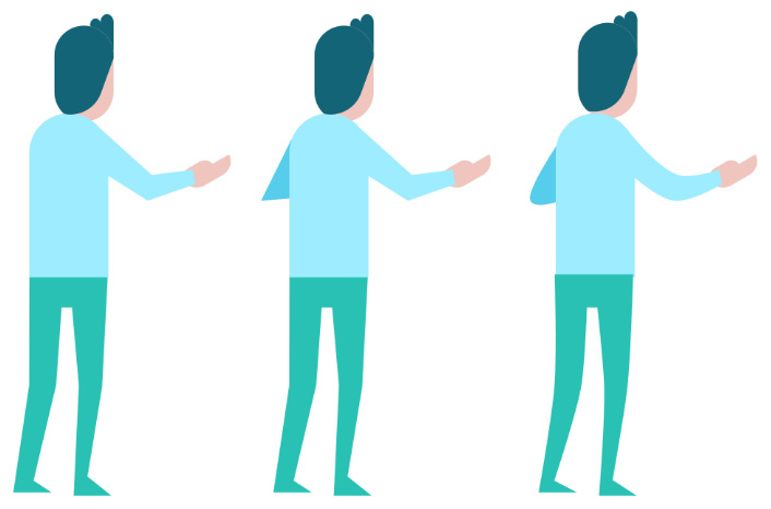
Figure 4.10 – Notice how the slightly curved joints create a more organic look
The first character is ready for now. It will be great to set the style and proportions for the remaining characters against this character. If this seems too flat and simple for you, don’t worry; we will revisit this character later in this chapter when we add lights and shadows to the elements of our illustration.
But before moving forward, select all the parts of the character and group them by right-clicking and selecting Group, or select Object | Group in the top menu. But of course, the fastest way, as always, is using Ctrl + G. Why is this necessary? You will learn about this in the following section.
Using groups and layers to keep your file organized
Before drawing the next character, let’s pause a bit and learn about organizing your work in Inkscape. The most effective tools for that are, without a doubt, groups and layers.
We already used groups to hold together the icons we created in Chapter 3, Modular Icon Set Design with the Power of Vector. Grouping is still useful even if an average icon only consists of 5-6 individual elements. This number in a complex illustration can be anywhere from 50 to hundreds or even thousands! And believe me, when objects start to pile up in a document, you need a method to create some order before it all falls into chaos.
The list of layers is a well-known sight to anyone who has ever used design software. In Inkscape, it is not so obvious, though; you have to press Shift + Ctrl + L to show the Layers and Objects panel. After that, layers work the same as in any other software: whatever you draw or copy on one layer will be held on that layer. Layers can be named, and you can stack them over and under each other too.

Figure 4.11 – The layer tab in Inkscape 1.2
The question is should you use layers or groups while working in Inkscape? Well, in answer, both. Here is the personal opinion of the writer of this book: layers are actually groups in a list, and I usually work better without them. Groups are faster to create and easier to manipulate on the fly. Hence, I will mostly use groups in this book.
But there are some advantages of the layer system that I do not want to skip and do appreciate from time to time! First of all, you can apply different blend modes to layers, creating a visual effect you could only do with a lot of work otherwise. You can set a layer’s Blend mode to multiply, darken, lighten, and so on, affecting all the layers underneath. This is a great tool!
Second, layers can be locked and hidden (note the lock and eye icons in Figure 4.11). When a layer is hidden, Inkscape does not display it, thus sparing memory and keeping your computer working fast.
Groups and layers are both great ways to organize your work. It does not matter which one you prefer, just please get used to organizing your elements! People who work with your vector files in the future will be very glad about this – including future you!
Let’s move forward and design the remaining characters for our illustration. Don’t forget to practice your organizing skills!
Drawing the remaining characters
Designing the second and third characters will be an easier task now that the first character is finished. Remember, we are drawing in vector form now, so we will salvage and reuse any useful elements previously drawn in the current project! As a designer, our intention always has to be to create original content and to avoid copying someone else’s or our past work.
But one of the appeals of working with vector graphics is how easily you can reuse and redesign existing shapes and parts. And we will practice exactly that in the following sections.
Drawing the second character
In my sketch, the second and third characters have similar poses. One of them is sitting on the edge of the big laptop, and the other is working up in a cloud. Let’s continue our design with the latter.
Before even drawing the first object for this character, let’s see what we can salvage from our existing design! Since the character will sit on the cloud, we do not have to draw that for sure:
- Create a copy of the cloud you used earlier in the sketch. The design of the first character is a good starting point, too. Copy the body and the head of the standing man here too. We will not reuse the legs and the arms of that character, but their shape can work as design guidelines for this new character.
The cloud from the sketch is gray, and the torso of the man is light blue. Let’s fix those colors before going forward.
- Use the Color picker tool on your color palette, or on the torso of the man, and set the cloud’s fill color to light blue. Now, to create contrast and some variety in your illustration, select the torso of the new character and apply the blue color to it from your premade color palette (#00AAD4).

Figure 4.12 – Using and recoloring elements you created earlier
A simple color change is not enough of a difference to create something new. Besides, if we want to create a female character, then we should change the proportions a bit too.
- Use the Path editor tool to select the top three nodes of the torso and scale down this part of the path to make the shoulders narrower. Also, move the nodes lower so the torso is shorter than the one of the standing man. After that, move these nodes to the right to skew the woman’s upper body a bit and make her appear like she is leaning forward.
- Select the head and move it where the shoulders are. While selected, press Home or Page Up to bring the head forward. This character will look toward the viewer, not away like the previous one. So, the head shouldn’t hide behind the shoulders. Rotate the head a few degrees so it appears to be looking down at the laptop. It might seem like her posture is off now, but it will all come together soon.
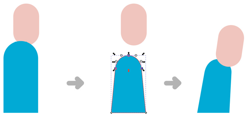
Figure 4.13 – Changing the position of the top nodes and the head to create a different posture
- Again, before going into details, we will define the whole shape of the character. Time to add her legs. You can follow the style of the legs of the other character, simple shapes for the legs and feet. But this time, the character is sitting. Use the Bezier tool to draw one leg of the character with straight lines. Use the dark blue (#146478) as the Fill color.
- If you are satisfied with the shape and position of the leg, pick the Path editor tool, then press Ctrl and click on two nodes to curve them. One of them is the node at the corner of her bottom, and the other is on the opposite side, the corner of the top of her knee. These two curvy nodes are enough to make the character look softer, and a bit more relaxed.
Why do we curve the nodes of the leg now and not later? Because this way, you only have to draw one leg and still end up with the image looking more natural. You will now duplicate the first leg and modify it with the Path editor tool.
- Select the nodes building the lower leg and move them to the right. This will elongate the leg a bit, but it will help create the pose. Keep these nodes selected and skew them so her leg is less bent. Move the nodes a bit higher to create a bit of distance between the two feet. She is now sitting in a comfortable chair with her legs crossed, working with a laptop on her thighs. See Figure 4.14 for my version.
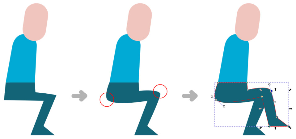
Figure 4.14 – Draw a leg with straight lines, then curve it and duplicate it into position
The design of her laptop can be really simple. Just two shapes, almost like a laptop symbol. No elaborate keyboard or screen content is needed since it is facing toward the character.
- Use the Rectangle tool and draw a light gray horizontal rectangle for the body of the laptop. Then draw another rectangle above the first, sitting on the top edge of it. Select and skew this top rectangle a bit so the laptop seems open, with the screen tilted backward at an angle. Select the shapes and group them by pressing Ctrl + G. Move the simple laptop into position.

Figure 4.15 – Create the simplest laptop ever made
- The next step is to draw her arm reaching toward the keyboard. Simply use the Bezier tool and draw an arm shape with straight lines. The top of the arm is cut off straight now, but that is fine: it creates the illusion that she is wearing a t-shirt! You do not have to draw the t-shirt sleeve; the viewer will still understand it is there. And because it is a t-shirt, the skin on her arm must be bare. Use the Color picker tool and pick the skin color from the character’s head.
It is also believable that her hand is covered by the screen of her computer while she is working on the keyboard. Lucky for us, as it means we do not have to draw her a hand this time.
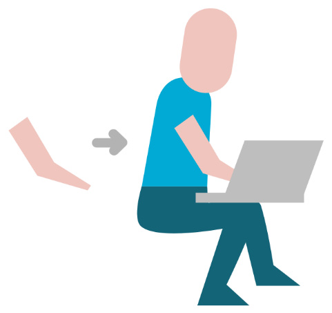
Figure 4.16 – Add an arm with no hand behind the screen
- At this level of detail, the last things to add to the character are the hair and a smile. We will aim to draw thick, wavy hair held together in a bun – in a simple geometric form. To create the hair, we will use the Path Boolean operations again. Follow the exact steps as shown in Figure 4.17.
- Draw a circle slightly smaller than the head. Send it behind the head with the End or Page Down key and move it upward and to the left. This will create the base of the hair. Color the circle the vivid red we chose earlier (#FF5555).
- Select the red circle and duplicate it. This time, you will use another version of the sandwich method you learned earlier. We will use the duplicated circle to cut off a part of the head of the character. The head with this missing part in front of the original circle will create the illusion. It will seem that the hair is in front of the forehead, covering a part of it. To create the effect, move the duplicated circle more to the left and upward. Then, select the head shape and the duplicated circle, and go to Path | Difference, or use the Ctrl + - hotkey.
- If you are not sure how much to cut off, use the Outline Overlay display mode to see the parts that are covered.
Tip
Use the Outline Overlay display mode to see all the elements with their outlines and their fill colors visible! It is a new feature from Inkscape 1.0 that helps a lot when shapes are covered and when you are working with a lot of objects and are having a hard time distinguishing between them. Activate this mode from the top menu by selecting View | Display mode | Outline overlay or use Ctrl + 5 to quickly cycle through all the display modes. After finding and selecting the object you are looking for, you can simply go back to normal view the same way.
- Draw a small red rounded rectangle and rotate it 45° to create the bun. Move it close to the hair and scale it to its final size.
- After you are done with the hair, add a smile to the character’s face. Simply draw a white circle and turn it into a semi-circle using the handlers with the Circle tool. If you just position this white semi-circle on the face, you will notice that the expression is somewhat off (as illustrated in the last steps of Figure 4.17). Since the character’s head is tilting down, the smile should be tilted as well. Select and rotate it. And since she is facing the laptop and not the viewer, we should also move the smile closer to the right side of the head.
- Select all the parts of the head and group them together by pressing Ctrl + G. Then move the head onto the body and group it with the other parts of the character.
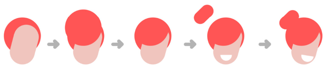
Figure 4.17 – Drawing hair in a bun and adding a smile to the character
- This character is in a sitting position, so she needs a chair to sit on. Move the group of the character onto the cloud and put it into its final position. We will create more of a seat for her later during the illustration process.

Figure 4.18 – The second character on her cloud
Congrats, the second character is almost finished! We will add more details later on, as we will add lighting and some interesting elements to the whole illustration. Let’s move on to the third character, then build the large laptop and the environment!
Building the third character
Creating the third character will be the easiest of them all for two reasons. First of all, you are warmed up by drawing the characters before, and second, almost everything you created earlier can be used in this character. This character will be a bald male, sitting with his phone on the edge of the big laptop.
Let’s start the drawing process with the same step as before and look around the drawing board for elements we can recycle!
- Since the character is a male, you can select the upper body and head of the first character, the one that is standing. We can also use his hand and copy that as well. Then select one of the legs of the second character, who is also sitting, and copy that here too. There are no rules to this; just look for elements that are easier to copy than create from scratch.
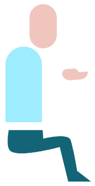
Figure 4.19 – The elements that you can reuse from the previous characters
Of course, we cannot just put the elements next to each other and call it a day. You have to modify and shape them into a new character. It is already visible at first glance that the upper body is too long, and seems too big for the legs.
- Using the Path editor tool, select the top nodes of the torso, and move them a bit lower. Also, scale up this part of the path of the torso. This is the opposite of how you created a leaner feminine character before. Now you are aiming to create a man with a bigger frame and different posture. Playing around a bit with the character shapes will create more life and diversity in your illustration.
- To create a different sitting position than before, select the nodes in the feet and pull them to the left until the lower leg is close to vertical but bending under the character. The thigh is also thin; editing its nodes with the Path editor tool is a good idea. Just select the nodes at the bottom and at the knee pit and move them lower. See my version of this step and the previous one in Figure 4.20!
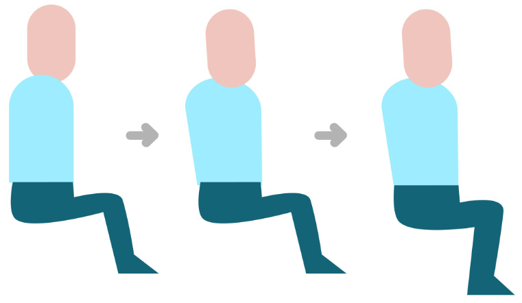
Figure 4.20 – Modifying the nodes of the torso and the legs for a new character
- Duplicate the leg to create the other leg. This time select the nodes of the thigh and the bottom of the character and simply delete them. This will cut off the rest of the leg and keep the lower leg and the feet. Position this leg onto the other one so the top of the leg is not visible. Make the leg longer with the Path editor tool and skew it a bit to create a relaxed sitting position for the character.
Tip
When using the Path editor tool and deleting nodes of a path, things can go strange in a second. The shape can grow weird bulges and seem out of control, as seen in Figure 4.21. If this happens, relax, as this is a common incident. Inkscape just keeps calculating the direction and distance of the path, as it should. Still using the Path editor tool, look for the node handles that are causing the trouble. Grab the handles and pull them closer to their nodes. This will refine the shape. It seems alarming at first, but the more you use the Path editor tool, the better you will get with it!
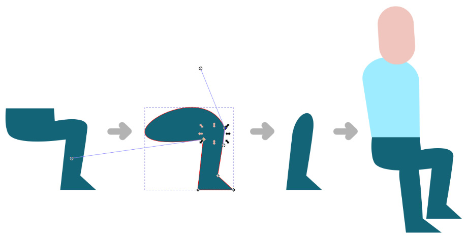
Figure 4.21 – Deleting the nodes of the leg to build the other leg
Before adding the arm, let’s apply different colors to this character. After all, you do not want to use the same colors on all of them (unless they are all wearing the same uniform). The aim is to play with the variations of the colors but not overdo it.
- To create more character variety, use the Color picker tool and pick the darker skin tone (#AE8C86) for the head. The trousers and the feet can stay the same dark blue color, but for the torso, we will use the original turquoise color (#2AC1B5). This will build a smooth contrast with the character’s skin color and later with the background too.
Now to create the arms. This character is sitting and talking on his phone while waving his hands in excitement. A lot of us use hand gestures in phone calls, even though they are useless in this situation. This is normal human behavior and adds to the illustration. So, one of his arms has to be bent and holding the phone. In this pose, the easiest way to draw it is to only draw the forearm, and not the upper arm.
- Draw a long rounded rectangle, and color it to his skin tone with the Color picker tool. Then, scale and position this rounded rectangle between the face and the elbow position of the character, as shown in Figure 4.22.

Figure 4.22 – Recoloring the character and adding an arm
- Drawing a simplified smartphone in Inkscape is easy: pick the Rectangle tool and draw a small rectangle with slightly rounded edges. Color it the darkest blue color we use in this illustration, the same as the trousers of this character (#146478). Now put the phone into the hand of the character: scale it and rotate it into position, then press Page Down to order it under the rounded rectangle of the arm.
- Although we are not using the whole hand here, copy the thumb created earlier and position it under the phone, as shown in Figure 4.23. Color it with the skin color as well, and it will give the perfect illusion of someone casually holding a phone. As the color of the head, the arm, and the thumb are the same, you do not have to be very precise when fitting the phone and the hand; a small overlap is fine.

Figure 4.23 – Building the phone and the hand
- Draw the other arm. Use the Bezier tool, and create the simple arm shape we created earlier, just in another position. Press Ctrl and click on the node at the elbow, to turn it into a curve.
- We will create the t-shirt effect by dividing the arm into two parts: the sleeve and the bare forearm. To do this, first, use the Bezier tool, and draw a shape right over the arm where you want it to be divided. Then, select both this shape and the arm, and click on Path Division in the top menu bar. The shape will disappear and will cut the arm path into two. Use the Color picker tool, and color the part on the left to the color of the torso, while the part on the right has to be skin-colored. See Figure 4.24 for more help!
Did you copy the hand of the other character here earlier? Great, now position it at the end of the gesturing arm of this character, and color it to match the skin color of his arm.

Figure 4.24 – Draw the arm, create a t-shirt sleeve, and position the hand
The only thing we’re missing is a great smile to show that the character is in conversation! You could copy the one from the woman you drew earlier, but it is such a simple shape that it may be easier to draw it here.
- Just draw a semi-circle with the Circle tool and color it white. Then position and scale it onto the character’s face. Take care to position the mouth under the hand and phone using the Page Down key.
- The third character is complete for now. Select all of the parts and create a group of them with Ctrl + G.

Figure 4.25 – The third character finished with a smile!
In this section, you drew three characters using the best things Inkscape can offer! You used simple shapes to build expressive characters. You created an easy color palette for your illustration and applied it to your characters. You learned about groups and layers and about how they can help your work. You learned my sandwich method to create perfectly fitted parts for your illustrations. And you managed to finish all three characters effectively, reusing and re-purposing their elements in a modular way.
And now that all the characters are set up, it is time to focus on the background of the illustration.
Drawing the laptop
So far, you have created a standing character and two others seated based on your initial sketch. Now, we will create the environment for them to give meaning to the whole illustration. We will start with the giant laptop as the central object in the story, then add more background elements. You will start with the big shapes and slowly work your way down to the smaller parts.
You created very simple laptops earlier: one for the woman working in the clouds and one for your sketch. The former will remain simple, as it is only a small object; the focus is on the character using it. The latter, on the other hand, is a placeholder for something far more important! The huge laptop in the middle connects the characters and offers a great backdrop for the illustration. It is evident that this laptop needs a bit more attention than the other one.
Also, this giant laptop is open in a different position than the small, simple one. Both the keyboard and the screen are visible. This means that you have to create content for the screen and draw a keyboard! This might seem like a very complex task, but you can make it painless with some planning!
Building the keyboard of the laptop
You could do your own calculations and draw each of the elements of the laptop in its final position manually. But why would you? The biggest benefit of using Inkscape is the flexibility of working with vector elements. Coloring, scaling, or distorting objects or a group of objects takes only a few clicks. This is exactly what you will practice now!
The plan is to create the rows of keys and the base of the laptop first in a flat, top view. Then group the elements and skew them into position, matching the view of the elements to your sketch.
As this is not a realistic illustration, we will draw an abstract keyboard. There will be no letters and numbers on the keys, and the keys will be bigger and fewer than in reality. A simplified keyboard, but complex enough to create the illusion:
- It all starts with the first key! Draw a square with slightly rounded corners and color it blue (#00AAD4). Now create a duplicate of it using Ctrl + D. Select and move this duplicate next to the original square. Now select both of them and create a new duplicate. Move these two new keys next to them too! Now select all four keys and duplicate them. When you have eight keys, select them, and hit duplicate four more times. This will create 40 keys.
- Your keys might seem scattered around, but don’t worry. Go to the bottom of the Object menu in the top menu and click on Arrange. This will open the Arrange dialog window. Select all 40 keys and arrange them in 4 rows and 10 columns.
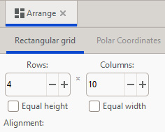
Figure 4.26 – Arranging the squares to create a 4x10 grid
- Set the spacing higher than 0, to see a gap between your keys. Hit the Arrange button, and if the gap is small enough, raise the X and Y distance and arrange again until you are satisfied.
- A regular 4x10 grid of squares looks very ordered, but it is not a keyboard yet. To have that familiar look, you need to add some special keys. For this, delete three keys in the bottom row, as shown in Figure 4.27. Then select the key next to the gap you just created, and using the Rectangle tool, elongate it horizontally to create the spacebar. You can also use the Selection tool to do this, since the key is an object, and will keep its curved edges upon transformation.
- Then delete the second and the last keys from the third row. One will give space to the Shift key, and the other one to the Enter key. Elongate the first key horizontally as before. Finally, elongate the last key on the second row vertically to fill the gap with a vertical key.
- Select all of the keys, and group them with Ctrl + G. Your illustrated keyboard is completed. It is not perfect, and has fewer keys than a real keyboard, but the viewers will recognize it.
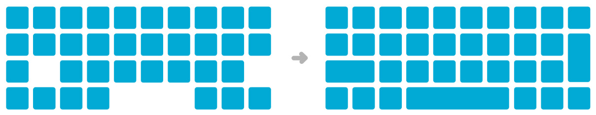
Figure 4.27 – From simple grid to keyboard
- To add a touchpad to your laptop, you need a bigger rectangle under the keyboard. Just select the spacebar key from the keyboard by pressing Ctrl and clicking it, then copy it outside the keyboard group. The width is correct for a touchpad but you need to scale it about two times higher. You can keep the same color just for now.
- The only thing you need to add now is one bigger rectangle under the keyboard and the touchpad. This will be the base of the laptop. Draw it bigger and wider than the whole keyboard. Then select it and send it to the back with the End or Page Down keys. You can color it gray or light blue, for now, just to distinguish it from the other elements above it. To position it to the keyboard group, select the group and the base rectangle, and align them to their centerlines using the Align dialog window.
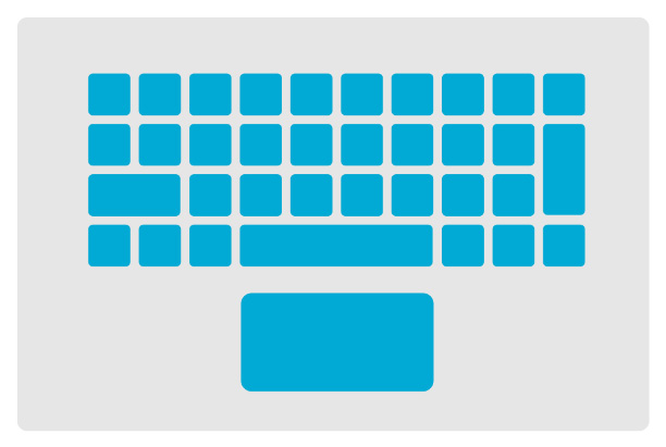
Figure 4.28 – The keyboard and the touchpad on the base
- Select the keyboard, the base, and the touchpad, and create a new group out of them. The lower part of the keyboard is ready.
It’s now time to create the screen.
Drawing the screen
Drawing the screen of the laptop is fairly easy if the screen is turned off. But we want the screen turned on and showing something interesting. The easiest thing to show on the screen is yet another character:
- First, duplicate the same base rectangle you added under the keyboard. Just double-click the group to enter it, then copy the base rectangle and paste it outside of the group. This will be the frame of the screen, the top part of the laptop.
- Duplicate the frame, and scale it a bit smaller while holding Shift. Holding Ctrl would scale it proportionally, but you don’t need that now. Holding Shift will scale the object around the middle point. This saves you time since you do not have to re-align the screen to the center of the frame. Color the screen brighter than the frame, for now, just to see the difference.
- Add a small dark circle to the frame above the screen. This will be like a small camera lens, but it will also add some more detail to the laptop.

Figure 4.29 – A simple screen, a frame, and a camera
- Now, to make the screen alive! We won’t leave it blank but rather add a fourth character talking on the big screen. You will do this in a blink, reusing the existing characters. You know the drill already: copy the torso and head of the first character you created.
- This torso is in a neutral shape and position but too tall for the screen. Draw a rectangle to cover it partly, finishing just under the shoulders, and cut the body off using Path | Difference.
- Add a white semi-circle to create a smile on the character’s face. Now, to add a different haircut, draw a rounded rectangle and set it behind the head. This will look like straight, long hair. Color it in dark blue, as we used earlier. We will use this color and not black or dark brown because we want to keep the color palette of the image coherent. This dark blue is the darkest color in the illustration.
- Add a smaller ellipse, the width of the head, to create a fringe for the character. Position it over the head. Select the fringe, the head, and the smile, and rotate them a bit simultaneously, to tilt the head.
- Now rotate the hair slightly in the other direction to add a bit of head movement to the image. Change the shirt color to red (#FF5555), then select all the parts and group the character.

Figure 4.30 – Designing a new character for the screen
- Position and scale the character over the screen, fitting the bottom of the character to the bottom edge of the screen. Select the character and the screen part of the laptop and create a group of them with Ctrl + G.
Both the top and the bottom parts of your laptop are created now and you have the keyboard and the screen ready to assemble.
Assembling the laptop
The next step is to connect the two parts and make them look a bit more like an actual computer:
- To start, create duplicates of three things: the top and bottom parts of the laptop and the laptop vector sketch you created at the start of this chapter. Create copies of the keyboard and monitor groups to be able to go back to the original flat versions and change something if you need it. Trust me, redrawing an element in a rotated and skewed group is no fun.
We will use the Selection tool to skew and rotate the bottom part of the laptop into place. How do we do that fast? The following method will help to skew this group of elements without guessing directions and creating unwanted distortions in your drawing.
- Locate the topmost and lowest corners of the laptop sketch base and use vertical guidelines to mark their positions (I also marked them with small arrows in Figure 4.31). Then position and rotate the lower part of the laptop to match the corresponding corner to the topmost corner of the rectangle in the sketch.
- Then, still using the Selection tool, scale the group vertically to match the bottom corner of the sketch too. Don’t worry about keeping the proportion; for now, the point is to skew this group according to the viewpoint of this illustration.
- Two corners are matching; now, scale the object horizontally to fit the two remaining corners as well. Then slightly skew it vertically a bit more if needed. We do not want an absolute match with the sketch; we just want to create an illusion of perspective here. This is not a real perspective graphic; this is also the reason why this method works easily here. Delete the bottom part of the sketch laptop as you do not need it anymore.
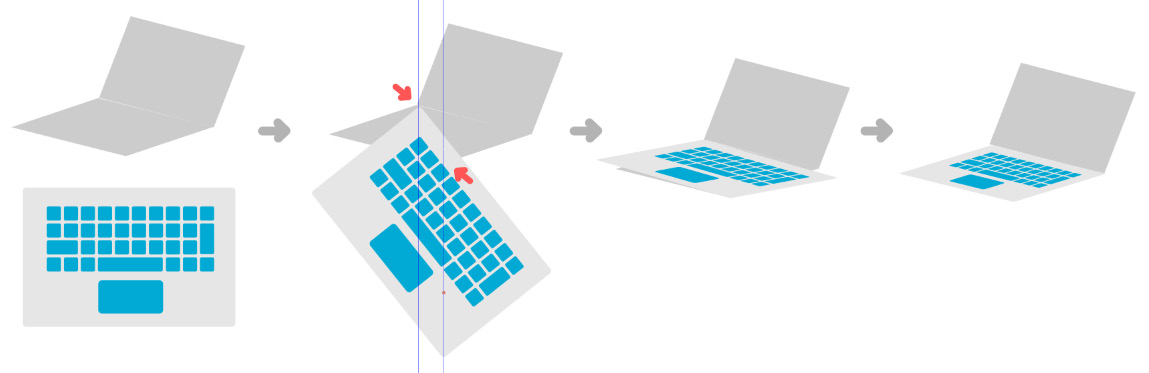
Figure 4.31 – Skewing the laptop keyboard cleanly into position
To elevate the laptop from a 2D object into a more realistic shape, it needs some thickness.
- Double-click the group, select the base rectangle of the laptop, and duplicate it. Pick a darker gray color for this rectangle. Pressing Page Down, send the duplicate behind the original. While still selected, move it slightly lower to create some thickness for this part of the laptop.
- Notice how there are gaps between the corners on the sides? Draw one small rectangle on both sides and align them to the corners of the laptop. Then select these small rectangles and the base and merge them together with Path | Union.
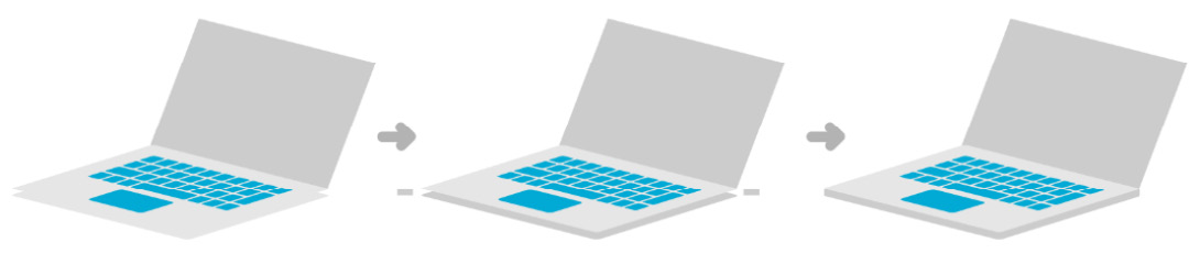
Figure 4.32 – Duplicating the base and filling the gap on the corners to make the laptop thicker
The keyboard and the lower part of the laptop are finished. Of course, now you have to go through the same routine for the upper part. Except it is not exactly the same, but slightly different this time.
- First, take the screen and position its bottom-left corner to the topmost corner of the lower part.
- Then, use the Selection tool and, holding Shift, pull down the arrow on the right side of the screen to skew it. Our aim is to match the meeting edges of the lower part and the upper part of the laptop.
- If the edges are parallel to each other, grab the skewing arrow on the top, and pull it right while holding Shift. This will make the screen look bent backward a bit while keeping the edges still parallel to the keyboard.
- Finally, if the screen is too big or too small, rescale it by holding the Ctrl key. This will keep every edge parallel to how you set it up before, but you might have to reposition the group to sit on the keyboard perfectly. Take a look at Figure 4.33. I signaled where to skew the group and in what direction.

Figure 4.33 – Putting the laptop screen in place by keeping the edges parallel
- The top part is always thinner than the bottom, but it still has some thickness. So, double-click the group, and select the frame of the screen. Duplicate it, and color it in the same dark grey you used for the thickness of the lower part.
- Then move it slightly to the right and down, just to create a small distance from the edge. Send it to the back using the Page Down key.
- If there is a gap at the rightmost corner, turn this rectangle into a path using Shift + Ctrl + C or select Path | Object to path and slightly lift the nodes with Path editor to close the gap. I use this small trick a lot when the corner is rounded, and it does not have to be absolutely precise straight lines since it is just to close one gap.

Figure 4.34 – Duplicating the frame to make the screen thicker
There, the main laptop seems completed now. It is bigger than it looks; it will be the main background component and the stage to host our characters.
- Move the laptop and the three characters into a new empty space and set the characters using your original vector sketch as a guide. (See Figure 4.1 and Figure 4.35 for reference.) Scale the laptop up while keeping the character sizes similar to each other. Don’t forget to hold the Ctrl key while scaling to keep proportions.
Again, this is why I prefer to use groups rather than layers in my work: just select the character you want to move and easily move and scale it into its final position. The woman sitting on the cloud can be put in the top left, the standing character can go in front of the laptop, and the third guy can sit on the laptop while talking on his phone.

Figure 4.35 – The characters and the laptop in their final position
In this section, you created a laptop in a simple and logical way by creating a flat design and skewing it into its final position. It is a straightforward process, from creating the rows of a keyboard to adding another character to the scene by displaying them on the laptop screen.
The characters are now set in the scene, but there are still a few things to fix or add. Let’s move on to the last phase, and add more background elements, shadows, and lighting before the finishing touches.
Finalizing your illustration
Of course, you could stop at this point, and claim the illustration is finished. Or you could continue to think about it and add more details, more lights, different colors, and so on.
From basic shapes to detailed illustrations, what is the difference? The difference is not being afraid to use your knowledge and patiently drawing shapes over shapes! We will upgrade our illustration from basic to complex with shadows and lights and details layered on each other.
Every illustration is built on simple, solid foundations, and then we use more elements to better express the message. And this is what makes an illustration look more professional.
Adding more background elements
The elements we are about to add to the illustration have a dual role. Their first role is to add more to the story. I know this is a long chapter about characters and laptops, but our main goal is still creating an illustration for the CloudUsers website. So, we need to add elements that convey the intended message and show the viewer what CloudUsers is about. There have to be elements referring to cloud services, communication, and connection.
The second role of the elements is composition. We need these visual elements to connect the main subjects of the illustration and hold everything together. If you look at what we have got so far, you might notice that the parts of our illustration are a bit separated. They need a background and small elements to fill the space when needed:
- The first thing to add is the big cloud that was already present in your original sketch. Copy that cloud here and send it behind the laptop.
- Scale the cloud up, also like in the sketch. Position the bottom line of the cloud to the corner of the laptop and then set its fill color to blue (#00AAD4).

Figure 4.36 – The big blue cloud behind the laptop
The image could also use some up and down arrows as signals for uploading and downloading data to the cloud.
If you created the icons in Chapter 3, Modular Icon Set Design with the Power of Vector, look for the one featuring a pair of up and down arrows. If you did not draw the icons then just go back to Chapter 3, Modular Icon Set Design with the Power of Vector, find the Creating the icon for Cloud storage section, and create just one of the simple arrows we drew there.
- Pick the arrow and copy it into your illustration here. Duplicate the arrow with Ctrl + D, then flip one of them vertically by hitting V.
- The arrows probably look very small compared to your characters and laptop, so scale them up! Make them about as tall as the standing character. Position the down arrow right on the cloud where the character is sitting and working. And place the up arrow on the right side, pointing up from the big cloud.
- Color the arrows using the turquoise from the logo (#2AC1B5). Look at Figure 4.37 to guide you in scaling and positioning:

Figure 4.37 – Add the up and down arrows to the clouds!
To add more movement to the image, and a feeling of communication, let’s create some speech bubbles! They are cliché, but they will work well here!
- First, create a horizontal rectangle and slightly round the corners of it. This will be the base of the speech bubble.
- To add the fin to the bubble, you need to draw a small right-angled triangle. The easiest way to do this is using the Bezier tool. Hold down Ctrl, draw a downward vertical line, then an upward diagonal line at a 60° angle, and then close the triangle. It is OK if the top of the triangle is not perfectly horizontal.
- Place the triangle under the base of the bubble, select both of them, and create a group of them. Color the bubble light blue by using the Color picker tool on the shirt of the standing character (#9EECFF).

Figure 4.38 – Creating a simple speech bubble
- Now duplicate the speech bubble twice so you have three in total. Add one to the lady talking on the screen. Take care that the fin of the bubble is pointing toward her! If you need to flip the bubble, just hit the H key for a horizontal flip.
- Place another bubble above the man talking on the phone. Make this bubble smaller and flip it horizontally. With this, it will not cover up the character on the big screen while still pointing in the correct direction.
- The last bubble should go above the laptop of the woman working on the cloud. Make this bubble smaller than the others to create some variation. Check out Figure 4.39 to see the placement of the bubbles!
The last objects to add are some floating circles. What are they for? They could symbolize data packages or pieces of clouds, but their main reason is to fill the space a bit more and help create a soft, friendly environment.
- Select the Ellipse tool to draw 4-5 small perfect circles on the scene, two of them on the right, near the floor, to fill in that blue space of the big cloud, and two or three of them in the air above the big laptop. Make some circles smaller than the others to make them look more playful.
- Color all the circles light blue for now. Again, you can use the Color picker tool and pick the blue of the shirt of the standing character (#9EECFF). Look at Figure 4.39 to see the placement of the circles!

Figure 4.39 – Placing speech bubbles and adding some circles
All background elements are added, and the illustration is visually balanced and gets the message through. In the next step, you will add a final touch to each element to make the illustration really pop!
Adding basic shadows and lighting
Adding even basic shadows and lights to your elements simply elevates the whole illustration. They define space and relationships between the different image elements; they can guide the viewer and even add new layers of meaning.
In this case, the shadows and lights will make these characters look like they are in the same space. We will add new objects to each character to create additional shadows and lights on them. The fastest way to achieve this is using the sandwich method that you learned about earlier in this chapter while drawing the hair of the first character.
Let’s jump into it, adding some shadows to the first character:
- With the Selection tool, double-click the group of the standing character to get into the group. Now we apply the sandwich method: select the torso and duplicate it. Select this duplicate and move it to the right and lower it a bit, still overlapping with the original torso.
- Then select the torso and duplicate it again. Select the two duplicates and choose Path | Intersection from the top menu or hit Ctrl + *.
This will create an intersection of the two objects, which will be a great element to add light to the character. How? By darkening the original torso object under it.
- Select the original torso and color it the original blue you created in the beginning (#00AAD4). It will be darker, and the light part is clearly visible now, but the contrast is huge. The difference should be milder. Let’s ease this color difference a bit with local color mixing.
Tip: local color mixing
This is the time to do some color mixing. The eight colors you previously selected are a good start, but you often will need more. To keep the new color in the range of the original palette, use local color mixing. To use this method, select any object, and using the Color picker tool, hold the mouse button and pull away from the original picking point. This will draw a circle around that starting point as long as you hold the mouse button. Any color values in the circle will be applied to your object, ending up with an average of color and opacity values. I use local color mixing in illustrations whenever I want to get a new color mixed from the color values of the surrounding elements.
- To create a milder blue, select the original torso. Then, with the Color picker tool, draw a circle over a small portion where the original torso and the light part meet.
- Repeat and refine this process as much as you need! Try to find a color that is lighter than the blue you started with, but dark enough to create a nice visible contrast with the light blue. See Figure 4.40 for the steps and my color choice! The background is hidden for clarity.

Figure 4.40 – Adding the shadow to the first character’s torso using the sandwich method
You just created the first shadow of your characters! Now, you will repeat the exact same method for all the torsos and legs for all three characters. First, use the sandwich method to cut the pieces into the places they need to be, then use color mixing to have a coherent color palette for shadows and lights.
- Let’s move on to the legs of the standing character. If the light is coming from the same direction, the light part has to be on the same side too. You will just add a simple light stripe to his right leg now. This time use the Bezier tool and draw a shape that follows the curve of his leg slightly and exists at the top and the bottom of the leg shape. It does not matter how the shape looks outside of the leg shape since it will be cut anyway. If confused, check Figure 4.41 for reference.
- After the shape is drawn, select the original leg shape and duplicate it. Your sandwich is ready. Use Path | Intersection and cut off the parts that are not needed.
- Select the original leg shape and set its fill color to a darker turquoise. You could simply mix a new color, or to work faster, set it to the dark blue of the hair using the Color picker tool, then mix your new turquoise shadow color on the spot.

Figure 4.41 – Adding light on the leg, while making the original leg shape darker
The character appears to be almost 3D now; the shadows on his torso and legs add extra detail. This is exactly the visual effect we are looking for.
Let’s recreate the same effect for the other two characters as well!
- Focus now on the character sitting on the edge of the big laptop. Double-click on the group and select his torso. Duplicate the torso with Ctrl + D. Since this will be a shadow on the turquoise color, you can use the Color picker tool and assign the same dark turquoise shade you mixed earlier for the trousers of the standing character. You can spare some time not thinking about finding a matching color and just use what is already available.
- Move the torso duplicate to the left and lower it a bit. Duplicate the original torso again and use the sandwich method. Select the two duplicates and choose Path | Intersection or hit Ctrl + *.
- For his legs, use the Bezier tool, and draw a shape for each of his legs. In Figure 4.42, I started with the forward leg, drawing a light blue patch covering half of it. Then I duplicated the original leg, selected the duplicate and the path I just drew, and then created the intersection.
- Then repeat the same for the other leg. Draw a shape over it to create the lighter part, then duplicate the original leg shape and create an intersection of the two objects. Since his trousers are dark blue, use local color mixing and create a lighter blue that is closer to the original shade.
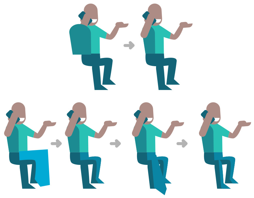
Figure 4.42 – Adding shadows first to the torso, then to the legs of the sitting character
Now you are done with the sitting guy too! If you zoom out and look at the picture as a whole now, you might notice that the blue keyboard and the turquoise shirt of this character are not creating enough contrast. This makes the middle of the laptop too busy.
I suggest you double-click the laptop group, select the keyboard and the touchpad, and give them another color. First, color them the darkest blue we used (the same as the trousers of the sitting guy, for example) and mix a new milder color from that dark blue and the gray of the laptop under it. This will make the character stand out from the background, as seen in Figure 4.43.

Figure 4.43 – Using local color mixing to create new colors to enhance contrast
The only character left is the woman sitting on the cloud with her laptop. This is yet another great opportunity to practice adding shadows to a character using the sandwich method:
- Double-click the group of the character, select the torso, and duplicate it. Move it to the right and lower it a bit this time. Duplicate the torso again and create the intersection of the two duplicates. The intersection will be the light part, so you have to apply a lighter blue for that.
- The same goes for our legs, as before. Use the Bezier tool to draw a path covering part of the legs, then duplicate the leg and create an intersection with the path you drew. Repeat this for both legs. In the case of this character, I used the same color as the other sitting figure, since their trousers are the same color.

Figure 4.44 – Adding shadows to the third character
One more thing to fix about this character: her seat. A cloud should be soft and fluffy, like a comfortable beanbag. So, let’s add some more fluff to the cloud for better seating.
- Select the cloud and duplicate it. Scale it slightly bigger and position it down to the left to create a kind of cushion and seat for the character (see Figure 4.45).
- Then duplicate the original cloud again and create an intersection of the duplicates. Color the original cloud shapes a darker blue to see the difference between the two.
A woman in a blue shirt sitting in a blue cloud chair. This scene is nice but does not have enough contrast. It has at one part where her legs are, but not enough contrast with her shirt. If we make the cloud lighter, then there will be no contrast with the frontal seat part we just built. The solution is to apply gradients.
Tip
It is easy to overdo gradients since they are fun and colorful. My advice is to use them only when you need them. They are useful in situations where you need to create simple shadows or create contrast on a surface. Gradients can really add value to your illustration when used with care.
In this case, a gradient from darker blue to lighter would be the solution. The light part at the top will provide enough contrast for the character’s shirt. At the same time, the dark end of the gradient will stand out against the light seat of the cloud. The top of the seat will also blend into the light blue background, which will just add to its cloudy feeling. See my version in Figure 4.45.

Figure 4.45 – Building the cloud chair and adding a gradient for contrast and depth
There are two bigger surfaces that could benefit from a gradient – the large cloud behind the laptop and the surface of the laptop under the keyboard:
- Apply a diagonal gradient fill to the cloud, dark blue at the bottom right fading into a slightly lighter blue on the top-left part. This will give a nice dark contrast at the bottom, and still enough contrast for the shirt of the standing character on the top.
- Also, double-click the big laptop, and apply a horizontal gradient to the rectangle under the laptop’s keyboard. It should be gray on the right side and white on the left.
This will make the whole illustration more engaging since the left corner of the laptop will blend into the background, but the viewer will still recognize the laptop’s shape because of the big blue cloud behind it.
The big laptop is much better this way, as it is creating a nice backdrop for our characters. But it still feels like it is floating, as do the two characters at the front. The third character is sitting in the clouds; she is supposed to be literally floating! To fix this, let’s add a few simple shadows under these characters and the laptop.
- Double-click the laptop group again and select and duplicate the square under the keyboard. Send it to the back, and move it downward a bit to create a drop shadow for the base of the laptop. Instead of the gray-white gradient, color it light gray, which will create a good shadow color on the white background.
- For the man standing, double-click the group and add a simple flat ellipse as his shadow. Draw the ellipse, color it the same gray as the shadow under the laptop, and send it behind the character with Page Down. You don’t need to add any details; as this is a flat-style illustration, an ellipse will suffice.
- Copy the small ellipse and paste it under the feet of the sitting man too. Again, it does not have to be a detailed shadow; it just has to indicate that he is standing on solid ground.
- Finally, paste the shadow ellipse again, this time under the small circle on the right. This will put this circle onto the same plane as well. Scale it smaller since it is a smaller object than the two characters. The final resultant image will look like Figure 4.46.

Figure 4.46 – The final illustration with all its details
The laptop is standing firmly now, casting a nice shadow. And so are the two characters! All three characters have shadows on them. You even added gradients for better lighting. If you look at Figure 4.39, you can see the difference that the simple shadows and the lights make to an illustration. By adding a few extra elements, you create space around the objects and a connection between them.
Saving your illustration
The only task left is selecting all the elements in your illustration and creating a group of them. This will help you move and scale them later as one object.
A complex vector illustration like the one you created during this project can work on different platforms. You can use it on a printed brochure, it can appear on a t-shirt, and it can tell a story as part of a website design (as we will create in Chapter 6, Flexible Website Layout Design for Desktop and Mobile with Inkscape). Even more, it can be animated or taken apart for other interactive uses.
Since there are so many usages, just save it as a standalone .svg file, only holding the final illustration and not the sketches, tests, and duplicates. From this, you will be able to generate anything you might need later on.
Summary
Congratulations, you have created a complex illustration in this chapter! This time, you started with a vector sketch of simple shapes. Then, after creating this base for the composition, you built three unique characters to tell your story! You practiced using the sandwich method to create shapes that perfectly fit together and learned about local color mixing to apply and mix new colors on the spot.
The characters are talking, moving, and working around the huge laptop that you created as a backdrop. Building that was a great opportunity to learn a productivity trick about applying complex elements to surfaces of different angles. And finally, you turned a flat design into a fleshed-out illustration with added shadows and lighting!
Now that you have finished this complex illustration, you will learn more about image editing in Inkscape. While Inkscape is a vector program, photos can be a part of your workflow too! In the next chapter, we will be Edit a Photo and Create a Hero Image in Inkscape!