
3
Modular Icon Set Design with the Power of Vector
In the previous chapter, you designed a vector logo. When you design a logo, your aim is to create a single image of high quality. But when you design a set of icons, prepare yourself to create quality in quantity! In this chapter, you will create a modular set of nine icons for our project!
First, you will learn about icon set design and the different types of icons, then you will start by designing your first icon. Finally, you will move forward and create the whole set of icons in the most effective way possible, by cleverly implementing modular design, and reusing and redesigning your vector elements!
These are the main topics we will cover in this chapter:
- Learning about icons and icon styles
- Creating an icon is simple, but how about a whole set?
- Designing the first icon and the building blocks of the set
- Building the icon set using modular design
- Exporting your icons
Learning about icons and icon styles
Icons need to be very descriptive; they should be a simple representation of their original function. You don’t need to reinvent anything, just do your research, and pick the metaphor you need. Be creative but aim for the easiest recognizable form.
After all, you want the user to recognize what is pictured by the icon. Safety? A lock, a key, or a shield are all safe bets. Speed? A speedometer or a flash. Ideas? A lightbulb or a brain. These are all common symbols you may use in your icons to make them instantly familiar to users.
Having a clean and recognizable form also helps with scaling. We usually design icons to be pixel-perfect in a small size with given measurements in mind. The times of using only 16x16 pixel icons are long gone; now, end users are used to seeing icons anywhere from 24x24 up to 180x180 pixels.
When you finalize an icon, it still has to cater to be used in small sizes as well. Keep the shapes of the icon clean and simple, so the unnecessary little parts do not add any noise to your design.
Before starting to create the icons, you need to choose a style you want or need to use for a project. In the following sections, we will categorize icon styles based on their visual complexity. This is not just about how the icons look, but also about how people tend to use them and how designers are building them up. Here are three examples of possible styles for vector-based icons:
- Line art icons
- Flat icons
- Illustrated icons
Line art icons
Line art icons tend to be minimal looking, with only a few details. They are usually designed using only strokes and no fill colors. This means the function of line art icons is clean and visible if the function itself is simple. A small icon for a user, messages, or delete is easy to create with a few lines, but when you need to picture something such as client-side data deduplication, you will need to add more and more lines and details to tell the story.
When creating line art icons in Inkscape, you can use regular objects to create geometrical order. This makes the icons more appealing, but only if you really focus on the rules of geometry.

Figure 3.1 – Reliability, safety, and great prices as a set of line art icons
Flat icons
Flat icons take details one step further than line art icons. Instead of using only strokes, designers of flat icons create simple flat shapes with color fills for better understanding. With no shading and a limited color palette, flat-style icons create a simple image that is easy to recognize. They are a great choice when you want to add more color to your icon set, and still keep things clean and simple:

Figure 3.2 – Simple, flat, medical icons about epidemiology
Illustrated icons
In this book, I call these illustrated, while others call them decorative icons, or even 3D icons (compared to the 2D of the flat style). These types of icons have a lot of details – shading, gradients, highlights, and many colors and objects – so they are sometimes closer to an illustration than a simple icon.
But the function of an icon is there: they are an image that is representing a task or expression. We usually use these to get attention, tell a bit of a story, and highlight the most important tasks in an app or website.

Figure 3.3 – Illustrated cat icon set created by Erika Szep-Biro
Of course, the preceding icon styles are not set in stone. There are many more, and styles can mix and change as trends tend to shift. In general, the more complex an icon, the more of a story it can tell with all the added details and colors. Complexity is related to the visual hierarchy as well. The icon bearing the most important function is usually prominent and colorful, while others are simple shapes, such as that small x in the corner of a page.
These are the basic icon styles we need to create during our everyday work as designers. Now that you have learned about these common styles, it is time to move forward and learn about turning a single icon into an icon set!
Creating an icon is simple, but how about a whole set?
Creating a single icon is (usually) a basic task, but icons are almost never used alone. They come in a set, and creating a whole set of icons for the same project can be a real challenge!
Custom icon sets are usually created for previously designed brands to be used in app user interfaces or on websites. This means that, apart from the functionality of the icons, they also have to be in style with the brand. To create an icon set, the visual elements used in your icons need to be consistent. This will turn a bunch of random icons into one set.
The visual elements you can use to create a coherent set of icons
There are many tools in your designer toolbox. Here is a short list of the ones that can help you turn a group of icons into an icon set:
- Color: Use the brand colors or pick a matching color.
- Size: All the icons in the set should be created for the same size to help visual consistency and easier usage. This also means a consistent thickness of strokes and scaling of the elements of the icon.
- Background shape: Square, circle, rounded rectangle, hexagon, and so on. If you want to use a shape as the background of your icon, pick one and stick to it!
- Basic shapes: Curved lines or straights and edges? Flats or strokes? Follow the icon style you chose for the set, and more importantly, always keep in mind that a simple shape can change the expression of any image.
- Repeating visual elements: A line, a circle, a colored blob, and so on. Repeating the same small element can create a connection between the icons.
The solution – modular icons
A modular design is a clever solution; it means that the designer is working from prebuilt modules or building boxes. In your case – using Inkscape to create a set of icons – modularity is the solution for both quantity and consistency. You do not have to draw all the icons one by one but rather, combine and modify the same simple elements, creating results faster.
The modular process is straightforward. First, you need to choose a style using references and sketches. Then, you define your basic building blocks to use and design the first icon. And finally, you duplicate and modify those building blocks to create your icon set. Modularity is here to make your work easier, but it does not mean a repetitive, boring visual design.
Be creative while using your building blocks – that is one of the goals, after all. As you will see, you will reuse and repurpose elements as well as modify them to create the visual effects you need.
What you will create in this chapter
You will design nine icons for the CloudUsers brand we established in the previous chapter. The icons will be also used on the website you will design in Chapter 6, Flexible Website Layout Design for Desktop and Mobile with Inkscape!
The icons are Secure, Fast, User-friendly, Access control, Disaster data recovery, Cloud storage, Big data, Remote support, and Cloud automation representations.
The modular design will make your journey for the best icon set faster, and moving forward, you will now take the first step: creating the first icon in the set.
Designing the first icon and the building blocks of the set
A set of icons needs to be visually coherent. Naturally, the first icon has to set styles and define the visual rules for the rest of them. When we talk about rules, we mean guidelines that help you work faster and easier. The rules are creative, but once you have created them, try to stick to them.
Experiment on the first icon but think in a set. Once you have figured out the rules by working on the first icon, keep the line thickness the same, use the same set of colors, and use the same building blocks. All this is to achieve a similar feel for all the icons in the set.
Remember the icon styles we learned about a few pages earlier? During this project, we will design all the icons of the set in line art style. This means the icons will consist of simple strokes without fill colors.
The flexibility of Inkscape will help you establish and maintain your own design rules throughout the process. In this case, for the sake of practice, the following guides and building blocks will be your icon design rules:
- Use the cloud shape: As all the icons are related to the cloud services, you can include the cloud shape for the logo in the icons as the one common element. The cloud shape will be the main visual element connecting the icons in the set.
Using the cloud shape will also set the standard size of the icons in the set. This will be a great reference point to size and position every other element used in building up your icons, plus it is an interesting background shape. The cloud will provide a frame for your icons.
Figure 3.4 shows some examples of the icons you will create. The cloud shape will be intentionally broken in different places, and the other elements will be added to explain the message of the icon.
- Colors: The colors of the logo are blue and turquoise; these are the colors you will use for the icons as well. The cloud will be blue (#00aad4), and the additional elements will be set to turquoise (#2ac1b5). This will add to the coherence of the icon set, and it will also train the viewer to recognize the repeating shape of the cloud as a standard and look at the different elements as clues about the functions we’re trying to depict in the icon.
- Stroke width and style: This has to be consistent too. Do not use fill color and set stroke width to 6 px and stroke style to Round Join and Round cap on everything you create for these icons. Set it once for the first icon, and the settings will remain the same for the rest during this exercise.
- Size of all the icons: The size in a set has to be the same; in this case, you will create the cloud shape and fit all other elements in the same size. In the examples in this chapter, I used a cloud that was 102 pixels wide and 62 pixels high. Feel free to experiment with your own sizing!

Figure 3.4 – A few examples of the finished icons to show the visual rules in action
In the next section, you will design the cloud shape as the first building block for your icon set and get ready to design the first icon.
Creating the cloud shape
First, you need to define the shape of the cloud in the icon. It does not have to be the same as in the logo, but as mentioned in the preceding section, it is good if it has the same characteristics. In the logo, you only built one-half of the cloud; the other side was two user characters. This time, you have to create a whole cloud. To do that, follow these steps:
- Open the file containing the cloud logo you created in Chapter 2, Design a Clever Tech Logo with Inkscape. Select and copy the user shape (both the head circle and that rounded rectangle you cut in half earlier) into a new .svg document.
- Start creating the cloud shape by duplicating the user shape four times. Keep three of the shapes standing vertically next to each other, while rotating the one on the left and on the right side, as shown in Figure 3.5.
- Set the height of the vertical parts as shown in Step 5 and move them closer together. You should have three vertical shapes of different heights. Also, change the length of the horizontal elements if needed and move them closer together to create a closed cloud shape.
- To keep the proportions and the regular shape of the elements, only change the length of the objects by moving the nodes on the flat part of the shape! Using the Transform tool to make them longer would ruin the proportions here.

Figure 3.5 – Duplicate and rotate the user shape to create the form of the cloud icon
- Now, select all five elements and merge them into one by selecting Path | Union. This will create one cloud shape. We want to create line art icons, so select the cloud, and add a stroke while removing the fill color. Follow Figure 3.6 to get the proportions right. In my example, I set the width of the cloud to 102 px, the height to 62 px, and the thickness of the stroke to 6 px.
- Set Join to Round join, and Cap to Round cap in the Stroke style dialog tab. This will also help when creating the icons later on when you will delete segments of the path of the cloud.
- The outline color of the cloud will be the blue color of the logo (#00aad4):

Figure 3.6 – Cloud icon base with outline and no fill
This cloud is our main starting design element; you will create the remaining shapes later as we design icon after icon. Now that the cloud is ready, let’s make the first icon from the set based on this shape!
Creating the Fast icon
Let’s start with three icons explaining the advantages of the company’s cloud-based solutions: Fast, Secure, and User-friendly. The icon used for Fast can be a speedometer, a lightning bolt, or lines implying fast movement. We will use the latter idea for this icon:
- First, duplicate the cloud icon, which we will use as a base.
- Then, modify the shape of the icon by removing a part of the stroke. Select and delete the node on the left side of the cloud curve. Now, select the remaining two nodes and remove the path connecting them using the Delete segment ... icon in the Tool control bar. The path is now open on the left:
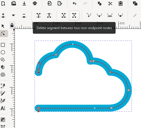
Figure 3.7 – The cloud shape is opened on the left with part of the path removed
Important notes about path editing
We will use the same method on almost all of the following icons! Duplicate the cloud base and open it up by removing parts of the path. This is a great method to work with strokes in Inkscape, and it is the base move for creating line art icons.
You might think, why not simply use the Difference path operation to cut open the cloud shape? Because when you cut off a part of a path, and if the original path was closed, then it will remain closed with a continuous stroke. You would then have to delete the section of the path anyway, to open up the path.
- Add the horizontal lines to create the speed effect. Draw a horizontal line with the Bezier tool (hold Ctrl while drawing to keep it totally horizontal) and set the color of it to the turquoise color (#2ac1b5) of the logo, and the stroke width should be the same as the stroke width of the cloud (in my example, 6 px).
- Now, duplicate the line and position the two lines as shown in Figure 3.8.
- Set the lines to different lengths to create the speed effect. The bottom line should be aligned with the baseline of the cloud, and the distance between the lines should be even. Also add another line attached to the cloud to make it more dynamic.
- To do this, double-click on the path to add a node to it, and then move that new node a bit to the left. Take care, as the icon cannot be wider than the original cloud! Set the length of the lines accordingly. Here is my version of the final icon for the Fast cloud services:

Figure 3.8 – The final Fast cloud icon
This is your first icon in the row of nine. The more you create, the faster it will get because you will use the same cloud base for all of the icons; also, you will have more and more elements to reuse in the icons following the previous ones.
In this section, you learned how to open a path and add new segments to it to express motion. You also introduced another color we will use for this icon set.
Building the icon set using modular design
For the next part, you will create all eight remaining icons in a fast and effective way – instead of drawing everything from scratch, just think, build, and duplicate!
You will use the same working document for all the icons now. This is a very flexible solution because it allows you to duplicate and try different versions without opening and closing documents. You will be also able to see all the versions together and check for quality differences or possible issues by comparing them.
Working with these small line art icons is also easy on memory, so they can easily fit in a small .svg file without slowing down your computer. Let’s continue with the second icon!
Designing the Secure icon
The sign for safety is usually a lock, a checkmark, or a protective shield. For this icon, we will use the padlock, as it is a simple but recognizable shape, and you can easily create it using one of our readymade elements:
- First, copy the user shape into your working document (the half-rounded rectangle you used to build the cloud shape).
- Add a turquoise stroke to it and remove the fill color.
- Set the stroke to the same thickness as the cloud – in my example, 6 px. Now, put a copy of this shape aside, as we will use it later as a building block! The following figure lays out the steps you will take to design the padlock:

Figure 3.9 – The steps to create the padlock
- Duplicate the user shape, select this duplicate, and rotate it 180 degrees. Position these two shapes under each other: the one above will form the shackle of the padlock, and the one under will be the body.
- Now, you will select the shape on the top, and scale it smaller. But if you just scale it right now, the width of the stroke will scale proportionally with the shape.
This is the default in Inkscape, but you do not want that while working on line art icons. What you want is control over the stroke thickness – in this case, you want to keep all the strokes the same 6 px width. So, before scaling the top object, turn off this icon in the Tool control bar when using the Selection tool:
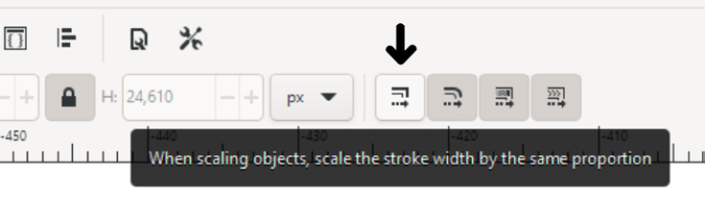
Figure 3.10 – Turn off this button to keep the stroke width the same while scaling
- After scaling the top object, use the Node editor tool, select the two bottom nodes and delete the part of the path between them (using the same method you used earlier with opening the cloud shape).
- Then, select one of the nodes at the opening and delete it to show that the lock is openable. Now it seems that the shackle is not rotated, just lifted a bit, and it makes it very recognizable as a padlock.
- Now it is time to add a keyhole, and your padlock is done! It has to be as simple as possible, so draw a small vertical line in the middle of the padlock using the same turquoise color and 6 px stroke width.
- Then, draw a slightly bigger circle on the top of the line, to make it more like an old-school keyhole.
- Set the size of the circle to 8 px. (You will use this circle later too!) The padlock is now finished; select all the elements of it and group them.
- To finish the icon, you have to add the cloud to the background. Create a copy of the cloud and put it behind the padlock. Match their position so that the top of the padlock is following the top curve of the cloud. Mind the height of the original cloud, and do not push the padlock higher than that!
- To make the icon set more interesting, you will do the same thing as with the Fast icon and open the shape of the cloud a bit. To do this, create two nodes on the cloud on both sides of the padlock.
- Select and delete any nodes between these two, then delete the part of the path between the two remaining nodes as you did earlier. This created the illusion that the shape of the lock completes the top of the cloud! You will play with this visual effect in the upcoming icon designs as well!
The Secure icon is now ready!

Figure 3.11 – Breaking the top of the cloud to make the final icon more interesting
The trick to working with paths
If you wouldn’t add the two new nodes to freeze the path, deleting nodes of a path could change the curves connecting them to their neighboring nodes. This is a neat little trick if you want to modify a part of a path while keeping the other parts intact! You can spare a lot of headaches by saving your original paths like this, and not needing to reset them by hand when they accidentally change curve.
Designing the User-friendly icon
How can you communicate that software is easy to use? The simplest way is to show a happy and satisfied user. This is exactly what you will do for this simple icon too. You will draw a smiley face on the cloud. If this icon would stand alone, you could argue that it is not techy enough. But because it is part of an IT-related icon family, users will understand its meaning, and it will add a friendly vibe to the whole set.
To do that, follow these steps:
- Begin making this icon by creating a smile on the face. You can do this in two ways (I will explain the difference between the two methods):
The first method is using a shape you created earlier:
- First, copy the user shape here and flip it 180 degrees. Select the two nodes on top of it and delete the flat part of the path between the nodes.
- Now, add two new nodes closer to the center of the curve and delete all the nodes above them!
This method will create a little smile that has the exact same curve, color, and stroke width as all the other shapes in the icon set! This is the way of thinking in modules and reusing elements in vector design. This is the method you can see in the next image.
The second method is using the Circle tool:
- Use the Circle tool and draw a small regular circle. Then, grab the white dot marker on the circle to create an arc of 120 degrees or smaller.
- Rotate the arc if needed, so the two endpoints are on the same horizontal level. Now, this seems like the fast and easy way, but you have to scale the arc and set the stroke according to the other lines in the icon set. With the previous method, that is all set previously, plus the size will be given as well.
- Add the eyes by using the dot you made for the keyhole on the lock. Duplicate it and position the two eyes wide enough above the smile to create a friendly face.
- Create a copy of the cloud base here. This time you will not open the shape, but leave it as it is, forming a simple backdrop for the smile.
- Finally, select the eyes and the smile, create a group of them with Ctrl + G, and position them in the middle of the cloud. See Figure 3.12 for all the steps of this simple icon!

Figure 3.12 – All the steps to build the User-friendly cloud icon
Creating the Access control icon
The first three icons were more decorative and expressed the values of the company. Let’s move on to icons depicting the concrete services of the CloudUsers company. This first one will be about managing access to different projects and networks on the cloud.
Access again could be a padlock, but to make it different, you will design a key and a keyhole to deliver the message.
To do that, follow these steps:
- Let’s start with the key, and draw a circle with the same turquoise color and the same thickness as all the lines before. Now add a horizontal line to it by copying one from the Fast icon. (This seems counter-intuitive, but sometimes, copying is faster than switching tools and setting up stroke properties.)
- Now, duplicate this line and rotate it 90 degrees while holding Ctrl to create a vertical line. Make it shorter and position it closer to the tip of the key. Select this line and duplicate it, move it to the left a bit, and make it even shorter, to add another bit to the key. Select the circle and the three lines and group them. Your key is now ready!

Figure 3.13 – How to build a simple key icon
- Now make a copy of the cloud base shape and position it behind the key. Also, copy the keyhole from the Secure icon you created earlier and put it on the cloud too.
- Again, you will have to open up the cloud shape a bit to make it more interesting. Double-click to add new nodes to the path, delete the nodes between them, then delete the section of the path between the two nodes.
- Now, position the key so it fills the position of the missing curve. Take care that the key is not sticking further out on the left than the original shape of the cloud. This way, all the final icons will keep the same size as the others. See Figure 3.14 for more details.
- This icon has to tell more of the network access management side of the story, so you need to add a part representing that. For this, draw a simple network node.
- First, add a horizontal line under the cloud. Then, duplicate it, rotate it 90 degrees, and put it on the horizontal line to form an upside-down T shape.
- Shorten the vertical line of the T, then select both lines, and make sure that the T is symmetrical by clicking Center to vertical axis in the Align and Distribute window. Group these two elements, then position this network line aligned to the keyhole in the cloud, and also align them to the base of the cloud.
Tip about deleting sections of a path
When you delete a section of a closed path – as in the cloud in this chapter – naturally, the path will keep the rest of its shape. Even when deleting multiple parts of a path, the nodes will still be kept together as the same path. They will be one path – you can scale them as one, move them as one, and so on. This is very useful a lot of times, but if you want to separate the parts of a path, you can also do that by clicking Break Apart in the Path dropdown menu.
- You have to open the cloud path one more time (this time, at the bottom) so the network path has an opening. Double-click the cloud path on the two sides of the bar to add new nodes on the path of the cloud, then select these two nodes and delete the section between them. This way, the turquoise path will fill the gap at the bottom of the cloud. To maintain the spacing, adjust a bit the length of the vertical and horizontal paths if needed:

figure 3.14 – The last steps to create the Access control icon
Creating a small icon for Big data
Big data analytics is one of the key roles of cloud computing. The best metaphor for it could be a visual representation of a database, a diagram, or a mosaic of small dots or cubes. In this case, we will take a playful approach and combine the cloud shape with a rain-like mosaic of lines of code. It might sound like a lot, but it will be very simple really.
Follow these steps:
- First, you need to create the data. The best way to do this is to create a few lines of zeros and ones in a minimalistic way that matches the style of the icon set we are working on.
- Copy the keyhole shapes here: a small vertical line and a circle. Scale the circle to the same size as per the thickness of the line (in my example, 6 px). The line will be a perfect one, and the circle will make the zero.
- Copy the cloud base here. First, we will use it as measurement only, while laying out the data. Duplicate a few circles and lines to start with and spread them out along the base of the cloud. As I wanted to keep the curve of the cloud on the sides, in the example, I used six elements in a row, both zeros and ones.
- Now, select these six elements and distribute them evenly. To do so, use the button labeled Make horizontal gaps between objects equal in the Distribute section of the Align and Distribute window:
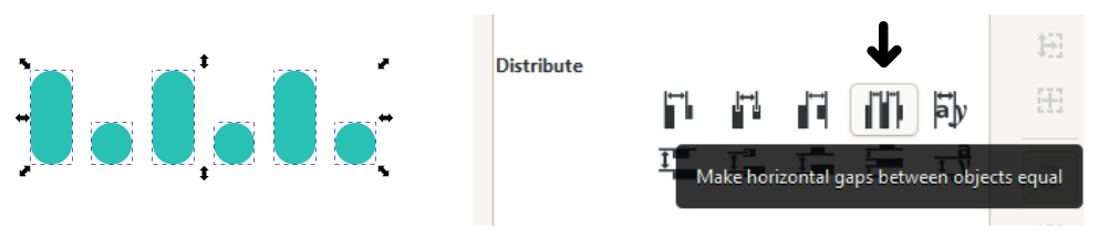
Figure 3.15 – Distributing the selected zeros and ones evenly
- Select all the lines and circles in the row and group them. Now you have one line of data prepared. Duplicate it twice to create two more rows to have a mosaic. Arrange the two lines of data under the original one.
As you can see now, the three rows are identical, and they look boring. Nothing about this communicates that it is a huge amount of data that needs to be understood.
- To add a bit of randomness, double-click on a group to go into it, and reorder the elements. You can also duplicate and delete some zeros and ones, be playful, and create your own versions! Take care that the objects are in the same six positions as before so there are no horizontal differences.
- Repeat this with another group too. Now you have three different-looking rows. Select them and group them together.
- The last step is to add the cloud, and open it up – this time, at the bottom. Add two new nodes to the base of the cloud and remove the segment between them.
- Align the cloud to the data such that the base of the third row of data is in line with the base of the cloud. This will move the first row closer to the edge of the cloud on the top. Take care that the first and last elements in that row are circles, so they are not touching the cloud line!
- Now, the Big data icon is ready!

Figure 3.16 – All the steps to create the Big data icon
Creating the icon for Cloud storage
This one will be an easier icon to make. Cloud storage means accessible user data in the cloud, so you will create two simple arrows to stand for uploading and downloading data. You need to create the arrows first. There are many ways you can get this done: form the arrow from a triangle, draw it using the Bezier tool, or build it from simple lines.
This time, we will stick to the most efficient method and build the arrow from lines, so it is matching the existing shapes and styles in the icon set:
- First, copy a single turquoise line from one of the previously built icons. If the line is not horizontal yet, rotate it now by holding Ctrl.
- Duplicate this horizontal line and make it shorter by moving one of the end nodes while holding Ctrl.
- Then, rotate this line while holding both Shift + Ctrl. Holding Ctrl will help you achieve a perfect 45-degree angle, while holding Shift will make the object rotate around the opposite corner of its selection box, not around the center as usual. (This is the fastest way for off-center rotations without manually repositioning the center of the rotation mark.)
- Position the angled line to the end of the horizontal line to form a point. Now, duplicate the angled line and press V to flip it vertically. Position this new line to the other two lines to form the tip of the arrow. Select all three lines and group them.
- Make a copy of the base cloud shape here. Take your arrow and rotate it 90 degrees by holding Ctrl. Duplicate the arrow, and flip it vertically by pressing V.
- Now, position the two arrows on the cloud, as shown in the next figure. Align the down-arrow so it touches the line of the cloud at the corner. Align the up-arrow to the base of the cloud.
- Create two openings on the cloud shape, one around each of the arrows. Use the known method: double-click the path to add new nodes, then delete the section between the nodes.
- Select the arrows and the cloud and group them. You have finished the Cloud storage icon!

Figure 3.17 – The steps to create the arrows and the Cloud storage icon
Cloud automation icon design process
After a short and easy design, let’s create something more complex. Although cloud-based automation is more about software solutions than hardware, automation is still best pictured with robots, factory assembly lines, or simple gears. For this icon, you will draw a set of gears in Inkscape. Apart from being easily recognizable, a gear is also the general icon for settings in an app, so it is always good to know how to draw them.
This icon needs a set of gears, not just one, as it has to be recognized for gears working together to create automation. So, you will have to design two gears at a minimum, but no more than three, to keep the design of the icon simple, and with it, the clean and simple appearance of the icon set:
- Let’s start with creating those gears! First, draw a small circle (the one I created is 22 px). Set the stroke width to 6 px, the stroke color to Turquoise, and turn off the fill color.
- To create the teeth of the gear, add a short vertical line (with the Bezier tool) to the circle. Select both the line and the circle, and align them by clicking the Center on vertical axis icon in the Align and Distribute window.
Design note
In this design, we use lines with round caps, as all the shapes in the icon set are rounded and friendly. If this icon set would use edges, you could draw a square instead of the short line we used here.
- Now you will create all the teeth along the wheel of the gear. To do this, you need to set the center of rotation of the tooth to match the center of the circle.
- To find the exact center of the circle, select it first, so the arrows appear around the selection box, showing you where the center lines of the circle are.
- Pull a horizontal guide from the top ruler and position it on the horizontal centerline of the circle. Now, because the tooth is aligned vertically to the circle, you only need to find its horizontal center. If you double-click on the tooth now, you can easily pull the rotation center (that small cross in the middle) down to the horizontal center line of the circle while holding the Ctrl key.
- Now the center of rotation of the circle and the tooth are aligned. This means that, if you rotate the tooth, it will perfectly follow the shape of the circle, keeping an even distance from its center.
- Duplicate the tooth and rotate it while holding Ctrl. Because you duplicated the first tooth of the gear, you don’t have to align the center of rotation again, as it will stay in the same spot, right at the center of the circle. Duplicate it and rotate it again and again, until you have eight teeth at even angles around the circle. The first gear is ready now! Select all the parts of the gear and group them together.
(This method is also useful when you want to create similar images with shapes rotated around a circle, such as a simple clockface, or a flower with petals.)

Figure 3.18 – The steps to creating a simple gear symbol. The second step shows how to align the center of rotation to the circle
The Cloud automation icon needs three gears, with each looking different than the others. To keep the design together and make your job easy, this difference will come from size. To do this, follow these steps:
- Duplicate the first gear and scale this duplicated gear to be a bit smaller. Remember the small icon in the top control bar you turned off a few pages earlier? That is still turned off, so Inkscape does not change the width of the strokes while scaling an object. The result of this is that when you scale the gear now, it will not just be a smaller version of the original, but it will have different proportions too! Feel free to experiment with the size!
- To create the third gear, first, duplicate the original gear again. This time, you have to scale it a bit up to make it different. Notice how the teeth look seemingly longer and thinner this time because the stroke width is fixed. Again, feel free to experiment with the size! Keep this in mind and do not overdo it – keep the size bigger than the original, but only about 20%.
- The third gear is bigger than the other two, but it also feels empty in the middle. Add a small circle in the center of it to fill the space there, and to make the gear more different from the other two!
- The only task left is to position the gears on the cloud base to finalize the icon. Create a copy of the cloud here and move the three gears over it. This needs a bit of experimentation since your goal is to fit all the gears in the cloud. Try to align them to the curves of the cloud. Make the gears overlap the stroke of the cloud a bit. You can also rotate each gear too, so they are at different angles and the teeth of the gears are lining up in a natural way.
- As the last move, open up the cloud shape again as you did with all the other icons in this set. Double-click the path of the cloud on two points before and after where it intersects with the first gear. Then, select both new nodes and delete the section of the path between them.
- Repeat the same step for all the gears. When finished, select all the elements of the icon and group them. The Cloud automation icon is now complete!

Figure 3.19 – Creating two more gears and finishing the Cloud automation icon
Creating an icon for Remote support
Support is very important for any IT service or product. Usually, it is portrayed using a picture of someone answering questions, or a headset with a microphone. This time, you will reuse some of the shapes you made earlier and add a small character and a speech bubble to the cloud icon:
- The small User icon is the easiest to make because its shapes are already created. So first, copy the user shape again.
- Then, draw an 8 px tall turquoise circle above the body of the user shape to create the head. You can also just copy that 8 px circle you used before in some of the other icons of the set.
- Select both the head and the body and center them vertically using the corresponding icon in the Align and Distribute window. Also, adjust the distance between the head and the body to about four pixels, or half of the height of the head.
You can set this distance closer but not further, as proximity creates visual unity: the viewer will understand that the small dot and the body form a small figure together.
- To make this character more dynamic, add a small arc to it, such as a waving arm. You can copy the arc created for the smile in the User-friendly icon or create a new one by using the same method. The aim is to keep the arc the same width, stroke, and mostly, size, as the top of the body of the character.
- To create the speech bubble, first, draw a circle next to the body. Then reduce it to a 270 degrees arc by using the Circle tool or the Path editor tool and moving the white dots in position on the circle.
- Now, draw a small angle to the speech bubble, to indicate that the speech is indeed coming from the character. Use the Bezier tool and draw a short horizontal line that is turning back up at a 45-degree angle. See this step and all the previous ones in the following figure:

Figure 3.20 – The parts to use to create the talking character, and the final Remote support icon
Create a copy of the cloud base and add the character and the speech bubble to it. Align the character to the baseline of the cloud, and the speech bubble to the curve of the cloud.
Add new nodes on the cloud path on both sides of the character and the bubble and delete the sections of the path, as shown in Figure 3.20. The Remote support icon is now finished!
Designing an icon for Disaster data recovery
The difference between this icon and the Cloud storage icon is that here, there is danger and urgency. You need to express that the service is made for accidental events such as fires, but it is also there to help the user and keep their data safe:
- As a first step, let’s see what you can repurpose from the elements you created earlier. You obviously need a copy of the cloud base, as with all of the previous icons. You also have a User icon and an arrow made previously, so create a copy of those as well!
- This time, instead of straight arrows pointing up and down, you will create arrows that follow the curve of the cloud. You can achieve this in two different ways. You could create the curved lines manually using the Ellipse tool or the Bezier tool and then bend and position the lines carefully over the original cloud shape, or you can use the shapes of the path that are already there. Since this is a faster and more elegant solution, let’s practice the latter one now!
- Select the tip of the arrow, create two duplicates of it, and place them on the two sides of the cloud icon, as shown in the next figure:

Figure 3.21 – The steps to create the Disaster data recovery icon
- Now you will turn the curves of the cloud into the shaft of the arrow. Using the well-known method, create a small gap above and under the arrows, as shown in the previous figure. Take care that you need to add four new nodes around both of the arrows, and delete only small segments, not the whole curve! You only want to create small gaps in the cloud path.
- Now the arrows are curving and virtually separated from the rest of the cloud, but they are still part of the same path. You need to separate them so they can be colored differently. Select the cloud and click on Break Apart (Shift + Ctrl + K) in the Path menu. This will literally break the cloud path apart into four individual paths:

Figure 3.22 – Using Break Apart to separate all unconnected parts of a path
- Select the two curves on the side, and color them the same turquoise you used in the previous icons. Now you have the cloud and the arrows on each side in a perfect shape.
- Position the User icon in the cloud. In the Remote support icon, you added a small, curved arm to it, so it seems alive and helpful. In this case, your aim is to make it look panicky. So instead of a curved arm, draw a small, curved line diagonally over the shoulder of the small figure.
- Duplicate the arm and mirror it horizontally by pressing H. Now, position this arm symmetrically on the other shoulder of the user.
- To add more urgency to the icon, draw an exclamation mark. To do this, simply duplicate the head of the User icon. That is the same 8 px circle you used in many places before. Position it next to the user at the lower part and draw a vertical line above it with the Bezier tool to create the exclamation mark.
- The only thing left is to position the user on the baseline of the cloud and cut an opening around it on the cloud path. Create a node on each side of the character, and simply delete the segment between the nodes.
- Select all the elements and group them. The icon is now finished!
This was the final icon in the list of nine. If you created all nine icons in the chapter, you were able to practice a very important thing for a graphic designer: being resourceful! You can create one element and duplicate and modify it and have a set of icons, where each icon is unique but similar to the others:

Figure 3.23 – All nine icons created in this chapter
You created a whole set of icons in a short time, using duplication and the Path editor tool to open paths and modify them if needed. In the next section, you will learn about exporting your icons into two different formats.
Exporting your icons
For now, all the icons you designed while reading this chapter are in one file. This made it easier for you to duplicate and reuse the elements, and also experiment with them if needed. All of the icons in one .svg file are neat and easy to use during the design process, but of course, not suitable for the final goal of the icons.
In this book, the final goal is to use the icons as decorative and descriptive elements in the website design you will create in Chapter 6, Flexible Website Layout Design for Desktop and Mobile with Inkscape. To be precise, to use them in that project, you do not need to export the icons yet.
But we cannot wrap up a chapter about vector icon design without talking about exporting those icons in their final formats either. There are plenty of cases when a designer needs to export icons in a fast and reliable way, and there are easy solutions for these in Inkscape.
The two main formats to export your icons (or any images created in Inkscape) are PNG and SVG. Both have different properties, and knowing how to export them quickly and effectively is a useful addition to your designer toolkit.
Exporting PNG icons
PNG icons are still the go-to format for app user interface designers and website designers. As you know, PNGs are usually small files, plus they can handle transparency, which is a must for icons in a modern interface. If you want to use a background color change (for example, for interactions), PNG icons are great.
So how do we export PNG files for icons? If you only have one or two icons, just select the icon and export it manually via the Export window.
If you need to export more icons, I think it is easier to batch-export them. There is a tab for that in the Export window, where you can decide between exporting a single image or doing a batch export:

Figure 3.24 – Batch export can save you a lot of time
How to batch export PNG images
First, if you have not done that yet, select the elements for each icon and group them.
Then, select the nine groups, tick the aforementioned Batch Export checkbox, and hit the Export button. This will create nine PNG files of the icons you created. Now you can find the images and rename them in the folder you saved them.
The name of the exported files actually comes from the SVG structure of Inkscape. When you draw, every object is assigned a unique ID in that document. It is created from the type of object and a number. For example, an ID can start with path for lines and paths, rect for rectangles, or g for groups.
If you do not want to rename the images after the export, you can simply change the object ID of the given group before you start batch export!
To do this, right-click on the group of the icon, and select Object Properties from the menu. This will open the Object Properties menu, where the first variable is the ID. Rename your group there and hit the Set button at the bottom of the dialog window to save the ID for the object.
There are two rules worth mentioning about setting a new object ID:
- First, an ID is a name for the given object, not a filename. You do not have to name the group icon1.png, for example – just name it icon1. It will be still exported as icon1.png when using the Batch Export feature, as Inkscape will stick the format after the name. IDs have other functions in Inkscape too, exporting is just one of them.
- Second, every ID has to be unique in that document! If you have a group with an ID of icon1, Inkscape does not let you name any other group like that. To avoid any error, I usually name my icons by number, or by what it is depicting, for example, icon-save, icon-user, icon-open, and so on.
Saving SVG icons
If transparent PNGs are still the standard for mobile apps, then what about SVG files? Now, SVGs are the more elegant solution. They are, of course, scalable and editable for different devices, and pushed the bitmap icons into a fallback role. That means, the latter only gets used when the actual device cannot render SVG vector files properly.
If you are working in Inkscape and creating simple vector icons, it is only natural that you want to use these crisp vector images in your app or website design. Sadly, there is no native solution in the current version of Inkscape to batch export selected SVG objects as you can do with PNG files. But there is a comfortable way to manually save several icons in a few steps.
Follow these steps for each of the icons in the set to create individual SVG files:
- Open the file containing the groups of the nine icons you created.
- Create a new SVG document and open it in another window.
- Select an icon in the source document and copy it into the blank .svg file.
To be able to use the icon on a website, the icon has to fit the page and has to be positioned at the corner of the page. You can easily do this the other way around.
- Select the icon, and push Shift + Ctrl + R to resize the page to the selection! (You could also achieve this from the Document properties dialog, but isn’t this just so much faster?)
- Go to File and save a copy from the current SVG file. Saving a copy instead of normal saving will help you to avoid accidental overrides.
- Delete the content of this file, and start again from Step 3, copying a new icon into the empty file, resizing the page, saving a copy of it, and so on.
This method sounds more labor-intensive than simply batch exporting those PNG files earlier, but it is a simple process, and you can easily save plenty of SVG images in no time.
Exporting tip
There is a fast and automatic way capable of exporting multiple objects into several different file formats using Inkscape extensions. You can learn more about that in Chapter 8, Pro Tips and Tricks for Inkscapers!
Summary
In this chapter, you built matching icons for an icon set. At the start of the process, you learned about the theory of icon design, and how to implement that in a fast and creative way in vector. Then, you moved forward and created each of the line art icons you can use in the following chapters. This was a practice in not just designing icons with similar features but working with the Path tools and creating line art in Inkscape.
Adding and removing segments of a path while maintaining structure is a key part of icon design and vector design in general, and so is exporting the final design into different formats and exporting multiple files effortlessly. This chapter focused on icons, but as you can see, it also focused on creating images in quantity as efficiently as possible.
We will continue to explore more possibilities in the next chapter, where you will learn to use complex illustration techniques in Inkscape!