
1
Inkscape Is Ready for Work – Design a Business Card as a Warmup!
Inkscape is free and open-source software that’s been in development for a long time. So, in this first introductory chapter, you will get an overview of the current state of the application. Then, you will design a business card as a self-assessment exercise to learn your true Inkscape level and refresh your skills. By the end of this chapter, you will not only learn the aim and method of this book but also know which Inkscape skills you need to improve on!
In this chapter, we’re going to cover the following main topics:
- Welcome to Inkscape 1.2 – and the next level of Inkscape!
- A short self-assessment exercise
- Designing a clean business card step by step
Welcome to Inkscape 1.2 – and the next level of Inkscape!
As you know, Inkscape is free. You do not have to pay to use it and you can create with it without any restrictions.
Being free means it is an accessible vector graphics solution for students, amateurs, and hobbyists, but it also means that the developer team is working on it as volunteers. This makes the development much slower than that of the profit-oriented development process of Adobe Illustrator, for example.
The development of the predecessors of Inkscape started around 1998, and the first Inkscape version appeared in 2003. The development aimed to create a well-rounded open-source SVG editor. During those years, the Inkscape developer team kept adding feature after feature so that this software could grow into its latest version.
Inkscape 1.0 was officially released in May 2020. This was a huge milestone, a stable release with many new tools and design solutions. Since then, we had Inkscape 1.1 and 1.2, and the version numbers will steadily grow with every new feature added.
For a long time, Inkscape was considered a tool for hobbyists, but this mindset started to shift. More and more, professional designers use Inkscape as their main tool. After a humble start, the developers continuously grew the toolset and the list of features of the program so that Inkscape is ready to compete with well-established vector editor programs on the market (such as Adobe Illustrator).
Of course, there is still room for improvement – user requests for new tools and features are popping up every day. But even with some shortcomings, Inkscape is ready for high-level use, and it is a relevant design tool today.
The following sections will address most of the strengths Inkscape developed during recent years.
Stability and supported operating systems
You can download a stable native version of the program for Windows or Linux, and the certified macOS version is also available. Inkscape running on Windows and Linux also received a performance boost with version 1.0.
Everything will run smoothly while you are working with hundreds of objects, applying filters, or using live path effects that are usually demanding on hardware. Inkscape also has a good bug-tracking system in place, and the Inkscape user community is very involved in reporting them to be fixed.
Professional tools and features
Inkscape has come a long way, and we can safely state that most of the things you can create with Illustrator can be created with Inkscape too! There are tools that designers used in other programs and wanted to have in Inkscape too or tools that would make working with Inkscape simply easier. Here are a few examples from the latest builds.
There is a whole new dialog window for Live Path Effects (LPE) to make dynamic changes to any path. This is the best tool if you are illustrating in Inkscape and want to render Perspective or align a Pattern Along a Path to spare time repeating shapes rendered along a path. Alternatively, you can apply Power Stroke to draw line art with an organic-looking ink line effect.
In the latest stable versions, these effects became fast and reliable, ready to make your life easier! You will learn more about them in Chapter 8, Pro Tips and Tricks for Inkscapers!:

Figure 1.1 – Perspective live Path Effects in action
The Gradient mesh tool got introduced in version 0.92 and is now a stable solution for creating illustrations with gradients built up using multiple colors with a grid and grid points. It takes some time to get used to, but it is a professional way to create subtle coloring and gradients in your design work.
The Measurement tool is a ruler that you can use to measure length in Inkscape. Whether it’s the distance between objects or nodes along a path, the ruler gives you a proper measurement.
Another new feature is Split Mode, which you can find under the View menu. Using it, you can watch your artwork simultaneously in two display modes – normal mode on the left, and Outline on the right. This can help you identify and edit overlapping objects easier on the fly. Outline overlay mode is another great view mode, where an outline of the objects is displayed while showing their real colors as well:

Figure 1.2 – Editing objects in a complex illustration using Split Mode
Inkscape 1.2 marked the introduction of the Page tool, which manages page setup and allows the usage of multiple paged Inkscape documents! This is an important step toward professional Inkscape usage, since working with multiple pages is important for desktop publishing, user interface design, or general graphic design.
Also, with Inkscape 1.1 came new export formats such as WEBP, and version 1.2 introduced revamped Batch export capabilities that make working with Inkscape even more convenient. These features allow you to export groups or selected objects in different versions in a few clicks.
One long-awaited tool is Shape builder, which will arrive in Inkscape 1.3, but you can try it out already in the developer versions. It allows you to merge and cut shapes and create new shapes more conveniently.
Quality resources and tutorials
This one is not a direct feature of Inkscape, but rather an indirect result of the hard work of the Inkscape developer team and the user community mentioned previously. After years of listening to the community and adding new features and solving bugs, the Inkscape team convinced professionals and educators to use Inkscape as their main vector design tool.
This resulted in countless high-quality portfolio examples and learning materials to help newcomers find and adopt Inkscape. This growth in available pro users will also demand even more from the developer team, thus making future development faster.
CMYK handling and creating print-ready files
If you want to work with a printer, most of the time, you will be asked for a vector file exported in the CMYK color space. As a designer, this will happen eventually, so it is a very common feature all graphic design programs must have. And I will be honest, Inkscape falls short here.
The program has CMYK support but can’t display the set CMYK color in RGB as Adobe products can. This means that if you want to export CMYK files from Inkscape, and want to see the proper matching colors on your monitor, you will need to use a third-party solution at the moment.
However, this is possible via extensions or using a program that can output proper CMYK, such as Scribus. I will explain these methods in Chapter 7, Combine Inkscape and Other (Free) Programs in the Design Workflow, so that you can try them for yourself!
In my opinion, these strengths perfectly answer the question: is Inkscape good enough for professional everyday use? Yes, it is! It is stable and resourceful and as you will see while completing the projects in this book, it is a very versatile design program.
I hope that after reading the previous sections, you can also see that Inkscape is becoming a professional tool and that it is worth the effort to learn to use it at a higher level.
A short self-assessment exercise
Are you ready for a warmup to refresh your Inkscape knowledge? To reach a higher level in any skill, knowing your current level is important. The goal of the following test exercise is to give you a realistic view of your Inkscape skills.
This short test is self-graded, so finish the exercise on your own first, then answer the questions of the evaluation. After that, you are free to look into my method to solve this task on the following pages, but for the best learning experience, please finish the task first on your own!
Your task: copy this business card design in the best possible way you can!

Figure 1.3 – Recreate this business card design in Inkscape
Here are a few hints and criteria:
- Create a card that is standard size 90*50 mm (or 3.5”x2”).
- Add the two background shapes on the left and the text on the right.
- Work with text and color and use gradients.
- Save the card as a PDF file.
Note
We don’t need to add bleed to our business card, and it doesn’t have to be print-ready either, as this is just a design exercise.
Are you ready? Start!
Evaluating your current Inkscape skill level
Now that you’ve finished this assignment, it is time to evaluate it. Give yourself 1 point for each task you completed with ease:
- You drew a rectangle and set its size to 90mm by 50 mm.
- You set the background color of the card and used the Gradient tool.
- You added the text and used different font sizes.
- You created the two shapes on the left using the Path editor tool and/or using path Boolean operations.
- You saved the card as a PDF file of the correct size.
Based on your total points, this is your current skill level:
- 4-5 points: You have used Inkscape before and have practical design knowledge! You can move forward to the next few chapters and learn even more about the professional workflow with Inkscape!
- 2-3 points: You know the basics and can find your way around the surface of Inkscape but need more practice. The projects in this book will help you develop those skills further while setting you up for a challenge.
- 0-1 point: To get the maximum out of this book, you will need to learn the basics first and get familiar with Inkscape. I’ve added some links here that will help you with the basics of Inkscape. Once you feel comfortable with your skill level, read on to become an Inkscape pro!
If you want to take a look at how I designed the card, read through the following section for my method.
Designing a clean business card step by step
Even if you scored high on the previous design test, feel free to read the following tutorial.
We will follow the same structure in all of the projects in this book, going step by step, focusing on actionable tasks, and learning by example. I will explain all the tools that are necessary for the task at hand so that you can keep the focus on learning what you need. We will cover almost all the possible tool combinations in Inkscape, but object-oriented, not tool by tool. So, here is how I created the business card design.
Step 1 – Creating a rectangle and setting it to the correct size
Use the Rectangle tool and draw a simple rectangle. The color does not matter for now; we will change that later. Set the size of the rectangle by selecting it and adding the width (W) and height (H) in millimeters in the Tool controls bar. If the unit is not set to millimeters, click on the units and select the proper unit for this project, as shown in Figure 1.4:

Figure 1.4 – Setting the width and height on the Tool controls bar and applying millimeters
Alternatively, you can navigate to File | Document properties and change the Display units to mms there! This way, all the tools and rulers will be in the correct unit.
Step 2 – adding text to the card
We will write the text first. As you need to set a visual hierarchy of the text on the card, you will need to apply different font sizes and font weights to the blocks of text. Text is just an object like any other object in Inkscape. You can move it, scale it, transform it, and recolor it easily.
Let’s learn how to do this:
- Click on the card using the Text tool and type the name.
- Select the text and choose a font and set a Font size of 18 pixels to it. Also, set Font weight to Semi-bold or Bold to make the name stand out:

Figure 1.5 – Setting the font’s weight and size
- Now, write the title under the name using the Text tool. Inkscape will remember the last settings of the Text tool, so the font, weight, size, and color will remain the same.
- Resize the title text so that it’s smaller than the name on the card. You can also reduce the weight of the chosen font if necessary.
- Then, as the third block of text, add the contact information of the owner. We created three blocks of text here, so we can freely move them around on the card if needed. I usually keep the name and profession close together, and the contact details a bit further down.
- Open the Align and Distribute dialog window from the Object menu at the top, or press Shift + Ctrl + A.
- In the dropdown list labeled Relative to, choose Last selected. This will make sure that the text objects will be aligned with each other, not to the edge of the card or the page.
- Now, select the three text objects and align their left edges. This will visibly align all the text to the left, but in reality, the text objects will be aligned with each other, not the text itself in the objects:

Figure 1.6 – Aligning the left edges of the text objects
- After the text is done, draw a thin rectangle as a horizontal separator between the two parts of the text.
Tip
It is smart to make the name and the role on the business card more visible than the other lines of contact information on the card. As the word suggests, a business card has an important role: to show the receiver what the profession of the owner of the card is. In my native language, we call such a card a name note (névjegy), which highlights the other function of the card: to clearly state the name of the owner.
Step 3 – creating the shapes on the left of the card
There are two methods you can use to create these shapes. Both are equally good for what we want to design here, and you are free to choose any of the two methods to continue. I usually use the one that I feel is fast and convenient for the project at hand.
We will practice both of them in the upcoming projects again and again, as they are the base of building custom shapes in vector.
Method 1 – using Boolean operations to create the shapes
Boolean operators are basic logical operations that help you merge and cut shapes and objects to create new shapes as you need. It is an effective method and very logical.
Here is how you can use this method in this case:
- Select the card and duplicate it by pressing Ctrl + D. Let’s call the card Rectangle1. We used duplication here because that involves creating a copy of an object exactly above the original object so that the edge of the new shape will be in position with the original card. This new rectangle is named Rectangle2.
- Next, you must use the Rectangle tool and draw a slightly bigger rectangle (named Rectangle3) above the duplicated rectangle (Rectangle2). If you need to, set any color to these rectangles so that you can differentiate them.
- Rotate Rectangle3 at an angle, and take care that it is completely covering the right half of Rectangle2:
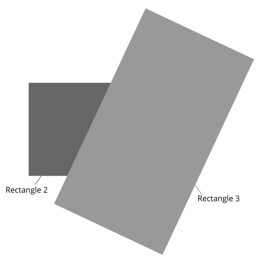
Figure 1.7 – These are your two rectangles overlapping
- Now, select both Rectangle2 and Rectangle3 and click on Path | Difference in the menu.
This command is used to cut off the shape on the top from the shape under it. It only works if two objects are selected. In this case, Rectangle3 is cut to the size that is half of Rectangle2, creating the shape we wanted!
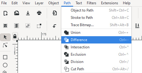
Figure 1.8 – Using the Difference path operation from the top menu
- Now, select this shape and duplicate it by pressing Ctrl + D.
- Select this new duplication and flip it vertically by pushing V! Now, you have both of the shapes on the left, and they are in perfect position! See Figure 1.9 for reference:

Figure 1.9 – The state of the card design with the two shapes in place
Tip about learning the Boolean operations
There is a small icon before every Boolean operation in the Path dropdown list. If you are not sure about the function of the operation, just take a peek, it’s ok!
Method 2 – using the Path editor tool to create the shapes
The Path editor tool is a very important tool that can take a beginner’s design to another level. With it, you can shape elements of your design by adding, removing, or modifying nodes to the path.
This is how you can use it to design your business card:
- Select the card and duplicate it with Ctrl + D. Set a different color to this duplicated rectangle.
- Now, select this new rectangle and click on Path | Object to path or use the Shift + Ctrl + C hotkeys! This will turn the rectangle object into a path that you can edit with the Path editor tool.
- Select the tool, click on the rectangle, and move the bottom-right node to the left while holding the Ctrl key. This will move the node on a horizontal line, thus keeping the edges of your shape aligned with the original card:

Figure 1.10 – Using the Node tool and moving this node to the left
- Move it about two-thirds of the length of the card.
- Now, select the node on the top right and move that to left as well, even further so that it creates a diagonal line with an approximate angle of 60 degrees.
- Now, select this shape and flip it vertically by pushing V! Now, you have both of the shapes on the left, and they are in perfect position! (See Figure 1.9 for reference).
Step 4 – setting colors and gradients
I usually don’t focus on colors until the shapes in my design are almost set. I just use any placeholder colors at first and work on the shapes, proportions, and positions in my design. We have several objects to color in this case: the card, the text, the horizontal bar, and the two diagonal shapes on the left.
First, the background. Where there is text, you have to think about legibility. So, pick a background color that you will set to the card base, then a text color that is easy to read on that background. I used a dark blue for the text as it stands out against the light gray of the card:
- Select the card and use the Gradient tool to apply a gradient that has a darker color on the left, creating a loose drop-shadow effect for the shapes on the left. To keep the design together, that darker side should be based on the same dark blue that is the color of the text.
- Select the gradient you just created and, with the Eyedropper tool, pick the color of the text.
- Then, grab the handler of the gradient and move it further, even out of the card if needed, to create a smooth gradient with a darkening effect:

Figure 1.11 – Applying a fine gradient to the card
- Now, select the bottom of the two diagonal shapes and, while selected, use the Color picker tool. Again, pick the blue color of the text.
- Apply a gradient to this shape as well from blue to a darker blue. To make the card a bit more interesting, we will color the other shape red, then add a gradient from red to blue. If you extend the gradient, it will go from red to dark purple, creating a nice effect and making the shapes pop out a bit.
- Finally, select the horizontal bar between the title and the contact information, and set it to the same red. There’s no need to add a gradient here – just some red to break the blues. Once you have finished all the steps, you should have a card that looks like the one shown in Figure 1.3!
Tip about gradients
Gradients are nice. But as in many cases, less is more. Try to use gradients only when the image benefits from them. I tend to use subtle gradients to create drop shadows, emulate lighting, or create color contrast. Ask yourself: do I need this gradient here?
Step 5 – grouping the elements and exporting the card
At this point, your card looks like the one I created, but the final task was to export it into a PDF file. Inkscape doesn’t have multiple artboards, but one huge artboard to show. When you start up the program, the default is an A4 page in the middle.
As our card is much smaller, you could start by adding the size of the document. But what I usually do is the opposite. I create the design in a given size and, as a final step, resize the document around it:
- Select all the elements of your business card and Group them from the right-click menu or by pressing Ctrl + G.
- Now. with your group still selected, open the File | Document properties dialog and, under the page size, choose Resize content to Page or selection. Alternatively, use Shift + Ctrl + R for the same resize effect without even opening the document properties:
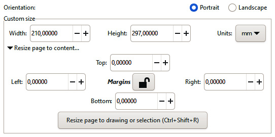
Figure 1.12 – Resizing the page to the group you’ve selected
Now your page is resized to the exact size of your business card!
- To save it as a PDF, just save it from the file menu. After choosing the .pdf extension, Inkscape will show you the Portable Document Format pop-up window.
- Here, you have to select Output page size: Use document’s page size. This will save the PDF file as the size of the business card you designed:
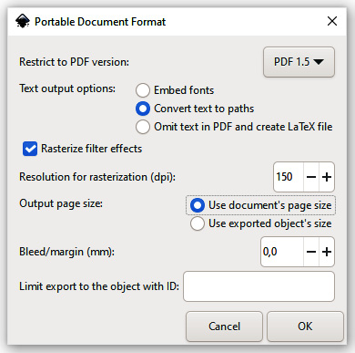
Figure 1.13 – Exporting your design to PDF, using the document’s page size
This is how we designed the business card in Inkscape. First, drew the base of the card, then added the text and some decorative elements, and finally exported it as a PDF file. How was this workflow compared to your method? Did you learn something new? How would you do things differently?
This book shares the workflows I use as a designer working with Inkscape, but as you saw, there is not one ultimate solution. There are always different methods that utilize different tools. The more tools and methods you know, the bigger your design toolbox, and the easier it is to find an efficient solution for a visual problem.
Summary
This concludes this first short chapter in this book. After the introduction, we took a closer look at the current state of Inkscape and saw that after years of constant development, this awesome program offers fast and stable versions on all major platforms, has a growing community with plenty of resources, and is ready for daily design work – even for professionals.
Then, you met your first challenge in this book. I hope you found the self-assessment exercise useful and that you now know your real Inkscape skill level. And I also hope it was setting your expectations for the upcoming projects in this book as they all will be more interesting and complex than this short warmup exercise!
After establishing the position of Inkscape as a relevant design tool and measuring your skills, it is time to move forward! In the next chapter, we will dive into creative territory by using Inkscape to design a clever tech logo.