
6
Flexible Website Layout Design for Desktop and Mobile with Inkscape
Any current website has to be responsive, with resizable elements built on a flexible layout to work great on all devices – and what is a better tool to create flexible layout designs than vector? In the following project, we will create a simple website layout for two different sizes, using the elements we created in the previous chapters.
In this chapter, we are going to cover these main topics:
- Using Inkscape for web design
- Creating a simple wireframe as the base for the layout
- Going from a wireframe to a full design
- Saving and exporting your website design
Using Inkscape for web design
Modern web design has several components, such as user experience design (UX), content creation, search engine optimization (SEO), and, most importantly for us designers, graphic design.
Fresh, illustrated websites with unique icons and gradients are everywhere, and oversized type elements and gradients are in trend again. You can create and incorporate typography, illustrations, icons, and many other website elements directly in Inkscape.
And of course, all of these need to look great on all devices from the smallest mobile screens to 32” desktop monitors. All its vector capabilities make Inkscape a great tool to design a responsive layout for any website.
What you will create in this chapter
During this project, you will design a landing page layout for the CloudUsers company. You will first create a simplified wireframe. Then, you will use most of the elements you created so far in the book and create two versions from the site: one for a wider desktop view and one for a small mobile screen.
If creating a website is not your territory, you should still give this chapter a try. It is about practicing your Inkscape workflow, and about seeing what you created so far coming together under a single project. Here is what you will create during this project:

Figure 6.1 – From simple wireframe to desktop and mobile website design
In the following section, we will create a simple wireframe, and then move on to creating the desktop layout version.
Creating a simple wireframe as a base for the layout
A wireframe is an overly simplified version of a website. When we say simple wireframe, what we really mean are empty placeholder boxes. There are no colors, no images, and no text to distract you from the first task of a web designer: the arrangement and flow of the information on the page.
There are several apps online to create wireframes and help you sketch your website ideas, but if you already use Inkscape, you might just create your wireframes in vector as well!
Before starting to work on the layout, you need to decide the screen sizes you design for. As you know, we face a wide array of screen sizes nowadays. This forces us to design for most of the brake points in responsive design, ranging from under 320 pixels (px) to sizes above 1920 px.
Now, we need to decide in what order things will be presented on the website.
The landing page for CloudUsers will include the following:
- An area for the logo and the navigation
- A header part to introduce the business
- Products to choose from
- Company values and benefits
- A footer with additional info and navigation.
We will create a classic three-column grid. It might be overused, but it provides a solid template to practice your design skills in Inkscape. The navigation and the header will be horizontal rows, while the products and services are organized into three columns of equal width. The footer will be a simple row again.
Let’s build a wireframe from top to bottom according to this plan!
Starting the wireframe with the base and the header
Why draw a rectangle, instead of using the page in Inkscape? Because it is easier to color and resize this rectangle if you need to, and it is a better reference point than the page.
In this example project, we will use a rectangle that is 1600 px wide and 2000 px tall. This width is comfortable to work with and easy to scale for both laptop and desktop users. Whenever we give exact measurements during creating the desktop layout, we will refer to this base width. Feel free to use the same width or pick another for this practice project.
- Set the height to 2000 px for now since this rectangle is only here to give a frame to your design, and a website can stretch to any height. You will change the height of the white background rectangle on the fly as you build the wireframe design by adding new rows of placeholder boxes.
Your aim here is not to create a pixel-perfect design. You mostly need to apply a visual balance to your layout and arrange the aforementioned content in a clean and orderly way. To achieve this, you will use guides and alignment in Inkscape.
Now, you need to set the width of the content. If the background width is 1600 px, then you want to set your content to 1300 px wide. This will provide enough margin on both sides of the screen and will have enough white space to arrange your content later.
- So, draw a rectangle that is 1300 px wide and 120 px tall. Select this new rectangle and the background rectangle and move the smaller rectangle to the top edge of the bigger one and center it. This will help us define the measurements for the width of the content and the header bar as well!
Now, you have to create your first guides for this design. Guides are very useful and easy to create in Inkscape. There is more than one way to add guides to your design. You can create them manually by clicking on the rulers on the side or at the top and pulling the guideline out of the ruler onto the drawing board. This way, you can create any number of guides anywhere in your document.
- However, to automate things and be more precise this time, you will turn the second rectangle into guides. Select the rectangle, then click on Object in the top menu, and select Object to guides. This will create four guidelines; one on each side of the rectangle that has now disappeared.

Figure 6.2 – The four guides at the top of the page, created from a rectangle
The top one will be aligned with the top of the background rectangle, while the bottom one will define the height of the header bar. The two vertical guides will set the width of the content of your landing page design.
Tip
Guides can be hidden by simply clicking anywhere on the rulers. Click again to show them again. Guides will not show up in your exported .png image, but they are saved in the .svg document and can be used by Inkscape or other design programs later.
Now that the guides are set for the header, you can add placeholders for the logo and the menu. The goal here is not to go into details – just draw a rectangle in the size of the logo.
- Align this rectangle with the guide on the left since the logo is usually located in the top-left or at the top-center part of a website. We used a 60 px X 280 px gray rectangle.
- The site navigation will also appear here, in the header bar. Add a rectangle, about 150 px X 30 px. At this stage as a designer, I am not thinking about whether the menu items will be buttons, just text links, or links with a bar to separate them. I simply added this rectangle and colored it a lighter gray than the one for the logo.
- Duplicate the rectangle three times, and so you get four placeholder menu items.
- Select all four of them and distribute them using the icon in the Arrange and Distribute window that says Make horizontal gaps between objects equal. This will create an even line of menu items.
- Select the menu items again and move them so they are aligned with the guide on the right, as shown in Figure 6.3.

Figure 6.3 – Logo and menu placeholders aligned to the guides
The next part of the wireframe you will design is the one with the headline and the hero image. This is setting the tone for the site, and this is the message the visitor first sees when landing on the page.
Setting up placeholders for the content of the website
- Again, use a rectangle as a placeholder for the hero image. This will be a background image in the final design, so it is OK if it is not totally aligned with the guide on the right. In the example, it is set to 900 px X 740 px.
- Color this rectangle to a darker gray tone so that you know this is a placeholder for an image. From now on, you can use the same tone to represent image placeholders in the wireframe design.
Tip
UX designers and almost any software use rectangles with crosses to mark the place for images and photos. Even in Inkscape, if you switch to a wireframe view, this is how bitmap images are presented. For this exercise (and when I am actually designing a website in Inkscape), I use simple gray rectangles as image placeholders. It is just faster and more convenient that way. Of course, you can also take notes when you work on the wireframe of a design.
The hero image will take up two-thirds of the width of the page in a desktop view, and it sits on the right-hand side of the screen. The remaining third of the space on the left will be used to add a headline, some short text, and a button.
- Add a rectangle representing each of these two textboxes. Again, as with the menu items, you are not sure about the exact text, and you are only looking for spacing here.
- Add another darker rectangle under these – this will stand for the Call To Action (CTA) button. Your placeholder boxes for the hero image and the headline should look like Figure 6.4. It looks very simple now, but you are building a good foundation.
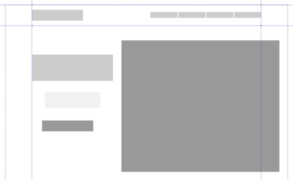
Figure 6.4 – The top of the page with the hero image and the title placeholders added
The next row is for the cards showing the products of the company. Cards are a compact form of presenting a subject together with a CTA. They are usually a few lines of text and a link or button arranged in a box format. This is exactly how you will draw them for your wireframe.
- Draw a tall rectangle – the size of the one in the example is 540 px X 380 px. This will be the base of the card. Draw another, smaller rectangle over the first one (260 px X 60 px). Set the color of this darker – this will become a button or link later on.
- Select both rectangles and center them. Move the button rectangle closer to the base of the other one, as shown in Figure 6.5.
- Group the two rectangles to make a card placeholder. Now, select the group and duplicate it twice. You will have three cards now that you can arrange in an even row. Place the first group at the guard on the left, and one at the guard on the right. Then, select all three of them and distribute them evenly with the Make gaps between objects equal icon in the Arrange and Distribute window.
This will create a neat row of cards, as shown in Figure 6.5.
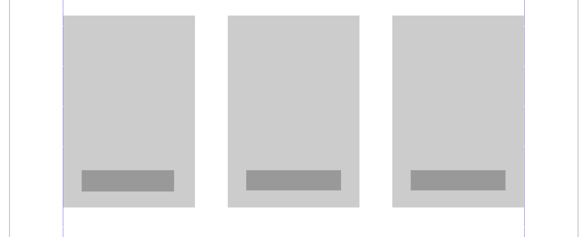
Figure 6.5 – The placeholders for the cards in an even row
The next part is similar, but this row will use cards with icons and will feature some company values. To create a placeholder for icons, designers usually use circles.
- Create a circle with a diameter of 180 px and color it the same dark gray that you used for the hero image earlier.
- Draw a small light gray rectangle (340 px X 240 px) under the circle as a placeholder for the text. Then, copy the button placeholder from the product cards and paste it here, under the rectangle. Select the circle and the two rectangles and arrange them by their centerlines. Set a distance between these objects as shown in Figure 6.6.
- Group the elements to make a card and duplicate this group twice.
- Now that you have all three cards with an icon, do the same as before: place the first one at the guard on the left, the second at the guard on the right, and then select all three of them and distribute them evenly with the Make gaps between objects equal icon in the Arrange and Distribute window as shown in Figure 6.6.

Figure 6.6 – The cards with the icons
Creating an easy placeholder for the footer
The last section of the landing page is the footer. It will be a simple bar sitting at the bottom of the screen and giving the footer menu a home:
- To create a horizontal bar that matches the width of the screen (the white background you drew for your design), simply duplicate the white background and set its height to 300 px.
- Align this new bar to the bottom of the white background rectangle and make it a medium-gray color.
- Footers usually have some sort of navigation, additional info about the company, or a simple copyright note. To symbolize this, add a simple light rectangle to this bar, then duplicate it three times, and distribute the four boxes above the footer as shown in Figure 6.7:
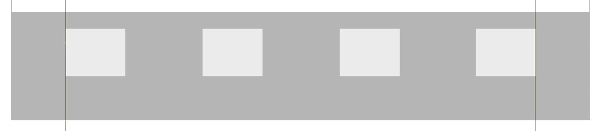
Figure 6.7 – A simple footer bar with footer menu placeholders
This concludes the wireframe design for our simple landing page. To see the whole wireframe as one unit, check out Figure 6.1 again, as it is shown in one piece on the left.
The reason to have a wireframe is to set a base for our design and have a blueprint – a place to experiment. If you are not satisfied with a part of the design, you can easily delete it, reposition it, or resize it to fit your needs. It is like a flexible sketch to create before the final design.
Now, you have learned how to use very simple shapes to designate the size and position of the design elements. Then, you added hierarchy and balance using guides and alignment. I hope that this part of the chapter was enough to show you how easy it is to build a wireframe in Inkscape. Even if you don’t want to design a website now, you can use this knowledge to create a wireframe for a future project quickly.
In the following pages, we will fill out this wireframe with colors, text, and other visual elements – but before that, let us make an inventory of the assets we have already created!
Going from a wireframe to a full design
A wireframe design is made up of placeholder elements, so it is a placeholder itself. It is only a blueprint of the final version but lacks detail. This is what you will work on in this part of the project.
Normally, when you want to turn a wireframe into a full-fledged design, you need to make a series of design decisions. If you have no company style guide to follow, your task is to build the whole visual style. You need to decide about fonts and colors to use, as well as designing a logo, icons, or even illustrations.
Gathering your existing assets
This seems like a long list, but the good news is, if you followed the previous chapters, and created the projects in this book so far, you already have most of the visual elements for the website!
If you completed most or all of the projects so far, you just need to gather those files. If you have not finished the previous projects yet, maybe it’s time to create those elements, as almost all of them will now be used in this chapter.
Here is a list of the elements with a short description and where to find them in the book. As most of the projects are built (in some parts) on the previous ones, it is easier to complete them in this order:
- Logo design: The logo is essential for the website, as it sets the visual style you can build on. This includes not just the logo but also choosing the base colors and the fonts you will use on the site. You can create the CloudUsers logo and branding in Chapter 2, Design a Clever Tech Logo with Inkscape.
- Icons: A set of cloud-themed icons was created in Chapter 3, Modular Icon Set Design with the Power of Vector. If you did not create them but want to learn about icons and incorporate them into the website design, then make sure to build at least three different icons from the nine examples created during that project.
- Main illustration: You created a complex illustration step by step in Chapter 4, Create Detailed Illustrations with Inkscape. All the elements of the illustration represent the company and strengthen the visual appeal of the website.
- Hero photo: This one is optional. In the rest of this project, I will show a design based on a colorful illustration. As an alternative to the illustration, you might use the photo-based hero image we created in Chapter 5, Edit a Photo and Create a Hero Image in Inkscape instead.
That will add an interesting style to the website design, and if you prefer that to the illustration, feel free to use that. Using both the colorful illustration and the darker photo-based image would not work well on such a small site, so I suggest choosing one of the two and sticking with it.
It is time to collect all the previously designed components into one document. Let’s start with the logo as an example:
- Open the .svg file containing the final version of the CloudUsers logo. Select the logo where the text is on the side of the cloud emblem and create a group of it using Object to group, or press Ctrl + G.
- Select this group and copy and paste it into the .svg document containing your wireframe design.
- Repeat the same procedure for the main illustration and three of the icons previously created. Having all these elements in the same file might seem too heavy, but since these are vector shapes, the file size and the workload on your computer won’t be too much.
You will be able to create your final website design in one document.

Figure 6.8 – All the previously designed components together
These are all the design elements you have created so far, and what you need to continue – but of course, there are other missing parts, such as buttons, bars, and text boxes. You will create those now while assembling the desktop version of the site.
Assembling the desktop version
In the coming pages, all you have to do is follow your wireframe and build the desktop version of the layout. You will put the design components in their final place and add what is missing to finalize the design.
The logo and the menu bar
Starting with the menu bar, you will follow the same top-down order as you did when creating the wireframe. On the left-hand side of the menu bar is the place for the logo:
- Select the CloudUsers logo you copied into this document and position it over the logo placeholder and scale it to fit the same height. When scaling, take care to maintain the proportions!
- When you are finished positioning the logo, select and delete the placeholder rectangle.
- The placeholder for the navigation bar was only a row of simple rectangles too. To add more realistic menu items, add text to the menu.
The font you used for the logo is a modified version of Montserrat, so you need to pick a typeface that goes well with that. For this reason, I chose Work Sans, another great sans-serif font. Feel free to use another font – just take good visual pairing and consistency into consideration.
- Create the first menu item by typing Products with the regular weight, 16px Work Sans. Select the text item and color it to an almost black, very dark blue (#044b5d). This will provide great readability on the white background.
- Select the first menu item and duplicate it. Take this duplicate, position it horizontally next to the first one, and retype the text as Solutions. This way, you will not only keep the font type, color, and size of the text but the menu items will also remain on the same baseline.
- Duplicate and move the menu item again and retype the text as Pricing. Repeat the same process twice more to add the About us and Log in menu items.
The next step would be to arrange the menu items as you did when working on the wireframe version, but since this is a more detailed version of the same site, we have to add two more design elements before that.
First, we have to add a distinction between active-state and normal-state menu items. The rule here is to change as little as possible to signal whether an item is selected or active.
- Just select the first or second menu item and recolor it to a brighter color. It is clever to use colors that you used earlier in the same design project, so I picked the red color we used in the main illustration (#FF5555).
Since the illustration is already copied into the same file, it is easy to pick this color. This color also pops out against the white background, so it can be used later for the buttons and link colors as well.
- Besides the brighter text color, you might also add a horizontal stroke of the same color under the active menu item. Simply draw a horizontal line under the text and set the stroke width to 2 px. See my version of the menu in Figure 6.9.
The other menu item that needs some special treatment is the Login button. It is not really a button, but you have to distinguish it from the other menu items so that registered users can easily find it. Since you copied those previously created icons into this document as well, go and use a small user icon from one of those.
- Select and copy that simple outlined figure and paste it next to the Login text item. If needed, scale it so it is slightly taller than the text. Then, select the icon and the text and group them. This will be important in the next step.
- Finally, select all the menu items, including the group with the small user icon, and arrange the menu items so that they have equal horizontal gaps between them.
This concludes the navigation menu for now, as shown in Figure 6.9!

Figure 6.9 – The desktop version of the navigation menu items
Header text and main illustration
After the navigation bar is set, keep following your wireframe layout further down. The next stop is the header text and the main illustration. As you know, both of these items have a similar role – to tell the story of the company and get the attention of the visitor!
In the wireframe, you allocated one-third of the space to the text on the left. Let’s start with that. The Montserrat font you used in the logo is also a great display font, so you can use a semi-bold variant of that for the title text:
- Set the color to the same dark blue you used for the menu before (#044b5d) and the font size to 72 px. This will give a nice block of text where a title or slogan can go. As an example, you can use To your users, from the cloud!. Use the placeholder rectangle as a blueprint and delete it after the text is in place.
- Under the title, create a textbox with the Text tool, and fill it with 3 to 4 lines of lorem ipsum, or any other filler text. Set it to the same text color as the other text (#044b5d), but this time, use Work Sans with a size of 24 px and a normal weight. This will be smaller and thinner than the title, but still big and easy to read. See Figure 6.10 as a reference for the text placement!
- Under the short text, you need to add a CTA button. To draw a button, you need to create a base and add text to it.
The base of the button should be a wide rectangle – in the example, it is set to 72 px X 320 px.
- Select the rectangle, and round its corners with the Rectangle tool. Set the corner radius to the max, meaning that it will look like a long capsule shape. This way, it will have no corners at all, and it will fit the friendly tone of the website.
- The button base should have a fresh gradient instead of a flat color. Select the base using the Gradient tool and draw a horizontal gradient. Assign the same gradient that is used in the logo – from blue to turquoise! This way, the button will be one of the items carrying the brand colors.
- Next, add the text to the button. You can use Sign up now! or any other phrase you see fit. Set the font to Montserrat again, the weight to bold, and the size to 28 px, and color it white. This will be thick enough to create contrast against the colorful base of the button. See Figure 6.10 to see the example.
Now that the title, the short text, and the button are set to the left, you should move your attention to the right. Here is the placeholder for the main illustration.
- Since you created the illustration already, this will be one of the easiest tasks while creating the website design: just move the illustration over the placeholder, and scale it to fit into this space. Select and delete the placeholder, and you are done!
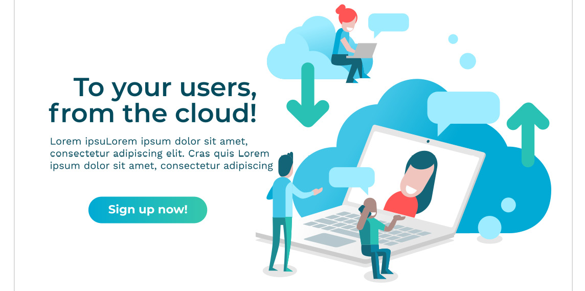
Figure 6.10 – The title the button and the illustration in place
The big hero text and the illustration stand out very well and are a good way to greet visitors to the site!
Product cards row
This section will hold the product cards. You will create the cards the exact same way as you did during the wireframing phase but, of course, this time with added colors, buttons, and text fields:
- Select the first placeholder card and add 30 px rounded corners to the base rectangle of it. You can do this by setting the Rx or Ry values to 30 px in the Tool menu of the Rectangle tool at the top.
The background color of the cards will be different but leave them gray just for now so the card will be visible on the white background. You will deal with that later.
- Next, add the textboxes to the card. The title of the card should stand out more than the description of the products, so set the title to Montserrat bold again. Use the same dark blue text color as before and set the size of this title text to 28 px. See Figure 6.11 for more details on the card design!
- Now, to add the second block of text, scroll back up to the title part, and copy the text object with the filler text from there. Paste the text here into the card and set the width and height of the textbox with the handle at the corner of the textbox while using the Text tool, or the Node tool!
You can also use the Flow into Frame option from the Text menu at the top:
- Draw a rectangle in the size and position you would like to flow your text into.
- Select the text object and the rectangle.
- Select Text | Flow into frame (or use the Alt + W hotkey).
- Delete the rectangle. That’s it – it is that simple!
You can check this method in Figure 6.11. As you see, you can create precisely sized textboxes with this solution.

Figure 6.11 – Flow into Frame to precisely resize a textbox
You also need to change the size of the text and set it to a smaller size – it is 18 px in the example design.
Why use a copy of the text object? You could achieve the same thing by drawing a new text object, copying text into it, and setting all the text properties as before, but copying and modifying an existing object in Inkscape is always easier and faster than setting all the values over and over.
- The product card has a title and description now, but it is missing a CTA button. Select the button from under the title you created earlier, copy it, and paste it here into the card.
- Of course, the button will be too big for this card – you need to scale it down to fit. Set height to 60 px and size to 28 px.
- Select all the elements of the card and create a group of them. Check out Figure 6.12 for the final card layout!
The card is almost looking good now, but the background of it is still gray. You want to have it crisp white – this is better for the text and the buttons too. Select the background square of the card and set it to white.
However, now you need to separate the white card from the white background. You could use a thin stroke, or put a drop shadow under the card, but I think it is better for the whole design if you add contrast to the cards by adding a colorful bar under them.
Using a colorful background for the product row is also a good way to separate this section from the previous one. In the title section you just finished earlier, the colorful illustration and the bold, dark text create a nice contrast to the crisp, white background.
You need to then add more color to separate this section from the previous one. The separation of rows helps to guide the visitor through the different contents of the page.
- To achieve this, first, select and duplicate the white background rectangle that you drew earlier for the website design. Duplicating makes sure that it is the same width and in the same position as the original background. Now, set the height of it leaving some margin above and under the card. In the example, it is 700 px.
- Send the rectangle behind the card using the Page Down key. It is still white, but you will change that soon, using the same method you used earlier when assigning an existing gradient to the button.
- Select the rectangle and, using the Gradient tool, create a horizontal gradient on it. Assign the same gradient you used for the button and the logo earlier. This will strengthen the brand colors and will give a colorful background to the white card!
- In the wireframe, there was more than one card, of course. This problem is easy to fix – simply duplicate the finished card twice and position the cards where the card placeholders are. Spread them out evenly using the Distribute dialog window as before. Once done, delete the placeholders – you will not need them anymore.
You can also demonstrate at this point how the hover state of a button would look.
- Select one of the buttons from the buttons on the three cards and recolor its background. Use the same vivid red you used while coloring the active menu item in the top navigation bar.
Using the gradient as a vivid background, your cards will pop! See Figure 6.12 to check out this design solution.

Figure 6.12 – White product cards on a colorful background
This section was good practice to create cards and add a simple but colorful component to the page. Next, you will create something similar but still different for a different result.
Company values with icons
Right under the product cards, we can show a bit more about the company. You can call this part a list of services, or company values – the point is that visually, these are another version of the product cards. Not so direct, but still selling the idea of the company to the visitors.
You drew the layout for this section as a wireframe, and now you just have to follow that blueprint again. There will be three blocks, each containing an icon, a short title and text under that, and a CTA at the bottom.
As these text boxes are almost like product cards, you can work smart and salvage some parts from those cards.
So, to start this section, execute the following steps:
- Copy the title and the text block from one of the cards you created in the Product cards row section. You will not need a card base this time, so just paste the title and the text where it should go according to the blueprint.
- Modify the title to something else (see Figure 6.13 for an example) and make the font size of the title a bit smaller. In the example, I used 22 px, instead of 28 px for the cards.
- Keep the font size of the text box the same but make the text itself a bit wider. There will be no visual card base now, so you will not have to accommodate any margin this time.
- Next, you need to add the icon to the top of these text blocks. Get one of those icons you copied here from your project in Chapter 4, Create Detailed Illustrations with Inkscape, and position it above the title as shown in Figure 6.13.
You will have to scale the icon too. When scaling, take care that you scale the stroke width proportionally too! In the chapter where you designed the icons, you kept the icon for this function turned off on purpose. Now, you need to turn it on so that the lines are all scaled, keeping their width and proportions (if you don’t still remember this part, don’t worry – go check out the tips in Chapter 4, Create Detailed Illustrations with Inkscape).
At the bottom of these text boxes, you need to add a CTA. This time, you can keep that a bit more subtle – so no button, just a text link with an arrow.
- Duplicate the title of the box, move it here under the text, and set the text size to 18 px, while keeping the bold Montserrat font. Make the text the same turquoise as the icons (#2AC1B5) and retype something such as Learn more!.
- This is a text-only button, but you can still make it a bit more interesting by adding an arrow next to it! Copy a small arrow from one of the icons you created earlier in Chapter 4, Create Detailed Illustrations with Inkscape, turn it so it is pointing right, and then position and scale it next to the text. If you need more help, check out Figure 6.13!
- Select the text and the arrow and make them a group. Now, select all the elements of the text box – the icon on the top, the title, the text, and the text button – and align them with Center on vertical axis in the Align and Distribute dialog. With all of the elements still selected, create a group of them.
- Duplicate the group twice, and spread them out evenly as before, using the icon in the Distribute window to make the gaps between the text boxes equal.
- The last step for this section is to change the titles in the second and third boxes, as well as change the icons in them. Move the new icon inside the group and position it over the old one. Luckily, we created all icons as the same size, so it is easy to fit them into the same space. Delete the previous one and you are done!

Figure 6.13 – The service boxes with the icons and simple call to actions
The services are now presented differently and interestingly under the product cards section. You can add more of these columns too, arranging a second or even a third row under the original one. For this example, we only created three text boxes with added icons, but feel free to experiment and practice!
There is only the final section left in your website design – the footer and the footer navigation menu.
The footer bar and the footer menu
The footer is an important part of any website. It has to be simple and yet contain important data. If the header with the hero image and the big title was the party end, then the footer is the plain business end, but of course, that does not mean that you cannot add a bit of fun there too:
- To create the footer bar, duplicate the white background rectangle, and set its height to 350 px. This will be enough to accommodate a simplified menu. The color of the footer is usually gray, or another plain color compared to the colors of a website.
In this case, since the main colors you used for the CloudUsers identity were blue and turquoise, I would choose a pale version of those. In the example, I used the blue color (#0a85a4) that I used in some of the dark blue parts of the illustration created earlier.
This is dark enough for the background and desaturated compared to the vivid colors of the illustration and the site in general.
- Now that the bar is set, you will add four columns to the footer. Three of these will be for the footer menu, and the last one a chat button with some extra playfulness.
- To create the design for the footer menu, simply create a few lines of placeholder text. In the example, I set the font to Work sans, normal weight, and a size of 16 px. This will be the smallest font on the site.
- To make it look even more mundane, set the color to the light blue (#9EECFF) that you used in the illustration. This will lessen the contrast between the footer background and the text. This text is not there to pop – on the contrary, it is only there to be found if someone is looking for it.
- Set the first line to bold and a slightly bigger font size. That will be the title of the menu list.
- Now, duplicate this list twice and distribute the three columns as you did before with the cards and other elements in this chapter. You can check the example in Figure 6.14.
The last column in the footer will be a contact link (that is, to a live chat or call). This could be a simple text link, but it is more interesting to create a contact icon here. Of course, you will use parts you have already designed!
- Copy the graphical part of the logo – the little users in the cloud – and paste it here into the footer. Color it the same light blue (#9EECFF) you used for the footer text.
- Then, take one of the speech bubbles you drew for the illustration and copy and paste it here too! If it is not the same blue color as the rest of the icons, set it to the same light blue! Duplicate the speech bubble and flip it horizontally (with the H key). Position the speech bubbles above the logo as shown in Figure 6.14!
To finish the contact icon, add some text to the speech bubbles. Use the same font as for the footer titles and set the text to the same blue as the footer background. This way, you have created a monochrome illustration that is playful but blends into the footer.

Figure 6.14 – The footer menu and the contact icon
With the footer done, the last part of the website design is completed! If you followed the steps in this chapter so far, you finished a wireframe design and a fully colored website design.
Next, you will create the mobile website based on the desktop version – faster than you think!
Creating the mobile version of the design
This book is all about practicing your Inkscape skills and working smartly and efficiently. This project is particularly about using the components you created in earlier chapters – and this upcoming segment is all about mutating the desktop version of the site into a simple mobile view.
Resizing for mobile
It is a bit of an oversimplification, but the main difference between the desktop and the mobile version of a website is the size. The mobile phone as a medium is narrower and smaller than a computer screen. This creates different usages and usability challenges if you want to provide the same (or a similar) experience to users on mobile. You as a designer have to maintain readability and usability on this smaller screen.
You will not create yet another wireframe layout but instead, modify the desktop version straight. Vector design is always praised for how easy it is to scale things up. Now, you will see how flexible it is to scale things down!
As we established at the beginning of this chapter, you will only create two versions of this website layout: a larger desktop view and a small mobile view. The mobile version will be designed for a 360 pixel-wide screen, so you will have to rescale and fit every component to this size.
Reminder
The upcoming pixel values are used by me in the example; you are free to experiment and use your own measurements.
To use the design you already created, select the desktop website layout, and save it as a new document. Alternatively, if you like to keep things in one bigger work file, simply duplicate the whole desktop version, and put the duplicate next to the original. Whichever method you use, you will base the mobile view on this new duplicate of the desktop version.
Let’s start with the background rectangles – rectangles plural because there are now three background elements you need to rescale. Select the white background, the gradient background bar behind the products, and the footer background and set their width to 360 px. Do not worry about the height for now, as you will set that manually later.
Logo and mobile navigation
After resizing the background, following the same method as earlier, you will resize the rest of the components from top to bottom. There will be some additional elements, but you will work on those later. Now, just resize what you have at hand:
- First, the logo. Set it to 150 px wide proportionally.
- Delete the navigation menu – we will hide the menu items behind a simple hamburger menu on the live page. This is an easy icon to create: draw a horizontal bar, that is 4 px X 24 px.
- Duplicate it twice and order the three bars under each other. This is your hamburger menu icon – group the bars and color them the same turquoise you used on the site (#18B7C2).
Since this is just a layout plan, we will not show the open menu. See the position of the logo and the menu icon in Figure 6.15.
Header and the hero image
Under the logo is the header section with the title text, the button, and the hero illustration. On mobile, you should always decide what is the best way to present text and visual elements. Most of the time, to keep things readable and visible, you need to scale them to fit the screen and arrange them under each other.
This is the obvious reason why mobile sites seem longer and narrower than on desktops. This is exactly what you need to do with the header section:
- Resize the title text to 36 px and center the text to the background. Otherwise, keep the color and the font the same.
- Under the title, set the font size of the text to 16 px. Then, resize the textbox with the Node editor tool or the Text tool so that it is narrower but is split over more lines for the same amount of text. You can also use the Flow into Frame method as was explained earlier.
- The original size of the button is, of course, too big to be used here, but before shrinking it too much, think about usability: buttons on a mobile screen have to be ergonomically built since users need to tap them with their fingers. With this in mind, select the base of the button, and resize it, so the height is 55 px.
- Then, resize the button text too – set it to 24 px. This will be a big enough button to read and tap but will not overwhelm the design. Select the title, the textbox, and the button, and align them to the centerline of the background.
- Under this button is the hero image. Scale it down proportionally until its width fits the background with some margin. In the example, it is 320 px wide. Select the illustration and align it horizontally to the center of the background.
With these simple steps, all the elements add together logically and start to form a smaller layout. Refer to Figure 6.15 to see the full picture so far.

Figure 6.15 – The first sections of the mobile website layout resized
These are the first sections of the website resized to a mobile view. Next, you will work on the products and services and add more mobile UI elements.
Realigning and resizing the product cards
Following down the road again comes the next task: resizing and rearranging the product cards. The cards need to be scaled down while the text needs to be readable. Luckily, the cards are designed in a way that resembles a vertical mobile screen, so you will not have much work to do. You need to resize the cards to fit the screen width and rearrange them under each other so that users can scroll through them easily.
You could apply changes to all three cards, but since this is only a website mockup with no real content, it is easier to change one card and duplicate it twice:
- To start, delete two of the cards and leave only one to work with.
- Since you design for the smallest average phone screen, you need to scale down the card background. To fit a screen that is 360 px wide, set the width of the card base to 260 px, and the height to 400 px.
- Then, resize the text as well: the title can be 28 px and the running text 16 px. Using the Text tool or the Node editor tool, resize the block of the text manually so that it has more lines and is narrower to fit into the card base. Alternatively, use the Flow into Frame option as explained earlier.
The button has to be resized as well. If you set the height of the base to 45 px, and the font size to 20 px, it will be still readable and usable. Again, these numbers are just guides for this example – experiment with your sizes!
As you can see in Figure 6.16, the visual of the product cards did not change much, but to fit them on the screen, you need to arrange them under each other.

Figure 6.16 – The product cards ordered under each other in the mobile view
- Create two duplications of the card you modified and arrange them under each other. Select all three cards and center them on the vertical axis of the background.
- With the cards still selected, distribute them with the Make vertical gaps between objects equal button in the Arrange and Distribute window.
- Now that the cards are completed and organized, you need to fit the height of the gradient bar to accommodate them. Select the gradient background rectangle and set the height manually until it has a bit of margin under and above the first and last cards of the column.
The product cards are now rearranged, resized, and presented in a classic vertical manner. In the next section, you will try to visualize another type of user interaction.
Reworking the company values section
Our generation is used to scrolling endless pages on our mobiles, so simply arranging content in a single column works, but you may want to use another type of interaction from time to time to present the information differently. This time, you will order the components next to each other in a row, and only show one at a time on screen:
- Although different, you will start to reshape this section the same way as the previous one. Delete two of the columns and leave only one textbox with the icon on the top and the text link at the bottom.
- Again, you will have to resize the text. Set the font size of the title line to 22 px and the font size of the text in the textbox to 16 px. The text link at the bottom needs to be smaller too – 16 px is enough. Shrink the arrow as well.
- Again, reset the width of the textbox too – make it fit into the screen. Use the Flow into Frame method explained earlier or resize the textbox by hand using the Node editor tool or the Text tool.
- Next, you need to resize the icon at the top too. Although it fits the screen perfectly, it needs to be smaller. It was designed to be small and simple, and, of course, cannot be as large as the hero image at the top of the page. Resize it proportionally to be 100 px wide.
Finally, add pagination under the box. Users are familiar with this type of interaction; they will know that there will be more content after they swipe left.
- To draw a simple horizontal dot pagination, draw a 10 px circle, and duplicate it twice. Spread the three circles out evenly with a gap of a few pixels between them. Color the first circle turquoise (#2AC1B5), and the other two light gray (#E6E6E6). This will show which circle – and which textbox – is active.
As shown in Figure 6.17, using dot pagination is an easy but elegant solution to simplify the layout for mobile view.

Figure 6.17 – The company values textbox with the horizontal dot pagination
Of course, this is just a static visual design – if you want to see this method in motion, you need to build a simple prototype, and that is not part of this book.
The next part is the last segment – the footer and the footer menu.
The footer menu on mobile
The footer is an essential part of a web page, and it was established on the desktop version of this website design. It has to be there in the mobile version too, but since we cannot allocate so much space to it, we have to simplify it. We will keep the footer bar visible, of course, but hide the footer navigation behind a drop-down button:
- First, delete the menu lists, and keep only one title saying Footer menu. You already resized the footer background square earlier, so you only need to fix the text size here. Set the text size to 16 px.
- Now, select the right arrow that you added to the text link just above the footer in the company values section. Copy and paste that arrow here, next to the footer menu title. Set the color of the arrow to the same light blue as the text in the footer (#9EECFF).
- Rotate the arrow to make it point downward. This is an indicator that there is a drop-down menu here. To emphasize this drop-down link more, draw a 2 px thick horizontal line under it in the same light blue color.
- The line is also great to separate the link from the contact icon you have now at the very bottom of the page. Resize that icon and align it to the centerline of the page.
That small contact icon was only sitting at the bottom of the page in the desktop view, but as you can see in Figure 6.18, it inhabits the space in the footer in the mobile view.
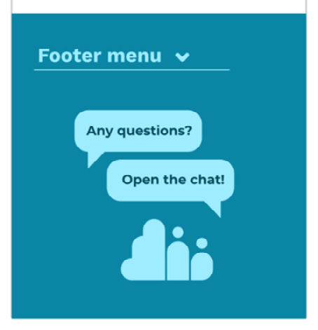
Figure 6.18 – The mobile footer with the hidden navigation and the contact icon
With the footer also reworked, you have completed the mobile version of the website design. As you saw, this was all just a case of resizing and repositioning elements you had already created. Inkscape is great for working with these types of responsive design elements. All the components are easy to move and repurpose when they are based on vectors.
Saving and exporting your website design
After creating the two layout versions of a website, you usually want to use the design. This means you might present it to a client, export the components and hand it over to a developer, or prepare to build the live version yourself.
Exporting the designs as mockups for a presentation is pretty straightforward. Select the website design and export it as a .png image in standard 96 DPI resolution. This is usually sufficient to give a preview to anyone and show off the work you created.
Saving individual components
To use the designs for building the website, you need to decide what the components that you actually need to export are, and which can be expressed in code. You will need to export the logo, the hero illustration, the icons, and the contact icon in the footer.
Select these components one by one to export them as .svg files. Here is a short description of how to save parts of a website design as .svg files for online use:
- Select the component you would like to use and turn it into a group.
- Create a new document and copy and paste the group into it. Make sure that it is a clean document with nothing else in it.
- Select the group and hit Shift + Ctrl + R or go to File | Document properties | Resize page to drawing or selection (using the hotkey is faster this time). This will resize the page to the drawing.
- Now, if you save the document, it will create a .svg file with only the component in it, perfectly sized and positioned. Take care not to save it as an Inkscape .svg – rather, use the Optimized SVG or Plain SVG formats! These formats exclude all the macros and extra data Inkscape is using in the native files, so you will have a smaller file size and a format that will render the same in every browser.
- Repeat this process for all the components. Do not forget to also save a .png file with transparent backgrounds for each component. This will be your bitmap image, the fallback file format for browsers or frameworks that are not compatible with .svg files.
When rebuilding a design into a website, exporting the images is only half of the work. The other half is to collect the color codes, measurements, and fonts to be used on the websites.
Take the gradient bar behind the product cards, for example. You won’t have to export the gradient as a bitmap image, not even as .svg. You simply check the color code and the angle of the gradient – this time, it was flat horizontal – and use that data in the CSS file to generate the gradient in the browser.
Buttons are not different either. You can apply rounded corners to any object via CSS and even specify the corner radius. Background colors and gradients should come from your original website design as well.
The same is true for the fonts used: use Google font services, or any other method to include the fonts in your website. As it was stated earlier, all sizes in the design are just approximations – you will have to find your own sizes.
As you can see, preparing a website you designed in Inkscape is a simple task if you have Inkscape open. You can easily export elements and get measurements and color codes to use in a real-life project.
Summary
During this chapter, you created three different versions of a landing page design. First, you built a simplified wireframe version. This was useful to set the sizes of the page and figure out the place for the different elements. Then, you collected all the materials you could use from the previous chapters: the logo design, the icon set, and the illustration.
You used most of the components you created so far in the book and practiced resizing and rearranging them into a bigger, more complex design. This is how you built the desktop version of the website – then, after more resizing and rearranging, you turned that into the mobile version. This flexibility is the reason Inkscape works so well for web design! You can rescale and reuse elements creatively and effectively.
In the next chapter, you will learn about optimizing your workflow by combining Inkscape with other applications.