Extreme Makeover: symbols, brushes, appearance, filters, and effects
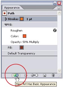
One important part of the Appearance palette (Window>Appearance) is the New Art Has Basic Appearance icon. It’s on by default, which means that every time you create a new object, that object will use the “basic” fill and stroke. What’s the basic appearance? The last fill and stroke you’ve used for that object. However, click on the icon to turn it off if you have created a specific appearance (using styles, effects, etc.) and want to create a whole series of new objects with the same look. In effect, when the icon is on, all new objects will use the basic fill and stroke for that particular object. When the icon is off, all new objects will use the last appearance (including styles, effects, etc.) you created for any object.
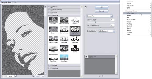
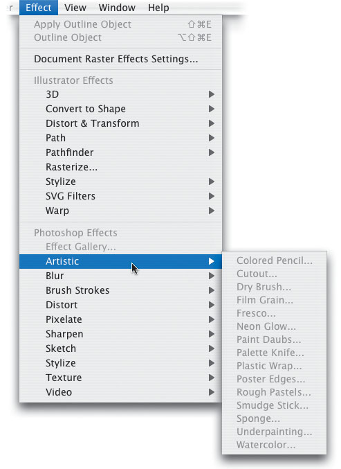
Here’s a huge speed tip when working with various effects in Illustrator CS2. Choose Effect>Effect Gallery. Your first thought is probably, “What the heck is this?!” Rightfully so, since Adobe really didn’t make a big deal out of this one and nobody is talking about it. However, it’s a huge time saver because you can preview various effects all within one dialog instead of looking at each effect, canceling out of the dialog, and going through the Effect menu all over again to preview another effect.
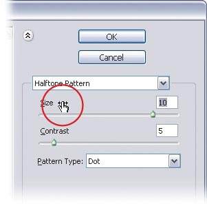
You may first be asking, “What the heck is a scrubby slider?” A scrubby slider is a newer way to adjust settings in dialogs and palettes without using the keyboard. To see what we mean try this: Apply a Halftone Pattern effect to an object in Illustrator (Effect>Sketch>Halftone Pattern). When the dialog opens, position your cursor over the word Size in the settings on the right. Note the little arrows that appear as the cursor. This is a scrubby slider. You can move your mouse to the left or to the right to adjust the setting without ever touching your keyboard. Note that not all settings in Illustrator have been updated with this ability.
Did you know that you can add an arrowhead to a selected path using Filter>Stylize>Add Arrowheads? No? Well then, that’s a bonus tip just for you. Just click on the arrows below the Start and End options to select your arrowheads’ style. If you did know that already, then here’s your tip: After using the Add Arrowheads filter, use the Direct Selection tool (A) to select the path. Then delete the path (keeping just the arrowhead), and you’ve got another source for simple shapes that you can use in your artwork.

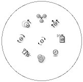
Here’s a cool way (thanks to Mordy Golding, former Adobe Illustrator Product Manager) to switch Symbolism tools on the fly, without using the Toolbox. Just press Control-Option as you click-and-hold (PC: Alt-Right-click-and-hold) with the Symbolism tool you’re using, and all the Symbolism tools will appear in a circle. Move toward the tool you want until the cursor changes, release, and start using the new tool.
Click on an object with the Eyedropper tool (I) to sample its appearance and then press-and-hold the Option key (PC: Alt key) while using the Eyedropper tool to apply that appearance to another object. Okay, so you probably knew that already. One of the Eyedropper tool’s hidden talents is to sample the appearance from multiple objects. (Before you try this, double-click the Eyedropper tool in the Toolbox to make sure that the Appearance options are selected.) With no objects selected in your document, use the Eyedropper tool to select your first color, then press Option-Shift (PC: Alt-Shift) and click on a second object to get your next color. Press-and-hold the Option key (PC: Alt key) and click on an object to apply both (or all) the sampled appearances to that object. If you’re not totally satisfied with the result, you can change the order of the various fills and strokes in the Appearance palette.
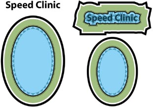
If you have created an appearance and want to apply the same look to a different object, here’s a simple solution. Select the object whose appearance you want to use (in our example, we used an outlined blue and green oval) and click-and-drag its small preview thumbnail from the Appearance palette onto the other object(s) on the artboard (in our example, we dragged it onto the words Speed Clinic). If you don’t see the preview, choose Show Thumbnail from the Appearance palette’s flyout menu.
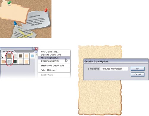
If all the built-in graphic styles aren’t enough for you, you can create additional styles by merging existing styles together. Find two (or more) styles you like in the Graphic Styles palette (Window>Graphic Styles) and select them. If the styles are adjacent in the Graphic Styles palette, you can press the Shift key and click on them; otherwise, you’ll have to Command-click (PC: Control-click) on the styles. Then from the flyout menu, choose Merge Graphic Styles. A dialog will ask you to name the new style that your selected styles will create.
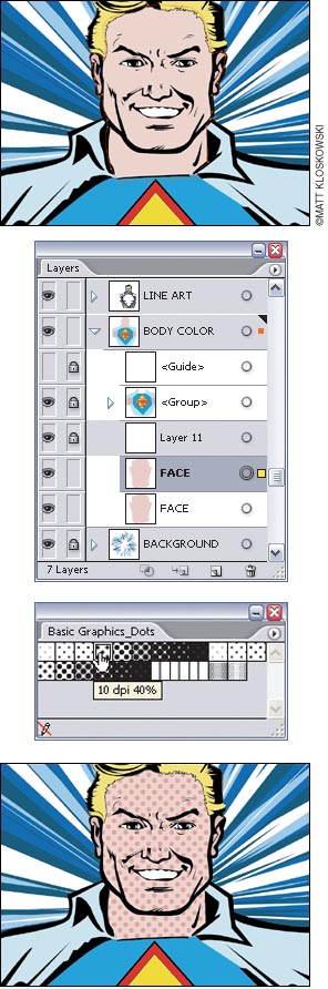
Bet you didn’t think you’d get an art history lesson here, did you? Well Roy Lichtenstein (October 27, 1923–September 29, 1997) was a prominent American pop artist whose work borrowed heavily from popular advertising and comic book styles. His illustrations often contained areas of solid color with other areas of dots. You can recreate this style in Illustrator easily. Start out with an illustration and pick a surface that you’d like to add the dot effect to. Duplicate that layer or sublayer by dragging it onto the Create New Layer icon at the bottom of the Layers palette (Window>Layer), so you have two copies (in this example, we’ve duplicated the layer with the face on it). Next, on the flyout menu in the Swatches palette, select Open Swatch Library>Other Swatch Library. Navigate to the Presets>Patterns>Basic Graphics folder and choose the Basic_Graphics_Dots.ai file. Click on one of the dots patterns to apply it (we used the 10 dpi 40% pattern). Lock all other layers and sublayers except the one that now has the dots on it by Option-clicking (PC: Alt-clicking) in the empty box to the left of the dot layer (to the right of the Eye icon) in the Layers palette. Then go to the Object menu and choose Expand. Deselect everything (Command-Shift-A [PC: Control-Shift-A]). Use the Direct Selection tool (A) to select a single dot, and from the Select menu, choose Same>Fill Color. Choose a color that is slightly darker than your fill color on the surface you duplicated. Deselect everything again and watch your illustration turn into a Lichtenstein!
To reapply the last Effect menu command you used with exactly the same settings, press Command-Shift-E (PC: Control-Shift-E). To apply the same effect but change the settings, press Command-Option-Shift-E (PC: Control-Alt-Shift-E) to open a dialog for the effect.
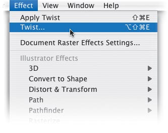
The difference between a filter and an effect is what Illustrator does to the object you apply it to. For example, draw a simple shape on the artboard. Duplicate it so the two are next to each other. Select the first shape and choose Filter>Distort>Twist and change the Angle setting to 150°. Then select the second shape and choose Effect>Distort & Transform>Twist and use the same 150° setting. They should both look identical at this point. But, if you choose View>Outlines, notice how the shape with the Filter applied to it has changed while the other one has not. This is because filters change the underlying structure of any paths they’re applied to, while effects only change the appearance. The most important point to glean from this tip is that a filter is permanent and an effect is “live”. This means that you can go back and change the settings of the effect (or remove it altogether) at any time.

In many of Illustrator’s Effect and Filter menu options, you can “start over” without closing the dialog that appears by pressing the Option key (PC: Alt key). The Cancel button will change to Reset—click Reset to revert all the settings to their default. For instance, we selected an object and chose Effect>Artistic>Dry Brush. After we changed a few of the settings, we decided to revert to the default settings using this tip. To find out which effects or filters dialogs this works in, try it!

Unfortunately, you cannot apply a filter or an effect to just the stroke of an object. You could draw the stroke separately, but then you’d have to worry about grouping the two objects. Instead, with the object selected, use the flyout menu in the Appearance palette (Window>Appearance) to choose Add New Stroke. Click on the new stroke to highlight it in the Appearance palette, change its color using either the Color palette or the Swatches palette, and change its Weight by going to Window>Stroke. Then go the Effect menu and pick an effect. That way, if you change the size of the original object, this second stroke will automatically change, too.

Here’s a great tip for getting a better drop shadow effect in Illustrator. While you can control the offset, opacity, and blur settings of a drop shadow, there’s really no way to control the thickness. If you try to do this by changing the offset value too much, it’ll just make the drop shadow separate from the overlying object and appear to be raised higher. Instead, try this: Create some type and choose Effect>Stylize>Drop Shadow. Use the following settings:
Mode: Normal
Opacity: 100%
X Offset: 2 pt
Y Offset: 2 pt
Blur: 0 pt
Color: Black
It looks nice, but the effect is too thin. To make it thicker, go to the Appearance palette (Window>Appearance), and just duplicate the Drop Shadow item a few times. Each time you duplicate it the drop shadow effect will get thicker.

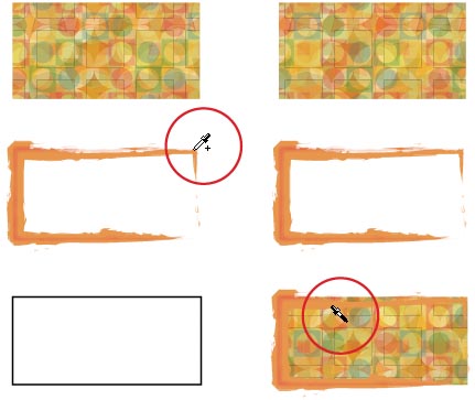
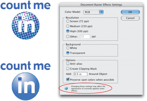
Before you start applying all kinds of raster effects or filters, make sure you have chosen the optimal raster quality settings for your document. From the Effect menu, choose Document Raster Effects Settings. In the dialog, choose the resolution, background (white or transparent), and options for anti-alias and clipping masks. These settings are document-wide, affecting all raster filters and effects. By default, the resolution is set to 72 ppi, so make this decision early on. If you change the resolution after creating objects and applying effects, the new resolution setting will be applied and the effects can change. For example, we had applied the Halftone Pattern effect to a logo, but the effect was changed after we altered the Document Raster Effects Settings.
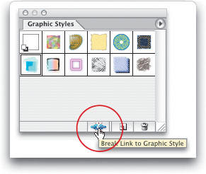
If you have applied a graphic style to a number of objects and later redefine the style in the Appearance palette (Window>Appearance), all the objects will update to the new style (they do not have to be selected). You can also ensure one object does not change from the original style by breaking the link to the style. Select the one object you don’t want to change and click on the broken chain icon at the bottom of the Graphic Styles palette (Window>Graphic Styles). Now, if you change the settings for the graphic style in the Appearance palette and choose Redefine Graphic Style from the Appearance palette’s flyout menu, the unlinked graphic will not change. There is no re-link icon, so you’ll have to reapply the graphic style by selecting the object and clicking on the style in the Graphic Styles palette.
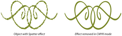
Some Effect menu options, such as the Artistic set, only work in RGB mode. This means if you change the Document Color Mode to CMYK in the File menu, the effect cannot be preserved (in other words, the effect you applied to an object will disappear, as it did here in our example using Effect>Brush Strokes>Spatter). To avoid this, before changing to CMYK mode, from the Object menu choose Expand Appearance (keeping in mind that your object will be converted to an image that cannot be edited to the same degree as when you started).
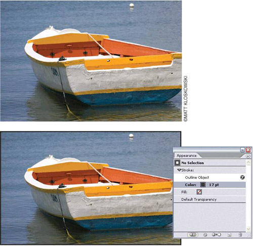
If you want to add a stroke to a placed image (File>Place) you can, but it’s not as simple as choosing a color for the stroke. You could draw a rectangle the same size, but there’s an easier way. With the placed image selected, go to the Appearance palette (Window>Appearance) and choose Add New Stroke from the flyout menu. Then from the Effect menu choose Path>Outline Object. Change the stroke color and weight, and you’re all set.
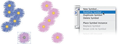
If you have created and used a symbol in your document, you can easily change all instances by redefining the symbol. Place an instance of your symbol from the Symbols palette and use the Object>Expand command to edit the original artwork. Make the changes to the artwork and keep it selected. In the Symbols palette, click once on the original symbol, and from the palette’s flyout menu, choose Redefine Symbol. All instances will automatically change to the edited symbol.
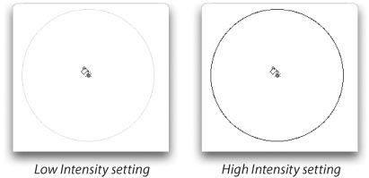
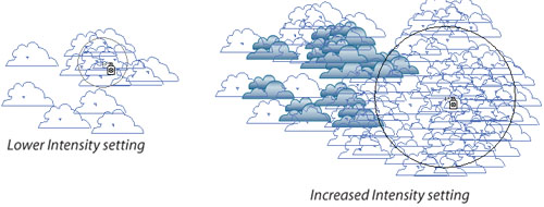
To find out the Intensity setting for the Symbolism tools, you could double-click on the active Symbolism tool in the Toolbox (say, for instance, the Symbol Stainer tool). But, for a quick visual clue, check out the brush’s outline color. If it’s very light gray, the tool has a low Intensity setting; if the brush outline is dark, the Intensity setting is high. Okay, so it’s not an incredibly accurate measurement, but it will tell you very quickly if you need to change the setting.
When you are using any of the Symbolism tools, you can use these keyboard shortcuts: Press Shift-right bracket (]) to increase the brush intensity (the rate of change) or Shift-left bracket ([) to decrease the intensity. Press the bracket keys alone to change the brush size: left bracket to make the brush smaller or right bracket to make the brush bigger.
By default, the Symbolism tools will affect whatever symbol is selected in the Symbols palette (Window>Symbols). So, if you have multiple symbols on the artboard, only the selected symbol will be affected by the Symbolism tools. The Symbolism tools can influence multiple symbols at the same time: Just Shift-click in the Symbols palette on all the symbols you’d like to work on.
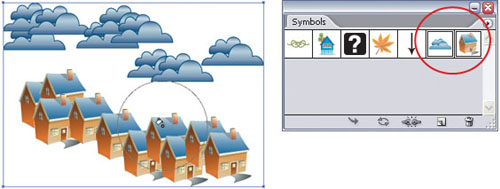
Normally when you drag-and-drop a selected object into the Symbols palette (Window>Symbols), a new symbol is created, but the original artwork has no connection to the symbol—the artwork is not an instance, meaning all its paths are still editable. To create a new symbol and turn the original object into an instance of the new symbol, press-and-hold the Shift key as you drag the artwork into the Symbols palette.

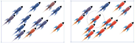
You can create multiple instances of a symbol by placing copies (Edit>Copy; Edit>Paste), or using the Selection tool (V) to select an instance and pressing-and-holding the Option key (PC: Alt key) while dragging to make a copy. But to select all the instances of a symbol in the document, make sure you have nothing selected in your document and click on the symbol in the Symbols palette. Then use the palette’s flyout menu to choose Select All Instances. If you want to replace all the selected instances, click on the new symbol in the Symbols palette and press the Replace Symbol icon (the second icon from the left) at the bottom of the palette.
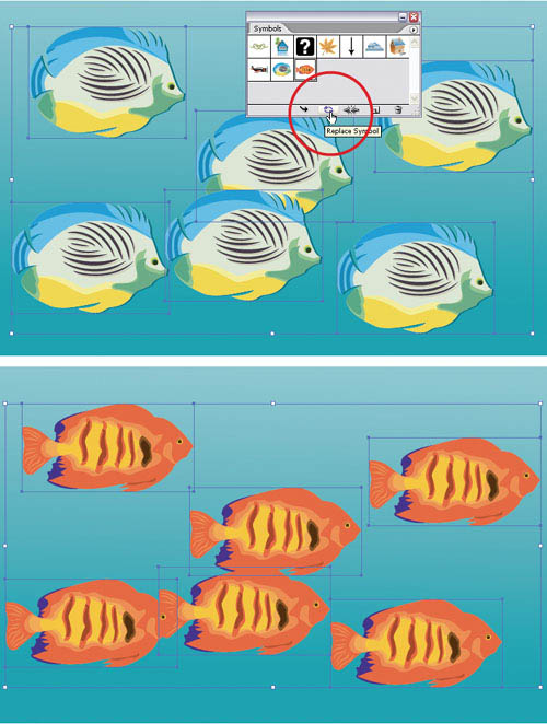
You know by now (if you read the previous tip) that you can replace all instances of a symbol. What we haven’t told you yet is that if you applied effects, changed colors with the Symbol Stainer tool, or resized the instance, all those characteristics will be preserved when you replace the symbol with a new one. For example, in our original symbol instance using the planets, we applied various effects and used the Symbol Stainer tool. When we replaced the symbol (see previous tip), all the instances changed to the cat symbol, while still preserving their individual characteristics.

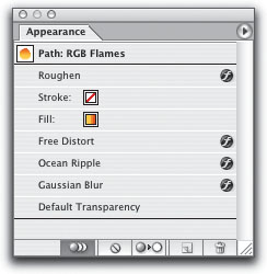
One of the best ways to learn all the great things you can do with graphic styles is to apply an existing style and then check out the Appearance palette (Window>Appearance). The entire makeup of the style will be laid out nicely for you—extra fills and strokes, effects, colors, and so on. In addition, if you really like a style and want to make a new one based on an existing style, you can of course, alter the style by selecting it in the Graphic Styles palette and changing style items in the Appearance palette. Then just click the New Graphic Style icon at the bottom of the Graphic Styles palette.
If you attempt to access a filter or an effect and it’s unavailable (grayed out), there could be several reasons. The bottom half of the Filter menu (from Artistic down) only works on rasterized objects or placed raster images. Moreover, many of the filters only work in RGB mode. Similarly, many Effect menu commands will only work if the document is in RGB mode. As you may know from a previous tip, you cannot switch from CMYK mode to RGB, apply an Effect menu command, and then switch back to CMYK because the effect will be lost.
You may not have even noticed this one but when you change settings in the 3D effects dialogs, the settings aren’t rendered to the screen until you take your finger off the mouse button. This makes it difficult to see what various settings look like as you’re applying them. To get around this, hold down the Shift key as you modify a 3D graphic, and the view on screen will be re-rendered each time you move the setting.
If you’ve tried to use the Rotate tool (R) on a 3D object, you may have noticed that the results can be somewhat unpredictable. Here’s a tip: Do all of your rotating within the 3D effect dialog. This rotates the object in true 3D space and it’ll leave things looking the way you expected.

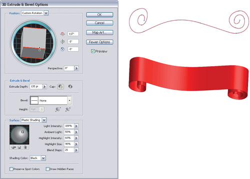
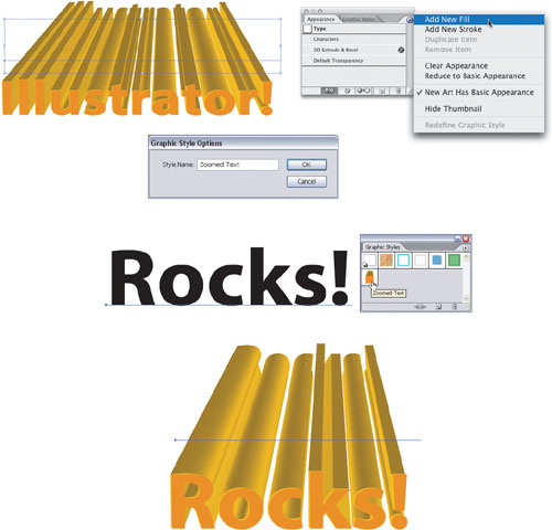
Here’s a quick way to create a realistic banner using 3D effects. First, envision what the banner would look like if you were looking straight down at it. Easier said than done, we know. The good news is that you can just draw a path as you see here. Set the Fill for this path to None and change the stroke color to whatever color you’d like the banner to be. Next, choose Effects>3D>Extrude & Bevel. Adjust the Extrude setting in the resulting 3D Options dialog to give some depth to the banner, and move the rotate cube so the banner is facing you. Be sure to check the Preview button so that you can see the changes. That’s it. Now you’ve got a shaded banner without going through all of the hassle of drawing each part manually.
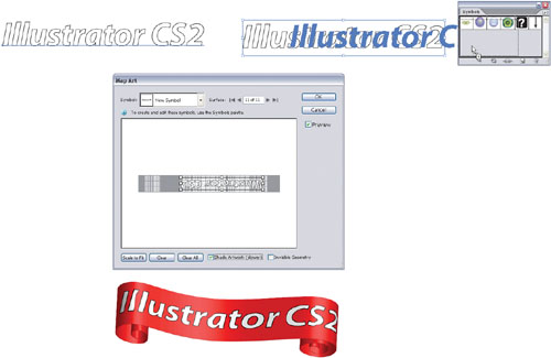
What’s a banner in the previous tip without text right? To add text to the banner, simply create the type that you’d like to have flow along the banner. Then drag the text into the Symbols palette (Window>Symbols) to make it a symbol. Now, select the banner and look in the Appearance palette (Window>Appearance). Double-click the 3D Extrude & Bevel item to modify the 3D effect you used to create the banner. Click the Map Art button and cycle through the Surfaces until you find the one of the front of the banner (look at the red highlights on the actual banner to see what surface is currently selected). Then, choose the new text symbol you just created from the Symbols pop-up menu. Position the text as you see fit, and keep in mind that it has a bounding box around it so you can transform it any way you’d like.
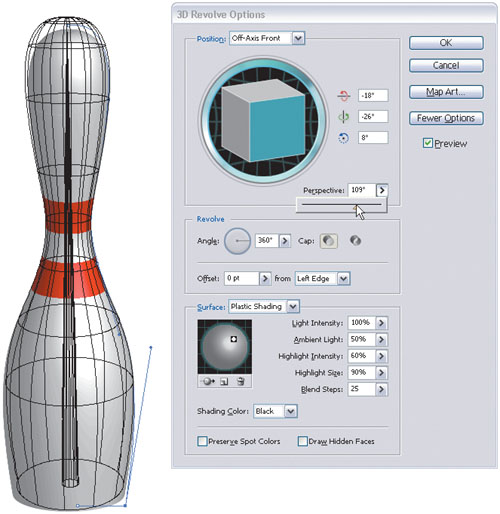
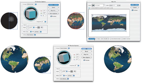
One of the interesting features of the Effect menu’s 3D command is the option to map art onto 3D surfaces. Only symbols can be mapped to the surface, so before heading to the Effect menu, create a symbol that you want to map to the surface of your 3D object, and drag it into the Symbols palette. You can create some very interesting results by using a placed photo as your symbol. Yes, placed raster images can be turned into symbols as long as the images are embedded rather than linked. Try placing (File>Place) an image of a world map (to embed the image, make sure the Link checkbox isn’t selected in the Place dialog). Make the image a symbol by dragging-and-dropping it into the Symbols palette (Window>Symbols). Then create a half-circle (by drawing a circle with the Ellipse tool [L] and cutting it in half with the Scissors tool [C]). Next, select your path and choose Effect>3D>Revolve. Click the Map Art button, select your symbol from the Symbol drop-down menu, and size the map to fit the grid by clicking the Scale to Fit button. You can add your symbol to different sides of the shape by using the Surface field. So now, if you ever need to show a different part of the world, double-click on the 3D Revolve effect in the Appearance palette, and use the 3D Revolve Options dialog to change the orientation of your globe.
You can make any of the 3D effects part of a graphic style, but you’ll need to do one extra step if you want the color to be part of the style. Apply the 3D effect to your object by selecting it and choosing a command from the Effect>3D menu. Then go to the Appearance palette’s flyout menu and choose Add New Fill. Even if your object already has a fill indicated, you’ll need to add this second fill for it to register as part of the style. Then go the Graphic Style palette and use the flyout menu to choose New Graphic Style. Give your style a name, click OK, and you’re set.
After you’ve used the Symbol Stainer tool (which is nested under the Symbol Sprayer tool in the Toolbox) to change the color of a symbol, while you still have your symbol instances selected, hold down the Option key (PC: Alt key) to decrease the colorization amount and reveal more of the symbol’s original color.
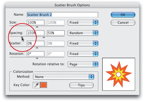
There are quite a few factors that determine exactly how a Scatter brush scatters along a path. Rather than trying to figure out the settings you need to create a brush, try this: Select the artwork for your brush and drag-and-drop it into the Brushes palette. When prompted, choose New Scatter Brush. Click OK in the Scatter Brush Options dialog without making any changes. Draw a short, open path with the Line tool and click on the new brush to apply it to the path. With the path still selected, double-click on the new brush in the Brushes palette to open the Scatter Brush Options dialog. Check the Preview box and now you can choose your settings, taking advantage of the preview to see what settings work best.

When a Scatter brush’s options are set at Random (rather than Fixed), you specify a range of numbers to determine the randomness of the Size, Spacing, Scatter, and Rotation settings. If you’re editing these Random settings in the Scatter Brush Options dialog, you can make your life a little easier with these keys. Double-click your Scatter brush to get the dialog, then press-and-hold the Option key (PC: Alt key) to move the minimum and maximum percentage an equal distance apart for one of the settings. For example, if the Spacing slider is set to 100% Fixed and you choose Random in the pop-up menu, hold down Option/Alt and drag the triangle slider to change the minimum to 150% and the maximum to 50% (with nothing held down you’d have to move each slider independently). Once you’ve set the range you’d like to use, you can move the range higher or lower (while keeping the same distance between the sliders) by holding down the Shift key. (Careful, this last step can be a bit touchy. Try it out and you’ll see what we mean.)
You can change the stacking order of multiple symbols using the Symbol Shifter tool—that is, as long as you have already selected the instances in the Symbols palette (Window>Symbols). To bring symbol instances forward, Shift-click the symbol instance with the Symbol Shifter tool (nested under the Symbol Sprayer in the Toolbox). To send the symbol instances backward, press-and-hold Option-Shift (PC: Alt-Shift) and click the symbol instance.

If you really want to experiment with the Extrude & Bevel 3D effect, try this: Open the document called Bevels.ai that is located in the Illustrator CS2 application’s Plug-ins folder. Draw a short, angled line with the Pen (P) or Line () tool and drag the path into the Symbols palette (Window>Symbols) to create a symbol. Save the document, close it, and restart Illustrator. Then, when you choose Effect>3D>Extrude & Bevel, your new bevel will appear in the dialog’s Bevel pop-up menu. With a bit of experimentation (each time adding a symbol to Bevels.ai, saving the document, and restarting Illustrator), you can create some pretty interesting results.

This is a pretty basic concept, but if you try to use the Symbol Stainer tool (nested under the Symbol Sprayer in the Toolbox) and nothing happens, it’s because the Symbol Stainer tool cannot affect an object that is black. With this in mind, you might want to create a version of your symbol in shades of gray and drag-and-drop it into the Symbols palette. Then if you decide to stain the symbol, you’ll have a version on which the Symbol Stainer tool will work.
Although Illustrator CS2 comes with a decent selection of symbol libraries, you can easily add many more symbols by using the brush libraries (because there are many more brush libraries included). From the Brushes palette’s flyout menu, choose Open Brush Libraries and pick a library (we selected Decorative Scatter). From the library palette that appears, drag a brush onto the artboard and then drag-and-drop it into the Symbols palette. Voilà! New symbol.

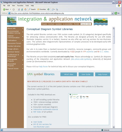
This will possibly be the most read tip in this book. Why? Because it has the word “FREE” in it. Anyway… here’s a useful download tip with a ton of free symbols for Illustrator. The Integration and Application Network at the University of Maryland Center for Environmental Science has produced a series of scientific symbol libraries. The libraries contain more than 1,000 custom-made symbols (in 28 categories) designed specifically for enhancing science communication skills for the graphically challenged. Diagrammatic representations of complex processes can be developed easily with minimal graphical skills. The best part about it is the libraries are available cost and royalty free. You can also download a searchable index (PDF) of all the available symbols and an interactive flash tutorial on how to use the symbols with Adobe Illustrator (they require version 10.0 or better). Just go to: http://ian.umces.edu/index.html?http&&&ian.umces.edu/conceptualdiagrams.php and check it out.
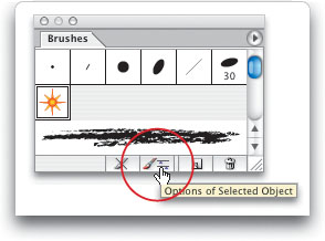
When you want to apply an Art brush to the stroke of an object, there are a couple of different options dialogs that can help you. Double-click on an Art brush in the Brushes palette (Window>Brushes) to set the overall options for the brush—every time you use the brush it will use these settings. Or, to affect only the selected object, select the object, click on the Art brush in the palette to apply the stroke, and click the Options of Selected Object icon at the bottom of the Brushes palette. Change the setting to affect how the brush stroke is applied to only that object. (The same principle applies to Scatter brushes and Calligraphic brushes.)
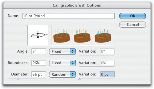
There’s an Easter Egg hidden in the Calligraphic Brush Options dialog that was revealed by Deke McClelland in his Real World Adobe Illustrator book. Why is it called an Easter Egg? Because it’s a little hidden treat that serves no practical purpose whatsoever. Double-click on any Calligraphic brush to open the options dialog and enter these settings: Angle 5°, Roundness 26%, and Diameter 56 points. Click anywhere in the dialog, and you’ll get a birthday surprise. Does the brush actually paint with this special design? No, thus the Easter Egg designation—cool but no practical application.