Chapter 3. Forms
Introduction
Forms are the workhorse of any web application. Whether you are updating your Facebook status, paying a bill online, or remotely programming your DVR, forms are what make the magic happen.
Currently, making that magic both robust and seamless requires some interesting and tricky uses of HTML and JavaScript. HTML5 makes much of this work far simpler—and even where browsers aren’t yet supporting the new HTML5 form features, it’s easy to use these as building blocks and add support with JavaScript.
HTML5 gives us new elements and new attribute values for the
input element to yield
new form fields, as well as some new attributes that allow us to
remove many lines
of JavaScript. However, since not all browsers yet support these
new features, it is still necessary to use some JavaScript to ensure cross-browser compatibility.
3.1. Displaying a Search Input Field
Solution
Use the input element
with an HTML5 type
value of search:
<form>
    <p><label>Search <input type="search" name="query"></label></p>
    <p><button type="submit">Submit</button></p>
</form>
Discussion
The search input type displays
a text input field that may visually differ from that of a regular text
field, based on the stylistic conventions of the platform.
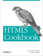
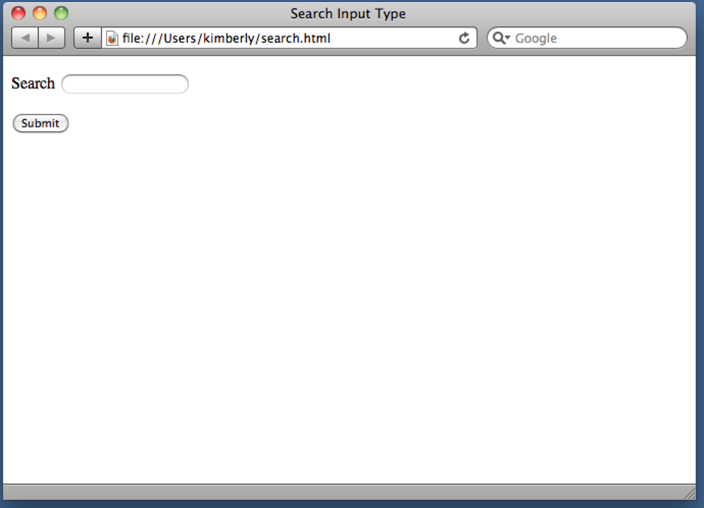
For example, Safari on Mac OS displays the search field with rounded (instead of square) corners, as shown in Figure 3-1. Both Safari and Chrome display an icon within the field to delete the current value, as shown in Figure 3-2.
Some user agents will display a plain text input field for the
search input type, so support cannot
be determined by visual appearance alone.
Testing browser support
To accurately test a browser’s support of the search input type (see Table 3-1 for a listing of
compatible browsers), load Mike Taylor’s support test page at http://www.miketaylr.com/code/input-type-attr.html. The
page shows not only support for the search attribute value, but for other
attribute values for input as
well.
IE | Firefox | Chrome | Safari | Opera | iOS | Android |
10 Platform Preview 2 | 4.0+ | 10+ | 4.0+ | 11.0+ | ✓ | ✓ |
If a user agent does not support the search input type, it will revert to
displaying a text input field. What is the value in having a separate
input type for search, when only some user agents will render a
visually different input field? There are a few answers to this
question.
First, enabling visual styles reminiscent of an operating system in the browser can make for a better user experience. Second, designating a search input field as such may help assistive devices more correctly signal users as to the purpose of the field or form.
Finally, the search input type gives us a more semantic input
type value to use in our forms and gives us a better hook for our CSS,
as compared to using a class or ID. The following CSS applies rounded
corners to the search input field for all user agents that support
the border-radius
property:
input[type="search"] {
    border-radius: 10px;
}
See Also
For more information on search inputs in WebKit browsers, including Chrome and Safari, see http://css-tricks.com/webkit-html5-search-inputs/.
3.2. Contact Information Input Fields
Problem
You want to present a user with a form to provide contact information, such as an email address, a URL, and a telephone number.
Solution
Use the input element
with HTML5 type values
of email, url, and tel:
<form>
    <fieldset>
        <legend>Contact Information</legend>
        <p><label>E-mail address <input type="email" name="email"></label></p>
        <p><label>Web site <input type="url" name="website"></label></p>
        <p><label>Telephone number <input type="tel" name="phone"></label></p>
    </fieldset>
    <p><button type="submit">Submit</button></p>
</form>
Discussion
How many times have you created text input fields to collect data
like an email address, and then had to write JavaScript to validate the
input? You won’t have to do this with the new email and url input types.
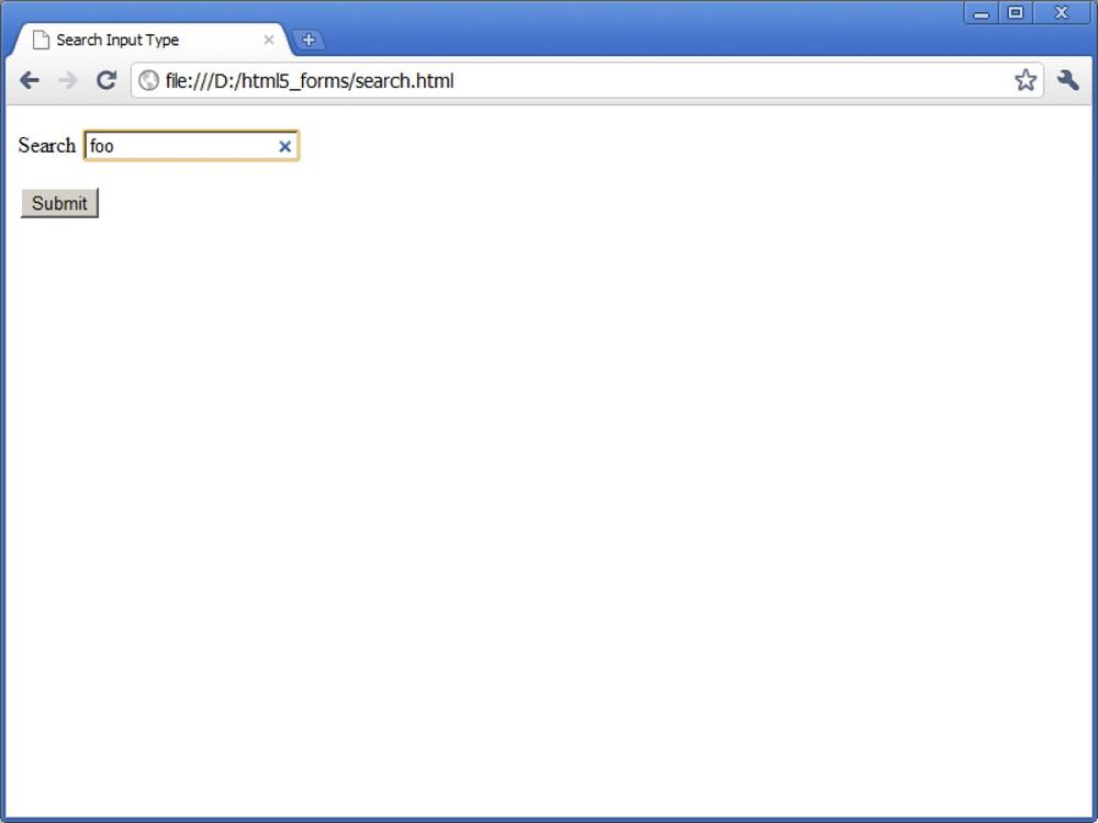
These restrict the value entered to a valid email address or absolute URL. If the user enters a value that is not valid, the user agent warns the user and the form data is not submitted (see Figures 3-3–3-6 for examples of this across various browsers).
The tel input type does not
enforce any particular syntax, due to the variety of telephone number formats used around the
world. The new pattern attribute can
be used to enforce a particular syntax, however. For more information,
see Recipe 3.12.
User agents vary in terms of the feedback provided to the users as they complete the form. At the time of this writing, some browsers are starting to visually highlight fields that do not validate on blur when the user exits the input field, but do not display the error message until the form is submitted. Other browsers provide no feedback until the form is submitted. See Table 3-2 for a browser support chart.
IE | Firefox | Chrome | Safari | Opera | iOS | Android |
10 Platform Preview 2 | 4.0+ | 10+ | 4.0+ | 11.0+ | ✓ | ✓ |


Customizing the default error message
If you look closely at Figures 3-5 and 3-6, you’ll notice that the default
error message varies from browser to browser. You can specify your own
language by adding a title
attribute to each input field:
<input type="url" name="website" title="That doesn't look like a valid web
    address.">
As with search, it’s visually
difficult to determine whether or not a user agent supports email, url, or tel. Mike Taylor’s support test at http://www.miketaylr.com/code/input-type-attr.html is
useful here, too. Browsers that do not support these new input types
display a text input field.
On some touch-screen devices, the user agent will display a
custom on-screen keyboard for these fields. For example, if the
email input field is selected, the keyboard shows not only letters but
also the at sign (@) and a period,
as seen in Figure 3-7. Cool,
huh?

See Also
For more about on-screen keyboard configurations for these fields, see Mark Pilgrim’s “Dive Into HTML5” online book at http://diveintohtml5.info/forms.html#type-email and http://diveintohtml5.info/forms.html#type-url.
3.3. Utilizing Date and Time Input Fields
Problem
You want to provide a user with a form to specify a date and/or time—for example, when scheduling an appointment.
Solution
HTML5 provides a number of new input types to assist in date and time entry.
This first solution uses the input element with the
HTML5 type value of datetime to display both a date-picker widget
and a time spinner control in combination, as shown in Figure 3-8:
<form>
    <p><label>Appointment Date and Time <input type="datetime"
        name="dateAndTime"></label></p>
    <p><button type="submit">Submit</button></p>
</form>
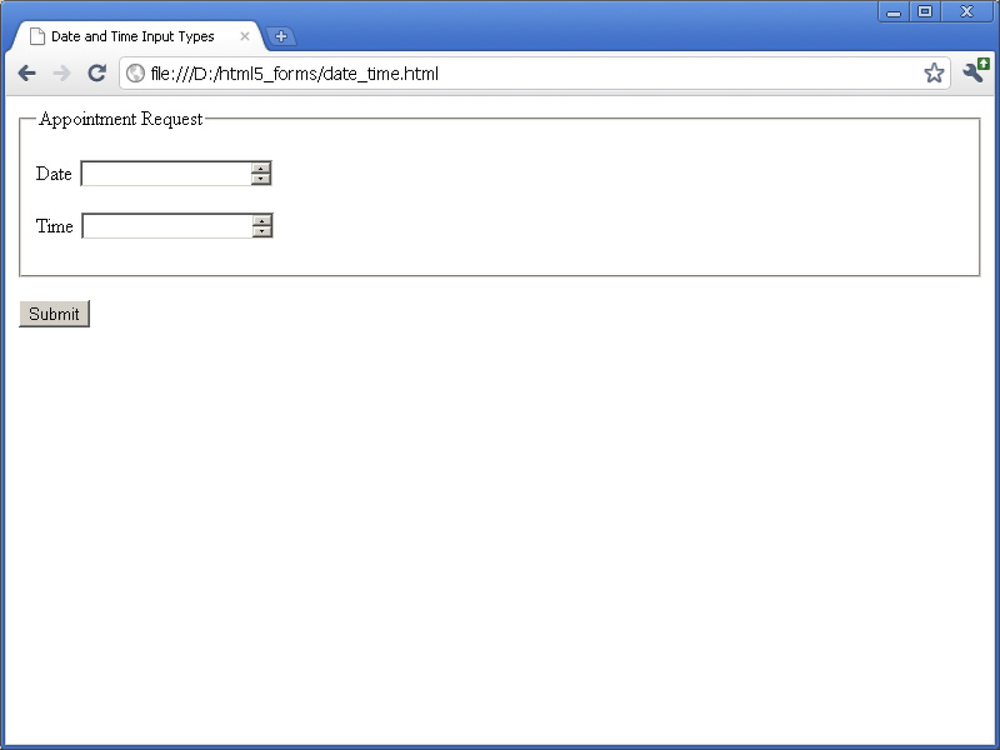
To present the date and time input fields separately, as shown in
Figures 3-9 and 3-10, use separate input fields with the
HTML5 type values date and time:
<form>
    <fieldset>
        <legend>Appointment Request</legend>
        <p><label>Date <input type="date" name="date"></label></p>
        <p><label>Time <input type="time" name="time"></label></p>
    </fieldset>
    <p><button type="submit">Submit</button></p>
</form>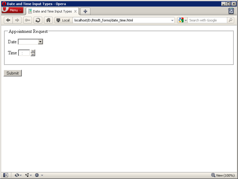
Discussion
The datetime, date, and time family of input types, which also includes month, week, and datetime-local, are excellent proof that new features in HTML5 are based on
what web designers and developers have been doing for years with various
JavaScript libraries and other solutions.
Opera has been the leader in generating date and time controls,
rendering a calendar-based date-picker control for date and a time spinner control for time, and many expect other browsers to
eventually follow its lead.
Webkit-based desktop browsers recently introduced support for these input types, using spinners for both. User agents that do not support these input types revert to a text input field.
For a look at browser support for the date and time input types, see Table 3-3.
IE | Firefox | Chrome | Safari | Opera | iOS | Android |
- | - | 10+ | 5.0+ | 9.0+ | ✓ | ✓ |
Note
For tips on delivering a more consistent cross-browser experience, see Recipe 3.13.
Like all other form inputs, you can specify a value to be
displayed when the page is rendered. The value for the date input type must be a valid date string,
such as 2010-12-31, which represents
December 31, 2010.
The value for the time input
type must be a valid time string, such as 23:59:59, which represents 11:59 P.M., one
second before midnight.
Finally, the value for the datetime input type must be a valid global
date and time string, such as 2010-12-31T23:59:59Z, which represents one
second before midnight UTC on December 31, 2010.
Additional features
Two new input element
attributes, min and
max, can limit the range of dates
and times that users can select.
This is useful in cases where you don’t want users to select appointment dates or times in the past or
select birthdates in the future, as shown in Figure 3-11:
<form>
    <fieldset>
        <legend>Appointment Request</legend>
        <p><label>Date <input type="date" name="date" min="2011-03-15"
            max="2012-03-14"></label></p>
        <p><label>Time <input type="time" name="time" min="08:00"
            max="18:00"></label></p>
    </fieldset>
    <p><button type="submit">Submit</button></p>
</form>
See Also
For more information on valid date and time values, see the HTML5 specification at http://www.w3.org/TR/html5/common-microsyntaxes.html#dates-and-times.
3.4. Number Inputs
Problem
You want to present a user with a form in which to enter a number—for example, to enter the quantity of an item in an order form.
Solution
Use the input element
with the HTML5 type
value of number:
<form>
    <p><label>Quantity <input type="number" name="quantity"></label></p>
    <p><button type="submit">Submit</button></p>
</form>
Discussion
As you may have guessed, the number input type restricts the value to a
valid number—a floating-point
number, to be specific.
If the user enters a value that is not valid, the user agent warns the user, and the form data is not submitted, as shown in Figure 3-12.

Some user agents display this form field with a spinner control next to the field, while others do not. On some touch-screen devices, the user agent displays a numeric on-screen keyboard for this field.
For a browser support reference on the number input type, see Table 3-4.
IE | Firefox | Chrome | Safari | Opera | iOS | Android |
10 Platform Preview 2 | - | 10+ | 4.0+ | 9.0+ | ✓ | ✓ |
User-friendly input fields
As always, it’s important to think through the user experience when implementing
the number input type. For example,
if you’re asking for a US zip code using the number input type, presenting a spinner
control might confuse the user, since its purpose isn’t well known
yet. On the other hand, you can’t rely on all browsers displaying a
spinner, so take care in crafting instructional text—don’t reference
the spinner arrows, in case they’re not there!
Load Mike Taylor’s support test (see http://www.miketaylr.com/code/input-type-attr.html) to
determine what level of support a particular browser has for this
input type. If a user agent does not recognize the number input type, it will display a text
input field.
Additional features
The min and max attributes can be used with the number input type to limit the values that
can be entered. In addition, you can use the step attribute to
specify the amount by which the value should be incremented. In this
example, a customer must order in pairs, so the minimum quantity is 2
and the step value is 2, as shown in Figure 3-13:
<form>
    <p><label>Quantity (must order in pairs of 2) <input type="number"
        name="quantity" min="2" max="20" step="2"></label></p>
    <p><button type="submit">Submit</button></p>
</form>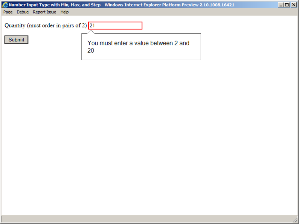
For a screenshot of an on-screen keyboard
configuration for number, see Figure 3-14.

See Also
See Mark Pilgrim’s writeup on the number input type at http://diveintohtml5.info/forms.html#type-number.
3.5. Selecting from a Range of Numbers
Problem
You want to present a user with a form to select a number from a range—for example, to adjust the volume on a video.
Solution
Use the input element
with the HTML5 type
value of range:
<form>
    <p><label>Volume <input type="range" name="volume"
        min="0" max="10" step=".5" value="5"></label></p>
</form>
Discussion
The range input type is like
number in that it restricts the value
to a valid floating-point number, but it has the added caveat that the
exact value is not important.
Exact values are important on product order forms and the like,
for values like quantity, so number
should be used in those cases. The range input type is useful in cases of
relative or subjective input, such as assigning a rating to an event or
product. To emphasize this point, the specification requires that the
control be rendered as a slider or similar control, as shown in Figure 3-15.
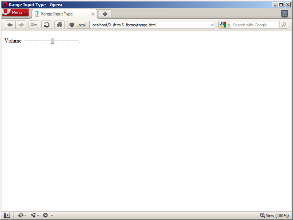
Webkit-based browsers and Opera render a horizontal slider control
for the range input type. If a user
agent does not recognize this input type, it displays a text input field
instead.
For a browser support reference on the range input type, see Table 3-5.
IE | Firefox | Chrome | Safari | Opera | iOS | Android |
- | - | 10+ | 4.0+ | 10.0+ | ✓ | ✓ |
Note
For tips on delivering a more consistent cross-browser experience, see Recipe 3.13.
See Also
The W3C specification on range at http://www.w3.org/TR/html-markup/input.range.html.
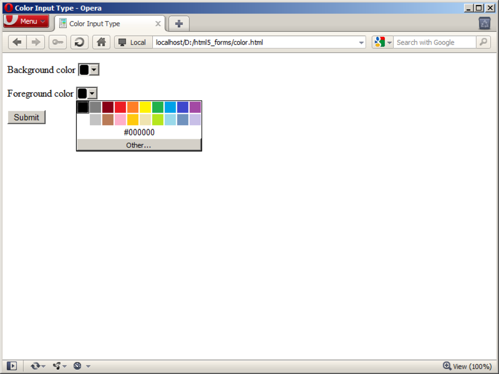
3.6. Selecting Colors
Problem
You want to present a user with a form to select a color—for example, to customize the look of a web page.
Solution
Use the input element
with the HTML5 type
value of color:
<form>
    <p><label>Background color <input type="color" name="bg"></label></p>
    <p><label>Foreground color <input type="color" name="fg"></label></p>
    <p><button type="submit">Submit</button></p>
</form>
Discussion
The color input type restricts
the value to a valid RGB value in hexadecimal format, including the
number sign or octothorpe, #, displayed before
the six digits.
The HTML5 specification prescribes a color-well control for this
input type, but so far only Opera has implemented this control.
Webkit-based browsers that support color, like Chrome and Safari, render a text
input field but successfully validate entries and prohibit form
submission if the value is not valid, as shown in Figures 3-16 and 3-17.
If a user agent does not support the color input type, it will display a text input
field instead.
For details on browser support of the color input type, see Table 3-6.
IE | Firefox | Chrome | Safari | Opera | iOS | Android |
- | - | 10+ | 5.0+ | 11.0+ | ✓ | ✓ |
Note
For tips on delivering a more consistent cross-browser experience, see Recipe 3.13.
See Also
“Octothorpe” is a good word and bears repeated mention in polite company; see http://en.wiktionary.org/wiki/octothorpe.

3.7. Creating an Editable Drop-Down
Problem
You want to give the user the ability to enter text but also prompt her with some suggestions to choose from. This is sometimes known as an editable drop-down or a combo box.
Solution
Use the HTML5 datalist element
to create a list of suggestions using the option element, and associate the list with
an input element via the
list attribute:
<form>
    <p><label>Donation amount <input type="text" name="donation"
        list="donations"></label></p>
    <datalist id="donations">
        <option value="10.00">10.00</option>
        <option value="25.00">25.00</option>
        <option value="50.00">50.00</option>
    </datalist>
    <p><button type="submit">Submit</button></p>
</form>
Discussion
The datalist element is used to
define a list of suggested values for other input controls—it is not a form input or control
itself.
The suggested values are specified using option elements, just as they would be for
a select element, but
nothing renders on the screen until the datalist is associated with an input element. Binding a datalist to an input field is done by
specifying an id on the datalist and using this as the value of the
list attribute on the input element.
The result is a control that both accepts user input and presents a list of options for the user to choose from. This is not unlike the type-ahead or autocomplete functionality implemented in many browsers and on most search websites, as shown in Figures 3-18 and 3-19.


For browsers that have not yet implemented datalist, the above solution results in the
display of the text input field, but not the list of suggestions. In a
few cases, older browsers may display the option labels.
For a reference on datalist browser
support, see Table 3-7.
IE | Firefox | Chrome | Safari | Opera | iOS | Android |
10 Platform Preview 2 | 4.0+ | - | - | 10.0+ | - | - |
A datalist workaround
Web developer Jeremy Keith has proposed the following implementation, which
works with both modern browsers that support the HTML5 datalist element and those that do
not:
<form>
    <p><label for="donation">Donation amount</label>
    <datalist id="donations">
        <select name="donation">
            <option></option>
            <option value="10.00">10.00</option>
            <option value="25.00">25.00</option>
            <option value="50.00">50.00</option>
            <option>Other</option>
        </select>
        If other, please specify:
    </datalist>
    <input type="text" id="donation" name="donation" list="donations"></p>
    <p><button type="submit">Submit</button></p>
</form>
The result is valid, semantic, and elegant: in the former case, the editable drop-down is rendered, but in the latter case, a select drop-down is rendered next to the text input field, as shown in Figure 3-20.

See Also
Read Jeremy Keith’s full post on the datalist solution at http://adactio.com/journal/4272/. For updated information on datalist support,
see http://caniuse.com/datalist.
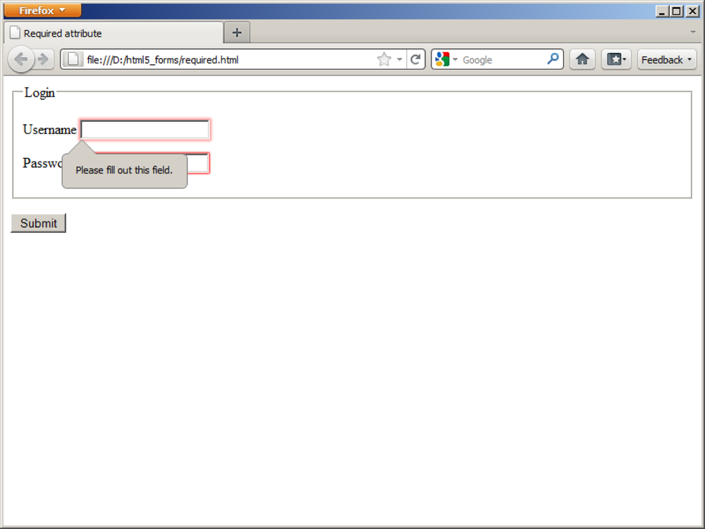
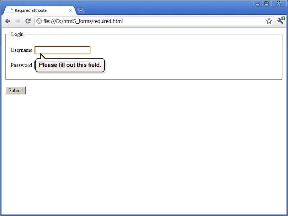
3.8. Requiring a Form Field
Solution
Apply the HTML5 required
attribute on any form field that must be completed in order to submit
the form:
<form>
    <fieldset>
        <legend>Login</legend>
        <p><label>Username <input type="text" name="username" required></label></p>
        <p><label>Password <input type="password" name="pwd" required></label></p>
    </fieldset>
    <p><button type="submit">Submit</button></p>
</form>
Discussion
The required attribute may be
specified on zero or more form elements in a form.
When the user submits the form, any required field that has been left blank will cause the browser to stop the submission and an error message will be displayed. The visual display of the error varies from browser to browser, as shown in Figures 3-21–3-24.
If a user agent does not recognize the required attribute, it will be ignored. You
can still craft JavaScript to perform this validation using this
attribute, however. See Recipe 3.14, for
details.
For a reference on required
attribute support in browsers, see Table 3-8.
See Also
Check browser support for form field validation at http://caniuse.com/form-validation.


3.9. Autofocusing a Form Field
Solution
Apply the HTML5 autofocus
attribute to only one form field:
<form>
    <p><label>Search <input type="search" name="query" autofocus></label></p>
    <p><button type="submit">Submit</button></p>
</form>
Discussion
Autofocus behavior on the Web is alternately loved or hated. It’s great when the search box on Google is autofocused, but it’s roundly hated when the user expects to be able to scroll a page by pressing the down arrow key but the page has autofocused in a field.
A native solution both eliminates the need to write JavaScript and
is potentially more accessible. When implementing the autofocus attribute, remember that it may be
specified only once per document, not per form! To
maintain accessibility, a user agent may honor a user setting or action
that would override the focus action.
If a user agent does not recognize the autofocus attribute, it will be ignored. You
can still use JavaScript to autofocus a field.
For a browser support reference of autofocus,
please see Table 3-9.
See Also
See Recipe 3.14, for details.
3.10. Displaying Placeholder Text
Solution
The HTML5 placeholder attribute
is used to specify instructional text when the user is not
focused in the form field:
<form>
    <fieldset>
        <legend>Contact Information</legend>
        <p><label>E-mail address <input type="email" name="email"
            placeholder="[email protected]"></label></p>
        <p><label>Web site <input type="url" name="website"
            placeholder="http://www.domain.com/"></label></p>
        <p><label>Telephone number <input type="tel" name="phone"
            placeholder="123-123-1234"></label></p>
    </fieldset>
    <p><button type="submit">Submit</button></p>
</form>
Discussion
Usability experts and user interface designers have been trying to solve the problem of displaying unobtrusive instructional text to users in forms for a long time.
Over the past five years, placeholder text within an input field
has become a standard design pattern, and now we have a standard way of
implementing this solution. When a placeholder attribute is specified on an input
element, a user agent will display the value of the placeholder attribute in the rendered form
field.
The placeholder text can then be toggled off and on, depending on which page element has focus and whether or not there is data in the form field: when the user is focused on the field, the placeholder text will disappear; if the user leaves the form field blank and leaves the field, the placeholder text will reappear, as shown in Figure 3-25.
While the placeholder attribute
helps make a form more usable, its purpose is to provide an additional hint to the user. Do
not omit the label element, which
properly captions a form control.
If a user agent has not implemented support for the placeholder attribute, the attribute will be
ignored.
For a reference chart on placeholder
attribute support, see Table 3-10.
See Also
To deliver a more consistent experience to both browsers that support it and those that do not, see Recipe 3.13.

3.11. Disabling Autocomplete
Solution
Set the HTML5 autocomplete
attribute to "off" for any individual input
field, such as a password field:
<form>
    <fieldset>
        <legend>Login</legend>
        <p><label>Username <input type="text" name="username"></label></p>
        <p><label>Password <input type="password" name="pwd"
            autocomplete="off"></label></p>
    </fieldset>
    <p><button type="submit">Submit</button></p>
</form>
Discussion
The autocomplete attribute was
introduced by Microsoft Internet Explorer in 1999 and was adopted by
other browsers, although it was not part of any previous HTML or XHTML
specification.
By default, autocomplete is
enabled (on) for all form fields. You
may currently rely on your browser’s ability to remember your passwords
and autocomplete functionality to log in to many of the websites you
visit. If, however, you specify a value of off for this attribute, you will disable this
functionality.
In addition to disabling autocomplete at the individual input field
level, you can also disable it at the form level. If you disable
autocomplete at the form level, you
can re-enable it for an individual
form field by setting autocomplete="on".
While many security experts suggest applying autocomplete="off" to form fields that contain
sensitive data, you should keep in mind that this is
not a particularly effective security measure. Some
browsers do not yet support autocomplete, and since so many tools exist to
circumvent autocomplete="off"—tools
that still auto-inject a user’s stored password—it’s often security
theater or simply a false security measure.
Those browsers that do not support autocomplete simply ignore the attribute
altogether.
For a browser support reference on autocomplete, see Table 3-11.
IE | Firefox | Chrome | Safari | Opera | iOS | Android |
Yes* | 4+ | Yes* | Yes* | 10.0+ | Yes* | Yes* |
Note
In Table 3-11,
“Yes” indicates that the browser has implemented autocomplete in a pre-HTML5, nonstandard
way. Use Mike Taylor’s input and attribute support page at http://www.miketaylr.com/code/input-type-attr.html to
determine when a browser has implemented it per the HTML5
standard.
See Also
The autocomplete attribute in
the WHATWG HTML specification at http://www.whatwg.org/specs/web-apps/current-work/multipage/forms.html#attr-form-autocomplete.
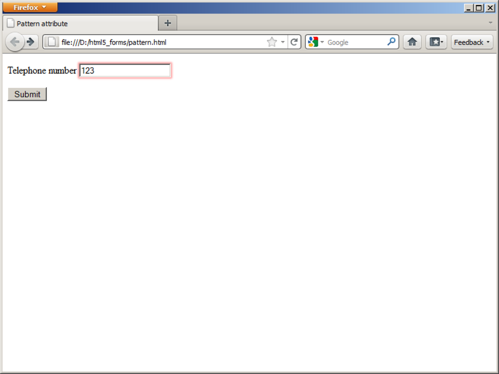
3.12. Restricting Values
Solution
Use the HTML5 pattern attribute
to specify a regular expression that will be used to
validate the user’s input:
<form>
    <p><label>Telephone number <input type="tel" name="phone"
        pattern="[2-9][0-9]{2}-[0-9]{3}-[0-9]{4}"
        title="North American format: XXX-XXX-XXXX"></label></p>
    <p><button type="submit">Submit</button></p>
</form>
Discussion
For years, web professionals have been writing validation scripts to check user data prior to form submissions—and most of us would likely say that we have hated it.
With HTML5, we have a method for checking form input that doesn’t rely on JavaScript: regular expressions.
Note
Regular expressions are very powerful and fun to write, once you get the hang of them. You don’t need to pore over a big book like O’Reilly’s Mastering Regular Expressions, by Jeffrey Friedl. Instead, the Regular Expressions Cookbook (also from O’Reilly) will help you to figure out how to define some common expressions. Then you’ll be ready for that big book in no time.
The HTML5 pattern attribute
allows you to specify a regular expression for an input field. On blur
of the input field or on submit of the form (browser implementations
vary), the user’s input will be validated against the pattern; if it
does not match, an error will be displayed and the form will not be
submitted, as shown in Figure 3-26.
Regular expressions for pattern
must use the same syntax as in JavaScript. Keep in mind that the
pattern attribute must match the
entire value, or else the user will see the error message.
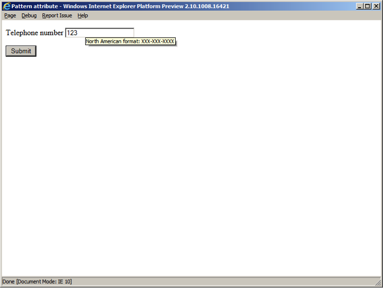
When the pattern attribute is
used, you should also specify a title
attribute to describe the pattern. The user agent may display this text
to the user as a tool tip or as an error if the submitted value does not
match the pattern, as shown in Figure 3-27.
If a user agent cannot compile the regular expression, it is
ignored and no validation will happen on that input. If a user agent
does not recognize the pattern
attribute, it, too, is ignored.
For a browser reference chart for pattern
attribute support, see Table 3-12.
IE | Firefox | Chrome | Safari | Opera | iOS | Android |
10 Platform Preview 2 | 4+ | 10+ | 5+ | 11+ | - | - |
Note
For tips on delivering a more consistent cross-browser experience, see Recipe 3.14.
See Also
As with the required attribute,
to keep up with browser support for pattern, check http://caniuse.com/form-validation. For a list of
commonly used regular expressions, see http://html5pattern.com.
3.13. Making HTML5 Work in Older Browsers
Problem
You want to make HTML5 input types and attributes work in browsers that do not support HTML5.
Solution
Use the Modernizr JavaScript library (see http://www.modernizr.com) to detect support for specific HTML5 attributes, then develop or use alternate solutions, such as jQuery UI (see http://jqueryui.com), for instances where features are not supported.
Note
Modernizr is a small, open source JavaScript library that detects native implementations of HTML5 and CSS3 features in browsers. Instead of performing browser detection in order to determine support, Modernizr performs individual feature detection. Modernizr is a very reliable way to detect support for HTML5 form features.
jQuery UI is a library of user interface design pattern implementations. It is based on and requires the jQuery JavaScript library, which is used by many of the top sites on the Web, including Google, Amazon, Twitter, and Microsoft. jQuery makes manipulating the DOM easy, and jQuery UI gives you easy-to-implement, themeable widgets.
Example 1: Supporting the autofocus attribute
Save Modernizr locally and call it in the head of your document:
<head>
    <script src="modernizer.js"></script>
</head>
Code your form using the autofocus attribute:
<form>
    <p><label>Search <input type="search" name="query" id="query"
        autofocus></label></p>
    <p><button type="submit">Submit</button></p>
</form>
Write a script to detect support for autofocus and, if it is not available, use
JavaScript to focus on the element. This script can appear immediately
after your form, to trigger the focus event as quickly as
possible:
<script>
    if (!Modernizr.input.autofocus) {
        document.getElementById("query").focus();
    }
</script>
Example 2: Supporting the placeholder attribute
Call Modernizr and jQuery in the head of your document:
<head>
    <script src="modernizer.js"></script>
    <script src="jquery.js"></script>
</head>
Code your form using the placeholder attribute:
<form id="search">
    <p><label>Search <input type="search" name="query" id="query" value=""
        placeholder="Enter query"></label></p>
    <p><button type="submit">Submit</button></p>
</form>
Write a script to detect support for placeholder and, if it is not available, use
JavaScript to toggle the display of the placeholder text in the input
field:
<script>
    if (!Modernizr.input.placeholder) {
        $("#query").focus(function() {
            if ($("#query").val() == $("#query").attr('placeholder')) {
                $("#query").val("");
            }
        });
        $("#query").blur(function() {
            if ($("#query").val() == "") {
                $("#query").val($("#query").attr('placeholder'));
            }
        });
        $("#query").blur();
        $("#search").submit(function() {
            if ($("#query").val() ==
        $("#query").attr('placeholder')) {
            return false;
            }
        });
    }
</script>
Even if you’ve never seen jQuery before, the above code is
probably very easy to read. jQuery uses CSS selector syntax to refer
to elements in the DOM, so $("#query") refers to the search input field
with an id of query. The focus() and blur() methods are chained onto the search
field, thus creating event handlers for when the field gains and loses
focus. Finally, when the search form is submitted, the value of the
search field is checked to ensure it’s not the same as the placeholder
copy; if it is, the form is not submitted.
When the blur event is triggered, the value (val) of the search field is set to the
placeholder attribute value,
provided the value was empty.
When the focus event is triggered, the value of the search field
is set to an empty string—but
only if the previous value was the same as the placeholder attribute text.
This script can appear immediately after the form, or it can be
combined with other scripts at the bottom of the body of your document.
Note
This techniques works well with all input types except password. Because browsers obscure the value of a password control, using the above solution results in your placeholder text appearing in an obscured manner. If you need to display placeholder text for a password input field, use JavaScript to insert the copy somewhere other than the value of the input.
Example 3: Supporting the date input type
Call Modernizr, jQuery, and jQuery UI in the head of your document (don’t forget the CSS
for jQuery UI!):
<head>
    <script src="modernizr.js"></script>
    <script src="jquery.js"></script>
    <script src="jquery-ui.js"></script>
    <link href="jquery-ui.css" rel="stylesheet">
</head>
Code your form using the date
input type:
<form>
<p><label>Date of Birth <input type="date" name="dob" id="dob"></label></p>
<p><button type="submit">Submit</button></p>
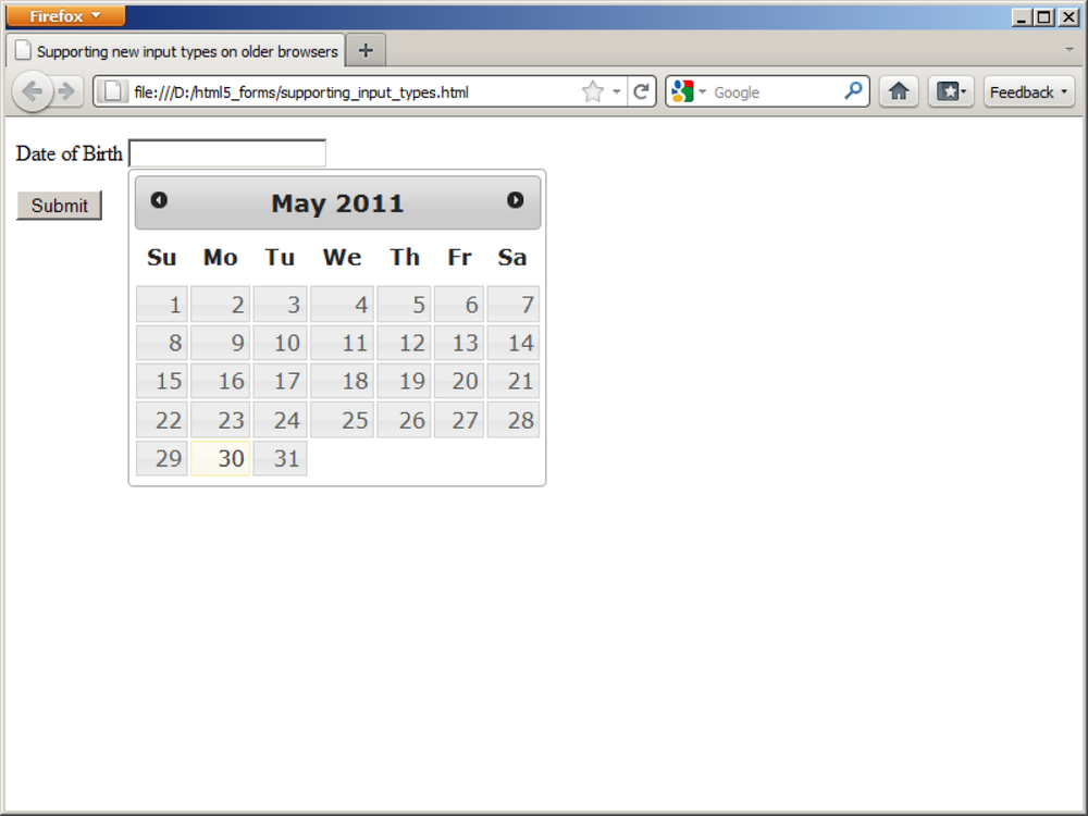
</form>Write a script to detect support for date and, if it is not available, trigger
jQuery UI’s date-picker widget:
<script>
    if (!Modernizr.inputtypes.datetime) {
        $("#dob").datepicker();
    }
</script>
I bet you’re surprised at how little code is needed for this
example, as compared to the previous one! This is the beauty of
adopting a reusable solution, like jQuery UI. Figure 3-28 shows
the result for a browser that does not natively support the date input type.
As in the previous example, this script can appear immediately
after the form, or it can be combined with other scripts at the bottom
of the body of your document.
Discussion
Remember that the new input types in HTML5 are derived from the solutions that developers have been creating with HTML and JavaScript for quite a while. This means it is fairly easy to find UI libraries that provide substitute functionality for browsers that do not yet support HTML5 forms.
In the future, when all of your users have upgraded to browsers that support HTML5 elements, input types, and attributes, you’ll be able to quickly and easily remove the scripts without needing to change your markup.
See Also
For a list of fallback solutions or polyfills, see https://github.com/Modernizr/Modernizr/wiki/HTML5-Cross-browser-Polyfills.
3.14. Validating Form Data in Older Browsers with JavaScript
Solution
Use the Modernizr JavaScript library (see http://www.modernizr.com) to detect support for specific HTML5 attributes and script alternate solutions when features are not supported. (Refer back to Recipe 3.13, for information on Modernizr and other JavaScript libraries.)
Save Modernizr locally and call it in the head of your document. We’ll also call jQuery
(see http://www.jquery.com) to make it easy to
reference the form element and to
attach an event handler:
<head>
    <script src="modernizer.js"></script>
    <script src="jquery.js"></script>
</head>
Code your form using HTML5 form validation attributes, such
as required and pattern:
<form>
    <fieldset>
        <legend>Login</legend>
        <p><label>Username <input type="text" name="username" required></label></p>
        <p><label>Password <input type="password" name="password" required
            pattern="[0-9a-zA-Z]{12}" title="Must be 12 alphanumeric
            characters"></label></p>
    </fieldset>
    <p><button type="submit">Submit</button></p>
</form>
Write a script to detect support for required and pattern and define alternate form handling if
support is not available:
<script>
if (!Modernizr.input.required || !Modernizr.input.pattern) {
    $('form').submit(function() {
        var validData = true;
        $('[required], [pattern]').each(function() {
            if (($(this).attr('required') !== false) && ($(this).val() == "")){
                $(this).focus();
                alert("The " + $(this).attr('name') + " field is required!");
                validData = false;
                return false;
            }
            if ($(this).attr('pattern')){
                var regexp = new RegExp($(this).attr('pattern'));
                if (!regexp.test($(this).val())){
                    $(this).focus();
                    alert("The data in the " + $(this).attr('name') +
                          " field isn't in the right format!");
                    validData = false;
                    return false;
                }
            }
        });
        return validData;
    });
}
</script>
Discussion
We’ve been validating forms with JavaScript for about 15 years, so
there are plenty of ways to require form field completion and to
validate data. What’s new about this solution is that it leverages the
HTML5 form attributes required and
pattern to establish the rules for validation, and
the JavaScript simply keys off of them. In the recent past, developers
have used the rel attribute
to perform a similar style of validation, but this is no
longer necessary (nor is it valid HTML5).
Again, when all of your users have upgraded to browsers that natively support HTML5 form validation, you’ll be able to quickly and easily remove the scripts without needing to change your markup.
See Also
Smashing Magazine’s listing of best practices and tutorials for web form validation at http://www.smashingmagazine.com/2009/07/07/web-form-validation-best-practices-and-tutorials/.
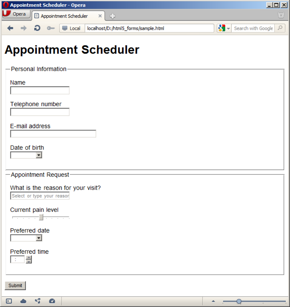
3.15. Example: Sample Form
Problem
You want to present a user with an appointment scheduling form, for example, for scheduling a doctor’s appointment.
Solution
<!DOCTYPE html>
<html>
<head>
<title>Appointment Scheduler</title>
</head>

<body>
<h1>Appointment Scheduler</h1>

<form>

    <fieldset>
        <legend>Personal Information</legend>
        <p><label>Name <input type="text" name="name" required></label></p>
        <p><label>Telephone number <input type="tel" name="phone" required
            pattern="[2-9][0-9]{2}-[0-9]{3}-[0-9]{4}" title="North American format:
            XXX-XXX-XXXX"></label></p>
        <p><label>E-mail address <input type="email" name="email"></label></p>
        <p><label>Date of birth <input type="date" name="dob"></label></p>
    </fieldset>

    <fieldset>
        <legend>Appointment Request</legend>
        <p><label for="reason">What is the reason for your visit?</label>
        <datalist id="reasons">
            <select name="reason">
                <option>Annual physical</option>
                <option>Cold or flu symptoms</option>
                <option>Blood test</option>
                <option>Post-operative</option>
                <option>Other</option>
            </select>
        If other, please specify:
        </datalist>
        <input id="reason" name="reason" list="reasons"></p>
        <p><label>Current pain level <input type="range" name="pain" min="0"
            max="10" step=".5" value="5" title="0 is no pain, 10 is worst pain
            imaginable"></label></p>
        <p><label>Preferred date <input type="date" name="date" required
            min="2011-03-15" max="2012-03-14"></label></p>
        <p><label>Preferred time <input type="time" name="time" required
            min="08:00" max="18:00" step="1:00"></label></p>
    </fieldset>

    <p><button type="submit">Submit</button></p>
</form>

</body>
</html>
Discussion
This is the future of form markup, my friends! When rendered in a browser that fully supports HTML5 forms, the only thing this form will want for is some CSS—no JavaScript necessary! It will render nicely across a variety of devices and be much more accessible than what we use today, as shown in Figure 3-29.
When will we have full support in the majority of browsers for HTML5 forms? Opera is leading the way in support, but Firefox and Chrome are on rapid release cycles and are catching up quickly.
The second Internet Explorer Platform Preview was released during the writing of this chapter and it, too, shows good progress.
See Also
Chapter 8 of CSS Cookbook by Christopher Schmitt (O’Reilly), for a discussion of styling forms.