
Chapter 10
Charming Charts and Gorgeous Graphics
In This Chapter
![]() Creating great-looking charts with just a few clicks
Creating great-looking charts with just a few clicks
![]() Customizing the chart from the Chart Tools contextual tab
Customizing the chart from the Chart Tools contextual tab
![]() Representing data visually with sparklines
Representing data visually with sparklines
![]() Adding a text box and arrow to a chart
Adding a text box and arrow to a chart
![]() Inserting clip art into your worksheets
Inserting clip art into your worksheets
![]() Adding WordArt and SmartArt to a worksheet
Adding WordArt and SmartArt to a worksheet
![]() Printing a chart without printing the rest of the worksheet data
Printing a chart without printing the rest of the worksheet data
As Confucius was reported to have once said, “A picture is worth a thousand words” (or, in our case, numbers). By adding charts to worksheets, you not only heighten interest in the otherwise boring numbers, but also illustrate trends and anomalies that may not be apparent from just looking at the values alone. Because Excel 2013 makes it so easy to chart the numbers in a worksheet, you can also experiment with different types of charts until you find the one that best represents the data — in other words, the picture that best tells the particular story.
Making Professional-Looking Charts
I just want to say a few words about charts in general before taking you through the steps for making them in Excel 2013. Remember your high-school algebra teacher valiantly trying to teach you how to graph equations by plotting different values on an x-axis and a y-axis on graph paper? Of course, you were probably too busy with more important things like cool cars and rock ’n’ roll to pay too much attention to an old algebra teacher. Besides, you probably told yourself, “I’ll never need this junk when I’m out on my own and get a job!”
Well, see, you just never know. It turns out that even though Excel automates almost the entire process of charting worksheet data, you may need to be able to tell the x-axis from the y-axis, just in case Excel doesn’t draw the chart the way you had in mind. To refresh your memory and make your algebra teacher proud, the x-axis is the horizontal axis, usually located along the bottom of the chart; the y-axis is the vertical one, usually located on the left side of the chart.
In most charts that use these two axes, Excel plots the categories along the x-axis at the bottom and their relative values along the y-axis on the left. The x-axis is referred to as the Category axis, while the y-axis is referred to as the Value axis. Often, the x-axis can be thought of as the time axis because the chart often depicts values along this axis in time periods, such as months, quarters, years, and so on.
 Worksheet values represented graphically in the chart remain dynamically linked to the chart so that, should you make a change to one or more of the charted values in the worksheet, Excel automatically updates the affected part of the chart to suit.
Excel 2013 offers you many quick and easy ways to chart your data. Before you use any of these methods, you need to indicate the data you want graphed. To do this, you simply position the cell pointer somewhere within the data table to select one of its cells. If, however, you want to chart only a part of the data within a larger table, in that case, you must select the values and headings you want included in the new chart.
Charts thanks to Recommendation
My personal favorite way to create a new chart in Excel 2013 is with the new Recommended Charts command button on the Insert tab of the Ribbon (Alt+NR). When you use this method, Excel opens the Insert Chart dialog box with the Recommended Charts tab selected, similar to the one shown in Figure 10-1. Here, you can preview how your data will appear in different types of charts by simply clicking its thumbnail in the list box on the left. When you find the type of chart you want to create, you then simply click the OK button to have it embedded into the current worksheet.

Figure 10-1: Insert Chart dialog box with the Recom-mended Charts tab selected.
Charts from the Ribbon
To the right of the Recommended Charts button in the Charts group of the Ribbon’s Insert tab, you find particular command buttons with drop-down galleries for creating the following types and styles of charts:
![]() Insert Column Chart to preview your data as a 2-D or 3-D vertical column chart
Insert Column Chart to preview your data as a 2-D or 3-D vertical column chart
![]() Insert Bar Chart to preview your data as a 2-D or 3-D horizontal bar chart
Insert Bar Chart to preview your data as a 2-D or 3-D horizontal bar chart
![]() Insert Stock, Surface or Radar Chart to preview your data as a 2-D stock chart (using typical stock symbols), 2-D or 3-D surface chart, or 3-D radar chart
Insert Stock, Surface or Radar Chart to preview your data as a 2-D stock chart (using typical stock symbols), 2-D or 3-D surface chart, or 3-D radar chart
![]() Insert Line Chart to preview your data as a 2-D or 3-D line chart
Insert Line Chart to preview your data as a 2-D or 3-D line chart
![]() Insert Area Chart to preview your data as a 2-D or 3-D area chart
Insert Area Chart to preview your data as a 2-D or 3-D area chart
![]() Insert Combo Chart to preview your data as a 2-D combo clustered column and line chart or clustered column and stacked area chart
Insert Combo Chart to preview your data as a 2-D combo clustered column and line chart or clustered column and stacked area chart
![]() Insert Pie or Doughnut Chart to preview your data as a 2-D or 3-D pie chart or 2-D doughnut chart
Insert Pie or Doughnut Chart to preview your data as a 2-D or 3-D pie chart or 2-D doughnut chart
![]() Insert Scatter (X,Y) or Bubble Chart to preview your data as a 2-D scatter (X,Y) or bubble chart
Insert Scatter (X,Y) or Bubble Chart to preview your data as a 2-D scatter (X,Y) or bubble chart
When using the galleries attached to these chart command buttons on the Insert tab to preview your data as a particular chart style, you can embed the chart in your worksheet by simply clicking its chart icon.
If you’re not sure what type of chart best represents your data, rather than go through the different chart type buttons on the Ribbon’s Insert tab, you can use the All Charts tab of the Insert Chart dialog box shown in Figure 10-2 to try out your data in different chart types and styles. You can open the Insert Chart dialog box by clicking the Dialog Box launcher in lower-right corner of the Charts group on the Insert tab and then display the complete list of chart types by clicking the All Charts tab in this dialog box.
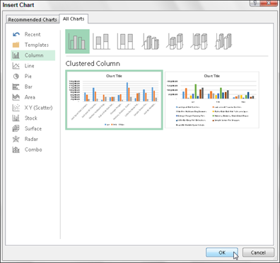
Figure 10-2: Insert Chart dialog box with the All Charts tab selected where you can preview and select from a wide variety of chart types and styles.
Charts via the Quick Analysis tool
For those times when you need to select a subset of a data table as the range to be charted (as opposed to selecting a single cell within a data table), you can use the new Quick Analysis tool to create your chart. Just follow these steps:
1. Click the Quick Analysis tool that appears right below the lower-right corner of the current cell selection.
Doing this opens the palette of Quick Analysis options with the initial Formatting tab selected and its various conditional formatting options displayed.
2. Click the Charts tab at the top of the Quick Analysis options palette.
Excel selects the Charts tab and displays its Clustered Bar, Stacked Bar, Clustered Column, Scatter, Stacked Column, and More Charts option buttons. The first five chart type buttons preview how the selected data in a different type of chart will look. The final More Charts button opens the Insert Chart dialog box with the Recommended Charts tab selected. Here you can preview and select a chart from an even wider range of chart types.
3. In order to preview each type of chart that Excel 2013 can create using the selected data, highlight its chart type button in the Quick Analysis palette.
As you highlight each chart type button in the options palette, Excel’s Live Preview feature displays a large thumbnail of the chart that will be created from your table data. This thumbnail appears above the Quick Analysis options palette for as long as the mouse or Touch Pointer is over its corresponding button.
4. When a preview of the chart you actually want to create appears, click its button in the Quick Analysis options palette to create it.
Excel 2013 then creates a free-floating chart (called an embedded chart) within the current worksheet. This embedded chart is active so that you can immediately move it and edit it as you wish.
Figures 10-3 and 10-4 show you how this procedure works. In Figure 10-3, I’ve selected only the first quarter sales figures (with their column headings) in the much larger YTD spreadsheet. After selecting the range and clicking the Quick Analysis tool that appears in the lower-right corner of the cell selection, I clicked the Charts tab and then highlighted the Clustered Column chart type button in the Quick Analysis tool’s option palette. The previewed clustered column chart then appears in the thumbnail displayed above the palette.
Figure 10-4 shows you the embedded chart created by clicking the Clustered Column chart type button in the Quick Analysis tool’s palette. When first created, the new chart is active and its chart area is automatically selected. When this is the case, you can move the entire chart to a new part of the worksheet by dragging it. While the chart area is selected, Excel outlines and highlights the data represented in the chart in red for the headings used in the chart legend, in purple for the headings used as labels along the horizontal, Category or x-axis, and in blue for the values represented graphically by the bars in the chart and in the vertical, Value or y-axis. In addition, the Chart Tools contextual tab with its Design and Format tabs are added to the Ribbon and the Design tab, with its options for making further design changes, is selected.

Figure 10-3: Previewing the clustered column chart to be created from the selected data via the Quick Analysis tool.
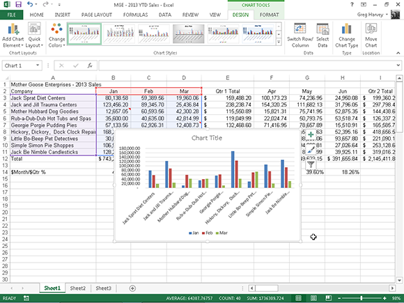
Figure 10-4: Embedded clustered column chart after creating it in the worksheet with the Quick Analysis tool.
Charts on their own chart sheets
Sometimes you know you want your new chart to appear on its own separate sheet in the workbook and you don’t have time to fool around with moving an embedded chart created with the Quick Analysis tool or the various chart command buttons on the Insert tab of the Ribbon to its own sheet. In such a situation, simply position the cell pointer somewhere in the table of data to be graphed (or select the specific cell range in a larger table) and then just press F11.
Excel then creates a clustered column chart using the table’s data or cell selection on its own chart sheet (Chart1) that precedes all the other sheets in the workbook (see Figure 10-5). You can then customize the chart on the new chart sheet as you would an embedded chart that’s described later in the chapter.
Moving and resizing embedded charts
Right after you create a new embedded chart in a worksheet, you can easily move or resize the chart because the chart is still selected. You can always tell when an embedded chart is selected because the chart is outlined with a thin double-line and you see sizing handles — those squares at the four corners and midpoints of the outline that appears around the perimeter of the chart. In addition, the following three buttons appear in the upper-right corner of the outlined chart:
![]() Chart Elements button with the plus sign icon to modify chart elements such as the chart titles, legends, gridlines, error bars, and trendlines
Chart Elements button with the plus sign icon to modify chart elements such as the chart titles, legends, gridlines, error bars, and trendlines
![]() Chart Styles button with the paintbrush icon to modify the chart layout and color scheme
Chart Styles button with the paintbrush icon to modify the chart layout and color scheme
![]() Chart Filters with the cone filter icon to modify the data series represented in the chart or the labels displayed in the legend or along the Category axis
Chart Filters with the cone filter icon to modify the data series represented in the chart or the labels displayed in the legend or along the Category axis
Whenever an embedded chart is selected (as it is automatically immediately after creating it or after clicking any part of it), the Chart Tools contextual tab with its Design, Layout, and Format tabs appears on the Ribbon, and Excel outlines each group of cells represented in the selected chart in a different color in the worksheet.
When an embedded chart is selected in a worksheet, you can move or resize it as follows:
![]() To move the chart, position the mouse pointer or Touch Pointer in a blank area inside the chart and drag the chart to a new location.
To move the chart, position the mouse pointer or Touch Pointer in a blank area inside the chart and drag the chart to a new location.
![]() To resize the chart (you may want to make it bigger if it seems distorted in any way), position the mouse pointer or Touch Pointer on one of the sizing handles. When the pointer changes from the arrowhead to a double-headed arrow, drag the side or corner (depending on which handle you select) to enlarge or reduce the chart.
To resize the chart (you may want to make it bigger if it seems distorted in any way), position the mouse pointer or Touch Pointer on one of the sizing handles. When the pointer changes from the arrowhead to a double-headed arrow, drag the side or corner (depending on which handle you select) to enlarge or reduce the chart.
When the chart is properly sized and positioned in the worksheet, set the chart in place by deselecting it (simply click any cell outside the chart). As soon as you deselect the chart, the sizing handles disappear, as does the Chart Elements, Chart Styles, and Chart Filters buttons along with the Chart Tools contextual tab from the Ribbon.
To re-select the chart later to edit, size, or move it again, just click anywhere on the chart with the mouse pointer. The moment you do, the sizing handles return to the embedded chart and the Chart Tools contextual tab appears on the Ribbon.
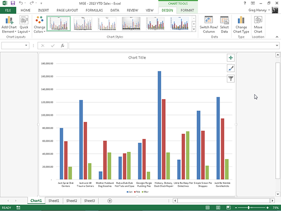
Figure 10-5:New clustered column chart on its own chart sheet instantly created from selected data by pressing F11.
Moving embedded charts to chart sheets
Although Excel automatically embeds all new charts on the same worksheet as the data they graph (unless you create the chart by using my F11 trick), you may find it easier to customize and work with it if you move the chart to its own chart sheet in the workbook. To move an embedded chart to its own chart sheet in the workbook, follow these steps:
1. Select the chart and then click the Move Chart button on the Design tab under the Chart Tools contextual tab to open the Move Chart dialog box.
2. Click the New Sheet button in the Move Chart dialog box.
3. (Optional) Rename the generic Chart1 sheet name in the accompanying text box by entering a more descriptive name.
4. Click OK to close the Move Chart dialog box and open the new chart sheet with your chart.
 If, after customizing the chart on its own sheet, you decide you want the finished chart to appear on the same worksheet as the data it represents, click the Move Chart button on the Design tab again. This time, click the Object In button and then select the name of the worksheet in its associated drop-down list box before you click OK.
Customizing charts from the Design tab
You can use the command buttons on the Design tab of the Chart Tools contextual tab to make all kinds of changes to your new chart. The Design tab contains the following groups of buttons to use:
![]() Chart Layouts: Click the Add Chart Element button to modify particular elements in the chart such as the titles, data labels, legend, and so on (note that most of the chart element options on this drop-down menu are duplicated on the chart elements palette that appears when you click the Chart Elements button in the worksheet to the right of a selected embedded chart). Click the Quick Layout button to select a new layout for the selected chart.
Chart Layouts: Click the Add Chart Element button to modify particular elements in the chart such as the titles, data labels, legend, and so on (note that most of the chart element options on this drop-down menu are duplicated on the chart elements palette that appears when you click the Chart Elements button in the worksheet to the right of a selected embedded chart). Click the Quick Layout button to select a new layout for the selected chart.
![]() Chart Styles: Click the Change Colors button to display a pop-up palette with different colorful and monochromatic color schemes that you can apply to your chart. Highlight the various chart styles in the Chart Styles gallery to preview and select a style for the current type of chart.
Chart Styles: Click the Change Colors button to display a pop-up palette with different colorful and monochromatic color schemes that you can apply to your chart. Highlight the various chart styles in the Chart Styles gallery to preview and select a style for the current type of chart.
![]() Data: Click the Switch Row/Column button to interchange the worksheet data used for the Legend Entries (series) with that used for the Axis Labels (Categories) in the selected chart. Click the Select Data button to open the Select Data Source dialog box where you can not only interchange the Legend Entries (series) with the Axis Labels (Categories), but also edit out or add particular entries to either category.
Data: Click the Switch Row/Column button to interchange the worksheet data used for the Legend Entries (series) with that used for the Axis Labels (Categories) in the selected chart. Click the Select Data button to open the Select Data Source dialog box where you can not only interchange the Legend Entries (series) with the Axis Labels (Categories), but also edit out or add particular entries to either category.
![]() Type: Click the Change Chart Type button to open the All Charts tab of the Change Chart Type dialog box where you can preview and select a new type of chart to represent your data.
Type: Click the Change Chart Type button to open the All Charts tab of the Change Chart Type dialog box where you can preview and select a new type of chart to represent your data.
![]() Location: Click the Move Chart button to move the chart to a new chart sheet or another worksheet.
Location: Click the Move Chart button to move the chart to a new chart sheet or another worksheet.
Customizing chart elements
The Chart Elements button (with the plus sign icon) that appears when your chart is selected contains a list of the major chart elements that you can add to your chart. To add an element to your chart, click the Chart Elements button to display an alphabetical list of all the elements, Axes through Trendline. To add a particular element missing from the chart, select the element’s check box in the list to put a check mark in it. To remove a particular element currently displayed in the chart, select the element’s check box to remove its check mark.
To add or remove just part of a particular chart element or, in some cases as with the Chart Title, Data Labels, Data Table, Error Bars, Legend, and Trendline, to also specify its layout, you select the desired option on the element’s continuation menu.
So, for example, to reposition a chart’s title, you click the continuation button attached to Chart Title on the Chart Elements menu to display and select from among the following options on its continuation menu:
![]() Above Chart to add or reposition the chart title so that it appears centered above the plot area
Above Chart to add or reposition the chart title so that it appears centered above the plot area
![]() Centered Overlay Title to add or reposition the chart title so that it appears centered at the top of the plot area
Centered Overlay Title to add or reposition the chart title so that it appears centered at the top of the plot area
![]() More Options to open the Format Chart Title task pane on the right side of the Excel window where you can use the options that appear when you select the Fill & Line, Effects, and Size and Properties buttons under Title Options and the Text Fill & Outline, Text Effects, and the Textbox buttons under Text Options in this task pane to modify almost any aspect of the title’s formatting
More Options to open the Format Chart Title task pane on the right side of the Excel window where you can use the options that appear when you select the Fill & Line, Effects, and Size and Properties buttons under Title Options and the Text Fill & Outline, Text Effects, and the Textbox buttons under Text Options in this task pane to modify almost any aspect of the title’s formatting
Adding data labels
Data labels identify the data points in your chart (that is, the columns, lines, and so forth used to graph your data) by displaying values from the cells of the worksheet represented next to them. To add data labels to your selected chart and position them, click the Chart Elements button next to the chart and then select the Data Labels check box before you select one of the following options on its continuation menu:
![]() Center to position the data labels in the middle of each data point
Center to position the data labels in the middle of each data point
![]() Inside End to position the data labels inside each data point near the end
Inside End to position the data labels inside each data point near the end
![]() Inside Base to position the data labels at the base of each data point
Inside Base to position the data labels at the base of each data point
![]() Outside End to position the data labels outside of the end of each data point
Outside End to position the data labels outside of the end of each data point
![]() Data Callout to add text labels and values that appear within text boxes that point to each data point
Data Callout to add text labels and values that appear within text boxes that point to each data point
![]() More Options to open the Format Data Labels task pane on the right side where you can use the options that appear when you select the Fill & Line, Effects, Size & Properties, and Label Options buttons under Label Options and the Text Fill & Outline, Text Effects, and Textbox buttons under Text Options in the task pane to customize almost any aspect of the appearance and position of the data labels
More Options to open the Format Data Labels task pane on the right side where you can use the options that appear when you select the Fill & Line, Effects, Size & Properties, and Label Options buttons under Label Options and the Text Fill & Outline, Text Effects, and Textbox buttons under Text Options in the task pane to customize almost any aspect of the appearance and position of the data labels
Adding data tables
Sometimes, instead of data labels that can easily obscure the data points in the chart, you’ll want Excel to draw a data table beneath the chart showing the worksheet data it represents in graphic form.
To add a data table to your selected chart and position and format it, click the Chart Elements button next to the chart and then select the Data Table check box before you select one of the following options on its continuation menu:
![]() With Legend Keys to have Excel draw the table at the bottom of the chart, including the color keys used in the legend to differentiate the data series in the first column
With Legend Keys to have Excel draw the table at the bottom of the chart, including the color keys used in the legend to differentiate the data series in the first column
![]() No Legend Keys to have Excel draw the table at the bottom of the chart without any legend
No Legend Keys to have Excel draw the table at the bottom of the chart without any legend
![]() More Options to open the Format Data Table task pane on the right side where you can use the options that appear when you select the Fill & Line, Effects, Size & Properties, and Table Options buttons under Table Options and the Text Fill & Outline, Text Effects, and Textbox buttons under Text Options in the task pane to customize almost any aspect of the data table
More Options to open the Format Data Table task pane on the right side where you can use the options that appear when you select the Fill & Line, Effects, Size & Properties, and Table Options buttons under Table Options and the Text Fill & Outline, Text Effects, and Textbox buttons under Text Options in the task pane to customize almost any aspect of the data table
Figure 10-6 illustrates how the sample clustered column chart looks with a data table added to it. This data table includes the legend keys as its first column.
If you decide that displaying the worksheet data in a table at the bottom of the chart is no longer necessary, simply click the None option on the Data Table button’s drop-down menu on the Layout tab of the Chart Tools contextual tab.
Editing the generic titles in a chart
When Excel first adds titles to a new chart, it gives them generic names, such as Chart Title and Axis Title (for both the x- and y-axis title). To replace these generic titles with the actual chart titles, click the title in the chart or click the name of the title on the Chart Elements drop-down list. (Chart Elements is the first drop-down button in the Current Selection group on the Format tab under Chart Tools. Its text box displays the name of the element currently selected in the chart.) Excel lets you know that a particular chart title is selected by placing selection handles around its perimeter.

Figure 10-6: Embedded clustered column chart with data table with legend keys.
After you select a title, you can click the insertion point in the text and then edit as you would any worksheet text or you can click to select the title, type the new title, and press Enter to completely replace it with the text you type. To force part of the title onto a new line, click the insertion point at the place in the text where the line break is to occur. After the insertion point is positioned in the title, press Enter to start a new line.
After you finish editing the title, click somewhere else on the chart area to deselect it (or a worksheet cell if you’ve finished formatting and editing the chart).
Formatting the chart titles
When you add titles to your chart, Excel uses the Calibri (Body) font for the chart title (in 14-point size) and the x- and y-axis (in 10-point size). To change the font used in a title or any of its attributes, select the title and then use the appropriate command buttons in the mini-toolbar that appears next to the selected title or from the Font group on the Home tab.
Use Live Preview to see how a particular font or font size for the selected chart title looks in the chart before you select it. Simply click the Font or Font Size drop-down buttons and then highlight different font names or sizes to have the selected chart title appear in them.
If you need to change other formatting options for the titles in the chart, you can do so using the command buttons on the Format tab of the Chart Tools contextual tab. To format the entire text box that contains the title, click one of the following buttons in the Shape Styles group:
![]() Shape Styles thumbnail in its drop-down gallery to format both the text and text box for the selected chart title
Shape Styles thumbnail in its drop-down gallery to format both the text and text box for the selected chart title
![]() Shape Fill button to select a new color for the text box containing the selected chart title from its drop-down palette
Shape Fill button to select a new color for the text box containing the selected chart title from its drop-down palette
![]() Shape Outline button to select a new color for the outline of the text box for the selected chart text from its drop-down palette
Shape Outline button to select a new color for the outline of the text box for the selected chart text from its drop-down palette
![]() Shape Effects button to apply a new effect (Shadow, Reflection, Glow, Soft Edges, and so on) to the text box containing the selected chart title from its drop-down list
Shape Effects button to apply a new effect (Shadow, Reflection, Glow, Soft Edges, and so on) to the text box containing the selected chart title from its drop-down list
To format just the text in chart titles, click one of the buttons in the WordArt Styles group:
![]() WordArt Styles thumbnail in its drop-down gallery to apply a new WordArt style to the text of the selected chart title
WordArt Styles thumbnail in its drop-down gallery to apply a new WordArt style to the text of the selected chart title
![]() Text Fill button to select a new fill color for the text in the selected chart title from its gallery
Text Fill button to select a new fill color for the text in the selected chart title from its gallery
![]() Text Outline button (immediately below the Text Fill button) to select a new outline color for the text in the selected chart title from its drop-down palette
Text Outline button (immediately below the Text Fill button) to select a new outline color for the text in the selected chart title from its drop-down palette
![]() Text Effects button (immediately below the Text Outline button) to apply a text effect (Shadow, Reflection, Glow, Bevel, and so on) to the text of the selected chart title from its drop-down list
Text Effects button (immediately below the Text Outline button) to apply a text effect (Shadow, Reflection, Glow, Bevel, and so on) to the text of the selected chart title from its drop-down list
Formatting the x- and y-axis
When charting a bunch of values, Excel isn’t too careful how it formats the values that appear on the y-axis (or the x-axis when using some chart types, such as the 3-D Column chart or an XY Scatter chart).
If you’re not happy with the way the values appear on either the x-axis or y-axis, you can easily change the formatting as follows:
1. Click the x-axis or y-axis directly in the chart or click the Chart Elements button (the first button in the Current Selection group of the Format tab) and then click Horizontal (Category) Axis (for the x-axis) or Vertical (Value) Axis (for the y-axis) on its drop-down list.
Excel surrounds the axis you select with selection handles.
2. Click the Format Selection button in the Current Selection group of the Format tab.
Excel opens the Format Axis task pane with Axis Options under the Axis Options group selected.
3. To change the scale of the axis, the appearance of its tick marks, and where it crosses the other axis, change the appropriate options under Axis Options (automatically selected when you first open the Format Axis task pane) as needed.
These options include those that fix the maximum and minimum amount for the first and last tick mark on the axis, display the values in reverse order (highest to lowest), and apply a logarithmic scale. You can display units on the axis (hundreds, thousands, millions, and so forth) and divide the values by those units, reposition the tick marks on the axis, and modify the value at which the other axis (y-axis when modifying the x-axis and x-axis when modifying the y-axis) crosses.
4. To change the number formatting for all values on the selected axis, click the Number option and then select the number format you want to apply in the Category drop-down list box followed by the appropriate options associated with that format. To assign the same number formatting to the values on the selected axis as assigned to the values in their worksheet cells, simply select the Linked To Source check box.
For example, to select the number format with the comma as the thousands separator and no decimal places, you select Number on the Category drop-down list box; then leave the Use 1000 Separator (,) check box selected and enter 0 in the Decimal Places text box.
5. To change the alignment and orientation of the labels on the selected axis, click the Size & Properties button under Axis Options on the Format Axis task pane. Then, indicate the new orientation by clicking the desired vertical alignment in the Vertical Alignment drop-down list box and desired text direction in the Text Direction drop-down list.
6. Click the Close button to close the Format Axis task pane.
As you choose new options for the selected axis, Excel 2013 shows you the change in the chart. However, these changes are set in the chart only when you click Close in the Format Axis dialog box.
To change the default font, font size, or other text attributes for entries along the selected x- or y-axis, click the appropriate command buttons in the Font group on the Home tab (see Chapter 3 for details).
Adding Great-Looking Graphics
Charts are not the only kind of graphic objects you can add to a worksheet. Indeed, Excel lets you spruce up a worksheet with a whole bevy of graphics, including sparklines (new tiny charts that fit right inside worksheet cells), text boxes, clip art drawings supplied by Microsoft, as well as graphic images imported from other sources, such as digital photos, scanned images, and pictures downloaded from the Internet.
In addition to these graphics, Excel 2013 supports the creation of fancy graphic text called WordArt as well as a whole bevy of organizational and process diagrams known collectively as SmartArt graphics.
Sparking up the data with sparklines
Excel 2013 supports a special type of information graphic called a sparkline that represents trends or variations in collected data. Sparklines are tiny graphs generally about the size of the text that surrounds them. In Excel 2013, sparklines are the height of the worksheet cells whose data they represent and can be any of the following chart types:
![]() Line that represents the relative value of the selected worksheet data
Line that represents the relative value of the selected worksheet data
![]() Column where the selected worksheet data is represented by tiny columns
Column where the selected worksheet data is represented by tiny columns
![]() Win/Loss where the selected worksheet data appears as a win/loss chart; wins are represented by blue squares that appear above red squares (representing the losses)
Win/Loss where the selected worksheet data appears as a win/loss chart; wins are represented by blue squares that appear above red squares (representing the losses)
Sparklines via the Quick Analysis tool
In Excel 2013, you can use the new Quick Analysis tool to quickly add sparklines to your data. All you have to do is select the cells in the worksheet to be visually represented, click the Quick Analysis tool followed by Sparklines on its options palette. This displays buttons for the three types of sparklines: Line, Column, and Win/Loss. To preview how your data looks with each type of sparklines, highlight the button in the palette with the mouse pointer or Touch Pointer. Then, to add the previewed sparklines to your worksheet, simply click the appropriate Sparklines button.
Figure 10-7 shows the sample Mother Goose Enterprises worksheet with the first quarter sales after I selected the cell range B3:D11 and then opened the Sparklines tab in the Quick Analysis tool’s palette. Excel immediately previews line-type trendlines in the cell range E3:E11 of the worksheet. To add these trendlines, all you have to do is click the Line option in the tool’s palette.
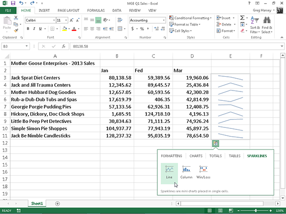
Figure 10-7: Previewing sparklines to visually represent the trends in the three-month sales for each company in the Quick Analysis tool’s Sparklines palette.
Sparklines from the Ribbon
You can also add sparklines the good old-fashioned way using the Sparklines command buttons on the Insert tab of the Ribbon. To manually add sparklines to the cells of your worksheet:
1. Select the cells in the worksheet with the data you want to represent with sparklines.
2. Click the chart type you want for your sparklines (Line, Column, or Win/Loss) in the Sparklines group of the Insert tab or press Alt+NSL for Line, Alt+NSO for Column, or Alt+NSW for Win/Loss.
Excel opens the Create Sparklines dialog box containing two text boxes:
• Data Range: Shows the cells you select with the data you want to graph.
• Location Range: Lets you designate the cell or cell range where you want the sparklines to appear.
3. Select the cell or cell range where you want your sparklines to appear in the Location Range text box and then click OK.
When creating sparklines that span more than a single cell, the number of rows and columns in the location range must match the number of rows and columns in the data range. (That is, the arrays need to be of equal size and shape.)
Because sparklines are so small, you can easily add them to the cells in the final column of a table. That way, the sparklines (shown in Figure 10-7) can depict the data visually and enhance meaning while being an integral part of the table.
Formatting sparklines
After you add sparklines to your worksheet, Excel 2013 adds a Sparkline Tools contextual tab with its own Design tab to the Ribbon that appears when the cell or range with the sparklines is selected.
This Design tab contains buttons that you can use to edit the type, style, and format of the sparklines. The final group (called Group) on this tab enables you to band a range of sparklines into a single group that can share the same axis and/or minimum or maximum values (selected using the options on the Axis drop-down button). This is very useful when you want a collection of sparklines to share the same charting parameters so that they represent the trends in the data equally.
You can’t delete sparklines from a cell range by selecting the cells and then pressing the Delete button. Instead, to remove sparklines, right-click their cell range and select Sparklines⇒Clear Selected Sparklines from its context menu.
Telling all with a text box
Text boxes, as their name implies, are boxes in which you can add commentary or explanatory text to the charts you create in Excel. They’re like Excel comments (see Chapter 6) that you add to worksheet cells except that you have to add the arrow if you want the text box to point to something in the chart.
In Figure 10-8, you see a clustered column chart for the MGE (Mother Goose Enterprises) 2013 First Quarter Sales. I added a text box with an arrow that points out how extraordinary the sales were for the Hickory, Dickory, Doc Clock Shops in this quarter and formatted the values on the y-axis with the Currency number format with zero decimal places.
Adding and formatting a text box
To add a text box like the one shown in Figure 10-8 to the chart when a chart is selected, select the Format tab under the Chart Tools contextual tab. Then, click the Insert Shapes drop-down button to open its palette where you select the Text Box button (the very first button in the Basic Shapes section).

Figure 10-8: Clustered column chart, with added text box and formatted y-axis values.
To insert a text box in a worksheet when a chart or some other type of graphic isn’t selected, you can open the Insert tab on the Ribbon and then click the Text Box option on the Text button’s drop-down palette.
Excel then changes the mouse pointer or Touch Pointer to a narrow vertical line with a short cross near the bottom. Click the location where you want to draw the text box and then draw the box by dragging its outline. When you release the mouse button or remove your finger or stylus after dragging this pointer, Excel draws a text box in the shape and size of the outline.
After creating a horizontal text box, the program positions the insertion point at the top left, and you can then type the text you want to appear within it. The text you type appears in the text box and will wrap to a new line should you reach the right edge of the text box. You can press Enter when you want to force text to appear on a new line. When you finish entering the message for your text box, click anywhere outside the box to deselect it.
After adding a text box to a chart or worksheet while it’s still selected, you can edit it as follows:
![]() Move the text box to a new location in the chart by dragging it.
Move the text box to a new location in the chart by dragging it.
![]() Resize the text box by dragging the appropriate sizing handle.
Resize the text box by dragging the appropriate sizing handle.
![]() Rotate the text box by dragging its rotation handle (the green circle at the top) in a clockwise or counterclockwise direction.
Rotate the text box by dragging its rotation handle (the green circle at the top) in a clockwise or counterclockwise direction.
![]() Modify the formatting and appearance of the text box using the various command buttons in the Shape Styles group on the Format tab under the Drawing Tools contextual tab
Modify the formatting and appearance of the text box using the various command buttons in the Shape Styles group on the Format tab under the Drawing Tools contextual tab
![]() Delete the text box by clicking its perimeter so that the dotted lines connecting the selection handles become solid and then pressing the Delete key.
Delete the text box by clicking its perimeter so that the dotted lines connecting the selection handles become solid and then pressing the Delete key.
Adding an arrow to a text box
When creating a text box, you may want to add an arrow to point directly to the object or part of the chart you’re referencing. To add an arrow, follow these steps:
1. Click the text box to which you want to attach the arrow in the chart or worksheet.
Sizing handles appear around the text box and the Format tab under the Drawing Tools contextual tab is added to the Ribbon.
2. Click the Format tab by the Arrow command button in the Insert Shapes drop-down gallery.
The Arrow command button is the second from the left in the row in the Lines section (with the picture of an arrow) of the gallery. When you click this button, the mouse pointer or Touch Pointer assumes the crosshair shape.
3. Drag the crosshair pointer from the place on the text box where the end of the arrow (the one without the arrowhead) is to appear to the place where the arrow starts (and the arrowhead will appear) and release the mouse button or remove your finger or stylus from the touchscreen.
As soon as you do this, Excel draws two points, one at the base of the arrow (attached to the text box) and another at the arrowhead. At the same time, the contents of the Shape Styles drop-down gallery changes to line styles.
4. Click the More button in the lower-right corner of the Shape Styles drop-down gallery to display the thumbnails of all its line styles and then highlight the thumbnails to see how the arrow would look in each.
As you move through the different line styles in this gallery, Excel draws the arrow between the two selected points in the text box using the highlighted style.
5. Click the thumbnail of the line style you want the new arrow to use in the Shape Styles gallery.
Excel then draws a new arrow using the selected shape style, which remains selected (with selection handles at the beginning and end of the arrow). You can then edit the arrow as follows:
![]() Move the arrow by dragging its outline into position.
Move the arrow by dragging its outline into position.
![]() Change the length of the arrow by dragging the sizing handle at the arrowhead.
Change the length of the arrow by dragging the sizing handle at the arrowhead.
![]() Change the direction of the arrow by pivoting the crosshair pointer around a stationary sizing handle.
Change the direction of the arrow by pivoting the crosshair pointer around a stationary sizing handle.
![]() Change the shape of the arrowhead or the thickness of the arrow’s shaft by clicking a thumbnail on the Shape Styles drop-down gallery. Click a new option on the Shape Outline and Shape Effects buttons on the Format tab of the Drawing Tools contextual tab or open the Format Shape task pane (Ctrl+1) and then select the appropriate options on its Line Color, Line Style, Shadow, Reflection, Glow and Soft Edges, 3-D Format, 3-D Rotation, Size, and Text Box tabs.
Change the shape of the arrowhead or the thickness of the arrow’s shaft by clicking a thumbnail on the Shape Styles drop-down gallery. Click a new option on the Shape Outline and Shape Effects buttons on the Format tab of the Drawing Tools contextual tab or open the Format Shape task pane (Ctrl+1) and then select the appropriate options on its Line Color, Line Style, Shadow, Reflection, Glow and Soft Edges, 3-D Format, 3-D Rotation, Size, and Text Box tabs.
![]() Delete the selected arrow by pressing the Delete key.
Delete the selected arrow by pressing the Delete key.
Downloading online images
Excel 2013 makes it easy to insert online graphic images into your worksheet. The new Insert Pictures dialog box enables you to search Office.com for clip art images to insert as well as to use Microsoft’s Bing search engine to search the entire web for images to use. If that’s not enough, you can also download images that you’ve saved in the cloud on your Windows Live SkyDrive.
To download an image into your worksheet from any of these sources, you click the Online Pictures button in the Illustrations group on the Insert tab of the Ribbon (Alt+NF). Excel opens the Insert Pictures dialog box similar to the one shown in Figure 10-9, containing the following options:
![]() Office.com Clip Art text box to search for clip art images on
Office.com Clip Art text box to search for clip art images on Office.com to add to your worksheet
![]() Bing Image Search text box to use the Bing search engine to locate images on the web to add to your worksheet
Bing Image Search text box to use the Bing search engine to locate images on the web to add to your worksheet
![]() SkyDrive Browse button to locate images saved on your SkyDrive to add to your worksheet
SkyDrive Browse button to locate images saved on your SkyDrive to add to your worksheet
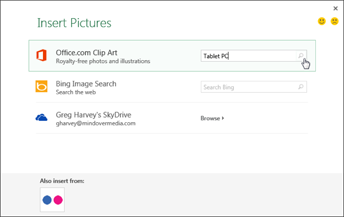
Figure 10-9: Searching Office.com for clip art images of Tablet PCs in the Insert Picture dialog box.
Inserting clip art images
Clip art is the name given to the ready-made illustrations offered by Microsoft for use in its various Microsoft Office programs, including Excel 2013. Clip art drawings are now so numerous that the images cover almost every classification of image that you can think of.
To locate the clip(s) you want to insert into the current worksheet in the Insert Pictures dialog box, in the Office.com Clip Art text box, type in a keyword describing the type of image you need and then press Enter or click the Search button (with the magnifying glass icon).
Excel 2013 then displays a scrollable list of thumbnails for all the clip art images that match your keyword in the Insert Pictures dialog box. Click a thumbnail in the list to display a short description plus the size (in pixels) of the image in the lower-left corner of the Insert Pictures dialog box (see Figure 10-10).
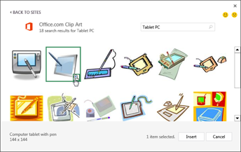
Figure 10-10: Selecting a clip art image to download into the current worksheet.
To get a better view of a particular image whose thumbnail you’ve highlighted or selected in the list, click the View Larger button that appears in the thumbnail’s lower-right corner (the magnifying glass with a plus sign in it). Excel then displays a slightly larger version of the thumbnail in the center of the dialog box while at the same time blurring out all the other thumbnails in the background.
To insert a particular clip art image into the current worksheet, double-click its thumbnail if it’s not already selected in the list. If the thumbnail is selected, you can insert it by clicking the Insert button or by pressing Enter.
Inserting images from the web
In addition to downloading clip art from the Microsoft Office.com website, you can also download pictures from the web using the Bing search engine. To download an image with Bing, open the Insert Pictures dialog box (Alt+NF), then click in the Search Bing text box where you type the keyword for the types of images you want to locate. After you press Enter or click the Search button (the magnifying glass icon), the Insert Pictures dialog box displays a scrollable list of thumbnails for images matching your keyword. You can then click a thumbnail in the list to display a short description plus the size (in pixels) of the image in the lower-left corner of the Insert Pictures dialog box.
To get a better view of a particular image whose thumbnail is highlighted or selected in the list, click the View Larger button that appears in the thumbnail’s lower-right corner (the magnifying glass with a plus sign in it). Excel then displays a slightly larger version of the thumbnail in the center of the dialog box while at the same time blurring out all the other thumbnails in the background.
To insert one of the located images into the current worksheet, double-click its thumbnail if it’s not already selected in the list. If the thumbnail is selected, you can insert the image by clicking the Insert button or by pressing Enter.
Keep in mind that the major difference between downloading a clip art image and downloading an image with Bing is that, by and large, most clip art images are drawn illustrations whereas almost all the images located through Bing are photographs.
Inserting local images
If the image you want to use in a worksheet is saved on your computer in one of the local or network drives, you can insert it by selecting the Pictures command button on the Insert tab of the Ribbon (Alt+NP). Doing this opens the Insert Picture dialog box (which works just like opening an Excel workbook file in the Open dialog box) where you open the folder and select the local graphics file and then import it into the worksheet by clicking the Insert button.
If you want to bring in a graphic image created in another graphics program that isn’t saved in its own file, select the graphic in that program and then copy it to the Clipboard (press Ctrl+C). When you get back to your worksheet, place the cursor where you want the picture to appear and then paste the image (press Ctrl+V or click the Paste command button at the beginning of the Home tab).
Editing inserted pictures
When you first insert an image into the worksheet, it’s selected automatically, indicated by the sizing handles around its perimeter and its rotation handle at the top (see Figure 10-11). To deselect the clip art image and set it in the worksheet, click anywhere in the worksheet outside of the image.

Figure 10-11: Clip art image ready for editing in the new worksheet.
While a clip art image or a picture that you’ve inserted into your worksheet is selected, however, you can make any of the following changes:
![]() Move the clip art image or imported picture to a new location in the chart by dragging it.
Move the clip art image or imported picture to a new location in the chart by dragging it.
![]() Resize the clip art image or imported picture by dragging the appropriate sizing handle.
Resize the clip art image or imported picture by dragging the appropriate sizing handle.
![]() Rotate the clip art image or imported picture by dragging its rotation handle (the green circle at the top) in a clockwise or counterclockwise direction.
Rotate the clip art image or imported picture by dragging its rotation handle (the green circle at the top) in a clockwise or counterclockwise direction.
![]() Delete the clip art image or imported picture by pressing the Delete key.
Delete the clip art image or imported picture by pressing the Delete key.
Formatting inserted images
When an inserted picture is selected in the worksheet, Excel adds the Pictures Tools contextual tab to the Ribbon with its sole Format tab (refer to Figure 10-11). The Format tab is divided into four groups: Adjust, Picture Styles, Arrange, and Size.
The Adjust group contains the following important command buttons:
![]() Remove Background opens the Background Removal tab and makes a best guess about what parts of the picture to remove. You have the option to mark areas of the picture to keep or further remove, and the shaded areas automatically update as you isolate what areas of the picture you want to keep. Click Keep Changes when you are finished or Discard All Changes to revert back to the original picture.
Remove Background opens the Background Removal tab and makes a best guess about what parts of the picture to remove. You have the option to mark areas of the picture to keep or further remove, and the shaded areas automatically update as you isolate what areas of the picture you want to keep. Click Keep Changes when you are finished or Discard All Changes to revert back to the original picture.
![]() Corrections to open a drop-down menu with a palette of presets you can choose for sharpening or softening the image and/or increasing or decreasing its brightness. Or select the Picture Corrections Options item to open the Format Picture dialog box with the Picture Corrections tab selected. There you can sharpen or soften the image or modify its brightness or contrast by selecting a new preset thumbnail on the appropriate Presets palette or by entering a new positive percentage (to increase) or negative percentage (to decrease) where 0% is normal in the appropriate combo box or dragging its slider.
Corrections to open a drop-down menu with a palette of presets you can choose for sharpening or softening the image and/or increasing or decreasing its brightness. Or select the Picture Corrections Options item to open the Format Picture dialog box with the Picture Corrections tab selected. There you can sharpen or soften the image or modify its brightness or contrast by selecting a new preset thumbnail on the appropriate Presets palette or by entering a new positive percentage (to increase) or negative percentage (to decrease) where 0% is normal in the appropriate combo box or dragging its slider.
![]() Color to open a drop-down menu with a palette of Color Saturation, Color Tone, or Recolor presets you can apply to the image, set a transparent color (usually the background color you want to remove from the image), or select the Picture Color Options item to open the Picture Color tab of the Format Picture dialog box. There you can adjust the image’s colors using Color Saturation, Color Tone, or Recolor presets or by setting a new saturation level or color tone temperature by entering a new percentage in the appropriate combo box or selecting it with a slider.
Color to open a drop-down menu with a palette of Color Saturation, Color Tone, or Recolor presets you can apply to the image, set a transparent color (usually the background color you want to remove from the image), or select the Picture Color Options item to open the Picture Color tab of the Format Picture dialog box. There you can adjust the image’s colors using Color Saturation, Color Tone, or Recolor presets or by setting a new saturation level or color tone temperature by entering a new percentage in the appropriate combo box or selecting it with a slider.
![]() Artistic Effects to open a drop-down menu with special effect presets you can apply to the image or select the Artistic Effects Options item to open the Artistic Effects options in the Format Picture task pane where you can apply a special effect by selecting its preset thumbnail from the palette that appears when you click the Artistic Effect drop-down button.
Artistic Effects to open a drop-down menu with special effect presets you can apply to the image or select the Artistic Effects Options item to open the Artistic Effects options in the Format Picture task pane where you can apply a special effect by selecting its preset thumbnail from the palette that appears when you click the Artistic Effect drop-down button.
![]() Compress Pictures to open the Compress Pictures dialog box to compress all images in the worksheet or just the selected graphic image to make them more compact and thus make the Excel workbook somewhat smaller when you save the images as part of its file.
Compress Pictures to open the Compress Pictures dialog box to compress all images in the worksheet or just the selected graphic image to make them more compact and thus make the Excel workbook somewhat smaller when you save the images as part of its file.
![]() Change Picture to open the Insert Pictures dialog box where you can find and select a new image to replace the current picture.
Change Picture to open the Insert Pictures dialog box where you can find and select a new image to replace the current picture.
![]() Reset Picture button to select the Reset Picture option to remove all formatting changes made and return the picture to the state it was in when you originally inserted it into the worksheet or the Reset Picture & Size to reset all its formatting as well as restore the image to its original size in the worksheet.
Reset Picture button to select the Reset Picture option to remove all formatting changes made and return the picture to the state it was in when you originally inserted it into the worksheet or the Reset Picture & Size to reset all its formatting as well as restore the image to its original size in the worksheet.
You can also format a selected clip art image or imported picture by opening the Format Shape task pane (Ctrl+1) and then selecting the appropriate options attached to the Fill & Line, Effects, Size & Properties, and Picture buttons, which cover almost all aspects of formatting any image you use.
In addition to the command buttons in the Adjust group, you can use the command buttons in the Picture Styles group. Click a thumbnail on the Picture Styles drop-down gallery to select a new orientation and style for the selected picture. You can also modify any of the following:
![]() Border shape and color on the Picture Border button’s drop-down palette
Border shape and color on the Picture Border button’s drop-down palette
![]() Shadow or 3-D rotation effect on the Picture Effects button’s drop-down menus
Shadow or 3-D rotation effect on the Picture Effects button’s drop-down menus
![]() Layout on the Picture Layout button’s drop-down palette to format a picture with SmartArt-styles
Layout on the Picture Layout button’s drop-down palette to format a picture with SmartArt-styles
Adding preset graphic shapes
In addition to online and local imported from graphics files, you can insert preset graphic shapes in your chart or worksheet by selecting their thumbnails on the Shapes drop-down gallery on the Insert tab of the Ribbon (see Figure 10-12).
When you open the Shapes gallery by clicking the Shapes button in the Illustrations group on the Insert tab of the Ribbon, you see that it’s divided into nine sections: Recently Used Shapes, Lines, Rectangles, Basic Shapes, Block Arrows, Equation Shapes, Flowchart, Stars and Banners, and Callouts.
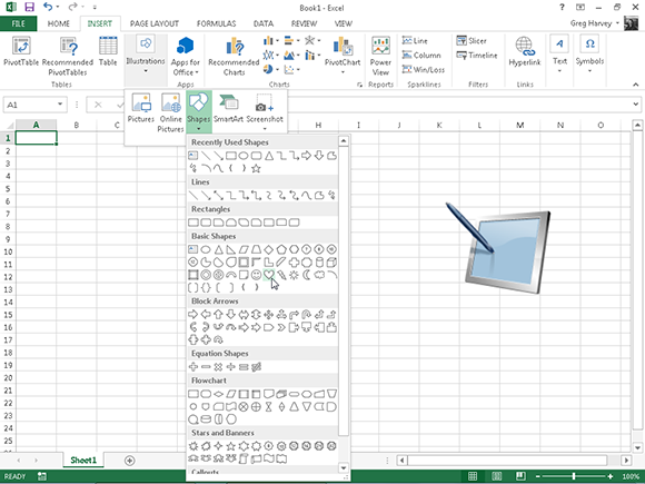
Figure 10-12: Click the shape’s thumbnail on the Shapes drop-down gallery and then drag the mouse pointer or Touch Pointer to draw it out in the chart or sheet.
After you click the thumbnail of a preset shape in this drop-down gallery, the mouse pointer or Touch Pointer becomes a crosshair you use to draw the graphic by dragging it to the size you want.
After you release the mouse button or remove your finger or stylus from the touchscreen, the shape you’ve drawn in the worksheet is still selected. This is indicated by the selection handles around its perimeter and the rotation handle at the top, which you can use to reposition, resize, and rotate the shape, if need be. Additionally, the program activates the Format tab on the Drawing Tools contextual tab and you can use the Shape Styles gallery or other command buttons to further format the shape to the way you want it. To set the shape and remove the selection and rotation handles, click anywhere in the worksheet outside of the shape.
Working with WordArt
If selecting gazillions of preset shapes available from the Shapes gallery doesn’t provide enough variety for jazzing up your worksheet, you may want to try adding some fancy text using the WordArt gallery, opened by clicking the WordArt command button in the Text group of the Insert tab.
You can add this type of “graphic” text to your worksheet by following these steps:
1. Click the WordArt command button on Text button’s drop-down menu found on the Insert tab or simply press Alt+NW.
Excel displays the WordArt drop-down gallery.
2. Click the A thumbnail in the WordArt style you want to use in the WordArt drop-down gallery.
Excel inserts a selected text box containing Your Text Here in the center of the worksheet in the WordArt style you selected in the gallery.
3. Type the text you want to display in the worksheet in the Your Text Here text box.
As soon as you start typing, Excel replaces Your Text Here with the characters you enter.
4. (Optional) To format the background of the text box, use Live Preview in the Shape Styles drop-down gallery on the Format tab to find the style to use and then set it by clicking its thumbnail.
The Format tab under the Drawing Tools contextual tab is added and activated automatically when WordArt text is selected in the worksheet.
5. After making any final adjustments to the size, shape, or orientation of the WordArt text with the selection and rotation handles, click a cell somewhere outside of the text to deselect the graphic.
When you click outside of the WordArt text, Excel deselects the graphic, and the Drawing Tools contextual tab disappears from the Ribbon. (If you ever want this tab to reappear, all you have to do is click somewhere on the WordArt text to select the graphic.)
You can change the size of WordArt text and the font it uses after creating it by dragging through the WordArt text to select it and then using the Font and Font Size command buttons on the mini-toolbar that appears next to the selected WordArt to make your desired changes.
Make mine SmartArt
Excel 2013 SmartArt is a special type of graphic object that gives you the ability to construct fancy graphical lists and diagrams in your worksheet quickly and easily. SmartArt lists and diagrams come in a wide array of configurations (including a bunch of organizational charts and various process and flow diagrams) that enable you to combine your own text with the predefined graphic shapes.
To insert a SmartArt list or diagram into the worksheet, click the Insert a SmartArt Graphic button in the Illustrations group on the Insert tab or press Alt+NM to open the Choose a SmartArt Graphic dialog box (shown in Figure 10-13). Then click a category in the navigation pane on the left followed by the list’s or diagram’s thumbnail in the center section before you click OK.
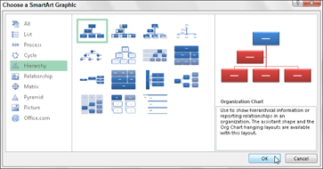
Figure 10-13: Select the SmartArt list or diagram to insert in the worksheet in this dialog box.
Excel then inserts the basic structure of the list or diagram into your worksheet along with a text pane (displaying Type Your Text Here on its title bar) to its immediate left and [Text] in the shapes in the diagram where you can enter the text for the various parts of the list or diagram (as shown in Figure 10-14). At the same time, the Design tab of the SmartArt Tools contextual tab with Layouts and SmartArt Styles galleries for the particular type of SmartArt list or diagram you originally selected appears on the Ribbon.

Figure 10-14: Adding text to a new organizational chart.
Filling in the text for a new SmartArt graphic
To fill in the text for the first section of the new list or diagram in the outline text box that already contains the insertion point, simply type the text. Then press the ![]() key or click the next list or diagram section to set the insertion point there.
key or click the next list or diagram section to set the insertion point there.
 Don’t press the Tab key or the Enter key to complete a text entry in the list or diagram as you naturally do in the regular worksheet. In a SmartArt list or diagram, pressing the Enter key inserts a new section of the list or diagram (at the same level in hierarchical diagrams, such as an org chart). Pressing Tab indents the level of the current section on the outline (in hierarchical diagrams) or does nothing.
When you finish entering the text for your new diagram, click the Close button (with an X) on the text pane in the upper-right corner opposite the title Type Your Text Here. (You can always re-open this box if you need to edit any of the text by clicking the button that appears in the middle of the left side of the selected list or diagram after you close the text pane.)
If the style of the SmartArt list or diagram you select comes with more sections than you need, you can delete the unused graphics by clicking them to select them (indicated by the selection and rotation handles around it) and then pressing the Delete key.
Formatting a SmartArt graphic
After you close the text pane attached to your SmartArt list or diagram, you can still format its text and graphics. To format the text, select all the graphic objects in the SmartArt list or diagram that need the same type of text formatting. (Remember you can select several objects in the list or diagram by holding down Ctrl as you click them.) Then click the appropriate command buttons in the Font group on the Home tab of the Ribbon.
To refine or change the default formatting of the graphics in a SmartArt list or diagram, you can use the Layouts, Change Colors, and SmartArt Styles drop-down galleries available on the Design tab of the SmartArt Tools contextual tab:
![]() Click the More button in the Layouts group and then click a thumbnail on the Layouts drop-down gallery to select an entirely new layout for your SmartArt list or diagram.
Click the More button in the Layouts group and then click a thumbnail on the Layouts drop-down gallery to select an entirely new layout for your SmartArt list or diagram.
![]() Click the Change Colors button in the SmartArt Styles group and then click a thumbnail in the drop-down gallery to change the colors for the current layout.
Click the Change Colors button in the SmartArt Styles group and then click a thumbnail in the drop-down gallery to change the colors for the current layout.
![]() Click the More button in the SmartArt Styles group and then click a thumbnail on the SmartArt Styles drop-down gallery to select a new style for the current layout using the selected colors.
Click the More button in the SmartArt Styles group and then click a thumbnail on the SmartArt Styles drop-down gallery to select a new style for the current layout using the selected colors.
Screenshots anyone?
Excel 2013 supports the creation of screenshot graphics of objects on your Windows desktop that you can automatically insert into your worksheet. To take a picture of a window open on the desktop or any other object on it, select the Screenshot drop-down button in the Illustrations group of the Ribbon’s Insert tab (Alt+NSC).
Excel then opens a drop-down menu that displays a thumbnail of available screen shots (ones currently available) followed by the Screen Clipping item. To take a picture of any portion of your Windows desktop, click the Screen Clipping option (or press Alt+NSCC). Excel then automatically minimizes the Excel program window on the Windows taskbar and then brightens the screen and changes the mouse pointer or Touch Pointer to a thick black cross. You can then use this pointer to drag an outline around the objects on the Windows desktop you want to include in the screenshot graphic.
The moment you release the mouse button or remove your finger or stylus from the touchscreen, Excel 2013 then automatically re-opens the program window to its previous size displaying the selected graphic containing the Windows screenshot. You can then resize, move, and adjust this screenshot graphic as you would any other that you add to the worksheet.
Excel automatically saves the screenshot graphic that you add to a worksheet when you save its workbook. However, the program does not provide you with a means by which to save the screenshot graphic in a separate graphics file for use in other programs. If you need to do this, you should select the screenshot graphic in the Excel worksheet, copy it to the Windows Clipboard, and then paste it into another open graphics program where you can use its Save command to store it in a favorite graphics file format for use in other documents.
Theme for a day
Through the use of its themes, Excel 2013 supports a way to format uniformly all the text and graphics you add to a worksheet. You can do this by simply clicking the thumbnail of the new theme you want to use in the Themes drop-down gallery opened by clicking the Themes button on the Page Layout tab of the Ribbon or by pressing Alt+PTH.
Use Live Preview to see how the text and graphics you’ve added to your worksheet appear in the new theme before you click its thumbnail.
Excel Themes combine three default elements: the color scheme applied to the graphics, the font (body and heading) used in the text and graphics, and the graphic effects applied. If you prefer, you can change any or all of these elements in the worksheet by clicking their command buttons in the Themes group at the start of the Page Layout tab:
![]() Colors to select a new color scheme by clicking its thumbnail on the drop-down palette. Click Customize Colors at the bottom of this palette to open the Create New Theme Colors dialog box where you can customize each element of the color scheme and save it with a new descriptive name.
Colors to select a new color scheme by clicking its thumbnail on the drop-down palette. Click Customize Colors at the bottom of this palette to open the Create New Theme Colors dialog box where you can customize each element of the color scheme and save it with a new descriptive name.
![]() Fonts to select a new font by clicking its thumbnail on the drop-down list. Click Customize Fonts at the bottom of this list to open the Create New Theme Fonts dialog box where you can customize the body and heading fonts and save it with a new descriptive name.
Fonts to select a new font by clicking its thumbnail on the drop-down list. Click Customize Fonts at the bottom of this list to open the Create New Theme Fonts dialog box where you can customize the body and heading fonts and save it with a new descriptive name.
![]() Effects to select a new set of graphic effects by clicking its thumbnail in the drop-down gallery.
Effects to select a new set of graphic effects by clicking its thumbnail in the drop-down gallery.
To save your newly selected color scheme, font, and graphic effects as a custom theme that you can reuse in other workbooks, click the Themes command button and then click Save Current Theme at the bottom of the gallery to open the Save Current Theme dialog box. Edit the generic Theme1 filename in the File Name text box (without deleting the .thmx filename extension) and then click the Save button. Excel then adds the custom theme to a Custom Themes section in the Themes drop-down gallery and you can apply it to any active worksheet by simply clicking its thumbnail.
Controlling How Graphic Objects Overlap
In case you haven’t noticed, graphic objects float on top of the cells of the worksheet. Most of the objects (including charts) are opaque, meaning that they hide (without replacing) information in the cells beneath. If you move one opaque graphic so that it overlaps part of another, the one on top hides the one below, just as putting one sheet of paper partially on top of another hides some of the information on the one below. Most of the time, you should make sure that graphic objects don’t overlap one another or overlap cells with worksheet information that you want to display.
Reordering the layering of graphic objects
When graphic objects (including charts, text boxes, inserted clip art and pictures, drawn shapes, and SmartArt graphics) overlap each other, you can change how they overlay each other by sending the objects back or forward so that they reside on different (invisible) layers.
Excel 2013 enables you to move a selected graphic object to a new layer in one of two ways:
![]() To move the selected object up toward or to the top layer, select the Bring Forward or Bring to Front option on the Bring Forward button’s drop-down menu in the Arrange group on object’s Drawing, Pictures, or SmartArt Tools contextual tab. To move the selected object down toward or to the bottom layer, select the Send Backward or Send to Back option on the Send Backward button’s drop-down menu in the Arrange group on object’s Drawing, Pictures, or SmartArt Tools contextual tab.
To move the selected object up toward or to the top layer, select the Bring Forward or Bring to Front option on the Bring Forward button’s drop-down menu in the Arrange group on object’s Drawing, Pictures, or SmartArt Tools contextual tab. To move the selected object down toward or to the bottom layer, select the Send Backward or Send to Back option on the Send Backward button’s drop-down menu in the Arrange group on object’s Drawing, Pictures, or SmartArt Tools contextual tab.
![]() Click the Selection Pane command button in the Arrange group on the Format tab under the Drawing Tools, Pictures Tools, or SmartArt Tools contextual tab to display the Selection task pane. Then, click the Bring Forward button (with the triangle pointing up) or Send Backward button (with the triangle pointing down) at the top of the task pane to the immediate right of the Show All and Hide All buttons. You click the Bring Forward or Send Backward button until the selected graphic object appears on the desired layer in the task pane (where the graphic at the top of the list is on the topmost graphic layer and the one at the bottom of the list is on the bottommost graphic layer).
Click the Selection Pane command button in the Arrange group on the Format tab under the Drawing Tools, Pictures Tools, or SmartArt Tools contextual tab to display the Selection task pane. Then, click the Bring Forward button (with the triangle pointing up) or Send Backward button (with the triangle pointing down) at the top of the task pane to the immediate right of the Show All and Hide All buttons. You click the Bring Forward or Send Backward button until the selected graphic object appears on the desired layer in the task pane (where the graphic at the top of the list is on the topmost graphic layer and the one at the bottom of the list is on the bottommost graphic layer).
Figure 10-15 illustrates how the Selection task pane works. Here I have a combination of downloaded clip art, web picture, and screenshot graphic, along with a drawn graphic object on the same worksheet but on different layers. As you can see in the Selection task pane, the Tablet PC clip art image is on the topmost layer so that it would obscure any of the other three graphic objects on layers below that it happens to overlap. Next comes the picture of the Microsoft Surface Tablet on the second graphics layer so that it obscures part of the drawn Explosion Graphic and the Mouse Properties dialog box screenshot graphic that ware placed on the third and fourth (and last) graphics layers, respectively. To move any of these graphic objects to a new layer, I have only to select them in the Selection pane followed by the Bring Forward or Send Backward buttons.
Excel gives generic names (such as Picture1, Diagram1, and so forth) to every graphic object you add to your worksheet. To give these objects more descriptive names (as I have done in Figure 10-15), double-click the generic graphic name in the Selection task pane, type a new name, and then press Enter to replace it.

Figure 10-15: Worksheet with various graphic objects on different layers of the Selection task pane.
Grouping graphic objects
Sometimes you may find that you need to group several graphic objects so that they act as one unit (like a text box with its arrow). That way, you can move these objects or size them in one operation.
To group objects, Ctrl+click each object you want to group to select them all. Next, click the Group Objects button in the Arrange group (the one with the picture of two entwined squares) on the Format tab under the appropriate Tools and then click Group on its drop-down menu.
After grouping several graphic objects, whenever you click any part of the mega-object, every part is selected (and selection handles appear only around the perimeter of the combined object).
If you need to independently move or size grouped objects, you can ungroup them by right-clicking an object and then choosing Group⇒Ungroup on the object’s shortcut menu or by clicking Group⇒Ungroup on the Format tab under the appropriate Tools contextual tabs.
Hiding graphic objects
The Selection task pane enables you not only to change the layering of various graphic objects in the worksheet, but also to control whether they are hidden or displayed. To open the Selection task pane, select one of the graphic objects on the worksheet and then click the Format button under the respective Tools contextual tab. Then click the Selection Pane button found in the Arrange group of the object’s Format tab.
After you open the Selection task pane, you can temporarily hide any of the graphic objects listed by clicking its eye check box (to remove the eye icon). To remove the display of all the charts and graphics in the worksheet, click the Hide All button at the top task pane instead.
To redisplay a hidden graphic object, simply click its empty eye check box to put the eye icon back into it. To redisplay all graphic objects after hiding them all, click the Show All button at the top of the task pane.
If you hide all the charts and graphics in a worksheet by clicking the Hide All button and then close the Selection task pane by clicking its Close button, you’ll have no way of redisplaying this task pane so that you can bring back their display by clicking the Show All button. That’s because you have no visible graphic objects left to select in the worksheet and, therefore, no way to get the contextual tabs with their Selection Pane buttons to appear on the Ribbon.
In this dire case, the only way I know to get the Selection task pane to appear so that you can click the Show All button is to create a dummy (pardon my French) graphic object in the worksheet (such as an arrow or oval in the Illustrations group on the Insert tab). Then click the Selection Pane button on the Format tab of its Drawing Tools contextual tab. With the Selection task pane open, click the Show All button to bring back the display of all the charts and graphics you want to keep. Get rid of the still-selected dummy graphic object by pressing the Delete key. (Whew, that was a close one!)
Printing Just the Charts
Sometimes, you may want to print only a particular chart embedded in the worksheet (independent of the worksheet data it represents or any of the other stuff you’ve added). To do this, open the Selection task pane (as described in the preceding section) and make sure that any hidden charts are displayed in the worksheet by putting the eye icons back in their check boxes.
Next, click the chart to select it in the worksheet and then choose File⇒Print or press Ctrl+P to open the Print screen in Backstage view, where you see the chart now displayed in the print preview area.
If you need to change the printed chart size or the orientation of the printing (or both), click the Page Setup link on the Print screen in the Backstage view (Ctrl+P) or click the Page Setup Dialog Box launcher on the Page Layout tab of the Ribbon to open the Page Setup dialog box. To change the orientation of the printing (or the paper size), change the appropriate options on the Page tab in the Page Setup dialog box. To change the print quality or print a color chart in black and white, click the Chart tab and change these options. You can then return to the print preview area in the Print screen in Backstage view by clicking the Print Preview button at the bottom of the Page Setup dialog box. If everything looks good in the print preview area, start printing the chart by clicking the Print button.