
Chapter 9
Playing with Pivot Tables
In This Chapter
![]() Understanding what makes a pivot table tick
Understanding what makes a pivot table tick
![]() Creating a new pivot table with the Quick Analysis tool and Recommended PivotTables command
Creating a new pivot table with the Quick Analysis tool and Recommended PivotTables command
![]() Manually creating a new pivot table
Manually creating a new pivot table
![]() Formatting your new pivot table
Formatting your new pivot table
![]() Sorting and filtering the pivot table data
Sorting and filtering the pivot table data
![]() Modifying the structure and layout of a pivot table
Modifying the structure and layout of a pivot table
![]() Creating a pivot chart
Creating a pivot chart
Pivot table is a name given to a special type of summary table that’s unique to Microsoft Excel. Pivot tables are great for summarizing particular values in a data list or database because they do their magic without making you create formulas to perform the calculations. They also enable you to quickly and easily examine and analyze relationships inherent in their data sources; data lists you maintain in Excel, or external database tables you import into Excel from standalone database applications such as Microsoft Office Access, or from a data feed such as Windows Azure Marketplace (as discussed in Chapter 11).
Pivot tables also let you play around with the arrangement of the summarized data — even after you generate the table. This capability of changing the arrangement of the summarized data on the fly simply by rotating row and column headings gives the pivot table its name. And, if you’re the type who relates better to data represented in pictorial form, Excel enables you to summarize your data list graphically as a pivot chart using any of the many, many chart types now supported by the program.
Data Analysis with Pivot Tables
Pivot tables are so very versatile because they enable you to easily analyze summaries of large amounts of data by using a variety of summary functions (although totals created with the SUM function will probably remain your old standby). When setting up the original pivot table (as described in the following section), you make several decisions: what summary function to use, which columns (fields) the summary function is applied to, and which columns (fields) these computations are tabulated with.
 Pivot tables are perfect for cross-tabulating one set of data in your data list with another. For example, you can create a pivot table from an employee database table that totals the salaries for each job category cross-tabulated (arranged) by department or job site.
Pivot tables via the Quick Analysis tool
Excel 2013 makes creating a new pivot table a snap with its new Quick Analysis tool. To preview various types of pivot tables that Excel can create for you on the spot using the entries in a data table or list that you have open in an Excel worksheet, simply follow these steps:
1. Select the data (including the column headings) in your table or list as a cell range in the worksheet.
2. Click the Quick Analysis tool that appears right below the lower-right corner of the current cell selection.
Doing this opens the palette of Quick Analysis options with the initial Formatting tab selected and its various conditional formatting options displayed.
3. Click the Tables tab at the top of the Quick Analysis options palette.
Excel selects the Tables tab and displays its Table and PivotTable option buttons. The Table button previews how the selected data would appear formatted as a table (see Chapter 3 for details). The other PivotTable buttons preview the various types of pivot tables that can be created from the selected data.
4. To preview each pivot table that Excel 2013 can create for your data, highlight its PivotTable button in the Quick Analysis palette.
As you highlight each PivotTable button in the options palette, Excel’s Live Preview feature displays a thumbnail of a pivot table that can be created using your table data. This thumbnail appears above the Quick Analysis options palette for as long as the mouse or touch pointer is over its corresponding button.
5. When a preview of the pivot table you want to create appears, click its button in the Quick Analysis options palette to create it.
Excel 2013 then creates the previewed pivot table on a new worksheet that is inserted at the beginning of the current workbook. This new worksheet containing the pivot table is active so that you can immediately rename and relocate the sheet as well as edit the new pivot table, if you wish.
Figures 9-1 and 9-2 show you how this procedure works. In Figure 9-1, I’ve highlighted the third suggested PivotTable button in the Quick Analysis tool’s option palette. The previewed table in the thumbnail displayed above the palette shows subtotals and grand totals for company sales for each of the three months of the first quarter organized by their sector (Retail or Service).
Figure 9-2 shows you the pivot table that Excel created when I clicked the highlighted button in the options palette in Figure 9-1. Note this pivot table is selected on its own worksheet (Sheet1) that’s been inserted in front of the Sales Table worksheet. Because the new pivot table is selected, the PivotTable Fields task pane is displayed on the right side of the Excel worksheet window and the PivotTable Tools contextual tab is displayed on the Ribbon. You can use the options on this task pane and contextual tab to then customize your new pivot table, as described in the “Formatting Pivot Tables” and “Modifying Pivot Tables” sections later in this chapter.
Note that if Excel can’t suggest various pivot tables to create from the selected data in the worksheet, a single Blank PivotTable button is displayed after the Table button in the Quick Analysis tool’s options on the Tables tab. You can select this button to manually create a new pivot table for the data, as described later in this chapter.

Figure 9-1: Previewing the pivot table to create from the selected data in the Quick Analysis options palette.

Figure 9-2: Previewed pivot table created on a new worksheet with the Quick Analysis tool.
Pivot tables by recommendation
If creating a new pivot table with the Quick Analysis tool (described in the previous section) is too much work for you, you generate them in a snap with the new Recommended Pivot Tables command button. To use this method, follow these easy steps:
1. Select a cell in the data list for which you want to create the new pivot table.
Provided that your data list has a row of column headings with contiguous rows of data as described in Chapter 11, this can be any cell in the table.
2. Select the Recommended PivotTables command button on Insert tab of the Ribbon or press Alt+NSP.
Excel displays a Recommended PivotTables dialog box similar to the one shown in Figure 9-3. This dialog box contains a list box on the left side that showing samples of all the suggested pivot tables that Excel 2013 can create from the data in your list.
3. Select the sample of the pivot table you want to create in the list box on the left and then click OK.
As soon as you click OK, Excel creates a new pivot table following the selected sample on its own worksheet (Sheet1) inserted in front of the others in your workbook. This pivot table is selected on the new sheet so that the Pivot Table Fields task pane is displayed on the right side of the Excel worksheet window and the PivotTable Tools contextual tab is displayed on the Ribbon. You can use the options on this task pane and contextual tab to then customize your new pivot table as described in the “Formatting Pivot Tables” and “Modifying Pivot Tables” sections later in this chapter.
Manually producing pivot tables
Sometimes, none of the pivot tables that Excel 2013 suggests when creating a new table with the Quick Analysis tool or the Recommended PivotTables command button fit the type of data summary you have in mind. In such cases, you can either select the suggested pivot table whose layout is closest to what you have in mind, or you can choose to create the pivot table from scratch (a process that isn’t all that difficult or time consuming).
To manually create a new pivot table from the worksheet with the data to be analyzed, position the cell pointer somewhere in the cells of this list, and then click the PivotTable command button on the Ribbon’s Insert tab or press Alt+NV.

Figure 9-3: Creating a new pivot table from the sample pivot tables displayed in the Recom-mended PivotTables dialog box.
Excel then opens the Create PivotTable dialog box and selects all the data in the list containing the cell cursor (indicated by a marquee around the cell range). You can then adjust the cell range in the Table/Range text box under the Select a Table or Range button if the marquee does not include all the data to summarize in the pivot table. By default, Excel builds the new pivot table on a new worksheet it adds to the workbook. If, however, you want the pivot table to appear on the same worksheet, click the Existing Worksheet button and then indicate the location of the first cell of the new table in the Location text box, as shown in Figure 9-4. (Just be sure that this new pivot table isn’t going to overlap any existing tables of data.)
 If the data source for your pivot table is an external database table created with a separate database management program, such as Access, you need to click the Use an External Data Source button, click the Choose Connection button, and then click the name of the connection in the Existing Connections dialog box. (See Chapter 11 for information on establishing a connection with an external file and importing its data through a query.) Also, for the first time, Excel 2013 supports analyzing data from multiple related tables on a worksheet (referred to as a Data Model). If the data in new pivot table you’re creating is to be analyzed along with another existing pivot table, be sure to select the Add This Data to the Data Model check box.
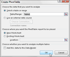
Figure 9-4: Indicate the data source and pivot table location in the Create PivotTable dialog box.
After you indicate the source and location for the new pivot table in the Create PivotTable dialog box and click OK, the program inserts a new worksheet at the front of the workbook with a blank grid for the new pivot table. It also opens a PivotTable Field List task pane on the right side of the Worksheet area and adds the PivotTable Tools contextual tab to the Ribbon (see Figure 9-5). The PivotTable Field List task pane is divided into two areas: the Choose Fields to Add to Report list box with the names of all the fields in the data list you can select as the source of the table preceded by empty check boxes, and a Drag Fields between Areas Below section divided into four drop zones (Report Filter, Column Labels, Row Labels, and Values).
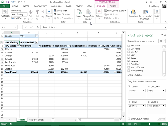
Figure 9-5: Completed pivot table after adding the fields from the employee data list to the various drop zones.
You can also insert a new worksheet with the blank pivot table grid like the one shown in Figure 9-5 by selecting the Blank PivotTable button in the Recommended PivotTable dialog box (shown in Figure 9-3) or the Quick Analysis tool’s options palette (displayed only when Quick Analysis can’t suggest pivot tables for your data). Just be aware that when you select the Blank PivotTable button in this dialog box or palette, Excel 2013 does not first open Create PivotTable dialog box shown in Figure 9-4. If you need to use any of the options offered in this dialog box in creating your new pivot table, you need to create the pivot table with the PivotTable command button rather than the Recommended PivotTables command button on the Insert Tab.
To complete the new pivot table, all you have to do is assign the fields in the PivotTable Field List task pane to the various parts of the table. You do this by dragging a field name from the Choose Fields to Add to Report list box and dropping it in one of the four areas below called drop zones:
![]() FILTERS: This area contains the fields that enable you to page through the data summaries shown in the actual pivot table by filtering out sets of data — they act as the filters for the report. For example, if you designate the Year field from a data list as a report filter, you can display data summaries in the pivot table for individual years or for all years represented in the data list.
FILTERS: This area contains the fields that enable you to page through the data summaries shown in the actual pivot table by filtering out sets of data — they act as the filters for the report. For example, if you designate the Year field from a data list as a report filter, you can display data summaries in the pivot table for individual years or for all years represented in the data list.
![]() COLUMNS: This area contains the fields that determine the arrangement of data shown in the columns of the pivot table.
COLUMNS: This area contains the fields that determine the arrangement of data shown in the columns of the pivot table.
![]() ROWS: This area contains the fields that determine the arrangement of data shown in the rows of the pivot table.
ROWS: This area contains the fields that determine the arrangement of data shown in the rows of the pivot table.
![]() VALUES: This area contains the fields that determine which data are presented in the cells of the pivot table — they are the values that are summarized in its last column (totaled by default).
VALUES: This area contains the fields that determine which data are presented in the cells of the pivot table — they are the values that are summarized in its last column (totaled by default).
To understand how these various zones relate to a pivot table, look at the completed pivot table shown in Figure 9-5.
For this pivot table, I assigned the Gender field from the data list (a field that contains F (for female) or M (for male) to indicate the employee’s gender in the FILTERS drop zone. I also assigned the Dept field (that contains the names of the various departments in the company) to the COLUMNS drop zone, the Location field (that contains the names of the various cities with corporate offices) to the ROWS drop zone, and the Salary field to the VALUES drop zone. As a result, this pivot table now displays the sum of the salaries for both the male and female employees in each department (across the columns) and then presents these sums by their corporate location (in each row).
As soon as you add fields to a new pivot table (or select the cell of an existing table in a worksheet), Excel selects the Analyze tab of the PivotTable Tools contextual tab that automatically appears in the Ribbon. Among the many groups on this tab, you find the Show group at the end that contains the following useful command buttons:
![]() Field List to hide and redisplay the PivotTable Field List task pane on the right side of the Worksheet area
Field List to hide and redisplay the PivotTable Field List task pane on the right side of the Worksheet area
![]() +/- Buttons to hide and redisplay the expand (+) and collapse (-) buttons in front of particular column fields or row fields that enable you to temporarily remove and then redisplay their particular summarized values in the pivot table
+/- Buttons to hide and redisplay the expand (+) and collapse (-) buttons in front of particular column fields or row fields that enable you to temporarily remove and then redisplay their particular summarized values in the pivot table
![]() Field Headers to hide and redisplay the fields assigned to the Column Labels and Row Labels in the pivot table
Field Headers to hide and redisplay the fields assigned to the Column Labels and Row Labels in the pivot table
Formatting Pivot Tables
Excel 2013 makes formatting a new pivot table you’ve added to a worksheet as quick and easy as formatting any other table of data or list of data. All you need to do is click a cell of the pivot table to add the PivotTable Tools contextual tab to the Ribbon and then click its Design tab to display its command buttons.
The Design tab is divided into three groups:
![]() Layout group that enables you to add subtotals and grand totals to the pivot table and modify its basic layout
Layout group that enables you to add subtotals and grand totals to the pivot table and modify its basic layout
![]() PivotTable Style Options group that enables you to refine the pivot table style you select for the table using the PivotTable Styles gallery to the immediate right
PivotTable Style Options group that enables you to refine the pivot table style you select for the table using the PivotTable Styles gallery to the immediate right
![]() PivotTable Styles group that contains the gallery of styles you can apply to the active pivot table by clicking the desired style thumbnail
PivotTable Styles group that contains the gallery of styles you can apply to the active pivot table by clicking the desired style thumbnail
Refining the Pivot Table style
When selecting a new formatting style for your new pivot table from the PivotTable Styles drop-down gallery, you can then use Excel’s Live Preview feature to see how the pivot table would look in any style that you highlight in the gallery with your mouse or touch pointer.
After selecting a style from the gallery in the PivotTable Styles group on the Design tab, you can then refine the style using the check box command buttons in the PivotTable Style Options group. For example, you can add banding to the columns or rows of a style that doesn’t already use alternate shading to add more contrast to the table data by putting a check mark in the Banded Rows or Banded Columns check box, or you can remove this banding by clearing these check boxes.
Formatting values in the pivot table
To format the summed values entered as the data items of the pivot table with an Excel number format, you follow these steps:
1. Click the field in the table that contains the words “Sum of” and the name of the field whose values are summarized there, click the Active Field command button on the Analyze tab under the PivotTable Tools contextual tab, and then click the Fields Settings option on its pop-up menu.
Excel opens the Value Field Settings dialog box.
2. Click the Number Format command button in the Value Field Settings dialog box to open the Format Cells dialog box with its sole Number tab.
3. Click the type of number format you want to assign to the values in the pivot table on the Category list box of the Number tab.
4. (Optional) Modify any other options for the selected number format, such as Decimal Places, Symbol, and Negative Numbers that are available for that format.
5. Click OK twice, the first time to close the Format Cells dialog box, and the second to close the Value Field Settings dialog box.
Sorting and Filtering Pivot Table Data
When you create a new pivot table, you’ll notice that Excel automatically adds drop-down buttons to the Report Filter field, as well as the labels for the column and row fields. These drop-down buttons, known officially as filter buttons (see Chapter 11 for details), enable you to filter all but certain entries in any of these fields, and in the case of the column and row fields, to sort their entries in the table.
If you’ve added more than one column or row field to your pivot table, Excel adds collapse buttons (-) that you can use to temporarily hide subtotal values for a particular secondary field. After clicking a collapse button in the table, it immediately becomes an expand button (+) that you can click to redisplay the subtotals for that one secondary field.
Filtering the report
Perhaps the most important filter buttons in a pivot table are the ones added to the field(s) designated as the pivot table FILTERS. By selecting a particular option on the drop-down lists attached to one of these filter buttons, only the summary data for that subset you select displays in the pivot table.
For example, in the sample pivot table (refer to Figure 9-5) that uses the Gender field from the Employee Data list as the Report Filter field, you can display the sum of just the men’s or women’s salaries by department and location in the body of the pivot table doing either of the following:
![]() Click the Gender field’s filter button and then click M on the drop-down list before you click OK to see only the totals of the men’s salaries by department.
Click the Gender field’s filter button and then click M on the drop-down list before you click OK to see only the totals of the men’s salaries by department.
![]() Click the Gender field’s filter button and then click F on the drop-down list before you click OK to see only the totals of the women’s salaries by department.
Click the Gender field’s filter button and then click F on the drop-down list before you click OK to see only the totals of the women’s salaries by department.
When you later want to redisplay the summary of the salaries for all the employees, you then re-select the (All) option on the Gender field’s drop-down filter list before you click OK.
When you filter the Gender Report Filter field in this manner, Excel then displays M or F in the Gender Report Filter field instead of the default (All). The program also replaces the standard drop-down button with a cone-shaped filter icon, indicating that the field is filtered and showing only some of the values in the data source.
Filtering column and row fields
The filter buttons on the column and row fields attached to their labels enable you to filter out entries for particular groups and, in some cases, individual entries in the data source. To filter the summary data in the columns or rows of a pivot table, click the column or row field’s filter button and start by clicking the check box for the (Select All) option at the top of the drop-down list to clear this box of its check mark. Then, click the check boxes for all the groups or individual entries whose summed values you still want displayed in the pivot table to put back check marks in each of their check boxes. Then click OK.
As with filtering a Report Filter field, Excel replaces the standard drop-down button for that column or row field with a cone-shaped filter icon, indicating that the field is filtered and displaying only some of its summary values in the pivot table. To redisplay all the values for a filtered column or row field, you need to click its filter button and then click (Select All) at the top of its drop-down list. Then click OK.
Figure 9-6 shows the sample pivot table after filtering its Gender Report Filter field to women and its Dept Column field to Accounting, Administration, and Human Resources.
In addition to filtering out individual entries in a pivot table, you can also use the options on the Label Filters and Value Filters continuation menus to filter groups of entries that don’t meet certain criteria, such as company locations that don’t start with a particular letter or salaries between $45,000 and $65,000. For more on using these types of filtering options, see the section about filtering the records in a data list in Chapter 11.
Slicers in Excel 2013 make it a snap to filter the contents of your pivot table on more than one field. (They even allow you to connect with fields of other pivot tables that you’ve created in the workbook.)

Figure 9-6:Pivot table after filtering the Gender Report Filter field and the Dept Column field.
Filtering with slicers
To add slicers to your pivot table, you follow just two steps:
1. Click one of the cells in your pivot table to select it and then click the Insert Slicer option on the Insert Slicer button located in the Sort & Filter group of the PivotTable Options contextual tab.
Excel opens the Insert Slicers dialog box with a list of all the fields in the active pivot table.
2. Select the check boxes for all the fields that you want to use in filtering the pivot table and for which you want slicers created and then click OK.
Excel then adds slicers (as graphic objects — see Chapter 10 for details) for each pivot table field you select.
After you create slicers for the pivot table, you can use them to filter its data simply by selecting the items you want displayed in each slicer. You select items in a slicer by clicking them just as you do cells in a worksheet — hold down Ctrl as you click nonconsecutive items and Shift to select a series of sequential items.
Figure 9-7 shows you the sample pivot table after using slicers created for the Gender, Dept, and Location fields to filter the data so that only salaries for the men in the Human Resources and Administration departments in the Boston, Chicago, and San Francisco offices display.
Because slicers are Excel graphic objects (albeit some pretty fancy ones), you can move, resize, and delete them just as you would any other Excel graphic; see Chapter 10 for details. To remove a slicer from your pivot table, click it to select it and then press the Delete key.
Filtering with timelines
Excel 2013 introduces a new way to filter your data with its timeline feature. You can think of timelines as slicers designed specifically for date fields that enable you to filter data out of your pivot table that doesn’t fall within a particular period, thereby allowing you to see timing of trends in your data.
To create a timeline for your pivot table, select a cell in your pivot table and then click the Insert Timeline button in the Filter group on the Analyze contextual tab under the PivotTable Tools tab on the Ribbon. Excel then displays an Insert Timelines dialog box displaying a list of pivot table fields that you can use in creating the new timeline. After selecting the check box for the date field you want to use in this dialog box, click OK.
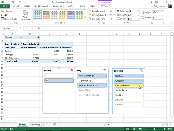
Figure 9-7: Sample pivot table filtered with slicers created for the Gender, Dept, and Location fields.
Figure 9-8 shows you the timeline I created for the sample Employee Data list by selecting its Date Hired field in the Insert Timelines dialog box. As you can see, Excel created a floating Date Hired timeline with the years and months demarcated and a bar that indicates the time period selected. By default, the timeline uses months as its units, but you can change this to years, quarters, or even days by clicking the MONTHS drop-down button and selecting the desired time unit.
I then literally use the timeline to select the period for which I want my pivot table data displayed. In Figure 9-8, I have filtered the sample pivot table so that it shows the salaries by department and location for only employees hired in the year 2000. I did this simply by dragging the timeline bar in the Date Hired timeline graphic so that it begins at Jan, 2000 and extends just up to and including Dec, 2000. And to filter the pivot table salary data for other hiring periods, I simply modify the start and stop times of the by dragging timeline bar in the Date Hired timeline.
Sorting the pivot table
You can instantly reorder the summary values in a pivot table by sorting the table on one or more of its column or row fields. To re-sort a pivot table, click the filter button for the column or row field you want to use in the sorting and then click the Sort A to Z option or the Sort Z to A option at the top of the field’s drop-down list.

Figure 9-8: Sample pivot table filtered with a timeline created for the Date Hired field.
Click the Sort A to Z option when you want the table reordered by sorting the labels in the selected field alphabetically or, in the case of values, from the smallest to largest value or, in the case of dates, from the oldest to newest date. Click the Sort Z to A option when you want the table reordered by sorting the labels in reverse alphabetical order, values from the highest to smallest, and dates from the newest to oldest.
Modifying Pivot Tables
Pivot tables are much more dynamic than standard Excel data tables because they remain so easy to manipulate and modify. Excel makes it just as easy to change which fields from the original data source display in the table as it did adding them when the table was created. Additionally, you can instantly restructure the pivot table by dragging its existing fields to new positions on the table. Add the ability to select a new summary function using any of Excel’s basic Statistical functions, and you have yourself the very model of a flexible data table!
Modifying the pivot table fields
To modify the fields used in your pivot table, first you display the PivotTable Field List by following these steps:
1. Click any of the pivot table’s cells.
Excel adds the PivotTable Tools contextual tab with the Options and Design tabs to the Ribbon.
2. Click the Analyze tab under the PivotTable Tools contextual tab to display its buttons on the Ribbon.
3. Click the Field List button in the Show group.
Excel displays the PivotTable Field List task pane, showing the fields that are currently in the pivot table, as well as to which areas they’re currently assigned. This task pane is usually displayed automatically when creating or selecting a Pivot Table, but if you do not see the task pane, click the Field List button.
After displaying the PivotTable Field List task pane, you can make any of the following modifications to the table’s fields:
![]() To remove a field, drag its field name out of any of its drop zones (FILTERS, COLUMNS, ROWS, and VALUES) and, when the mouse pointer or Touch Pointer changes to an x, release the mouse button or click its check box in the Choose Fields to Add to Report list to remove its check mark.
To remove a field, drag its field name out of any of its drop zones (FILTERS, COLUMNS, ROWS, and VALUES) and, when the mouse pointer or Touch Pointer changes to an x, release the mouse button or click its check box in the Choose Fields to Add to Report list to remove its check mark.
![]() To move an existing field to a new place in the table, drag its field name from its current drop zone to a new zone at the bottom of the task pane.
To move an existing field to a new place in the table, drag its field name from its current drop zone to a new zone at the bottom of the task pane.
![]() To add a field to the table, drag its field name from the Choose Fields to Add to Report list and drop the field in the desired drop zone. If all you want to do is add a field to the pivot table as an additional row field, you can do this by selecting the field’s check box in the Choose Fields to Add to Report list to add a check mark (you don’t have to drag it to the ROWS drop zone).
To add a field to the table, drag its field name from the Choose Fields to Add to Report list and drop the field in the desired drop zone. If all you want to do is add a field to the pivot table as an additional row field, you can do this by selecting the field’s check box in the Choose Fields to Add to Report list to add a check mark (you don’t have to drag it to the ROWS drop zone).
Pivoting the table’s fields
As pivot implies, the fun of pivot tables is being able to restructure the table simply by rotating the column and row fields. For example, suppose that after making the Dept field the column field and the Location field the row field in the example pivot table, I now decide I want to see what the table looks like with the Location field as the column field and the Dept field as the row field.
No problem at all: In the PivotTable Field List task pane, I simply drag the Dept field label from the COLUMNS drop zone to the ROWS drop zone and the Location field from the ROWS drop zone to the COLUMNS drop zone.
Voilà — Excel rearranges the totaled salaries so that the rows of the pivot table show the departmental grand totals and the columns now show the location grand totals.
You can switch column and row fields by dragging their labels to their new locations directly in the pivot table itself. Before you can do that, however, you must select the Classic PivotTable Layout (Enables Dragging of Fields in the Grid) check box on the Display tab of the PivotTable Options dialog box. To open this dialog box, you select the Options item on the Pivot Table button’s drop-down menu. This button is located at the very beginning of the Analyze tab beneath the PivotTable Tools contextual tab.
Modifying the table’s summary function
By default, Excel uses the good old SUM function to create subtotals and grand totals for the numeric field(s) that you assign as the Data Items in the pivot table.
Some pivot tables, however, require the use of another summary function, such as AVERAGE or COUNT. To change the summary function that Excel uses, simply click the Sum Of field label that’s located at the cell intersection of the first column field and row field in a pivot table. Next, click the Field Settings command button on the Analyze tab to open the Value Field Settings dialog box for that field, similar to the one shown in Figure 9-9.

Figure 9-9: Selecting a new summary function in the Value Field Settings dialog box.
After you open the Value Field Settings dialog box, you can change its summary function from the default Sum to any of the following functions by selecting it in the Summarize Value Field By list box:
![]() Count to show the count of the records for a particular category (Count is the default setting for any text fields that you use as Data Items in a pivot table)
Count to show the count of the records for a particular category (Count is the default setting for any text fields that you use as Data Items in a pivot table)
![]() Average to calculate the average (that is, the arithmetic mean) for the values in the field for the current category and page filter
Average to calculate the average (that is, the arithmetic mean) for the values in the field for the current category and page filter
![]() Max to display the largest numeric value in that field for the current category and page filter
Max to display the largest numeric value in that field for the current category and page filter
![]() Min to display the smallest numeric value in that field for the current category and page filter
Min to display the smallest numeric value in that field for the current category and page filter
![]() Product to display the product of the numeric values in that field for the current category and page filter (all non-numeric entries are ignored)
Product to display the product of the numeric values in that field for the current category and page filter (all non-numeric entries are ignored)
![]() Count Numbers to display the number of numeric values in that field for the current category and page filter (all non-numeric entries are ignored)
Count Numbers to display the number of numeric values in that field for the current category and page filter (all non-numeric entries are ignored)
![]() StdDev to display the standard deviation for the sample in that field for the current category and page filter
StdDev to display the standard deviation for the sample in that field for the current category and page filter
![]() StdDevp to display the standard deviation for the population in that field for the current category and page filter
StdDevp to display the standard deviation for the population in that field for the current category and page filter
![]() Var to display the variance for the sample in that field for the current category and page filter
Var to display the variance for the sample in that field for the current category and page filter
![]() Varp to display the variance for the population in that field for the current category and page filter
Varp to display the variance for the population in that field for the current category and page filter
After you select the new summary function to use in the Summarize Value Field By list box on the Summarize Values By tab of the Value Field Settings dialog box, click OK to have Excel apply the new function to the data present in the body of the pivot table.
Creating Pivot Charts
After creating a pivot table, you can create a pivot chart to display its summary values graphically in two simple steps:
1. Click the PivotChart command button in the Tools group on the Analyze tab under the PivotTable Tools contextual tab to open the Insert Chart dialog box.
Remember that the PivotTable Tools contextual tab with its two tabs — Analyze and Design — automatically appears whenever you click any cell in an existing pivot table.
2. Click the thumbnail of the type of chart you want to create in the Insert Chart dialog box and then click OK.
As soon you click OK after selecting the chart type, Excel displays two things in the same worksheet as the pivot table:
![]() Pivot chart using the type of chart you selected that you can move and resize as needed (officially known as an embedded chart — see Chapter 10 for details)
Pivot chart using the type of chart you selected that you can move and resize as needed (officially known as an embedded chart — see Chapter 10 for details)
![]() PivotChart Tools contextual tab divided into three tabs — Analyze, Design, and Format — each with its own set of buttons for customizing and refining the pivot chart
PivotChart Tools contextual tab divided into three tabs — Analyze, Design, and Format — each with its own set of buttons for customizing and refining the pivot chart
You can also create a pivot chart from scratch by building it in a similar manner to manually creating a pivot table. Simply, select a cell in the data table or list to be charted and then select the PivotChart option on the PivotChart button’s drop-down menu (select the PivotChart & PivotTable option on this drop-down menu instead if you want to build a pivot table as well as a pivot chart). Excel then displays a Create PivotChart dialog box with the same options as the Create PivotTable dialog box (shown in Figure 9-3). After selecting your options and closing this dialog box, Excel displays a blank chart grid and a PivotChart Fields task pane along with the PivotChart Tools contextual tab on the Ribbon. You can then build your new pivot chart by dragging and dropping desired fields into the appropriate zones.
Moving pivot charts to separate sheets
Although Excel automatically creates all new pivot charts on the same worksheet as the pivot table, you may find it easier to customize and work with it if you move the chart to its own chart sheet in the workbook. To move a new pivot chart to its own chart sheet in the workbook, you follow these steps:
1. Click the Analyze tab under the PivotChart Tools contextual tab to bring its tools to the Ribbon.
If the PivotChart Tools contextual tab doesn’t appear at the end of your Ribbon, click anywhere on the new pivot chart to make this tab reappear.
2. Click the Move Chart button in the Actions group.
Excel opens a Move Chart dialog box.
3. Click the New Sheet button in the Move Chart dialog box.
4. (Optional) Rename the generic Chart1 sheet name in the accompanying text box by entering a more descriptive name there.
5. Click OK to close the Move Chart dialog box and open the new chart sheet with your pivot chart.
Figure 9-10 shows a clustered column pivot chart after moving the chart to its own chart sheet in the workbook.

Figure 9-10: Clustered column pivot chart moved to its own chart sheet.
Filtering pivot charts
When you graph the data in a pivot table using a typical chart type, such as column, bar, or line, that uses both an x- and y-axis, the Row labels in the pivot table appear along the x- (or category) axis at the bottom of the chart and the Column labels in the pivot table become the data series that are delineated in the chart’s legend. The numbers in the Values field are represented on the y- (or value) axis that goes up the left side of the chart.
You can use the drop-down buttons that appear after the Filter, Legend fields, Axis fields, and Values field in the PivotChart to filter the charted data represented in this fashion like you do the values in the pivot table. As with the pivot table, remove the check mark from the (Select All) or (All) option and then add a check mark to each of the fields you still want represented in the filtered pivot chart.
Click the following drop-down buttons to filter a different part of the pivot chart:
![]() Axis Fields (Categories) to filter the categories that are charted along the x-axis at the bottom of the chart
Axis Fields (Categories) to filter the categories that are charted along the x-axis at the bottom of the chart
![]() Legend Fields (Series) to filter the data series shown in columns, bars, or lines in the chart body and identified by the chart legend
Legend Fields (Series) to filter the data series shown in columns, bars, or lines in the chart body and identified by the chart legend
![]() Filter to filter the data charted along the y-axis on the left side of the chart
Filter to filter the data charted along the y-axis on the left side of the chart
![]() Values to filter the values represented in the PivotChart
Values to filter the values represented in the PivotChart
Formatting pivot charts
The command buttons on the Design and Format tabs attached to the PivotChart Tools contextual tab make it easy to further format and customize your pivot chart. Use the Design tab buttons to select a new chart style for your pivot chart or even a brand new chart type. Use the Format tab buttons to add graphics to the chart as well as refine their look.
To get specific information on using the buttons on these tabs, see Chapter 10, which covers creating charts from regular worksheet data. The Chart Tools contextual tab that appears when you select a chart you’ve created contains its own Design and Format tabs with comparable command buttons.