
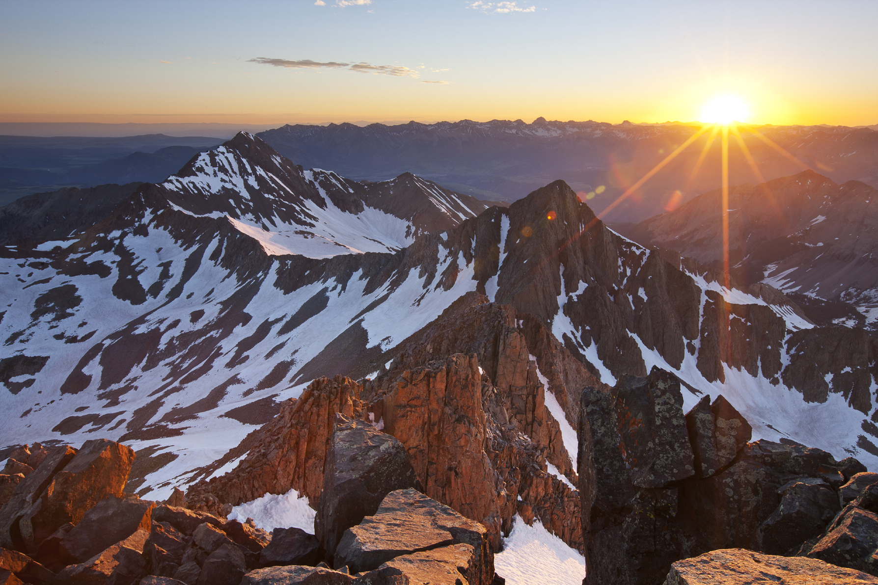
FIGURE 7-1 Wilson Peak and Gladstone Peak at sunrise from the summit of Mt. Wilson, San Miguel Mountains, Lizard Head Wilderness, Colorado
7 Digital Capture and Processing of High-Contrast Scenes
Many of the most dramatic landscape photographs are taken in high-contrast light, with sunrise or sunset light stabbing through the clouds and spotlighting a distant peak or sandstone tower, leaving the equally important foreground in deep shadow. Capturing a full range of tones in such high-contrast situations and reproducing them in a way our visual system considers natural has challenged landscape photographers ever since photography was invented nearly 200 years ago.
High-contrast scenes are difficult to photograph because of differences between our complex visual system and a camera’s sensor. Our eyes can see a huge range of light intensities from brightest highlight to darkest shadow. However, the range of brightness levels in a print is limited by the amount of light reflected by even the brightest white paper or canvas and by the amount of light absorbed by the blackest ink or paint available. The range of light intensities in the real world, in one scene, can be 10 or even a hundred times greater than what can actually be reproduced in a print. As you’ll see, the problem is compounded because our visual system does not analyze contrast globally, but rather within regions. A straightforward linear compression of the tonal scale we see into one we can print looks quite unnatural because it doesn’t correspond to the way our visual system processes high-contrast scenes.
This problem is not new. In the preceding chapter I mentioned the Rembrandt Solution, my term for a photographic technique that employs the same principles as counter-shading, the technique that Rembrandt developed for creating the illusion of greater dynamic range than actually existed in a painting. I also described how you could achieve the same result with graduated neutral-density filters. In this chapter, I’ll describe how you can use Photoshop to create the same effect with much greater flexibility and precision than is possible with physical filters. This chapter will also teach you the principles of perception that underlie this technique. I will discuss how our visual system processes high-contrast scenes, which will give you insight into how to craft photographs that look both believable and beautiful. With that information to guide you, I’ll then show you how to use the Rembrandt Solution within Photoshop to merge two separate exposures of a scene—one exposed for highlights, one exposed for shadows.

FIGURE 7-2 I used the Rembrandt Solution to assemble this image of Peak 13,242, columbines, and Blue Lake, Mt. Sneffels Wilderness, San Juan Mountains, Colorado
Countershading
Understanding counter-shading is fundamental to understanding the Rembrandt Solution. Counter-shading is the technique of introducing a gradual change in the background illumination, let’s say from light to dark, so that light foreground elements placed against the dark part of the background look brighter than they actually are. Counter-shading relies on two principles. The first is that our visual system is much more sensitive to abrupt changes in luminosity than gradual ones. In other words, our eyes are programmed to look for edges of objects. Our visual system evolved this way because it was much faster, for example, to identify the outline of a lion hiding in tawny brush than it was to distinguish the texture of fur from the texture of grass. The second principle is that surrounding a tone with something darker makes the original tone seem lighter; surrounding the original tone with something lighter makes it seem darker. Vision scientists call this effect simultaneous brightness contrast.

FIGURE 7-3 The circle-gradient illusion. The two circles are exactly the same in reality, but they look different because one is surrounded by a gradient from dark gray to light gray, while the other is surrounded by pure white.
Figure 7-3 shows a simple example of counter-shading called the circle-gradient illusion. When a background gradient is present, as in the left-hand image, you should see a subtle gradient inside the circle, from lighter on top to darker on the bottom. When the background is pure white, as in the right-hand image, you can see that the circle is actually a completely even tone. Simply by creating a tonal gradient in the background, we’ve induced an apparent, opposite tonal gradient in the foreground.
Now let’s take it further, to an example that shows how both the digital and analog versions of the Rembrandt Solution can create the illusion of greater dynamic range. Take a look at figure 7-4, which shows the Cornsweet illusion. The left half of the figure shows two rectangles, one above the other. The top rectangle should appear lighter than the bottom. In the right half of the figure, the middle two quadrants of the diagram are hidden. Suddenly you see that, in reality, the top quadrant of the strip is exactly the same shade of gray as the bottom quadrant.
Here’s what’s going on: The top half of the illusion actually contains a gradient from midtone to lighter-than-midtone. The bottom half contains a gradient from darker-than-midtone back up to midtone. Our eyes are insensitive to the gradual change of density in the gradients, but very sensitive to the abrupt change of density in the middle. Here’s the crucial point: merely by introducing two simple gradients, you can create the illusion of a greater dynamic range than actually exists. The top and bottom quadrants of the illusion are, in reality, the same density, but they look different. The Cornsweet illusion shows why you can use a split ND filter with a gradual transition from dark to clear in a situation where the actual transition from highlight to shadow is abrupt—and not only hide the fact that you’ve used such a filter, but actually enhance the apparent dynamic range of your print. The digital equivalent of using a split ND works exactly the same way.

FIGURE 7-4 The Cornsweet illusion. In the gray strip at the top, the far left and far right ends are exactly the same tone, although they appear different because they are joined in the middle by a gradient. The two lower squares are copied from each end of the rectangle. As you can see, their tones are identical. If you cover the middle gradient of the top strip with your finger, you’ll see that all four boxes are the same color.
Picture a typical split ND situation, with brightly lit mountains and deeply shadowed foreground flowers. You attach a split ND filter with a gradual transition zone from dark to clear and position the middle of the transition zone over the sharp dividing line between shadowed flowers and sunlit peaks. Let’s analyze the situation in the captured file as we move from top to bottom along the filter. Figure 7-5 shows an example. The solid gray part of the filter uniformly darkens the upper part of the peaks. As the filter’s transition from dark to clear begins, the sunlit peaks actually become brighter as the amount of light absorbed by the filter diminishes. At the shadow line, still beneath the transition zone of the filter, the shadow becomes darker than it otherwise would be because the filter’s transition zone hasn’t yet faded to clear. The bottom of the scene is unaffected because it’s behind the clear portion of the filter. A print of the image will show the illusion of a greater dynamic range than actually exists. As you’ll soon see, the digital version of the Rembrandt Solution achieves the same effect using slightly different means.
How our Visual System Processes High-Contrast Scenes
Now let’s talk about how our visual system processes high-contrast scenes. You might think that we analyze contrast globally; in other words, you might think that we look at the darkest part of the scene and call it black, then look at the brightest part of the scene and call it white—but that’s not actually how we see. In high-contrast situations, our visual system divides the scene into various zones and analyzes the local contrast in each zone independently. Shadows and highlights are the most obvious zones, but we also create zones more subtly. We then assign brightness values within zones, and don’t really pay much attention to brightness differences across zonal boundaries. For a scene to look natural, the local contrast must look right in each zone. When you use the Rembrandt Solution (either analog or digital), you can expose both the highlight and shadow regions somewhere close to midtone, which means both regions will have near-ideal contrast and color. Then, by using a Cornsweet illusion-like pair of tonal gradients, you can marry the two regions in a way that our visual system finds believable.

FIGURE 7-5 Illustration showing how split NDs affect the density of an image
For an illustration of how our visual system analyzes local contrast rather than global contrast, check out the optical illusion in figure 7-6. Examine the two thin rectangular regions I’ve outlined, one containing a strip of white paper in the shade, the other containing a portion of the second letter “l,” printed in black ink, in the sun. The white paper in the shade looks significantly brighter than the black ink in the sun. How could it be otherwise? Isn’t white paper always brighter than black ink? Now look at the copies of the same two rectangles that I’ve placed to the right of the photograph of the newspaper. You’ll see that the white paper is actually much darker than the black ink. The two rectangles shown in isolation are exactly the same density as the two rectangles outlined in the photograph of the newspaper, but they look different because they are isolated against a plain white background rather than placed inside the context of an image with clearly defined highlight and shadow regions.
You might think it would be better to show only the perfectly exposed highlights and shadows, without having a gradual transition between the highlight and shadow regions. In fact, it’s better not to create a hard edge between the highlight and shadow regions because the transition between the two regions will look more natural if you don’t. Creating a hard edge between the two regions leads to an abrupt transition from cool shadow to warm highlight that has a color change but no density change. Your brain can be fooled, but it’s not stupid: the result looks patently fake, as you can see in figure 7-7.
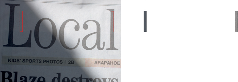
FIGURE 7-6 Newspaper local-contrast illusion
Capturing Rembrandt Solution Images in the Field
Enough theory! Let’s take these ideas and put them to practical use. In chapter 6, I discussed how to use physical split NDs. Now let’s talk about creating the digital equivalent. To use the digital version of the Rembrandt Solution, you need to make two captures, one correctly exposed for the highlights, the other correctly exposed for the shadows.
For starters, be sure to lock your camera down on a solid tripod, and be careful not to move the tripod or camera when adjusting the exposure. When changing exposure, be sure to change the shutter speed, not the aperture. Changing the aperture will change the depth of field, which will prevent the images from aligning perfectly. Using the auto-bracketing feature on your camera makes the job much easier. In aperture priority and manual exposure modes, most if not all cameras will auto-bracket by holding the aperture constant and varying the shutter speed—exactly what you want. In shutter-priority or time-value mode, they will hold the shutter speed constant and vary the aperture—not what you want.
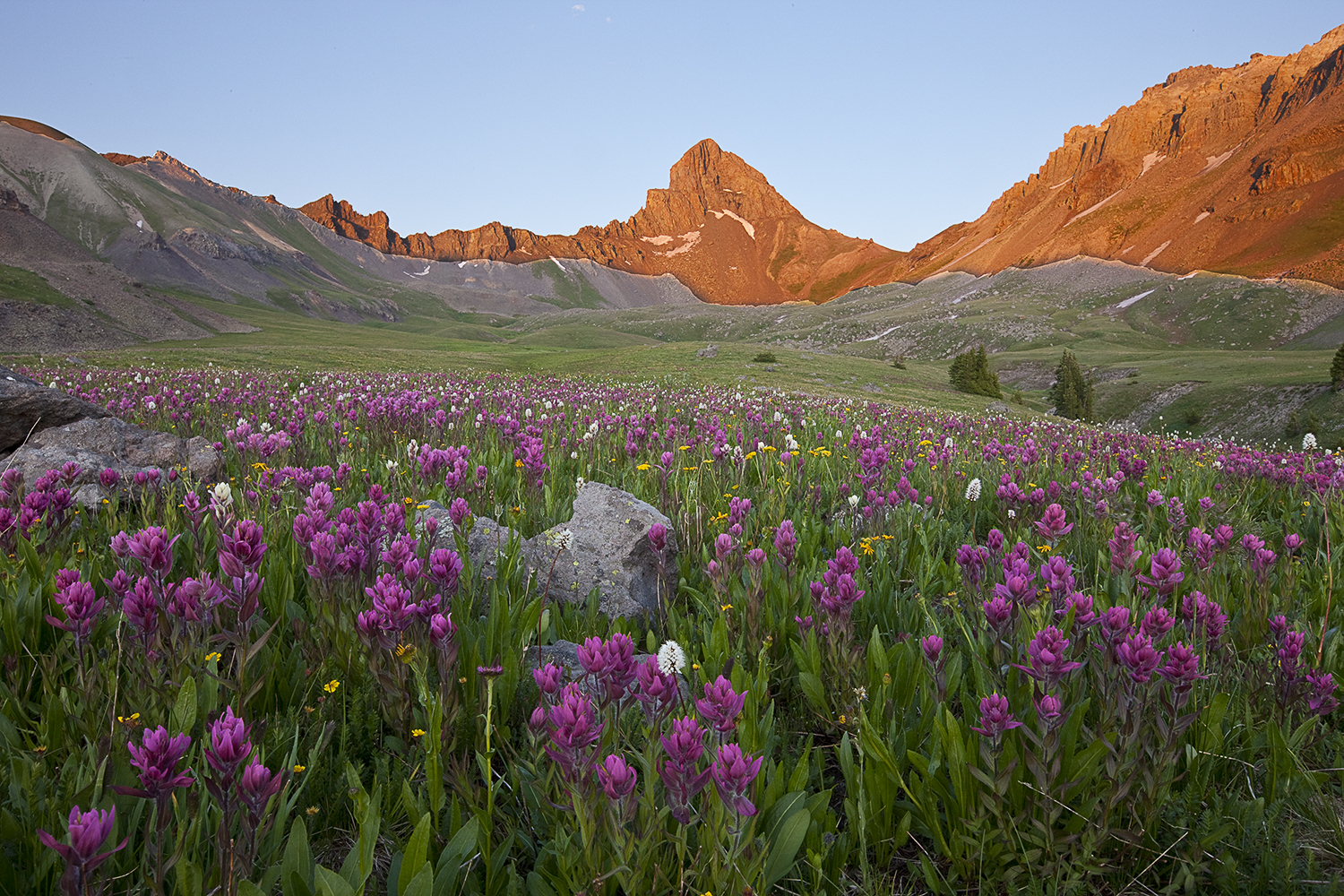
FIGURE 7-7 Creating a sharp boundary between the highlight and shadow regions of an image, with each region exposed close to midtone, leads to an obviously unnatural result. Compare this image to figure 7-5.
The procedure for calculating the two digital exposures is similar in concept to the rigorous method for choosing the correct strength of a split ND filter. Let’s start with the digital procedure, using the example of a field of wildflowers in shade with a peak in the background catching the last rays of the setting sun. I start by calculating the correct exposure for my foreground using either a hand-held or in-camera spot meter.
To understand spot metering, first recall that reflected-light meters always recommend an exposure that will render whatever you meter as a middle tone. If the subject is midtone, such as green grass or deciduous foliage, then the meter’s recommendation will be dead-on. That’s true whether you’re using an overall meter pattern that reads the whole scene, such as evaluative (Canon’s term) or matrix (Nikon’s term), or whether you’re using spot metering. Spot metering merely confines the meter reading to the small portion of the subject visible through the spot metering circle in your viewfinder.

FIGURE 7-8 I made this image of Windom Peak, Sunlight Spire, and Sunlight Peak from South Sunlight Lake at sunrise, Weminuche Wilderness, Colorado, using a physical split ND filter and 4 × 5 film
Since my foreground in this example has lots of midtone green foliage, I spot meter the foliage and use manual exposure mode to set the exposure recommended by the meter on the camera. This is my base exposure, which will perfectly expose everything in the foreground. For the moment, I don’t care what happens to my background.
With my foreground exposure locked in, I calculate the correct background exposure. Let’s say I meter the sunlit peak at 3 stops brighter than my foreground flowers. For example, I might meter the foreground foliage at 1/2 second, f/16. I then meter the sunlit peak at 1/15 second, f/16. That’s a three-stop difference. When I make the first capture at my base exposure (the correct exposure for the foreground), the sunlit peak will be three stops overexposed and I will get a very pale, washed-out peak. The sky, which is usually even brighter, will be completely white. I need to make a second exposure that renders that peak only one stop brighter than midtone. Since my base exposure places the peak three stops over midtone, that means I need a second exposure that will be two stops darker than my base exposure. So I engage auto-bracketing on my camera and set the bracket interval to two stops. I then choose a two-frame bracket set, and set the bracket order to normal, under, over. Since the bracket set only contains two frames, the camera won’t actually shoot the over frame. (If your camera doesn’t offer a two-frame bracket set, use a three-frame bracket set and just discard the grossly overexposed over frame once you’ve downloaded your images to your computer.) I always shoot the normal exposure first because I usually have to wait for the wind to stop. The normal exposure will be the one with correctly exposed flowers. I want to nail that exposure first while the flowers are completely still.
Why not bring the exposure for the sunlit peak all the way down to mid-tone? Primarily because it would look unnaturally dark and rich. It’s a highlight; it should be brighter than midtone.
FIGURE 7-9 I made this image of heartleaf arnica and Uncompahgre Peak at sunset, Uncompahgre Wilderness, Colorado, using a graduated neutral-density filter and 4 × 5 film
If I was using physical split ND filters, I would choose a two-stop filter, which reduces the exposure for the mountain by two stops, rather than making a second exposure that was two stops darker than the first.
If all this talk of spot metering has you seeing spots, consider this: in a Rembrandt Solution situation, the difference between the correct foreground and background exposure will almost always be between two and three stops. If you calculate a one-stop difference, your camera can almost certainly straddle the range of brightness levels present in the scene. If you calculate a four-stop difference, you probably won’t be able to merge the two images without the transition line being obvious. If the difference is four stops, you’re in an HDR situation.
At this point you may be wondering, “Why not just use the Universal Exposure Strategy? That’ll cover all the bases.” The problem with the Universal Exposure Strategy in this case is that the compromise exposure recommended by the meter for the scene overall will attempt to straddle the difference between the bright highlights and the dark shadows and do justice to neither. This unacceptable compromise exposure will be the first one the camera makes. By the time the camera gets around to making the correct exposure for the flowers, the wind may be blowing again and the flowers may be blurred.
Merging the Images in Photoshop
In the directions that follow, I’ll assume you’re using a PC. Mac users should substitute the Command key for the Control key.
The first step is to load the two exposures as layers in a single file in Photoshop. The easiest way to do this is to start from Lightroom. In Lightroom, select both images, then choose Photo>Edit In>Open as Layers in Photoshop. If you don’t use Lightroom, start from Bridge (which ships with Photoshop). Select both images, then choose Tools>Photoshop>Load Files into Photoshop Layers. And if you don’t use Bridge, then start from Photoshop itself. Choose File>Scripts>Load Files into Stack and navigate to the appropriate files.
Whichever method you use, the next task is to drag the dark (good highlight) layer to the top of the layer stack if it’s not already there.
Target the highlight (top) layer and add a layer mask to it by clicking the Add Layer Mask icon at the bottom of the Layers panel. It looks like a square with a circle inside it. Be sure your foreground color is white and background color is black. (Press D for default colors of white and black.) Be sure you’ve targeted the layer mask, not the image itself, by clicking on the mask. Select the Gradient tool (hit G on the keyboard). Click the Gradient icon (far-left icon in the Options bar) and make sure you have foreground to background selected. Drag out a gradient in the image window, starting where you want the transition from white to black to begin, and ending where you want the transition to end. Photoshop will fill in the mask with solid white above the starting point of your drag and fill it in with solid black below the ending point of your drag. White areas of the mask reveal the corresponding portion of the layer to which the mask is attached; black areas conceal that portion. Gray areas partially hide that portion of the layer, allowing some portion of the layer beneath to show through. Figure 7-10 shows what the Layers panel should look like. Your image should now show the best parts of each layer, with an unobtrusive transition between the highlight and shadow regions. If it doesn’t, just redraw the gradient. There’s no need to hit Control-Z to undo the first version. Photoshop will replace the first version with the new one. You can do this as many times as you like.
FIGURE 7-10 The Layers panel after completing the Rembrandt Solution
If necessary, refine the mask by painting on it with either white or black to achieve the final result. Press B to get the Brush tool. With the mask still targeted, paint with white to reveal more of the good-highlight region. Paint with black to reveal more of the good-shadow layer. Press the backslash key to see a translucent pink overlay of the mask. The pink overlay corresponds to black areas on the mask.
The image I chose for the example above works perfectly for this simple form of the Rembrandt Solution. The dividing line between highlight and shadow is nearly straight, and there are no large dark elements, like trees, that poke up into the highlight region. But what if the dividing line between highlight and shadow is irregular rather than nearly straight? The simple approach doesn’t work, as you can see in figure 7-11. Here’s how to handle even this extreme example.
FIGURE 7-11 This photo shows the result of using the Rembrandt Solution, whether analog or digital, with a straight dividing line between dark and clear portions of the filter, or the white and black portions of the layer mask. Notice that the sunlit mountains and shadowed flowers are correctly exposed, but the shadowed valley walls on either side of the frame are too dark.
Start by opening and stacking both images with the dark image on top, as before. Now, instead of adding a layer mask, press L for the Lasso tool. Draw a selection around the highlight region. You don’t need to be too fussy about making it perfect. In fact, you should draw the selection well down into the shadow region where the skyline is the boundary between highlight and shadow to avoid creating a halo (an unnatural bright region along the skyline) when you blur the mask in the final step. Add a layer mask by clicking the Add Layer Mask icon at the bottom of the Layers panel. Photoshop will automatically make the selected area white on the mask and black everywhere else. The image will look very odd, as shown in figure 7-12.
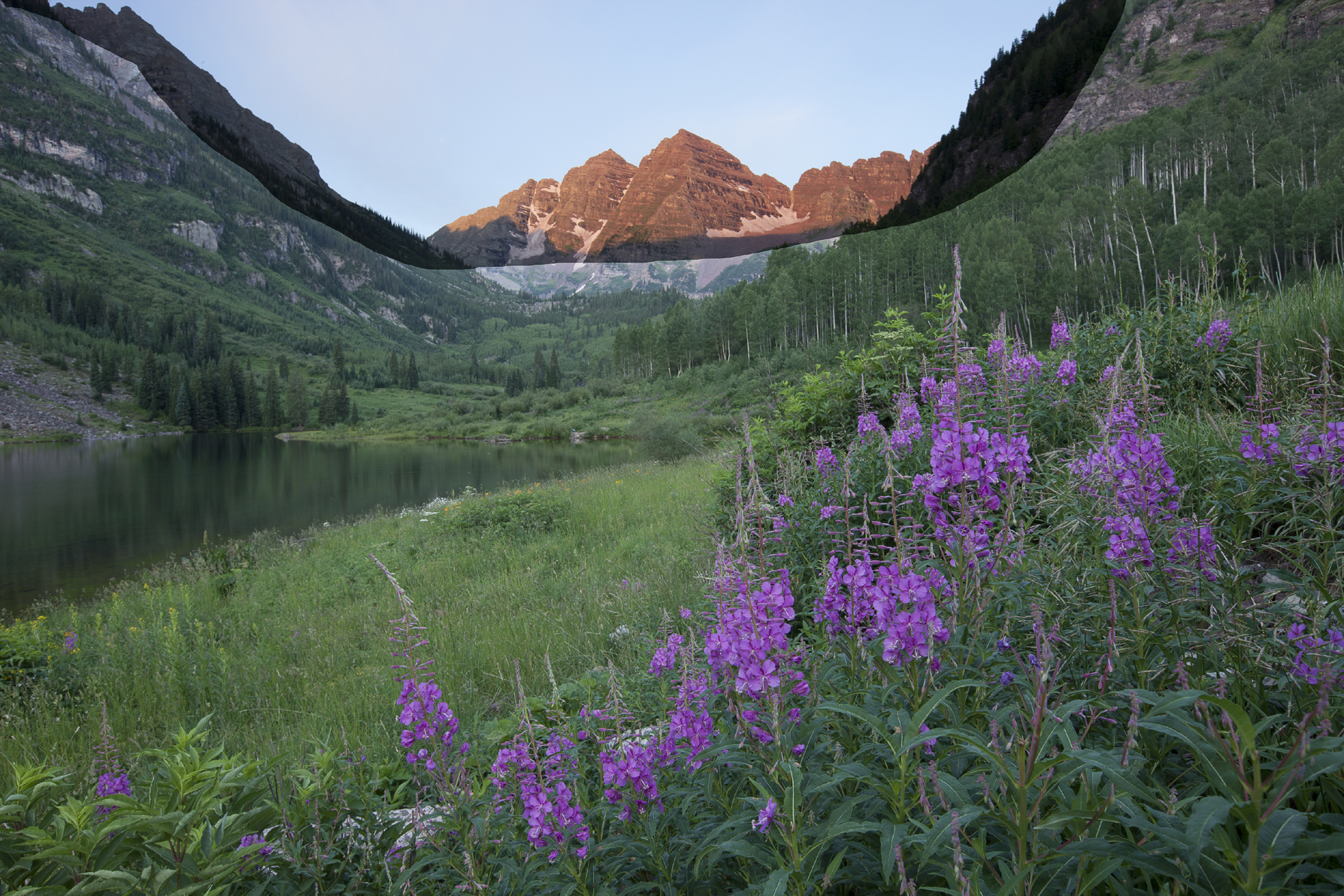
FIGURE 7-12 The image after drawing the selection and adding a layer mask
Now let’s make the image look natural. With the mask targeted, go to Filter>Blur>Gaussian Blur and blur the mask. You’ll need a high Radius, probably between 100 and 250 pixels, depending on the resolution of your image and how much you want to blur the mask. Click OK, and you’ll see that you’ve effectively blurred the mask, which in turn has softened the transition from the highlight to the shadow region. You can touch up the mask as needed by painting on it with either black or white. In effect, you’ve just created a custom split ND filter that follows the boundary between light and shadow.
Smart Objects and the Masks Panel
Two additional Photoshop features, Smart Objects and the Masks panel, give you still further control and flexibility when using the Rembrandt Solution. Smart Objects have many uses, but the most important for our purposes is that they allow you to edit the contents of an individual layer using all the tools available in Adobe Camera Raw. The Masks panel, which became part of the new Properties panel starting with Photoshop CS6, allows you to blur a mask nondestructively. You can reopen the image at any time and change the amount of blur.
You can implement these two features starting from either Lightroom or Bridge. In Lightroom, select the two images you want to work with and choose Photo>Edit In>Open as Smart Object in Photoshop. In Bridge, select the two images and double-click one of them to open both in Camera Raw. Select both files using the Select All button on the top left, then hold down Shift and click Open Object. The two files will open in Photoshop as Smart Objects.
If you’re using a tabbed interface (the default), each image will be open under its own tab. Click the tab for the good-highlights image (the darker one, with good highlight detail but dark shadows) to make it active. Press Control-A to select all, then choose the Move tool (press V). Hold down Shift, and drag the good-highlights image up to the tab for the good-shadows image. Don’t try to drop it there; instead, wait until Photoshop switches to the good-shadows image, then move the cursor down over the good shadows image and release the mouse button. Now (finally!) you can release the Shift key. By holding down Shift, you tell Photoshop to align the two images precisely.
Proceed as before by drawing a selection around the highlights with the Lasso tool and adding a layer mask. The image will look awful. Now open the Properties panel, which contains the Masks panel. If it’s not visible, choose Window>Properties. With the mask targeted, adjust the Feather setting in the Masks panel. Use a high radius (100 to 250 pixels, depending on the image and the resolution of your camera). This will blur the mask and soften the transition between the highlight and shadow regions.
There is one important caveat about using the Feather slider in the Masks panel to blur the mask. The Feather setting controls both the amount of blur applied to the mask and the amount of blur applied to any subsequent painting you may do on the mask to refine the mask edge. If you choose a small, soft-edged brush and have a high radius set with the Feather slider, your brush may be so blurred that it essentially has no effect. Trying to paint on a mask with the Feather slider set to a high value is also very processor-intensive. Your machine may slow down to the point where you assume it has frozen. If you need to further adjust the mask after blurring it with the Feather slider in the Masks panel, try this procedure: first, note the setting of the Feather slider that works best with your image. Then reset the Feather slider to zero. With the mask targeted, go to Filter>Blur>Gaussian Blur and blur the mask using the same setting you initially used for the Feather slider. Now you can paint on the mask with predictable and near-instant results. The disadvantage of this procedure is that once the file has been saved and closed, you can’t undo the mask blurring as you can with the Feather slider in the Masks panel, although you can, of course, correct mistakes by further painting on the mask.
If you want to make further adjustments to the RAW files, you can double-click the Smart Objects icon inside the layer thumbnail of the appropriate layer in the Layers panel. This will reopen the image in Camera Raw and allow you to make any further changes. Click OK to close the Camera Raw dialog box. Photoshop will reopen with your changes in place. Note that changes to a Smart Object will not be reflected in the Develop settings for the original RAW, which will retain the Develop settings in place when you first opened the file as a Smart Object. The Spot Healing Brush and Clone Stamp tool won’t work directly on a Smart Object. It’s easiest to clean your images in Lightroom or Camera Raw before opening them in Photoshop as Smart Objects, but you can also use this workaround: add a new, blank layer at the top of the layer stack (Control-Shift-N). If you’re using the Clone Stamp tool, set Sample to All Layers in the Options bar. If you’re using the Spot Healing Brush, check Sample All Layers. Both tools should now work.
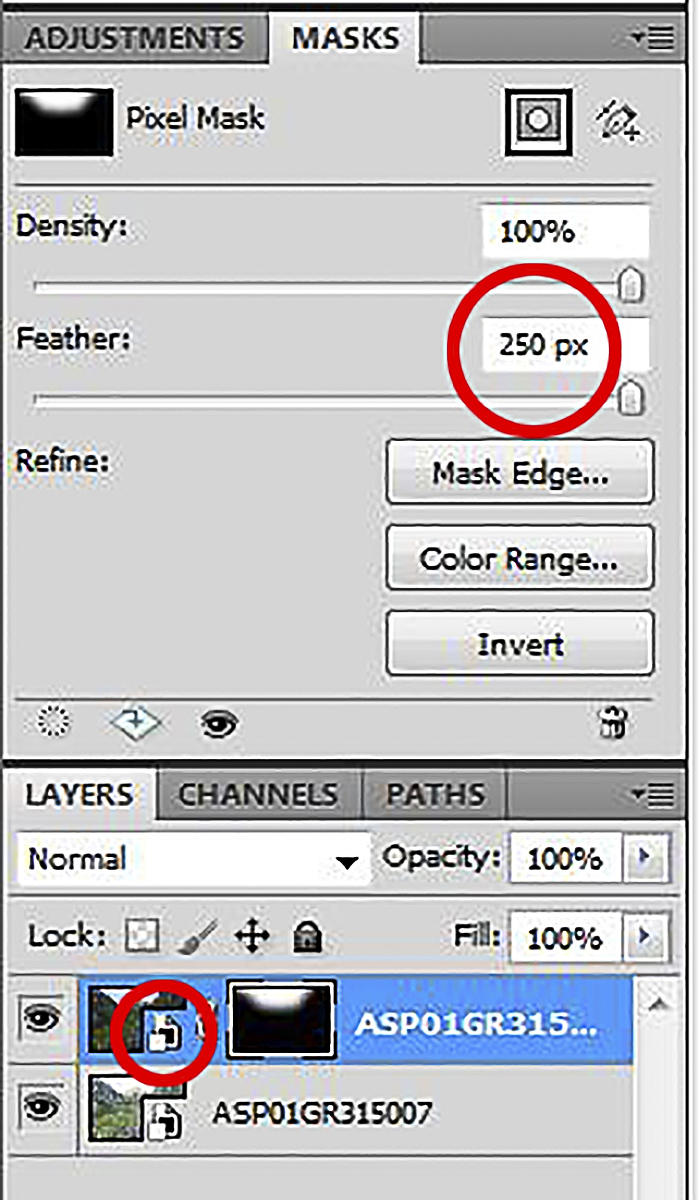
FIGURE 7-14 The Masks panel showing a feather setting of 250 pixels. The Smart Objects icon is circled.
Final Thoughts on the Rembrandt Solution
Which is better: a physical split ND filter or the digital equivalent? Certainly you’ll find the physical filters useful if you’re still shooting with film. If you’re shooting digitally, but don’t use either Photoshop or Photoshop Elements, particularly if you’re capturing images as JPEGs, you will find split NDs very useful. Lightroom doesn’t support layers, so it can’t be used by itself for this procedure. If you are comfortable using either the full version of Photoshop or Photoshop Elements, particularly if you are capturing images as RAW files, and if you’re familiar with the high-dynamic-range techniques I’ll describe next, you may find that digital techniques for merging two or more images taken at different exposures have made split NDs obsolete. Split NDs do have one significant advantage over all of the digital techniques: they allow you to record the full range of tones present in the scene in a single capture, eliminating the problem of scene elements, such as flowers, leaves, or water, moving in between exposures. And they save time at the computer—time that can be spent more enjoyably in the field. For me, however, the flexibility and control offered by the digital techniques outweigh the advantages of physical filters. I carried a quiver of eight split ND filters for 15 years when I was shooting 4 × 5 film, but I retired the kit for good when I bought my first high-end DSLR.

FIGURE 7-15 I shot this image of sunrise over an aspen grove on Beaver Mountain, Rocky Mountain National Park, Colorado, using 4×5 film and a three-stop graduated neutral-density filter
The same landscapes that work well with physical split NDs are good candidates for the digital version of the Rembrandt Solution. In situations that lend themselves to this technique, the digital Rembrandt Solution can quickly produce results that are both realistic and beautiful. While subject movement can be a problem, it’s often easier to manage movement using this approach than it is when using HDR software. Let’s say the wind never stops completely, so that a few blossoms are blurred, even in your very best frame. If you use the Rembrandt Solution, only one layer (the good-shadow layer) is visible in the image region containing the flowers. You will see slight motion blur in the blossoms that moved during the exposure, but you won’t see totally unnatural ghosting, with two versions of the same blossom faintly visible through each other—as can happen with HDR software. The only region where motion could be a problem is under the transition zone between the two images. Usually that can be placed on the mid-ground or background, where it’s unlikely that subject movement will be noticeable.
My first choice when shooting high-contrast scenes is to try to get all the detail I need in a single capture. If the dynamic range of the scene exceeds the range of my sensor, I turn next to the Rembrandt Solution. If that approach won’t work, I resort to high-dynamic-range software.
HDR: Great Potential, Many Pitfalls
Interest in high-dynamic-range imaging has exploded over the last five years. More than half a dozen HDR programs are available today, and more seem to pop up every week. HDR imaging promises to solve one of the great challenges of photography—taking the broad range of tones we see in the real world and compressing it into the much narrower range of tones we can see on a monitor or reproduce on paper.
Until recently, however, I was an HDR skeptic. All too often, HDR software produced unnatural results. Shadow contrast sometimes looked strangely flat. Colors shifted in unexpected ways and dark objects set against bright backgrounds often developed pronounced halos—weird bright bands along the object’s edge. Textures were often enhanced beyond the bounds of believability.

FIGURE 7-16 A sea of fog fills the valley of the Arkansas River as seen from the summit of Mt. Princeton at sunrise, San Isabel National Forest, Colorado. To create this image, I produced a 32-bit TIFF from my bracketed set of photos, then tone-mapped the TIFF in Lightroom.
Granted, HDR software must solve a tough problem: replicating the intricacies of human vision. As I discussed earlier in this chapter, our visual system analyzes contrast locally rather than globally. In other words, we don’t look at the darkest part of the overall scene and call it black, then look at the brightest part and call it white. Instead, we analyze contrast within regions, most obviously shadows and highlights, but also more subtly. The challenge for HDR software is to maintain good local contrast within regions, while still creating believable transitions across regional boundaries. Simply taking the overall range of tones and squashing it down to a range we can print produces an odd, low-contrast image no one would call realistic.
FIGURE 7-17 Aspen grove on top of Stealey Mountain at sunset, near Owl Creek Pass, San Juan Mountains, Colorado. To create this image I used my favorite HDR technique: producing a 32-bit TIFF from my bracketed set of photos, then tone-mapping the TIFF in Lightroom.
The latest generation of HDR software goes a long way toward solving these problems. My current favorite approach is using Lightroom to tone-map 32-bit TIFFs. Before tackling this approach in detail, however, let’s dive a bit deeper into the concept behind HDR. The number of brightness levels a digital image can contain is determined by its “bit depth.” JPEGS, for example, are 8-bit images, which means they can contain 256 brightness levels (shades of gray, in black-and-white terms), from solid black to pure white. Most DSLRs capture RAW files in 12 or 14 bits, which is then interpolated up to 16 bits. A 16-bit Photoshop file can contain 32,769 brightness levels. (The mathematically inclined among my readers will have noticed that 16-bit Photoshop files actually only have 215 brightness levels for technical reasons we don’t need to get into here.) While greater bit depth doesn’t directly translate to greater dynamic range, it does help preserve smooth tonal gradations in high-contrast images. A 16-bit file can cover a broad brightness range, but it’s still not enough to cover the full dynamic range of a high-contrast scene.
FIGURE 7-18 Frosted ponderosa pines at sunrise, Flagstaff Mountain, Boulder Mountain Parks, Colorado. Created by tone-mapping a 32-bit TIFF in Lightroom.
HDR images are 32-bit images, which can contain far more brightness levels than 16-bit images—enough to cover the full dynamic range of the highest-contrast scenes we encounter. Unfortunately, HDR images contain such an enormous range of brightness levels that no conventional monitor can display them, and we’ll probably never be able to print them using ink on paper. Before an HDR image is usable, it must be tone-mapped. In other words, the dynamic range of the image must be intelligently compressed into a range we can display on a monitor and then print. HDR programs differ both in the quality of the initial 32-bit file they produce and in the quality of their tone-mapping algorithms.
Setting up an HDR Image
Now let’s discuss the procedures you should follow in the field when you’re planning to use the HDR approach. As with the Rembrandt Solution, be sure to lock your camera down on a solid tripod, and be careful not to move the tripod or camera when adjusting the exposure. When changing exposure, be sure to change the shutter speed, not the aperture. Changing the aperture will change the depth of field, which will prevent the images from aligning perfectly.
At a minimum, you should bracket high-contrast scenes in a set of three, with a bracket interval of two stops. In other words, shoot a frame at –2 exposure compensation, then 0, then +2 stops. For the highest-contrast scenes, such as those with the sun in the frame, you will get slightly better results if you shoot seven frames at a 1-stop bracket interval. This covers a range from –3 stops to +3 stops rather than –2 to +2. The very darkest of these exposures will have slightly better detail in the sky around the sun, which will be noticeable in the final print.
HDR software is always improving. If you capture a wide range of exposures today, you may be able to improve your rendition of the image in the future as the software becomes more capable. Regardless of how many frames you shoot, be sure to check your histogram after your first bracketed sequence to be sure you have at least one frame with excellent shadow detail and one frame with excellent highlight detail. Ideally, your lightest shadow frame should be light enough that most of the shadow region falls in the midtones. This helps suppress the noise buildup that can plague images generated with HDR software.

FIGURE 7-19 Mt. Sneffels in late September from County Road 7, San Juan Mountains, Colorado. Created by tone-mapping a 32-bit TIFF in Lightroom.
In most situations you can let the camera pick the starting-point exposure, then bracket around that setting. With certain subjects, however, that approach will fail. Let’s assume you’re working on a shot where 80 percent of the frame is shadowed rock and 20 percent is ultra-bright sky. Your meter will recommend an exposure that will render the dominant subject—the shadowed rock—as a midtone. That’s all the detail you need in those dark rocks; you really don’t need any lighter exposure for the shadows. However, if you’re bracketing around the zero exposure-compensation mark, your camera will then make an exposure two stops brighter and an exposure two stops darker. The +2 exposure is unnecessary (not a big problem) but the –2 exposure may not be dark enough to bring in all the detail you want in that bright sky (a very big problem). The solution? Set your exposure compensation to –1, and bracket around that starting point. That gives you –3, –1, and +1 as your three exposures. You’ll still have plenty of shadow detail, and you’ve brought in the highlights as well.

FIGURE 7-20 If your subject is predominately dark with a very bright strip of sky, like this view from the summit of Mt. Evans, set the starting point for your bracketed series at –1 exposure compensation
Similarly, if the shot involves 80 percent bright sky and 20 percent dark land, the meter will recommend an exposure that will render the sky as a midtone, which is adequately dark. If you’re bracketing around the zero exposure mark, however, you’ll get a frame that’s two stops darker (unnecessary, but not a big problem) and a frame that’s two stops lighter, which may not be light enough to give you the detail you want in the land (a very big problem). The solution is to set your exposure compensation to +1 and bracket around that starting point, giving you –1, +1, and +3 as your bracket set. You’ll still have plenty of highlight detail, and you’ll have adequate shadow detail as well.
Bottom line: if the scene is predominately dark, bias your starting-point exposure toward dark (–1 exposure compensation); if the scene is predominately light, bias your starting-point exposure toward light (+1 exposure compensation). Then check the histogram for each frame in the bracket set to make sure you have adequate highlight detail in your darkest frame and adequate shadow detail in your lightest frame.
Tone-Mapping in Lightroom
Once you have a well-exposed set of images, the next task is to combine them into a 32-bit file. All of the stand-alone HDR programs, as well as Photoshop, include a utility to perform this chore without user input. The various HDR programs then provide you with a bewildering variety of ways to tone-map the 32-bit file so it can be displayed on a monitor and printed. These programs are good, and may have improved further by the time you read this, but right now tone-mapping your 32-bit TIFFs in Lightroom is the best option.
FIGURE 7-21 If your subject is predominately bright with a thin strip of dark land, like this view from the summit of Mt. Shavano, set the starting point for your bracketed series at +1 exposure compensation
I always prefer software workflows that are intuitive. That’s one major reason I like to use Lightroom to tone-map my HDR files. I can use all of Lightroom’s powerful, sophisticated, and familiar controls in a completely nondestructive manner while getting full access to the enormous range of tonal data in the 32-bit file. If you shoot in high-contrast light but hate the surreal HDR look, the Lightroom approach is something you’ve got to try.
This approach does have a catch. As of this writing, Lightroom doesn’t have the capability of creating a 32-bit TIFF from a bracketed set of images. (At this time, Lightroom can only manage 32-bit TIFFs, not 32-bit files in any other format.) To create the 32-bit TIFF, you’ll need Photoshop, Photomatix Pro (most easily used as a stand-alone program—not accessed through Light-room), or the Merge to 32-bit HDR plug-in for Lightroom created by HDRSoft, the same company that makes Photomatix. By the time you read this, Light-room may be capable of creating a 32-bit TIFF, and other methods may be available as well. Be sure to check out all the options. Creating a 32-bit file is not a turnkey operation, and the quality of the file varies considerably from program to program. Shots with the sun in the frame pose a particular challenge because the extreme difference in brightness levels makes it difficult to create smooth, believable gradients across the sky.

FIGURE 7-22 Snowmass Mountain and Capitol Peak from the summit of 14,156-foot South Maroon Peak at sunrise, Maroon Bells-Snowmass Wilderness, Colorado. Created by tone-mapping a 32-bit TIFF in Lightroom.
Regardless of the method you use to create the 32-bit file, the next step is the same: open the image in Lightroom’s Develop module. The first thing you’ll notice is that the Exposure slider in the Basic Panel now provides a range from –10 to +10 stops. For an ordinary RAW file, the range is just –5 to +5 stops. That gives you an idea of just how much data you get to play with. Don’t expect to do all the work with the Exposure slider, however. You’ll probably need to make some large adjustments of the Shadows, Blacks, Highlights, and Whites sliders to bring out all the detail in the file. Many 32-bit images benefit from adding contrast in the Tone Curve panel, and you may need to further adjust shadow and highlight density with the Graduated Filter and Adjustment Brush. You’ll find that you can recover more clean, usable detail, even in the darkest shadows and brightest highlights, from a 32-bit image than you can from a 16-bit RAW file. And it’s all nondestructive. You can return to the image at any time to make further refinements. If your goal is to create natural-looking images of high-contrast scenes, you’re going to love this approach.
Keeping it Real with HDR
Despite all the advances in HDR software in recent years, achieving a natural-looking result can still be a challenge. In fact, one of the questions students most frequently ask in my landscape photography workshops is, “How do I make my HDR photographs look more realistic?”
FIGURE 7-23 Beaver Lake and aspens, near Silver Jack Reservoir, San Juan Mountains, Colorado. Created by tone-mapping a 32-bit TIFF in Lightroom.
To answer that question, we first need a clear understanding of the problem. As I’ve discussed, we’ll never be able to create an image on paper that displays the full dynamic range we can see in the real world. In that sense, it’s impossible for a print to ever look completely real. But it is possible to get close—close enough that a print evokes in the viewer many of the same emotions that the real scene evoked in the photographer.
My guide when preparing prints has always been what I saw, rather than what my film or sensor captured. I was never satisfied with the limited dynamic range of my 4 × 5 film, for example, and I carried eight graduated neutral-density filters to try to capture shadow and highlight detail the way I saw it. When affordable film scanning became available, I began using Photoshop to further adjust shadow and highlight density. Digital capture was another step forward, but even the high-end DSLR I’m using today still has less dynamic range than my eyes, which is why I use a variety of digital techniques, including HDR, to capture what I see.
But how do you really know what you saw hours, days, or weeks later? According to RIT professor Mark Fairchild, people are notoriously bad at remembering colors. We can distinguish thousands of different colors if they are placed side by side, but we can accurately remember less than a hundred. We can easily remember if the flowers were blue or red, for example, but we quickly forget what shade of pink we saw in sunset clouds. To further muddy the waters, according to Fairchild, people tend to remember colors as more saturated than they actually were. In addition, we tend to substitute certain “memory colors” for common objects. For example, we remember yellow-green grass as more green than it actually was, and we tend to remember sky as pure blue when it actually wasn’t. Your best guide to what you saw is your original bracketed set of images—with one qualification.
Let’s assume you’ve loaded a bracketed set of images into your favorite HDR software. As you begin to adjust the 32-bit file, compare the region you’re working on to the frame from your bracketed set that is properly exposed for that region. If you’re adjusting the portion of the image that contains flowers, for example, “properly exposed” may mean the frame in which the green foliage surrounding the flowers was rendered as a midtone. If you’re adjusting a sunset sky, however, don’t pick the frame in which the glowing clouds are midtone and everything else is black. As pretty as those clouds may be, they’re underexposed. Glowing clouds are a highlight; they should be brighter than midtone. Midtone clouds will look unnaturally dark if placed in a landscape where the flowers beneath are also midtone.
Here are some other key principles for making your HDR photos look more realistic:
• Keep saturation under control: Wildly oversaturated colors may catch your viewer’s eye, but excessive color saturation looks unnatural and is a flimsy reed on which to hang the entire impact of your image.
• Let highlights be highlights: As Margaret Livingstone, a neurobiolo-gist and vision researcher at Harvard Medical School points out, “We don’t actually perceive the amount of light at any point in a scene, but instead we perceive the relative amount of light at each point, compared to that point’s immediate surround.” Explaining further, she added, “Something looks light only if it is lighter than its background.” Photographs of high-contrast scenes generally look more realistic if the brightest tones are close to pure white but not clipped on the histogram. Images containing the sun are an exception. The disk of the sun itself will always be blank white unless it is partially concealed behind dense fog or clouds. In a clear sky, the sun can cause veiling flare in our eyes as well as our lenses. Veiling flare, an overall diffuse, washed-out appearance in an image, occurs when the sun is shining directly on the lens surface, even if the sun is outside the frame. (Sunlight shining directly into our eyes can cause a similar condition.) Allowing some degree of flare to reduce the contrast in the region around the sun can actually make an image look more natural. Your HDR sequence may have a frame that’s so dark it shows very little flare at all, but that’s not necessarily the best frame to match.
FIGURE 7-24 Clouds ignited by sunrise light are reflected in a pond below Columbine Lake, San Juan National Forest, Colorado. I kept the land dark to make the richly colored sky more believable; making the land midtone would have looked fake.
FIGURE 7-25 Pyramid and Cathedral Peaks from the summit of 14,156-foot South Maroon Peak at sunrise, Maroon Bells-Snowmass Wilderness, Colorado. Created by tone-mapping a 32-bit TIFF in Lightroom.
• Let shadows be shadows: Compressing the tonal scale until the shadows and highlights have the same density screams “HDR!” Retaining small areas of pure black makes your images more believable so long as the subject matter allows it. Most high-contrast scenes do. Large areas of near-black shadows, however, can be unnatural, since our eyes can usually see good detail in broad shadow regions.
• Maintain good local contrast in the highlights and shadows: As I’ve discussed, our visual system does not analyze contrast globally. Instead, we analyze contrast locally, within regions, most notably highlights and shadows. According to both Fairchild and Livingstone, there’s no easy way to define in a scientific sense what level of local contrast looks most realistic. Fairchild says, “Amazingly, we are pretty good at just looking at them (images) and making a judgment (and with fairly good agreement among observers).” When in doubt, go back to your bracketed set of images to see what level of local contrast you captured in the frame that’s properly exposed for the region of interest. Remember that surrounding the target region with high-contrast subject matter will lower the perceived contrast of the target region. Surrounding the same target region with low-contrast subject matter will have the opposite effect. Strong overall contrast tends to make bright areas look brighter. For example, if you have the sun in the frame, letting a few shadows go dark will make the sun appear brighter, which will enhance the naturalness of the image’s appearance.

FIGURE 7-26 Crepuscular rays (god beams) from the summit of 14,267-foot Torreys Peak, near Georgetown, Colorado. Created by tone-mapping a 32-bit TIFF in Lightroom. Keeping the foreground ridge dark enhanced the apparent brightness of the clouds.
• When it comes to blending shadow and highlight regions into a believable whole, gradients can be your friends: As you know by now, I love gradients. They’re essential when employing the Rembrandt Solution, but also useful when tone-mapping your HDR images. Light-room and Camera Raw both have a slick Graduated Filter that you can use when tone-mapping a 32-bit TIFF. Some dedicated HDR programs offer this option, as well.
• Look at HDR images at all scales, from thumbnail to print size: You’re looking for two different problems here. One characteristic of an over-baked HDR is excessive textural contrast. You’ll see this often in shots of old cars and abandoned factories, where the texture in the rust and peeling paint has a grungy, hyperreal quality. Excessive use of Clarity in Lightroom or Camera Raw can produce this look, as can any number of controls in dedicated HDR programs. The texture might look fine at screen size, but could be a problem once you zoom in to print size at, say, 16 × 24 inches. The second problem concerns gradients. If you employ a digital graduated filter tool to help blend the highlights and shadows, take a look at the image at thumbnail size (the first size most people will see in this digital era). If the transition zone is too narrow, it can be obvious in the thumbnail even if the print-size image looks fine.
• Beware of halos where dark objects meet bright backgrounds: This is another dead giveaway of an over-baked HDR. HDR programs have gotten much better over the past few years at controlling halos, but if you compress the tonal scale too far, halos can still be an issue.
FIGURE 7-27 North Maroon Peak from the summit of 14,156-foot South Maroon Peak at sunrise, Maroon Bells-Snowmass Wilderness, Colorado. Created by tone-mapping a 32-bit TIFF in Lightroom. I preserved the hazy bright appearance of the sky and land in the top-right corner of the image to mimic the veiling flare I saw as I was shooting.
Final Thoughts on Realism and HDR
In the days before digital, a film aesthetic ruled. Straight photographs were generally deemed realistic even though our eyes could see more detail in the highlights and shadows of the actual scene than the film could record. For a high-contrast scene in the film era, bright highlights and inky black shadows were considered realistic because that is what we were used to seeing. The invention of digital photography gave photographers greater control over highlight and shadow density, and the film aesthetic began to seem less realistic because it didn’t capture the real-world scene as accurately as a digital sensor could.
Today’s HDR software goes even further: it gives you total control over the density of every part of your frame, from the deepest shadows to the brightest highlights. This unprecedented power has opened the door for a new aesthetic, but this new aesthetic has not yet become widely accepted. Some people love HDR and the way it can render every part of the scene in rich detail; others hate it. For example, I’ve worked diligently to create an HDR rendition of a high-contrast scene that closely resembled what I saw, only to have other photographers tell me they thought the result looked quite unnatural. There is no consensus among landscape photographers about the best use of the incredible new tools at our disposal. Opinions on HDR vary, and the technology continues to evolve; in this period of flux, your best guide to producing a realistic image—one that represents what you saw during capture—will be your bracketed set of images, your knowledge of how our visual system processes high-contrast scenes, and your own good judgment.