

FIGURE 6-1 Aspens below Mt. Jackson, the east fork of the Cimarron River and Uncompahgre Peak, San Juan Mountains, Colorado
6 The Perfect Exposure
Today’s digital cameras are basically computers with lenses attached. After spending all that money on the latest gee-whiz electronic gadget, you may be thinking, “Why do I need to learn all this technical stuff? Why not let the camera pick the right aperture, shutter speed, ISO, and white balance (whatever that is)? I’ll worry about the fun, creative stuff—choice of subject, composition, and timing—and let the camera handle the rest.”
Sometimes “auto-everything” will indeed give you exactly what you want. In many situations, however, auto-everything will fail miserably. If you really want to master the art of photography, you should start by mastering the craft, beginning with learning to determine correct exposure.
In this chapter, I’ll first discuss how light meters work. Next, I’ll teach you to recognize “exposure danger zones”—situations where your camera’s meter cannot be trusted. Some of these are obvious; you can recognize them without even taking your camera out of its bag. Others require shooting a test frame and examining the histogram, a crucial tool that I’ll discuss in detail. I’ll also describe the four basic exposure strategies as well as the Universal Exposure Strategy, which can be the best approach of all in certain circumstances. After finishing this chapter and the next, you should be able to photograph any landscape subject in any light, and be confident that the final print will have the detail and tonality you want throughout the image.
How Light Meters Work
The function of the light meter inside your camera may seem obvious: it measures the light in a scene to determine the right exposure. But what is the right exposure from a light meter’s point of view? Your meter assumes that the world, on average, is a midtone. In black-and-white terms, it assumes that the world is a middle gray—halfway between black and white. In technical terms, meters assume that the scene, on average, reflects 18 percent of the light falling on it, which human vision interprets as a middle tone. Reflected-light meters, as they’re called, always recommend an exposure that will render the main subject as a middle tone. So if you fill the frame with an evenly illuminated middle-gray rock, being sure that there is nothing in the frame but rock, and use the exposure recommended by the meter, you get a middle-gray rock—exactly what you want.
If, however, you fill the frame with a white snowfield, a white waterfall, or a white sand beach, and use the exposure recommended by the meter, you get a gray snowfield or waterfall or beach—not what you want. Fresh snow can reflect as much as 90 percent of the light falling on it, but your meter assumes that the subject reflects only 18 percent. You have to increase the exposure by a stop or two to compensate, so that your white subject stays white, but maintains printable detail. You can increase the exposure by using a longer shutter speed or bigger aperture (if you’re in manual exposure mode) or by setting exposure compensation to the plus side (if you’re in one of the automatic exposure modes).

FIGURE 6-2 Roseroot, alpine avens, and Parry’s clover along the Blue Lakes Trail, Mount Sneffels Wilderness, San Juan Mountains, Colorado. Your camera’s meter is dead-on accurate for images like this, which have a midtone subject and soft lighting.
Similarly, if you fill the frame with a dark subject, such as dark rock or a black bear, and use the exposure recommended by the meter, you will get a gray rock or gray bear. You have to decrease the exposure by a stop or two to compensate, so that your dark subject stays dark. You can decrease the exposure by using a shorter shutter speed or smaller aperture (if you’re in manual exposure mode) or by setting exposure compensation to the minus side (if you’re in one of the automatic exposure modes).
Now you know how to compensate for subjects that aren’t midtone. Is that all you need to know to achieve correct exposure in every case? Unfortunately, no. There are many other situations that scream, “exposure danger zone ahead!”
Exposure Danger Zones
Exposure danger zones come in two basic categories: situations where the scene is not midtone, and situations where your sensor can’t record the wide range of brightness levels in the scene. In the examples that follow I’ve used a variety of ways to hold detail everywhere in the frame. You’ll learn all of these techniques in this and the next chapter.
1. Any scene that is mostly white: snow, waterfalls, white sand. You should increase exposure to compensate (figures 6-3 and 6-4).

FIGURE 6-3 Hallett Peak from Dream Lake after a 44-inch snowfall, Rocky Mountain National Park, Colorado
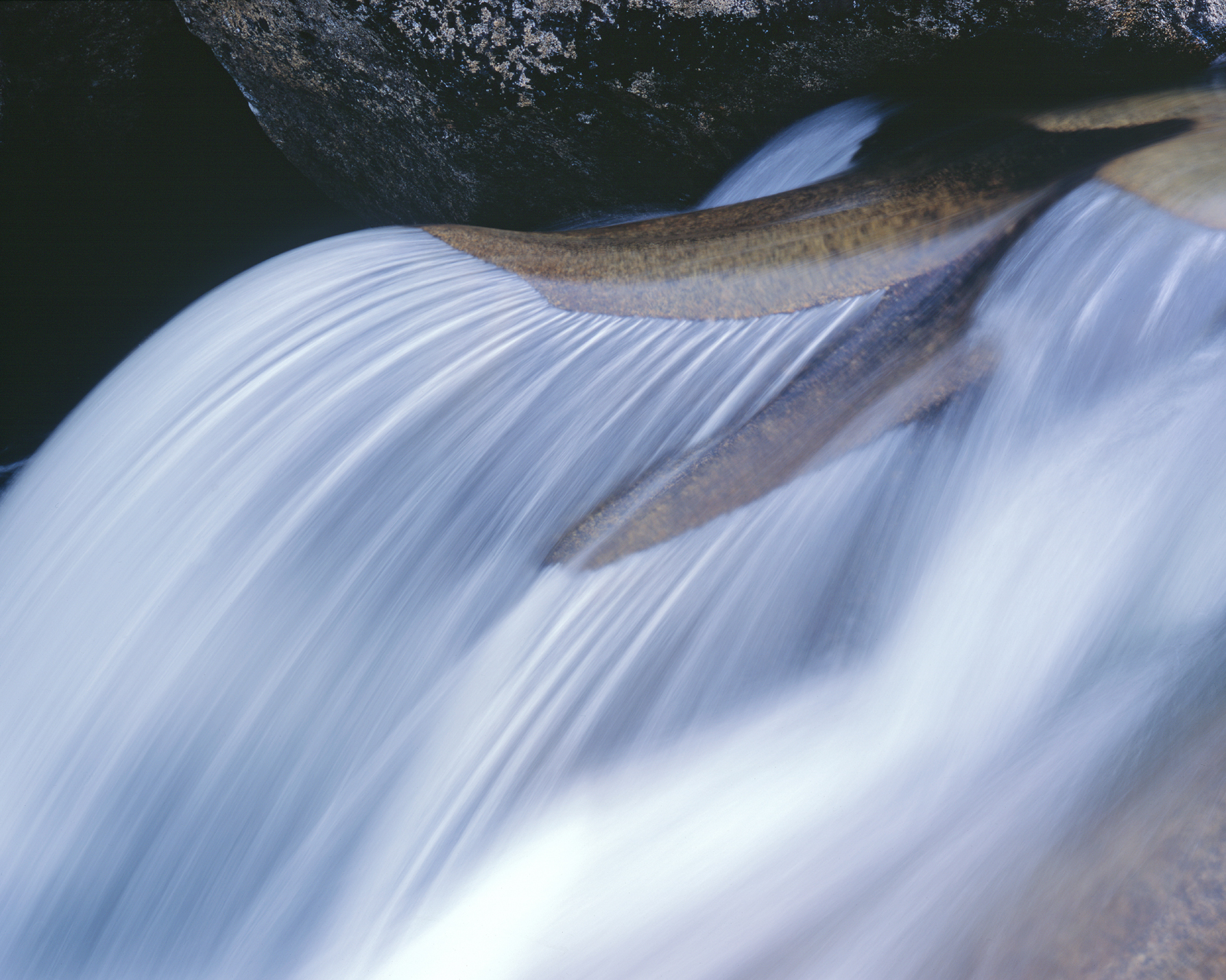
FIGURE 6-4 Waterfall near the Grottos, Roaring Fork River, White River National Forest, Colorado

FIGURE 6-5 Bison near Lookout Mountain, Colorado
2. Any scene that is predominately dark: very dark rock, dark-furred animals. You should decrease exposure to compensate (figure 6-5).
3. Any scene where you have an important foreground in shade and a background in full sun. If the foreground is shaded only by thin clouds, the range of light intensities may still be within the range of your sensor if the scene is perfectly exposed. If the foreground is shaded by thick clouds or something solid, such as a mountain or canyon wall, the range may be beyond the ability of your sensor to hold good detail everywhere in a single capture (figure 6-6).
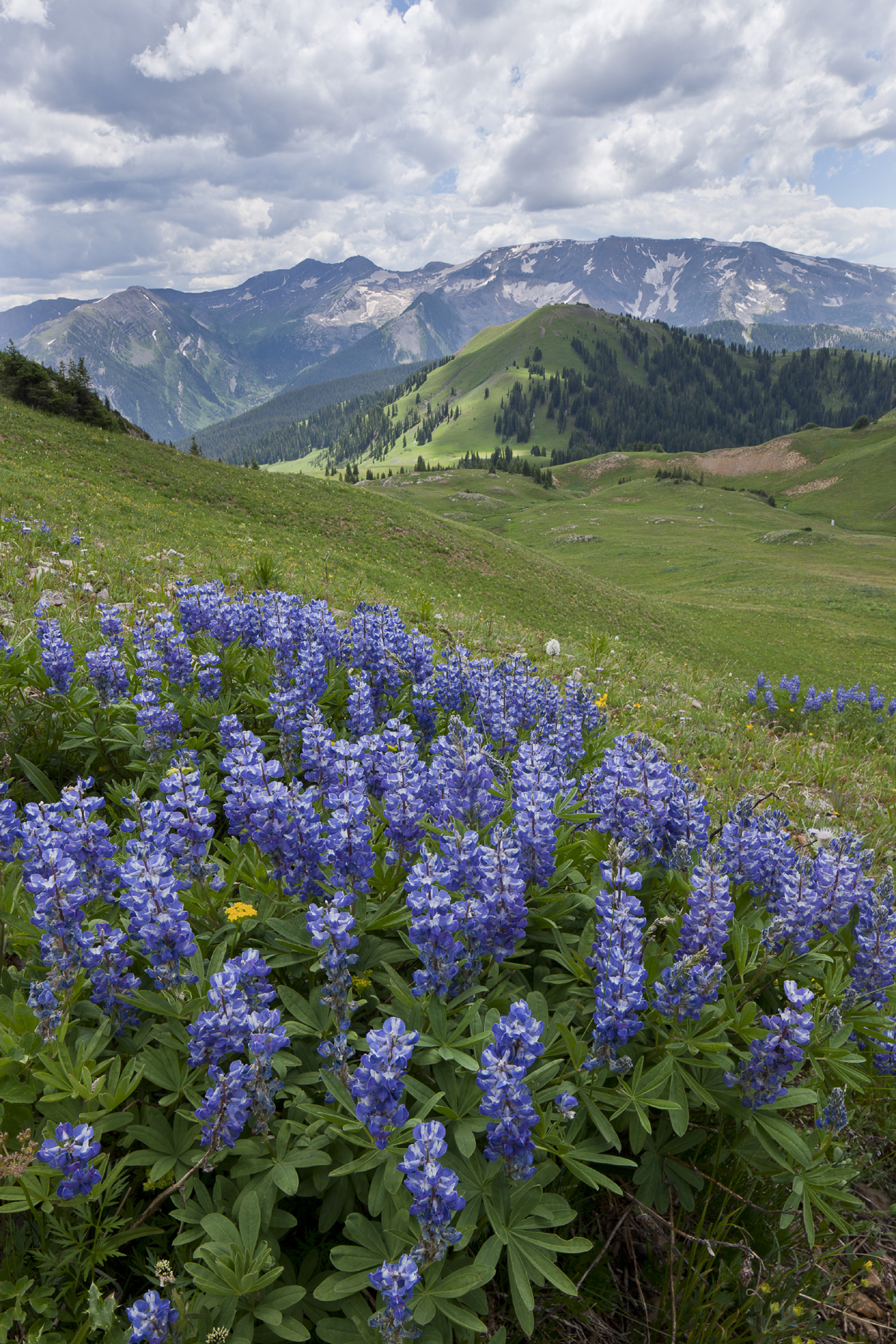
FIGURE 6-6 Lupines in Silver Creek Basin and Treasure and Treasury Mountains, Maroon Bells-Snowmass Wilderness, Colorado
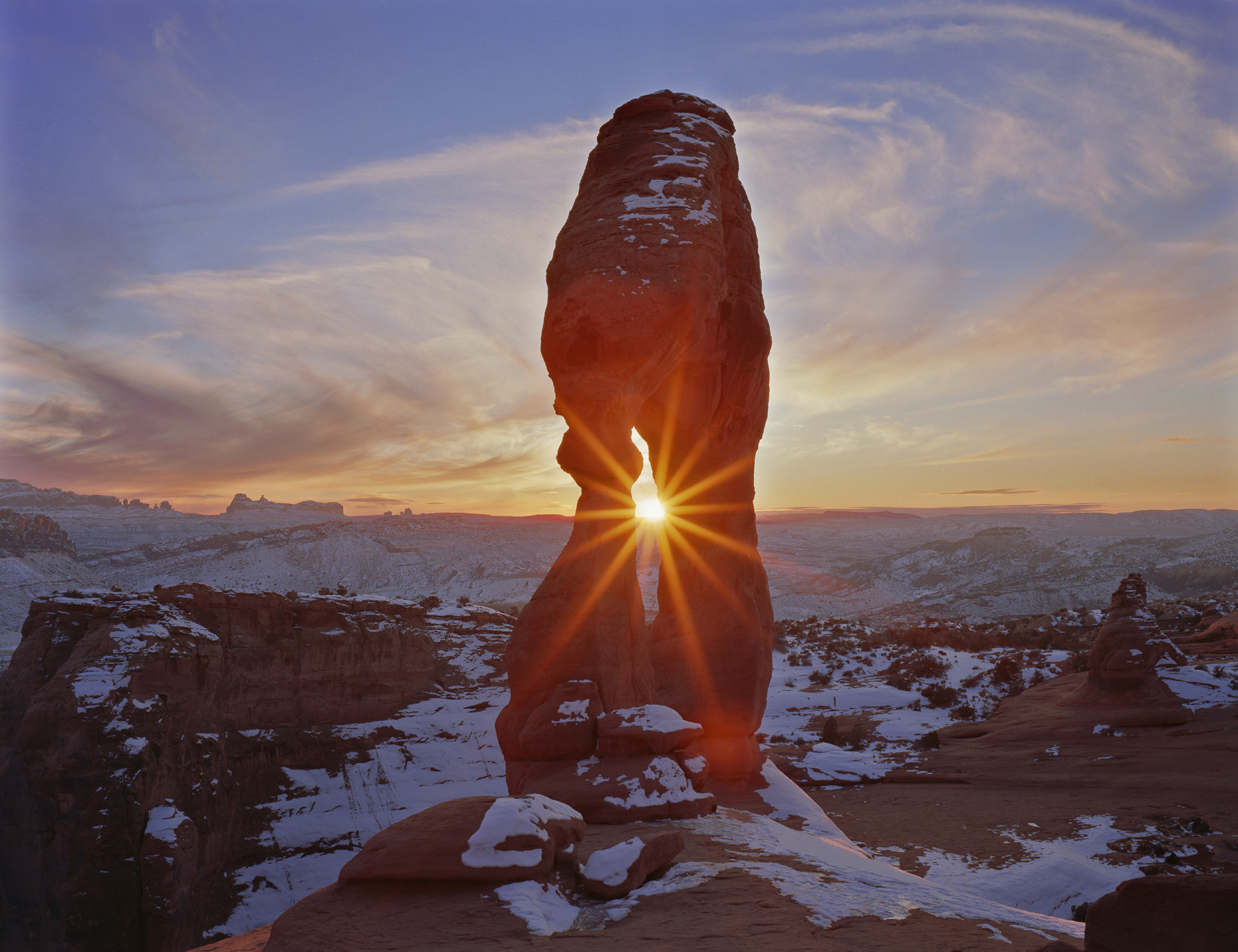
FIGURE 6-7 January sunset at Delicate Arch, Arches National Park, Utah

FIGURE 6-8 Ski mountaineers approaching Mt. Sanford, Wrangell-St. Elias National Park, Alaska. Notice how the shadowed faces have gone completely black.
4. Any backlit scene, meaning a scene where you are looking toward the sun or other light source (even if it is out of the frame). The sun in a clear sky is way too bright to expose with any detail, but even the sky around the sun is likely to be too bright to hold detail, and you may have difficulty achieving proper exposure in both the sky and the foreground shadows (figure 6-7).
5. Any scene in which only half the landscape is covered in snow, even if the entire scene is in full sun. A classic example is a green, flower-filled meadow with snowcapped peaks in the background (figure 6-8).
6. Any scene shot on a cloudy day when you have sky in the frame. The lighting on the land is very even, which means your sensor can easily record detail everywhere in that part of the image. However, the sky is always wickedly bright and can easily blow out to a very distracting pure white (figure 6-9).

FIGURE 6-9 Columbines in American Basin, Handies Peak Wilderness Study Area, Colorado
7. Any scene with a pond or lake where you need a wide-angle lens to include both the subject and its reflection. The amount of light reflected from water is dramatically dependent on the angle of incidence of the light. The angle of incidence is the angle between the path of the incoming light and a line perpendicular to the surface of the water. Yes, I know that’s counterintuitive, but that’s the way scientists define it. Light with an angle of incidence of zero plunges straight down into the water; light with an angle of incidence of 90 degrees is traveling parallel to the water’s surface. Light that strikes the water at a high angle of incidence (meaning it just barely grazes the surface) is nearly all reflected. The difference in exposure between the subject and its reflection might be only 1/2 stop—easily within the range of your sensor to capture good detail everywhere. If a 50mm or longer lens (on a full-frame sensor) is wide enough to include both the subject and its reflection, you’re probably safe. If the angle of incidence is low (meaning the light is plunging steeply down into the water), much of the light is transmitted into the water and the difference in exposure between the subject and its reflection can be four or even five stops. That’s too big a difference for your sensor to straddle comfortably. If you need a 24mm or wider lens to encompass both the subject and its reflection, you’re in an exposure danger zone (figure 6-10).
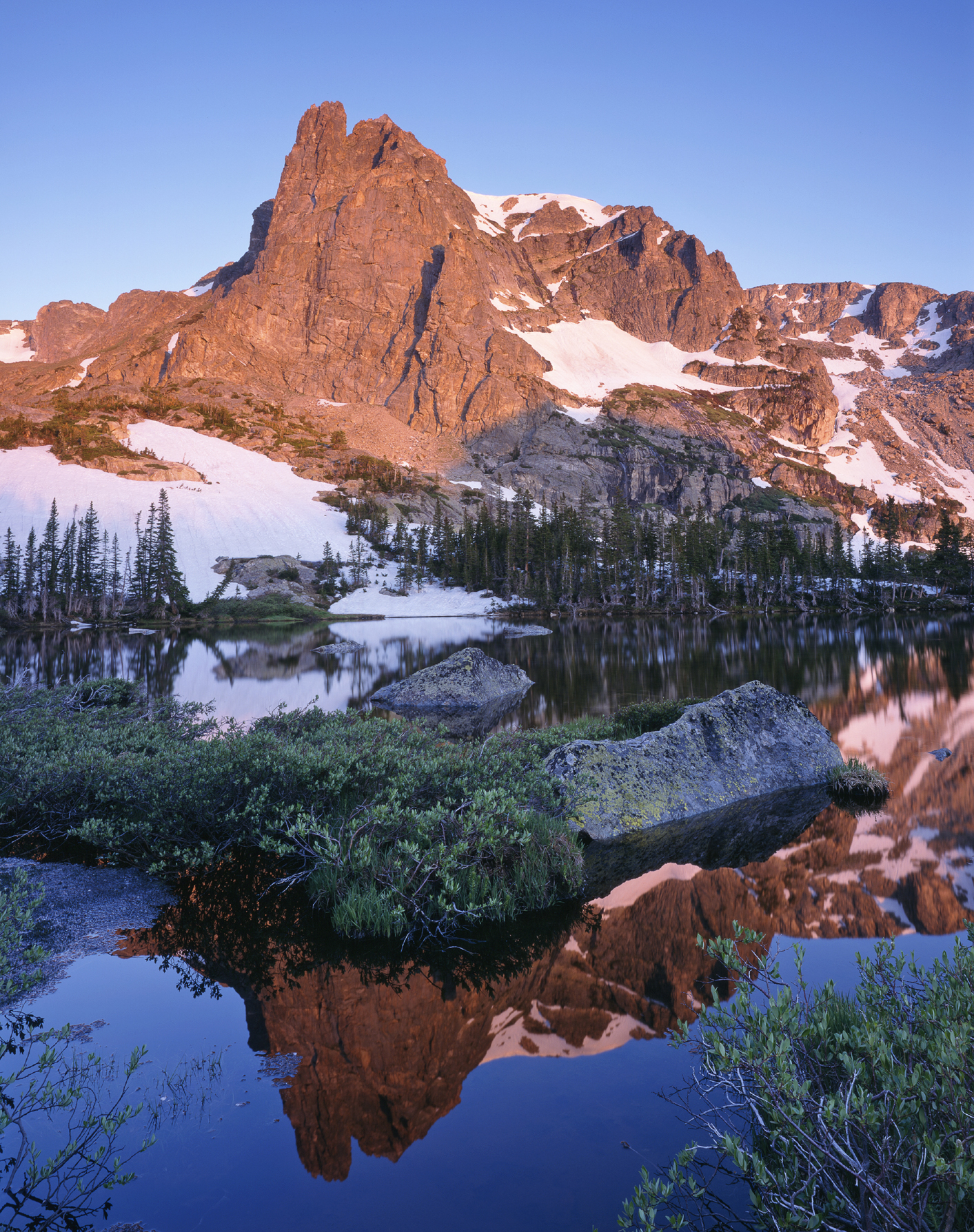
FIGURE 6-10 Notchtop Mountain reflected in Lake Helene, Rocky Mountain National Park, Colorado, shot on 4×5 film with the equivalent of a 20mm lens
8. Any night scene, particularly if your foreground includes evergreen trees and the sky includes the glow of a nearby city (figure 6-11). I’ll discuss night photography in depth in chapter 9.
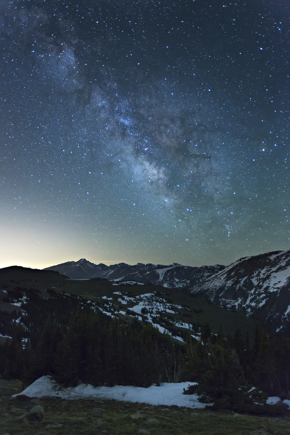
FIGURE 6-11 The Milky Way over Longs Peak from Trail Ridge Road, Rocky Mountain National Park, Colorado
Once you’ve recognized an exposure danger zone, how do you deal with it? You can, of course, just “spray and pray”—shoot a whole bunch of frames of the scene at different exposures and hope for the best. However, that’s hardly an ideal solution. First, things may be happening so fast that you can’t bracket exposures. What if you’re shooting sports, or wildlife, or your daughter’s first step? What if you’re shooting flowers in a grand landscape and the wind only stops once during the fleeting seconds of perfect light? In some situations, your first capture is your only capture, and the exposure had better be right.
A mindless strategy of always bracketing your exposures can also fail when the dynamic range of the scene exceeds the dynamic range of your sensor. In that situation, no single capture will contain all the detail you want in both the highlights and shadows. While bracketing is sometimes essential, it should not be the only tool in your exposure-strategy toolbox.
Histograms
Your best guide to exposure in the field is your histogram, not the appearance of the image on the LCD. In its simplest form, a histogram is a black-and-white graph of the tones in your image. The horizontal axis is brightness. Although the scale is not marked on the histogram, it runs from zero (black) on the left to 255 (white) on the right. For the moment, think of the vertical axis as the number of pixels at each brightness level. I’ll provide a more rigorous definition later.
Take a look at the examples in figures 6-12 through 6-17, which are from Photoshop CC with RGB selected as the channel. We’ll start here because these monochrome histograms are similar to the composite (RGB) histograms you’ll see on the back of your camera. I shot these photos under cloudy skies, meaning the light was low-contrast. Normally, that makes exposure easy. Notice, however, that the combination of a near-white subject (the aspen trunks) and the dark, shadowed areas visible between the trunks means that a correctly exposed frame uses the full dynamic range of the sensor and the histogram stretches from near-white to near-black.
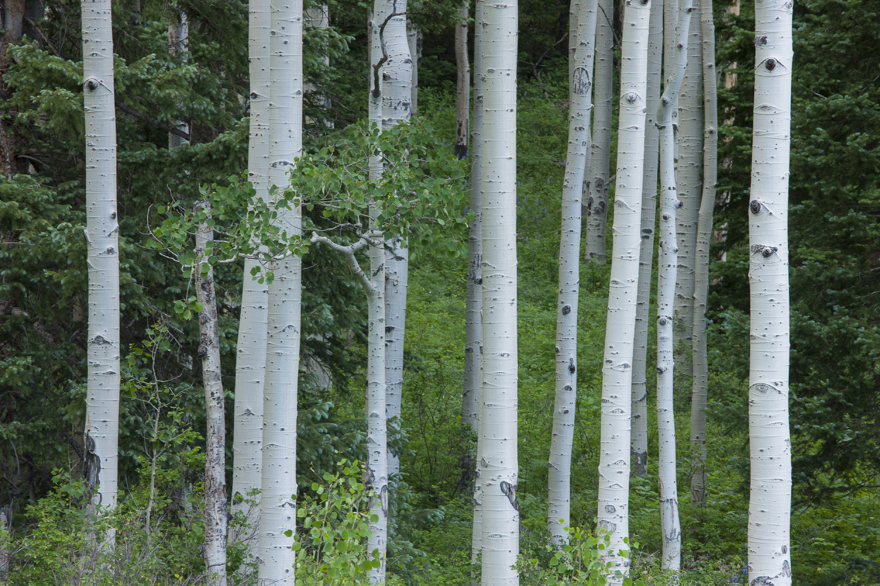
FIGURE 6-12 This image is correctly exposed, with no blank white highlights and no large areas of pure black.

FIGURE 6-13 This is the histogram for the correctly exposed image in figure 6-12. There is no “clipping” in the highlights, which means that the mountain of data is not cut off by the right side of the graph. There is only a very small amount of clipping in the shadows. Small amounts of pure black in a landscape image are actually often an asset.
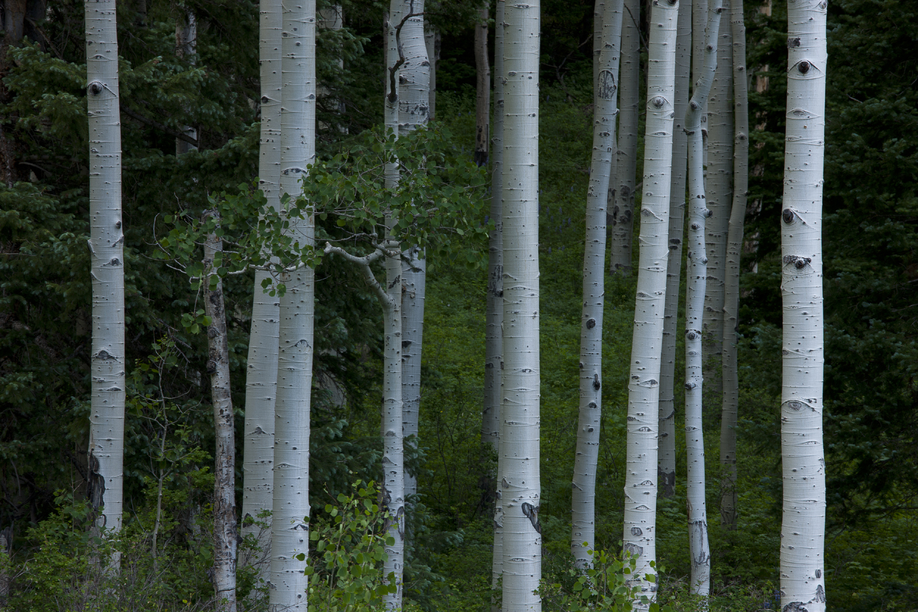
FIGURE 6-14 This image is underexposed. The white aspen trunks are dull gray instead of near-white, and large areas of the shadows have turned black.
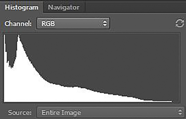
FIGURE 6-15 This is the histogram for the underexposed image in figure 6-14. The mountain of data is cut off on the left side, meaning that a large number of pixels are pure black, with no detail.
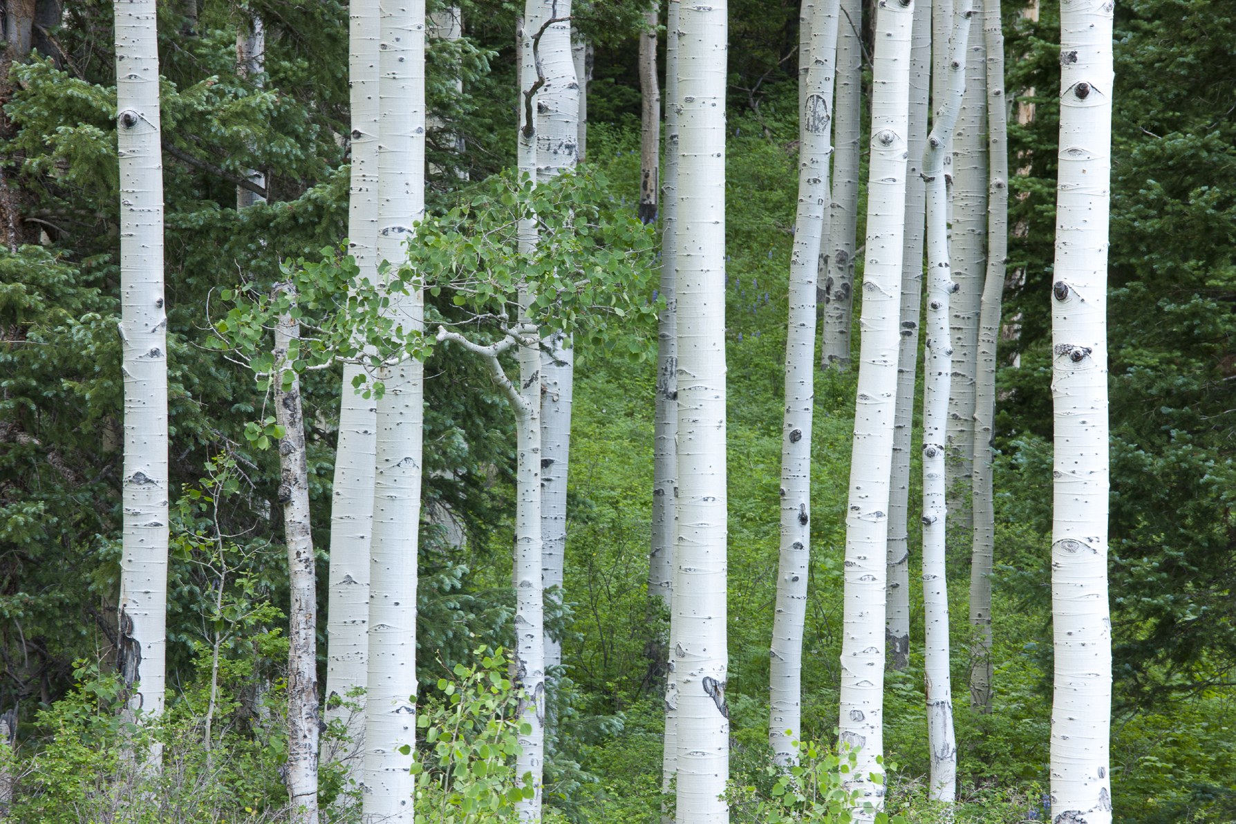
FIGURE 6-16 At first glance, the exposure for this image looks good, but close examination shows it is slightly overexposed. Some areas of the trunks are blown out to pure white, as can be seen on the histogram in figure 6-17. This example shows why it’s important not to use the image shown on your camera’s LCD panel to judge exposure. It’s better to trust the histogram.
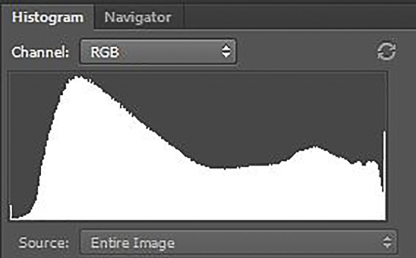
FIGURE 6-17 This is the histogram for the slightly overexposed image in figure 6-16. Notice how the mountain of data is cut off by the right side of the graph, meaning that a significant number of pixels are pure white, with no detail.
I mentioned previously that the vertical axis on Photoshop’s RGB histogram does not, strictly speaking, represent the number of pixels at each brightness level. In other words, the software (and your camera) doesn’t simply take the average of the red, green, and blue values for a particular pixel and plot that on the histogram. Instead, the histogram plots “counts”: one count is recorded at each level for every pixel where the red, green, or blue value is equal to that level. In other words, a pixel with red, green, and blue values of 255, 240, and 225 provides one count at the 255 level, as well as one count each at the 240 and 225 levels.
Engineers designed the histogram this way so that if any channel reaches 255 for a given pixel, you’ll see it on the histogram as a count at 255. If the software simply averaged the red, green, and blue values for each pixel, pixels that were clipped in one channel wouldn’t appear at the far right side of the graph even though they might be dangerously close to clipping overall.
It’s important to note that camera histograms are, by design, rather conservative. I’ve found that if I really have to, I can overexpose by one stop beyond the point where the histogram says the image is almost clipped, and achieve barely printable detail in Lightroom as long as I’m shooting in RAW format (the only format I use for capture). Remember, a portion of your image placed that far above a midtone density won’t hold good color and detail; it will be near-white, with barely printable detail. That degree of overexposure is only appropriate for parts of your subject that you want to render near-white, such as brilliant white cumulus clouds, and only if you absolutely have to capture the broadest possible range of tones. You should test your camera to see how conservative your histogram is before relying on this technique.
Now let’s take a slight detour and look at the more complex, multicolor histograms you’ll find in Lightroom and Adobe Camera Raw. Although you may not see this type of histogram on your camera, it’s important to understand what these histograms represent as you optimize your images in your favorite photo-editing program.

FIGURE 6-18 This is the histogram from Lightroom 5 for the correctly exposed image in figure 6-12. The histogram in Adobe Camera Raw (the RAW processing engine that ships with Photoshop) is very similar.
In these histograms, the three color channels (red, green, and blue) are superimposed on one another. To understand this style of histogram, consider first the appearance of a histogram for only one channel. For instance, the red histogram plots the number of pixels with each red value. If there are 50 pixels with a red value of zero, it plots a count of 50 at the zero position at the far left side of the graph. If there are 65 pixels with a red value of 255, it plots a count of 65 at the 255 position on the far right side of the graph, and so on. The other two histograms, for blue and green, are plotted the same way. Lightroom and Camera Raw then stack all three histograms on top of one another. Areas where all three channels overlap are shown in gray. Areas where two of the three histograms overlap are shown in the color the two channels would make if mixed together. Areas where the blue and green histograms overlap are shown in cyan; the red-green overlapping area is shown in yellow; the red-blue overlapping area is shown in magenta. Areas where only one channel is present are shown in that channel’s color.
Many DSLRs today can display not only a monochrome histogram, but also the three individual color channels, usually as separate histograms rather than the combined view discussed previously.
You should care about the brightness of the individual channels because clipping in even one channel is a warning sign that you may be on the verge of clipping the highlights or shadows overall. No digital magic can recover good color and detail from areas of an image that are pure white (areas where all the pixels have red, green, and blue values of 255, 255, 255), or pure black (areas where all the pixels have red, green, and blue values of 0, 0, 0). In my experience, however, minor clipping in just one channel as shown in the camera’s histogram will not degrade the final image.
The Four Basic Exposure Strategies
Your knowledge of histograms will help you understand exposure strategies. In my view, there are four basic exposure strategies for landscape photography: PhD; Limiting Factor; the Rembrandt Solution; and HDR. Each strategy has its niche in terms of the degree of contrast and type of subject matter with which it is most effective. The first two are relatively simple, so I’ll discuss them fully here. The last two exposure strategies are more complicated, so I’ll introduce them here, and then complete my discussion of them in the next chapter.
The PhD Strategy
No, you don’t need a doctorate; PhD stands for Push Here, Dummy. In PhD situations, your camera’s meter will give you a perfect exposure time after time; no thought required. Two conditions must be met: the lighting must be low-contrast, and the subject must be close to midtone throughout the frame. If both conditions are met, your in-camera meter is reliable. For example, if you’re shooting closeups of flowers set amid green foliage on an overcast day, you can trust your meter and concentrate exclusively on creating the perfect composition of the best specimens. The overcast day means the light on your subject is very even, with no bright highlights or dark shadows, and the green foliage is very close to midtone.

FIGURE 6-19 I used the PhD strategy to make this image of columbines and heartleaf arnica near No Name Creek, Weminuche Wilderness, Colorado
The even lighting of an overcast day works very well for closeups, but it’s usually deadly when shooting grand landscapes. Often the resulting photographs lack depth and dimension, which is why the lighting is said to be “flat.” High-contrast lighting is usually more interesting for grand landscapes, but it also requires more thoughtful decisions about exposure.
The Limiting Factor Exposure Strategy
There are many high-contrast situations where you need to get all the detail possible in a single capture. These situations include any subject that moves: wildlife, people, waterfalls, and delicate flowers and colorful aspen leaves trembling in the wind. The Limiting Factor Exposure Strategy will produce the single best frame you can achieve in such situations. The limiting factor is the highlights: don’t blow them out! You then let the shadows fall where they may and compose knowing that deep shadows will be very dark or black.
The easiest way to implement this strategy is to take your best guess at the correct exposure and shoot a test frame. Check the histogram. If the highlights are clipped, estimate how much darker your exposure needs to be to bring the highlights within range, and try again. Repeat until you have an exposure that is almost (but not quite) clipped. If the highlights fall well below clipping, estimate how much you need to open up the exposure and try again. Repeat until you have an exposure that is just shy of clipping the highlights. By placing the highlights as high as possible in the tonal scale, without blowing them out, you have also given yourself the best shadow detail possible in a single capture.
If you have a DSLR that offers Live View, you may also have a Live View histogram with exposure simulation. Check your manual: on some cameras, even high-end ones, this is a feature that must be turned on in the menus. If you do have a Live View histogram, setting the lightest exposure that still preserves highlight detail is simple: the histogram updates as you change the exposure compensation (if you’re in one of the automatic exposure modes) or the shutter speed or aperture (if you’re in manual exposure mode). (If you use manual exposure mode, remember that you’ll want to adjust only shutter speed to preserve the depth of field achieved by setting a small aperture.) Simply engage Live View, cycle through the display modes until the histogram is displayed, then adjust the exposure until the histogram shows that the highlights are almost (but not quite) clipped.
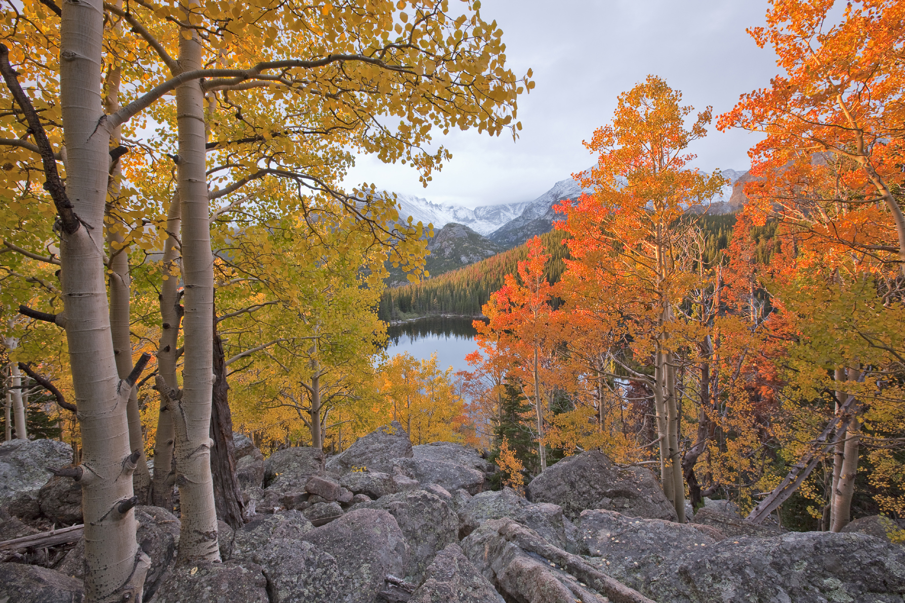
FIGURE 6-20 I used the Limiting Factor exposure strategy to make this image of aspen trees above Bear Lake in late September, Rocky Mountain National Park, Colorado

FIGURE 6-21 The histogram for the image in figure 6-20
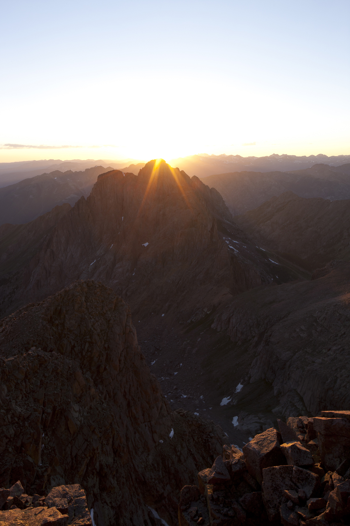
FIGURE 6-22 The dynamic range of any scene with the sun in the frame is well beyond the ability of your sensor to hold pleasing detail everywhere
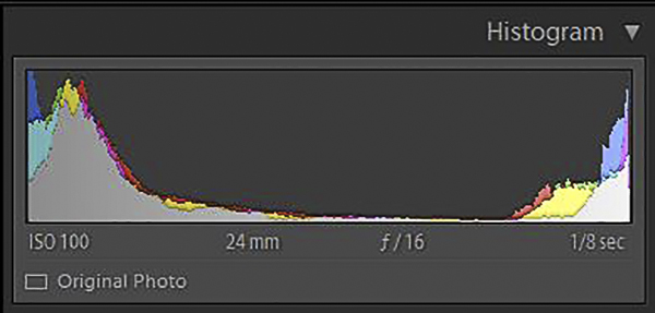
FIGURE 6-23 This is the Lightroom 5 histogram of the image in figure 6-22. Both the highlights and shadows are severely clipped. Note also that there are virtually no midtones. I call this the Devil’s histogram because it has two horns. Images like this are bound to give you problems.
The Rembrandt Solution
Sooner or later, as the contrast in the scene increases still further, you’ll encounter the Devil’s histogram—a histogram with two horns representing large areas of near-black on the left and near-white on the right, with very little data in the middle of the scale, as shown in figure 6-23. This histogram is a warning that the scene contrast may exceed the range your sensor can straddle comfortably. If your subject includes only a white waterfall and black water-washed rocks, a histogram with pronounced spikes at each end may be acceptable if the highlights and shadows aren’t clipped, but if your subject includes shadowed wildflowers and brilliant white cumulus clouds, watch out! Wildflowers, or more precisely the green foliage around them, must be rendered as a midtone to look good in a print. The Devil’s histogram is showing you that a single exposure cannot simultaneously capture good highlight detail and render the green foliage as a midtone. The Limiting Factor exposure strategy is inadequate in such situations. It’s time to consider the Rembrandt Solution.

FIGURE 6-24 Sometimes it’s not so obvious that a scene is beyond the sensor’s ability to capture shadows and highlights gracefully. My eyes saw excellent detail in both the shadowed evergreens and the colorful clouds, but my sensor couldn’t comfortably straddle the six-stop range, as shown in the histogram in figure 6-25.

FIGURE 6-25 Lightroom 5 histogram for the image in figure 6-24
Four hundred years ago, painters like Rembrandt tackled high-contrast scenes using a technique called countershading to create the illusion of greater dynamic range in their paintings than actually existed. Today you can achieve the same result with the use of graduated neutral-density filters. You can also use Photoshop to create the same effect with much greater flexibility and precision than is possible with physical filters. The basic idea of the digital approach is to shoot one frame for the highlights, one frame for the shadows, then combine them in Photoshop. I call both the analog and digital versions of this approach to shooting high-contrast scenes the Rembrandt Solution.
I’ll reserve a discussion of the science behind the Rembrandt Solution for the next chapter. I’ll also hold off on discussing the digital version of the Rembrandt Solution until that time. Right now, let’s discuss graduated neutral-density filters.
Split NDs, as I’ll call them for short, are dark gray on the top half and clear on the bottom half. There’s a gradual transition zone in the middle from dark to clear. The dark half is a neutral density, meaning it does not shift colors. The filters are usually rectangular and fit into a holder that you attach to your lens via an adapter ring. The holder lets you slide the filter up and down and rotate it left or right. The concept behind these filters is simple: position the dark half of the filter over the bright part of the subject, usually the sky or a sunlit peak. The dark half of the filter holds back some of the light from the bright part of the scene so that your sensor can record better detail in the shadows and highlights. The filters come in different strengths, measured in the number of stops of light they subtract from the bright regions of the image. One-stop, two-stop, and three-stop filters are the most common, with two-stop filters being the most useful. They’re also available with a variety of transition-zone widths for reasons I’ll explain later in this chapter.
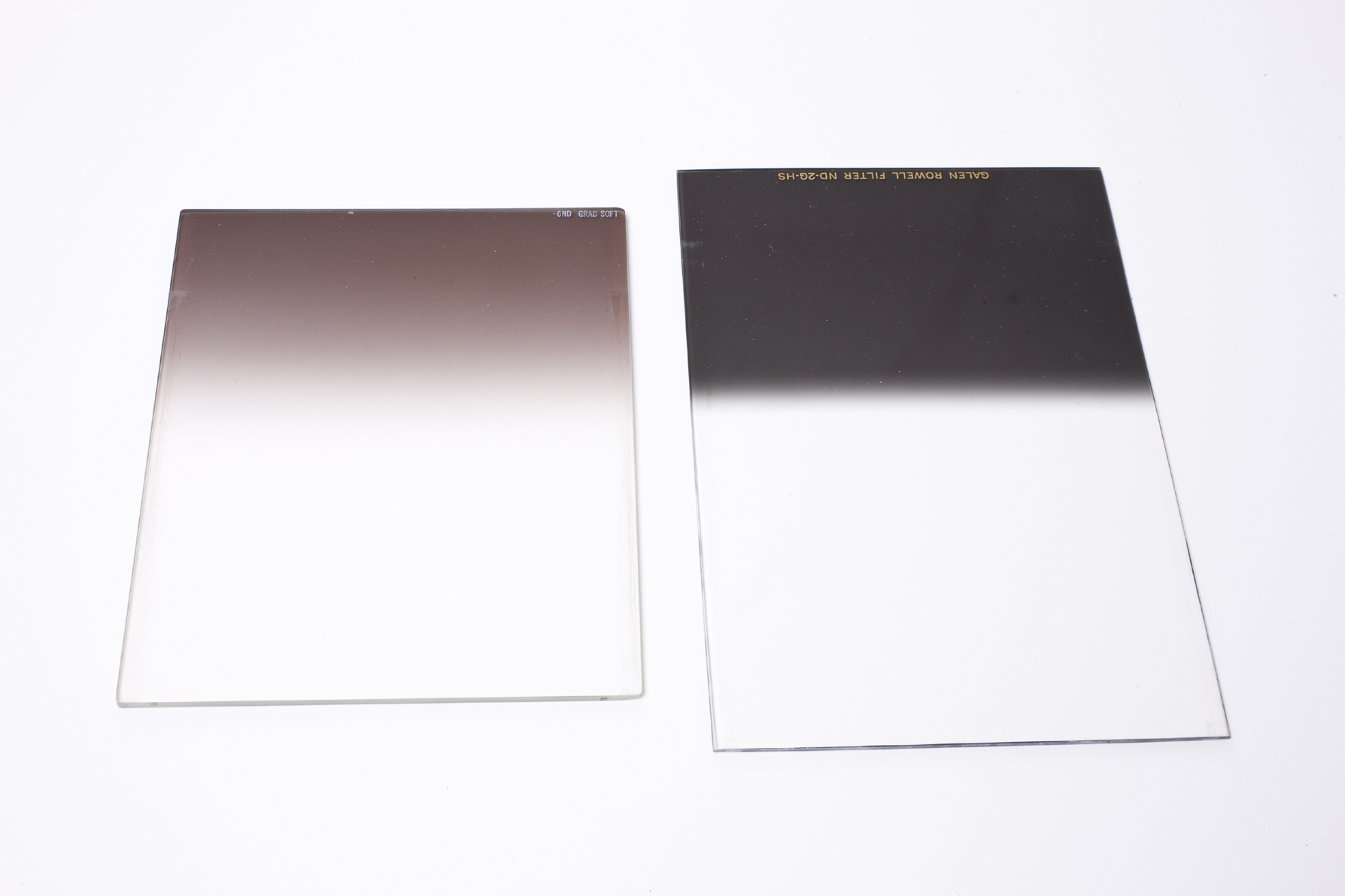
FIGURE 6-26 Both of these graduated neutral-density filters subtract two stops of light from the bright areas of the image without shifting colors. Notice that the one on the left has a gradual transition from dark to clear, while the one on the right has an abrupt transition, known as a hard stop. The one on the right is longer so the transition can be placed very high or low in the frame without the edge of the filter being visible.

FIGURE 6-27 This photo shows a graduated neutral-density filter mounted in a Lee filter holder, which is attached to the lens with an adapter ring
Split NDs are easy to use once you’ve learned three principles. First, always position the filter while looking through the lens after stopping down to the shooting aperture. In normal operation, DSLRs (and SLRs) give you through-the-lens viewing with the lens wide open, at its biggest aperture (smallest f-number, such as f/2.8 or f/4). The lens only stops down to the aperture at which you’ll actually take the picture right before the shutter opens. That’s useful when you’re composing your picture because you see the brightest possible image. Looking through a wide-open lens is a problem, however, when using a split ND filter. When the lens is wide open, the transition zone from dark to clear will be too blurry to see how to position the filter.
The best solution is to use your depth-of-field preview button (if your camera has one). Pressing the depth-of-field preview button stops the lens down to the shooting aperture. The intended purpose of this feature is to show you how much of your photograph will be sharp at the aperture you have chosen. The unintended but useful consequence of pressing the depth-of-field preview button is that it makes the transition on the filter from dark to clear much easier to see if you set a small aperture, such as f/16 or f/22. It’s also much easier to see if the filter is in motion. Here’s my technique: I start with the filter high in its holder, press the depth-of-field preview button, then gradually slide the filter downward until it’s positioned correctly, with roughly half the transition falling above the dividing line between highlights and shadows, and half below. As soon as I let go of the filter, the transition disappears again because our eyes have such a wide dynamic range that they instantly compensate for the diminished brightness of the highlight region.
The second principle of split ND use is that the width of the transition from dark to clear on the image, for any given filter, depends on the focal length of the lens. The width of the transition from dark to clear on the filter itself is, of course, a fixed dimension, but the effect of that filter on your image varies depending on the angle of view of the lens. With very wide lenses, the transition may be quite narrow. With normal focal-length lenses, or with short telephotos, the transition may occupy the entire height of the frame.
The best way to learn the width of the transition zone on the image is by making a simple, one-time test. Place your filter over the lens. Stop down to a small aperture, say f/16 or f/22, since those apertures will make the transition zone most obvious, and since those are the apertures you would normally use to achieve a deep depth of field in a typical landscape photograph. Now photograph an evenly lit, plain-toned wall that has no obvious texture or pattern. If your lens is a zoom, try a few representative focal lengths, such as 16mm, 20mm, 24mm, 28mm, and 35mm. You don’t need to test each 1mm increment in focal length. Download the photos and take a look. Measure the width of the transition as a fraction of the frame and make a simple chart to carry in your camera bag.
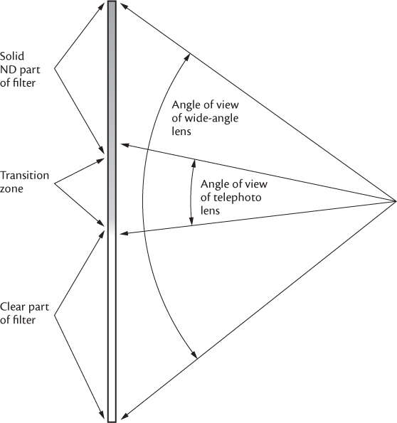
FIGURE 6-28 Diagram showing how one split ND filter will have very different effects on images shot with different focal-length lenses. Notice how the transition zone from dark to clear on the filter occupies only a small fraction of the angle of view of a wide-angle lens, but nearly the entire angle of view of a telephoto lens.
Once you know the width of the transition on your image for different focal lengths, you can choose the best filter for the situation. In general, soft-transition filters work best with wide-angle lenses, and hard-stop filters work better with longer focal lengths. If the boundary between shadow and highlight is irregular, consider a soft transition. If the boundary is straighter, consider a harder transition. When in doubt, try more than one filter to cover all your options.
The third principle for using split NDs is to find a band of naturally dark horizontal subject matter where you can hide the transition. For example, let’s say you’re shooting a field of wildflowers at sunset. The flowers are in shade, the mountains rising above are catching the last direct light, and there’s a band of dark evergreens along the far side of the meadow where you can hide the transition zone on the filter. The trees are already naturally dark. Most people won’t notice that you’ve made them a little darker.
Which Split ND Do You Need?
Here are my rules of thumb for deciding what strength of filter to use. In all examples, let’s assume that the background is in full sun. If the foreground is shadowed by a thin cloud, I use a one-stop filter. If the foreground is shadowed by a thick cloud or by something solid (a cliff or mountain) and I’m looking away from the rising or setting sun, I generally use a two-stop filter. There are exceptions where a three-stop filter is necessary, like when my foreground is in the deep shade of a tall cliff or tall trees that are immediately behind me. I use a three-stop filter when I’m looking toward the rising or setting sun, or when the sun is in the frame. Precise decisions on which filter to choose and how to set the right exposure require spot metering, which I’ll get to in the next chapter.
The Rembrandt Solution works well when there is a clean, simple separation of shadow and highlight detail. It fails when large, dark objects, like a shadowed tree, project upward against a bright sky. Your effort to darken the bright sky will inevitably darken the top half of the tree, which is also behind the dark part of the filter, creating what I call a “split ND artifact”—an unnaturally dark region of the image. Worse yet are subjects like a backlit arch at sunrise. A band of dark arch separates the bright sky visible above the arch from the bright sky showing through the arch. There’s no good place to position the transition of your filter. You either fail to darken all of the overly bright sky, or you darken the top half of the arch unnaturally. In situations like these, you should consider the fourth exposure strategy: HDR.
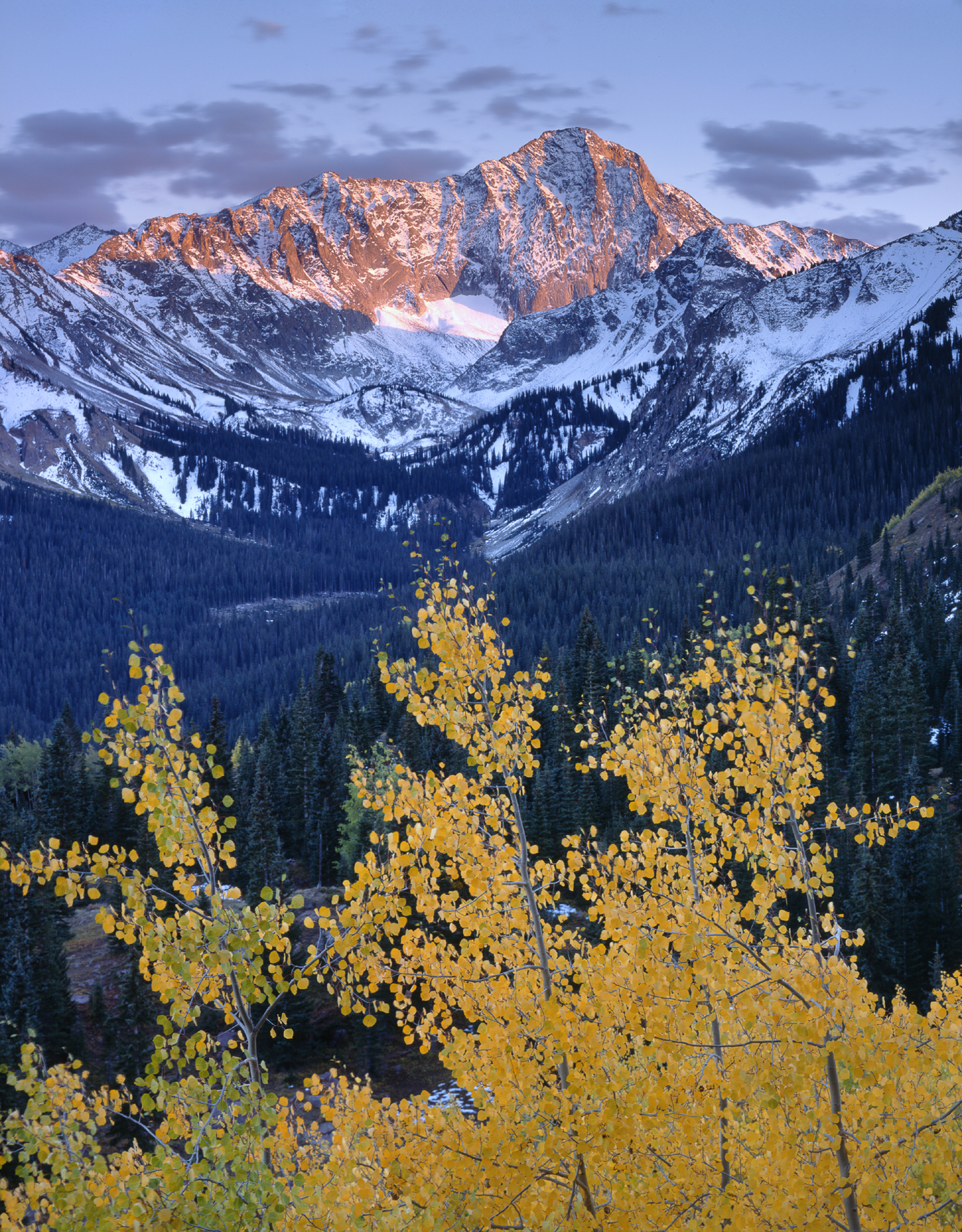
FIGURE 6-29 Graduated neutral-density filters work well in situations like this one because the dividing line between shadow and highlight is relatively straight, there is a dark band to hide the transition from dark to clear, and because no large dark elements, like a tree, project upward into bright regions
HDR
The last essential exposure strategy is HDR, an acronym for high-dynamic-range imaging. The basic idea is simple: shoot a bracketed set of exposures of the scene, then let a specialized piece of HDR software combine the correctly exposed parts of each frame into one perfectly crafted rendition of a high-contrast scene. You must bracket widely enough that the lightest frame has excellent shadow detail and the darkest frame has excellent highlight detail. The simplest approach is a three-frame bracket set with a two-stop bracket interval. With these settings, your camera will make three exposures in a row, and the exposures will be the metered exposure (0 exposure compensation), –2 exposure compensation, and +2 exposure compensation.
I’ll have a lot more to say about executing the HDR approach in the next chapter. For now I just want to introduce the concept because it will help you understand the pros and cons of the Universal Exposure Strategy.
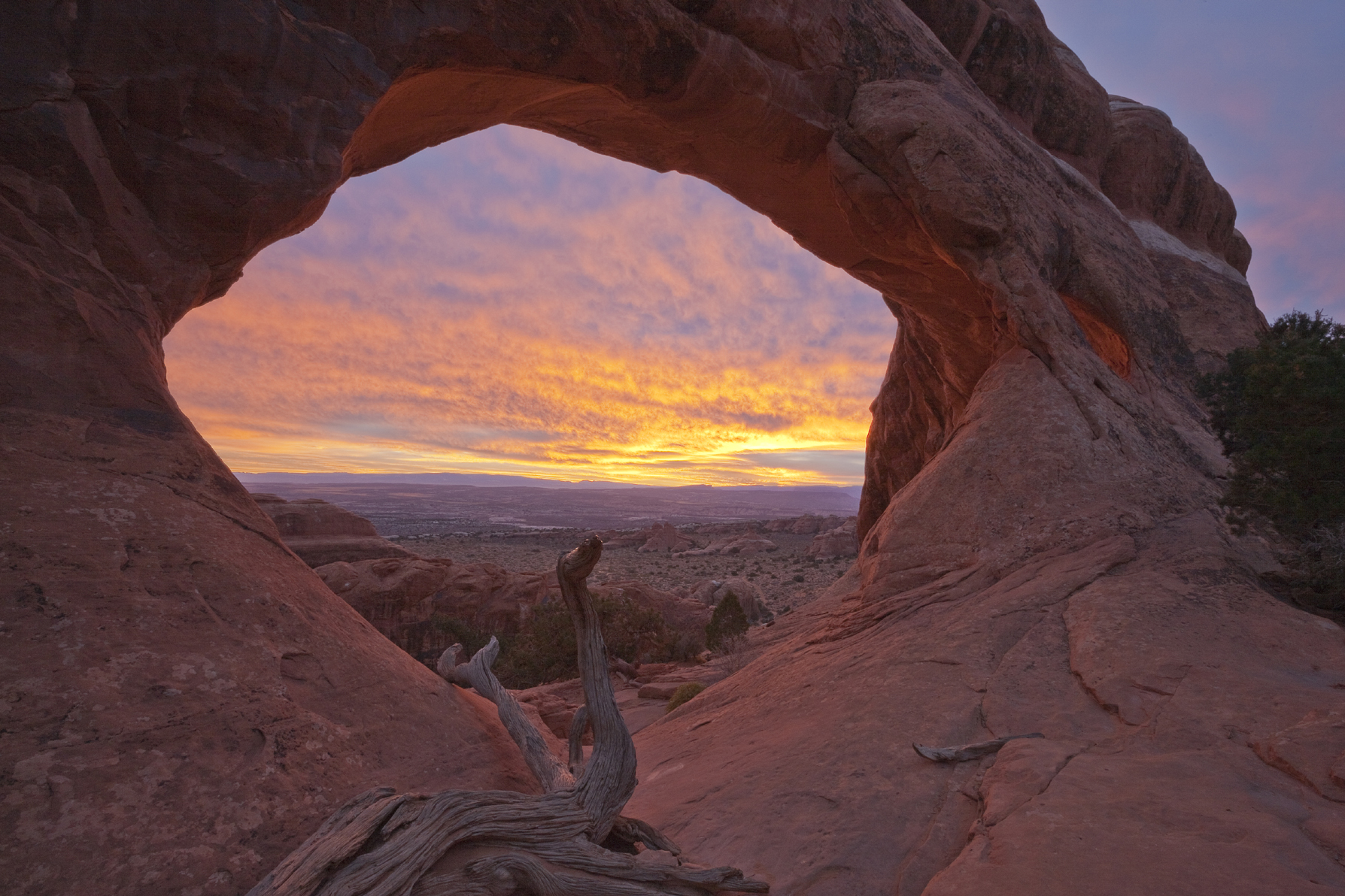
FIGURE 6-30 HDR was the only solution for this image of Partition Arch at sunrise, Arches National Park, Utah
The Universal Exposure Strategy
In an ideal world, photographers would always have the leisure to carefully analyze which exposure strategy would give them the perfect result. But the world is imperfect, and the most promising situations are often fleeting. When I’m rushed, and nothing is moving within the frame (the big caveat), I often resort to the Universal Exposure Strategy. I set the camera to give me a five-frame bracket set with a one-stop bracket interval. A typical set, therefore, will have exposure compensation values of –2, –1, 0, +1, and +2. With that strategy, I can come away from the shoot confident that I have the data to choose, after the fact, which of the four basic exposure strategies will give me the best result.
In a PhD situation, the middle frame of the bracketed set (the metered exposure—0 exposure compensation) should be perfect. In fact, if you’re completely confident it’s a PhD scene, you don’t need to bracket at all. However, as I showed in my image of the summer aspen grove in soft light (figure 6-12), even an intimate landscape on a cloudy day can be surprisingly high contrast, so I almost always bracket one stop over and under the metered exposure, even in a PhD situation. In a Limiting Factor situation, you always get your choice of the ideal exposure because you use a one-stop bracket interval instead of two. If you bracket with a two-stop interval, as is often recommended for HDR, you risk straddling the ideal exposure. One bracketed frame may be too dark, but the next frame in the set may be too light. The difference in exposure between frames is too great. Similarly, the Universal Exposure Strategy lets you choose the ideal two frames (the good-highlights frame and the good-shadows frame) when using the digital version of the Rembrandt Solution. And, of course, if you choose the HDR route, you can use all five frames in your favorite HDR software.
The big caveat with the Universal Exposure Strategy is that ideally nothing should be moving within the frame. If the subject moves in between frames and you try to use HDR software, you’ll get ghosting: two translucent versions of the same object roughly stacked on top of each other but not perfectly aligned. HDR software offers tools to correct ghosting, but they’re imperfect at best. Although it’s less likely, you can have similar problems when using the Rembrandt Solution depending on where exactly the subject movement occurs within the frame.
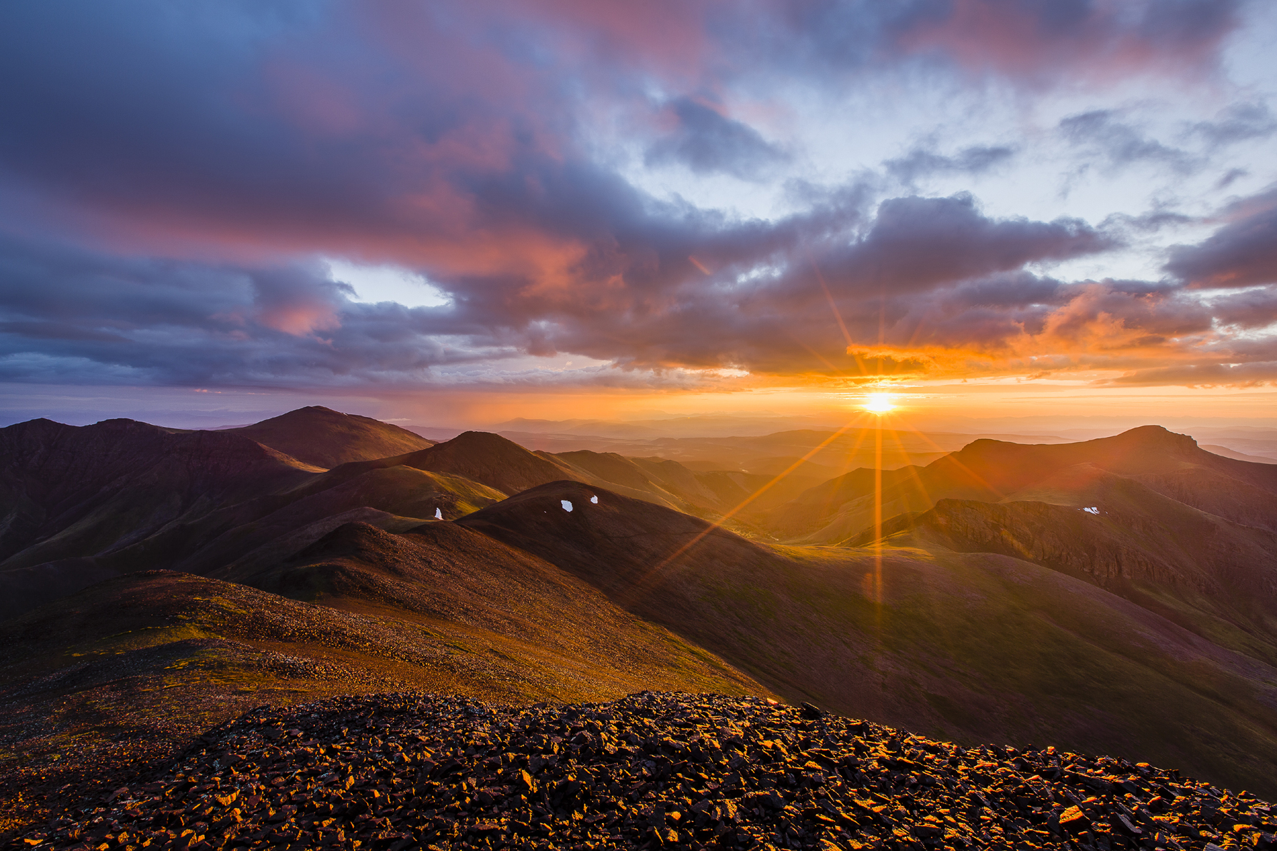
FIGURE 6-31 Stewart Peak, Baldy Alto, and Organ Mountain at sunrise from the summit of San Luis Peak, La Garita Wilderness, Colorado. To create this image I produced a 32-bit TIFF from my bracketed set of photos, then tone-mapped the TIFF in Lightroom.
What if your camera limits you to a three-frame bracket set? Here’s a tip for efficiently shooting a five-frame bracket with a camera that will only do a three-frame bracket at one time:
• Set bracketing to three frames with a one-stop bracket interval
• Set exposure compensation to +1
• Shoot three frames, which will give you the series 0 exposure compensation, +1, and +2
• Now set the exposure compensation to –1 and shoot three frames
That will give you the sequence –2, –1, and 0 (again). You’ll have one duplicate frame (the metered exposure—0 exposure compensation). Discard the duplicate and you’ve got a five-frame bracket set with a one-stop bracket interval.
Don’t let the Universal Exposure Strategy become a crutch. Whenever possible, you should think through your exposures in the field. But when you’re hypoxic and sleep-deprived on the summit of a 14,000-foot peak at sunrise (as I was repeatedly when shooting my book Sunrise from the Summit), and when nothing is moving in your foreground, the Universal Exposure Strategy can be an effective way to ensure you have all the pixels you need to create the most evocative possible image.