
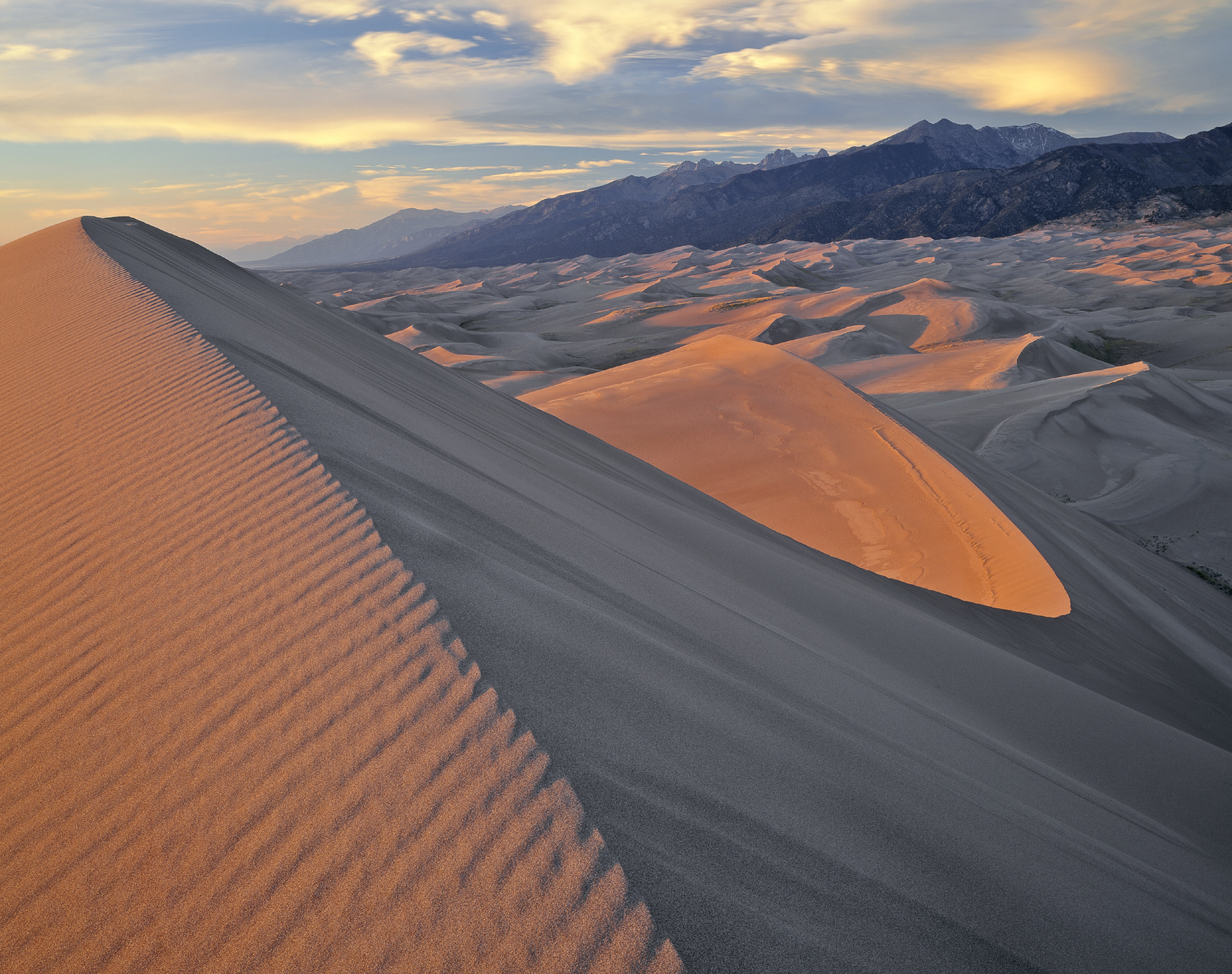
FIGURE 5-1 The Sangre de Cristo Mountains from Star Dune, Great Sand Dunes National Park, Colorado
5 The Art and Science of Composing Compelling Images
Great landscape photography begins with a strong emotional reaction to the scene. Raw emotion by itself, however, is not sufficient to create a compelling photograph. With that emotion as the foundation, you now face the challenge of composing a photograph that will generate the same feelings in your viewer.
Don’t let the word composition intimidate you. And don’t be put off by the legions of dry, theoretical books that have been written on the subject. As Edward Weston once said, “To consult the rules of composition before making a picture is a little like consulting the laws of gravitation before going for a walk.” The principles of composition are useful, and it can be helpful to read a book or two on the subject, but learning to use those principles is like learning to walk. Although learning to walk was hard and we all fell down a lot at the beginning, the activity comes naturally now that we have mastered it. In a similar way, experienced photographers simply feel that a composition is right—which means that for them composition is a highly developed but largely unconscious process. Skilled photographers don’t run through a checklist of compositional principles before snapping the shutter.
The first step in creating a good composition is analytical. Decide what elements in the scene must be included to convey the emotion you’re feeling. Include those, and only those. Exclude everything else. In other words, get close and keep it simple. Try to provide a center of interest, a focus of attention that the viewer’s eye can linger on. You need to be clear in your own mind about why you are making the photograph. Then be sure that every element in the frame helps make that reason obvious to the viewer.
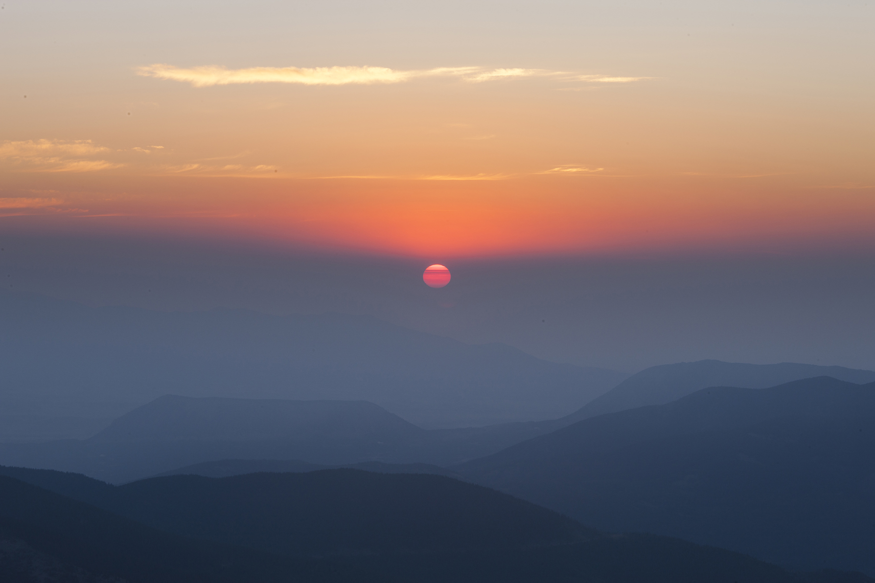
FIGURE 5-2 Looking east from the summit of 14,042-foot Mt. Lindsey at sunrise, Sangre de Cristo Wilderness, Colorado

FIGURE 5-3 Turks Head and the Green River at sunrise, White Rim area, Island in the Sky district, Canyonlands National Park, Utah
As I mentioned in chapter 1, we have the impression that our eyes take in an entire scene in a single glance, but that’s not actually the way we examine our surroundings. The angle of view within which we see with the greatest sharpness and most accurate perception of color is actually quite narrow. We direct this narrow spotlight of sharp vision, called foveal vision, from object to object, fixating briefly on each one before moving on to the next. We are largely unaware of objects in between those that we have chosen to fixate on, which is one reason we so often fail to notice the beer can hiding under the clump of flowers—until it shows up in our photograph.
This quirk of our visual system has relevance when it comes to composing a photograph. Most beginners repeatedly make the mistake of including far too much irrelevant clutter around the main subject. I remember my excitement many years ago in Denali National Park when I came across a grizzly bear several hundred yards away that was busy digging up ground squirrels for lunch. I blazed away happily with a 300mm lens, confident I had some great shots. When I got the slides back from the lab, however, I saw that what I really had was a tiny grizzly dot in the middle of an otherwise empty frame. My attention was focused so strongly on the bear that I had failed to notice what was really within my frame—mostly nothing. Your visual system has a tremendous capacity for selective attention. Cameras have none. Be sure your main subject fills the frame.
You’ve probably heard the rule, “Don’t center the main subject.” While this is sometimes good advice, it requires qualification. When I judge photo contests at camera clubs, I often see photographs of a single flower set against an out-of-focus green background. In many cases the photographer has arbitrarily shoved the subject off-center to avoid breaking this compositional “rule,” but there’s no reason apparent to the viewer why the subject has been moved off center. A better solution with that type of subject is usually to compose so tightly that the flower fills the frame. It’s centered, but it has to be centered. There’s no other place for it go. Moving it off center would simply make it feel crowded against the edge of the frame.
Another common beginner’s mistake, related to the mistake of including acres of trivia, is to allow some distracting element, like a branch or twig, to jut unnoticed into the frame—unnoticed, that is, until you examine the image closely on your monitor. I once shot half a roll of photos of a spectacular group of towers in Rocky Mountain National Park at sunrise in winter. After picking up the processed film, I was startled to see that in frame after frame, one-third of the photo was black. I certainly hadn’t seen anything black as I was looking through the viewfinder—or rather, I hadn’t noticed anything black. I finally concluded that my black camera strap must have blown into the field of view of my ultra-wide fisheye lens as I was lying on my stomach in the snow in a vicious windstorm. I was concentrating so hard on the towers and the rising sun I had simply failed to notice what I was really taking a picture of. You must consciously train yourself to do “border patrol”—to run your eye around every edge of every frame, every time, to make sure nothing unwanted is intruding on your composition.

FIGURE 5-4 Aspen grove on top of Stealey Mountain at sunset, near Owl Creek Pass, San Juan Mountains, Colorado
The same principle applies, more subtly, in the interior of the frame, in the spaces between the various elements of your photograph. Many years ago I was working in Colorado’s Flattops Wilderness when I came across a spectacular field of columbines. Overall, the field must have been 100 feet wide and 30 feet high as it stretched up a gentle hillside. Closer examination, however, showed that the columbines were by no means uniformly distributed across the field. Instead, they grew in small clumps, with two- and three-foot wide patches of green vegetation in between each clump. Composing an effective overall shot of the field proved to be devilishly difficult. No one clump was so large and rich that it could stand on its own as the center of attention, so I tried to find a composition that would include several good clumps in a pleasing arrangement. Each attempt, however, resulted in a dead spot somewhere in the composition—an area that lacked interest, where the eye refused to linger. As I was looking at the scene directly, rather than through the camera, my eyes readily skipped over all the uninteresting green foliage as they darted from one beautiful group of columbines to the next. The eye seems less willing to do that when looking at a photograph; areas that lack interest seem to jump out and shout, “boring!”
Remember that the end product of your efforts will be a flat, two-dimensional representation of the scene in front of you. You know instinctively as you look at the scene that the dead, ugly twig a few inches behind the gorgeous flower isn’t growing directly out of the flower, but it will look that way in the photograph if you compose the shot so that the twig is directly behind the flower. A more familiar example is the telephone pole that appears to be growing out of your daughter’s head in the photograph. While composing the shot, you saw clearly that the telephone pole was 20 feet behind your daughter. All photographs tend to flatten out space because they give you fewer depth clues than you had when you were standing there in person. Be sure to do a “background check” of the composition before you snap the shutter and make sure that the relationship between foreground and background elements is precisely the way you want it.
All this emphasis on framing tightly should not blind you to the fact that sometimes context is important. A very tall mountain will often look taller if you include some portion of the lesser peaks nearby, so the viewer has some basis for comparison and can see how tall the giant peak really is. Is that flower field really a strong enough subject to stand on its own? Or is the charm of the scene actually caused by the juxtaposition of delicate flowers with the power of the waves beating against the cliffs below? Perhaps both waves and flowers need to be included to make your statement clear.
The principle of including some standard for comparison can also help you compose shots of extraordinary optical phenomena—spectacular sunsets and rainbows, for example. If you entirely fill the frame with a glowing orange rock lit by an especially intense display of alpenglow, the viewer might well conclude that you’d simply stuck an orange filter over the lens or altered the color in Photoshop. Include the rich blue sky and bluish shadowed rock surrounding the orange glow, and the viewer can better appreciate just how unusual the alpenglow truly is.

FIGURE 5-5 Dead Horse Point at sunrise, Dead Horse Point State Park, Utah. I placed the camera so the top edge of the Utah juniper wouldn’t break the curving line of the bank of the Colorado River.
The Essentials of Graphic Design
Now you’ve decided what elements to include and what to exclude. How do you arrange those elements within the frame? How will you handle the “graphic” part of your photograph?
The answer begins with your original reason for making the photograph. What elements in the scene are most important in conveying your message? Make them large, bold, probably somewhere not too far from the center of the frame. Which elements, if any, are crucial to provide context, yet can play a supporting role? Render them smaller, closer to the edge of the frame, yet not crowded up against an edge or, even worse, jammed tightly into a corner.
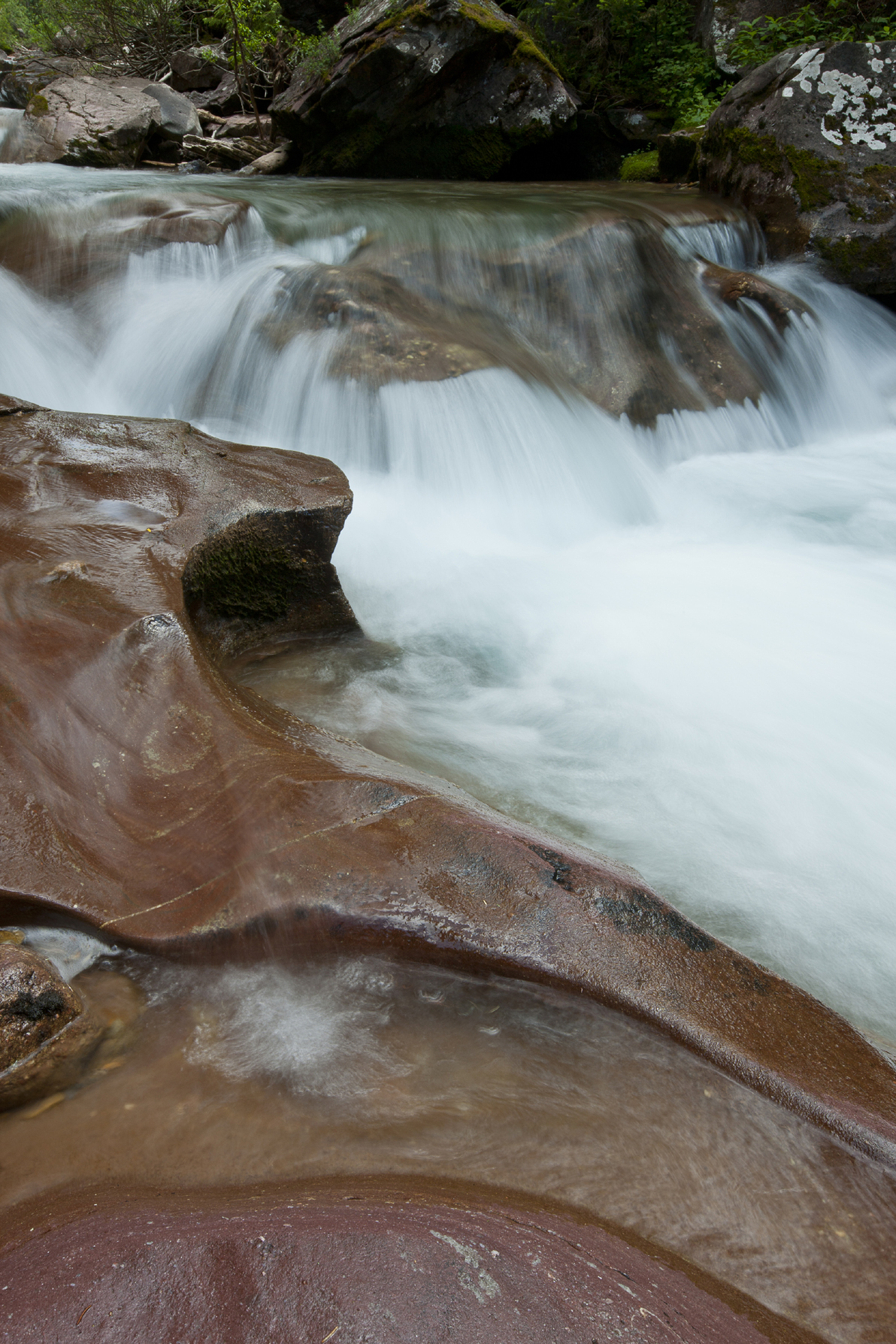
FIGURE 5-6 Cascade along the North Fork of the Crystal River, Maroon Bells-Snowmass Wilderness, Colorado
Emphasizing some elements and subordinating others is a matter of choosing the right camera position. Camera position determines perspective: the size relationship between near and far objects. Are nearby flowers, as measured on the print, three times as large as the distant peaks? Or are the flowers small colored dots at the foot of a gigantic mountain? These relation-ships—the perspective—are determined by where you put the camera, not the lens you choose. If you shoot a scene with a telephoto lens, then shoot the same scene from the same camera position with a wide-angle and crop the wide-angle shot down to include only those elements within the tele-photo shot, you’ll have the same picture, with the same size relationship between near and far elements.
To emphasize the foreground elements in the scene, move the camera closer to them. That may mean you need to switch to a wider-angle lens so you can continue to include the background. To reduce the importance of the foreground elements, move the camera away from them. That may require you to switch to a longer focal-length lens to avoid including extraneous elements in your shot.

FIGURE 5-7 I used a 35mm lens to make this photograph of Green Mountain, near Boulder, Colorado

FIGURE 5-8 This is the same image shown in figure 5-7, cropped to show the angle-of-view of a 70mm lens
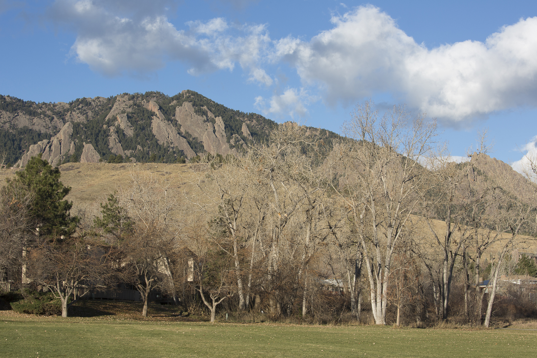
FIGURE 5-9 I shot this image with a 70mm lens from exactly the same camera position I used for the image in figure 5-7. There is no difference in perspective between this shot and the 35mm shot cropped to the same angle of view.
An old saw says that the $10 photographer sees a scene he likes and takes a picture. The $100 photographer sees the scene, steps three feet to the left, and takes the picture. The $1,000 photographer sees the scene, steps three feet to the left, steps one foot back to the right, and takes the picture. Selecting the right camera position is that critical. In fact, sometimes moving the camera just an inch or two can significantly improve the composition of a grand landscape if some elements within the frame are close to the lens. Precise compositions—those in which a small movement of the camera produces a significant change in the composition—are often pleasing because the photograph seems like a carefully considered record of a particular place rather than a generic image that could have been made anywhere within a hundred-yard radius.
Many of my students have a tendency to arrive at our shooting location and plant themselves in one place. They extend the legs of their tripod so they can position the camera conveniently at eye height and shoot every frame from that position. Sure, they zoom in and out and point the camera in different directions, looking for the best composition, but they don’t compose with their feet. Before putting the camera on the tripod, look through it handheld and consider all the possibilities. Maybe the best shot is from knee level or waist level, or from three feet to the left or ten feet to the right.

FIGURE 5-10 Gray Rock and South Gateway, Garden of the Gods, near Colorado Springs, Colorado. I placed the camera so the right-hand of the two towers would fit into the notch in the branches above.
Composing with your feet (or knees and elbows) is particularly important when shooting a field of wildflowers. Here the goal is to optimize the flower field’s optical density. For every flower field, there is an optimum height of the camera above the ground. If you place your camera at ground level, more distant flowers line up behind the foreground ones, and the flower field looks very dense (that’s good) but also very shallow, occupying only a small portion of the frame if you also include the distant peaks (not so good). On the other hand, if you place the camera at eye level, the flower field looks broad (that’s good) but also sparse because the flowers themselves will look small and you can see all the gaps in between the blossoms. The ideal placement of the camera is usually somewhere in between those two extremes. When you’ve found the right place, the field will appear lush, with a good density of flowers, yet expansive, so it fills a reasonable portion of the frame.
Photographers are often advised to “work the scene,” meaning they should shoot a variety of compositions of the same subject. This is good advice, but it needs clarification. Landscape photographers should work the scene by looking at all the possibilities before the light hits. It’s usually best to identify one ideal composition, dial it in to perfection, then wait for the light to peak rather than trying to shoot three different compositions during the fleeting moments of great light. Perfecting a composition takes time, particularly if you’re setting up the tripod on uneven ground. I usually try to resist the temptation to change compositions at the last minute if the clouds behind me light up instead of the ones in my frame. All too often I find that the good light behind me is gone before I can dial in a satisfying new composition. To add insult to injury, the clouds in my original composition usually light up as I’m struggling to perfect the new shot, then fade as I frantically try to redo the original composition that I should have stuck with the entire time.

FIGURE 5-11 Druid Arch reflected in a pothole, Elephant Canyon, Needles District, Canyonlands National Park, Utah
Balance and Depth
Books on composition are full of abstract discussions of the connotations of various geometric forms. For example, much has been written about the properties of lines. Vertical lines are said to be in balance; diagonal lines are falling or are about to fall. Jagged lines are tense, nervous, full of energy; horizontal lines are at rest. Curved lines are graceful and soothing. In my opinion, these concepts, while worthwhile to keep in mind, are often more useful to the graphic designer working with simple lines and shapes than they are to a nature photographer working with natural forms. The key elements of graphic design for the landscape photographer are balance and a sense of depth.

FIGURE 5-12 Lone Eagle Peak Reflected in Mirror Lake, Indian Peaks Wilderness, Colorado
Let’s start with balance. During the Renaissance and earlier, European artists gave their paintings balance by using symmetrical compositions. If the painter put three supporting figures to the right of the main figure, then he would put three figures to the left as well. Similarly, architecture was also often painted symmetrically, so that the left half of the painting would be a mirror image of the right. While effective in achieving balance, these paintings were also stiff and static.
Since the Renaissance (and much earlier in the traditions of oriental art), most painters have favored asymmetrical compositions, in which balance, while still desirable, is not a given. Instead, balance must be carefully constructed, with each element placed to fit harmoniously with the others. It’s helpful here to remember the principle of the lever and fulcrum. A large, heavy object near the center of the frame can balance a smaller, lighter object at a greater distance from the center and on the opposite side of the frame, just like the big kid sits closer to the center of the teeter-totter than the small kid on the opposite side. As you arrange the elements of your picture within the frame, you also need to be aware of their relationship to the frame itself. If an important element with a distinct edge is placed too close to the frame, it will feel crowded. If placed too far from the frame, the viewer will see the extra space as wasted or useless. Take a look at Lone Eagle Peak Reflected in Mirror Lake. The large, heavy mass of Lone Eagle Peak balances with the smaller peak to the right. The dark masses of trees are similarly balanced with each other and with the peaks and their reflections. To achieve this, I walked back and forth along the edge of the lake until all the major subject elements fit harmoniously within the frame.
Sometimes, of course, it’s neither possible nor desirable to include all of the subject. Let’s say you’re shooting an expansive field of flowers. Excluding the borders of the flower field, so that the flowers entirely fill the frame (or a large portion of it) makes the viewer think the flower field continues forever. On the other hand, cutting a small clump of flowers in two with the edge of the frame looks like a mistake. In that situation, you’ll generally want to either include the entire clump cleanly, like you planned it that way, or exclude it completely.
Some photographers use the Rule of Thirds as a guide when composing images. Imagine dividing the picture space into nine equal-sized areas by drawing two equally spaced vertical and two equally spaced horizontal lines across the frame. The intersections of those lines are supposed to be good places for the main subject.
Can the Rule of Thirds actually help landscape photographers compose better-balanced photos? Frankly, I’m skeptical. There’s little scientific evidence supporting the idea that placing the main subject at any of those four “power points” leads to consistently better compositions. Too often, constructing a photo so it adheres to this rule leads to compositions that feel forced rather than organic.
Although the Rule of Thirds is too rigid and arbitrary for my taste, the underlying principle is sound: completely symmetrical landscape compositions are rarely as interesting as asymmetric ones. This principle is particularly helpful when deciding where to place the horizon, especially when the horizon is straight. I rarely place the horizon dead center, halfway between the top and bottom edges of the frame. Usually I choose to favor either the sky or land. In the absence of other considerations, a one-third/two-thirds split often works well. Reflections are one exception to the no-symmetry rule. Placing the shoreline halfway between the top and bottom of the frame can sometimes emphasize the symmetry of the reflection in a pleasing way.
Let’s move on to the second critical aspect of graphic design for the landscape photographer: depth. The sense of realism in a nature photograph is strongly enhanced if the image has a sense of depth. Obviously, realism need not be your goal in every shot. Nature abstracts can be just as pleasing to the eye and satisfying to make (though probably not as salable) as grand landscapes. If your goal, however, is to make images that give the viewer the sensation that they can walk right into the frame, then you need to consider ways to enhance the illusion of depth. As Harvard researcher Margaret Livingstone wrote in her book, Vision and Art: The Biology of Seeing, “Artists must look at a three-dimensional scene with their two-dimensional retinas and then generate a two-dimensional painting that appears three-dimensional to viewers who look at it with their two-dimensional retinas.”
The sense of depth in a photograph is enhanced by several mechanisms: converging lines, size relationships, overlapping elements, and aerial perspective. Let’s take these elements one at a time and explore each more fully.
The sense of depth created by converging lines is shown clearly by the way railroad tracks seem to come closer together as they recede into the distance. The lines formed by the banks of a stream or a narrow arm of a lake can have the same effect. In the absence of water, you need to attune your eyes to more subtle, implied lines in your composition. The implied lines formed by the bases and tops of trees along the side of a meadow can form converging lines that lead your eye into the frame as you look down the length of the meadow toward distant peaks. The eye subconsciously tends to identify a series of dots as a line, a principle the Gestalt psychologists of the early 20th century called closure. A series of stones can work as an implied line. Converging lines most strongly create a sense of depth if they come in pairs, like railroad tracks, but a single line leading diagonally across the frame can serve the same function if other clues in the picture also work to enhance the sense of depth.

FIGURE 5-13 Sunrise over Wetterhorn Peak from the summit of Uncompahgre Peak, Uncompahgre Wilderness, Uncompahgre National Forest, Colorado
Closer objects look bigger to us; distant objects look smaller. You can use this principle to create a sense of depth, particularly when you have a group of objects that the viewer assumes are all the same size, such as flowers of a particular species. Using a wide-angle lens, move in close to the nearest flowers. That will render them large in the frame, which will make the other flowers diminish in size as they recede into the distance, thus enhancing the illusion of depth.

FIGURE 5-14 By using a wide-angle lens and placing the camera close to the foreground flowers, I created a size gradient that enhanced the feeling of depth in this image of lupine, Wolcott Mountain, Mears Peak, and Peak 13,134 at sunset, Mt. Sneffels Wilderness, Colorado.
If same-sized objects are regularly spaced, such as the furrows in a plowed field, the technique of moving close to the nearest one has another effect. More distant objects not only look smaller, but also look closer together. Some artists call this a texture gradient. It also enhances the feeling of depth.
The overlapping of objects is another important depth clue. We naturally assume that if the outline of an object blocks our view of another object, the second object is behind the first. The artful overlapping of some of the main elements in the photograph can help enhance the photo’s feeling of depth. On the other hand, if you place two objects that are at different distances so their edges exactly meet, but do not overlap, you lose the perception of depth. Unless you’re interested in creating optical illusions (a cow that appears to be standing on a man’s hand, for example), you should usually avoid such compositions.
I touched upon the final depth clue—aerial perspective—in the chapter on light. The blue light scattered from the atmosphere between you and a distant object makes the object appear bluish. The same object, if seen from a closer distance, would lack that blue cast. As a result of this phenomenon, warm colors in general seem to come forward; cooler tones tend to recede. Haze also softens the details and edges of distant objects. The ability of slight haze to enhance the feeling of depth is one reason you should think carefully before using a polarizer, which cuts through haze when you are looking at a 90-degree angle to the sun. If you render everything in your photograph, from near to far, in razor-sharp detail, you can reduce the feeling of depth, which may be undesirable.
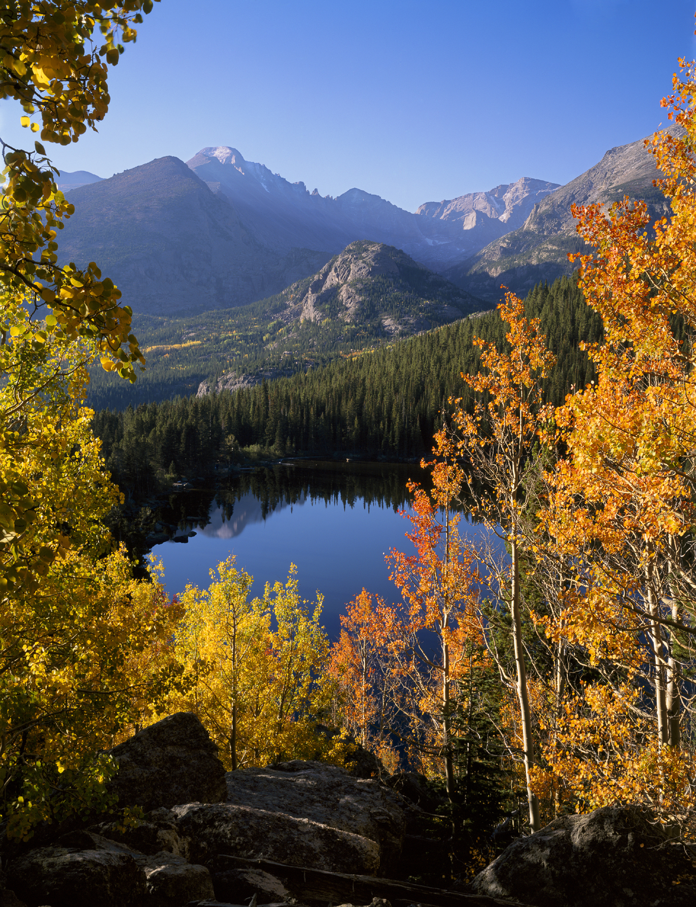
FIGURE 5-15 This image of Longs Peak and Glacier Gorge from Bear Lake in autumn, Rocky Mountain National Park, Colorado, clearly shows the way aerial perspective enhances the sense of depth
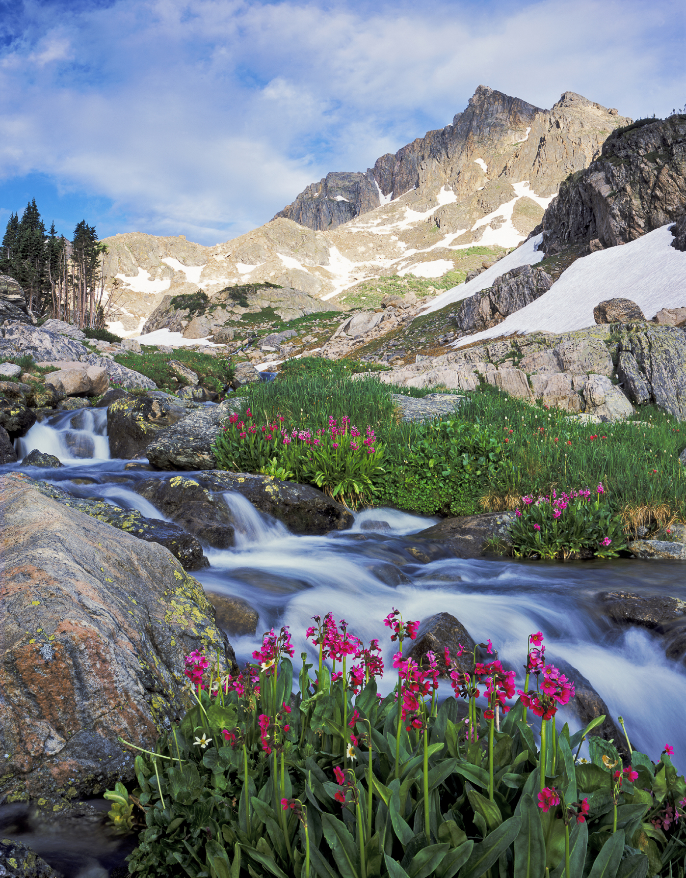
FIGURE 5-16 The converging lines formed by the banks of this stream enhance the feeling of depth in this image of Mt. Neva and Parry’s primroses, Indian Peaks Wilderness, Colorado
Focus Stacking
In the film era, your choice of camera position was sometimes limited by your inability to get full depth of field with the lens required. For example, your ideal composition for a grand landscape of flowers and mountains might require placing the camera two feet from your foreground flowers and using a 35mm lens. A wider lens would include extraneous clutter; a longer lens would cut off the tops of the mountains. Unfortunately, the maximum depth of field of a 35mm lens on a full-frame camera, even at f/22, only extends from about four and a half feet to infinity—not enough, in this example, to keep everything sharp with your ideal composition. Fortunately, digital cameras and appropriate software provide a solution: focus stacking.
The technique is simple, but does require either the full version of Photoshop or specialized focus-stacking software. Set up your shot with the camera on a tripod, focus on the closest part of your subject, and make the first frame. Focus on something slightly farther away from the camera, and shoot a second frame. Continue shooting additional frames until you’ve made one that is focused on the most distant part of your subject.
The next step is getting all the images into Photoshop as layers in a single document. If you have both Lightroom and Photoshop, the job is easy. Select all the images in Lightroom and choose Photo>Edit In>Open as Layers in Photoshop. Once the images have loaded, select the top layer, then Shift-click on the bottom layer to select all the layers. Choose Edit>AutoAlign Layers. In the next dialog box, I usually choose Auto as the type of projection, but I have found that sometimes Cylindrical or Perspective produce less distortion of the original rectangular shape. Under Lens Correction, check Vignette Removal and Geometric Distortion. Click OK. Next, choose Edit>AutoBlend Layers. Under Blend Method in the next dialog, choose Stack Images, and be sure Seamless Tones and Colors is checked.
If you don’t have Lightroom, start from Bridge, which ships with Photoshop. Choose all the images in your focus stack, then choose Tools>Photoshop>Load Files into Photoshop Layers, and proceed as described before.
Focus stacking works best with wide-angles and when doing macro work. Obviously, no part of the subject can move in between frames. Trying to focus stack flowers on a windy day is a sure route to hair loss. Be sure to compose generously by including a bit more of the subject than you want to appear in the final image. Even if your technique is perfect, it’s common to find minor blending and merging errors along the edges of the frame, which must be cropped away. Check the interior of the image carefully as well. In some situations you’ll find narrow, out-of-focus “halos” around foreground objects, particularly when shooting with a telephoto lens. These halos can be corrected in Photoshop by selecting the foreground object, inverting the selection, and cloning portions of the sharp background image over the blurry halo. The task can be laborious, and the details are beyond the scope of this book.

FIGURE 5-17 Focus stacking enabled me to get full depth of field in this image of Pursh’s wallflower and alpine parsley near the summit of Mt. Shavano, San Isabel National Forest, Colorado
Color
A lot has been written about the meaning of colors. Black is sometimes associated with death and mourning. Green is the color of spring; yet we also say “he’s green with envy.” Red is often used to imply violence and war, but red is also associated with passion and love. Which is it? The truth is that the meaning you associate with a color is strongly determined by context and by the culture in which you grew up. In some countries, for example, white, not black, is considered the color of mourning. There’s no need to memorize a list of color attributes and cling to it as a rigid standard.
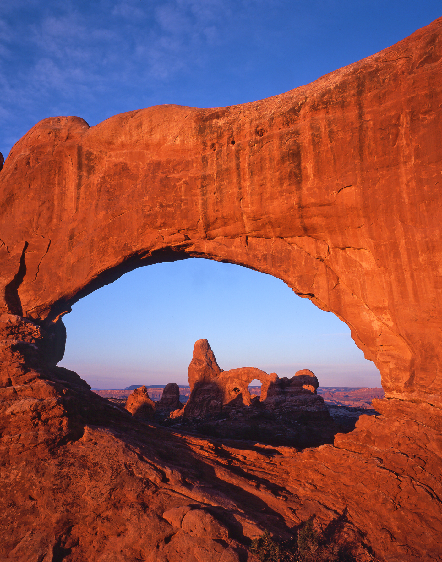
FIGURE 5-18 The near-complementary colors in this photo of Turret Arch through North Window, Windows area, Arches National Park, Utah, help make the image pop
Color does have certain universal attributes that photographers should know. Let’s start with the idea of primary and complementary colors. The topic is confusing because the colors considered primary and complementary differ depending on whether you’re talking about mixing light or mixing paint. As photographers, we’re concerned with light, so I’ll limit my explanation to that type of color mixing.
First, some background. Our eyes have two types of light-sensitive cells: rods and cones. Rods are responsible for vision in low light. They’re much more sensitive than cones, but can’t detect differences in color. Cones function in brighter light and are responsible for color vision. They come in three types, each sensitive to a different region of the visible spectrum. For ease of discussion, let’s call them red-sensitive, green-sensitive, and blue-sensitive cones.
Do those colors sound familiar? They are, of course, the colors we use to create the colors in our digital images. When we are discussing colors of light, red, green, and blue are considered primary colors; different mixtures of these colors of light can create all visible hues.
The first stage of color vision is simple: when red light hits red-sensitive cones, they fire, and so on for the other colors. The next stage is more complicated. Our visual system is wired so that it compares activity in red-sensitive cones with the sum of activity in the green and blue cones. Green and blue make cyan, so you can think of this as placing the color on a red-cyan axis. Similarly, our visual system also compares activity in the blue-sensitive cones with the sum of activity in the red- and green-sensitive cones. Red and green make yellow, so you can think of this as placing the color on a blue-yellow axis. All visible colors can be specified by their position in a color space defined by these two axes. (Photoshop mavens will recognize that this is how color is defined in LAB mode, which uses three channels: luminosity [the L channel], red-cyan [the A channel], and blue-yellow [the B channel].)
If activity in the red cones is balanced by activity in the green and blue cones combined, we see an achromatic color: white, or at least neutral. Red and cyan are complementary colors; when these colors of light are mixed together they make white. Similarly, blue and yellow are complementary, as are green and magenta—or any other pair of colors of light that make white when mixed together. Cyan, magenta, yellow—do those colors sound familiar? These (plus black) are the colors of ink that we use in our inkjet printers.
Here’s where it gets really intriguing. Colors that neutralize each other when mixed will strongly enhance each other when they are adjacent. The explanation is too complicated to detail here, but this is a measurable physiological effect. Red-sensitive double-opponent cells in our visual system will fire more strongly if cyan light strikes the adjacent region of the visual field than if the surrounding region is hit by white light. This is also true for other pairs of complementary colors. To make your images pop, look for complementary colors, such as yellow aspen leaves in the fall set against a brilliant blue sky. Magenta Indian paintbrush set against rich green foliage is an equally vibrant combination. As an aside, colors also look more saturated when set against a dark background.

FIGURE 5-19 The already intense color in these aspen trees is accentuated by placing them against a dark background in this image of storm light over the Cimarrons, Uncompahgre National Forest, Colorado
Such bold, eye-catching colors aren’t necessarily what you want in every shot. You may find that more subtle color combinations look much better in a photograph that you intend to hang on your wall for years to come. As I look through the images that became my best-selling prints, I can find examples that are studies in cool blues, greens, and purples; others that exhibit strongly complementary colors (both floral and fall-color shots); and even one that is a study in vibrant orange and black. Clearly there is a large degree of personal taste in what color combinations are most appealing in a landscape image. According to Mark Fairchild, a professor of imaging science at Rochester Institute of Technology, “Color preferences are difficult to quantify and specify, but in general people prefer color reproductions that are accurate in hue, slightly more saturated than the original scene, and higher in contrast (the rate of change from dark to light).”
Hue is not the only aspect of color that is important. The brightness of a color also affects our perception of it. For example, our eyes often go first to the lightest tones in a photograph. Painters use this principle when they make the face of their subject a light tone set against a darker background. Using a light tone helps direct the viewer’s eye to the most important part of the picture. Although photographers can’t manipulate color and tones quite as directly as painters can, they can ensure that their main subject is not excessively dark. Often this principle is most helpful when considered in a negative sense. A bright white object near the edge of the frame, such as a white granite boulder or, even worse, a piece of white trash, can be very distracting. Bald white skies can be equally distasteful. Avoid them when possible, and keep them to an absolute minimum when it’s necessary to include them.
In the end, learning to create dynamic, balanced compositions is a matter of study, practice, more study, and more practice. Before writing this chapter, I spent more than 20 years practicing the art of composition. I also read half a dozen books and numerous articles in scientific journals looking for some kind of objective foundation. What I learned is that composition is one aspect of photography where science can only take you so far. In the 19th century, the Classic Revival painters believed that good composition boiled down to a group of formulas. Ultimately, their work came to be seen as stiff, formal, and lacking in imagination. I can’t enumerate a set of rules for you, which is one reason why composition is so hard to teach. Getting feedback from more experienced eyes can be helpful. We all have difficulty evaluating our own work, particularly at the beginning of our careers. Look with great care at the work of photographers you admire and consider every aspect of their compositions. Once in the field, slow down. One of the unheralded virtues of using a tripod is that it allows you the luxury of considering your composition at length. Don’t be satisfied with the first composition that feels vaguely right. Continue to refine it by making small changes to camera position until nothing more needs to be added, nothing more can be stripped away, and every element in the scene is positioned in perfect harmony with every other element.

FIGURE 5-20 This image of columbines along the trail to Arapaho Pass, Indian Peaks Wilderness, Colorado, is my all-time best seller as a print