
What we'll cover in this chapter:
Creating a custom vertical scrollbar
Importing Catalyst files into Flash Builder
Connecting a Data List component to an XML file
Files used in this chapter:
wineJournal-start.fxpwineJournal-complete.fxpwineJournal-complete-withXML.fxpXMLAndImages.zipverticalScrollBar.ai
One of the key advantages of Catalyst is that it separates the work done by interaction designers from the work done by developers. Interaction designers get to build in Catalyst using visual tools with design-time data and no coding, and developers can work from the same file in a much more code-friendly environment to connect it with a variety of data sources. This transition can often be difficult, largely due to the dramatically different ways each group works with the file.
This chapter looks at this transition by building out an application in Catalyst using static data and then connecting it with an outside data source in Flash Builder. The outside data source is a simple XML file, to keep the chapter focused on the transition rather than the data-handling capabilities of Flash Builder. The process you use, though, is very similar regardless of the data source. To complete this example, you need to bring it into Flash Builder. If you don't have Flash Builder installed, you can get a trial copy at www.adobe.com/products/flashbuilder/.
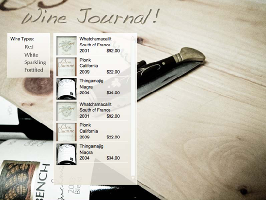
The example creates a Wine Journal app that is first built in Catalyst using static data. You then open the file in Flash Builder and use an XML file to populate the list and data that is shown when an item in the list is clicked. As an added bonus, you create a custom vertical scrollbar for the list. The completed file appears as shown in Figure 10-1 and can be seen working at http://greggoralski.com/wineJournal.

In this application, the user first selects the kind of wine (see Figure 10-2). For the sake of speed, in this case you make only the Red button active, but you can use the same process to make the others function.

This gives the user a list of wines to choose from (see Figure 10-3).

Selecting one of these brings up a detailed description and a larger image of the wine (see Figure 10-4).

To save time and focus on the interesting bits, you start with a partially completed file called wineJournal-start.fxp. This file includes all the elements of the design as static objects before they're made into interactive components. In essence, this is a static comp of the design (see Figure 10-5). In Catalyst, you make it into an interactive comp, and in Flash Builder you connect it to an external data source.

The first action the user performs in this site is selecting a kind of wine. For the sake of the example, you only create the functionality for the Red selection. Follow these steps:
Open the
wineJournal-start.fxpfile.Select the Red text, and, in the HUD, convert it to a button as shown in Figure 10-6. You can also change the look of the text in the Over and Down button states if you want to give the button a rollover effect.
As you see when you move this project into Flash Builder, effective naming of the components makes the process move more efficiently later. Name the layer that the button is on redButtonLayer. Note that in the library, this button has been named automatically using the following convention; layerName+ComponentType. In this case, because the layer the button was originally on was named red, the button in the library is named redButton.
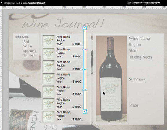
Next, you want to create the Data List component that is at the heart of this application. The elements to create the repeated item of the Data List are already on the stage (see Figure 10-7).
Select all the elements to make up one wine listing (the thumbnail image, the four text boxes, and the line) by clicking each while holding down the Shift key.
Convert them into a Data List by selecting Convert Artwork to Component

As you saw in Chapter 7, the Data List needs to know which pieces are to be repeated. This process is guided by the HUD. In the HUD, select Edit Parts (see Figure 10-9).
In the Data List, select all the items again by clicking them while holding down the Shift key, and define them as the repeated item (see Figure 10-10).
Scale the Data List bounding box so the Data List occupies the whole of the white box it's on (see Figure 10-11).
Because there will be more wines to present than the default five repeated items that are created in a Data List, add several more repeated items. To do so, add rows in the Design-Time Data panel, as shown in Figure 10-12. Because you'll add a vertical scrollbar to this Data List, you can add more rows than are visible at one time.
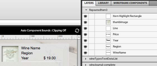
It's important to have clear and consistent naming in the project. Notice that the naming of the repeated items is currently generic (image 1, Text 1, Text 2, and so on). These names give the developer little indication as to what needs to go in these fields. To make the names more meaningful, enter the Data List by double-clicking it; then, enter the repeated item, again by double-clicking. Here, rename the layers as shown in Figure 10-13.


You saw in Chapter 7 how to add a vertical scrollbar to a Data List. At the time, you used a wireframe component to see how this process works. In this example, a wireframe vertical scrollbar doesn't match the look of the rest of the application, so you need to create a vertical scrollbar with a custom look.
A vertical scrollbar is made up of four items: a thumb (the part the user moves), a track (on which the thumb moves), and, optionally, an up button and a down button. You can draw these in a graphics program and then convert them into a vertical scrollbar in Catalyst.
A design for a vertical scrollbar that matches the application's look is provided in the file verticalScrollBar.ai. This file consists of two rectangles (for the thumb and track) and two triangles (for the up and down buttons), as shown in Figure 10-14.

If you aren't currently in the Data List component, double-click it to enter it. Then, follow these steps:
Import the Illustrator file (File
Select the Illustrator file, and use the default import settings. This places the image of the vertical scrollbar in the Data List (see Figure 10-15). Position the graphics so they're in the appropriate location for the scrollbar.
To make this artwork into a functioning scrollbar, with all the pieces still selected, choose Modify
Double-click the scrollbar to enter it so you can define which piece of the artwork becomes which part of the component. Select each part of the artwork and define its role in the HUD, as shown in Figure 10-17.


With this, the vertical scrollbar is complete and functional. Run the project to see it in action. The vertical scrollbar now moves the repeated items in the Data List.
So far, you've created the application so that everything is visible at once. When the application is complete, you want the experience to be a bit different. At first, you want the user to see only the wine-type selection menu. When they click, you want the Data List to Appear. And finally, when the user selects one of the wines, the detailed information should become visible. To achieve this, you need to create two more states. Follow these steps:
Duplicate the Expanded state, and name it WineList (see Figure 10-18). This state presents the menu and the Data List but not the detailed information.
To make the detailed information invisible, click the eye icon for the ExpandedInfo folder in the Layers panel (see Figure 10-19). Doing so makes all the elements that are part of the detailed information not visible in this state.
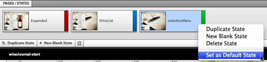
In the same way, you can create a duplicate state that shows only the wine-selection menu. Duplicate the WineList state, and name the copy selectionMenu. In this state, set the WineDataList folder to be invisible by selecting the eye icon. The design should now look like Figure 10-20.
To set this state as the first state the user sees, right-click the state and select Set as Default State from the context menu, as shown in Figure 10-21.


You now have the basic structure of the project complete. Next, you create the interactions to control the movement between states and then bring the project into Flash Builder to connect it to the outside data source.
To move the user through the different states of the application, you need to add interactions to the components you've created. The first of these is placed on the redButton. When the redButton is clicked, the application should transition to the WineList state. Follow these steps:
Select the redButton. In the Interactions panel, define the interaction as On Click
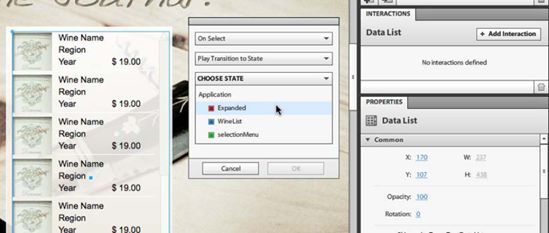
In a similar way, when the user selects one of the wines, you want the application to transition to the Expanded state that shows the detailed information about the wine. Select the WineDataList and, in the Interactions panel, define the interaction as On Select
It doesn't matter in which state you define the interactions, because they're associated with the component, not the state.
Save the project (File

The Catalyst part of this project is now finished. Next, you open the same project in Flash Builder; because Flash Builder can open a project created in Catalyst, nothing special needs to be done to make the project ready for import into Flash Builder.
Flash Builder is a developer-centric program that is used to create Rich Internet Applications (RIAs). Just like Catalyst, Flash Builder is part of the Flash Platform; thus the ultimate project that comes out of Flash Builder is a SWF file.
Flash Builder is a very data-friendly and powerful development environment. The purpose of this chapter is to see how a project goes from Flash Catalyst to Flash Builder, but you don't learn how to use Flash Builder itself—that's a subject for another book.
This chapter goes into developer territory, so don't get discouraged if the material is disorienting or unfamiliar. This isn't normally the part of the process that interaction designers are directly involved with, but seeing the entire process will help you understand how to better create the Catalyst files to make life easier for the developers.
After Flash Builder is installed on your computer, open it. Then, follow these steps:
In Flash Builder, import the Wine Journal Application that you created in Catalyst (File
This brings your project into Flash Builder. You can see the project in the Package Explorer (see Figure 10-26).
A Flash Builder project is made up of a variety of files and folders that are all contained in a package. If you open the package by clicking the arrow next to the name, you can see its folders and files. The ones you're most concerned with are in the
srcfolder. This is the Source folder, and it's automatically created to hold the project's main code files.A package is essentially a collection of code. The default package holds the main code for the project.
Main.mxmlcontains the main structure of the project you created in Catalyst, and theassets.imagesfolder holds all the images you used. You can see these in Figure 10-27.Double-click
Main.mxmlto open the project in the code view. Click the Design button above the main window, as shown in Figure 10-28, to switch to the design view and get a more familiar look at your project.In this project, you replace the data that is used to populate the list of wines. In Catalyst, the data was the single repeated wine that you used when you created the Data List. In a finished application, the data that populates the list comes from an outside file or database. In this case, you use data from an XML file—specifically, the provided file
XMLAndImages.zip.Because your data source is an XML file, you bring the file into the project so it's a part of the overall package. It's good form to bring the XML into the project's
assetsfolder but keep it separate from the images. To do this, you need to create a new folder nameddatain theassetsfolder.Right-click the
assets.imagesfolder, and select NewIn the New Folder dialog box, select
assets, give the folder the namedata, and click Finish, as shown in Figure 10-30.The XML file and a series of images that are used for the different wines are provided with the example files for this chapter in the zip file
XMLAndImages.zip. Download and extract these files onto your desktop.To make the XML part of the project, drag and drop the file directly into the
datafolder in the Package Explorer panel, as shown in Figure 10-31. Doing so places a copy of the XML file into theassetsfolder; it will be exported with the project when it's finished.Do the same thing to make the images part of the project: drag the images that were in
XMLAndImages.zipinto theassets.imagesfolder.With the XML file in place, you can now make it into a data service in the project. A data service takes in and processes data, making the individual fields accessible later in this example. When you make the data into a data service, Flash Builder can connect or, in the language of Flash Builder, bind the information in the file to the individual components.
To create a data service, select the Data Services tab along the bottom panel, and click Connect to Data/Service, as shown in Figure 10-32. Doing so brings up a Data/Service wizard to guide you through the process (see Figure 10-33). As you can see, Flash Builder can work with a variety of different kinds of data sources.
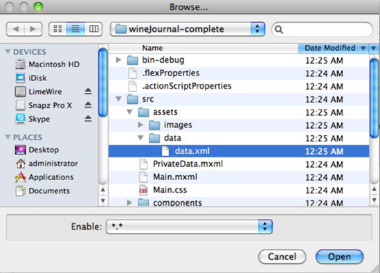
The next step in the wizard has you locate the XML file you need to use. To find the one you just added to the project, click Browse beside the Path field (see Figure 10-34). This opens the Browse window at the root of the current project.
Navigate through the project's file structure until you reach the
data.xmlfile. It's in thesrc/assets/data/folder, as shown in Figure 10-35. Click Finish to complete the creation of the data service.You've now created the data service. Flash Builder understands the structure of the XML, and it can be used to bind to a component. In the Data/Services panel, you can see the structure of the XML file, as shown in Figure 10-36.
You now want to connect the data service with the Data List you created in Catalyst. Select the WineList state in the States panel at upper-right in the interface (see Figure 10-37).
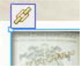
Notice that when the Data List is selected, an icon that looks like a chain appears to the left of the component. This is the binding icon (see Figure 10-38). Click it to bind the data service to the component.
You receive a message stating the component is already bound (see Figure 10-39). This is because the Data List has been bound, in Catalyst, to the design-time data. Because you no longer want to use the design-time data, you can replace the binding. Click OK in the message.
The next dialog box gives you some control over how the data service binds to the Data List (see Figure 10-40). Keep the default settings, and click OK.
The contents of the Data List disappear at this point. This is because, although the data from the XML file is now being passed to the Data List, it doesn't yet know how to handle the data. It doesn't know which field from the XML goes into which part of the repeated item. You need to manually connect this directly in the code.
All the components that you created in Catalyst also exist in Flash Builder as individual MXML files. These MXML files control the appearance of the individual components and can be found in the Package Explorer panel in the
src/componentsfolder, as shown in Figure 10-41.The component you're concerned with here is RepeatedItem. This is the part of the Data List that is repeated for each wine.
Double-click the
RepeatedItem.mxmlfile to open it. It isn't much to look at in the design view, because it doesn't contain the data. But if you switch to source view, you can see the code that makes up the component.This source view can be difficult to understand if you aren't familiar with MXML, but it holds all the properties of the components you created in Catalyst (see Figure 10-42). You need to make a few small changes to this code in order for it to understand how to handle the data that is coming in.
Let's start with the thumb image of the wine label. This can be found at line 17 (see Figure 10-43). The
sourceproperty of this image defines where the image data comes from. Right now, it's looking for a field calledimage1in the XML file, because this was the generic name given it from the design-time data. This is represented assource="{data.image1}". You need to change it to the correct field in the XML:thumb.Change the
sourceproperty to{data.thumb}, as shown in Figure 10-44.In the same way, the text field that contains the information about the wine name, region, year, and price needs to be pointed to the correct part of the XML file. You can find these components at lines 8 to 11. Currently, the data fields they're pulling from are named
{data.text1},{data.text2},{data.text3}, and{data.text4}, as shown in Figure 10-45.You need to change these to pull from the appropriate fields. You can tell which data should go to which component by looking at the
userLabelfield of each component. These are the names of the layers you added in Catalyst. (You can tell that this process would be considerably more difficult if theuserLabelfield weren't clear.)Change the fields to
{data.name},{data.region},{data.year}, and{data.price}, as shown in Figure 10-46.That's all for the Data List. To see the project in action, run it by selecting Run
The contents of the Data List showing all the wines are now brought in from the XML data, as shown in Figure 10-48. Any future changes in the XML file will be reflected in the contents of the Data List.
Clicking any of the wines in the Data List still bring up the detailed view. This information is still static. Making it live would require a deeper investigation of the coding in Flash Builder than is in the scope of this book, but you should now have some idea of how you might go about it.
There is a bit of an issue: when you click the Data List, it seems to disappear (see Figure 10-49). To prevent this, select the Data List in the
Main.mxmlfile (in the design view), and select Apply Current Properties to All States from the context menu (see Figure 10-50). This carries over the changes that you made to the Expanded state.


You now see how one piece of a design is connected to an outside data source. The development process continues from here to bind more of the components to the data, but this example gives you an overall sense of how the process works.
As you can see in this example, the developer works with the same file and with the same images in Flash Builder that you use in Flash Catalyst. This means ambiguously named components and uncompressed images stay with the project after you hand it over, making it more difficult to work with and slower to download. Taking care of naming and image compression in Catalyst makes the project an easier file to work with.
The final point to keep in mind as you finish this book is that the real power of Catalyst lies in changing your design process to make you a better interaction designer. With Catalyst, you can design a prototype much more quickly, and this should lead you to create many more prototypes. Use this speed to sketch the interaction, experiment with different approaches, and not rely on your first idea about a design.
This concludes the book. We hope you've found it useful, and we look forward to seeing the work you produce with it.